2.12 billion tons of waste are created every year in the world. Create and promote a new brand for a product made from waste.
TYPE OF WASTE
Food waste
OPTIONS
Skincare range from discarded bread
Sportswear clothing range from coffee grounds
Vodka (or other spirit) made from surplus milk
MY RESPONSE
Creating and promoting a vodka brand made from milk seemed to be the most challenging option to me, but I felt that with this choice I had the best opportunity to play around and produce innovative results.
RESEARCH
The issue I set out to tackle was that of food waste, more specifically surplus milk. To learn more about the issue, I looked into the scale of the problem, as well as how dairy farmers feel about it. From my findings, I discovered several key points from which I could focus my brand.
Among the top 5 most wasted foods in the UK is milk ... a real slap in the face for the farmer.
We waste an estimated 490 million pints a year overall.
If we can come to think of ourselves and our communities as intimately entwined with farming , we might view waste in a different way.
Customers love a story behind their purchase.
AUDIENCE
After researching my issue, I brainstormed who the target audience for my brand might look like. I figured those who are engaged with their community, live an environmentally concsious lifestyle, and are into creativity would be the types of people interested in a brand like Clover's.
GOAL
To create the purest, most eco-friendly vodka on the market by partnering with the most ethical and sustainable dairy farms across England
Sustainability, creativity, connection, community VALUES
WORD MARK
I made my first wordmark for this project, and found that once I finalized it, my brand really started to come together. Derived from the Playball typeface, my word mark is inspired by the nostalgic, old-school branding of products you might find in a general store. When I started to add the curls on the ends of some letters, I noticed I could make a clover shape with them. I then used this clover as the apostrophe, and made it my logo.
Untouched typeface
Finetuning the wordmark
Final wordmark
LOGO
The logo was the hardest part for me to come up with. I had lots of varying ideas, from clover flowers, to the leaves of clovers, to cow tags, but when I made my word mark, the finalization of my logo clicked.
PHRASING
I needed to clarify that my product was vodka, but I found it challenging to come up with a short phrase to place under my word mark. It needed to clearly state that my product was vodka, while maintaining the tone of my brand.
I received feedback that this phrase was too obvious and lacked character.
I tried this phrase out because it was stuck in my head from my ideation phase, but decided it was too goofy for the tone of my brand.
I ultimately landed on this phrase, as it captures the message of my brand best, and creates an impression of high-quality for my brand.
MOOD BOARD
I was inspired by imagery of farms, fields, general stores, retro packaging, and western aesthetics.
PATTERN
I used my logo and color palette to make a checkerboard pattern that inspires a friendly, welcoming and playful attitude for my brand.
COLOR
My color palette was derived from my mood baord, and captures the essence of where my product originates from: the countryside.
PROMOTIONAL DEVELOPMENT
IDEA
To promote my brand, I started by thinking about where my target audience would interact with my product. I didn't want to simply make posters, or an Instagram account. I wanted to reach my audience in an environment where my brand's values were present. The best way to do this, I decided, was in locally owned restaurants across London. By partnering with these restaurants, I could offer my audience a chance to try my product before purchasing a bottle. I designed a curated cocktail menu, custom Clover's glasses and coasters in order to spread awareness of my brand, and most importantly to support local businesses.
PROMOTIONAL DEVELOPMENT
OUTCOME
I chose three highly rated, locally owned restaurants in London with atmospheres that I could picture my product in. I had dinner at Mina's back in March, and had a chance to talk to one of their employees who told me their restaurant is new and family owned. She thanked my friends and I for coming and genuinely appreciated our satisfaction with our meal. I knew this is the type of restaurant I could picture Clover's collaborating with.
CHOSEN RESTAURANTS
Mina's Restaurant and Cocktail Bar
Lardo
Bottle and Rye
PACKAGING DEVELOPMENT
IDEA
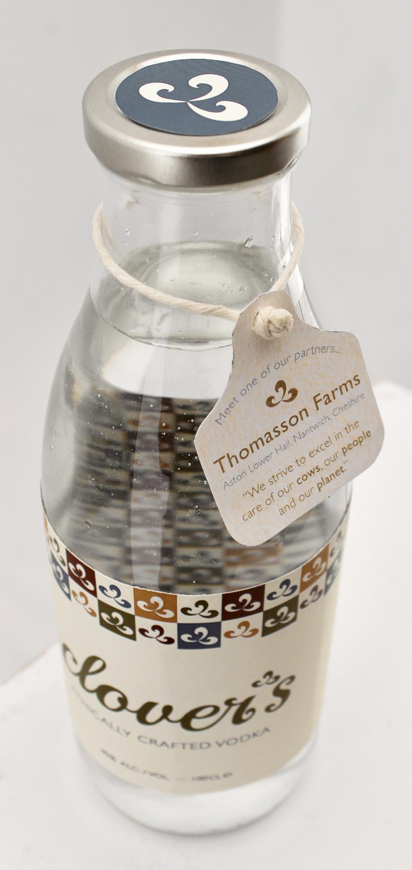
From the start, I knew I wanted to package my vodka in a milk bottle. I thought this would make my product stand out amongst competitors, while also staying true to the background of my brand. I would make my label out of recycled paper with a perforation to make removing and recycling the label easier. I also wanted to highlight on each bottle one of the farms my brand partners with for our source of milk. For this, I would tie a cow tag label around the neck of the bottle, showcasing a sustainable dairy farm in England.
EVALUATION
Reflecting on my process for the creation of Clover's Vodka, I can confidently say that I am very proud of my outcome. It was not an easy process, but I learned a lot about how to form a well-rounded brand identity. I wanted all aspects of my project to feel cohesive and complete, and I did this by focusing on the intricate details. My brand is unique, fun, thoughtful, ethical, and sustainable. My brand inspires connection, community and creativity. From the brand assets, to the packaging, to the promotional piece, Clover's has a clear message and aesthetic that can appeal to anyone.
In the future, I will be sure to set out a more rigid plan of action for myself so as to feel more organized throughout my process. I also hope to improve my mock-up and motion skills to create even more professional designs.
Working on this project has solidified my passion for graphic design and branding, and I look forward to expanding my knowledge and skills in the discipline.