
San Mateo Vernacular Typography
SanMateoDr NElCaminoReal
A. Closed Sign
B. Parking Post
C. Walk of Honor
D. Disposal Bins
E. The Chronicle
F. Drains to Bay
G. PGE
H. Bench
I. Thai Bistro
N. Cajun Bowl
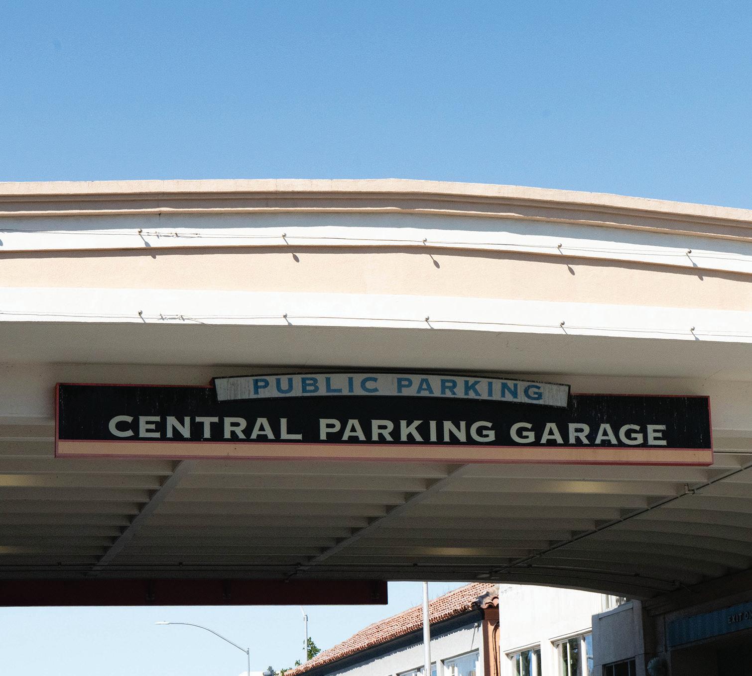
O. Central Parking
P. Pedestrian Post
Q. Mr. Pizza Man
R. Light Pole
S. Open Sign
T. Amor Amor
U. Dry Cleaner
V. Railroad Crossing
J. Do not dump Sign
W. Railroad Sign Legend
K. Rockwood Sprinkler
L. Bento
M. Cajun Bowl Address
Local History


San Mateo was first inhabited by the Ohlone Indians who lived there 4000 years before explorers arrived in the area. In 1776, Spanish explorers came to todayʼs San Mateo. During a scouting trip to locate a place to start a colony on the Peninsula, Lieutenant Colonel Juan Bautista de Anza, Padre Pedro Font, Lieutenant Jose Joaquin Moraga, and eleven soldiers set up camp in San Mateo. Father Font named the creek that they slept by “San Mateo Creek.”


Juan Bautista de Anza, Padre Pedro Font, Lieutenant was at San Mateo Creek and was established to bring the Church to the Peninsula, to organize and oversee


In 1793, the mission fathers in San Francisco created an outpost of the mission on the Peninsula. The outpost was at San Mateo Creek and was established to bring the Church to the Peninsula, to organize and oversee the newly converted Christians in livestock herding, and to provide food for the Mission. The outpost was the first building built in San Mateo by non-natives.

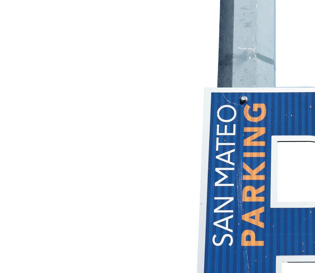

Sign directing cars towards additional parking spaces.


In May 1861, under the direction of Charles B. Polhemus, the construction of a railroad to link San Francisco with San Jose began. The track was completed in January 1864 and the first service through San Mateo was on October 17, 1863. The train made the trip from San Francisco to San Mateo in thirty-seven minutes.


With construction, business


With Polhemus in the role of director of railroad construction, the decision about where the central business district would be located lay in his hands. The first building to be erected near the tracks was the train station, but it wasnʼt long before buildings began springing up in the area of Main Street and Railroad Avenue. This was the beginning of downtown In hemus, Francisco pleted San the ty-seven


The the began Railroad San Mateo.

Metal Type
Various metal type was found around this street. Most metal type found was used for industrial or city signs.
Drains to Bay


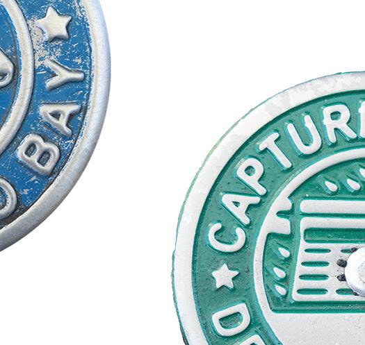
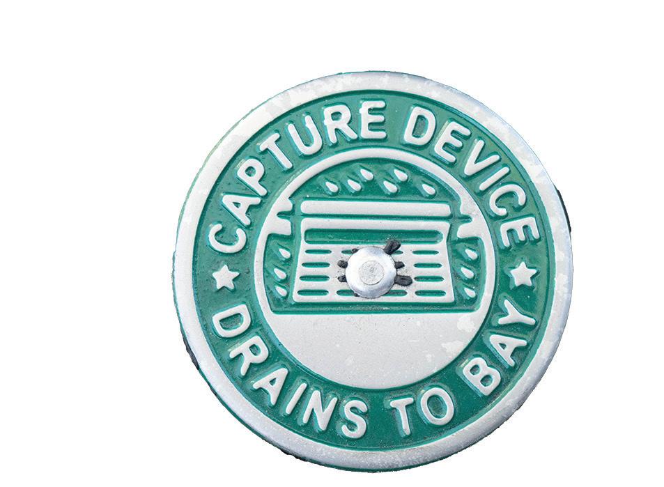
On this street, diagonal-placed street parking is available. Near these parking spots, drains are placed with embossed metal-type, notifying people not to dump any liquids down the drains as they go out to the bay, which could harm wildlife. This type was made with a bold sans serif font
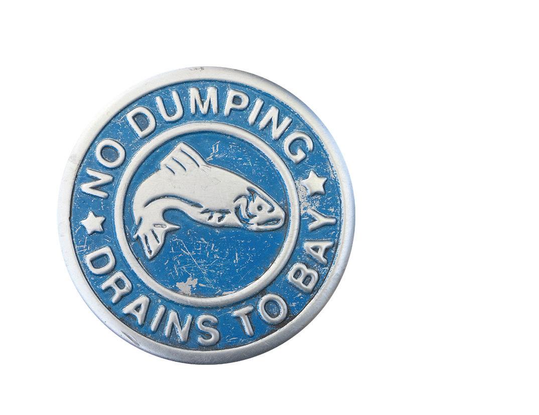
Emblems placed on the floor near drains warning people to not dump liquids down.

On the floor, I noticed an embossed plaque honoring the contributors of the community. On the plaque, a mix of cursive and serif fonts was used to honor these people.
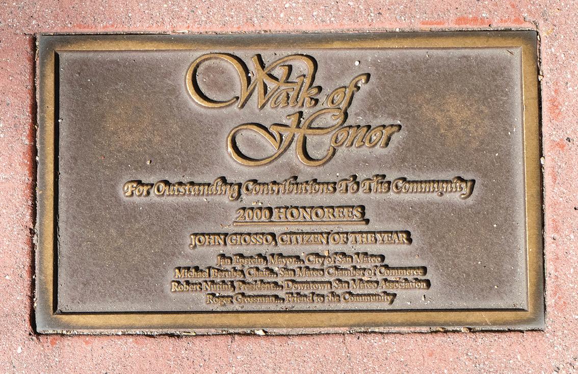
Plaque on the sidewalk people in the community that have donated to maintain the area.
City of San Mateo
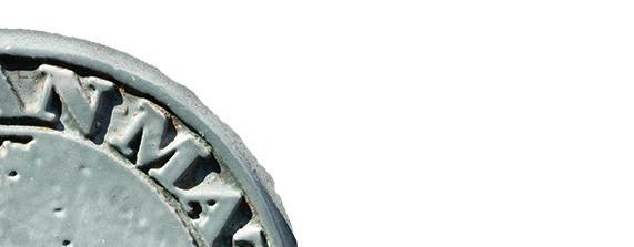
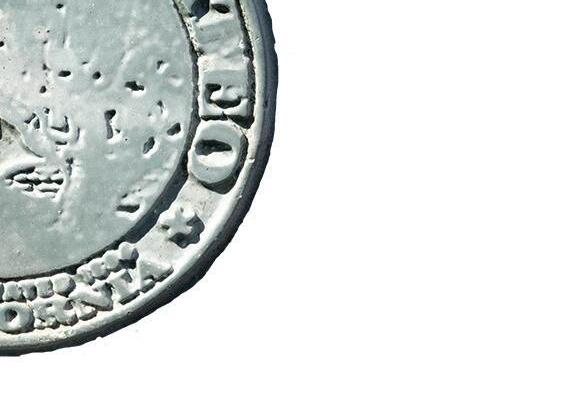
On the lamp posts along the street, metal type was embossed at the base of the pole. Although the image in the center was a little worn down, you could still read the type placed around it. The font used was a serif font in all caps to give a sense of authority, stating that this is San Mateo.
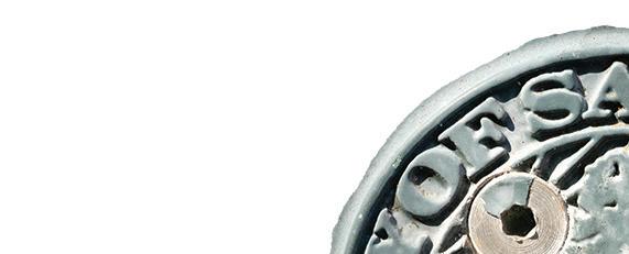


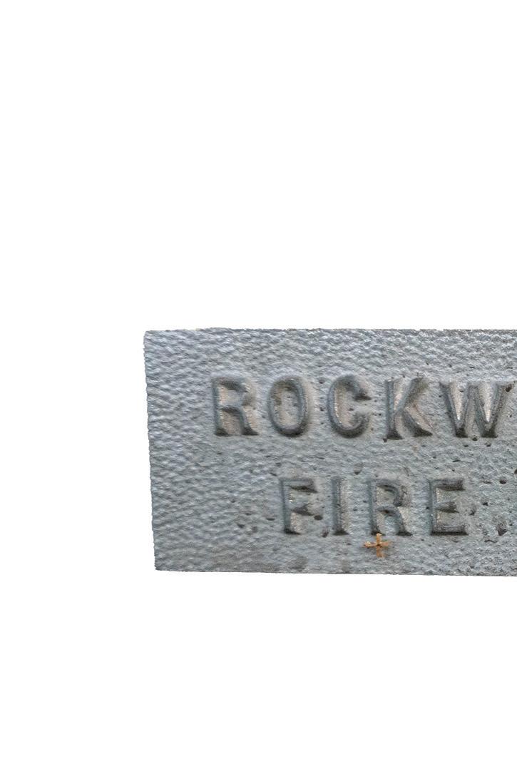
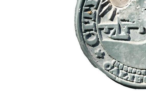
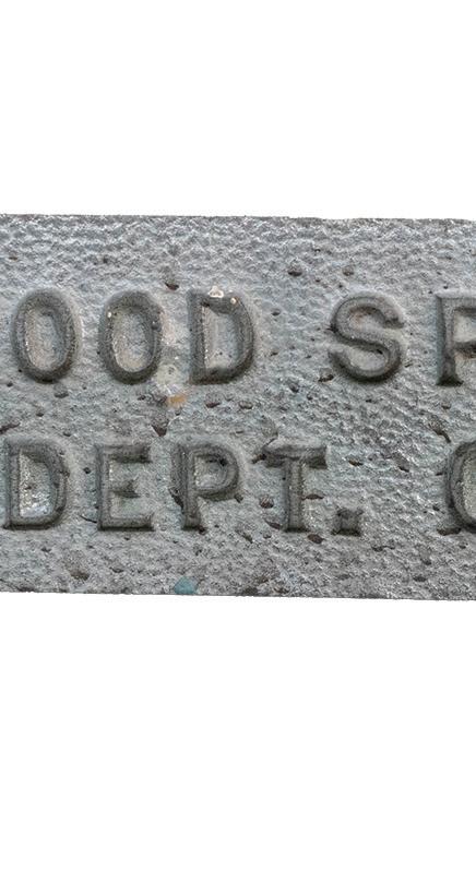
Lamp pole with engraving of the seal of San Mateo along with a sprinkler system placed on the side of a building.
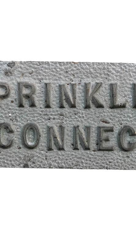
Rockwood Sprinkler
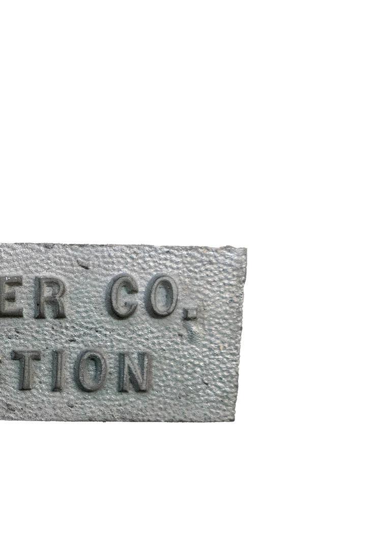
Some buildings had industrial sprinklers placed outside them in case of emergencies. The font placed above the sprinklers used sans serif fonts in all caps, exclaiming that these were for use of the fire department.

Push Button
The crosswalks here use metal signs above the buttons used to signal that a pedestrian is crossing. A simple sans serif font was used to ensure it was easily readable.
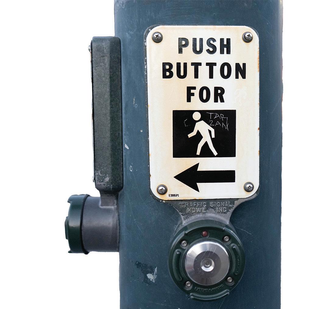

Pedestrian crossing pole with some graffi ti near the stick figure.

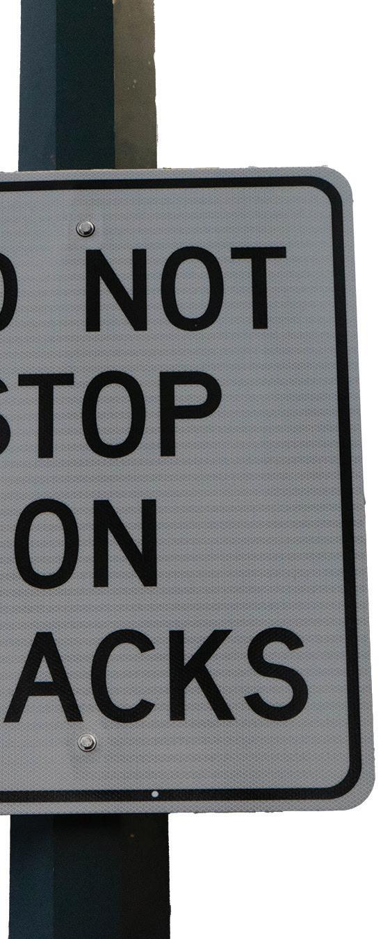
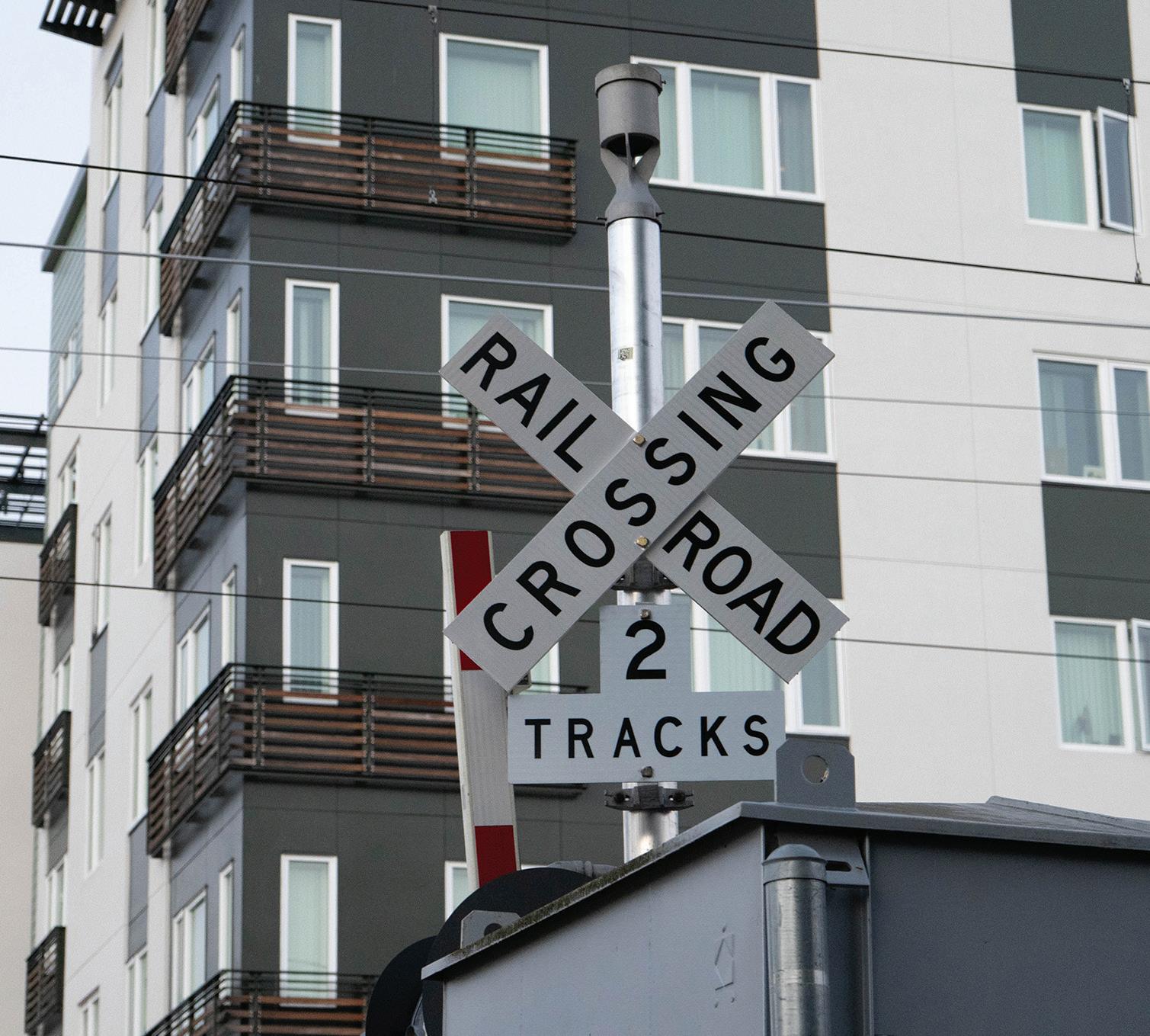
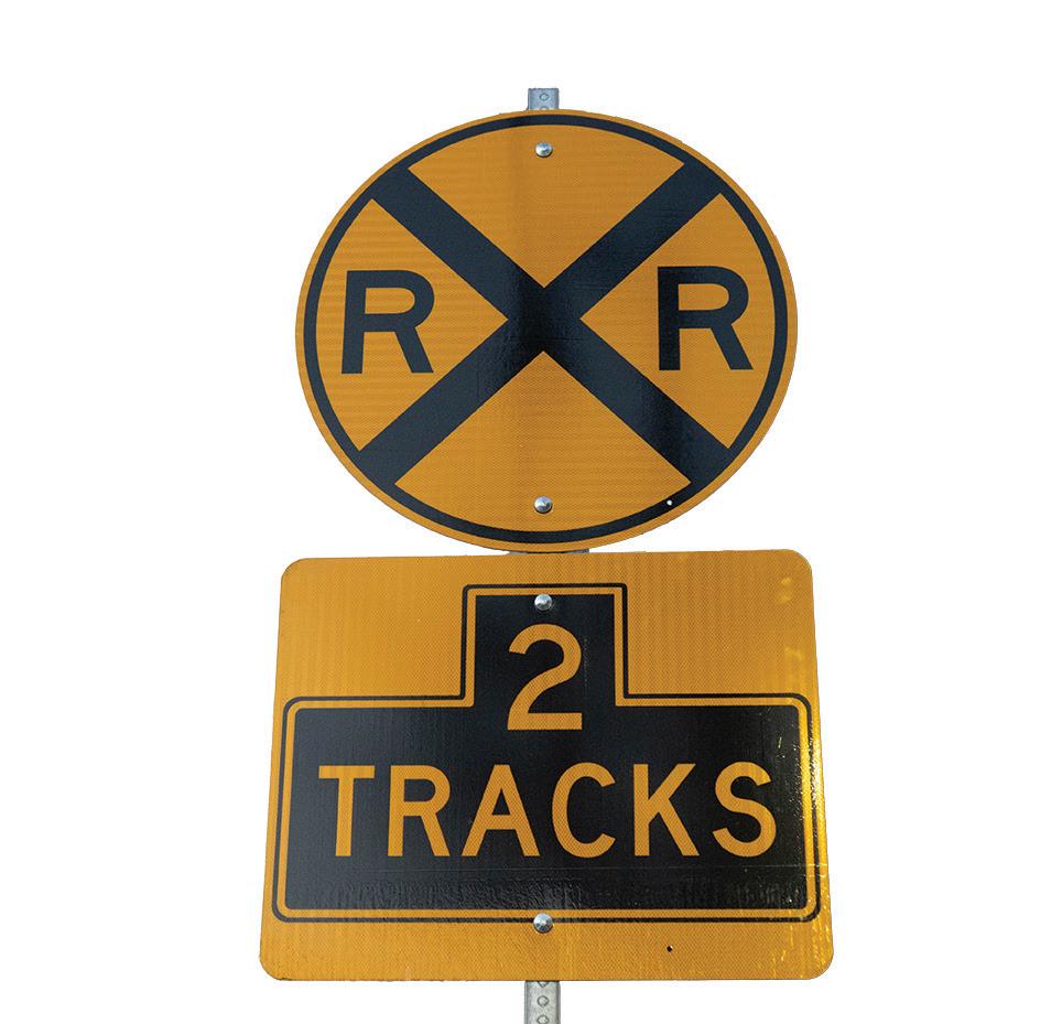
Railroad
Along the railroad, there are signs notifying that a railroad crossing is up ahead. These signs use sans serif fonts and are all in caps to warn people to be careful up ahead.

Train crossing signs giving warnings for safety.

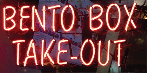
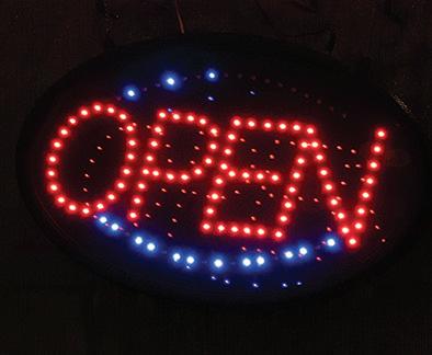
Neon signs in front of restaurants to draw the attention of customers when it gets dark.
Neon Sign
Neon signs were used at a few small shops I passed by. They were all very vibrant, using different colors to attract customers inside.
Bento Box
Bento Box Take-out used a sans serif font with a red hue to it. The font used appears to be in a style that looks more handwritten with disconnecting lines.
Open
Plenty of restaurants used open neon signs to grab the attention of customers when it gets darker. This sign, in particular used a display font that uses dots to make up the letters of “OPEN”.
Shirts
A dry cleaner on the street had an interesting neon shirt sign in the front window. The outline of the shirt was made with a blueish white neon tube, while the word “shirt” was made with red while using a sans serif font.
Restaurante Italiano Pasta
A restaurant named Sapore Express used a neon sign below their original sign using the colors of the Italian flag in cursive spelling “Restaurante, Italiano, and Pasta”.
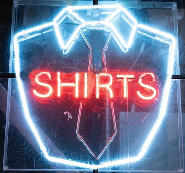

Shirts neon sign in front of a dry cleaners.

Neon sign in front of Sapore Express using the Italian flag colors to light up the sign.

Plastic Sign
Plastic signs are probably the most affordable type of sign to use. They are usually cheaper to make compared to metal or neon signs.
The Chronicle
I noticed a few newspaper stands along the street and saw this plastic sign placed on the stands. This sign was used to advertise a certain newspaper brand and used a sans serif font.
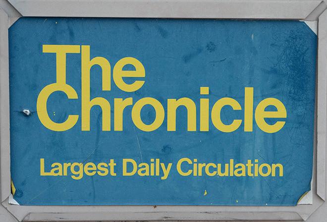
Advertisement for The Chronicle Newspaper placed on the front of a newsstand.
This sign was made of a plastic that lit up at night. It used a sans serif font in all caps and yellow, along with their logo right next to it.
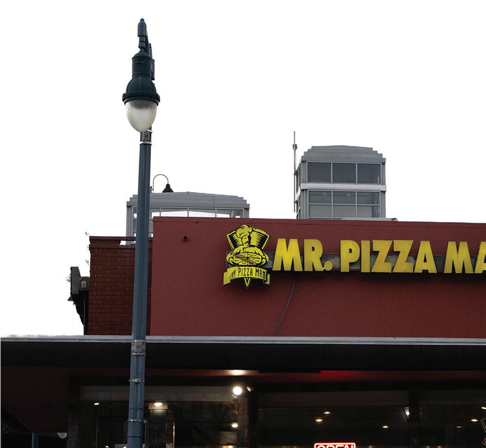
Popular pizza restaurant situated on a busy corner.
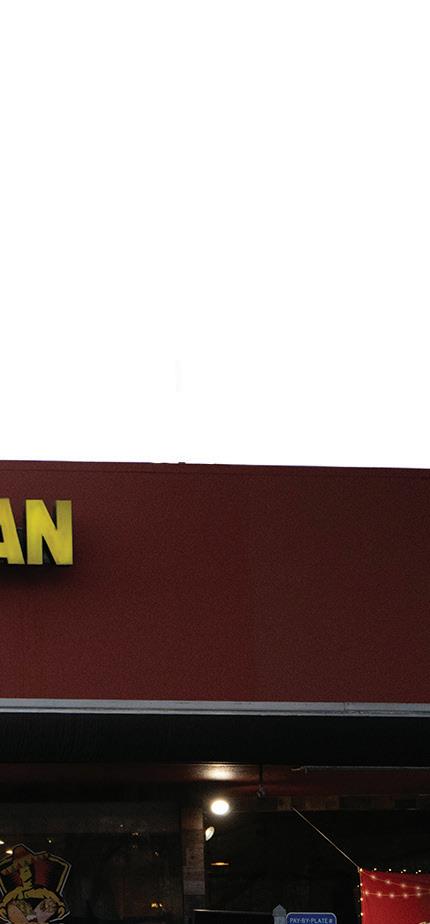

Cajun Bowl
This restaurant used a combination of cursive handwritten and a display font for their name. “Cajun Bowl” used a more handwritten cursive font while “Seafood Restaurant” used an interesting display font that used lines to signify the circles usually used in letters like ” a, e, and o”.
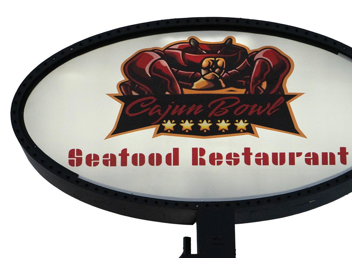
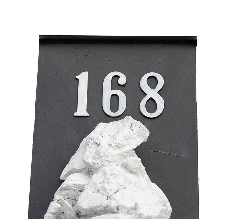
Busy seafood restaurant that has an all you can eat seafood boil menu. Their address was surrounded by a lot of big rocks.
Cajun Bowlʼs address used plastic numbers with a serif font in white to make it contrast with the black background allowing it to be easily readable.
Wood Sign
Wood signs give buildings a little more of an old-fashioned vintage style. These signs tend to be hand-carved to give more personality. samTrans
samTrans is the local bus service in San Mateo. A bench near a bus stop had the name engraved on it. The font used was a sans serif font.

Wooden bench placed near bus stop for people to sit while waiting for the bus.
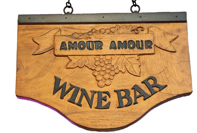
Hanging signs in front of buildings adding more personality to these shops.
Amor Amor
This wine bar had a wooden sign hanging from the awning in front of the building. The name “Amor Amor” was carved and painted black using a sans serif font. The words “Wine Bar” were more 3d and carved around and also painted black but with a serif font.
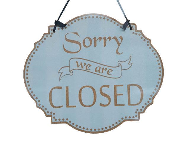
Closed
A store I passed by used a wooden closed sign that instead of being carved, was just painted on top of. It looks like a stencil was placed on top of it and was spray-painted. It used a combination of sans serif and serif font.
Hand-painted sign
Hand-painted signs were very prevalent around this area. From trash cans to chalkboards, allow for more personality to show.
Landfill and Recycle
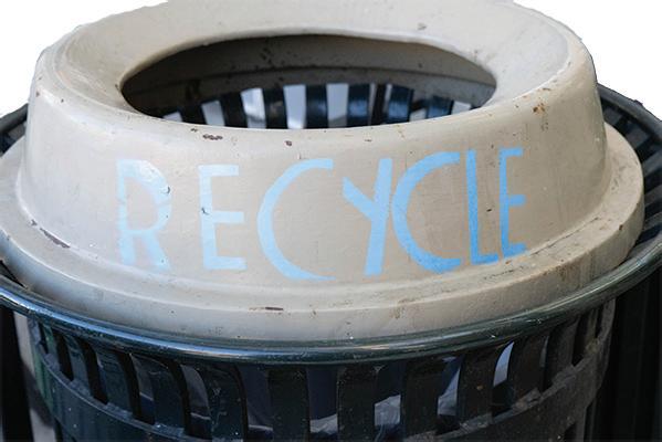
Changing out disposal bins can be expensive especially at a large scale. In order to help cut costs and be environmentally friendly, disposal bins that looked similar were painted with the words, “landfill and recycle” to let people know which bins to throw their waste into.
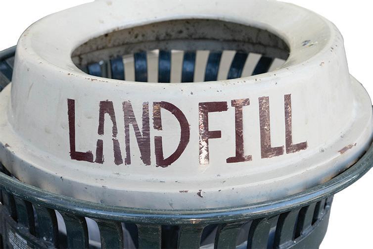
Similar looking bins with “recycle” and “landfill” written on them to make trash separation easier.
PGE
On a street corner, I noticed some yellow spray-painted words on the floor. It looks like it was used by PGE as a type of marker for that location. The horizontal lines seem to be more dragged out, while the vertical lines have a similar stop point.
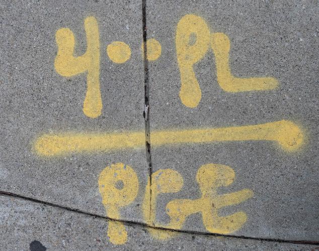
Spray paint on corner of sidewalk.
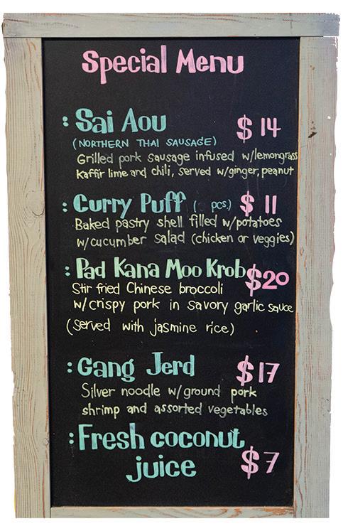
Chalkboard in front of Thai restaurant.
Special Menu
A special menu outside of a Thai restaurant used a chalk board and hand-painted type to alert customers of the current deals. The names of the dishes were written with more of a serif font, while the descriptions were written with a sans serif font.
Symbols
168 17
A
Amor Amor 19
B
Bento Box 12
Neon Sign 12
C
Cajun Bowl 16
Closed 19
D
Drains to Bay 6
Metal Type 6
L
Landfill and Recycle 20
Hand-painted sign 20
Local History 4
M
Mr. Pizza Man 15
O
Open 12
P
PGE 21
Push Button 10 R
Railroad 11
Restaurante Italiano Pasta 13
Rockwood Sprinkler 9
S
samTrans 18
Wood Sign 18
Shirts 13
Special Menu 21 T
The Chronicle 14
Plastic Sign 14 W
Walk of Honor 7
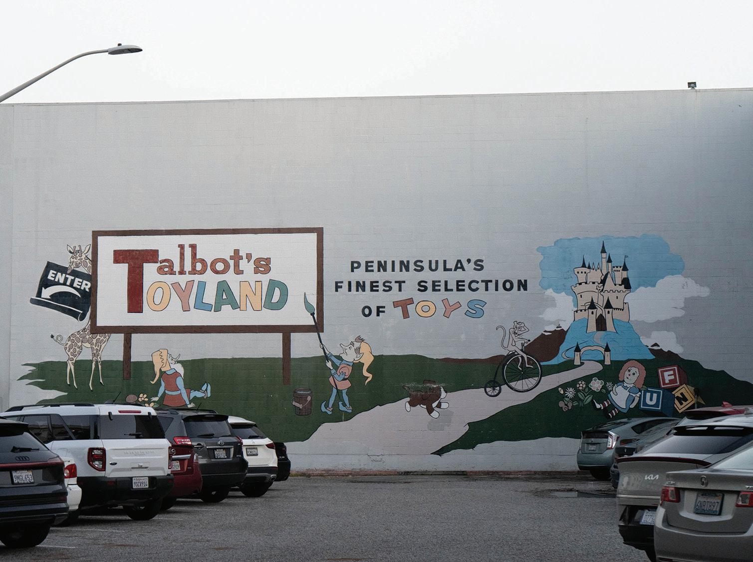
tracks.
