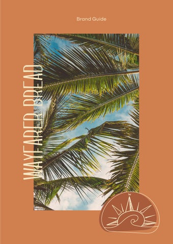
W a y f a r e r b r e a d
T a b l e o f c o n t e n t s
Our mission Our voice Logo usage What is wayfarer Typography Color Graphic elements Applications 3 5 7 11 15 21 23 25
OUR MISSION
At Wayfarer our mission is to inspire communities by connecting people to local, natural, artisanal food. Our founder, Crystal White, has spent a lifetime refining her craft and we want to share her ideals with our community. Wayfarer hopes to lead the way towards a simpler life; small batch, locally sourced food, and elegant fare. Much like our products, we want our brand to feel simple and welcoming to allow our products to shine.
Simple is best.
Familiar; make it feel like you’re catching up with your surf buddy from down the street.
Light-hearted. There is a whole world out there for people to explore, and we’re here to help them remember that.
OUR Voice

L o g oO r a n g e s
The logo always includes the background loaf shape, but the brand name is not necessary.
Colors should be kept with their light and dark counterparts. Keep the logo to one hue in different shades (no mixing blue and orange).
Mark is optional in vertical logo representations, but must include the brand name.
w ayfarer br ea d w ayfarer br ea dW AYFARER BR EA D
W AYFARER BR EA D
W AYFARER BR EA D
W AYFARER BR EA D
The logo always includes the background loaf shape, but the brand name is not necessary.
Colors should be kept with their light and dark counterparts. Keep the logo to one hue in different shades (no mixing blue and orange).
Mark is optional in vertical logo representations, but must include the brand name.
o g o -
l u e s
w ayfarer br ea d w ayfarer br
ea d
L
B
Our founder, Crystal White, was raised in Napa, CA, surrounded by world-class food and hospitality. She knew early on that baking was her calling.
For 16 years Crystal has worked her way through kitchens, honing her skills and narrowing her focus. She founded Proof Bakery in Los Angeles in 2010, and climbed the ladder at the world renowned Tartine Bakery in San Francisco. The culmination of this experience has prepared her to launch a concept of her own.
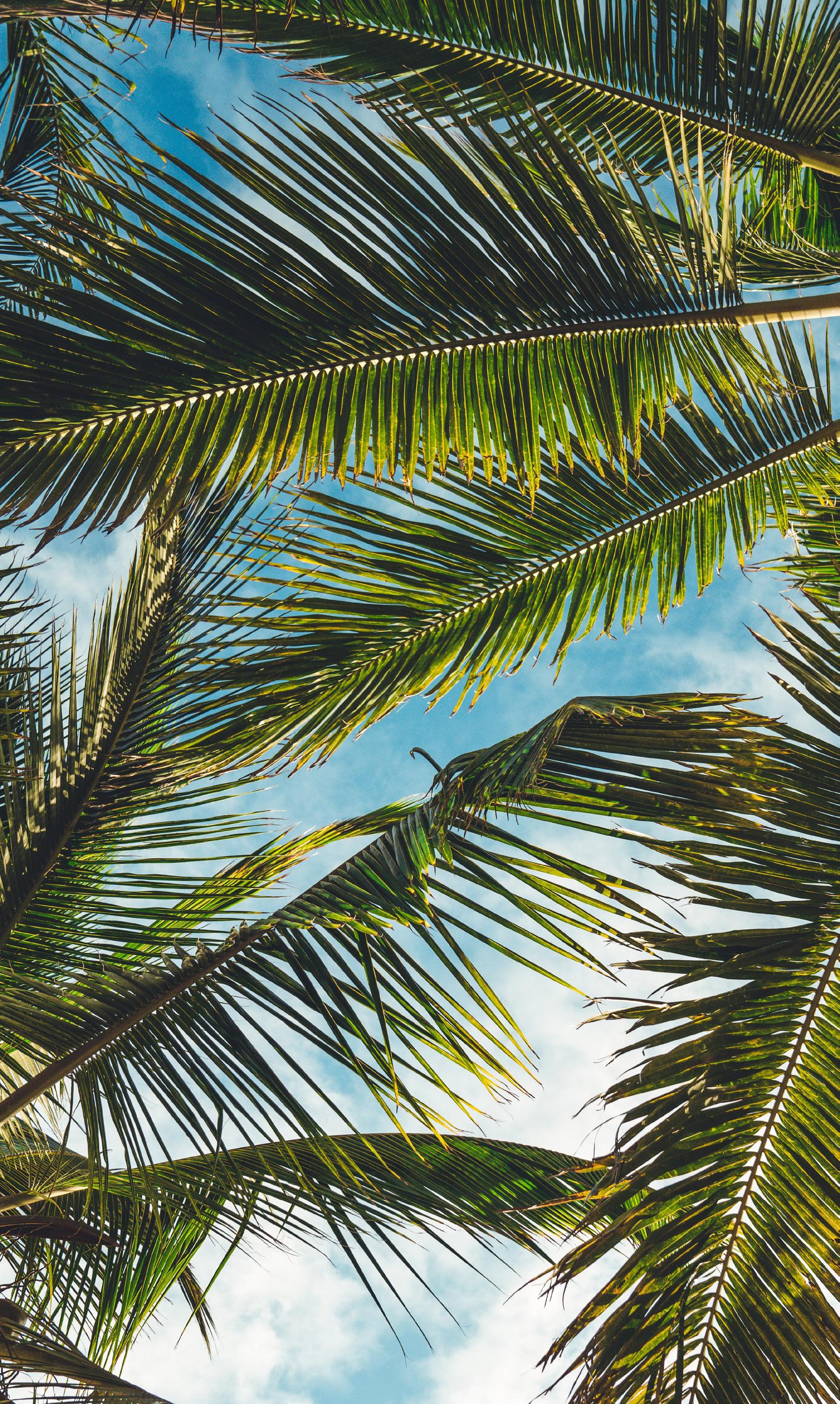
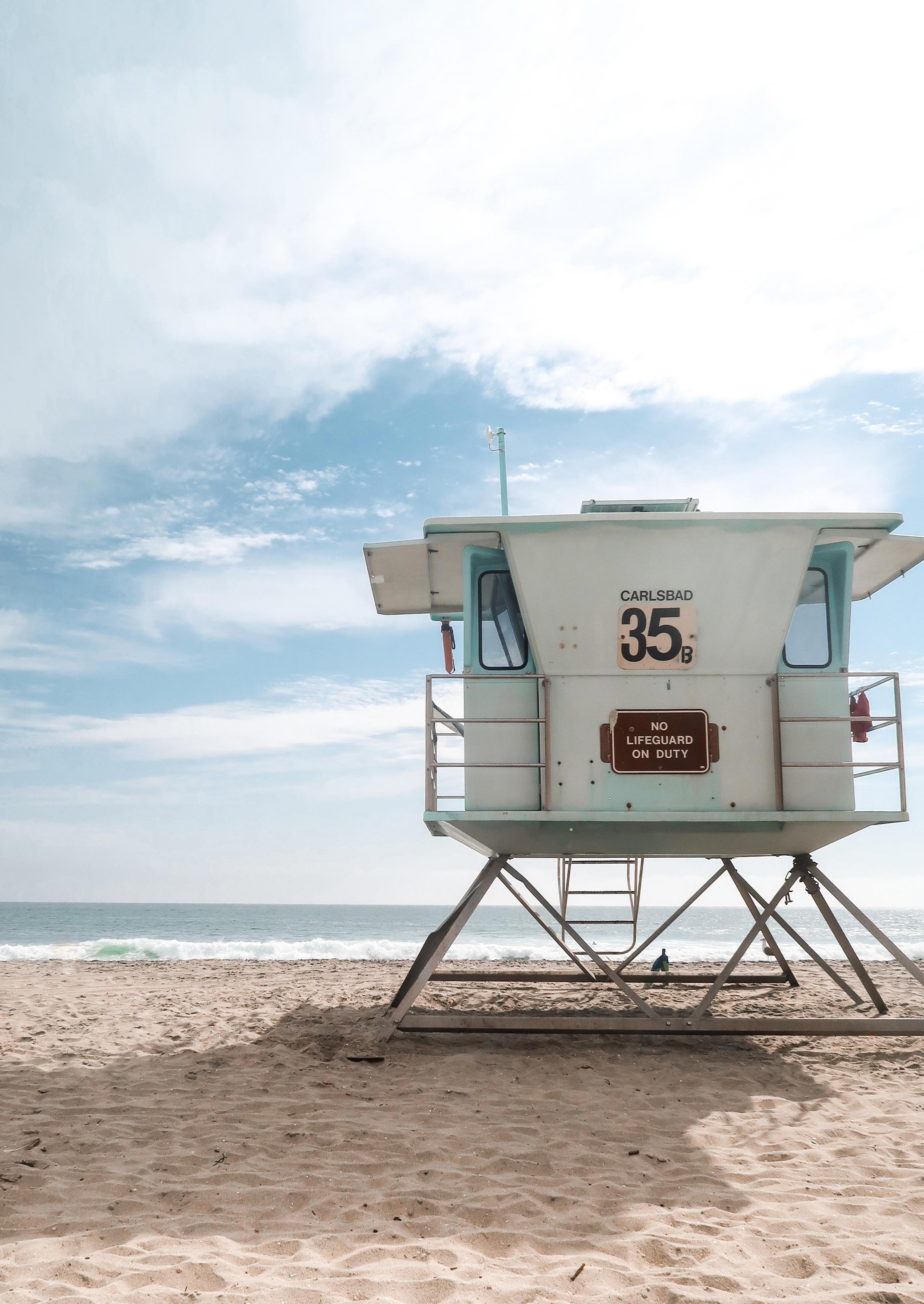
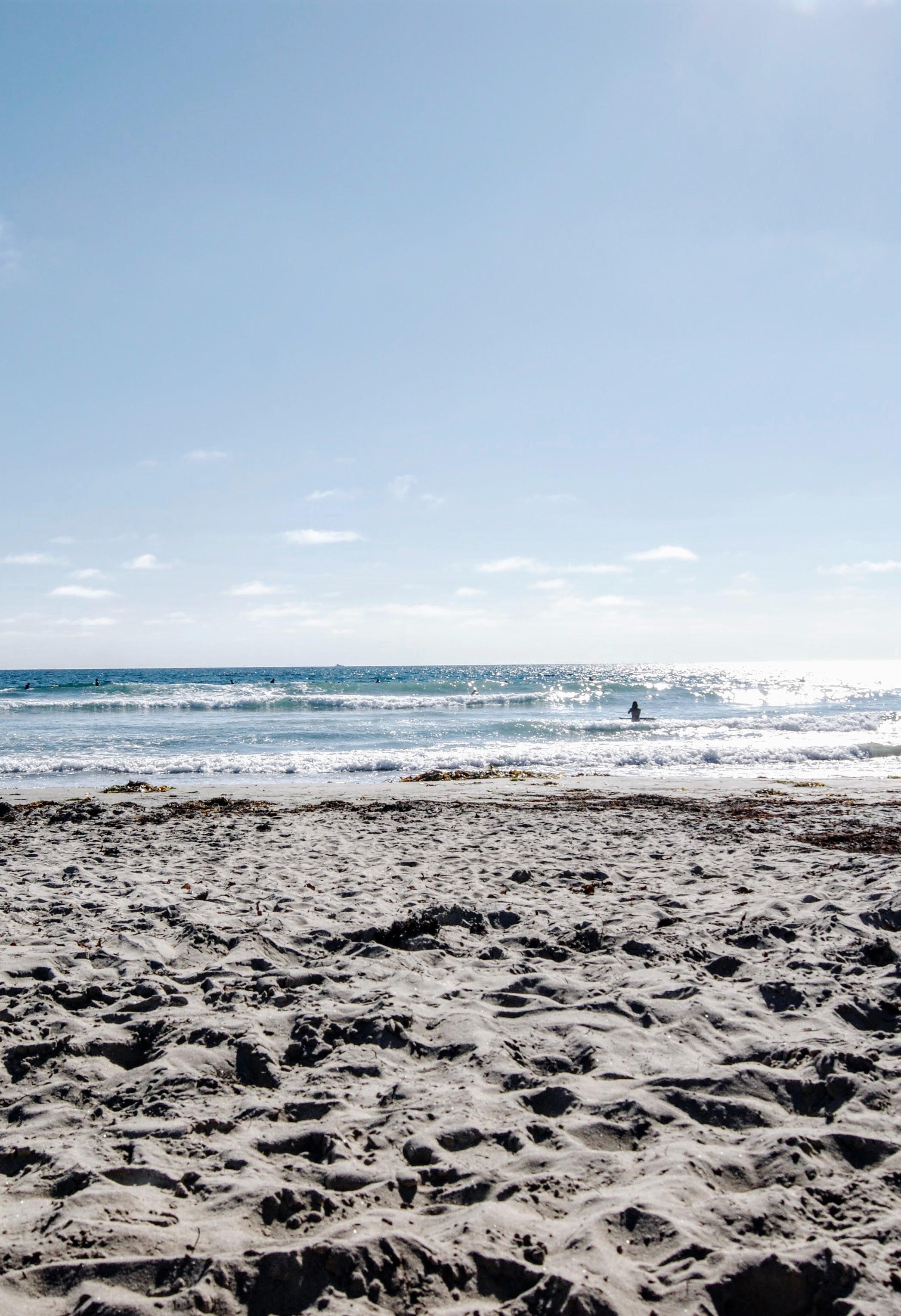
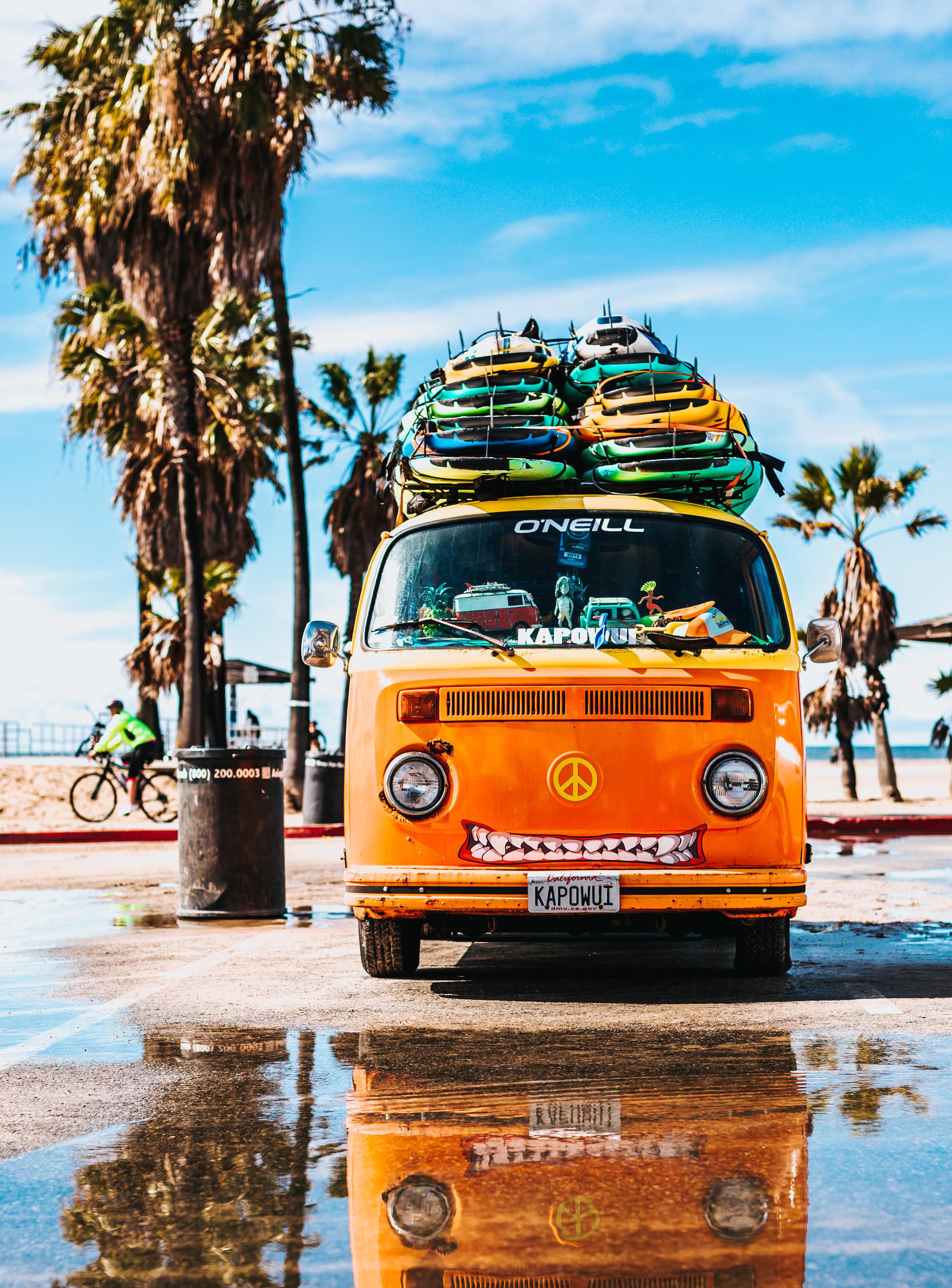
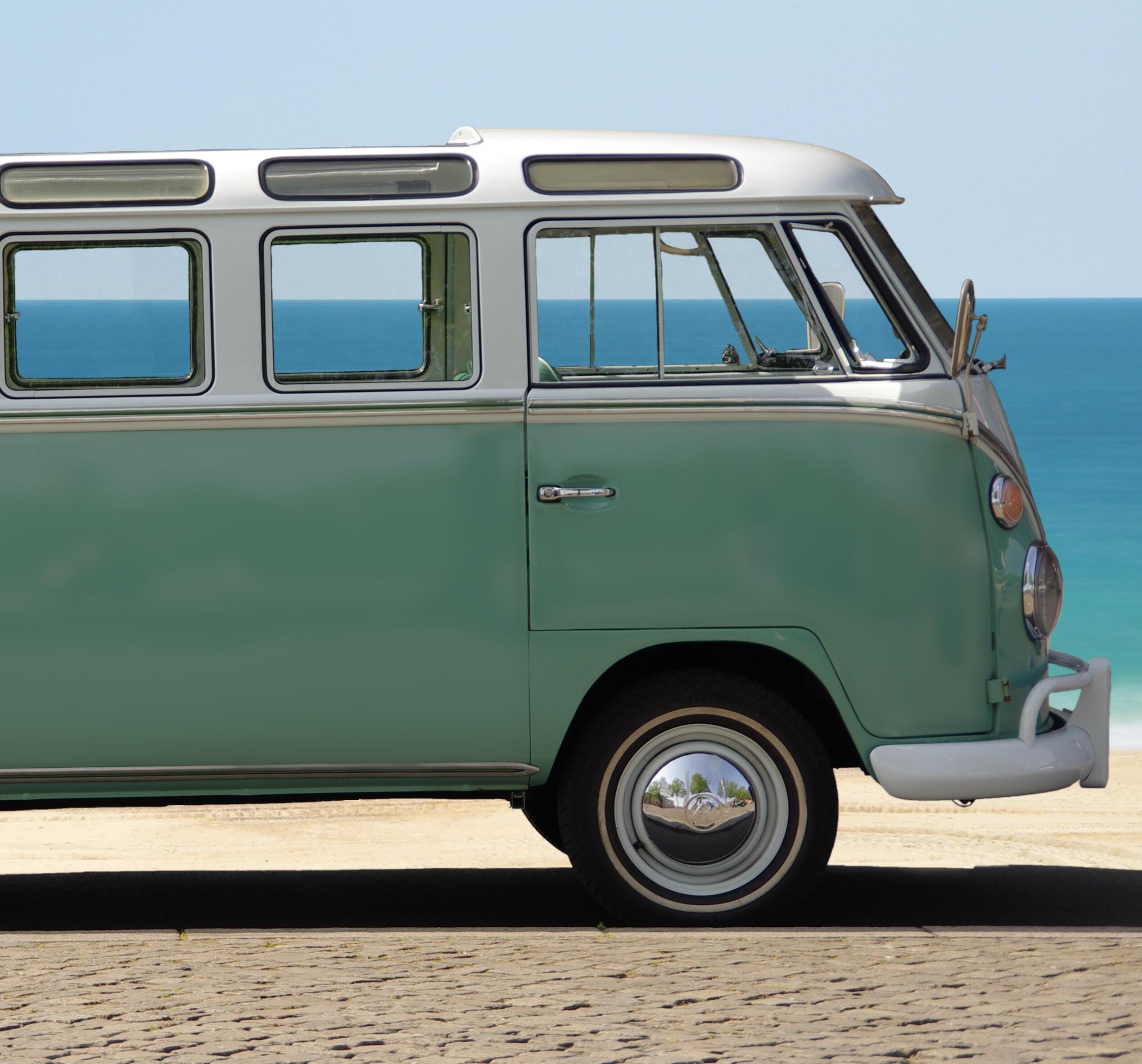
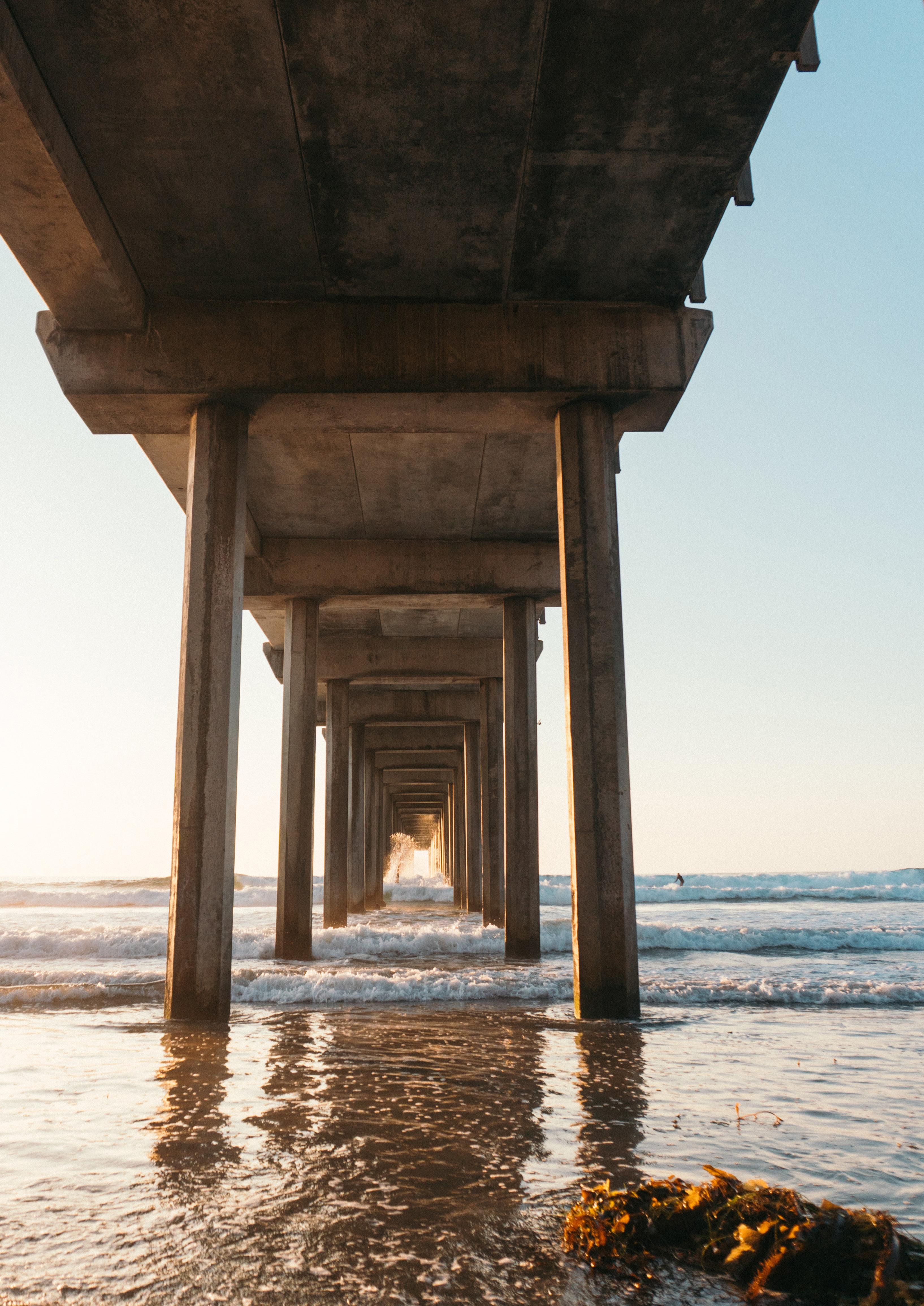
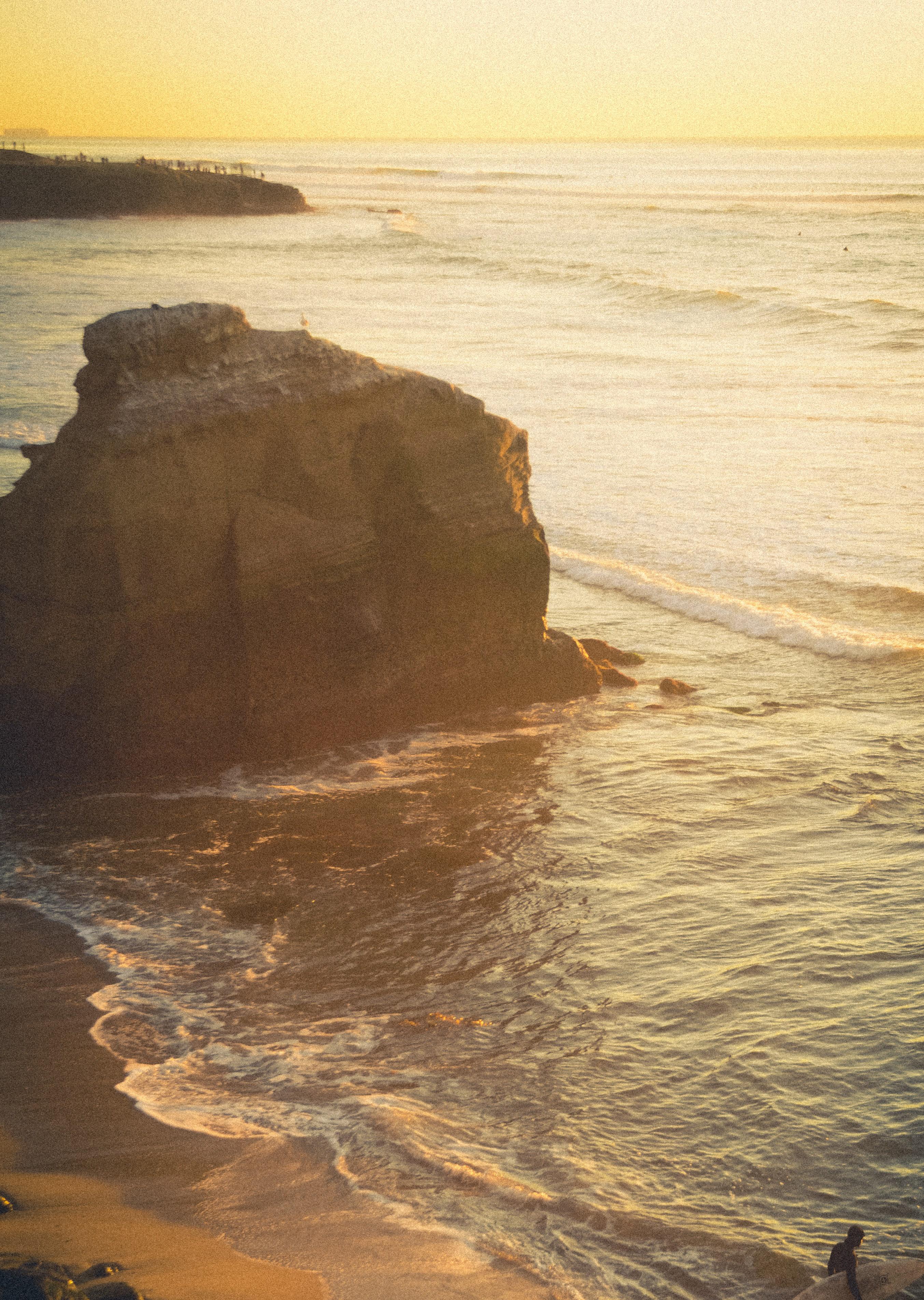
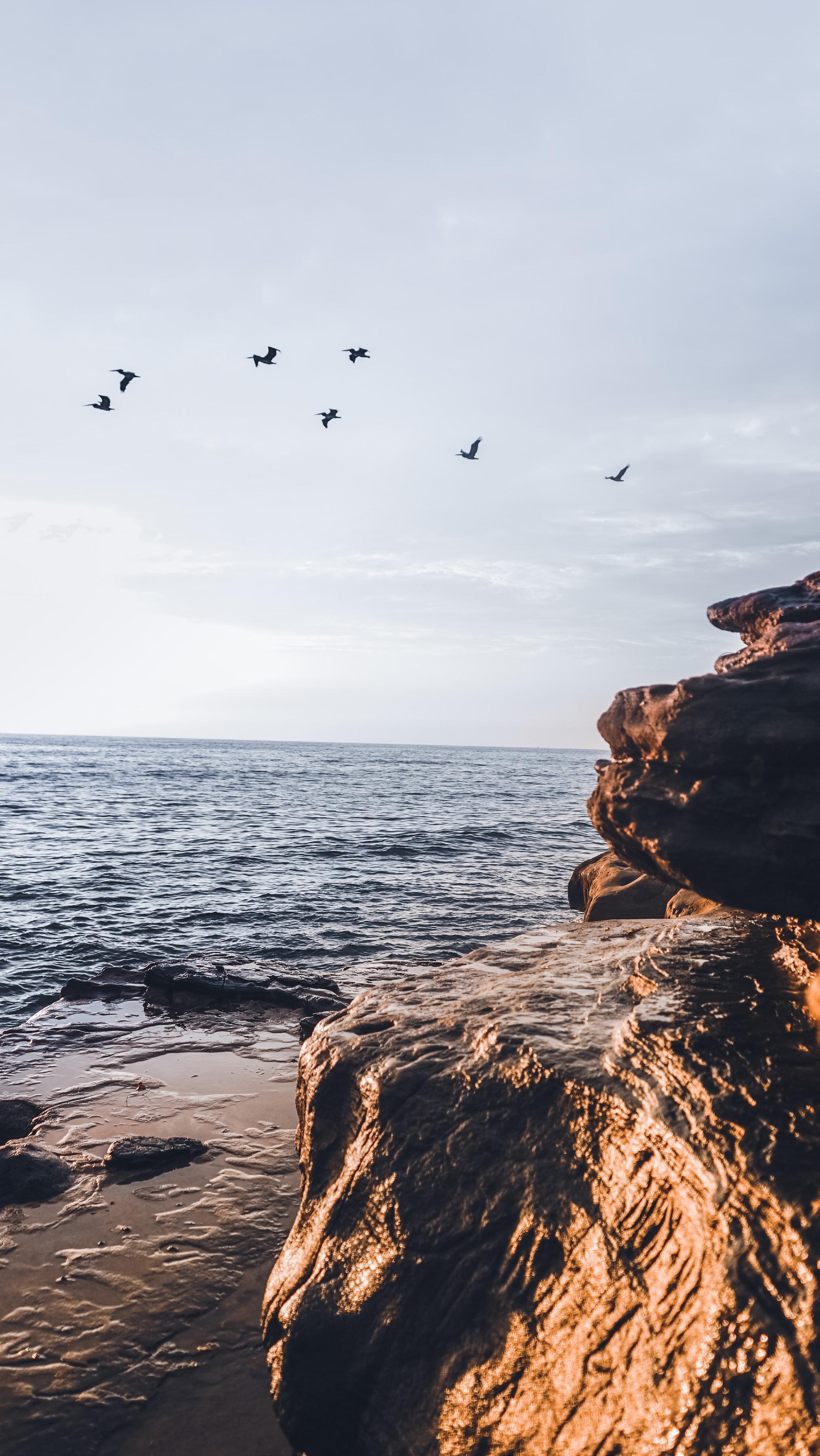
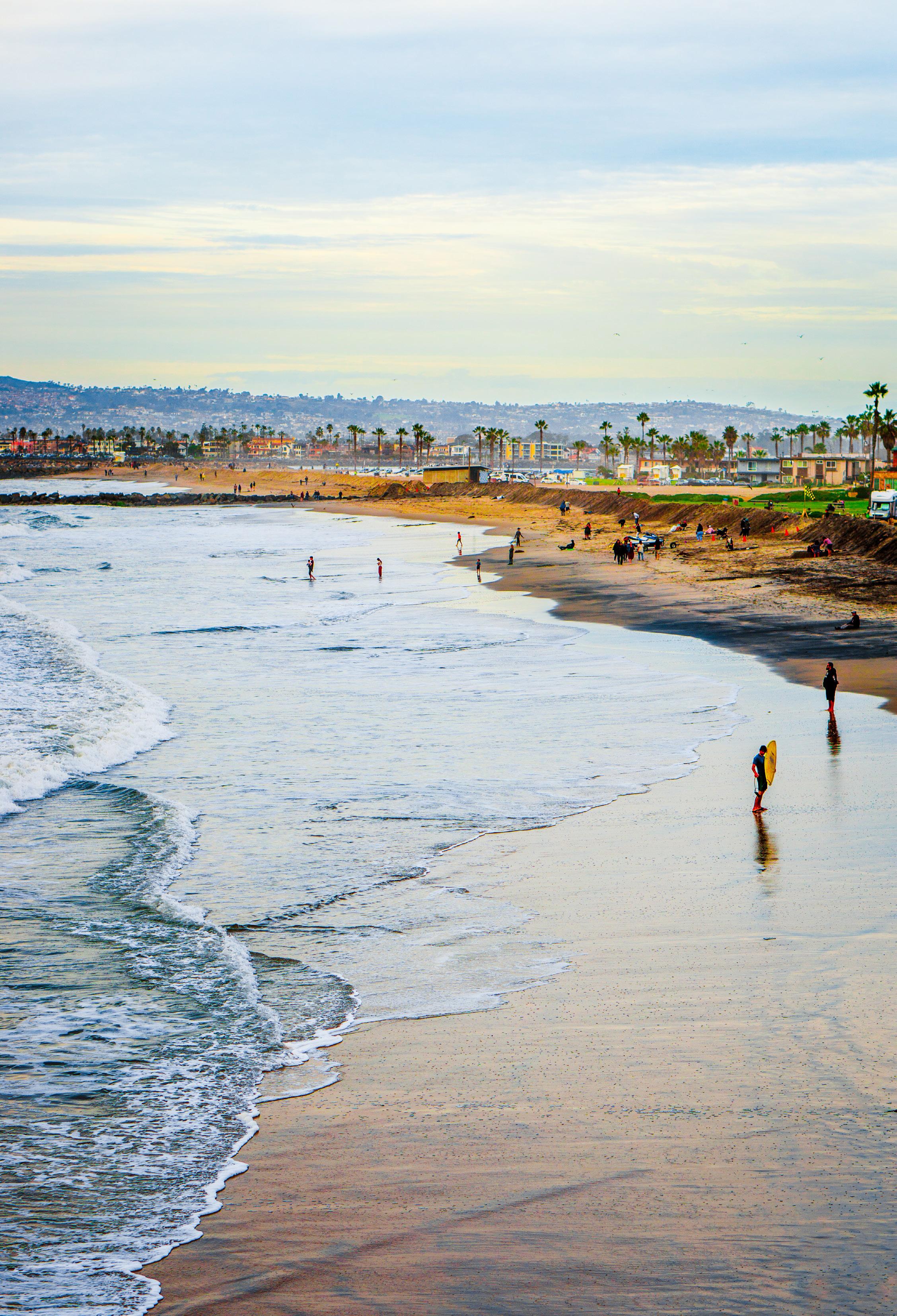
Wayfarer represents the small beach town vibe of Bird Rock in San Diego, CA. Tucked away from the hustle and right along the coast, Bird Rock is home to many local, fresh, sustainable businesses. At Wayfarer we aim to stay true to this energy.
Wayfarer aims to bring the community together. We utilize ingredients from local farms, offer sales from local businesses in our own storefront, and are always selling bread at local farmers markets.
In a world that is constantly evolving, changing, and disconnecting, we want to remind those around us of the importance of whole, simple ingredients, interdependence, and the joy of sharing life in a happy community. Life is never too busy to stop and smell the roses, catch a wave, or enjoy a fresh, warm pastry.
Always made in small batches.
Always with the highest quality, locally sourced ingredients.
Always fresh.
T y p o g r a p h yO n W h i t e
Header - haiterbach Demo
Subheader - Mozaic GEO Variable Medium
Body - Mozaic GEO Variable Light. Wayfarer Bread is a small neighborhood bakery focused on selling naturally fermented breads hot and fresh, directly to the community. Though primarily a bread bakery, Wayfarer also provides pastries and sandwiches on fresh bread in the afternoon.
Only the darker color on offwhite background.
No indentations - spacing to indicate line breaks.
Mozaic font family is always in sentence case, Haiterbach Demo family is always capitalized.
Header - haiterbach Demo
Subheader - Mozaic GEO Variable Medium
Body - Mozaic GEO Variable Light. Wayfarer Bread is a small neighborhood bakery focused on selling naturally fermented breads hot and fresh, directly to the community. Though primarily a bread bakery, Wayfarer also provides pastries and sandwiches on fresh bread in the afternoon.
Only the darker color on offwhite background
No indentations - spacing to indicate line breaks.
Mozaic font family is always in sentence case, Haiterbach Demo family is always capitalized.
T y p o g r a p h yO n W h i t e
T y p o g r a p h yO n C o l o r
Header - haiterbach Demo
Body - Mozaic GEO Variable Light. Wayfarer Bread is a small neighborhood bakery focused on selling naturally fermented breads hot and fresh, directly to the community. Though primarily a bread bakery, Wayfarer also provides pastries and sandwiches on fresh bread in the afternoon.
Only the offwhite text on dark color background.
No indentations - spacing to indicate line breaks.
Mozaic font family is always in sentence case, Haiterbach Demo family is always capitalized.
Subheader - Mozaic GEO Variable MediumHeader - haiterbach Demo
Subheader - Mozaic GEO Variable Medium
Body - Mozaic GEO Variable Light. Wayfarer Bread is a small neighborhood bakery focused on selling naturally fermented breads hot and fresh, directly to the community. Though primarily a bread bakery, Wayfarer also provides pastries and sandwiches on fresh bread in the afternoon.
Only the offwhite text on dark color background.
No indentations - spacing to indicate line breaks.
Mozaic font family is always in sentence case, Haiterbach Demo family is always capitalized.
T y p o g r a p h yO n C o l o r

c o l o rb e s t p r a c t i c e s
White body text and lines should always be on a dark background, dark color text on a white background.
Pair orange with orange and blue with blue. There can be accents of one in its compliment, but the major light and dark pairing should be the same hue.
Logo color pairings should always be blue and white or orange and white.
#94AEA4 #708E82 #CF8051 #A85C3C #F5E7C4DON’T mix and match hues. Dark and dark clashes, same with orange and blue. Clashing combinations will fight for the user’s eye.
DON’T use light colors together. Light and light will wash each other out. Using white on top of the light orange and blue will make any text or art hard to see.
DON’T Pair logo colors with a complement (blue on orange or vice versa).
c o l o ra v o i d
graphic elements
Bar separator:
Lines up with the width of the content.
Color band:
Always opposite light/darkness of the background color. In the example, the color band is the dark blue, #708E83.
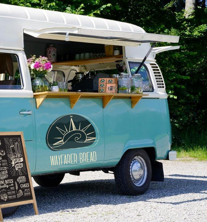
Transit
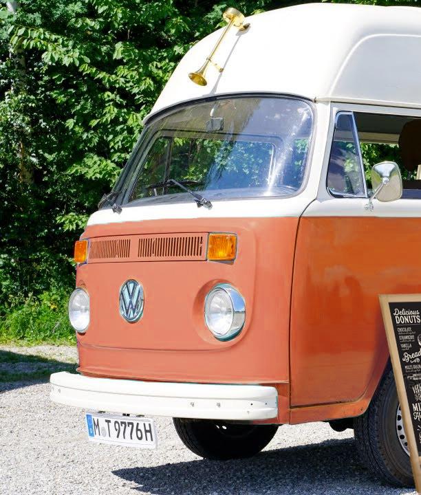
Traveling coffee shop
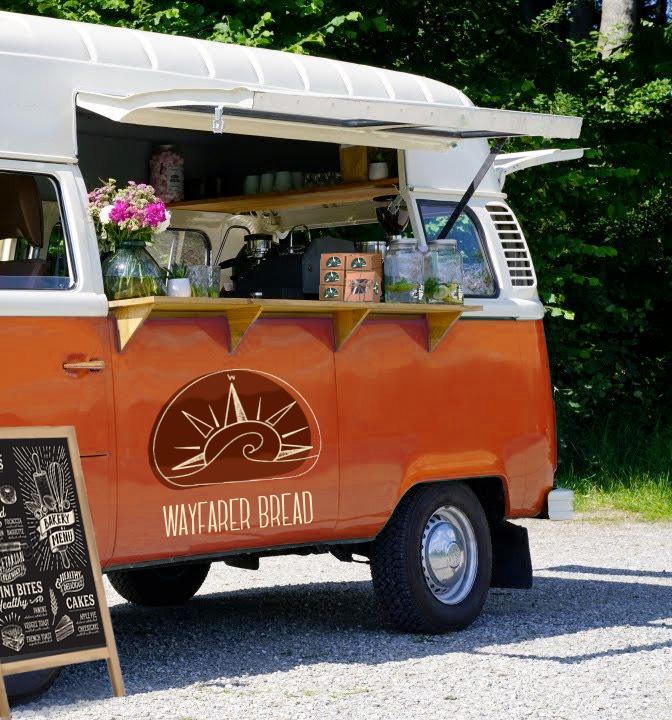
Transit
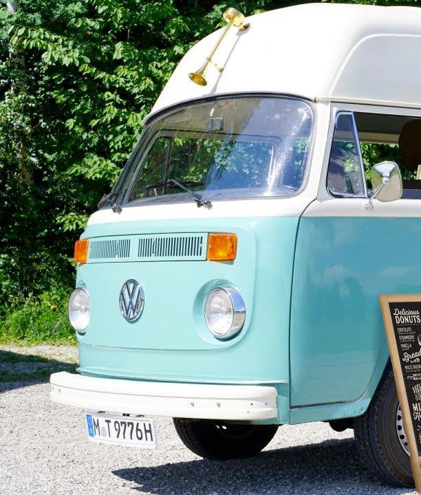
traveling coffee shop
Applications
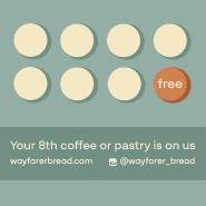
Loyalty cards
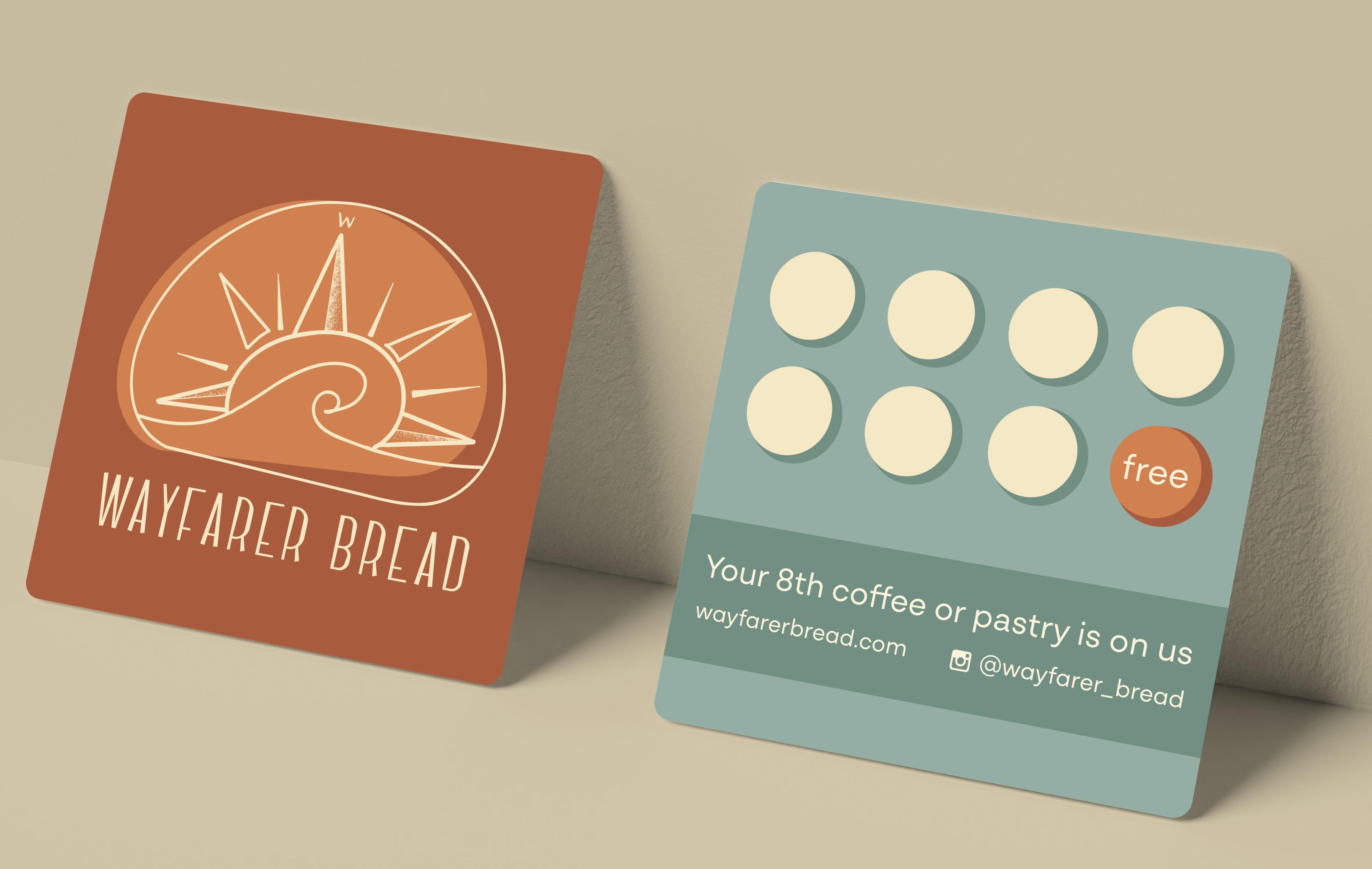
Applications
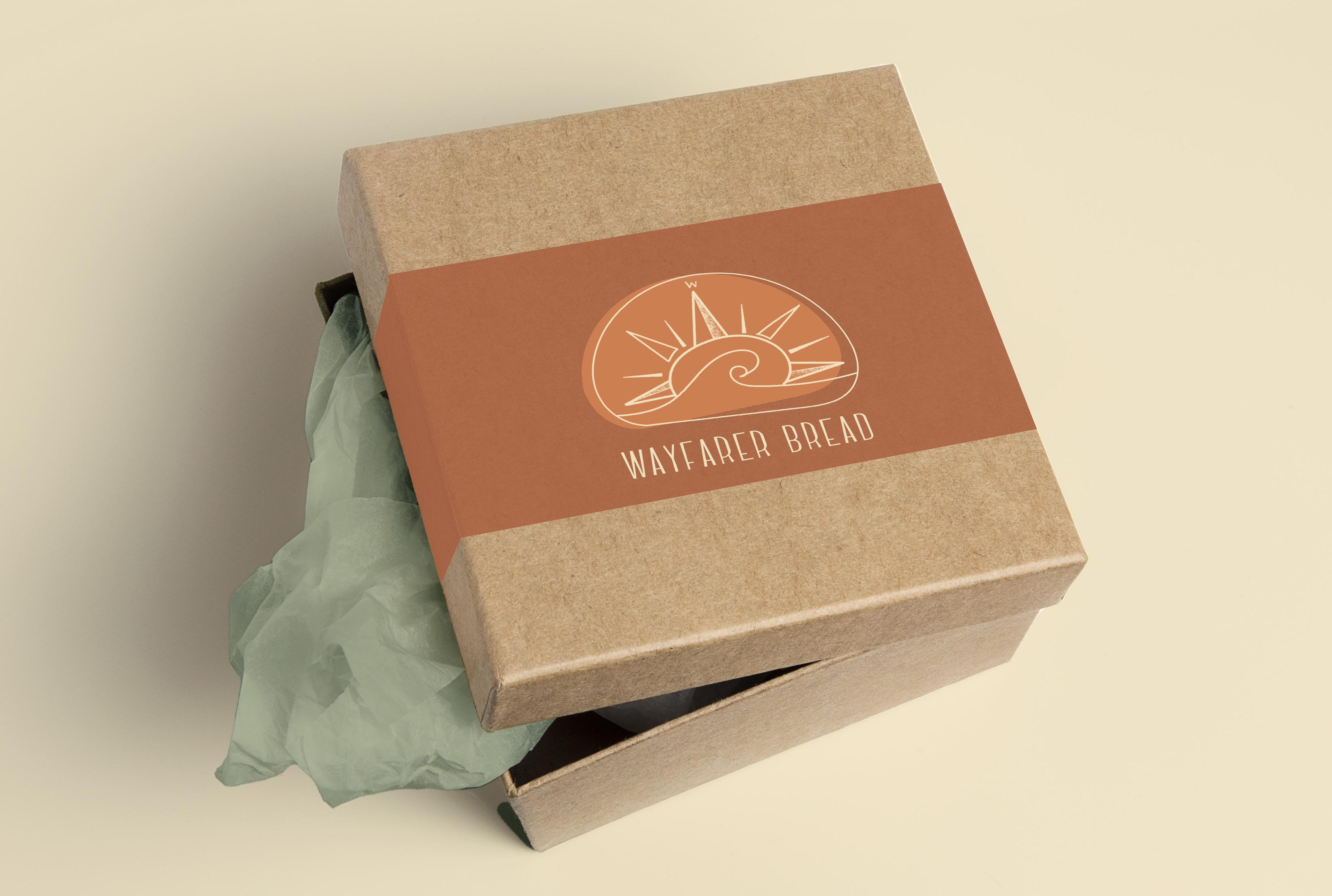
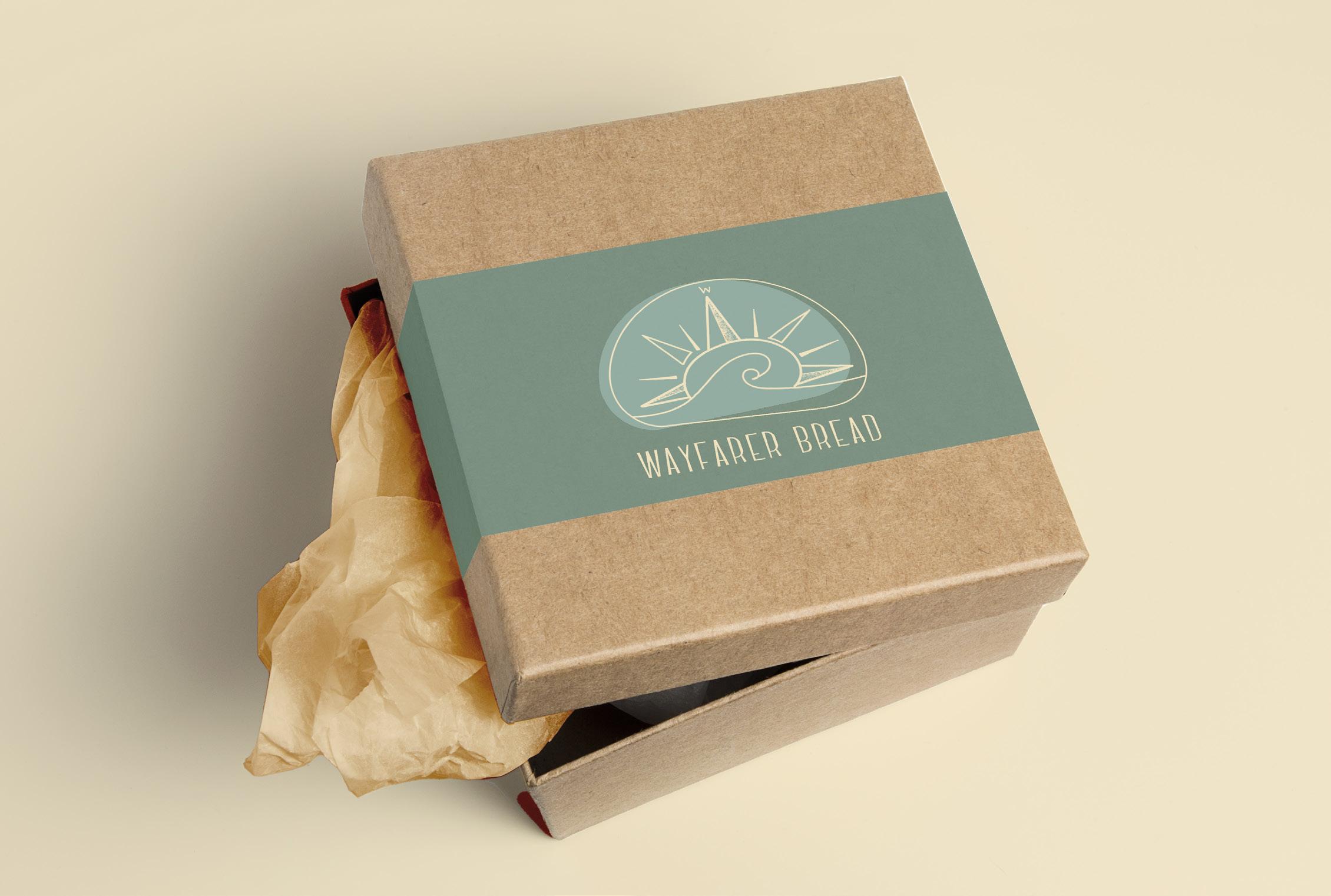
Packaging

Wayfarer loves the Bird Rock community and hopes to keep the simple, surf town energy as it continues to grow. The beauty is in the details and simplicity. This brand is designed to reflect that ideal; it is designed to be as simple and bright as the community it calls home