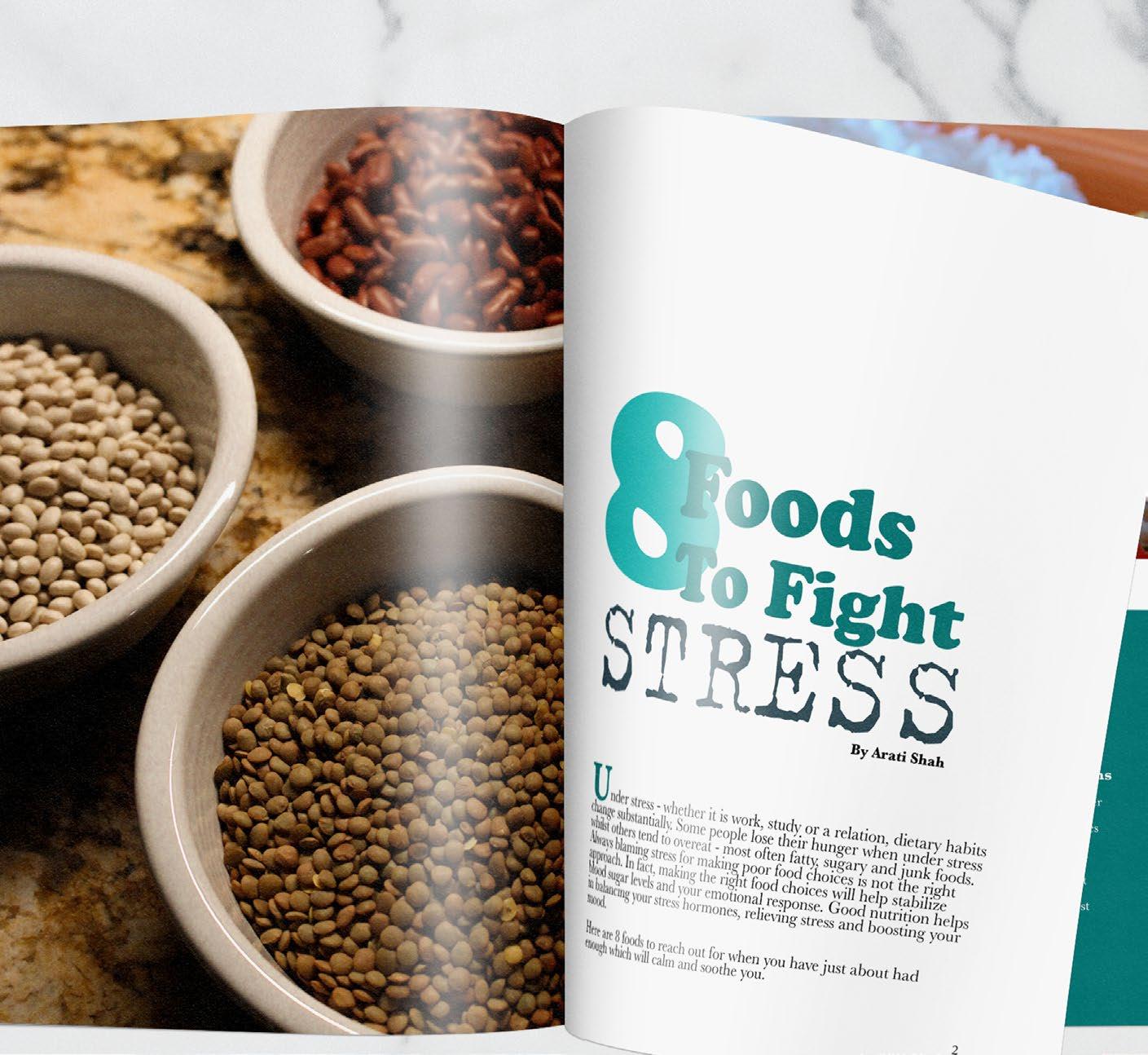
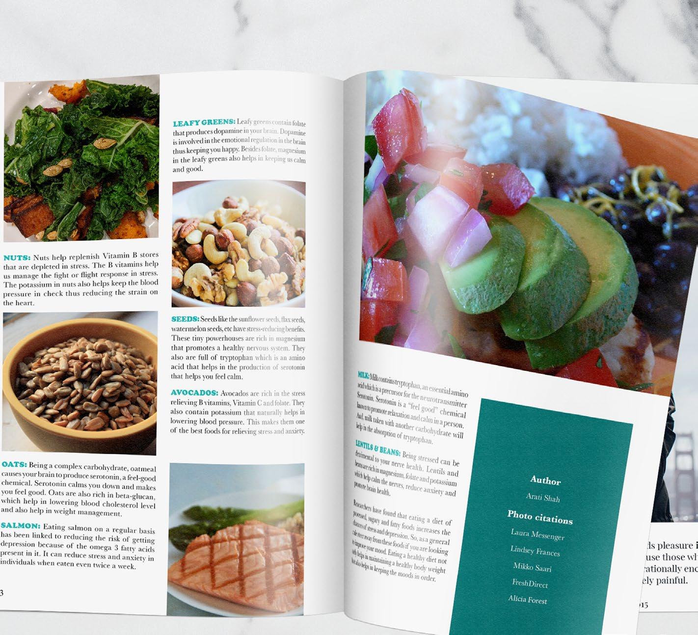
MAGAZINE SPREAD
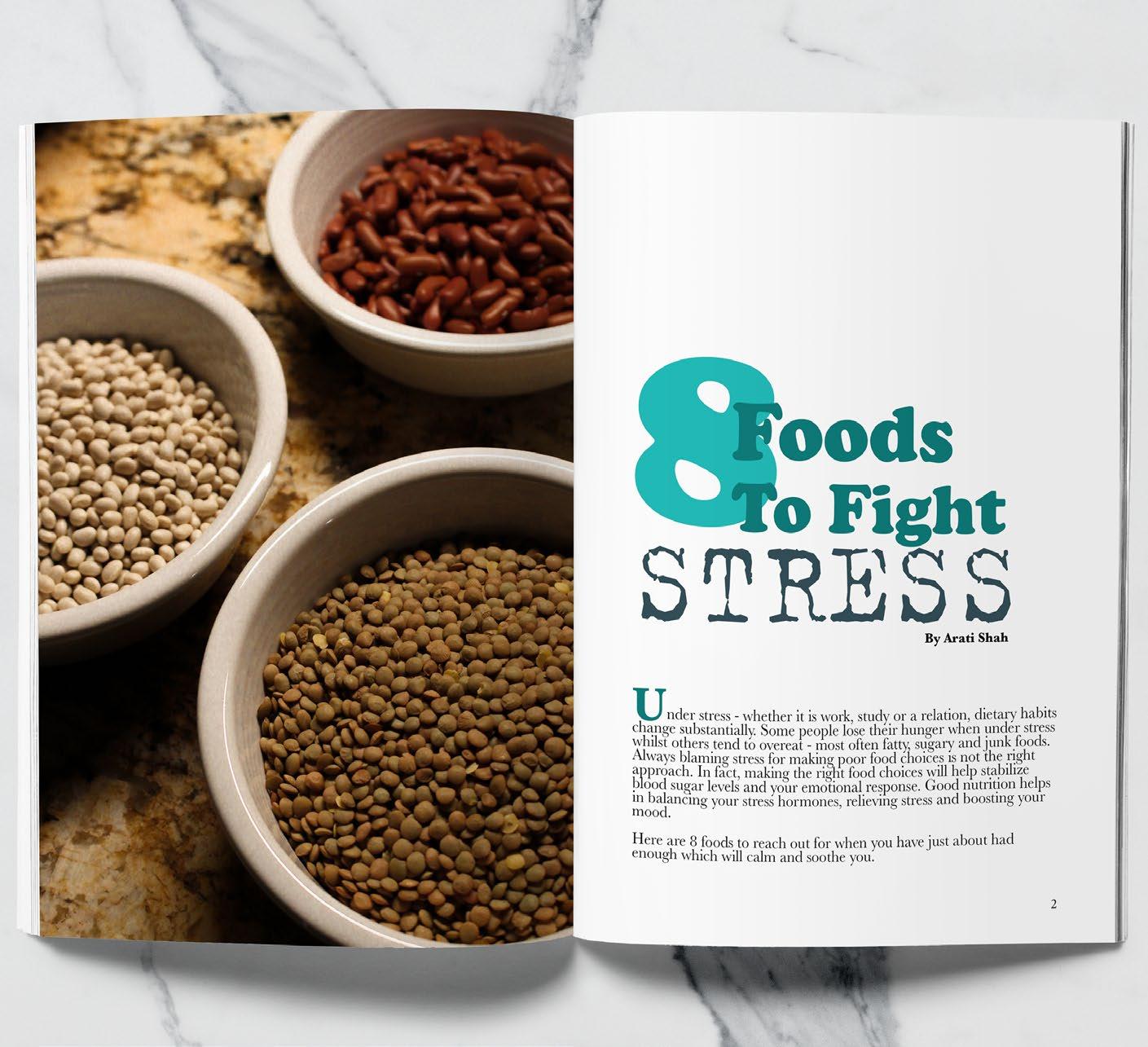
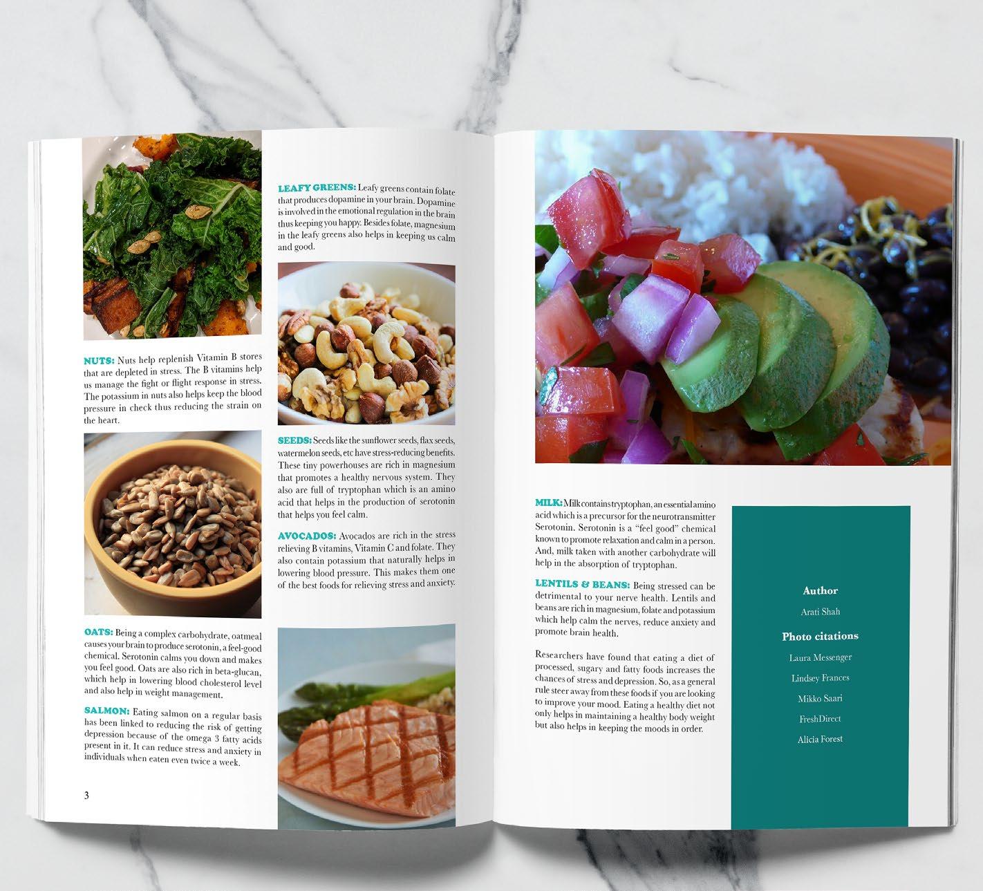
8 Foods to Fight
STRESS
The Magazine spread was where I designed the layout for an article that was already written. I chose to do the article 8 Foods to Fight Stress by Arati Shah. The problem that I had to solve for this project is creating a layout that was well designed and would fit all the content of the article. The other problem that I faced was not having enough content from the article to cover 3 pages. I solved this by making the images bigger and being creative for the works cited portion. The constraints for the spread was making sure that the colors and fonts expressed the theme of the article.
The audience for this piece would be a wide range of people that read health magazines or who want to live healthier lives The piece appeals to them because it offers information about how they can eat healthier while also reducing stress that wear them down.
Adobe
Design
Theory
Tools & Techniques: Layout Editorial Print
Typography Color
Illustrator
InDesign
Photoshop
Adobe
Adobe
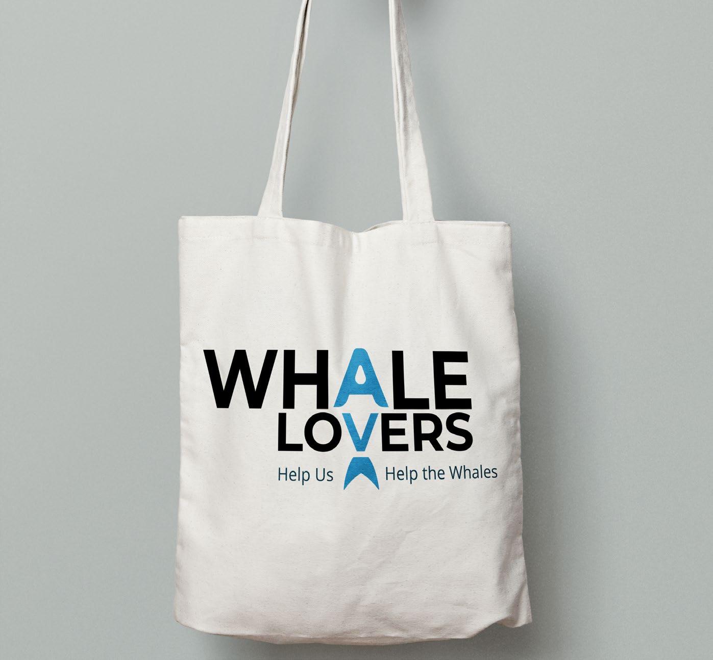
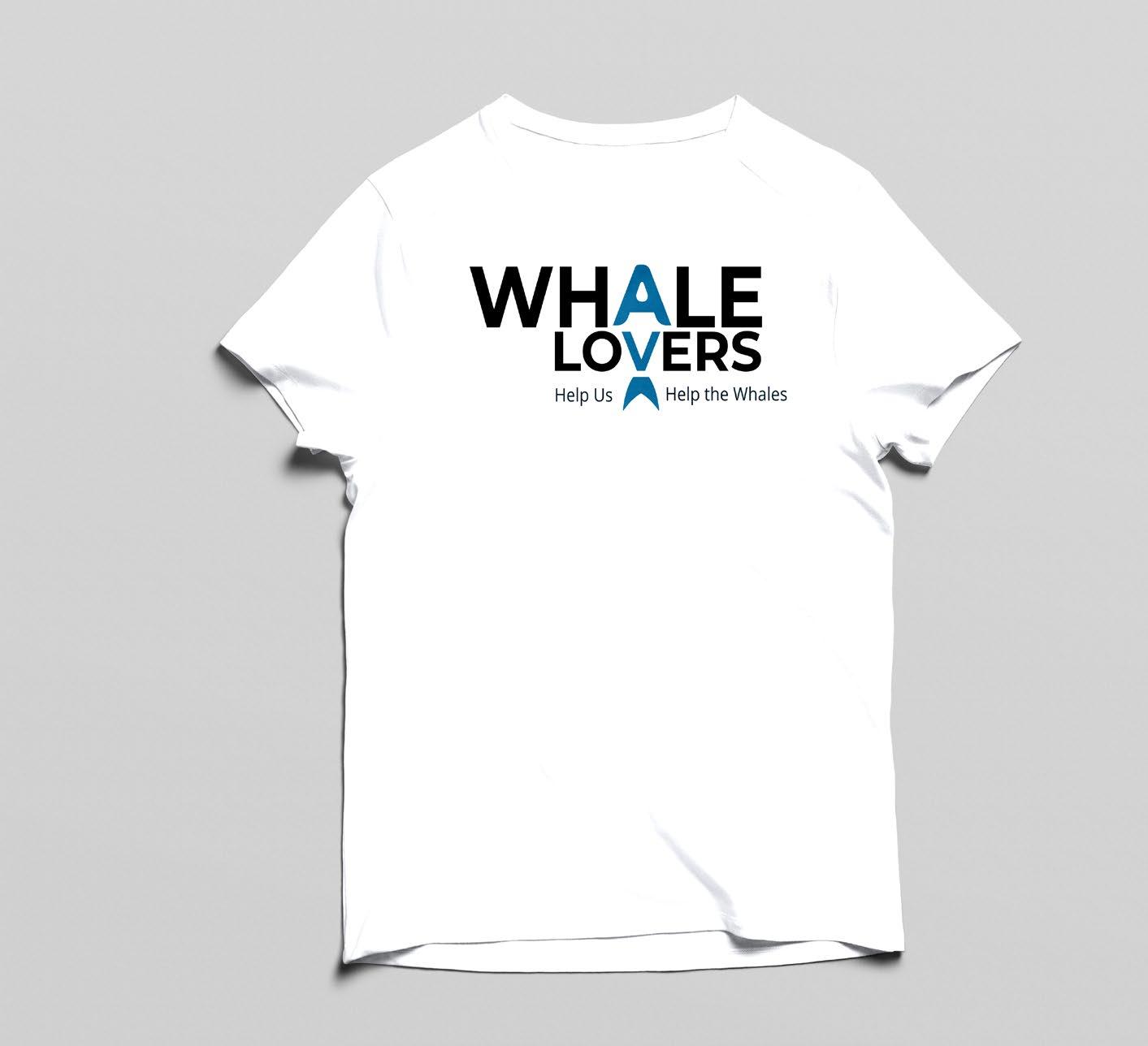
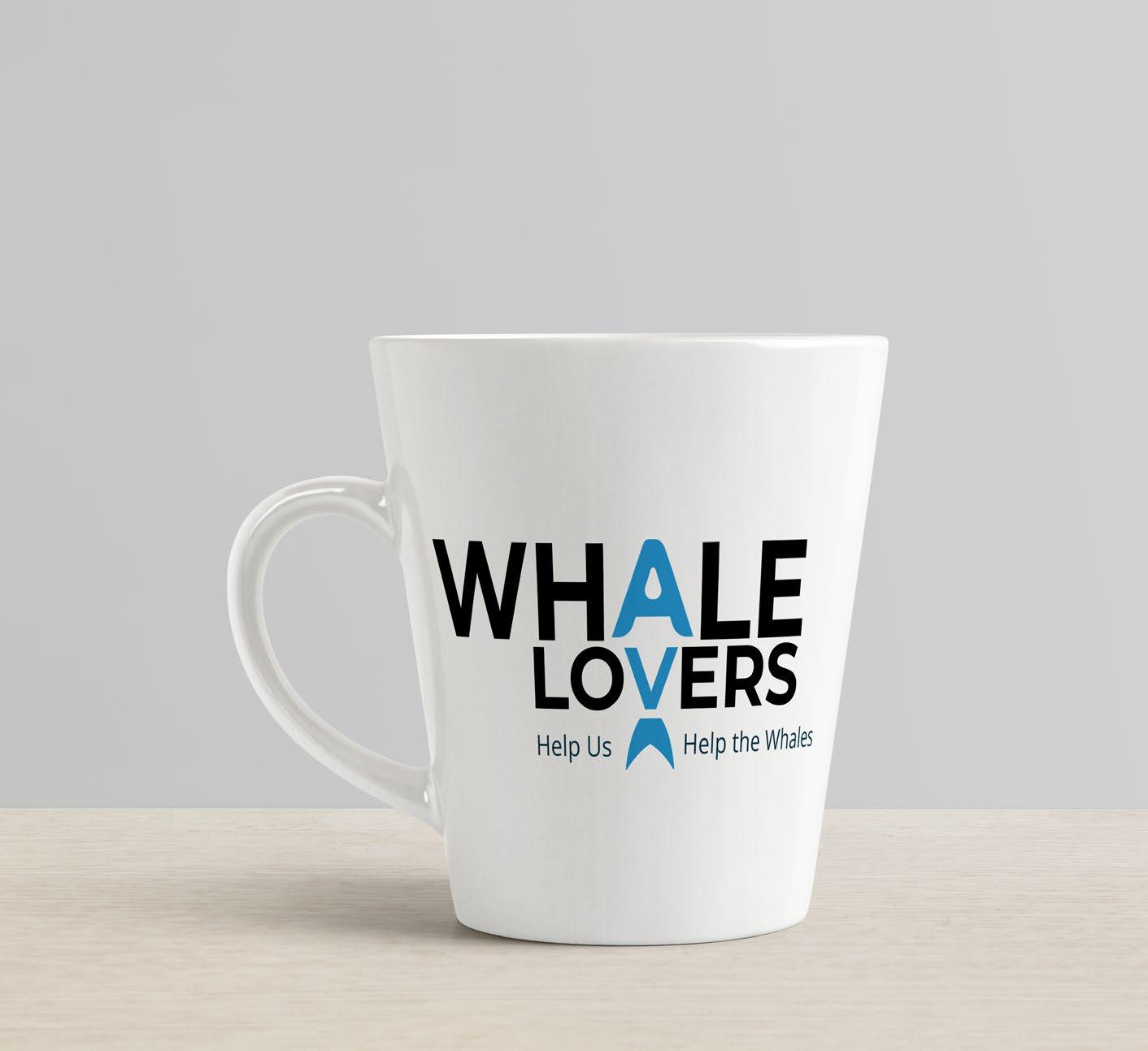
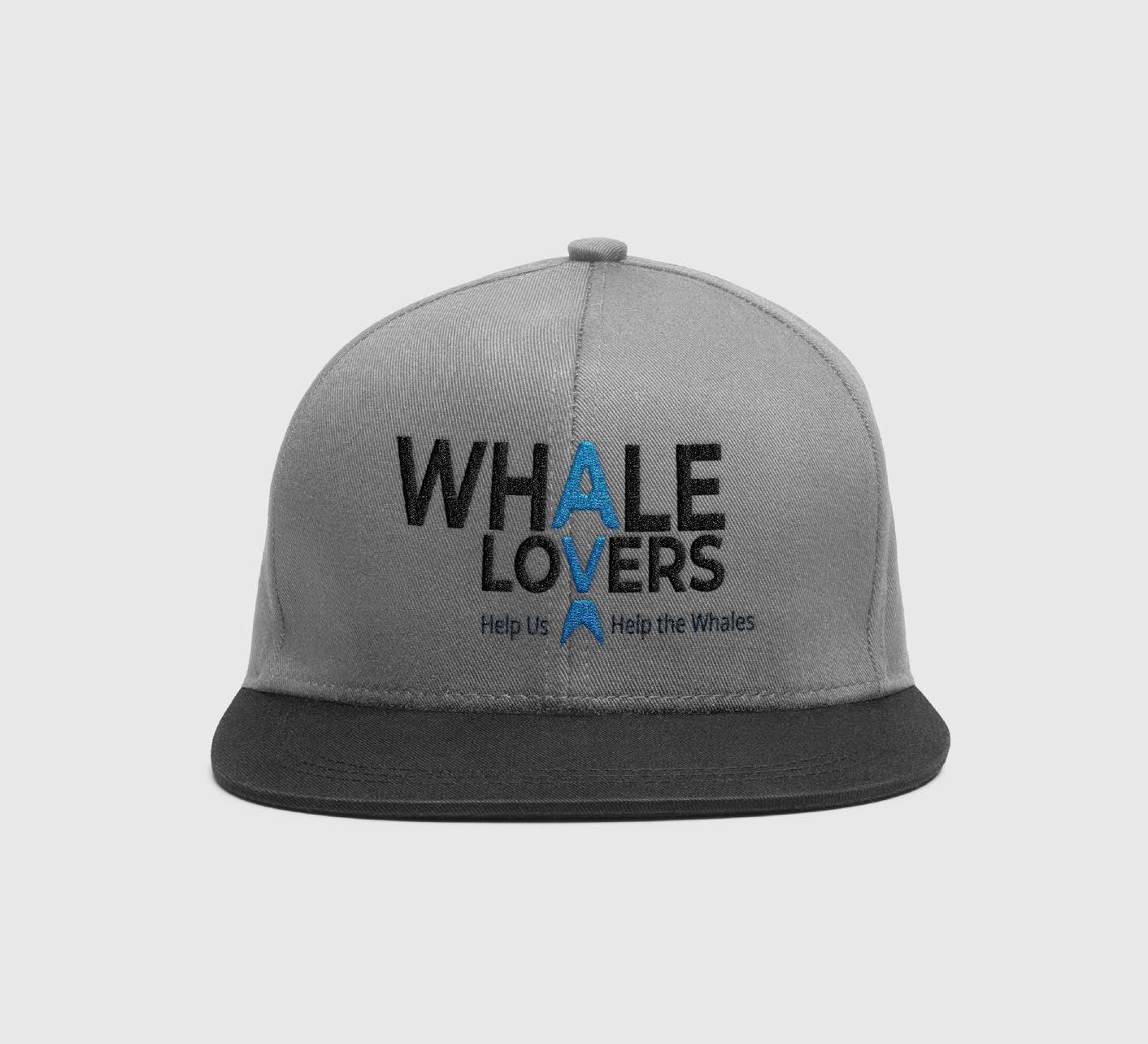
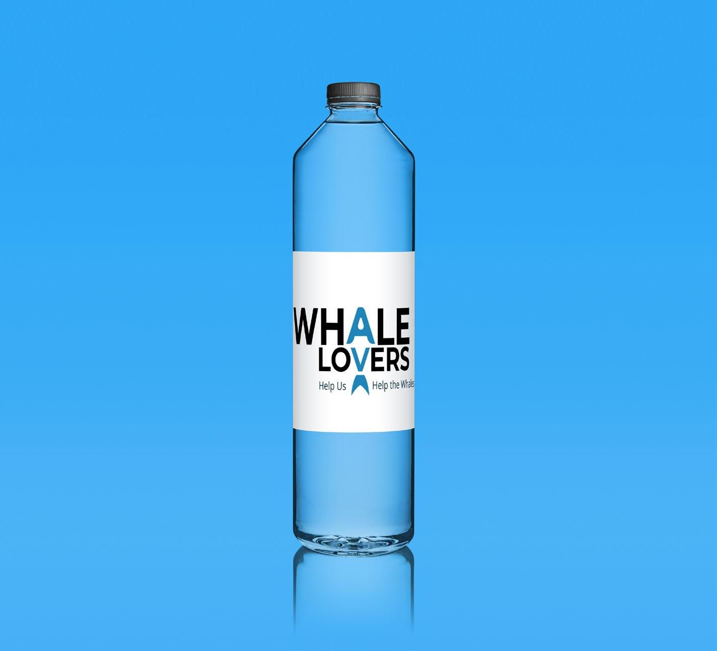
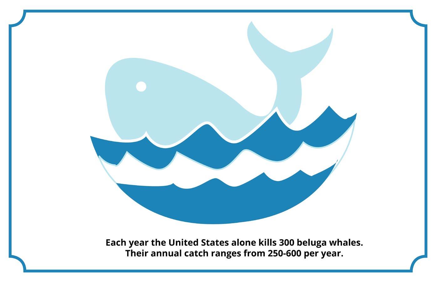
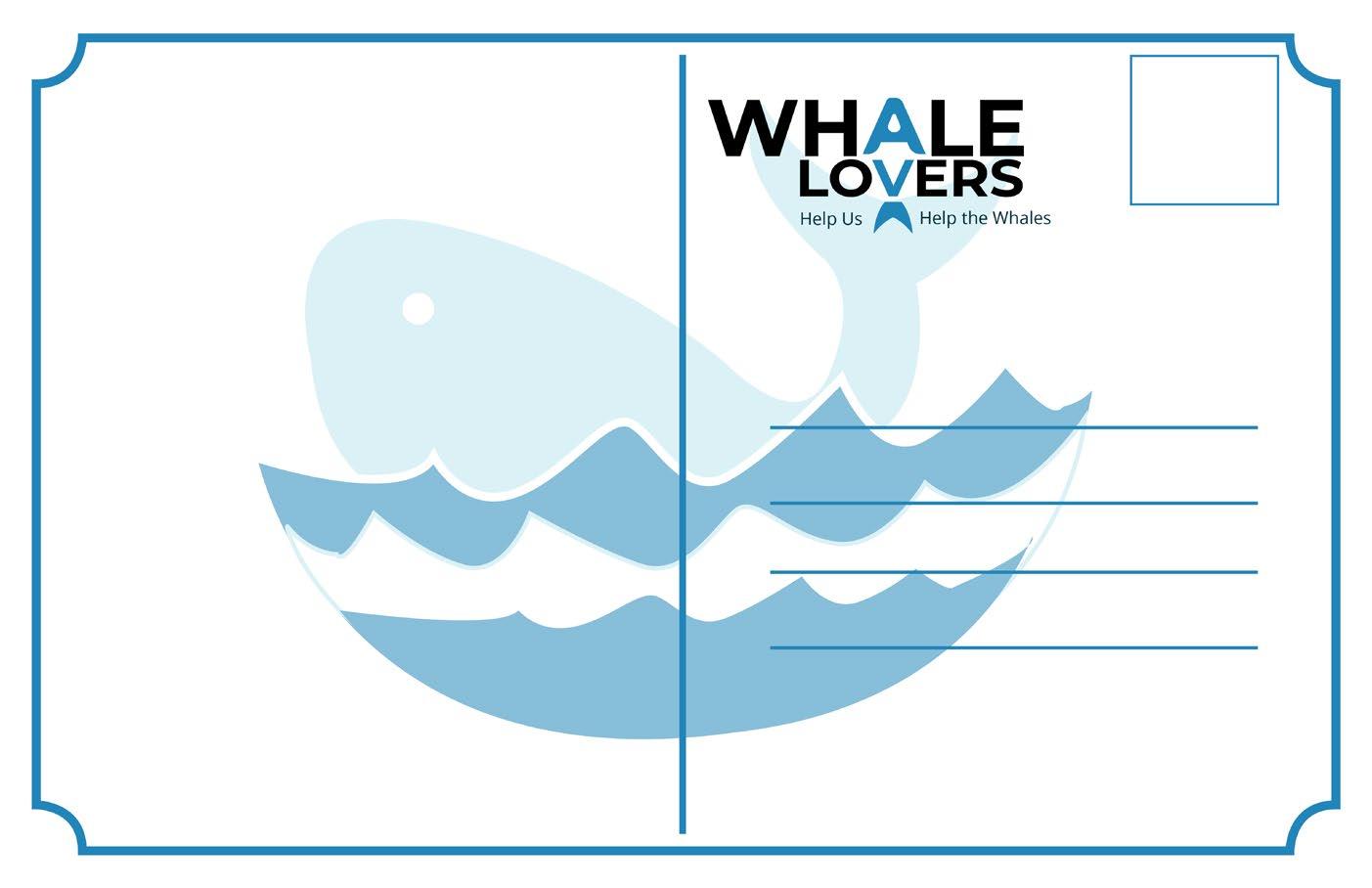
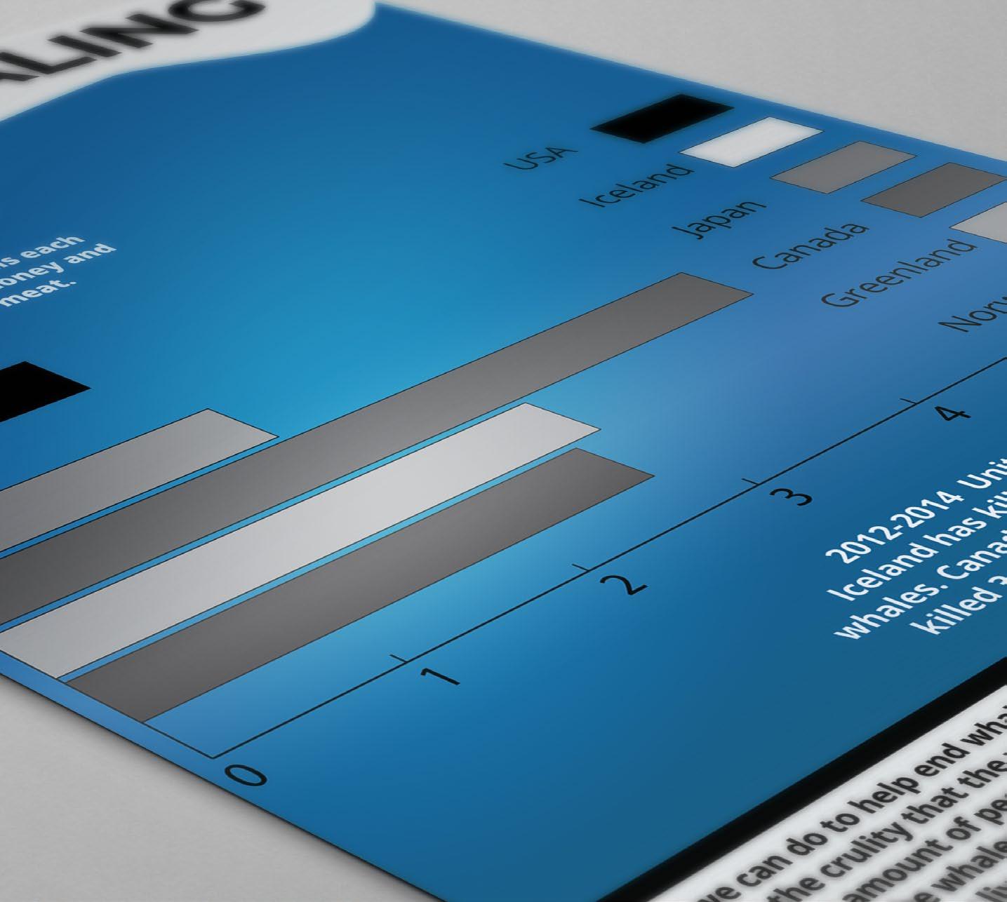
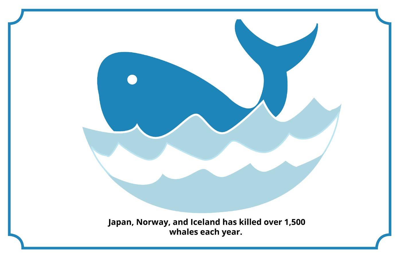
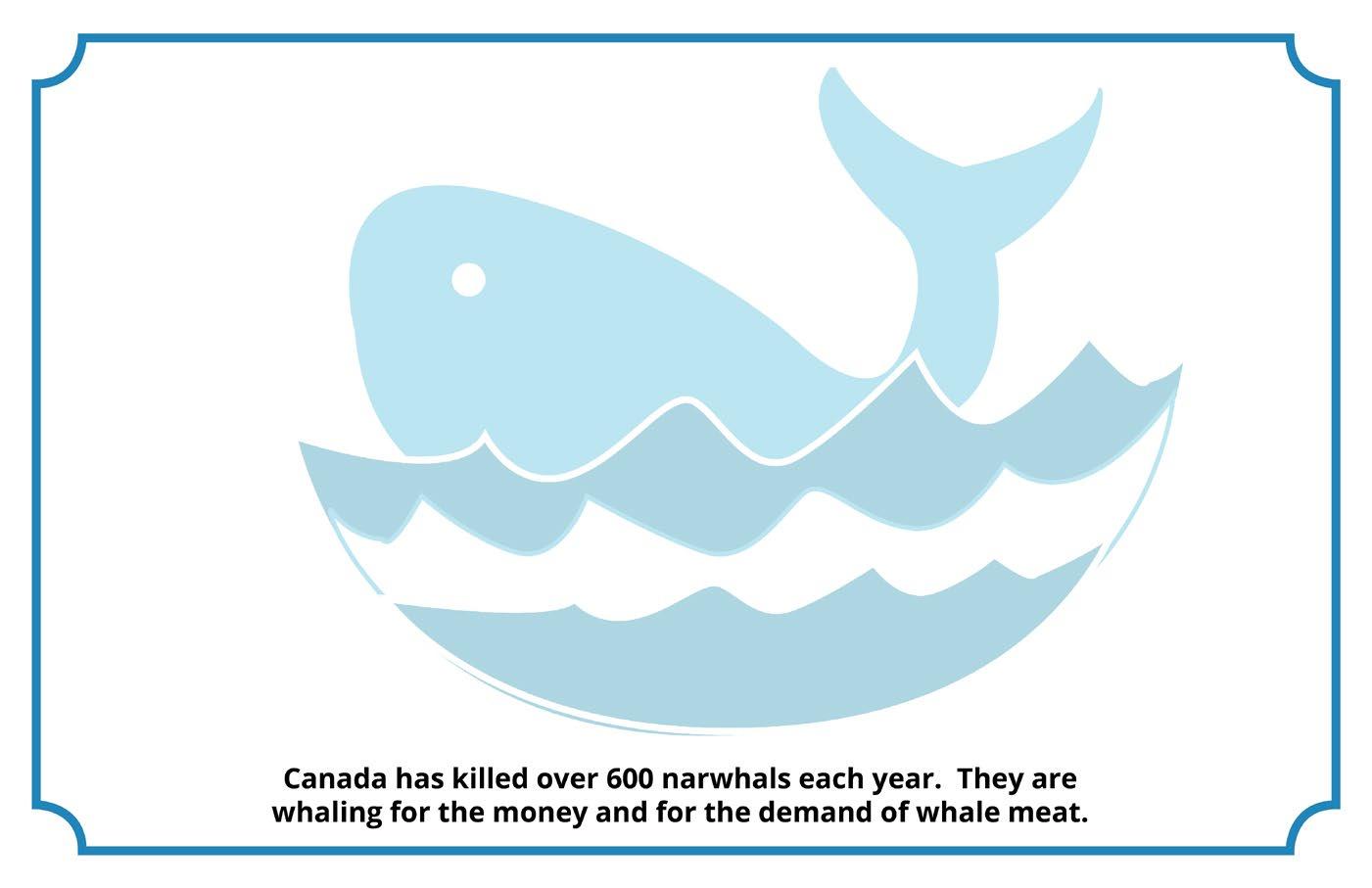
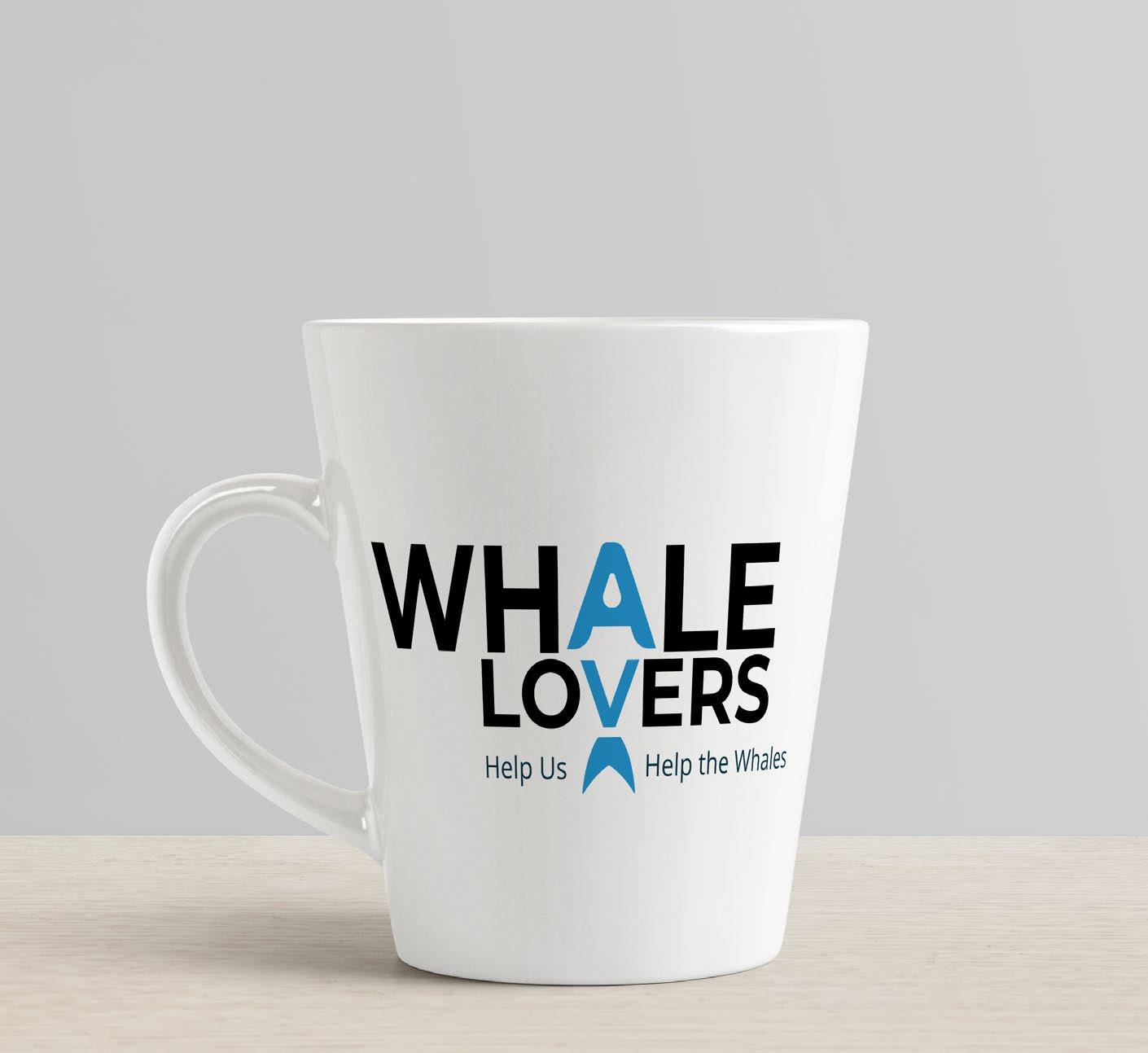
DESIGN FOR GOOD Whale Lovers
Project Whale Lovers was created to show the different ways a non-profit organization advertises. The problem that I had to solve for this project is to create my own non-profit organization along with the logo, info graphic, apparel, and postcard. The constraints for the project was making sure my concept was actually doable and conveyed the message.
Audience for this piece would be a wide range of people that want to help save the lives of whales. This organization appeals to them because it tells them how they can help save the whales and how to get others involved.
Tools & Techniques:
Layout
Typography
Color Theory
Adobe Illustrator
Adobe InDesign
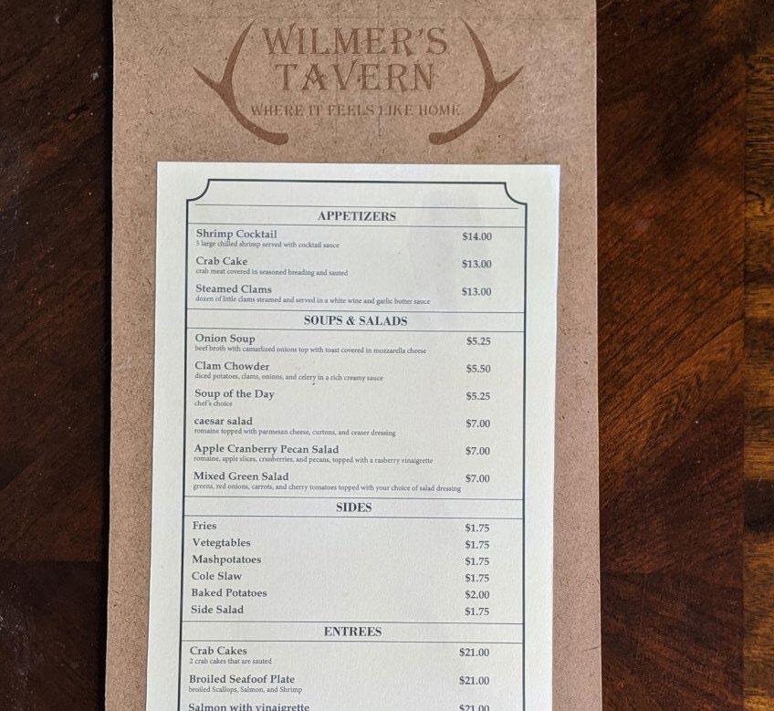
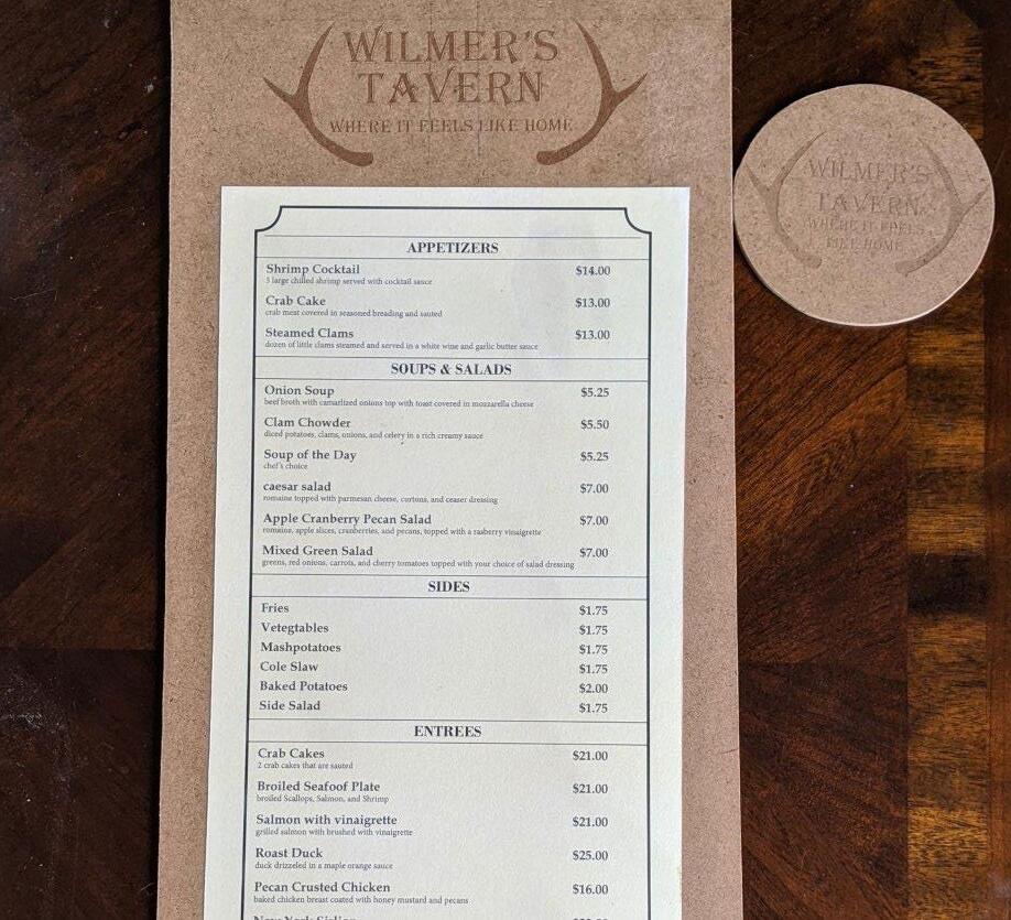
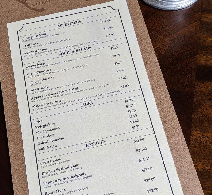
MENU DESIGN
Wilmer’s Tavern
This menu design project was created to show how to accomplish hierarchy using different fonts and how to make a menu. The problem that I had to solve for this project is how to create hierarchy and font pairing. The constraints for the menu design was making sure the customer would be able to read it, differentiate between the sections, and making the menu a suitable size.
The audience for this piece would be a wide range of people that like to eat at old rustic taverns. The piece appeals to them because it offers food that fits its theme and is easily read and understood.
Tools & Techniques:
Layout
Print Design
Typography
Color Theory
Adobe Illustrator
Adobe InDesign
Inovation Lab
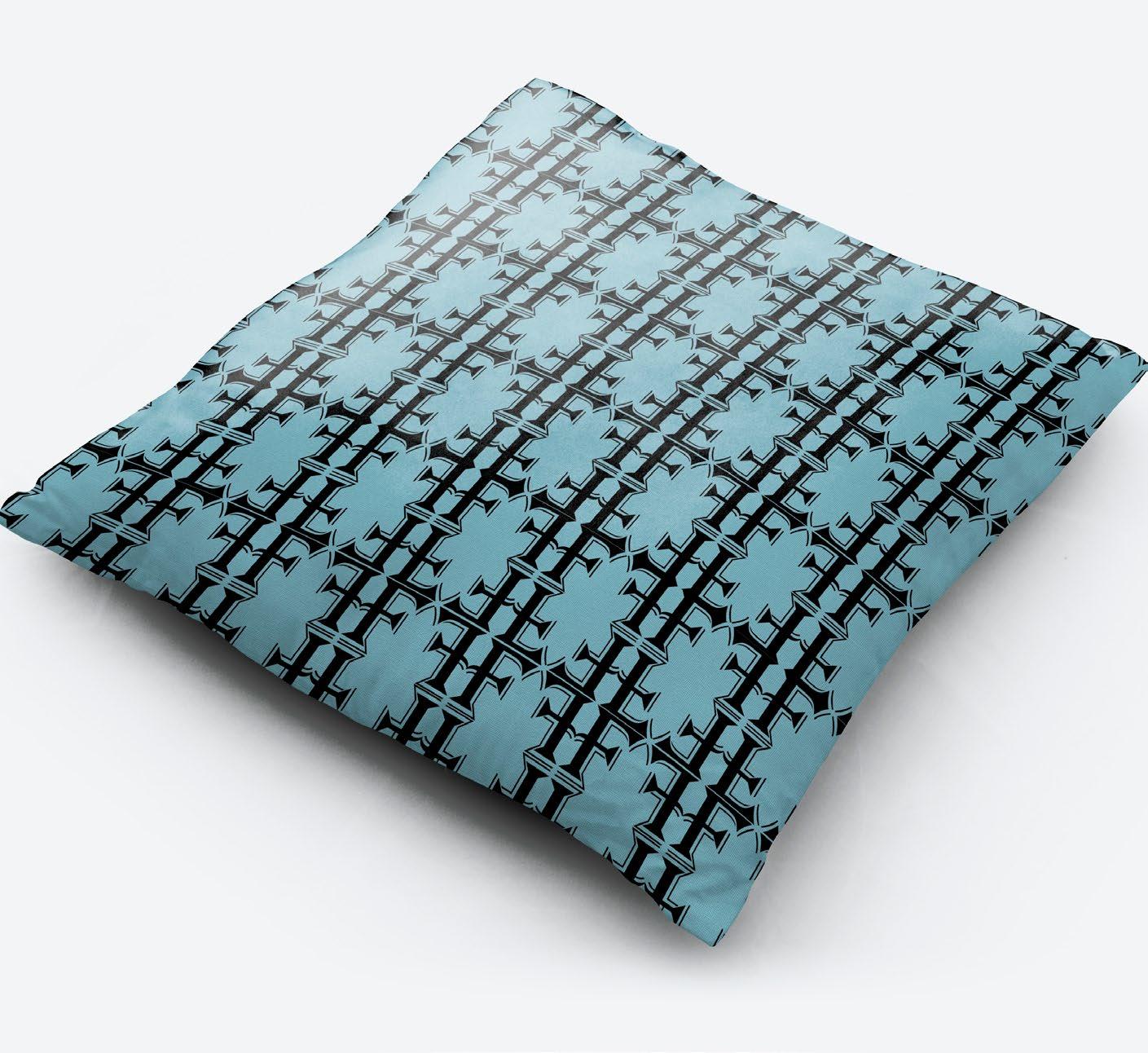
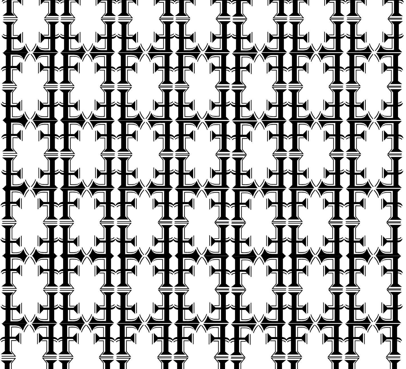
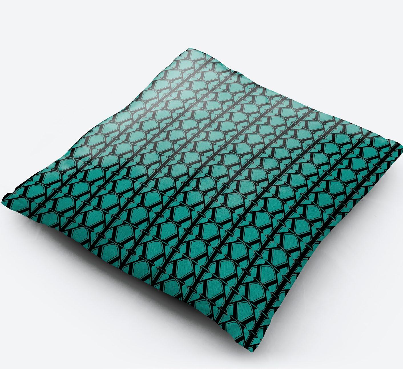
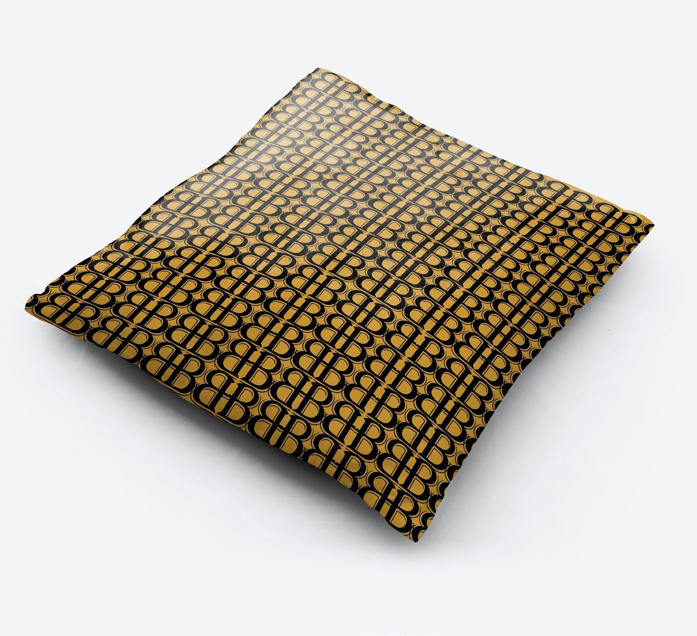
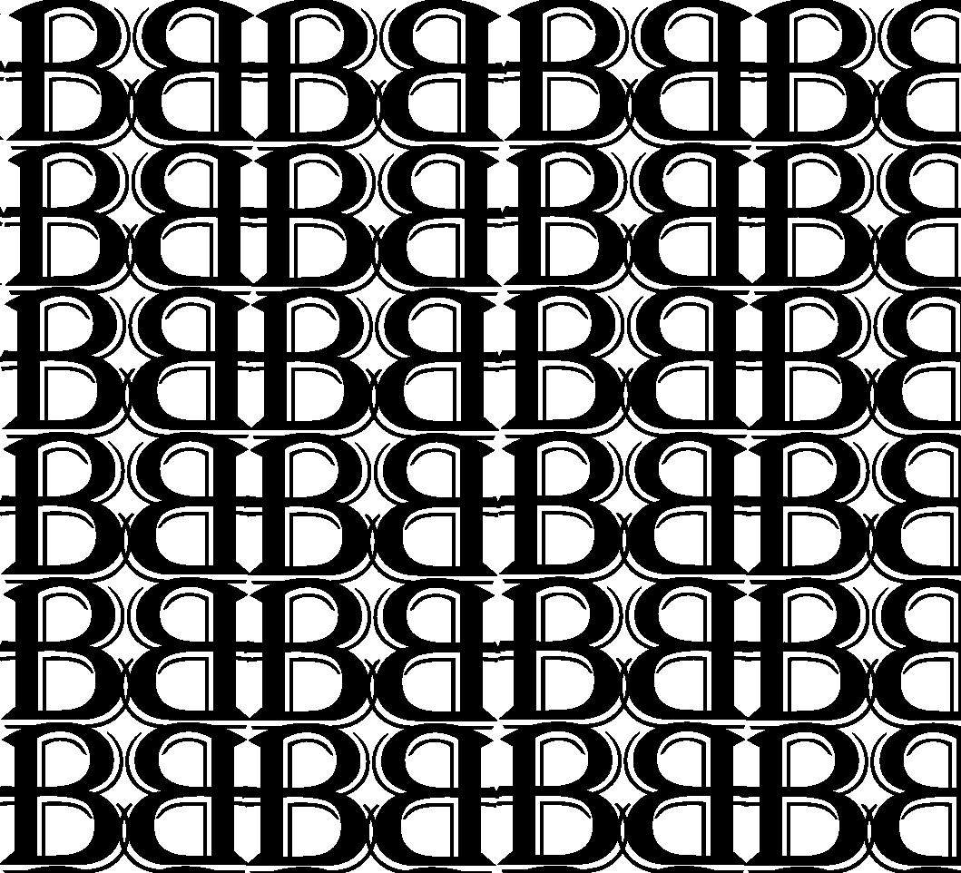
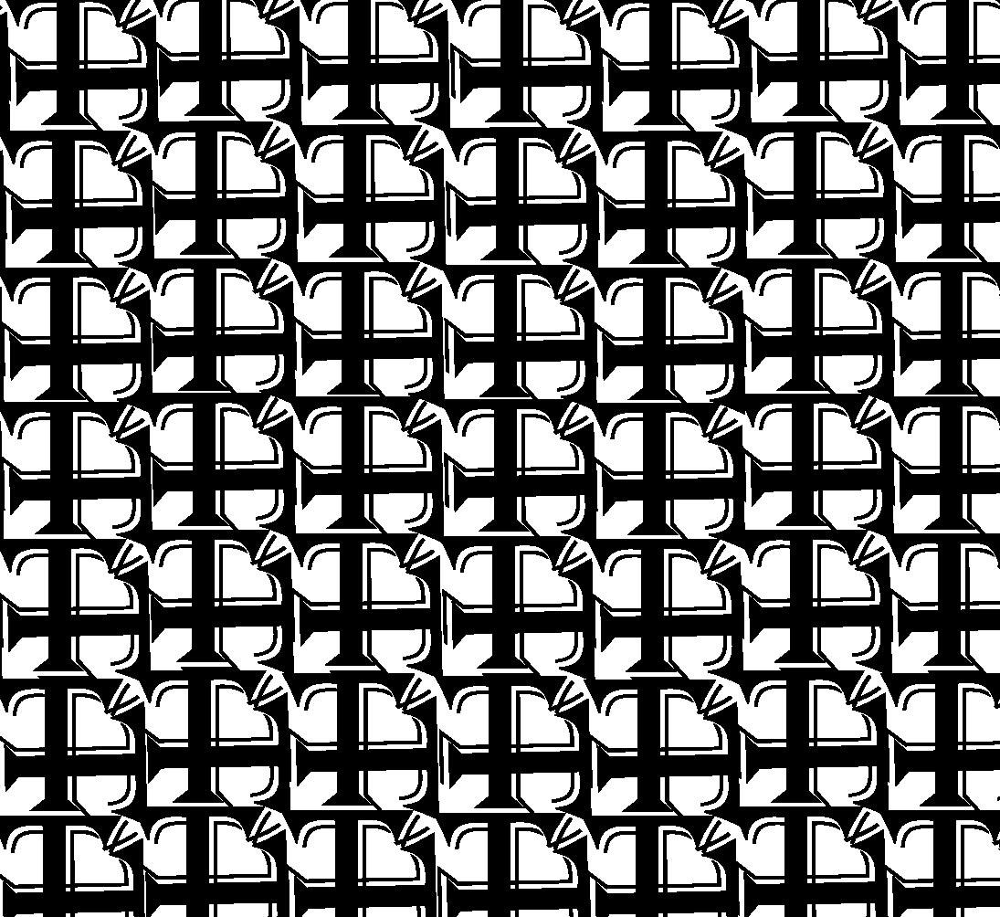
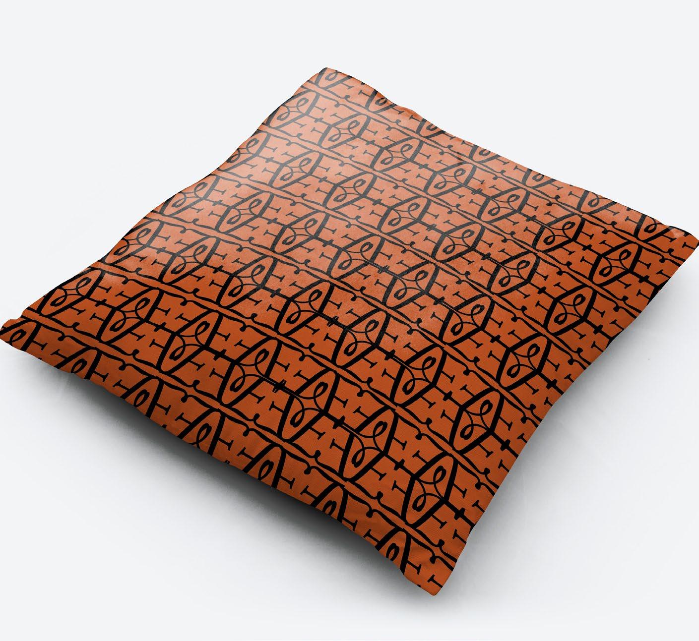
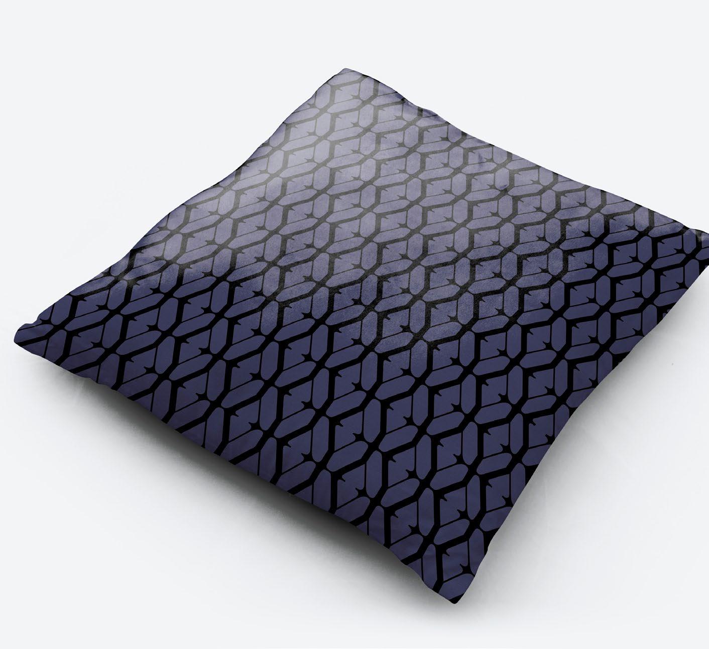
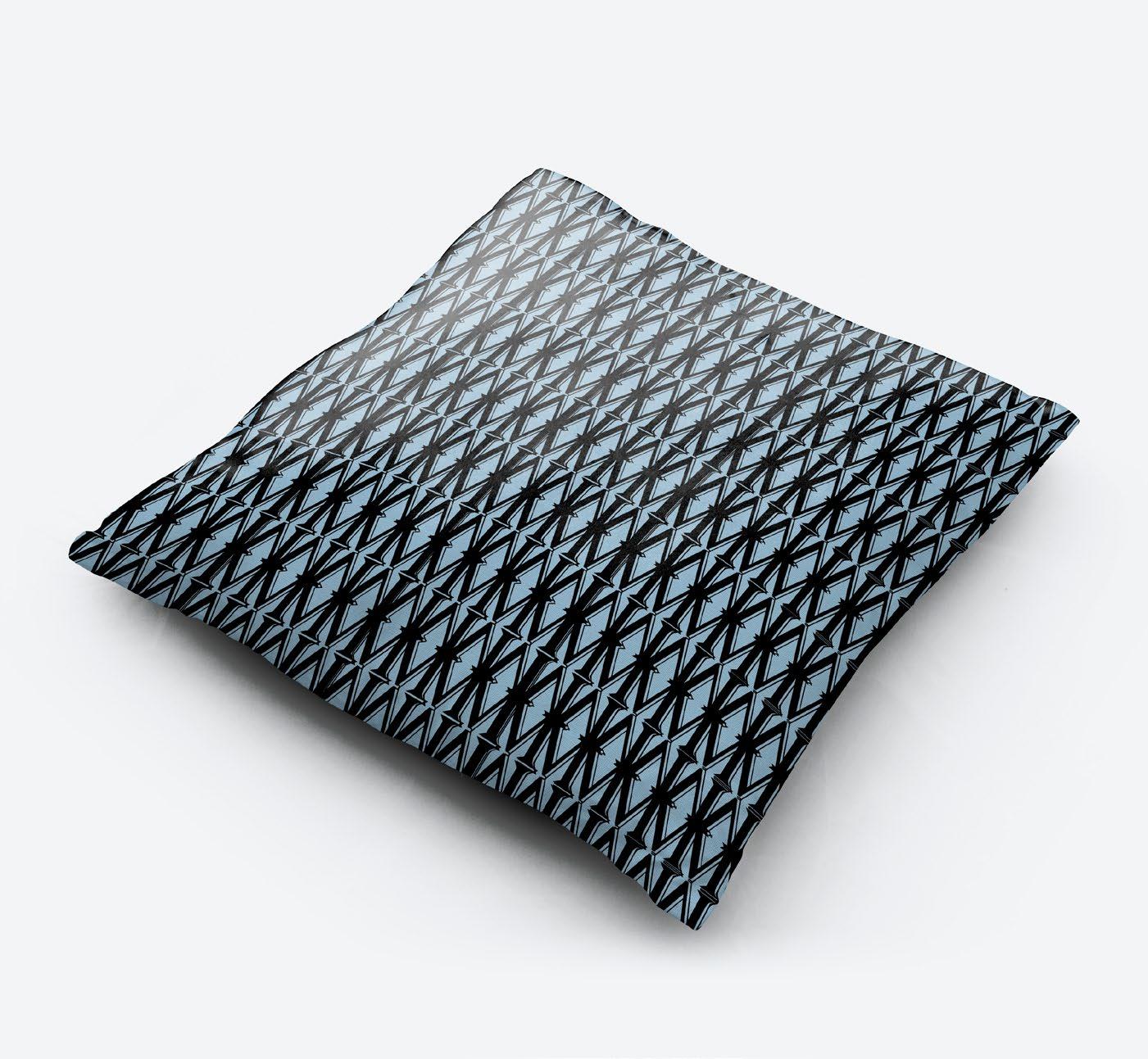
TYPE PATTERNS
Pillow Type Patterns
Project type patterns was created to show the different ways to create type patterns out of different fonts. The problem that I had to solve for this project was to come up with 8 different type patterns and place them on mock-ups that would best show off the design. The constraints for the project was making sure that the designs were unique and looked like a pattern and not the letter used.
Audience for this piece would be a wide range of people that like typography and type pattern designs. This appeals to them because it gives the typography lovers a chance to try and figure out what font and letter was used to create the beautiful pattern displayed on the pillow.
Tools & Techniques:
Layout
Typography
Color theory
Adobe Illustrator

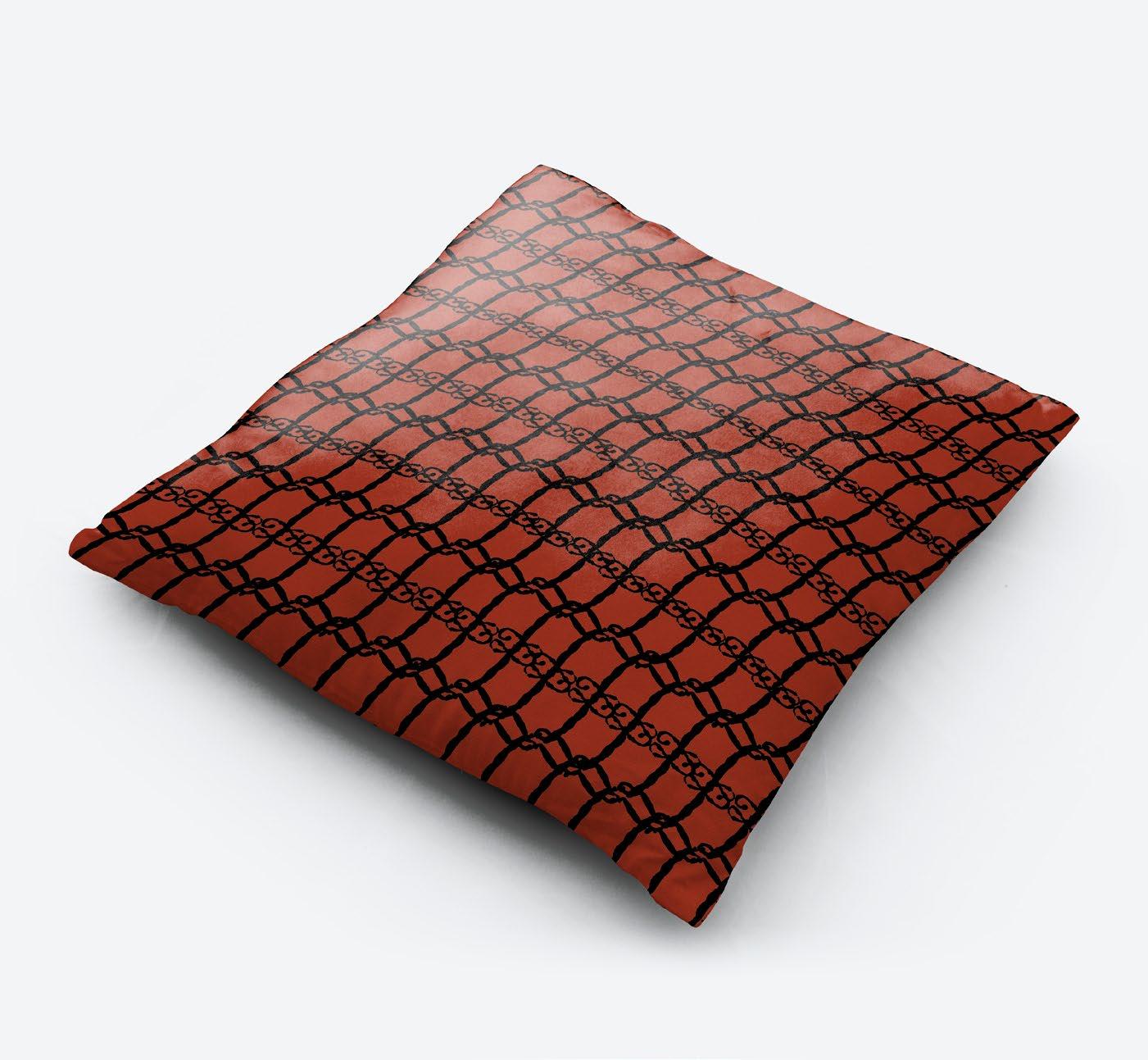
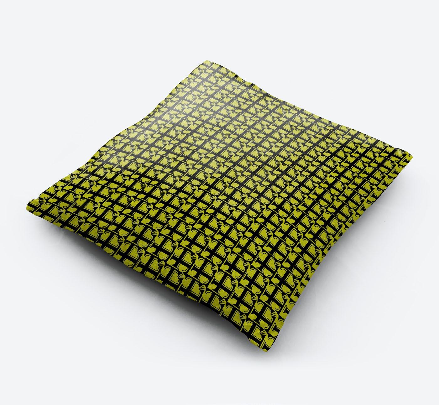


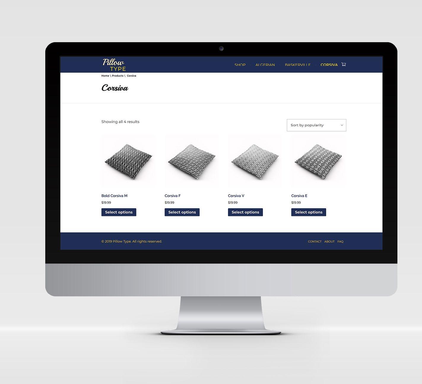
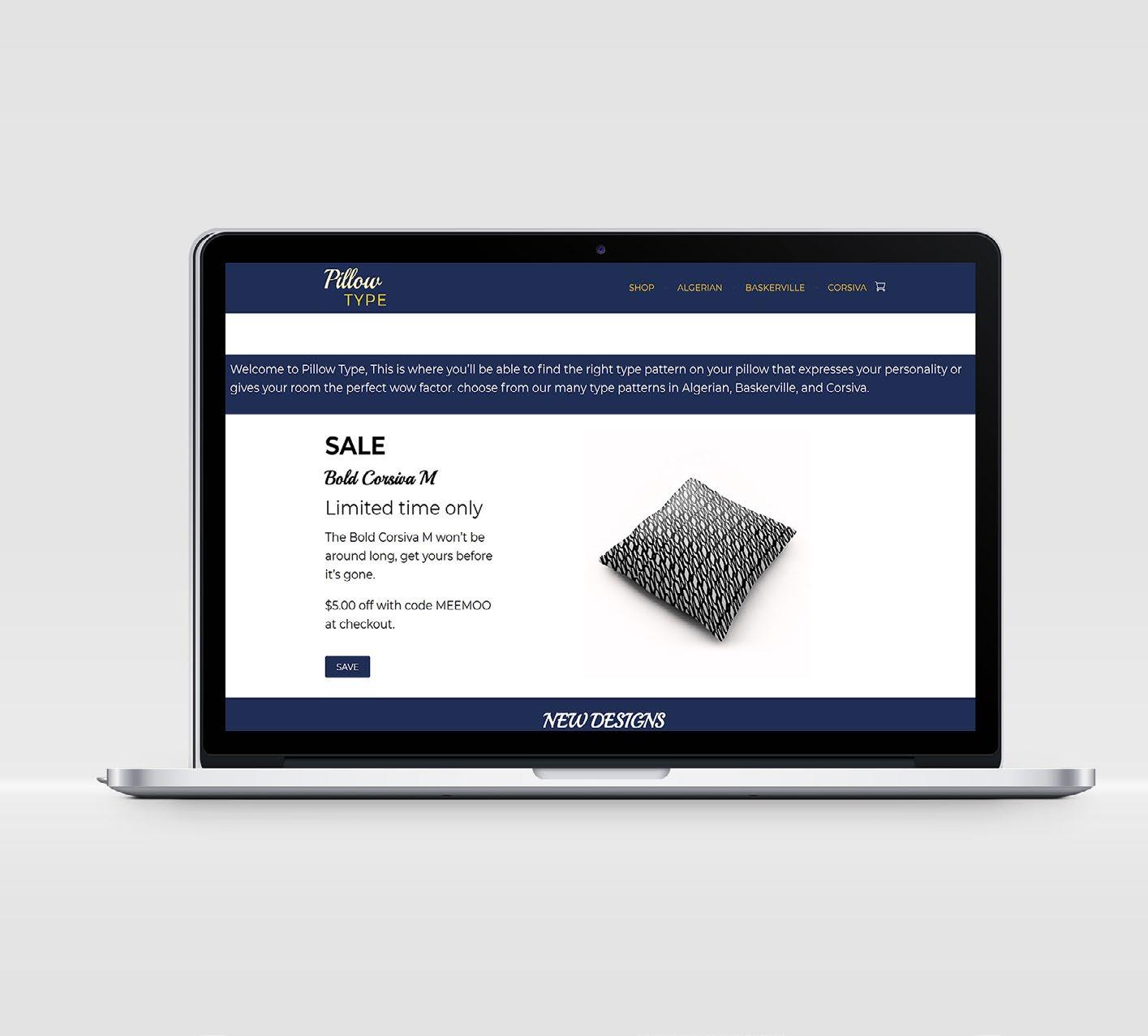
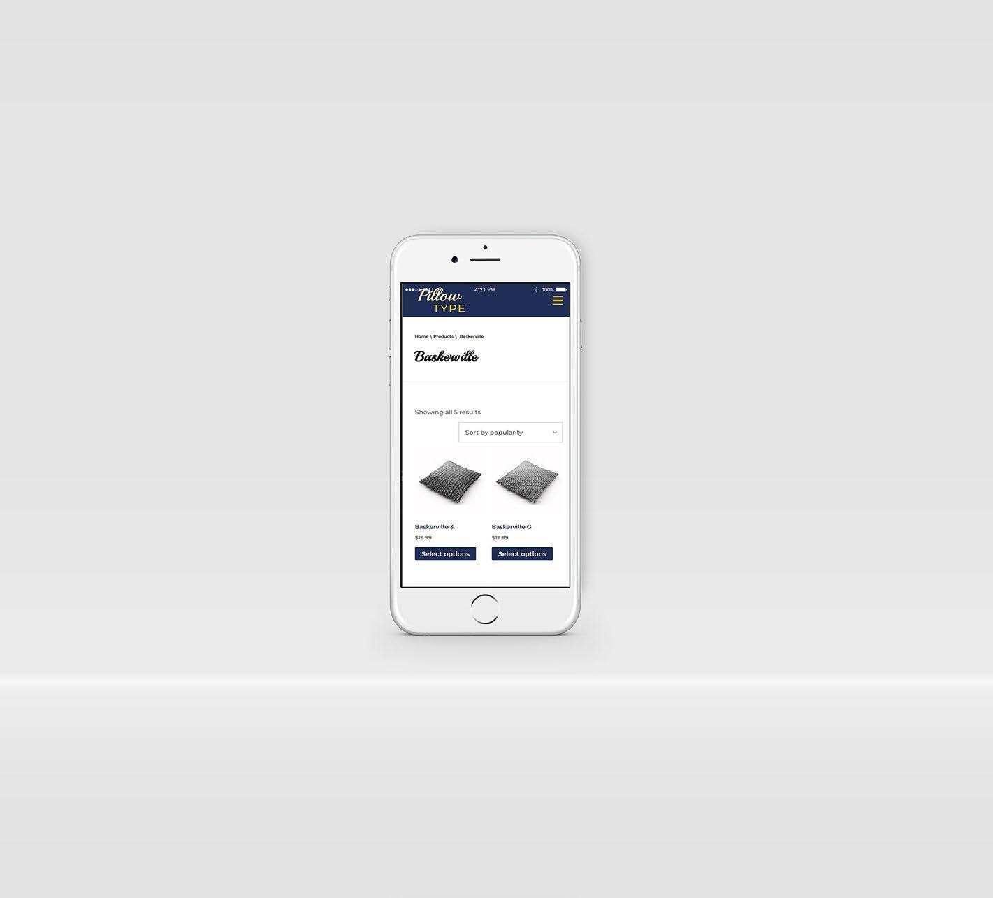
PILLOW SHOP
Pillow Type
The Website shop project was where I had to make a website for a product that had 3 different sections. I was allowed to use one product but to make sure the sections of the product were different. The point of the project was to create a functioning website on desktop and mobile for our product which included checkout and sales. The problem that I had to solve for this project is developing the product and the variations of it. The constraints for the website Pillow Type was making sure it was appealing to the customer and that it was user friendly and easy to navigate. Audience for this website would be a wide range of people like family, elderly, homeowners, and college students. The piece appeals to them because its the perfect conversation starter for any room it also adds the right accent to any room making your room pop.
Tools & Techniques:
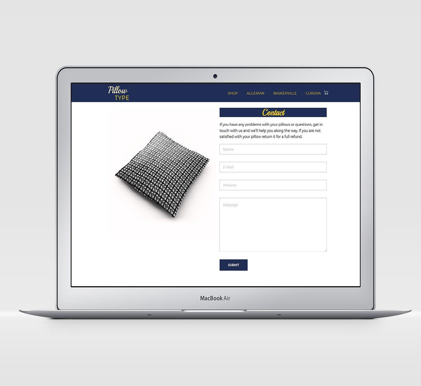
Layout Typography Color Theory Adobe Illustrator Adobe InDesign Adobe Photoshop
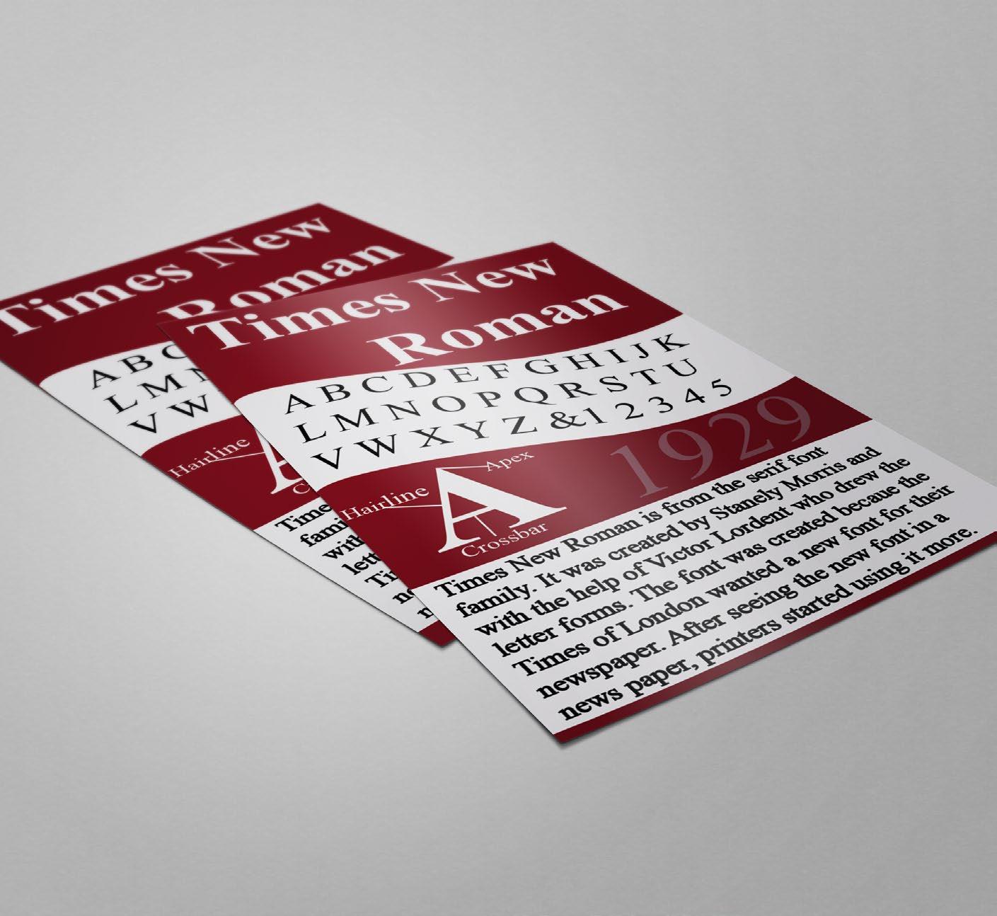
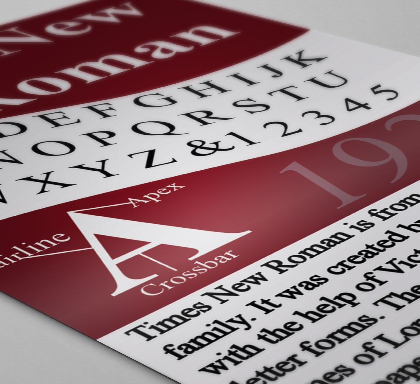
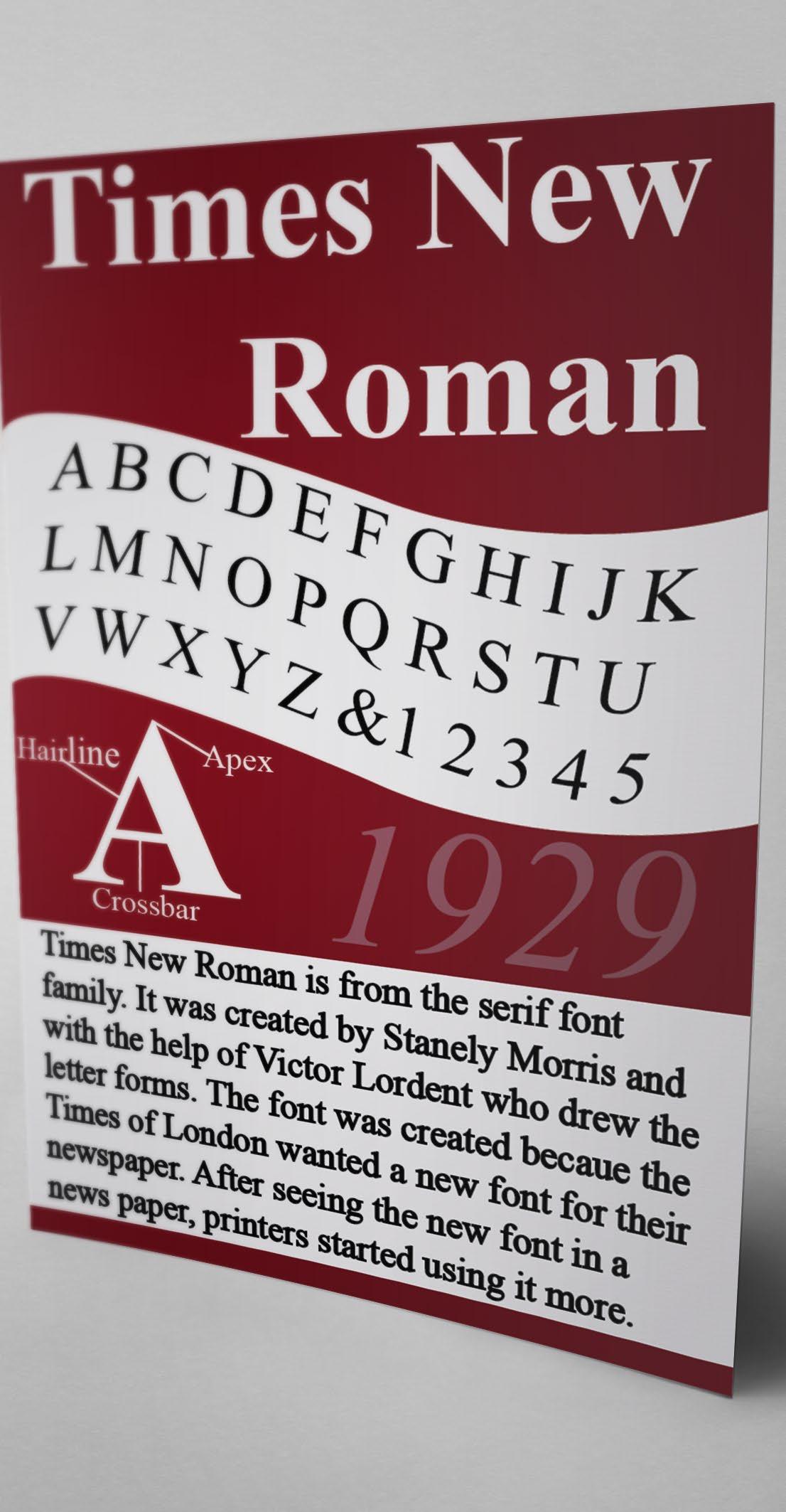
TYPE POSTER
Times New Roman
This Type Poster was created to show off the Times New Roman font and to give a brief background of the creator Stanley Morison and how the font came to be. The problem that I had to solve for this project is how to design a type poster using only Times New Roman. The constraints for the type poster was developing hierarchy by using only one type family and how to arrange all the required components to create a poster.
The audience for this piece would be typography fanatics who are interested in the history of fonts. The piece appeals to them by showing the different ways you can create hierarchy with in the same font family by just adjusting the weight and size of the fonts and by giving a brief background of how it was created.
Tools & Techniques:
Design Typography Color Theory Adobe Illustrator
Layout Print
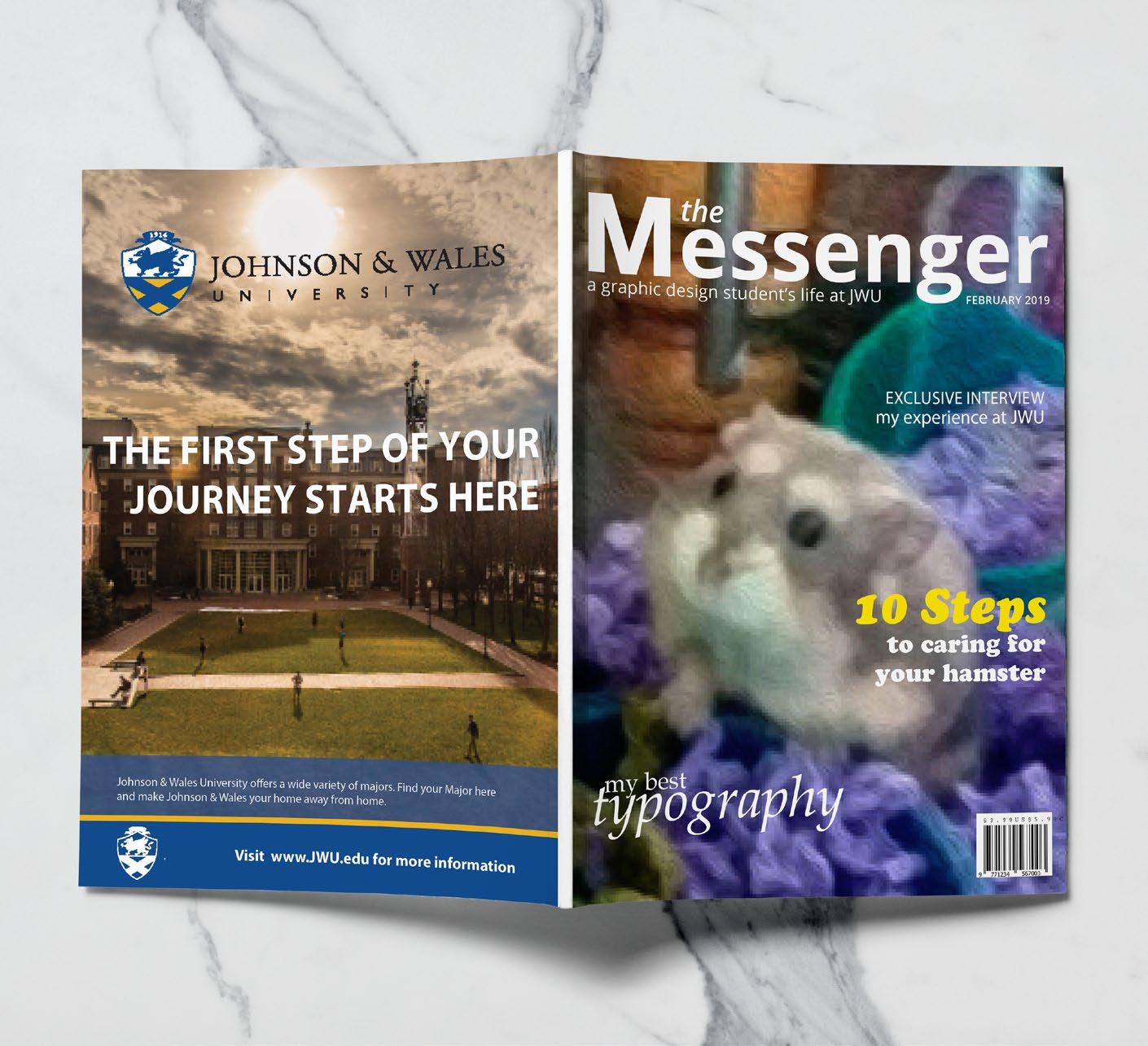
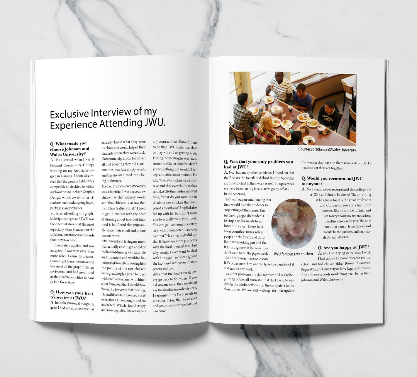
MINIZINE
The Messenger
This Minizine Design project was created to show how to accomplish editorial layout. The problem that I had to solve for this project is to create the content that would fill the pages. I had to do an interview, informative article, Ad, creative piece, and an Ad for JWU. The constraints for the Minizine was making sure the reader would be able to read it, be able to know when they were on a different section, and making sure the images used were of high quality for the reader to see them.
The audience for this piece would be college students and high school students. The piece appeals to them because it offers information about JWU which will help them decided on whether they want to attend Johnson & Wales University or choose a different college.
Tools & Techniques:
Layout
Editorial
Print Design
Typography
Color Theory
Adobe Illustrator
Adobe InDesign
Adobe Photoshop
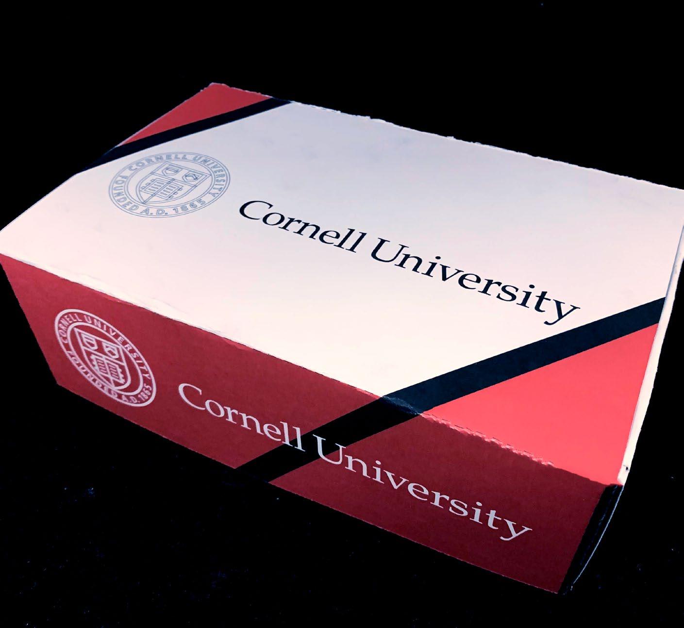
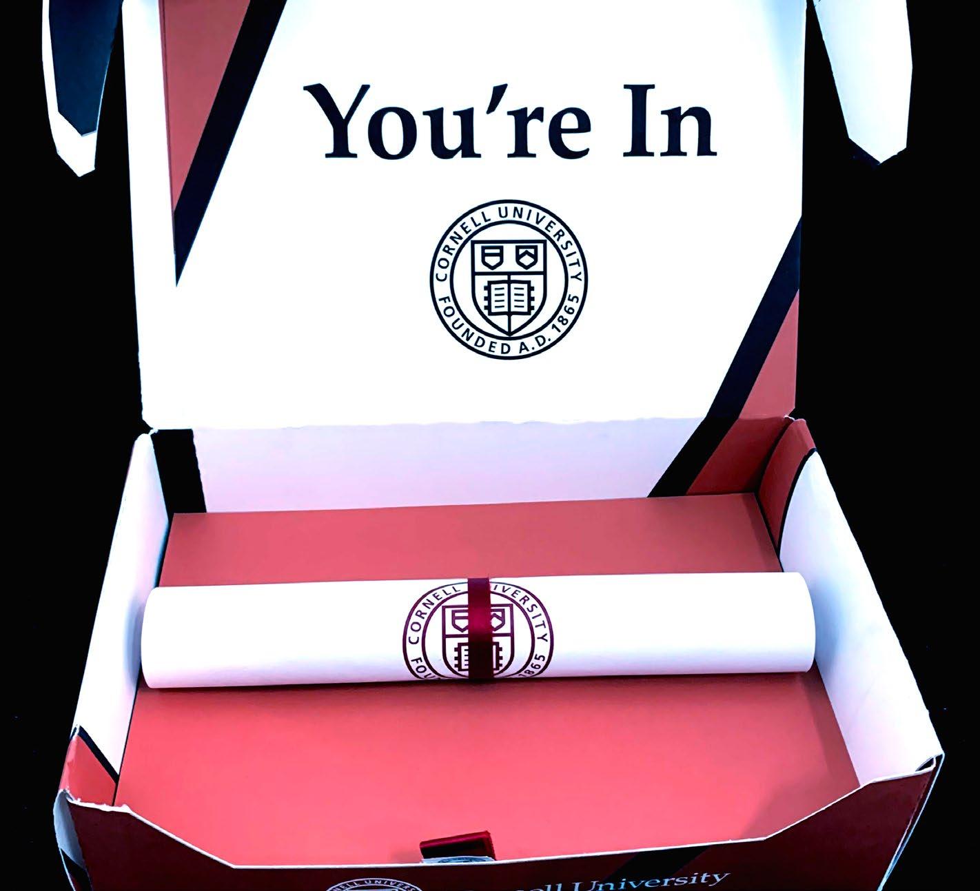
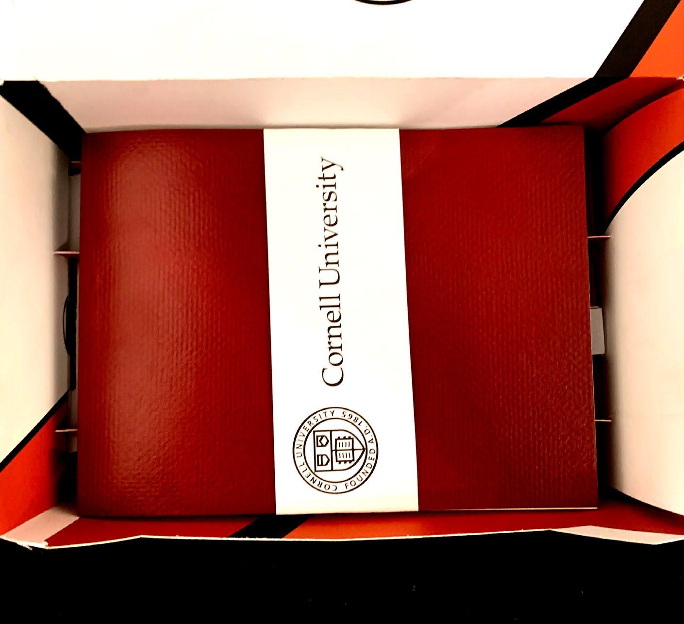
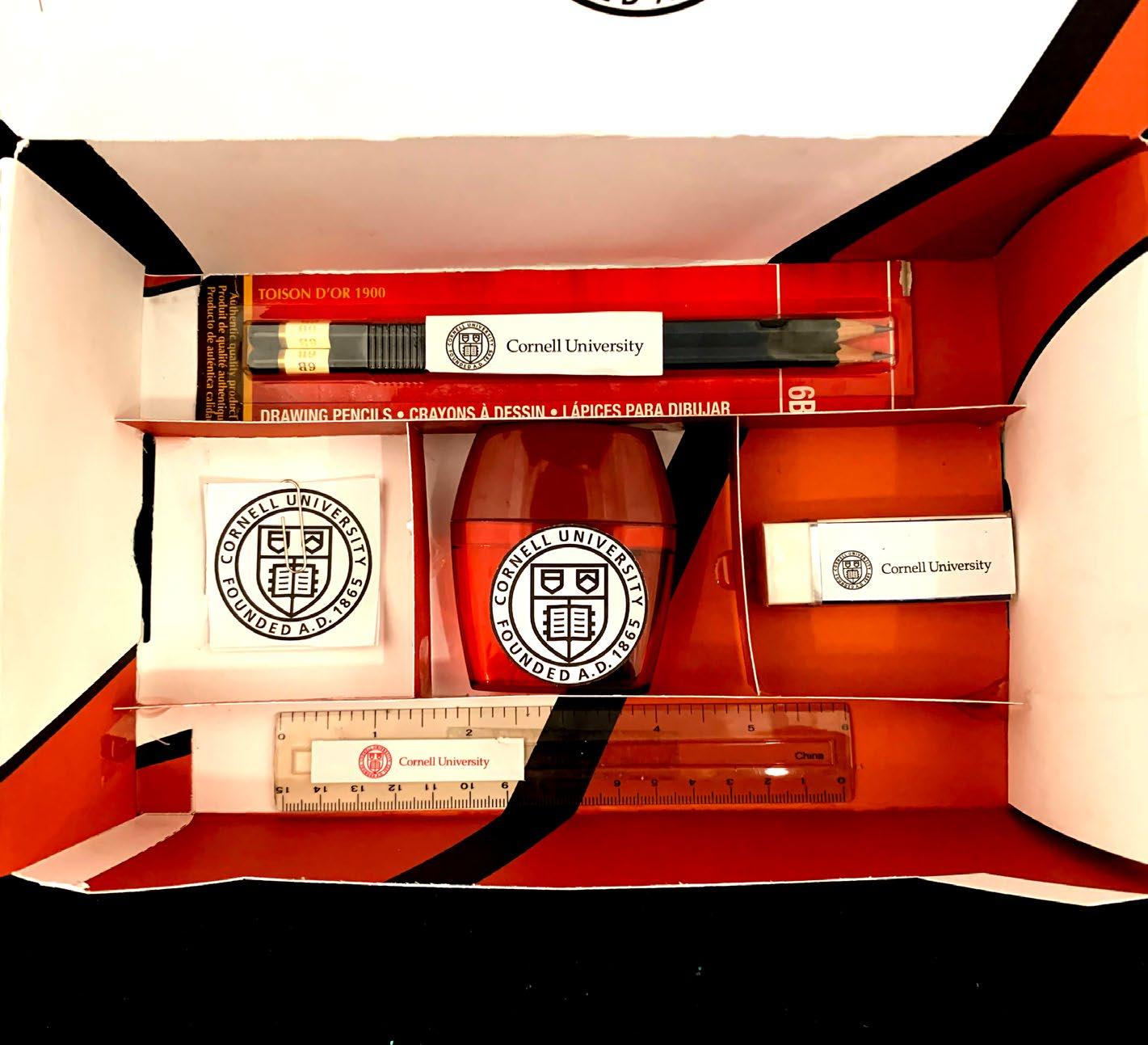
UNIVERSITY ACCEPTANCE BOX
Cornell University
The university acceptance box project was given to test my design and packaging skill. I chose to do Cornell University undergraduate art program, cause Cornell is mostly known for Law I wanted t to make others aware that they do offer other programs. The problem that I had to solve for this project is creating the box along with following the brand guidelines from the school to make sure the box felt that it belonged to the school. The other problem that I faced was trying to figure out what should go into the box and make sure it was related to the major. The constraints for the Acceptance Box was making sure the colors where the exact colors form the school, the fonts were the exact same I had to use a similar font that was close to the schools, and that the logo was being used properly.
The audience for this piece would be college students who want to change their college or high school students who are getting ready to go off to college. The piece appeals to them because it offers information about Cornell University’s undergraduate art program which will help them decided on whether they want to attend.
Tools & Techniques:
Layout Editorial Print Design
Illustrator Adobe InDesign
Photoshop
Typography Adobe
Adobe
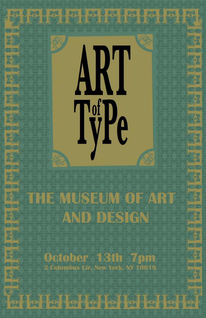
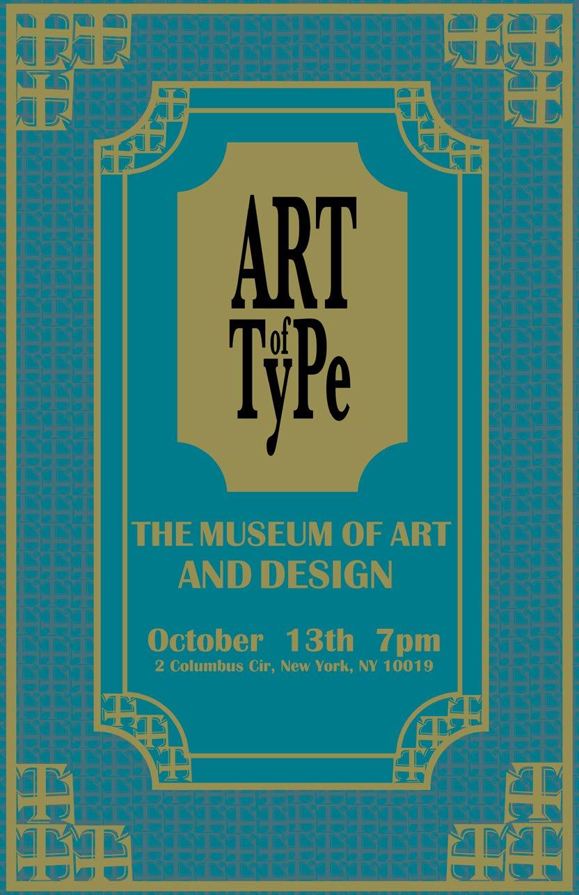
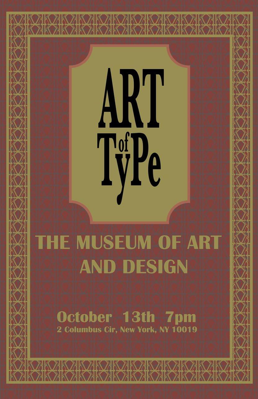
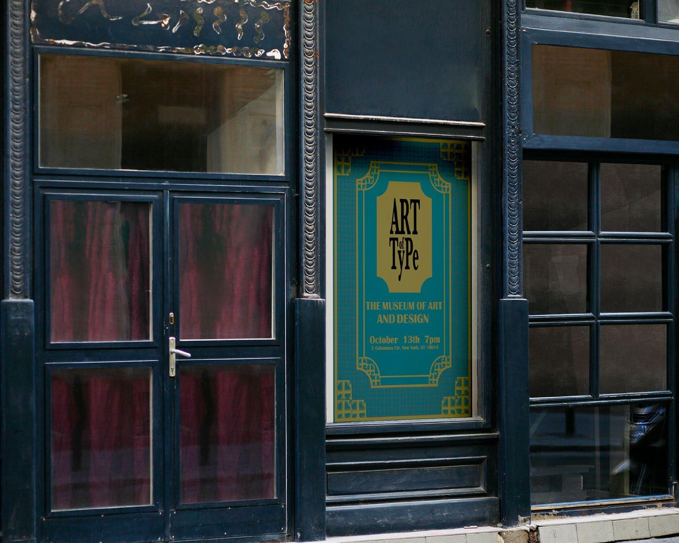
POSTER SERIES
The art of Type
The poster series was where I designed three posters for a museum exhibit that was going to be opened fro a limited time. The problem that I had to solve for this project is figuring out what museum fits the exhibit that I was promoting. The other problem was deciding on what I wanted the exhibit to be about. I decided to promote typography at the Museum of Art and Design in New York.
The audience for this piece would be a wide range of people that are interested in seeing how typography can be used in creating design and also learning about typography. The piece appeals to them because it offers information about what the exhibit is about where it is being held and when.
Tools & Techniques:
Layout
Editorial
Print Design
Typography
Color Theory
Adobe Illustrator
Adobe InDesign
Adobe Photoshop
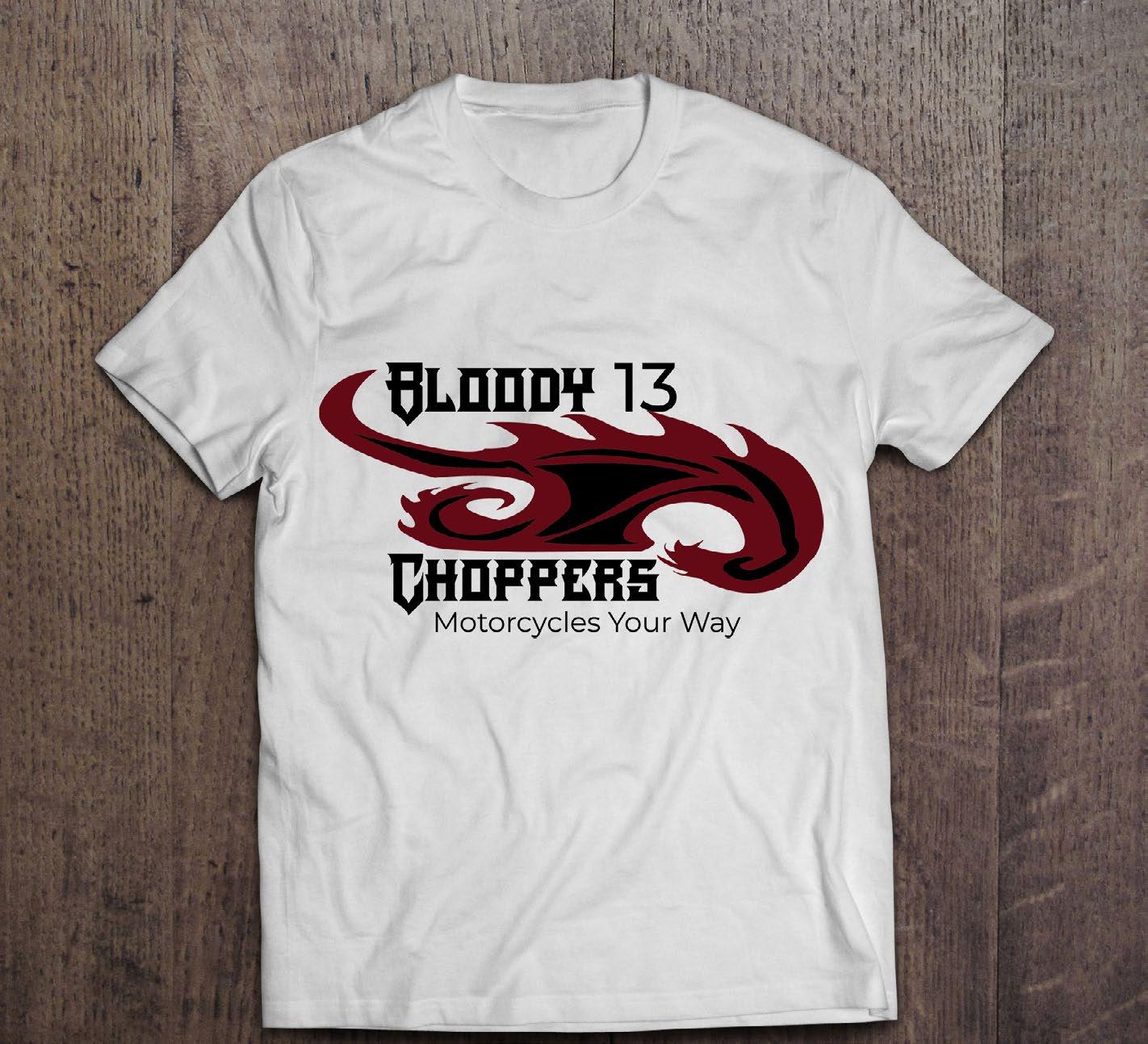
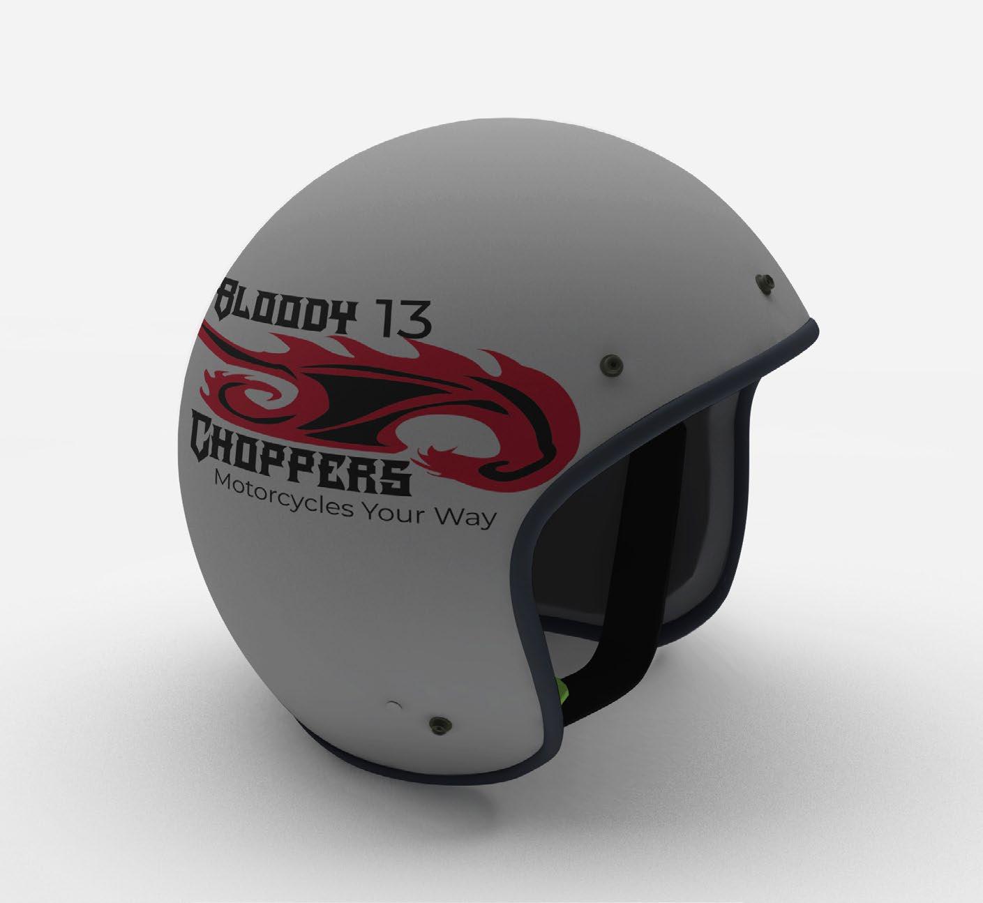
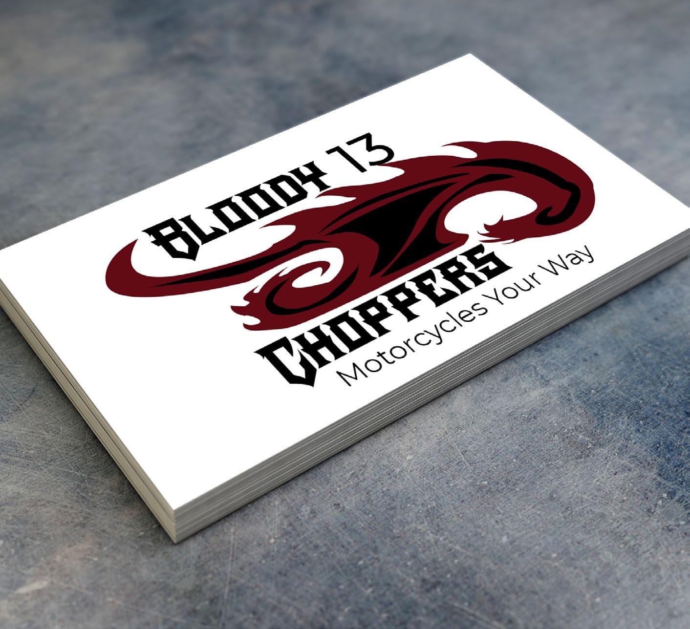
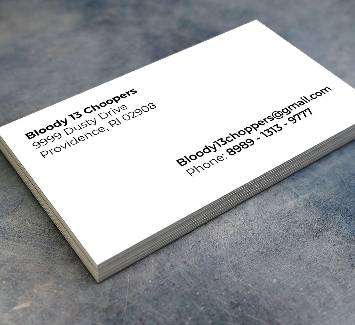
BUSINESS CARD
Bloody 13 Choppers
Project Bloody 13 was created to show how I can advertise for a company. The problem that I had to solve for this project is to create the company along with the logo and business card. The constraints for the project was making sure that the business cards were readable and they convey the theme of the company.
Audience for this piece would be people that are18-30 who are interested in getting their motorcycles designed. This company appeals to them because it has their style and trends that are popular to their age group.
Tools & Techniques:
Layout
Typography
Color Theory
Adobe Illustrator
Adobe InDesign
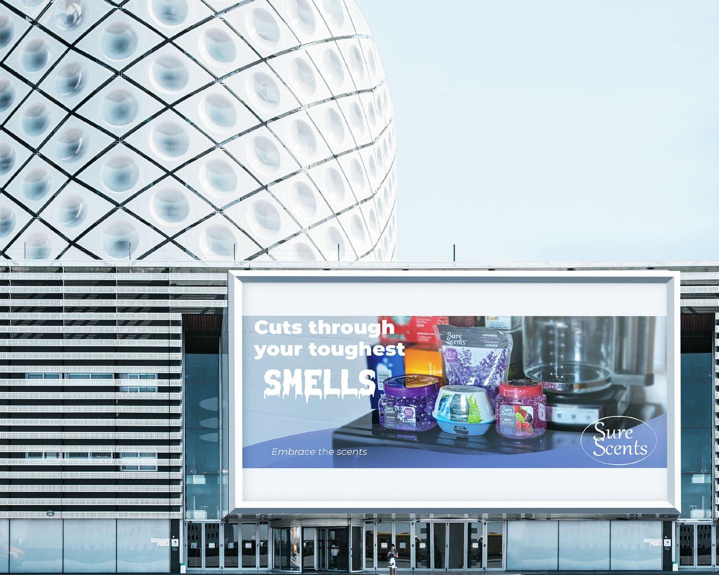
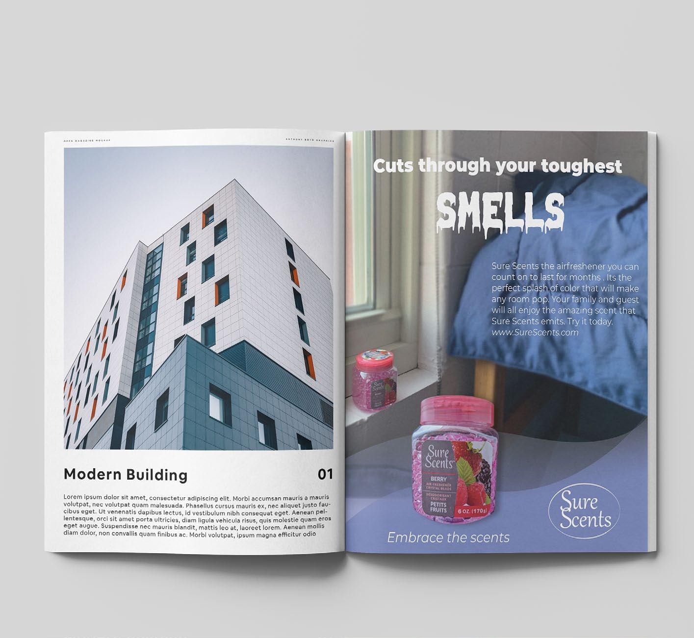
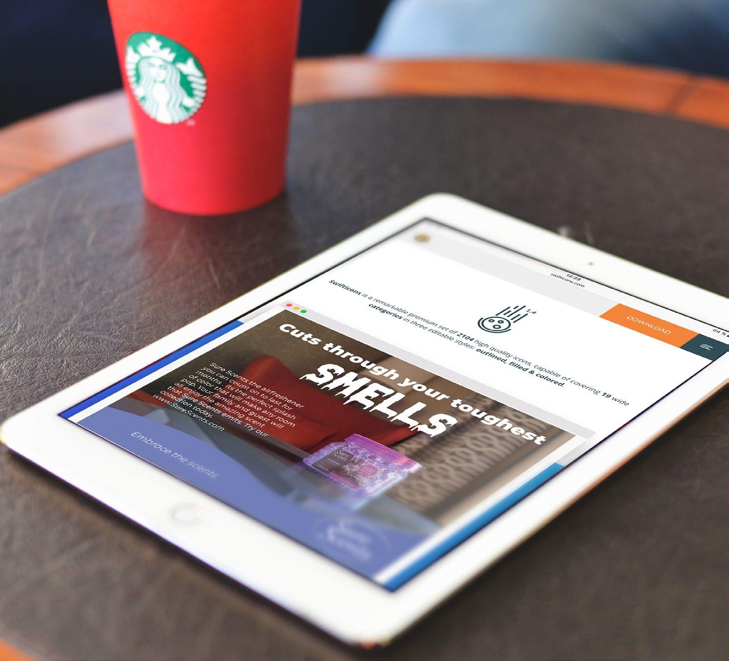
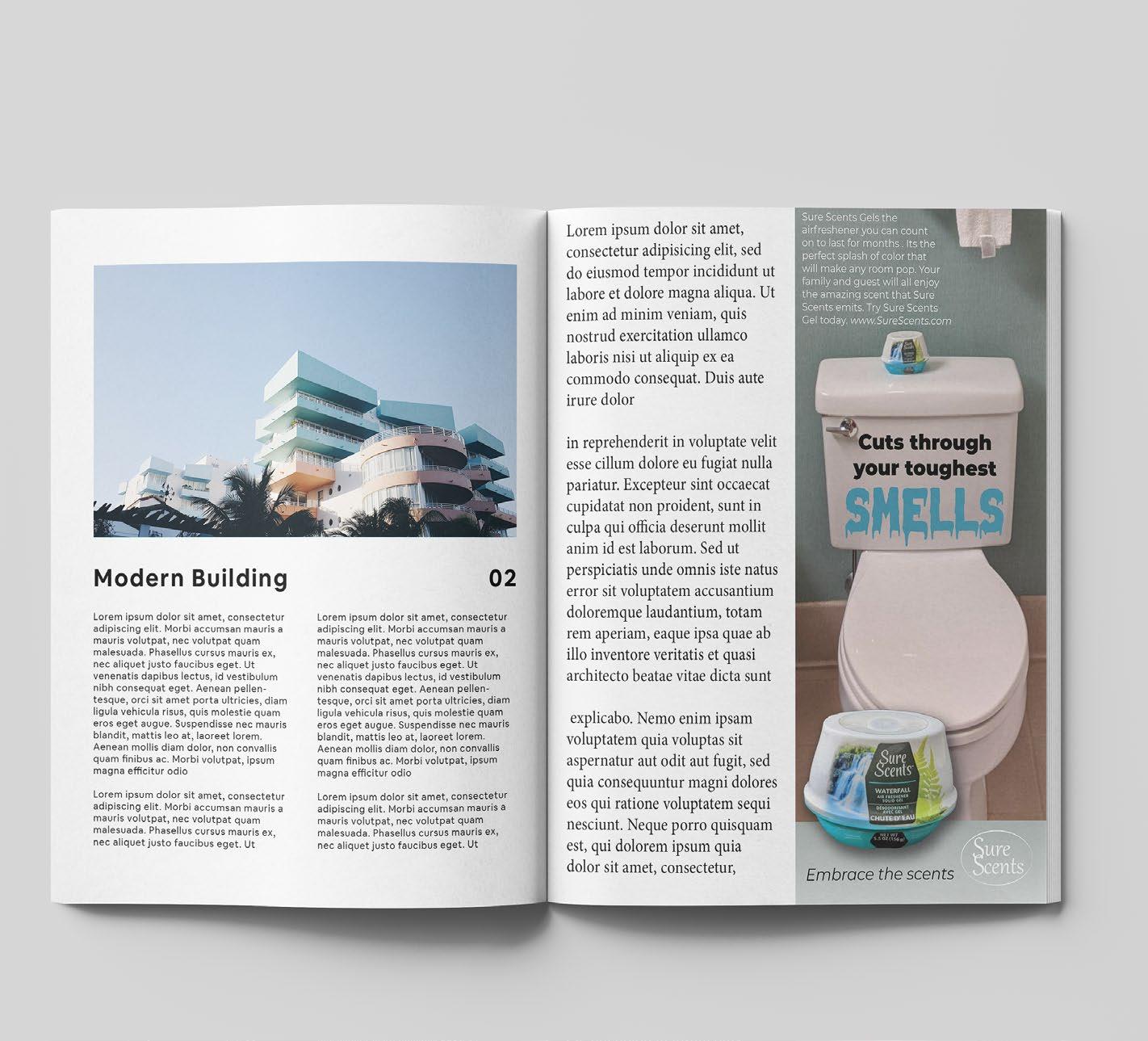
ADVERTISING DESIGN
Sure Scents
The Advertising Design project was where I had to take a non popular dollar store item create a full page, half page, Google, and billboard ad. I was also allowed to re-brand the product. The point of the project was to create a series of cohesive ads that best showed the product and made it feel like it belonged to that brand. The problem that I had to solve for this project is getting the setting of the pictures right so the product didn’t feel out of place, creating hierarchy and font pairing that expresses the brands character. The constraints for the advertising design was making sure it was appealing to the customer and that the ads felt like they belong to one series.
The target audience for this piece would be a wide range of people like family, elderly, homeowners, and college students. The piece appeals to them because its an inexpensive product that proves that it will last longer than the competitors at half the price and it helps odors that appear in your homes.
Tools & Techniques:
Layout
Print Design
Typography
Color Theory
Adobe Illustrator
Adobe InDesign
Adobe Photoshop
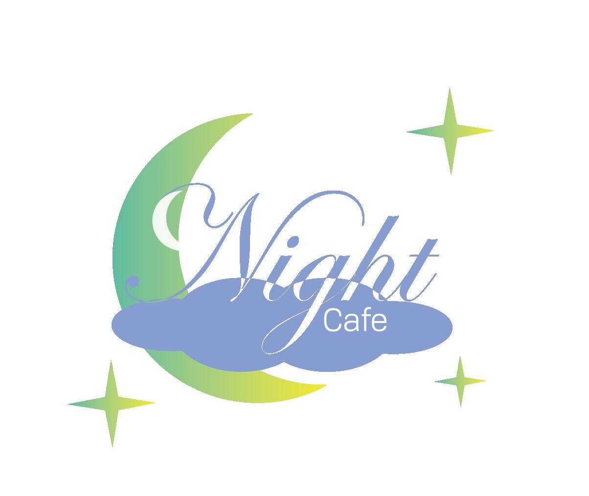
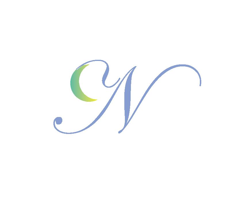
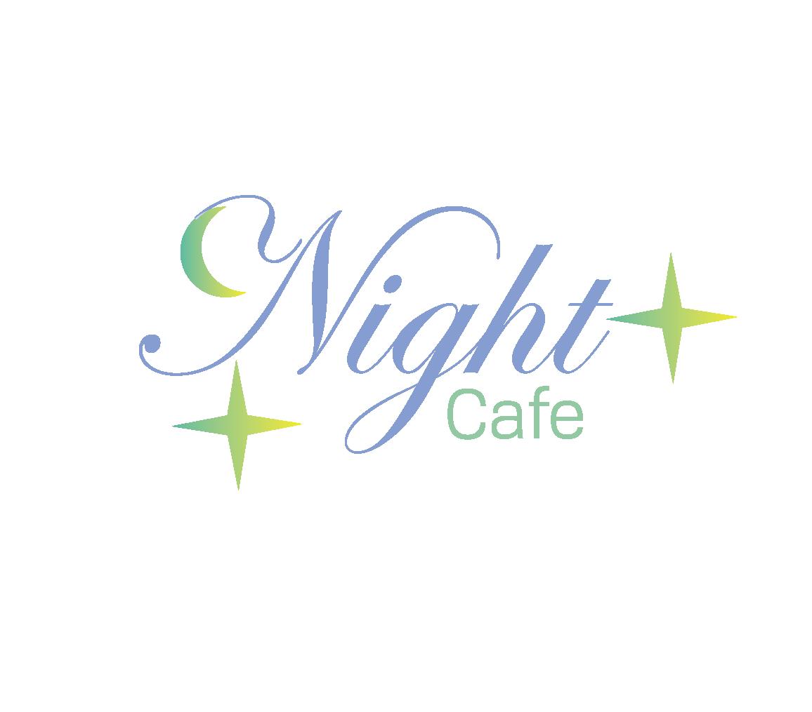
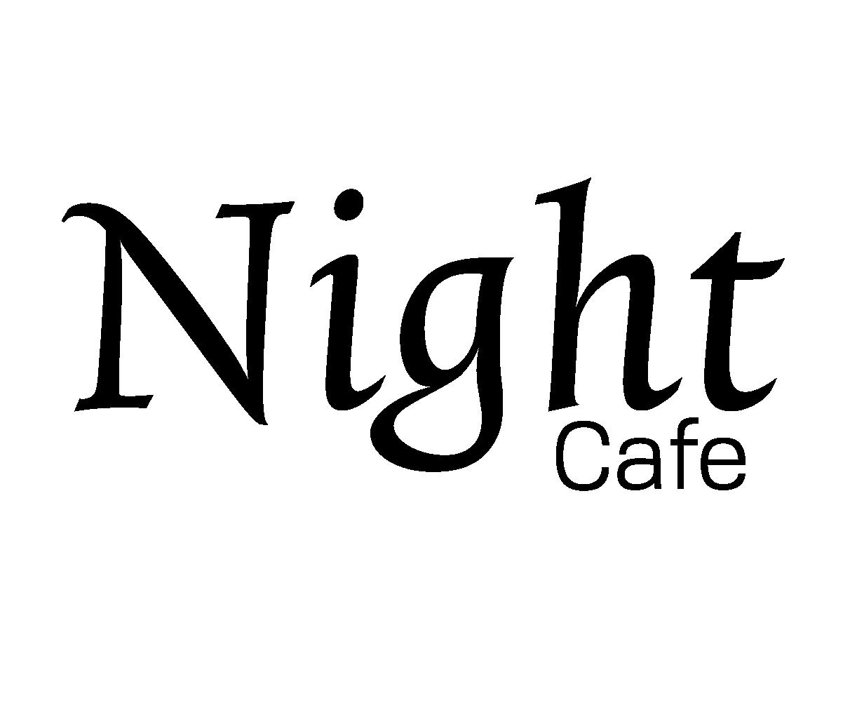
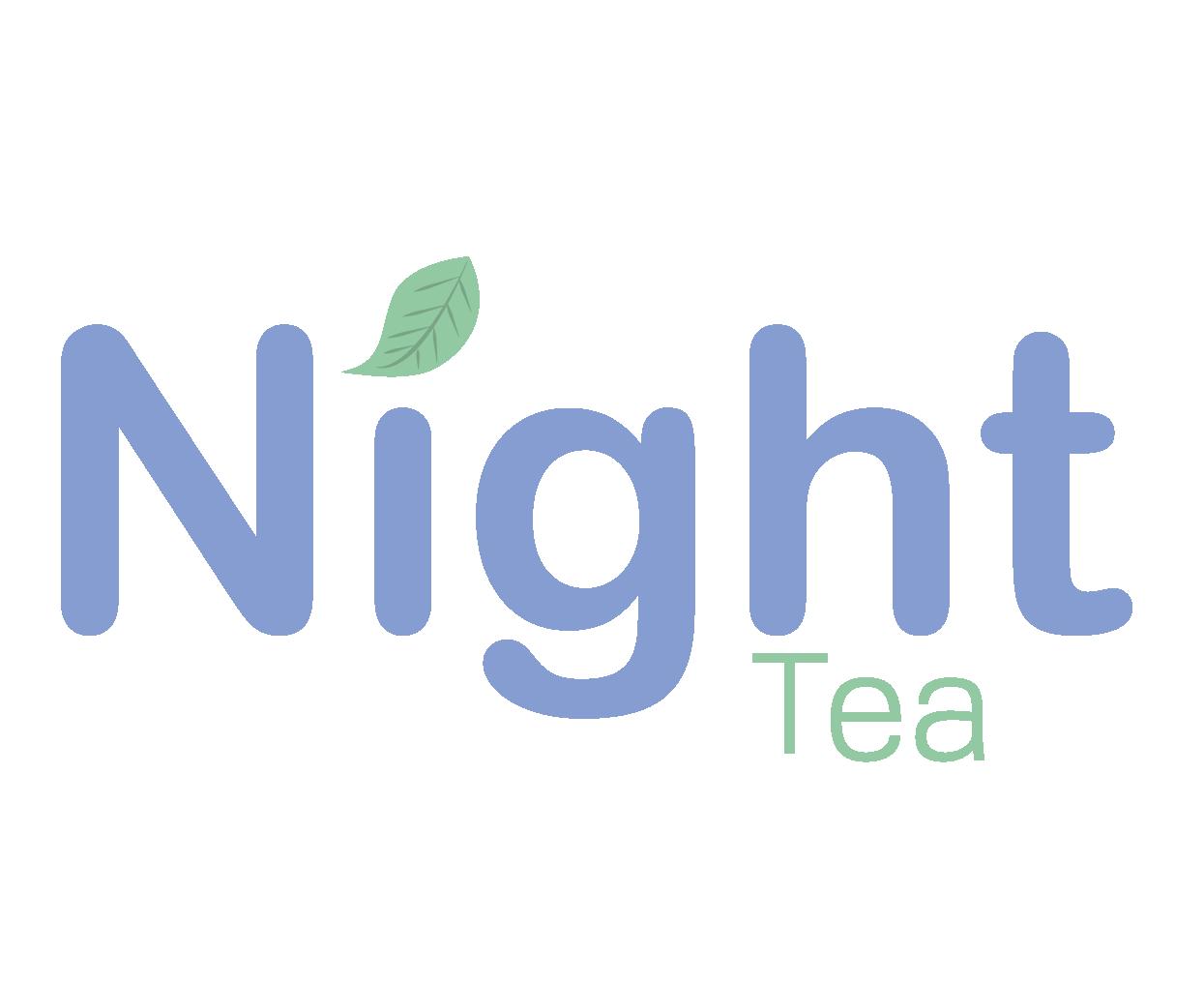
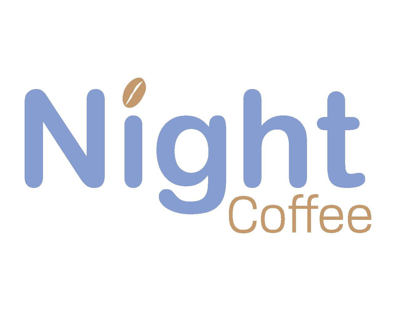
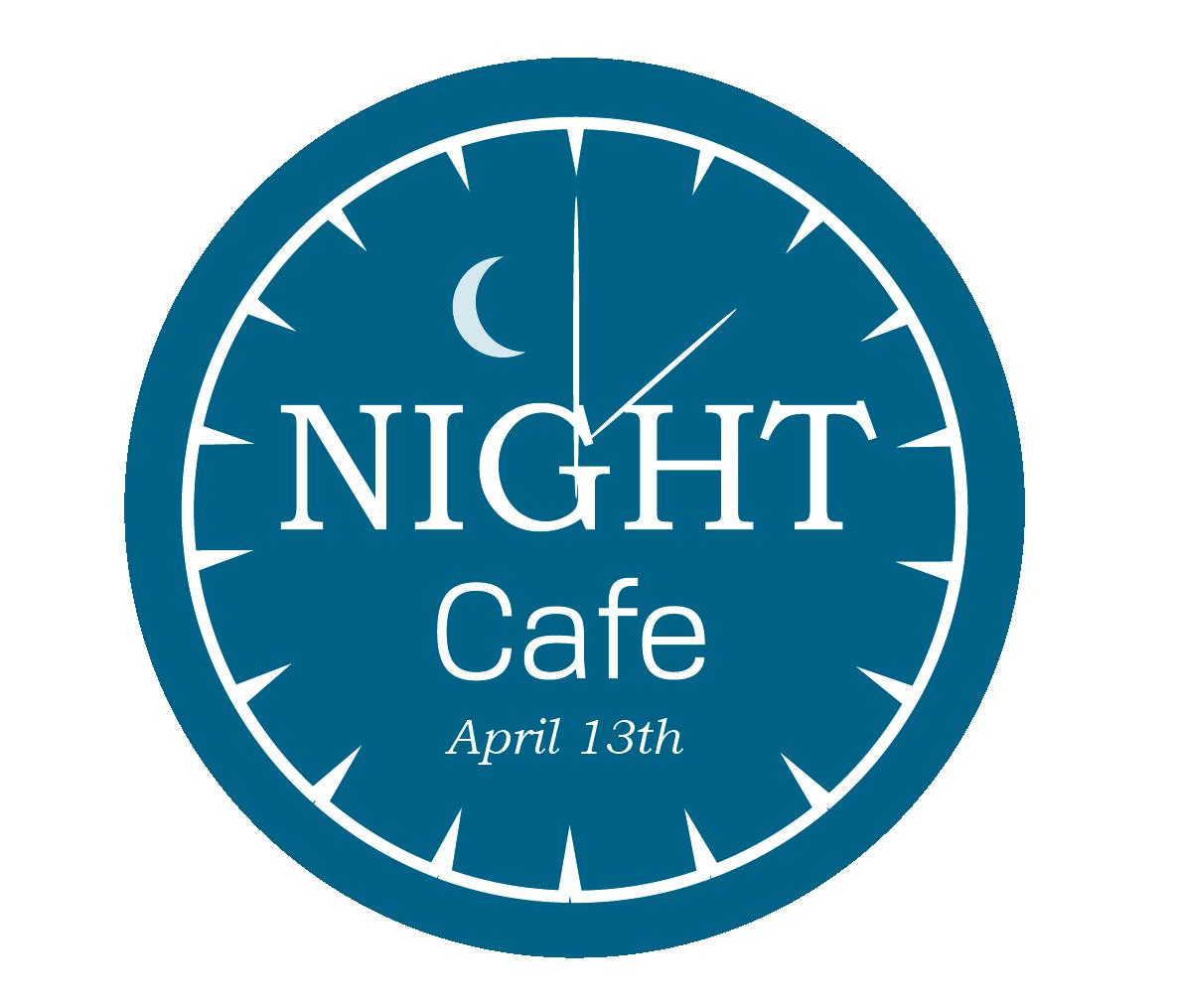
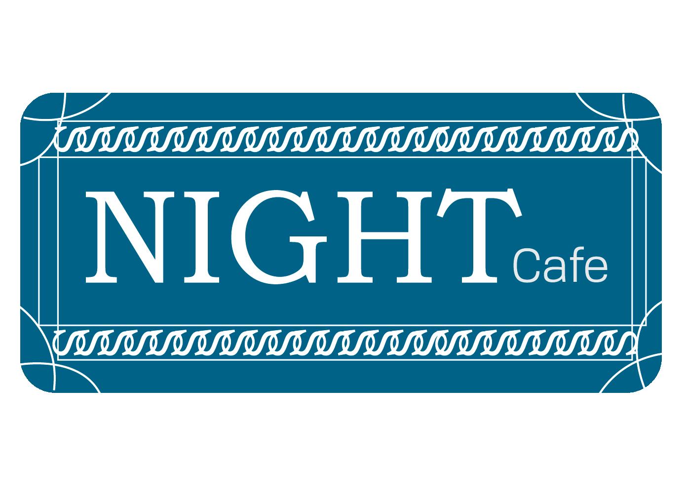
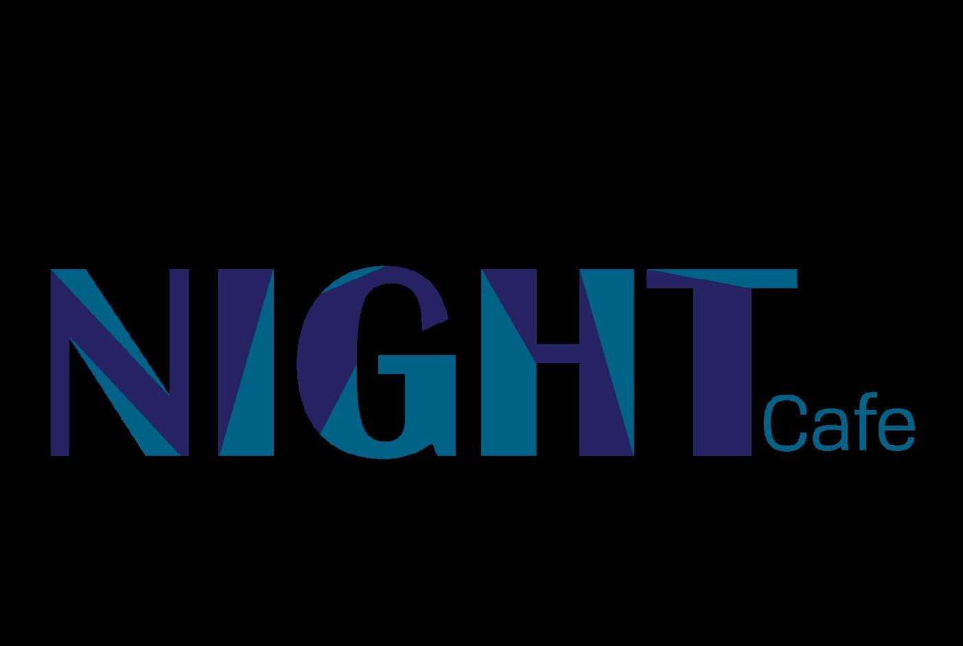
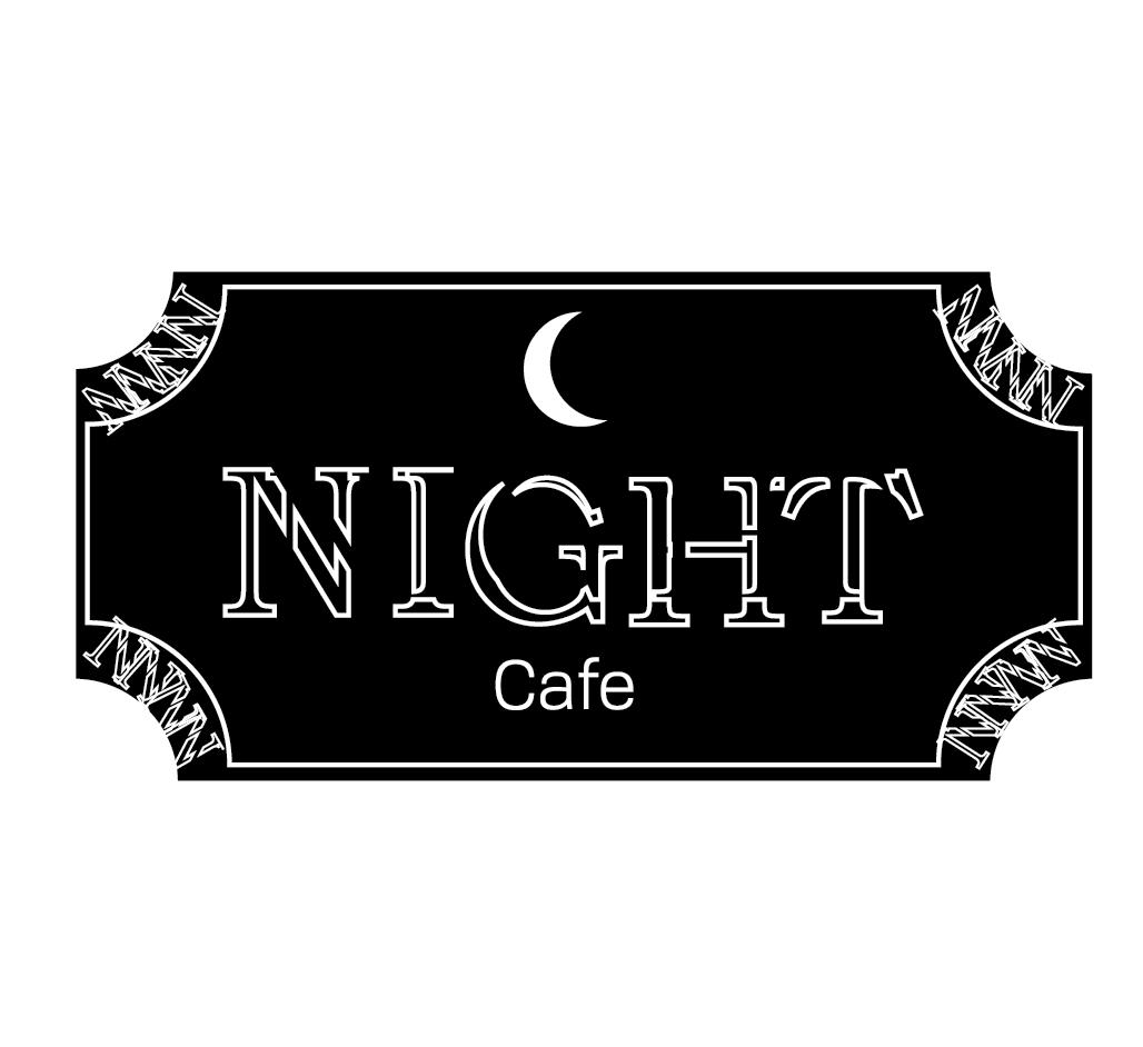
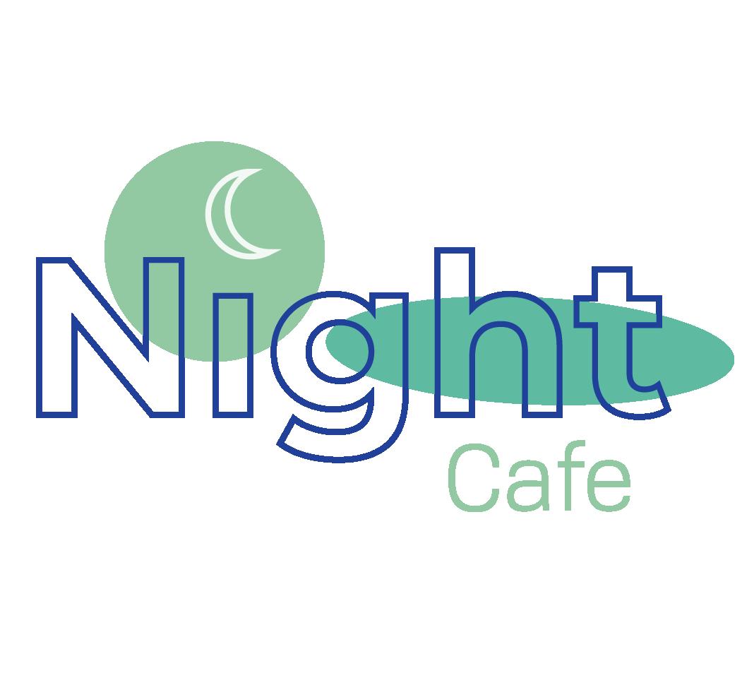
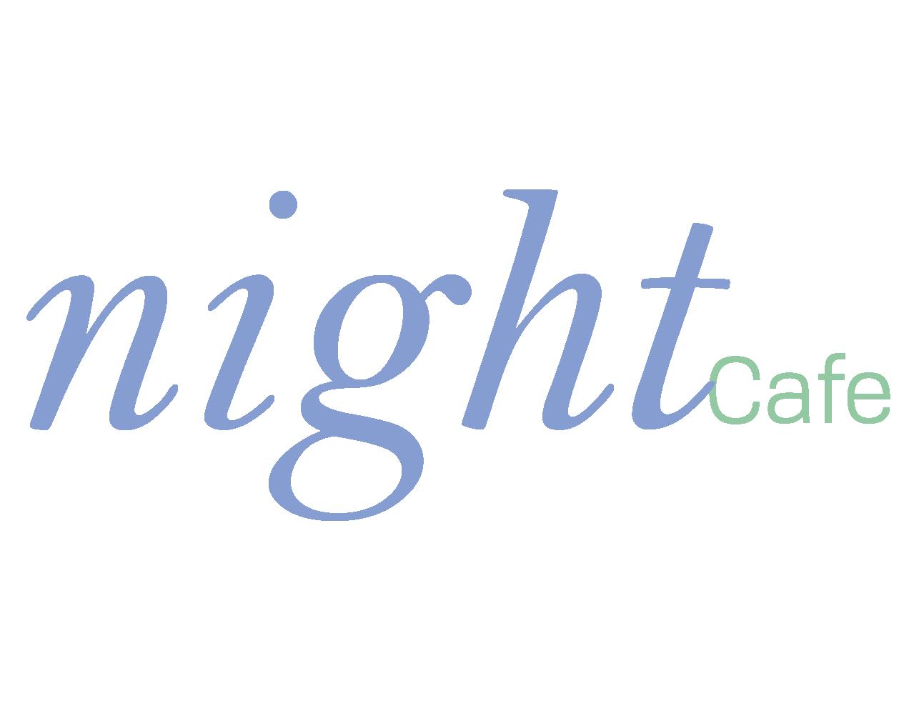
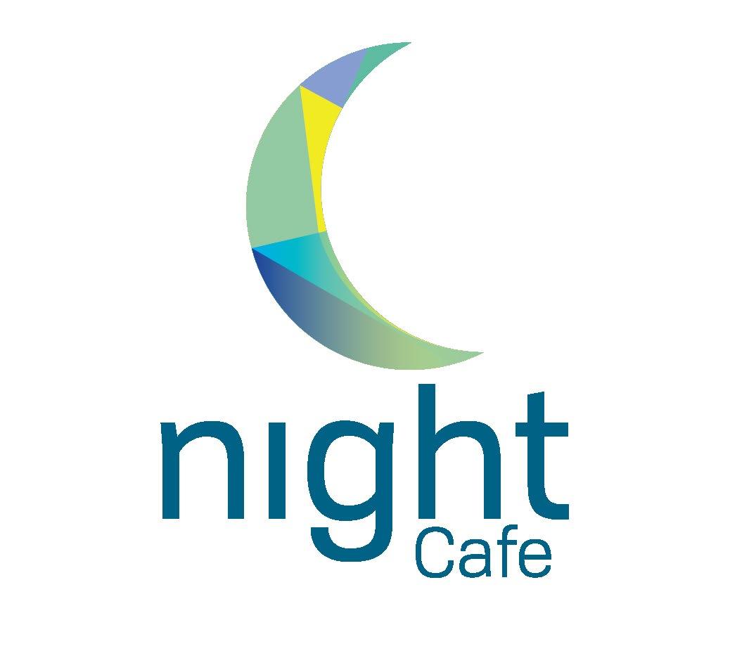
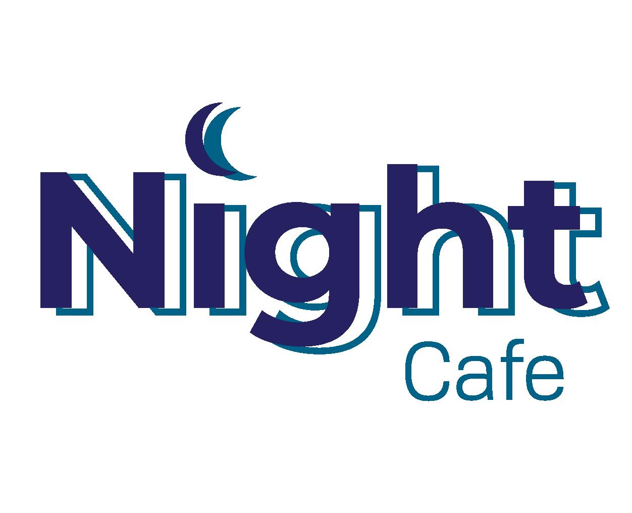
BRANDING TRENDS PROJECT
Night Cafe
The Branding Trends Project is where I had to create a logo using the same word in 12 different styles. I choose to do the word Night. The problem that I had to solve for this project was creating 12 logos that were well designed and would fit the each of the styles. The other problem that I faced was finding different fonts and colors that conveyed the theme of each of the styles. I solved this by making a base logo for the responsive style and began making changes to it to make it fit each of the styles. I also changed the fonts from script to sans serif . The constraints for the branding was creating the logos with the word Night.
The audience for this piece would be a wide range of people that are interested in opening a cafe and wanted a unique style for their logo. The piece appeals to them because it offers a wide variety of styles which will allow them to express the mood they want their cafe to give off.
Tools & Techniques:
Layout
Typography
Color Theory
Adobe Illustrator
Adobe InDesign
Adobe Photoshop
Responsive
Hand Written
Responsive
Responsive

Adaptive Texture/Detail Adaptive
Badge
Flat 2.0
NEG. Space
Historic Minimalism Perspective Geometric Memphis
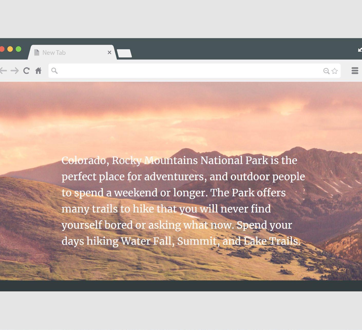
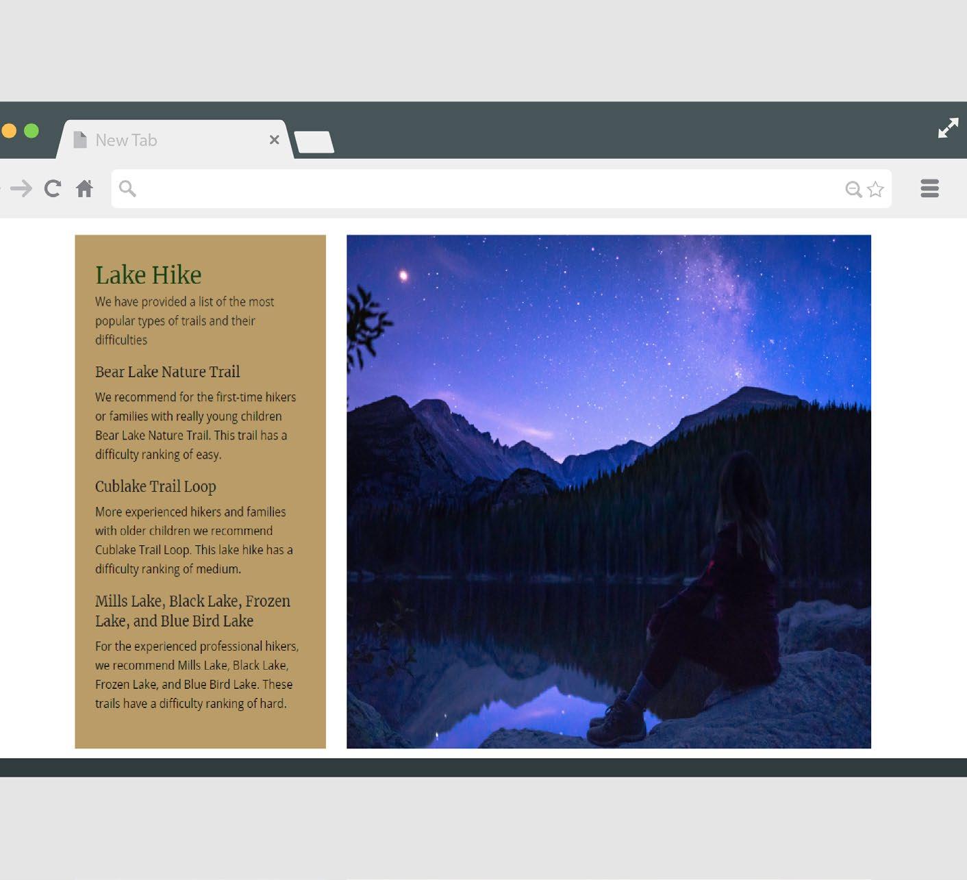
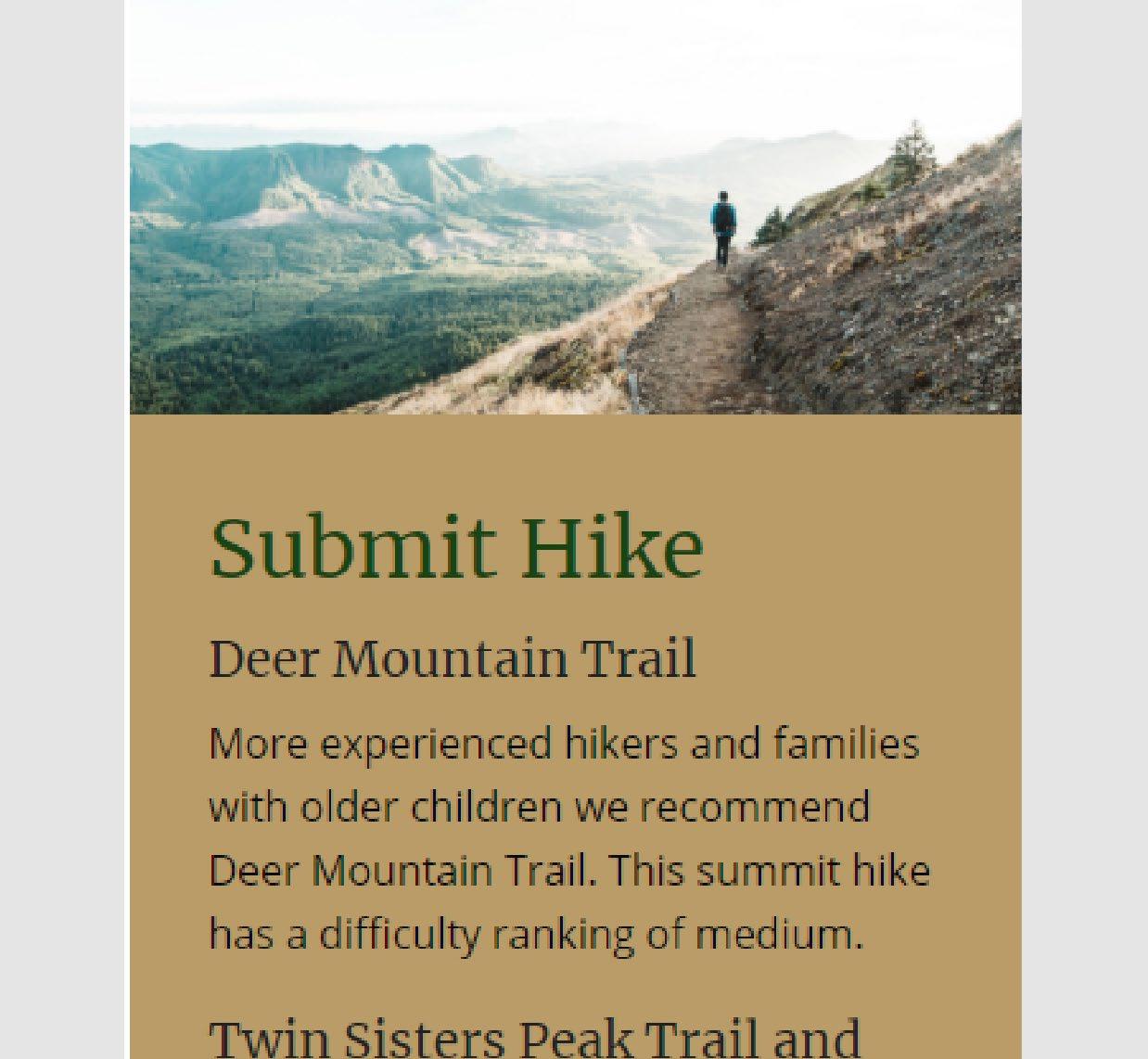
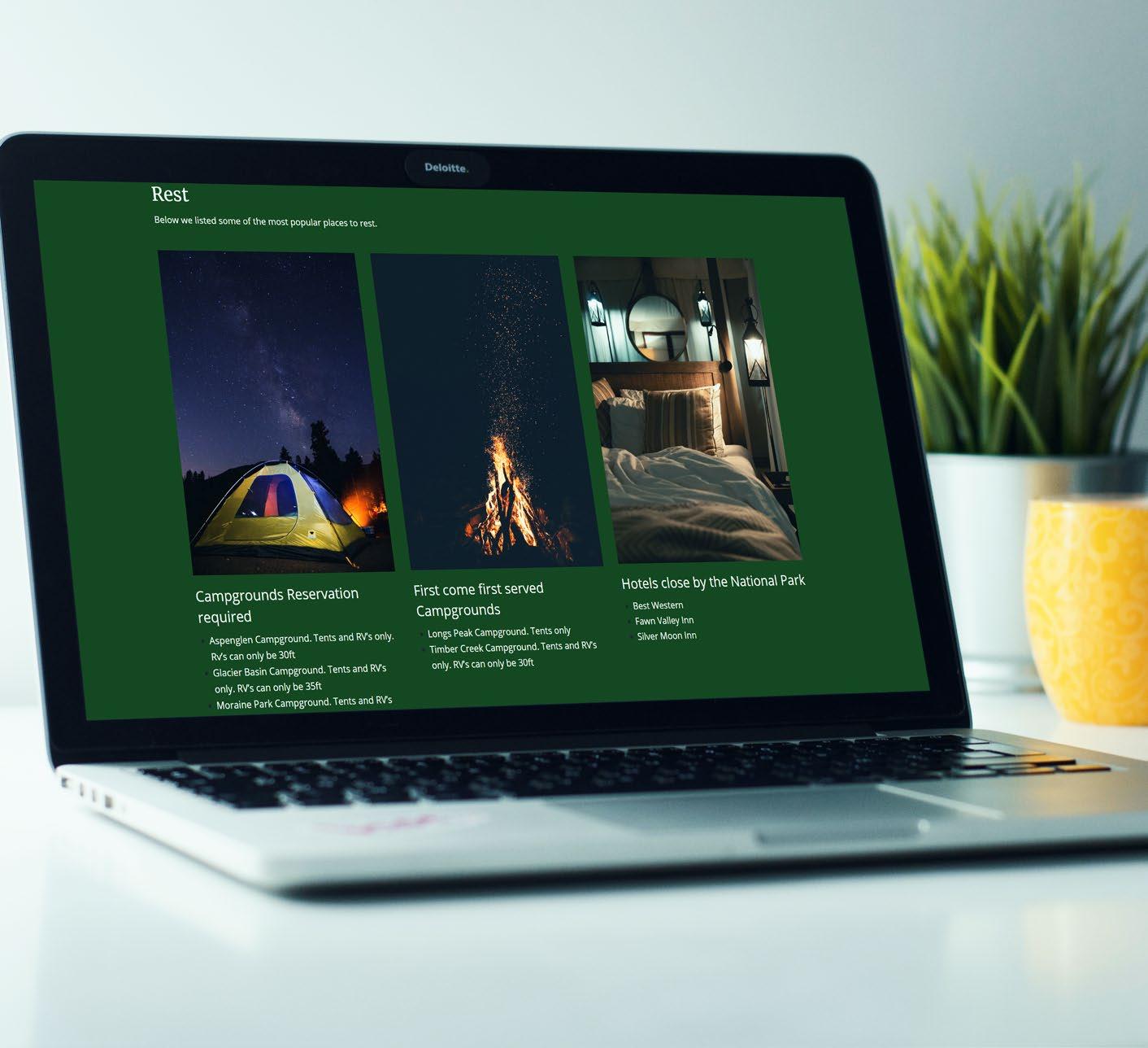
MICROSITE
Hike the Rocky Mountains
Project microsite was created to show how I can make a website that is compatible on both wide screens and mobile screens. The problem that I had to solve for this project was to come up with the content of a place that I want people to visit and break it down into three different sections. The constraints for the project was making sure that the sections were clear and that the site worked on big screens and mobile screens.
Audience for this website would be a wide range of people that like to do outdoor activities. This website appeals to them because it gives them a list of things they can do, where they can stay the night, and peoples testimonies.
Tools & Techniques:
Layout
Typography
Color Theory
Adobe Illustrator
Sublime Text
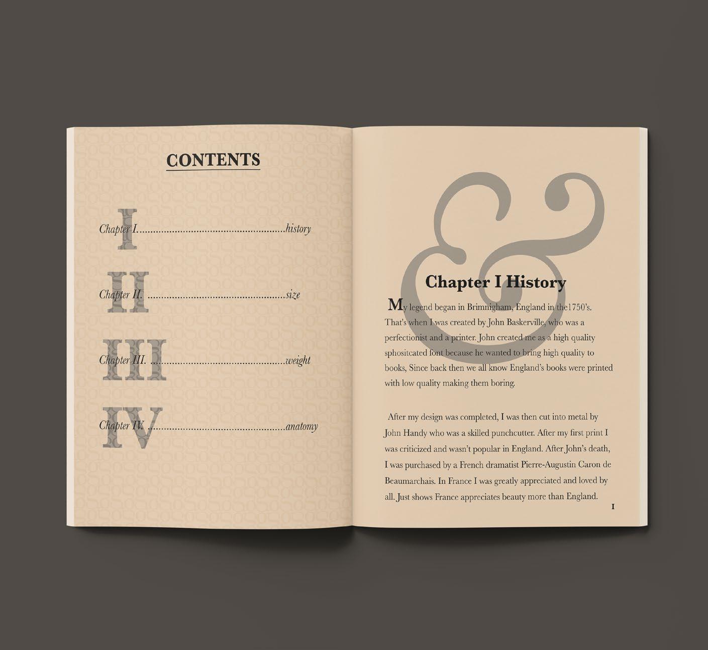
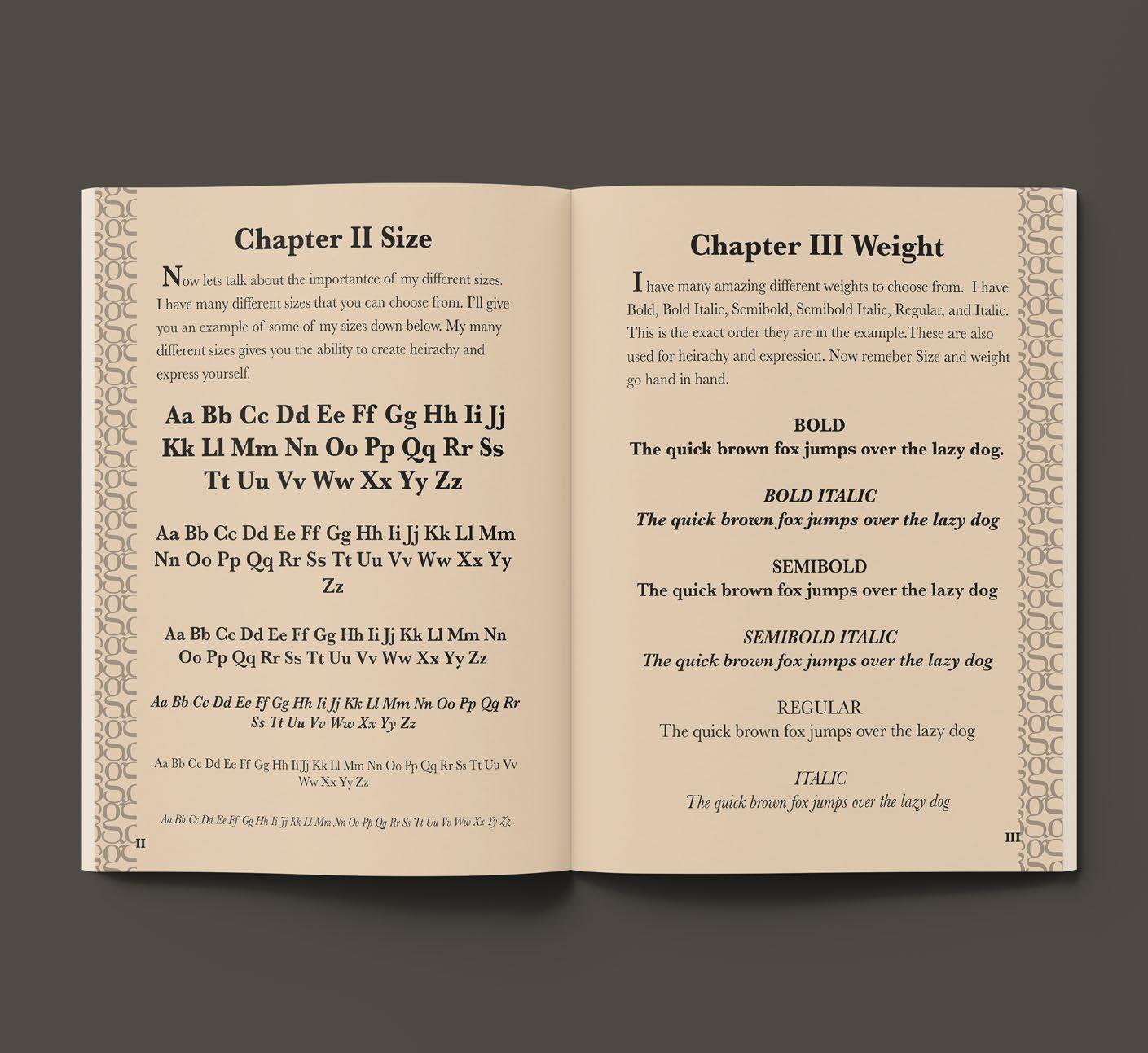
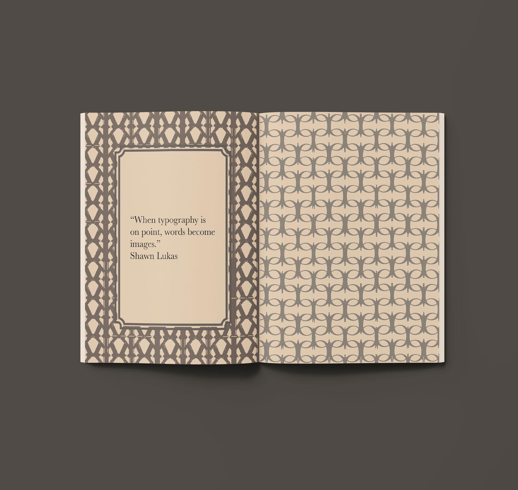
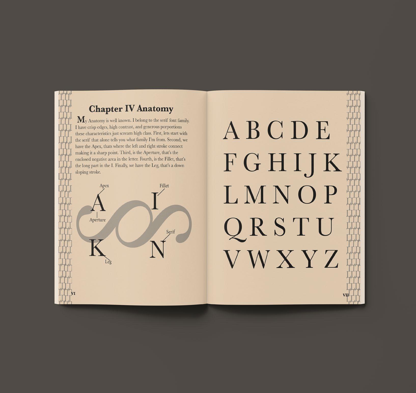
TYPE BOOK
Baskerville Type Book
This Type book was created to show the Baskerville font and to give a brief background of the creator John Baskerville and how the font came to be. The problem that I had to solve for this project was how to design a type specimen book using only Baskerville fonts. The constraints for the type specimen book was developing hierarchy, creative designs using only one type family Baskerville and making the book interesting and appealing to the reader.
The audience for this piece would be typography fanatics and those who are interested in type specimen books. The piece appeals to them by showing the different ways you can create hierarchy and designs with in the same font family by just adjusting the weight, size, and placement of the fonts and how the content is laid out.
Tools & Techniques:
Layout
Print Design
Typography
Color Theory
Adobe Illustrator
Adobe InDesign
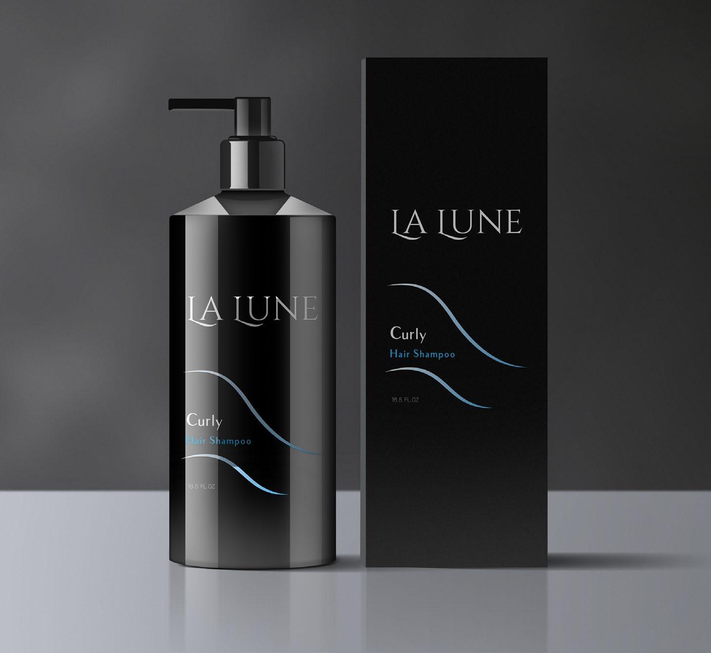
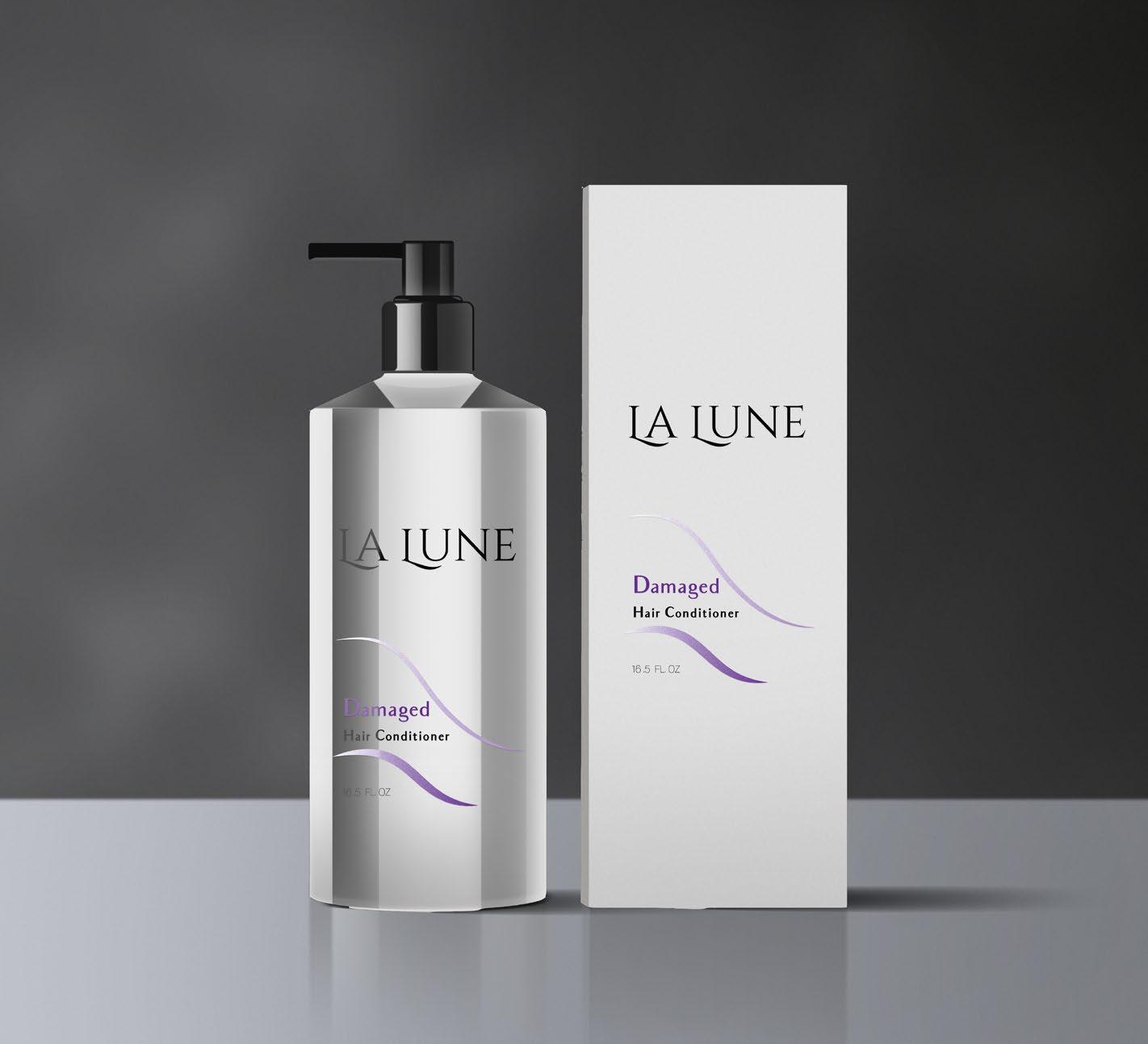
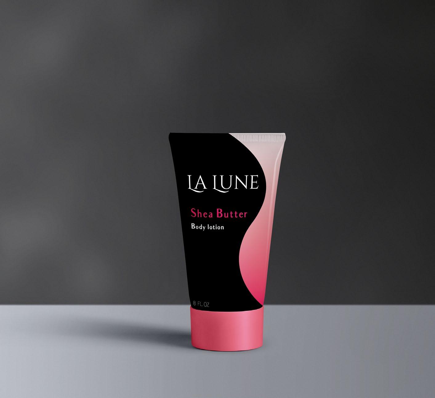
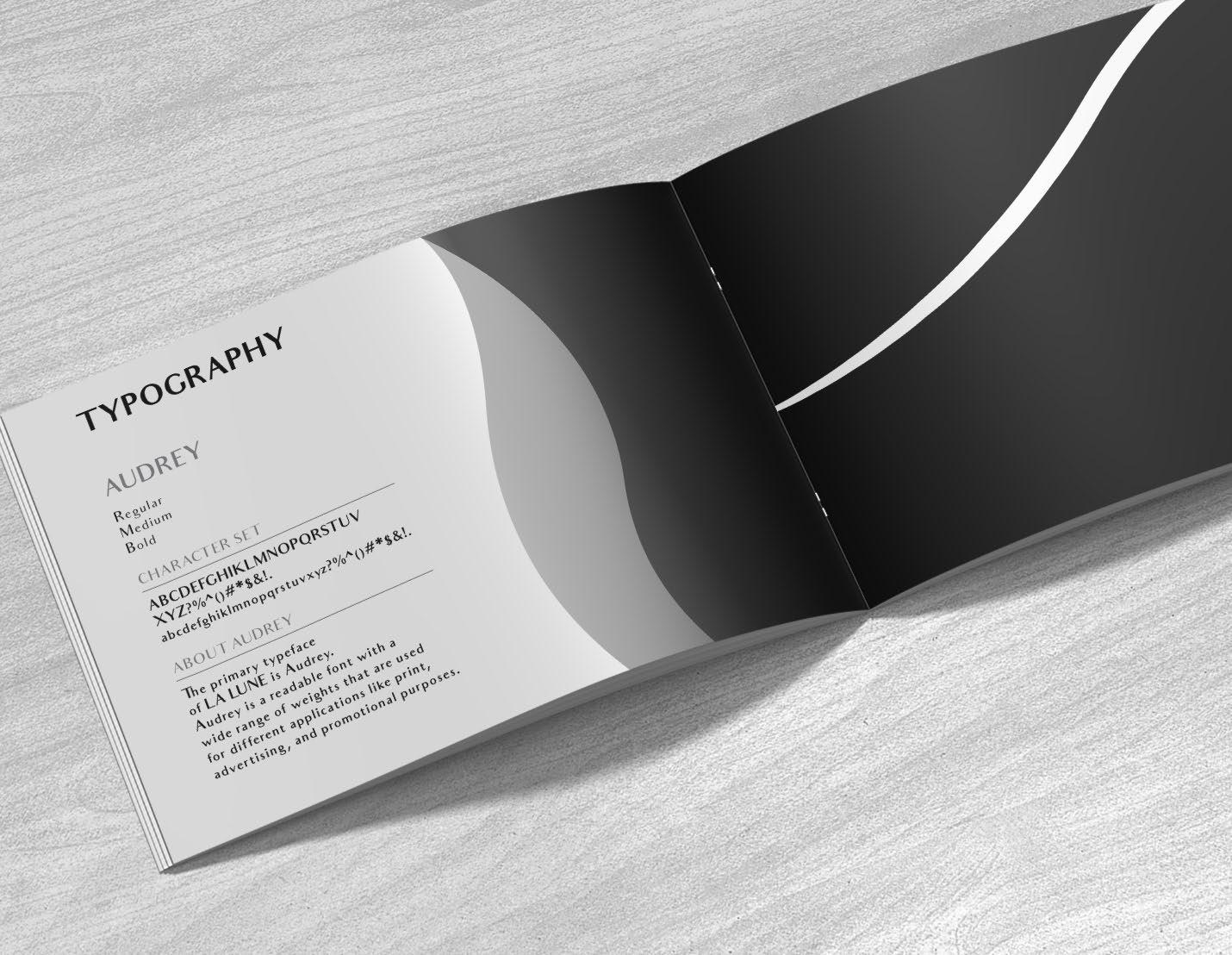
DESIGNING FOR THE BASICS
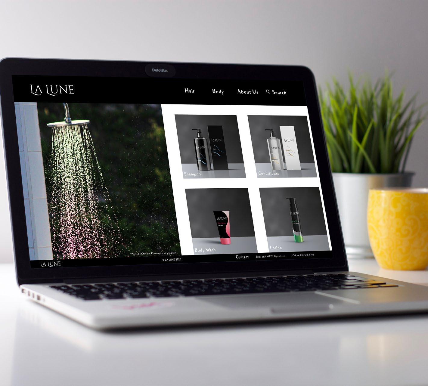
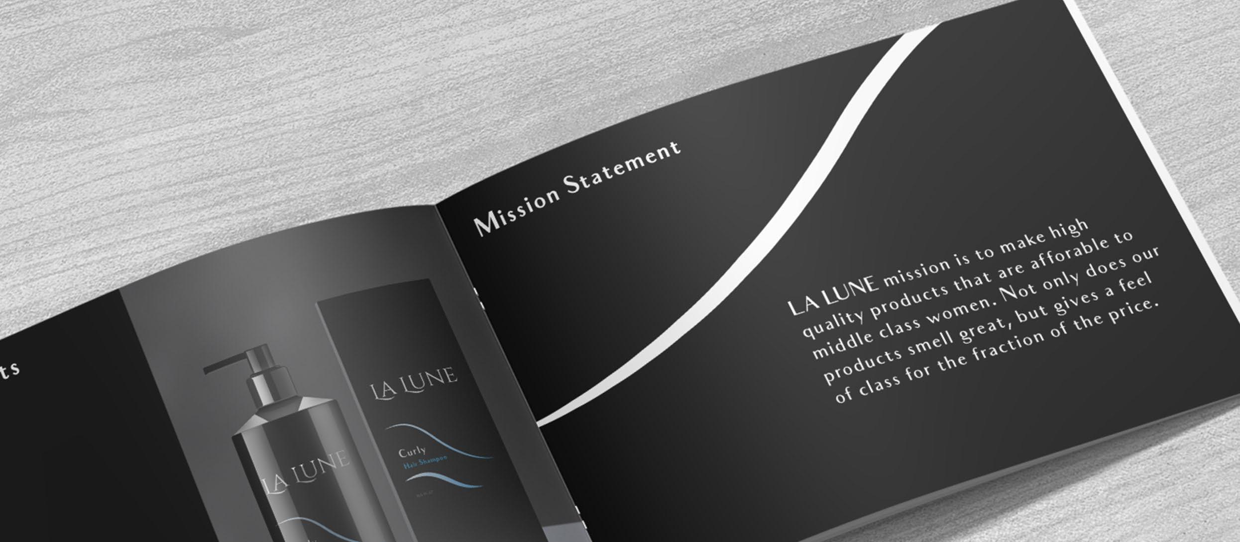
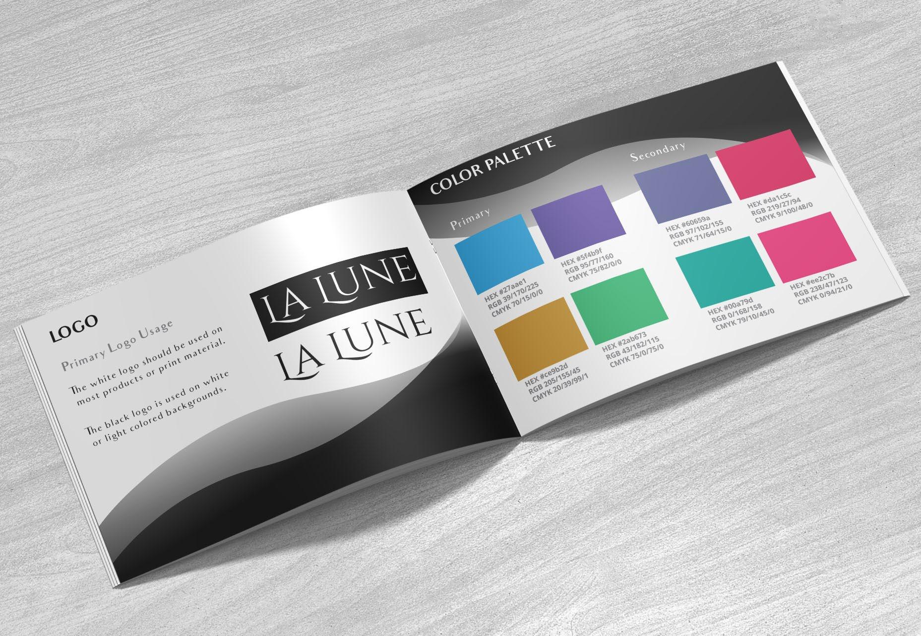
La Lune
The designing for the basics project is where I had to create a logo and packaging for a product line. I choose to do the products shampoo, conditioner, body wash, and lotion. The problem that I had to solve for this project was creating a logo that expressed the theme of the company and packaging design that was cohesive throughout the line but was different for each product. The other problem that I faced was finding different fonts and colors that conveyed the theme of the brand. I solved this by using a sans serif font that expressed elegance like the logo but didn’t out shine the logo. I also stuck with a basic color palette of blues, purples, greens, pinks, and yellows. The constraints for the product line was sticking to the products given.
The audience for this piece would be middle class women that are 18 -45 that want to feel classy. The piece appeals to them because its affordable and its branding gives it a sense of elegance that makes them feel high class.
Tools & Techniques:
Layout
Branding
Typography
Color Theory
Adobe Illustrator
Adobe InDesign
Adobe Photoshop
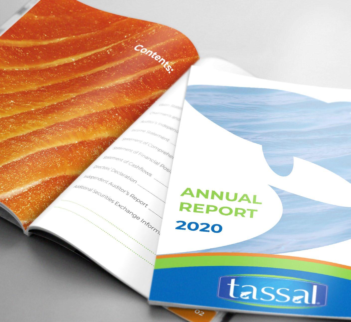
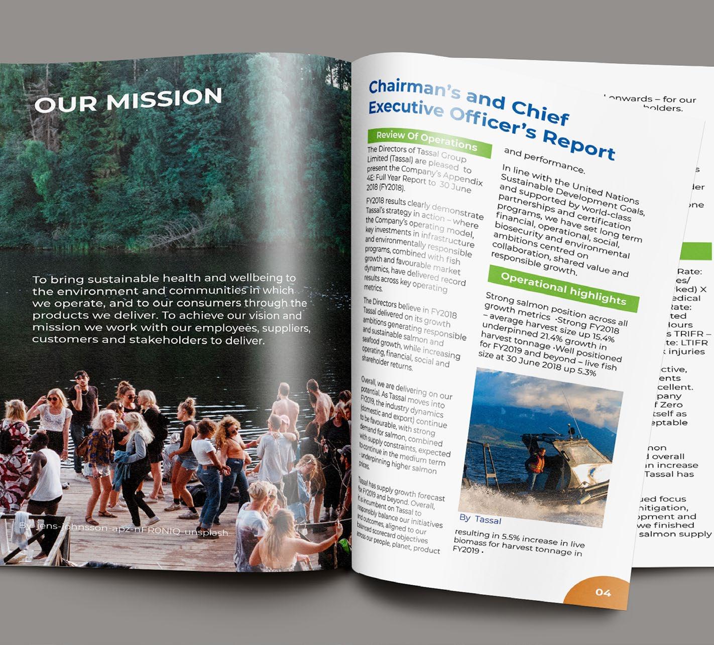
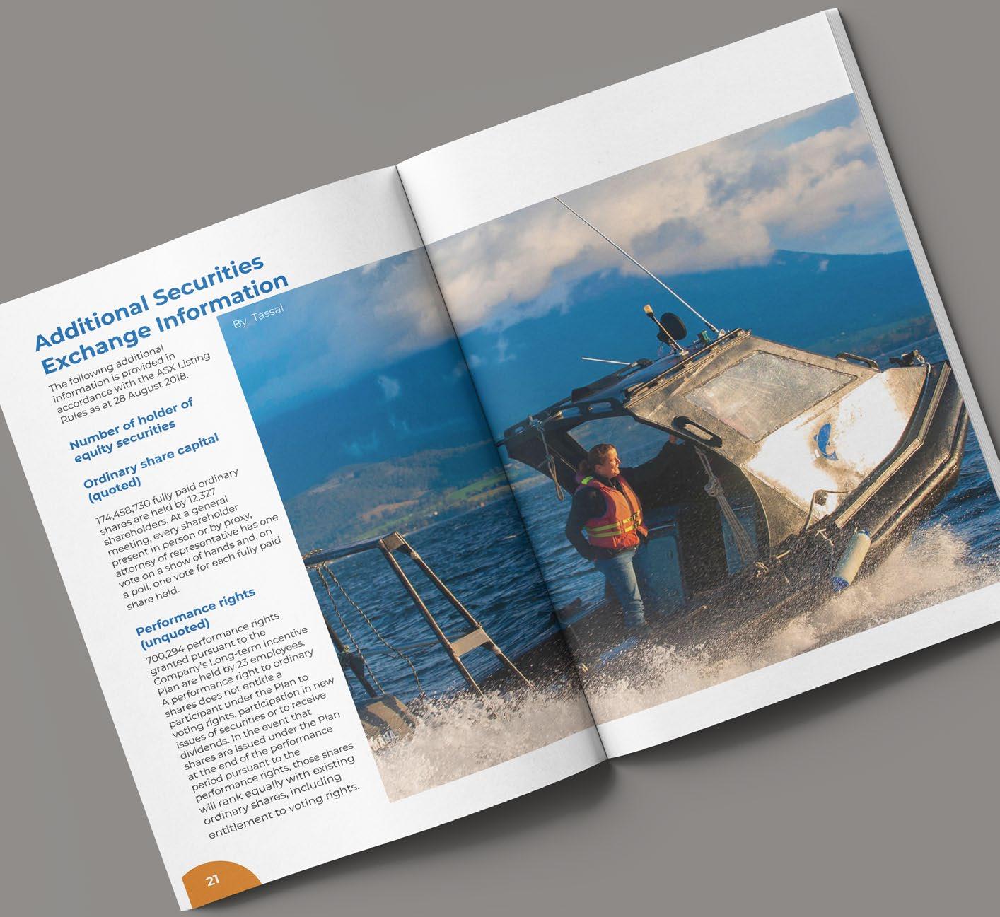
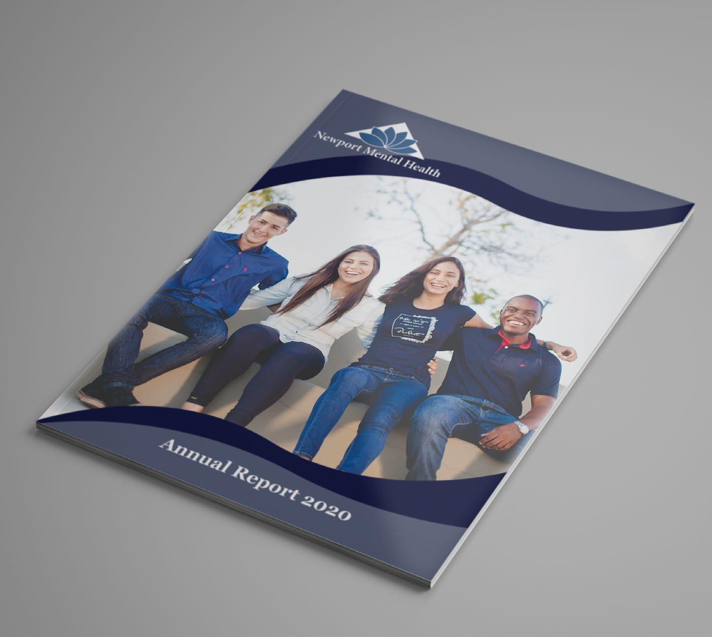
ANNUAL REPORT
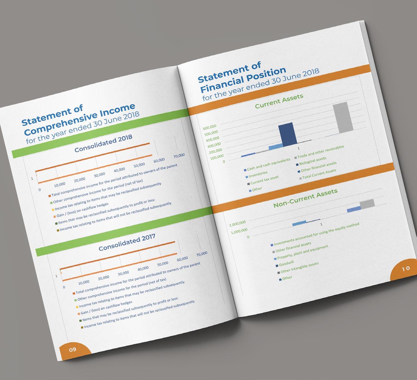
Tassal Annual Report
The Annual Report project was where I was given an annual report from a company and had to redesign it to make it fit their theme and was more appealing. The problem that I had to solve for this project is figuring out what parts of the original report was important and which pictures would best fit in it along with creating hierarchy and font pairing that expresses the company’s character. The constraints for the annual report was making sure it was appealing to the investors and that it felt like it belonged to that company.
The target audience for this piece would be investors interested in a salmon farm company and the president of the company. The piece appeals to them because it shows what the company’s mission is and how well they’re doing which persuades the investors to invest in the company.
Tools & Techniques:
Layout
Print Design
Typography
Color Theory
Adobe Illustrator
Adobe InDesign
Adobe Photoshop
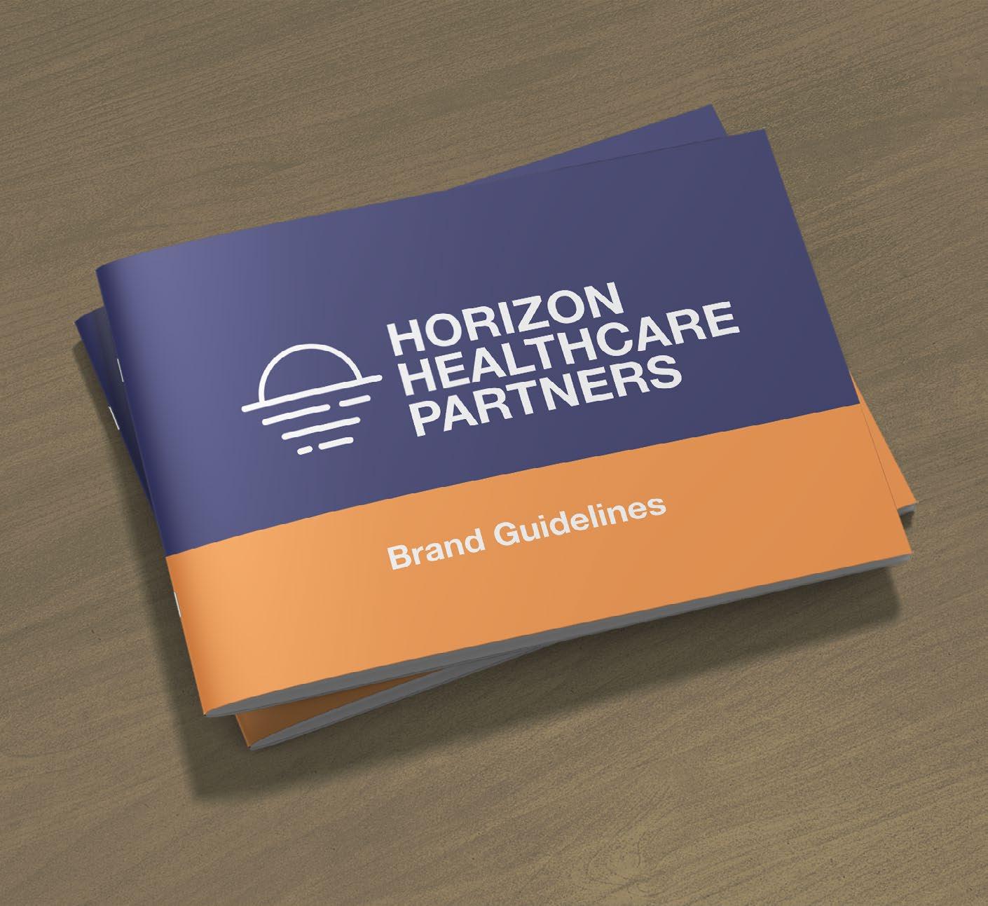
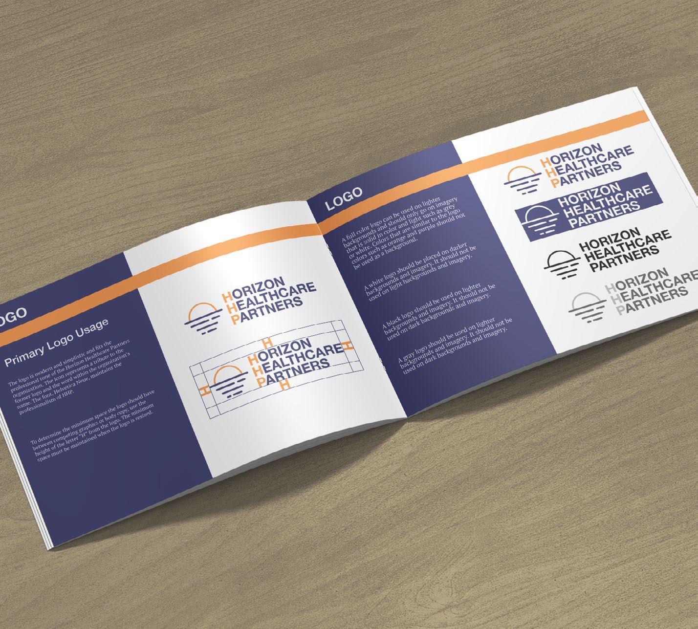
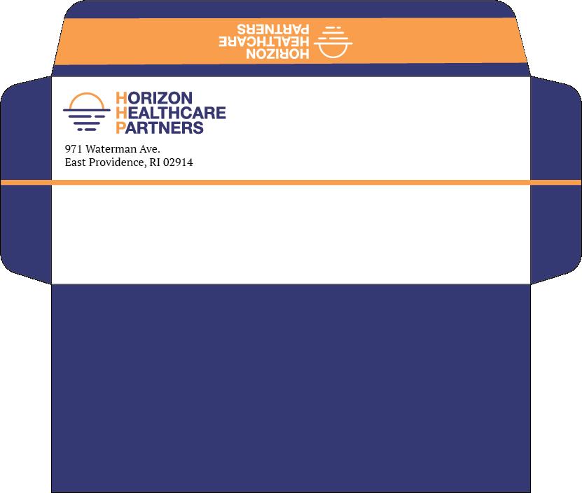
HHP
Horizon Healthcare Partners
The HHP project is where I had to create a brand guide, presentation template, and envelope for the Horizon Healthcare Partners organization. I used the design elements from their logo to help bring out their theme. For the fonts I used Helvetica Neue for the headings and PT Serif for the body copy. this created the needed hierarchy. The color palette is made of a dark blue with the highlights of an orange. Combining all these elements helped to make the pieces feel like they all belonged to the same brand and express the same theme.
The audience for this piece would be employees that are designing new products for HHP. The piece appeals to them because it shows them what they’re allowed to do with the logo, what fonts to use and how, and what colors.
Tools & Techniques:
Layout Branding Typography Color Theory Adobe Illustrator Adobe InDesign Adobe Photoshop
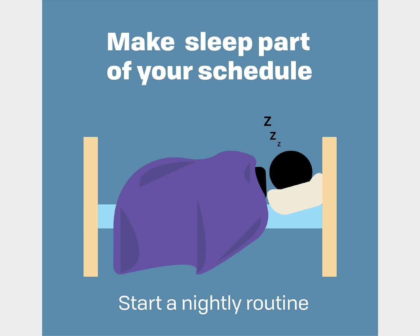
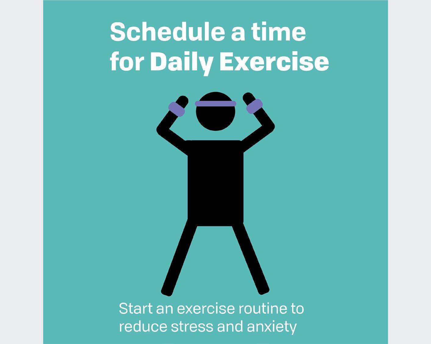
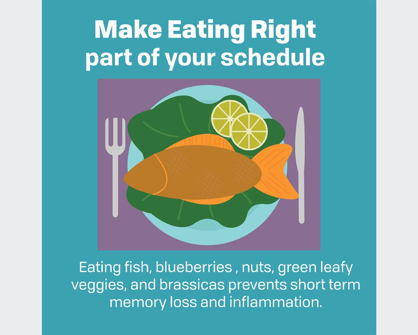
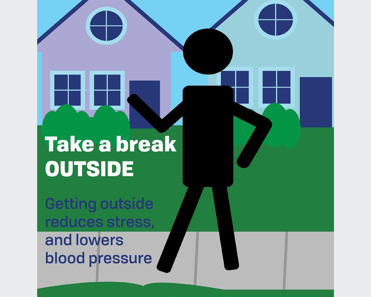
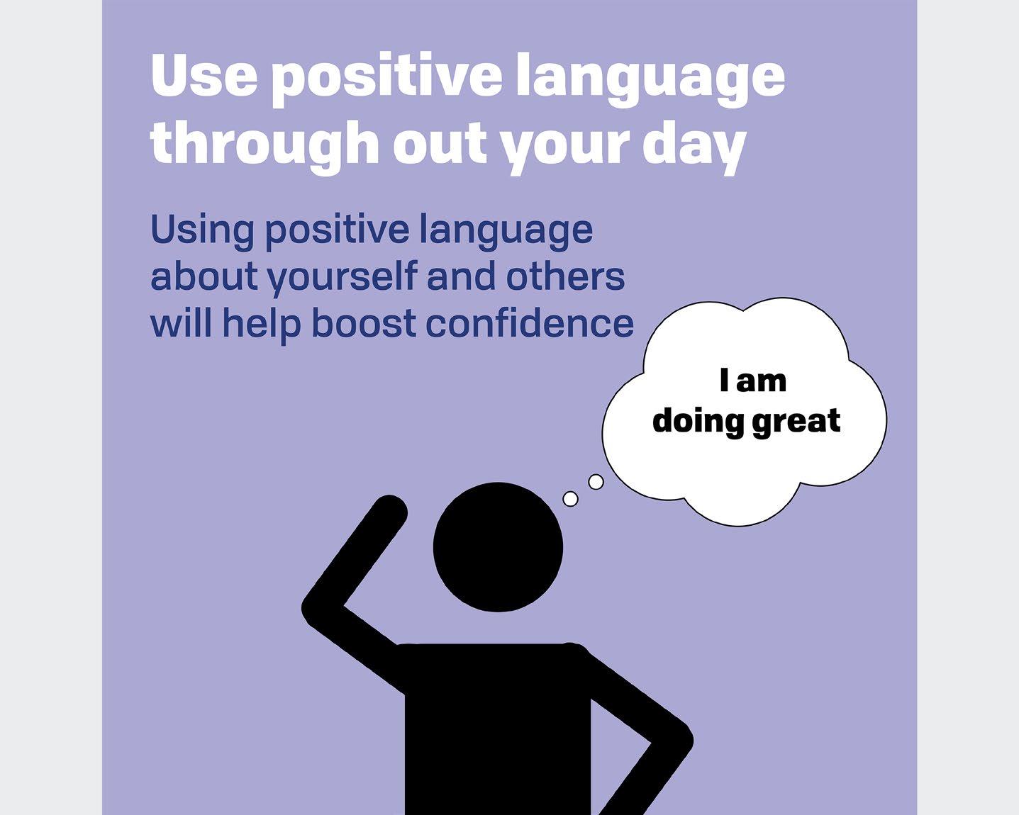
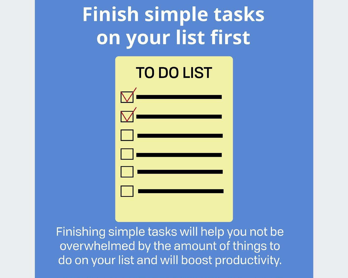
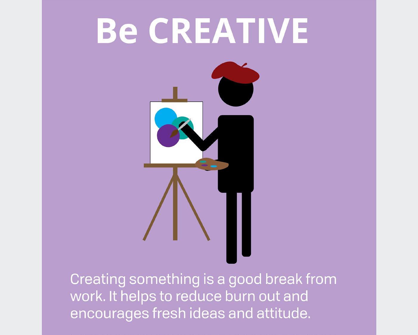
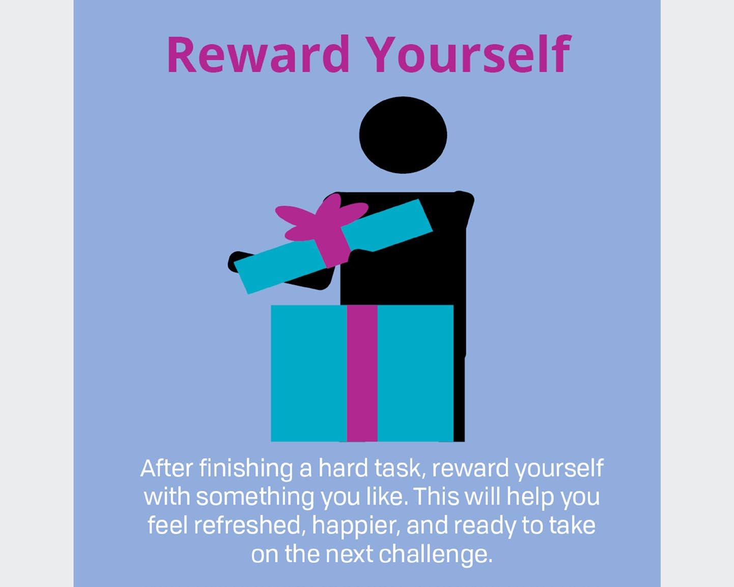
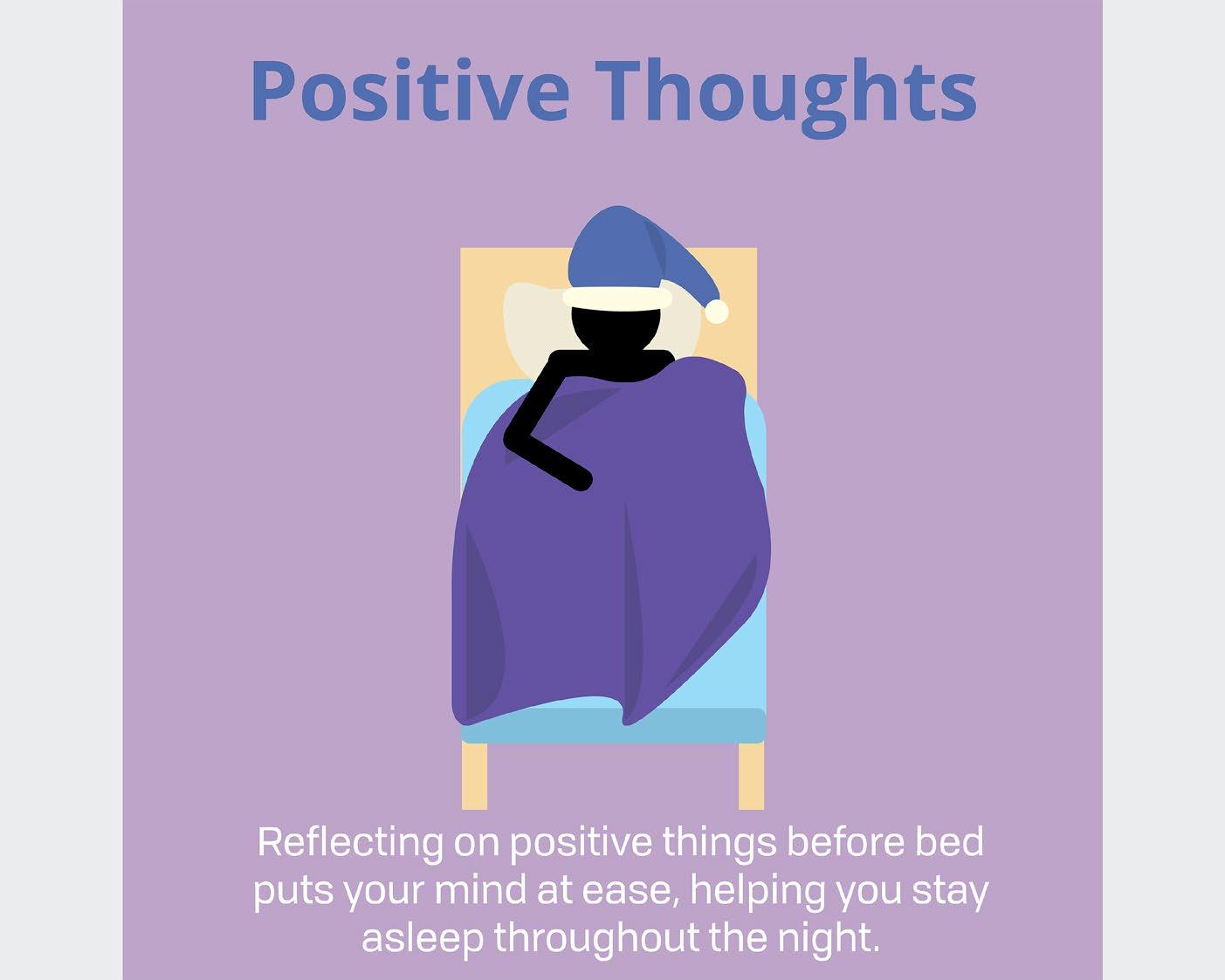
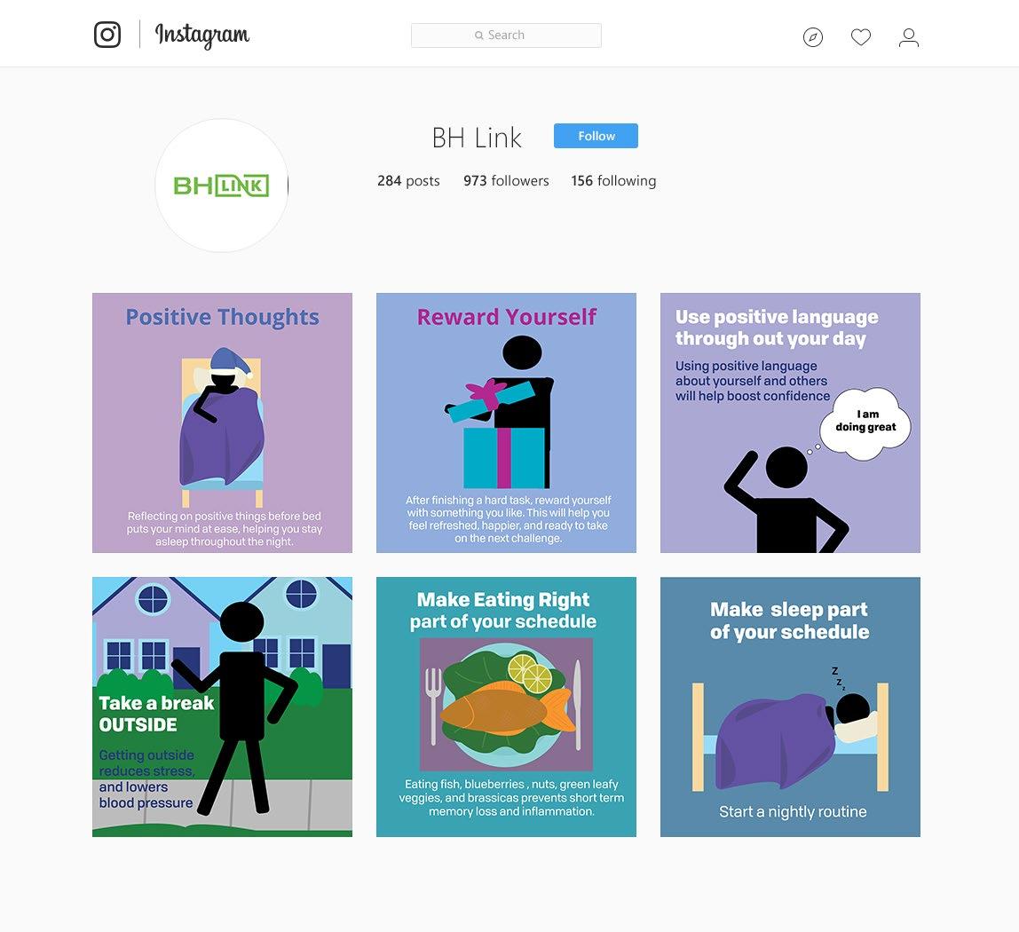
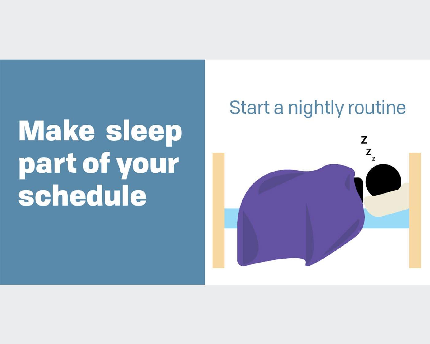
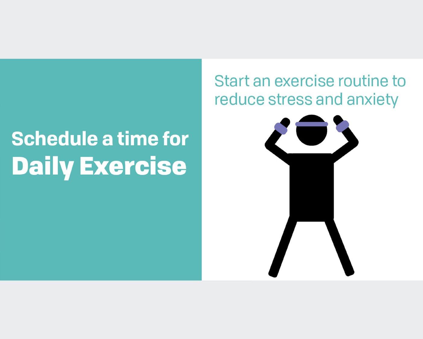
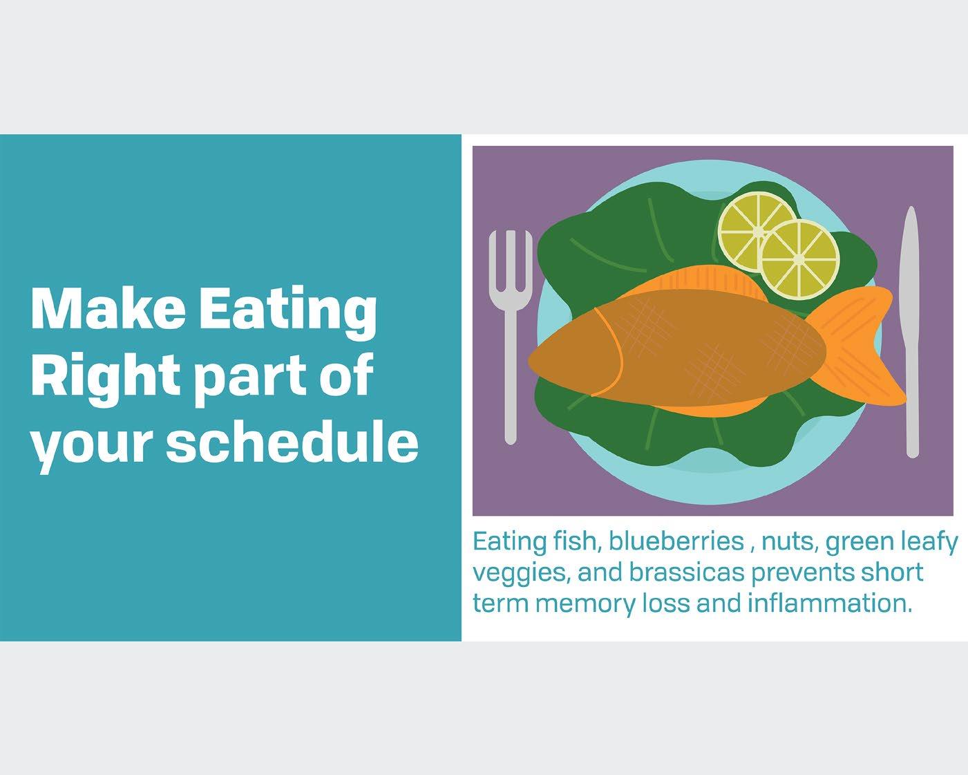
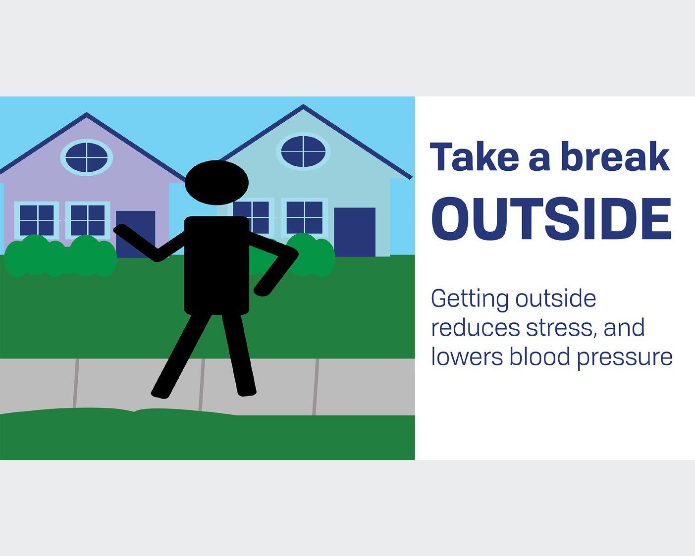
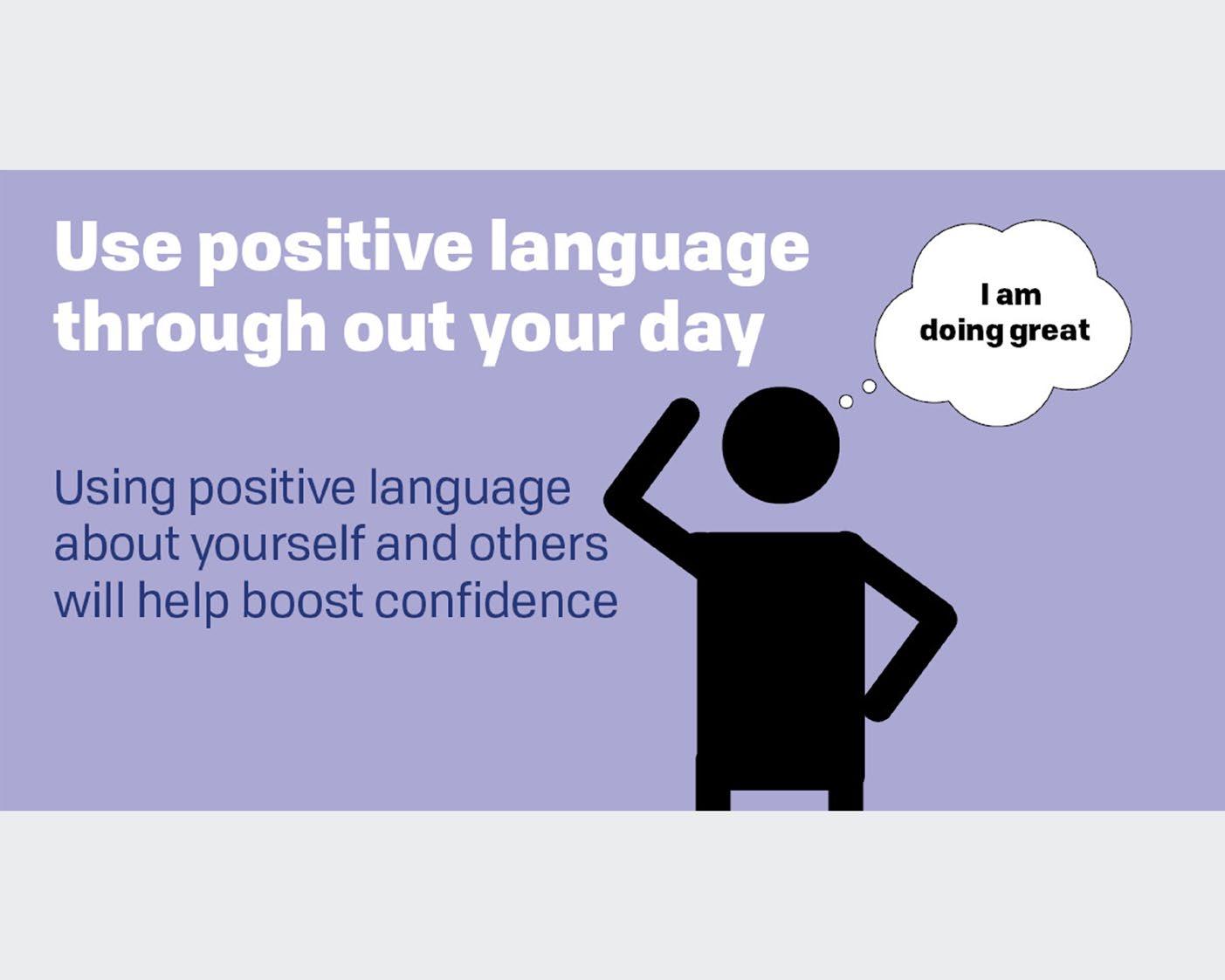
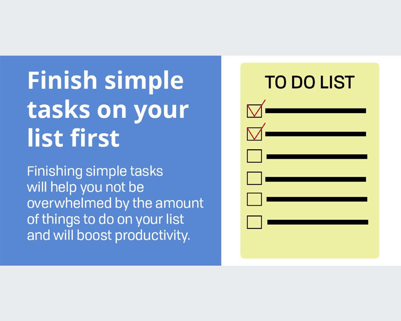
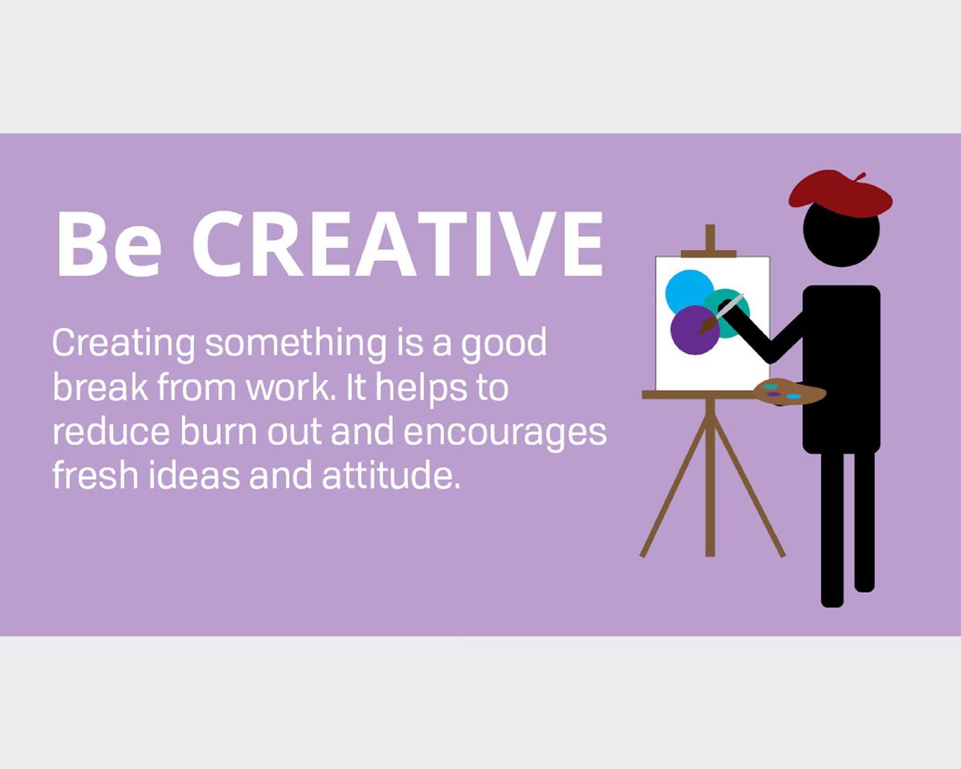
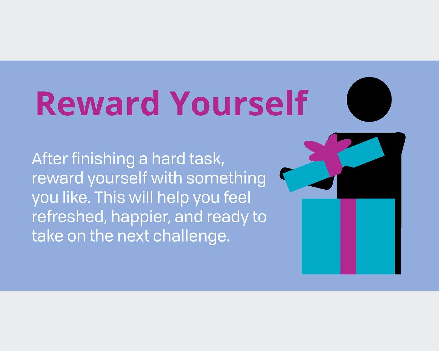
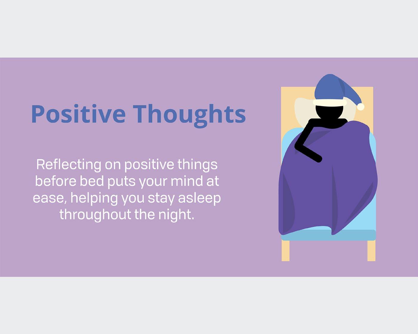
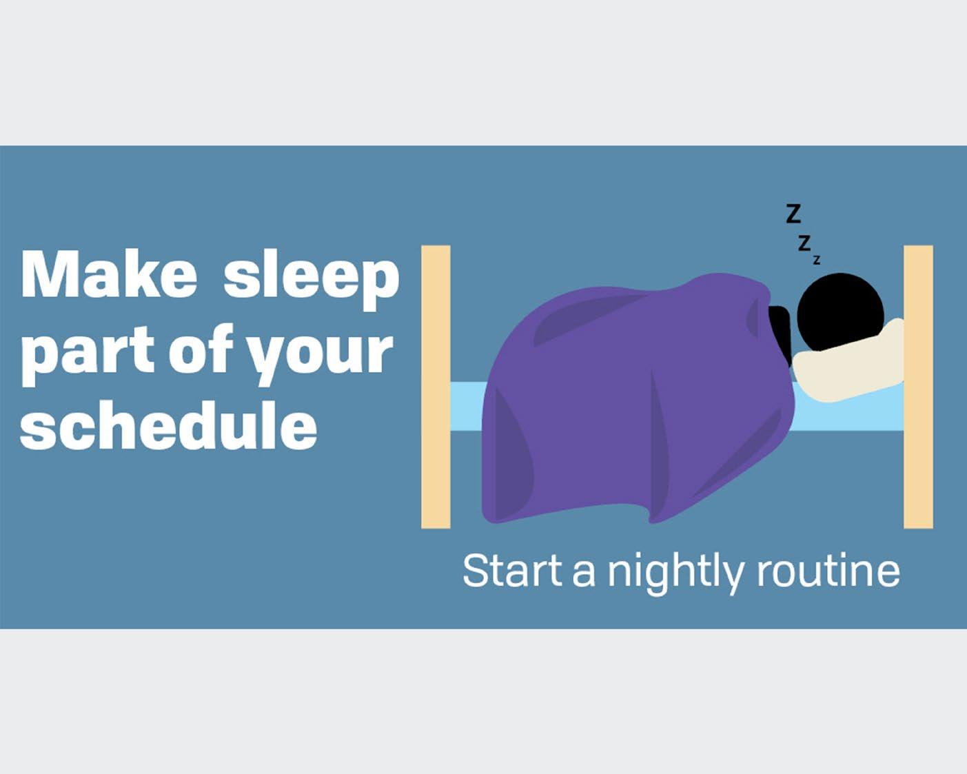
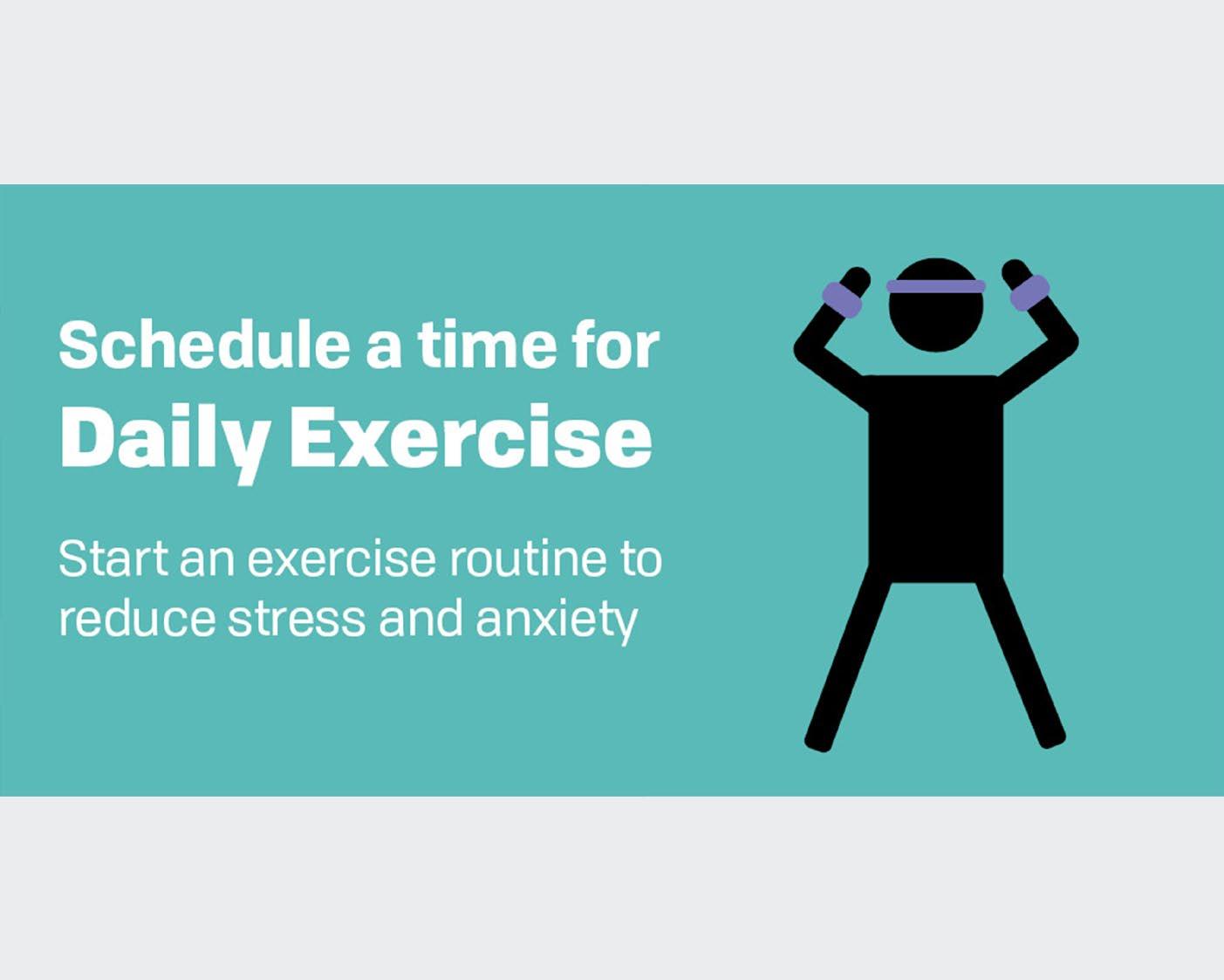
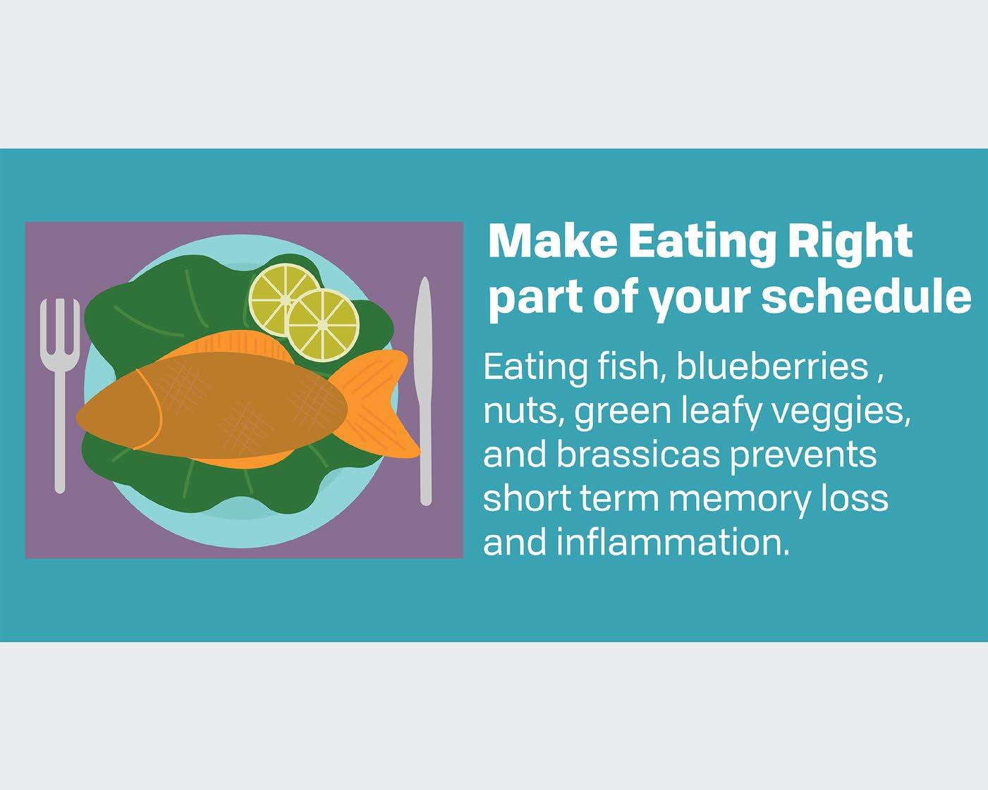
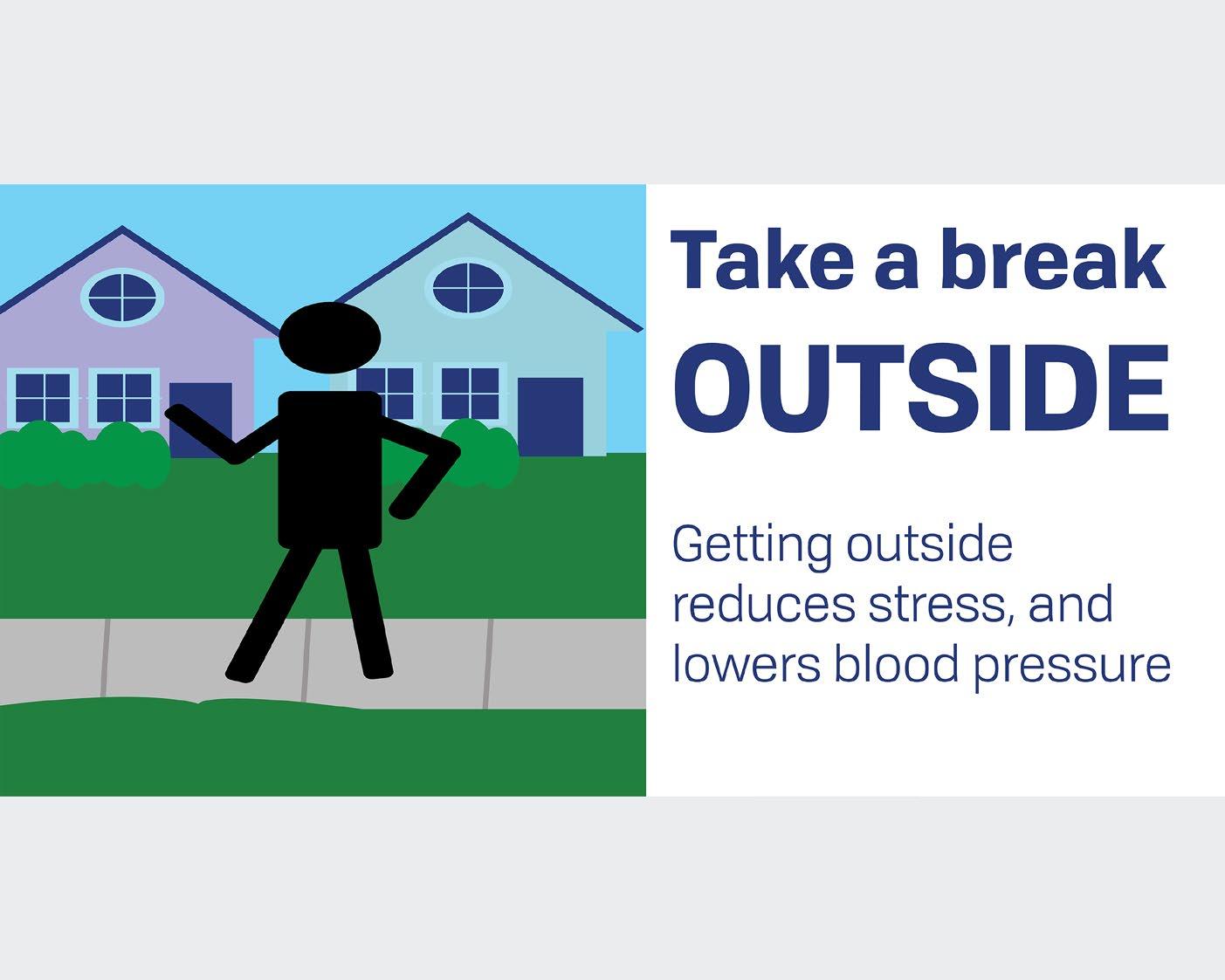
SELF CARE TIPS
BH Link Social Media Post
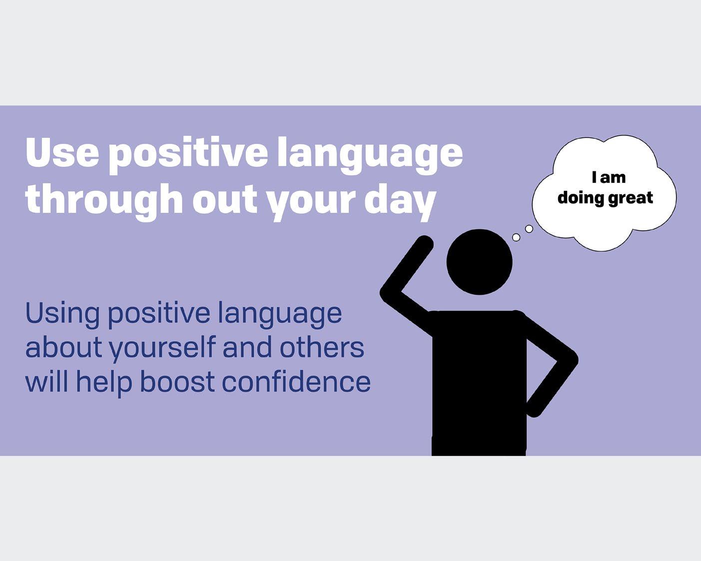
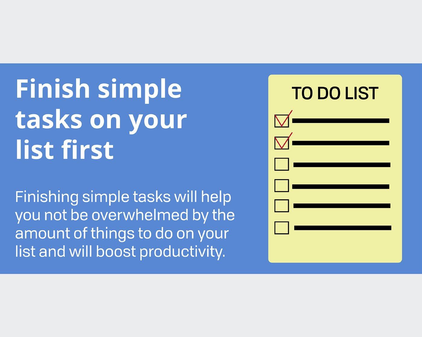
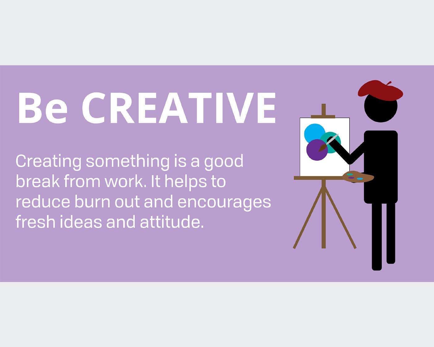
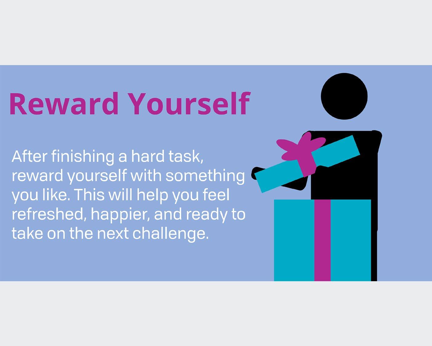
The Selfcare project is where I had to create social media posts with self care tips for Instagram, Facebook, and Twitter for BH Link. I choose the tips getting enough sleep, exercising, eating right, getting outside, using positive language, completing simple tasks, being creative, rewarding yourself, and using positive thoughts. The problem that I had to solve for this project was creating posts that were easy to understand and that would catch viewers attention. The other problem that I faced was finding different colors that conveyed the theme of each of the styles. I solved this by using basic mid tone colors, bolding and capitalizing certain phrases, along with using Illustrations.
The audience for this piece would be a wide range of people that are interested in self care and how to use it through their day. The piece appeals to them because it offers a wide variety of tips, which will allows them to practice the tips in their daily routine.
Tools & Techniques:
Layout
Typography
Color Theory
Adobe Illustrator
Adobe InDesign
Adobe Photoshop
Instagram Instagram Instagram Instagram
Instagram Instagram Instagram Instagram Instagram Mockup
Facebook Facebook Facebook Facebook Facebook Facebook
Facebook Facebook Twitter Twitter Facebook Twitter
Twitter Twitter Twitter Twitter Twitter Twitter
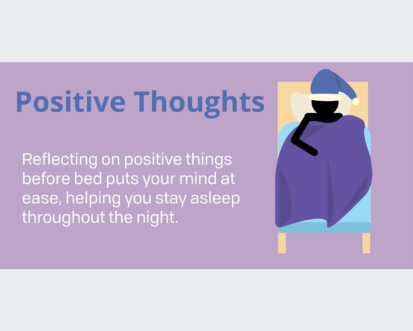
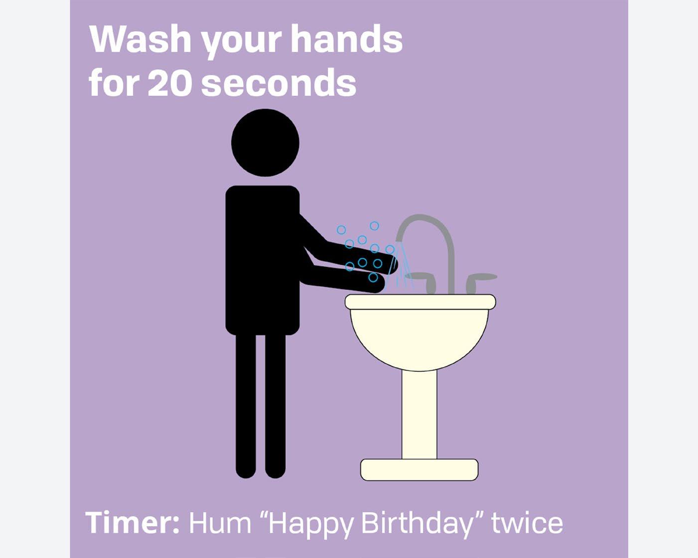
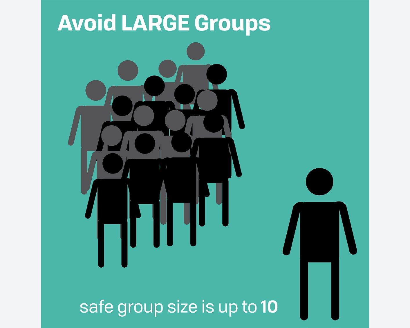
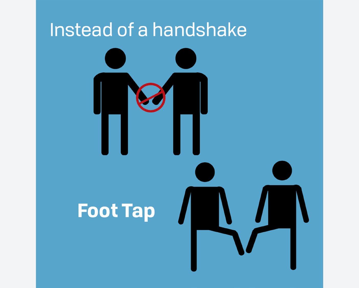
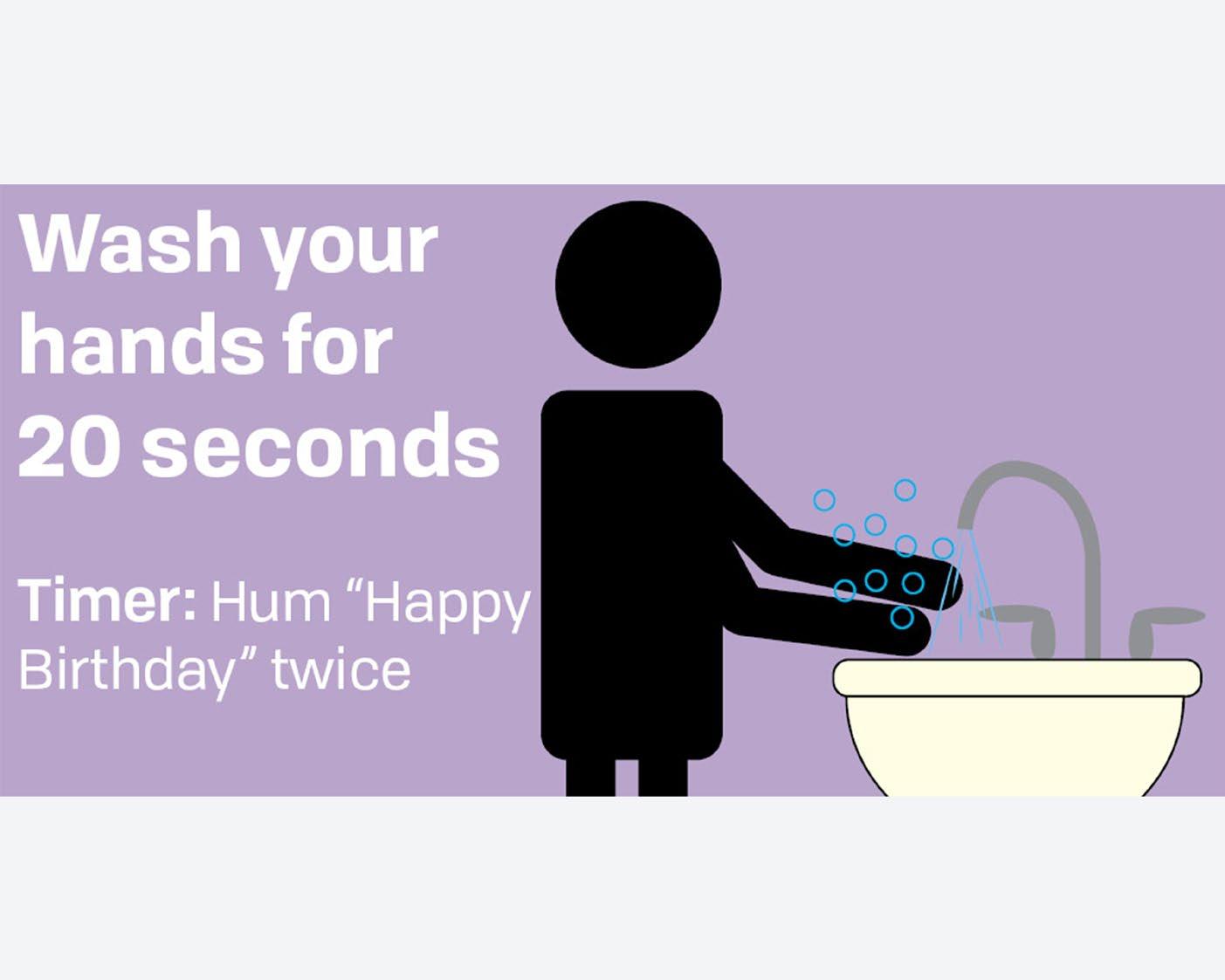
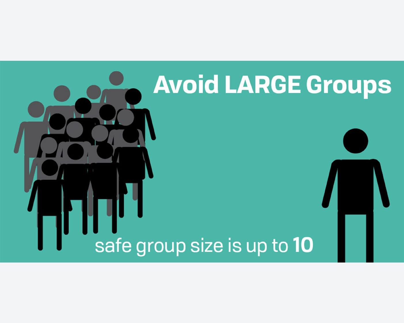
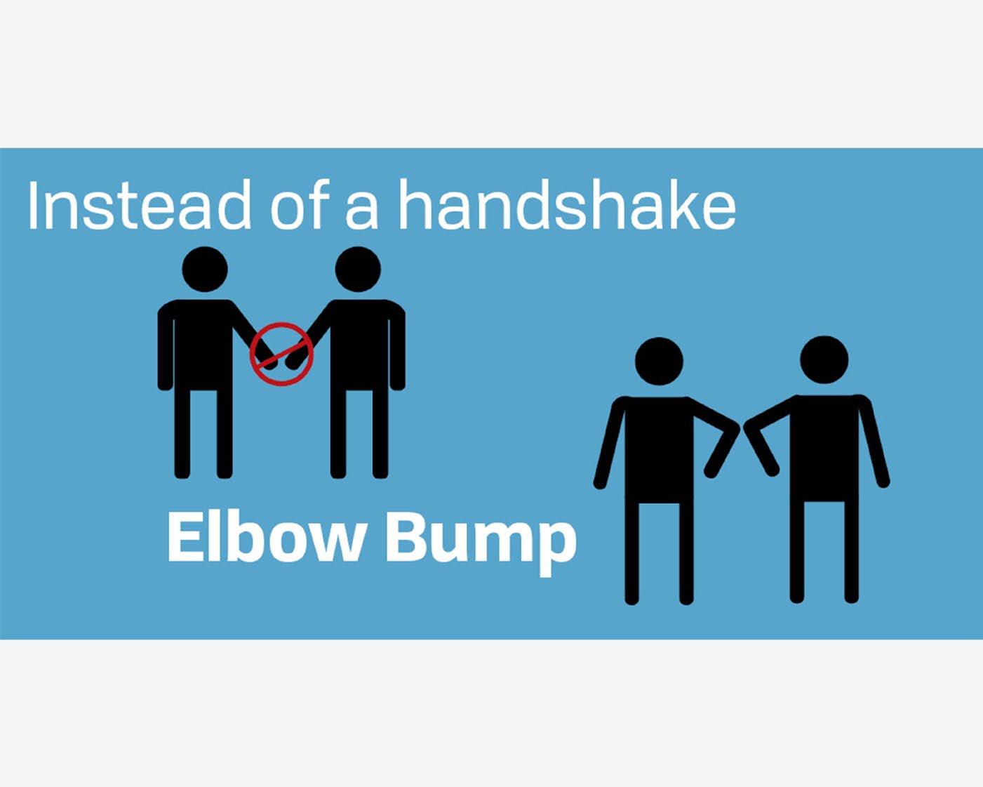
LIFE IN THE NEW NORM
BH Link Social Media Post
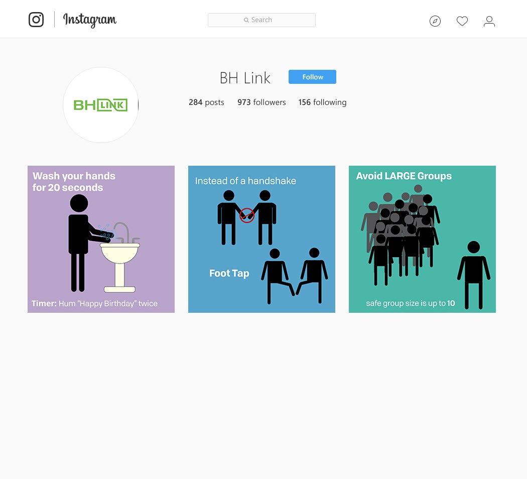
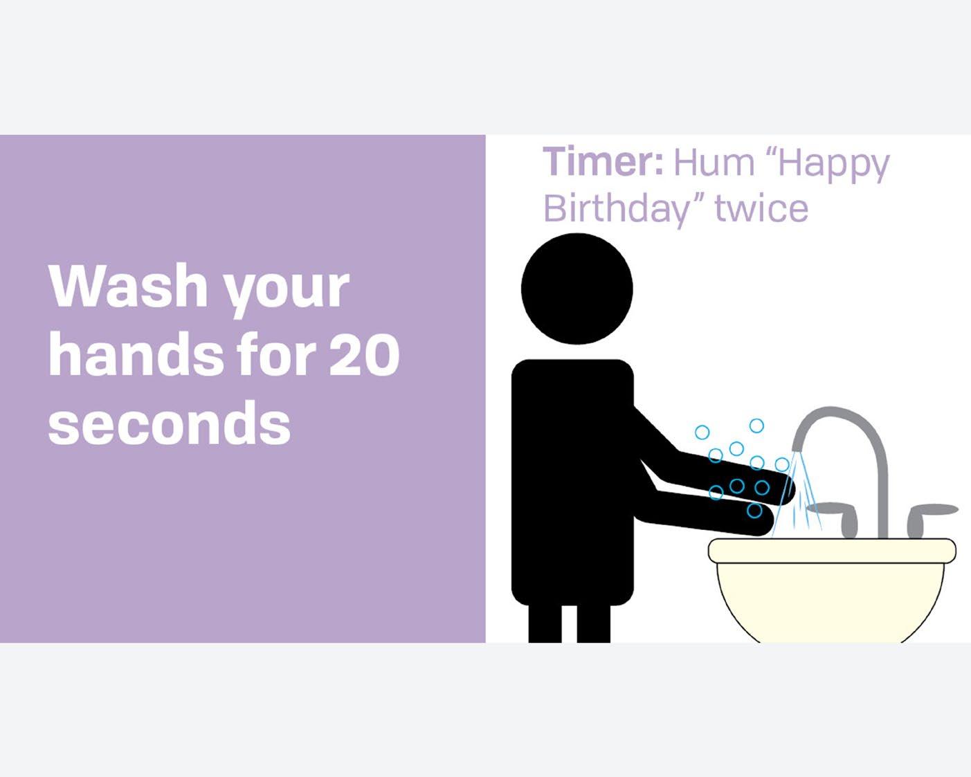
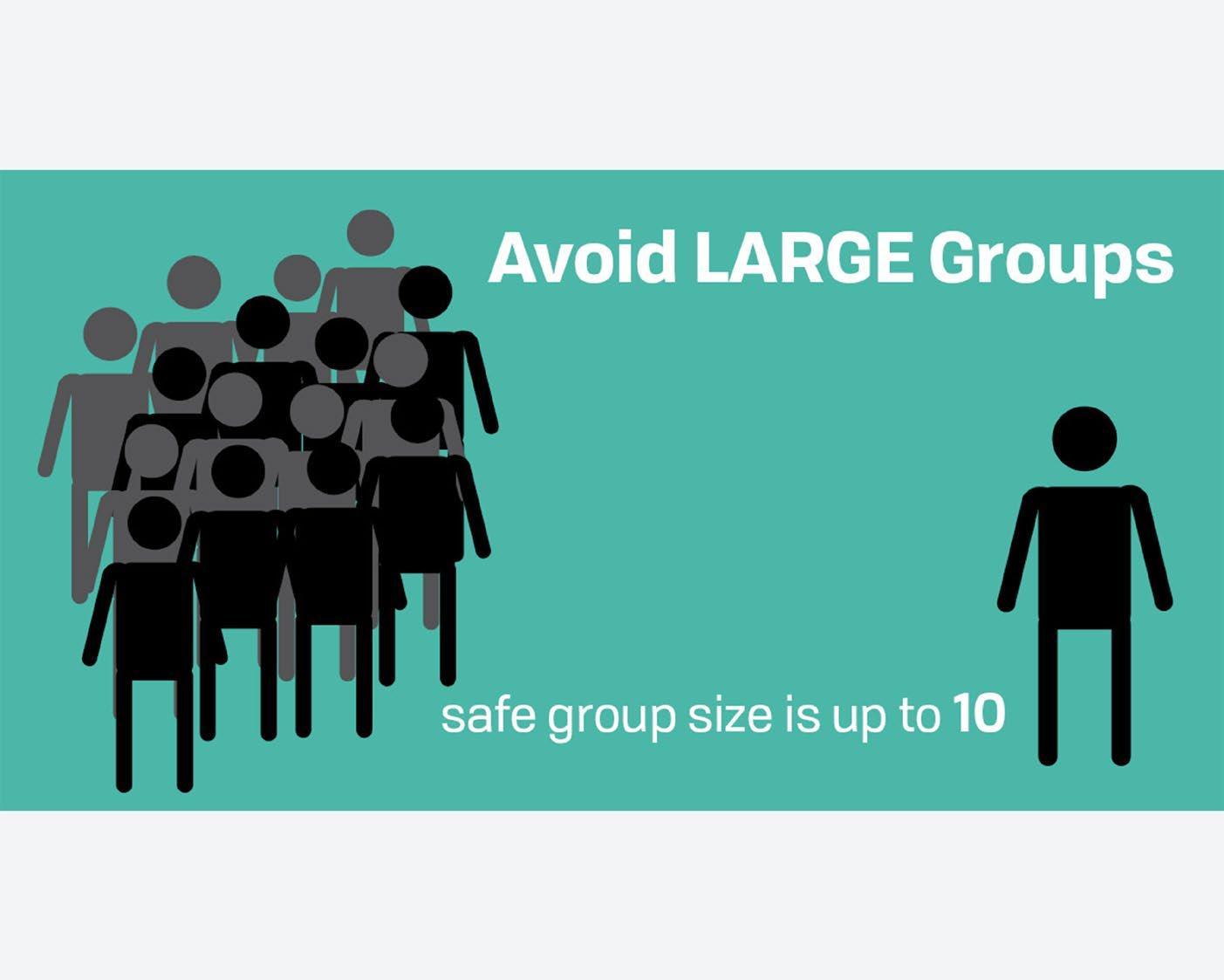
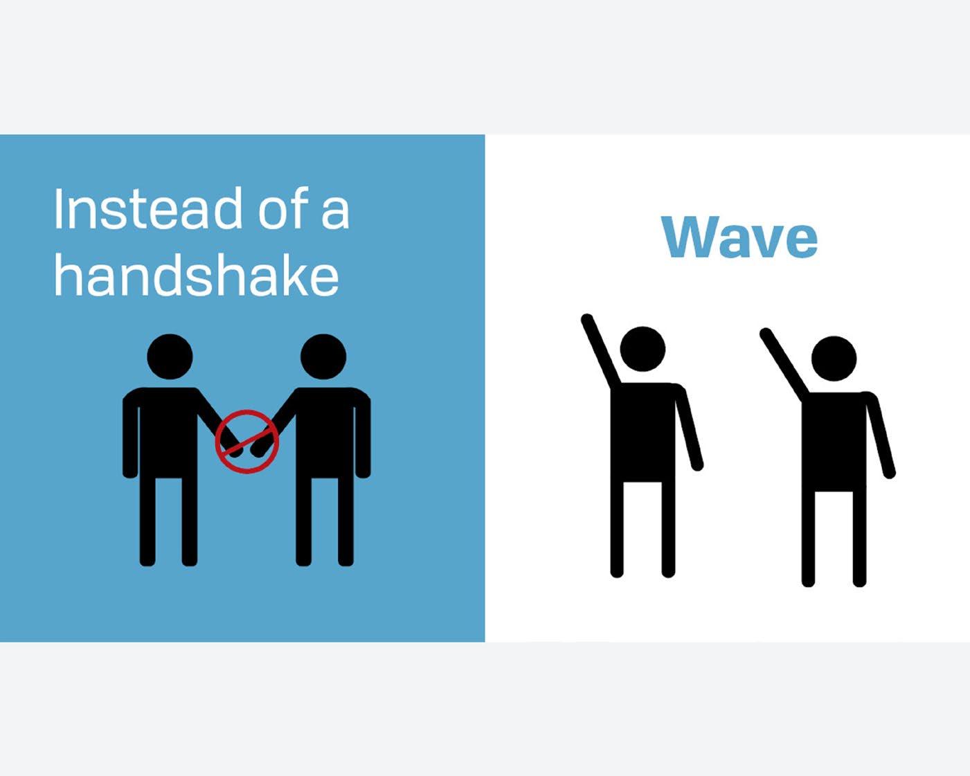
The “Life in the New Norm” project is a series of social media posts that BH Link is developing to tell people what life is now going to be like for the foreseeable future, such as regular mask wearing, frequent hand washing, social distancing and avoiding large groups, etc.. These posts are intended to help people with emotional and mental health issues to adjust to the ‘new norm’, and to help others who support them. I used a pale tone of colors ranging from blue, green, and purple as the background. These would be noticeable and catch viewers’ attention while scrolling through social media. I used a Sans Serif font with a range of weights that would catch the audience’s eye and pull them in. It also ’showed’ them what the most important information was and what was secondary . To lead viewers through the posts I used illustrations as well as hierarchy so they would know exactly what the posts were about and not feel lost
The audience for this piece is people with emotional and mental health issues to adjust to the “new norm” ; and to help others to support them.
The audience for this piece would be a wide range of people that are interested in self care and how to use it through their day. The piece appeals to them because it offers a wide variety of tips, which will allows them to practice the tips in their daily routine.
Tools & Techniques:
Layout
Typography
Color Theory
Adobe Illustrator
Adobe InDesign
Adobe Photoshop
Instagram Instagram Instagram Mockup
Facebook Facebook Twitter Twitter Facebook Twitter
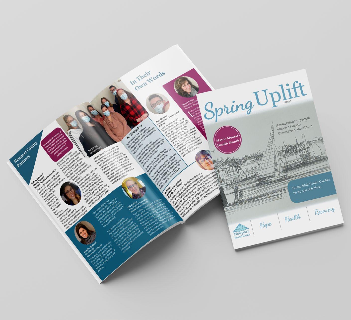
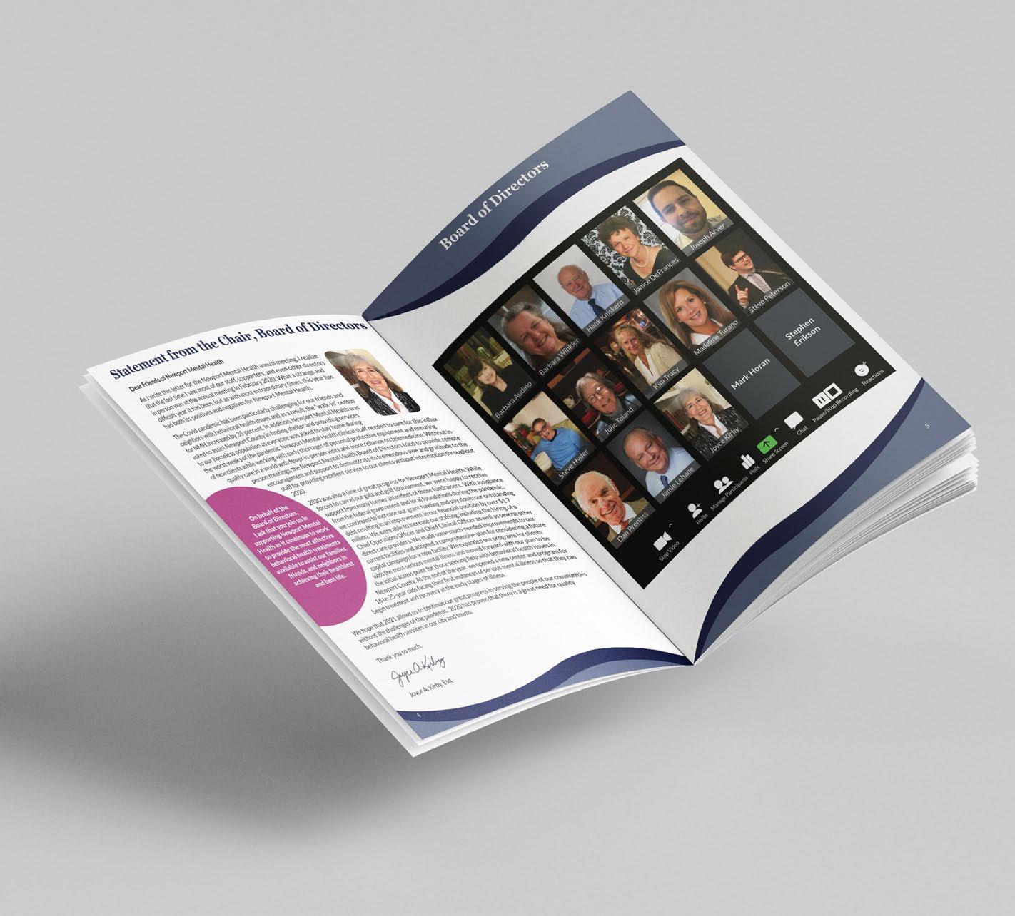
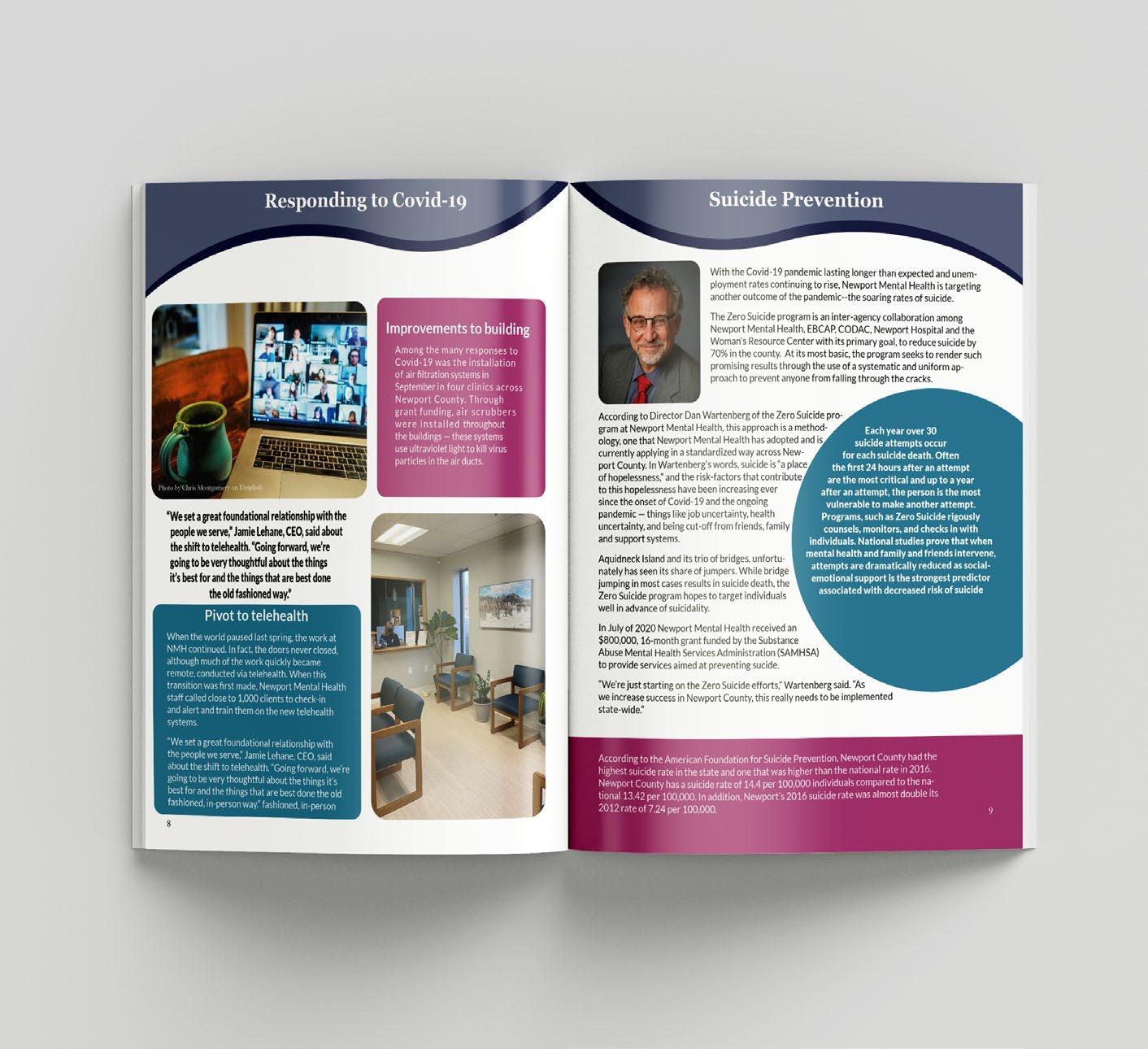
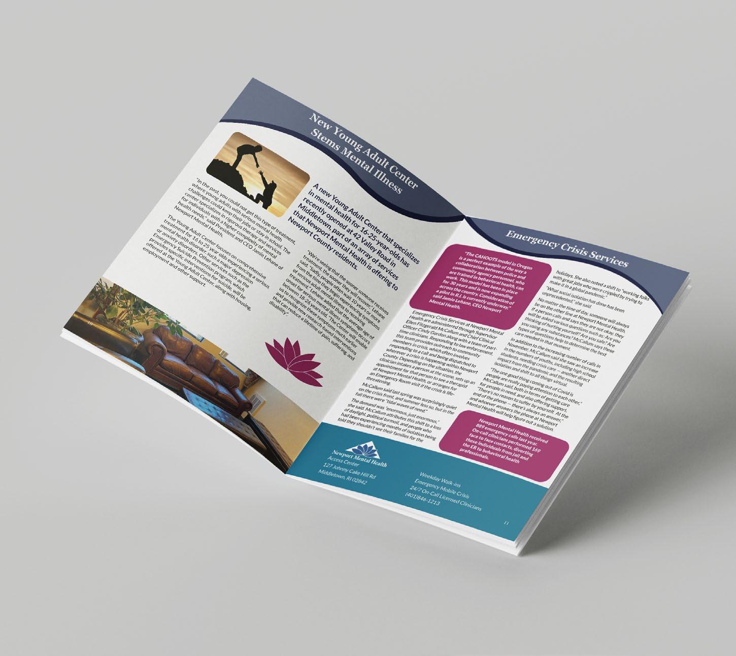
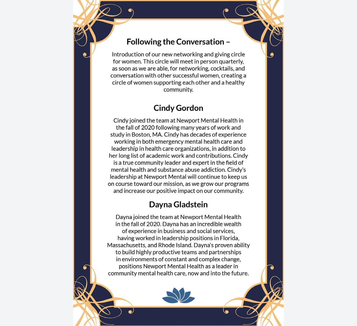
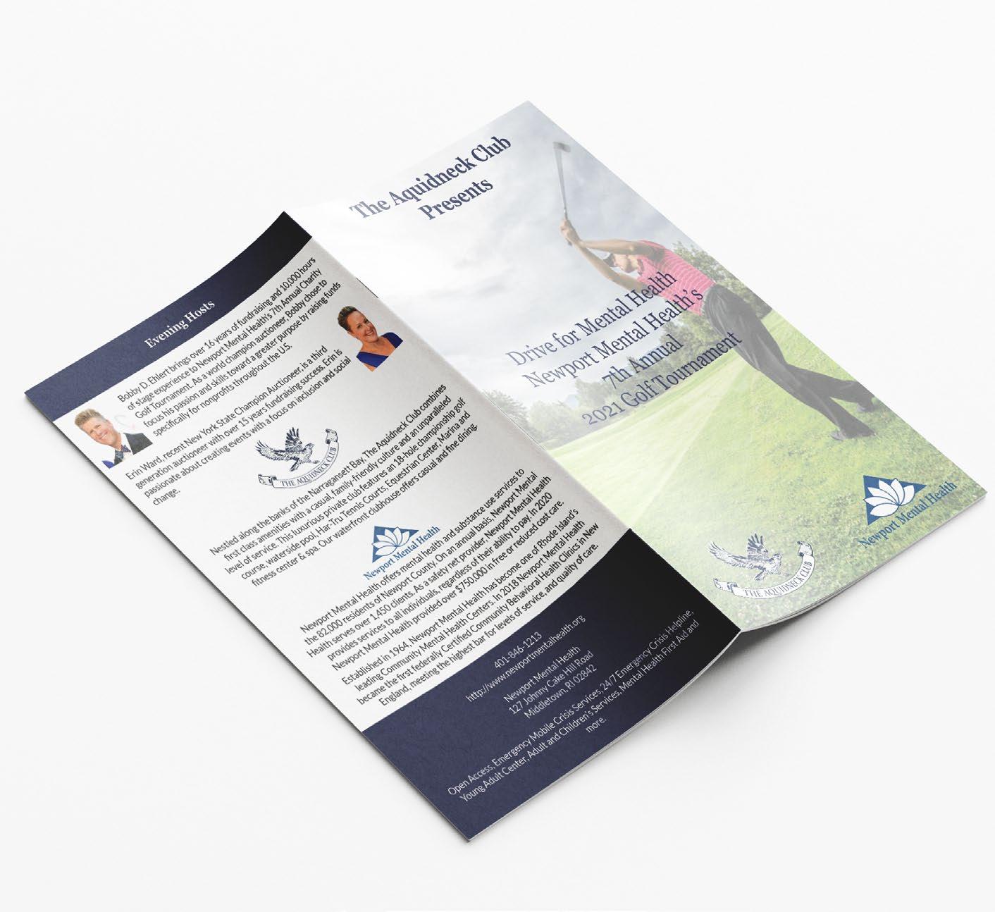
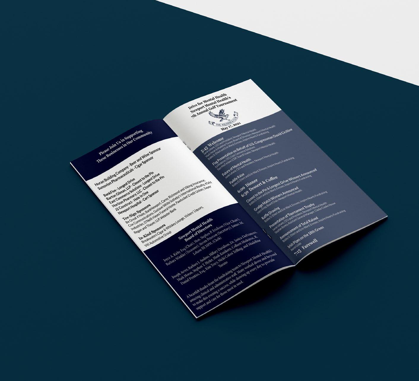
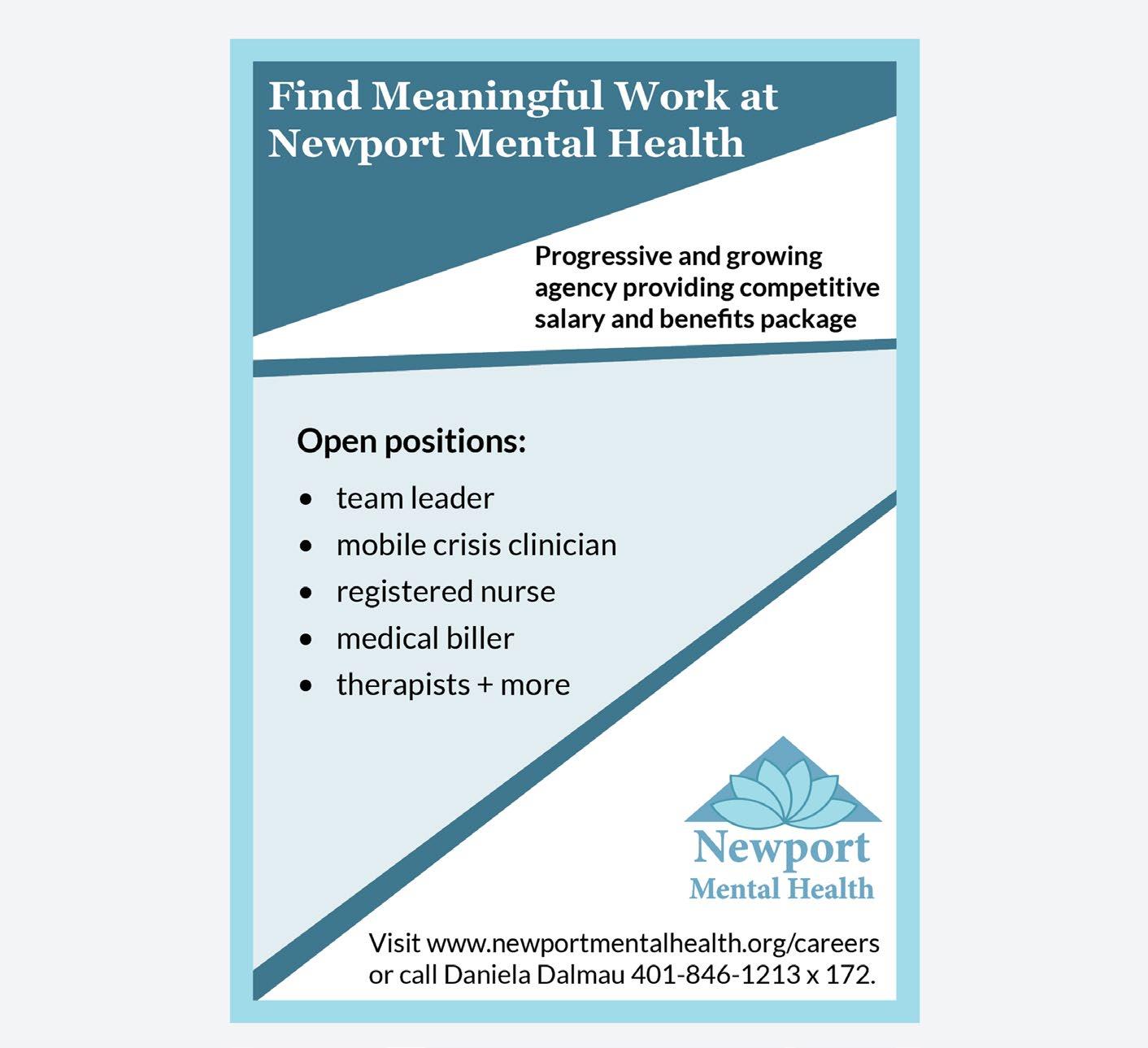
NEWPORT MENTAL HEALTH
MNH
I started working for Newport Mental Health back in August 2020 as a contractor. I worked on a wide range of projects that included Brand guide, letter heads, Envelopes, Post Cards, Posters, Magazines, Newsletters, Annual Reports, Invites, Sponsorships, and Ads.
The Brand Standards for Newport Mental Health (NMH) is that the layouts are designed towards MNH clients needs. This will include making sure that the structure flows and that the font is legible for their readers. Along with that the designs are eye catching to capture the readers attention but not too distracting to distract the reader from the content of the piece.
Tools & Techniques:
Layout
Typography
Color theory
Adobe Illustrator
Adobe InDesign
Adobe Photoshop


Newport Mental
For
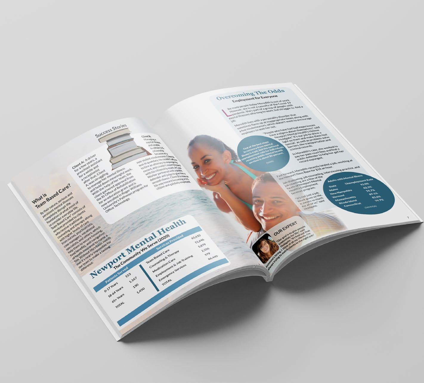
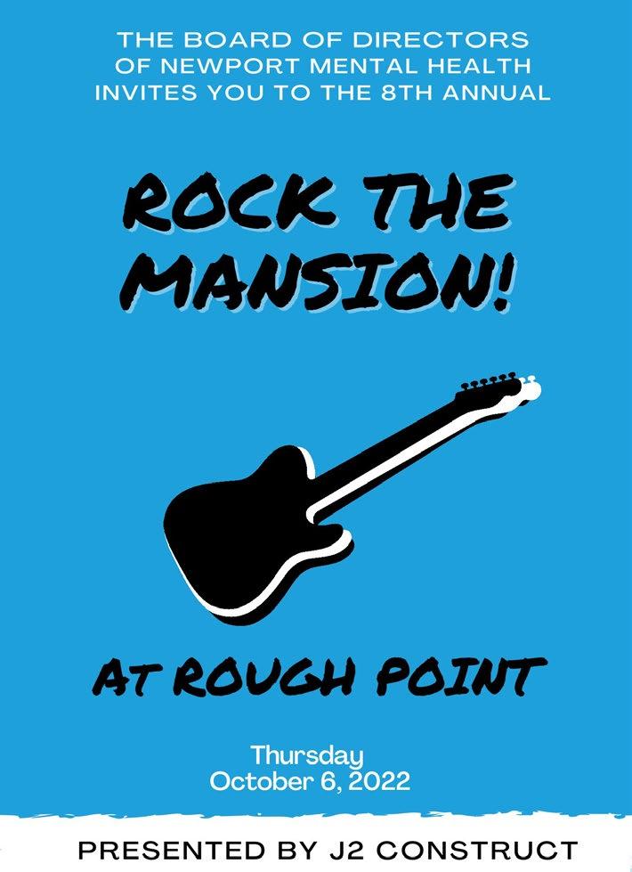
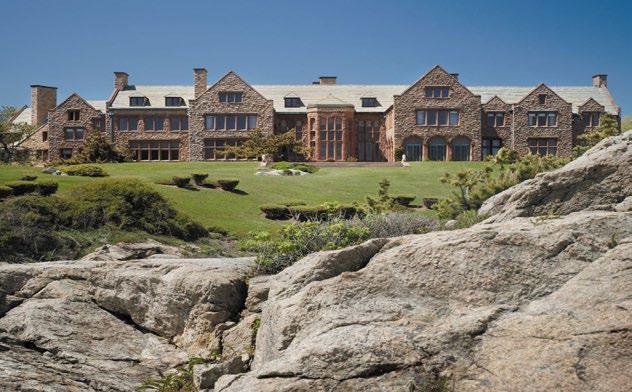
S A V E T H E D A T E ! Thursday, October 5, 2023 5:00 pm - 10:00 pm Eisenhower House, Newport, Rhode Island This not-to-miss event features a cocktail hour, dinner, music and dancing with the DownCity Band, and exciting live and silent auctions. 9th Annual “Rock the Mansion” 2021 7th Annual Gala Support our Work in the Community Become a 2021 Gala Sponsor Tickets Available Starting August 25, 2021 Thursday, October 7, 2021 OceanCliff Newport, Rhode Island 2021 Annual Gala Sponsorship Opportunities Sign Up Sign up for your sponsorship online at newportmentalhealth.org/Gala Sponsorships Available Now Learn More Call Edward McPherson, Director of Development & Marketing, (401)2361891, emcpherson@newportmh.org. Call Beth Sousa, Development Specialist with any questions, (401)846-1213 ext. 140, bsousa@newportmh.org. Newport Mental Health offers mental health and substance use services to the 82,000 residents of Newport County. On an annual basis, Newport Mental Health serves over 1,450 clients each month. As a safety net provider, Newport Mental Health provides services to all individuals, regardless of their ability to pay. Newport Mental Health 65 Valley Rd. Middletown, RI 401-846-6620 Newport Mental Health 127 Johnny Cake Hill Rd. Middletown, RI 401-846-1213 ~Hope ~Health ~Recovery Integrated Health Home Program 401-846-1213 www.newportmentalhealth.org Team Leader: Day/Date: Time: Location: *Please call 24 hours in advance if you need to cancel your appointment. Main Office: 401-846-1213 and press *. 24 hour crisis services 846-1213 9 Newport Mental Health’s 8th Annual Rock the Mansion Gala For more information on sponsorship or to purchase tickets, please contact: Jennifer Bristol, jbristol@newportmh.org 2022 Rock the Mansion Sponsors Roadie BankNewport Herren Wellness Homes by Connect Jo’s American Bistro Lobby Muddy Fest Newport Society Club The Selian Family Webster Bank Barbara Winkler Promoter Vickers Liquors Stage Manager Aramli Foundation Rock Star J2Construct Fan Coastal1 Credit Union Horizon Pharmacy, LLC David and Jean Kelly Joyce Kirby and Michael Greene Thrive Pilates Studio Song Writer Joan and Michael Beachnau Jay Lasky Mr. & Mrs. M. Holt Massey Cynthia Sinclair at Rough Point 680 Bellevue Avenue, Newport RI, 02840 Thursday, October 6, 2022 5:30 to 9:30 pm PRESENTED BY J2 CONSTRUCT Open Bar Plated Dinner Dress Code: Semi Formal Attire Live and Silent Auctions Live Music and Dancing with Mr. Chubb Band This is the sponsor list as of August 18, 2022. Newport Mental Health provides mental health and substance use services to over 2,500 children and adults each year. Same-day walk-in services are available Monday through Friday, and help is available 24 hours a day through our open access phone line, 401-846-1213. Newport Mental Health Board of Directors 2022 Rock the Mansion Committee Board Chair, Joyce Kirby Development Chair, Madeline Turano Committee Co-Chairs Hillary Davidson Nicki Colosi Trilling A. Lavaz Watson Committee Members Barbara Audino Jeanette Beach Dotsie Bohan Nicole Canning Leanne DePaul Helen C. Hames Marlena Horan Elizabeth Moniz Jen Raby Maria Selian Mary Sizeland Kendra Toppa Pam Troppoli Carol Jeanne Ward Tara Winston Joyce A. Kirby, Esq., Chair Barbara Winkler, Vice Chair Joseph Arver, Treasurer Madeline Turano, Secretary James M. Lehane III, MPH, Clerk Barbara J. Audino Terrance Caldwell Hillary Davidson Dr. Janice DeFrances Mark Horan Stephen T. Hyder Colleen Medeiros R. Daniel Prentiss, Esq. Nicki Colosi Trilling A. Lavaz Watson Emeritus Member Hon. Stephen Erickson Honorary Board Members Congressman David N. Cicilline Hon. J. Clement Cicilline Integrated Health Home Program Your Team leader helps you decide on services that you need and helps you make appointments, connect with benefits offices, jobs specialists & more. Description of Services: Once you are a client in our integrated health home team we are able to connect you with therapy and therapeutic groups such as mindfulness and DBT groups. Our case managers, benefit and vocational specialists are equipped to help you with housing, Medicaid and SNAP benefits, job, and educational support. You will also be connected with one of our psychiatrists, and if you need a primary care doctor we can connect you with one. Your assigned Team Leader will assist you with coordinating all your medical and behavioral health needs. • Therapy and Groups • Primary Care Doctor Appointments • Psychiatric Appointments • Jobs Support, Government Assistance Support, Housing Support, Educational Support Client 1: “My Team Leader connected me with a doctor. It was the first physical had in five years.” Client 2: “I finally got the help needed to create a budget for me and my family. ” In Their Own Words: Newport Mental Health Clients 401-846-1213 www.newportmentalhealth.org Your journey starts here: First, you meet for an intake assessment 1 2 Team leader meeting: Your first scheduled welcome appointment with your Team Leader takes place to discuss your needs and eligible services. Care Team meeting: You and your Team Leader will meet with your Care Team to discuss medications, job coaching or any other appointments or services you may need. You will meet with your care coordinator monthly or more frequently if needed. 3
with the DownCity Band to benefit
Health
more information, please contact Susan Piacenti, 401-846-1213, Ext. 1233, spiacenti@newportmh.org
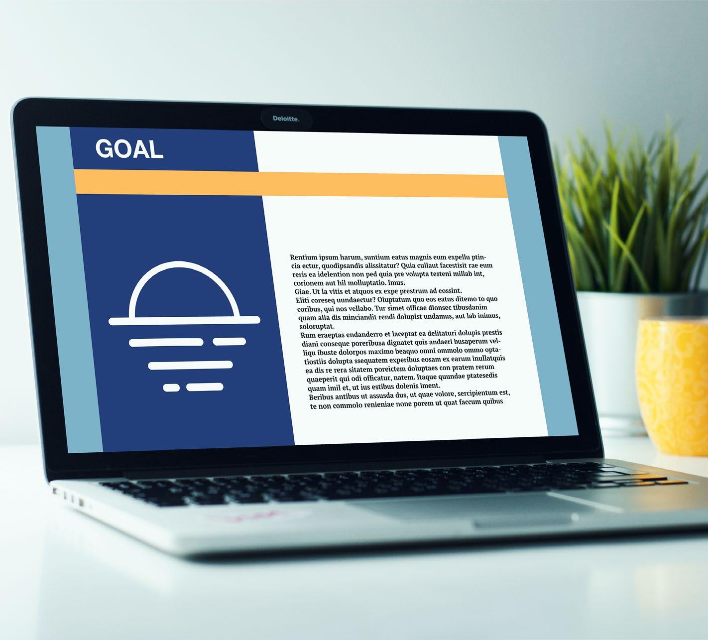
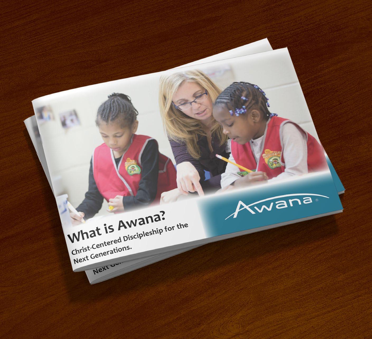
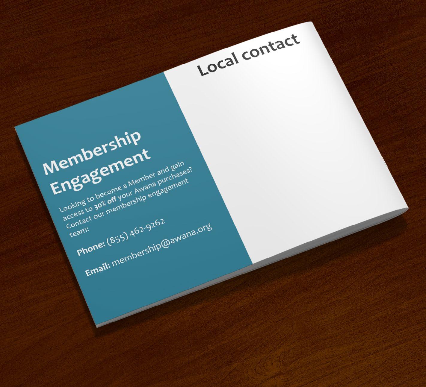
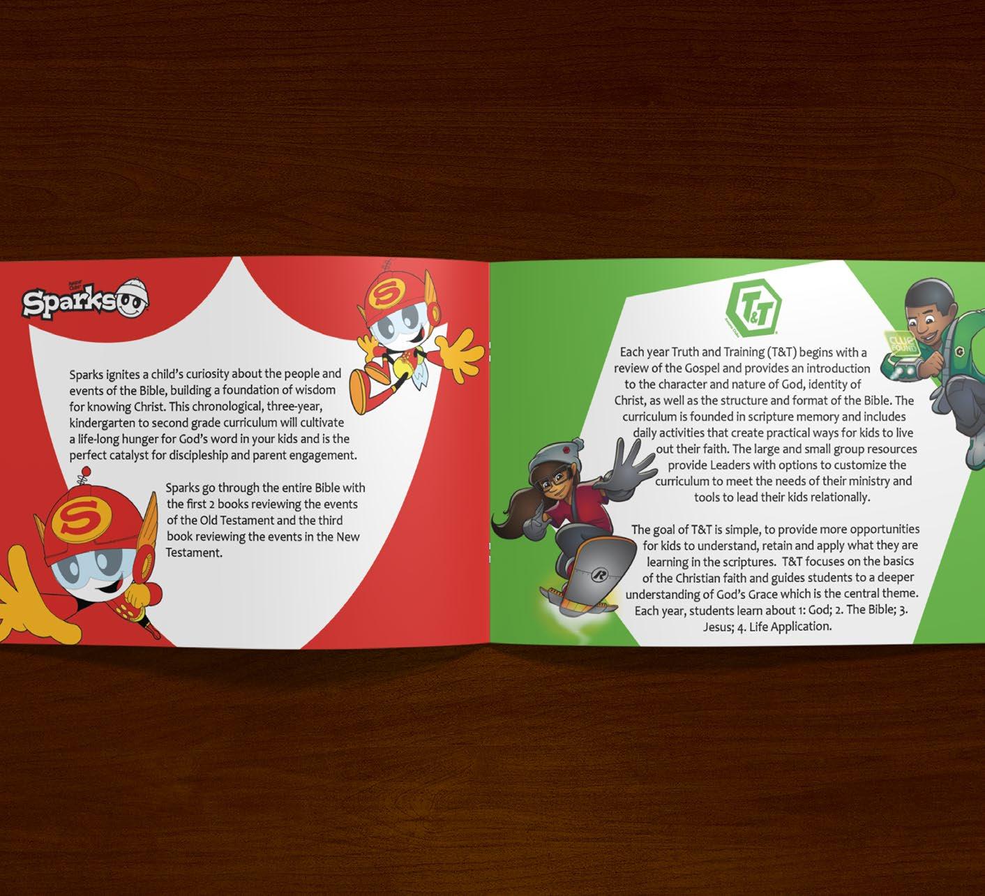
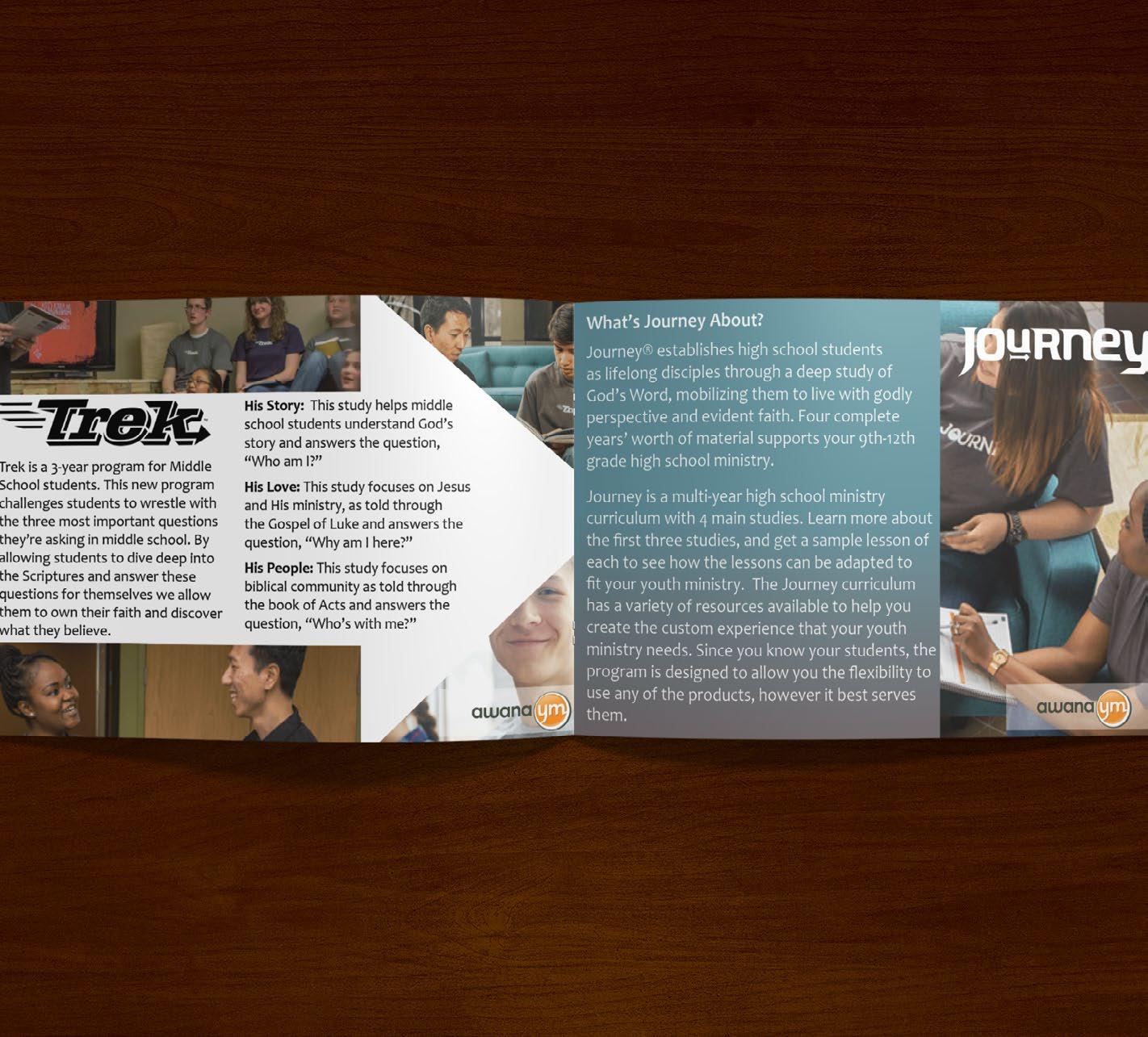
AWANA
What is Awana
The what is Awana Brochure project is where I teamed up with Chris Mikesh in creating a brochure that will be given to missionaries all over the country to hand out at their churches to inform people what awana is and what its goals are. The main concern for this project was to design a brochure that the missionaries would be able to print themselves and to make edits to without being too expensive.
To begin I used the design elements from their old catalogs and from their clipart to help bring out their theme. The color palette is made of a mix of dark blues, light blues, red, green, yellow, and purple. Combining all these elements helped to make the pages feel unique as well as cohesive. Catching the readers eye and keeping their attention.
The audience for this piece would be missionaries, awana employees, and the ones interested in joining or wanting to learn more about Awana.
Tools & Techniques: Layout
Typography Color
Adobe
Adobe
theory
Illustrator
InDesign
Photoshop
Adobe