


DESIGNED BY
LAURA CONTARINO
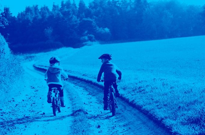
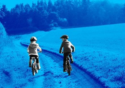
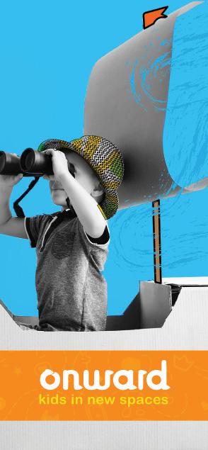
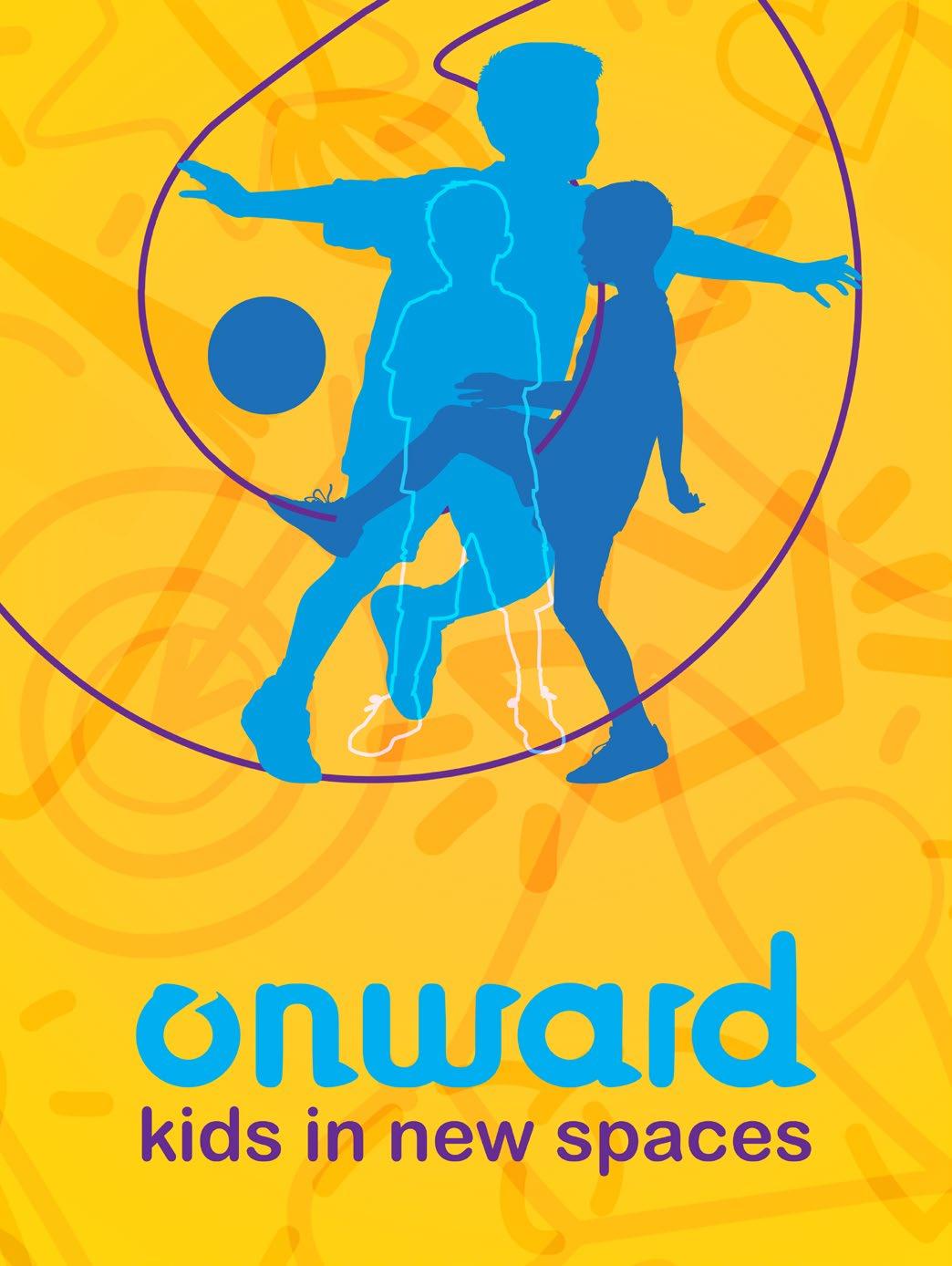
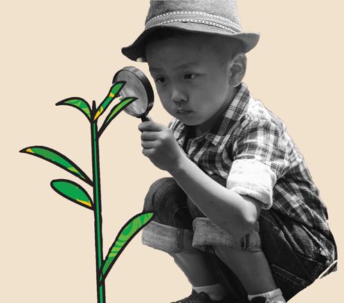
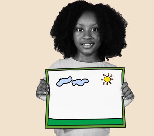
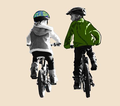
Children across the U.S. face significant stress during moves, struggling to adjust with few resources to guide them. Onward transforms this challenge into an empowering adventure, equipping kids with joy, connection, and confidence every step of the way.
Requirements
Functionality Journey Mapping Phone
Keywords
Logo Anatomy
Primary Logo
Secondary Logo
Minimum Space
Clear Space
Type Usage
Primary Color Use System
Secondary Color Use System
Incorrect Usage
Correct Usage
Photography
Iconography
Toolkit
Adventure Book
Phone App Social Media
Final Thoughts Acknowledgments

In the Visual Communications lab, I completed a series of assignments and labs a new location within the United States. The following pages contain my thought
In the Visual Communications lab, I completed a series of assignments and labs that were targeted towards producing the major project for the class: a thesis-proposal video that formed the basis of my Midpoint Review. I first had to define a set of topics before deciding on my final topic for my thesis. After several weeks and countless hours spent researching, I decided to create a series of products using graphic design to help young children through the emotional process of moving to a new location within the United States. The following pages contain my thought and design process as well as any sketched concepts and physical mock-ups.


• Make children see this move as a new adventure
• Help children deal with leaving their former home
• Help children to help their parents with the move
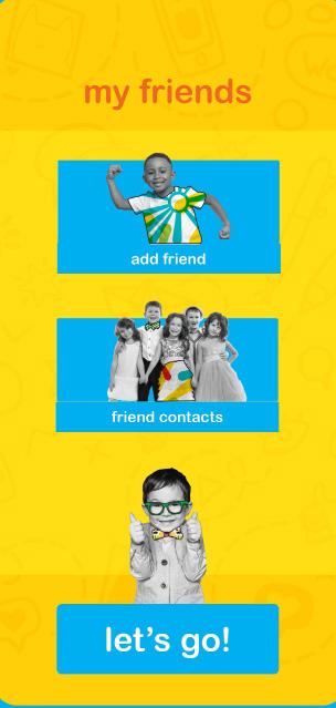
• Help children to digitally connect to the new location before actually making the move


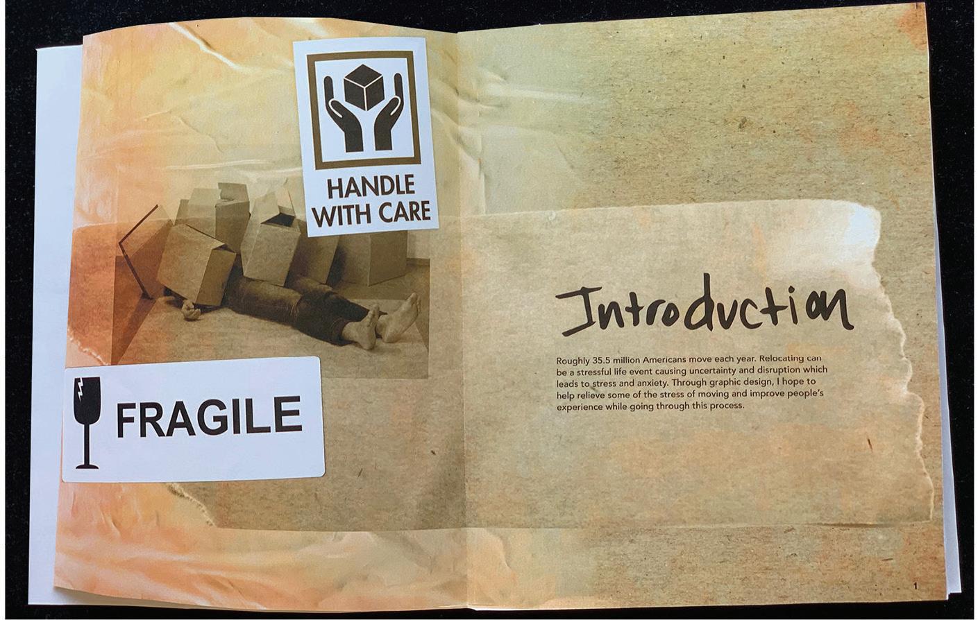
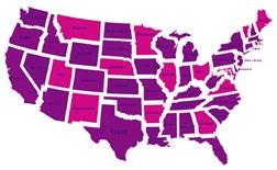
Roughly 35.5 million Americans move each year. Relocating can be a stressful life event causing uncertainty and disruption which leads to stress and anxiety.
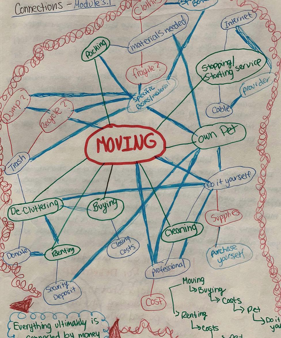
I made a web-chat to connect the different facets of moving. What I found is that money is what most of these things have in common because you either are paying a professional to help with the move, or buying materials for packing, cleaning etc if you are doing it on your own.
Here, I made a list in somewhat of an outline form to help me make further connections.
RENTING
• Security Deposit
• Pets [extra cost sometimes]
• Do not own [no equity]
• Cannot always paint or remodel
• Limited space often times
• Can hear people if in the same building
BUYING
• Mortgage
• Can have pets
• Equity
• More space
• Can remodel
• Cannot move until house sells
PACKING
Professional
• Costly Do- it yourself
• Costly {pay for materials]
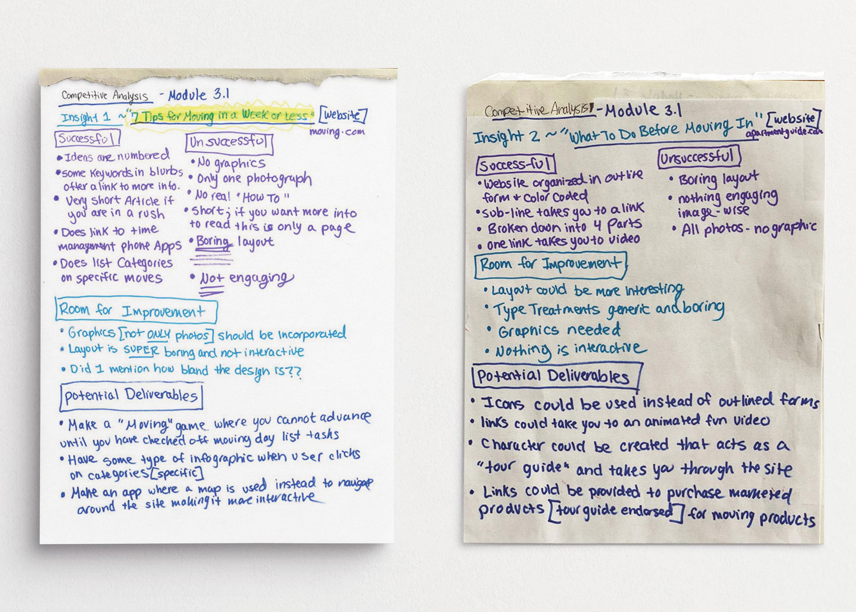
Reflection: Competitive analysis revealed major gaps in emotional support, real-time budget tracking, hyper-local resource sharing, postmove guidance, and genuine fun mechanics within the moving industry.
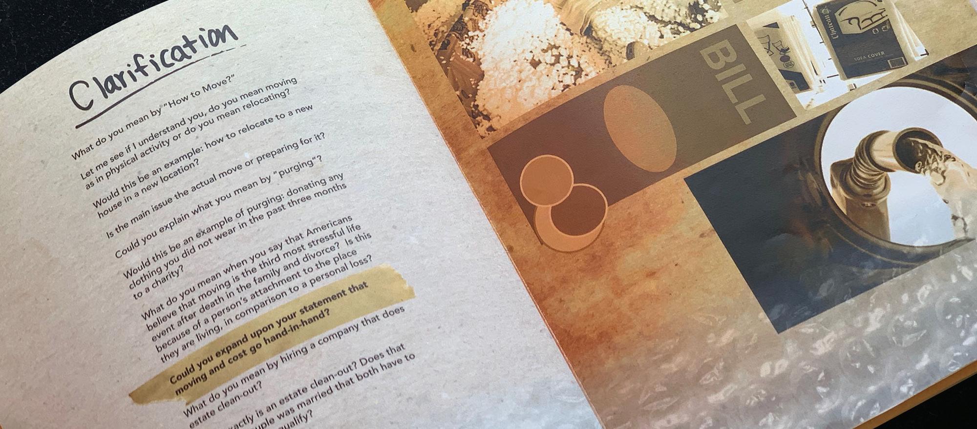
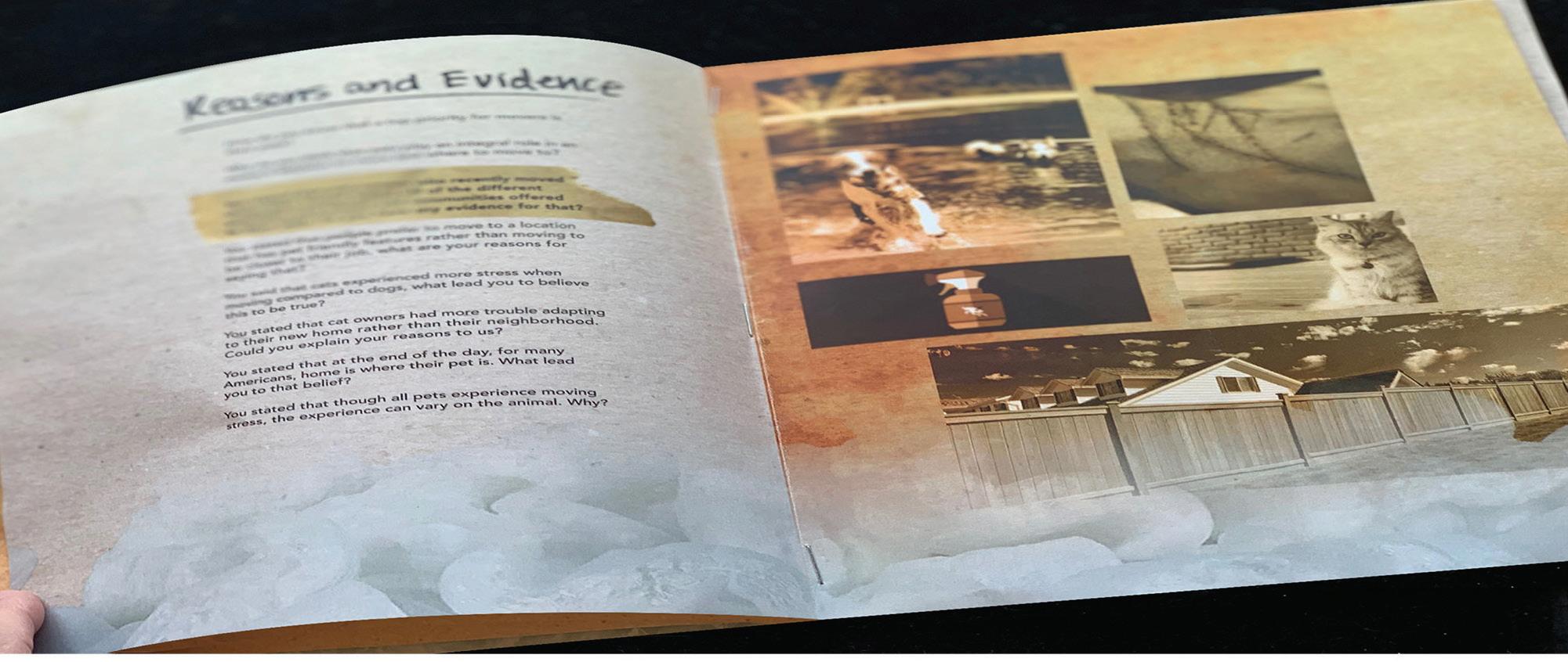
I had to conduct a competitive analysis of the examples I found surrounding my two desired topics and then determine what was successful and unsuccessful about the competitors, and what was similar and dissimilar in the analogous examples. I specifically looked for gaps and opportunities for potential deliverables.
My wildcard insight stems from my mother’s raw experience: after my grandmother’s sudden death, she uncovered a stark imbalance—countless resources for logistics like movers, storage units, and estate sales, yet virtually no practical, compassionate guidance for the emotionally charged task of sorting, preserving, or releasing a loved one’s personal belongings amid profound grief.
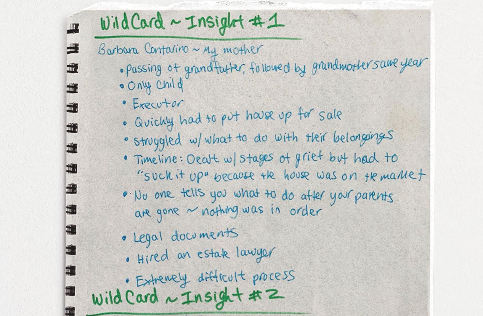
Reflection: My wildcard insight from my mother—who, after her own mother’s death, exposed a glaring gap—reveals abundant moving logistics resources but virtually no guidance for handling a loved one’s belongings in bereavement.
I completed three hands-on labs that built foundational skills for Onward. Lab 1 required researching my topic, compiling insights and questions into a booklet, hand-assembling it, and documenting the process with photographs. Lab 2 focused on designing digital persona cards, which I later printed and refined into physical versions for Lab 3. The following pages showcase rough sketches, process notes, and full digital slides of the photographed final projects.

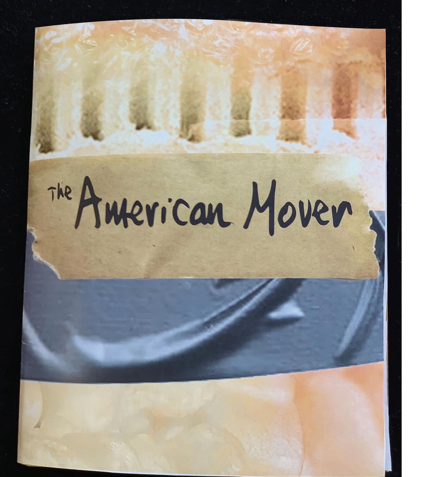
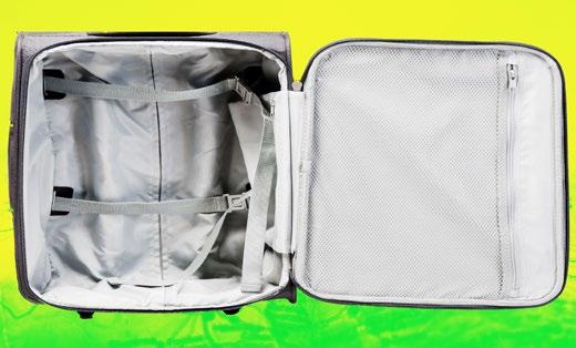
After narrowing my focus to the adults moving within the United States, I compiled a research booklet packed with insights and probing questions. I designed it using evocative stock images of packing materials—boxes, tape, and bubble wrap—to ground the adult perspective I was still targeting at that stage.
Reflection:
Moving tops divorce (44%), marriage (33%), and having kids (31%) as a stressor, with 45% calling it their most traumatic event and 64% ranking a recent move among life’s worst.
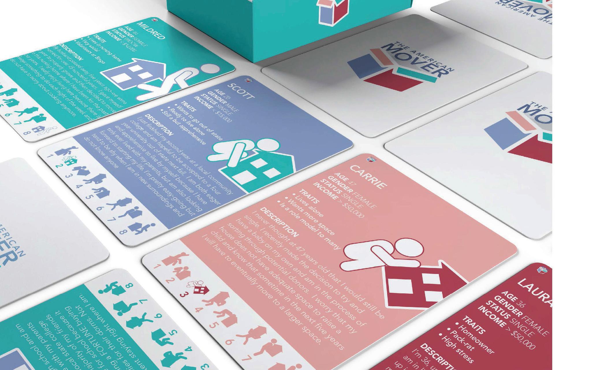
For this lab, I had to create eight archetypes to use as personas. Each persona had to consist of the following:
• A handle
• Demographics: gender, age, and income
• 3 specific details about the person
I created five personas: two far outside the target audience, two near the center (highly likely to engage), one slightly peripheral, and one dead-center (most aligned by traits, beliefs, life stage, and relevance). One persona represented myself (positioned #6 on the diagram), enabling me to clearly define primary users, secondary audiences, and key stakeholders.
Reflection:
This page highlights four of the eight personas: three with reserved, introspective traits and one representing the enthusiastic, highly engaged core user.
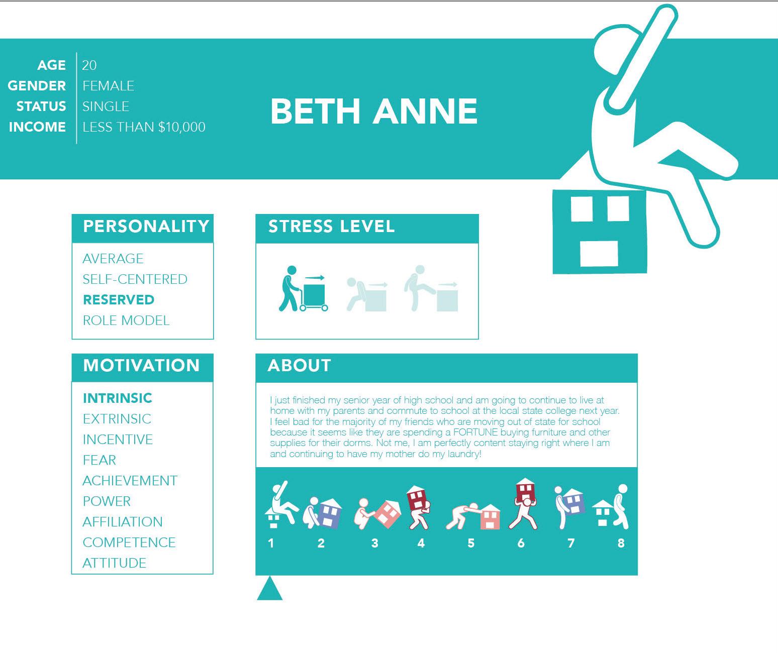
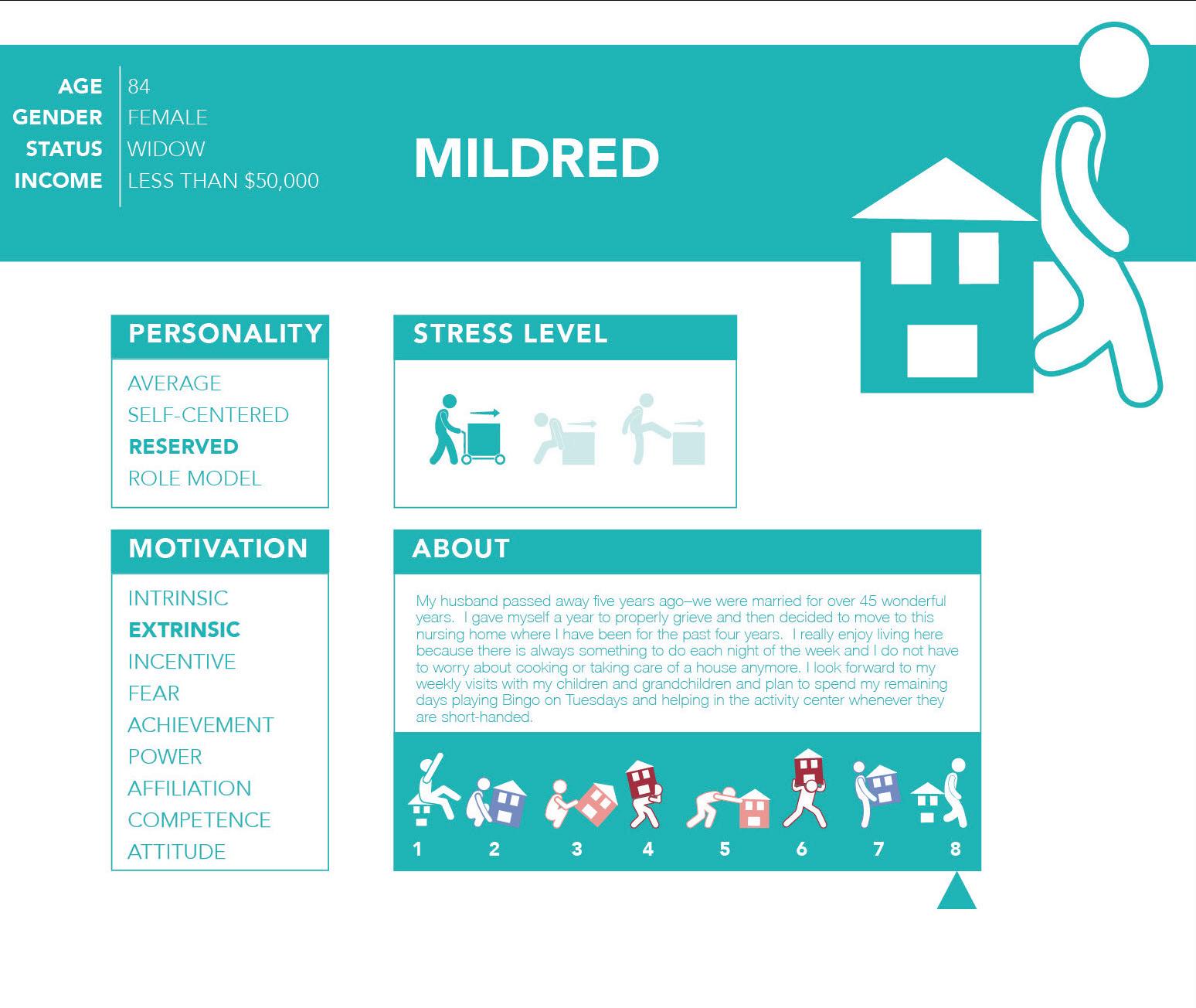
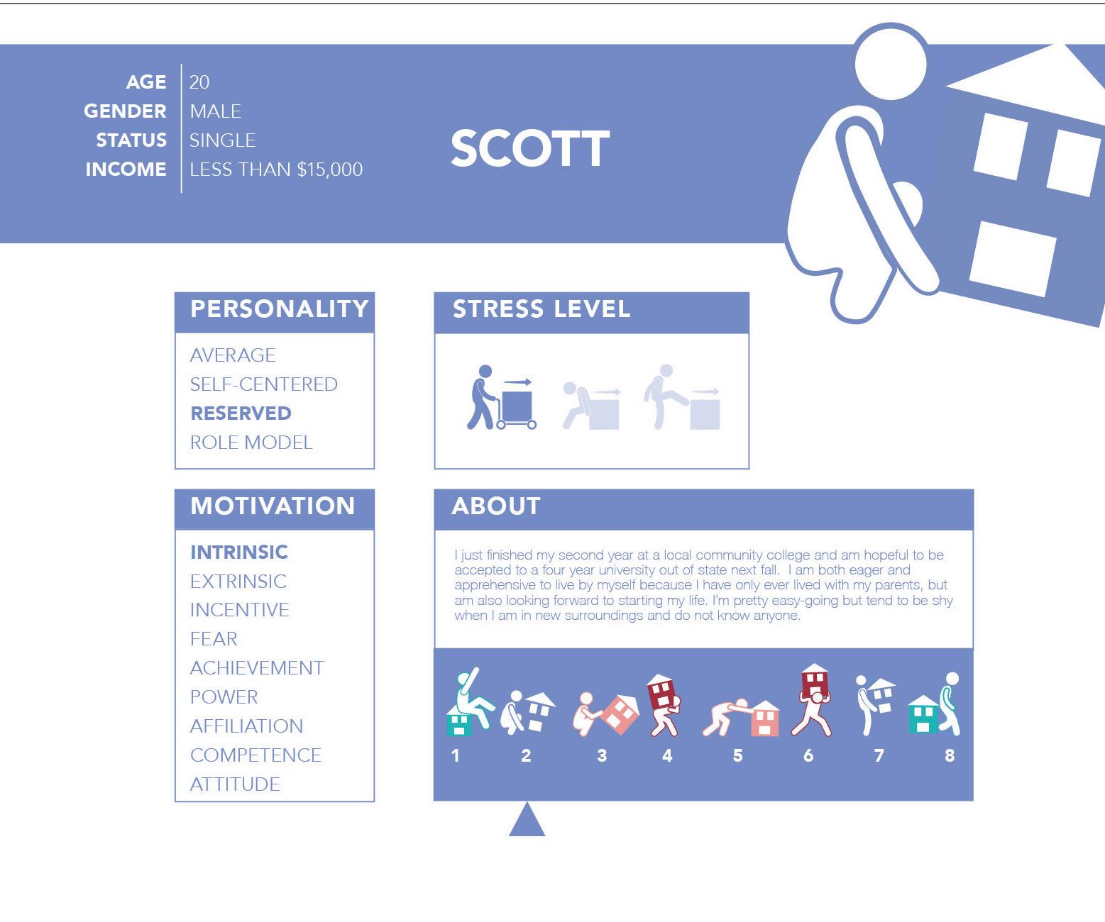
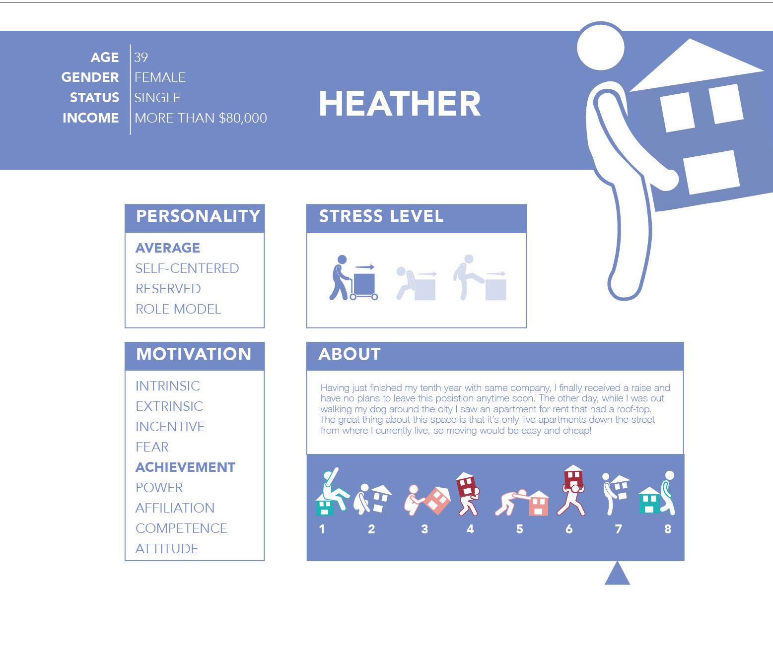
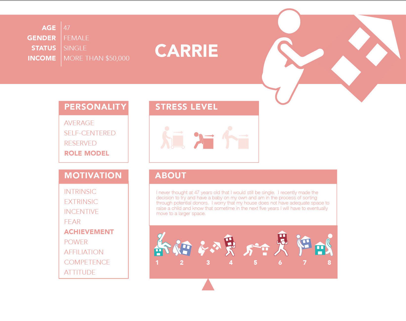
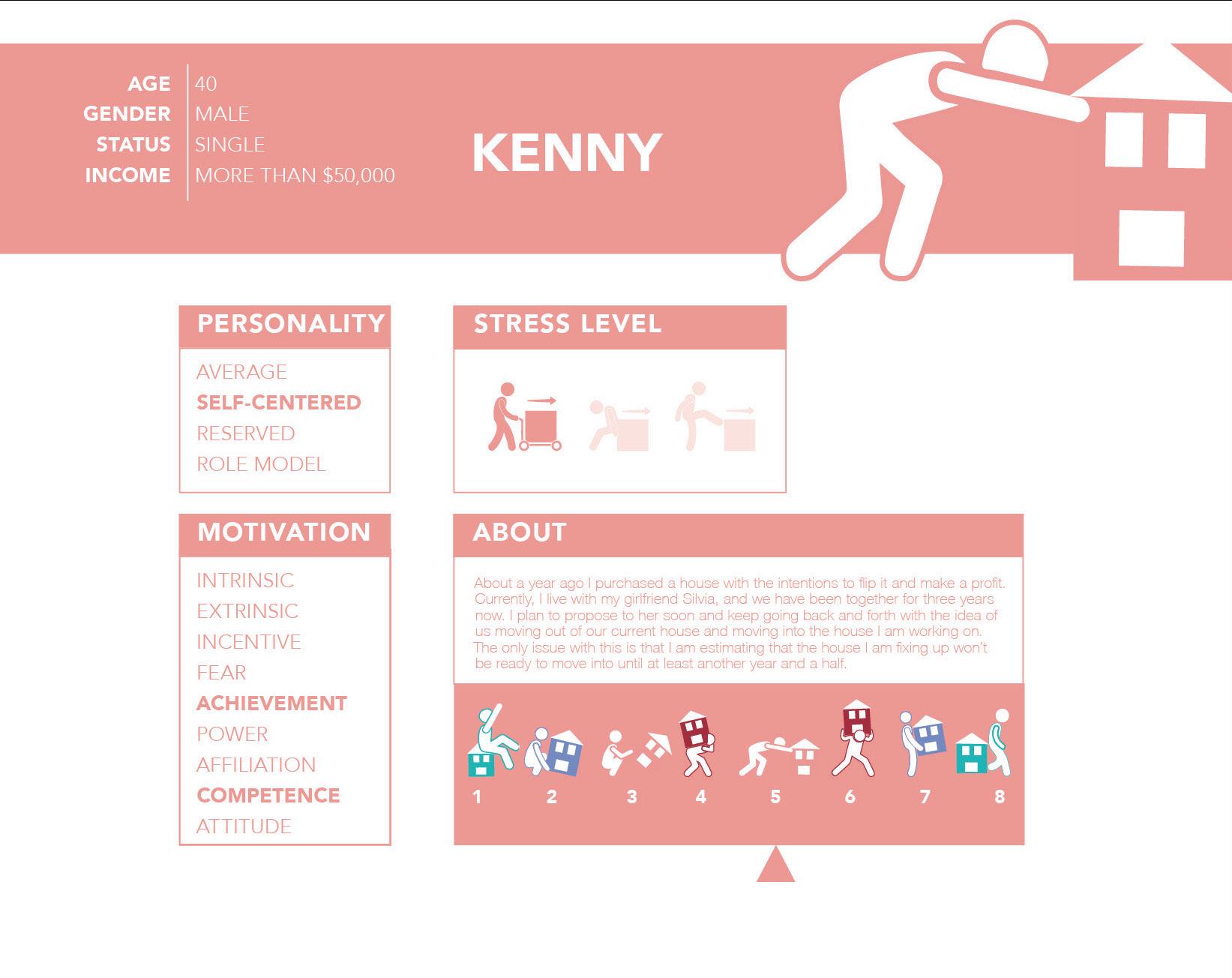
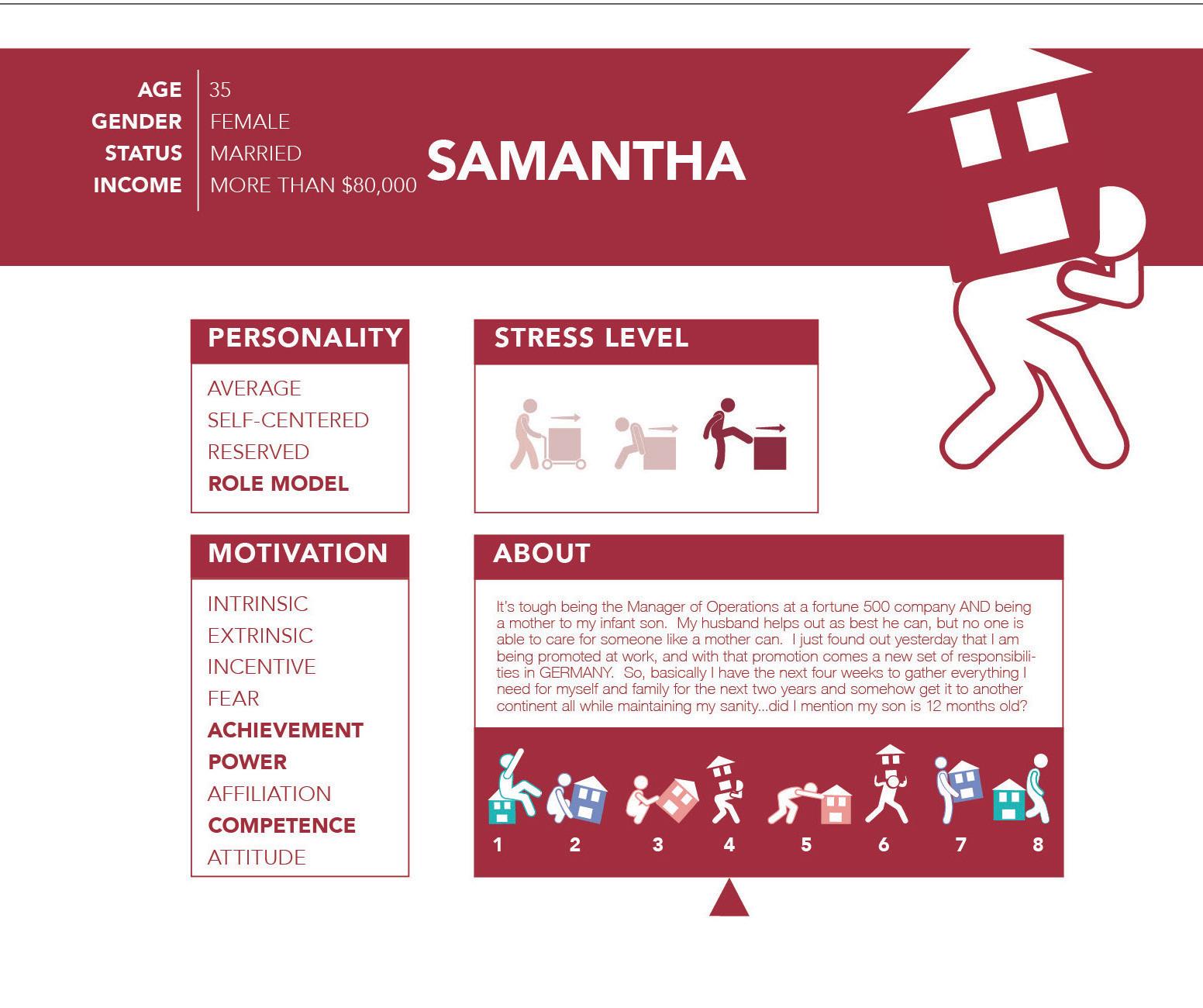

Reflection: This page spotlights four of the eight personas: three experiencing low to moderate stress during moves, contrasted with one facing high-intensity stress.

Reflection:
I built a web-chat to link the various aspects of moving. The key insight: money ties it all together—whether hiring professionals or buying packing and cleaning supplies for a DIY move.
After refining my direction, audience, and goals, I mapped key insights, strategies, and deliverables to drive the project forward.
Topic Area: How moving to a new place impacts children living in the United States of America.
Audience: Children between the ages of 5-9 years old and their parents that are living in the United States.
Outcome: to create a series of products using graphic design to help young children through the emotional process of moving to a new location within the United States.

• insights
• strategies
• materials matrix
• ds chart
• deliverables
insight 1
Children experience high levels of stress when moving.
strategy 1
Help children relieve the emotional stress of making new friends in a new environment.
deliverable 1
Design a physical hardbound interactive book that will come with a marker set and craft supplies for interaction.
strategy 1
Children tend to have a sense of loss of belonging and loss of place when moving.
strategy 2
To lessen the sense of loss for children when moving to a new location.
deliverable 2
App that makes children want to explore their new surroundings, but in the form of an adventure game with different quests.
insight 3
Once children have moved, they often have difficulties adjusting to their new surroundings.
strategy 3
Help children adjust to their new location.
deliverable 3
Social media component that will serve to promote interest in the Onward system.


Reflection:
Onward’s Materials Matrix (eco-friendly book + safe markers) and DS Chart (colors, Arial Rounded/Futura, icons) ensure tactile and visual consistency across app, book, and social.
MATERIALS STRATEGY
INSIGHTS AND INFORMATION
MATERIALS AND DESCRIPTIONS
Moving as a child I want to alleviate the emotional stress that moving creates for a ch ld years- old to t welve years- old and their parent s
Ch ldren experience high levels of stress when moving.
Help children relieve the emotional stress of making new friends in a new environment.
Ch ldren tend to have a sense of loss of belonging and loss of p ace when moving.
To lessen the sense of loss for children when moving to a new location.
Once children have moved, they their new surroundings
Help children adjust to their new location.
Design: (1pt) Poster Ser es focusing on friendship and it s impor tance
Environment Design: (1pt) Insp rat onal quotes about friendship around the local park or other places that children frequent Branding: (2pt s) Booklet ser es of ac tivit es that children can do to get to know each other
Typography: (1pt) Booklet forselves and share with new fr ends
User Experience: (3pt s) Design a digital app for phone/tablet that is for 5 -9 year- olds and is par t of the ONWARD toolkit.
Packaging: (3pt s) Get ting to Know You” Board- game
Editorial Design: (1pt) Stor y book about making new fr ends Innovation: (1pt) Interac tive screen on how to ma ntain new friendships
13 pt s tot al
Design: (1pt) Poster Series on relocation to a new p ace Environment Design: (1pt) Poster in park or other area children frequent expla n ng it s okay to feel sad when moving to a new place Branding: (4pt s) Ac tivit y book with mult ple sec tions for 5 -9 year- o ds on things a child can do to occupy their t me when they move to a new location
Typography: (2pt s) Booklet for -
in their new ocation User Experience: (1pt) App dealing with feelings of loss from moving.
Packaging: (1pt) Game ch ldren can play on their own that gives tips on how to occupy your time while alone
Editorial Design: (1pt) Stor y book about making ch ldren understand that t ’ s okay to fee sad in a new place Innovation: (2pt s) Interac tive screen on how to deal with sense of loss when mov ng to a new home This could be in the form of a game
13 pt s tot al
Design: (1pt) Poster Series on how moving is an adventure Environment Design: (1pt) Posters in child environment that s a stor y ine for moving being an adventure
Branding: (1pt) Series of ac tivit es that children can do to become adjusted to their new environment
Typography: (2pt s) Booklet for themselves that also of fers tips on how to become familiar with things in an unfamiliar surrounding.
User Experience: (2pt s) Design an Instagram account that serves as a bridge between the platform, parents, and the community.
Packaging: (1pt s) Design a physical box that children can use to keep special things that they want to stay safe when moving.
Editorial Design: (2pt s) Book about moving, but in the form of an adventure story.
Innovation: (3pt s) Interac tive screen moving be ng seen as an adventure to explore and tr y new things
13 pt s tot al
TOPIC: ONWARD
HOW MOVING TO A NEW PLACE IMPACTS
CHILDREN LIVING IN AMERICA
AUDIENCE: CHILDREN AGES 5-9 AND THEIR PARENTS
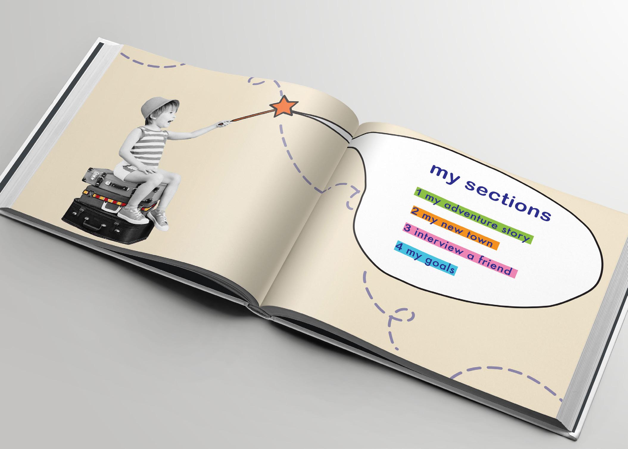
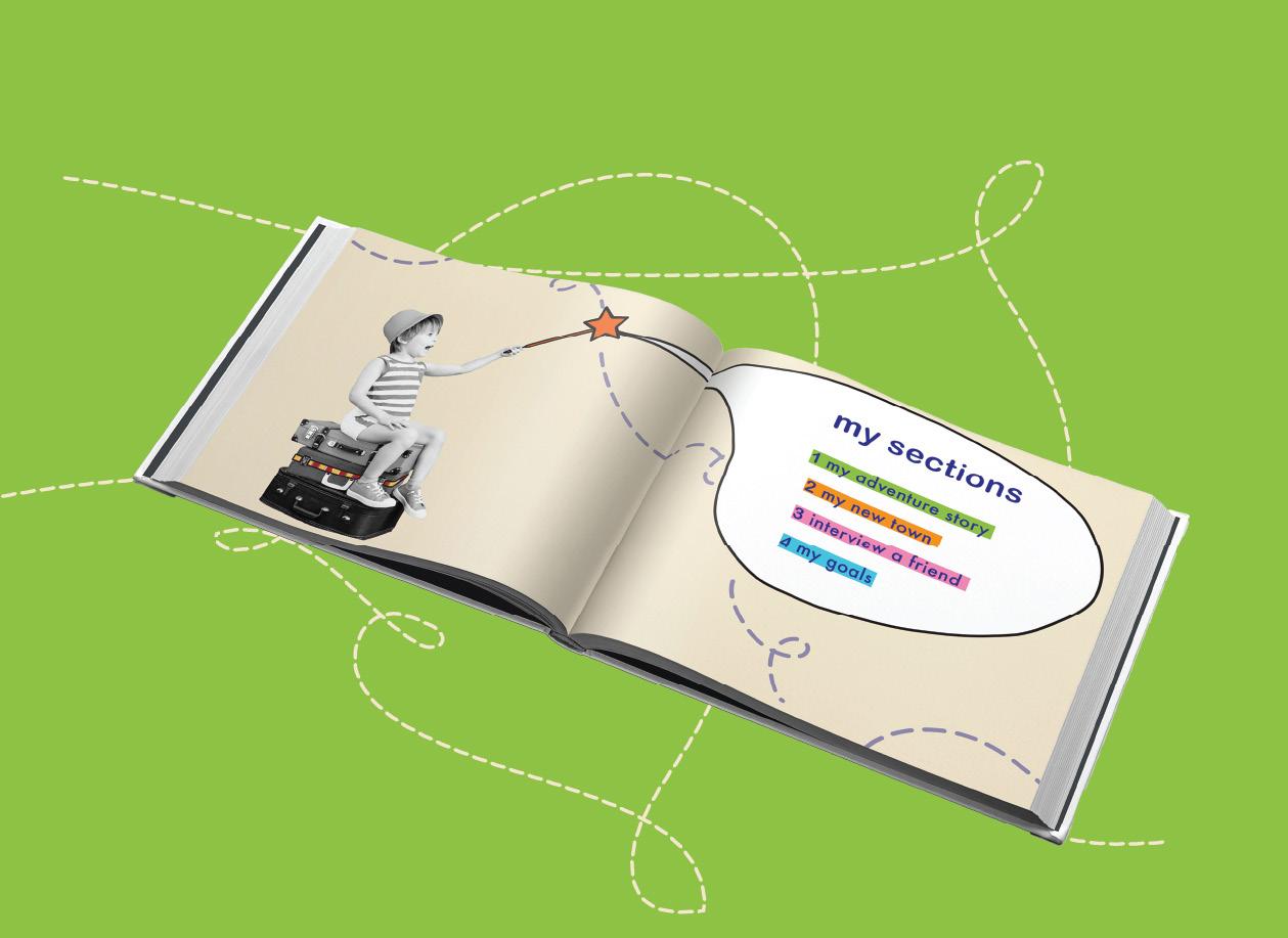
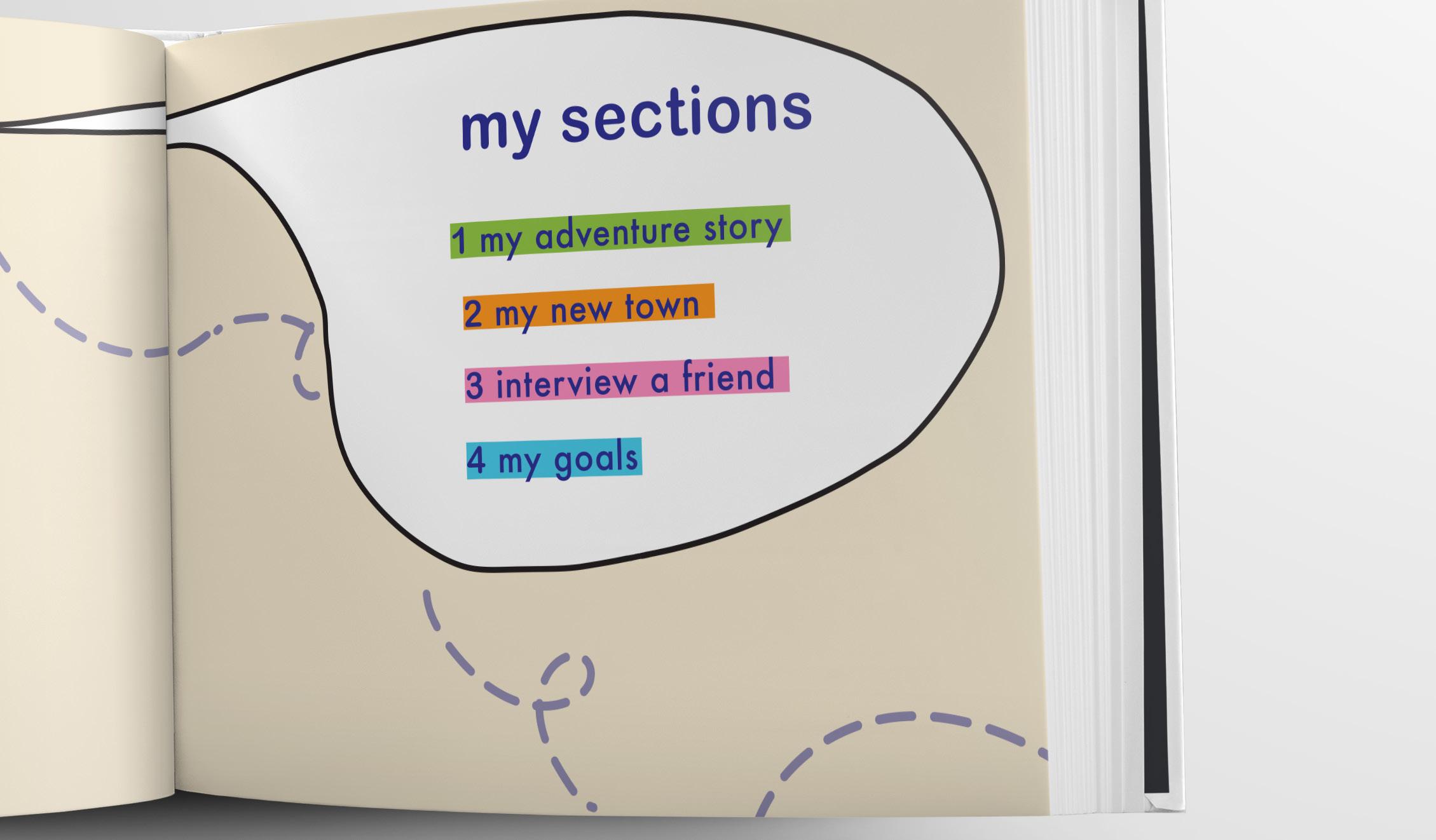
BOOK WITH FIVE SECTIONS FOR AGES 5-9 (46 PAGES)
BRANDING: (3PTS)
Design a physical hardbound interactive book that will come with a marker set for interaction, and will be divided into the following sections:
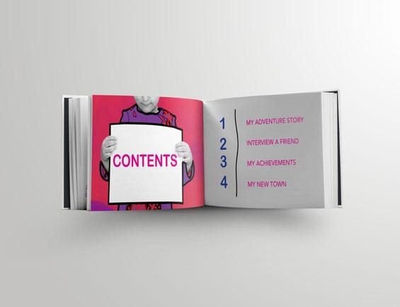
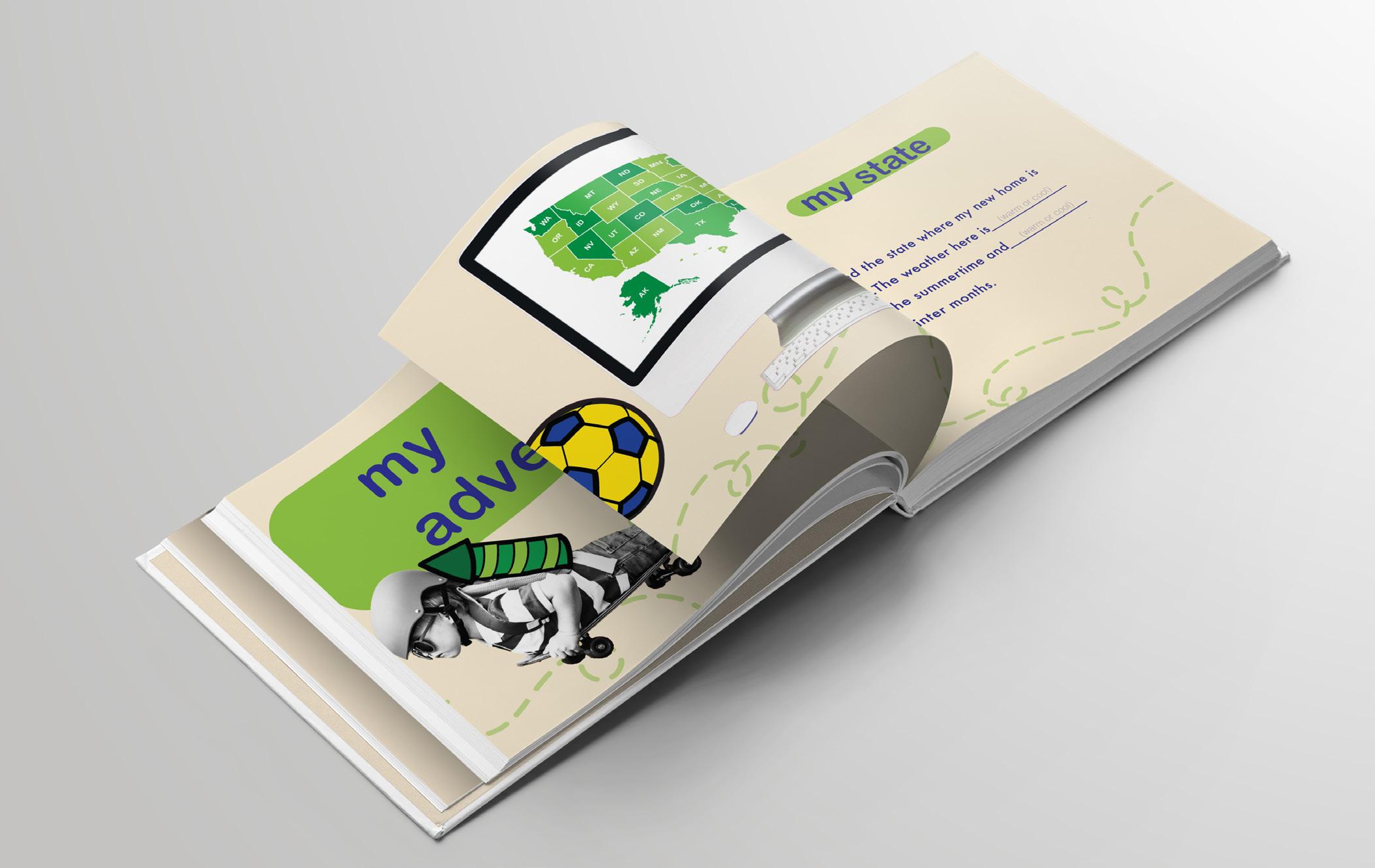
MY ADVENTURE STORY
This section will be comprised of a story in the form of an adventure that will be illustrated to showcase the positive things that can manifest when a child moves to a new place. (14 pgs )
MY TOWN
This section will ask questions that will be geared to excite the child and prompt them to seek information about their new location on their own. (6 pgs)
INTERVIEW A FRIEND
This section will be in the form of questions for the child and potential new friend to ask and answer together. (14 pgs)
MY GOALS
This section will provide space for the child to log dreams and achievements. (4 pgs)
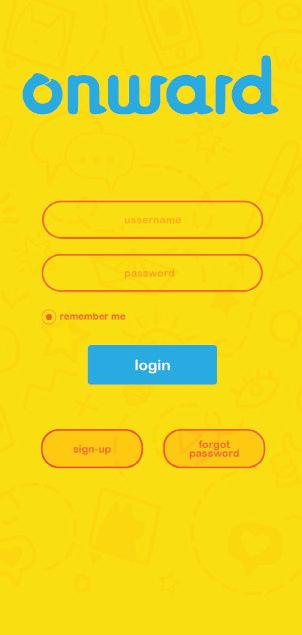
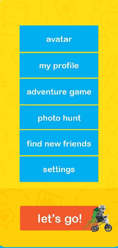
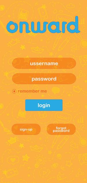
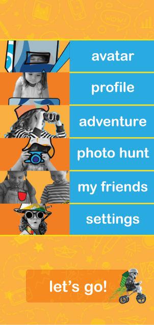
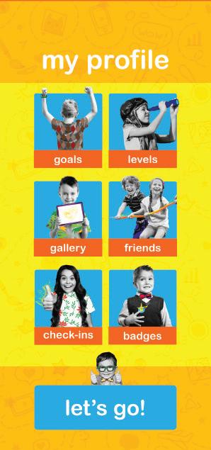
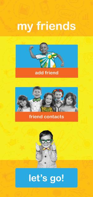
PHONE/TABLET APP FOR AGES 5-9 (15-20 SCREENS)
USER EXPERIENCE: (4PTS)
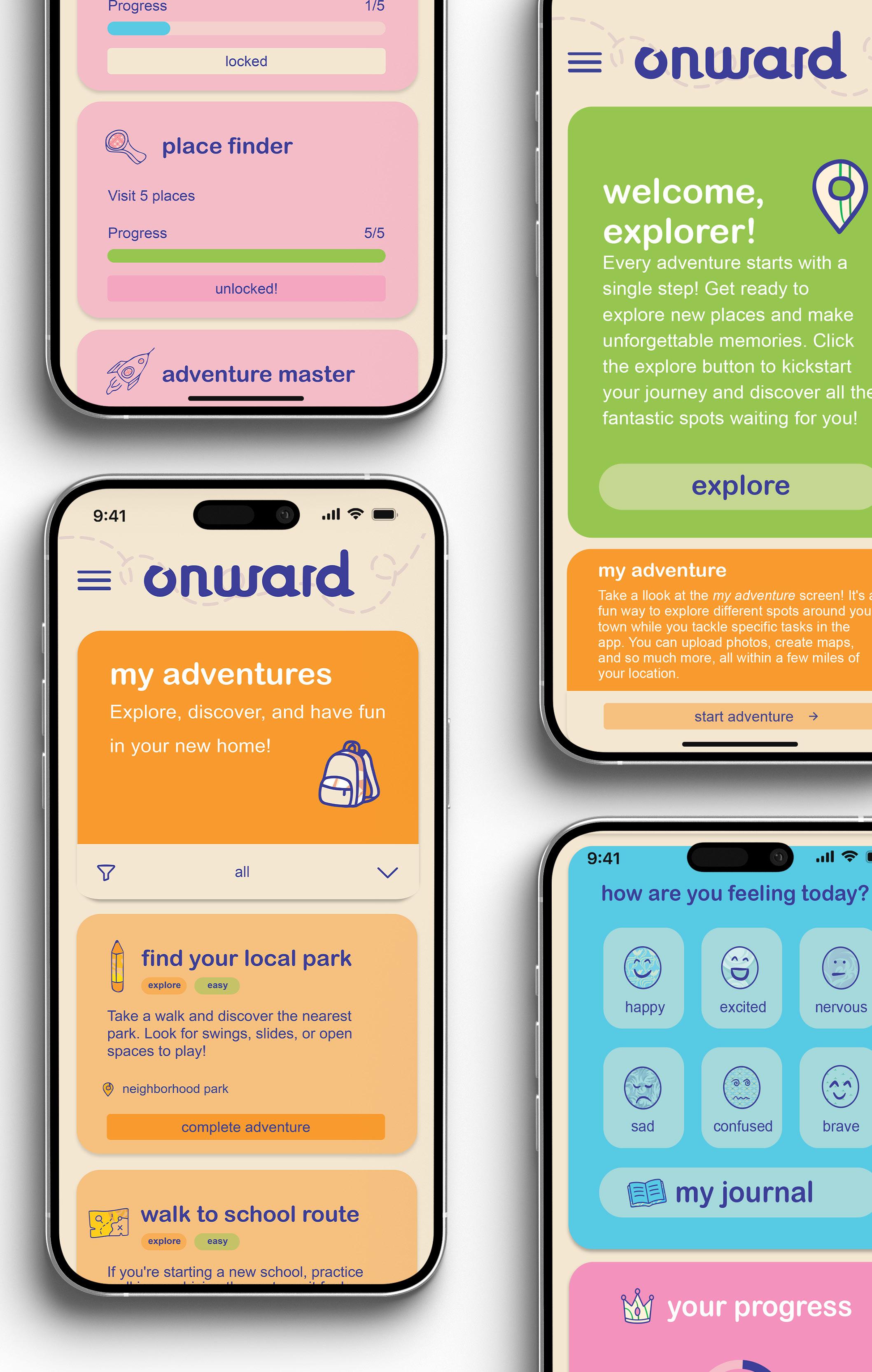
Design screens for a digital app on a phone/tablet platform that is part of the ONWARD system. The app will consist of the following screens:
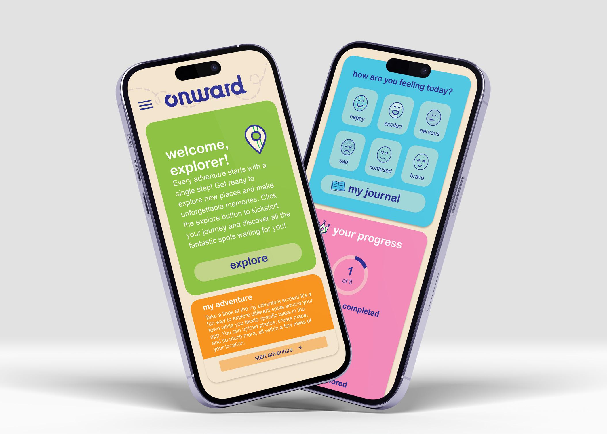
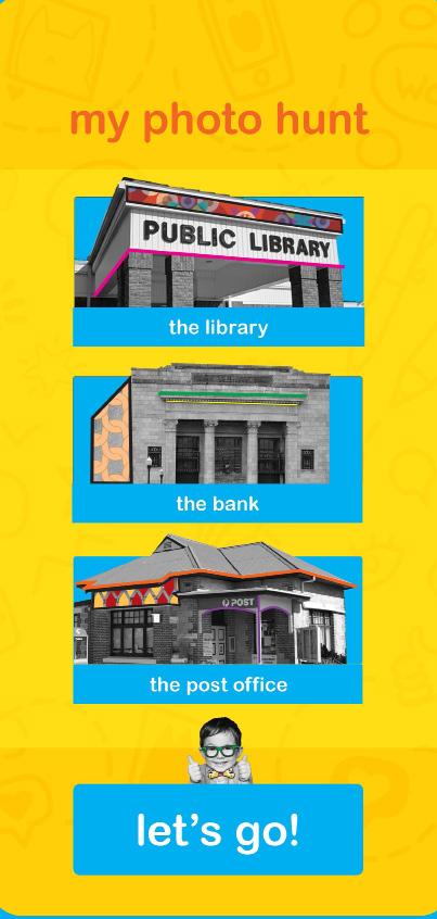
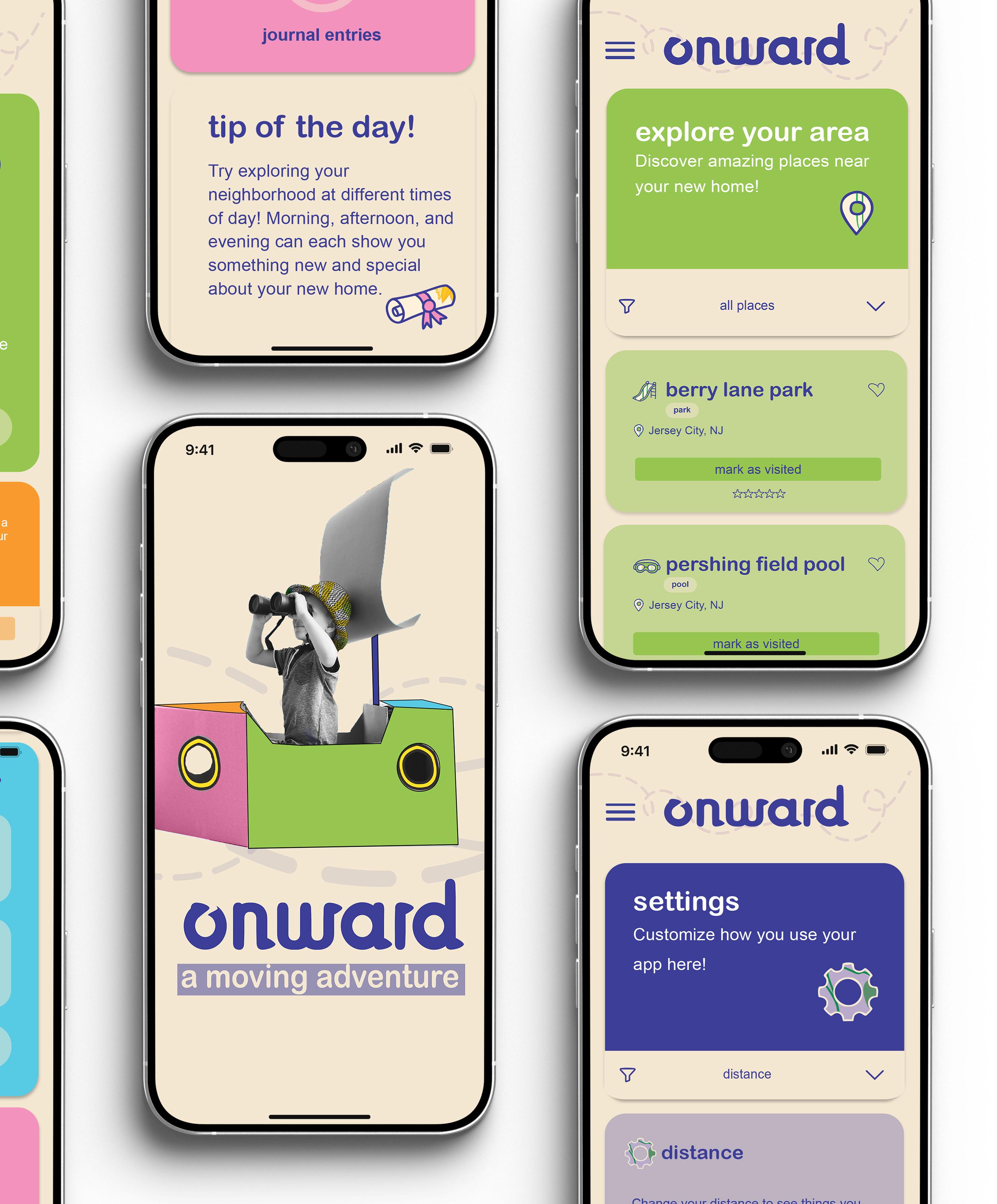
EXPLORE
The child can visit different spots around town while tackling specific tasks in the app. They can upload photos and so much more. (3 scroll screens)
MY ADVENTURE
Fun missions that encourage the child to visit locations just for exploration. (7 scroll screens)
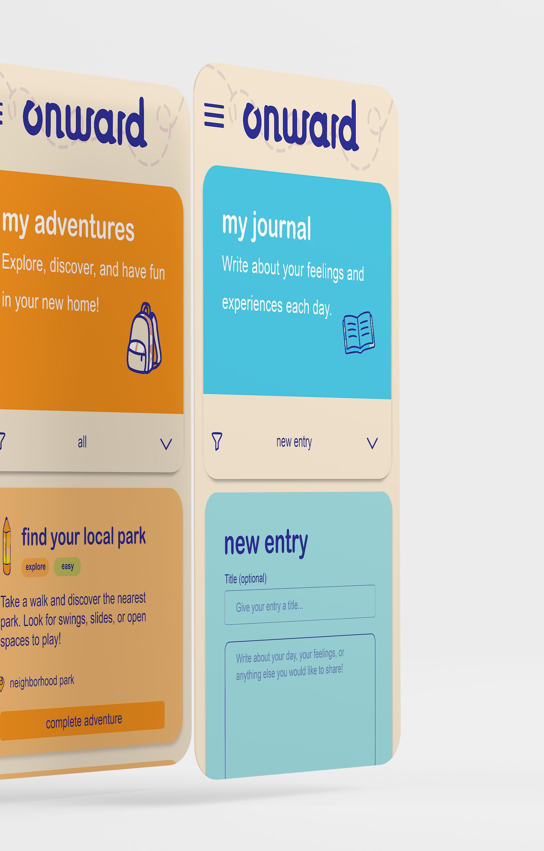
MY JOURNAL
Safe space for the child to express emotions with mood tracking. (
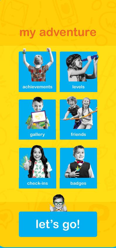
MY ACHIEVEMENTS
Here, the child can earn badges for completing adventures.
WEBSITE FOR AGES 5-9 (10-20 POSTS)
USER EXPERIENCE: (2 PTS)
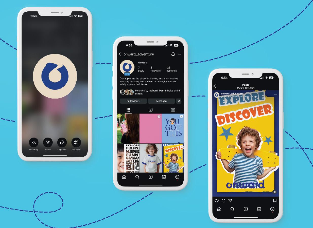
Design an account for ONWARD on Instagram that will help drive app downloads and build trust with parents.
QUEST SPOTLIGHTS
Reels and photos that bring app quests to life. (3-4 posts)
APP SPOTLIGHTS
Produce short reels or photos that explain the app’s purpose and how to navigate it. This content should appeal to curious parents and potential new downloads. (3 posts)
PARENTS PRO TIPS
Share practical advice through engaging formats like “Myth or Fact” reels and photos. This series aims to offer valuable insights, helping parents get the most out of the app. (3–4 posts)
branding: (3pts)
Design a physical hardbound interactive book that will come with a marker set for interaction, and will be divided into the following sections: my adventure story
This section will be comprised of a story in the form of an adventure that will be illustrated to showcase the positive things that can manifest when a child moves to a new place. (14 pgs ) my town
This section will ask questions that will be geared to excite the child and prompt them to seek information about their new location on their own. (6 pgs) interview a friend
This section will be in the form of questions for the child and potential new friend to ask and answer together. (14 pgs) my goals
This section will provide space for the child to log dreams and achievements. (4 pgs)
user experience: (4PTS)
Design screens for a digital app on a phone/tablet platform that is part of the ONWARD system. The app will consist of the following screens: explore
The child can visit different spots around town while tackling specific tasks in the app. They can upload photos, create maps, and so much more, all within a few miles of the child’s location.
my adventure
Fun missions that encourage the child to visit locations just for exploration.
my journal
Safe space for the child to express emotions with mood tracking.
my achievements
Here, the child can earn badges for completing adventures.
social media: (2 pts)
Design an account for ONWARD on Instagram that will help drive app downloads and build trust with parents.
quest spotlights
Reels and photos that bring app quests to life— Share a photo of you at the park! Tag @ONWARD for free stickers and pencils! #ExploreWithOnward”(3–4 posts)
app spotlights
Produce short reels or photos that explain the app’s purpose and how to navigate it. This content should appeal to curious parents and potential new downloads. (3 posts)
parent pro tips
Share practical advice through engaging formats like “Myth or Fact” reels and photos. This series aims to offer valuable insights, helping parents get the most out of the app. (3–4 posts)
In order to come up with names for my thesis, I had to brainstorm at least 50 ideas and then refine the best ones. I used these names to create a brand and visual system by gathering inspiration for each keyword from various sources. From the most promising initial sketches, I then developed more detailed versions.
• Aim for at least 50 loose sketches and a minimum of three distinctly different ideas.
• Use semiotic meanings to drive ideas.
• Use keywords to drive ideas.
• Make the most promising loose sketches into tight sketches.
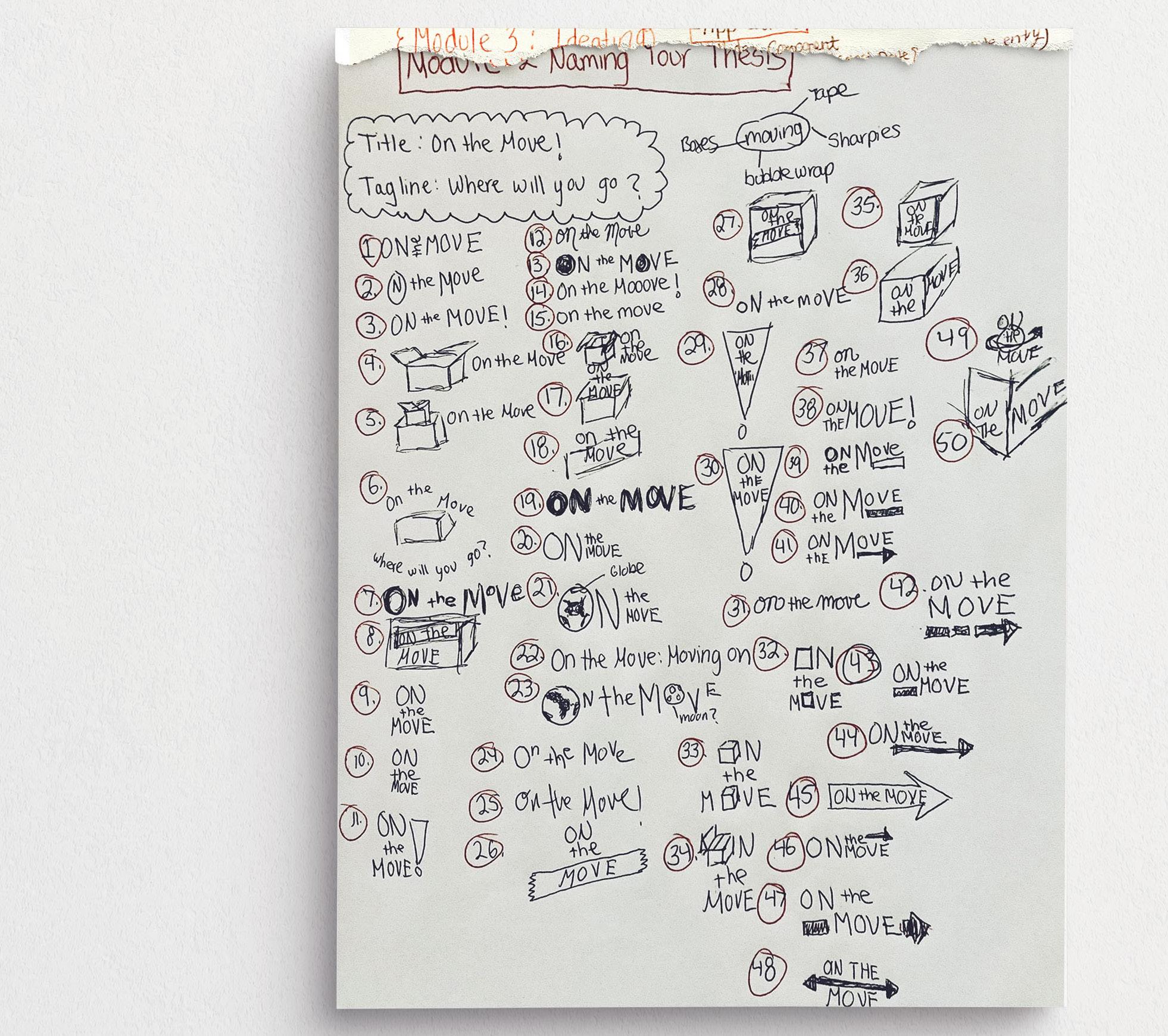
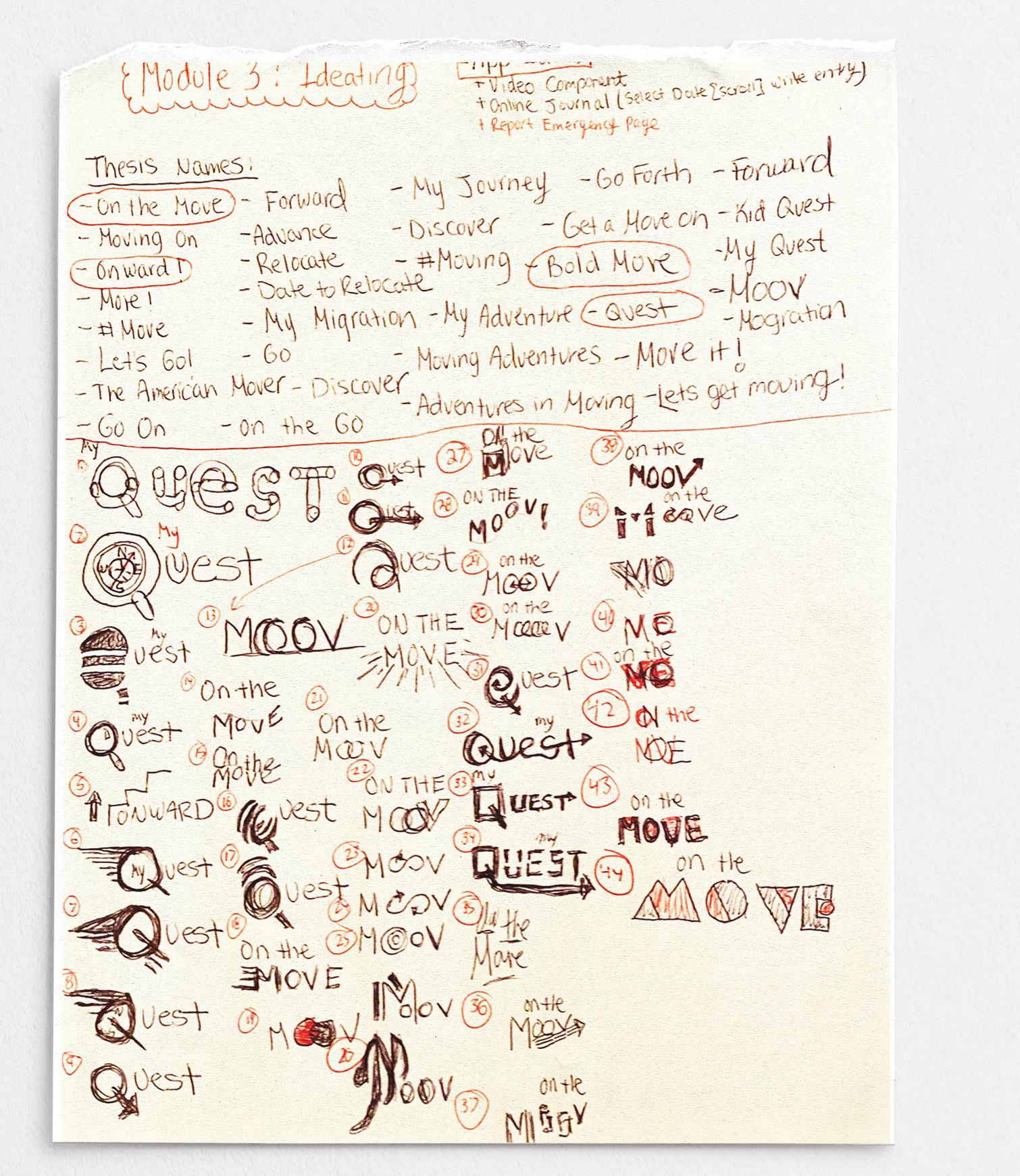
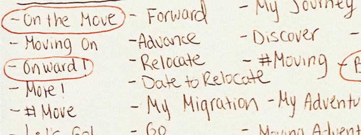
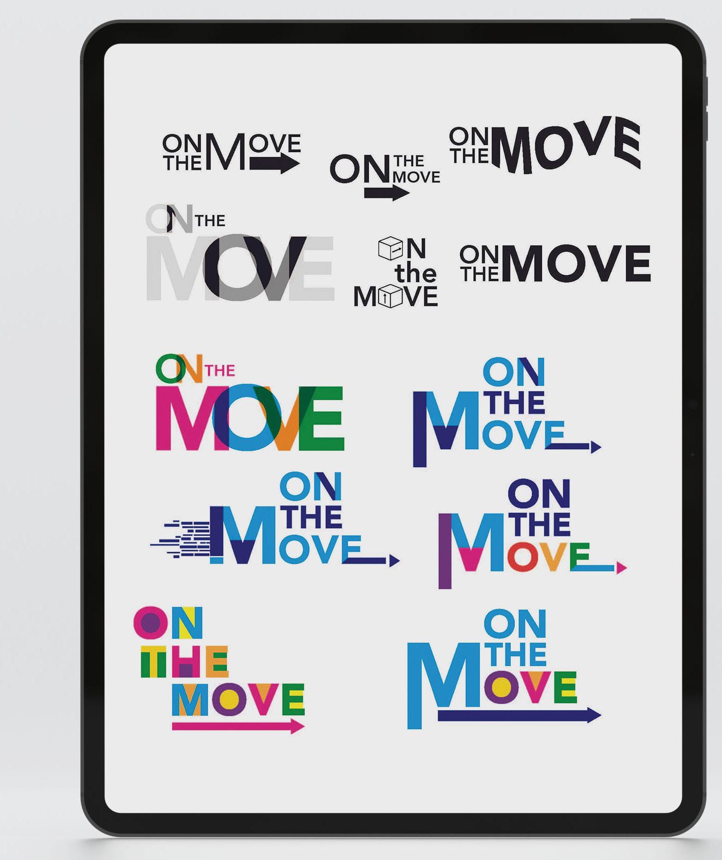
Reflection: In the initial phase, I dove into my sketchbook to brainstorm thesis titles. The phrase “On the Move” immediately resonated with me, so I adopted it as the foundation for my logo concept in this phase.
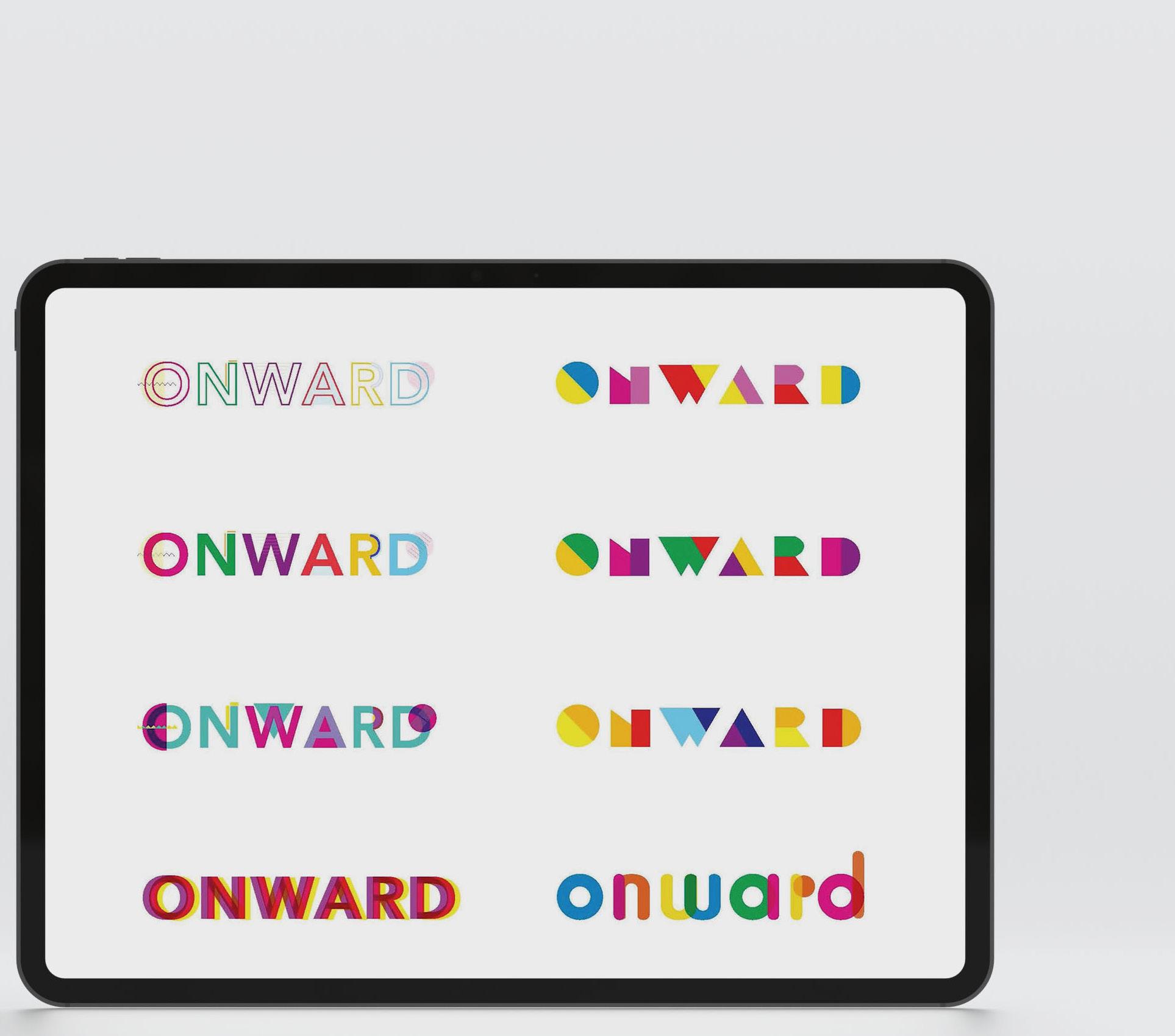
Reflection: I refined my thesis title from “On the Move” to ONWARD. Next, I transitioned to the computer, crafting digital mockups with the goal of infusing my branding with a vibrant, playful energy.
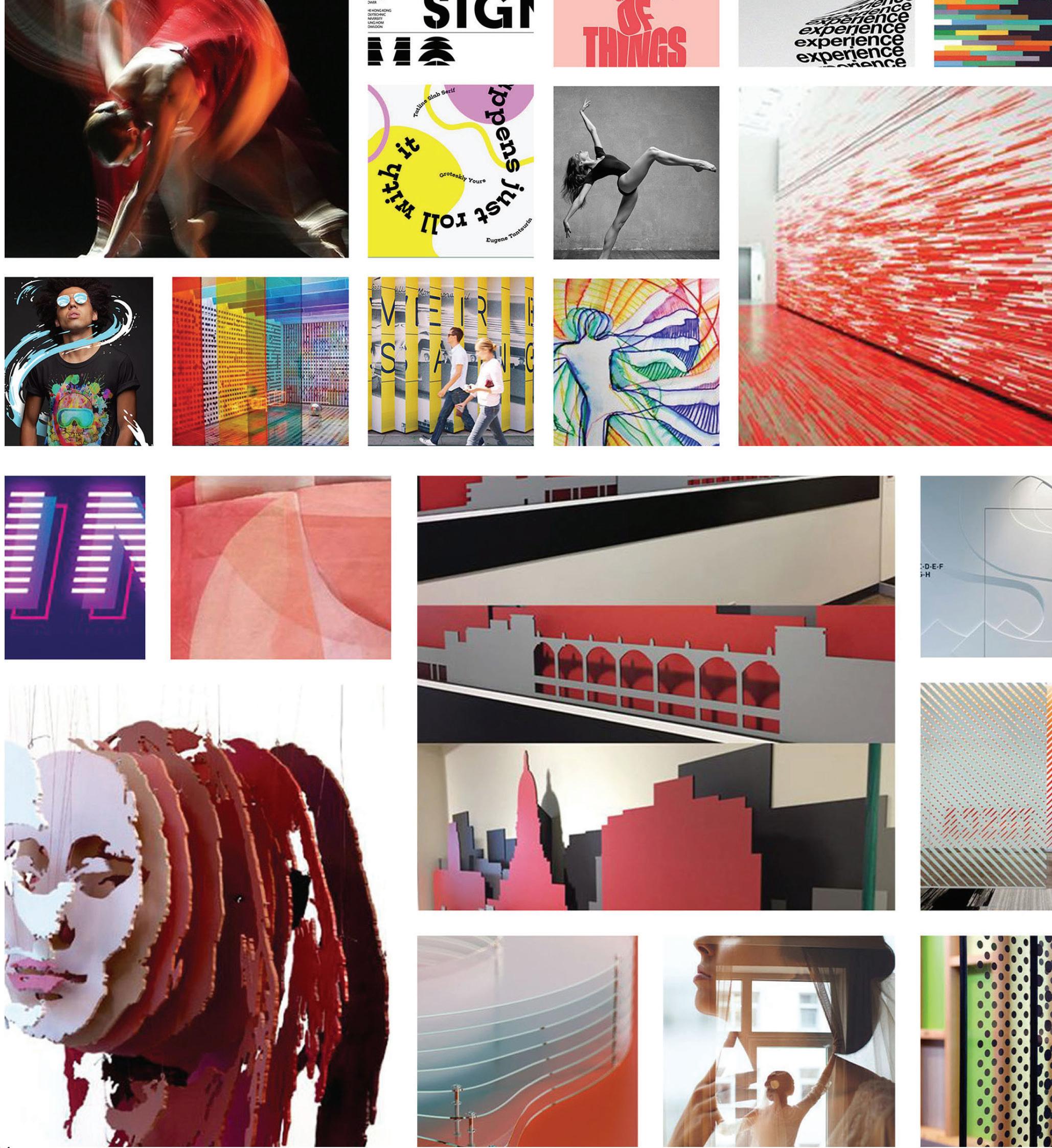
Reflection: I crafted my moodboard to highlight vibrant colors, layered compositions, and soft, rounded forms.


In this pivotal stage, I refined my thesis title from “On the Move” to ONWARD, then dove into fresh sketchbook explorations—and began generating bold logos, playful icon sets, and energetic color palettes to infuse the brand with a feeling of excitement.
Transitioning to digital, I crafted vibrant computer mockups that captured this lively identity, while deliberately keeping the user flow streamlined and intuitive, as recommended for early-stage clarity and focus.

• Userflow
• Journey Maps
• Logo Development
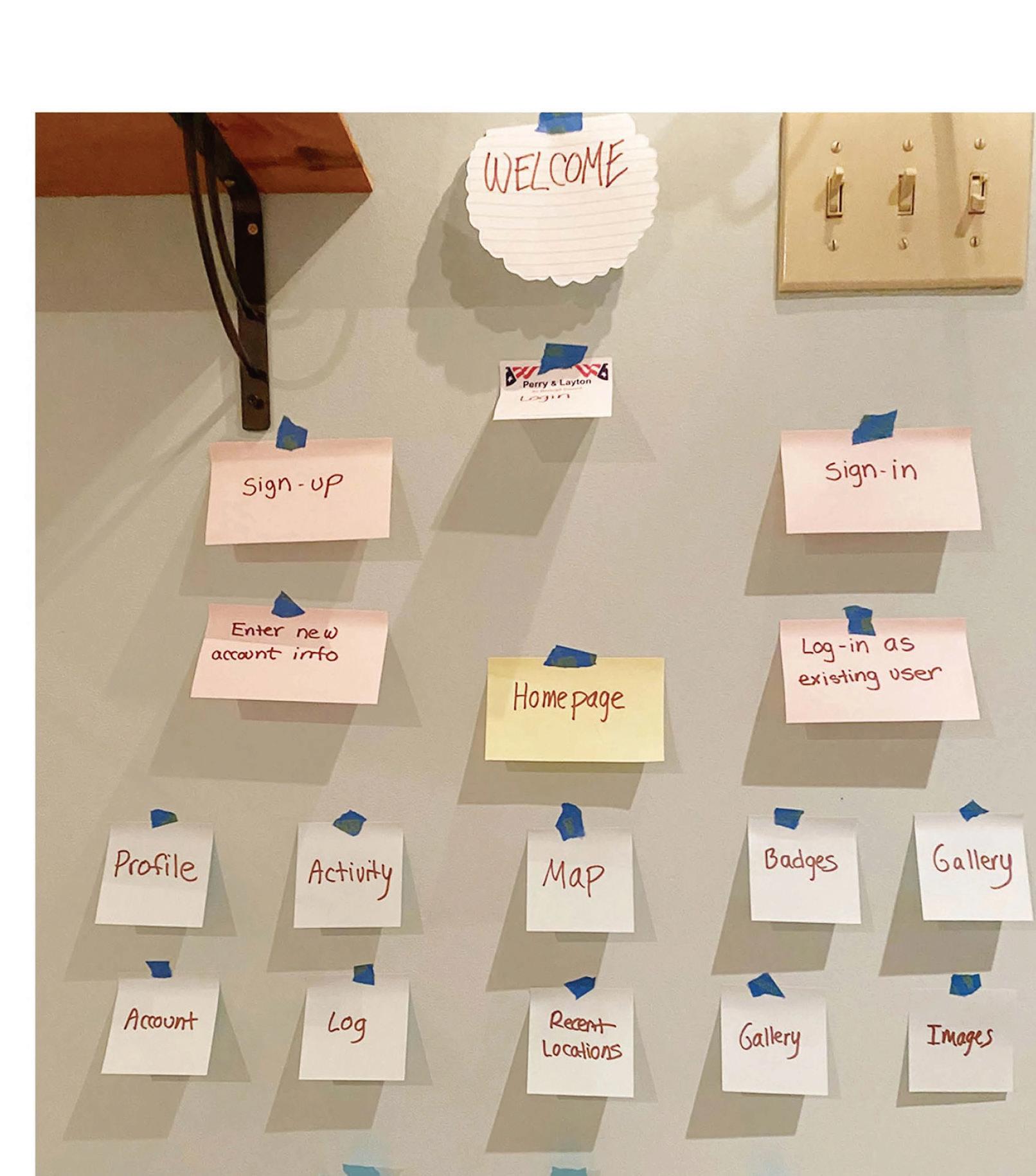
Reflection: The original ONWARD Journey Map traces a child’s emotional path from discovering a move and grappling with sadness to embracing excitement.
For my original user flow, I deliberately avoided excessive detail to maintain simplicity during the early conceptual stages. The chart was built around a mobile app envisioned as an interactive game, designed to let children safely explore their surroundings in a playful, engaging way—unlocking virtual rewards, discovering hidden “treasures” in their neighborhood, and completing light missions like “find three different leaves” or “sketch the tallest tree nearby.”
Reflection: I kept my original user flow simple for early stages. It outlined a mobile game app letting kids safely explore, log adventures, and network with peers.
Reflection:
This was the original concept, but as you’ll see, it evolved into a far more robust structure—delivering far beyond the initial the three exploration sections.
Reflection:
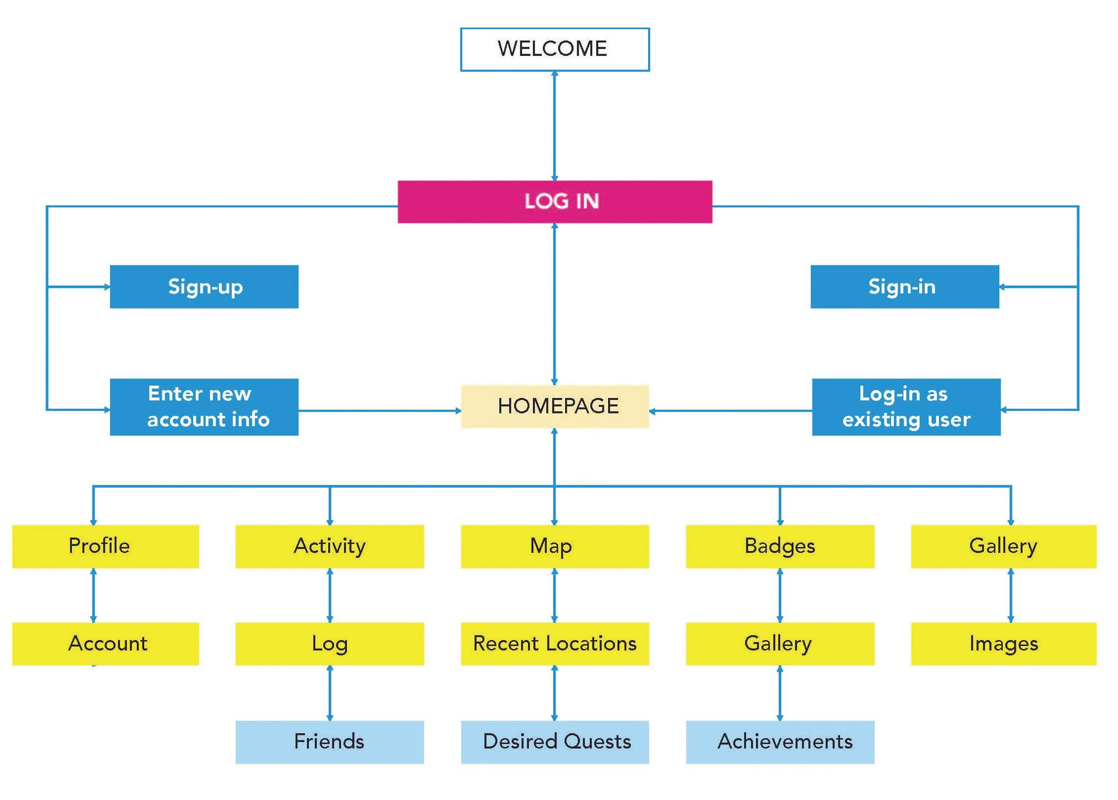
Thesis 2’s final flow kept the Thesis 1 quest game (e.g., 3-level library challenge) before Thesis 3’s major refinement.
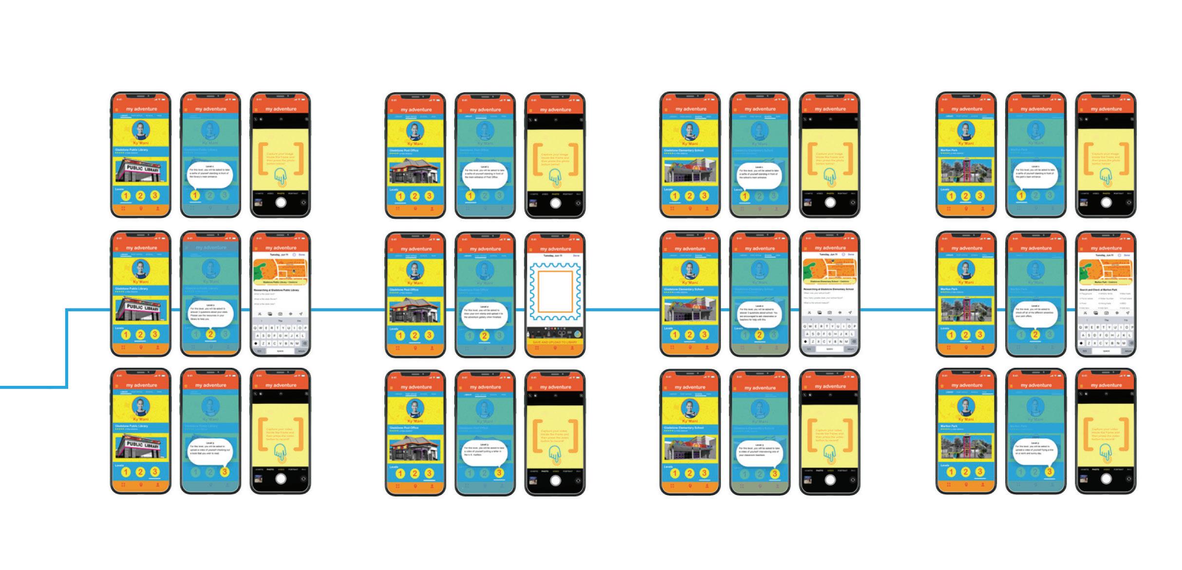
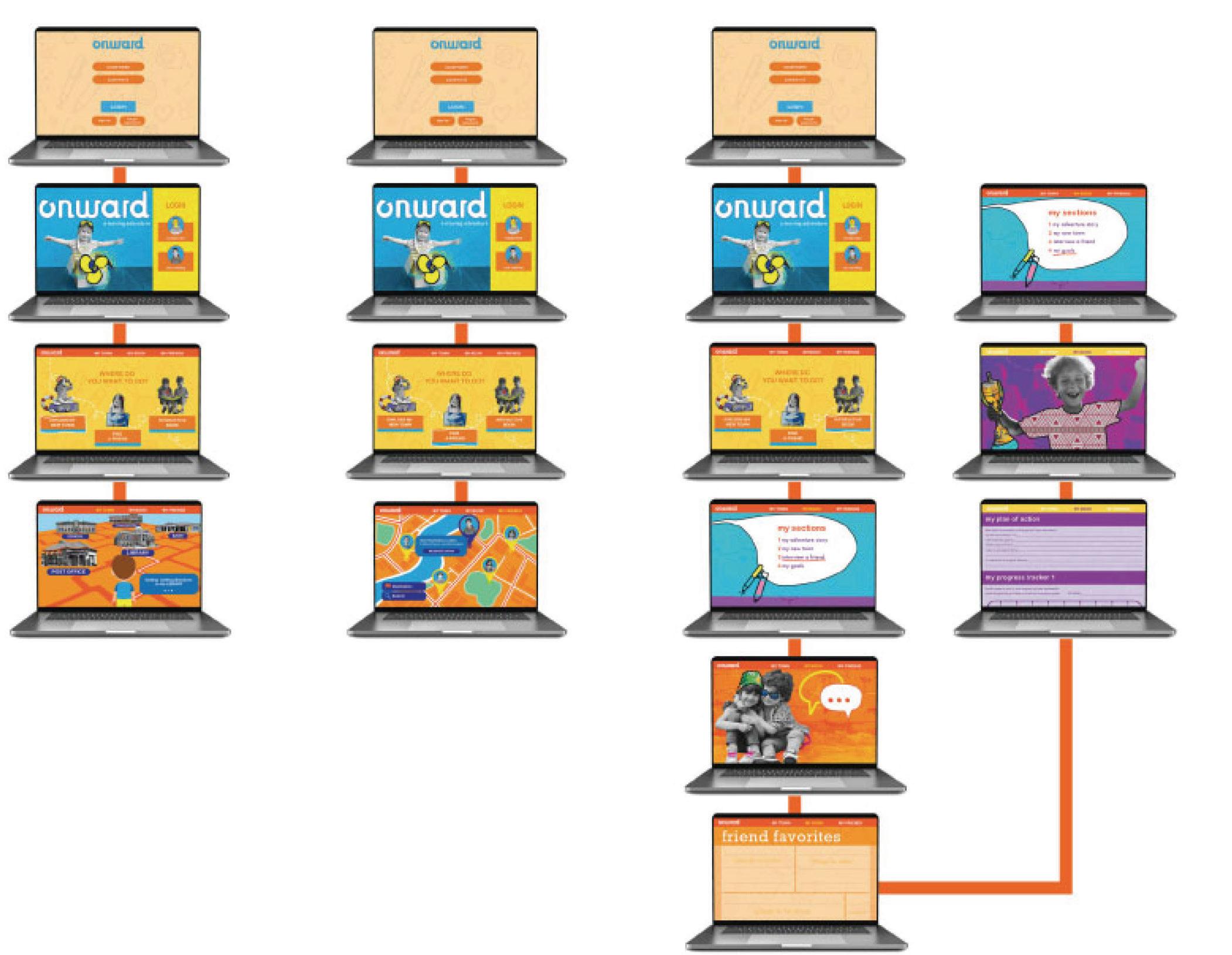
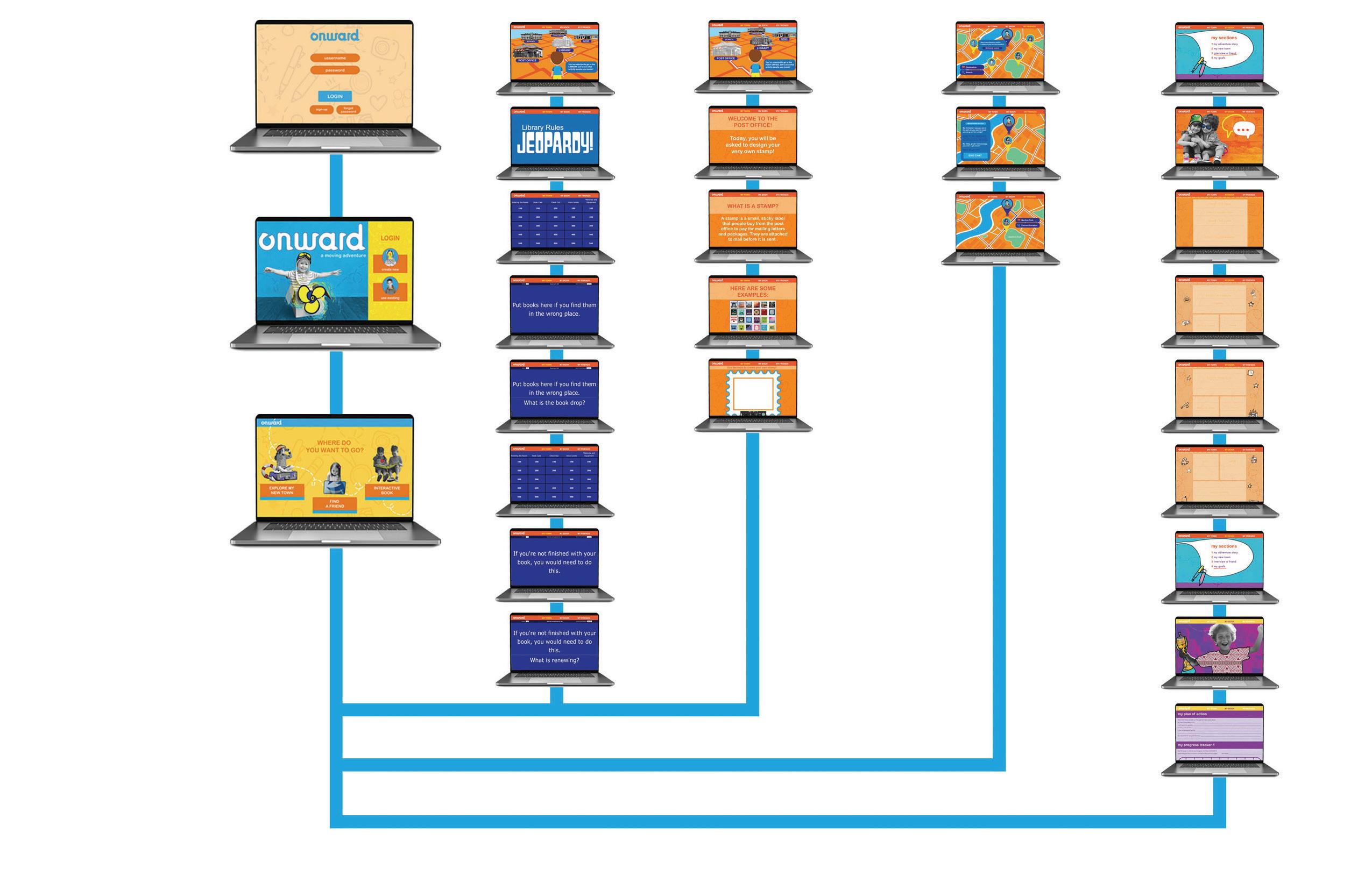
This was the final user flow and graphic system for my app at the close of Thesis 2. It preserved the original Thesis 1 adventure concept—transforming a child’s relocation into an immersive game where quests acclimate them to their new surroundings.
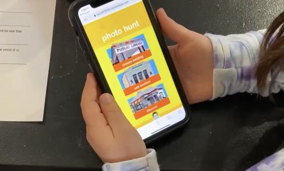
For example, the “Discover the Library” quest unfolded across three escalating levels: Level 1—snap a photo outside the library; Level 2—obtain a library card; Level 3—check out a book.
Yet, upon entering Thesis 3, this framework evolved dramatically, gaining intricate depth and nuance—as fully documented later in this book.
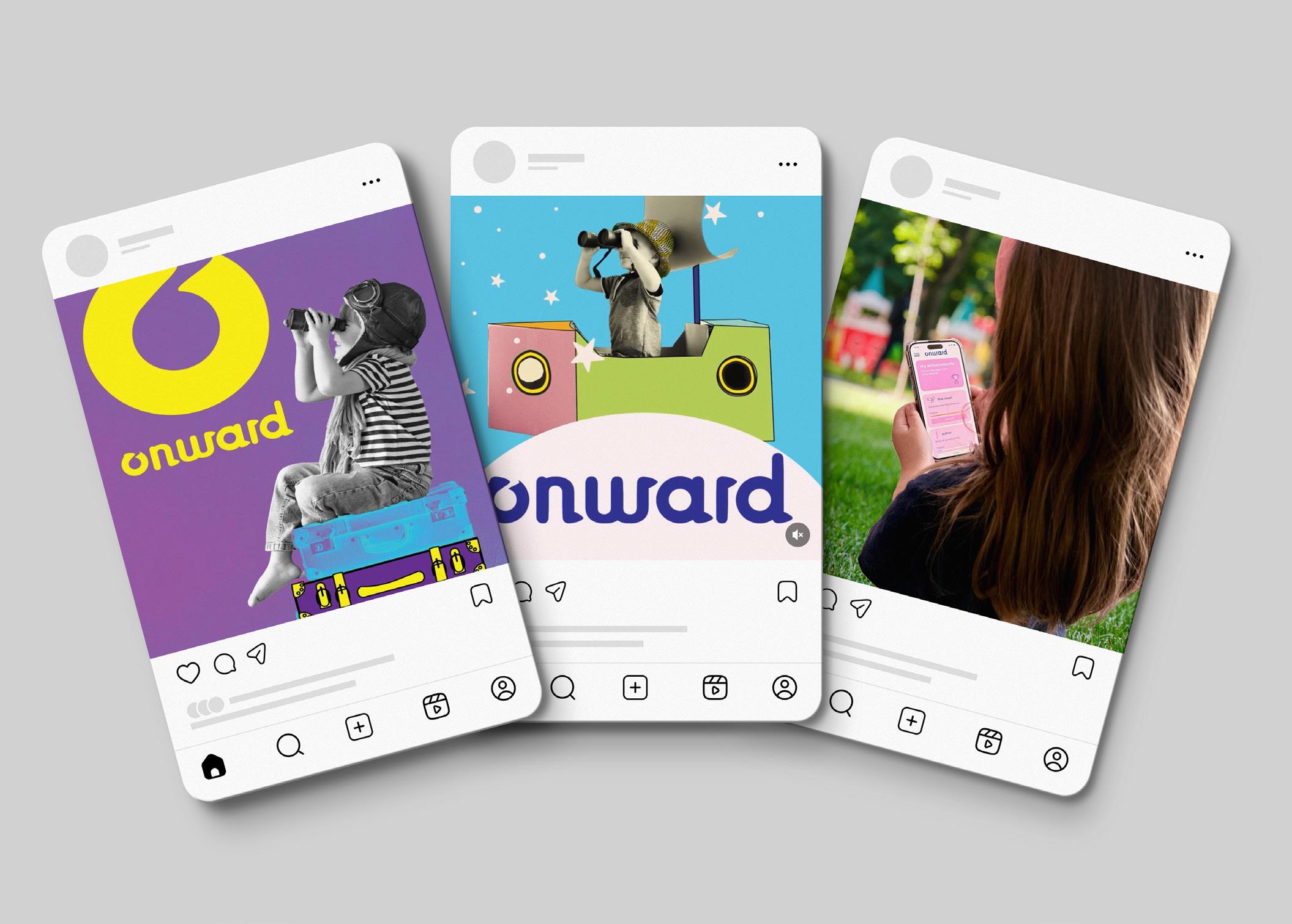
Reflection: Originally, my third deliverable was a companion website for the ONWARD Adventure Book. In Thesis 3, I replaced it with a vibrant social media campaign.
Originally, my third deliverable was envisioned as a companion pairing website for my first deliverable—the ONWARD Adventure Book. However, upon entering Thesis 3, I pivoted entirely—scrapping the website in favor of a dynamic social media campaign that promotes both the book and app through bite-sized videos, parent testimonials, kid-created “move hacks,” and viral challenges like #ONWARDQuest, designed to build buzz, foster community, and drive organic adoption.

Reflection:
I built a web-chat to link the various aspects of moving. The key insight: money ties it all together—whether hiring professionals or buying packing and cleaning supplies for a DIY move.
In the Visual Communications lab, I completed a series of assignments and labs that were targeted towards producing the major project for the class: a thesis-proposal video that formed the basis of my Midpoint Review. I first had to define a set of topics before deciding on my final topic for my thesis. After several weeks and countless hours spent researching, I decided to create a series of products using graphic design to help young children through the emotional process of moving to a new location within the United States. The following pages contain my thought and design process as well as any sketched concepts and physical mock-ups.
• Logo development
• Interactive book development
• Phone app development
• Website development
• Materials development
Reflection: I hand-drew every letter form, experimenting with fluid lines and dynamic serifs to capture the essence of movement, growth, and forward momentum.
Reflection: I chose a vibrant, high-energy palette to spark instant excitement and joy—perfect for young explorers.
Reflection:
In my second logo iteration, I paired vibrant hues and layered dynamic patterns to amplify energy and playfulness. The result: a bold, textured mark that pulses with childlike wonder and forward motion.
logo development: round 2
logo development: round 2


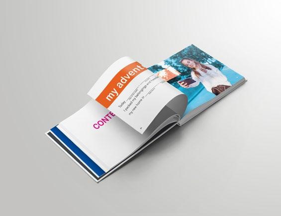
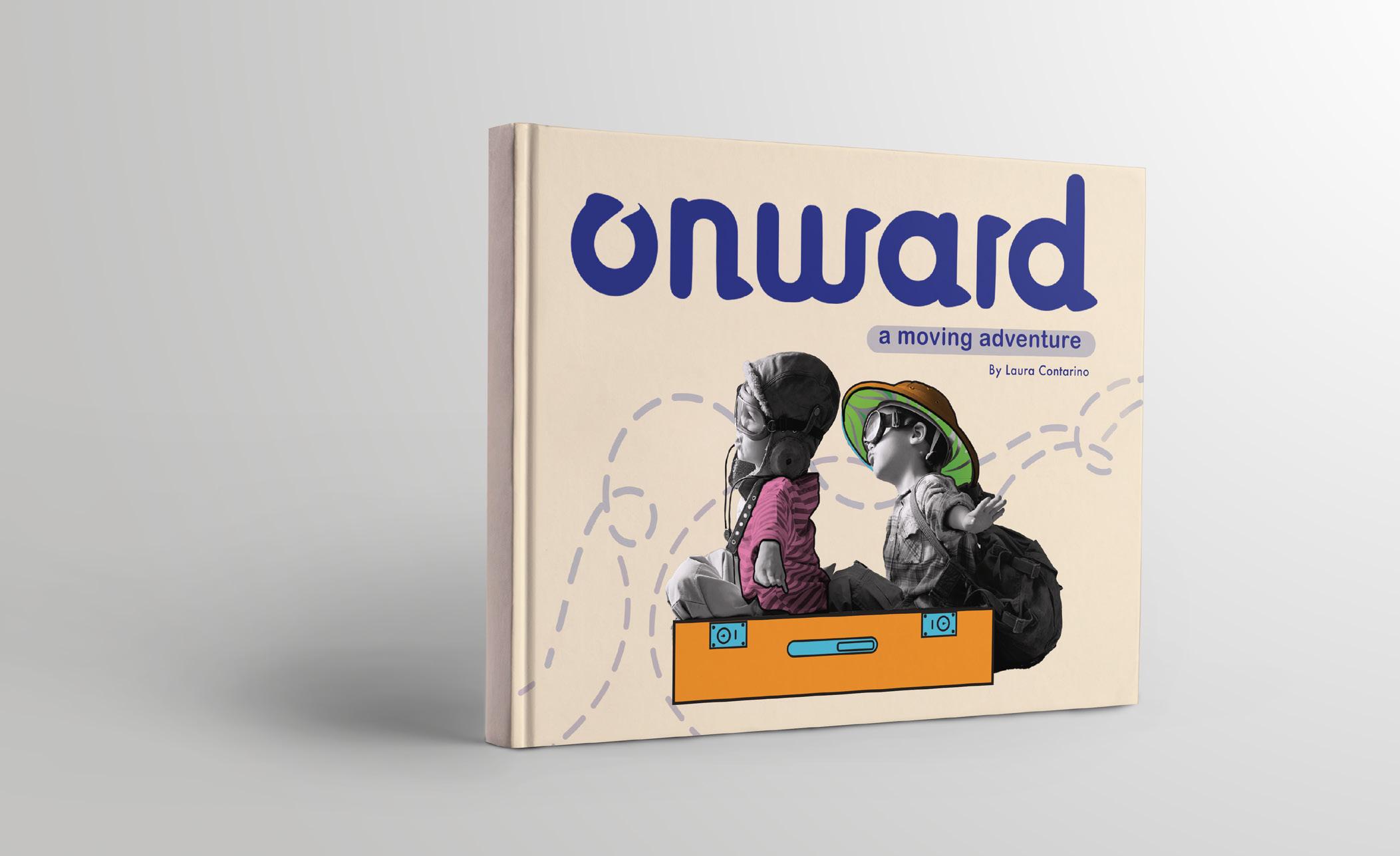
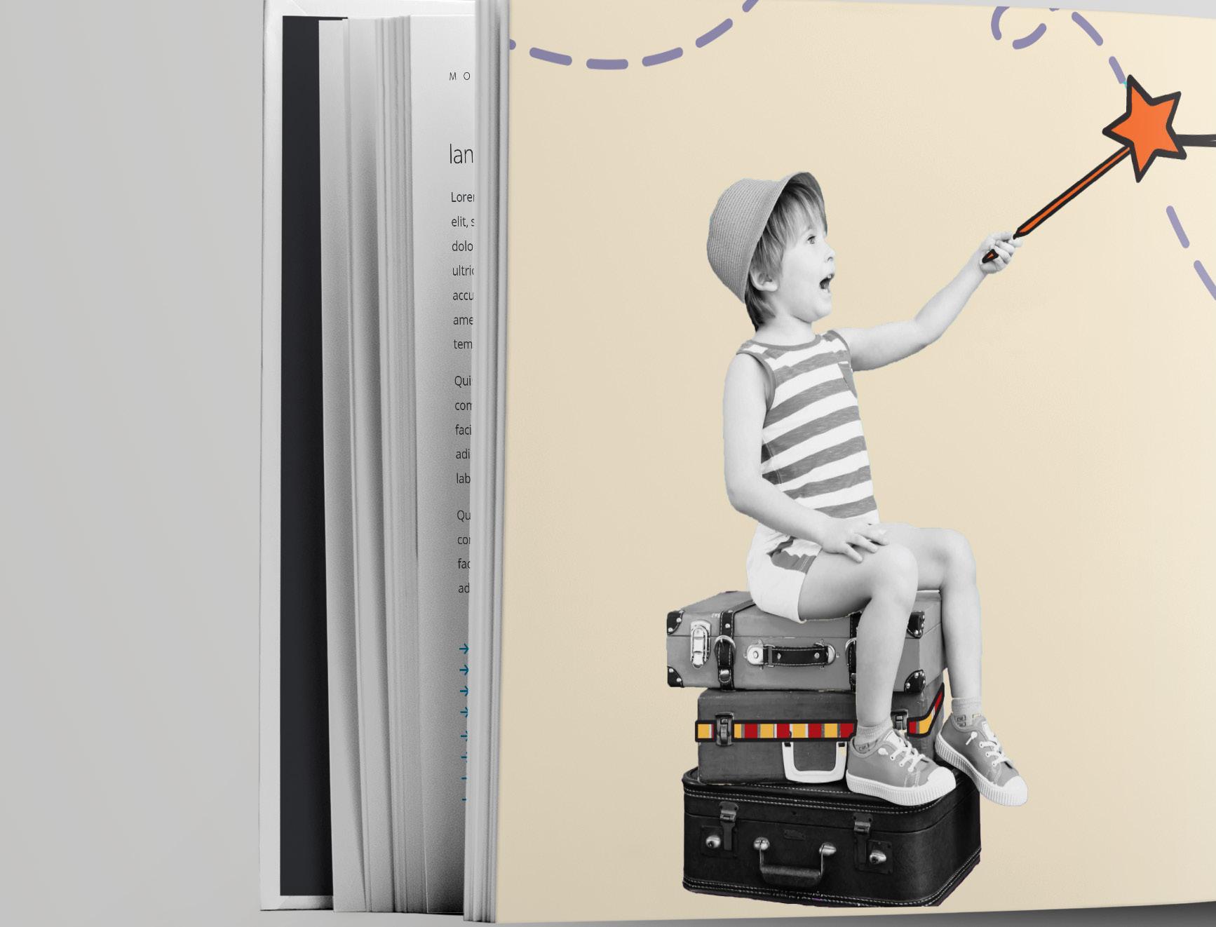
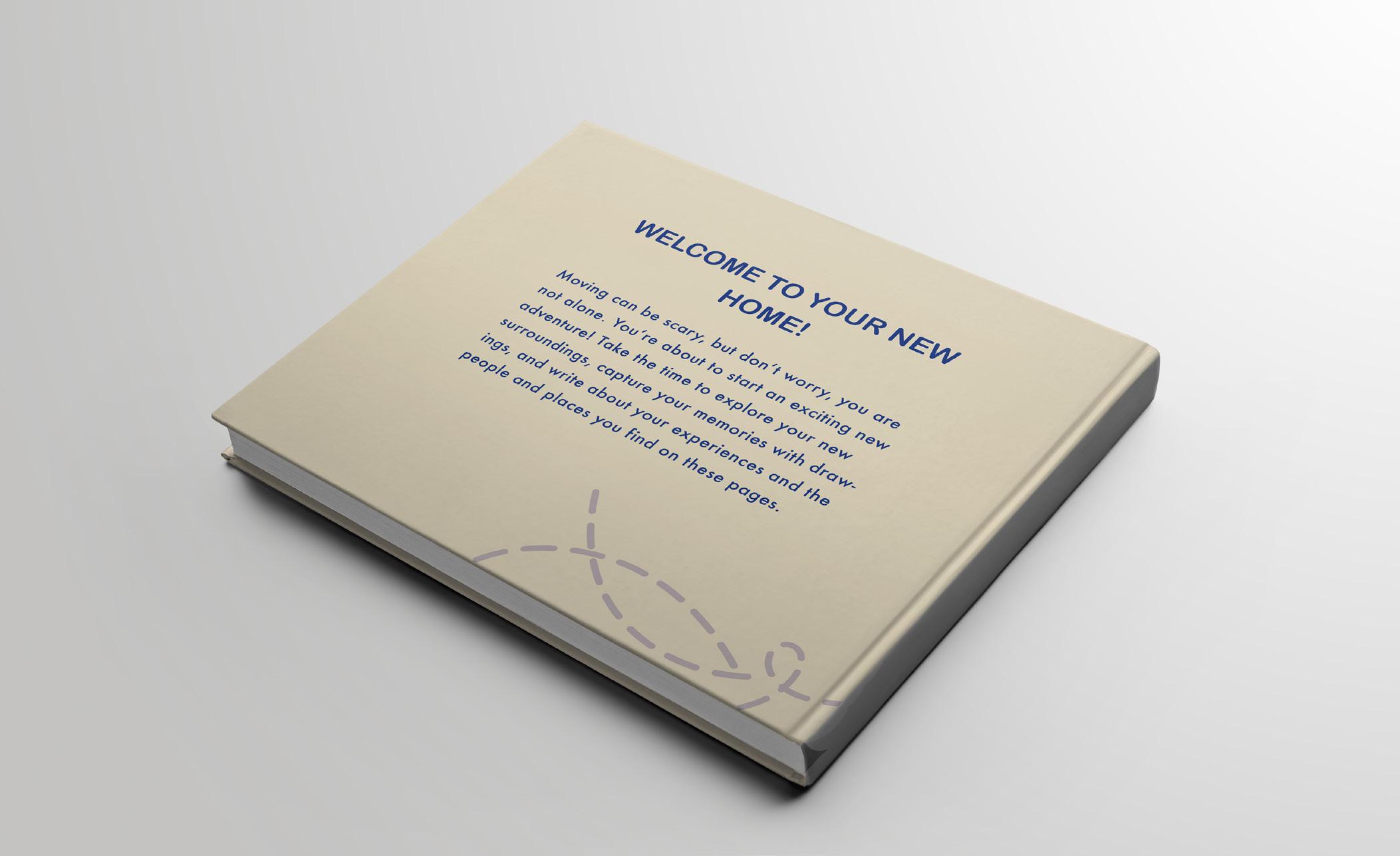
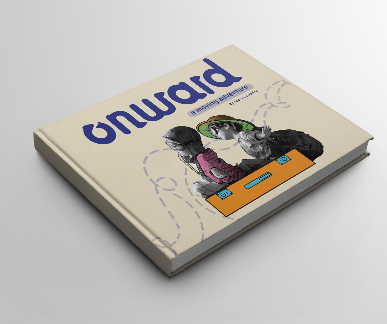
Here, I designed the cover for what grew into a 46-page Onward Adventure Book, weaving in the logo’s vibrant colors and playful patterns to create an irresistible, joy-filled gateway. The following pages reveal the book’s early layout stages—fluid, experimental, and full of discovery—before it significally changed by the end of Thesis 3.


Reflection: By Book Direction 2, I ignited the bold, whimsical style that would blaze into my final Onward system. Vibrant strokes and playful rhythms locked in, fueling a joyful, kid-powered design universe.


Reflection: By this stage, I crafted bold hierarchy and layered vibrant patterns, guiding young eyes with playful energy.
Reflection: By the final stage, my vision for the book was crystal clear. It radiated playful energy and bold, child-friendly design.
Reflection: By the end of Thesis 3, I crafted 19 vibrant spreads for the Onward Adventure Book, thoughtfully organized into four engaging sections.
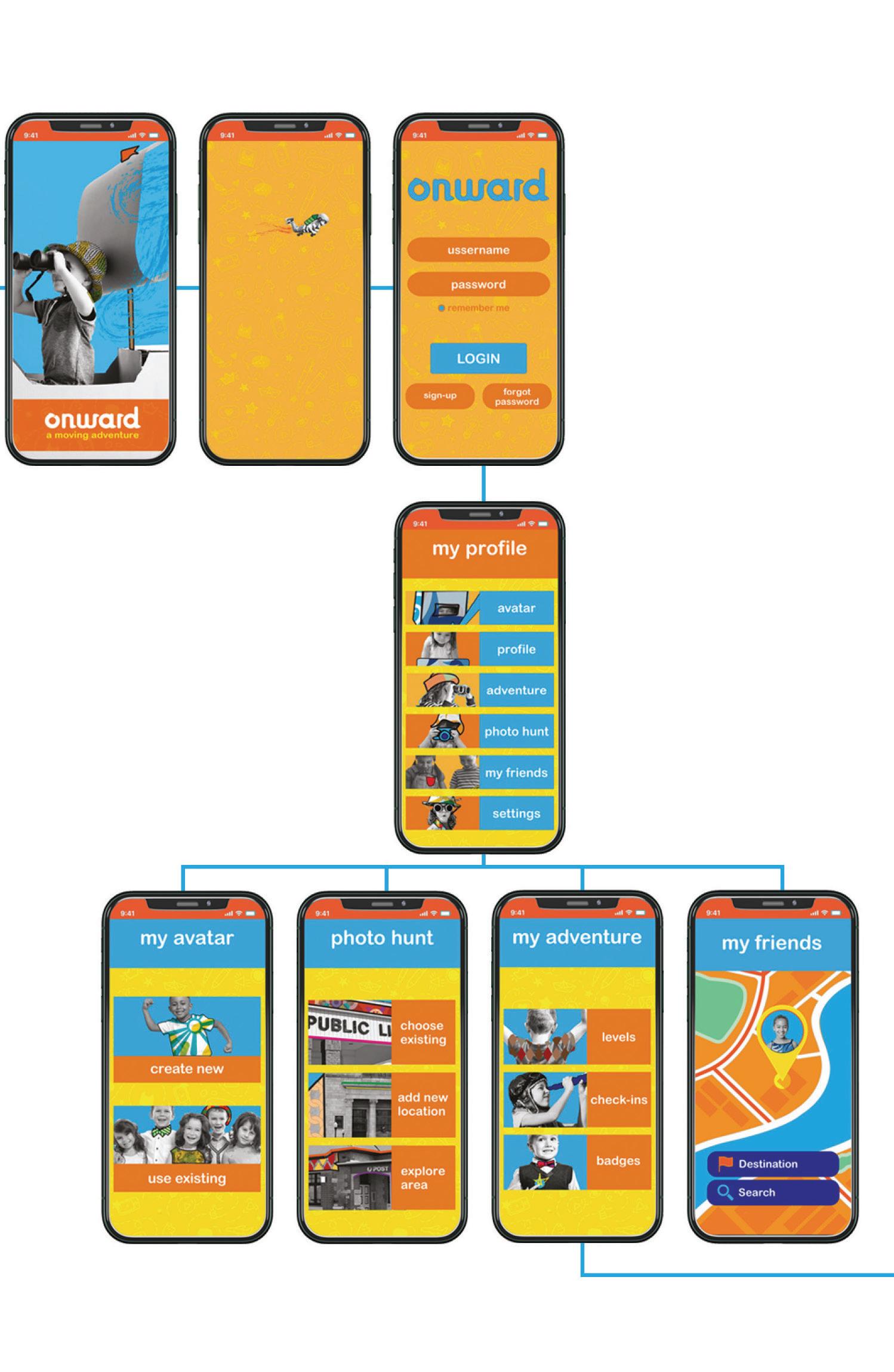
phone app: direction 1


Reflection: This is the final version of the app screens from Thesis 2. They underwent significant changes by Thesis 3.
Reflection: I crafted a bold series of posters to expand the Onward brand, even though at this point, their exact role was still unfolding.
materials: direction 1 where will you go?
where will you go? where will you go?
Reflection: I placed icons within the “O” counter to form subtle patterns, using only yellow and blue as the core palette. This created a clean, cohesive look that reinforced the brand’s playful identity.
Reflection:
This is the final, streamlined system I developed for my Onward poster designs. By Thesis 3, I integrated them into the social media campaign to amplify the brand’s playful energy.


My book design resonated strongly with the target audience, earning enthusiastic feedback from young users who found the size and font clear, legible, and engaging. While the overall concept and purpose were warmly embraced, a key improvement—adding more writing lines—was consistently requested.
I conducted qualitative testing with the 5–9 age group in their schools and homes, gathering insights through direct observation and guided questions. All responses were compiled via email, confirming the design’s appeal and informing thoughtful refinements.
• Testing session 1 findings contents
• Testing session 1 user feedback
Reflection:
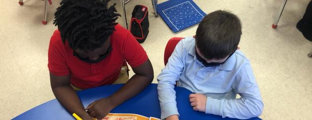
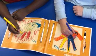
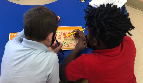
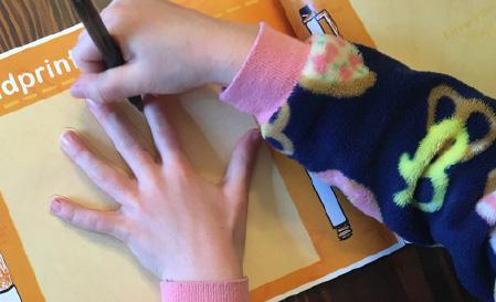
For user testing, I distributed two printed copies of my book to children ages 5–9—one through a local elementary school and another to a friend’s daughter out of state.
For my user testing, I printed two copies of my book. Because my thesis focuses on children between the ages of 5 and 9 , finding participants was somewhat challenging. Fortunately, a former co-worker who now works at an elementary school in my district was able to distribute my testing materials to a student and document the process with several photos, as I wasn’t permitted to enter the school due to COVID restrictions. For my second participant, a friend living out of state kindly offered to have his daughter test my book after I mailed a copy to them.

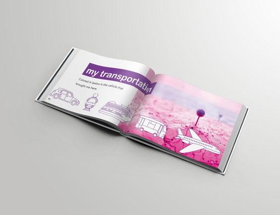
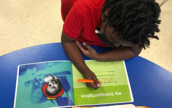
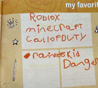
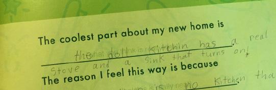
User 1: Based on the responses provided by this student, it appears that certain vocabulary within the book was challenging to comprehend. When asked if there were any aspects he found confusing, he identified page 5: My Transportation as particularly difficult. Additionally, he noted that the space provided for written responses was insufficient and expressed a dislike for page 7, which included a drawing activity. However, he reported a positive social experience, mentioning that he made a new friend while completing the book, and he expressed particular enjoyment of the interview pages.
Reflection:
User 1 found some vocabulary and page layouts challenging—particularly pages 5 and 7—but enjoyed the interview sections and had a positive social experience while completing the book.
Reflection: These pages feature the work of User 1, a 7-year-old participant who has not recently relocated.
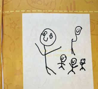
Reflection: Pictured is my 7-year-old user, who made a new friend while testing my book.
Reflection:
For my user testing, I gathered feedback from two children aged 5 to 9— one locally and one out of state—providing insights into how they engaged with the book.
For my user testing, I printed two copies of my book to gather feedback from children within my target age range of 5 to 9 years old. Because of this narrow age group, identifying suitable participants proved somewhat challenging. Fortunately, a former co-worker who now works at an elementary school in my district agreed to facilitate one of the tests by distributing my materials to a student and documenting the process with several photographs, as I was not permitted to enter the school due to COVID-19 restrictions. For my second participant, a friend living out of state kindly offered to have his daughter engage with the book after receiving a mailed copy. Conducting these two tests provided valuable insights into how children in this age group interact with the material.
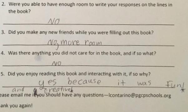
User 2: This participant did not fully meet the intended user criteria, as she had not recently relocated. As a result, she was unable to complete the section on making new friends, since those relationships were already established. When asked if any improvements could be made, she suggested adding more lines for written responses. Unlike User 1, she chose to write with a pen rather than the provided marker set and noted that the pen did not work well with the glossy pages. On a positive note, she reported that she enjoyed completing the book, describing the experience as “fun and creative.”
Reflection: User 2, not recently moved, skipped the friends section but enjoyed the “fun and creative” book. She requested more writing lines and noted pen ink failed on glossy pages.
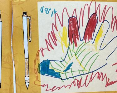
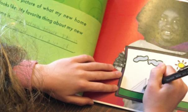
Reflection: Featured is Sofia, a 7-yearold who recently relocated.
Reflection: Sofia appeared to enjoy the drawing activities the most and described the book as highly “creative.”
Reflection:
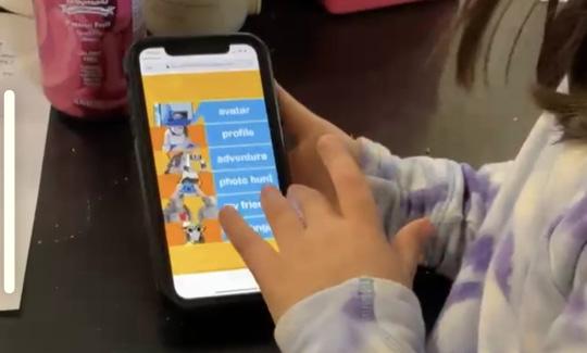
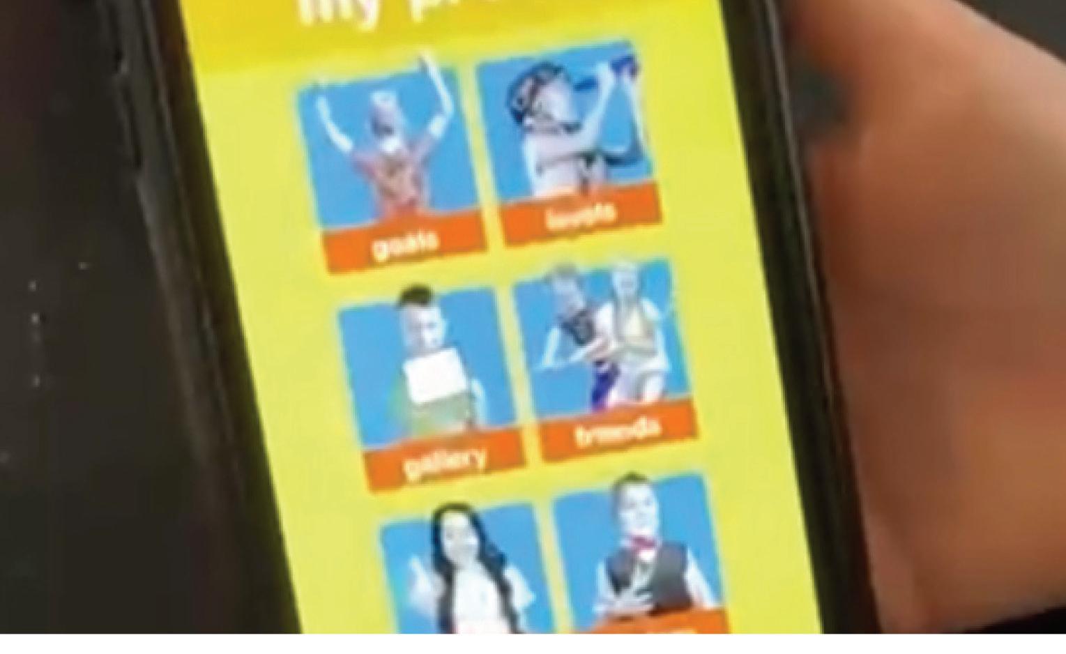
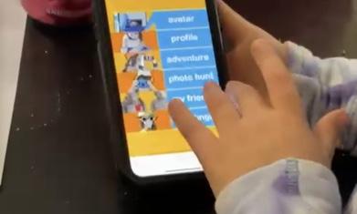
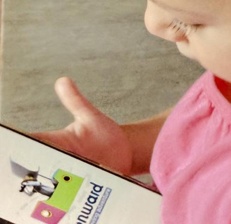
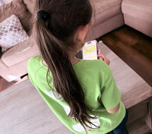
I used InVision to create an interactive app prototype, tested by a 7-year-old who navigated the screens and provided valuable feedback on usability and flow— despite empty secondary screens.
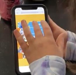
For my user testing, I utilized the program InVision to simulate the experience of using my app as if it were live on an actual mobile device. This tool allowed me to create interactive prototypes, enabling users to navigate through the app’s screens and gain a realistic sense of its flow and interface. To test the prototype, I shared it with a friend whose 7-year-old daughter was able to scroll through the screens and provide initial reactions to the navigation and layout. It is important to note that at this stage of development, the secondary screens did not contain any content, as they had not yet been designed; the focus of this testing was primarily on usability, navigation, and the intuitive nature of the interface rather than on the final content. Despite the incomplete content, observing the participant interact with the prototype offered valuable insights into how children of the target age group engage with the app, including which elements captured attention, which interactions were intuitive, and where users encountered potential confusion. DELIVERABLE 2: PHONE APP
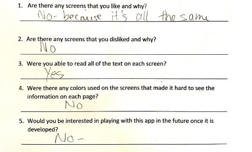
USER 3: This 7-year-old tests at a 12-year-old level and brings exceptional intelligence to the table. While her advanced abilities made the content feel too simple and not engaging, she confirmed that every element was perfectly legible and easy to navigate.
Though she hadn’t recently moved—preventing full relatability—her feedback highlighted a key opportunity: creating scalable challenges or advanced quests to captivate gifted users within the same age range. Her insight reinforces the book’s clarity while guiding future adaptations for diverse cognitive levels.
Reflection: Gifted 7-year-old found content too simple and unrelatable but confirmed perfect legibility and navigation, suggesting scalable challenges for advanced users.
Reflection: These pages feature the work of User 3 named Maria, a 7-year-old participant who has not recently relocated.

Reflection: Due to the use of wireframes only, the user was unable to fully comprehend the app’s complete functionality and experience.
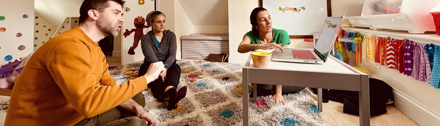
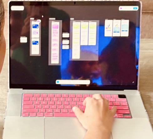
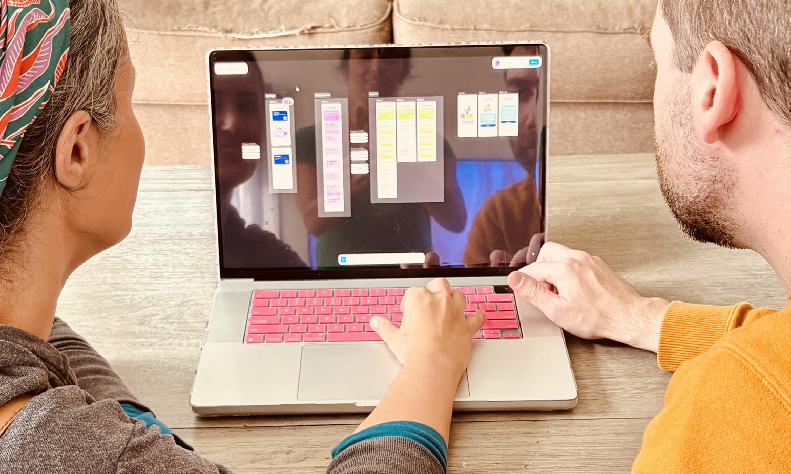
For my user testing phase, I meticulously prototyped the Onward app using Figma, crafting an interactive, high-fidelity model that closely mirrored real-world mobile navigation. I arranged a dedicated session with two five-year-old girls and their parents, creating a comfortable, familiar environment in their home to encourage natural engagement. Given the young age of the primary users, I shifted my approach mid-session, focusing the conversation on the parents to gain deeper insights into the app’s parental controls, dashboard functionality, and overall accessibility.
• Testing session 3 findings contents
• Testing session 3 user feedback
Reflection:
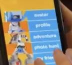
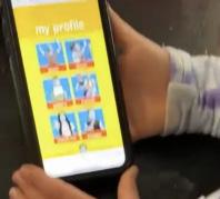
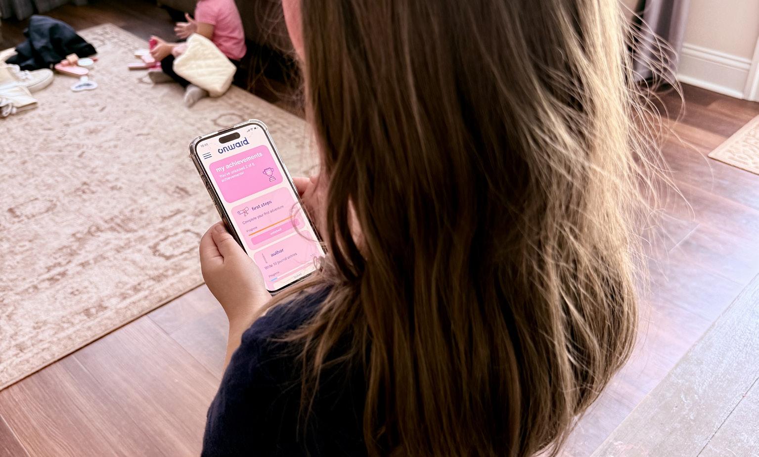
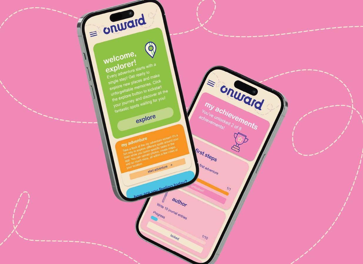
I prototyped Onward in Figma with four interactive sections—My Adventure, Explore, My Journal, and My Achievements—each offering intuitive, child-focused tasks.
For my final round of user testing, I built a fully interactive, high-fidelity prototype of the Onward app in Figma, meticulously designing all four core sections: My Adventure, Explore, My Journal, and My Achievements. Each section was engineered with age-appropriate tasks and intuitive touch interactions—such as tapping to mark quests complete, swiping to browse nearby discoveries, drawing or typing in the journal with guided prompts, and collecting animated badges— ensuring young users could engage meaningfully while parents observed progress in real time.
USER 4: The parents of the two five-year-olds were enthusiastic supporters, unanimously praising the app as a brilliant idea—especially one mom, who said she’d “love to have this for my daughter’s next move.” When asked for improvements, one parent suggested allowing artwork from the Create section (within My Adventure) to be uploaded directly in-app; I later made this a reality through the @MovingQuestAdventures social media campaign, where kids can proudly share their creations with the community.
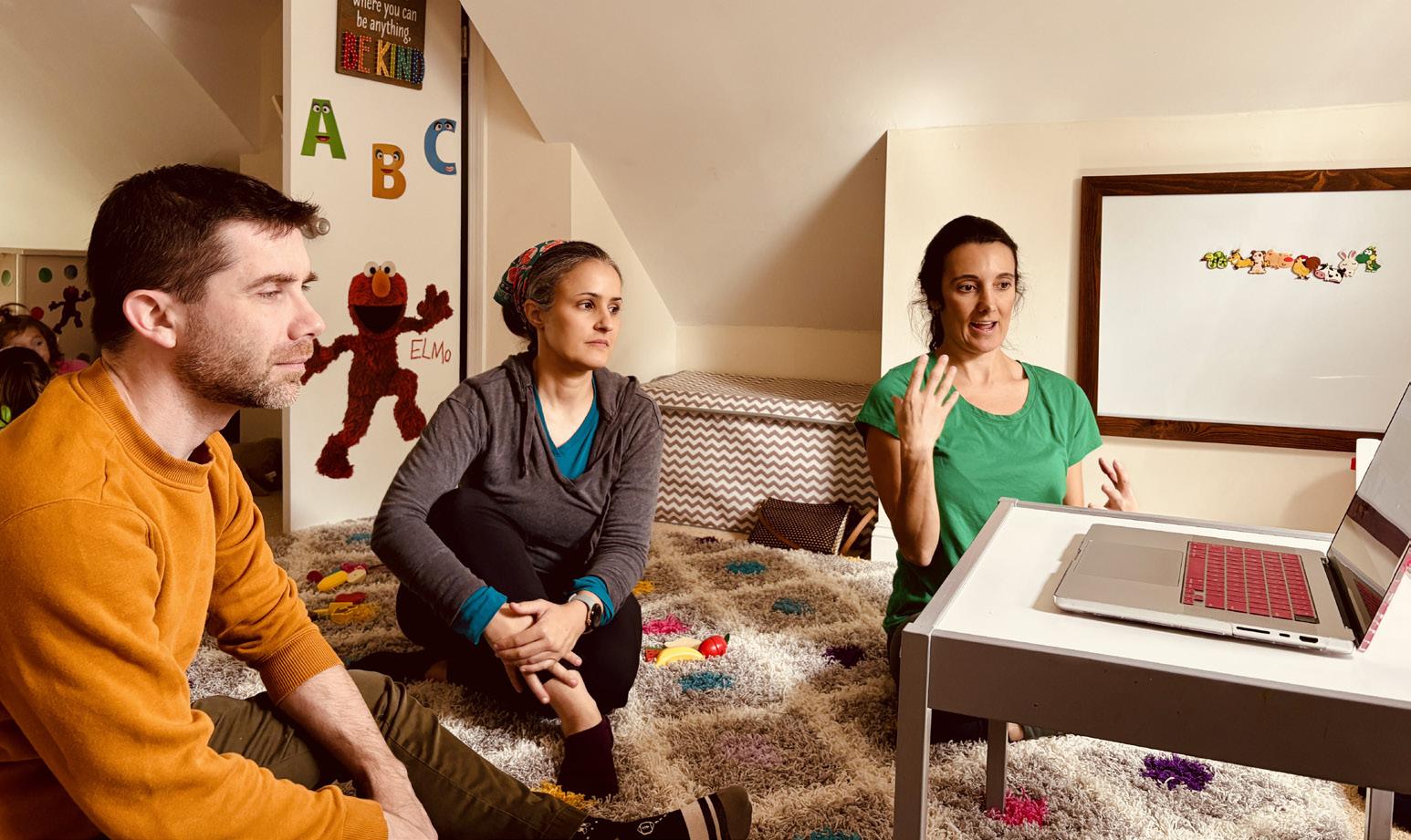
Reflection: The parents loved the app and suggested in-app artwork uploads from Create—a feature I added via @MovingQuestAdventures.
Reflection:
These pages showcase the insightful feedback from the parents of the two five-year-old testers, whose enthusiasm and thoughtful suggestions shaped key features of Onward.
Reflection:
The young users explored the fully interactive Onward app prototype directly in Figma, navigating each section with ease and providing real-time reactions.
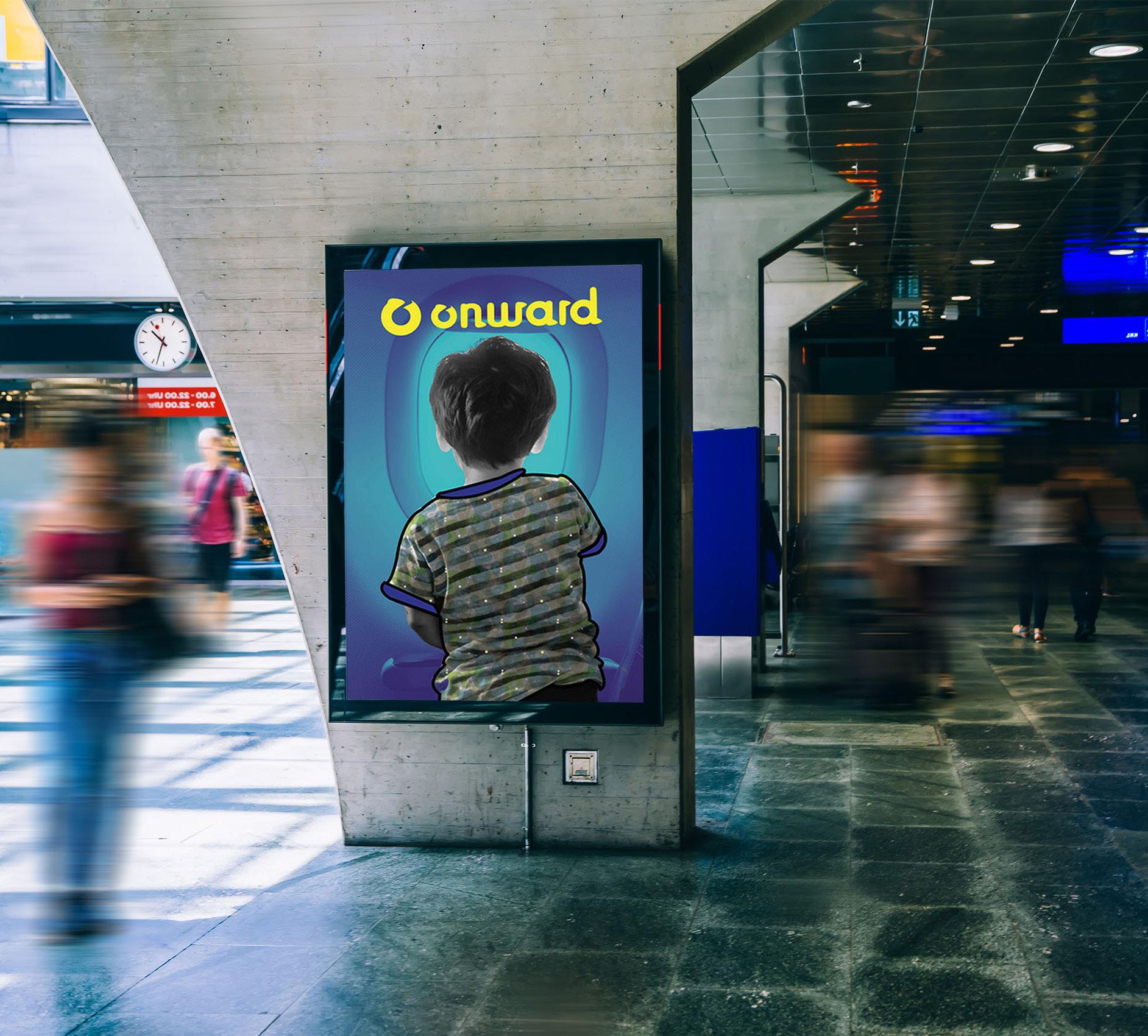
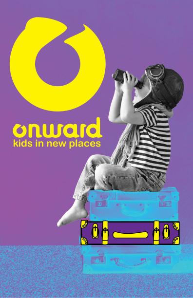
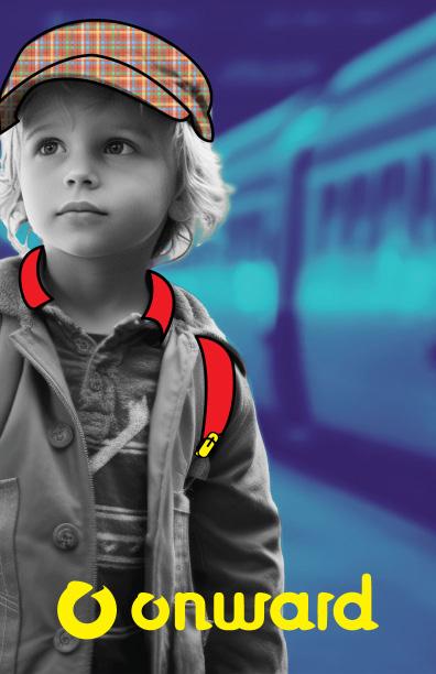
The following pages outline the official ONWARD brand guidelines, detailing its visual identity, core values, and usage standards to ensure consistent and impactful representation. Please respect all usage rights and reach out with any questions—I’m here to help.

• Keywords
• Logo
• Usage
• Sizing and Scaling
• Unapproved Uses
• Approved Uses contents
• Typography
• Colors
• Photography
• Iconography
• Unapproved Uses
• Applications
In shaping the Onward brand, I anchored it in three core keywords: dynamic, movement, and layered. My goal was to craft a visual identity that feels alive—rich with overlapping textures, fluid motion, and bold, attention-grabbing design— inviting young explorers to step forward with curiosity and confidence.
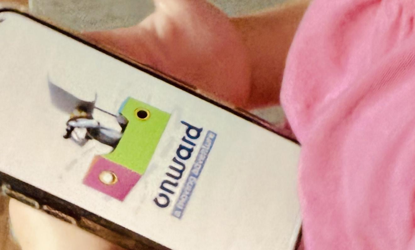
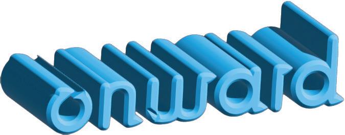
I designed a series of logos centered on movement, incorporating a subtle arrow atop the “O” and shaping every serif into a forward-leaning arrowhead. The process was iterative and time-intensive, but the final mark powerfully embodies momentum and direction—perfect for Onward.
I sketched a series of designs to create the logo, and then transferred them to the computer. The idea behind the logo was to depict movement, so I added an arrow at the top of the “O” to show the letter in motion.
signature
signature
Additionally, I designed each serif to represent onward motion and resemble an arrow.Develtime, but I was ultimately happy with the end result.
SIGNATURE
LOGOTYPE
SYMBOL
The primary logo is required for all printed materials, except when a photograph competes with it, allowing for the use of just the logotype or symbol. Both primary and secondary logos are also available in black and reverse versions, to be used only when full-color options are not feasible.
COLOR-SIGNATURE
COLOR-SYMBOL
REVERSE-SIGNATURE
The primary logo should be used on all printed materials. However, there are some exceptions. If a photograph competes with the signature logo, it is okay to use only the logotype or
Furthermore, both the primary and secondary logos are available in black and reverse versions. These versions should only be used in cases where it is not possible to use the pre-
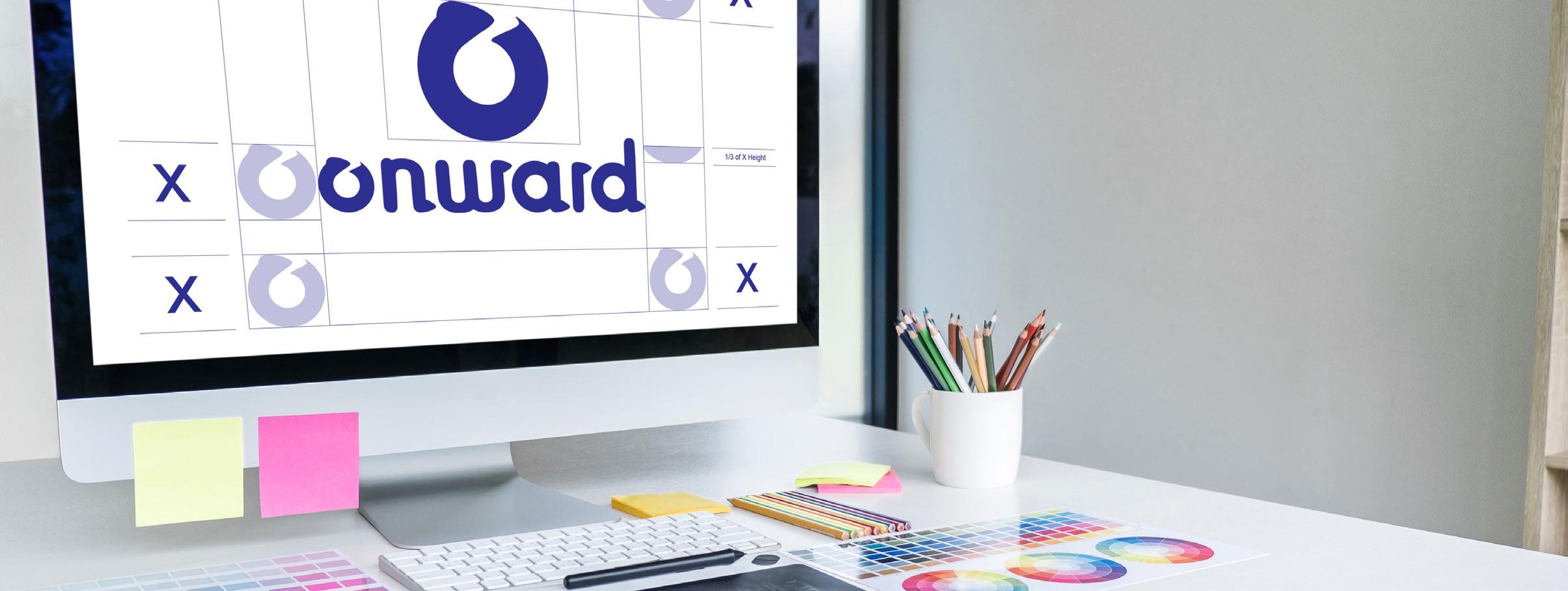
ABOVE 1”
Onward offers three logo configurations—Primary, Secondary, and Icon-Only—each with strict minimum sizes to ensure legibility: 1/4 inch (15 px) for Primary and Icon-Only, 1/2 inch (25 px) for Secondary. Never use below these thresholds.
available. To maintain legibility, the ONWARD logo should not be used at sizes below the prescribed minimum size.
Avoid scaling the primary logo below 1/4”high for print or 15 pixels high for on-screen use. The secondary logo should not be scaled below 1/2” high for print or 25 pixels high for on-screen use. For all other measurements, please refer to the sizing chart.
1/3 of X Height
To maintain logo clarity and impact, adhere to these minimum size guidelines: the primary logo should never appear smaller than 1/4 inch in print or 15 pixels on screen, while the secondary logo requires at least 1/2 inch in print or 25 pixels digitally.
The ONWARD logo uses a clear space to maintain the clarity and impact of the logo. The clear space surrounds the logo and should be kept free of competing graphics, images,or typography.
ABCDEFGHIJKLMNOPQRSTUVWXYZ abcdefghijklmnopqrstuvwxyz 0123456789~!@#$%^&*(){}<>:;?/+-*
FUTURA BOOK
ABCDEFGHIJKLMNOPQRSTUVWXYZ abcdefghijklmnopqrstuvwxyz 0123456789~!@#$%^&*(){}<>:;?/+-*
FUTURA MEDIUM
ABCDEFGHIJKLMNOPQRSTUVWXYZ abcdefghijklmnopqrstuvwxyz 0123456789~!@#$%^&*(){}<>:;?/+-*
ABCDEFGHIJKLMNOPQRSTUVWXYZ abcdefghijklmnopqrstuvwxyz 0123456789~!@#$%^&*(){}<>:;?/+-*
I selected Arial Rounded for book headers to evoke a playful, childlike handwriting feel—warm and approachable without falling into Comic Sans territory. After experimenting with hand-drawn titles, I chose Futura as the secondary typeface: Futura Book for clear, readable body text, and Medium and Bold weights to create clean, confident hierarchy.
#2b3585
C 100% M 96% Y 12% K 2%
R 43 G 53 B 133
#f0e2cd
C 5% M 9% Y 19% K 0%
R 240 G 226 B 205
I crafted a sophisticated palette of muted brights—vibrant hues softened with subtle undertones—to captivate young children without overwhelming their senses. Tan and deep navy form the primary foundation, offering a calm, neutral base with a bold yet grounding accent, while secondary colors inject playful energy and warmth. This balance ensures every page feels inviting, emotionally supportive, and irresistibly engaging for 5–9-year-olds.
8bba48
C 51% M7% Y 94% K 0% R 139 G 186 B 72
4ebdd8 C 62% M 4% Y 12% K 0% R 78 G 189 B 216
ed9228
C 4% M 50% Y 96% K 0% R 237 G 146 B 40
e886b1
C 4 % M 59% Y 3% K 0% R 232 G 134 B 177


Use the Onward logo exactly as provided—never add outlines, shadows, gradients, extra colors, distortions, reorientations, patterns, or confine it in shapes. Maintain clear space (1x logo height) and approved colors on contrasting backgrounds.
The integrity of the logo must not be altered and stay true to its original design. Please do not outline, apply a drop shadow, add a grachange the orientation, stack, apply patterns or
photograpy
a moving adventure in the usa


I combined color and black-and-white photography by importing each image into Photoshop, applying a full desaturation to create a clean grayscale version, then transferring it to Illustrator. There, I used the Pen Tool to trace and mask specific elements and the Paintbrush Tool to apply precise color strokes, selectively restoring vibrancy to focal points for emphasis and visual clarity.
I designed the Onward app icons to reflect the book’s theme, using consistent patterns and hand-drawn strokes. Created for mobile use, they incorporate both the primary and secondary color systems for clarity and brand cohesion.

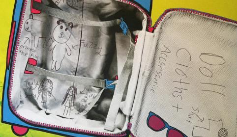
The Onward Toolkit is housed in a compact, durable suitcase and includes:
• An interactive book with a dedicated marker set for dynamic, hands-on engagement.
• A clear, concise pamphlet outlining step-by-step guidance on how the system works.
• A QR code providing seamless access to download the companion mobile app.
All components are thoughtfully designed to deliver a complete, portable solution for driving progress.
Reflection:
Featured: The Onward Toolkit — a sleek, durable suitcase housing an interactive workbook with premium markers, a concise instructional pamphlet, and a QR code for instant app access — your all-in-one solution for strategic advancement.
interactive book
branding: (3 pts)
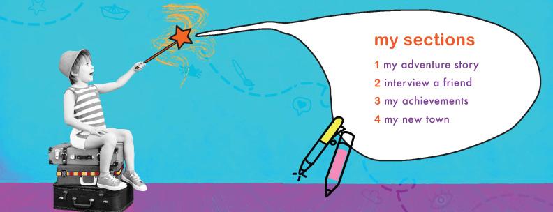
Design a hardbound, interactive book that includes a marker set and craft supplies for hands-on engagement, thoughtfully divided into the following sections:
my adventure story
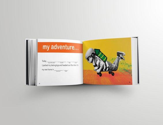
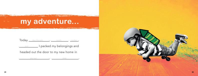
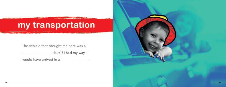
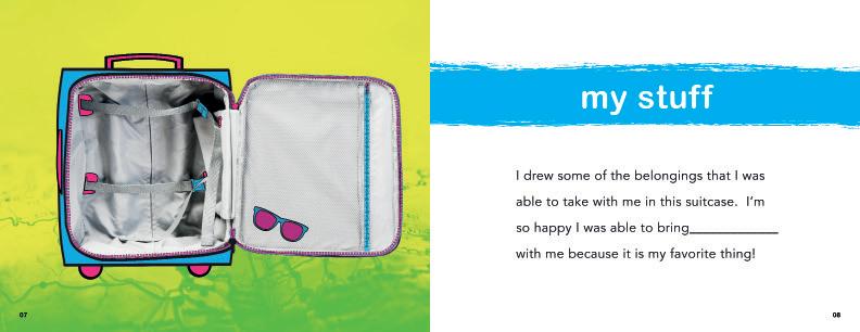
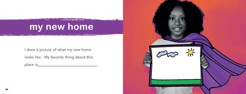
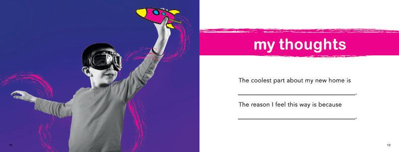
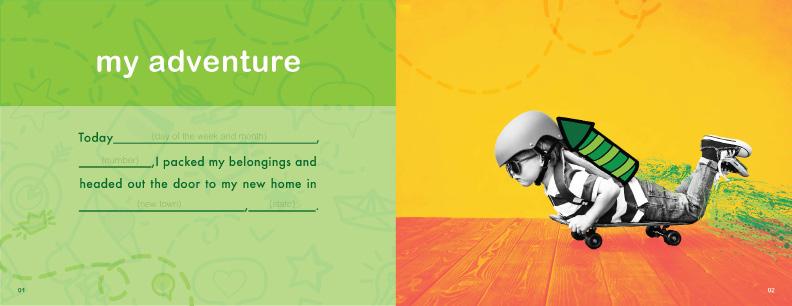
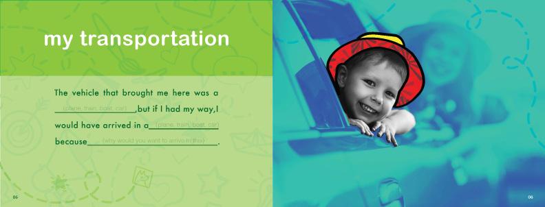
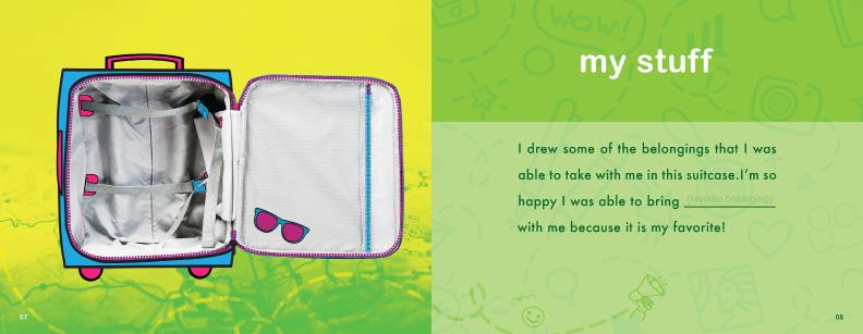
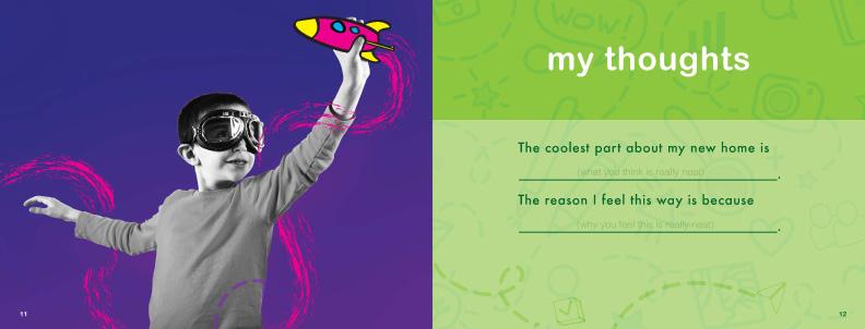
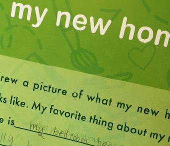
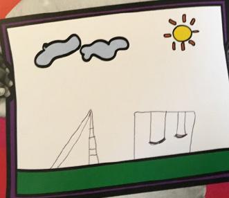
This section unfolds as an illustrated adventure story, vividly showcasing the exciting discoveries, new friendships, and joyful possibilities that await a child in their new home. (10 pgs )
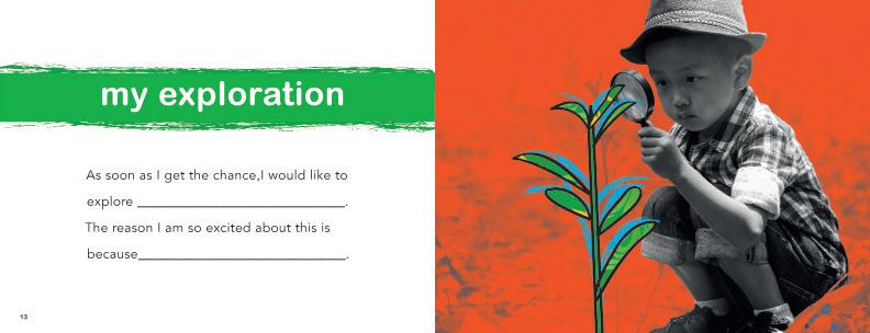
my town
This section sparks curiosity with engaging questions designed to excite children and inspire them to independently explore and uncover the wonders of their new neighborhood. (5-9 pgs)
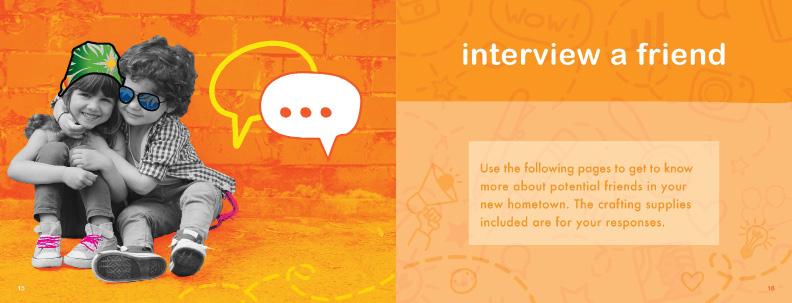
interview a friend
This section features interactive questions for the child and a potential new friend to ask and answer together, fostering connection and shared discovery. (8-10 pgs)
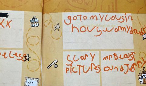
my goals
This section offers dedicated space for the child to celebrate achievements, and reflect on their personal growth throughout the moving journey. (8-10 pgs)
Reflection:
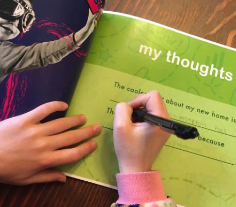
These pages proudly present the completed Onward interactive adventure book, fully realized with vibrant illustrations, engaging prompts, and hands-on spaces for creativity and reflection.
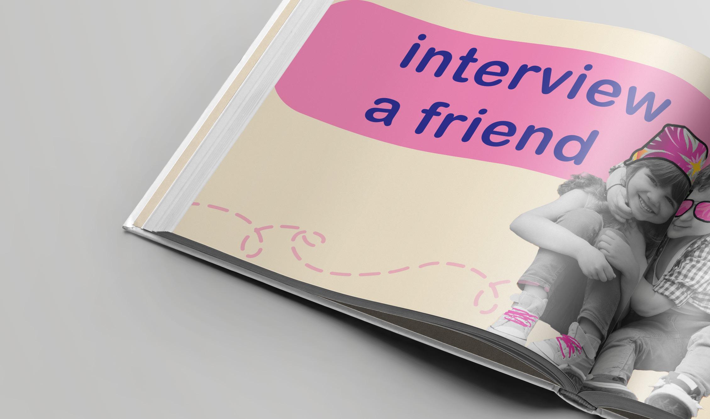
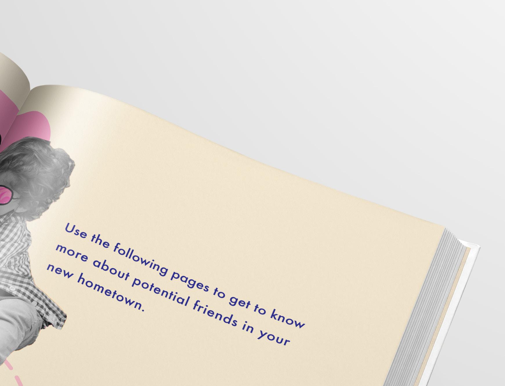
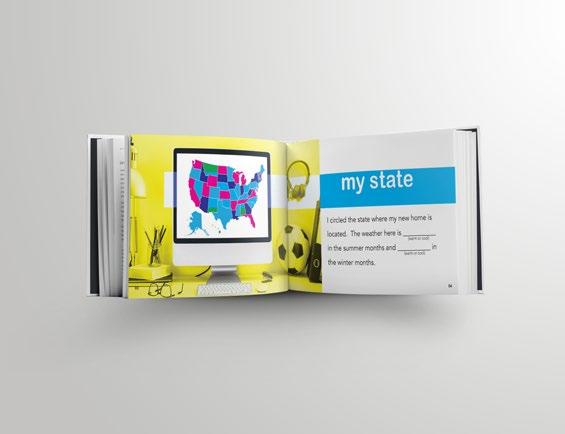
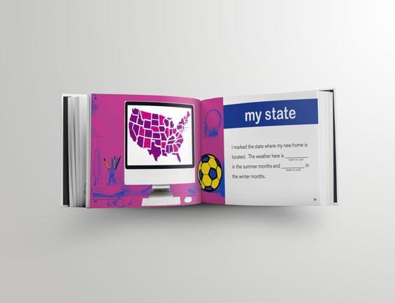
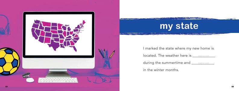
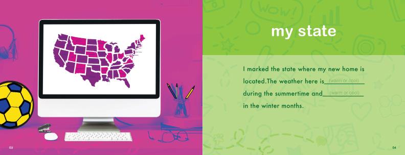
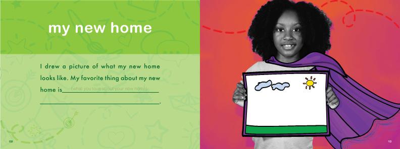
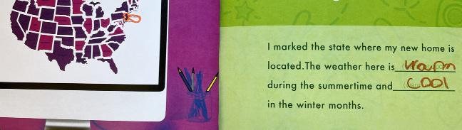
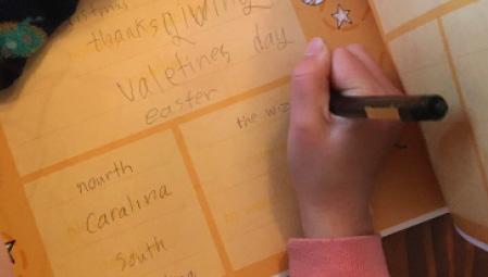
Reflection: These pages feature the “Interview a Friend” and “My State” spreads, designed to spark meaningful conversations and help children discover their new community.
user experience: (3 pts)
Design a mobile application which encourages children to explore their surroundings, reflect on their emotions, and celebrate their progress in a safe and interactive environment.
explore
Allows children to discover nearby locations through guided tasks and prompts. They can upload photos and document what they find, transforming their new environment into a space of adventure and learning. (7 scroll screens )
my adventure
Offers discovery-based missions that inspire curiosity and motivate children to visit new places simply for the joy of exploration. Each mission fosters independence and a sense of accomplishment. (3 scroll screens )
my journal
Provides a private and secure space for emotional reflection. Through writing and mood tracking, children can process their feelings about the move and express themselves creatively. (4 scroll screens )
my achievements
Serves as a motivational hub where users earn digital badges for completing activities and challenges. This feature reinforces a sense of progress, confidence, and pride in their personal journey. (1 scroll screen)
Reflection:
These pages showcase the wireframes created in Figma for the ONWARD app, illus trating the structure, layout, and user flow of the digital experience.
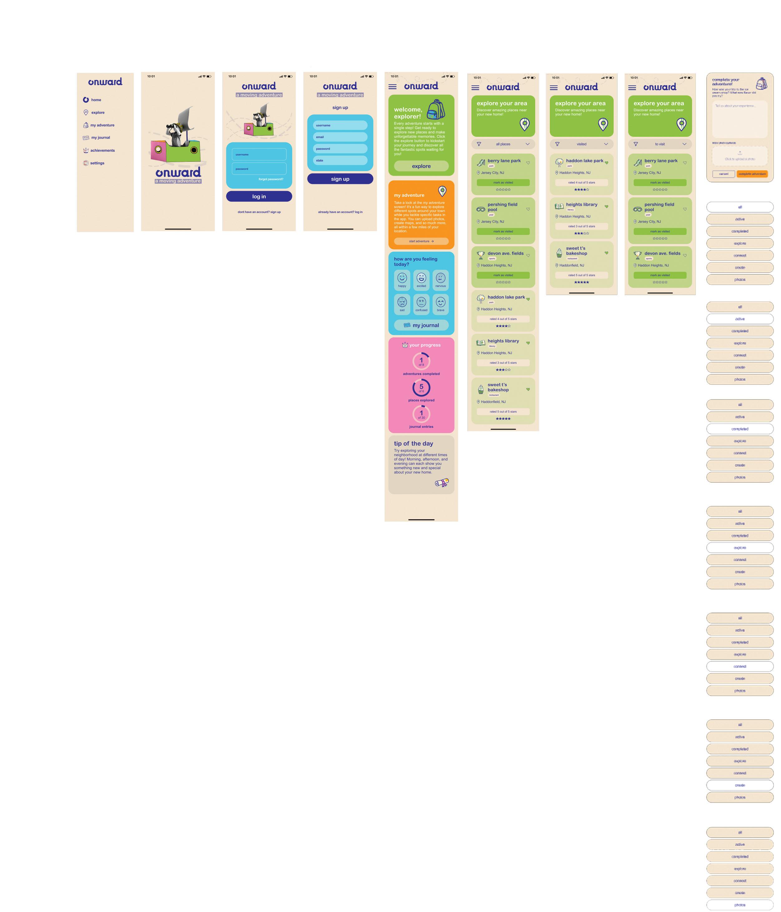
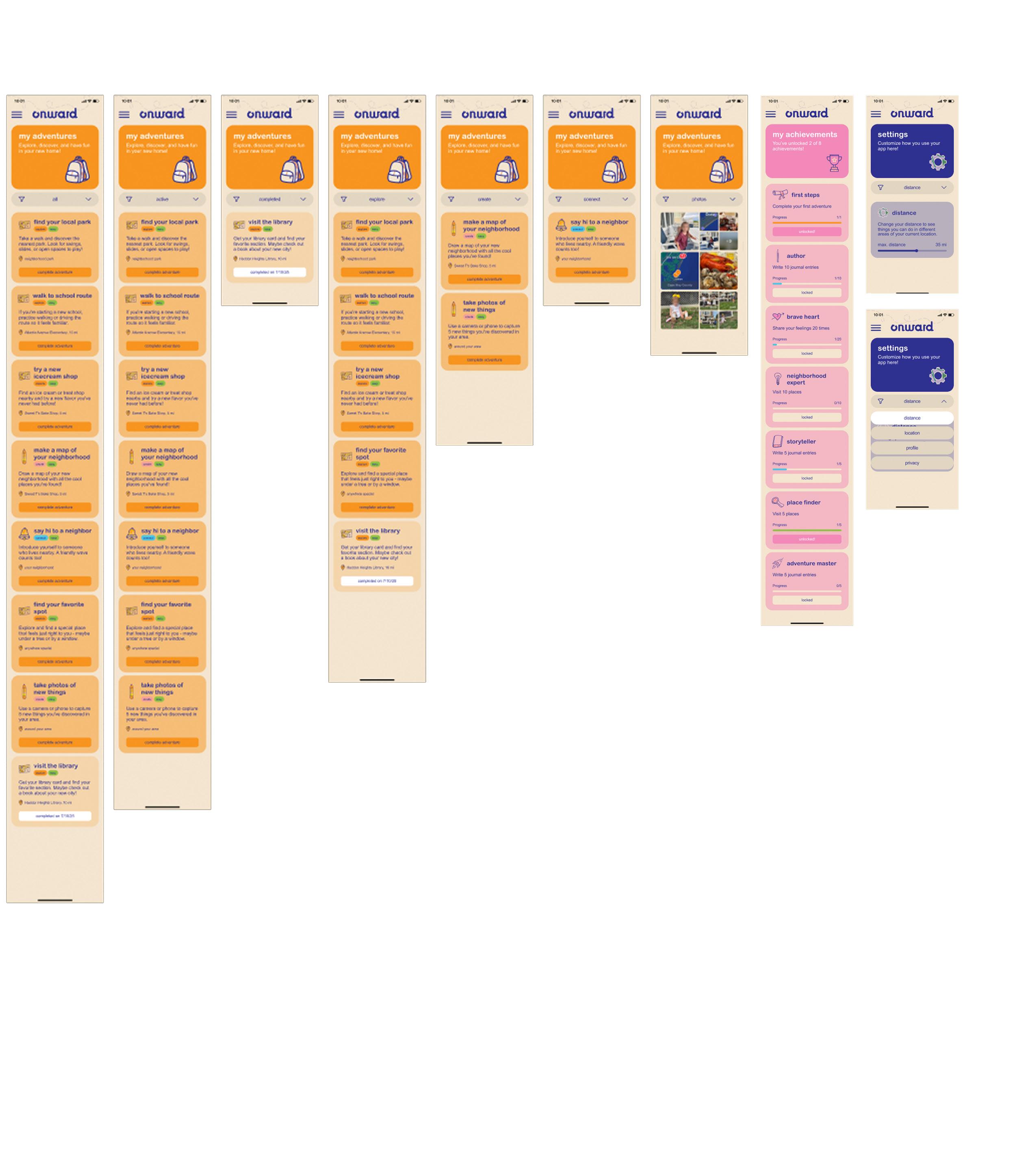
Reflection: The ONWARD app extends the experience into a digital space where children can explore, reflect, and grow.
Reflection: Through Explore, children complete tasks and share photos, while My Adventure and My Journal spark creativity. My Achievements rewards progress with badges, promoting confidence and exploration.
interactive book
user experience: (2 pts)
Design an Instagram account that serves as a bridge between the platform, parents, and the community. It features:
quest spotlights
Quest Spotlights, which highlight app quests and encourage participation through shared photos and hashtags. (1-2 posts per week )
app spotlights
App Spotlights, a series of short reels introducing features and demonstrating app navigation. (1-2 posts per week )
my journal
Parent Pro Tips, offering helpful advice and insights on supporting children through transition. (1-2 posts per week )
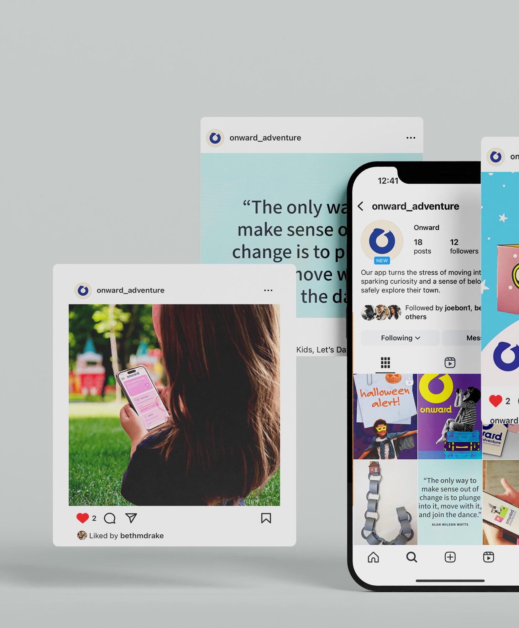
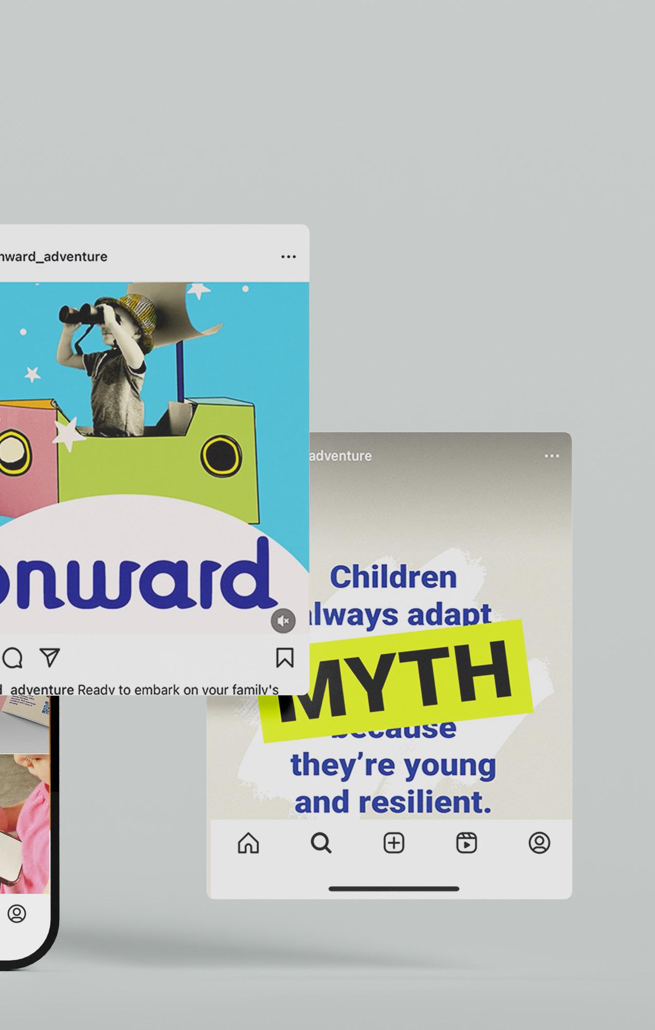
Reflection: The ONWARD Instagram connects parents and the community through weekly Quest Spotlights, App Spotlights, and Parent Pro Tips that highlight activities, features, and guidance for families.
In conclusion, the Onward Toolkit packs strategic power into one durable suitcase—blending interactive workbook, markers, pamphlet, and app to turn ideas into real momentum with grit and focus. It’s the game-changer that fuels leaders and trailblazers to keep pushing forward.
“The journey of a thousand miles begins with a single step—and the right tools.”
–
Lao Tzu (adapted)
I extend my deepest gratitude to my parents, Jake Shuster,Jim Marone and Sandra Isla for their unwavering support and patient endurance throughout this journey.