
9 minute read
News in Brief


A Taste of The Smithsonian
This fascinating article appeared in the world-renowned Smithsonian magazine. You can read the full story by subscribing here
Advertisement
Should the frame be recognised as an art form? John Marin, the early American modernist, is best remembered for his paintings of the kinetic desert of Taos Canyon, New Mexico and the razor-sharp dimensions of Red Sun, Brooklyn Bridge. But to Martin Kotler, a frames conservator at the Smithsonian American Art Museum (SAAM), the frames encasing Marin’s work are just as important as the canvases inside.
Over the course of his career, Marin sought a “Blessed Equilibrium” between every painting and its frame. He worked with New York City frame maker George Of to create custom mounts, which he coated in watercolours to enhance the palette of the painting inside. Later in his career, Marin made his frames by hand, and steadily pushed his art over the edge: The black frame of Sailboat, Brooklyn Bridge, New York Skyline is streaked with silver, like the lines on a well-trafficked road.
Copyright 2020 Smithsonian Institution. Reprinted with permission from Smithsonian Enterprises. All rights reserved. Reproduction in any medium is strictly prohibited without permission from Smithsonian magazine.
Webinars
Thanks to everyone for the great feedback on our webinars – which is still coming in as the first eight webinars are all available on the website. The latest session covered pricing software in partnership with Framiac. You can view all the webinars at www.larsonjuhl.co.uk.
• Pricing and upselling
• All about digital marketing
• Framing masterclass with
Jon Price GCF (APF)
• Selling from the design bench with Jo Palmer GCF (APF) Adv
• Developing your USP with
Graham Perryman
• Covid-19 business continuity with MHA accountancy
• Re-opening your framing business
• Interior design trends • Frame design – Jon Price GCF (APF)
SWLA sponsorship
Larson-Juhl is sponsoring the Society of Wildlife Artists’ drawing competition again this year as part of The Natural Eye 2020 exhibition at Mall Galleries, from 28th October to 8th November. The initiative celebrates drawing or dry media, draughtsmanship and capturing ideas as an art form.
The 2019 competition was won by the hugely talented Wynona Legg (show image from last year’s four walls) and we can’t wait to see this year’s entries which will feature in Issue 39 of 4walls. The winner will receive £500 worth of Larson-Juhl materials.
www.mallgalleries.org.uk


Designs on framing with the BCFA
Our digital marketing activity has extended into the world of interior design. Consultant Alys Bryan recently ran the first Larson-Juhl CPD event for members of the British Furniture Contractors Association (BCFA) focusing on the inspirational ways in which framing can be used by interior designers in the hospitality sector and how framing can broaden a scheme’s colour, texture and material palette.
MIXING AND STACKING MOULDINGS (PART 2): DESIGN & TECHNIQUES
A MASTERCLASS WITH JON PRICE GCF (APF)
It’s a long time since I wrote the first article on mixing and stacking mouldings to elaborate on the new Masterclass videos which I filmed for Larson-Juhl at the start of 2020. In that article I promised to “look at the design and thinking behind the four designs in the Mixing Mouldings video, as well as any additional techniques required”. Although this follow up has been delayed for obvious reasons, that’s exactly what I’ll be doing here. To make the most of this article read Part 1 in 4walls Issue 36 available at: https://issuu.com/larson-juhl, where I explain techniques for joining frames and the rules of mixing and stacking mouldings.
As we look towards some semblance of pre-pandemic normality many framers are extremely busy. One business owner told me “people are spending money like it’s going out of fashion”. The reassurance of lots of work coming through the door alongside people questioning their life/work priorities means it’s a good time to consider changes to our products, services and prices. One way to justify charging more is to offer more: more service, more design, more conservation and more than the competition. Which brings me back to mixing and stacking mouldings.
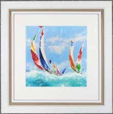
Although I don’t believe the framing design process should be rigid, I do have a standard way of coming up with a design. I normally choose my mounts first: selecting colours to match those in the artwork, plus suitable neutral colours. There’s no reason you can’t do the same thing with mouldings. Of the four designs in the mixing mouldings video, I wouldn’t hesitate to offer three to my everyday customers. The fourth is a more ‘framing fantasy’ but it emphasises the point that you shouldn’t rule out stacking multiple mouldings just like you shouldn’t rule out using multiple mounts! Design 1 utilises mouldings from the Coastal Woods range. The 43mm wide, white stained 422000127 on the inside and the deeper 466000127 on the outside. Being of the same range and of different depths, these mouldings are perfect stacking partners. Combined with a single 8977 Bright White mount this design draws the viewer’s eye into the picture step-by-step, while the 5mm gap around the artwork provides balance by imitating the stacked mouldings. That description makes it sound like the design was carefully planned step-bystep. It was, but let’s not be pretentious. I selected a mount that matched the white in the artwork, chose some mouldings that would work together with the thought of offering a neutral coloured, drifty type frame and played around to see what looked good. That’s the way frame design works for me.

DESIGN 1
466_000_127
DESIGN 2 As Design 2 illustrates, I often use mount fillets as slips under the rebate lip of the frame rather than around the window aperture of a mount. As with the first design, I’ve opted for a coastal feel. This time by using the Andover range. My pseudo slip 205749481 and the 279811481 moulding have a smooth white finish along with pin lines of the base pine showing at the top of the bevelled rebate lip and, in the case of the moulding, also on the outside edge of the face. I decided to make more of that by adding a similar coloured wood moulding between the two. Although the 385200000 moulding is an oak, it works well with the pine of the Andover because there is such as small amount of that pine showing and the two woods are separated by the white. This is an exception to the rule that mouldings with different finishes don’t work well together. As with mount design, you can sometimes use colours, or in this case grains and textures, that don’t quite match by separating them. As you’ll see from the video, I mitred the slip to fit under the rebate lip of the moulding and glued it into place (Image 1). Because I am relying on glue to hold the slip in position, I use masking tape to secure the slip, but only while the glue dries. The two mouldings were then stacked and joined in the normal way. As with Design 1, I used an 8977 Bright White mount. This time it’s a double mount with 3mm of the second mount showing.
Design 3 utilises two mouldings from the Confetti range and 3346WH on the outside. The 3346WH matches the white Confetti in colour and both other mouldings in texture and finish, so they were always likely to stack together well. This print has so many colours in it that it’s hard to introduce colour into the frame design without unbalancing it. The obvious choice to bring balance to the force was blue which is dominant throughout the image. The Confetti 140653 White and the 140643 Sky Blue work well as a double stack (Image 2). However, the blue is strong and the addition of the 3346WH tones it down so that it is balanced with the white. Previously I’ve talked about how David Wilkie GCF prescribes weight to mount colours, with a narrow dark mount having the same weight as a wide cream mount. The wider area of white moulding and the narrower central blue in this design are an example of that same concept applied to the moulding.
205_749_481 IMAGE 1

279_811_481 385_200_000 140_653 DESIGN 3

140_643

IMAGE 2 Design 4 is intentionally over the top but I hope it makes the point that you shouldn’t limit yourself either when stacking mouldings or with the number of mounts used. Four mounts or five mouldings works in some designs. So, why on earth aren’t you suggesting them? Because the customer who just pulled up in a brand new Mercedes can’t afford it? What a load of ‘offcuts’! This final design uses six different coloured Confetti mouldings, matching almost every colour in the image. There’s no arguing that the frame dominates the picture. However, the inner white moulding means the colours are less dominant than if they were straight up against the image and the outer (3346WH) and inner whites offer balance. The only mount I liked with this design was no mount. Which meant I had to space the artwork away from the glazing another way. I used spacers which sit under the lip of the frame and separate the glazing from the artwork. I usually make my own spacers from foam/mountboard. I ‘face’ a piece of foamboard by gluing mountboard to it. Having worked out how deep I want my spacers to be, I cut my foam/mountboard accordingly. I then trim them to the exact length of the inner rebate of the frame. The spacers for the top and bottom of the frame should be cut first to the full length of the top/bottom rebates and the left and right spacers cut to the length of their rebates, minus the thickness of the top and bottom spacers. This means the side spacers will help hold the top and bottom spacers in position (see Image 3). I glue the spacers in place and the foam/mountboard together with Evacon R, a pH neutral adhesive available from Larson-Juhl.
There you have it ‘one piece of art, four moulding designs’. I hope you find these new Masterclass videos inspirational and that they encourage you to mix mouldings, use more than two mounts and above all be creative. That’s what makes our profession enjoyable and satisfying. It’s the sum of all the parts – the artwork and frame together can be so much more than either one on their own.
Customers will pay for that creativity and for framing that stands out. Like I say ‘offer more’: more service, more design, more conservation and more than the competition.
Jon Price GCF(APF) owns Handmade Framing and Gallery in North Cornwall. He sits on the Fine Art Trade Guild’s Framing Standards and Qualification Committee and has framed the works of world renowned artists, photographers and designers. Jon offers a framing consultancy service, so if you need help and advice on any aspect of framing or running a framing business don’t hesitate to contact him.

DESIGN 4 IMAGE 3

130_632_000 130_634_000 130_635_000 130_637_000 130_640_000 130_641_000 www.handmadepictureframing.co.uk


