am Lara and a seasoned creative, blending diverse skills from graphic design to print design, digital design and architecture.
My goal is for my work to resonate deeply, inspiring genuine emotions and crafting immersive experiences. Committed to craftsmanship and collaboration, continuously push creative boundaries, telling impactful stories that endure. view myself not just as a designer, but as a storyteller dedicated to creating authentic, unforgettable experiences.
Many of my projects are confidential, and appreciate your understanding and respect for this discretion.
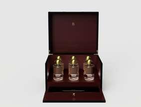
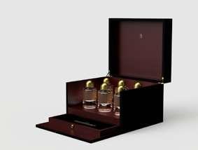
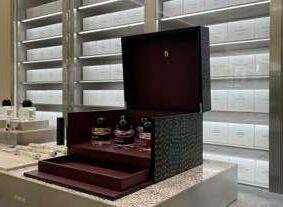
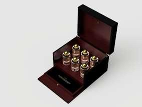
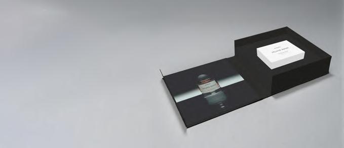
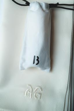
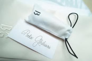
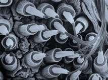
For Byproduct, I designed an exclusive box for Byredo’s Night Veils perfumes at their Stockholm flagship store to showcase the bottles (night veils). It features a sleek exterior with gold embossing, a soft leather interior with custom compartments, and a magnetic flap closure. It’s handcrafted from black calfskin with natural thread stitching and is inspired by Indian Kantha embroidery.
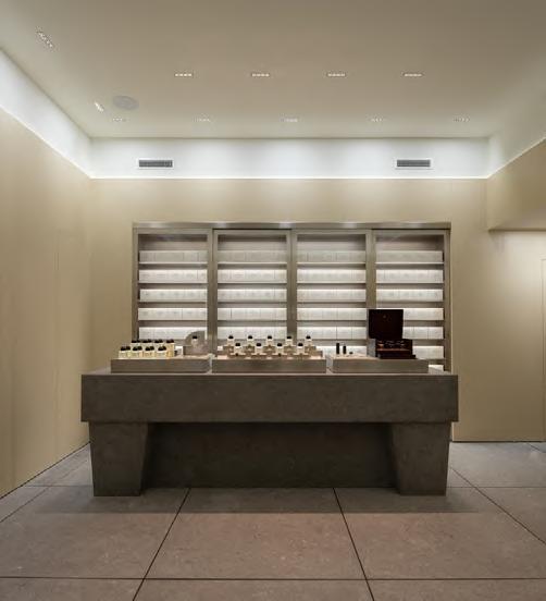
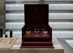
The Night Veil Box in its environment, Byredo Flagship Store
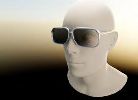
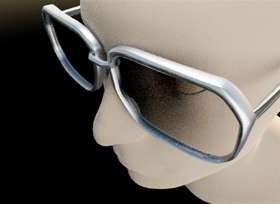
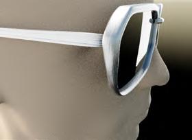
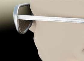
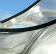
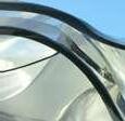
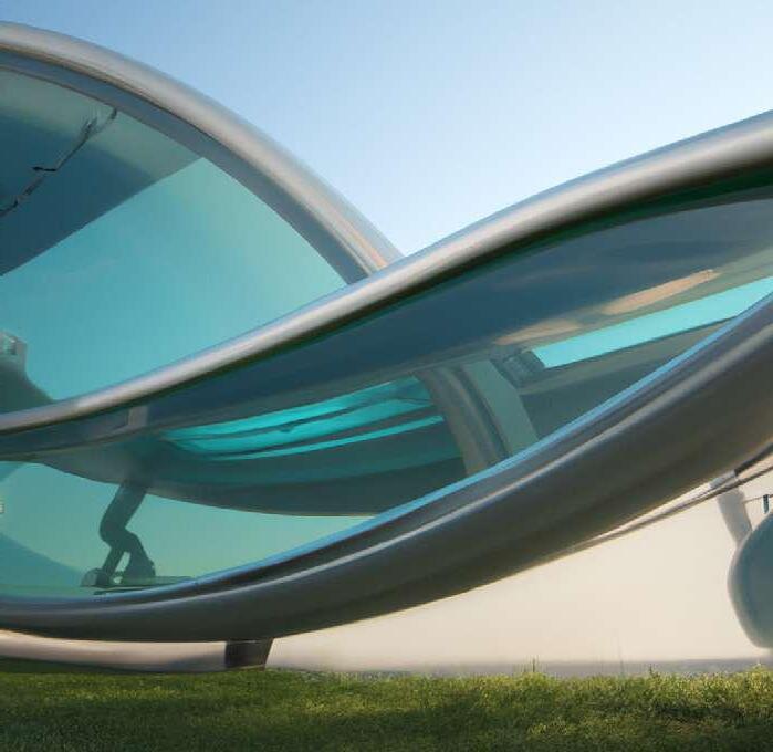
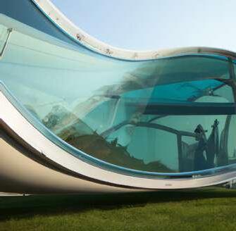
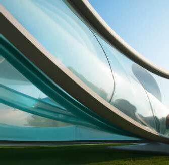
I contributed to the development of the “Road Tripper”
are inspired by the windows of 1970s cars, featuring a chunky, rounded rectangular design crafted from metal.
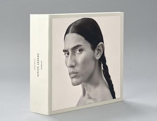
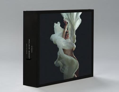
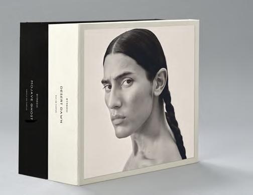
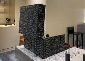
For the launching Desert Dawn (beige) campaign and the later upcoming Mojave Ghost Absolu (black) campaign, was tasked with designing Press Boxes. The concept behind these Press Boxes was to encapsulate the unique characteristics of each fragrance and campaign, presenting them in a cohesive output. My goal was to create high-quality pieces that people would not only want to keep but also display and stack together.
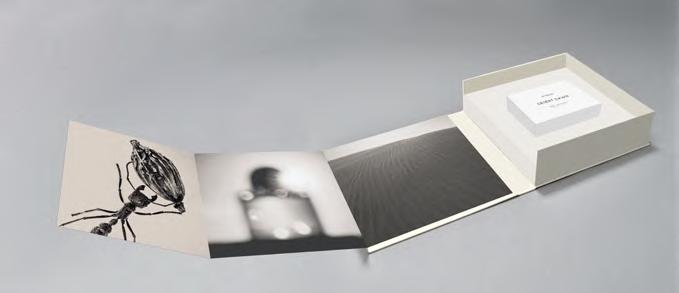
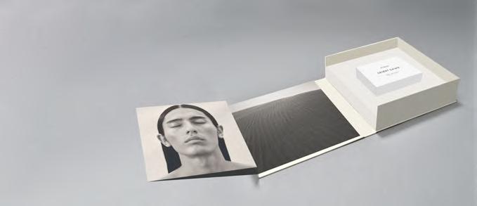
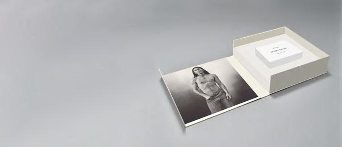
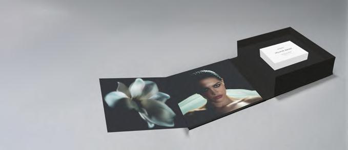
The box includes a leaflet that highlights images from the campaign. It features a blind debossed logo on the spine and a black debossed title on the front. For “Desert Dawn”, the exterior is elegantly wrapped in a soft beige cloth, capturing the essence of the campaign’s dune-inspired theme. In contrast, “Mojave Ghost” is adorned with a textured black cloth, echoing the rugged landscape of the Mojave Desert. The cover photo on the closed box is enhanced with a glossy lamination, adding a refined touch to the presentation.
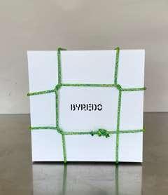
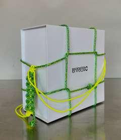
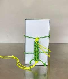
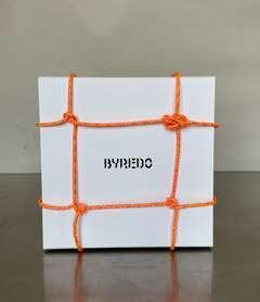
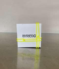
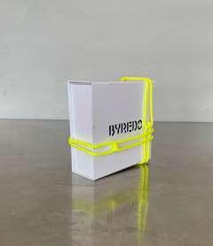
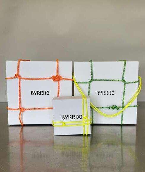
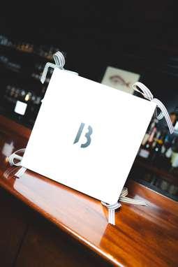
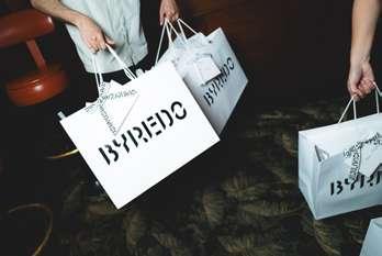
The concept involves creating a unique gift-wrapping knot closure that customers receive when they opt for gift wrapping. This closure uses ropes that can transform the wrapped box into a convenient shopping bag, eliminating the need for an additional bag. Customers can carry the box as is, displaying the brand to everyone. This is currently a test, and the final material to be used should be paracord. Experimenting with the cobra knot, aiming to match the aesthetic and functionality of the „Byredo Kantha Knot Paracord Charm.“
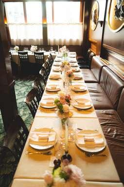
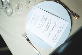
Lucia Pica, Creative Image & Makeup Partner of Byredo, hosted an exclusive dinner during Paris Haute Couture Week on June 26th, 2024. was tasked with designing and preparing the table setting and invitations for this special event, which was covered by Say Who x Vogue. My responsibilities included creating table cards, calligraphy, menu cards, personalized napkins for each guest, and POSM. Below, you’ll find images from the dinner showcasing the elegant setup.
Photographer: Edouard Richard for Say Who
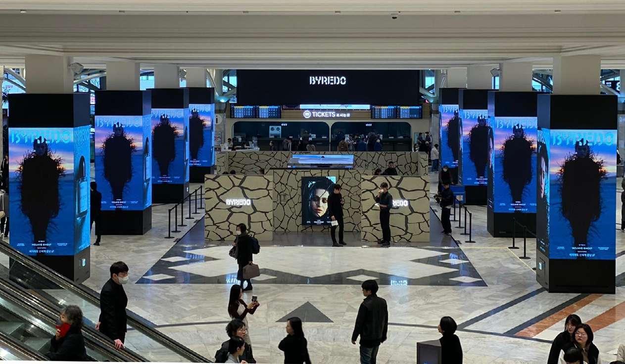
At Byredo, a key responsibility is designing artwork for store lightboxes globally, both in print and digital formats. The process starts by deciding the format, which guides the choice and placement of the hero image. Campaigns are then tailored to fit global and regional priorities, with specific adaptations for regions like the Middle East and APAC. Logos and taglines are added only if the store lacks existing branding.
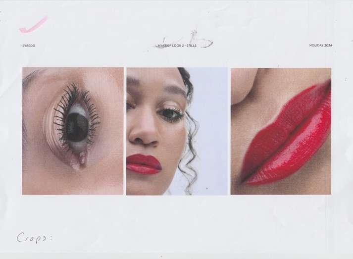
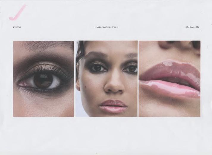
A key part of my role is cropping images and collaborating with Art Directors to finalize campaign visuals. also assist with color grading, correction, and retouching, ensuring the logo and tagline are perfectly positioned for both still and moving content.
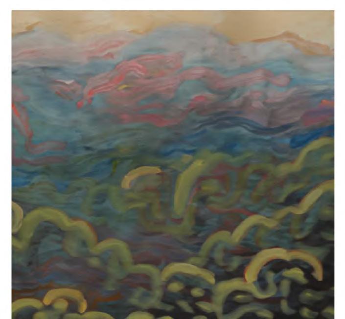
Using paint as a foundational tool for this project perfectly captured the essence of the SS25 bandana print collection for OAS. The collection focuses on being honest and authentic, and it features deep, rich colors telling expressive print stories that celebrate art and craftsmanship through a contemporary lens. For the painting on the left, used a combination of oil and acrylic paints with rich, earthy tones to emphasize the depth of strokes and textures. then refined the colors and introduced a bleeding fade effect in Photoshop, giving it a hand-dyed quality (right).
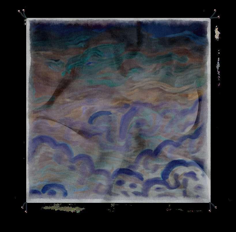
This painting blends oil and acrylic colors to capture a scenic landscape view. Employing a brush technique that mimics the texture of a sponge, created details. Afterwards, refined the hues and colors, enhancing the overall aesthetic. Renders guide my understanding of the product and print, followed by technical drawings for the supplier as well as quality control.
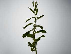
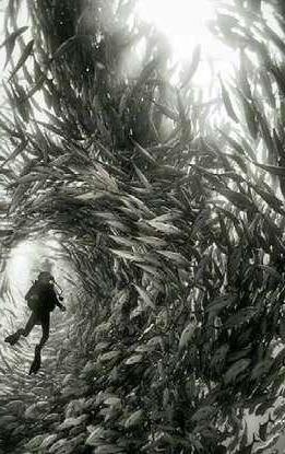
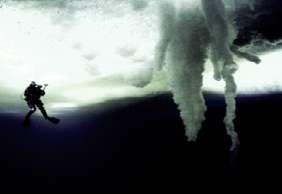
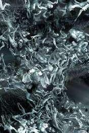
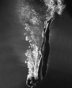
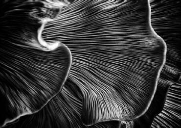
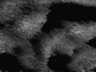
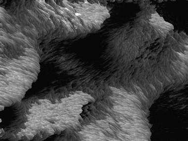
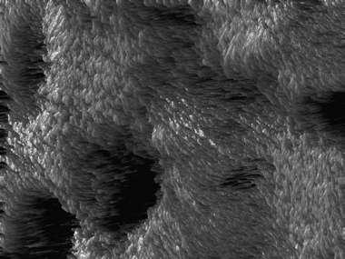
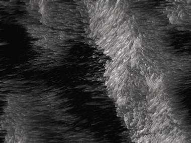
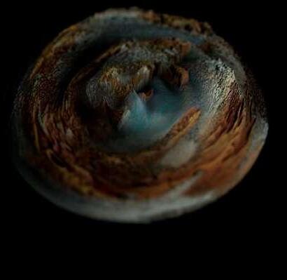
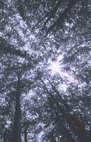
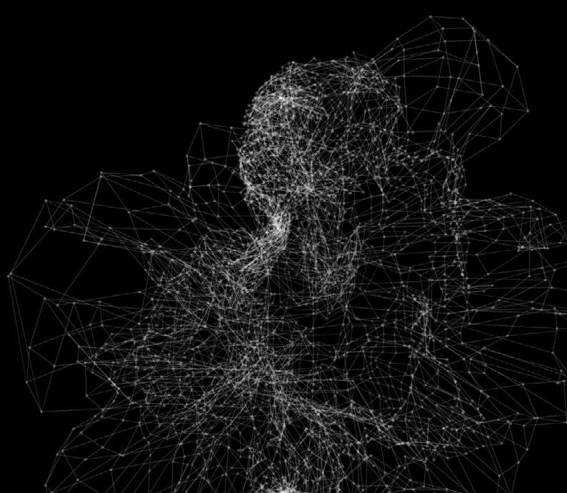
The underwater world is a place of diverse and abundant life and symbolizes the idea of the unknown and the untamed. The deep, dark depths of the ocean, with its many unknown species and environments, serve as a metaphor for the mysterious and unpredictable nature of existence. This perspective encourages us to embrace the unknown and to remain open and curious in the face of the unknown.
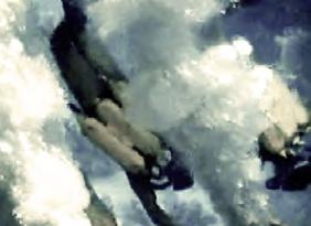
In my artwork I wanted to create a fluid and harmonious movement that reminds of a group of fish that has been described as a metaphor for the interconnectedness of life and is inspired by the words existence community and unity.
The school of fish represents the idea of interdependence. Each individual fish in the school contributes to the movement and success of the group, and in turn, the group provides protection and safety to each individual. This interplay between individual and collective action highlights the importance of collaboration and community in the natural world.
It symbolizes the concept of unity in diversity. Despite their differences, the fish in the school move together in a seemingly coordinated effort. This unity amidst diversity is a reminder of the importance of embracing and valuing our differences, while still working together towards a common goal.
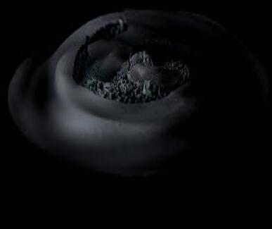
program: TouchDesigner
Individual fish in a school are influenced by both their own behavior and the behavior of the other fish around them. For example, fish may follow the movements of other fish in the school, or they may use visual cues to keep a certain distance from one another. In this technique generated a point texture, displaced it and used feedback to record the movement as trails, creating the illusion of particles. Then took the feedback loop further and add some OPs to abstract the outcome to imitate interactions between individual fish in the school that is synchronized and a cohesive group that interacts to the sound.
My research in this project starts from the definition, similarity and difference of utopia and dystopia. How could our world look like in the future? Is it a place of ideal perfection especially in laws, government, and social conditions? Like the Garden of Eden, an aesthetically pleasing place in which there was “no knowledge of good and evil”, or Heaven, a religious supernatural place where God, angels and human souls live in harmony? Or is it a place where environmental disaster is the backdrop to this modern dystopia?
An imagined society or community that is characterized by extreme oppression, poverty, and suffering like in a science fiction movie?
Fact is that dystopian societies are more common than utopian societies because utopias are ideal, while dystopias are what actually happen. Reminding you of a real life dystopia is Nazi Germany, lasting from 1933 to 1945 during the time of World War II. A flawless world is not possible. Just as there are problems in the present, difficult times will exist in the future. Being free from poverty, war, and other problems that plague human civilization, but in reality, the cost of achieving this ideal society is the loss of individuality, freedom, and democracy. All of this made me curious of how this future would could look like.
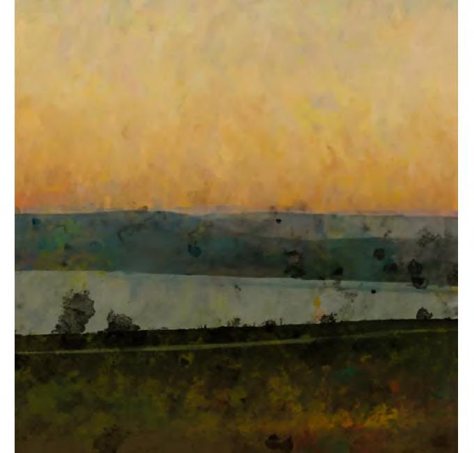
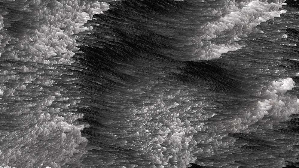
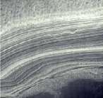
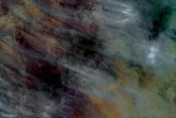
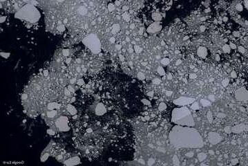
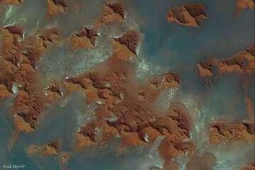
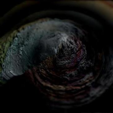
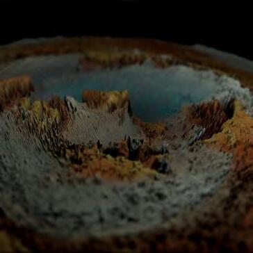
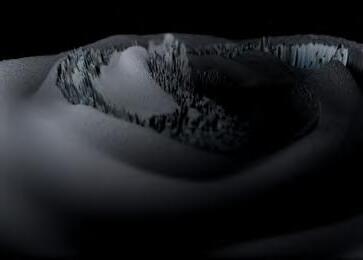
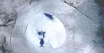
thought about taking already existing places on our beautiful planet as a base reference for my artwork. Places that are only visible miles above Earth’s surface. Microorganisms reacting to the salt runoff in these waters color the pools surreal hues, and the resulting chromatic smudge, seen from space. A great innovative tool is Earth View from Google Earth, a collection of thousands of the planet’s most beautiful landscapes. Now, some of these landscapes are not suitable for human habitation, either due to harsh physical conditions or lack of resources. Can we make them lively?
Through this exploration felt that the colors (based on the images) chose bring a bit of life in the landscape. Though it´s texture and roughness made it look like a different planet, something that is not discovered yet.
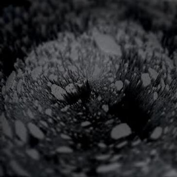
Creating a landscape which organic aspect of the structure is not limited to the design, but also to the quality of living, which has been adapted to the rules of nature. Using images of deserts, polar regions and remote islands and implement them as height maps, creates the pattern and the Noise makes the height map move and lively. used a tube as a base, because it´s being distorted on a circular grid and to emphasise the cycle of life. These emerging patterns look like an organism which can represent a future world. Some structures emerge and grow over time while the bumps interact with each other and it´s sound. Is it a Utopia or Dystopia?
Link to the Video: https://youtu.be/WwaAhBbyqeo
Music: Ryoichi Kurokawa - unknown
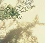
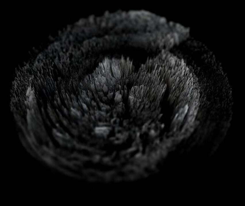
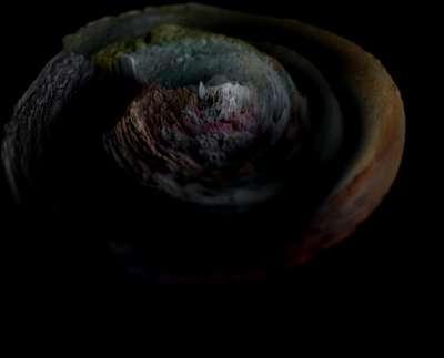
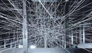
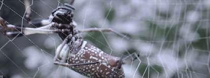
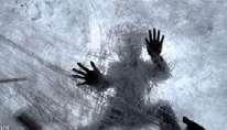
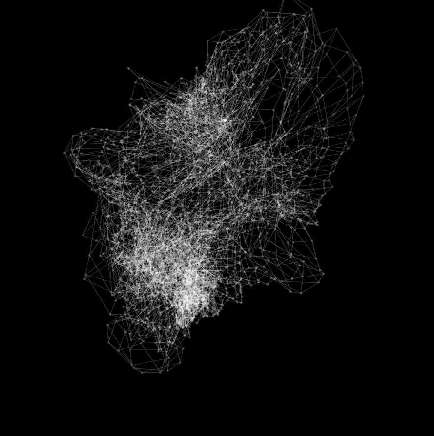
In my artworks often aim to explore the relationship between nature and technology, and to highlight the interconnectivity of these two important forces in our lives. Ultimately Molitiam is a narrative exploring fragile beauty and weakness as a strength. Fragile looking but incredibly strong and flexible.
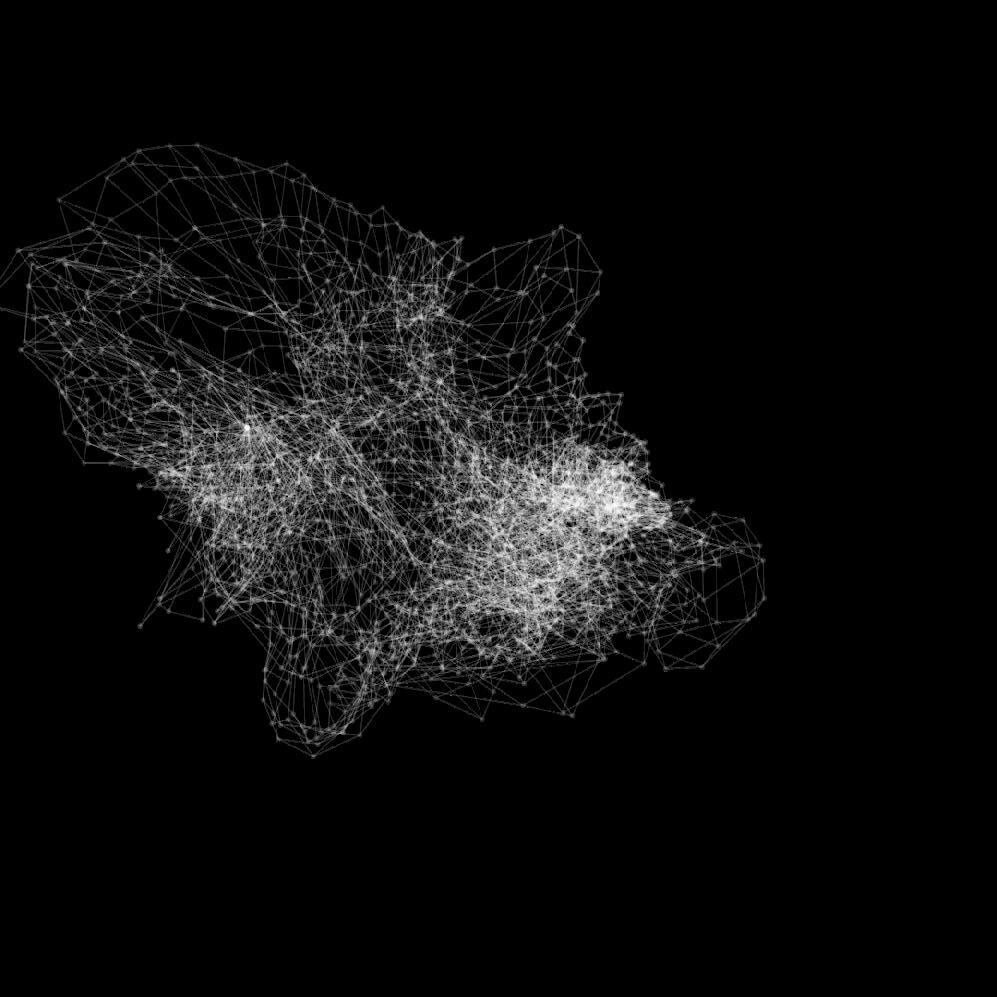
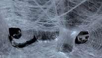
The spider’s web: She finds an innocuous corner in which to spin her web. The longer the web takes, the more fabulous its construction. She has no need to chase. She sits quietly, her patience a consummate force; she waits for her prey to come to her on their own, and then she ensnares them, injects them with venom, rendering them unable to escape. Spiders – so needed and yet so misunderstood.
A spider’s web is a complex network of threads spun by a spider, which serves as its home and as a trap for its prey. The web is typically made up of many different threads of spider silk, which are extruded from the spider’s silk glands and then woven into the web in a specific pattern.
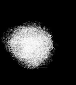
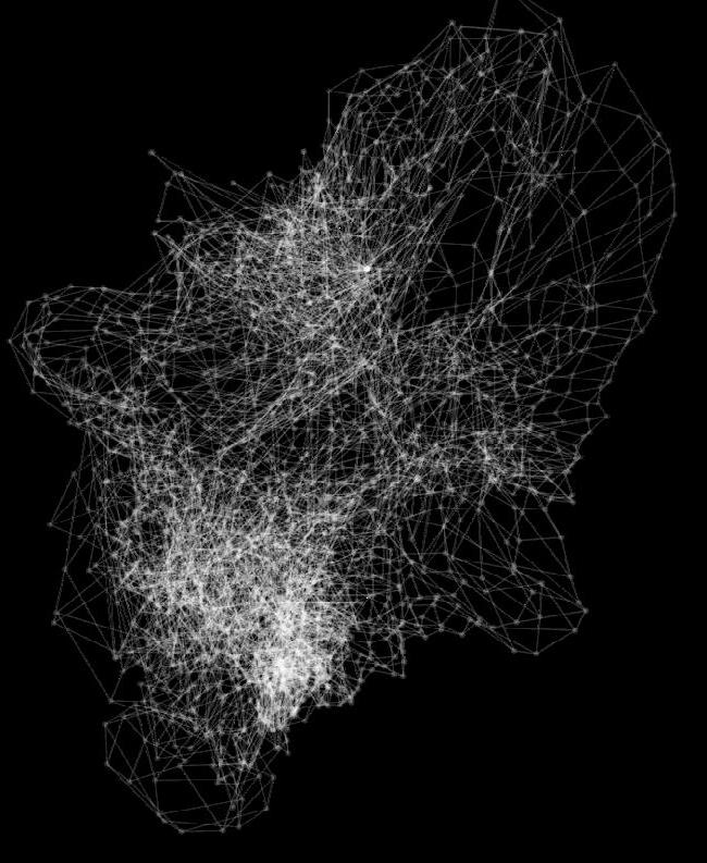
As as a biological organism it lies in its unique properties and abilities. Furthermore, the intricate patterns and structures that spiders build are often seen as a symbol of the complexity and beauty that can emerge from simple biological processes. In this sense, a spiders web can be seen as a metaphor for the larger themes of the natural world, such as the unity of all life and the ability of seemingly simple systems to produce remarkable outcomes.
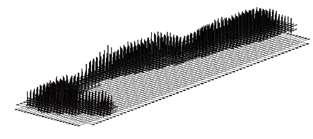
A metaphor for the broader themes of existence, such as the interplay between fragility and strength, the ability of life to adapt and evolve, and the delicate balance between stability and change. But also society is like a monolithic spiders web. The threads of the web are created by human bonds, relationships forged by trust, respect, justice and joint enterprise. Technique program: TouchDesigner
In this example used the Line MAT, which is a simple network but has a very powerful outcome. It’s based on a wire frame sphere with drawn points wherever the lines meet. That are imitating the web structure. then set the geometry to rotate and added a noise and a fractal to make the geometry move. Testing out different values of parameters contributed to the outcome. The movement makes it look lively, like an organism, a living spider web that is constantly changing in response of the environment (audio-reactive) around it. Choosing a sphere geometry to make it look like it’s ready to catch even the slightest movements of insects that fly into the web.
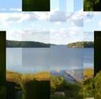
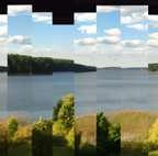
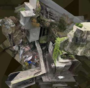
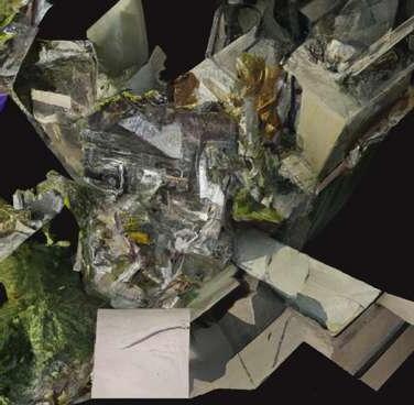
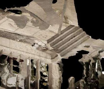
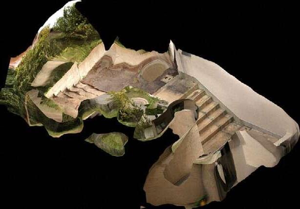
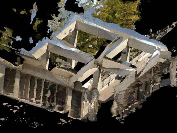
Our design aims to take advantage of the full potential of the surrounding countryside by combining residential and community units in a hybrid densification that integrates seamlessly into the natural landscape. The structure is cleverly folded into the elongated hillside site and offers stunning views of the lake, creating an immersive experience for residents to interact with nature and the surrounding countryside.
We designed the residential units to be of the terrace apartment type with gallery levels, which are skillfully embedded into the slope. This provides ample space for large families or residential communities, while also offering privacy and retreats for the individual. Additionally, we incorporated spacious common areas to encourage interaction and socialization, allowing residents to build a sense of community and connection.
To ensure a sustainable and environmentally friendly living experience, we use the energy of water to provide an almost self-sufficient energy supply. The green roofs are designed to collect rainwater in cisterns, which can be used to water the green roofs and provide water for the residents. We bypassed conventional drainage with downspouts and designed the structure to mimic a flowing stream, creating a beautiful and calming atmosphere that is both functional and aesthetic.
Our design is a flowing stream of innovation and inspiration, embracing the best of both urban and rural living. We aim to inspire others to rethink the possibilities of suburban living and encourage the creation of sustainable and inclusive communities that will improve the quality of life for all.


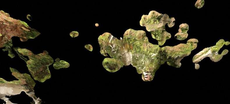
The scenery may either be organic or artificial. It shapes the limit of our senses and introduces us to a new universe. However, the pastoral essence of the surroundings has been altered by the conquest of space and the emergence of datacenter landscapes. Google mapped the territories and the Earth was memorized. The landscape could be doubled. Nonetheless, there is a sense of something absent, something that is vanishing. We explore the landscape through our computers and are aware of our location and its identity. But, could the scenery cease to exist along with us?
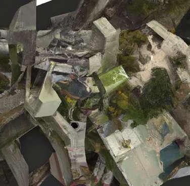
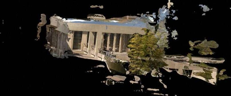
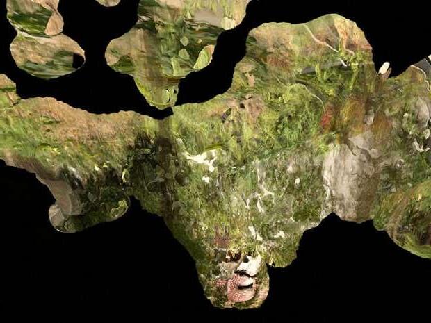
The architecture comprises public and private areas, communal zones, inner gardens, and diverse dwelling arrangements, forming complex mazes that unravel new cognitive maps. The edifice bends and folds in on itself, creating an ever-shifting landscape that appears to stretch endlessly as a camera glides over the “Rothsee.” The terraces break apart under the sway of the network, constantly morphing into new shapes. It is a dynamic structure that transforms daily, with a floor that disintegrates into an elusive space resonating with anonymous voices and haunted by spectral passions.
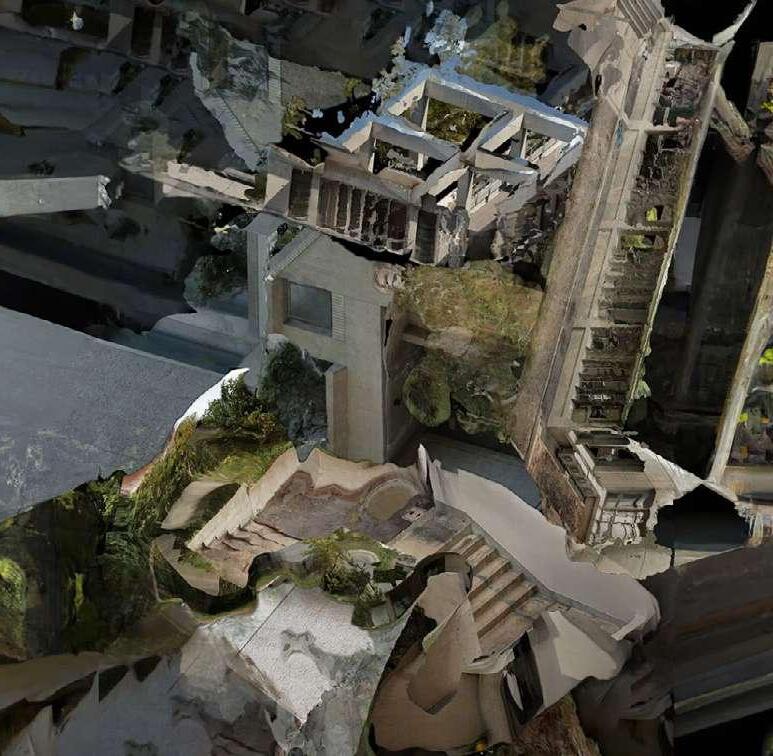
“Belonging to a territory is the phenomenon most in need of rethinking and careful redescription.”
- Bruno Latour
The need for a more relational and interconnected understanding of the world, one that recognizes the complex and dynamic web of relationships that exist between all things.
Bruno Latour‘s „drawing things together“ refers to his philosophical approach of understanding the interconnectedness of all things in the world. Latour challenges traditional distinctions between human and nonhuman, subject and object, and seeks to understand how these categories are produced and maintained through networks of relationships and associations. This approach emphasizes the importance of „mediators“ in these networks, which help to connect and translate between different actors, often across different scales and domains of existence.
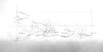
For this purpose, the frame of reference of a poetic, geometric, topological and programmatic structure is constructed. Further creative action takes place within this larger structural fabric, in networking with the approaches of other teams, on a concrete scale and under a content charge. The creative-inventive, logical-rational and productive approaches already learned are applied in this context.designing is understood as the drawing together of a complex set of facts - in the words of Bruno Latour as „drawing things together“.
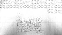
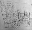
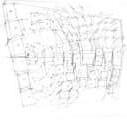
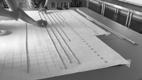
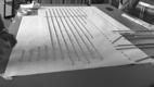
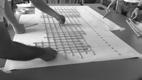
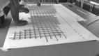
A common analog drawing surface. The number of participating actors with their various specializations engage in a common discourse in order to formulate the overarching framework by drawing. The format of the map serves as the site of negotiation in terms of content: it becomes the site of the collaborative construction and representation of a territory in which the individual works are embedded and related.
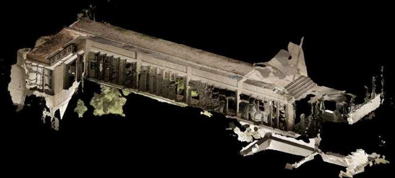
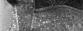
A real urban texture is surveyed and interpreted and constructed as the context of the further design procedure. It is represented in its horizontal extent as a map and in its vertical extent in a sequence of sections.
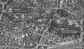
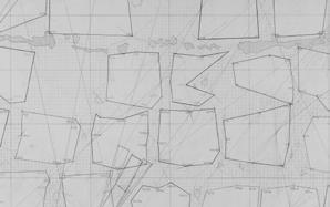
1) Pick a location in the city. (Nuremberg, Germany)
2) Decide a geometric soil formation with a certain degree of complexity and height difference.
3) Determine its area.

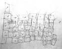
4) Read as a topological structure, precisely recorded in its components in a level manner and transferred in differentiated manner to the common map.
5) Also map immaterial cirteria or structures in the process.
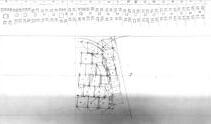
6) The drawing should show the trace of the construction and must comprehensibly contain all structuredetermining dimensions and has size of 1,50m x 3,65m.
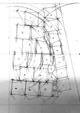
7) These, as well as further textual descriptions of the positional relationship and materiality, are to be incorporated into the map using precise technique.
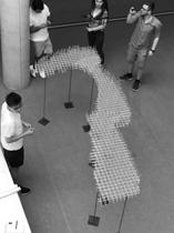
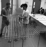
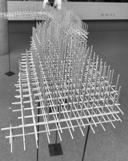
Create an artifact that relates the conceptual logic to the territory that your group has constructed through the technique of cartography. The point of reference is the layout of the topological structure of the map. It is to be interpreted on a scale of 1/50 and understood as a tangible micro-architecture.
3


the more it comes into contact with the territory, the stronger the bending of the material. The structure embeds itself and its change weaves itself into the environment and leads to an organic form.
10) Define the position of your artefact on your territory.
11) Create a artifact - an experimental microarchitecture that connects conceptual logic to your territory. Focus on the topological structure of the map (scale 1:50).
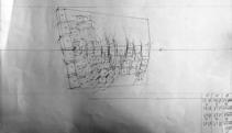
12) Represent through a sequence of 2D and 3D diagrams.
15) Further render studies show the result. What did you learn?
Each layer of the structure is given a grain to highlight the layering.
13) Refine your statement by using narrative techniques. Particular interest lies in line management and planar, colored representation, which corresponds to the common design approach.
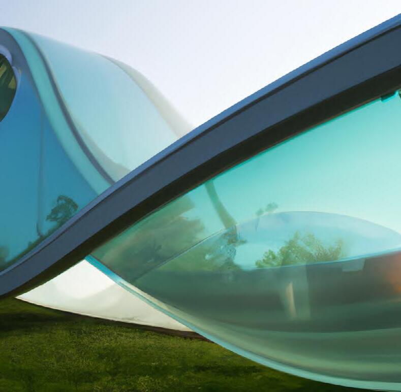
Glass highlights the idea of liquidity and transparence.
14) Choose a material and make tests.
“The world is not a solid continent of facts sprinkled by a few lakes of uncertainties, but a vast ocean of uncertainties speckled by a few islands of calibrated and stabilized forms.”
- Bruno Latour these strategies the team has looked at example projects
The built environment is not simply a collection of physical objects, but rather a complex network of relationships between humans and non-human entities. Creating spaces that facilitate and mediate interactions between people and things. Assemblages, heterogeneous elements, the natural features of the territory, such as water, moss and the walkway make up the built environment that come together to form a coherent whole.
think Latour‘s approach to „drawing things together“ can be seen as a way of rethinking the role of the architect in society. Rather than seeing architects as autonomous creators of form, Latour suggests that architects should be understood as mediators or facilitators of the relationships between humans and non-human entities in the built environment. This requires a shift away from a focus on the individual genius of the architect and towards a recognition of the collaborative and interdisciplinary nature of architectural practice.