Avenir Typeface

Page 1

Avenir Typeface

Avenir Includes You

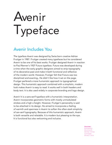
The typeface Avenir was designed by Swiss born creative Adrian Frutiger in 1987. Frutiger created many typefaces but he considered Avenir to be one of his best works. Frutiger designed Avenir in reaction to Paul Renner’s 1927 Futura typeface. Futura was developed during a time when the early graphic designers aimed to strip topography of its decorative past and make it both functional and reflective of the modern world. However, Frutiger felt that Futura was too disciplined and exacting., He didn’t like how it sat on the page.

Frutiger perfered a more humanistic approach to typographical design. This humanistic approach combined with a simplistic, modern look makes Avenir is easy to read. It works well in both headers and body text. It is also used widely in corporate branding and logo design.

Avenir It is a sans-serif typeface with a humanistic interpretation. Avenir incorporates geometric forms with mostly unmodulated strokes and a high x-height. However, Frutiger’s personality is said to be attached in its design. He aimed to incorporate a feeling of warmth and openness in Avenir to soften the often-stark simplicity of san-serif typography. Because of this humanistic approach, Avenir is both versatile and relatable. It is modern but pleasing to the eye. It is functional but also welcoming and inclusive.

Sources: Wikipedia Microsoft Anther Kiley Linotype Envato Tuts

Avenir Includes You

The typeface Avenir was designed by Swiss born creative Adrian Frutiger in 1987. Frutiger created many typefaces but he considered Avenir to be one of his best works.

Frutiger designed Avenir in reaction to Paul Renner’s 1927 Futura typeface. Futura was developed during a time when the early graphic designers aimed to strip topography of its decorative past and make it both functional and reflective of the modern world. However, Frutiger felt that Futura was too disciplined and exacting. He didn’t like how it sat on the page. Frutiger perfered a more humanistic approach to typographical design. This humanistic approach combined with a simplistic, modern look, makes Avenir is easy to read. It works well in both headers and body text. It is also used widely in corporate branding and logo design.

Avenir It is a sans-serif typeface with a humanistic interpretation. Avenir incorporates geometric forms with mostly unmodulated strokes and a high x-height. However, Frutiger’s personality is said to be attached in its design. He aimed to incorporate a feeling of warmth and openness in Avenir to soften the often-stark simplicity of san-serif typography. Because of this humanistic approach, Avenir is both versatile and relatable. It is modern but pleasing to the eye. It is functional but also welcoming and inclusive.

Sources: Wikipedia Microsoft Anther Kiley Linotype Envato Tuts
Turn static files into dynamic content formats.

Create a flipbook
Issuu converts static files into: digital portfolios, online yearbooks, online catalogs, digital photo albums and more. Sign up and create your flipbook.