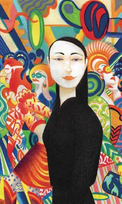
One of Italy’s finest artist with a small selection of his works.
EDITOR’S LETTER
Paul Auster (1947-2024) wrote what was described as “a new departure for the American novel” between 1985-1986. It became known as The New York Trilogy, the first book being City of Glass. This is a take on the classic detective story, but more Kafka than Elmore Leonard. Far more Kafka! Impossible to translate into a graphic novel, you would think, but Paul Karasik thought otherwise.
David Mazzucchelli had made his name in the world of comics with stints on Daredevil and Batman, both with writer Frank Miller (Batman: Year One is widely respected as the best Batman story in its 85 year history). Karasik asked him if he would like to tackle City of Glass. Always open to a challenge, Mazzucchelli agreed and produced a remarkable work in 1994, from an adaptation by Karasik.
An introduction to David Mazzucchelli
Charles Schultz and Peanuts
But what about the rest of the trilogy? What of Ghosts and The Locked Room? What comics artist would take up this kind of challenge?
Karasik designed Ghosts and engaged the magnificent Lorenzo Mattotti to do the artwork. Karasik took on the adaptation of The Locked Room by himself.
But all this took some time. In fact it was not until this year (2025, for those who have purchased this magazine a few years from now on eBay) that Faber & Faber (where TS Eliot used to work) brought out the complete comics adaptation in a beautifully packaged hardcover. Every home should have one.
The magnificent work or Dima Iyas Nassar
Charlie picks 5 of his favourite books
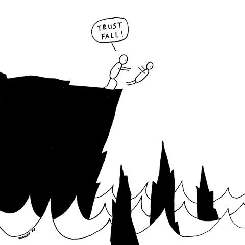
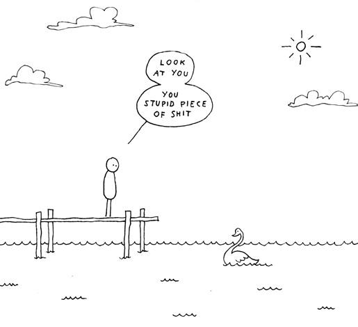
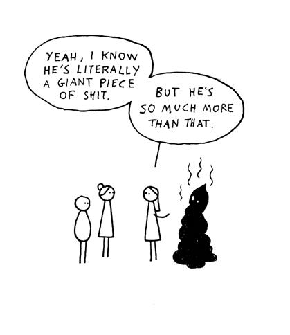
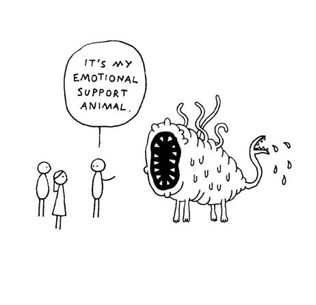
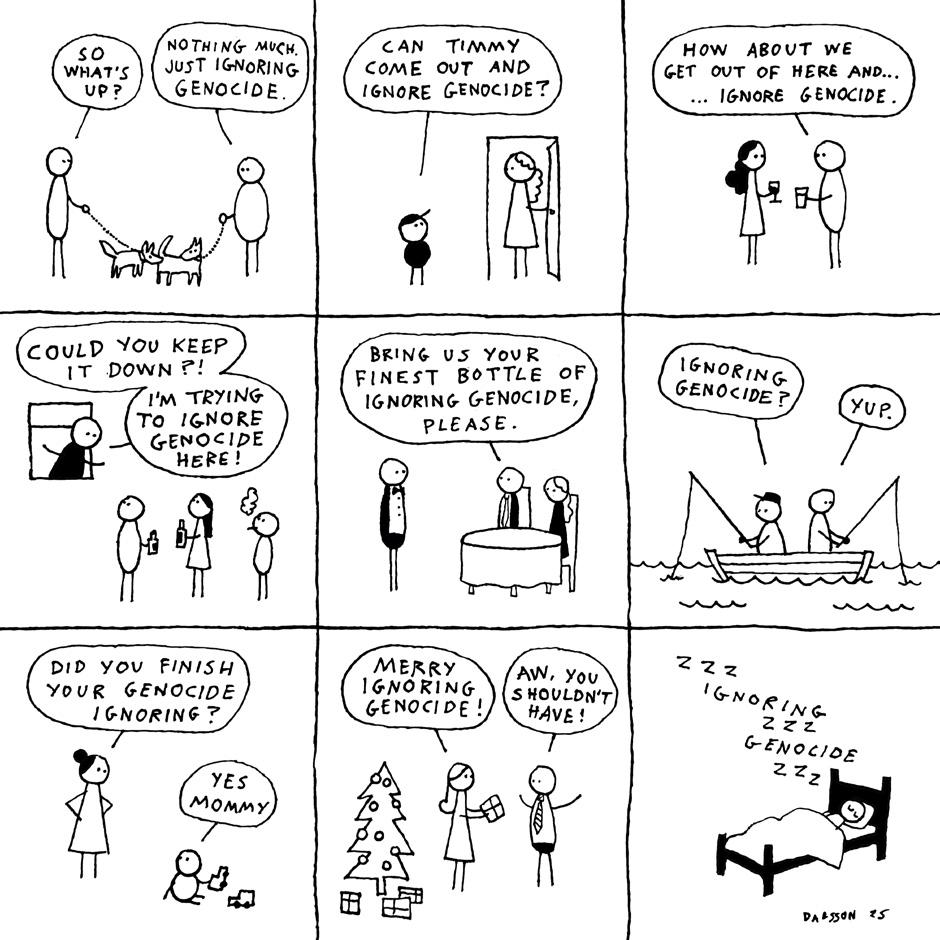
Selection of Dagsson’s creations for 2025
Check out our articles on Mazzucchelli and Mattotti in this very issue.
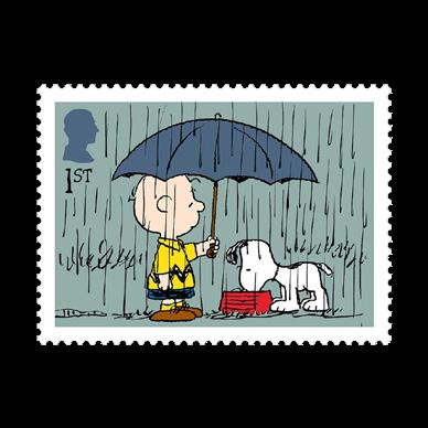
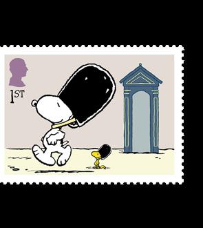
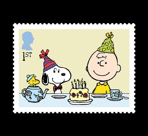
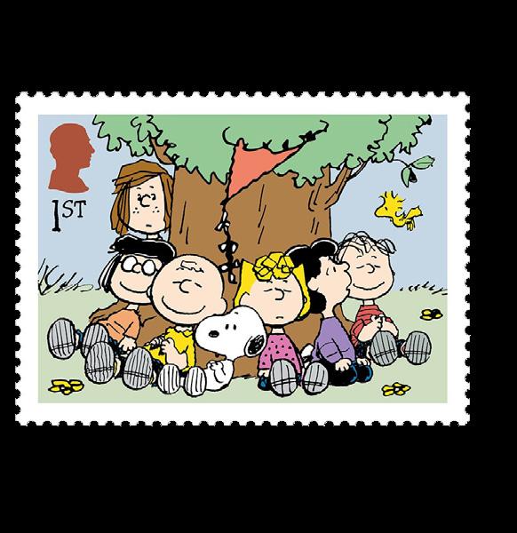
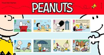
And, hey, we could not let the 75th anniversary of Charles Shultz’ Peanuts go by without an article about this remarkable comic strip. Charles Schultz wrote and drew - by himself - every episode of his famous strip for 50 years! That’s 17,897 strips! No scriptwriter, no art assistants, no letterer - no comics creator ever matched Schultz’ achievement. Run out to the nearest Post Office and buy the lovely anniversary stamps and then come back and read more about Peanuts further on in this issue.
If you are reading this at LICAF 25, don’t forget to head for our Comics Marketplace. Books are available from La Belle Adventure and from individual creatives. And, let’s face it, you’re in Winderemere. Take in the beauty of England’s largest lake and be inspired.
See y’all next issue.
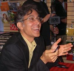
John McShane
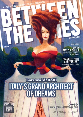
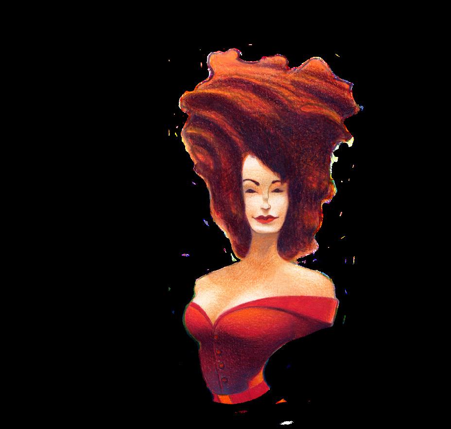
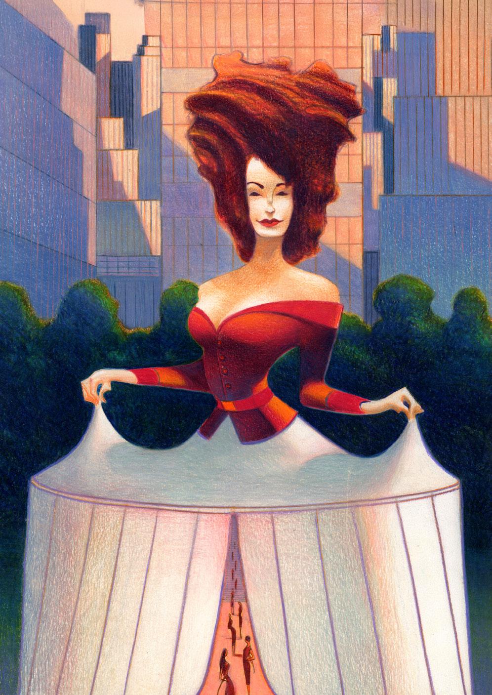
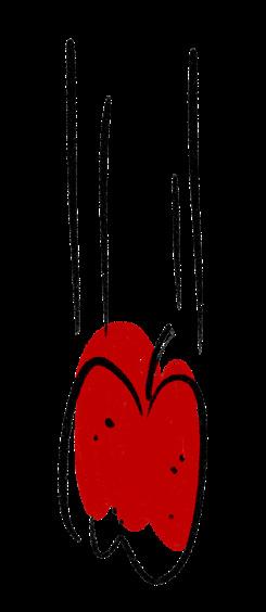
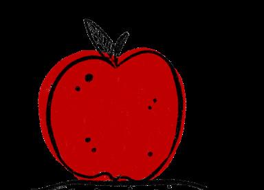
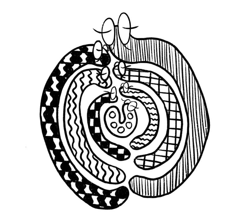
THE DREAM WORLDS OF LORENzO MATTOTTI
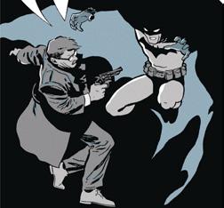
GHOSTS (2025)
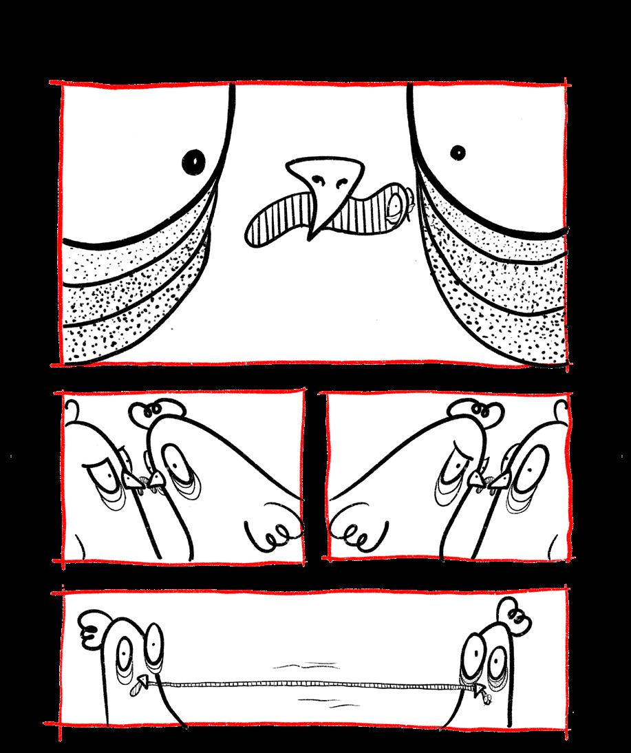
Paul Auster (1947-2024) does not write straightforward books. His New York Trilogy combines detective, noir fiction with a postmodern approach more akin to Kafka. Auster’s work challenges the very notion of storytelling. Surely this kind of work could not be adapted into comics?
Paul Karasik studied at the famous School of Visual Arts in New York where he encountered Will Eisner, Harvey Kurtzman, and Art Spiegelman - three auteurs who pushed the boundaries
So it was that in 1994, Karasik and David Mazzucchelli collaborated on City of Glass, the first volume of Auster’s trilogy. It was quickly recognised as one of the “100 best comics of the 20th Century”. How could another artist live up to that?
But then, you could always call on Lorenzo Mattotti…
Lorenzo Mattotti was born in Brescia in 1954 and now lives in Paris. He studied architecture at Venice University. As well as his groundbreaking contribution to sequential art, his illustrations have appeared in such major publications as The New Yorker, Vogue, Le Monde, Vanity Fair and more. He created various album covers, notably for Lou Reed’s The Raven.
with each other then and discussed our ideas. Today we are less of a group and more individual authors. But we all want to explore new ideas - it would be boring otherwise… Every story is still a discovery.”
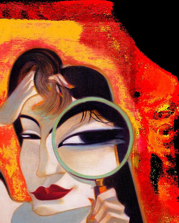
Certainly, City of Glass contains many discoveries. Paul Karasik sketched out all three of the novels using different styles of graphic storytelling. He gave the Ghosts sketches to Mattotti. Here the pictures do not merely reproduce what you could read in the prose, they comment on it. In early UK comics there are chunks of prose under each panel which merely put into prose what you can see in the pictures. Did any child ever read these captions? In Ghosts something different is happening.
Massimo Mattioli) the avant garde
borders between comics,
full of enthusiasm and
We were more in touch
See pages 151 to 153 in the recently published hardback containing all three adaptations (the last one is solely by Paul Karasik). On the first page, Blue accepts the offer of employment from White. In the picture, as they shake hands, Blue is floating above an open trapdoor. In the next page he is falling into a typewriter and on the third page he has fallen out of bed. None of this appears in the prose. Blue will soon find out that he has fallen in more ways than one.
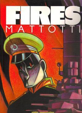
FIRES (1986)
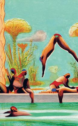
This was Mattotti’s breakthrough graphic novel, rendered in oil pastel and coloured pencil.. The publication of Fires in 1986 revolutionised the comic language with its expressive lines and lavish colours and has been inspiring generations of artists ever since. Some people have said that it is a turning point in comics history, making comics into high art. It won the Yellow Kid Award and is often cited as his masterpiece.
Paul Gravett says: “Mattotti’s oil-pastel techniques harness the narrative power of fine art: the warmth and vibrancy of Post-impressionism for the magical island; the harsh mechanics of Futurism for the massive battleship; the distortions of Expressionism for the sailor’s altered mental state. No clever homages, these shifts in style always serve the story as well as communicating atmosphere and feeling.” ‘Nuff said?
“Lorenzo Mattotti is Italy’s grand architect of dreams… Mattotti’s rich imagery introduces sensations and depths of emotion new to comics - a breath of wind, the heat of fire, the freshness of woodland, feelings of tribalism, melancholy and peace.”
Paul Gravett
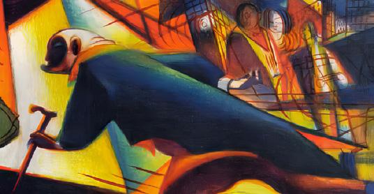
DR JEKYLL & MR HYDE (2002)
Created with writer Jerry Kramsky, this is, of course, an adaptation of one of Robert Louis Stevenson’s most famous works. There are other artists who have tackled this story: Alan Grant and Cam Kennedy (Waverley Books, 2008) and Guido Crepax (Olympia Press, 1989) who, naturally, adds some very graphic, voyeuristic scenes to depict Hyde’s obsessions.
The artist Graham Johnstone gives an excellent account of the style Mattotti has chosen for this book: “Mattotti’s trademark style is rooted in the early 20th Century avant-garde, and here he explicitly references his debt to the era’s Expressionist movement. The opening panels of Hyde’s shadow cast across the angular buildings evoke the painted sets of 1920 film The Cabinet of Dr. Caligari,
while the seedy night-life scenes clearly channel the satirical drawings of Georges Grosz.”
And there is an influence here of another British artist: “On the transformations between Jekyll and Hyde he channels painter Francis Bacon, who took the angst-ridden distortions of Expressionism to their grotesquely violent extreme. The result is some of the most powerful pages seen in comics.”
Caligari, Grosz, Bacon. Mattotti references these influences to move the setting to a Weimar era, thus updating Stevenson while portraying Hyde in a frighteningly unique fashion. The book won an Eisner Award in 2003 for Best US Edition of International Material.
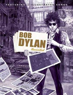
BOB DYLAN REVISITED (2008)
Some artists settle on a style early in their career and just stick to it. Not so Bob Dylan who was not afraid to give up the acoustic guitar for electric, change from the folk idiom, to rock, and even to Gospel. So it is with Mattotti. Each of the few works I have mentioned here employ different styles and techniques.
Many years ago, Felix Dennis invited several artists to contribute comic strips to illustrate Dylan’s lyrics, but without Dylan’s actual words to save paying the attendant fees. But it was never published. Part of Dave Gibbons’ strip (Need a Fog Set = Gates of Eden) finally saw print in his Confabulation on pg 56. Pudsy Morris’ contribution (The Fifth Organ = Father of Night) can finally be found in Ganjaman #1, 2017 .
Guy Delcourt Productions’ Bob Dylan Revisited does have enough of a budget to reproduce the lyrics when required (Alfred uses only 4 words for Like A Rolling Stone). There are 13 artists, 13 different approaches. Mattotti gives us a haunting, colourful, but sad interpretation of Hard Rain. His images of horror and destruction stay in the mind long after the book is closed.
I have barely scratched the surface of this magnificent artist’s contributions to sequential art. If you have not yet discovered his work, I envy you seeing it for the first time. This is far from the last word…
Such were the words of Ralph Waldo Emerson, the American political author, essayist, and philosopher who led the New England transcendentalist movement of the 1800s. “Art” of course, much like “beauty”, is a tricky and unmanageable concept, both simultaneously intuitive and yet beyond the fragile capabilities of the spoken wordidentifiable and yet ultimately so vague that it becomes undefinable.
What can be assured, however, is that art, whatever it may be, is a pervasive concept, one often linked to concepts such as creativity and, perhaps more neutrally, craftsmanship. And it is in craftsmanship and its materiality that, out of all other concepts, that we mostly find the concept of the “tool”.
It is then perhaps appropriate to call comics auteur and pioneer David Mazzucchelli, a crafter, not simply an artist. An engineer who, in spite of his preference for stylisation over rote realism, not only meticulously crafts a litany of finely tuned works, but the nature of very tools by which he first brings them into the realms of material reality - an appropriateness that goes beyond his name’s roots in the 13th century Italian “Mazza” meaning “toolmaker”.
Of course, when speaking of the idea of a piece of art as opposed to a product of craft, it is particularly easy to get weighed down in the idea of the “artist” - essentially making
THE TOOL MAKER: AN INTRODUCTION TO DAVID MAzzUCCHELLI
BY FINN MILES
the individual person of the author and their own associated life story as prudent to analysis as the product of authorship itself, a phenomenon that can easily devolve into sycophantism - contributing to arts fraught with an association with elitism.
Luckily for those more interested in the fruits of labour than the garden in which said fruits are grown, Mazzucchelli’s stated biography is appropriately short and sweet. Born in Rhode Island in 1960, Mazzucchelli’s rise in comics is a tale oft written with few words. After receiving his BFA, he broke into comics rather sporadically in the 1980s.
And yet, in spite of an often thin biography of the man himself, the same accusation of slightness could not be applied to the praise in which he is often showered and the corresponding esteem in which he is held - a reality that makes writing about Mazzucchelli more the “how’s” and “why’s” of his craft as opposed to some sort of longform psychoanalysis.
It is here with the reassertion of the notion of “craft” that we come back round to the concept of “the tool”, the very idea of craftsmanship returning to its proverbial head. For as in regards to Mazzucchelli’s work itself and the nature of his artistic sensibilities, as stylised as they may be, one needs to frame each product as the careful result of a series of material tools and decisions that build the layers of his multifaceted and distinctive works.
Naturally for someone entrusted with handling such a property during the era, Mazzucchelli demonstrates many of these skills in his run on Marvel’s Daredevil, considered by some to be one of his most memorable works, which in itself would demonstrate many a strength found within his work that would go on to further contribute to his esteemed reputation, such as his art’s striking visual nature and use of subtle shade, as well an aptitude for an expressive vigour that, at least in his
superhero works, stands in contrast to the classical, rigid and squared jaw dynamism of a Jack Kirby or Joe Schuster.
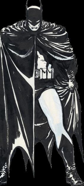
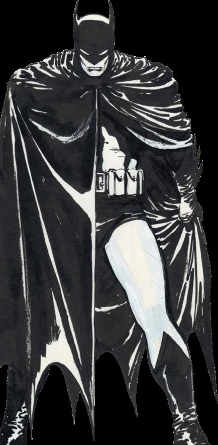
But perhaps his most memorable foray into superherodum and a demonstration of his visual acumen comes in the form of what some consider his magnum opus, Batman Year One.
On the subject of Batman himself there is perhaps little praise too high for Year One itself. Co-created with writer Frank Miller in 1987, this prequel to the general Bat mythos is considered by many to be the greatest Batman story ever told, only challenged by Miller’s own Dark Knight Returns and a small handful of other seminal works through the character’s near century long run, laying much of the modern foundation for DC’s most enduringly popular property.
Whilst this can, to a degree, be accredited to Miller’s own dark, unwavering, and uncompromising writing style, it is doubtful that the piece could have reached the heights of such an accolade without the flair of Mazzucchelli’s broad artistic contribution, which is tailored to make use of the mythology and subjects in question. Mazzucchelli’s subtle and stylised use of shadow both in functional and conceptual terms, for instance, is a facet of Mazzucchelli’s that is especially perfect for the titular Dark Knight, the grim gothic streets of Gotham, and that which lurks within its plethora of ambient shadows which provide a perfect playground and stage for Mazuchelli to play with exposure and contrast, light and darkness.
This complexity combined with a modicum of restraint allows Mazzucchelli to present a work that straddles the bounds of both multi layered design and illustrative clarity, his relatively simple and clean line work providing panels that manage to convey ample amounts of narrative without succumbing to the common pitfalls of stylistic over-indulgence and rampant
visual noise, his use of thick line work with an ink brushed texture highlighting his pencils in a way that creates a stylised visual warmth that is both gritty and, in simple yet precise terms, cozy. Such efforts towards a thematically appropriate but restrained artistic stylisation could have, in other hands, quickly turned into a self indulgent and vapid foray into some sort of drab pseudorealism or abject brutalism, painting a purely dreary and predictable picture of what it means to be a mature superhero story.
Instead Mazzucchelli manages to capture the serious and grim nature of the Batman mythos, exemplified through Year One’s own adult narrative themes, whilst still bringing a personalised and vibrant artistry to proceedings.
This broad aesthetic is then further brought to life by two seperate colourings from wife Richmond Lewis, an original and, at times, more surreal and varied original palette that in its use of cool to medium tones often takes on a pale complexion and a later recolouring that is often more a realistic yet vivid effort, with at times more expected yet intense visual aesthetics makes greater use of exuberant creams and yellows.
The former with its granular and grained texture and more abstract tones emphasises the rugged underbelly of Gotham city whilst providing a reoccurring sense of psychedelic surrealism that almost feels referential to the narcotics that line Gotham’s own sordid streets and alleyways. The latter, on the other hand, imbues Year One with a sharper visual dynamism that almost pops out from the frame, its greater three dimensionality and range of colour rendering the art as if Batman himself is leaping out from the shadows as he basks in the glow of a police searchlight.
Mazuchelli would arguably demonstrate this explicitly for the first time in what is perhaps his first true foray into the “postmodern” graphic novel, with 1994’s comic adaption of City of Glass, playing with the visual language of the genre to render an expressive and vibrant thriller.
It was from here on that Mazzucchelli would begin to explore more distinctive rendering and visual methods, with 2001’s Discovering America using two-colour printing that made no use of black inks to tell a litany of short stories with diverging narratives.
Following Year One, however, Mazzucchelli would largely remove himself from the public eye, disappearing at a time when he found himself at the height of his creative power, if not in raw ability then certainly in regards to popularity, essentially retreating within the world of comics from the proverbial spotlight.
It is from this point of relative anonymity that Mazzucchelli would first begin his journey into more experimental and independent work, reinventing himself in broader stylistic terms whilst experimenting within the confines of the comics anthology Rubber Blanket.
It is around this period that we as an audience truly start to see Mazzucchelli flourish as not only an artist or craftsman of individual comics but as a maker of tools, coming up with relatively new and experimental ways of channeling his artistic acumen and flavour.
Of course, as previously stated, a tool maker is one who truly understands not only the tools of their trade but their very construction, allowing them in the process to deconstruct said instruments, modifying or even creating new tools in the process.
And then there’s what could be termed as Mazzucchelli’s ‘alt’ magnum opus, 2009’s Asterios Polyp, a richly inventive piece which is to fans of Mazzucchelli’s more experimental works what Year One is to fans of his superhero endeavours - his single greatest work. A 10 year passion project, it is here that Mazuchelli embarks on a deconstructing and reassembling of comics as a visual medium, experimenting with ideas of shapes, perspective, colour and emotion, often in conjunction.
It is thus easy to see how Mazzucchelli’s career serves as something of an exercise in stylistic progression, one that can be appreciated in distinct phases, a phenomenon perhaps best encapsulated in the traditional art world by the likes of a Pablo Picasso or Salvador Dali. Such change thus serves to form a fine canvas upon which to paint one’s own creative legacy, be that legacy framed in terms of artistry or craftsmanship. For the story of that which is produced can then transcend both the self contained qualities of a singular work, and the background of their respective individual production, forming a portfolio that becomes strongly relational, each individual piece of art paving another road in a journey that expands out into a greater tapestry. A curtain ultimately weaved from the process of the same fundamental tools, from light to shadow, that bind it together, tools reshaped and reinvented over and over again.
Without the benefit of hindsight, where such a journey concludes is of course left uncertain. But if precedent is anything to go by, the rest of Mazzucchelli’s career will leave a lasting impression upon those that bear witness, forming a voyage that through sheer earned goodwill will recruit many an onlooker willing to join him on the journey.
COMICS AS PSYCHOTHERAPY: CHARLES SCHULT
BY
Hearst mansion and met Marion Davies (Susan Alexander in the movie). Mank even wrote a scathing review of an actress he knew and then fell asleep over the typewriter - that’s in the film as well, the reviewer brilliantly portrayed by Joseph Cotton.
Charles [NB] Schultz is said to have watched the film 40 times. The young boy fostered [NB] off by his mother clearly ringing chords with him and he was massively affected by it and by other events in his life.
Schultz was born in 1922 in Saint Paul, Minnesota. His father was a barber. He was an only child and most people called him Sparky, after a racehorse called Spark Plug in the Barney Google strip which had also started in 1922. Like his major creation, Charlie Brown, Schultz was shy and introspective.
Charles Schultz wrote and drew - by himself - every episode of his famous strip for 50 years! That’s 17,897 strips! In spite of feeling unwell in 1999, he resisted going to the doctor. Eventually he was diagnosed with colon cancer. The last episode was published on February 13th, 2000; he had died the previous day.
Poor ol’ Charlie [NB] Brown felt himself a failure. He did not deserve the disrespect he got in the very first strip (October 2nd, 1950):
“Well, here comes ol’ Charlie Brown! Good ol’ Charlie Brown… yes, sir! How I hate him!”
And, of course, it is the brilliant cast of characters and their interactions that we all remember.
Lucy van Pelt runs a “Psychiatric Help” booth (5 cents per consultation), but she can be so cruel, we feel that maybe she is the one who needs such help.
Her brother is Linus who tends to carry a security blanket. He is Charlie Brown’s best friend and often quotes to him scripture or classical philosophy. This seems to be his creator reasoning with himself - Schultz being part-Linus and part-Charlie.
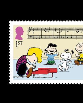
Lucy has a crush on Schroeder, a Beethoven obsessed pianist. Charlie Brown’s crush on the Little Red-Haired girl is also unrequited, as Schultz’s early crush for a girl was also unrequited.
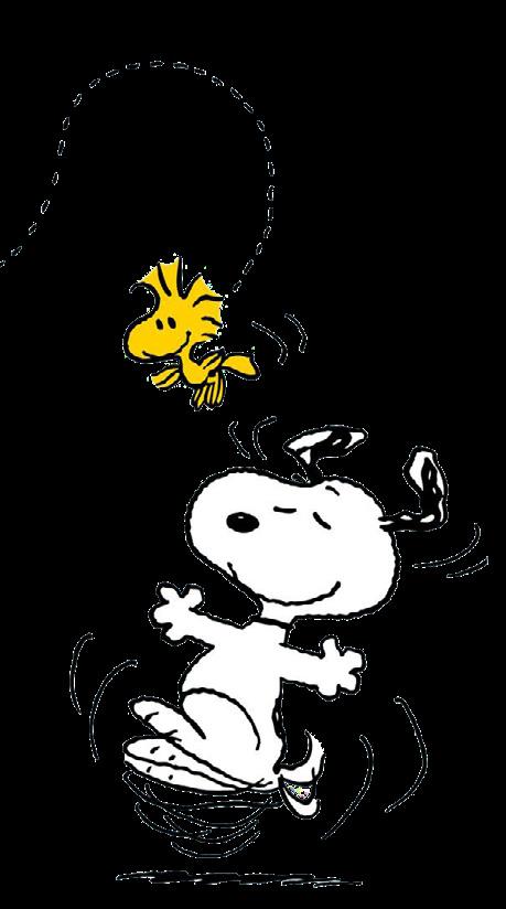
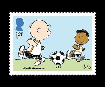
Then there are: Peppermint Patty, her friend Marcie (who has a crush on Charlie Brown!), Pigpen who is never clean, Franklin (introduced to help promote interracial friendship), and many more. But the outstanding character who is one of the most famous comics characters in the world has to be Snoopy.
Snoopy originally looked like a regular dog, but eventually evolved into a really unique character. His “thought dreams could be seen,” as Bob Dylan once wrote. He could be a First World War flying ace, a novelist, a Foreign Legionnaire.
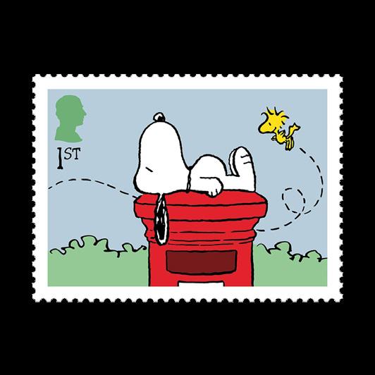
Woodstock was added to the cast. Snoopy could understand this little bird, so they could have conversations not shared with the human cast.
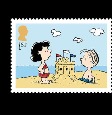
In time for the 75th anniversary of the strip, the UK Post Office has released a lovely series of eight postage stamps featuring Snoopy and Woodstock, Lucy and Linus, Schroeder playing piano, Franklin, and a final group pose of the gang. There’s even a Snoopy medal. What’s not to like?
And what about Schultz’s favourite movie? Does that overtly feature in the strip? It does, a number of times, but the most famous is…
Note: Spoiler Alert!
Strip
of December 9th, 1973:
LUCY: What are you watching?
LINUS (staring at TV): “Citizen Kane”
LUCY: I’ve seen it about ten times.
LINUS: This is the first time I’ve ever seen it…
LUCY: “Rosebud” was his sled!
LINUS: AAUGH!!
This set of stamps is available from the Royal Mail at: https://shop.royalmail.com/special-stamp-issues/peanuts
QUSASAT: COMICS ANTHOLOGY FROM PALESTINE
We have pleasure in presenting to you a selection of artwork by Dima Iyas Nassar. Taken from the inspiring work created at the Qusasat Comics & Digital Production Training Camp in Bethlhem in July this year.
Scan this qr code to download the anthology or visit: www.comicartfestival.com/qusasat-anthology
QUSASAT: COMICS ANTHOLOGY FROM PALESTINE MORE ARTWORK BY DIMA IYAS N
www.comicartfestival.com/qusasat-anthology
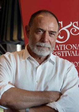
DESERT ISLAND COMICS WITH
CHARLIE ADLARD
I’ve been mulling a couple of top 5’s over in my head. So, here is the list - AS IT STANDS NOW - because, let’s face it, these things change over time!
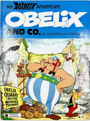
1] Obelix and Co (1976) by, of course, Rene Goscinny and Albert Uderzo - inevitably an Asterix book, and this one in particular since it’s an insanely clever pastiche on business and the only Asterix book not to have “Asterix” in the title!
Sadly this was one of the last books written by Goscinny before he passed away in 1977. So, it is fitting that two of the legionaries who are carrying a drunk on a shield are Goscinny and Uderzo themselves. (The drunk is apparently a friend of theirs.)
Is this possibly the greatest comic book series ever?
Being an artist, I’ve chosen two books simply to look at and feel inspired…
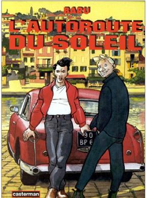
2] L’Auroroute Du Soleil (1991-1994) by Français Baru - possibly my favourite Bande Dessinée. Beautiful B&W with grey tone wash artwork… a feast for the eyes. Produced first of all in conjunction with Japanese publisher Kodansha, so it breaks the “norm” style-wise from most French albums, and all the better for it. Casterman published a French edition in 1995 and the following year it won Best French Album at Angoulème.
The story tells of the escape from their town of Karim and Alexandre after Karim unwisely slept with the wife of a far-right party member. They take off over a Japanese style 430 page journey to the south of France via the A7 Autoroute which links Lyon to Marseille. It is an absolute treat.
Charlie Adlard
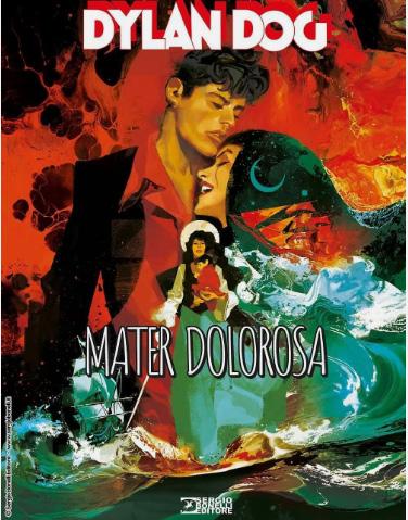
3] Dylan Dog Mater Dolorosa (2017) by Gigi Cavenago - I just LOVE Gigi’s artwork and in this book, he colours it as well. It’s something I constantly refer to time and time again. I just can’t get enough of it. If you have not yet read Dylan Dog, this is a good place to start.
For nostalgia…
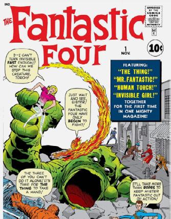
4] Fantastic Four #1 (November 1961) by Stan Lee & Jack Kirby - this is the first comic I ever read and it still holds a power over me. It felt strange and otherworldly at the time and weirdly still does… If it wasn’t for that comic, would I be doing what I’m doing now?
Everybody probably knows the story it tells, but it did kick-start the Marvel Universe.
And lastly -
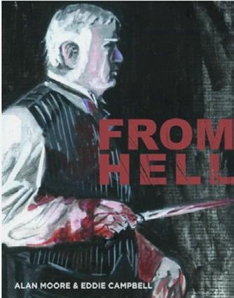
5] From Hell (1989-1998, full volume 1999) by Alan Moore and Eddie Campbellpossibly the only comic ever to send shivers up my spine at certain moments. After all, it is Moore’s take on the Jack the Ripper murders. Just dive in to its 576 pages and take your time, and believe me, there’s SO much to take in. An all consuming experience. My one extra item [apart from my reading glasses] would have to be my bean to cup coffee machine… gotta have my morning coffee! I mean, what’s the point in life without that one little pleasure to look forward to each day?
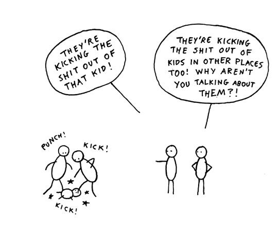
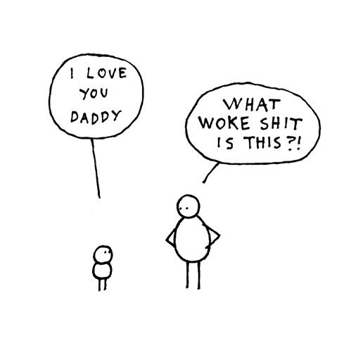
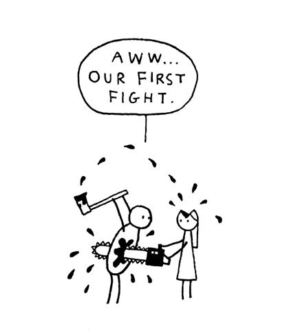
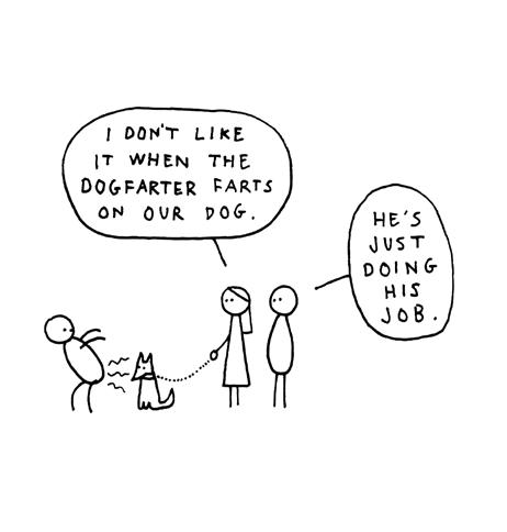
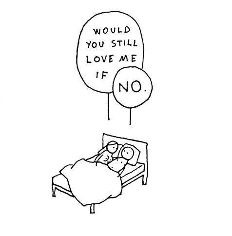
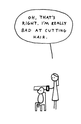
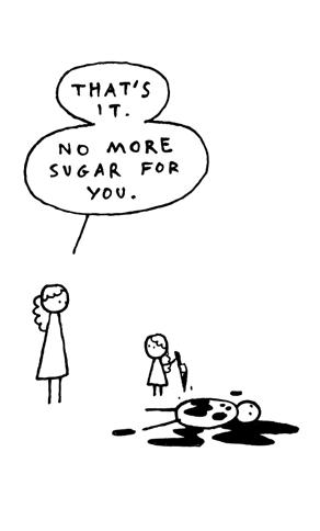
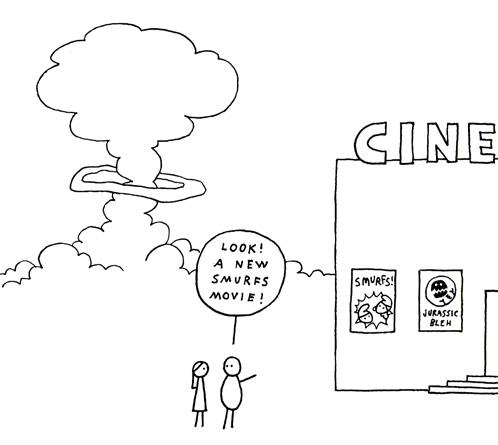
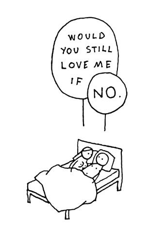
DAGSSON 25
A special guest again at LICAF 2025 here is a selection of recent cartoons reproduced by kind permission of Dagsson. Not for the feinthearted and contains some adult material