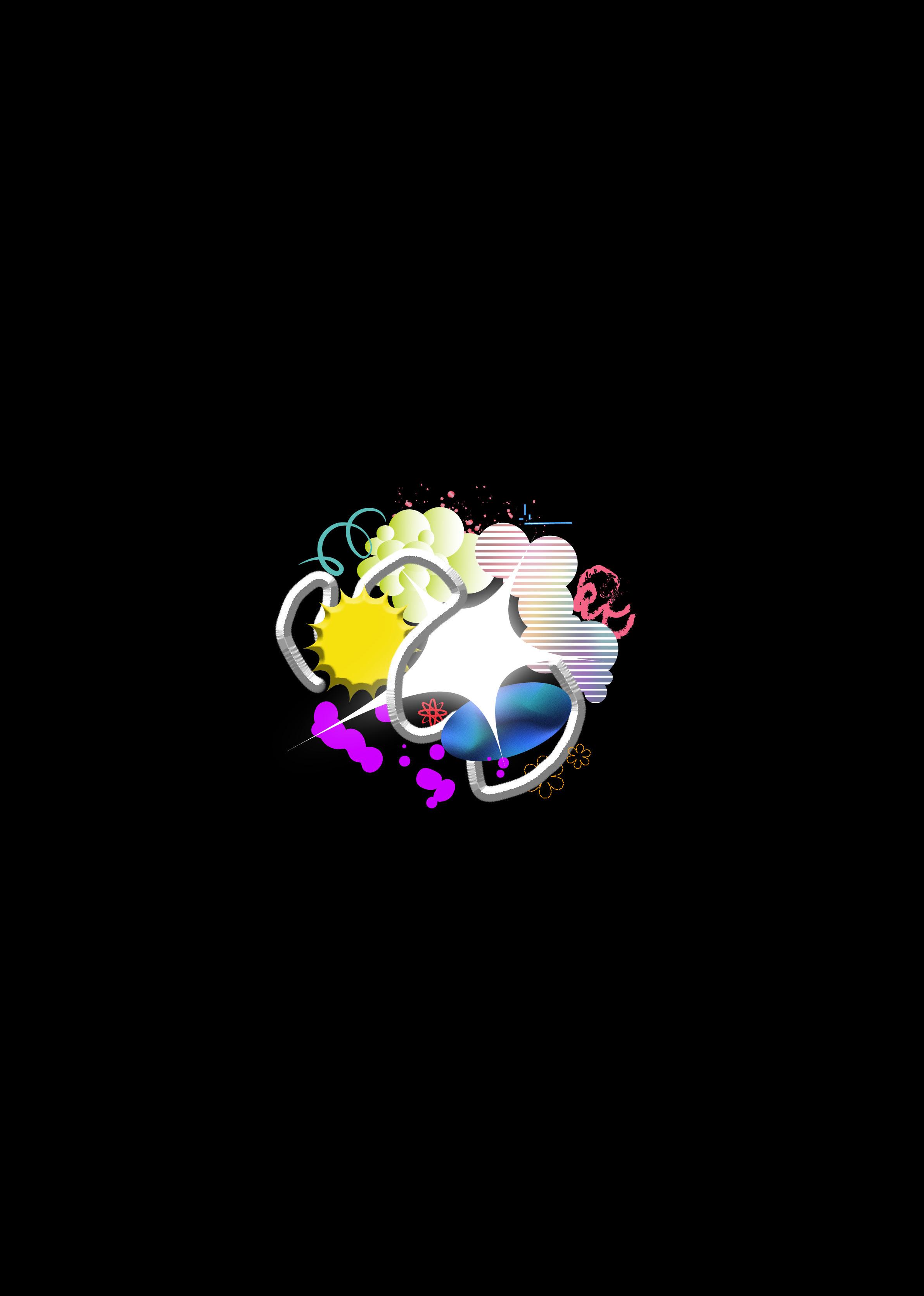
Synthesis: A Collection of Works from Rizkya Damayanti
By definition, SYNTHESIS relates to the creation of a compound by combining substances and elements. Applying this idea in visuals, I as a designer take and fuse various artistic elements to synthesize substantial and meaningful works.
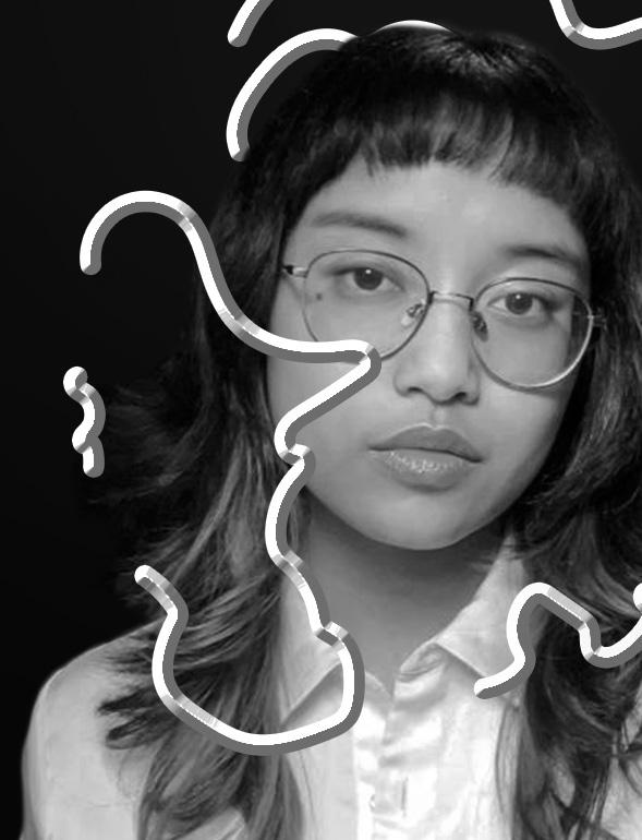
THE SCIENTIST
NAME: RIZKYA DAMAYANTI
LAB BASE: SOUTH TANGERANG
SPECIALIZATION:
EMULSIFYING THOUGHTS, CONCEPTS, AND VISUALS
GRADUATED: 2023
EDUCATION
2019 - 2023
Universitas Multimedia Nusantara
Bachelor’s degree in Visual Communication Design (Brand Design Major)
EXPERIENCE
September - December 2021
EGGHEAD Branding Consultant
Graphic Design Intern
January - June 2022
PT. Xiaomi Indonesia
Creative Intern for Redmi under MBKM
January - June 2022
Kronikel Project
Graphic Designer
January - July 2023
Future Creative Network
Designer Intern at Ou Creative
October 2022 - June 2024
Senyawa Asia Brand Agency
Graphic Designer (Freelance-Fulltime)
July 2024 - Present
Fishtank Theory
Graphic Designer
SOFTWARES
Adobe Illustrator
Adobe Photoshop
Adobe InDesign
Adobe Premiere Pro
Adobe After Effects
Blender
kya.damayanti@gmail.com
behance.net/kyadamayanti
@00.45am on instagram
Rizkya Damayanti on LinkedIn
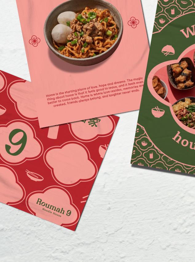
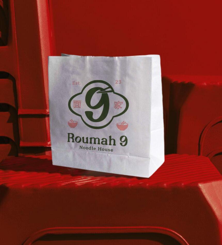
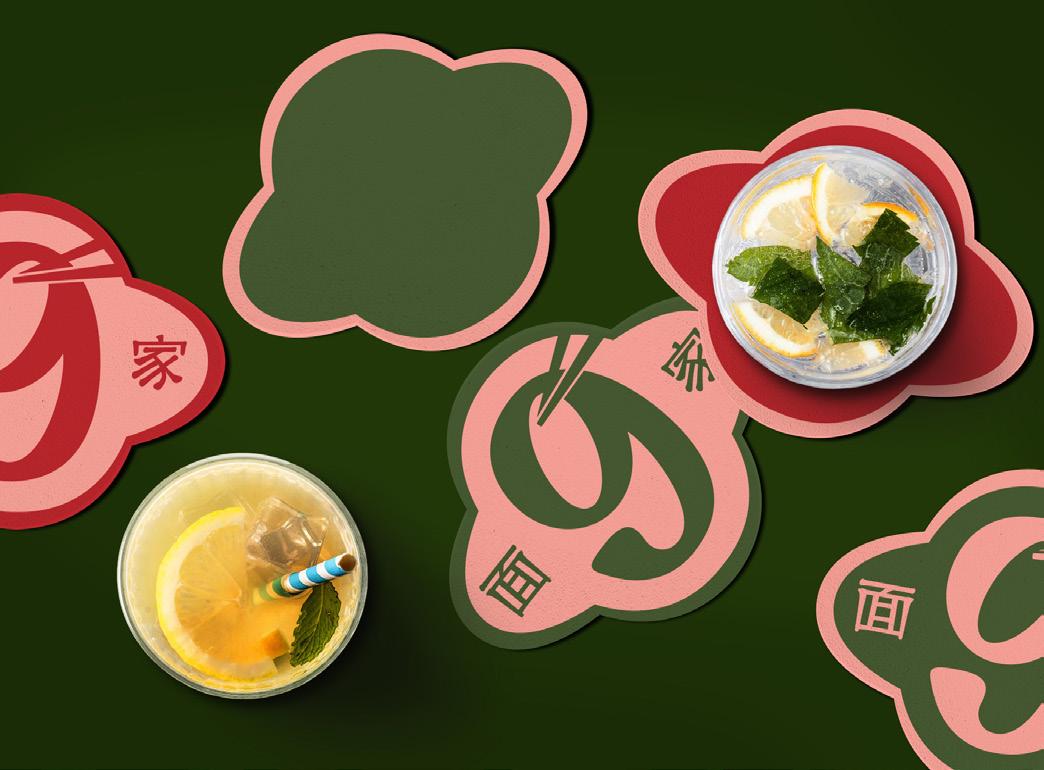
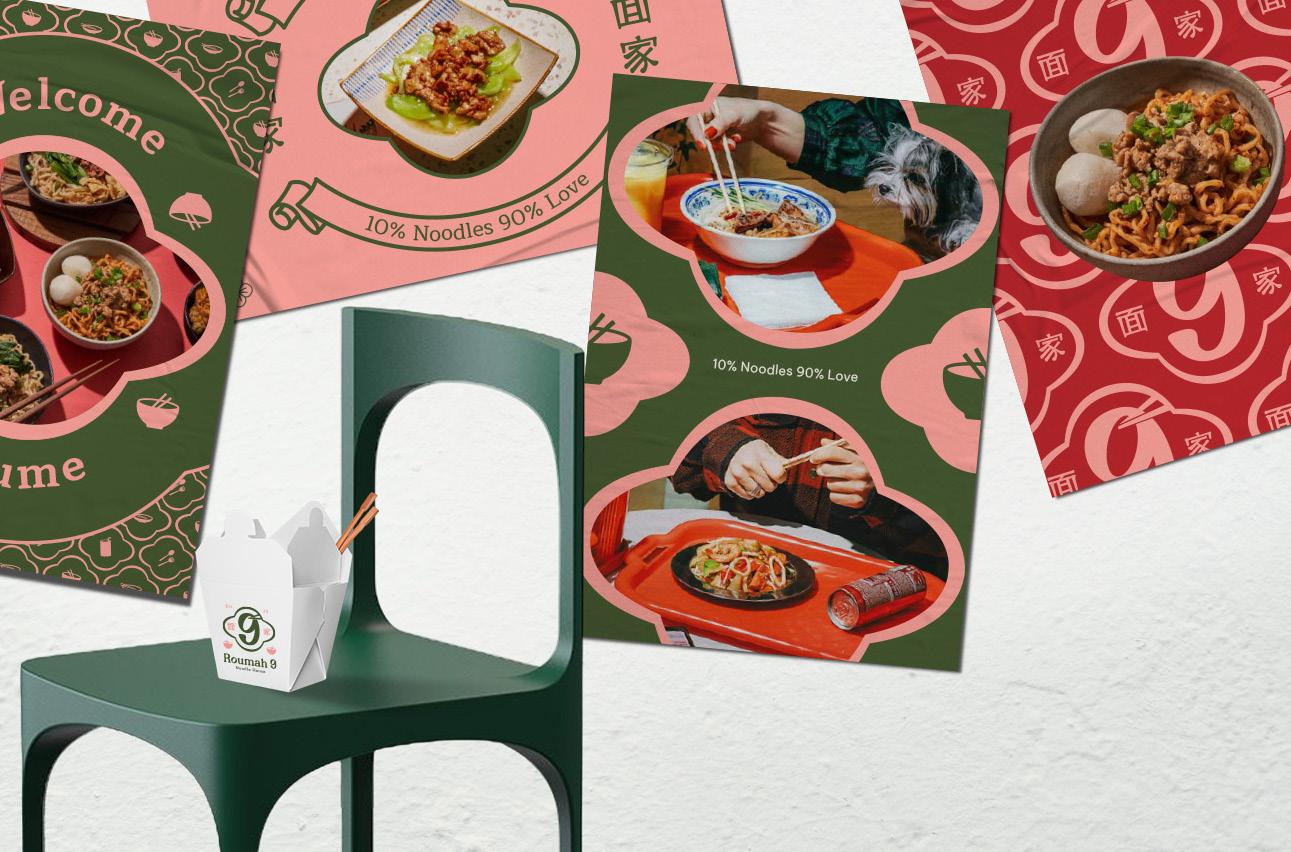
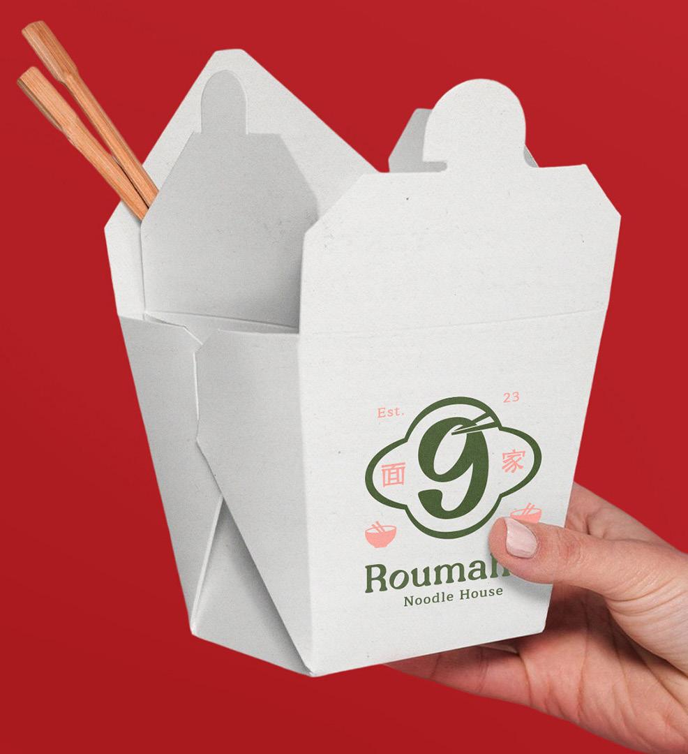
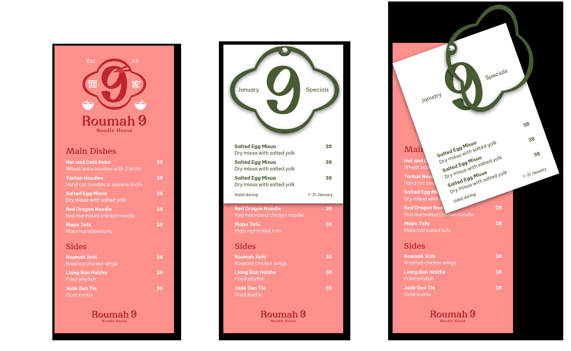
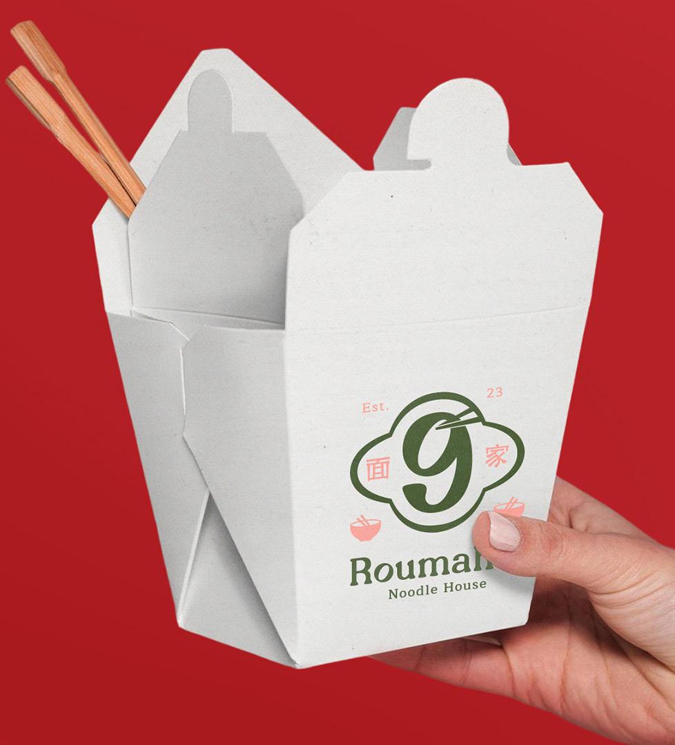
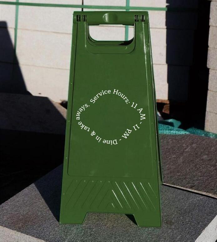
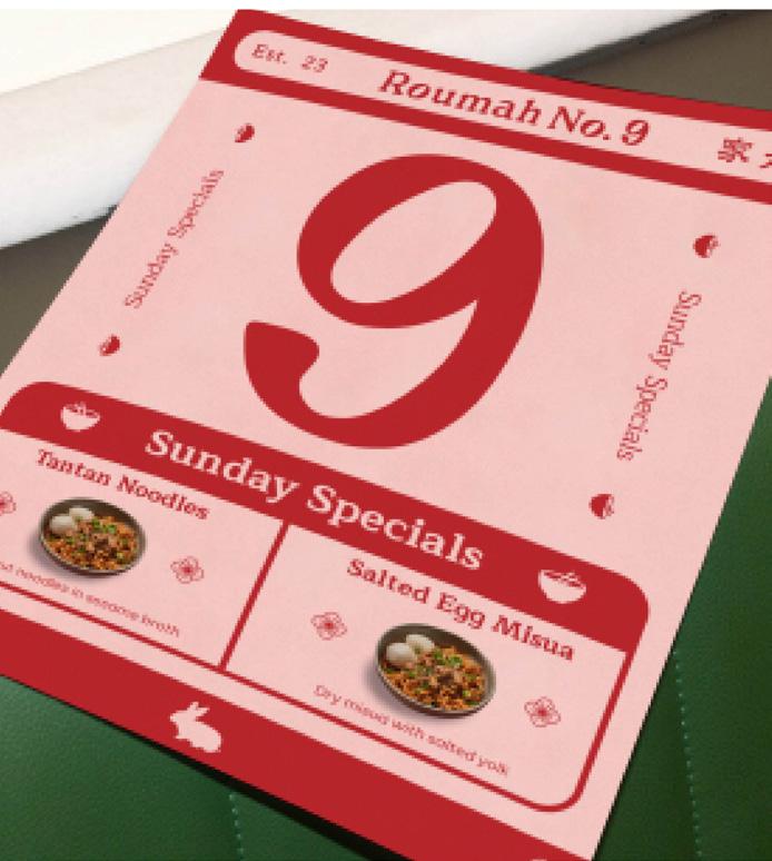
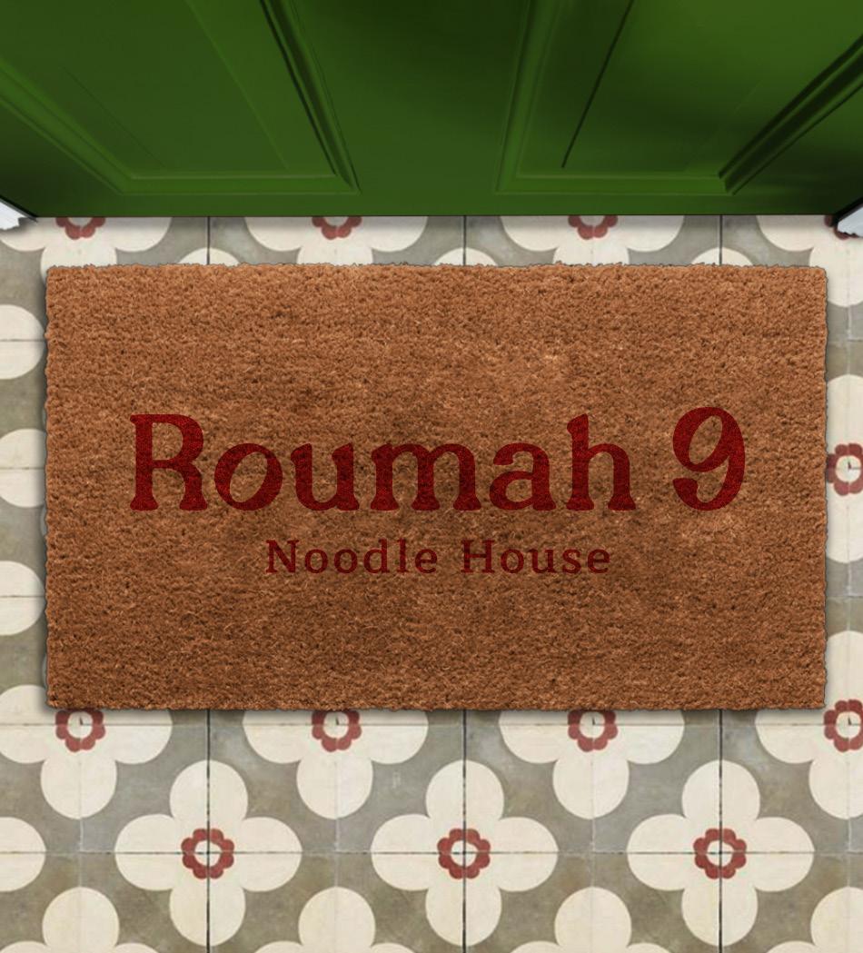
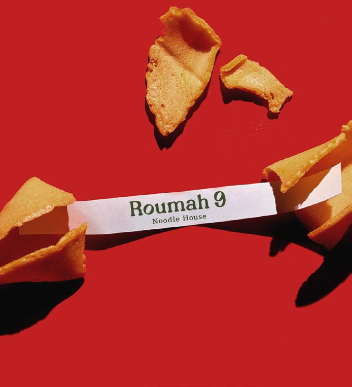
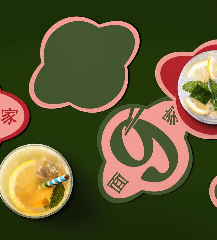
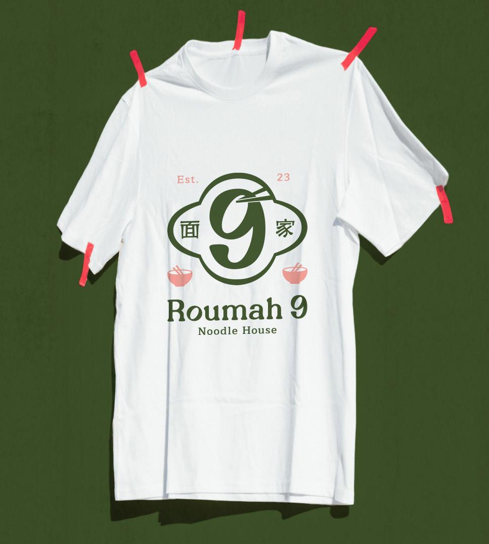
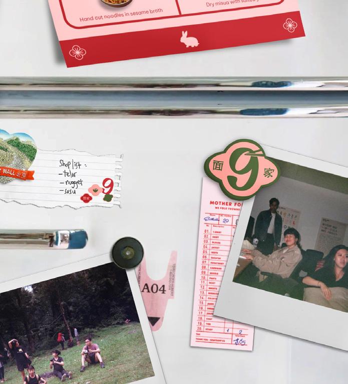
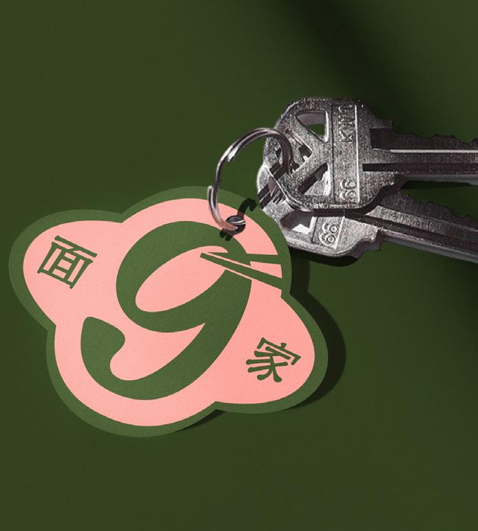
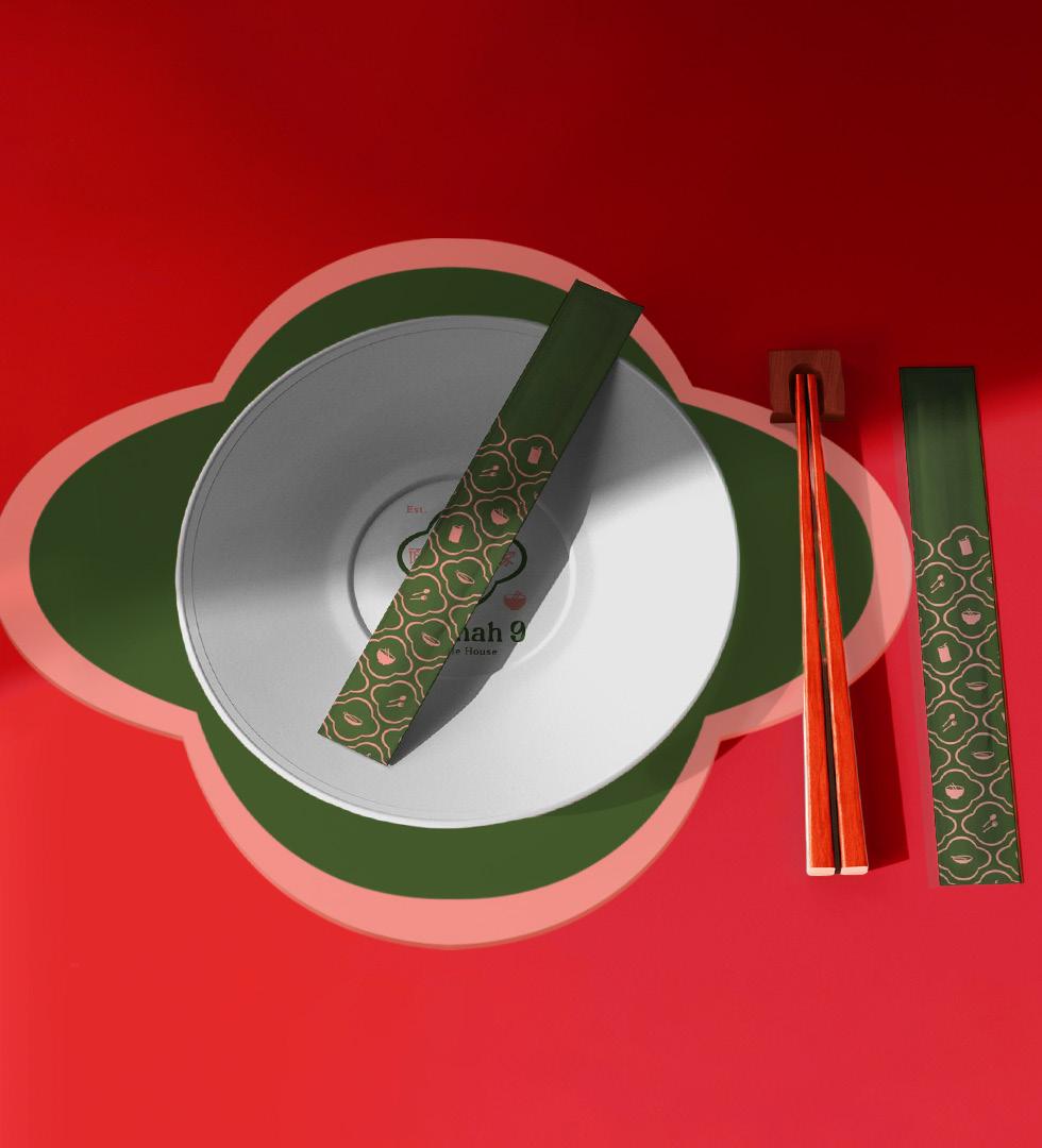
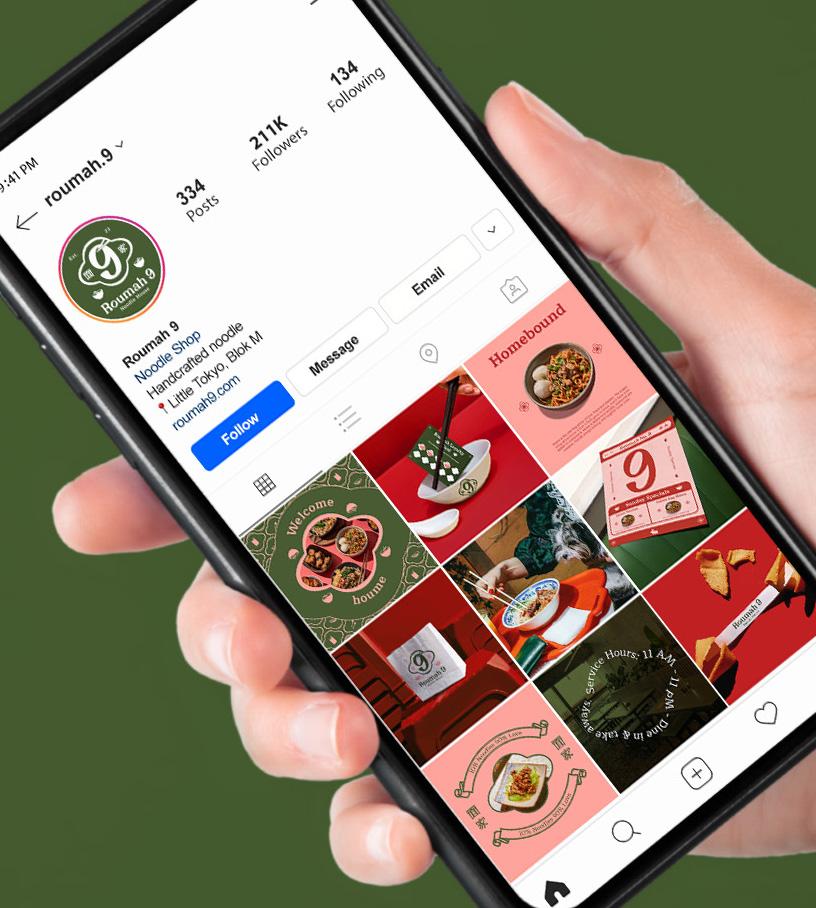
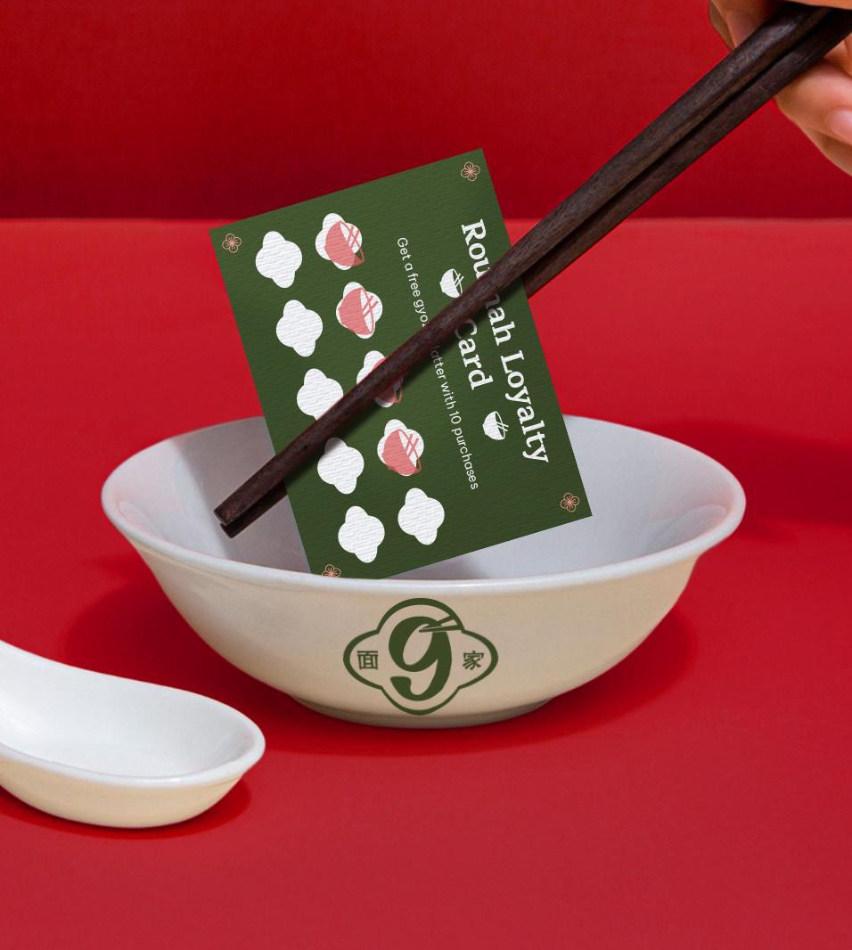
Roumah 9
Roumah 9 is a noodle shop brand designed as a part of my internship curriculum at Ou Creative.The goal is to repackage Ou into another brand –in this case, noodle shop–based on my personal experience as an intern.
The concept behind Roumah 9 came to fruition from observing the people and friends in Ou. The blend of unique personalities creates a warm bond within the four walls of Ou office. This phenomenon sparked the idea of fusing tangible and intangible elements together being ‘space’ and ‘memories’ for Roumah 9.
Every corner of a home bears witness to stories lived within it. Memories held dear within Roumah 9 manifest as trinkets and knick knacks so that those memories may be revisited and new ones can begin under the warm chimney of the noodle shop.
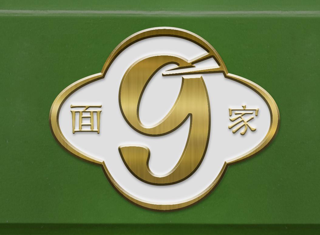
Having to incorporate the letters O and U into the logo, the number 9 was chosen for its anatomy that resembles the two letters stacked together.
The outer shape that puts the whole emblem together is inspired by the unique shapes of classic house number plaques.
The counter in the number 9 is meant to resemble the opening of a bowl.
The mandarin letters functions as a descriptor and also serve a decorative purpose.
The details within the logotype is inspired by traditional mandarin lettering characteristics.
The illustrated graphics within the logo are meant to serve as a cue for a noodle shop and also add more character to the decorative logo.
Each detail presented in Roumah 9 replicates the image of a home you can go back to–from the plates, mats, key chains, to its digital media.
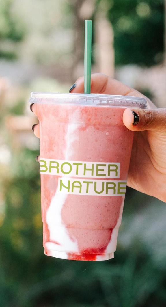
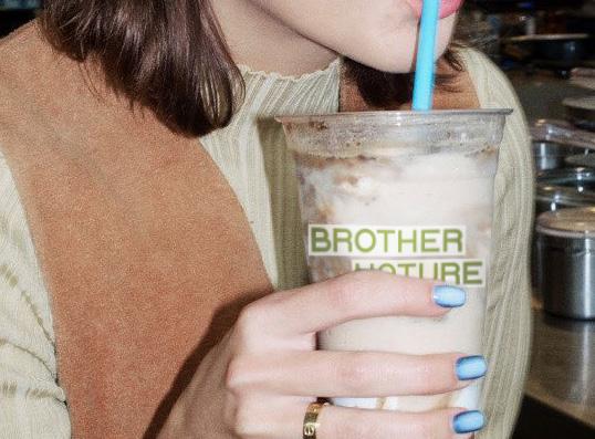
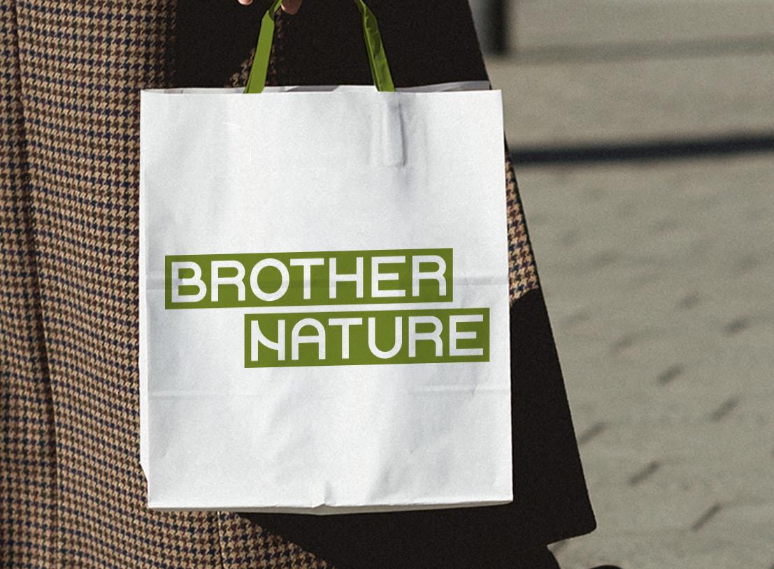
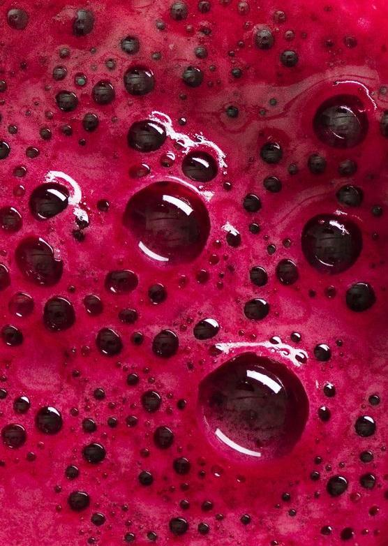
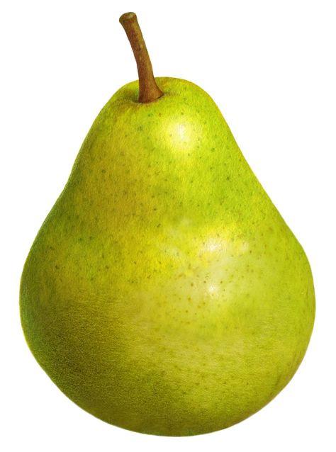
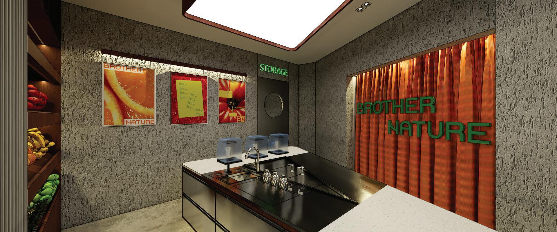
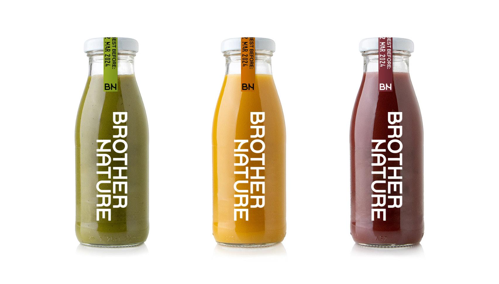
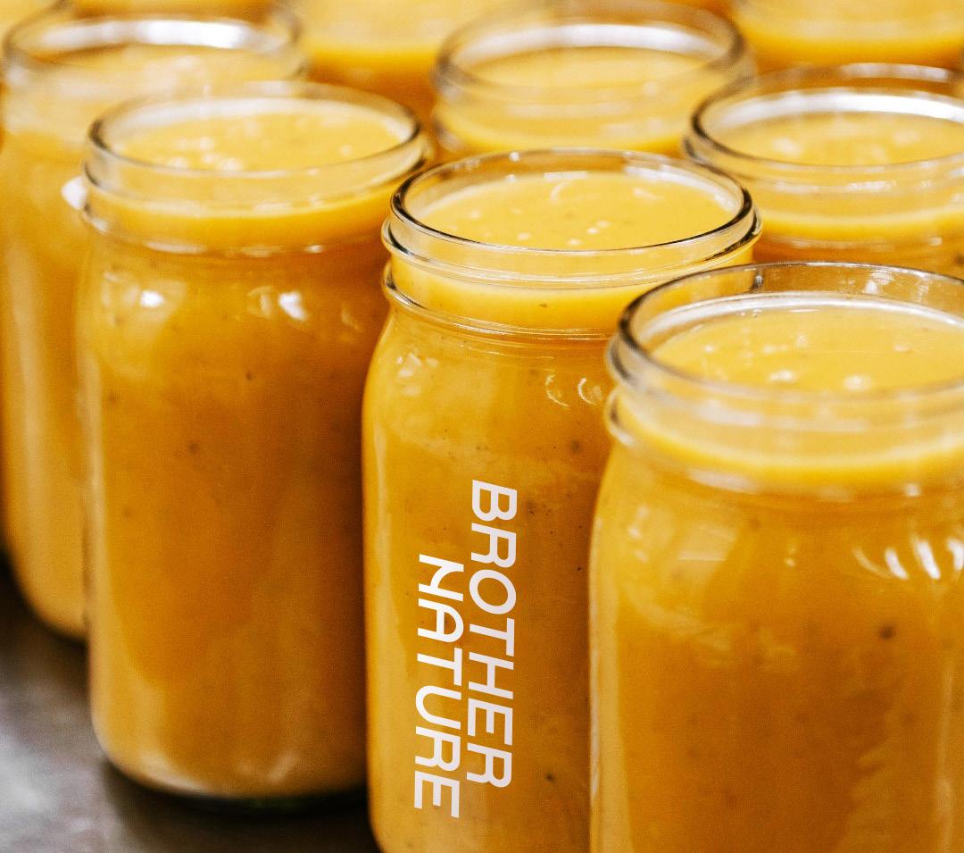
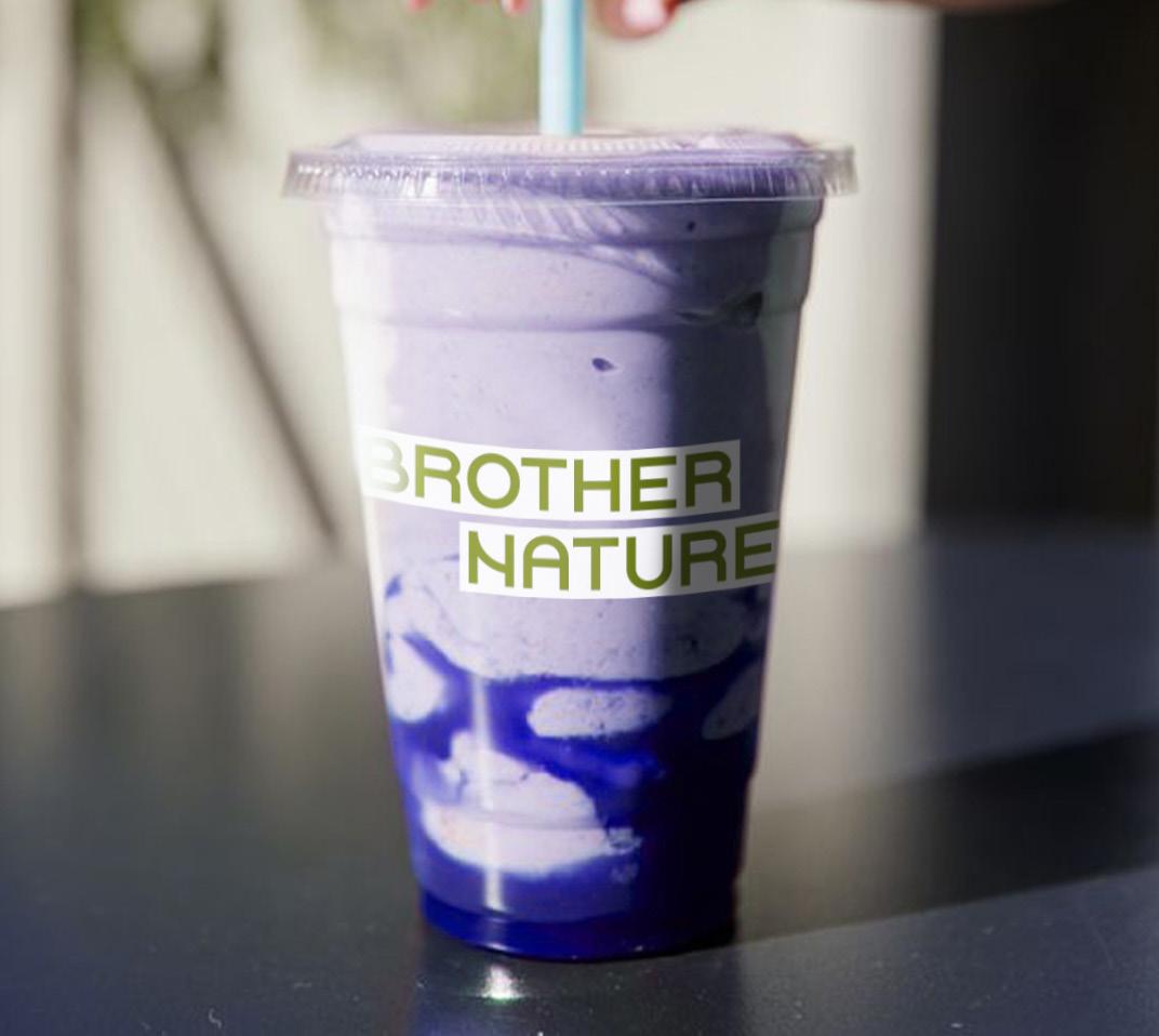
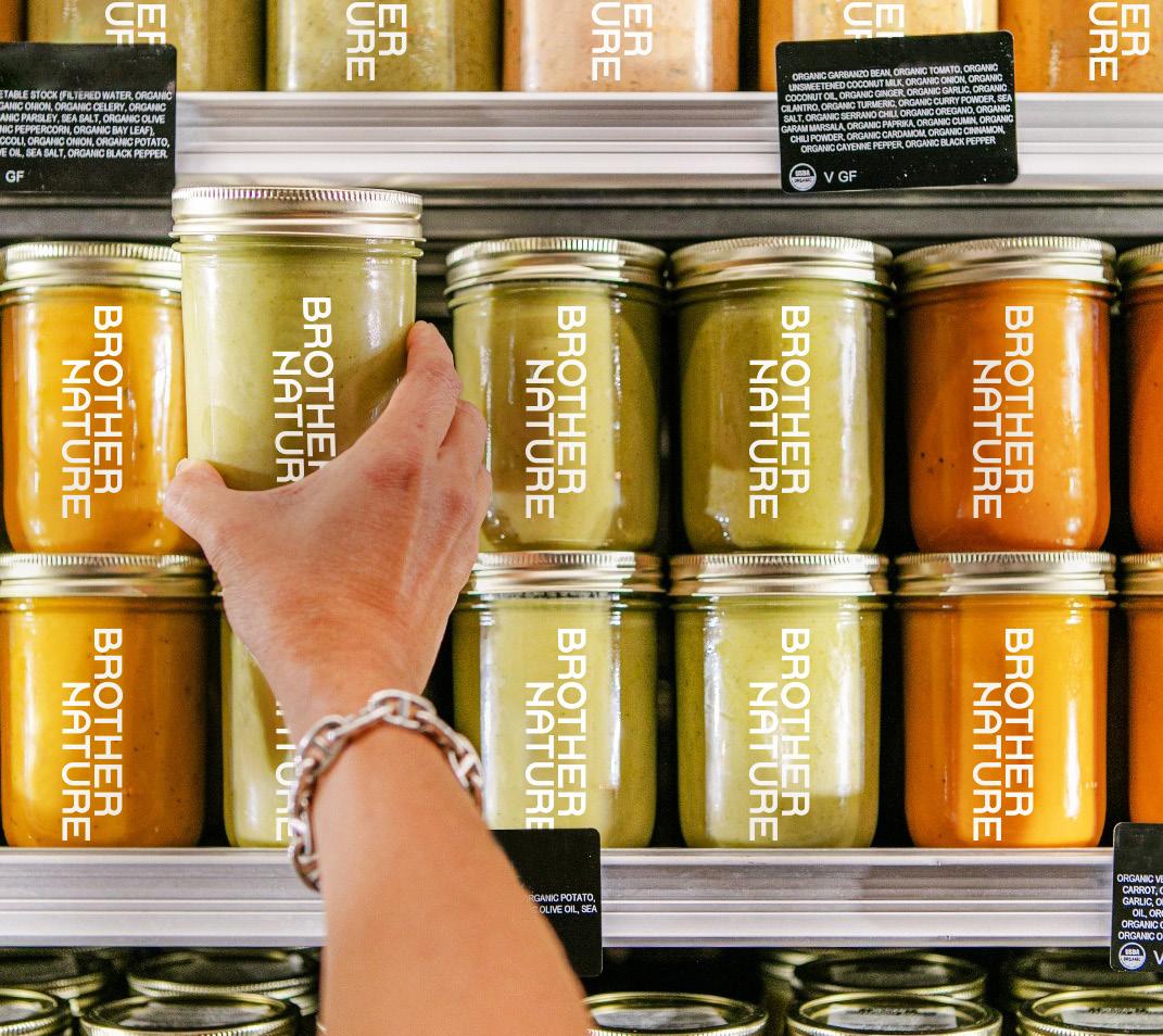
Brother Nature
Brother Nature is a smoothie hub set to open in Senopati in 2025.
Brother Nature is more than a juice bar. It is a vision into a utopian future where community thrives in collective wellness and holistic health.
Brother Nature upholds commitment to transparency, innovation, and wellness.
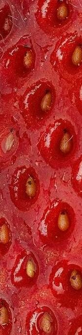
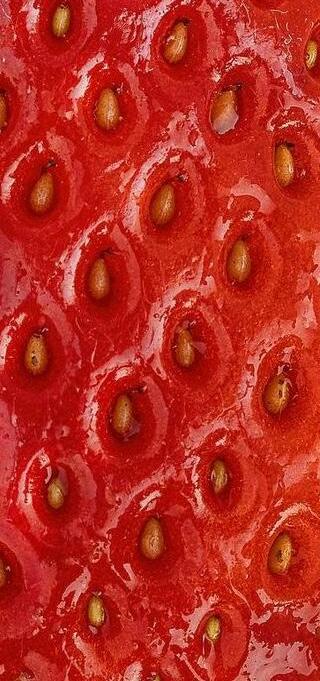
Organic, farmer’s market-esque graphics reminiscent of shipping tags and boxes are used to emphasize Brother Nature’s dedication in providing transparency of its source material
A touch of futuristic ambience is added throughout its branding to tie in with its innovation-derived-from-nature concept.
SOON BBLENDINGSOON LENDING
Lorem ipsum dolor sit amet
Lorem ipsum dolor sit amet
To highlight its familiarity with harvest and fruits, the colors used are of the natural hues of green to yellow.
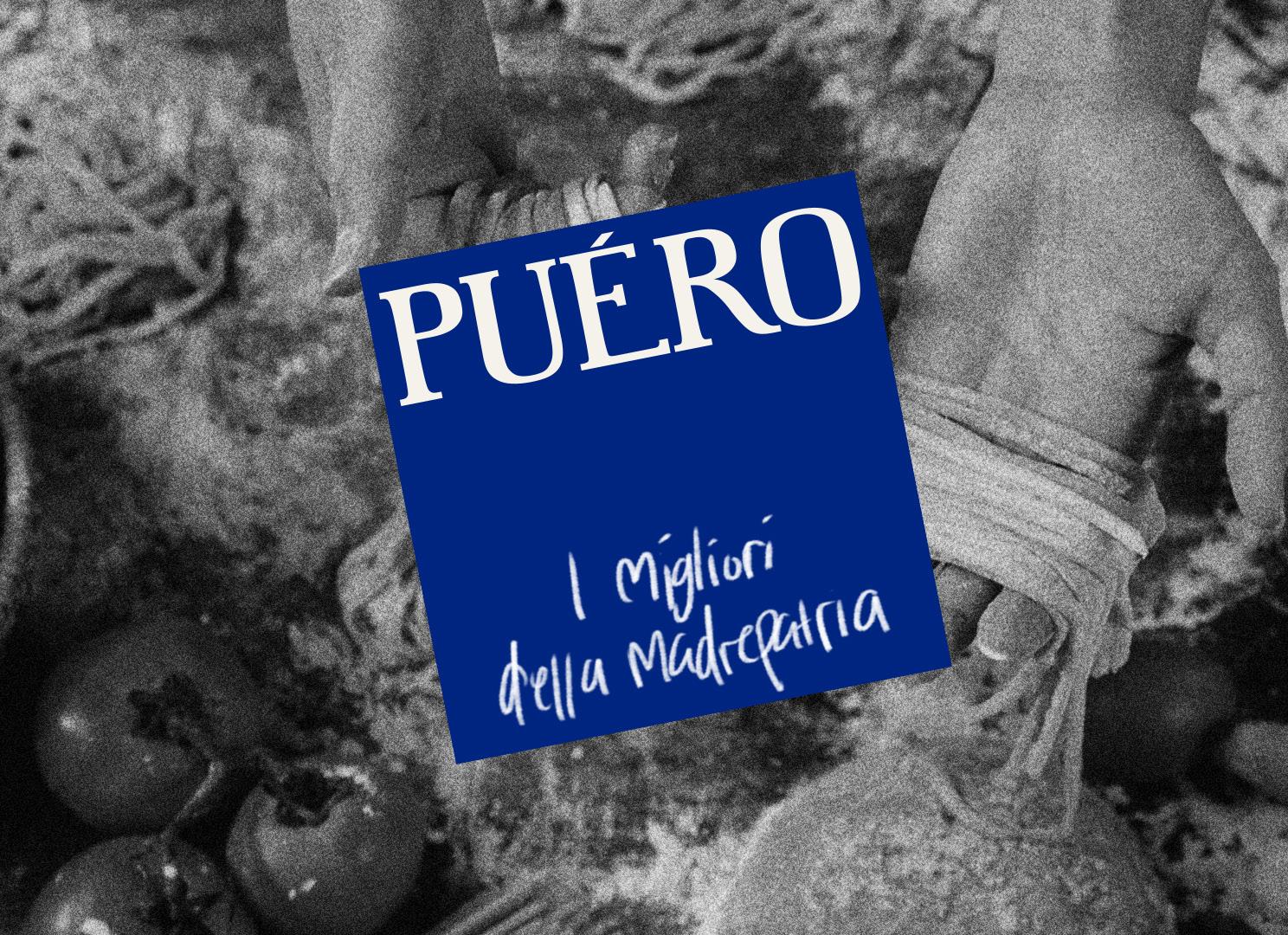
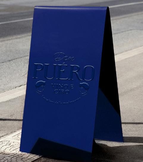
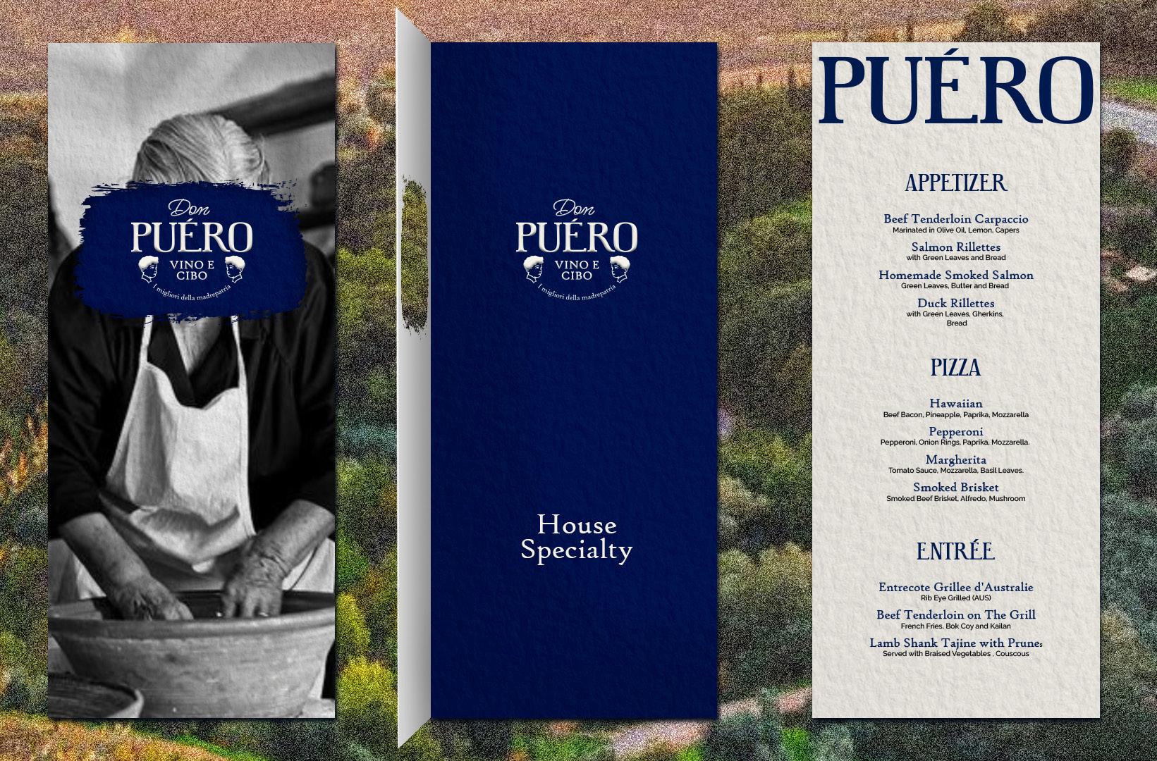
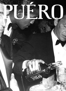
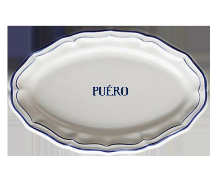
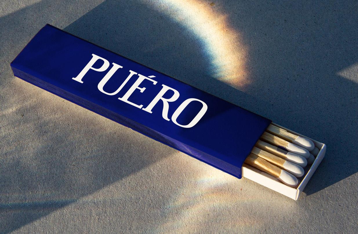
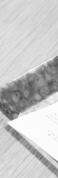
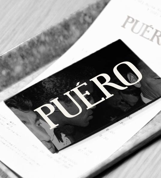
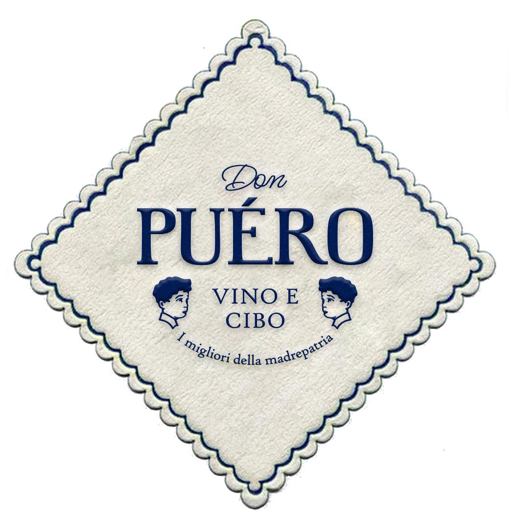
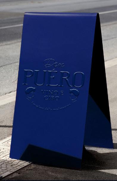
PUERO
PUERO is an italian food restaurant in Senopati.
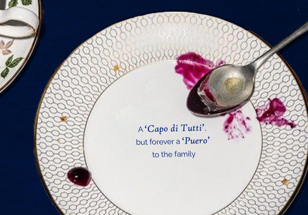
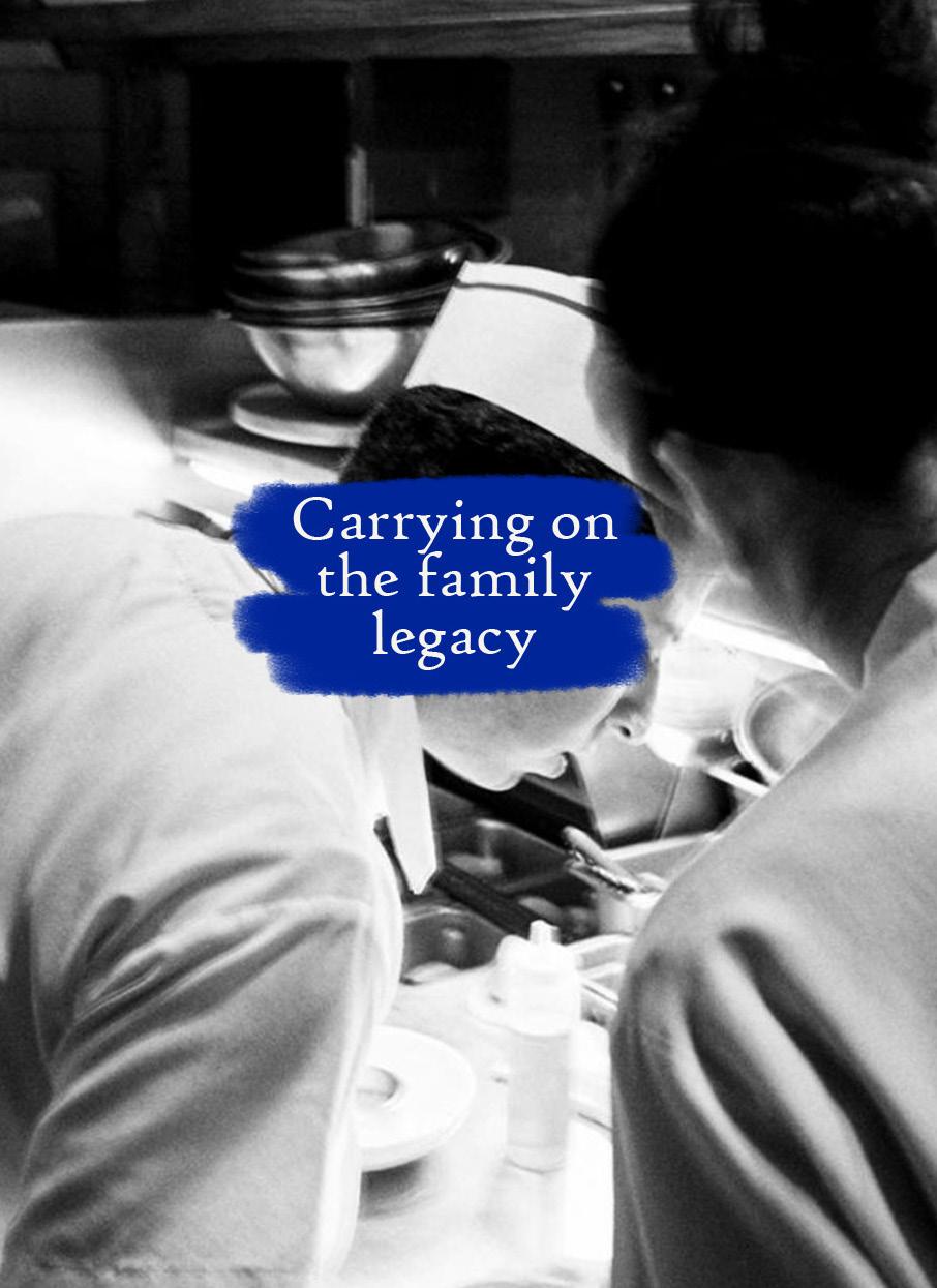
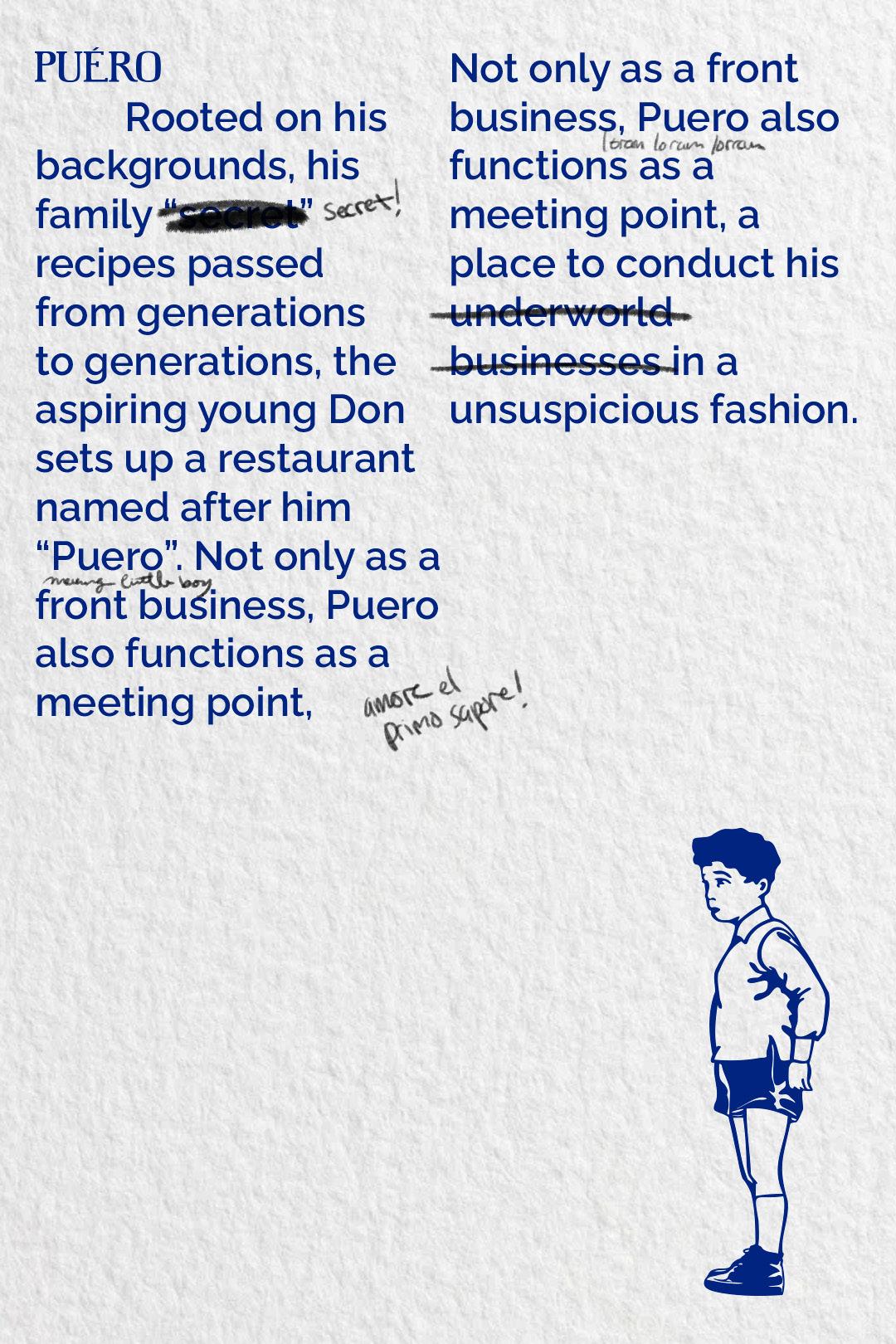
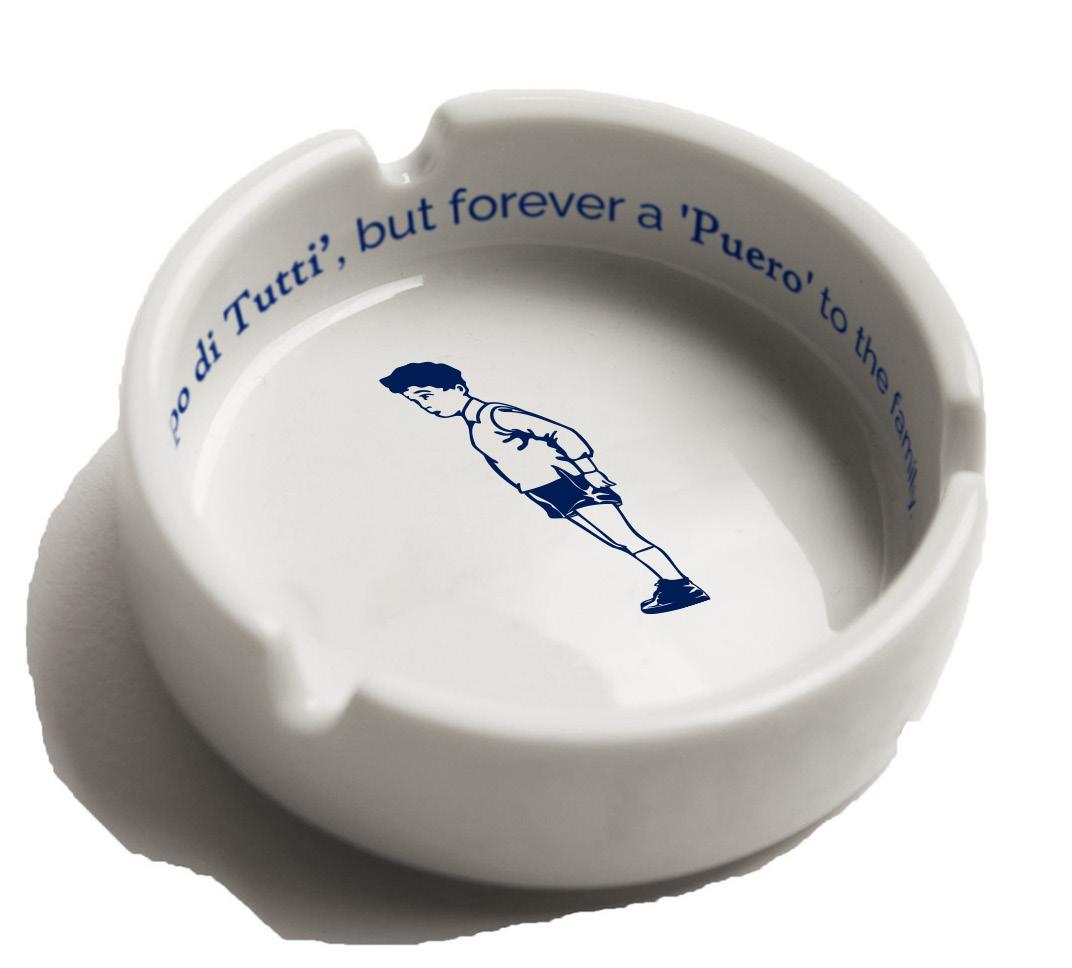
PUERO tells a tale about a little Italian boy named Puero, the aspiring young boss–known as ‘Don’ in the Cosa Nostra.
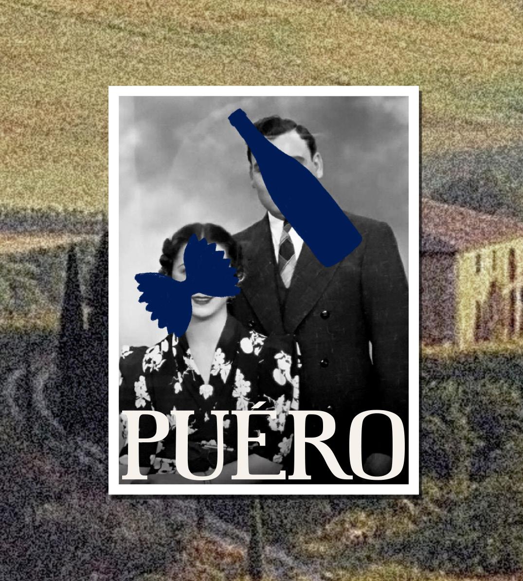
Secondary Logo
Served as a front operation for the family, The osteria had become a childhood safe haven for Puero.
The osteria complete with his Nonna’s recipes allows a peek into Puero’s innocence and childhood memoirs despite the hard cold environment he’s growing into.
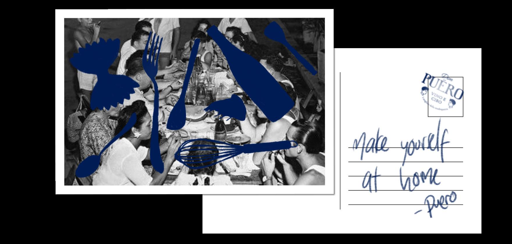
The graphics for PUERO take shapes from scribbles of crayons drawn by little Puero, which are then designed into silhouettes to highlight the sense of mystery around the establishment.
Furthermore, crossed out photographs are used to focus on the concept of confidentiality.
Handwritten details are also used to represent intimate secret notes from Puero and Nonna.
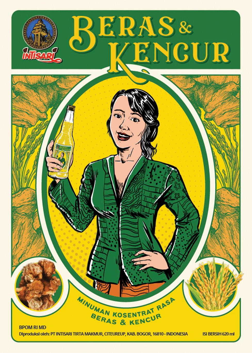
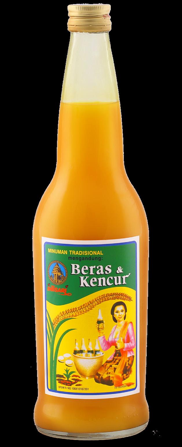
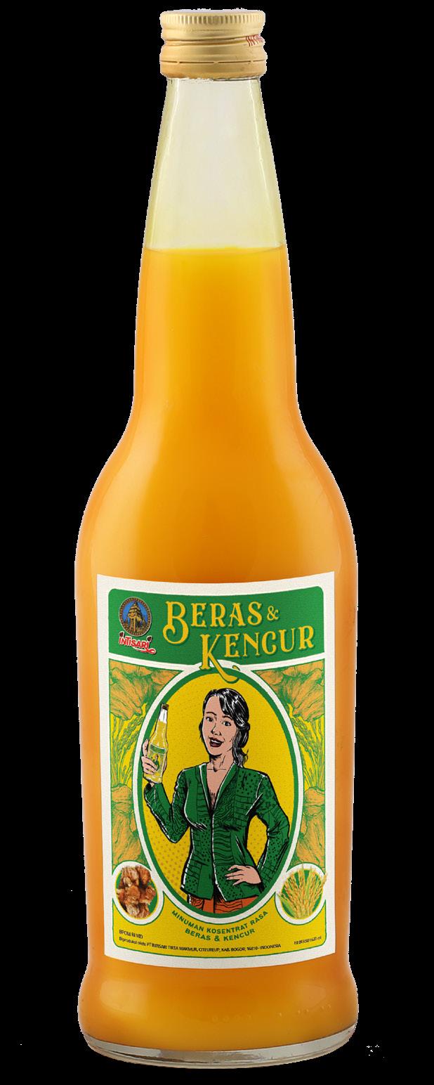
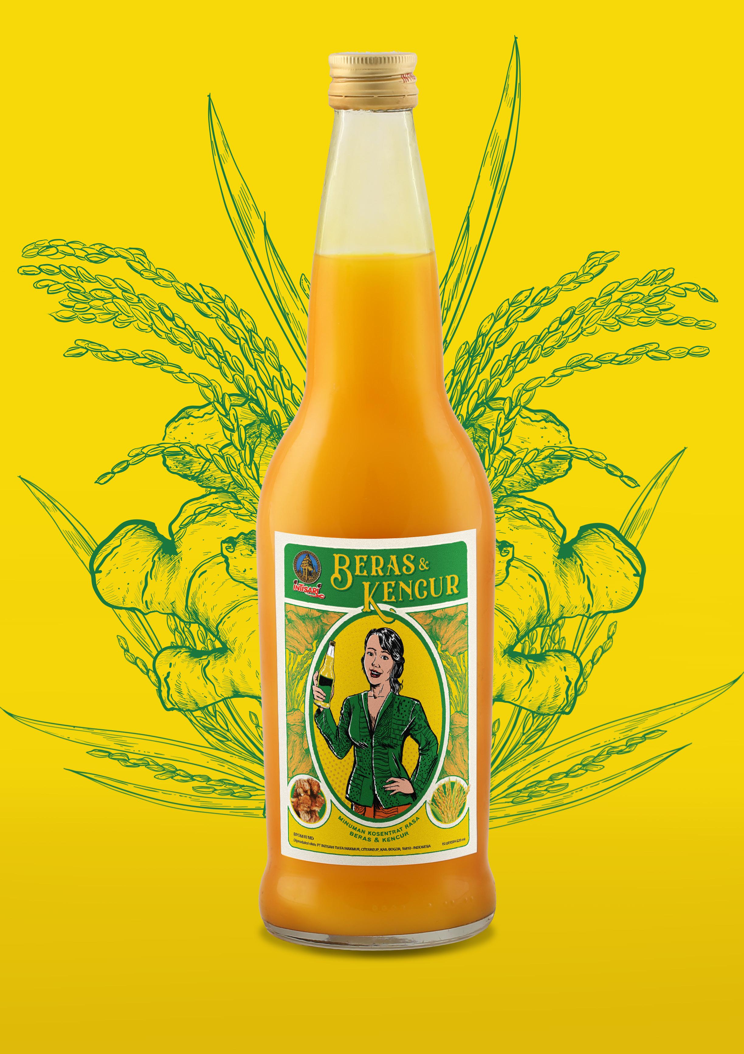
Beras Kencur
Beras Kencur needed a packaging rebranding as a solution to its legal problem of misleading imagery using “mbok jamu”
To streghten its brand, the new label keeps its indonesian vernacular style with a refreshed look.
Original Beras Kencur OT label design
Proposed redesigned label design
Sketching process
Illustration of an indonesian mother was used instead to reposition Beras Kencur as a traditional home remedy that’s warm and trusted, just like a mother’s hug.
Beras Kencur’s Mother was illustrated by Hans Djaputra
PART 2: Fusion
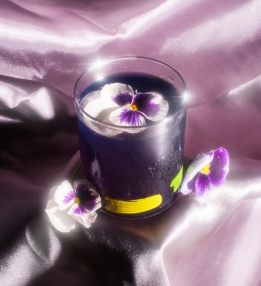
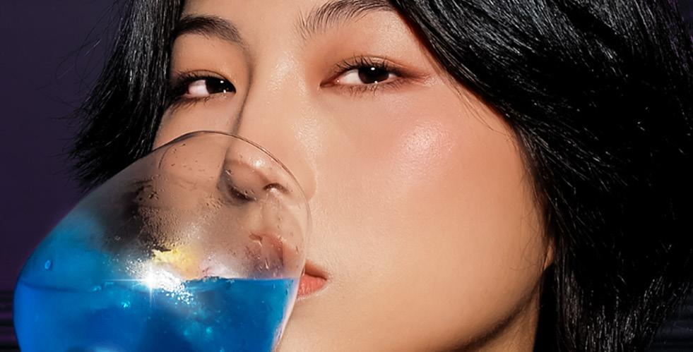
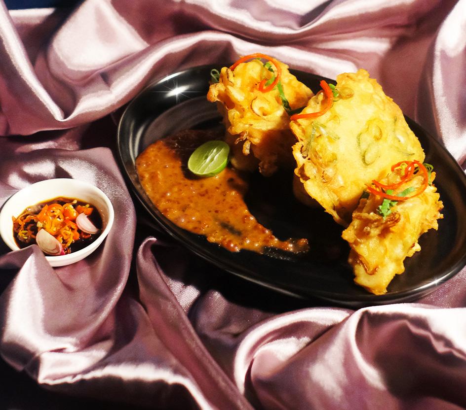
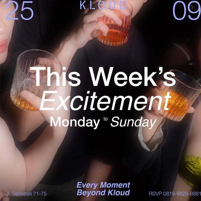
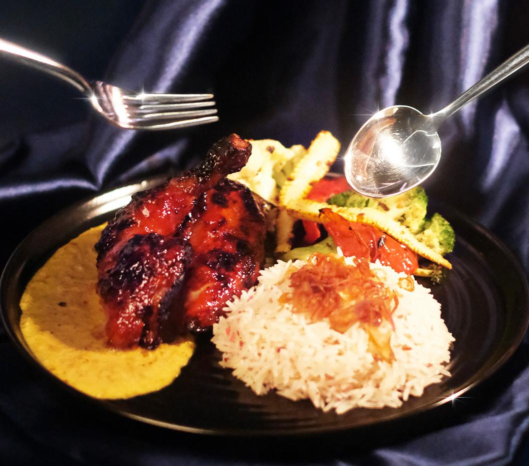
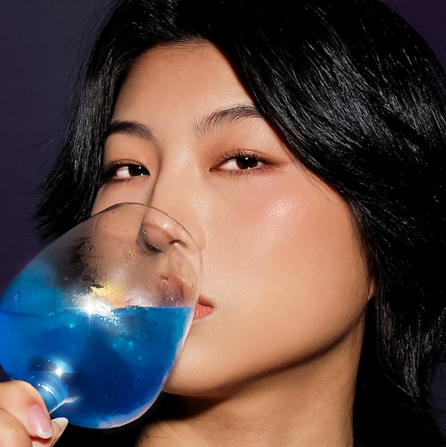
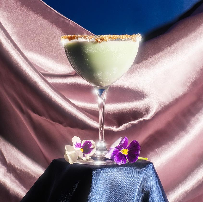
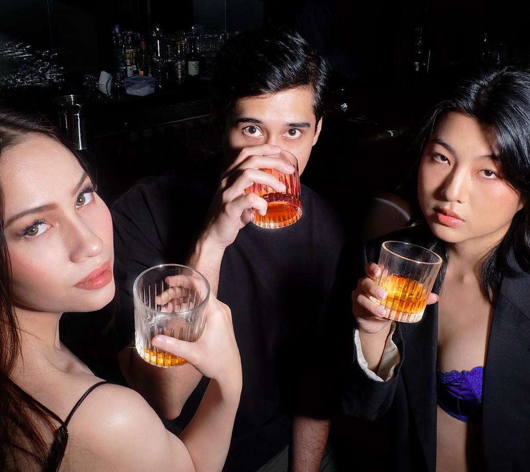
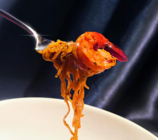
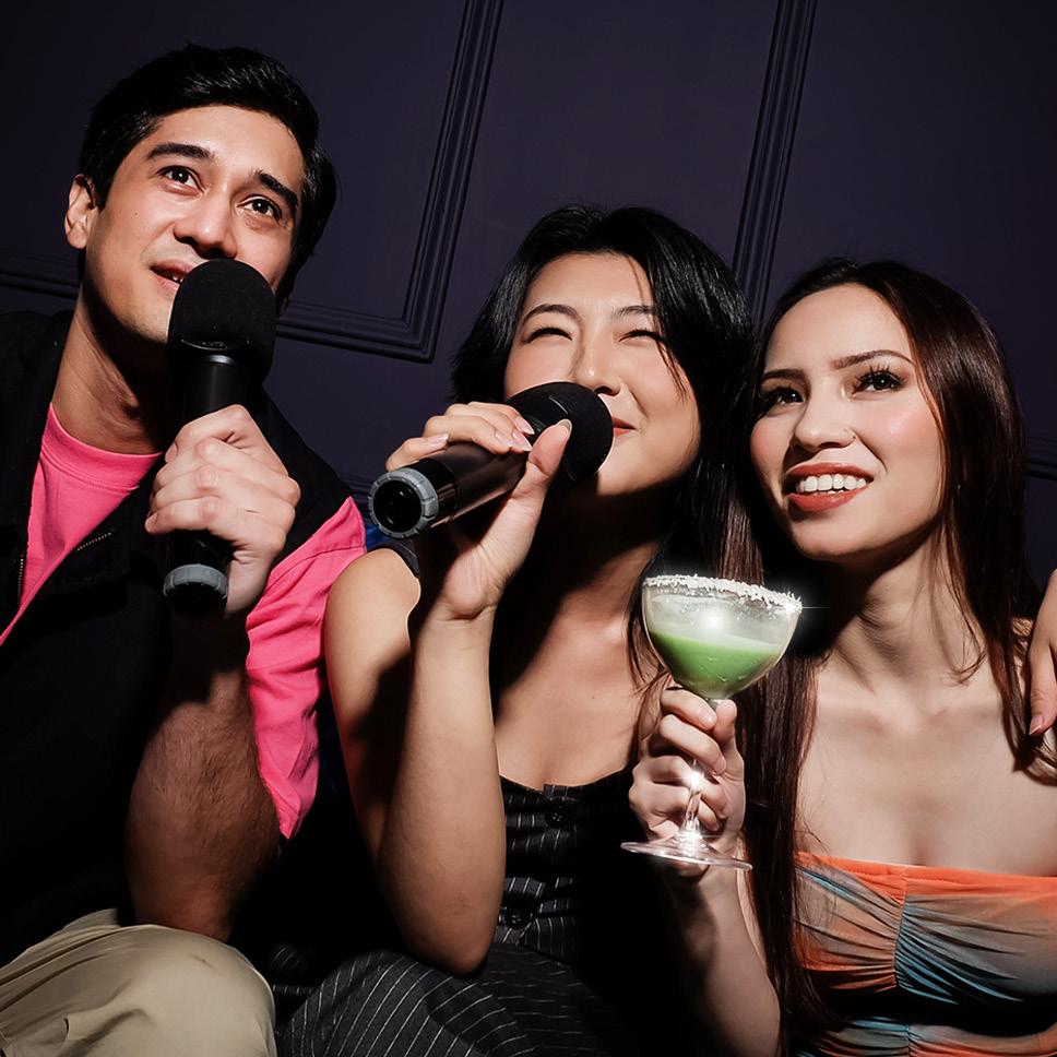
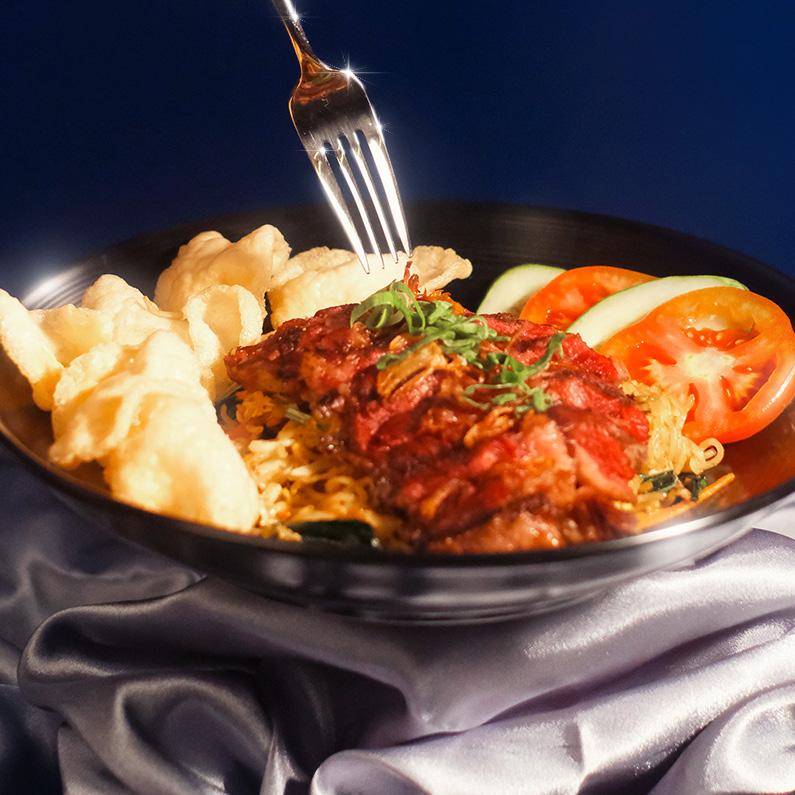
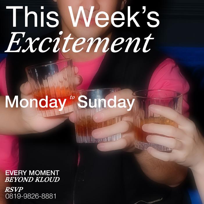
KLOUD Senopati
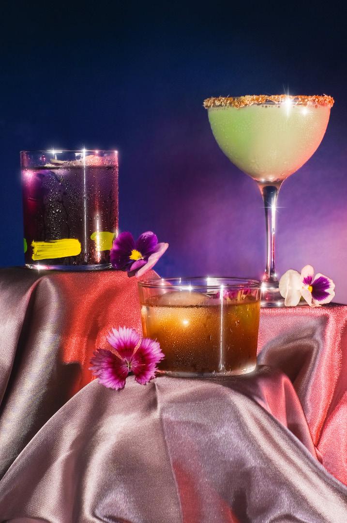
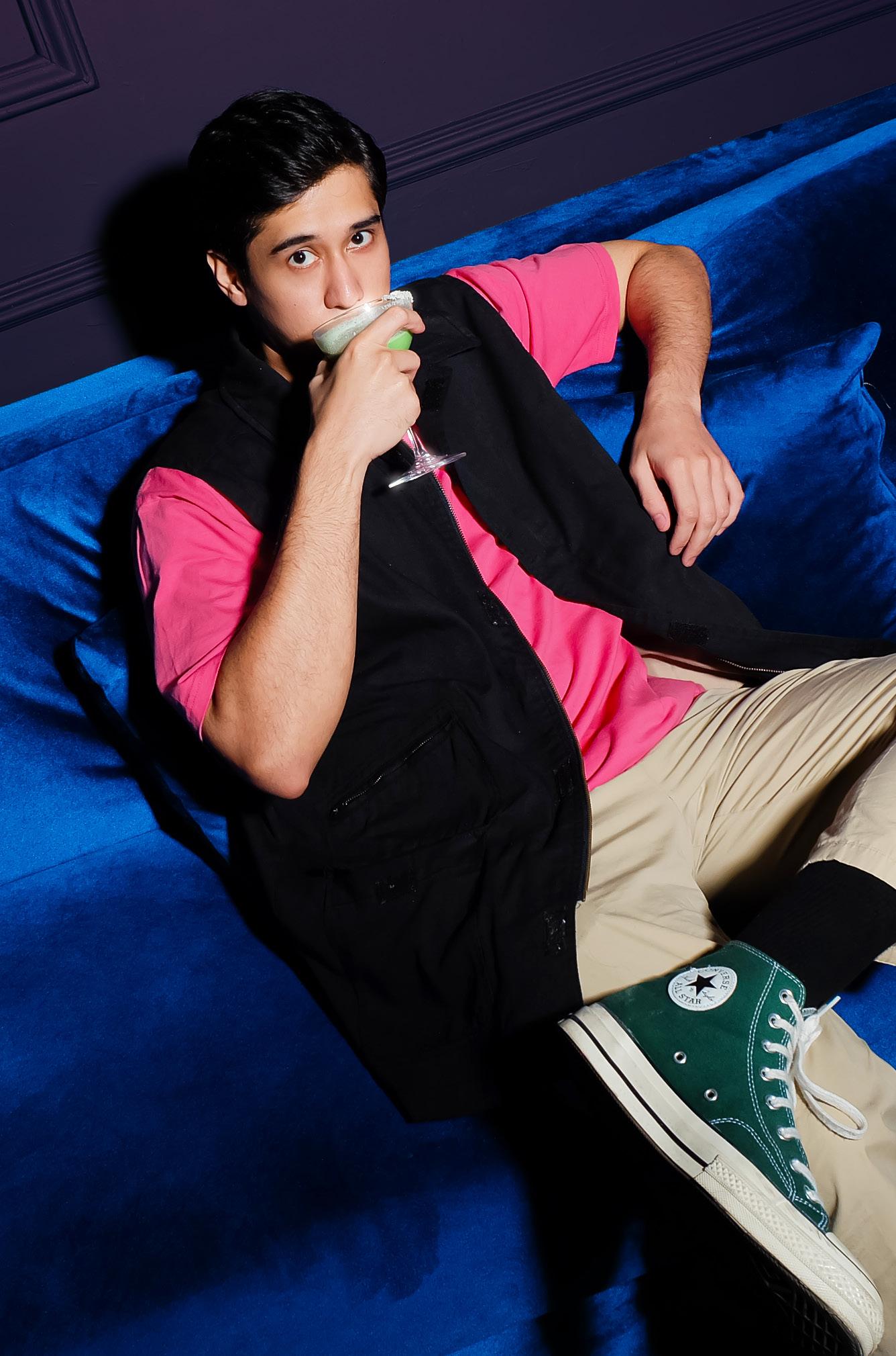
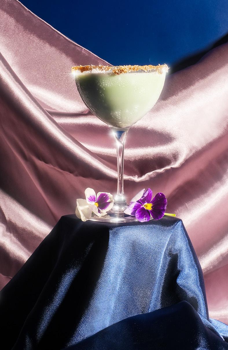
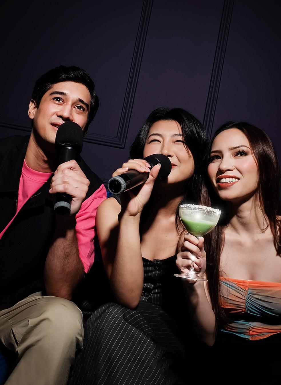
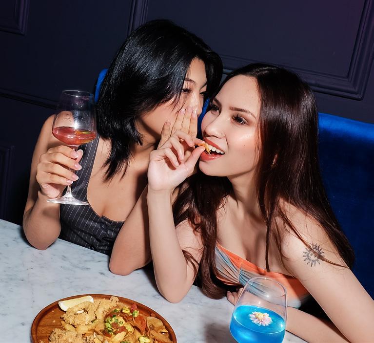
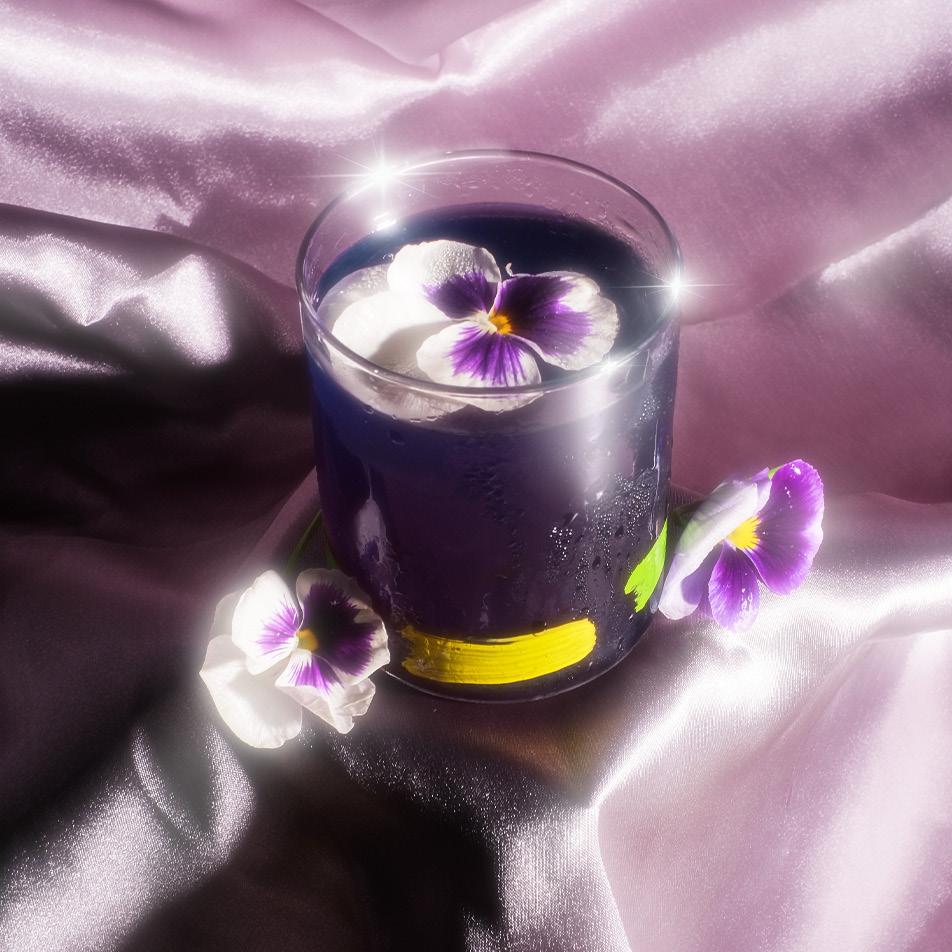
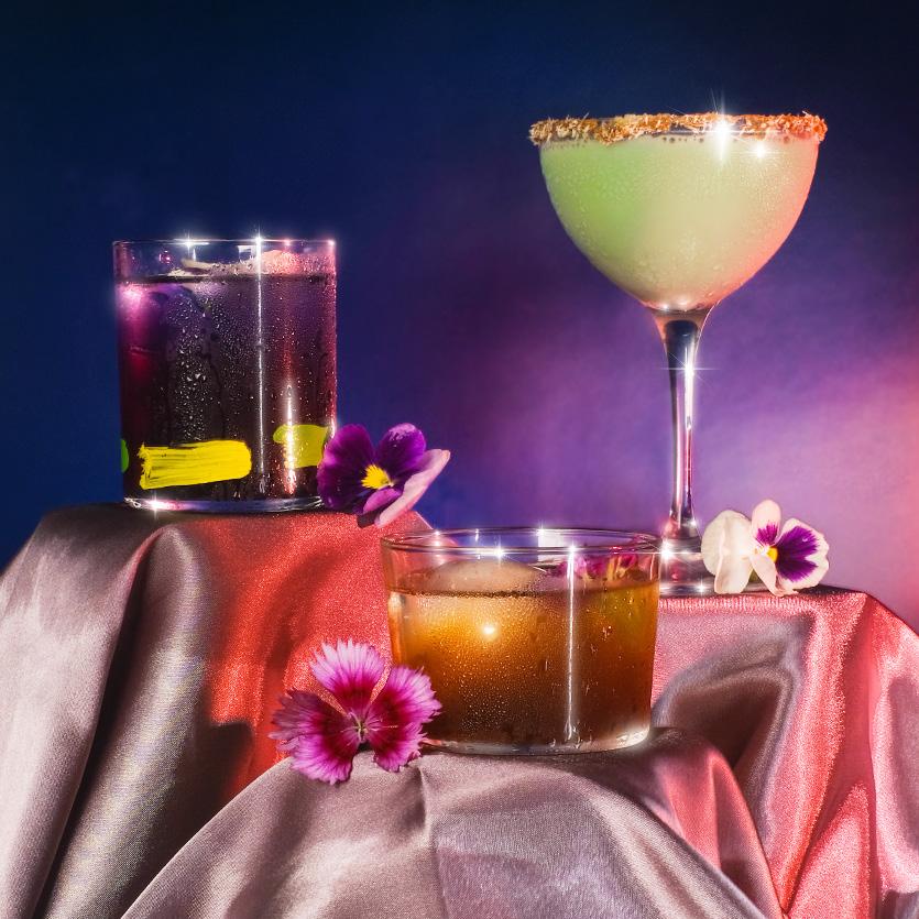
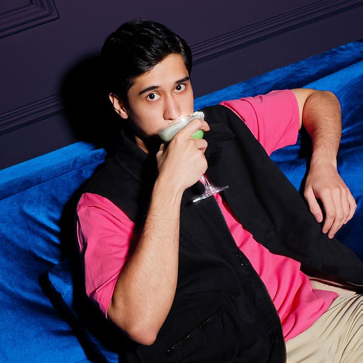
KLOUD is a sky dining and lounge located in the heart of bustling Jakarta.
The aim of this project is to create a brand empowerment by translating its brand essence into a visual direction that will mostly be used for social media.
KLOUD captures Jakarta’s dynamic spirit, seamlessly blending hustle and entertainment. With meticulous attention to exclusive ambience and service, KLOUD becomes a melting pot of memorable moments for its patrons.
KLOUD’s fearless approach extends from bold drink choices to daring communication that encourages authenticity and adventures.
Exuding positivity and excitement, KLOUD is thrilled to share creations with patrons in a lively and enthusiastic manner, turning every interaction into exhilarating experience.
To bring KLOUD’s essence to life, the visual direction emphasizes on capturing the brand’s sense of metropolitan glam.
The photographs showcases models interacting lively, capturing authentic emotions during those moments that define the KLOUD experience.
The emphasis on highlighting signature cocktails and a diverse menu maintains cohesive styling across social media with clean graphics to enhance the brand’s sophistication.
The three main content pillars for KLOUD is product photo, ambience, and promotional/event
The color palette chosen is to complement KLOUD’s existing interior, cocktail colors, and the overall theme.
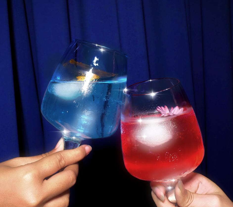
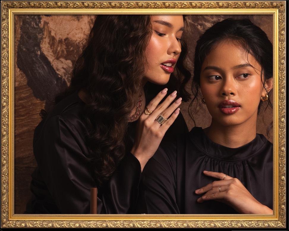
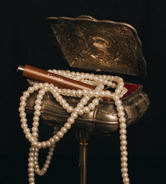
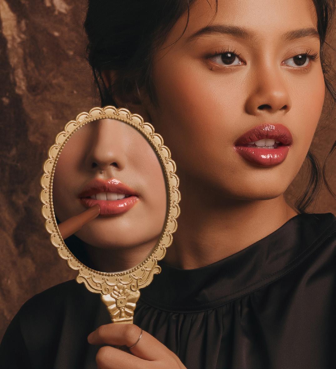
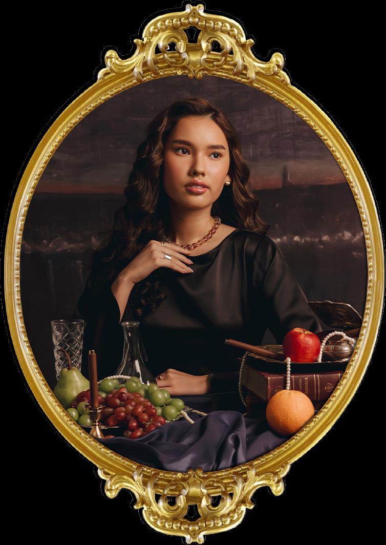
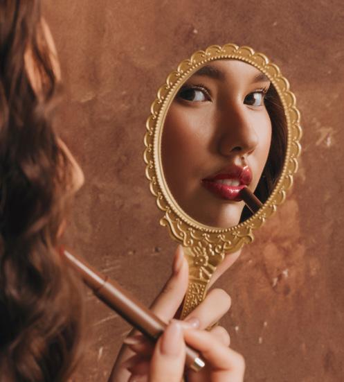
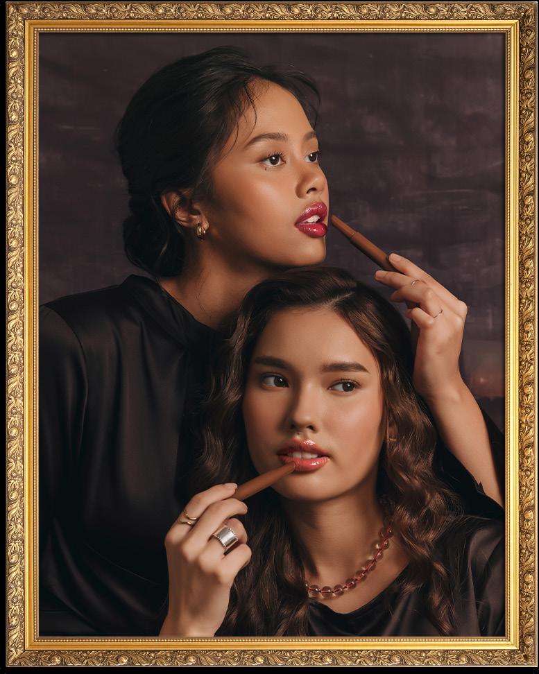
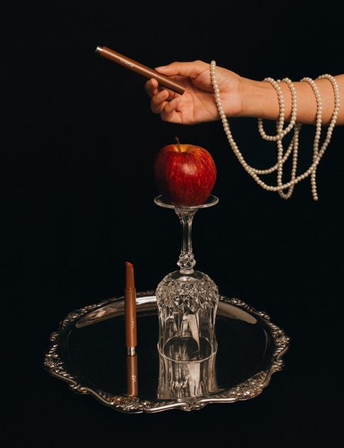
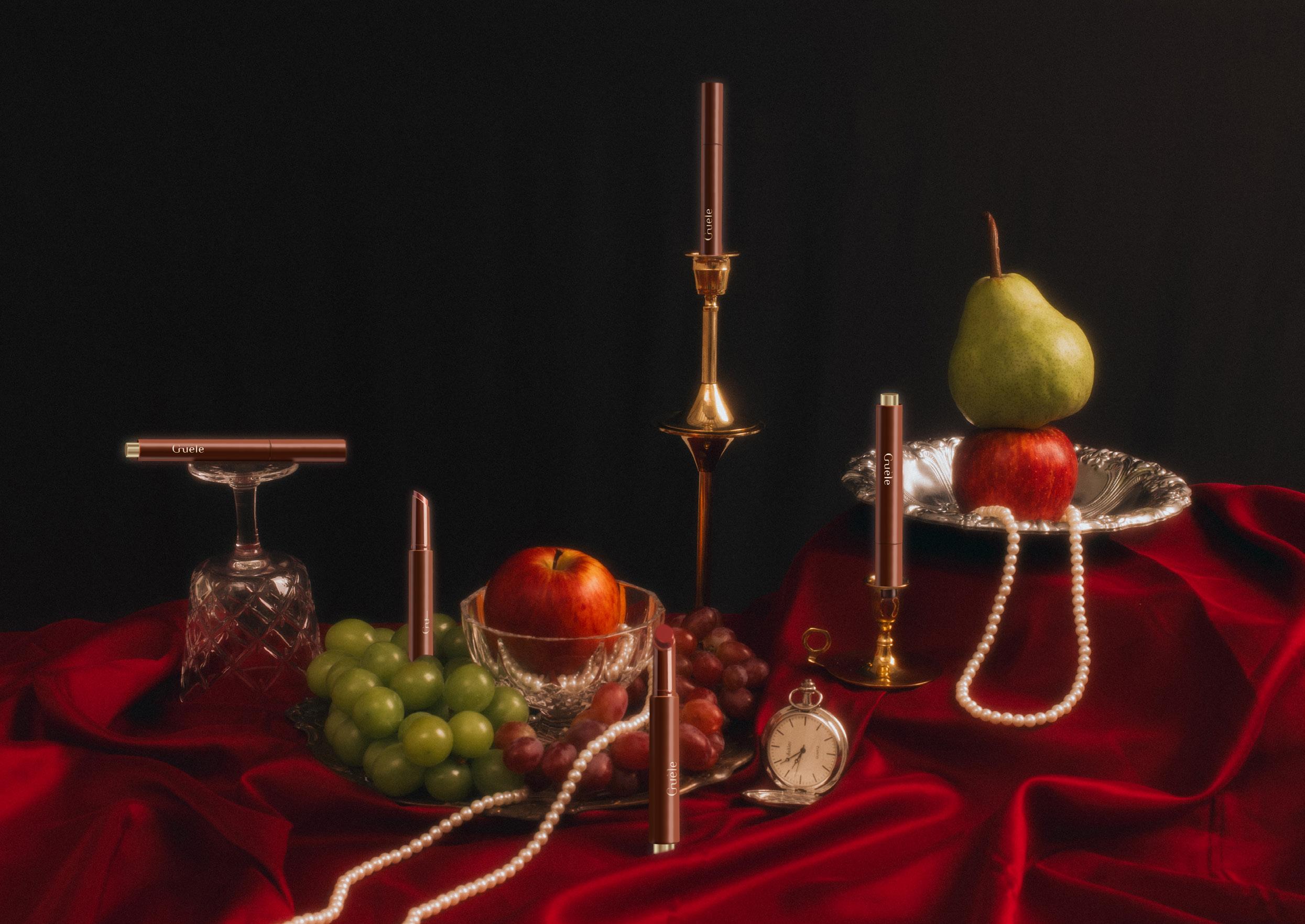
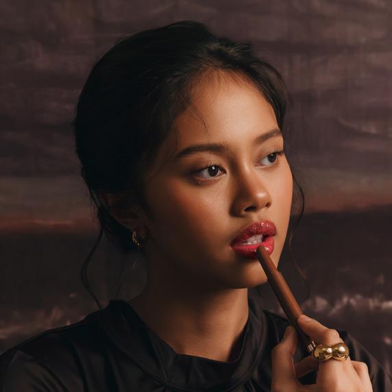
Muse Tinted Lip Balm
MUSE Tinted Lip Balm is a product by Guèle launched in November 2024.
The concept behind MUSE Tinted Lip Balm is that life itself is an art form.
Like an artist shaping a masterpiece, every mark tells a story of resilience, creativity, and empowerment.
Lips are more than just features—they are a canvas for self-expression, reflecting moments of struggle, growth, and triumph.
The visual direction takes inspiration from classic Renaissance paintings, using dramatic lighting, rich textures, and refined details to create a timeless aesthetic.
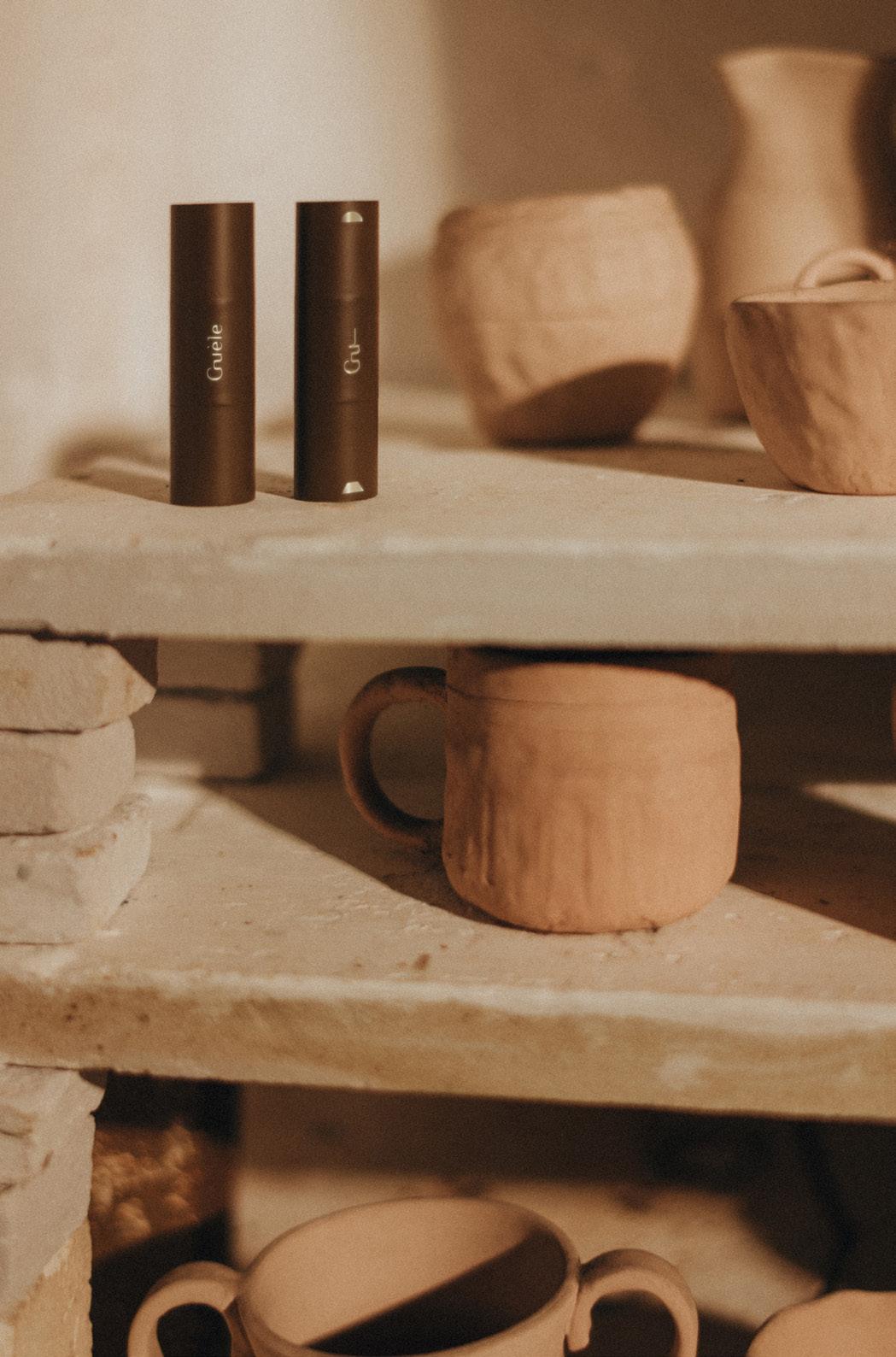
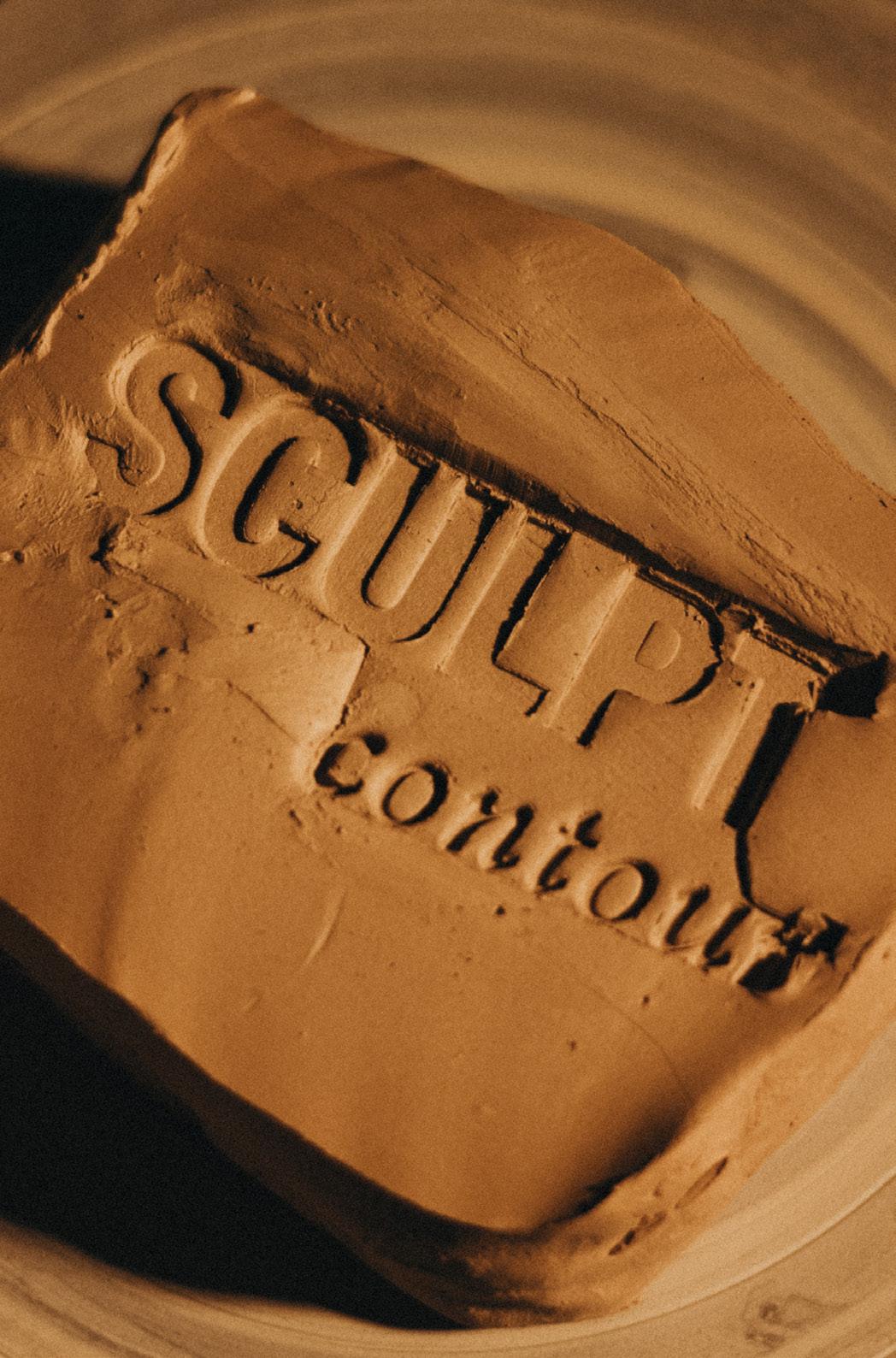
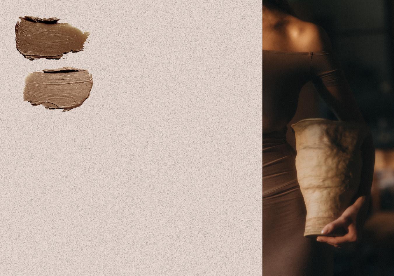
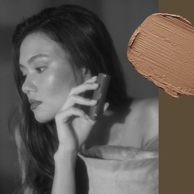
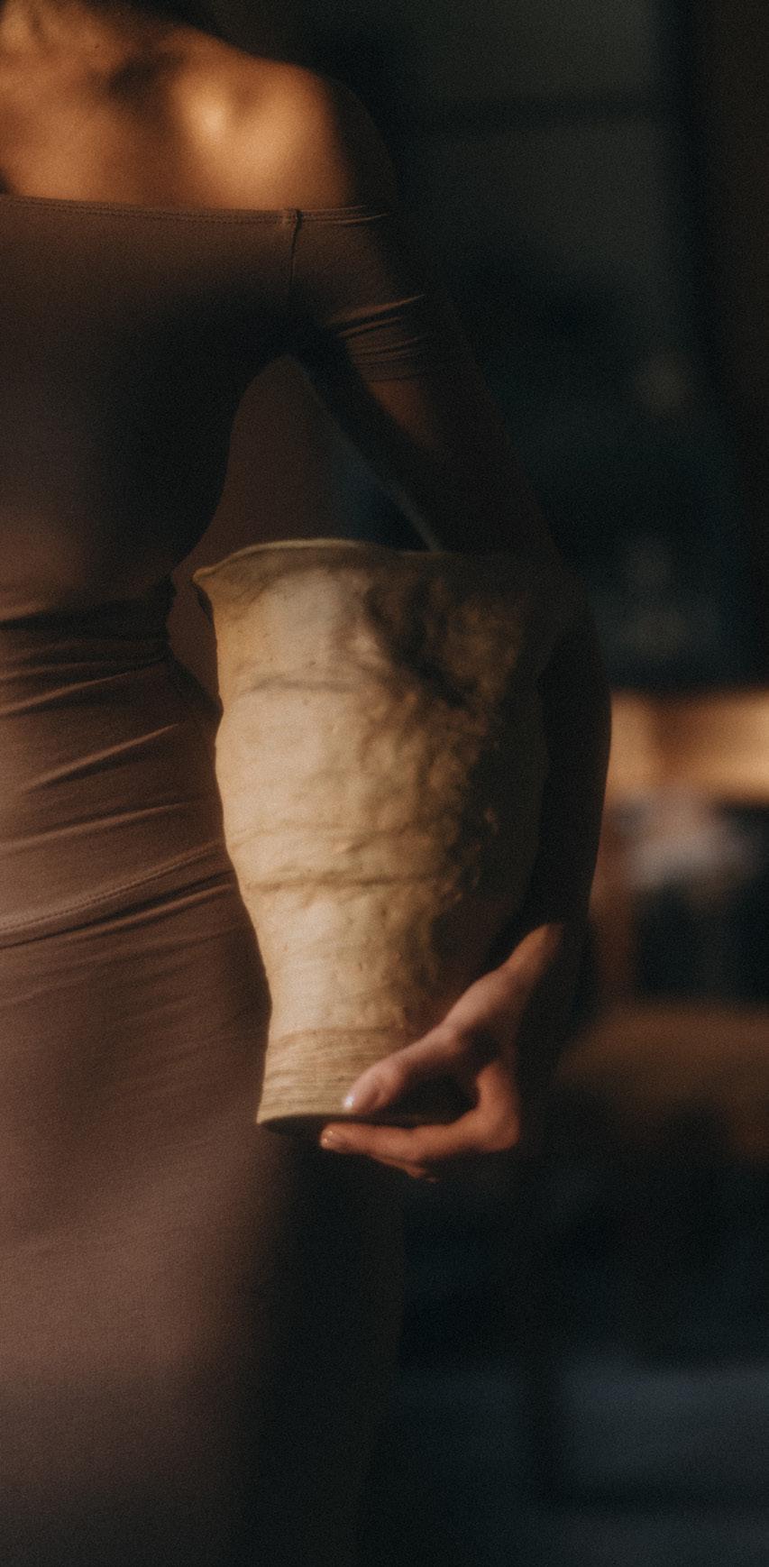
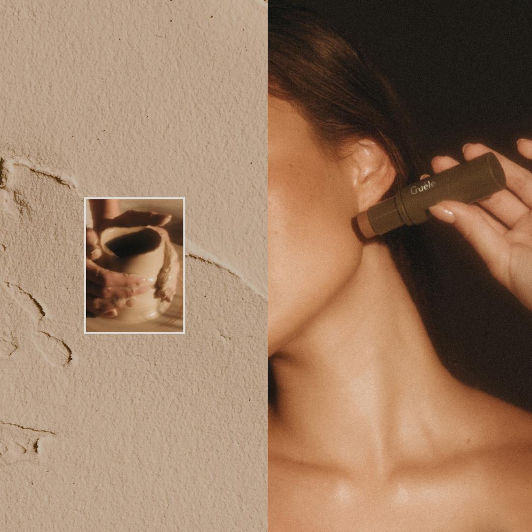
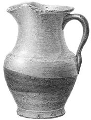
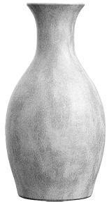
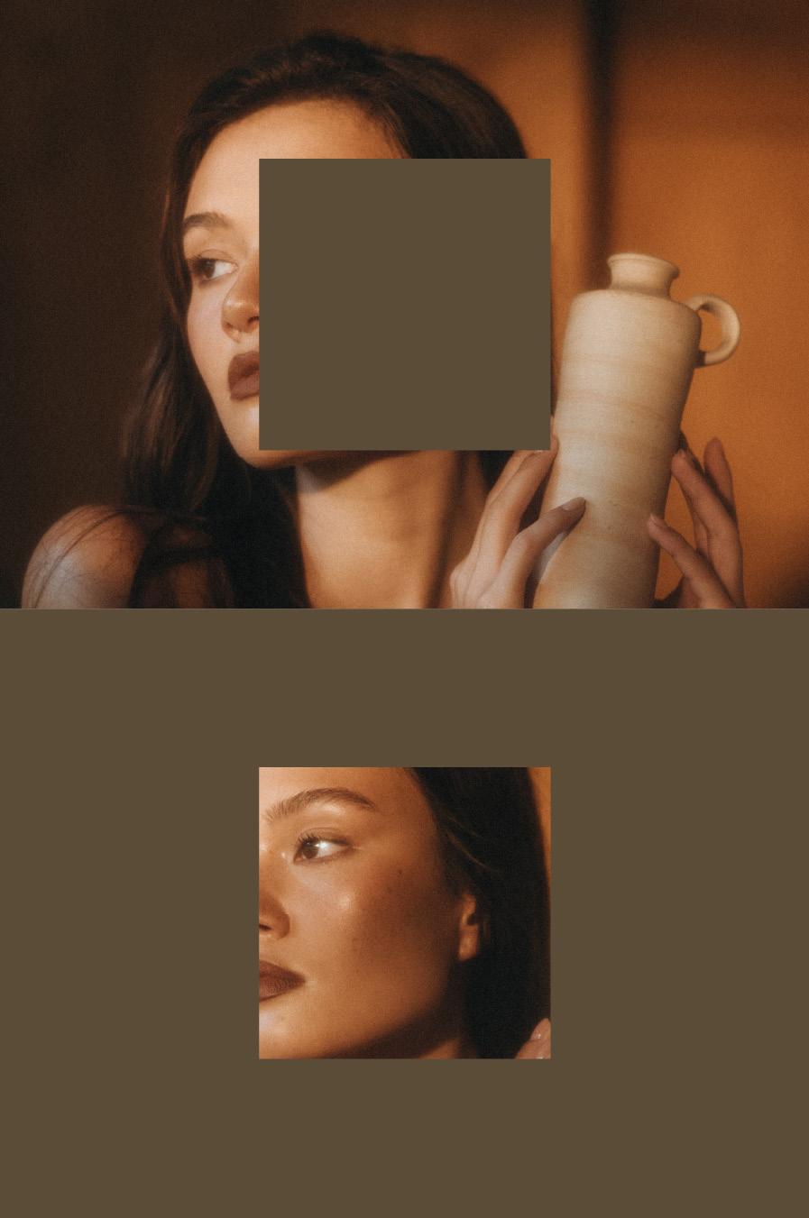
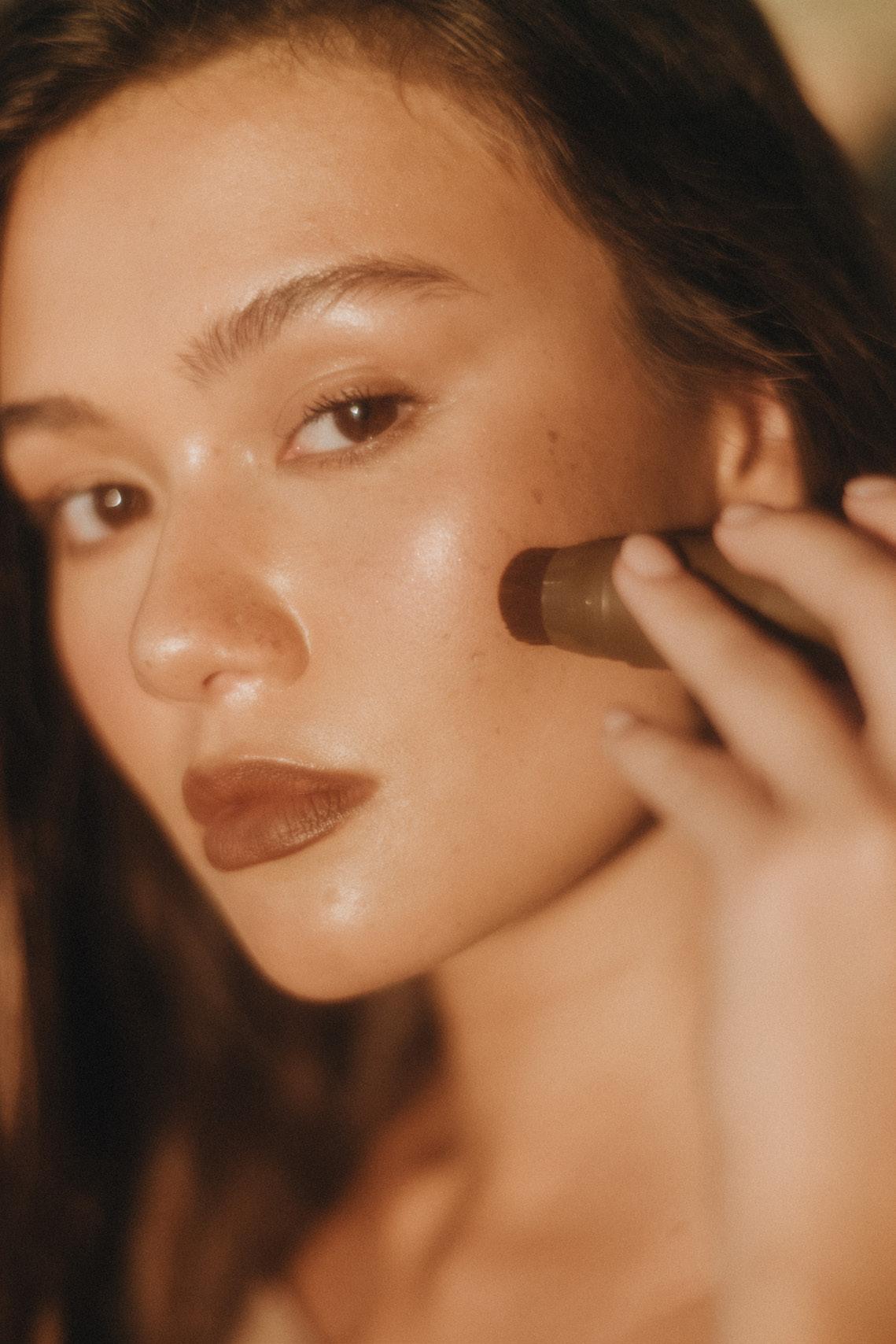
SCULPT Contour
SCULPT Contour is a product by Guele.
Drawing from the art of pottery, the campaign highlights the product’s ability to shape and define, mirroring the way clay is molded into form.
The visual direction combines raw, earthy textures with organic shapes and refined graphics, creating a sense of depth and artistry.
This approach reinforces the theme of sculpting beauty with precision, mirroring the careful craftsmanship of shaping clay.
Thank you for taking the time to explore my portfolio