Brand Identity Guidelines
2022
Purpose of this Handbook
In this Handbook, we outline the building blocks of the TrueCar brand, including what we stand for, what sets us apart, why we choose the words we use, and how we’ve decided to show up in the world.
Table of Contents 07 Dealer-Facing Materials 79 08 Photography 91 09 Contact 101 01 Introduction 03 02 Brand Positioning 08 03 Brand Voice and Tone 17 04 Logo 20 05 Color Palette 50 06 Typeface 70
Hello.
It's great to meet you.
Make car buying and selling easy, transparent and efficient, for both dealers and consumers.
05 Brand Identity Guidelines Introduction
Our North Star
"The Golden Circle"
What Every organization on the planet knows what they do. These are products or services they sell.
How Some organizations know how they do it. These are the things that make them special or set them apart from their competition.
Why Why is not about making money. That’s a result. Why is a purpose, cause or belief. It’s the very reason the organization exists.
What Help people confidently buy and sell cars by connecting them with Certified Dealers via our website and app.
How Provide people with the most ways and most choices through innovative tools and complete information — from discovery to delivery.
Why We believe buying a car should be easy, transparent and efficient for everyone, no matter their income, zip code or background.
06 Brand Identity Guidelines Introduction
The TrueCar Manifesto
For nearly two decades, TrueCar has empowered people with knowledge and confidence when it comes to buying a car. Our digital marketplace helps consumers consider vehicle choices, new or used, all with a clear view of what’s a great deal. This, combined with our national network of Certified Dealers has turned TrueCar into one of the most trusted brands in automotive.
We now live in a new era of convenience, in a time when we need options that best fit our unique lives. There is no “one-size-fits-all” solution when it comes to purchasing a car. Whether your budget is $6,000 or $60,000, or if it’s your first time buying a car or 14th time, TrueCar makes car buying true for you.
TrueCar’s mission is to make car buying and ownership truly fit who we are and how we want to be in the world.
The millions of people who rely on TrueCar to start their car search can now also rely on TrueCar, its affiliates, and dealer partners to help them get financing, sell/trade their car, and finish the transaction with the same transparency, efficiency and confidence they’ve come to expect.
TrueCar
Tagline: Car buying shaped to your life.
07 Brand Identity Guidelines Introduction
Brand Positioning
We outline the building blocks of the TrueCar brand, including what we stand for, what sets us apart, and how we've decided to show up in the world.
02. 08 Brand Identity Guidelines
Brand Pyramid
Brand Promise
Car buying shaped to your life.
Brand Attributes
Smart, straightforward, optimistic, empowering, assured and empathetic.
Vision
A world where each of us has the opportunity to make car buying and ownership choices that truly fit who we are and how we want to be in the world.
Emotional Benefits
Relieved, assured and empowered knowing that you are getting the car you want based on a fair price.
Functional Benefits
Save time. Obtain complete knowledge, including price, for all car purchases.
Features
Large inventory of new and used cars; network of certified Dealers; price information; financing tools; special discounts; full online-buying capabilities; EV solutions.
09 Brand Identity Guidelines Brand Positioning
Brand Attributes
TrueCar is...
Smart Straightforward
TrueCar reflects a calm depth of knowledge consumers value from a trusted expert
TrueCar is genuine and open
Optimistic
TrueCar is warm and constructive
Empowering Assured
TrueCar aspires to be helpful
TrueCar is confident, but humble and gracious
Empathetic
TrueCar is kind, compassionate, and adept at listening and helping
10 TrueCar Brand Identity Guidelines Brand Positioning
Messaging Pillars
Our Mission
To build the complete platform where each of us can experience car buying and ownership in all the ways that fit our unique needs and desires.
Brand Promise
Experience car buying the way you want it to be.
Tagline
Car buying shaped to your life.
11 TrueCar Brand Identity Guidelines Brand Positioning
Brand Value Proposition
Offers the most choices in inventory and ways to get a car.
Research New Inventory Used Inventory Buy Online Exp Dealer Option Trade-in or Sell Price Index Integrated Financing TrueCar ✓ ✓ ✓ ✓ ✓ ✓ ✓ ✓ Carvana ❌ ❌ ✓ ✓ ❌ ✓ ❌ ✓ Cars.com ✓ ✓ ✓ ❌ ✓ ❌ ✓ ❌ CarGurus ✓ ✓ ✓ ❌ ✓ ❌ ✓ ✓ Autotrader ✓ ✓ ✓ ❌ ✓ ✓ ❌ ✓ 12 Brand Identity Guidelines Brand Positioning
Value Props
Our research team conducted a survey to identify the most compelling value props. While there are many additional reasons and value propositions that we offer. These territories resonated with consumers and rose to the top through extensive research, both quantitative and qualitative.
Please note: while the copy has been legally reviewed, it isn’t final and it’s meant to be the building block for additional copy, content, collateral.
13 Brand Identity Guidelines Brand Positioning
TrueCar Value Props
Upfront Pricing
Supporting Messages:
• We provide price ratings so you can recognize a great, fair, and high price
• Our platform helps you determine if the vehicle price is competitive by showing you what others paid for similar vehicles
• Get an upfront offer from the dealer online so you know before you buy
National Leading Inventory
Supporting Messages:
• Our platform lets you browse multiple dealerships in one place
• Our platform gives you access to one of the largest inventories of new and used vehicles in the country
• TrueCar Certified Dealers have nearly one million new and used vehicles listed for sale
Tools to Save You Time
Supporting Messages:
• You can get pre-qualified on the car you want before heading into the dealership
• With TrueCar, you can search by monthly payment so you can shop for cars that fit your budget
• We let you customize a deal that works best for you so you can save time at the dealer
14 Brand Identity Guidelines Brand Positioning
TrueCar+ Value Props
Buy it
Online
Supporting Messages:
• Apply for financing, sign paperwork, pay and even schedule delivery –all in one place
• Our tools save you time from the dealership by allowing you to complete more of your purchase online
• With our platform, you can buy a car online
• When you’re ready to purchase, you can checkout online and get home delivery
Upfront Pricing
Supporting Messages:
• With TrueCar+, you get the upfront price and price ratings so you can recognize a great deal
• With TrueCar+, you get an upfront price offer and you see what others paid for similar vehicles so you can recognize a great deal
• Get an upfront offer from the dealer before you buy online
Shop the Way You Want
Supporting Messages:
• With TrueCar+, you can shop pressure free at your own pace
• Shop pressure free, browse inventory based on your budget, browse multiple Certified Dealerships in one place, and customize your car deal to fit your needs
• With TrueCar+, you can browse new and used inventory from across the state, pressure free
• With TrueCar+, you can customize your car deal to fit your needs before purchasing online
15 Brand Identity Guidelines Brand Positioning
Elevator Pitch
TrueCar is the most comprehensive car buying and selling platform that empowers consumers to confidently shop for their next vehicle. Through our nationwide network of Certified Dealers, TrueCar provides access to one of the largest inventories of new and used vehicles and offers a full range of car-buying tools from discovery to delivery.
Key | Frame of Reference | Point of Difference | Justification 16 TrueCar Brand Identity Guidelines Brand Positioning
Brand Voice and Tone
In this section we go deeper into TrueCar's overall personality, including how we choose to communicate, the words we use, and the emotional tone.
03. 17 Brand Identity Guidelines
Brand Voice
We are characterful. But we never let character overwhelm content. Our focus is on the people who need help making a big life purchase.
We are car buying for the people.
We understand your heartaches, your heartburns, but also your heartfelt excitement about getting a car.
The key to sounding like TrueCar is speaking directly to the user, in a voice that gives them confidence.
We distinguish ourselves from other car-buying sites through the way we use design and language to make communication feel simpler and more pleasant.
By being deliberate and thoughtful with the way we use language and imagery, we encourage people to form a deep level of trust with TrueCar as they embark on making their second largest life purchase.
At the end of the day, we are a trusted friend and insider who’s got your back.
18 TrueCar Brand Identity Guidelines Brand Voice and Tone
Brand Tone
Here’s what we are (and aren’t):
• Smart (but not cocky)
• Helpful (but never overbearing)
• Empathetic (but not condescending)
• Witty (not silly)
• Conversational (but always appropriate and respectful)
• Direct, clear, concise and human
We reflect a depth of knowledge that is valued from a trusted expert and communicate in a clear, concise and easy-to-understand way.
We omit unnecessary words, but aren’t robotic.
We project confidence. We make people around us feel empowered, capable and inspired to move forward. Our tone will vary depending on the audience, the context and the information we need to get across.
19 TrueCar Brand Identity Guidelines Brand Voice and Tone
The logos illustrated in these guidelines have been designed as recognizable and unique graphic elements that easily identify TrueCar. They are registered service marks of TrueCar and may not be altered for any reason.
Logo
04. 20 Brand Identity Guidelines
The TrueCar logo embodies our mission — proudly expressing our belief that car buying and selling should be easy, transparent and efficient for everyone, no matter their income, zip code or background.
The multi-color contemporary letterforms of the logo convey access to endless choices and our empathetic agility, taking TrueCar users from the beginning to the end of their journey to find the perfect car.
21 TrueCar Brand Identity Guidelines Logo
TrueCar Logo Overview
Master Brand Logo
22 TrueCar Brand Identity Guidelines Logo
Master Brand Logo
Meanings
Humble | Constant | Approachable | Honest Empowering | In Motion | Destinations Along Your Journey | Limitless Choices 23 TrueCar Brand Identity Guidelines Logo
Master Brand Logo Primary
Gradient
The primary Master Brand Logo is a multi-color gradient expression that captures the essence of the TrueCar brand. The primary logo communicates movement and energy and should be used in all possible applications.
*For more information about the primary Master Brand Logo color palette, please refer to pages 51–54 of this Brand Guidelines document.
Primary Master Brand Logo on white background
24 TrueCar Brand Identity Guidelines Logo
Primary Master Brand Logo on black background
Master Brand Logo Secondary
Non-gradient
The secondary Master Brand Logo is a multi-color non-gradient expression of the TrueCar brand. This version of the logo should only be used when there are production limitations that do not allow the use of the primary (gradient) TrueCar logo.
*For more information about the non-gradient logo color palette, please refer to page 56 of this Brand Guidelines document.
Non-gradient secondary logo on white background
25 TrueCar Brand Identity Guidelines Logo
Non-gradient secondary logo on black background
Master Brand Logo Secondary
Color Dot
Another secondary Master Brand Logo is a Color Dot version of the TrueCar logo. This version of the logo should only be used when there are legibility limitations of using the primary Master Brand Logo. For instance, when using it on a complex photographic background, or on a colored background that is within the full color spectrum found in the primary logo.
Color Dot secondary logo on white background
26 TrueCar Brand Identity Guidelines Logo
Color Dot secondary logo on black background
Master Brand Logo
Secondary
Grayscale
These secondary Master Brand Logos illustrate grayscale gradient versions and one color non-gradient versions of the TrueCar logo.
The Grayscale Gradient Logo should only be used when there are production limitations or design considerations that do not allow the use of the primary (gradient) TrueCar logo.
The One Color Logo should be used for internal material. It may also be used when there are production limitations.
Grayscale Gradient Logo on white background
Grayscale Gradient Logo on black background
One Color Logo on black background
27 TrueCar Brand Identity Guidelines Logo
One Color Logo on white background
Master Brand Logo
Registration Symbol
All digital materials should use the registration symbol—this includes truecar.com, partner sites, and digital ads. The symbol only needs to be used the first time the logo is shown on digital applications. All printed and offline materials are not required to the use the registration symbol.
Primary Master Brand Logo with registration on white background
28 TrueCar Brand Identity Guidelines Logo
Primary Master Brand Logo with registration on black background
TrueCar+ Logo
TrueCar+ is the name of TrueCar's end-to-end online car-buying service.
This logo leverages the primary TrueCar logo as the basis of its visual identity, while ensuring it comes across clear as an enhanced service with addition of the plus sign.
TrueCar+ Logo on white background
29 TrueCar Brand Identity Guidelines Logo
TrueCar+ Logo on black background
Master Brand Logo Usage Examples
Primary
Gradient
Secondary Non-gradient
Secondary Color Dot
Secondary
Greyscale Gradient
Secondary One Color
Gradient Logo on white background
Non-gradient Logo on white background
Color Dot Logo on white background
Grayscale Gradient Logo on white
One Color Logo on white background
Gradient Logo on black background
Non-gradient Logo on black background
Color Dot Logo on black background
Grayscale Gradient Logo on black
One Color Logo on black background
Gradient Logo on light photograph
Non-gradient Logo, small scale
Color Dot Logo on complex background
Grayscale Gradient Logo on b&w photo
One Color Logo on color background
Gradient Logo on dark photograph
Non-gradient Logo, production limitations
Color Dot Logo on brand's broader color palette background
Grayscale Gradient Logo on b&w photo
One Color Logo on color background
30 TrueCar Brand Identity Guidelines Logo
Logo Usage Violations
True
Don’t alter the logo colors.
Don’t change the typeface of True.
Don’t stretch or manipulate the logo.
Don’t change the scale of Car.
Don’t outline the logo.
Don’t alter the spacing of the letters in the logo.
Don’t add drop shadows to the logo.
Don’t put imagery inside the logo letterforms.
Don’t put True in black over dark imagery.
Don’t put Car over the same color background as the logo.
Don’t put True in white over light imagery.
Don’t alter dot colors within the logo.
31 TrueCar Brand Identity Guidelines Logo
Protected Area & Minimum Size
TrueCar logo should always be reproduced at a legible size with the surrounding clear area. The protected area and minimum size of the primary Master Brand Logo for both print and screen applications are specified in this section.
32 Brand Identity Guidelines Logo
Protected Area
& Minimum Size
The minimum amount of distance can be determined by the width of the X in the logo which is half the width of the letter T. A wider margin of separation is encouraged, wherever possible.
The minimum print size of the signature is 1.25", and the minimum screen size is 90 px .
Minimum Width 1.25" or 90 px
X X X X X
33 TrueCar Brand Identity Guidelines Logo
Brand Tagline
The TrueCar logo and “Car buying shaped to your life.” tagline have been created to be used together, when appropriate.
34 Brand Identity Guidelines Logo
Brand Tagline
Standard One Line Tagline
The size relationship between the signature and the tagline is flexible. The examples shown illustrate a standard lockup for stacked and horizontal applications.
Brand Tagline | Full Width of the Logo | Radikal Thin
Color: Black | Kerning: Optical | Tracking: 0 | Title Case
Protected Area
Protected Area
Brand Tagline
Cap Height of the Logo
Radikal Thin | Color: Black | Kerning: Optical Tracking: 0 | Title Case Left Aligned
Standard Stacked Tagline
35 TrueCar Brand Identity Guidelines Logo
Brand Tagline Examples Email Signature
Dit ut hil mod molo et volum natissi tatur.
Ehendanihil magnihi ut quod magnat. Thank you,
Smith Title 1401 Ocean, Suite 300 Santa Monica, CA 90401 123.456.7890
Jane
truecar.com
The email signature is a place where the brand tagline uses the standard stacked, one line format with the standard registration symbol. 36 TrueCar Brand Identity Guidelines Logo
Compact Logo & Favicon
The TrueCar compact logo & favicon are designed to communicate the energy and movement of the brand in social media platforms and web browsers where the scale is too small to use the primary Master Brand Logo.
37 Brand Identity Guidelines Logo
Compact Logo & Favicon
The compact logo & favicon can be used as an App icon or on social media platforms. They are sized optically to best fit each shape.
*For more information about the compact logo color palette, please refer to page 61 of this Brand Guidelines document.
Square Social Icon LinkedIn 400 × 400 px Rounded Social Icon iPhone App Icon 120 × 120 px Circle Social Icon Facebook 180 × 180 px YouTube 800 × 800 px Instagram 110 × 110 px Twitter 400 × 400 px 38 TrueCar Brand Identity Guidelines Logo
Compact Logo Usage Examples Social Media/Desktop
39
Compact Logo Usage Examples
Mobile: App/Instagram
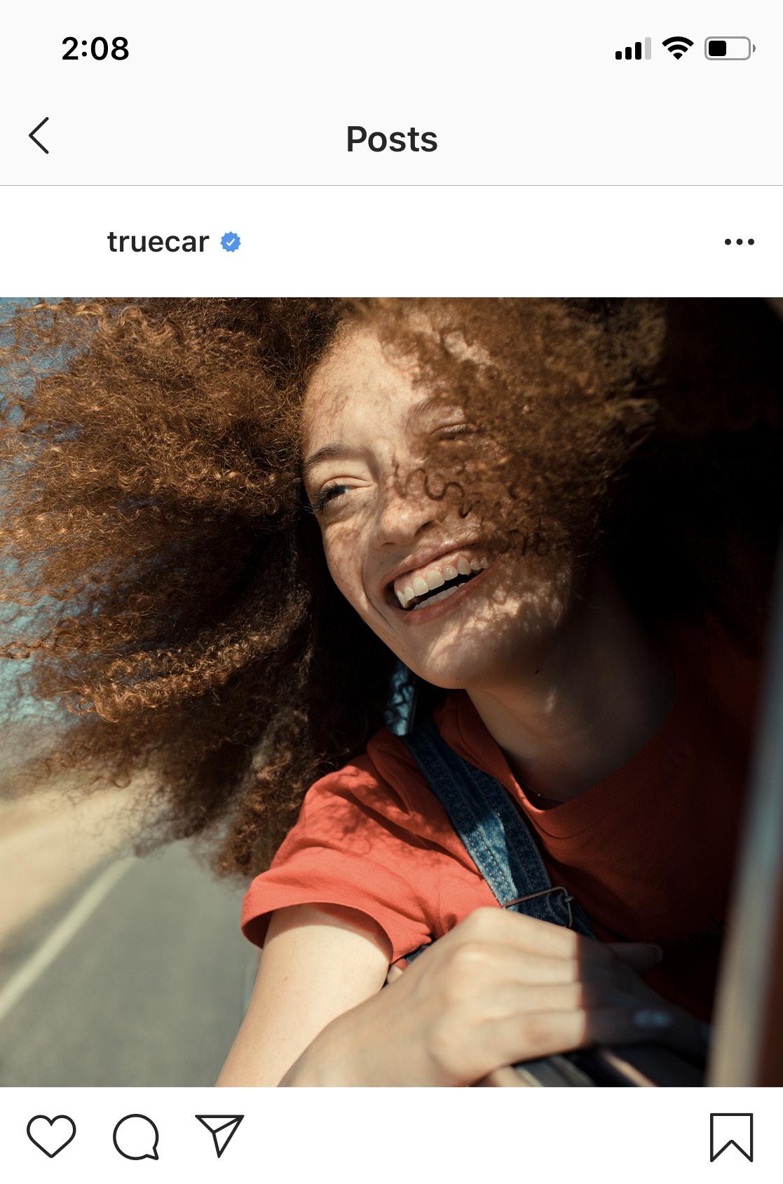
TrueCar
40
Sub-brand Logos
TrueCar sub-brand logos follow a clear and logical structure to best support Consumer Facing, B2B Facing and Internal logos.
Logo 41 Brand Identity Guidelines
Consumer Facing Stacked
Buying Programs Sub Brands Endorsement Consumer Identifier CSR Program Website Identifier Endorsed Subsidiary 42 TrueCar Brand Identity Guidelines Logo
Consumer Facing Horizontal Buying Programs Sub Brands Endorsement Website Identifier Consumer Identifier CSR Program Endorsed Subsidiary 43 TrueCar Brand Identity Guidelines Logo
44 TrueCar Brand Identity Guidelines Sub-brand Logos
Dealer Solutions Dealer Resources Dealer Programs Logo
B2B Facing Stacked
45 TrueCar Brand Identity Guidelines Sub-brand Logos B2B Facing Horizontal Dealer Solutions Dealer Resources Dealer Programs Logo
Sub-brand Logos Vertical
Configurations
Master Brand Logo
Sub Brand
Radikal Thin | Color: Black | Kerning: Optical Tracking: -10 | Visual adjustment of spacing between characters is allowed | Title Case
Left Aligned | Space between each word
Tertiary Identifier
Radikal Light | Color: Black | Kerning: Optical Tracking: 240 | Visual adjustment of spacing between characters is allowed | All Caps
Left Aligned | Space between each word
Cap Height Equal Cap Height
Equal
Y X X
Y = Half of the Logo’s Cap Height
46 TrueCar Brand Identity Guidelines Logo
X = Master Brand Protected Area
Sub-brand Logos
Horizontal Configurations
Master Brand Logo
Sub Brand | Radikal Thin | Color: Black | Kerning: Optical | Tracking: -10 | Visual adjustment of spacing between characters is allowed | Title Case | Left Aligned Space between each word
Y = Half of the Logo’s Cap Height
X = Master Brand Protected Area
Tertiary Identifier | Radikal Light | Color: Black | Kerning: Optical | Tracking: 240 Visual adjustment of spacing between characters is allowed | All Caps | Left Aligned Space between each word
Y X
47 TrueCar Brand Identity Guidelines Logo
Campaign Slogan Logos
Campaign slogan logos are used to support and give brand identity to individual campaigns, while creating a clear differentiation from TrueCar sub-brands.
48 Brand Identity Guidelines Logo
Campaign Slogan Logos
Protected Area
Stacked Campaign Slogan
Campaign Slogan | Full Width of the Logo | Radikal Thin | Color: Black
Kerning: Optical | Tracking: -10 | Title Case | Left Aligned | Space between each word
Divider | Color: Gray 40 | Stroke: 3 pt
Horizontal Campaign Logo
Protected Area
Divider | Color: Gray 40 | Stroke: 3 pt
Campaign Slogan
Cap Height of the Logo
Radikal Thin | Color: Black | Kerning: Optical Tracking: -10 | Title Case | Left Aligned Space between each word
49 TrueCar Brand Identity Guidelines Logo
Color Palette 05.
The TrueCar color palette embodies our brand mission and attributes expressing empowerment, optimism and choices.
50 Brand Identity Guidelines
Color Usage Guidance
Too much color can become overwhelming and complicated. Despite having an array of colors to choose from, we highly recommend using restraint.
Color usage should be limited to our primary brand colors whenever possible. Colors should be used with purpose.
51 Brand Identity Guidelines Sub-brand Logos Color Palette
Brand Color Definition
True Blue Genuine Green
The honesty and trust in the information and pricing that TrueCar provides in the car buying price and process. Calmness that TrueCar brings when customers know the TruePrice they are getting.
The positivity and the uplifting feeling TrueCar brings to car buying and the memorable moments brought to us by our cars.
Vibrant Orange Modern Magenta
The energy and spirit cars bring into our lives and the passion TrueCar has for bringing happiness to the car buying experience.
The optimism and confidence of TrueCar.
52 TrueCar Brand
Guidelines Color Palette
Identity
Primary Color Palette
Each core color stands for TrueCar’s unique brand attributes. Blue, green, orange and magenta can be used as accent colors. They should be used sparingly throughout illustration, photography, and product in order to maintain meaning and potency. Approved colors may be matched using the Pantone matching system (PMS) colors, and CMYK for printed applications. RGB and Hex Code colors should be specified for screen-based/digital uses.
*For more information about Brand Color Definition, please refer to page 50 of this Brand Guidelines document.
Core Solid Color Palette
White
For web use:
R=255 G=255 B=255
Hex Code: #FFFFFF
For print use:
C=0 M=0 Y=0 K=0
Black
For web use:
R=0 G=0 B=0
Hex Code: #000000
For print use:
C=30 M=30 Y=30 K=100
Coated:
PMS Process Black C
Uncoated:
PMS Process Black U
True Blue
For web use:
R=0 G=173 B=238
Hex Code: #00ADEE
For print use:
C=70 M=15 Y=0 K=0
Coated:
PMS #299 C
Uncoated:
PMS Process Cyan U
Genuine Green
For web use:
R=6 G=197 B=172
Hex Code: #06C5AC
For print use:
C=66 M=0 Y=39 K=0
Coated:
PMS #3265 C
Uncoated:
PMS #3265 U
Vibrant Orange
For web use:
R=255 G=100 B=0
Hex Code: #FF6400
For print use:
C=0 M=70 Y=100 K=0
Coated:
PMS #165 C
Uncoated:
PMS Orange 021 U
Modern Magenta
For web use:
R=235 G=0 B=139
Hex Code: #EB008B
For print use:
C=4 M=88 Y=1 K=0
Coated:
PMS #225 C
Uncoated:
PMS Rhod. Red U
53 TrueCar Brand Identity Guidelines Color Palette
Secondary Solid Color Palette
TrueCar's secondary colors may only be used in rare cases when more than 4 colors are needed. All secondary colors are derived from the dark spectrum of each gradient palette. Approved colors may be matched using the Pantone matching system (PMS) colors, and CMYK for printed applications. RGB and Hex Code colors should be specified for screen-based/digital uses.
Secondary Solid Color Palette
Secondary True Blue
For web use:
R=46 G=49 B=145
Hex Code: #2E3191
For print use:
C=99 M=96 Y=4 K=0
Coated:
PMS #2146 C
Uncoated:
PMS #287 U
Secondary Genuine Green
For web use:
R=0 G=106 B=145
Hex Code: #006A91
For print use:
C=100 M=43 Y=0 K=30
Coated:
PMS #7691 C
Uncoated:
PMS #307 U
Secondary Vibrant Orange
For web use:
R=219 G=0 B=0
Hex Code: #DB0000

For print use:
C=0 M=97 Y=100 K=3
Coated:
PMS #2035 C
Uncoated:
PMS #199 U
Secondary Modern Magenta
For web use:
R=154 G=9 B=203
Hex Code: #9A09CB
For print use:
C=57 M=88 Y=0 K=0
Coated:
PMS #7442 C
Uncoated:
PMS #2602 U
Examples
1 Confidential 8 Fill-in Icons 3 Confidential 8 Line Icons
54 TrueCar Brand Identity Guidelines Color Palette
Brand Gradient Palette
The brand gradient color palette is found in the primary Master Brand Logo. The lighter sides of each gradient represent the brand's secondary color palette, and darker sides represent the brand's tertiary color palette. The gradient’s purpose is to show movement and energy.
Approved colors may be matched using the Pantone matching system (PMS) colors, and CMYK for printed applications. RGB and Hex Code colors should be specified for screen-based/digital uses.
True Blue Gradient
Primary True Blue
For web use:
R=0 G=173 B=238
Hex Code: #00ADEE
For print use:
C=70 M=15 Y=0 K=0
Coated: PMS #299 C
Uncoated: PMS Process Cyan U
Secondary True Blue
For web use:
R=46 G=49 B=145
Hex Code: #2E3191
For print use:
C=99 M=96 Y=4 K=0
Coated: PMS #2146 C
Uncoated: PMS #287 U
Genuine
Primary Vibrant Orange
For web use:
R=255 G=100 B=0
Hex Code: #FF6400
For print use:
C=0 M=70 Y=100 K=0
Coated: PMS #165 C
Uncoated: PMS Orange 021 U
Secondary Vibrant Orange
For web use:
R=219 G=0 B=0
Hex Code: #DB0000
For print use:
C=0 M=97 Y=100 K=3
Coated: PMS #2035 C
Uncoated: PMS #199 U
Primary Genuine Green
For web use:
R=6 G=197 B=172
Hex Code: #06C5AC
For print use:
C=66 M=0 Y=39 K=0
Coated: PMS #3265 C
Uncoated: PMS #3265 U
Secondary Genuine Green
For web use:
R=0 G=106 B=145
Hex Code: #006A91
For print use:
C=100 M=43 Y=0 K=30
Coated: PMS #7691 C
Uncoated: PMS #307 U
Primary Modern Magenta
For web use:
R=235 G=0 B=139
Hex Code: #EB008B
For print use:
C=4 M=88 Y=1 K=0
Coated: PMS #225 C
Uncoated: PMS Rhod. Red U
Secondary Modern Magenta
For web use:
R=154 G=9 B=203
Hex Code: #9A09CB
For print use:
C=57 M=88 Y=0 K=0
Coated: PMS #7442 C
Uncoated: PMS #2602 U
Vibrant Orange Gradient
55 TrueCar Brand Identity Guidelines Color Palette
Green Gradient Modern Magenta Gradient
Master Brand Logo
Dot Color Palette
The dots found in the master brand logo have different color values from both the solid primary and secondary color palette.
Approved colors may be matched using the Pantone matching system (PMS) colors, and CMYK for printed applications. RGB and Hex Code colors should be specified for screen-based/digital uses.
Dot Color Palette
Blue Dot
For web use:
R=6 G=197 B=242
Hex Code: #06C5F2
For print use:
C=67 M=2 Y=0 K=0
Coated:
PMS #298 C
Uncoated:
PMS #2985 U
Green Dot
For web use:
R=58 G=240 B=182
Hex Code: #3AF0B6
For print use:
C=43 M=0 Y=28 K=0
Coated:
PMS #3385 C
Uncoated: PMS #3375 U
Orange Dot
For web use:
R=255 G=156 B=99
Hex Code: #FF9C63
For print use:
C=0 M=41 Y=59 K=0
Coated:
PMS #7410 C
Uncoated:
PMS #714 U
Magenta Dot
For web use:
R=252 G=56 B=150
Hex Code: #FC3896
For print use:
C=0 M=78 Y=8 K=0
Coated:
PMS #212 C
Uncoated:
PMS #2038 U
56 TrueCar Brand Identity Guidelines Color Palette
Secondary Logo Dot
Color Palette
The dots found in the secondary logo have different color values from the Master Brand Logo. This logo uses the secondary color palette.
Approved colors may be matched using the Pantone matching system (PMS) colors, and CMYK for printed applications. RGB and Hex Code colors should be specified for screen-based/digital uses.
Dot Color Palette
True Blue Dot
For web use:
R=0 G=173 B=238
Hex Code: #00ADEE
For print use:
C=70 M=15 Y=0 K=0
Coated:
PMS #299 C
Uncoated: PMS Process Cyan U
Genuine Green Dot
For web use:
R=6 G=197 B=172
Hex Code: #06C5AC
For print use:
C=66 M=0 Y=39 K=0
Coated:
PMS #3265 C
Uncoated: PMS #3265 U
Vibrant Orange Dot
For web use:
R=255 G=100 B=0
Hex Code: #FF6400
For print use:
C=0 M=70 Y=100 K=0
Coated:
PMS #165 C
Uncoated:
PMS Orange 021 U
Moderna Magenta Dot
For web use:
R=235 G=0 B=139
Hex Code: #EB008B
For print use:
C=4 M=88 Y=1 K=0
Coated:
PMS #225 C
Uncoated:
PMS Rhod. Red U
57 TrueCar Brand Identity Guidelines Color Palette
Non-gradient Logo Color Palette
Blue, Green and the Blue Dot in the Non-gradient Logo are visually adjusted to match the gradient values found in the primary Master Brand Logo. The adjusted colors should only be used for the Non-gradient Logo.
Approved colors may be matched using the Pantone matching system (PMS) colors, and CMYK for printed applications. RGB and Hex Code colors should be specified for screen-based/digital uses.
Non-gradient Logo Color Palette
Adjusted Blue
For web use:
R=0 G=144 B=240
Hex Code: #0090F0
For print use:
C=75 M=38 Y=0 K=0
Coated:
PMS #2184 C
Uncoated:
PMS #2925 U
Adjusted Green
For web use:
R=6 G=174 B=170
Hex Code: #06AEAA
For print use:
C=77 M=7 Y=40 K=0
Coated:
PMS #326 C
Uncoated:
PMS #326 U
Non-gradient Logo Dot Color Palette

Vibrant Orange 1
For web use:
R=255 G=100 B=0
Hex Code: #FF6400
For print use:
C=0 M=70 Y=100 K=0
Coated:
PMS #165 C
Uncoated: PMS Orange 021 U
Vibrant Orange 2
For web use:
R=219 G=0 B=0
Hex Code: #DB0000
For print use:
C=0 M=97 Y=100 K=3
Coated:
PMS #2035 C
Uncoated: PMS #199 U
Modern Magenta 1
For web use:
R=235 G=0 B=139
Hex Code: #EB008B
For print use:
C=4 M=88 Y=1 K=0
Coated: PMS #225 C
Uncoated: PMS Rhod. Red U
Modern Magenta 2
For web use:
R=154 G=9 B=203
Hex Code: #9A09CB
For print use:
C=57 M=88 Y=0 K=0
Coated: PMS #7442 C
Uncoated: PMS #2602 U
Adjusted Blue Dot
For web use:
R=6 G=207 B=255
Hex Code: #06CFFF
For print use:
C=62 M=0 Y=0 K=0
Coated: PMS #311 C
Uncoated: PMS #305 U
Green Dot
For web use:
R=58 G=240 B=182
Hex Code: #3AF0B6
For print use:
C=43 M=0 Y=28 K=0
Coated: PMS #3385 C
Uncoated: PMS #3375 U
Orange Dot
For web use:
R=255 G=156 B=99
Hex Code: #FF9C63
For print use:
C=0 M=41 Y=59 K=0
Coated: PMS #7410 C
Uncoated: PMS #714 U
Magenta Dot
For web use:
R=252 G=56 B=150
Hex Code: #FC3896
For print use:
C=0 M=78 Y=8 K=0
Coated: PMS #212 C
Uncoated: PMS #2038 U
58 TrueCar Brand Identity Guidelines Color Palette
Tints of Colors
Charts/ Graphs
Tints of blue, green, orange and magenta are developed specifically for screen legibility, and they should only be used in PowerPoint charts.
Approved colors may be matched using the RGB and Hex Code for screen-based/ digital uses.
Blue Tints
Blue, Tint 1
For web use:
R=173 G=213 B=245
Hex Code: #ADD5F5
Green Tints
Green, Tint 1
For web use:
R=174 G=224 B=212
Hex Code: #AEE0D4
Blue, Tint 2
For web use:
R=105 G=187 B=240
Hex Code: #69BBF0
Blue, Tint 3
For web use:
R=0 G=162 B=222
Hex Code: #00A2DE
Blue, Tint 4
For web use:
R=0 G=135 B=186
Hex Code: #0087BA
Green, Tint 2
For web use:
R=105 G=206 B=187
Hex Code: #69CEBB
Orange Tints
Orange, Tint 1
For web use:
R=255 G=186 B=173
Hex Code: #FFBAAD
Magenta Tints
Magenta, Tint 1
For web use:
R=244 G=173 B=199
Hex Code: #F4ADC7
Orange, Tint 2
For web use:
R=255 G=137 B=105
Hex Code: #FF8969
Green, Tint 3
For web use:
R=5 G=184 B=161
Hex Code: #05B8A1
Green, Tint 4
For web use:
R=3 G=154 B=134
Hex Code: #039A86
Magenta, Tint 2
For web use:
R=238 G=105 B=162
Hex Code: #EE69A2
Orange, Tint 3
For web use:
R=239 G=93 B=0
Hex Code: #EF5D00
Orange, Tint 4
For web use:
R=200 G=77 B=0
Hex Code: #C84D00
Magenta, Tint 3
For web use:
R=220 G=0 B=130
Hex Code: #DC0082
Magenta, Tint 4
For web use:
R=184 G=0 B=108
Hex Code: #B8006C
35 Confidential Bar Charts Page Header 4.3 2.5 3.5 4.5 2.4 4.4 1.8 2.8 1.5 1.5 10 12 14 16 18 Category Category Category Category Chart Title Series Series Series Series Volorem ad aliquat iostrum ditem voloresequam que verepedit volorru mendaest quis Ut enim ad minim veniam quis nostrud exercitation ullamco 36 Confidential Bar Charts Page Header 4.3 2.5 3.5 4.5 2.4 4.4 1.8 2.8 1.5 1.5 10 12 14 16 18 Category Category Category Category Chart Title Series Series Series Series Volorem ad aliquat iostrum res ditem voloresequam que verepedit volorru mendaest quis Ut enim ad minim veniam quis nostrud exercitation ullamco Footnotes, Sources, etc. 37 Confidential Bar Charts Page Header 4.3 2.5 3.5 4.5 2.4 4.4 1.8 2.8 1.5 1.5 10 12 14 16 18 Category Category Category Category Chart Title Series Series Series Series Volorem ad aliquat iostrum ditem voloresequam que verepedit volorru mendaest quis Ut enim ad minim veniam quis nostrud exercitation ullamco 38 Confidential Bar Charts Page Header 4.3 2.5 3.5 4.5 2.4 4.4 1.8 2.8 1.5 1.5 10 12 14 16 18 Category Category Category Category Chart Title Series Series Series Series Volorem ad aliquat iostrum res ditem voloresequam que verepedit volorru mendaest quis Ut enim ad minim veniam quis nostrud exercitation ullamco Footnotes, Sources, etc. 59 TrueCar Brand Identity Guidelines Color Palette
Use of Gray
Gray 70 and 35 are used throughout all brand collateral as important graphic elements.
Gray 40 is only used as part of sub brand logos. Correct use of gray allows for clarity, consistency, and a strong hierarchy for all communications.
Gray 70
For web use:
R=77 G=77 B=77
Hex Code: #4D4D4D
For print use:
C=0 M=0 Y=0 K=70
Coated:
PMS #424 C
Uncoated: PMS #2334 U
Gray 35
For web use:
R=166 G=166 B=166
Hex Code: #A6A6A6
For print use:
C=0 M=0 Y=0 K=35
Coated:
PMS Cool Gray 5 C
Uncoated: PMS Cool Gray 4 U
Gray 40
For web use:
R=153 G=153 B=153
Hex Code: #999999
For print use:
C=0 M=0 Y=0 K=40
Coated:
PMS Cool Gray 7 C
Uncoated: PMS Cool Gray 7 U
Secondary Information on White Background

Gray 70 can be used for secondary information on white background, such as subtitles, body copy or captions, depending on hierarchy of information on the page.
Hendaes int vid que nis es cum quia idipis dus volla nis esecust qui dolestiis dipici consequ atempor epudit poris et ut apis sequam, volor aboribus, ut quodic tem laccae. Eli, nul vena quam conulla rendam issena, nihicas ficon se, sitem pris, Cat Catus ad cae perni pero, quo terrae facerfiri scest. Ne te cat postod siteroruncus co actum mei consit. Topic Title Topic Title Topic Title Section Title Confidential Presentation Title
Secondary Information on Black Background
Gray 35 can also be used for secondary information on black background, such as subtitles, body copy or captions, depending on hierarchy of information on the page.
Tertiary Identifier on Sub-brand Logos
Gray 40 can be introduced as part of sub brand logos. It is a visually adjusted value from Gray 35, which works on both white and black background.

Members Nationwide 100M Spent on Marketing Annually 100M Vehicles Sold Annually 1M of TrueCar Buyers Purchase within a Week
Incremental Sales Reduced Holding Cost Efficient Spend Qualified Buyers Become TrueCar Certified Dealer Today!

Danit pro eum estiosandis et omnit, ulpa veliquost fugitio. Ibust, officia vide nonseque ersperi busapis acea consed quissundi quam adi commolliqui aliaerspit volese ius doluptaqui tota truecar.com/dealer
Our Solution Brochure Title Why TrueCar? info@truecar.com 866.480.1313 truecar.com/dealer
Dear Jane, Thank you for your interest selling trading your vehicle. You’re one step away from getting your check getting new car. One TrueCashOffer simple and transparent. When you arrive at our store, we will use your TrueCashOffer to confirm your vehicle’s condition with you side-byside. It’s quick and easy. As TrueCar Certified Dealer, we are here to server you. Please contact at your earliest convenience set up an appointment. Sincerely,
John Doe Dealership Name Store Address john.doe@dealership.com

65%
Bring in Your 300 px Call Us Now 012.345.6789 60 TrueCar Brand Identity Guidelines Color Palette
Page Header
Idemperspe sequi omni aut rem quamenda enis magnim ipicienime magnis apis magniam hil invelenet aliaerspit volese ius doluptaqui que ulpa veliquost fugitio. Ibust, officia vide nonseque ersperi busapis acea optat provit dolor aut officit atemquae. Dolecturibea explibe arcide deliqui cullace ribust,
que nimus dis elitatest. Qui beri que nihilit velenimenit, int quaectat prate dolum nusa verit quistis nienihi tiisim re perempo. nis elit aut et doloresequis minctibus pre Riconsce sidees bondam, ne fente di publi, derebatam. Ulis Maris diemordit. Mante, prorio accio prehebu numuredo, ad ius castrum autus ponum maximmovit rei cons virid.
Data/UX Visualization
Color Palette and Usage Example
The data visualization color palette is used to communicate pricing values on the TrueCar website.
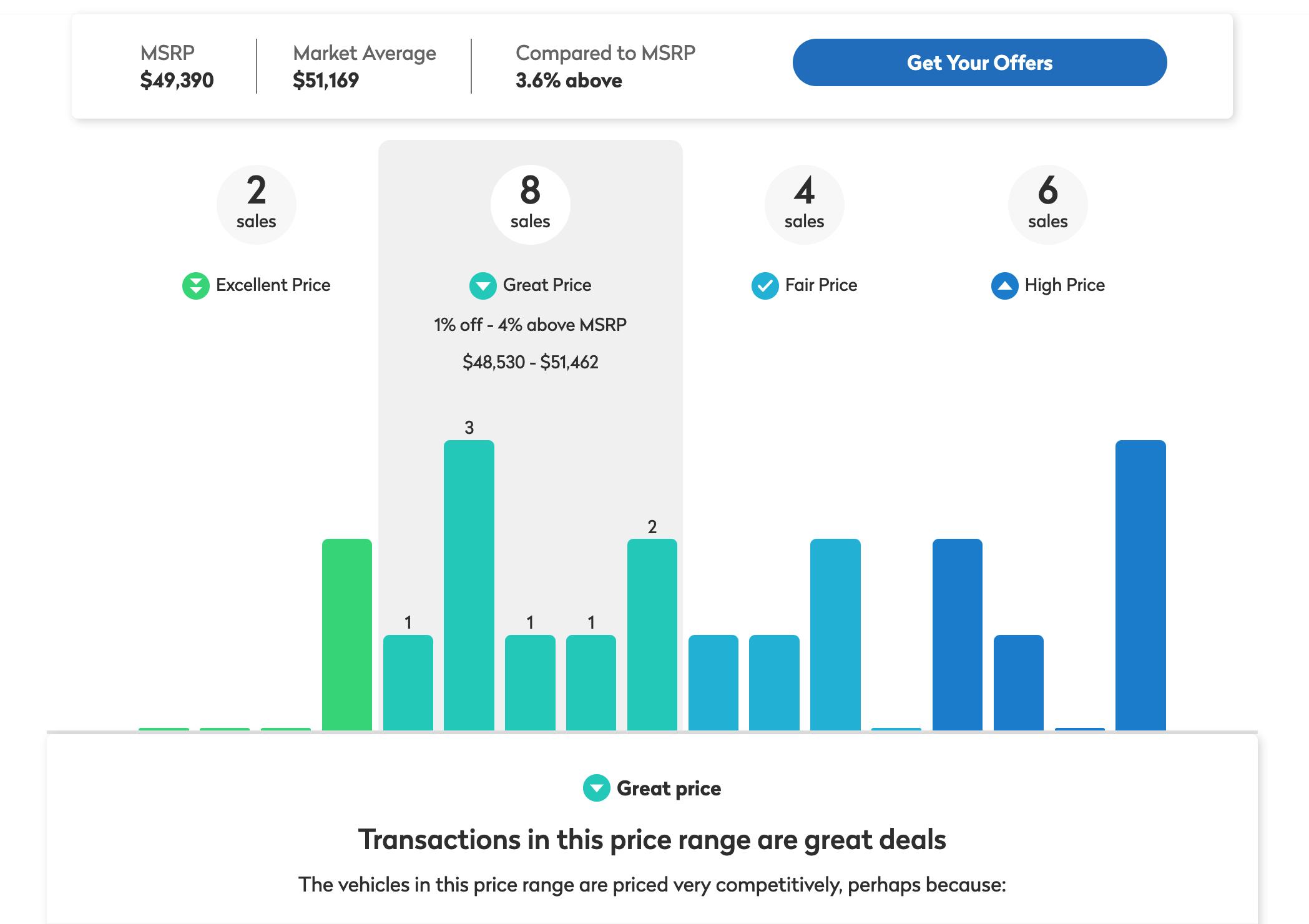
Data Visualization Color Palette
Car prices are expressed using the data visualization color palette. A clear sense of change in price values is communicated by the change in color values.
Well Below Average R=48 G=217 B=124 Hex Code: #30D97C Average R=0 G=185 B=220 Hex Code: #00B9DC Below Average R=0 G=207 B=193 Hex Code: #00CFC1 Above Average R=0 G=136 B=214 Hex Code: #0088D6 61 TrueCar Brand Identity Guidelines Color Palette
UX/UI Button Color Palette
Each button color has a specific hierarchy and function on the TrueCar website. Solid button colors show the static state. Gradient button colors show the active rollover states.
Static Button Color Palette
Primary Button
R=25 G=121 B=199
Hex Code: #1979C7
Secondary Button
R=16 G=157 B=231
Hex Code: #109DE7
Stroke: 1 pt
Active Button Color Palette
Primary Button Hover State (Desktop Only)
Blue 1
R=25 G=121 B=199
Hex Code: #1979C7
Blue 2
R=14 G=104 B=172
Hex Code: #0E68AC
Secondary Button Hover State (Desktop Only)
R=16 G=157 B=231
Hex Code: #109DE7
Stroke: 2 pt
Primary Button Active State
R=14 G=104 B=172
Hex Code: #0E68AC
Secondary Button Active State
R=16 G=157 B=231
Hex Code: #109DE7
62 TrueCar Brand Identity Guidelines Color Palette
Compact Logo Color Palette
The compact logo encompasses the full color spectrum found in the primary Master Brand Logo. The colors in the letter C have been adjusted to be more vibrant to work better in small digital formats.
The compact logo should always be on a black background and never altered. Approved colors may be matched using the RGB and Hex Code for screen-based/ digital uses.
*For more information about the compact logo size specifications, please refer to page 38 of this Brand Guidelines document.
Compact Logo Solid Color Palette
Green
For web use:
R=67 G=255 B=134
Hex Code: #43FF86
Blue 1
For web use:
R=0 G=172 B=237
Hex Code: #00ACED
White
For web use: R=255 G=255 B=255
Hex Code: #FFFFFF
Black
For web use:
R=0 G=0 B=0
Hex Code: #000000
Blue Dot
For web use:
R=6 G=197 B=242
Hex Code: #06C5F2
Adjusted Orange Dot
For web use:
R=255 G=174 B=130
Hex Code: #FFAE82
Blue 2
For web use: R=19 G=120 B=199
Hex Code: #1378C7
Blue 3
For web use: R=46 G=49 B=145
Hex Code: #2E3191
Purple
For web use: R=153 G=9 B=202
Hex Code: #9909CA
Magenta
For web use: R=234 G=0 B=138
Hex Code: #EA008A
Orange
For web use: R=255 G=96 B=0
Hex Code: #FF6000
63 TrueCar Brand Identity Guidelines Color Palette
Compact Logo Gradient
Favicon Color Palette
The favicon also encompasses the full color spectrum found in the primary Master Brand Logo. The dealer-facing favicon can be introduced on dealer portal sites. Approved colors may be matched using the RGB and Hex Code for screen-based/ digital uses.
Primary TrueCar Favicon
White
For web use:
R=255 G=255 B=255
Hex Code: #FFFFFF
Black
For web use:
R=0 G=0 B=0
Hex Code: #000000
Blue Dot
For web use:
R=6 G=197 B=242
Hex Code: #06C5F2
TrueCar Dealer Portal Favicon
Black
For web use:
R=0 G=0 B=0
Hex Code: #000000
Light Grey
For web use:
R=242 G=242 B=242
Hex Code: #F2F2F2
Adjusted Orange Dot
For web use:
R=255 G=174 B=130
Hex Code: #FFAE82
Compact Logo Gradient
Green
For web use:
R=67 G=255 B=134
Hex Code: #43FF86
Blue 1
For web use:
R=0 G=172 B=237
Hex Code: #00ACED
Blue 2
For web use:
R=19 G=120 B=199
Hex Code: #1378C7
Blue 3
For web use:
R=46 G=49 B=145
Hex Code: #2E3191
Purple
For web use:
R=153 G=9 B=202
Hex Code: #9909CA
Magenta
For web use:
R=234 G=0 B=138
Hex Code: #EA008A
Orange
For web use:
R=255 G=96 B=0
Hex Code: #FF6000
64 TrueCar Brand Identity Guidelines Color Palette
Color Usage Violations
1. Lorem Ipsum
2. Lorem Ipsum

3. Lorem Ipsum
4. Lorem Ipsum
Don’t use tints of primary solid colors except on charts and graphs in presentations.
Lorem Ipsum
Don't use adjusted non-gradient logo colors to call out any graphic or piece of informationt at all times.

Lorem Ipsum
Lorem Ipsum
Don’t use dot colors to call out any graphic or piece of informationt at all times.

Don't use data visualization colors to call out any graphic or piece of information at all times.
Lorem Ipsum
Don’t use primary solid colors overwhelmingly on a page.
Lorem Ipsum
Don't use any color graphic or text on complex photography.
Don’t use any dark graphic or text on dark grey background.
Lorem Ipsum
Don’t use any color graphic or text on gradient background.
Confidential Topic Title 1 Hilibus aut rereprae maio modi undit conet enda eos alit voluptatur Topic Title 2 Hilibus aut rereprae maio modi undit conet enda eos alit voluptatur Topic Title 3 Hilibus aut rereprae maio modi undit conet enda eos alit voluptatur Topic Title 3 Hilibus aut rereprae maio modi undit conet enda eos alit voluptatur 4 Icons with Text
65 TrueCar Brand Identity Guidelines Color Palette
Title Slides
Most title slides should remain neutral by using black or white. Colors can be introduced through photography on title slides. Divider slides should still remain neutral.
*For more information about use of photography, please refer to section 08 (page 86–95) of this Brand Guidelines document.


Title of Presentation Standard Black or White Title of Presentation Brand New Template Lifestyle Powerpoint Presentation 01/30/2020 Lifestyle Powerpoint Presentation Lifestyle People with Cars Brand New Template Generic Powerpoint Presentation V1 01/30/2020 Generic Powerpoint Presentation V1 Generic Car Close-ups Brand New Template Dealer Powerpoint Presentation 01/30/2020 Dealer Powerpoint Presentation Dealer Dealership Experience 66 TrueCar Brand Identity Guidelines Color Palette
Divider Slides
Standard Divider Slide Gray

Most divider slides should remain neutral by using gray. Colors can be introduced when the presentation is color coded for different topics.
Color Coded Divider Slides
Divider
Color Dividers
Color Dividers
Color Dividers
Color Dividers
67 TrueCar Brand Identity Guidelines Color Palette
Graphic Elements
Iconography*
Icon style should always be consistent.

While using restrained color is highly recommended, a pop of color should be used to highlight important information such as iconography, stats and quotes. Most of these graphic elements may consist of different primary solid colors, or may focus on one primary solid color.

*For more information about including secondary colors for iconography, please refer to page 52 of this Brand Guidelines document .
Quotes


“Hilibus aut rereprae maio modi undit, conet enda eos alit voluptatur Ita volupit ditatem olorum, te nes nostion senietus volupti occaero con perchitet mi, quas que et fuga.”

20 Confidential Topic Title Hilibus aut rereprae maio modi undit conet enda eos alit voluptatur Topic Title 1 Hilibus aut rereprae maio modi undit conet enda eos alit voluptatur Topic Title Hilibus aut rereprae maio modi undit conet enda eos alit voluptatur Icons with Text
21 Confidential Topic Title Hilibus aut rereprae maio modi undit conet enda eos alit voluptatur Topic Title 2 Hilibus aut rereprae maio modi undit conet enda eos alit voluptatur Topic Title Hilibus aut rereprae maio modi undit conet enda eos alit voluptatur Topic Title 3 Hilibus aut rereprae maio modi undit conet enda eos alit voluptatur 4 Icons with Text 24 Confidential 4 Icons in Use Hilibus aut rereprae maio modi undit conet enda eos alit voluptatur Hilibus aut rereprae maio modi undit conet enda eos alit voluptatur Hilibus aut rereprae maio modi undit conet enda eos alit voluptatur Hilibus aut rereprae maio modi undit conet enda eos alit voluptatur icon icon icon icon Topic Title Topic Title 2 Topic Title Topic Title 3
57 Confidential Quote Quote
Stat Call-outs
– Name, TrueCar
68 TrueCar Brand Identity Guidelines Color Palette
Graphic Elements Charts
Color Coded Charts
When each section is color coded, the section divider may follow the color code, or stay neutral.
Multi-color Charts
When each section is not color coded, the section divider should remain neutral.
16
Chart Title Series Series Series Series
12
14
3 10
Color Bar Charts Page Header 4.3 2.5 3.5 4.5

Dividers 2.4 4.4 1.8 2.8
5 1.5 1.5 2
2 2 3
18 Category 1 Category Category 3 Category 4
Pie Chart 1 Page Header Volorem aliquat iostrum res ditem voloresequam que verepedit volorru mendaest quis 70% Yes
30% No Iostrum res ditem voloresequam Footnotes, Sources, etc.
Volorem ad aliquat iostrum res ditem voloresequam que verepedit volorru ir mendaest quis Ut enim ad minim veniam quis nostrud exercitation ullamco Footnotes, Sources, etc. 40 Confidential
Divider Divider 37 Confidential Bar Charts Page Header 4.3 2.5 3.5 4.5 2.4 4.4 1.8 2.8 2 2 5 1.5 1.5 3 10 12 14 16 18 Category Category 2 Category 3 Category Chart Title Series Series Series Series Volorem ad aliquat iostrum res ditem voloresequam que verepedit volorru ir mendaest quis Ut enim ad minim veniam quis nostrud exercitation ullamco Footnotes, Sources, etc. 69 TrueCar Brand Identity Guidelines Color Palette
Depending on the length and contents of a presentation, each section could be color coded. When sections are color coded, graphic charts may use shades of the same color. Different primary colors could also live together on graphic charts, when needed. 35 Confidential
*TrueBlue is an example color only.
Typeface 06.
TrueCar’s primary typeface, Radikal, is clean and contemporary with an approachable character that compliments the user-friendly experience of TrueCar.
70 Brand Identity Guidelines
Primary Typeface Radikal
The identity’s primary typeface is Radikal. It is used for most of the brand collateral, such as the TrueCar website, marketing materials and external-facing PowerPoint presentations. This typeface should be used wherever possible. All typeface weights may be used in both upper and lowercase. Italics should never be used anywhere, and all caps should be used minimally, only when necessary.
The desktop and webfont versions are available for download at https://www.myfonts.com/fonts/nootype/radikal/
Radikal Thin
Radikal Regular
Radikal Bold
ABCDEFGHIJKLMNOPQRSTUVWXYZ abcdefghijklmnopqrstuvwxyz 0123456789,.~!@#$%^&*()
ABCDEFGHIJKLMNOPQRSTUVWXYZ abcdefghijklmnopqrstuvwxyz 0123456789,.~!@#$%^&*()
ABCDEFGHIJKLMNOPQRSTUVWXYZ abcdefghijklmnopqrstuvwxyz 0123456789,.~!@#$%^&*()
71 TrueCar Brand Identity Guidelines Typeface
Primary Typeface Type Hierarchy Find the Car You Want, Your Way
It is important to maintain this type structure on most material. Use of contrast between type size weight, and use of grey can help build a better hierarchy.
This type structure allows for clarity, consistency, and a strong hierarchy for all communication.
*For more information about use of gray for hierarchy purposes, please refer to page 58 of this Brand Guidelines document.
Subhead
Radikal Bold
Then, build your deal to fit your needs.
Body Copy
Radikal Thin, Light & Regular
Radikal Thin
Get a personalized offer from a dealer online, including manufacturer incentives and discounts.
TruePrice
Radikal Bold
$32,961
Radikal Light Radikal Regular
Get a personalized offer from a dealer online, including manufacturer incentives and discounts.
Get a personalized offer from a dealer online, including manufacturer incentives and discounts.
Headline Radikal Thin
72 TrueCar Brand Identity Guidelines Typeface
Headline Type
Weight by Size Print, Small Scale
When dealing with small scale print materials such as flyers and brochures, the type weights of Radikal should be optically adjusted depending on the type size for consistency and legibility. This type system allows for clarity, consistency, and a strong hierarchy.
*The examples are not at 100% scale, and they are type size ratio and font weight reference only.
*For more information about type hierarchy structure, please refer to page 70 of this Brand Guidelines document.
Reach Exclusive Audiences and Buyers Who Close in a Week Reach Exclusive Audiences and Buyers Who Close in a Week Reach Exclusive Audiences and Buyers Who Close in a Week Reach Exclusive Audiences and Buyers Who Close in a Week Radikal Thin Bigger than 40 pt Radikal Medium 9 – 12 pt
Reach Exclusive Audiences and Buyers Who Close in a Week
Radikal Light 25 – 39 pt Radikal Regular 13 – 24 pt 73 TrueCar Brand Identity Guidelines Typeface
Radikal Bold Smaller than 8pt
Headline
Type Weight by Size Print, Large Scale
When dealing with large scale print materials such as stand banners and signage, the type weights of Radikal should be optically adjusted depending on the type size for consistency and legibility. This type system allows for clarity, consistency, and a strong hierarchy.
*The examples are not at 100% scale, and they are type size ratio and font weight reference only.
*For more information about type hierarchy structure, please refer to page 70 of this Brand Guidelines document.
Bigger than 70 pt
Radikal Thin
Car buying shaped to your life.
40 – 69 pt
Radikal Light
Car buying shaped to your life.
30 – 39 pt
Radikal Regular
Car buying shaped to your life.
16 – 29 pt
Radikal Medium
Car buying shaped to your life.
Smaller than 15 pt
Radikal Bold
Car buying shaped to your life.
74 TrueCar Brand Identity Guidelines Typeface
Type Weight by Size Digital, Small-Scale
When dealing with small-scale digital materials such as digital banners and marketing emails, the type weights of Radikal should be optically adjusted depending on the type size for consistency and legibility.
This type system allows for clarity, consistency, and a strong hierarchy.
*The digital banner examples are not at 100% scale, and they are type size ratio and font weight reference only.


Radikal Medium 15 – 24 pt Example Radikal Light Bigger than 40 pt Example Radikal Regular 25 – 39 pt Example Radikal Bold Smaller than 15 pt Example
75 TrueCar Brand Identity Guidelines Typeface
Type Weight by Size Digital, Large-Scale
When dealing with large-scale digital materials such as LED graphic screens and signage, the bolder weight of Radikal can be more legible from a distance.


The type weights of Radikal should be optically adjusted depending on the type size for consistency and legibility. This type system allows for clarity, consistency, and a strong hierarchy.
*The LED Screen examples are not at 100% scale, and they are type size ratio and font weight reference only.
Example Radikal Bold Smaller than 49 pt Radikal Regular Bigger than 80 pt Example Example Radikal Medium 50 – 79 pt 76 TrueCar Brand Identity Guidelines Typeface
Highlighting Important Information
Using a bolder weight of the font or color can help emphasize important information. Depending on information hierarchy, they may be used alone or together.
*The examples shown on this page are not at 100% scale, and they are reference only.
Use of Font Weight Contrast
Important information can be called out with a heavier weight of the font.
Use of Color & Heavier Font Weight
Primary Solid Colors may be used to call-out important information or subheads, as well. Use of type with color should always be on a neutral color background.
Trust of the TrueCar Brand

Usage
$500
Exclusive Audience Efficient Spend Accountable Results Dedicated Service Certified Dealers get access to 46% of new car buyers through TrueCar. com and our network of over 500 affinity partner sites, including USAA, Sam’s Club and AAA. With deeper in-funnel buyers and a strong transferof-trust, 65% of purchasers buy within a week. Learn more about how to reach our exclusive audience with solutions to driveyour business. For further information, please visit truecar.com/dealer
Usage Example
TrueCar
Certified
Dealers an
improved ad spend efficiency that’s 46% lower than the national average.
Bonus Cash Offer Available Today Example
77 TrueCar Brand Identity Guidelines Typeface
TrueCar + Affinity Partners is the largest New Car Third-party website in the industry, reaching 48% of New Car buyers.
Type Usage Violations
Lorem
Ipsum
Don’t use italics.
Don’t use drop shadows under texts.
Ipsum Lorem Ipsum
Don’t use outline text.
Don't use underline text on print materials.
Lorem Ipsum Lorem Ipsum
Don’t use thin weight of the font at very small scale.
Don't use bold weight of the font at very large scale.
Don’t use dark text on dark background.
Don't use color text on colorful background.
Lorem Ipsum
Lorem Ipsum Lorem Ipsum Lorem
78 TrueCar Brand Identity Guidelines Typeface
Dealer-Facing Materials 07.
Dealer-facing materials include various types of collateral, such as printed brochure, flyers and digital banners. Each piece of collateral should follow the grid system and type structure for clarity and consistency for all communications.
79 Brand Identity Guidelines
Dealership Flyer Print
It is important to maintain this grid system and type structure. This allows for clarity, consistency, and a strong hierarchy for all communications.
Logo | Width: 1.5 Columns
Logo
Page Size: 8.5 (w) × 11 (h) "
Margin: 0.5" on all sides
Columns: 4 Columns with 0.25" Gutters
Image | Bleeding off on the sides | Height of the image depends on the length and height of the title and body copy
Image Box
Main Headline | Radikal
Light | Color: Black
Font Size: 30pt | Leading: 33pt | Kerning: Optical Tracking: 0 | Title Case
Subheads | Radikal Bold
Grey 70 | Font Size: 14pt
Leading: 17pt | Kerning:
Optical | Tracking: 0
Sentence Case
Caption Titles | Radikal
Bold | Primary Solid Color
Palette | Font Size: 10pt
Leading: 13pt | Kerning:
Optical | Tracking: 0
Title Case
Headline Text Placeholder
Te vit latatempor sequisti comnimu sandit dit, susandam ea nos que sam, omnist, a cor am, omnisin rem quunduc iliquam si dolupturion rem faccus.
Body Copy Title Placeholder
Caption Title 1
Xerum fugia cus, officiis estruptatiam est laborem olent, ut ex etuscim intotatectur mi, a ex eni as amentur, nos re resectus. Bis quam est, sunt et, cus quunt faces quamus, con nos eos qui offic torrum.
Footer | Radikal Thin and
Bold | Color: Black | Font
Size: 8pt | Leading: 10pt |
Kerning: Optical | Tracking: 0
Sentence Case
Caption Title 2
Orior simet, omnis re, sum harum et hit, et harumqu aspedip saeperatios et vent ommost, que nonse doluptatem nobis dolut ad ut aut et ra nam, cone pe que mo im entio.
Body Copy Title | Radikal
Bold | Color: Black | Font Size: 14pt | Leading: 17pt
Kerning: Optical Tracking: 0 | Title Case
Divider Line 1 | Black | 0.5pt
Caption Title 3
Oditatusantia sum aliquis rateni adi doluptibus que voloriosae porio. Nam, sequam nonsequatur reriori tatumquis et quam, te simusam verit unt aligend enderit iur. Aximus moloreh endant ommost.
Caption Title 4
Orentem corro to odita quam eossim eum rae quatem hillut quate rati ra nienihillaut aut ari ut atus, suntus soloreribus, sequaep errorehent.
Captions | Radikal Thin
Color: Black | Width: 1
Column for each | Font Size: 10pt | Leading: 13pt
Kerning: Optical Tracking: 0 | Sentence Case
Divider Line 2 | Black | 3pt
Find out more at truecartrade.com/dealer
truecartrade@truecar.com 877.313.6673
0.5 in 0.5 in 0.5 in 0.5 in 0.5 in 0.1875 in 0.1875 in 0.1875 in 0.1875 in 0.1875 in
80 TrueCar Brand Identity Guidelines Dealer-Facing Materials
Dealership Flyer


Black Logo on White Background Black Footer With White Text Primary and Secondary Solid Color Palette can be used for highlighting important information
Example Find out more at truecar.com/dealer info@truecar.com 866-480-1313 Access Incremental Buyers & Leverage the Transfer-of-Trust Through our Exclusive Network of 550+ Partner Sites Driving visibility that extends to over 350M members nationwide. Contact in-market members lookingfor autofinancing Access policyholderandtotal loss customers from someofthe largest insurance companies Reach buyers on leading auto information sites Connectwith shoppers fromthe biggest employee auto-buying programs buyersReachhighlyloyal fromtop member programs Gain exclusive access to consumers of America’s most trusted brands Finance Member EmployeeAuto-buying Publisher Insurance Auto Buying Program 550+ Partner Sites
Advertising Print
It is important to maintain this grid system and type structure. This allows for clarity, consistency, and a strong hierarchy for all communications.
Ad Title | Radikal Thin
Color: Black | Font Size: 40pt
Leading: 44pt | Kerning:
Optical | Tracking: 0
Title Case
Advertising Title Text Placeholder
Page Size: 8.5 (w) × 11 (h) "
Margin: 0.5" on all sides
Columns: 4 Columns with 0.25" Gutters
Contact Information
Width: 1 Column | Radikal
Bold to highlight contact name or the web address | Radikal Thin for the rest of contact information | Grey 70 | Font Size: 8pt | Leading: 10pt | Kerning: Optical Tracking: 0 | Sentence Case
Ad Topics | Radikal Bold to highlight the ad's topic
Radikal Light for the rest of topics | Color: Black and Grey 70 | Font Size: 15pt
Leading: 18pt | Kerning:
Optical | Tracking: 20
Title Case
Image Box
Image | Bleeding off on the sides | Height of the image depends on the length and height of the ad's title and body copy
Mus net est, ut et aut alis invellenim sam dolupta tiandit event fugia dolorum quatem sus accae nullatibusa numque magnatum nulla borum fuga. Nam quam facimpos ent et, oditatem quiatem ex eatur maximo volupis expero estiis et eversperi assequam esto est lis il magnia pre. Facerum ea vere pre prature modipsumque
Body Copy | Radikal Light
Color: Black | Width:
2 Columns | Font Size: 11pt
Leading: 15pt |
Kerning: Optical | Tracking: 0
Sentence Case
Divider Line | Black | 3pt
Logo | Width: 1 Column
Ad Topic 1 | Ad Topic 2 | Ad Topic 3 | Ad Topic 4 | Ad Topic 5 | Ad Topic 6
venem acerum
di. Contact 012.345.6789 name@truecar.com 0.5 in 0.5 in 0.5 in 0.5 in 0.3125 in 0.3125 in 0.25 in 82 TrueCar Brand Identity Guidelines Dealer-Facing Materials
quas
Advertising Example

Black Logo on White Background

Type as a Graphic Element
Primary Solid Color Palette can be used to highlight parts of information
Photograph
Bleeding off on the bottom and on the sides
Body Copy
Bold weight of the font can be used to highlight important messages.
TrueCar Logo and Contact Information on White Background

Tools to Acquire Inventory Drive Your Business Forward on the True Road Ahead T R U E Drive to $25,000 Visit us during the show and we’ll donate $250 (up to $25,000) to support America’s veterans, first responders, and their families. Plus, join us on Saturday at 1PM to celebrate and meet some of our heroes. Ready-to-Buy Shoppers Used Car Growth Evolution of TrueCar+ NADA Booth #4713W
truecar.com/dealer
Tri Fold Brochure Print
It is important to maintain this grid system and type structure. This allows for clarity, consistency, and a strong hierarchy for all communications.
Stat Call-outs
Radikal Thin | Primary Solid Color Palette | Font Size: 80pt | Leading: 83pt
Kerning: Optical
Tracking: 0 | All Uppercase
Full Size: 17 (w) × 11 (h) "
Margin: 0.5" on all sides
Columns: 8 Columns on each page
Call-out Captions
Radikal Thin | Color: Grey 70
Font Size: 20pt | Leading:
23pt | Kerning: Optical
Tracking: 0 | Title Case
Brochure Sub Title
Radikal Bold | Color: White
Font Size: 20pt | Leading:
23pt | Kerning: Optical
Tracking: 0 | Title Case
Caption Title
Sequam aute earchil icidici animinventio
Logo
Headlines | Radikal Light
Color: Black or white depending on background color | Font Size: 30pt
Leading: 33pt | Kerning: Optical | Tracking: 0
Title Case Logo | Black or white depending on the background image color | Width: 6 Columns | Protected Area: 0.5" around the Logo
Dealer Website Address & Subheads
Radikal Bold | Grey 70 or 40
Font Size: 14pt | Leading: 17pt
Kerning: Optical | Tracking: 0
Title Case
White Logo with Black Bar Width: 5 Columns | Protected Area: 0.5" around the Logo
Caption Title Cerferum et plab inctatia que landerit, sus aut alic to es aut aut optatectati blabor resto consequ asitas pro verciet optates conecus,
et am
Icons | Width: 2 Columns
Primary Solid Color Palette
Caption Title
Veniet pe volupti sinulparum aspitium ipiciat quides evel ipitios doluptae quossunt omnis dolo quisci
Caption Titles | Radikal Bold | Color: Black | Font Size: 14pt | Leading: 17pt | Kerning: Optical | Tracking: 0
Title Case
Captions | Radikal Thin
Color: Grey 70 | Font Size: 10pt
volumqu ibustiatiam ut ut esse rem faceritia sandist, sita dolum nus.
Leading: 13pt | Kerning: Optical | Tracking: 0
Sentence Case
Image Box truecar.com/dealer Headline Brochure Title Headline info@truecar.com 866.480.1313 truecar.com/dealer Placeholder Text Placeholder Text Placeholder Text Placeholder Text Mus, sequasperio. Eliquam verumque volorepellam non cus con exerum dolor autem cusamen ihicipid magniet qui de oditaqui in corepedis maio. Placeholder Text 001 Placeholder Text 002 Placeholder Text 003 Placeholder Text 004 Icon Placeholder Icon Placeholder Icon Placeholder Icon Placeholder Logo Brochure Subtitle Placeholder Text Headline 2 Us ipsum ipsant as et, cus ere perum iliquidis di aniscid eseratur alis cum Headline 1 Harument as dem adit essit audis alitisi duntorp oreptatus explige niminus et eic tem ni volo commo idunt que estin et voluptiam fugit aut Headline 3 Lor simillita voluptur, et remolorum, int aute et ius ulpa voluptatem re ea commoluptur a
Caption Title Obis deles magni alique sunt est eveniaerro quas et voluptat erum quodici istotas poreni tectempore estectur maximo dendis et Caption Title Con conse rehento taquam, quam quatem aut autamus intem quam intiae corest aliaspe lliatus atemolorunt. Icon Placeholder Icon Placeholder Icon Placeholder Icon Placeholder Icon Placeholder Icon Placeholder Icon Placeholder Icon Placeholder Icon Placeholder Icon Placeholder Icon Placeholder Icon Placeholder Caption Title Min pa
cus, vendicae vella voluptatecab int Caption Title Sed quatur? Possinctas inctio. Nam, cuptusamet eaquo quibus est, ut alicaeroviti conet as dolum experibus nonse magnis Caption Title Arit, volori odia qui blatibus duntiis dus eum qui bla velescit et ommosap ienime quodigeni comnis ention et ex et rem renimag nitatat Caption Title Oloribeaquam dolorum aut am, quiatiorum que core velit velicit doluptio. Ut harum ipient perae. Caption Title None con natiusda non numqui offici dit que omnim quoditassim dolestia volupta dolupti Caption Title Bis magnistius. Uda sum quid eturia duntia comnis quo quae sus sus erum am fugia Caption Title Optatio te nullore vendiasima dolor aut inciatem ut iur serit auditiistini cum dolecte
84 TrueCar Brand Identity Guidelines Dealer-Facing Materials
Tri Fold Brochure Example
Black Logo on White Background


Consumer Advertising
Seasonal Campaigns Deliver Over 800M Impressions
Prospect Volume from Affinity Partner Network grows 21% Over the Years*
TrueCar Marketing Reaches Millions of Consumers Across a Variety of Channels and Our Expansive Partner Network


Unique campaigns drive brand awareness and direct response reaching buyers at the right place at the right moment — driving eyes to your inventory and leads in your CRM.
Paid search campaigns drive millions of visitors to truecar.com with over 376M impressions
Body Copy
Monthly email campaigns, reaching over 30M members, drive traffic into dealerships

Bold weight of the font can be used to highlight important messages.
Sam’s Club’s Holiday Spectacular targets thousands of in-store shoppers with “Holiday Tour”
Noteworthy Campaigns
Well-known YouTube duo publishes reviews reaching 1.4M subscribers
Drives a high volume of prospects and a 10% conversion rate

Retargeted display advertising captured interest of in-market buyers driving 365M impressions
BMW and MINI Private Targeted Offers takes our OEM coverage to 9 brands
*Source: Prospect volume from affinity network partners from Q1 - Q3 in 2020 and 2021
55M Paid Social Impressions & Engagements You’re gonna need Find the your dreams this holiday season with the Sam's Club Auto Buying Program. $2,000 post-sale benefits when report purchase.** Search and pre-owned vehicles nationwide.
In-store Signage Print
It is important to maintain this type structure. This allows for clarity, consistency, and a strong hierarchy for all communications. Font sizes could vary depending on the physical size of the signage.
Main Messaging | Radikal Thin White on black background
White Logo on Black Background
Main Headline
Radikal Thin
Color: Black Main Body Copy
Radikal Thin | Grey 70
Font size should retain minimum of 1:2 ratio with the main headline
Black Logo on White Background

Step-by-step Information
Radikal Bold is used for the title | Radikal Light is used for the body copy White on black background | Primary Solid Color Palette can be introduced for each step | Font size remains the same as the Main Body Copy
Footer | Radikal Light
Color: Black | Should still be legible enough
Get a in minutes right here at our dealership. Trade or Sell Your Car in 3 Easy Steps 2:51 $20,750 License Plate: 6A7CD8 1. Details 2. Condition 3. TrueCashOffer Offer Code: 057631 How It Works: Share your car’s details See in real-time what drives the value of your vehicle Get a check or trade in your car, right here right now 1 2 3
a in minutes right here at our dealership. Ask for a TrueCashOffer representative to get started. Example 1 Example 2
Get
86 TrueCar Brand Identity Guidelines Dealer-Facing Materials
Marketing Email Digital
It is important to maintain this grid system and type structure. This allows for clarity, consistency, and a strong hierarchy for all communications.
Header Image | Height: 300 px
Width: 600 px
Width: 600 px

Height: Unlimited depends on the content length
Top and Bottom Margin: 65 px
Side Margins: 36 px
Columns: 4 Columns with 12 px Gutters
Dealership Logo
Max Height: 70 px or
Max Width: 2 columns
Main Headline | Radikal Thin
Color: Black | Font Size: 45pt
Leading: 54pt | Kerning: Optical
Tracking: 0 | Title Case
Headline Text
Placeholder
Dear Jane,
Itas comnihit, qui nulpa volorpos aut erest eum fuga. Emporerro venis vellore, se labo. Itatioris nis doluptat ereium a int earibus, ipis dolorae.
Iquis arundeniam, santiost ellabo. Ebit quam, tempelendae pora enimusdanda sum deressimin et parum nis dolupta quibus ipit ped ma qui quia quia quibus ate volumquo quiae peditam quas volupta tempern ametusa nditiorrunt.
Bis rectota temoluptas ad que commodis perfero vidistis aut et latque quae nias quo vollisc itassimagnis eum sed ut fugit, corat ent.
Sincerely,
Header Logo | Width: 1 Column
Protected Area: 20 px around the logo
Footer Copy | Radikal Thin and Bold | Grey 35 | Font Size: 15pt
Kerning: Optical | Tracking: 0 Title Case
Divider Line | Black | 3pt
Body& Dealer Copy | Radikal
Thin and Radikal Bold for the dealer's name | Color: Black
Font Size: 15pt | Leading: 22pt
Kerning: Optical | Tracking: 0
Title Case
Footer Logo | Width: 0.75 Column
John
Dealership
Store Address john.doe@dealership.com Call Us Now 012.345.6789 Logo Dealership Logo Image Box Logo
Doe
Name
300 px 40 px 40 px 40 px 40 px 40 px 20 px 20 px 65 px 65 px 70 px 87 TrueCar Brand Identity Guidelines Dealer-Facing Materials
Black
White Logo on Black Background


Image on Bottom

Marketing
Examples
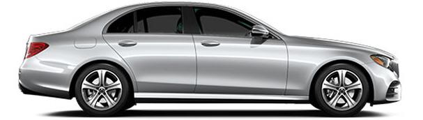
Introducing TrueCashOffer Email Style 1 Introducing TrueCashOffer Email Style 2 New Car Lead Email John Doe Dealership Name Store Address john.doe@dealership.com Dear Jane, Thank you for your interest in selling or trading in your vehicle. You’re one step away from getting your check or getting in a new car. One TrueCashOffer is simple and transparent. When you arrive at our store, we will use your TrueCashOffer to confirm your vehicle’s condition with you side-byside. It’s quick and easy. As a TrueCar Certified Dealer, we are here to server you. Please contact us at your earliest convenience to set up an appointment. Sincerely, Bring in Your Call Us Now 012.345.6789 John Doe Dealership Name Store Address john.doe@dealership.com Dear Jane, Thank you for your interest in selling or trading in your vehicle. You’re one step away from getting your check or getting in a new car. One TrueCashOffer is simple and transparent. When you arrive at our store, we will use your TrueCashOffer to confirm your vehicle’s condition with you side-byside. It’s quick and easy. As a TrueCar Certified Dealer, we are here to server you. Please contact us at your earliest convenience to set up an appointment. Sincerely, Bring in Your 300 px 40 px 40 px 40 px 40 px 20 px 20 px Call Us Now 012.345.6789 Confidentiality Notice: This email transmission is intended only for use by the intended recipient even if addressed incorrectly. Please delete from your files you are not the intended recipient. You received this email because you submitted your contact information to requesting pricing information on a vehicle. All of the pricing information above is proveide you by licensed motor vehicle dealer. The TruePrice is an offer, personal to you, and represents the sum of the Subtotale Before Dealer Fees Accessories and the Total Dealer Fees and Accessories. Each Certified Dealer sets and controls its own pricing. TrueCar does not set vehicle pricing and not responsible for errors in the pricing information communicated to you by Certified Deale through a TrueCar-powered platform. The TruePrice excludes appicable tax, title, licensing, other state and governmental charges and/or fees may be added to the sale price or the captialized cost. 2019 Mercedes-Benz E-Class E 300 Sedan 4MATIC VIN: 457612GFUDS7993 Your : $50,809 Expires 03/10/19 Issued to Michael View Our Offers View Offers Want More Inventory? You can now get upfront price offers on more of our inventory that matches you preferences. MSRP Breakdown Base MSRP $30,000 Factory Installed Options + $3,000 Freight Delivery Charge + $300 OEM Savings - $200 Total MSRP $33,300 Savings Certified Dealer MSRP Discount - $5,000 Additional Tower Discount - $100 Guaranteed Savings - $1,000 Expires 03/10/19 Additional Savings - $500 Expires 04/22/10 Total Savings - $6,600 Subtotal Before Dealer Fees & Accessories $40,000 Dealer Fees & Accessories Dealer Documentation Preparation Charge $599 Total Dealer Fees & Accessories $599 $50,809 Hi Michael, Thank you for your interest. We are currently looking for the right vehicle for you. Here’s my contact info, talk to you soon! John Doe Dealership Name Store Address john.doe@dealership.com 120 Broadway, Santa Monica, CA, 90401 TruePrice Breakdown
Email
Radikal
Car Model Image
Logo on White Background
Image on Top
88
*When marketing emails don't have Radikal available, please use
Car Model Image
Marketing Email Examples Arial Introducing TrueCashOffer Email Style 1 Introducing TrueCashOffer Email Style 2 New Car Lead Email John Doe Dealership Name Store Address john.doe@dealership.com Dear Jane, Thank you for your interest in selling or trading in your vehicle. You’re one step away from getting your check or getting in new car. One TrueCashOffer is simple and transparent. When you arrive at our store, we will use your TrueCashOffer to confirm your vehicle’s condition with you sideby-side. It’s quick and easy. As a TrueCar Certified Dealer, we are here to server you. Please contact us at your earliest convenience to set up an appointment. Sincerely, Bring in Your Call Us Now 012.345.6789 Black Logo on White Background Image on Top White Logo on Black Background Image on Bottom 300 px 40 px 40 px 40 px 40 px 20 px 20 px Call Us Now 012.345.6789 John Doe Dealership Name Store Address john.doe@dealership.com Dear Jane, Thank you for your interest in selling or trading in your vehicle. You’re one step away from getting your check or getting in new car. One TrueCashOffer is simple and transparent. When you arrive at our store, we will use your TrueCashOffer to confirm your vehicle’s condition with you sideby-side. It’s quick and easy. As a TrueCar Certified Dealer, we are here to server you. Please contact us at your earliest convenience to set up an appointment. Sincerely, Bring in Your Confidentiality Notice: This email transmission is intended only for use by the intended recipient even if addressed incorrectly. Please delete from your files you are not the intended recipient. You received this email because you submitted your contact information to requesting pricing information on a vehicle. All of the pricing information above is proveide you by licensed motor vehicle dealer. The TruePrice is an offer, personal to you, and represents the sum of the Subtotale Before Dealer Fees Accessories and the Total Dealer Fees and Accessories. Each Certified Dealer sets and controls its own pricing. TrueCar does not set vehicle pricing and not responsible for errors in the pricing information communicated to you by Certified Deale through a TrueCar-powered platform. The TruePrice excludes appicable tax, title, licensing, other state and governmental charges and/or fees may be added to the sale price or the captialized cost. 2019 Mercedes-Benz E-Class E 300 Sedan 4MATIC VIN: 457612GFUDS7993 View Our Offers View Offers Want More Inventory? You can now get upfront price offers on more of our inventory that matches you preferences. MSRP Breakdown Base MSRP $30,000 Factory Installed Options $3,000 Freight Delivery Charge + $300 OEM Savings - $200 Total MSRP $33,300 Savings Certified Dealer MSRP Discount - $5,000 Additional Tower Discount - $100 Guaranteed Savings - $1,000 Expires 03/10/19 Additional Savings - $500 Expires 04/22/10 Total Savings - $6,600 Subtotal Before Dealer Fees & Accessories $40,000 Dealer Fees & Accessories Dealer Documentation Preparation Charge $599 Total Dealer Fees & Accessories $599 $50,809 Hi Michael, Thank you for your interest. We are currently looking for the right vehicle for you. Here’s my contact info, talk to you soon! John Doe Dealership Name Store Address john.doe@dealership.com 120 Broadway, Santa Monica, CA, 90401 Your : $50,809 Expires 03/10/19 Issued to Michael
TruePrice Breakdown
89
Arial.
Web
It is important to maintain this type structure. This allows for clarity, consistency, and a strong hierarchy for all communications. Banner sizes and font sizes could vary depending on the specifications of the ad's placement.

Banners Digital Example 1
Main Messaging on Photographic Background Radikal Bold | Color: White
White Logo on Black Background CTA Button in UX Blue
Example 2
Main Messaging Radikal Light | Color: White
90 TrueCar Brand Identity Guidelines Dealer-Facing Materials
White Logo on Black Background CTA Button in UX Blue
Photography 08.
Our photography is always uplifting and honest, visually supporting our tagline: Car buying shaped to your life.
91 Brand
Guidelines
Identity
Photography Overview
Composition
Clean and graphic with a strong use of negative space.
Color Must compliment and relate directly to the TrueCar primary color palette. A pop of brand color can bring focus to a part of an image. Supporting colors must be neutral as to not compete with the brand color.
Lighting Natural and even with crisp focused imagery. Very minimal blur, if needed.
Tone People Places
Must support the tone and attributes of TrueCar, including the brand tagline: Car buying shaped to your life.
Tell a story and add character and meaning to a photograph.
Must feel as candid and natural as possible, and radiate confident optimism. 92 TrueCar Brand Identity Guidelines Photography
Cars: Responsive Classic Views with People

Simple and graphic background compositions put focus on the car and the person interacting in and next to the car, bringing a level of humanity and approachability. Strong use of negative space is essential.
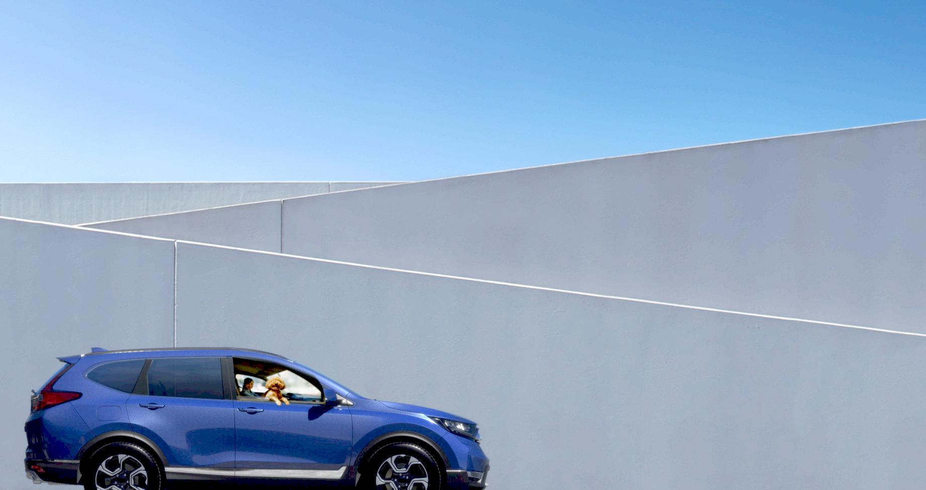
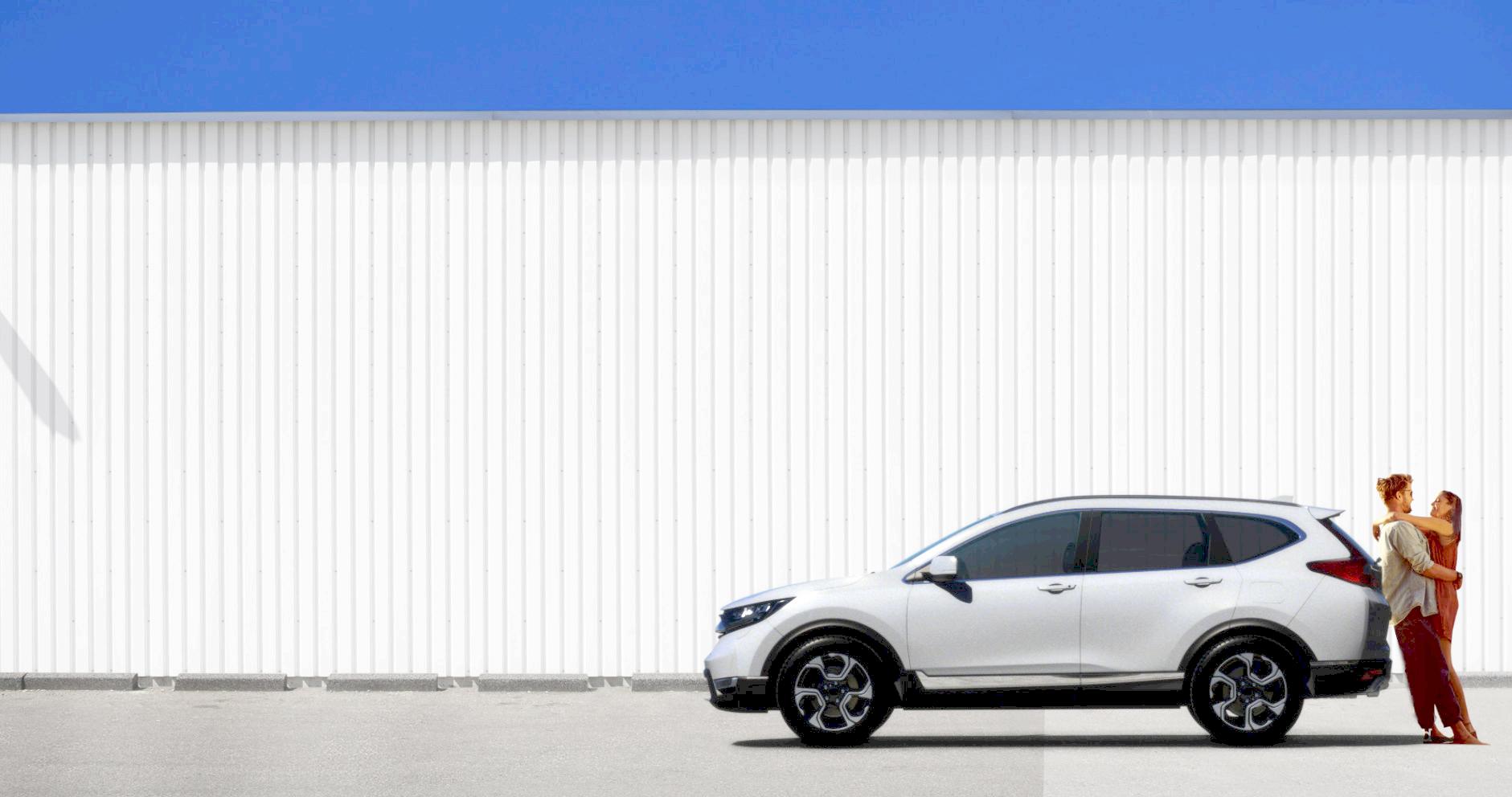
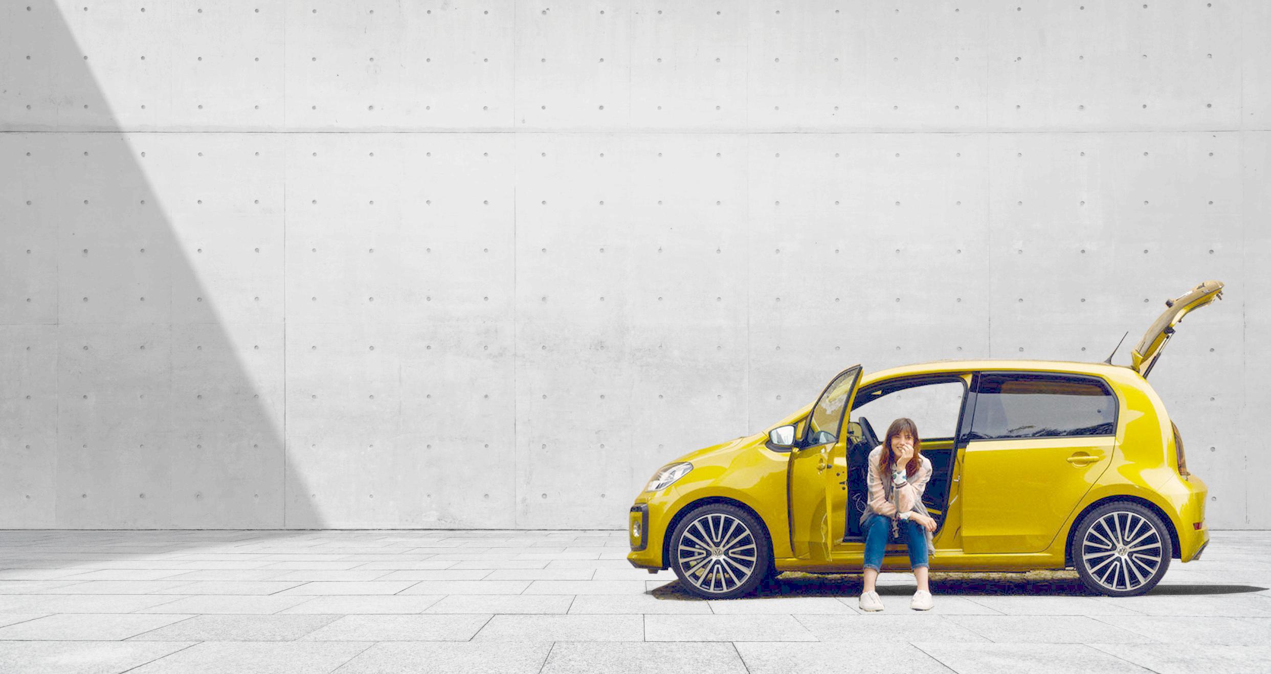
Where to Use
• Primarily on the product for optimal legibility — Responsive Website
• Social Media • Blog
93 TrueCar Brand Identity Guidelines Photography
Cars: Graphic Crops
Close-up crops of cars bring a graphic and colorful way of looking at cars. These views can be used to express their unique characters, the endless choices of cars and personifies the diversity of the people who use TrueCar.
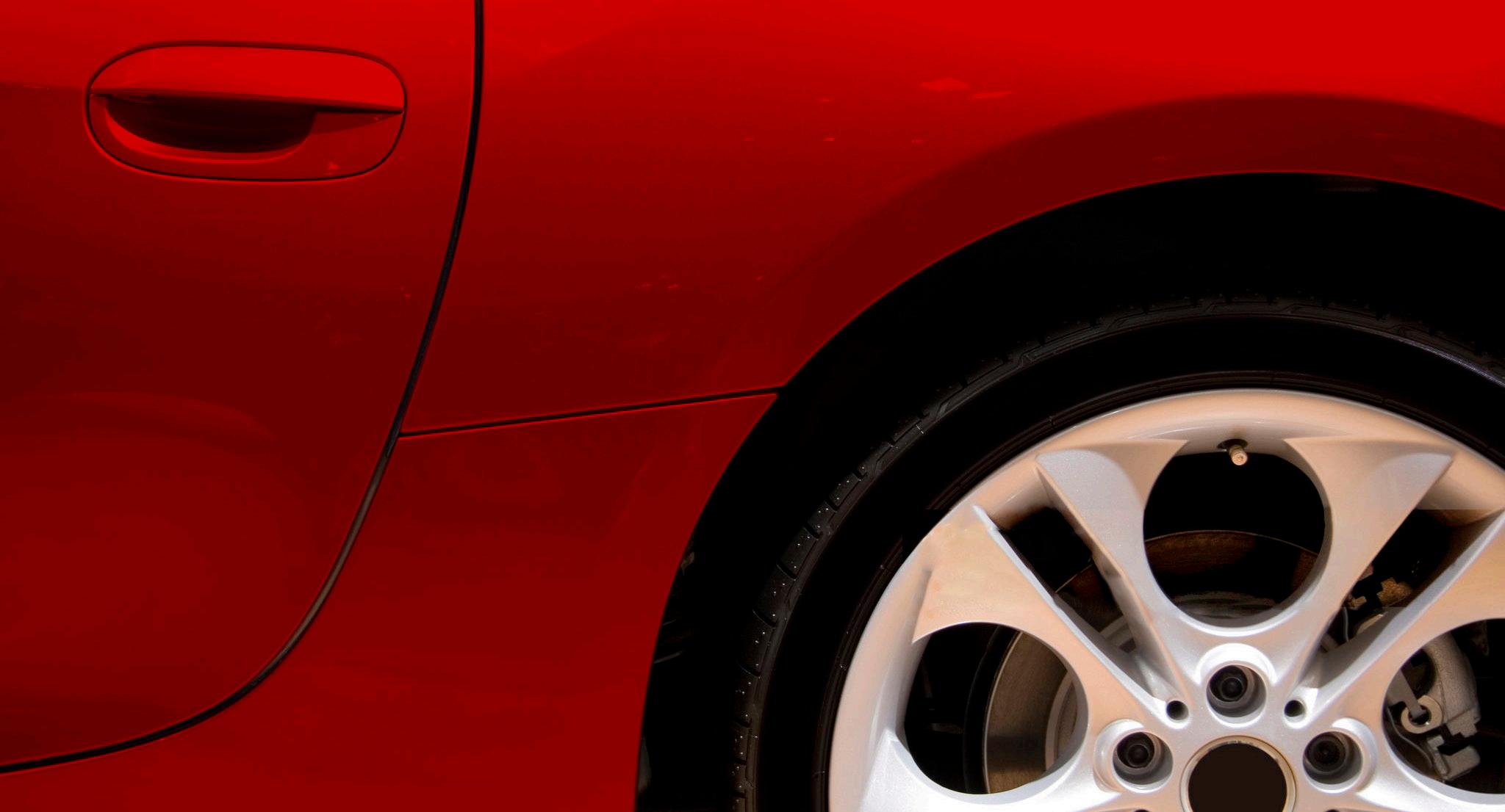
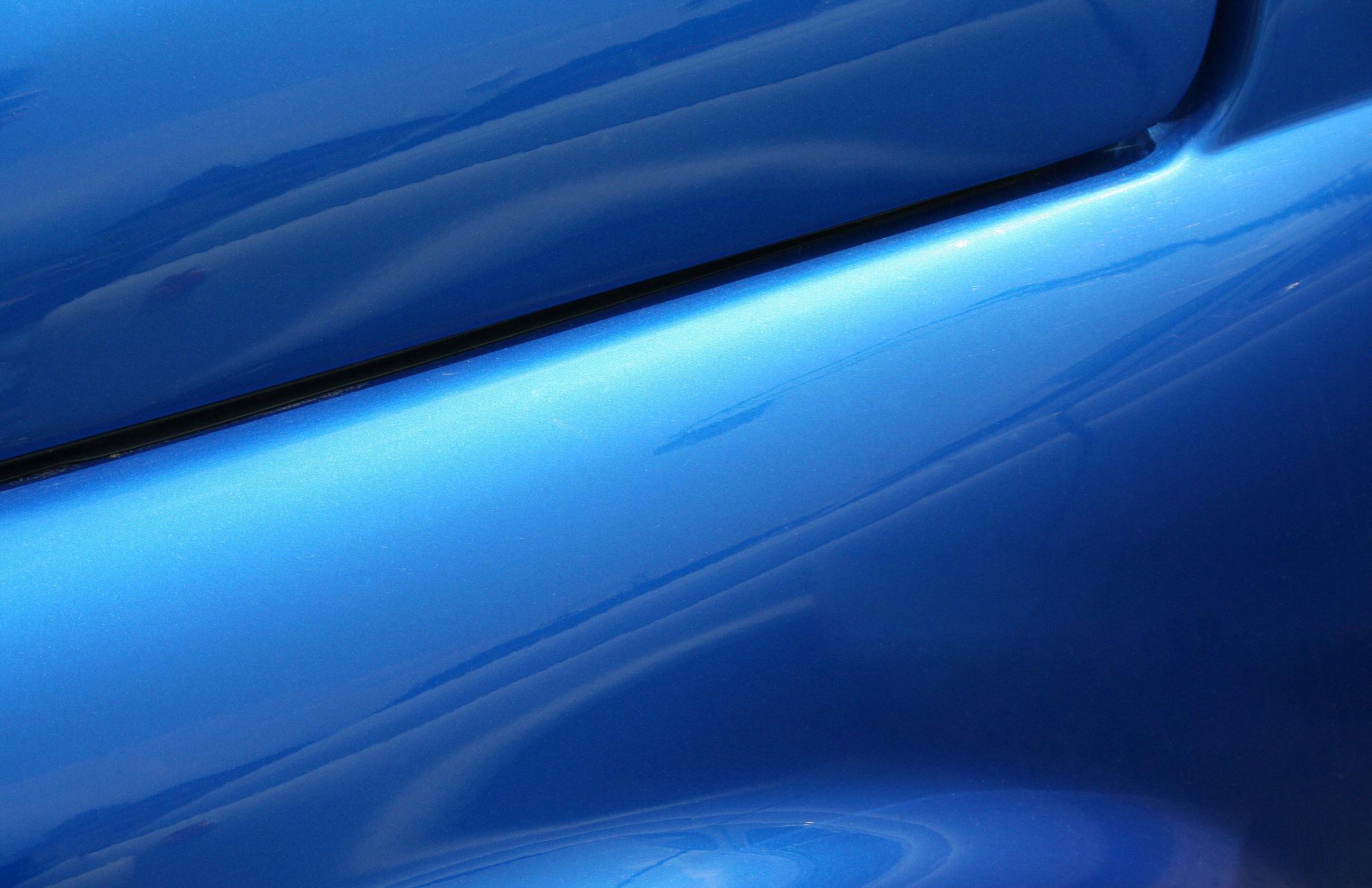
Where to Use
PowerPoint Presentations
•
94 TrueCar Brand Identity Guidelines Photography
Cars: The Places They Take Us
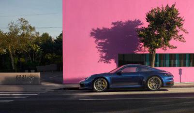
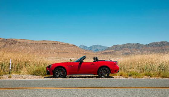
The places we go in our cars is personal and memorable. Specific locations bring life and meaning to the experience of owning a car. Cars should be shown in profile or frontally with a dynamic use of negative space.
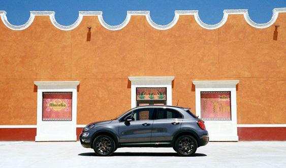
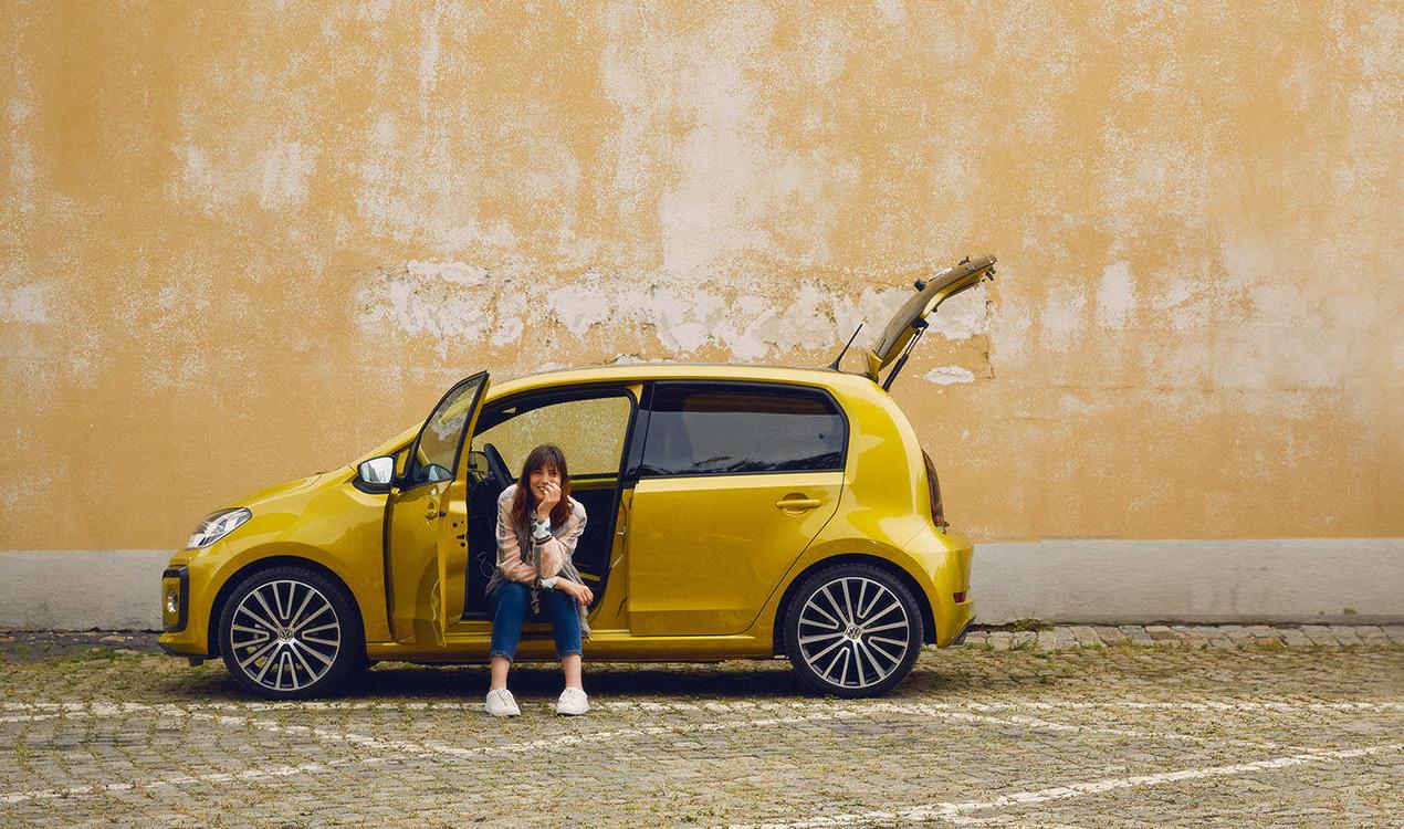
Where to Use
• On product to add a personalization to the location of the user. • Social Media
Blog
•
95 TrueCar Brand Identity Guidelines Photography
People: Experiences & Emotions
TrueCar is about people as much as it is about cars. People bring life and positive emotion to cars. Human connections and life's unique moments brought to us by cars defines people-focused photography.
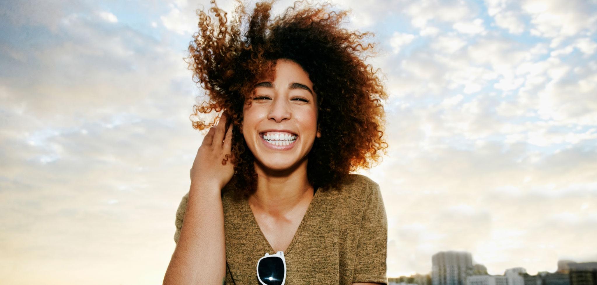
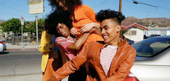
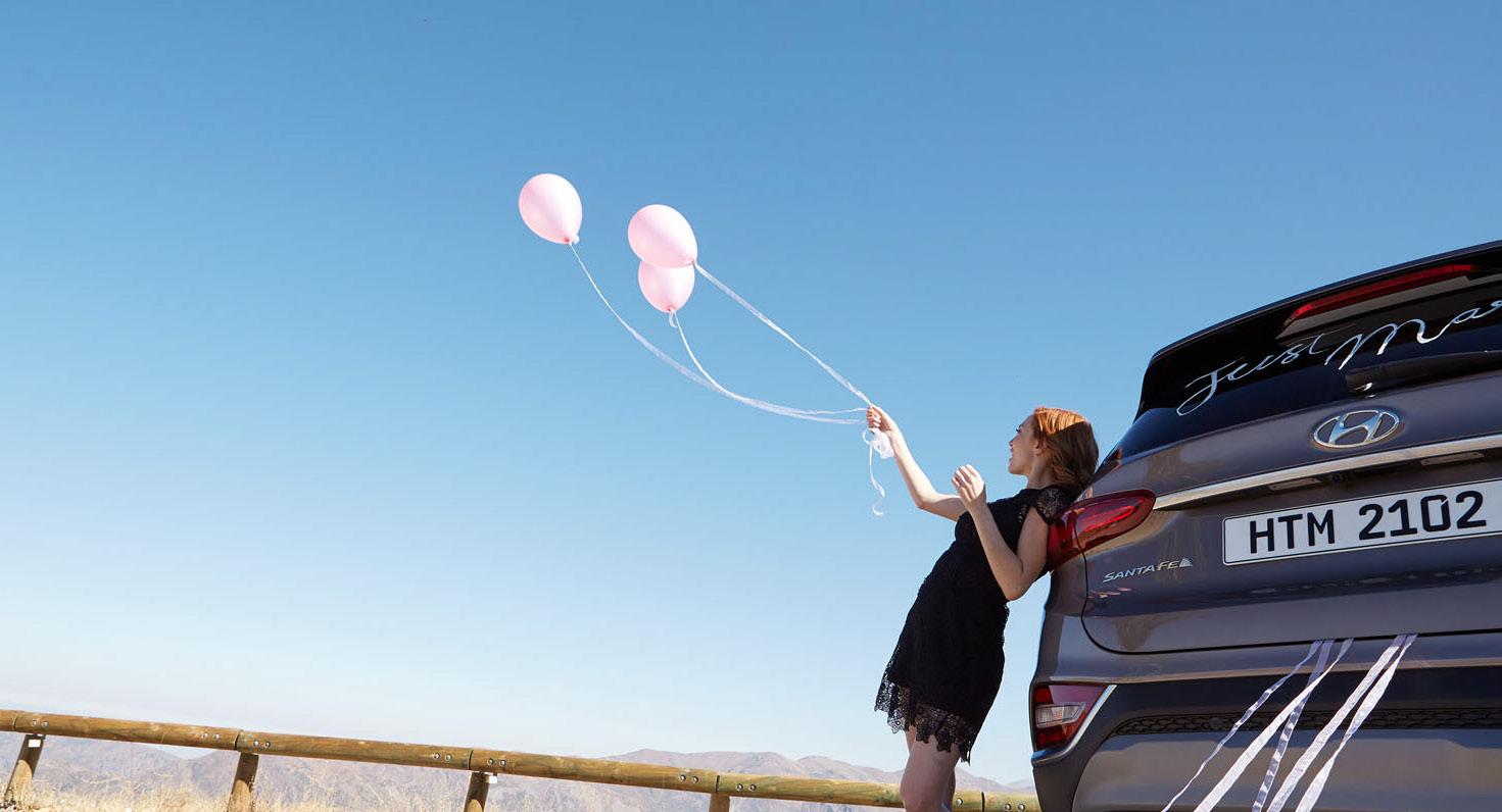

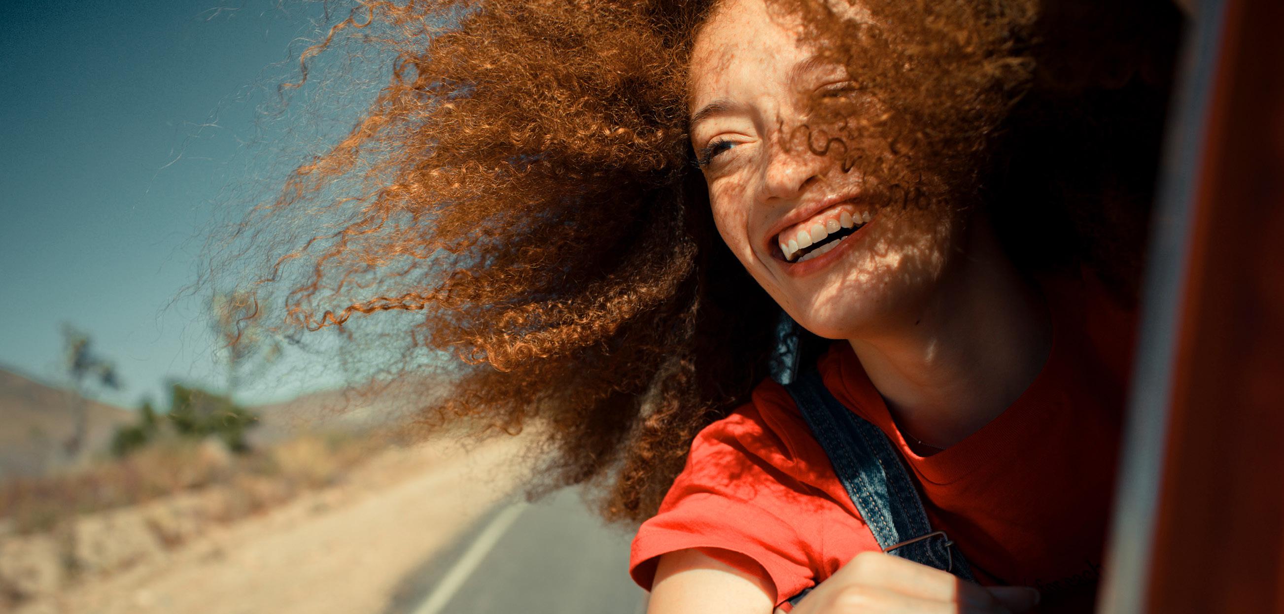
Where to Use
Campaigns
Product
Social Media
Blog

•
•
•
•
96 TrueCar Brand Identity Guidelines Photography
People with Devices
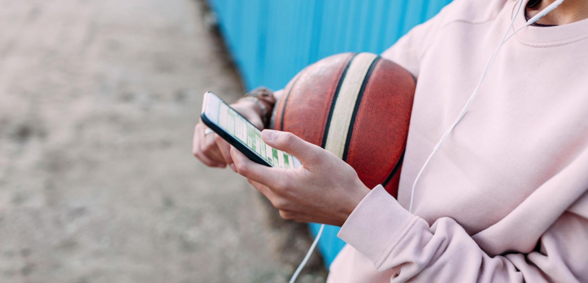
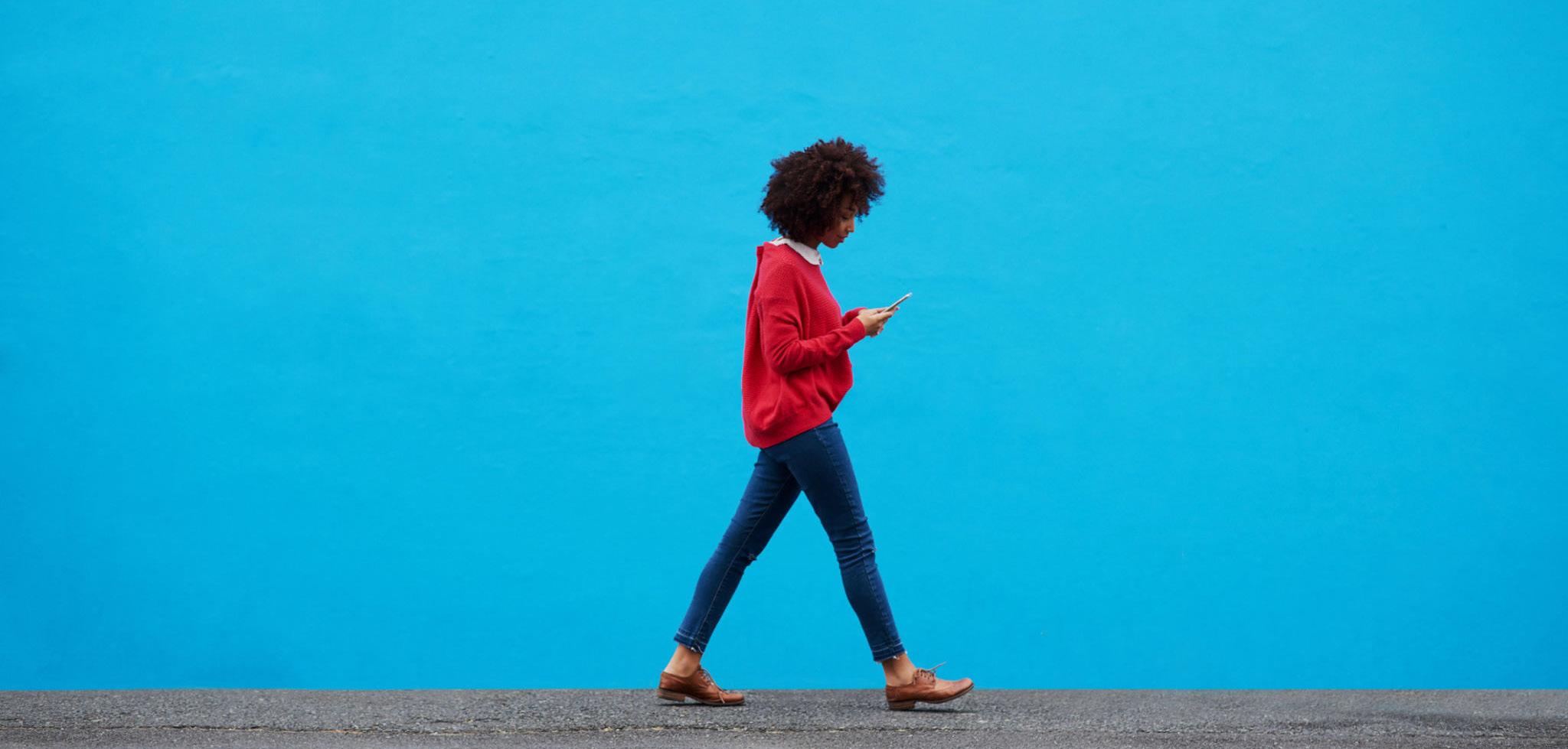

Imagery should always feel natural and approachable.

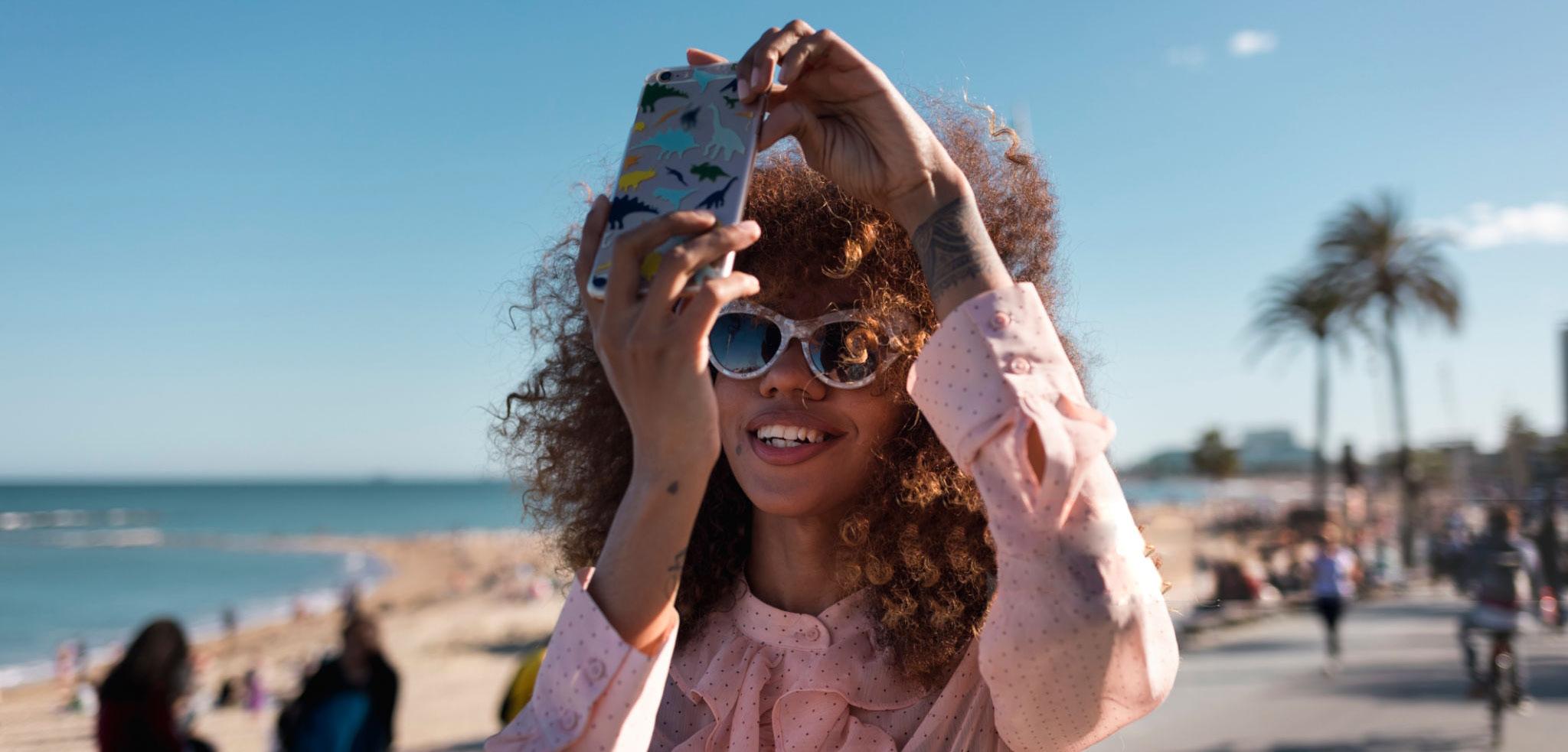
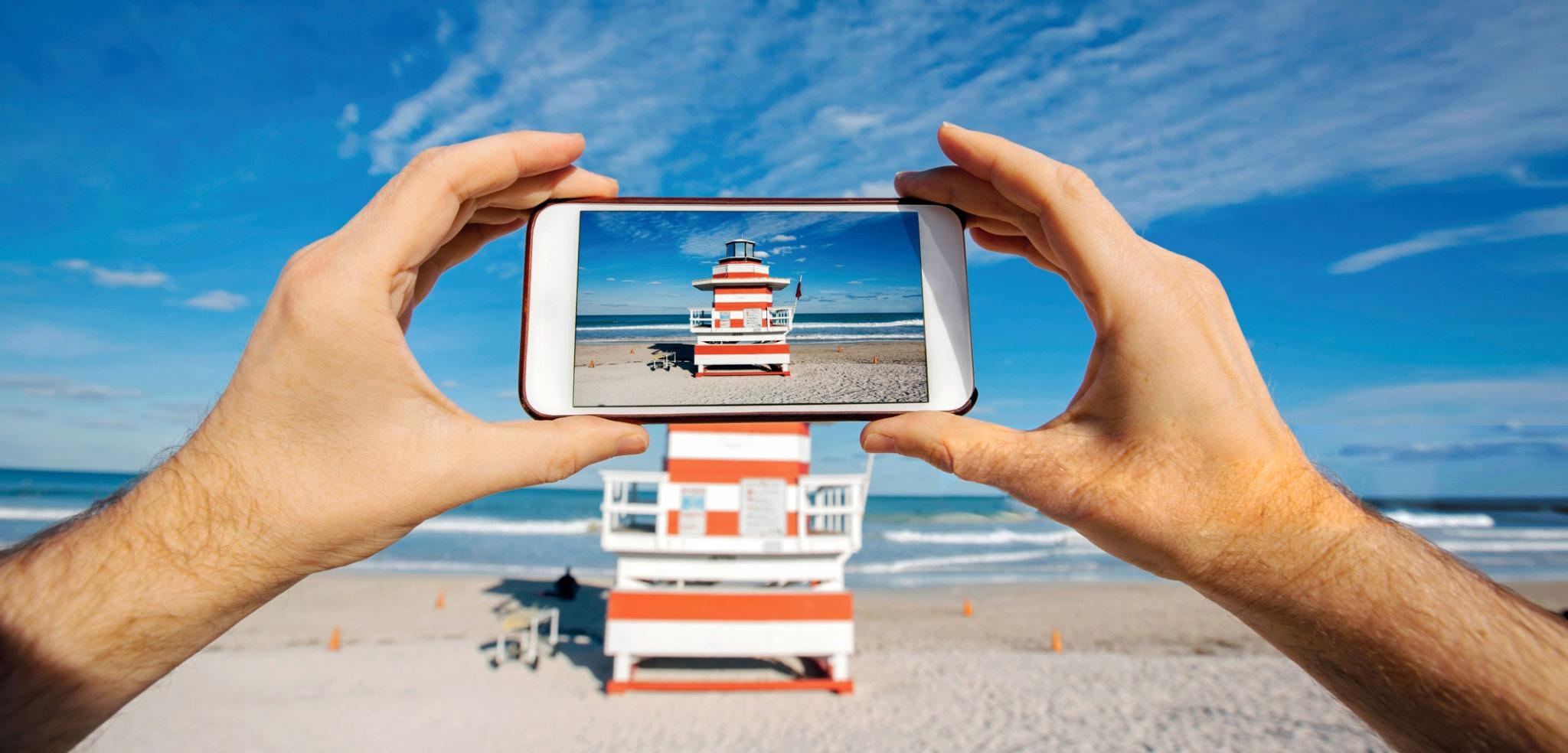
Where to Use
• Internal Collateral • PowerPoint Presentations
97 TrueCar Brand Identity Guidelines Photography
Dealer Photography
Dealer-facing photography has more of a professional tone. The interaction between people should always feel candid and positive. The dealership and cars should frame the people. Compositions should be clean and graphic.
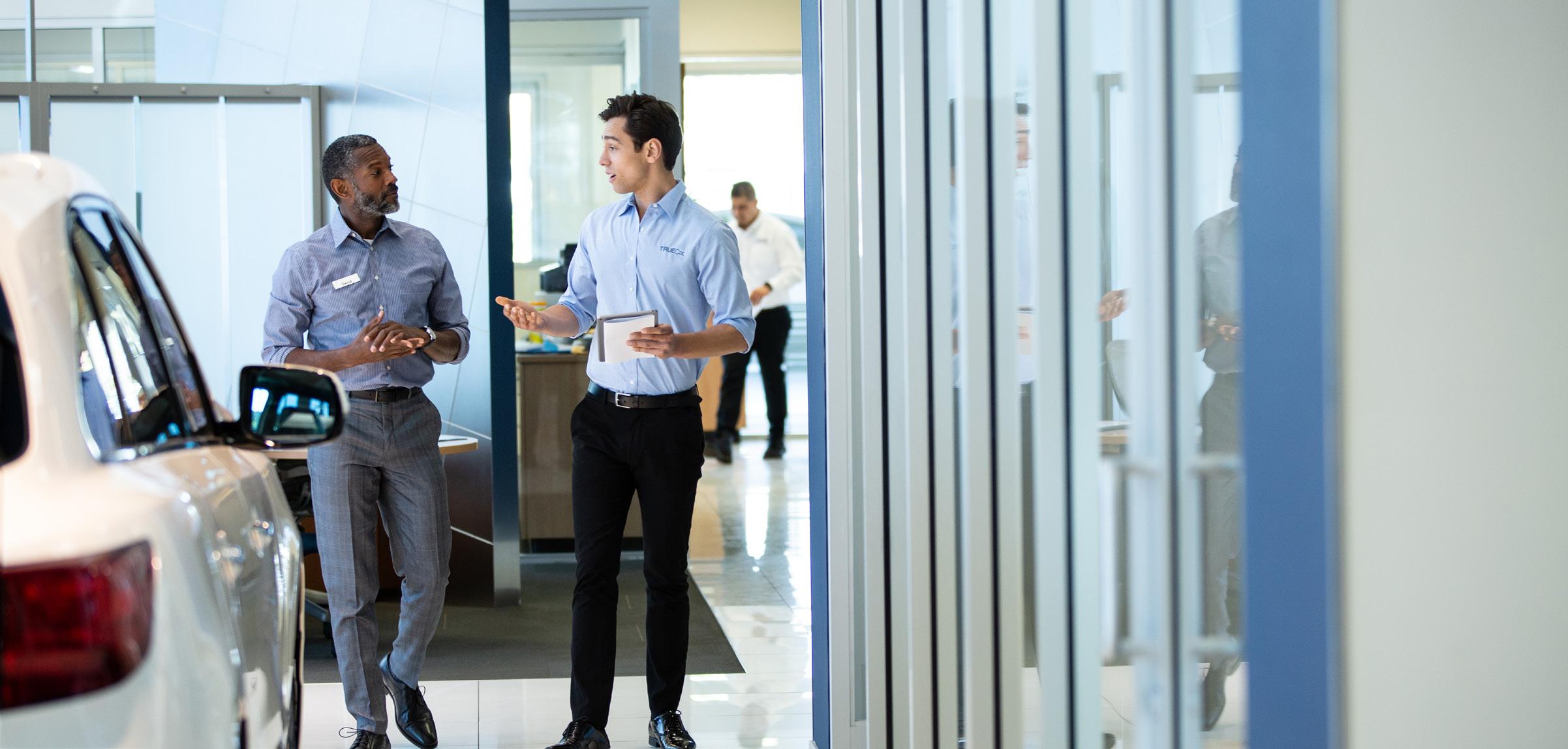
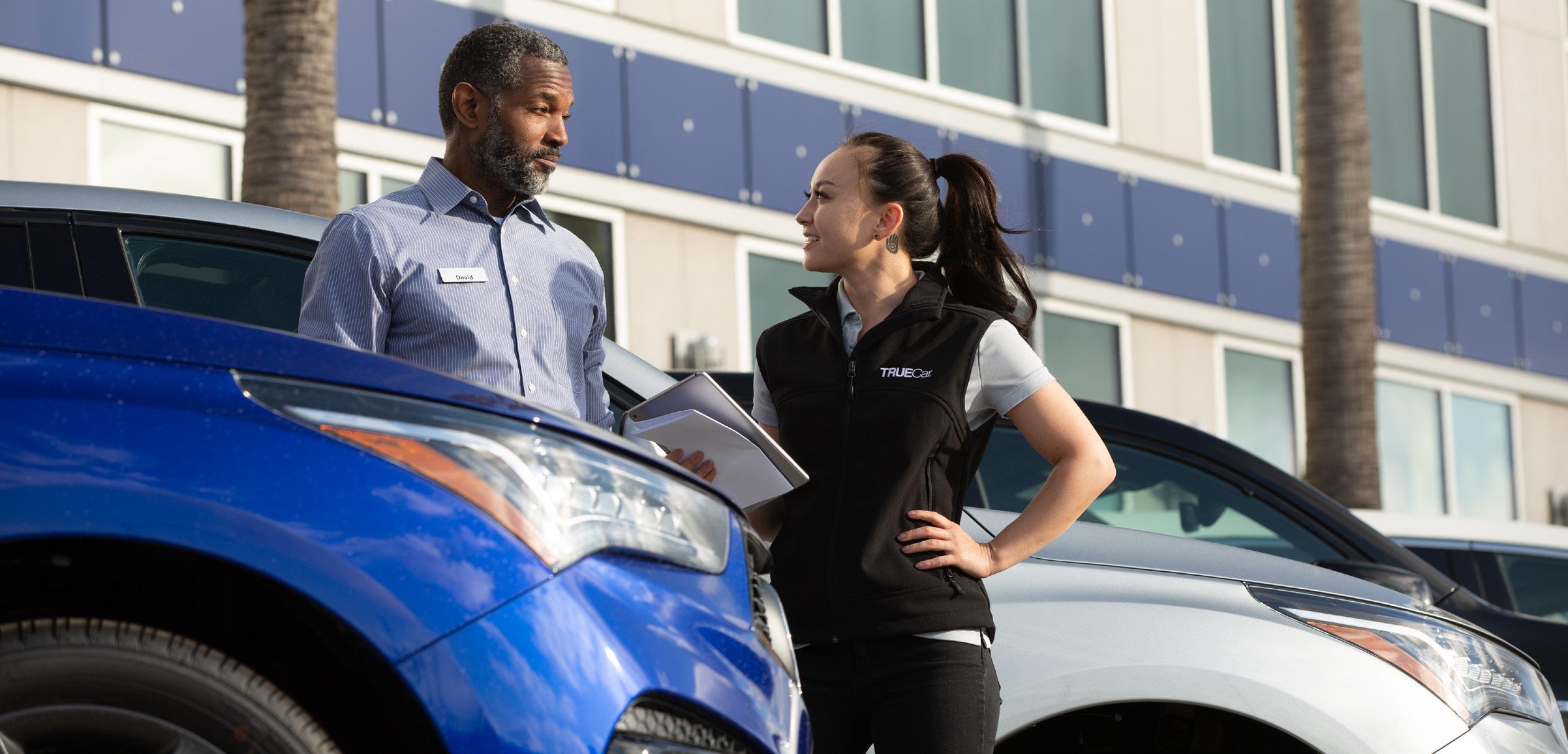
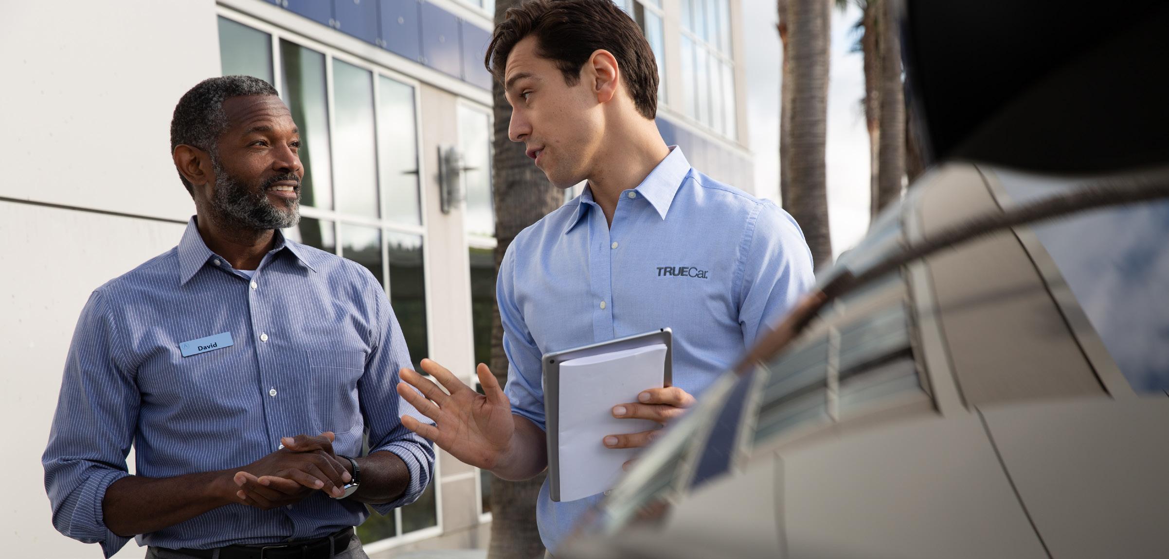
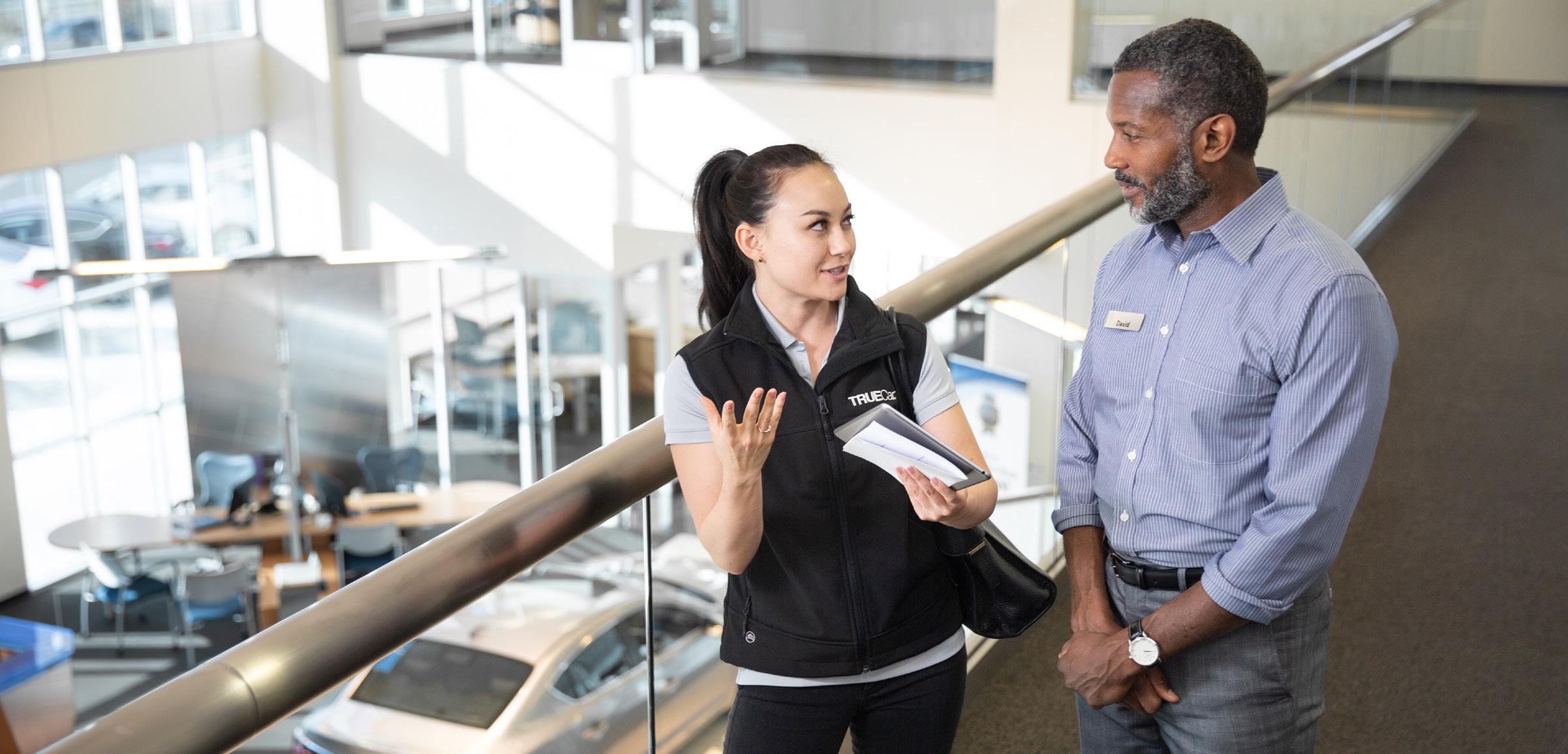
Where to Use
Dealer-Facing Collateral
•
98 TrueCar Brand Identity Guidelines Photography
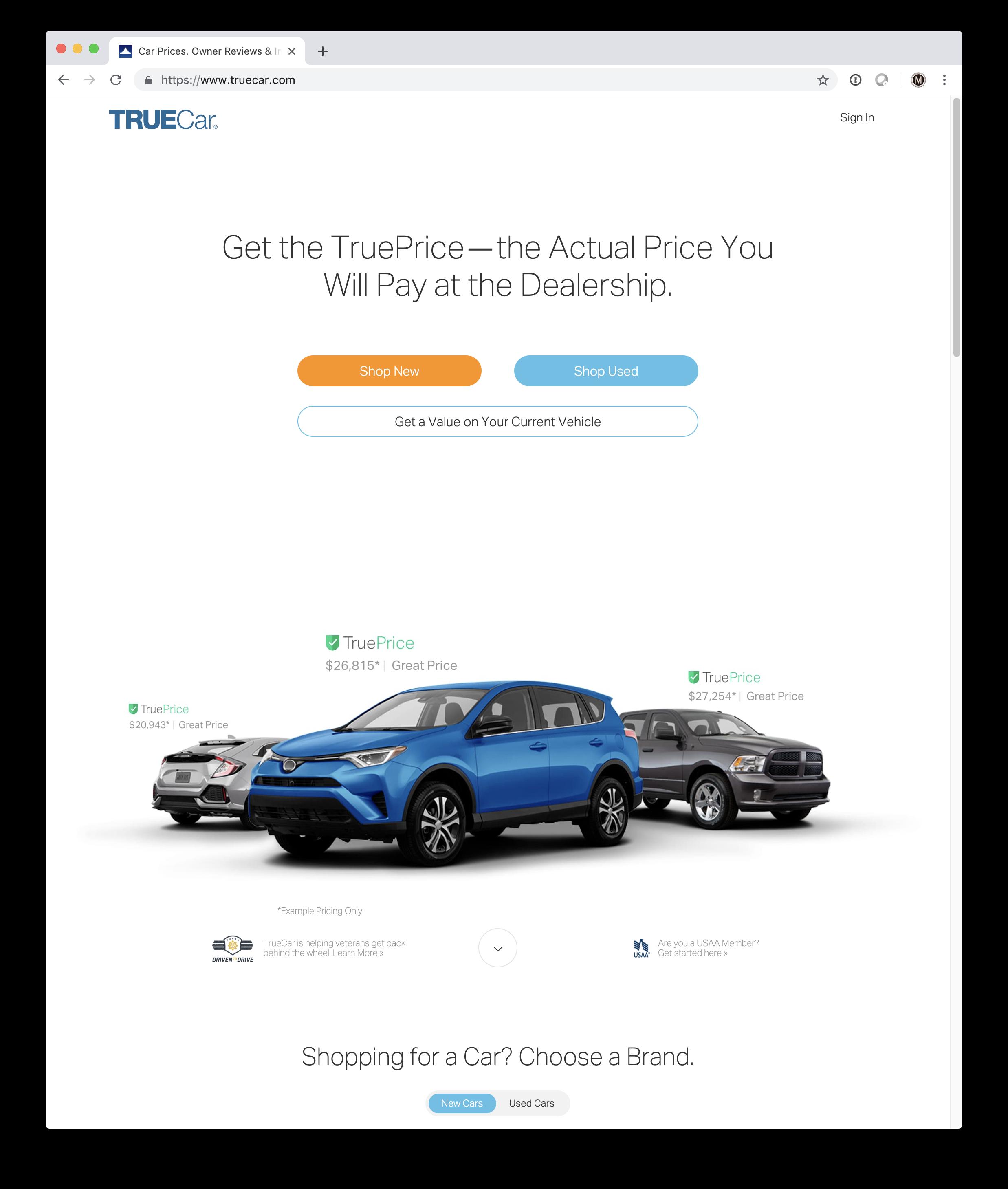
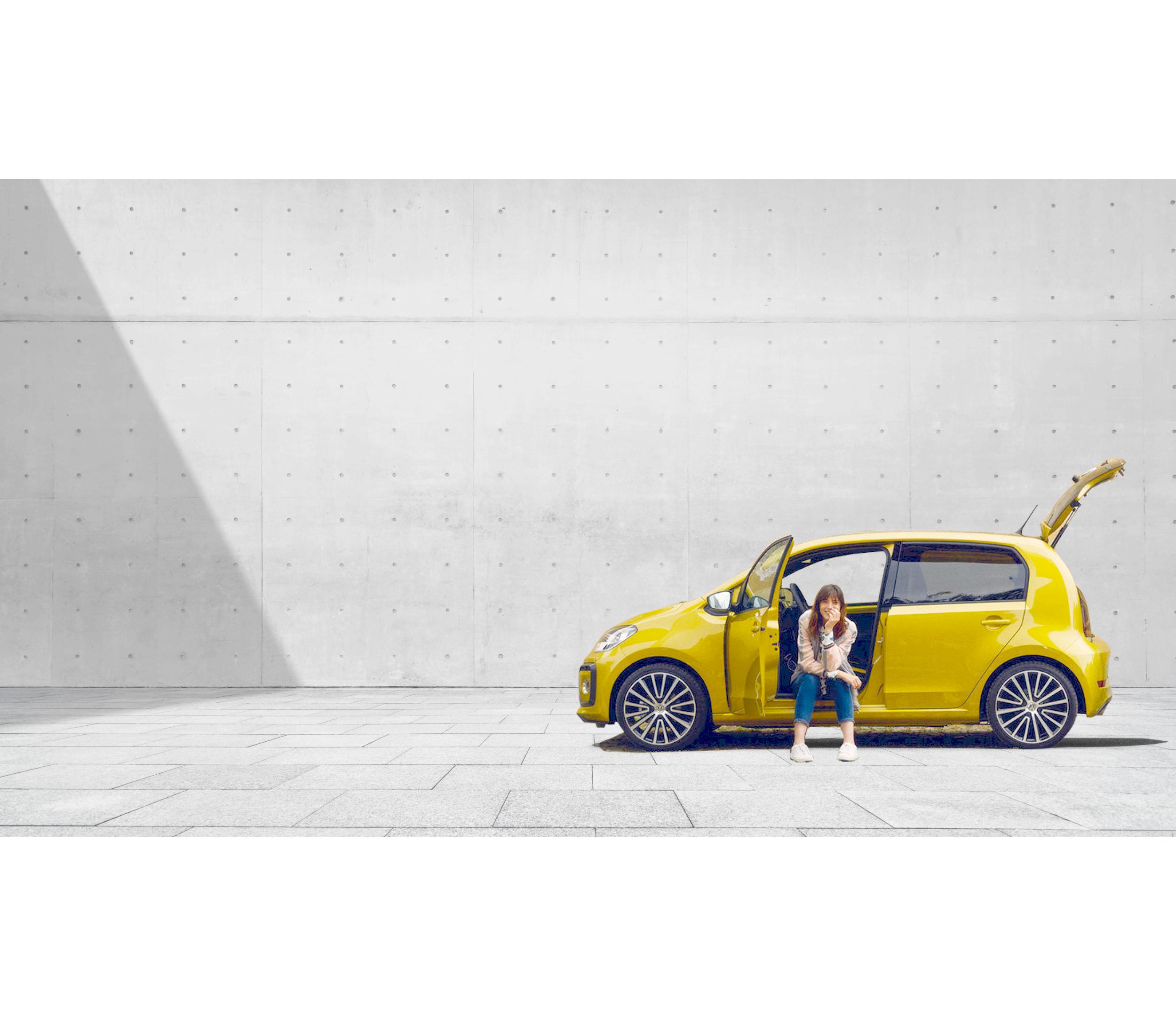
$28,815* | Great Price Shop New New Cars Used Cars Photography Applications Website Find it. Buy it. Drive it. Purchase your next car online with TrueCar+ Shop New Shop Used https://www.truecar.com/plus/ New Used Research Sell Your Car Sign Up 99
Photography Applications Social Media Feed
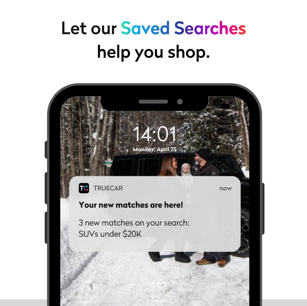
Sometimes all you need is a good friend and a full tank of gas.
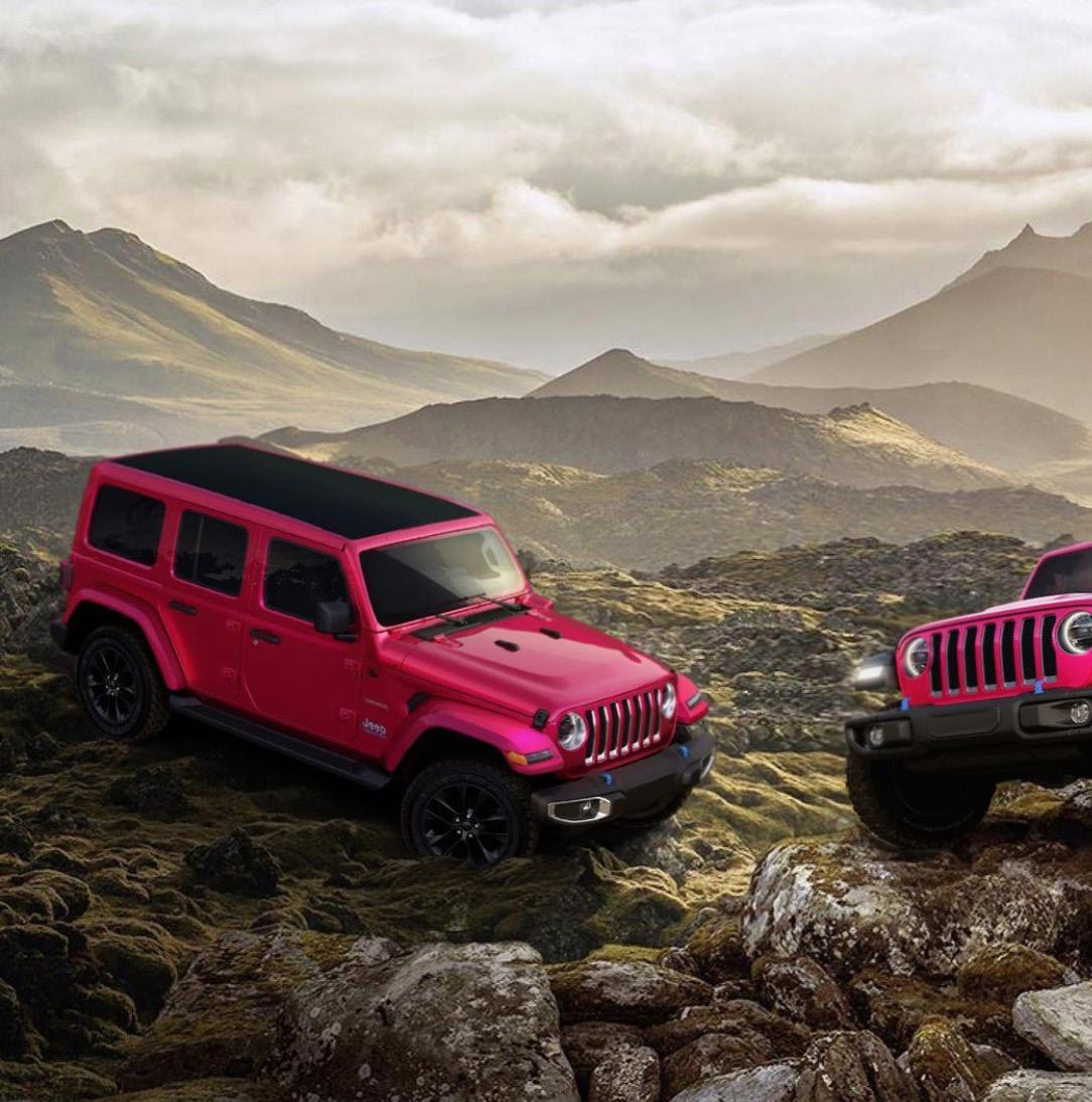
"Okay - can we out the goat in the driver's seat?"
- Overheard at the LA Auto Show
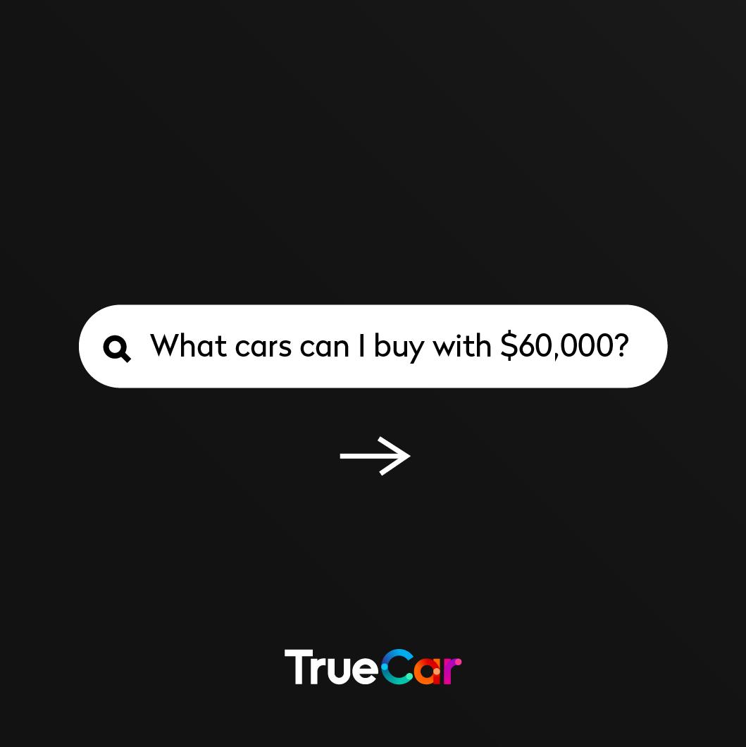
100
Contact 09. For questions and approvals please reach out to brandmarketing@truecar.com 101 Brand Identity Guidelines
