HARBOUR HUES
NEW HUES IN 2024
EXPRESS YOURSELF

COLLECTORS
ISSUE 1 - AUTUMN 2024
FIRST EDITION
COLOUR LOVERS QUARTLERY - FOR ART
AND CREATIVES
COLOURWAYS


GET CREATIVE AUTUMN EDITION CONTENTS www.kristineballard.com CAPTURING THE HEARTBEAT OF A CITY POP UP SHOW & ART WORKSHOP ART CLASSES & WORKSHOPS PEACH FUZZ 2024 COLOUR OF THE YEAR ART UP ON RETREAT THIS AUTUMN BALLARD’S @ BUNGENDORE COLOURWAYS is a Ballard production © 2024 For any enquiries contact Kristine Ballard. Email kballard@kristineballard.com Ph 0416 182 046 PG 2 PG 8 PG 12 PG 4 PG 10 BK PG

Welcome to the first edition of ‘Colourways’ my brand new quarterly publication to keep you updated with all things arty and colourful.

THE YEAR FOR KINDNESS WITH COLOUR 20 24 —


It was time I combined my design skills and love of art and painting. This is the place where I take you for an inside peak at my own inspirations and process, and you can be my travel buddy on my adventures of colour.
It’s the place where I celebrate all things creative and colourful. I’ll let you in on upcoming art shows and exhibitions. You’ll get to see my own art practice and new artworks in the making.
For the creators you’ll get an update on all the workshops and retreats on offer. My aim is help you find ways to make your unique personality shine and of course, make your life as colourful and art filled as you dream it to be.
I meet many people who admit they would love to have a more creative and colourful life, they just don’t know how to start.
Well I hear you, and I see you! I am the first to admit that life can catch you up in its swings and roundabouts, that sometimes you just can’t muster up that colour and energy yourself. That finding your ‘bright’ can feel so far away you, you just admit defeat and surrender to the beige!!!
But I’m listening! I am a Ballard that is determined to reignite that radiance through art and colour.
I claim that 2024 should be a year for kindness (to others and yourself) and colour! I want to inspire and entertain you with the many benefits art and colour can add to your life.
So here it is… the first edition of Colourways, where you can escape the greyness on my rainbow train. I have a seat reserved just for you!
I admit it may be a bit of a Gingernut Express at times, but I’ll try my darnest to keep it colourful! Always with the intention of offering you a brighter, lighter and more expressive perspective on the other side.
In this edition we explore some sunset colours and the colour predictions for 2024. You can discover new places to get arty and find some artistic ways you can boost your own colour choices and self expression.
So grab your ticket and come travel with me as we travel down the road of colour and creativity. Let’s keep it ‘Bright Beyond Beige’.
Hitting the new year with broad strokes, your fellow colour lover,
Kristine Ballard

COLOURWAYS - ISSUE 1 - PAGE 1
CAPTURING THE HEARTBEAT OF A CITY IN
SUNSET RETURNS


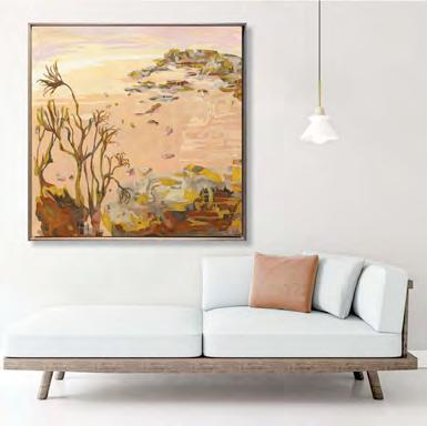
As the summer heat slips into the cooler days of Autumn I say goodbye to those saturated tones of a summer sunset. I love working with rich vibrant colours and this piece ‘Sunset Returns’ was inspired by the gorgeous glow of a steamy Sydney Summer.
Milling around the harbour in summer is one of my favourite things to do but it is that dusk light that I find the most magical.
Working with rich reds and pinks is a challenge but the rewards are great. Layering those rosy hues helps the surface glow and emulate that momentary space between day and night. It’s that time the city shows its heart and glows from within. When the light is just right and everything radiates as the sun sinks into the horizon.
I spend a lot of time looking into the harbour from its edges. There is something about the water and city life that I find captivating and want to translate in paint. This artwork was inspired by that delightful view from Lavender Bay near Wendy Whiteley’s magnificent garden.
There is something powerful here. Brett and Wendy Whiteley felt it. Perhaps it is the presence of both nature and human habitation? That this is a place where the union is
a positive one? We feel privileged to be here and it makes us feel motivated to take care of it for the future. Sydney’s red carpet moment is at sunset. Being able to witness the city under this light can take your breath away. The beauty is that this is available to everyone, not just reserved for the harbourside penthouses. You can still access the view by sitting on a park bench in a public park! This is far more valuable than any financial returns. Watching the sunset over the harbour is sure to enrich your body mind and soul.
One of the bonuses about creating this painting is that I got to relive that feeling every time I picked up a my brush and added another layer to it.
I’m super proud of this piece and it makes me feel so lucky to say Sydney is my home every time I look at it.
GREAT NEWS! This piece was selected as a finalist in the SOHO ART PRIZE on show at the Soho Studio Space 2 - 15 March 2024.
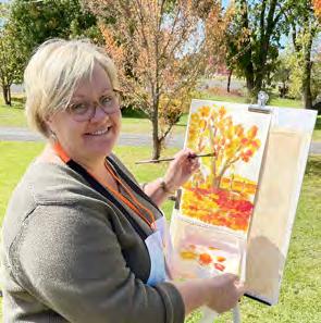
Trusty art assistant, Sketch the cat, hard at work.
Action in the Ballard Studio.
Each artwork starts with a linework drawing and bucket loads of washy colour.
Sydney’s


FINALIST SOHO ART PRIZE SIGNATURE STATEMENT ARTWORKS COLOURWAYS - ISSUE 1 - PAGE 3 6 March - 20 March 2024 148 Edgecliff Road, Woollahra, NSW 2025 www.sohostudio.space/artprize Sunset Returns Oil on Canvas 122 x 152cm
red carpet moment is at sunset Check out the artwork statement https://www.kristineballard.com/shop/original-artwork/ dreamscapes/land-of-aus/sunset-returns/

PEACH FUZZ
WHAT’S THE FUZZ ALL ABOUT?
Well into 2024 you have probably seen a lot of peachy tones taking centre stage in interiors, accesories and fashion by now. This year, the colour gods of Pantone have selected the colour PEACH FUZZ as our colour of the year.

PANTONE 13-1023
Peach Fuzz is nurturing and its cozy sensibility elicits a feeling of tactility.
It’s clean, fuzzy feeling looks youthful and modern.
If you have been around as long as me, you are probably having a few 90s flashbacks. I remember many conversations when I worked in a framing shop as to whether this light orange colour was peach or apricot? It never did get answered, and now thirty years later it seems we are circling back.
There has been a move over the last few years to more neutral and naturalistic colours. This could be interpreted as a reflection of our desire for truth and authenticity. Colours from hand made dyes, natural materials from the earth and plants are a sign of our consumer conscious times. In a world where things all seem a bit to harsh and negative, we are seeking a little warmth and
humanity and so this new ‘Peach Fuzz’ fits the bill on a lot of levels. Pantone really likes to go to town on selling their new colours up but it is always interesting to understand the decision for putting a particular colour in the spotlight.
Here’s a little of the speel from Pantone...
The colour we selected to be our Pantone Colour of the Year 2024 needed to express our desire to want to be close to those we love and the joy we get when allowing ourselves to tune into who we are and just savor a moment of quiet time alone. It needed to be a color whose warm and welcoming embrace conveyed a message of compassion and empathy.
Subtly sensual, PANTONE 13-1023 Peach Fuzz is a heartfelt peach hue bringing a feeling of kindness and tenderness, communicating a message of caring and sharing, community and collaboration. A warm and cozy shade highlighting our desire for togetherness with others or for enjoying a moment of stillness and the feeling of sanctuary this creates, PANTONE 13-1023 Peach Fuzz presents a fresh approach to a new softness.
An appealing peach hue softly nestled between pink and orange, PANTONE 13-1023 Peach Fuzz inspires belonging, recalibration, and an opportunity for nurturing, conjuring up an air of calm, offering us a space to be, feel, and heal and to flourish from.
Sensitive but sweet and airy, PANTONE 13-1023 Peach Fuzz evokes a new modernity. While centered in the human experience of enriching and nurturing the mind, body, and soul, it is also a quietly sophisticated and contemporary peach with depth whose gentle lightness is understated but impactful, bringing beauty to the digital world. Poetic and romantic, a clean peach tone with a vintage vibe, PANTONE 13-1023 Peach Fuzz reflects the past yet has been refashioned with a contemporary ambiance.
PAGE 4

Wow, that’s a lot of words for light orange isn’t it? The colour is pretty user friendly across a range of products but you might see the peachy colour used for text a little too much and it’s really hard to read on white.
In interiors you will see it used a lot with last year’s colour of the Year Viva Magenta as it sits easily with the warm palettes and combines well with warm timber tones as well as dark neutrals like charcoal, navy and deep greens.
For the painters this colour can range from pinky to orange tones. You can make the colour up with white and Cadmium or Permanent orange, add a bit of yellow oxide and white to soften the colour. Naples reddish yellow is also closer to these tones.
In printing it is made up of 25.49% magenta and 40.39% yellow. Web colour is hex #FFBE98


Who is Pantone anyway?
Before Pantone, every printing company had their own colour guide. Each company interpreted what a colour looked like differently.
In 1963, Pantone (meaning “all colours”, combining pan and tone) developed the first colour matching system. For the first time, colour consistency existed for designers, printers, ink makers, and their clients. It has become the universal language of colour.
The Pantone Matching System (PMS) is now the colour standardisation system that assists in colour matching and identification. It is comprised of 1,867 solid colours that are created by combining 13 base pigments. It’s a bit like an ingredients book for designers and manufacturers.

Pantone now supplies a range of guides for many different materials used in apparel, beauty, interiors, architectural and industrial design, encompassing over 10,000 colour standards across multiple materials including printing, textiles, plastics, pigments, and coatings. For more details check out www. pantone.com/about-pantone


COLOURWAYS - ISSUE 1 - PAGE 5
Picture Credits: Instagram/Dwayne Johnson
INTERIORS GO ALL THINGS PEACHY


PAGE 6
Above is Pantone’s ideal for how they want you to feel when you see the colour of the year! Warm and fuzzy and floating on a cloud.
HARMONISING THE HUE

I’ve been using these colours for quite a while. They are great hues for landscapes and provide great scope for neutral warm palettes. It pairs with soft yellows, deep greens, terracotta orange, woody tones and all things neutral.


Both
COLOURWAYS - ISSUE 1 - PAGE 7
Summer Prospects Oil on Canvas 122 x 122cm
Quiet Alcove Oil on Canvas 122 x 122cm
artworks pictured are available from my website www.kristineballard.com


ONE DAY POP - UP SHOW ALCHEMY 227 Malton Rd, North Epping 2121 www.gallery1111.net PAINTINGS & PRINTS BY KRISTINE BALLARD GOLDEN MOMENTS INSPIRED BY NATURE SATURDAY 18 MAY 2024 10AM - 4PM YOUR FACILITATOR Kristine Ballard is a practicing artist and arts educator. She exhibits and teaches in Australia and Sheinternationally. specialises in colour and painting.contemporary Kristine will get you excited about painting and the joy of individual growth. DO YOU LOVE COLOUR & PAINTING? Create your very own sunflower painting inspired by Van Gogh’s expressionist style. Learn how to add vibrancy and energy to your floral paintings using techniques and colour theories used by the French expressionists. You will also learn all about the different yellows and how to make them glow in your own paintings. Each participant will create a medium sized acrylic painting on canvas. NO SKILLS REQUIRED, JUST ENTHUSIASM AND A LOVE FOR COLOUR. Kristine places an emphasis an on individual interpretation and nurturing your creative growth at any level or age! WHAT’S INCLUDED • Fully guided creativity art class • Easy and fun exercises to help you enjoy ad understand the process • All materials included. Quality paints. One medium canvas. • Morning tea included. Please bring your own lunch. • One complimentary drink and a Ballard Art Card $220pp LIMITED SPACES www.kristineballard.com HELD@GALLERY11:11STUDIO&ARTSPACE For227MaltonRd,NorthEpping2121 email:bookingscallMelonyon0417433422or info@gallery1111.net orbookdirectonline@www.gallery1111.net COLOURPLAY WORKSHOPS SUNFLOWER STITCH UPFLORAL INSPIREDPAINTINGBY VAN GOGH - ACRYLIC PAINTING WITHBALLARDKRISTINE19SUNDAYMAY 2024 10AM - 4PM SUNFLOWER STITCH UP FLORAL PAINTING INSPIRED BY VAN GOGH FULL DAY ACRYLIC PAINTING WORKSHOP SUNDAY 19 MAY 10AM - 4PM $220pp All art equipment included For more info and bookings go to www.gallery1111.net/workshopbookings/sunflower-stitch-up-floral-painting-inspired-by-vangogh-acrylic-painting-with-kristine-ballard-sunday-19-may-10am-4pm or call GALLERY 11:11 direct on 0417 433 422 PAGE 8
SEE YOU AT THE FAIRS!

LOOK OUT FOR THE BALLARD ARTWORKS
AT THE GALLERY 11:11 STAND


ART MONEY AVAILABLE FOR ARTWORKS OVER $1000
COLOURWAYS - ISSUE 1 - PAGE 9
ART RETREAT
TOP UP YOUR CREATIVE INSPIRATION THIS AUTUMN


Calling all colour warriors!
Time to plan a creative getaway for Autumn!
Only ten kilometres out of Bathurst, Perthville will be a divine display of warm Autumn tones, just waiting to excite the painters palette. Set in the grounds of St Joseph’s Heritage Convent and Conference Centre, you’ll have four glorious days to translate the seasonal hues to canvas.
Every day will be an adventure in colour and creativity. Discover new ways to translate your experience into expressive acrylic artworks. There will be lots of fun with colour and paint. This retreat is welcoming and supportive for all levels of painters. You’ll get to tackle some outdoor painting and create in the spacious air conditioned studio. This getaway is all about kick starting your
creativity onsite. You’ll get some great tips on how to explore ideas, translate your inspirations, and maintain that motivation.
No skill level required, just enthusiasm, an open mindset, and a love for colour! The focus will be on developing your colour skills in expressive and abstracted artworks with acrylic paint.
I believe everyone has the ability to be creative, often you just need the opportunity to start. Allowing yourself the space to create can be the challenge. The Perthville countryside is the perfect place to make a start.
Develop your inner ‘colour warrior’ and spend a long weekend with me going ‘Bright beyond beige!
PAGE 10


PACKAGE INCLUSIONS
• Morning and afternoon sessions of expressive and colourful art classes
• Art talks on colour
• 4 nights accommodation (single roomwith ensuite) at Vale Lodge at St Joseph’s Heritage Convent and Conference Centre in Perthville.
• All meals. Self serve buffet breakfast, morning tea, lunch pre-dinner drink and dinners. Vicky, the amazing cook can cater to your specific dietary needs.
NOT INCLUDED*
Travel and art equipment. BYO.
*Price is


For more info and bookings go to www.kristineballard.com/ art-retreat/
What’s the difference between a workshop and an art retreat?
A workshop is shorter (half or full day) and dedicated producing a finished artwork with the influence of a particular style or artist. An art retreat takes advantage of the location as inspiration and you have the luxury of more time to develop your artworks.
Personal experimentation and interpretation is encouaraged and nurtured.
RETREAT $1590* 26 - 30 APRIL
COLOURPLAY ART
COLOURWAYS - ISSUE 1 - PAGE 11
based on
with ensuite
PER PERSON CHECK OUT THE VIDEO > 5 REASONS TO RETREAT https://www.youtube.com/watch?v=0zOeNu1ie6k
single room
basis.


BOOK IN FOR TERM 2 8 WKS 7 MAY - 25 JUNE TUES MORN. 10-11.30AM www.thebrightspace.com.au BOOK IN FOR TERM 2 8 WKS 8 MAY - 26 JUNE WED EVE. 7-8.30PM www.thebrightspace.com.au BOOK IN FOR TERM 2 8 WKS 8 MAY - 26 JUNE WED AFTERNOONS www.thebrightspace.com.au PERSONALISED ART MENTORING Customised art tuition to help you develop your unique style. For more info go to www.kristineballard.com/tuition/ WANT A CUSTOMISED PROGRAM FOR YOUR ART GROUP? Email me at kballard@kristineballard.com DOWNLOAD YOUR FREE GUIDE > 5 FACTOR CHEAT SHEET EMPOWER YOUR ART AND DEFINE YOUR STYLE https://kristineballard.com/empower-your-art/ HELPING YOU GET PAINTING CANBERRA ART SOCIETY 28 - 30 SEP 2024 Contact Society for bookings ABOUT YOUR FACILITATOR Kristine Ballard is a practicing artist and experienced arts educator. She exhibits her art and teaches in Australia and internationally. She specialises in expressive contemporary painting. The originator of her Fragmatism® style, Kristine will help nurture your unique strengths and get you excited about painting and the joy of individual growth. Check out her website for samples of her work. COLOURPLAY WORKSHOPS www.kristineballard.com EXPLORE THE STYLES OF 3 FABULOUS FEMALES AUSTRALIAN PAINTERS EXPRESS YOURSELF DO YOU LOVE COLOUR & EXPRESSIVE PAINTING? These workshops are perfect for those artists wanting to enrich and extend their own painting practice with a few tips from some of Australia’s greatest artists. Three days of expressive acrylic painting inspired by the styles of three fabulous female artists Led by contemporary artist, Kristine Ballard, the focus in these workshops will be to extend your colour knowledge and learn techniques that will empower your paintings and get you excited about your process. Each day you will create a new artwork using acrylics on canvas. Each day will be inspired by a different approach to painting: SAT 28 SEP - STILL LIFE WITH MARGARET OLLEY Still life using impressionism structures and expressive compositions. Bring your own bouquet* if you like. SUN 29 SEP - INTERIORS WITH GRACE COSSINGTON- SMITH Trying on some Post Impressionism techniques to add vibrancy and energy to your work. MON 30 SEP LANDSCAPES WITH CLARICE BECKETT Creating mood with colour and style through tonalism. WORKSHOPS INSTRUCTED WITH ACRYLIC PAINTS. 10am - 4pm Equipment list will be supplied. Reference Material will be supplied. *You may bring your own bouquet to this workshop if you wish. • INSPIRED BY THE MASTERS • 3 DAYS OF EXPRESSIVE PAINTINGACRYLIC PAINTING WITH KRISTINE BALLARD 28 - 30 SEPTEMBER 2024 SAT 28 SEP OLLEY SUN SEP 29 COSSINGTONSMITH MON SEP 30 BECKETT WEDNESDAY AFTERNOONS Like to nurture your own creativity with a focus on colour. I’ve got a stack of options for you to immerse yourself in! ST GEORGE ART SOCIETY 25 MAY 2024 Contact Society for bookings EXPRESSIVE PAINTING FOLLOW MY INSTAGRAM HANDLE @paintwithkristine for images, art events and art classes PAGE 12


SATURDAY PAINTING WORKSHOPS IN THE CITY CBD GALLERY - ALL EQUIPMENT SUPPLIED $109pp BOOK ONLINE AT WWW.CBDGALLERY.COM.AU/ART-WORKSHOP
BALLARDS @ BUNGENDORE


Have you visited the gorgeous Bungendore Woodworks Gallery?
Just 40 minutes out of Canberra it’s a perfect place to stop off on the way to the ACT. This little town is an artisan’s mecca. The Bungendore Wood Works Gallery is host to fine wood work funiture and design pieces and features many original artworks.
Some extra Ballard artworks have just landed in the gallery for you to peruse!


7 days a week, 9am to 5pm 22 Malbon Street, Bungendore NSW
Australia www. bwoodworks.com.au
Open
2621,
Winter Woodland 63 x 63cm
Bluegum Bundle 63 x 63cm
Desire Tracks 122 x 152cm
