COMMUNITY MARKETPLACE PAGE 26
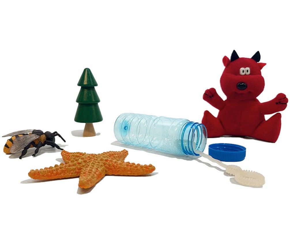
THE HIVE PAGE 2
DOGPATCH LIBRARY PAGE 12
GAIETIES 2022 + SCENIC DESIGN PAGE 32
CUBE STUDY PAGE 22
COMMUNITY MARKETPLACE PAGE 26
THE HIVE PAGE 2
DOGPATCH LIBRARY PAGE 12
GAIETIES 2022 + SCENIC DESIGN PAGE 32
CUBE STUDY PAGE 22
STANfORD, CALIfORNIA GRADUATE STUDENT HOUSING
133f - CAPSTONE STUDIO SPRING 2025
ARCHITECTS - KATIE
RESNICK, SOfIE ROUX
STRUCTURAL ENGINEERS - ANGELINA LEE, HUILAN HUANG ENVIRONMENTAL ENGINEERS - ANNA GOLDMAN, APURBA PAUDEL
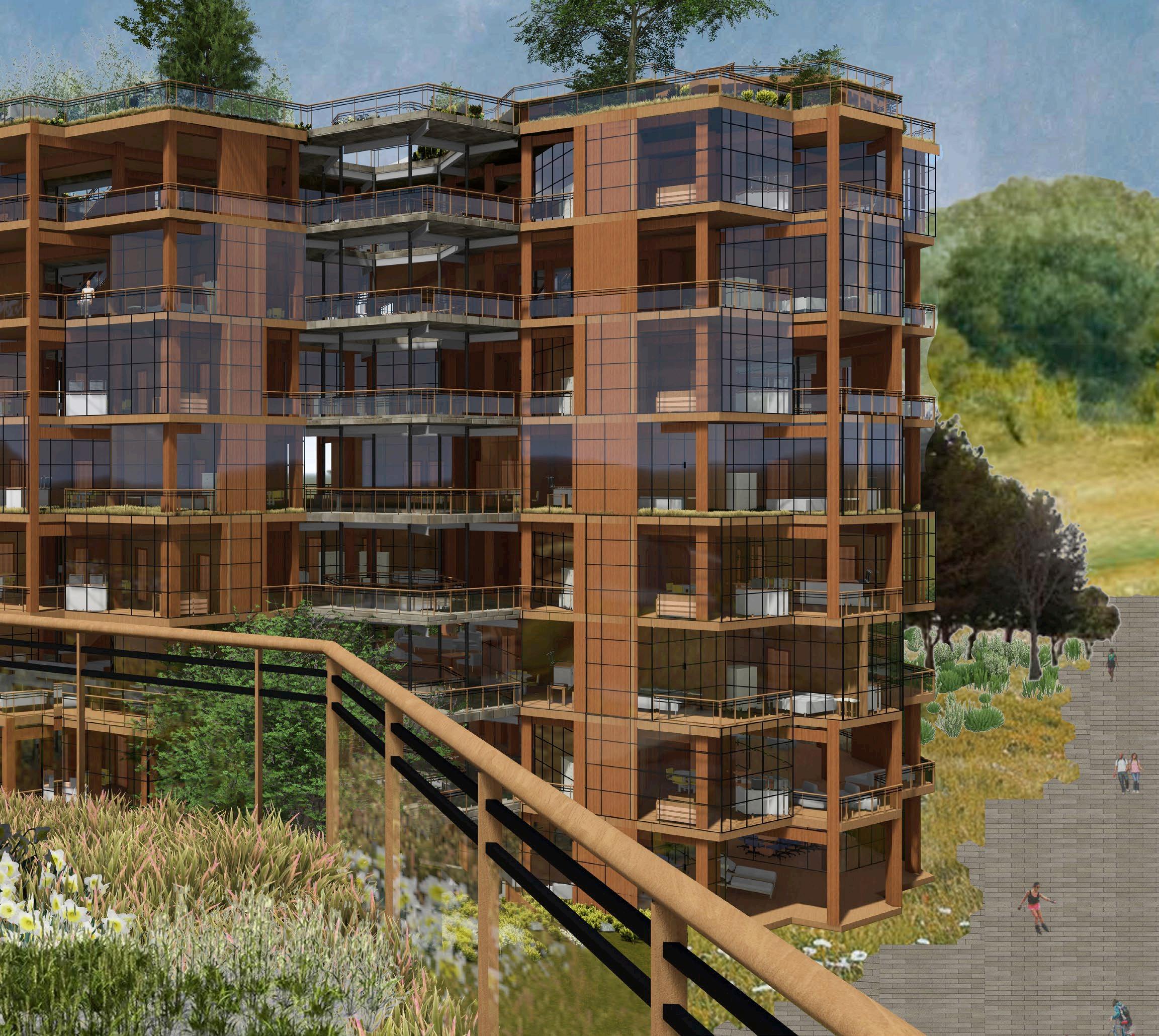
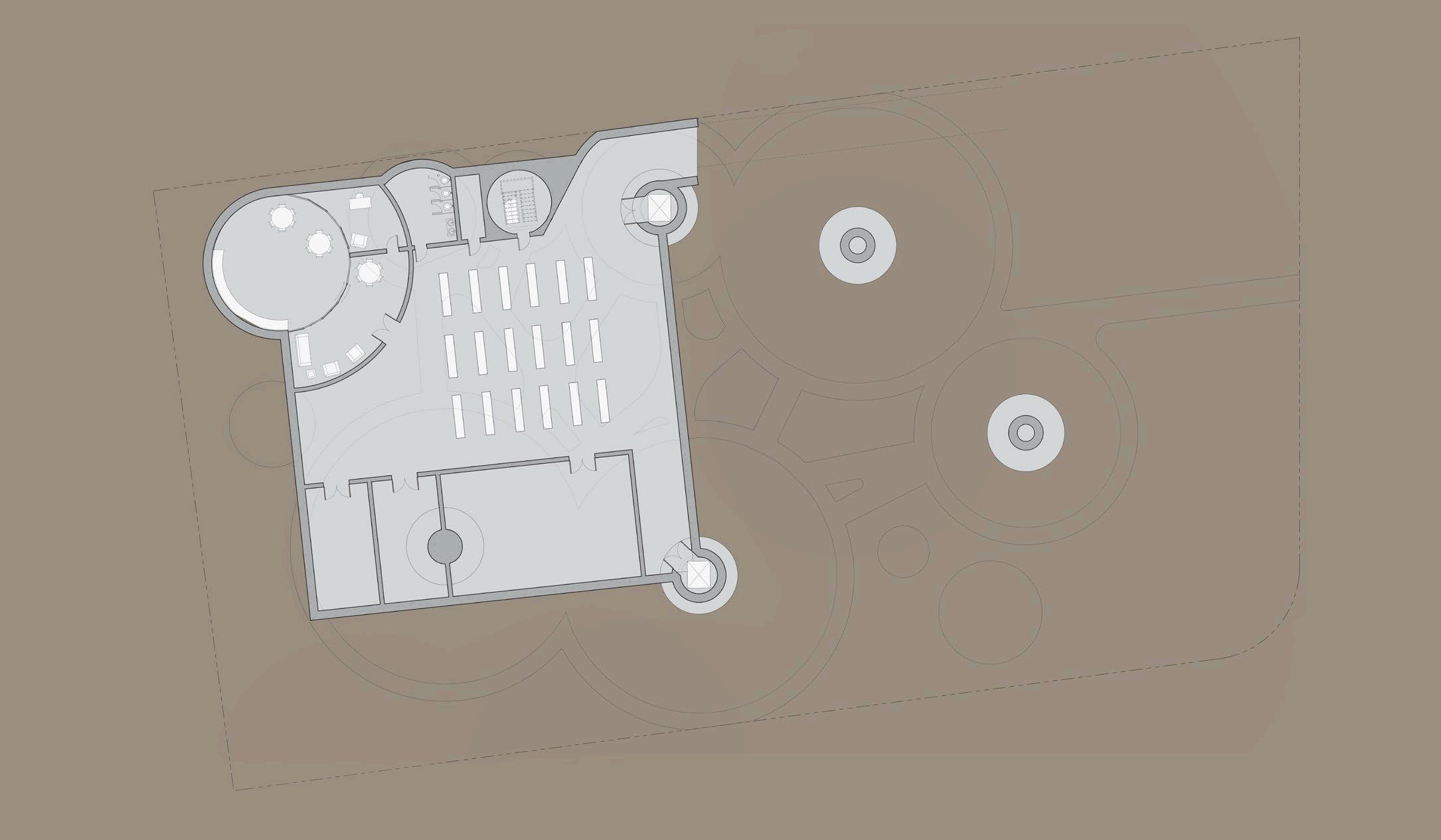
THE CAPSTONE STUDIO TASKED US wITH DESIGNING A GRADUATE STUDENT HOUSING qUAD fOR students in stanford’s new doerr school of sustainability. i worked on a team of ARCHITECTS, STRUCTURAL ENGINEERS, AND ENVIRONMENTAL ENGINEERS TO DESIGN BEYOND THE TYPICAL SCOPE Of AN ARCHITECTURAL STUDIO, INTEGRATING DETAILED STRUCTURAL AND ENVIronmental components into the final product. in my role as architect, i designed the quad’s layout, the unit layouts, the circulation system, and how each tower snaps together. i also modeled the project in revit and generated all final architectural images through rendering and the adobe suite. my architectural partner sofie and i wORKED TOGETHER TO DESIGN THE SHAPE AND HEIGHT Of EACH TOwER, AS wELL AS THE STACKing pattern of the units.
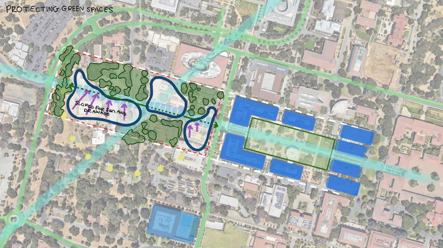
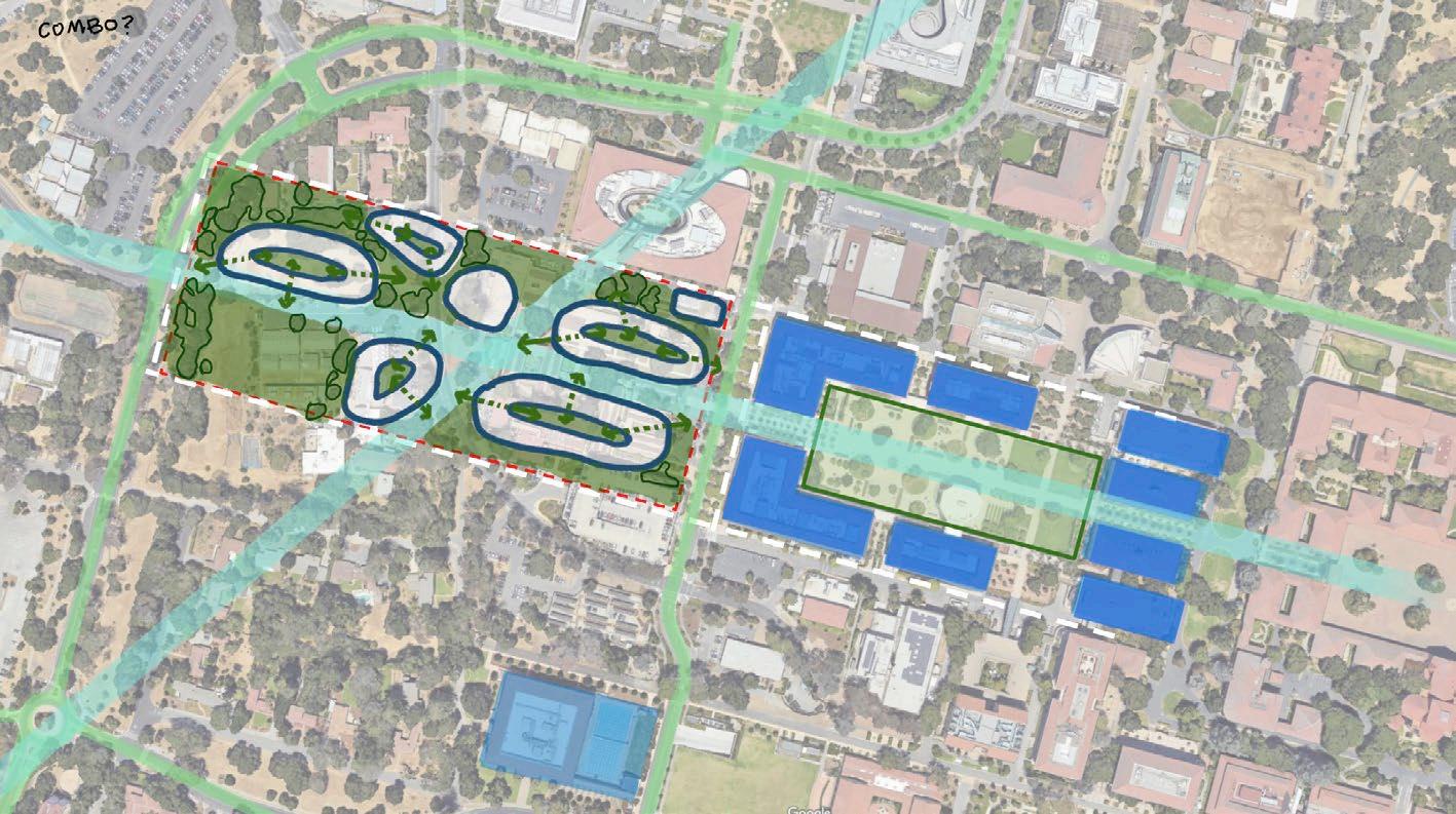
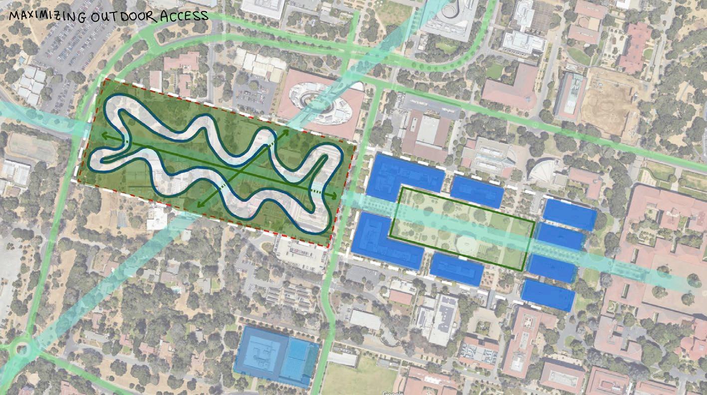
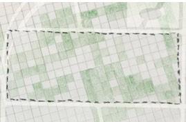
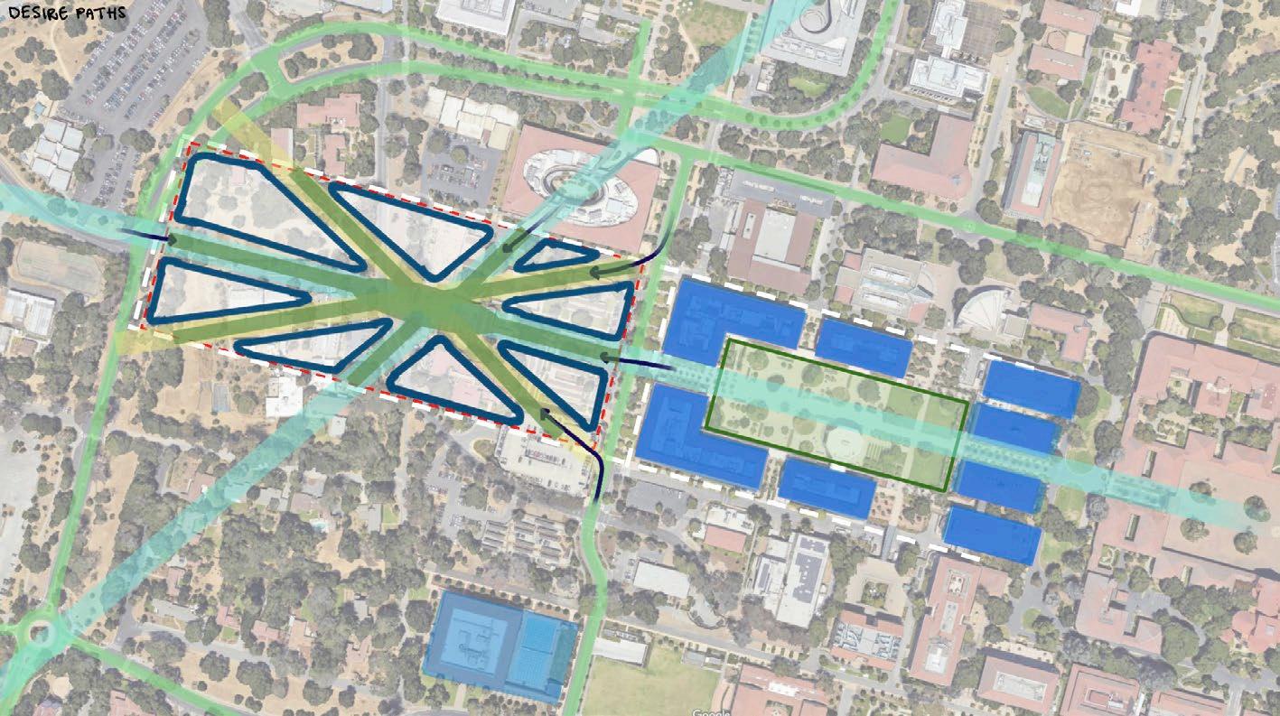
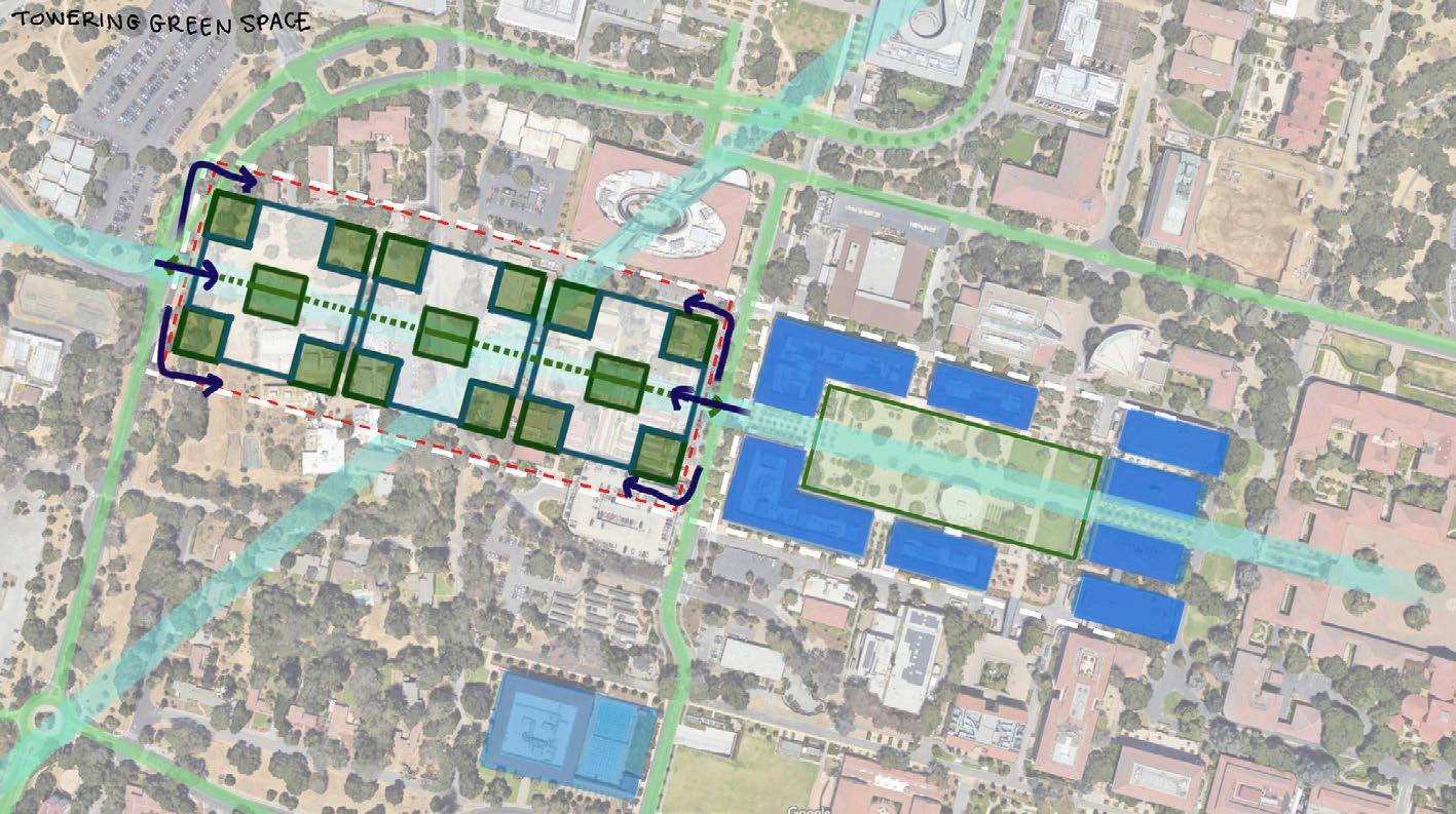
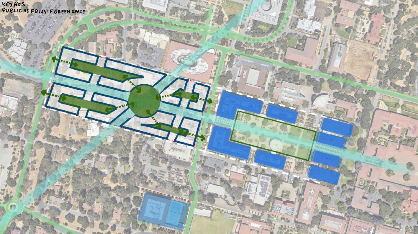
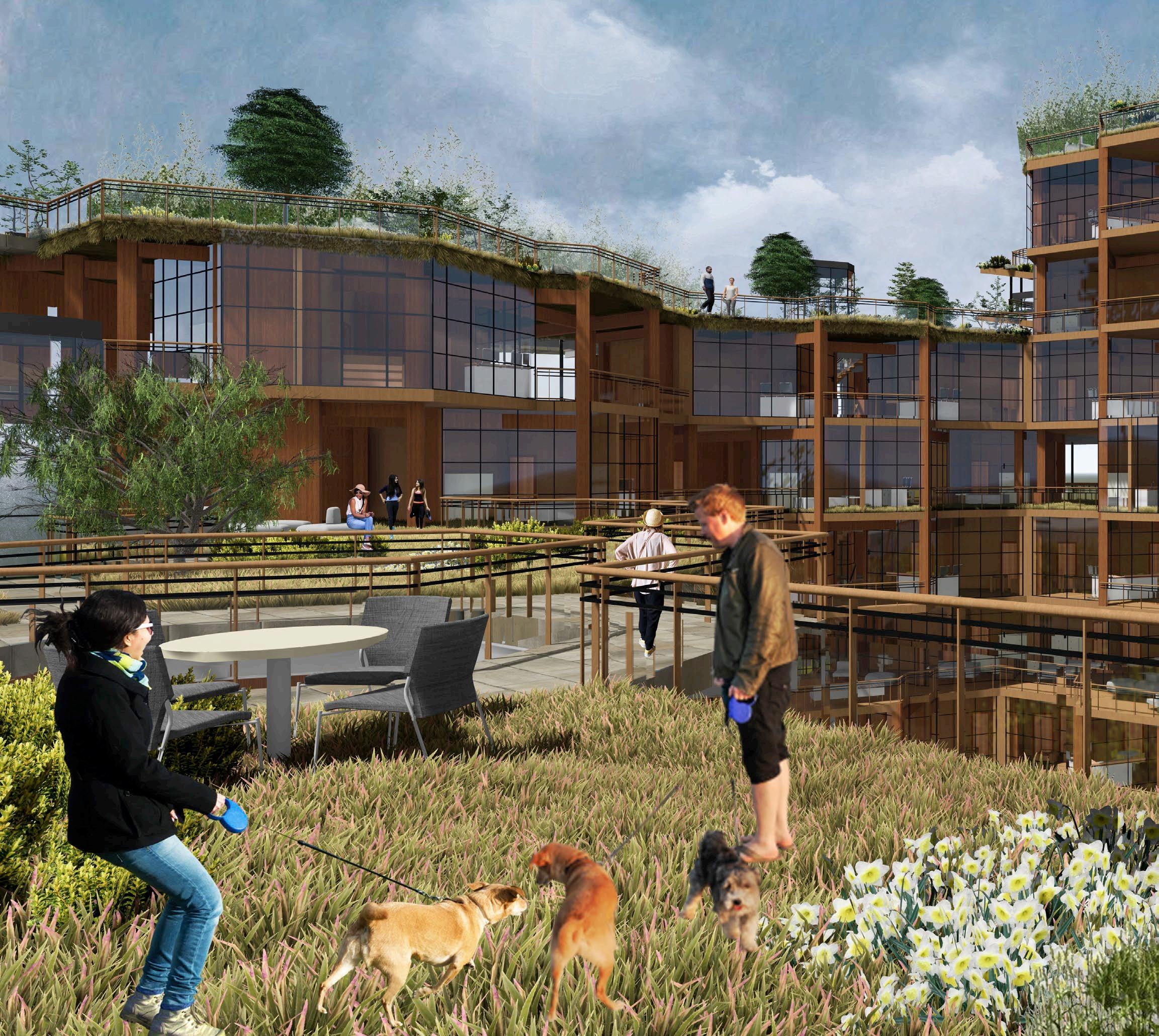
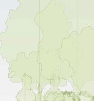
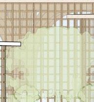
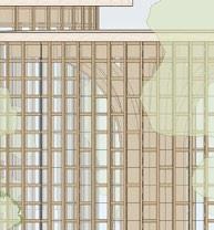
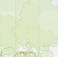
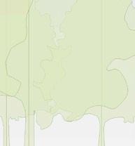
the site layout developed around three core principles. first, preserve the central axis, which begins in stanford’s main quad and will continue through the new quad. SECOND, MAXIMIzE THE EXTERIOR SURfACE AREA TO BUILDING wIDTH RATIO SO THAT EVERY UNIT has strong exterior views. and lastly, respect the original vegetation on the site, most importantly the key trees identified by the stanford arborist.
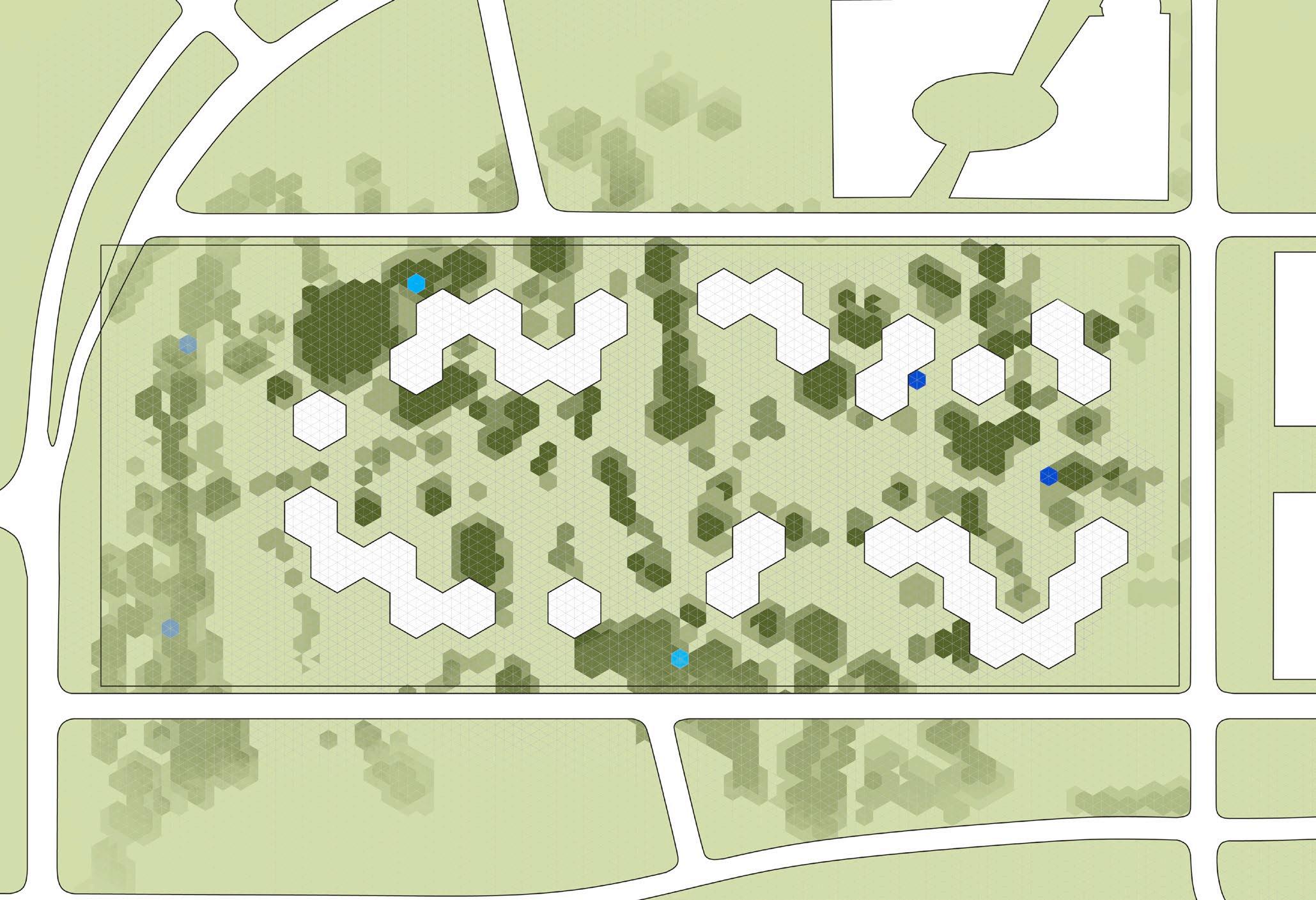
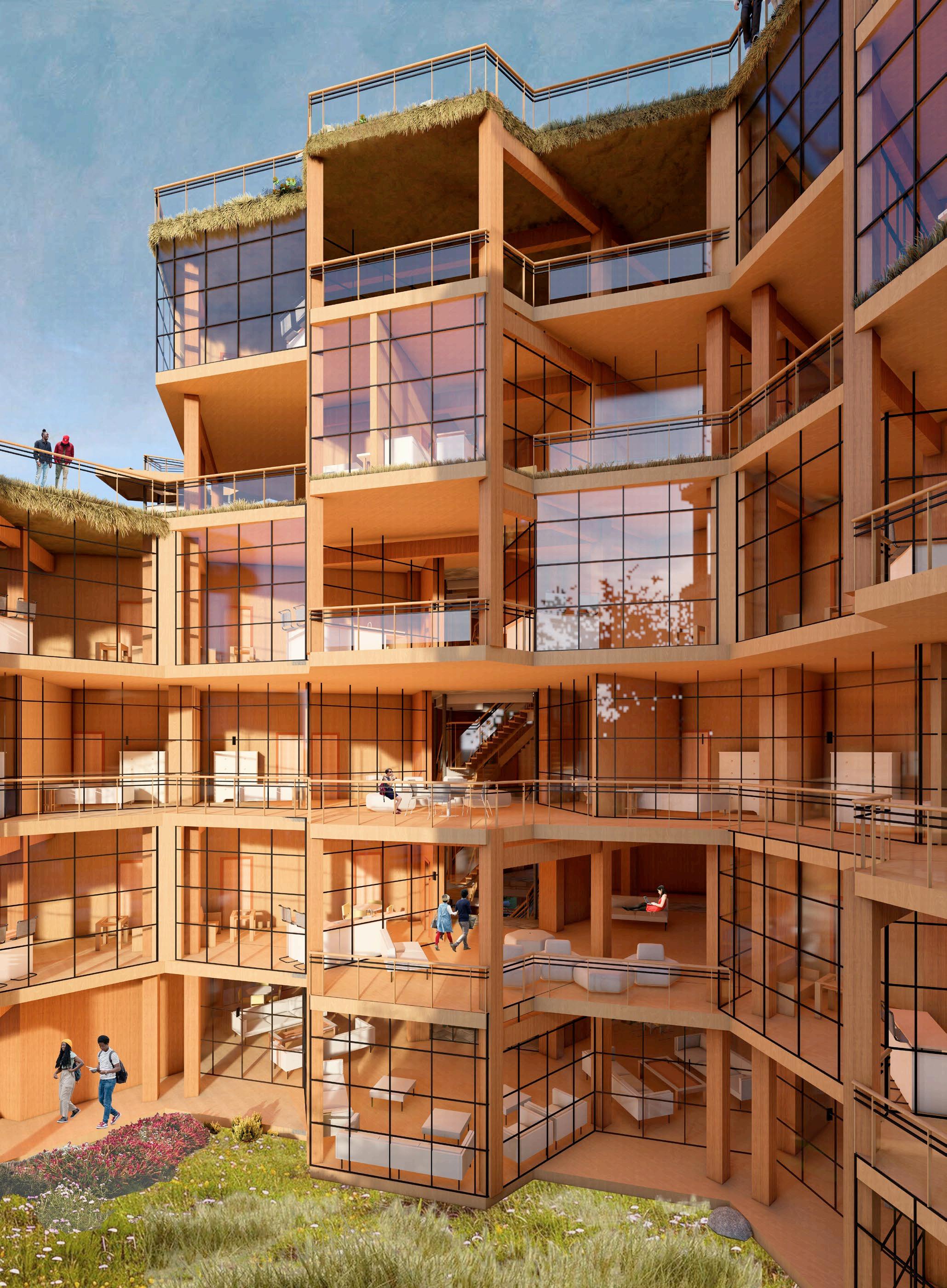
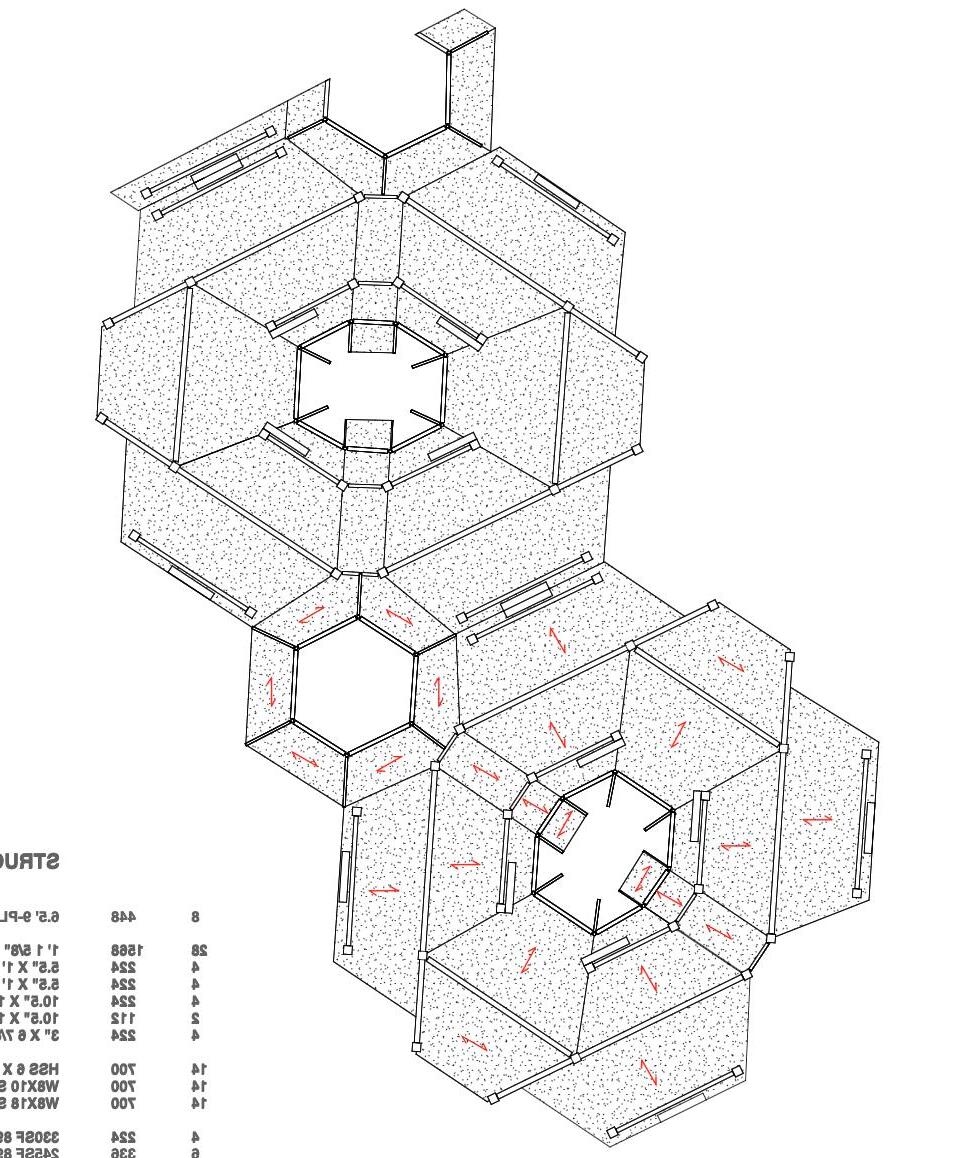
THE THIRD PRINCIPLE PROMPTED ME TO OVERLAY DIffERENT-SIzED GRIDS ON THE SITE TO DETERmine which size and shape could accurately capture the vegetation. ultimately, a hexagonal grid best captured the vegetation footprint. serendipitously, we found that ARRANGING HEXAGONAL UNITS INTO LARGER HEXAGONAL TOwERS ALLOwED US TO SNAP UNITS INTO THE SHAPE Of THE TREE CANOPY AT THE MICRO LEVEL AND AROUND THE LARGER MASSES of vegetation at a macro level. the resulting site layout is a snaking arrangement of hexagonal towers, clustered in varying numbers each tower has a different number Of LEVELS, CREATING A fLOwING SKYLINE Of GREEN ROOfS THAT TRANSPORTS THE NATURAL site atop the buildings.
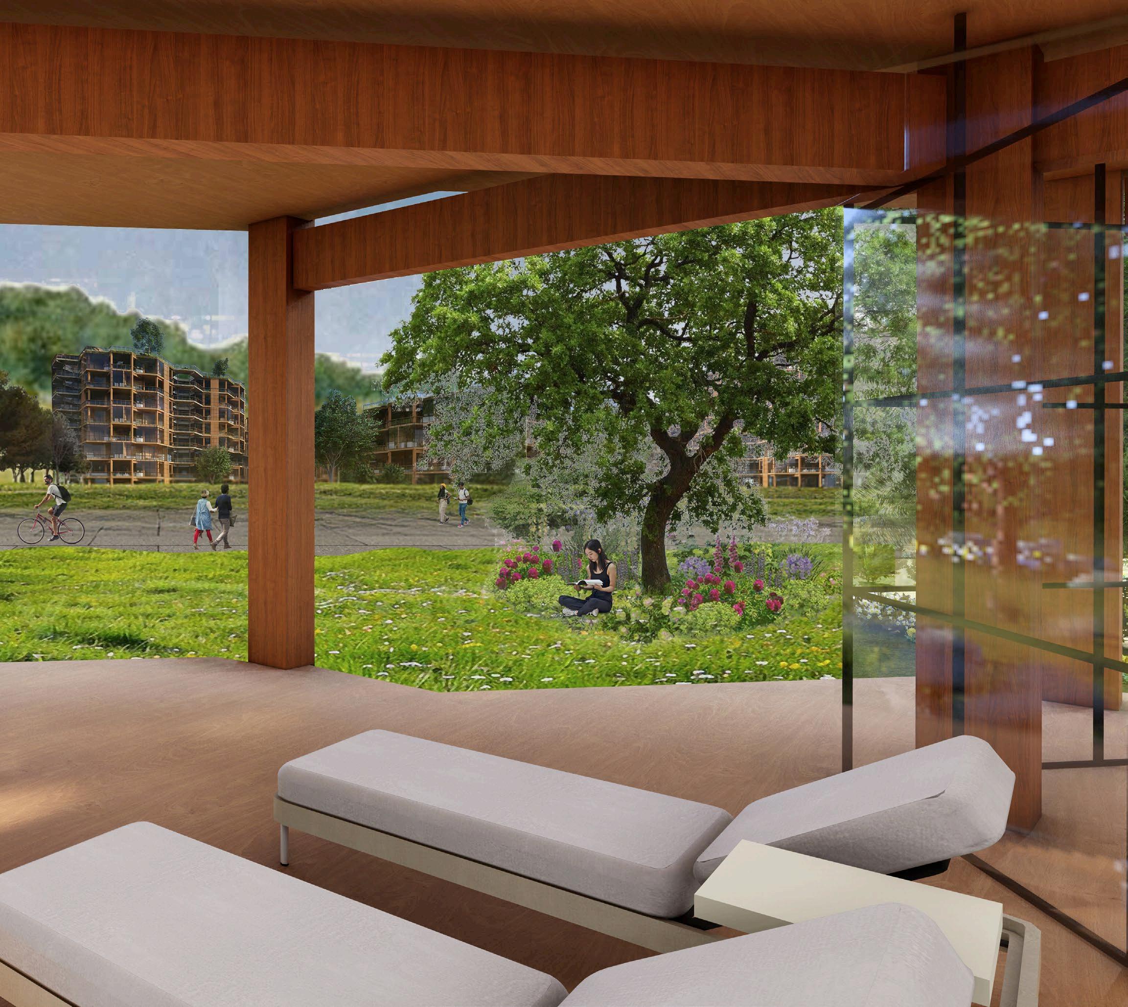
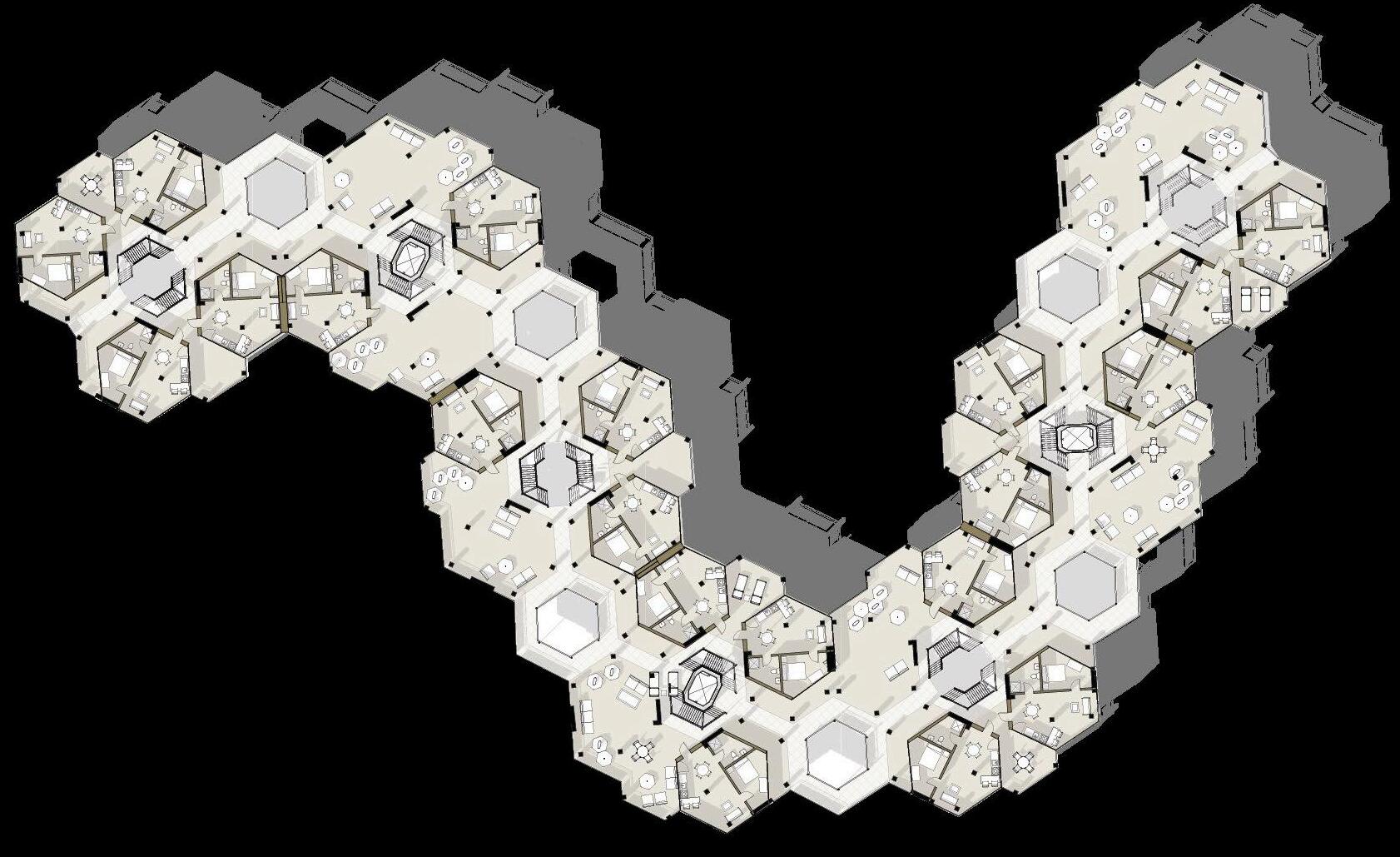
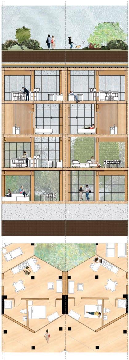
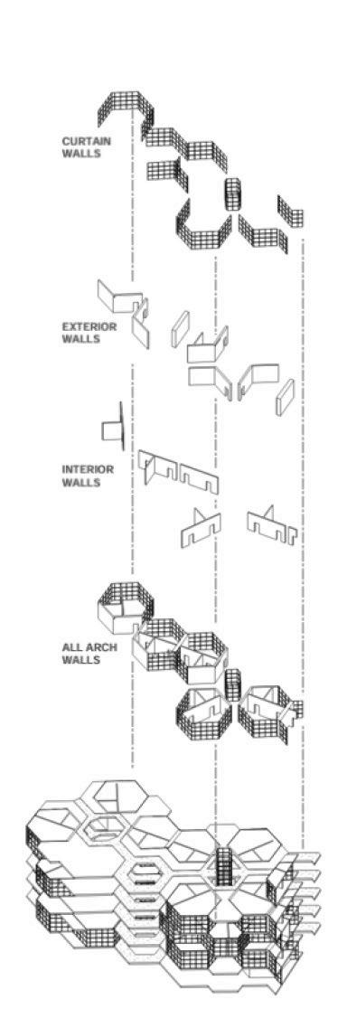
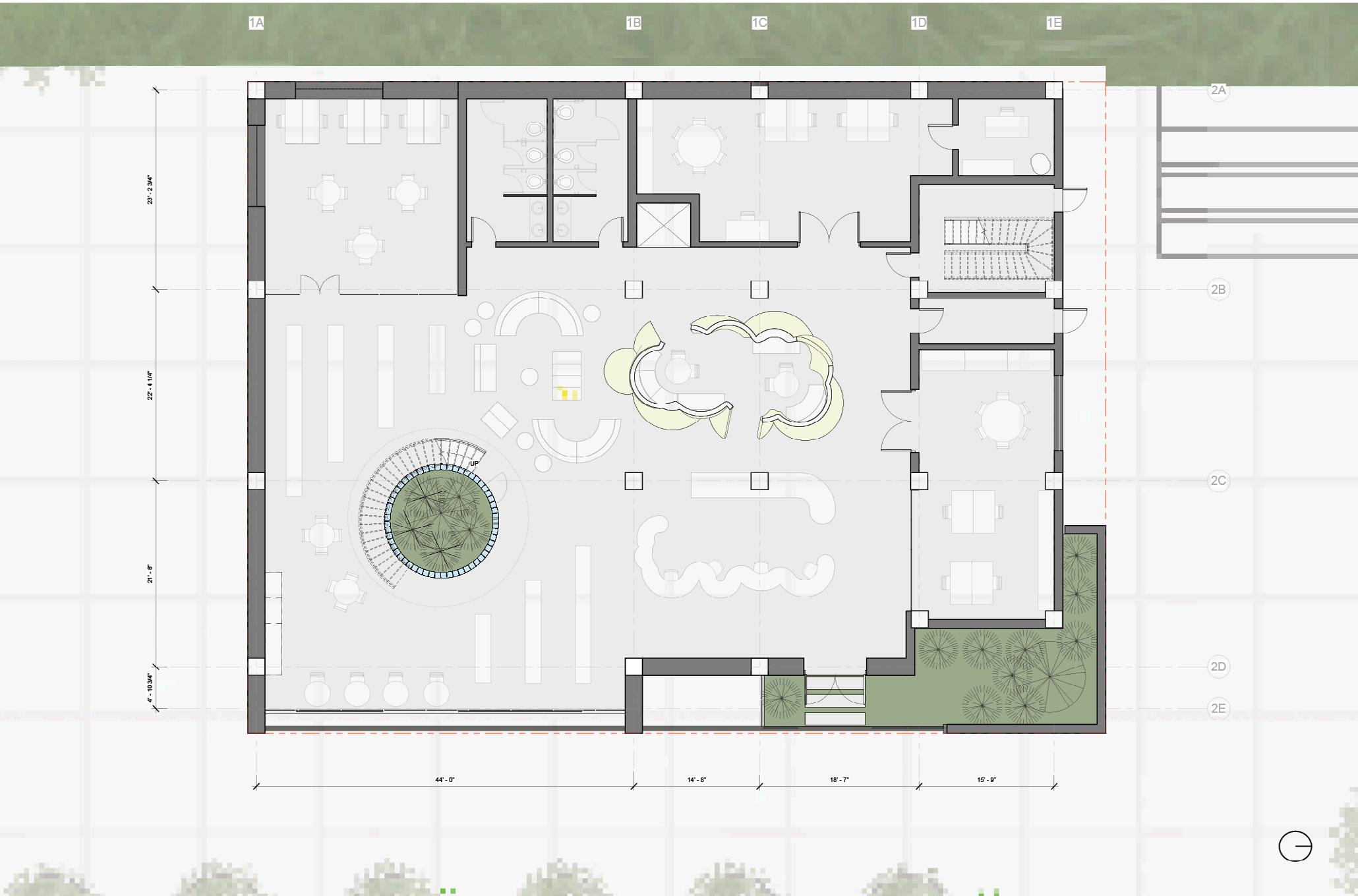
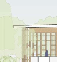
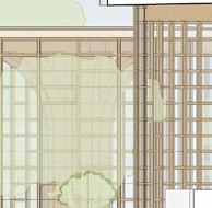
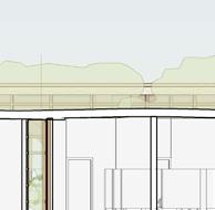
AfTER SETTLING THE SITE LAYOUT, wE fOCUSED ON THE CLUSTER Of TOwERS IN THE SOUTH-EAST CORNER Of THE SITE, USING IT as a model for the rest of the quad. the UNITS ARE STACKED IN ALTERNATING SETS Of TwO OR THREE ON EITHER SIDE Of AN OUTdoor circulation core. the levels share A UNIVERSAL fLOORPLATE SHAPE, CREATING unique outdoor spaces for each unit.
THIS BALCONY SPACE wAS A VITAL DRIVING force of the project given its setting in northern california, the quad’s focus on sustainability, and our team’s commitment to engaging with the site.
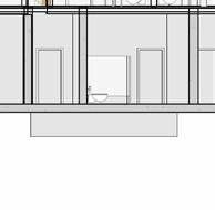
ONCE wE ESTABLISHED A CLEAR LANGUAGE Of ALTERNATING fORMS, wE REMOVED SOME UNITS fROM THE TOwERS TO ALLOw LIGHT TO PENETRATE THE CENTRAL CIRCULATION CORES, GIVE EXTERIOR SPACE BACK TO THE STUDENT POPULATION TO OCCUPY AS THEY SEE fIT, AND create visual interest.
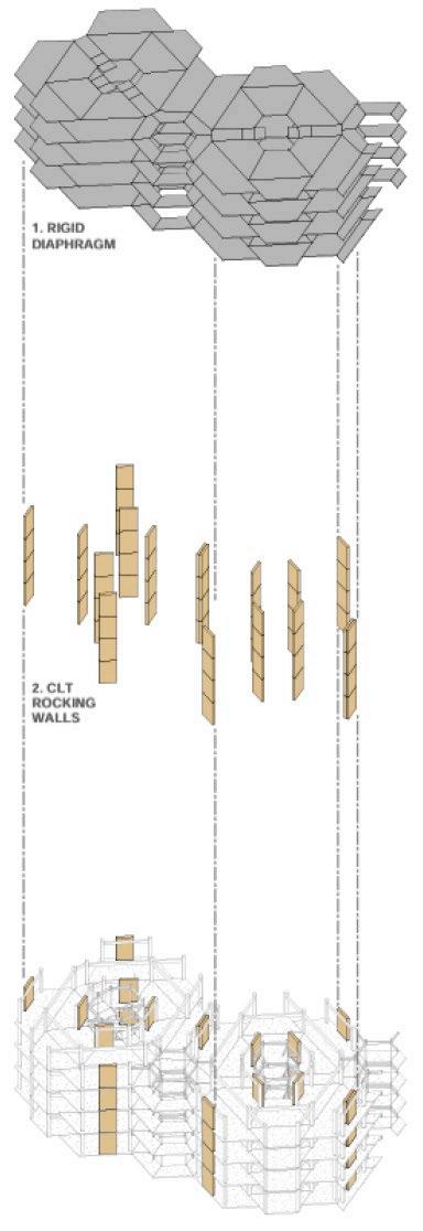
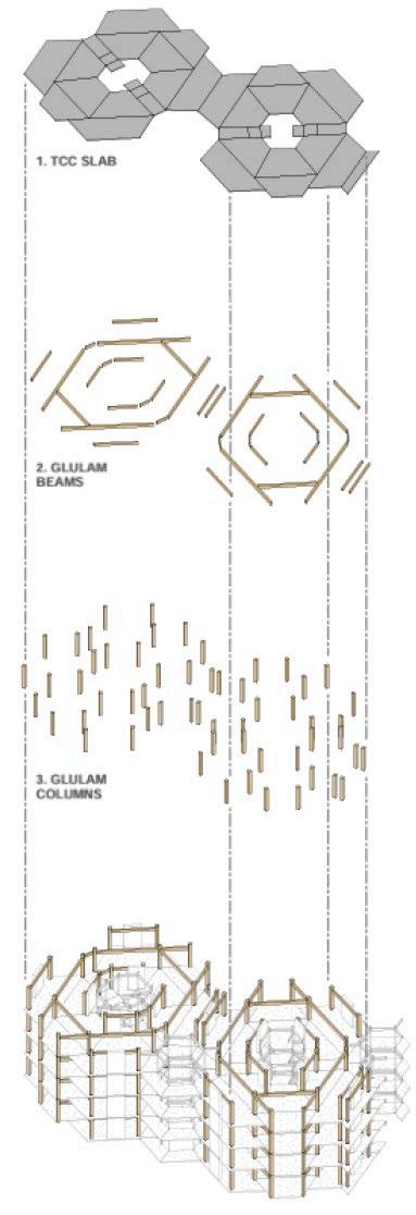
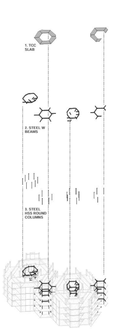
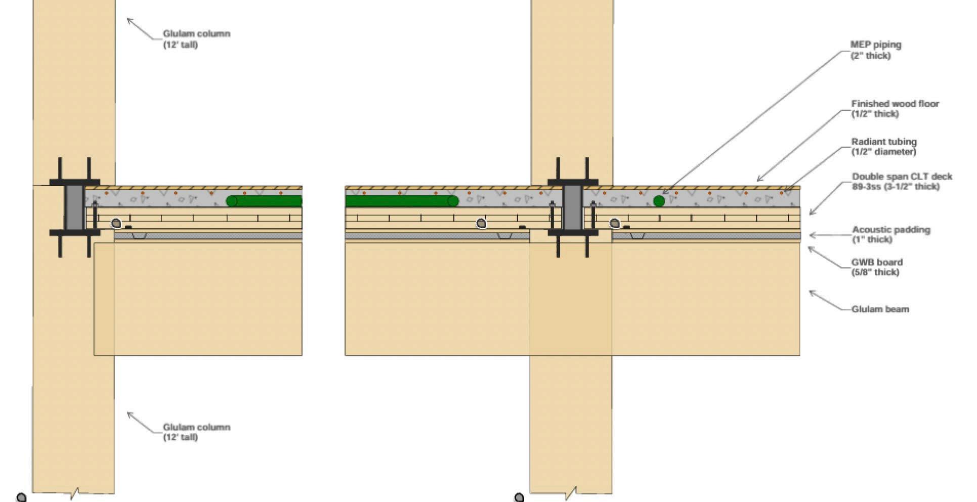
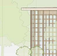
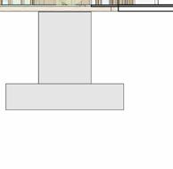
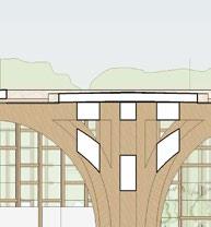
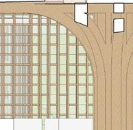
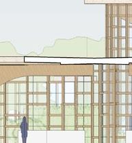
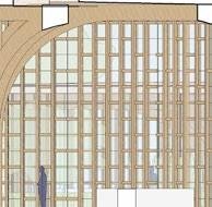
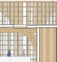
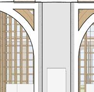
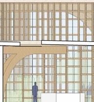
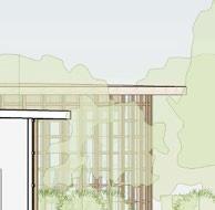
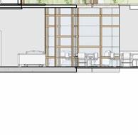
EACH UNIT IS SUPPORTED LATERALLY BY A SYStem of columns and rocking walls. these STRUCTURAL COMPONENTS POSED A CHALLENGE wHEN DEVELOPING A SERIES Of DIffERent unit layouts. however, by using timBER STRUCTURAL ELEMENTS AND EMBRACING THEIR VISIBILITY, wE wERE ABLE TO CREATE A system that supports the project’s physical and aesthetic needs.
GLULAM COLS
GLULAM BEAMS
GLULAM BEAMS
GLULAM BEAMS
GLULAM BEAMS
GLULAM BEAMS
ROUND STEEL COLS
STEEL BEAMS
STEEL BEAMS
CLT fLOOR PANEL A
CLT fLOOR PANEL B
CLT fLOOR PANEL C
CLT fLOOR PANEL D
CLT fLOOR PANEL E
CLT fLOOR PANEL f
CLT fLOOR PANEL G
SAN fRANCISCO, CALIfORNIA
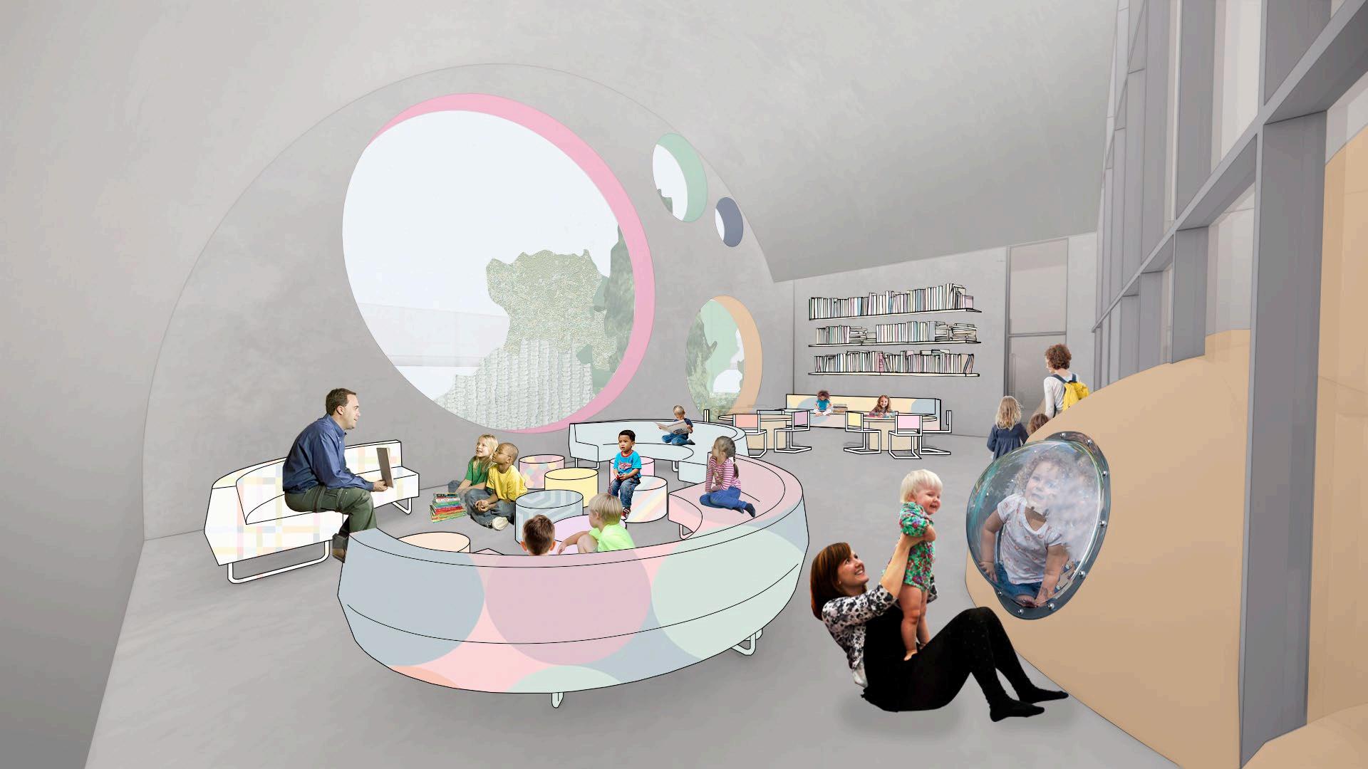
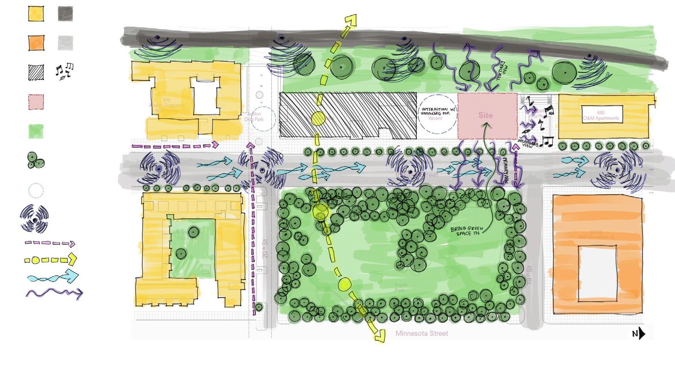
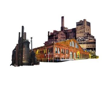
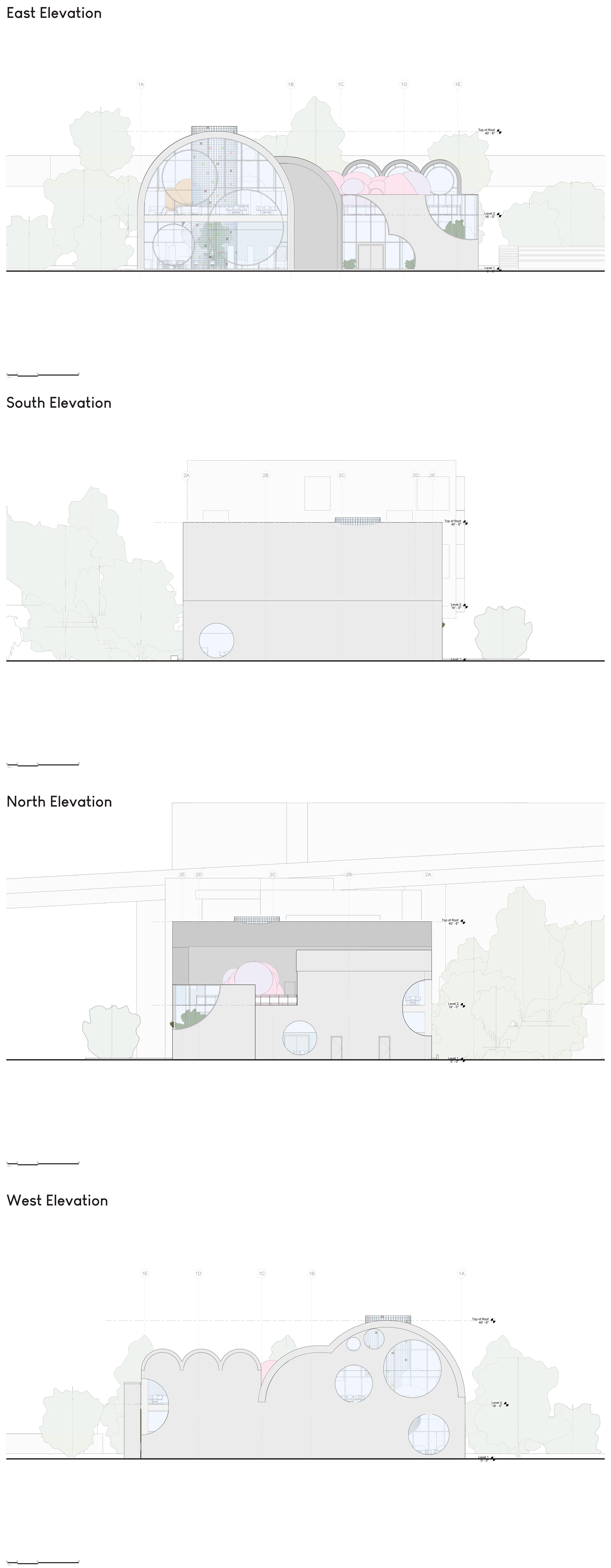
wHEN DESIGNING A SAN fRANCISCO BRANCH LIBRARY fOR THE DOGPATCH NEIGHBORHOOD, I AIMED TO CREATE A PLAYfUL, INVITING SPACE THAT CONNECTS wITH ITS GREEN SURROUNDINGS and reflects the neighborhood’s rich and evolving culture. i was interested in posiTIONING THE LIBRARY AS A COMMUNITY HUB AND THIRD SPACE, wELCOMING A wIDE RANGE Of patrons. my goal was to support both quiet individual use and more informal social activity. i intended to make the layout feel intuitive and accessible rather than instiTUTIONAL, AND TO ENSURE THE BUILDING COULD ENTICE PEOPLE TO ENTER fROM ALL SIDES Of the site, including the freeway behind it i also considered how natural light could BE USED TO CREATE A BRIGHT, UPLIfTING INTERIOR wHILE PROTECTING THE BOOK COLLECTION from long-term light exposure and keeping energy use low.
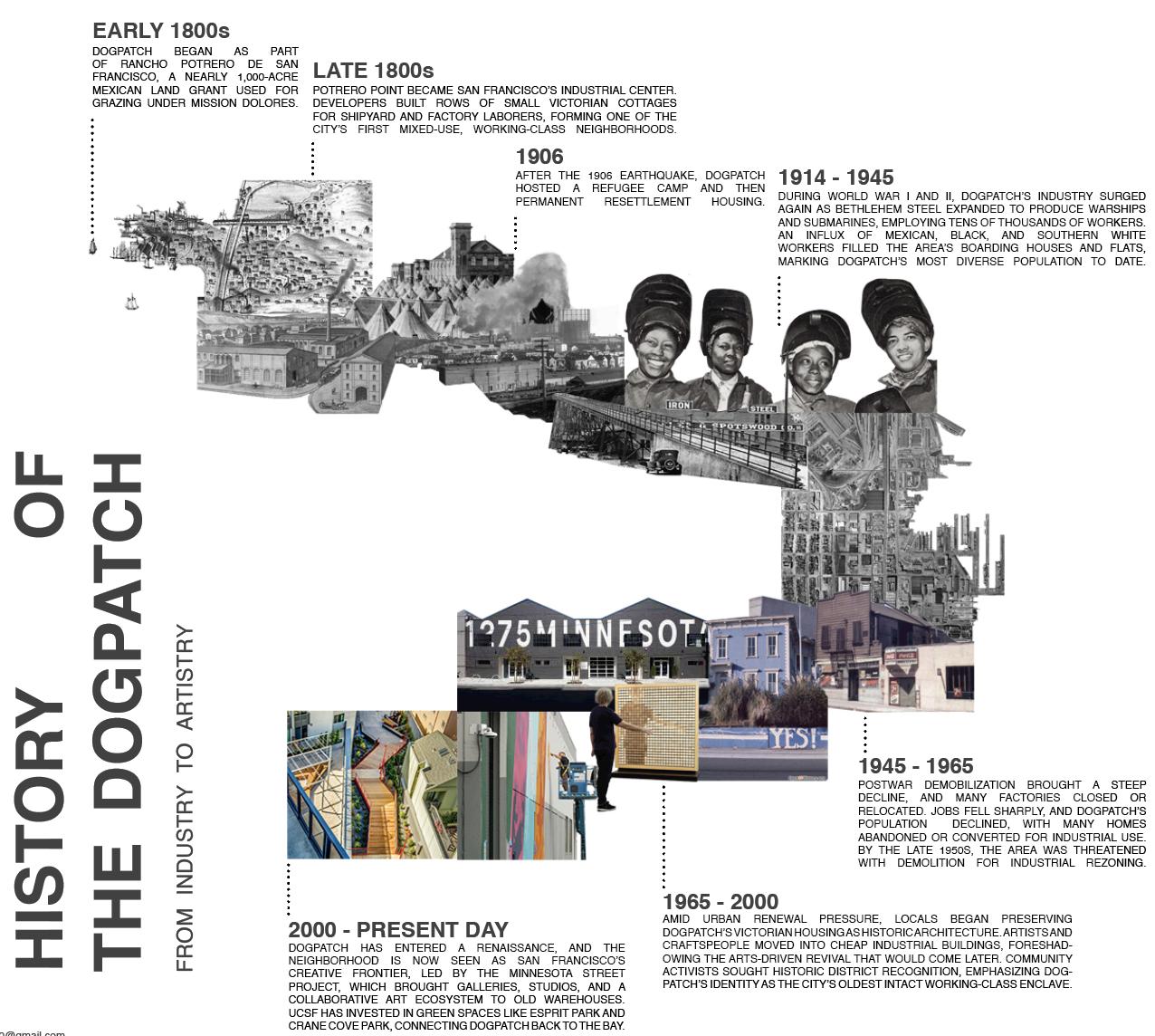
after learning more about the dogpatch neighborhood’s transformation from an industrial hub to an artistic haven, my objective became to reference the neighborhood’s history by incorporating industrial design elements while also supporting the area’s continued evolution.
IMAGINATION + LEARNING
NOSTALGIA + VIVACITY
NEARBY PUBLIC SPACE
SITE + PROGRAM
INDUSTRIAL HISTORY
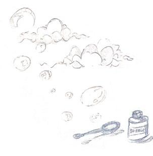
in addition to the site’s historical and contemporary context, i considered the strict programmatic requirements for a branch library and the site context. finally, i settled on the emotions i wanted to evoke with this project: nostalgia, playfulness, and IMAGINATION, wHICH I VISUALIzED AS AMORPHOUS fORMS SUCH AS BUBBLES AND CLOUDS AND which directly influenced the building’s form.
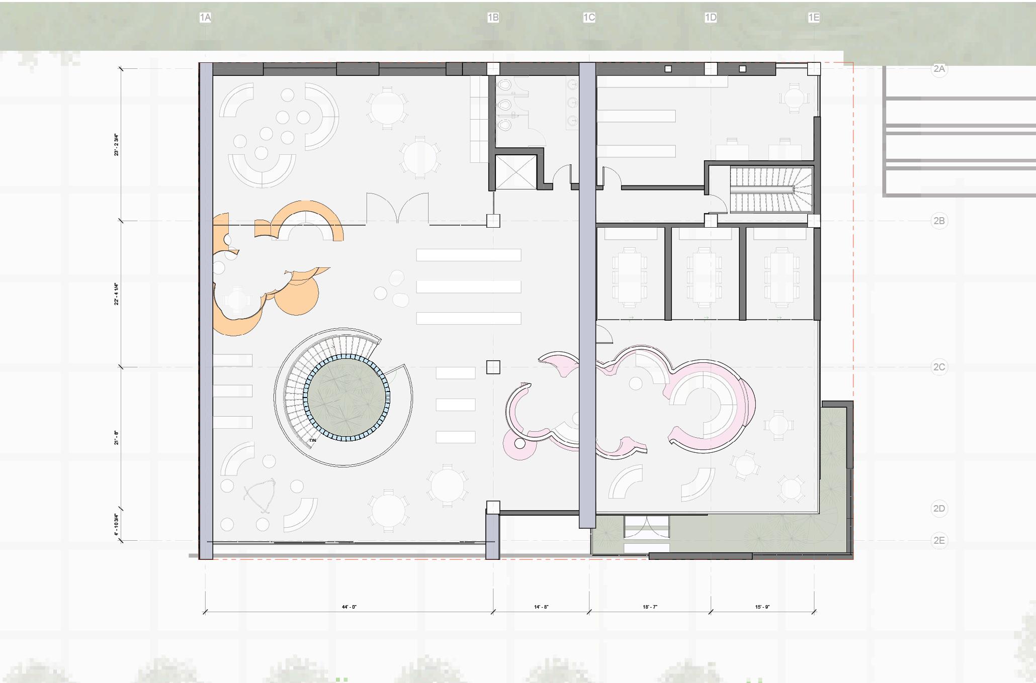
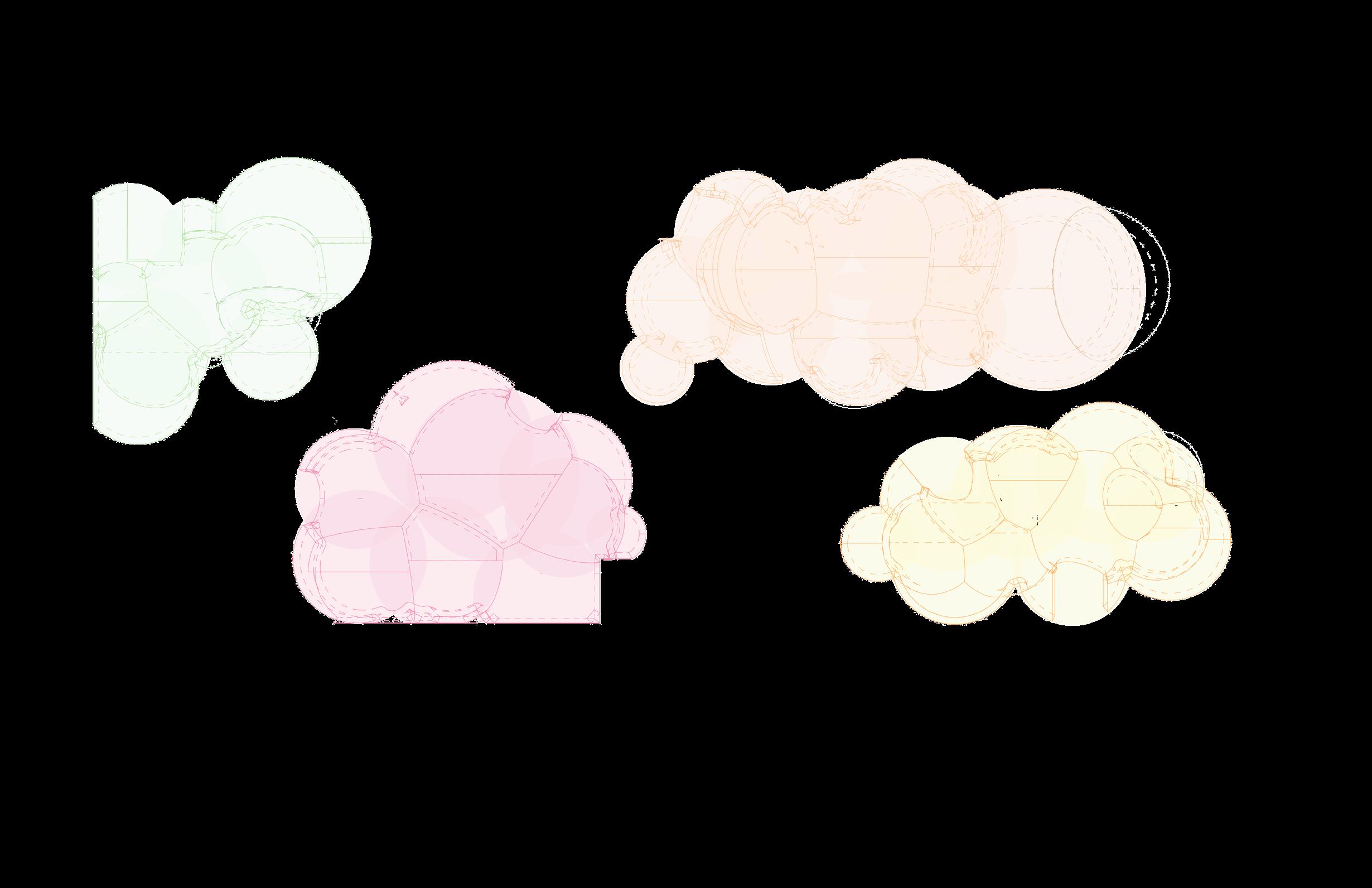
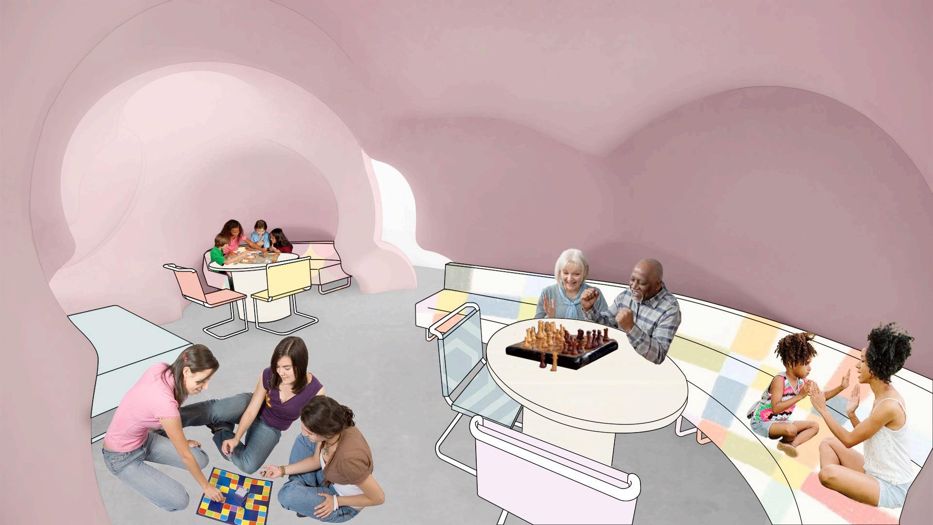
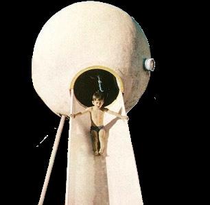
“ the blobs,” as they affectionately came to be known, began as an idea for a distinctive teen space that felt cozy and “cool” to teens and young adults. the concept EXPANDED TO OTHER AREAS Of THE LIBRARY, OffERING PATRONS Of ALL AGES THE CHANCE TO study or explore these amorphous forms. housing playful programming elements SUCH AS THE GAME zONE AND EARLY LITERATURE, THE BLOBS INTERACT wITH THE wALLS AND floors, often intersecting with and disrupting these stagnant elements their bubble wINDOwS LET LIGHT PEEK IN AND ALLOw OCCUPANTS TO LOOK OUT, EVOKING THE fEELING Of being inside a spaceship.
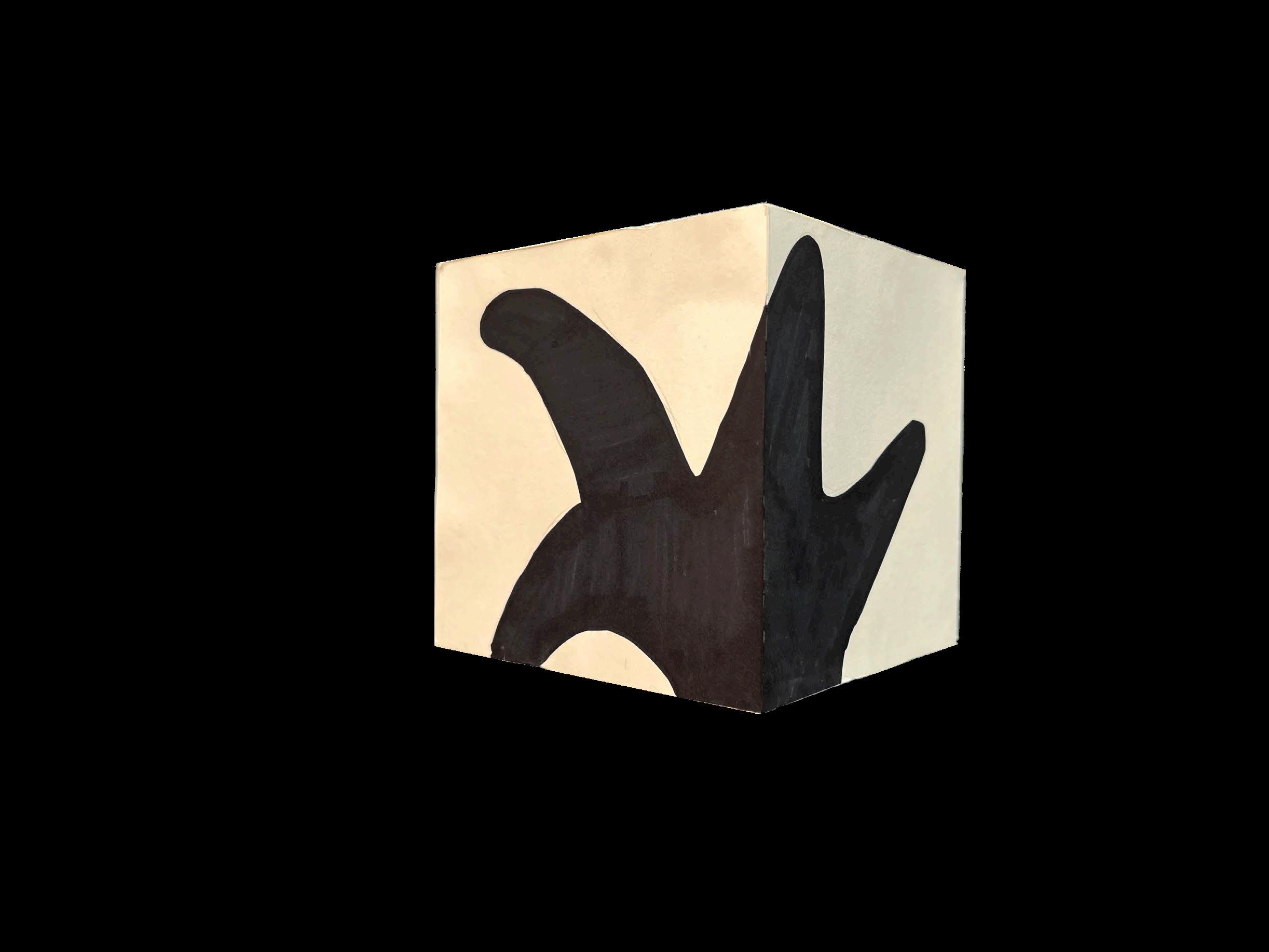
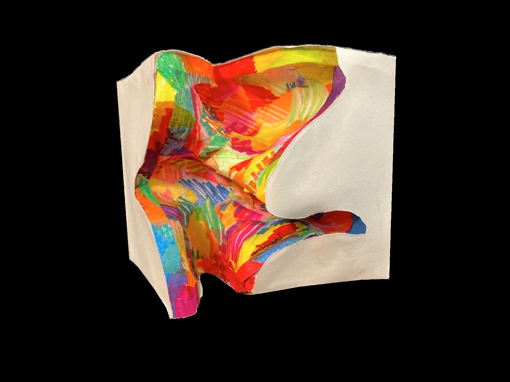
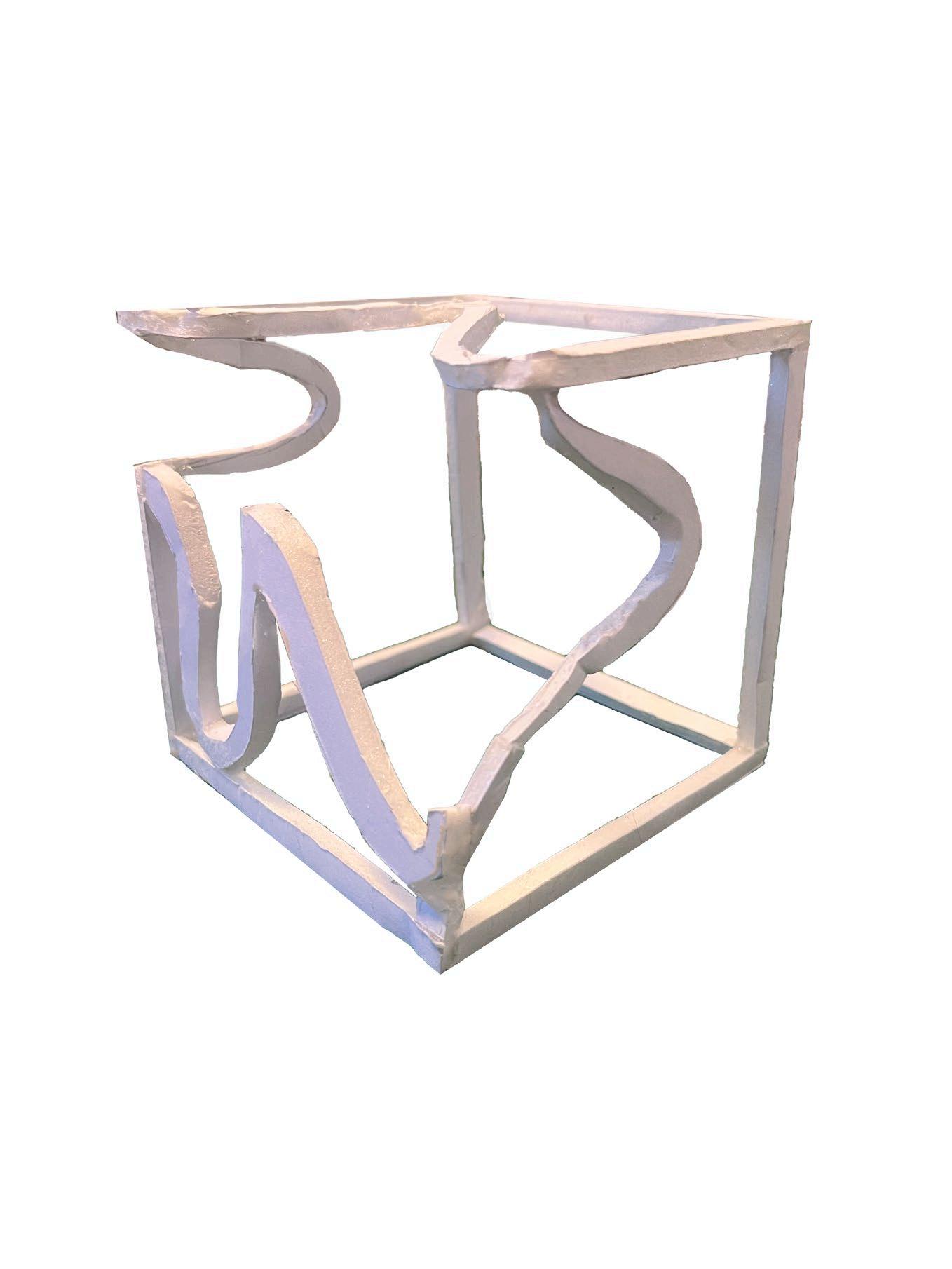
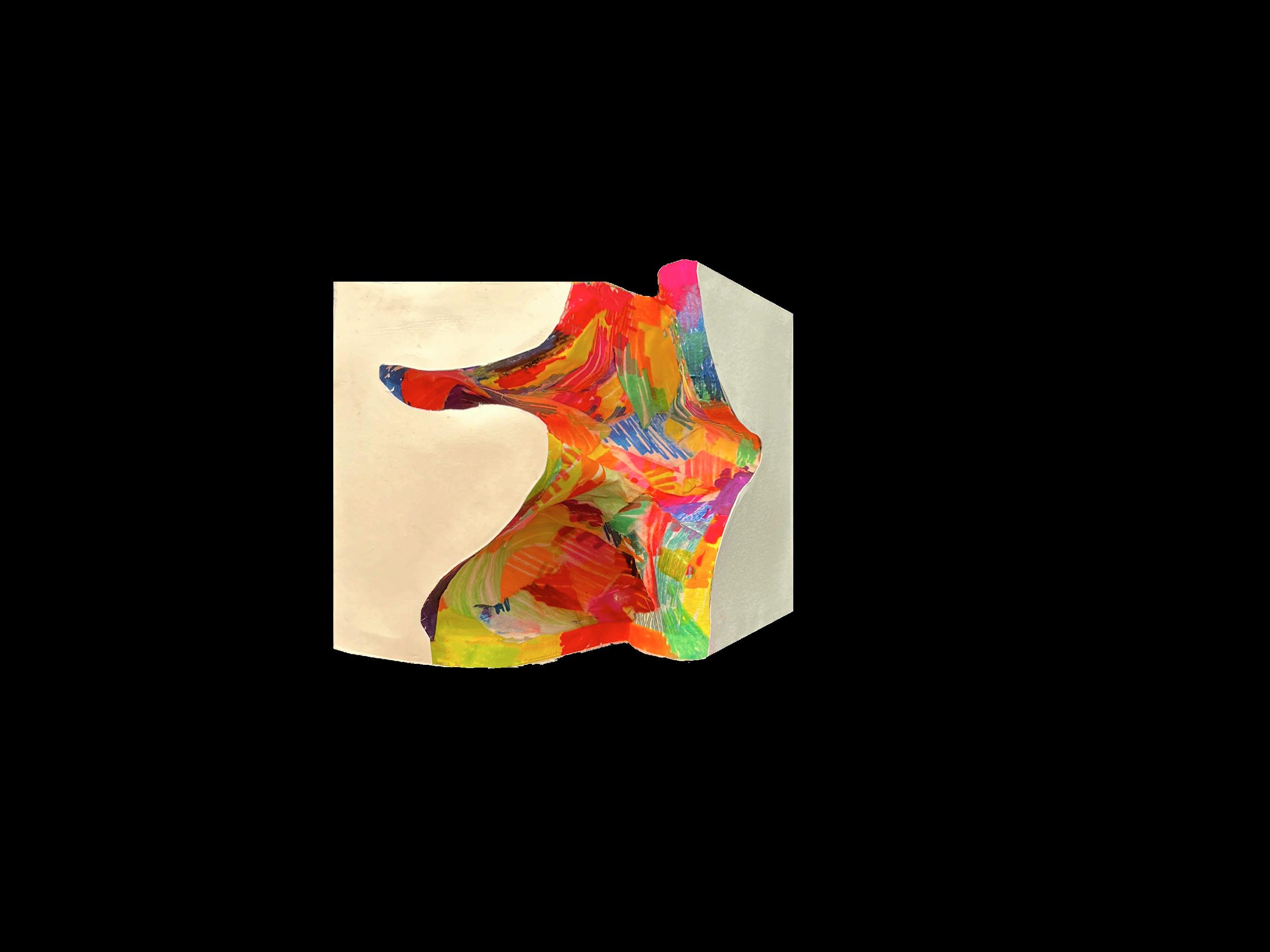
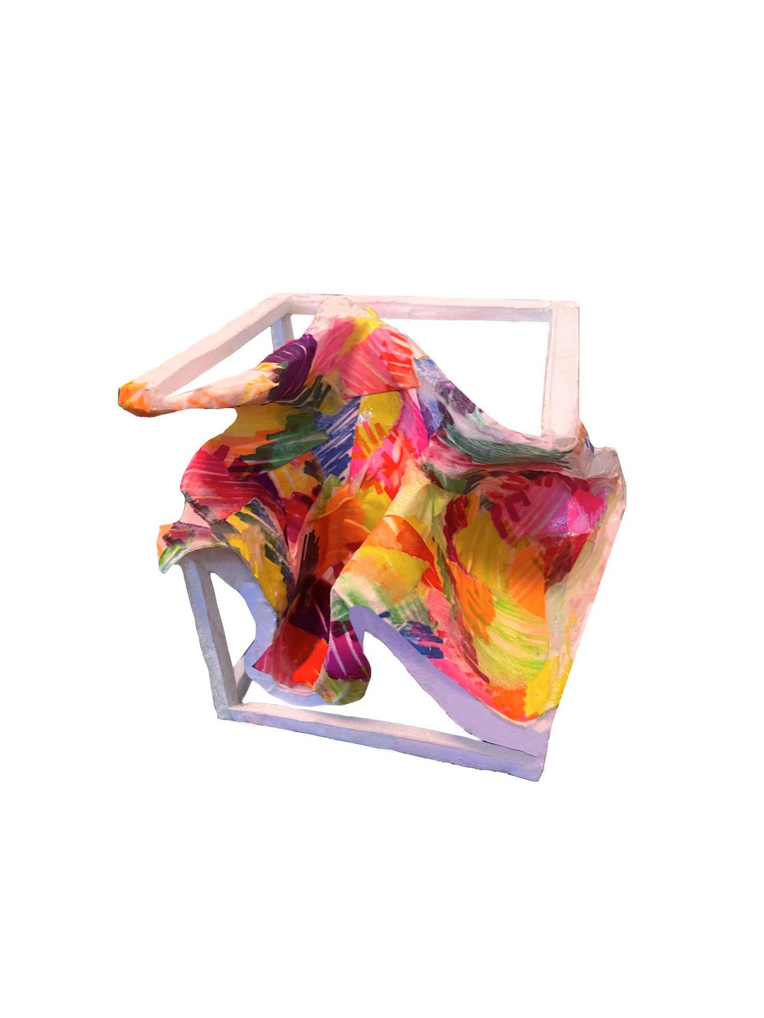
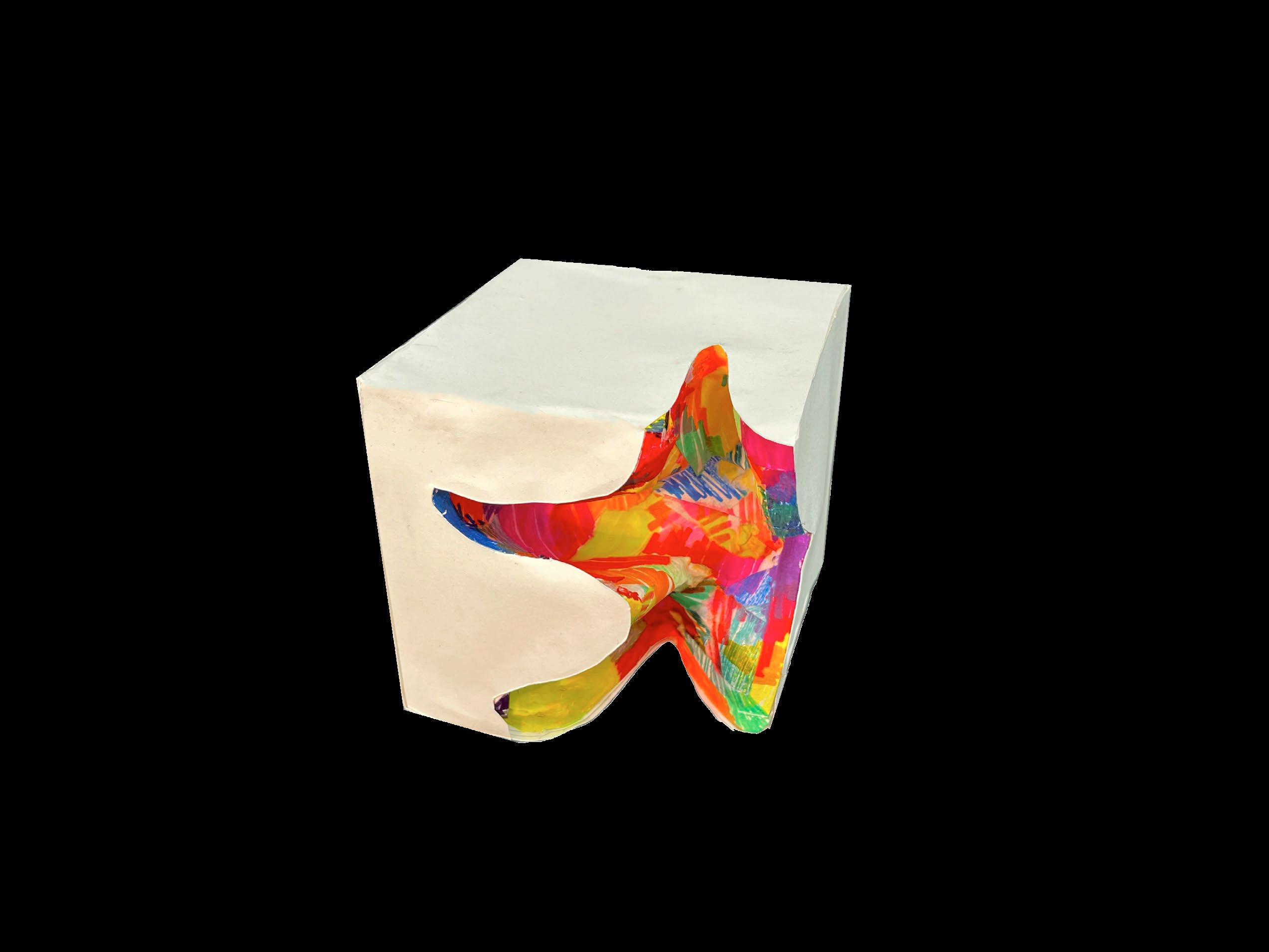
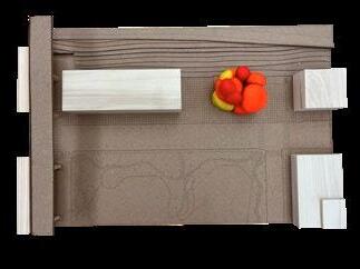
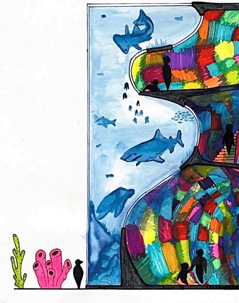
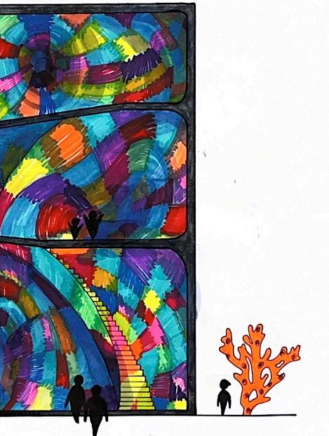
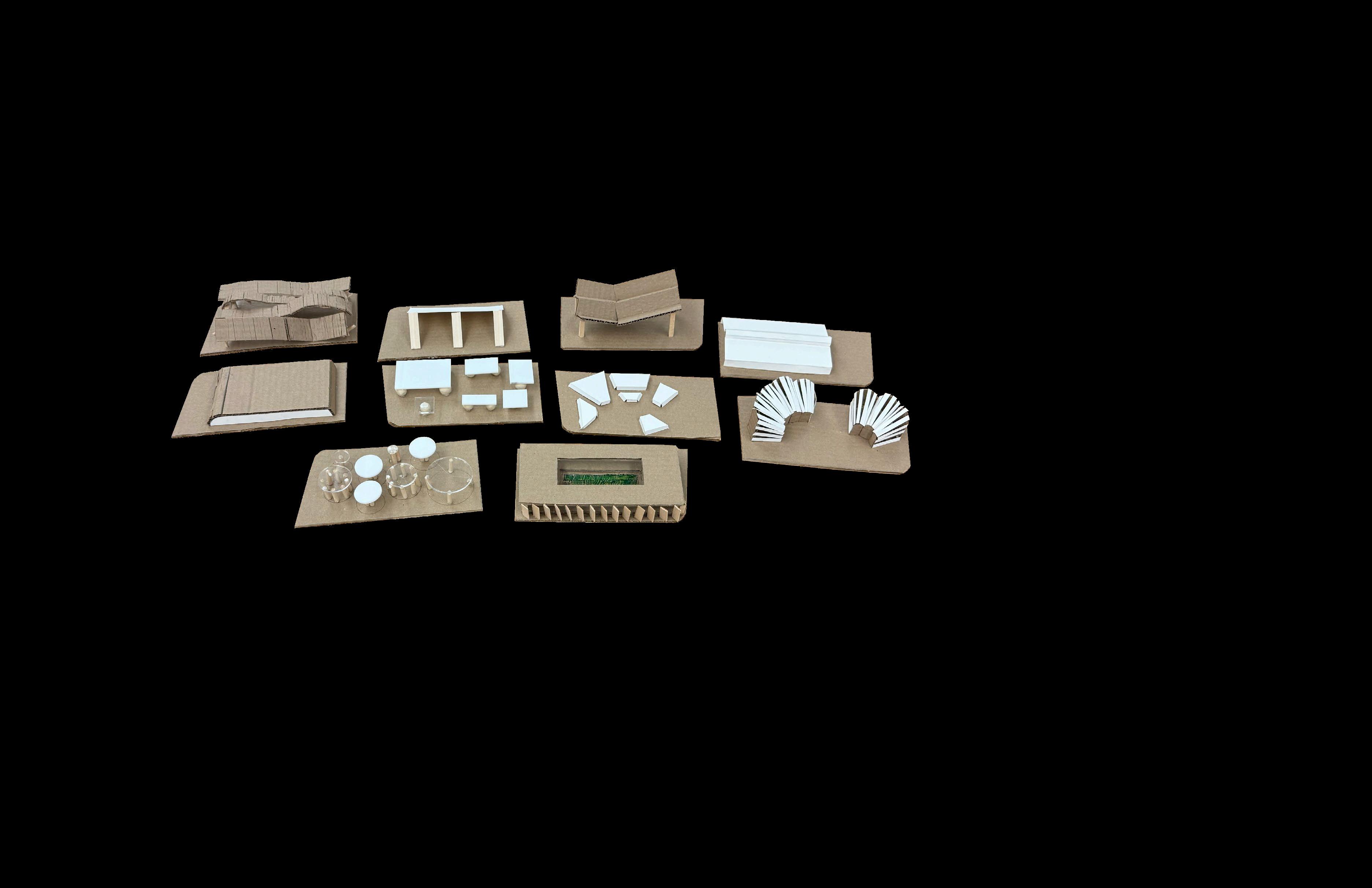
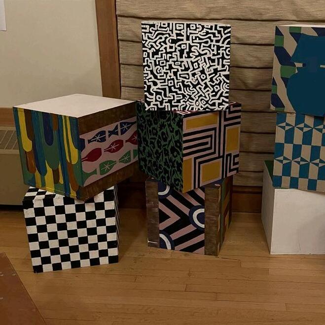
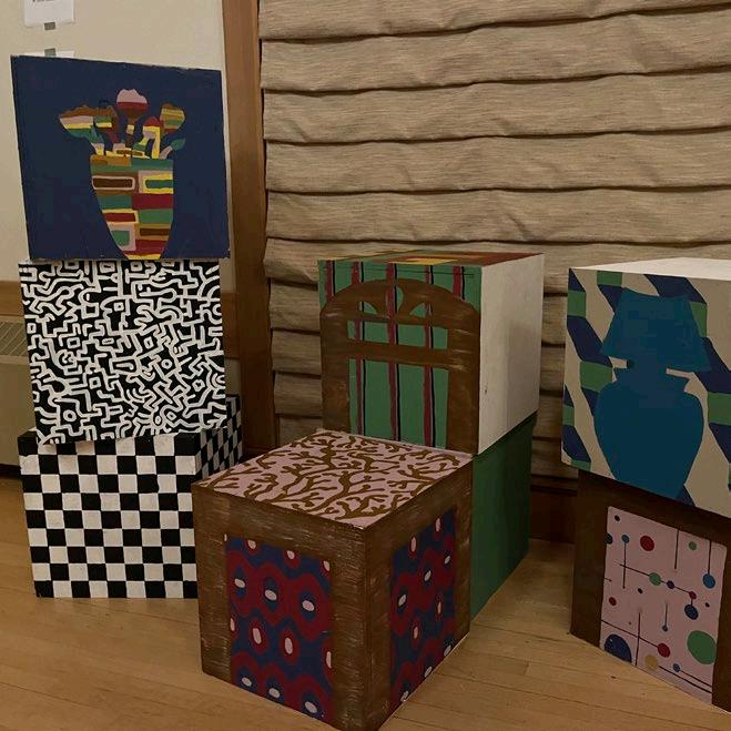
this project explores solid and void relationships via model making, creating voids on an 8x8” cube and then translating that form into an occupiable space. i investigatED wHAT fORM MIGHT EMERGE If THE SHAPE Of A STARfISH SPRAwLED ACROSS A CUBE wERE turned inward to create a void using foam core and papier-mâché, i crafted a model of this concept. then, using crayola markers and watercolor, i translated the model into a conceptual aquarium exhibit.
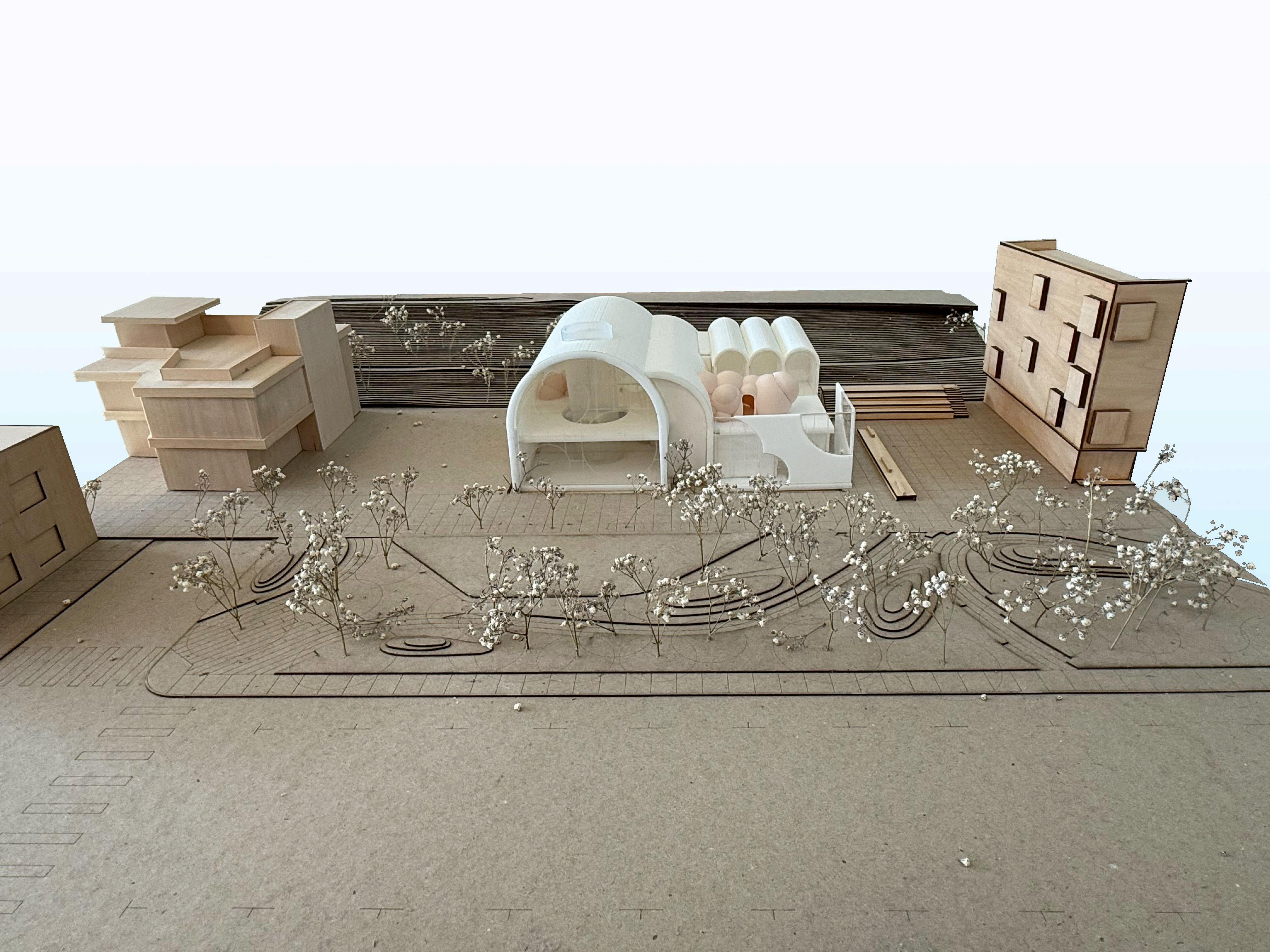
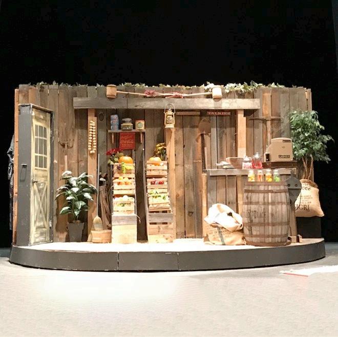
EAST PALO ALTO, CALIfORNIA COMMUNITY MARKETPLACE
133D - INTEGRATED
ARCHITECTURE AND ENGINEERING
wINTER 2025
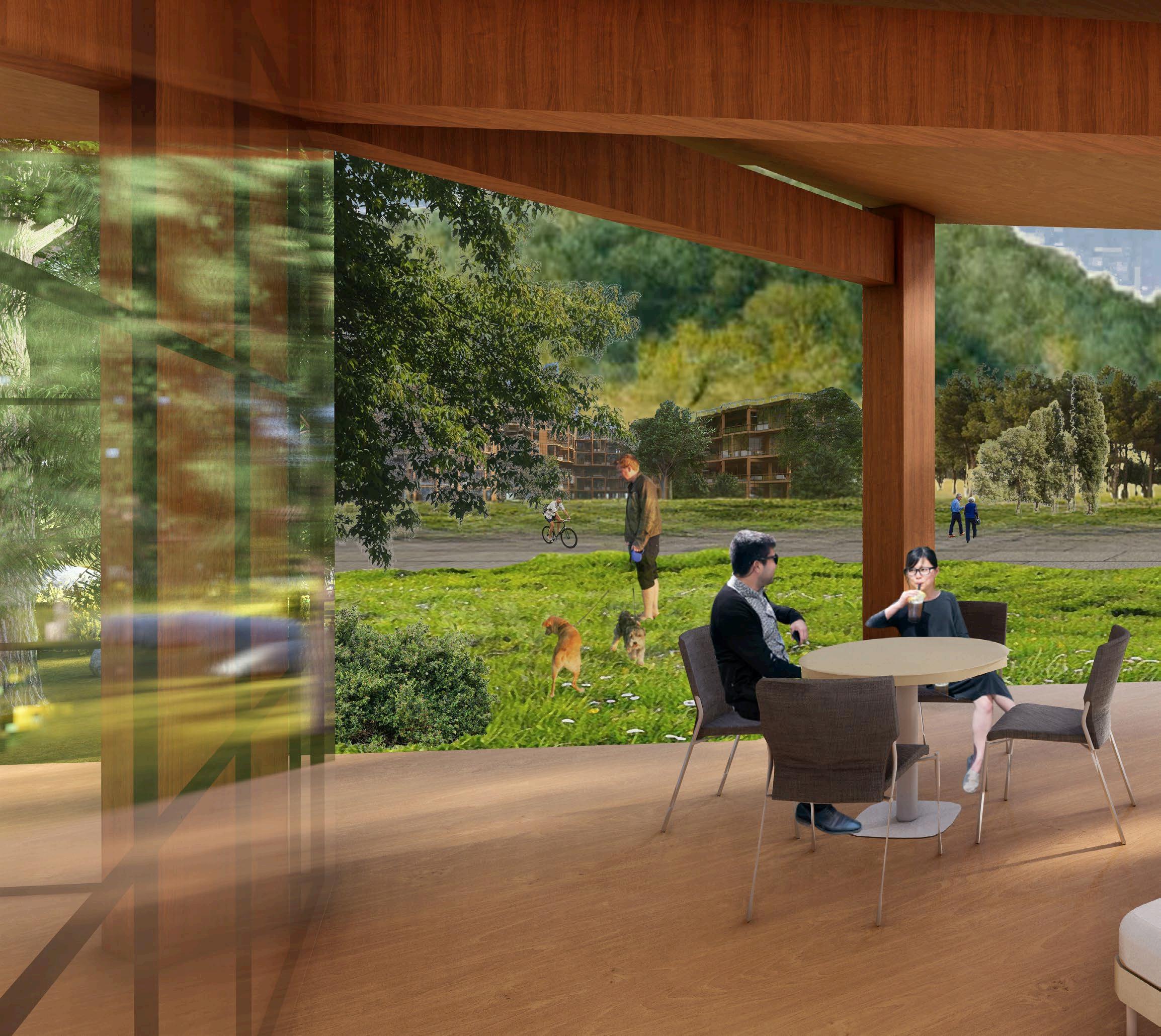
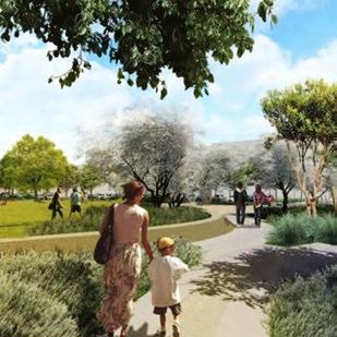
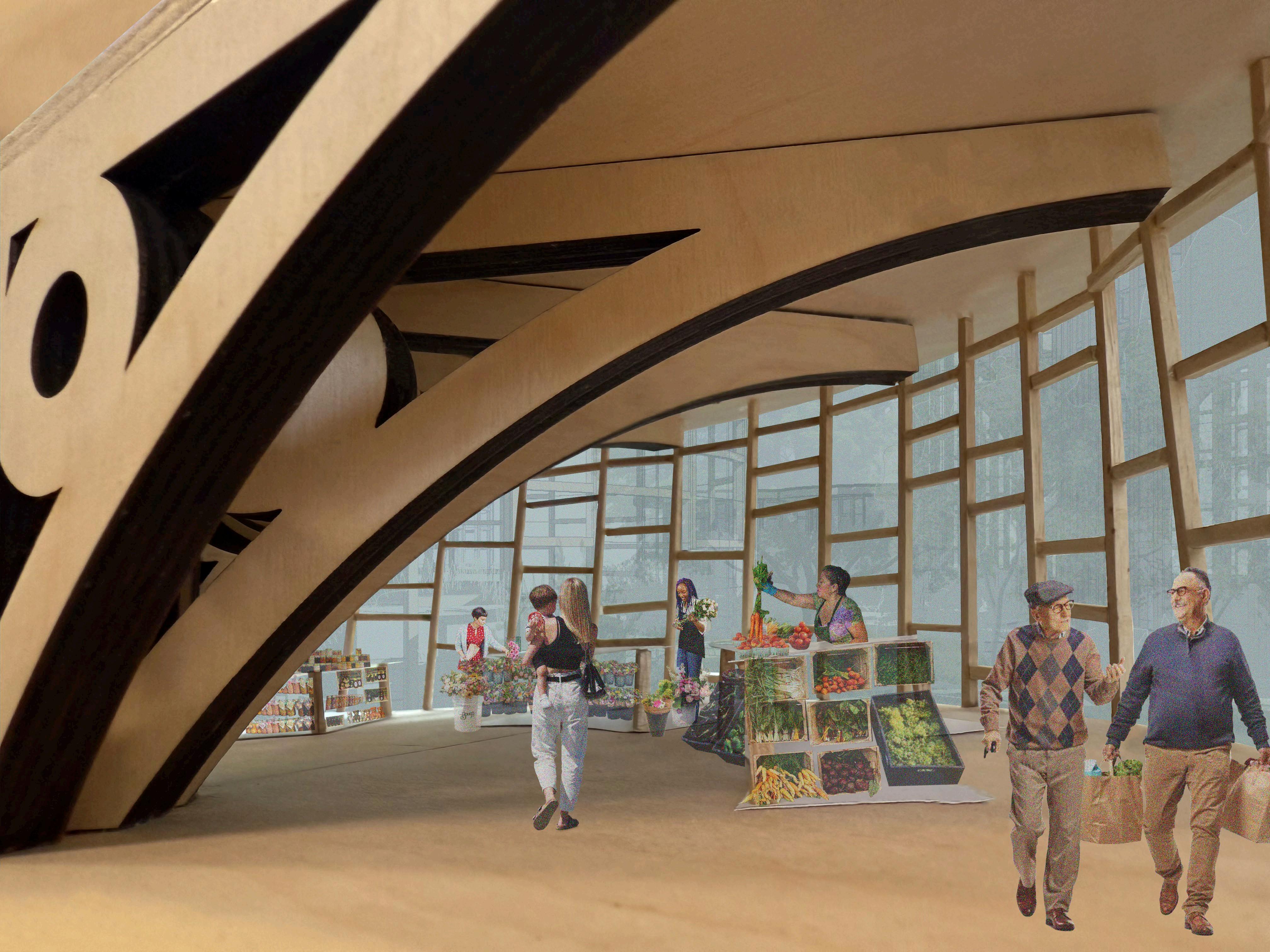
wHEN DESIGNING A MARKETPLACE fOR THE RAPIDLY EVOLVING CITY Of EAST PALO ALTO, I AIMED TO CREATE A COMMUNITY-fOCUSED MARKET AND GATHERING PLACE THAT UPLIfTS LOCAL ARTIsans. initially, the project’s neighborhood was introduced to us as a food desert. however, upon visiting the site, which is currently a mcdonald’s, i made two realizations. first, there is a well-stocked, family-owned supermarket across the street from the site. second, the mcdonald’s currently occupying the site is an important hub for the community. during my visit, i witnessed friends sharing breakfast, coworkers grabbing coffee on their way to work, mcdonald’s employees sitting and CHATTING wITH PATRONS, AND EVEN A SLIDESHOw, DESIGNED BY AN EMPLOYEE, fEATURING fAmous black inventors playing on the tv.
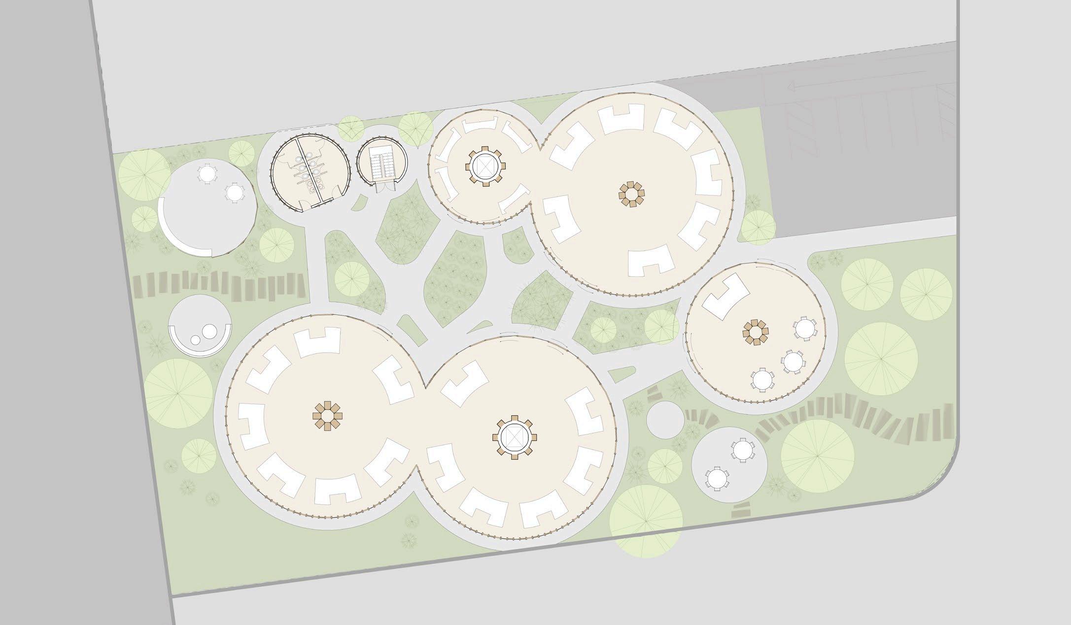
IT RAPIDLY BECAME CLEAR THAT wHAT THIS AREA NEEDED wAS NOT ANOTHER SUPERMARKET THAT COULD PUT LOCAL ENTREPRENEURS OUT Of BUSINESS, BUT A GATHERING PLACE THAT fEELS accessible and welcoming to the community. this realization resulted in a park-like space that hosts a series of pavilions. each pavilion features rentable market stalls for local artisans and farmers to sell their creations. by replacing the formerly paved site with green space, the project provides the community with both indoor and outdoor spaces for shopping and gathering.


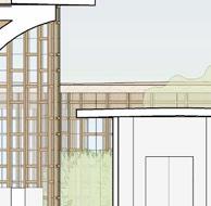
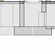


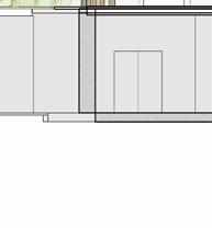
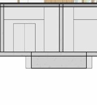
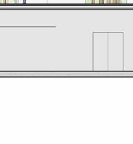
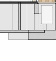
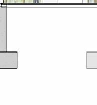
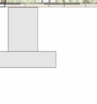
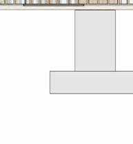


each pavilion is supported by “branches” composed of a column, a curved knee brace, and a beam. these branches form a circle in the middle of each pavilion, which connects down into the building’s “roots,” aka concrete piers. each pavilion has a dynamic system of mullions, the spacing, size, and projection length of which grow and shrink as they travel around the building. the dynamic spacing is guided by the sun path and provides shading to the pavilions’ brightest areas. the various vertical MULLION wIDTHS, COMBINED wITH THE VARIED PATTERN Of THE HORIzONTAL MULLIONS, CREATE a dappled-light effect, mimicking sunlight passing through a tree’s leaves. together, THE MULLIONS, BRANCH-LIKE STRUCTURAL SYSTEM, AND PLUNGING PIERS MIMIC THE SURROUNDing greenery and contribute to the park-like feel of the site. the basement houses vendor storage, mep facilities, and a staff lounge that connects to a sunken patio. it IS ALSO ACCESSIBLE VIA TwO ELEVATORS THAT RISE COVERTLY fROM wITHIN THE RING Of STRUCtural supports to connect the storage facility and the marketplace.
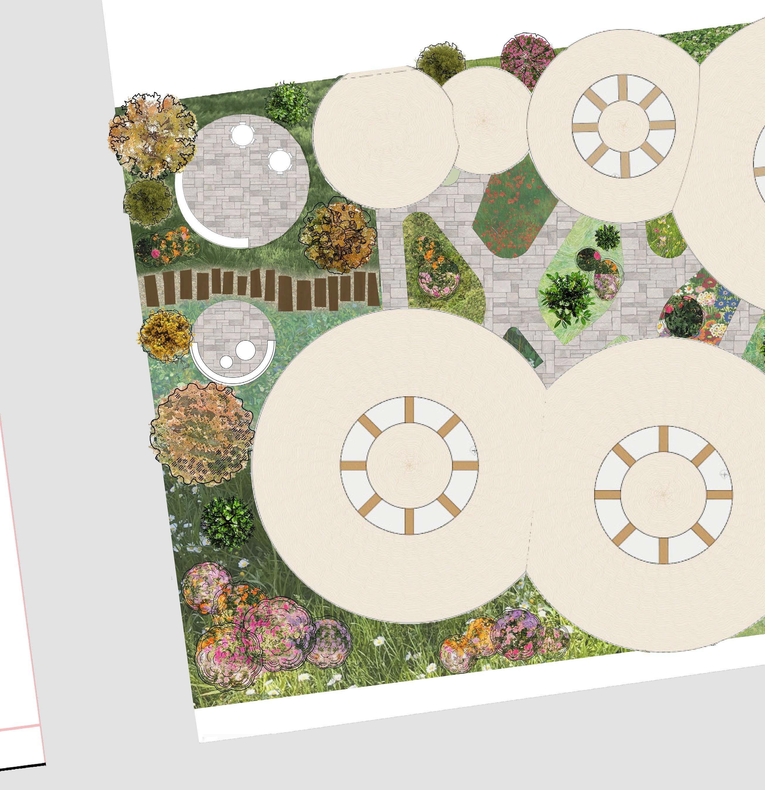
the final landscaping plan reflects the project’s ethos. it is a place to shop, but also to meander, explore, or settle in. you can bounce between pavilions, gathering treats and crafts from different vendors, or sit down and relax with your friends you can enjoy nature by wandering along a winding garden path or by settling on one of the paved patio spaces.
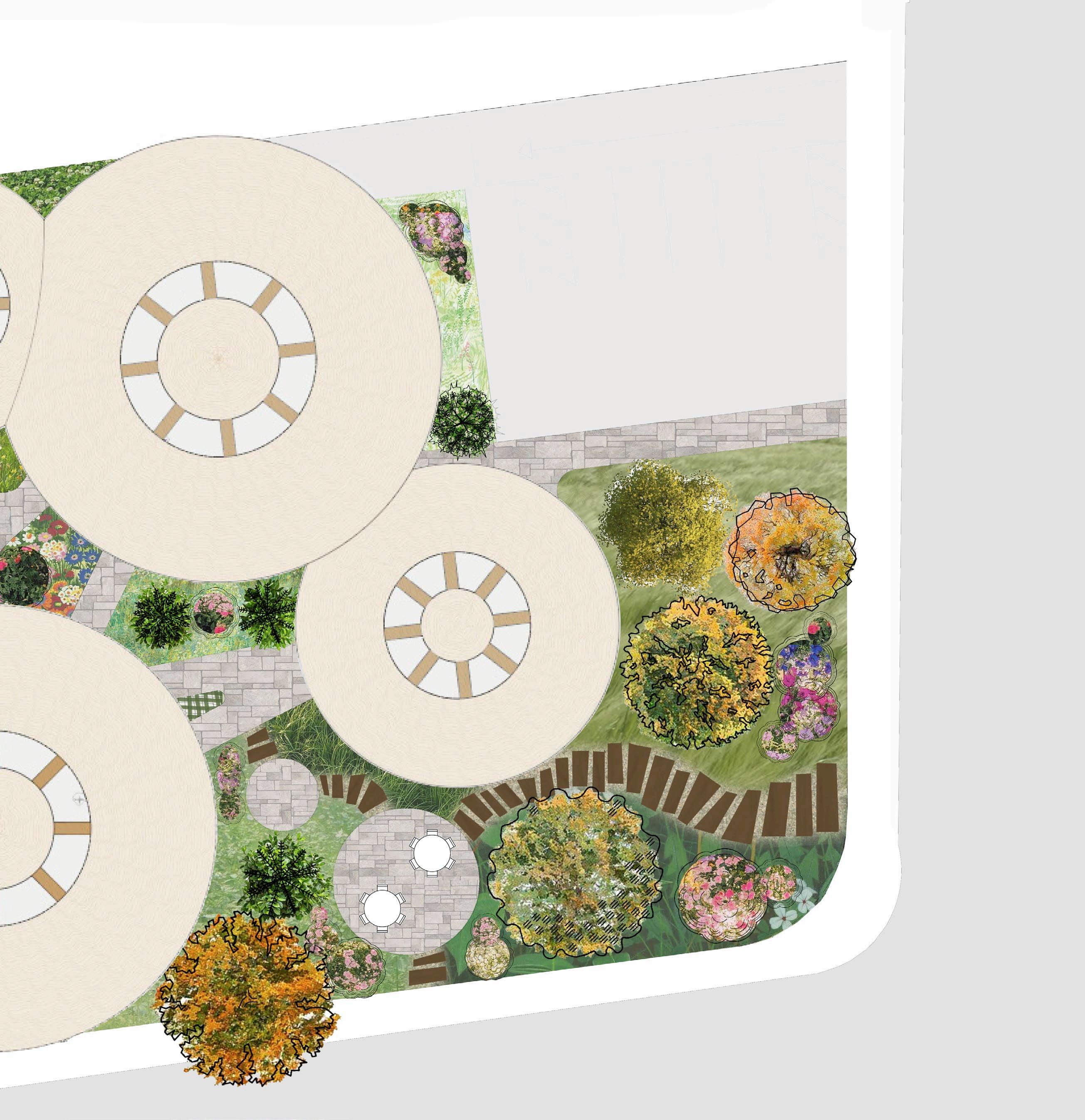
THE SITE MAY ENTICE COMMUNITY MEMBERS TO DIVERT THEIR DAILY COMMUTES Off THE SIDEwALK AND THROUGH THE PARK, OR ENCOURAGE THEM TO ENGAGE wITH NEw KINDS Of CUISINE or art no matter how patrons choose to engage with the space, the project is built to adapt and grow to fit the community’s needs, with inviting interiors, rearrangeable and reassignable vendor stalls, and a park-like exterior.
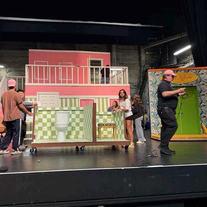
HEAD THEATRICAL SOCIETY fALL 2022
projections developed in collaboration with helen he
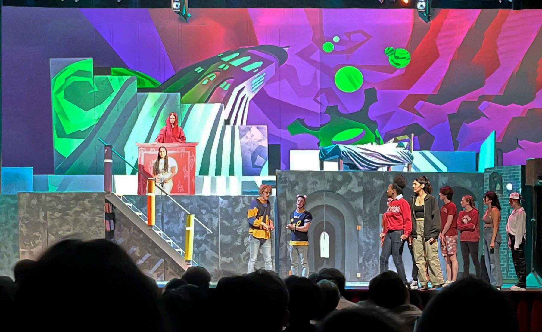
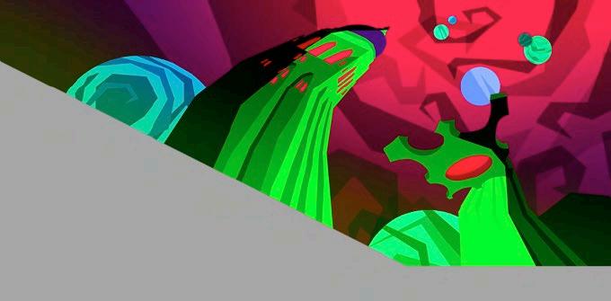
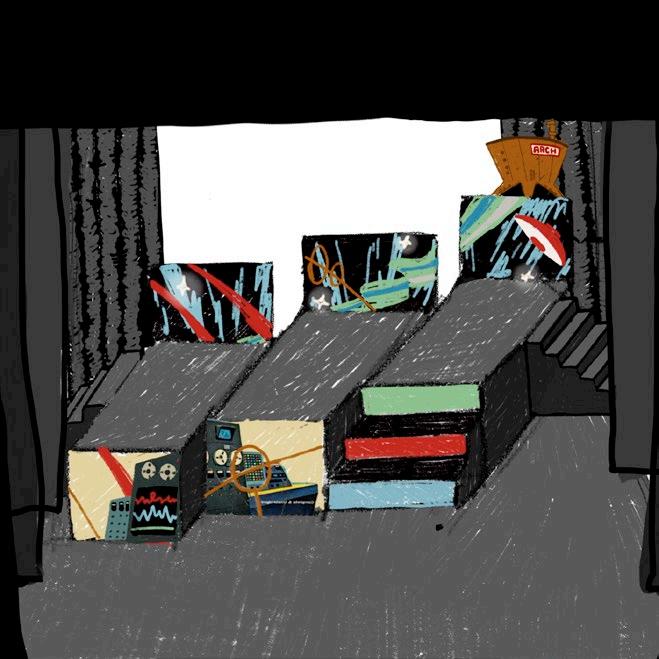
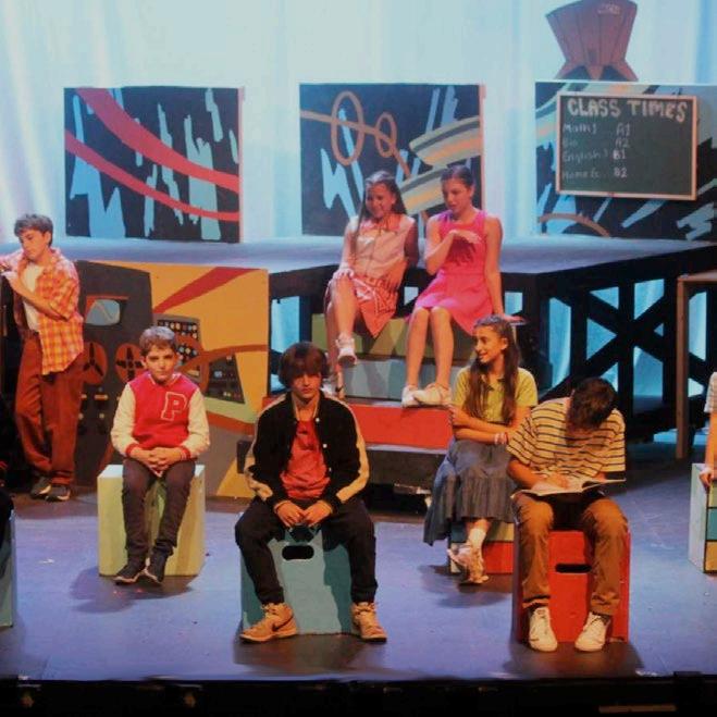
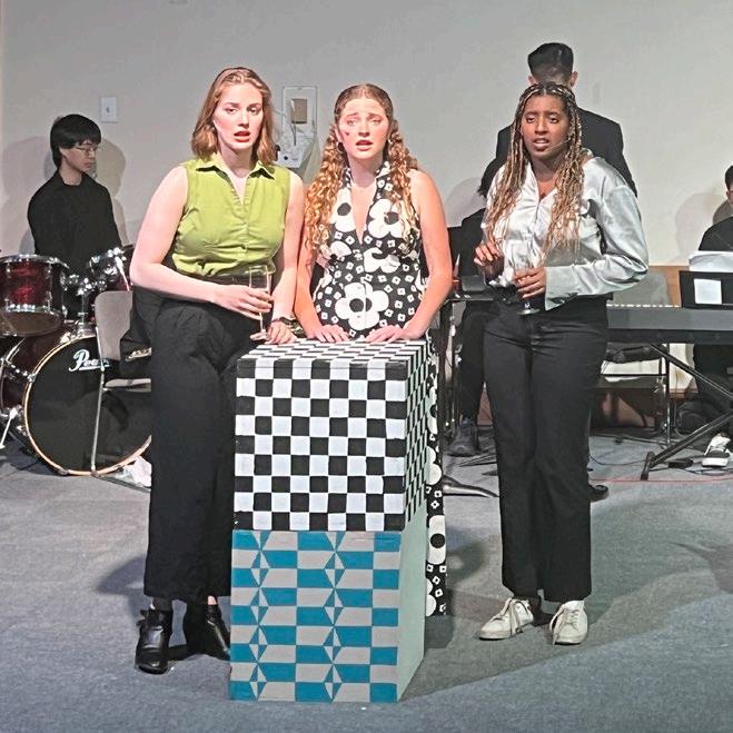
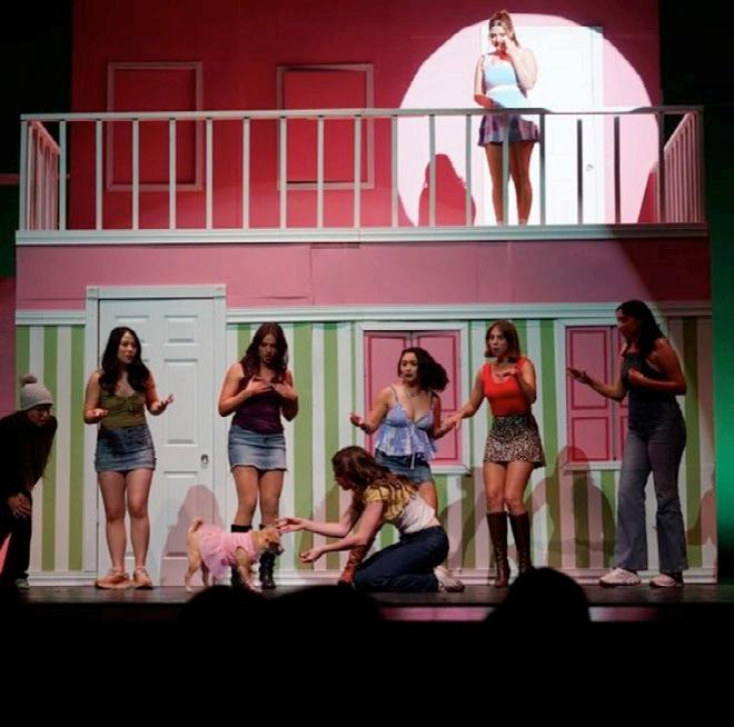
A BELOVED STANfORD TRADITION, GAIETIES IS AN ANNUAL, STUDENT-wRITTEN AND PRODUCED musical performed in anticipation of the “big game” against uc berkeley. gaieties offERS A UNIqUE OPPORTUNITY TO DESIGN A SET fOR A SHOw THAT HAS NEVER BEEN PERfORMED before collaborating closely with the writers, director, and production team, we DEVELOPED AN AESTHETIC LANGUAGE THAT TRANSPORTED THE AUDIENCE TO THE SEVEN CIRCLES of stanford hell.

campy, flamboyant, brutalist. these were the guiding design principles for the gaieties 2022 set. by contrasting fiery pinks and reds with stark concrete, we transported stanford into a horrifying alternate dimension. the unusually high, brutalist platfORMS SHIfTED AUDIENCE PERSPECTIVES, fORCING THEM TO LOOK UPwARD, AS THOUGH THEY were in the depths of hell alongside the actors. using projection as a storytelling device, we created a dynamic background that morphed with the script.
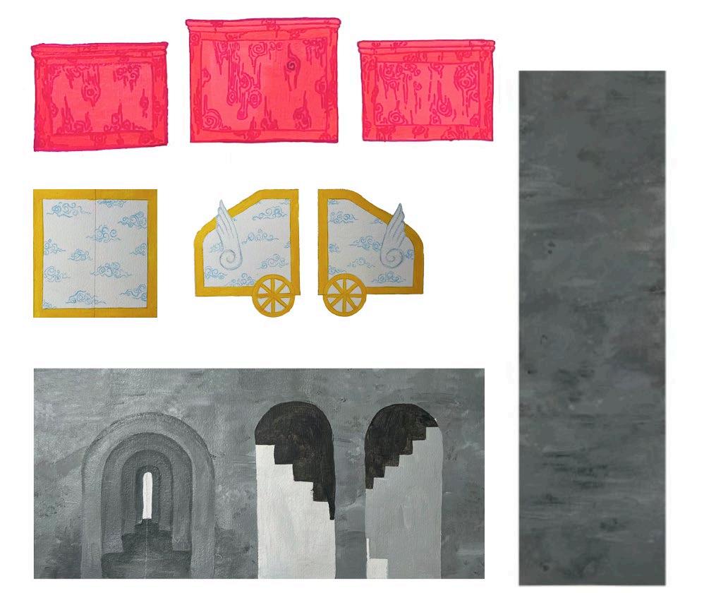
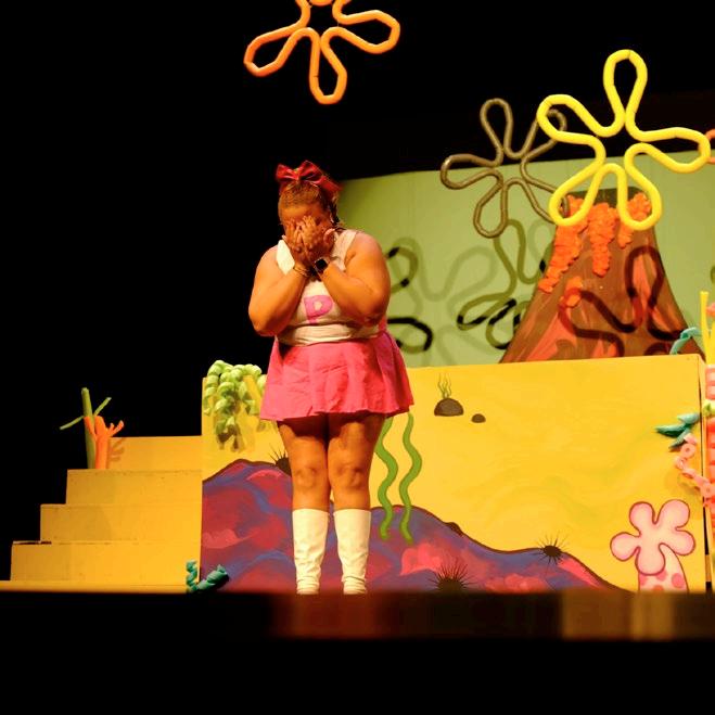
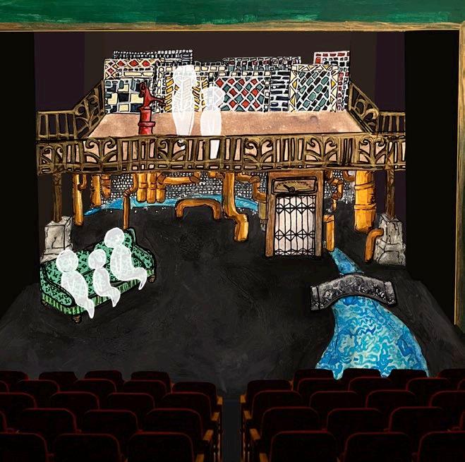
STANfORD, CALIfORNIA + HANCOCK, NEw YORK
SCENIC DESIGN
RAMS HEAD THEATRICAL SOCIETY, fRENCH wOODS fESTIVAL fALL 2021- SPRING 2025
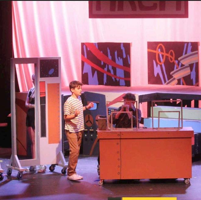
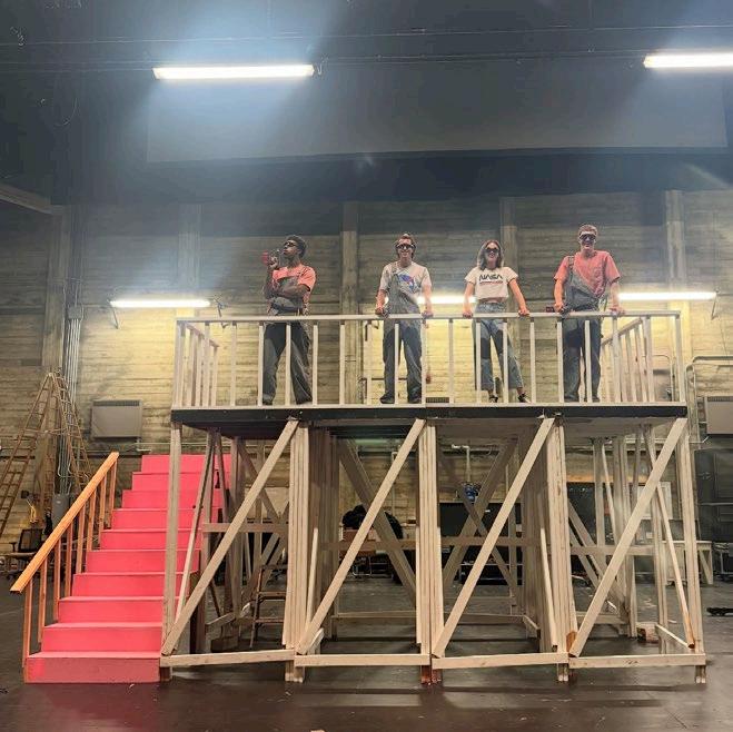
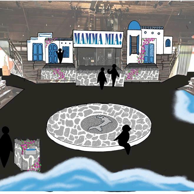
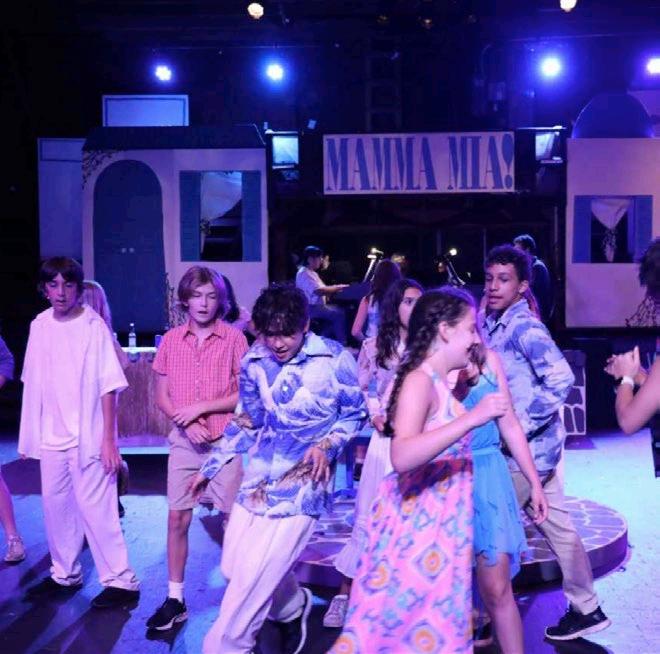
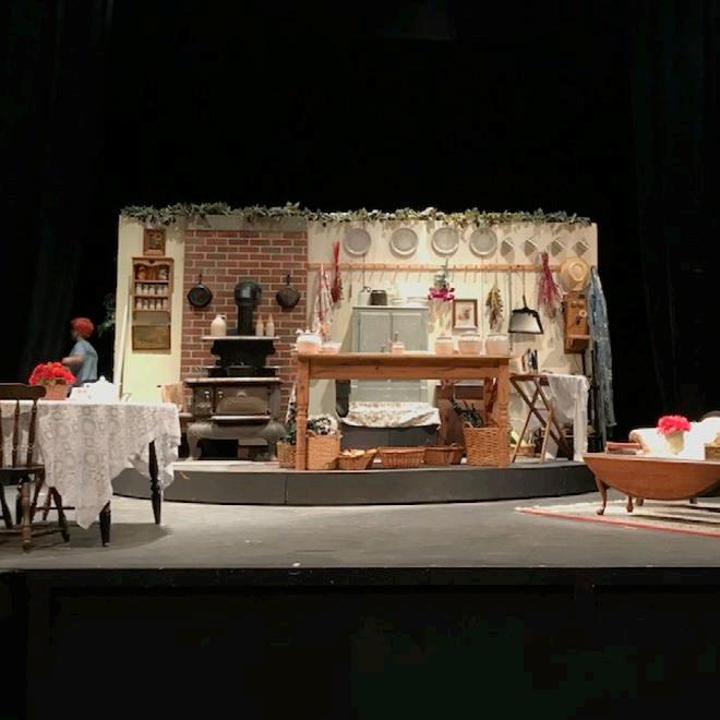
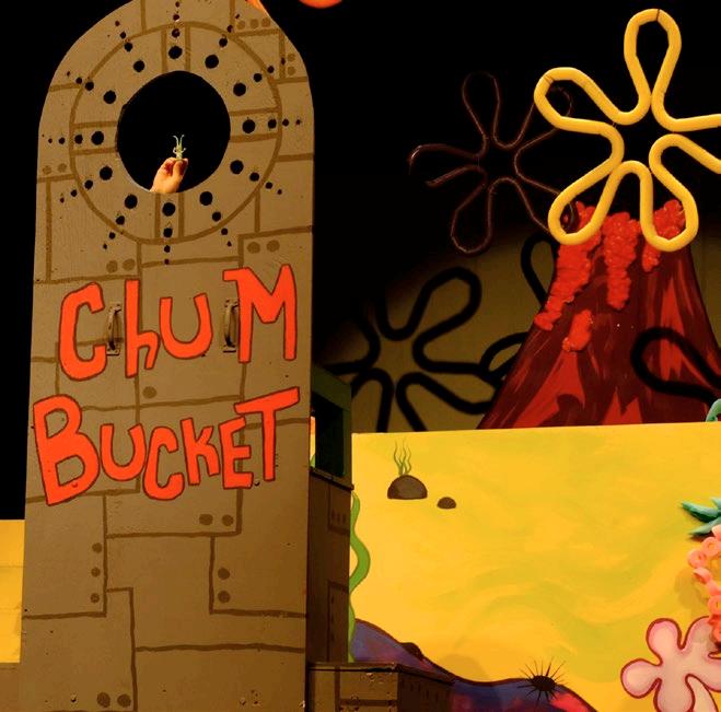
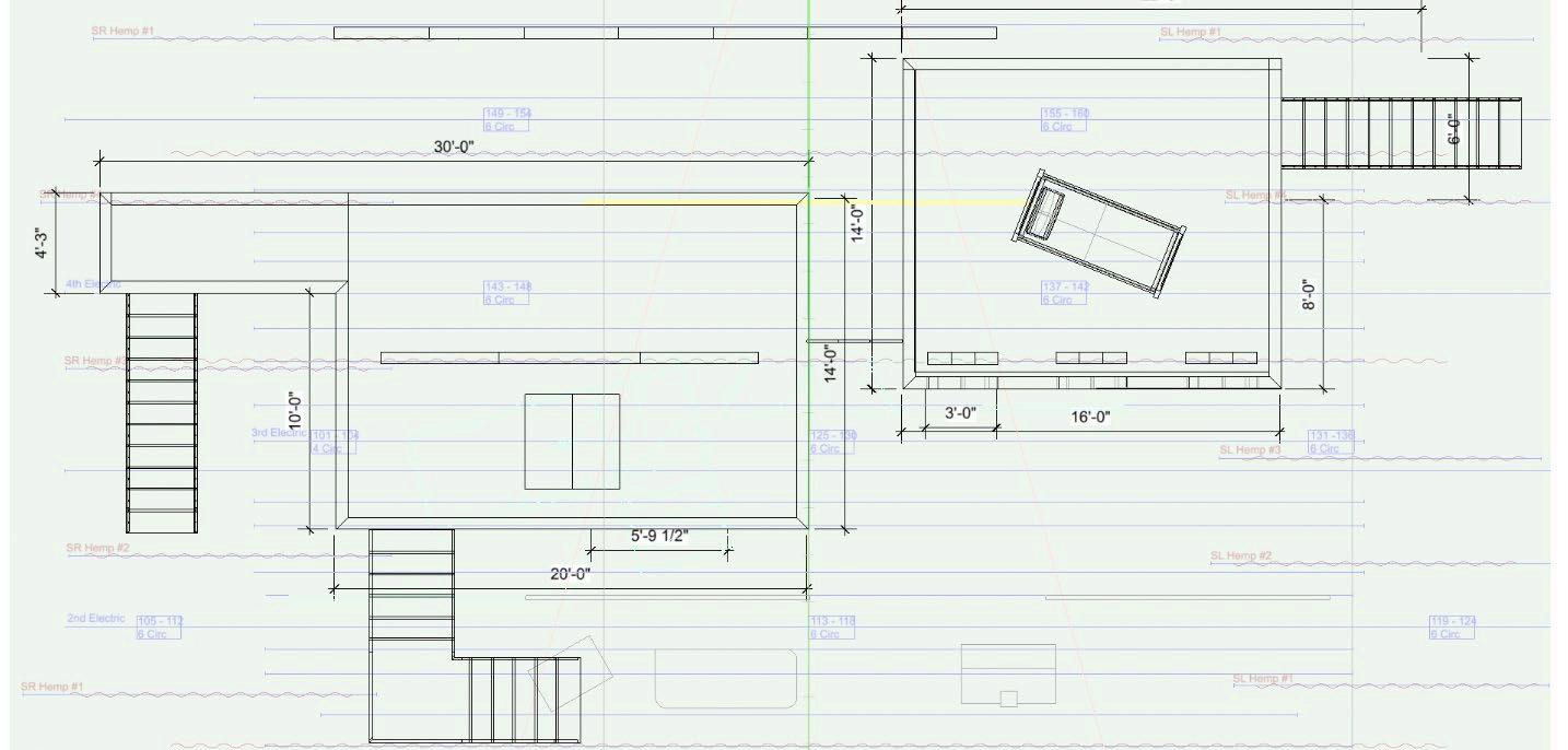
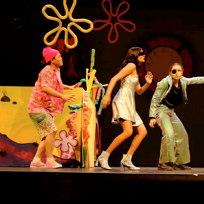
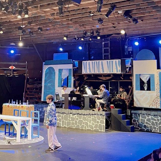
ACROSS PRODUCTIONS AT fRENCH wOODS fESTIVAL Of THE PERfORMING ARTS, STANfORD, AND independent projects, my scenic work explores how environments can support performances under real-world constraints. working on fast-paced timelines and within SHARED OR UNCONVENTIONAL THEATER SPACES, I DEVELOPED DESIGNS THAT PRIORITIzE ADAPTability, collaboration, and audience experience. projects ranged from retrofuturist, MODULAR SETS THAT ENABLED RAPID CHANGEOVERS BETwEEN MULTIPLE SHOwS TO IMMERSIVE THRUST-STAGE ENVIRONMENTS THAT REIMAGINED AUDIENCE SEATING AS PART Of THE SCENIC world. rather than pursuing strict realism, my designs often lean into abstraction, whimsy, and visual metaphor alongside scenic design, i frequently acted as technical DIRECTOR, CREATING CAD DRAwINGS, PAINT ELEVATIONS, AND BUILD SCHEDULES, THEN LEADING build crews while managing budgets and safety approvals.