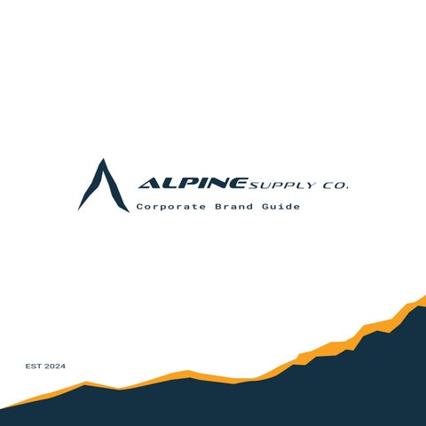
Corporate Brand Guide
EST 2024

No Adventure Is Limited
Brand History The Logos Colours Palette Typography Photo Guidelines Collateral | 5 | 7 | 11 | 13 | 15 | 17 3
Table of Contents
Nested in the heart of Whistler, British Columbia, a group of colleagues came together to form a brand with luxury, quality, and sustainability in mind.
In the beginning, the brand was pitched with another name, Mountaineer Supply Co. and was only changed when one of the founders thought to embrace the natural beauty of the humble town they are fortunate enough to call home.
Alpine Supply Co. prides itself on its forward and careful consideration for the environment, and has ensured every Alpine Supply Co. product is made with as much recycled material as possible to ensure a cleaner tomorrow.
At Alpine Supply Co. we make it our mission to provide a one-of-a-kind experience when visiting an Alpine Outlet or Flagship store. By offering an interactive purchase experience and a friendly, clients are able to enjoy the reception and warmth that Alpine Supply Co. has handcrafted for all.
Every organization/company uses a logo to promote their public image and boost recognition.
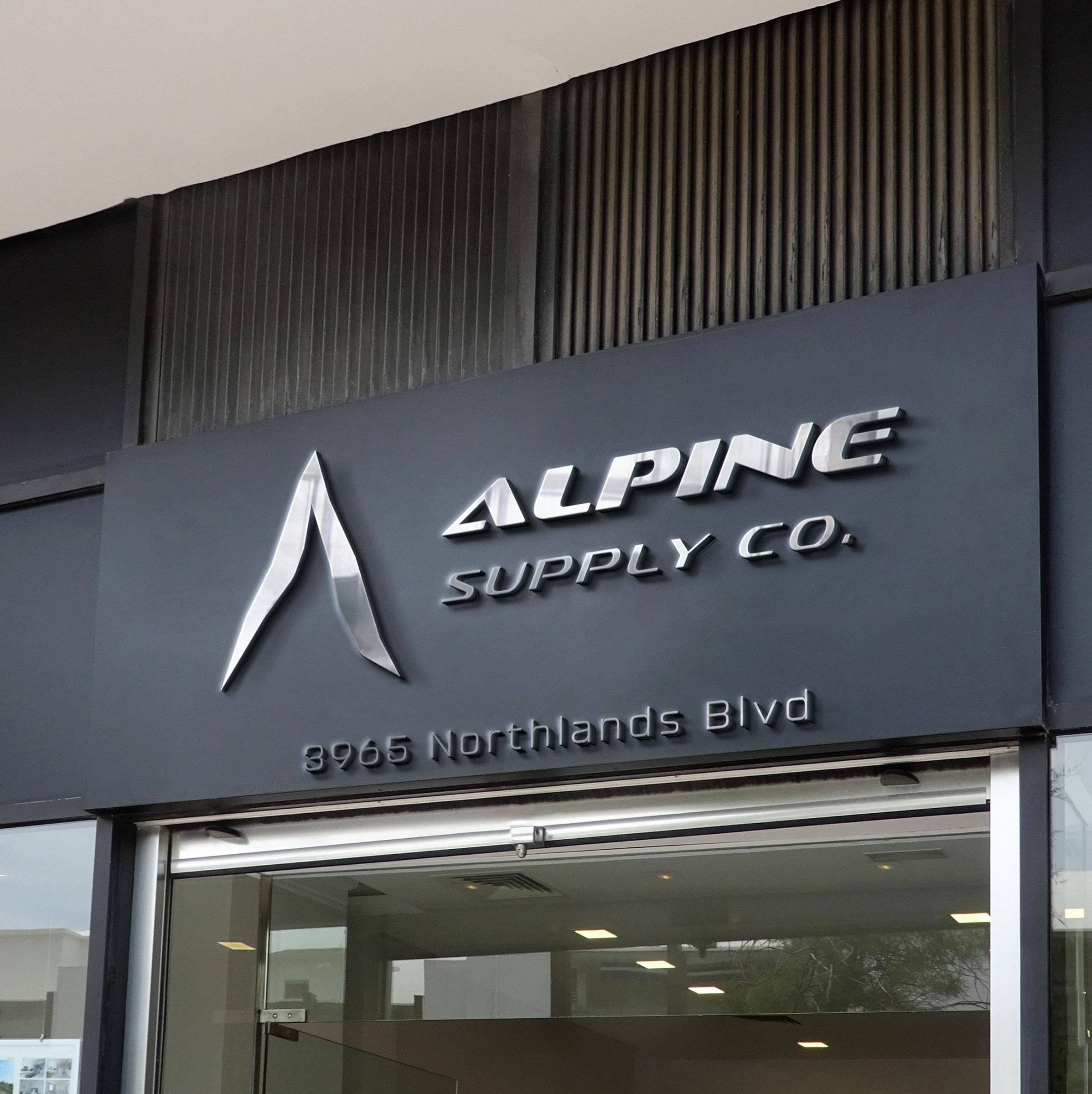
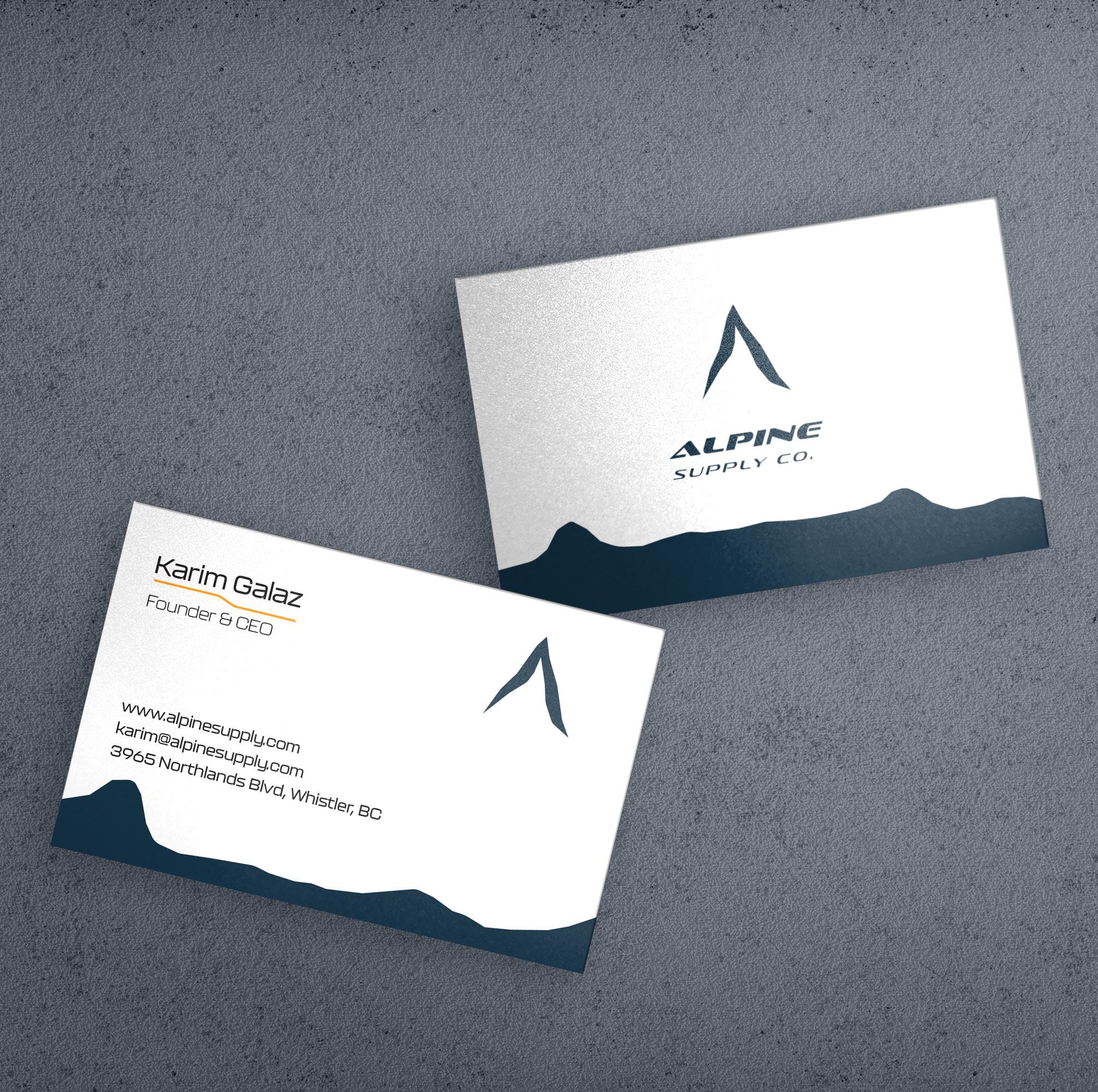
Above is the primary brand logo of Alpine Supply Co. and is used for all signage, stationery, and the corporate letterhead. The icon represents a peak of a mountain which ties in with our products for outdoor activities, in addition, the peak resembles the shape of an “A” for Alpine.
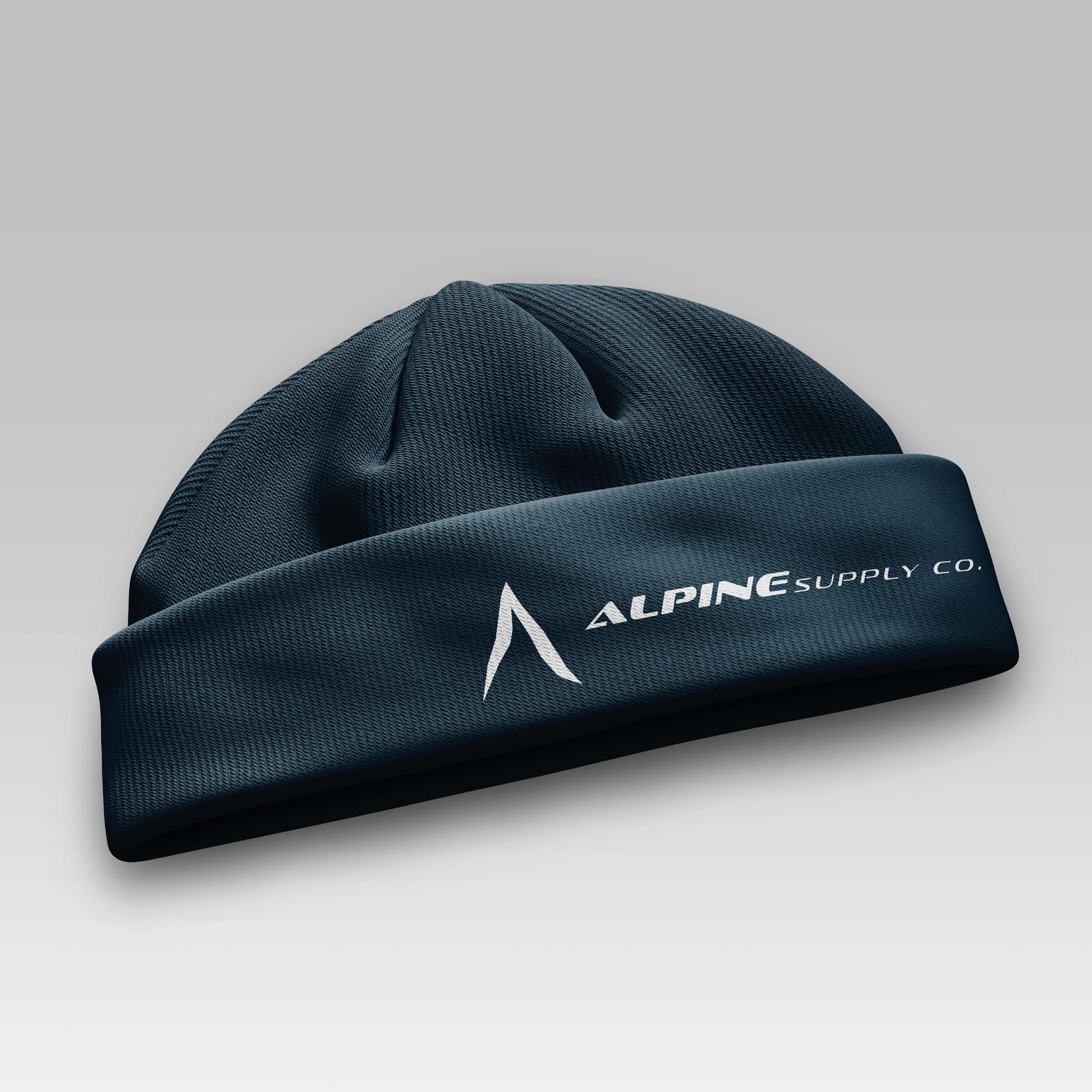
The secondary brand logo has all the logotype in one line to create a fluid appearance to the eye, this version is used on merchandise/collateral.
The simplified logo variation is a refined version exclusively used only on Alpine Supply Co. products.
The Icon variant of the logo is just the brand logo, and is used on packaging, websites, social media, and the mobile app.
Alpine Supply Co. has spent countless hours creating the iconic logo that has become synonymous with the locals. As such we take steps to ensure it is not used incorrectly. The logo is not to have a drop shadow and cannot be rotated for any reason. The logo cannot have an outline around the logotype and must always remain monochromatic. When using the logo on a photo, ensure the logo is transparent to avoid a white box blocking the photo. Finally, avoid angling the letters vertically, ensure they remain slanted.

CMYK:
C: 92 | M: 72
Y: 50 | K: 48
RGB:
R: 21
G: 50
B: 68
HEX:
#153244
CMYK:
C: 03 | M: 01
Y: 00 | K: 00
RGB: R: 245
G: 249
B: 253
HEX: #F5F9FD
CMYK:
C: 83 | M: 40
Y: 64 | K: 24
RGB:
R: 41
G: 103
B: 92
HEX:
#29675C
CMYK:
C: 00 | M: 43
Y: 99 | K: 00
RGB:
R: 249
G: 160
B: 30
HEX:
#F9A01E
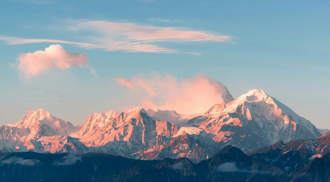
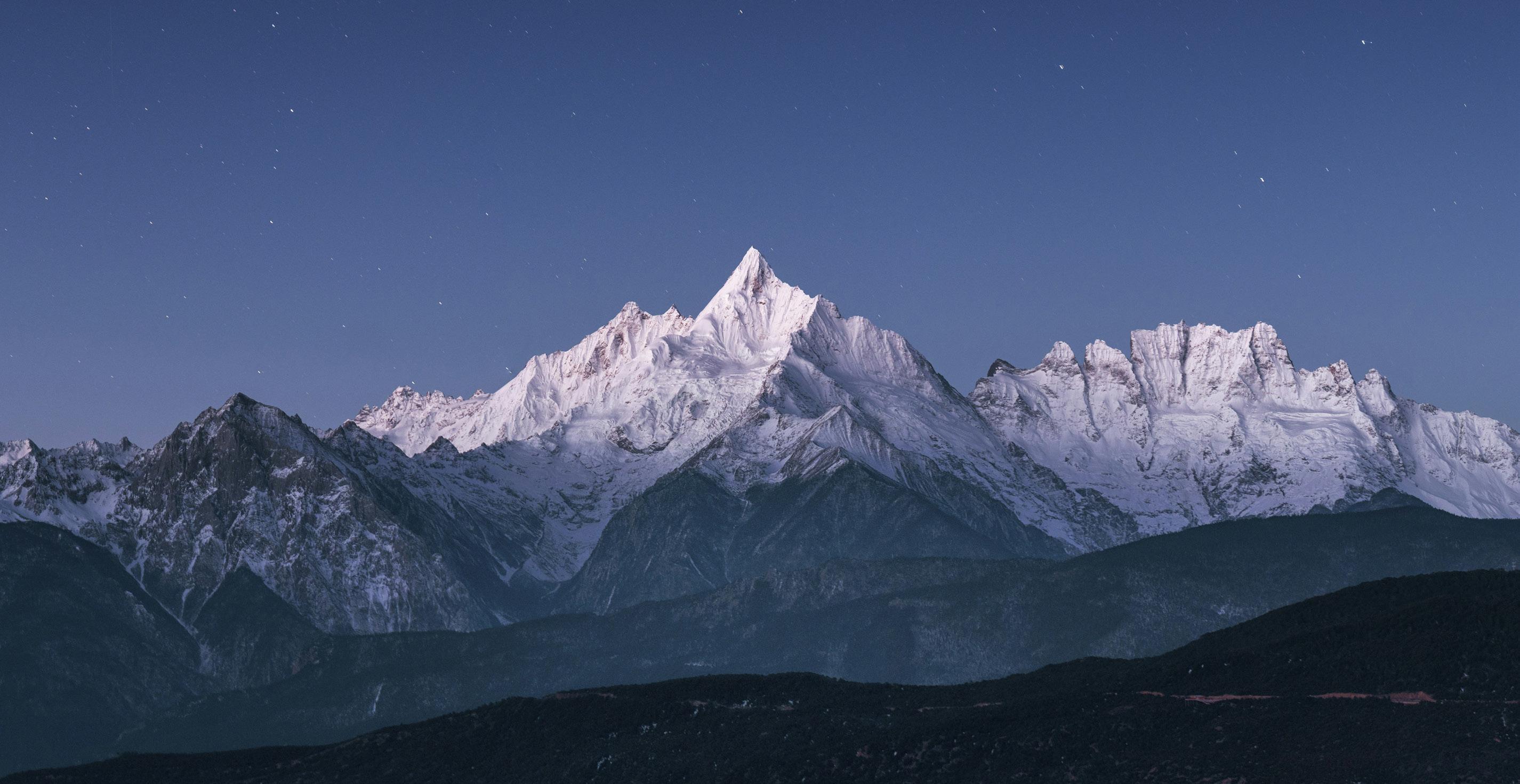
As Alpine Supply Co. specializes in mountaineering apparel and equipment, we have taken inspiration from the natural colour palette that surrounds the Whistler area. From the dark blue shadows of Whistler Blackcomb as the winter sun sets to the teal green waters of Rainbow Lake. All of these colours tie together the vivid colours of the community in which Alpine Supply Co. is founded.
Typography is a key aspect of identity for any brand, whether being newly established or a legacy brand. For Alpine, typography serves to help solidify the brands business in mountaineering.
Utilizing Sofacrhome can replicate the shape of a mountain, which Alpine Supply Co. uses to display headers & section titles on any page.
The use of Roboto for body copy and subtitles helps counter the sharpness of the headers, and allow for easier legibility for the reader.
Sofachrome Italic / headers (14pt)
abcdefghijklmnopqrstuvwxyz
1234567890 -+=!?$%
Roboto Regular / Body Copy (15pt)
ABCDEFGHIJKLMNOPQRSTUVWXYZ
abcdefghijklmnopqrstuvwxyz
1234567890-+=!?$%
Roboto Light / Captions + Fineprint (13pt)
ABCDEFGHIJKLMNOPQRSTUVWXYZ
abcdefghijklmnopqrstuvwxyz
1234567890-+=!?$%
Monserrat Regular / Suggested Web Type (12pt)
ABCDEFGHIJKLMNOPQRSTUVWXYZ
abcdefghijklmnopqrstuvwxyz
1234567890-+=!?$%
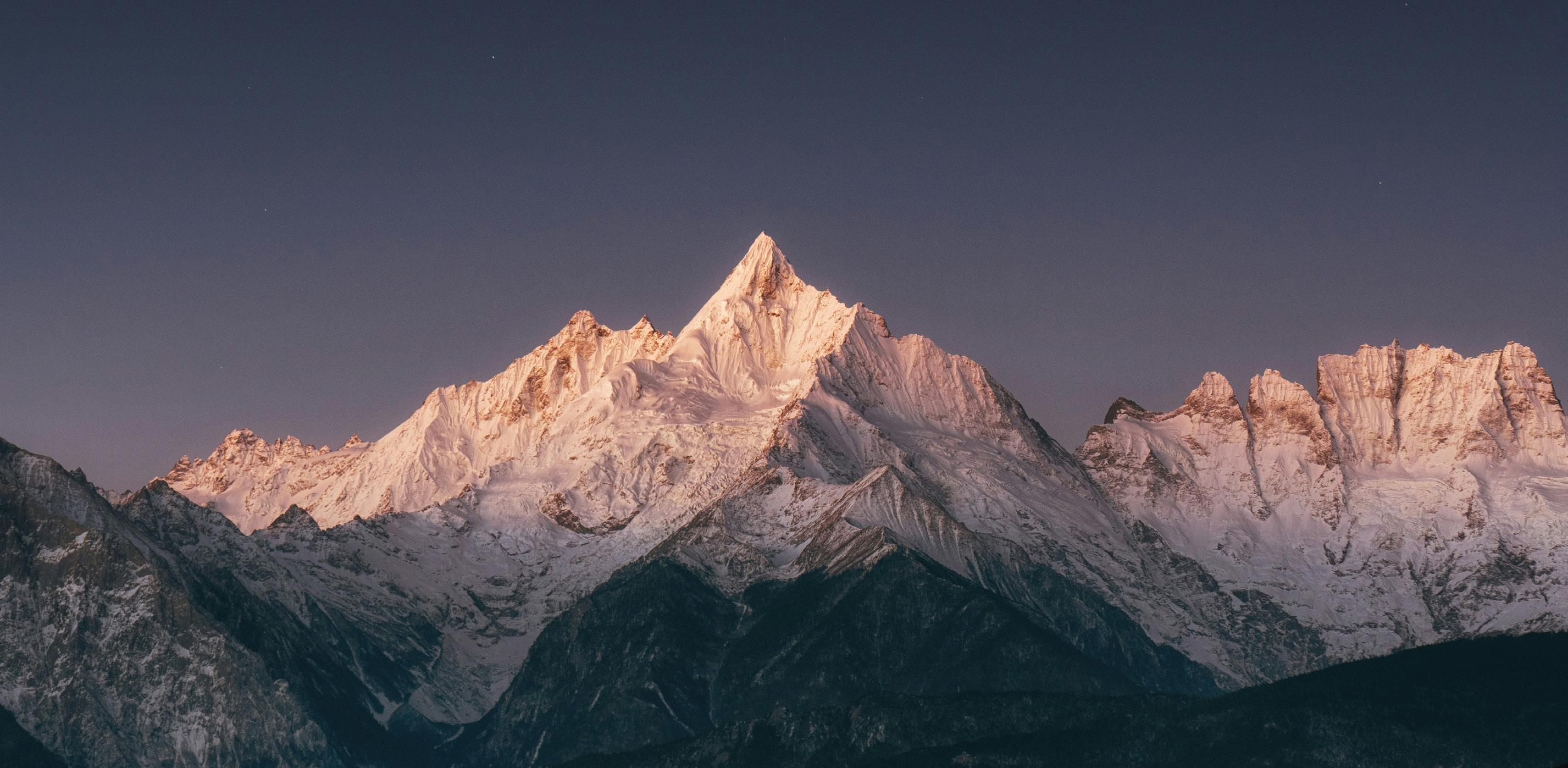
Alpine Supply Co. ensures that all photos used in any marketing / promotional campaigns are sources from freeto-use publishers and where need be, will give credit(s) to the photographers.
When using photos as a background asset, the logo should not be blocking any of the eye-catching features, as well as to avoid creating clutter with the photo.
In order to ensure clutter is minimized, the logo can be placed in an open area of the photo, such as the sky or an opening in the trees.
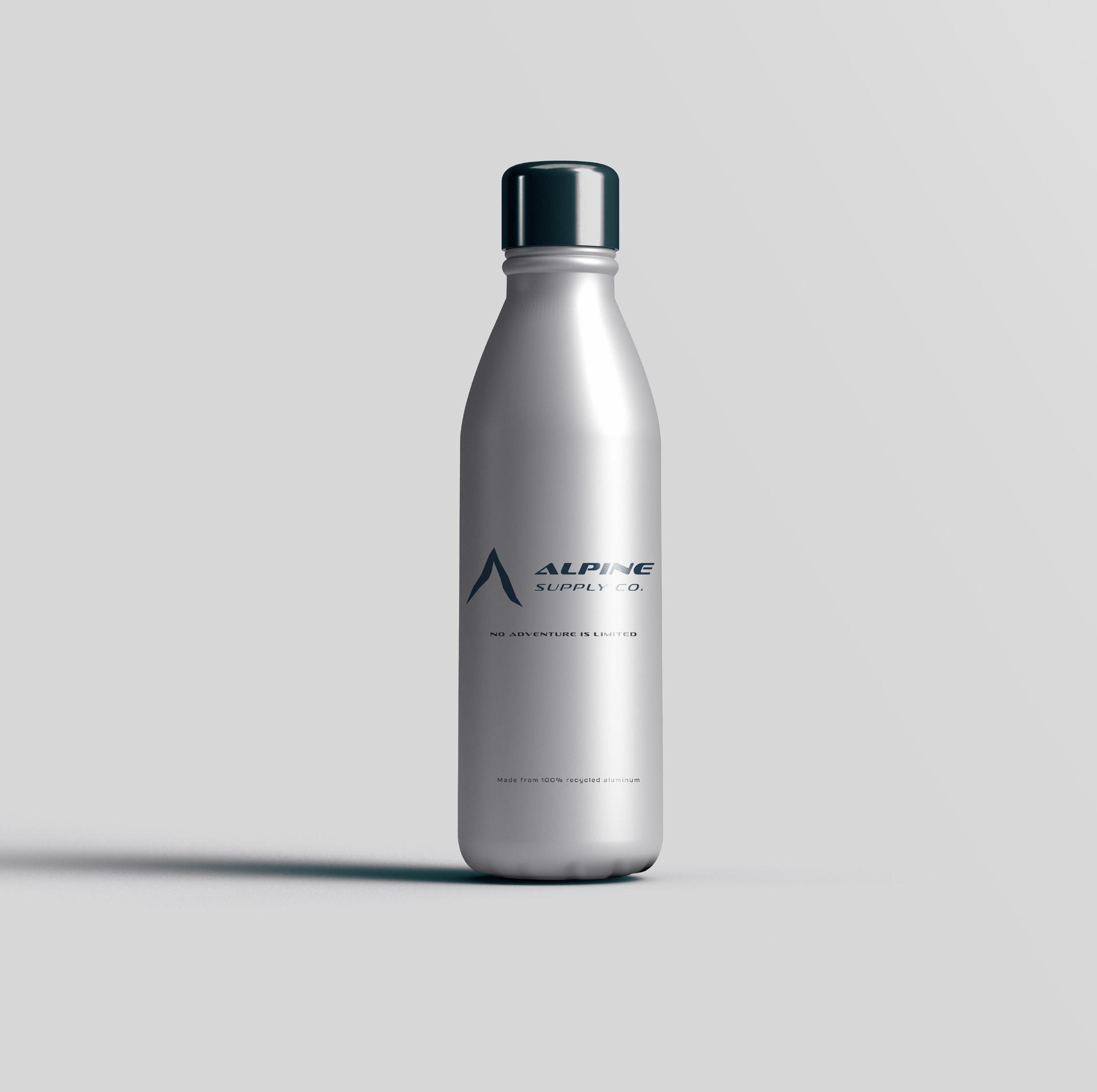
For the next few pages, Alpine Supply Co. is happy to introduce its new merchandise and production items, also known as Collateral Assets.
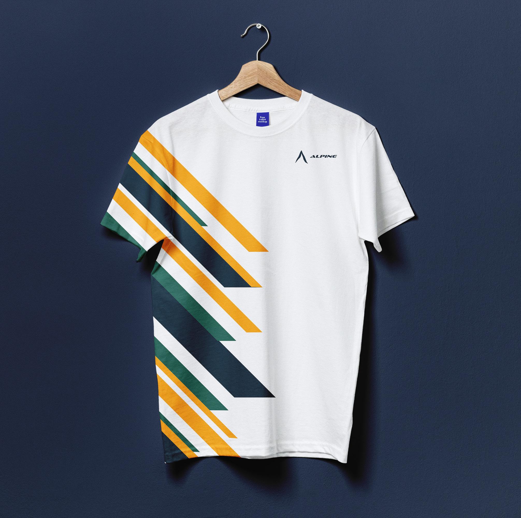
Items from our promotional line include hats, lanyards, water bottles, and t-shirts.
As part of our production line, we are happy to showcase some of our packaging assets from our sales tags, to prototype designs for our retail items.
Our product designs use our brand colours to bring style to our mountaineering apparel, as well as the use of a variety of shapes / materials to create different sections on our products.
 Production Short Sleeve Shirt
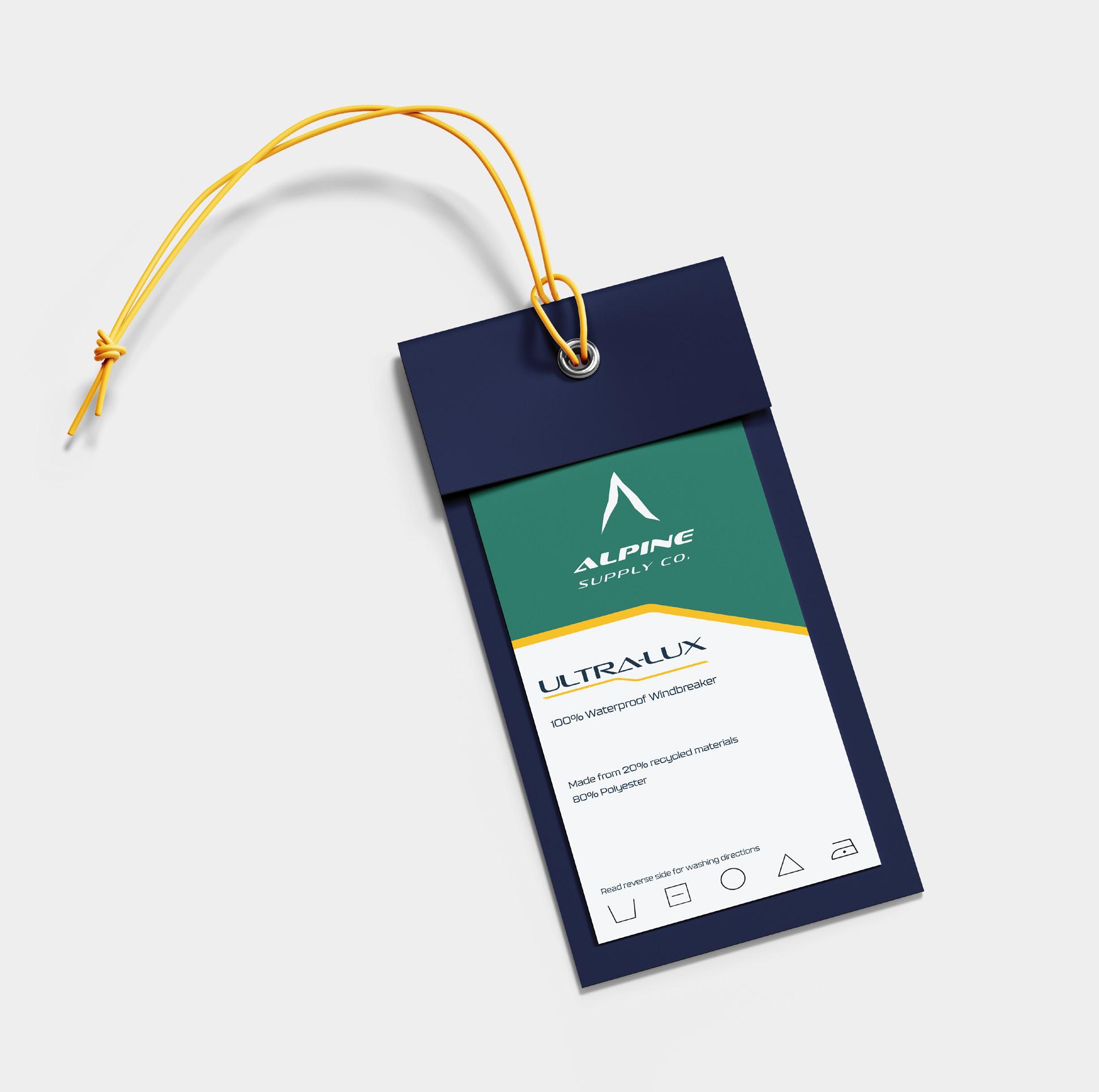
Product Item Tag
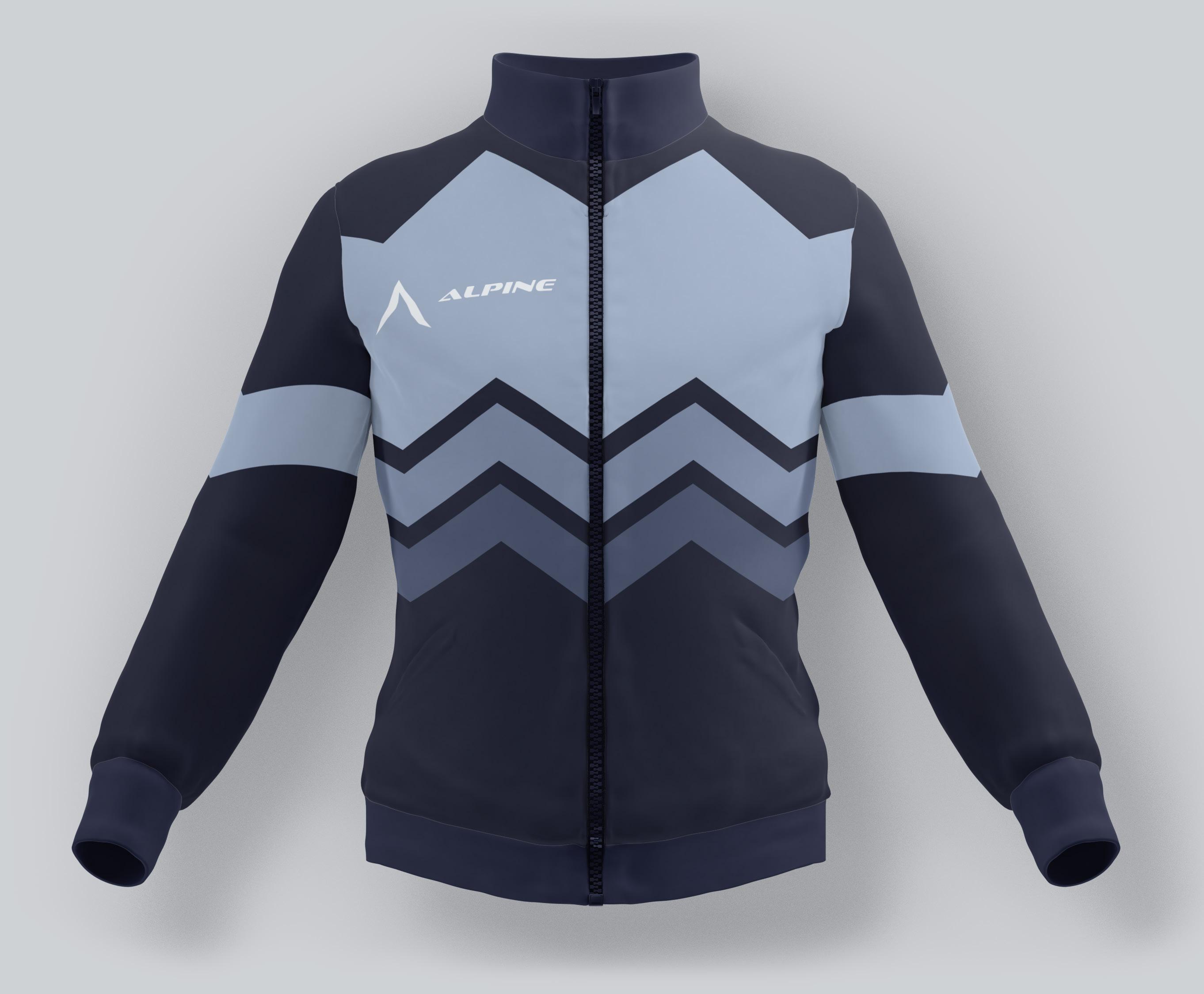 Production Women’s Windbreaker