Design 101
knv001@students.jefferson.edu
Kayla Vitabile:
I
2022
Professor Elisa Lanzutti
Design
Fall


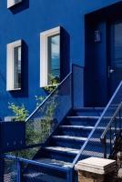
For the first project of the semester, were we told to work as a group of 3 to create a site-specific installation somewhere on the Thomas Jefferson campus that would analyze the theme of reconnection.

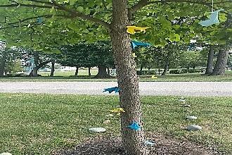
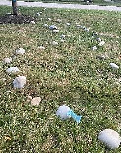
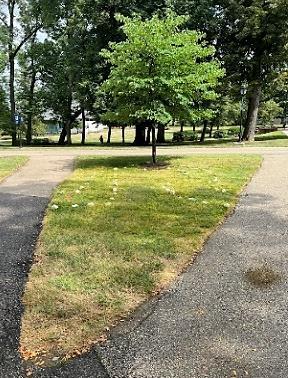
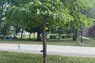
For our project, we created paper origami rams in Thomas Jefferson colors to symbolize us as students and placed them throughout the installation. We created rock pathways that surrounded our main focus, a tiny tree slightly offset of the center of a grass patch. The rock paths were of all different shapes and length to symbolize the different paths that each student may take to get to Jefferson, some may be long and strenuous, while some maybe be easy and short, bur eventually we all come together at the university (the tree) to reconnect. We then had some of the rams climbing up the tree and hanging to represent us progressing in our studies at Jefferson to, eventually, make our way into the workforce (the branches of the tree). Once you reach the branches, the rams turn into colored leaves to represent us as rams blending into the workforce, but deep down we will always be a ram (hence them still being colored).
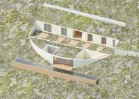
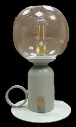
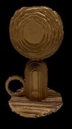
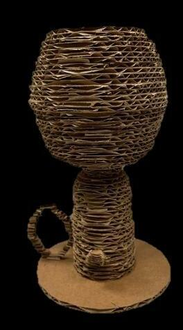
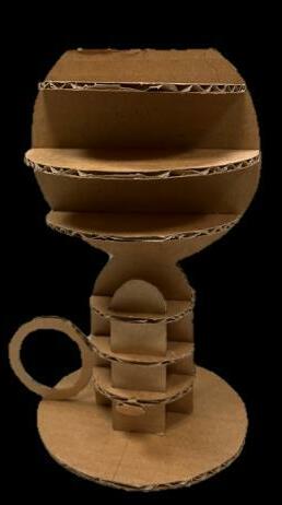
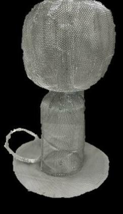
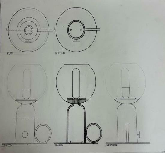
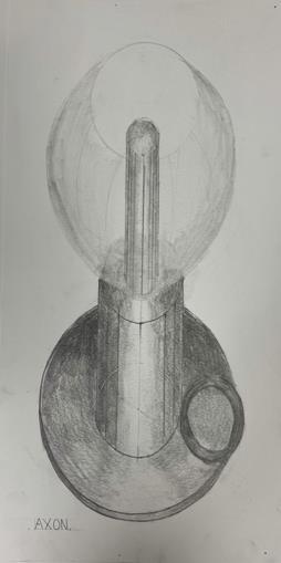
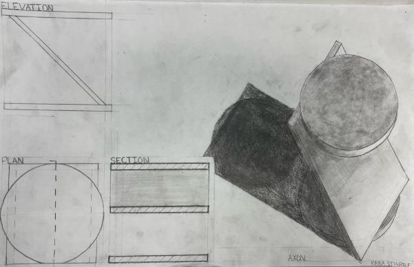
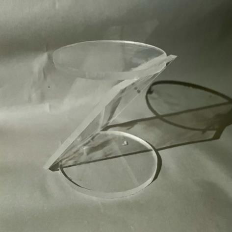
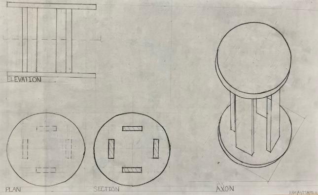
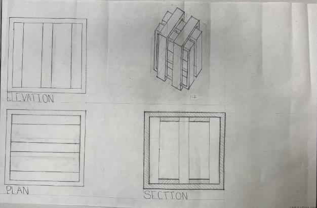
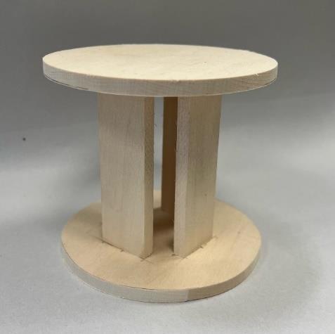
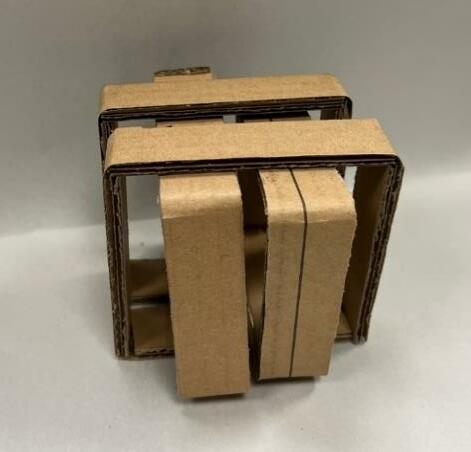
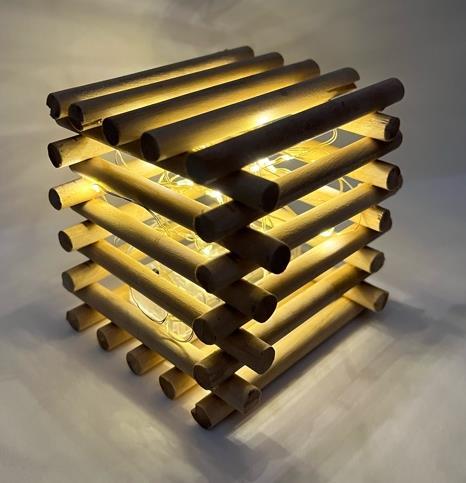
Upon completion of this project, six drawings and four models representing the chosen object, a lamp was turned in. The drawings included a plan, longitudinal elevation, longitudinal section, front elevation, cross section, and axonometric. The four models included 1 horizontal and 1 vertical stacked cardboard models, an egg-crate model, and a skin model made out of a material of our choice (mine being wire mesh).

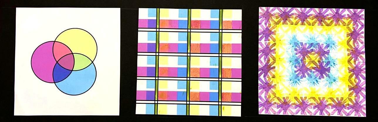
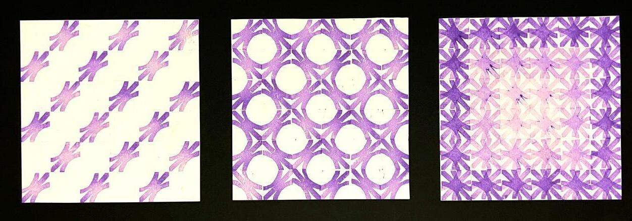
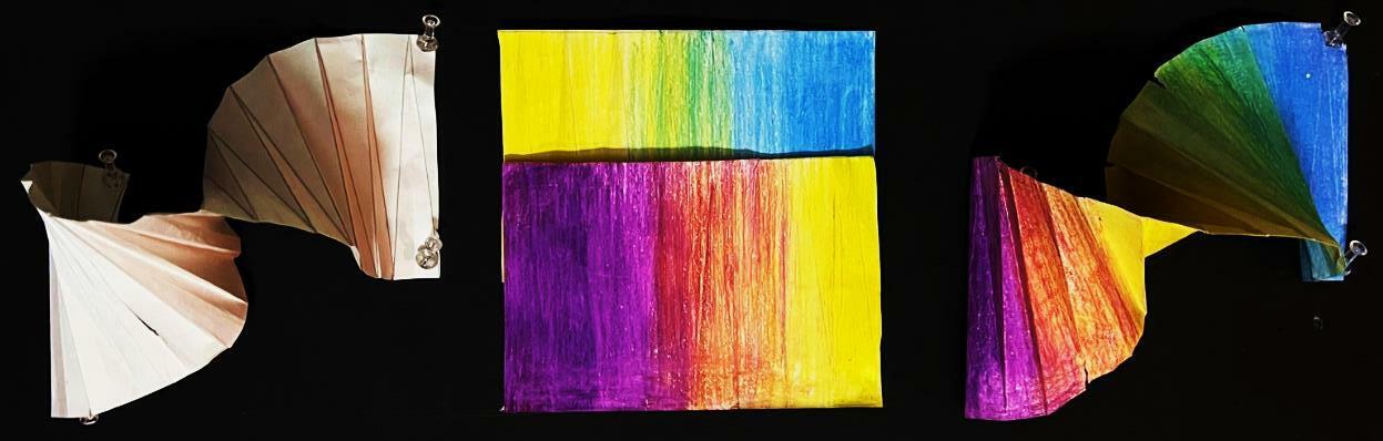
The main objective of this project was to explore how texture, tonal value color changes our experiences with form. The challenge was to explore these three feelings in order to learn and understand how they affect design. At the end of the exploration six models were created: one exploration of pattern, one of color, and one of form, pattern, and color combined. For the pattern exploration, three compositions were created using a rubber stamp, one in a basic grid set up, one using rotation, and the final by combining rotating and overlapping the stamp. Next, for an exploration of color, three colors were chosen that complimented each other. Then, a pallet and a plaid composition were generated to explore the overlapping secondary colors the three original primary colors made. Lastly, the overlapping pattern was recreated and colors was added to explore the effect color would have on the pattern. For the last exploration of form, a simple origami spiral was made and explored by adding colors, and a pattern to investigate how that would change the look of the origami. The first spiral is without color, the next the unfolded spiral cut in half to show the color placement, and lastly, the folded colored origami.

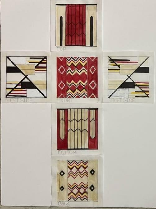
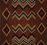
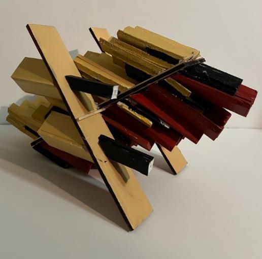
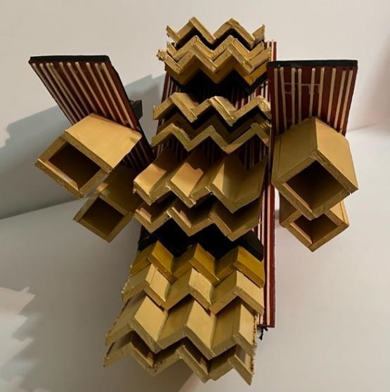
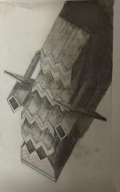
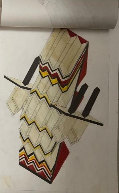
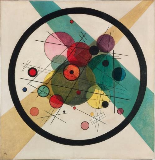
The main objective of this project was to understand the main differences between 2D and 2D representations. In this project we were given a textile to analyze, in my case that was the Navajo Wearing Blanket. We had to take that 2D textile, create a series of diagrams analyzing the main concepts depicted in our textile. Then we were told to come up with a 3D model that would look like our textile on one face but explore the main elements we had depicted in our analysis. For my design, I choose to focus on the symmetry, main shapes, and hierarchy of the colors in the textile. The colors that popped out the most, the tan and yellow, were placed at the forefront of my model, whereas the colors that created depth, the black and red, were set back. For my other faces, I choose to do a reverse symmetry effect on the opposite face to create a similar pattern as the front face. The colors that were set at the forefront were now set back, and the colors that were set back were now placed at the forefront. We then constructed 6 2D drawings of each face and 2 3D drawings, one colored and one shaded of our model.

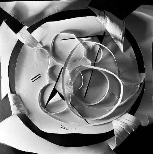
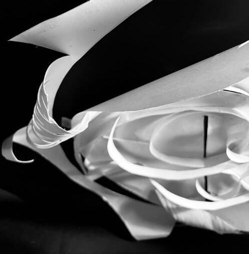
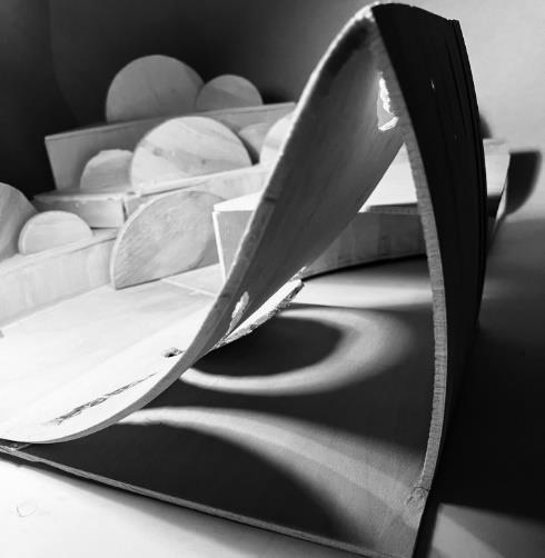
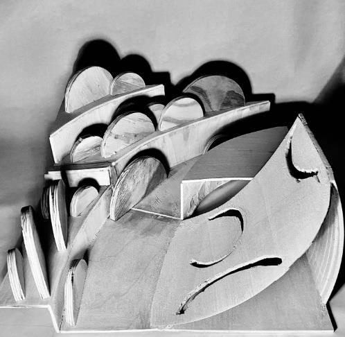
This project was divided into to parts, A and B. For part A, we were given a painting to analyze, just like we did in project 4 Visual Hierarchy. We then took those key concepts and generated a paper bas relief of the painting. The goal was to create as much depth and shadows as possible by bending, cutting, or folding the different elements in our painting and our diagrams.
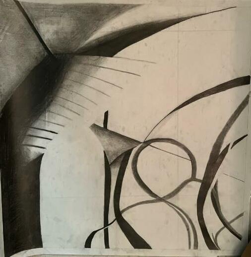

For part B, we the were tasked with taking artistic photographs of our bas relief, choosing a photo that generated the most contrast and shadows, and redrawing that photo 18” x 18” to create a “site plan.” We then constructed a wooden model using that site plan as inspiration, but the final model did not have to look exactly like the plan.
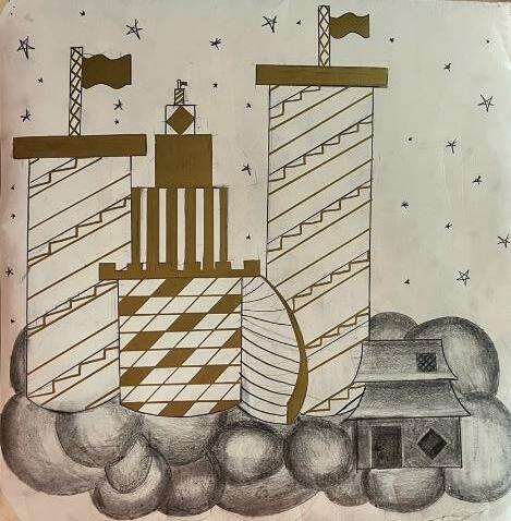
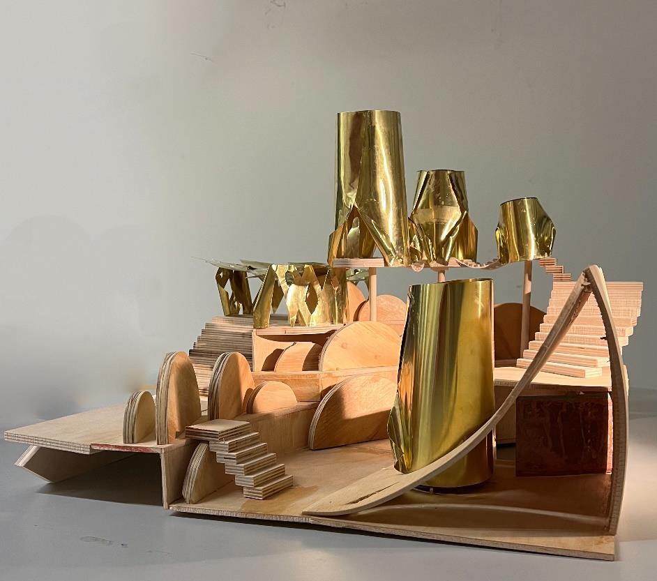
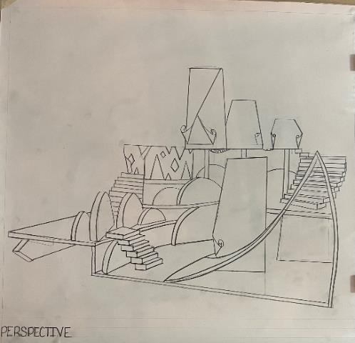
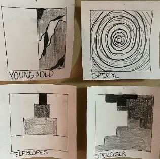
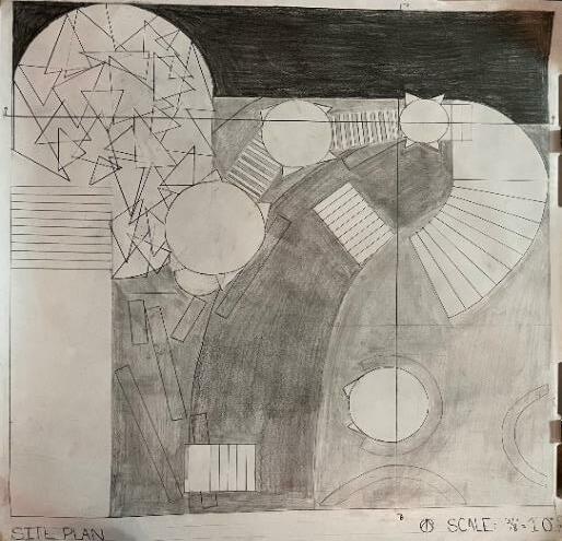
This was the final project we had for the semester. Using the model, we had created in Project 5 as the site, we generated an imaginary city inspired by a city from Calvino’s Invisible Cities. My city, Isadora, was a city that explored the concepts of young, old, and desires. It was a city of dreams with ginormous spiral seashells, telescopes, and staircases at every corner. Using those concepts, I created a theoretical artistic interpretation of what I thought my city would look like, with a ginormous castle and giant grand staircases, and a more realistic, yet depressing, tiny house in the corner that represented the old more realistic part of the city. I then took those concepts and generated a physical model and drawings to go with it.

Throughout the year we were tasked each week with generating one cube, one cylinder, and a drawing for each. Every week the material we would use would progressively get more difficult, starting with paper, foam core, and cardboard, to then generating cubes out of wood, plexiglass, and concrete. Each week as the material would become more difficult to use, we were tasked with generating creative and unique designs while still maintaining accuracy in our measurements, maintain a 4” x 4” size throughout the course. The overall of this project was to grow our craftsmanship, familiarizing ourselves with each material, and the basic concepts of hand drafting, while still allowing ourselves to be creative and challenge the idea of “What is a cube?” or “What is a cylinder?” .

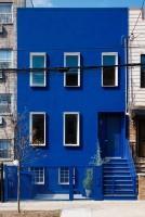
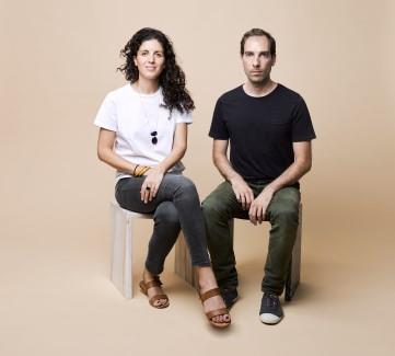
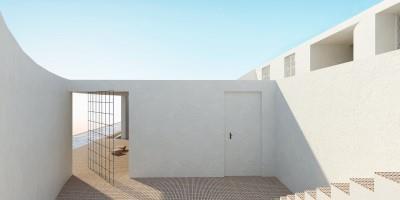
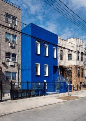
Throughout the year, each week a different group of students were to research and create a presentation on an artist significant to the world of architecture. For my presentation, my partner and I were tasked with researching LOT Architecture, a firm located in both Greece and New York. We generated a presentation that discussed what LOT’s overall goals were as a firm, their founders Leonidas Trampoukis and Eleni Petaloti, as well as showcase some of their most famous designs.