
Interior Design Portfolio
KAYLA KROHN


Wold Architects & Engineers
Interior Design Intern | May 2024 - August 2024
Iowa State University Test Centers
Proctor | March 2021 - May 2025
Waddle Exteriors & Roofing
Administrative Assistant | June 2023 - April 2024
DubH Hip Hop Club
President, Vice President, Treasurer | Spring 2022 - Spring 2025
Iowa State University STAR
Student Admissions Representative | Spring 2022 - Spring 2023


kaykrohn15@gmail.com | (712) 251-0634 | kayla-krohn
Iowa State Univeristy
Graduation: May 2025
GPA: 3.85
BFA in Interior Design
CIDA Accredited
Major in Psychology
Minor in Entrepreneurship
• Adobe Creative Suite
• Lumion / Enscape
• AutoCAD
• Revit
• Color Theory
• Visual Problem Solving
• Building Relationships
• Customer Service
• Project Management
• Communication
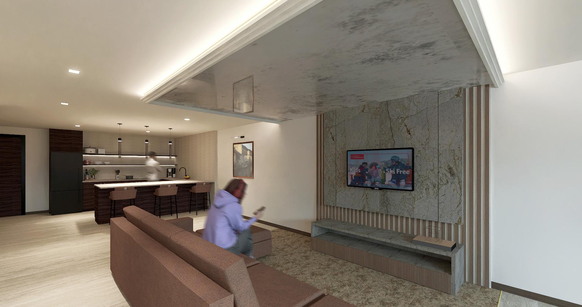
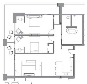
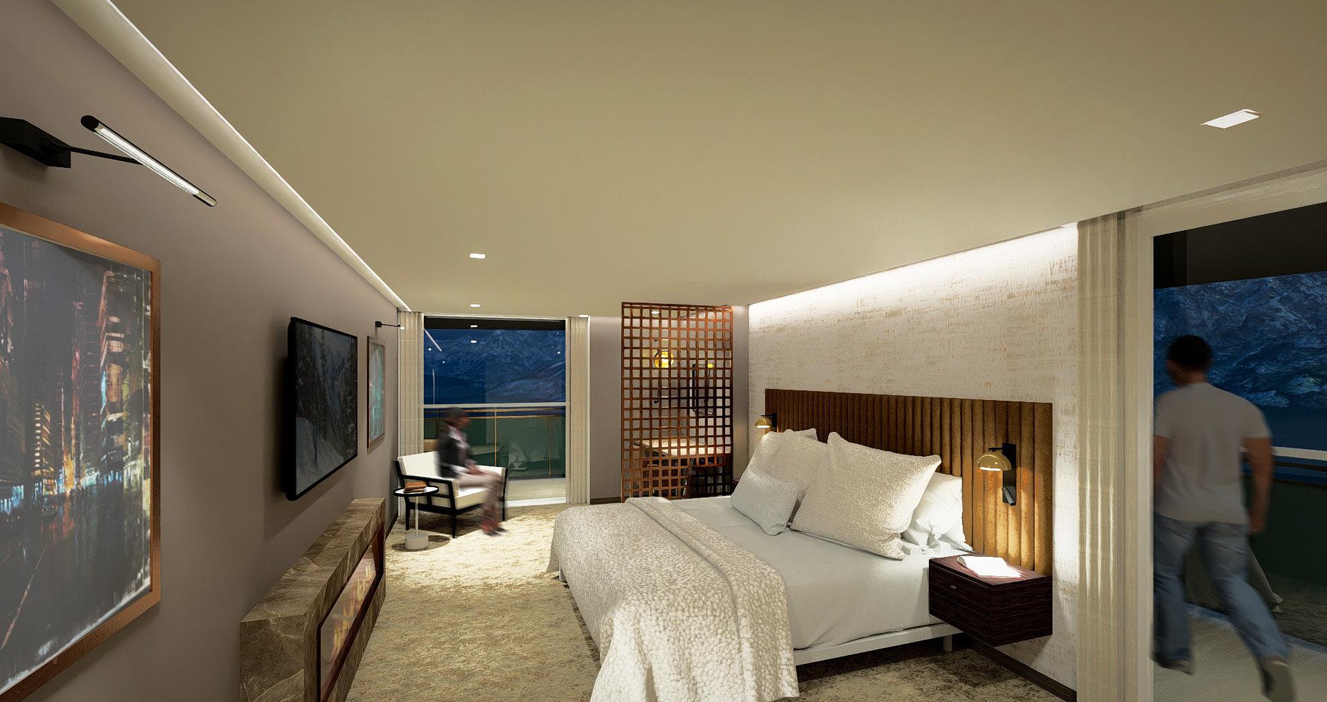
The 925 Hotel Fall 2024
Internship Work Summer 2024
Montessori School Spring 2024

Other Work
By: Kayla Krohn, Rachel Luchsinger,
Kallie Presser, & Summer Stehr
Client: ACE Hotel
- Seeking to balance work, play, and rest
- Target market: 30-50 year old business travelers
- Requirements: 24/7 availability, various amenities, ambiance enhanced spaces
1. Remote workers are looking to break through the isolation of working from home and increase their social network.
2. Hotels in Aspen are lacking all the ideal amentity options for a successful “workation.”
3. Everyone has different work styles and preferences for how and where they work. There is no “one-size-fits-all.”
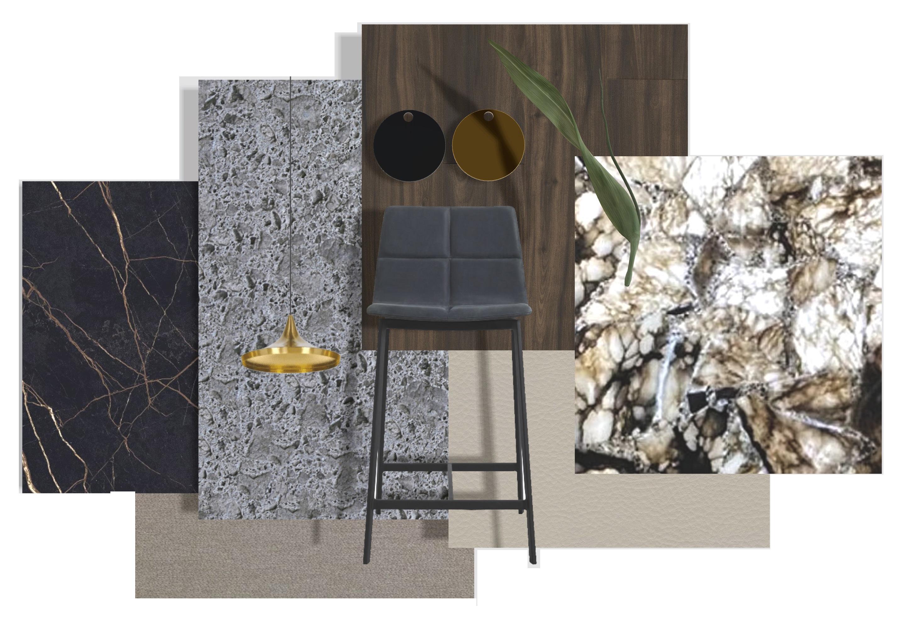
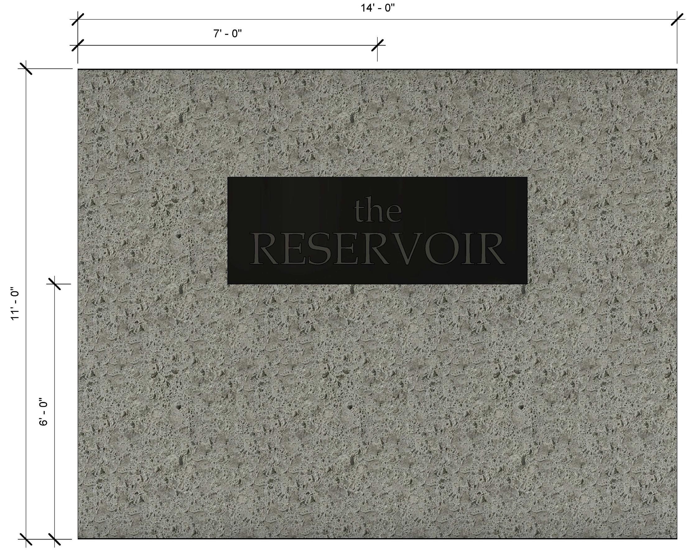
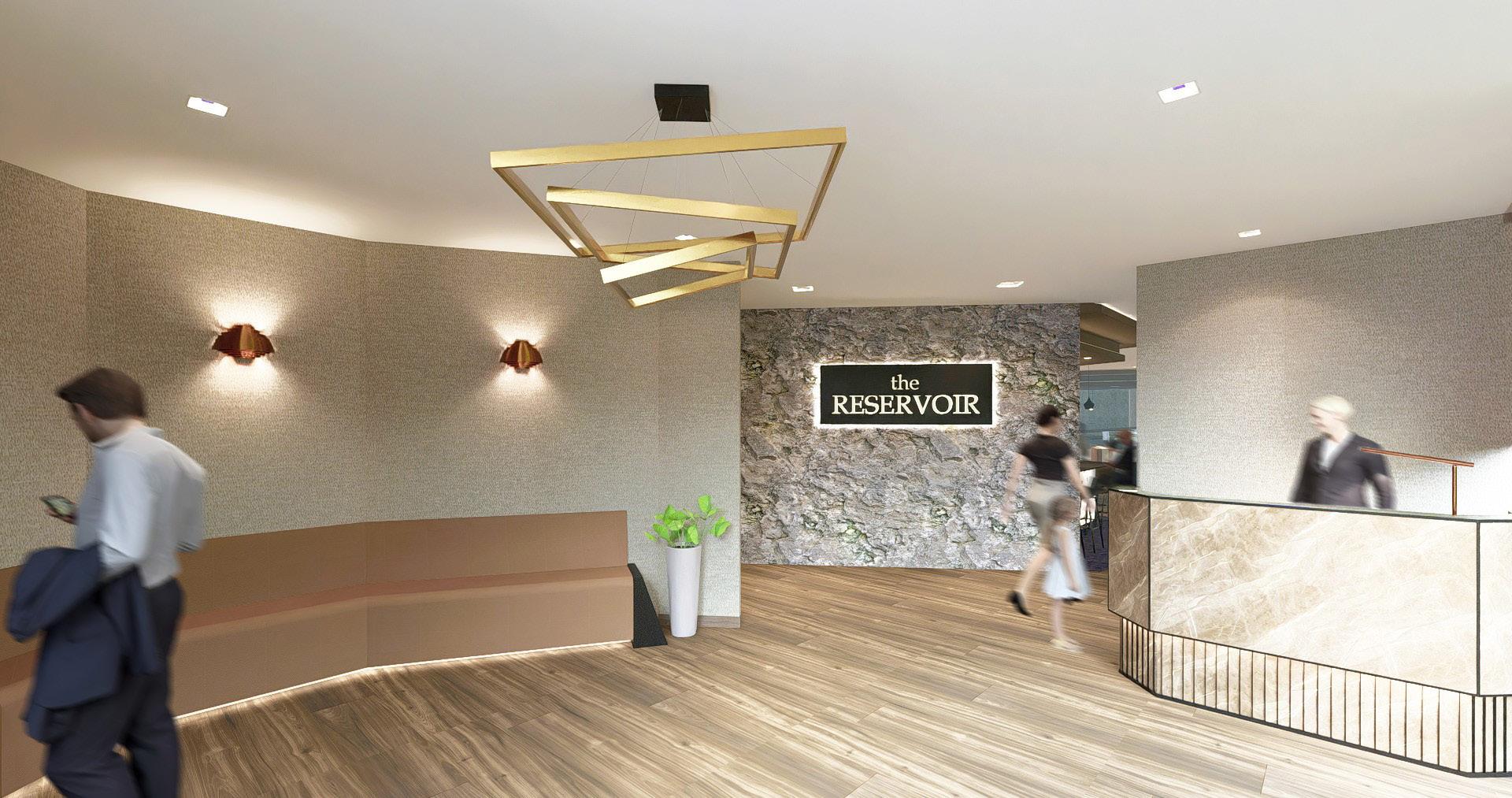
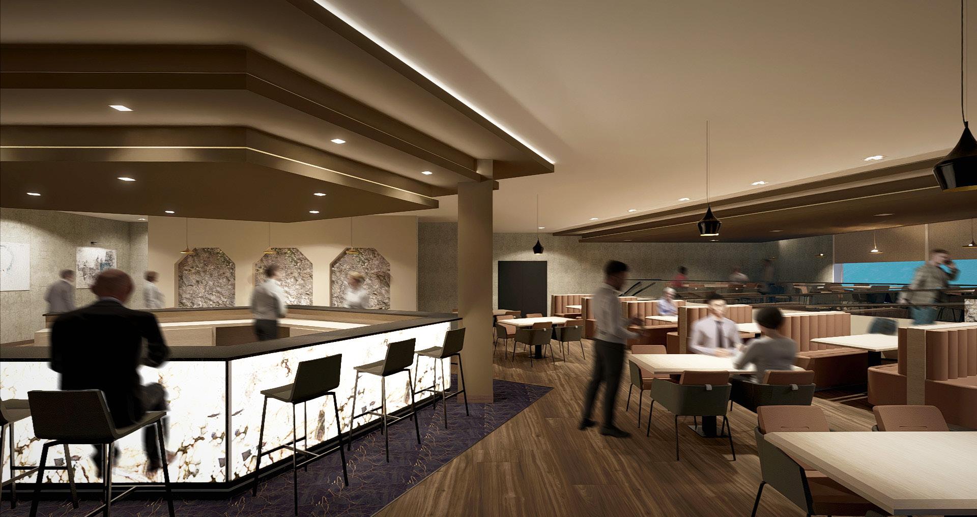
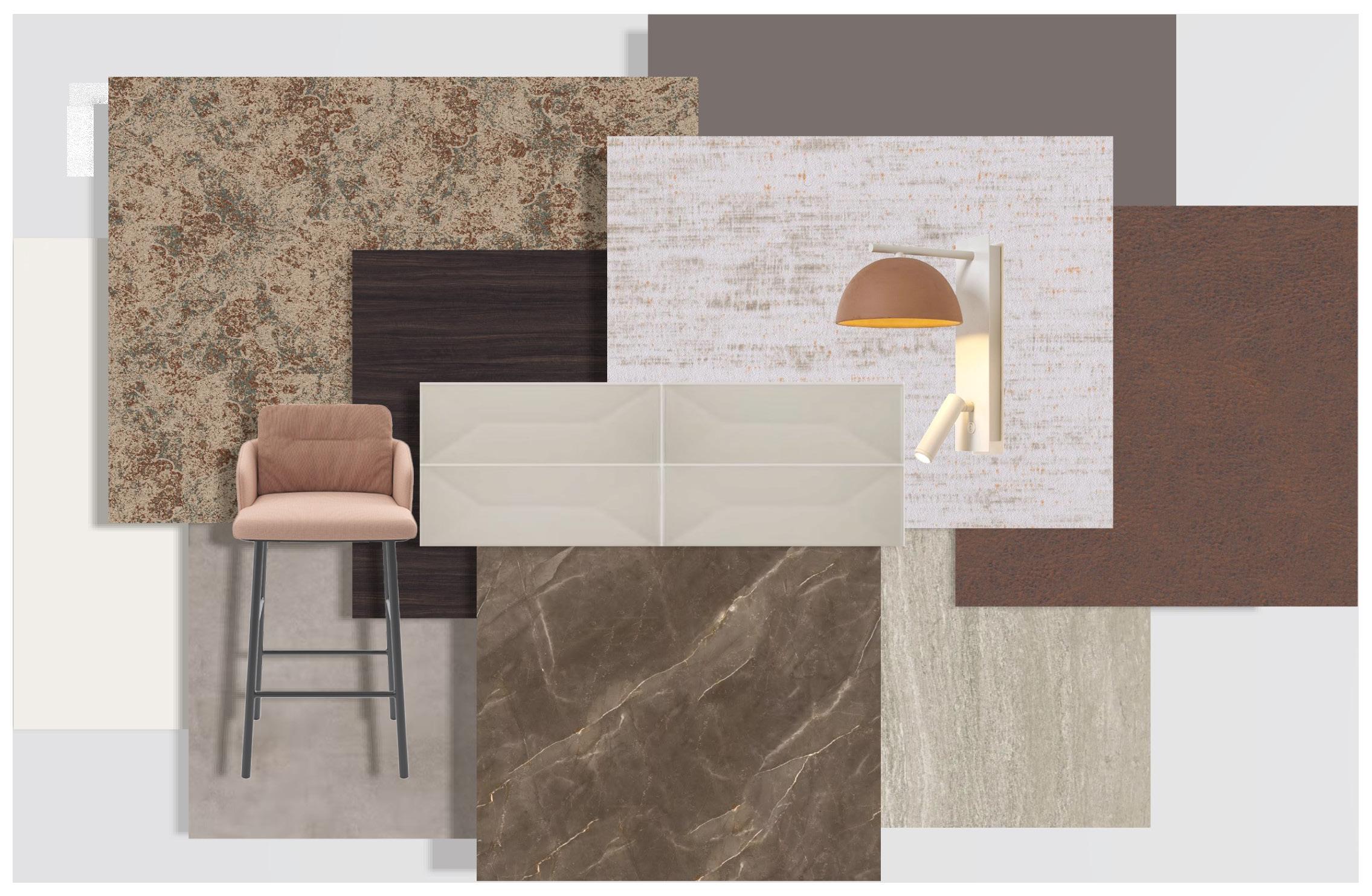
The 925 hotel will create an authentic and unique workation experience by utilizing place identity in recognition of the historic riches of Aspen, Colorado. All design elements will reflect back toward timeless beauty, locally inspired materials, and the addition of monumental features to invoke awe and inspire the users. Utilizing Aspen’s history of silver mining, the design aims to dig deeper into the “Aspen Ideal” and provide a way for users to connect with their mind, body, and soul.
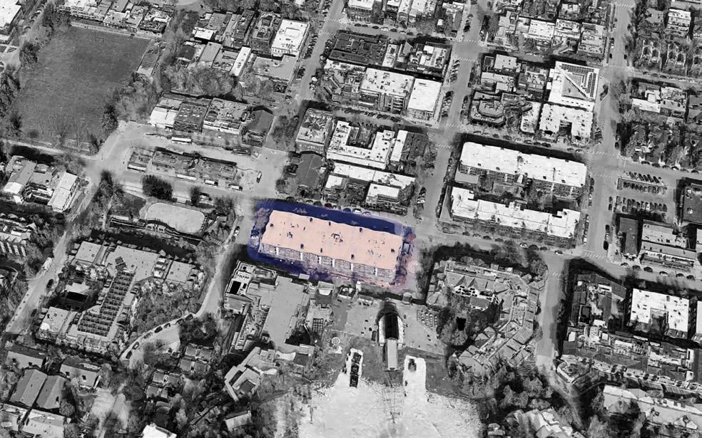
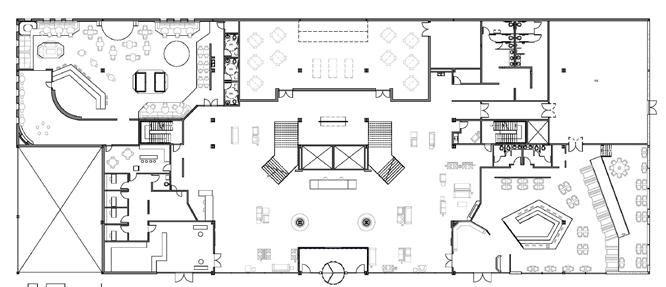
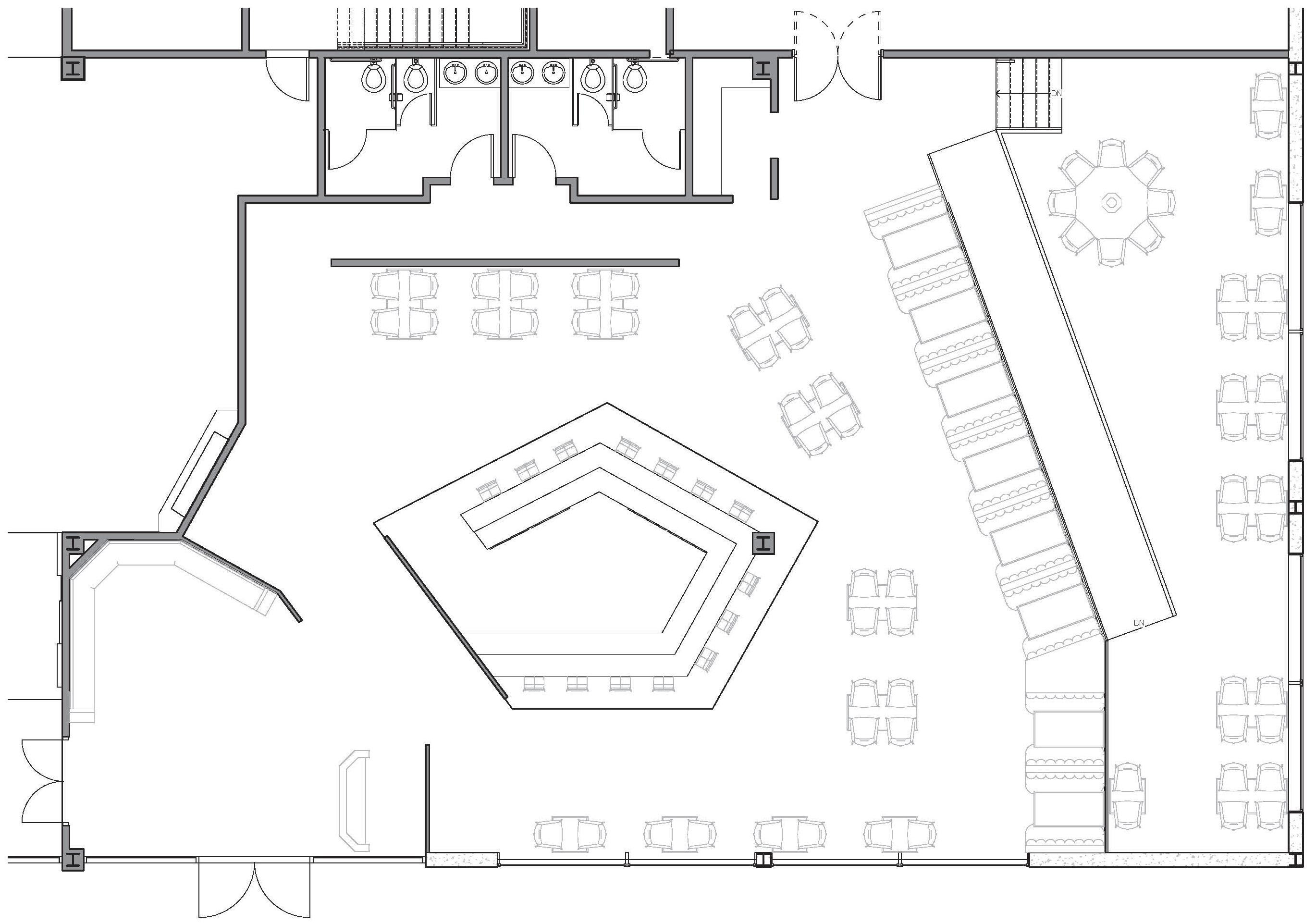
Site:
555 E Durant Ave, Aspen, CO
History:
- Prominent mining town
- Revitalized through skiing
- The Aspen Ideal: connection of mind, body, & soul
Surroundings:
- Several hotels
- Intermittent dining & shops
- Frequent art galleries
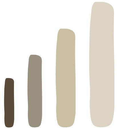
Drivers: Authentic, Variety, Monumental, Reflect, Scale
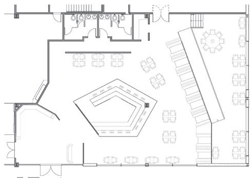
Diagramming:
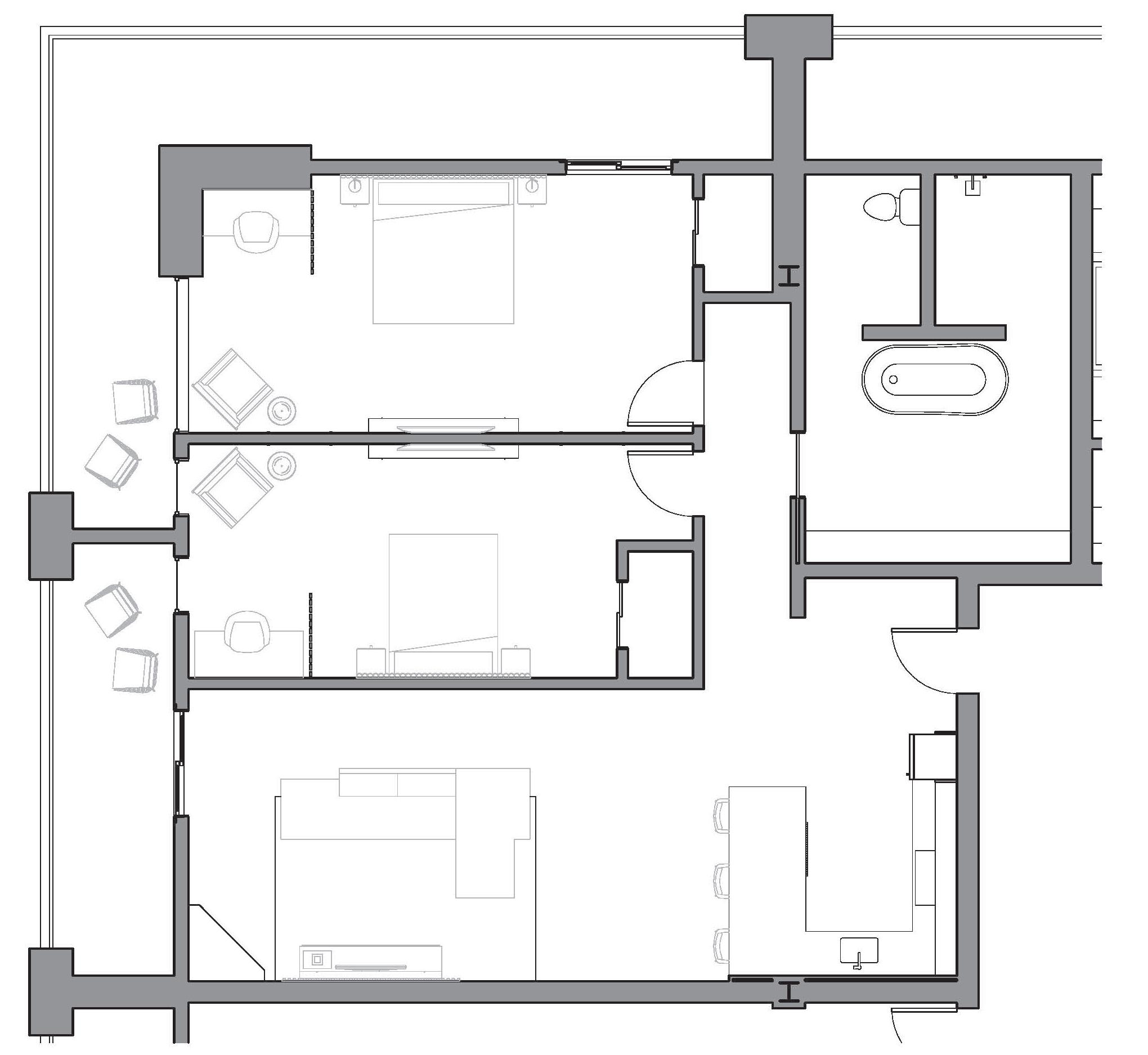
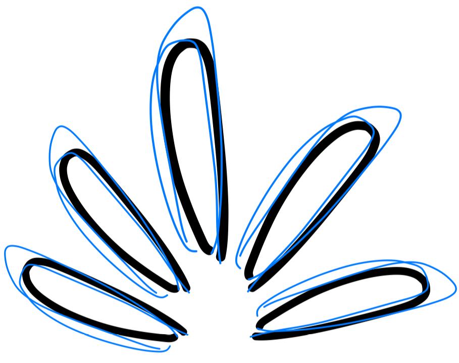
Parti Diagram Scale, Reflect, Contrast

Parti Diagram Balanced, Mirrored
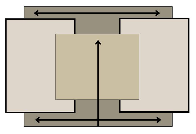
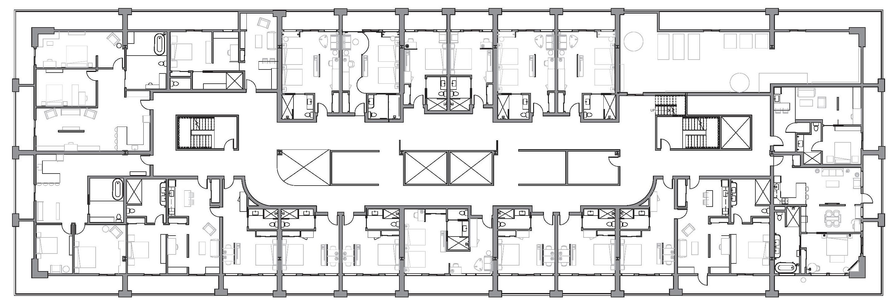
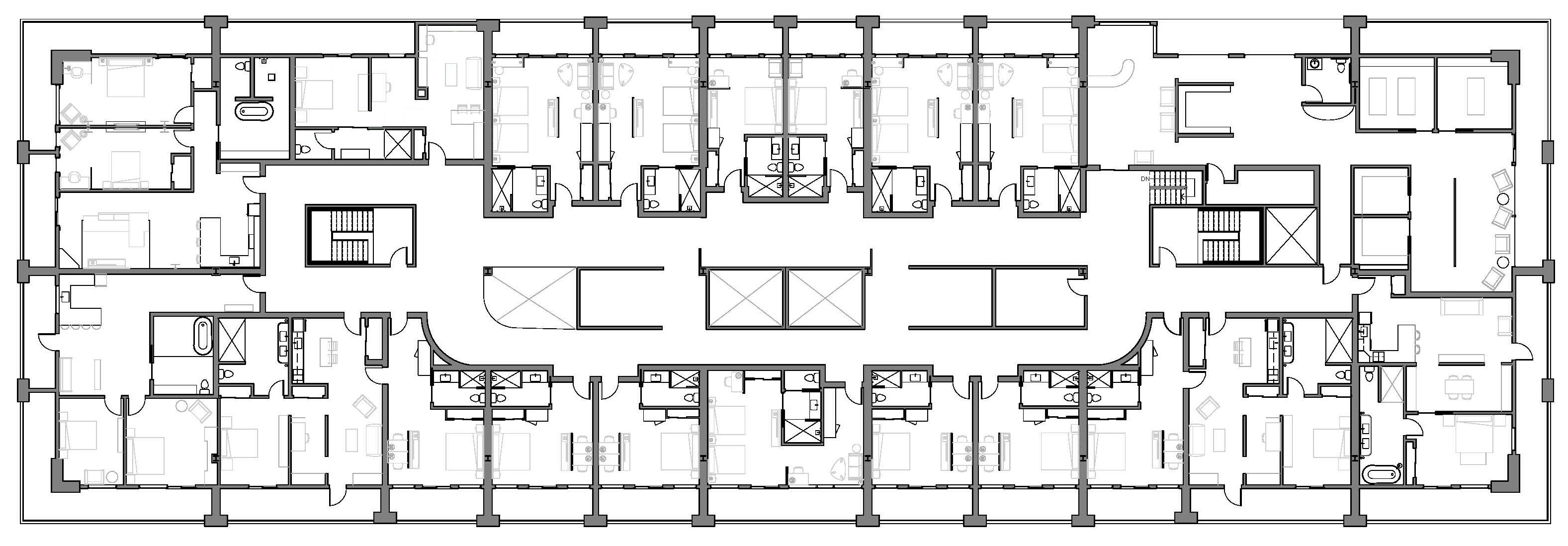
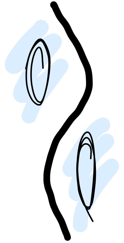
Circulation Diagram
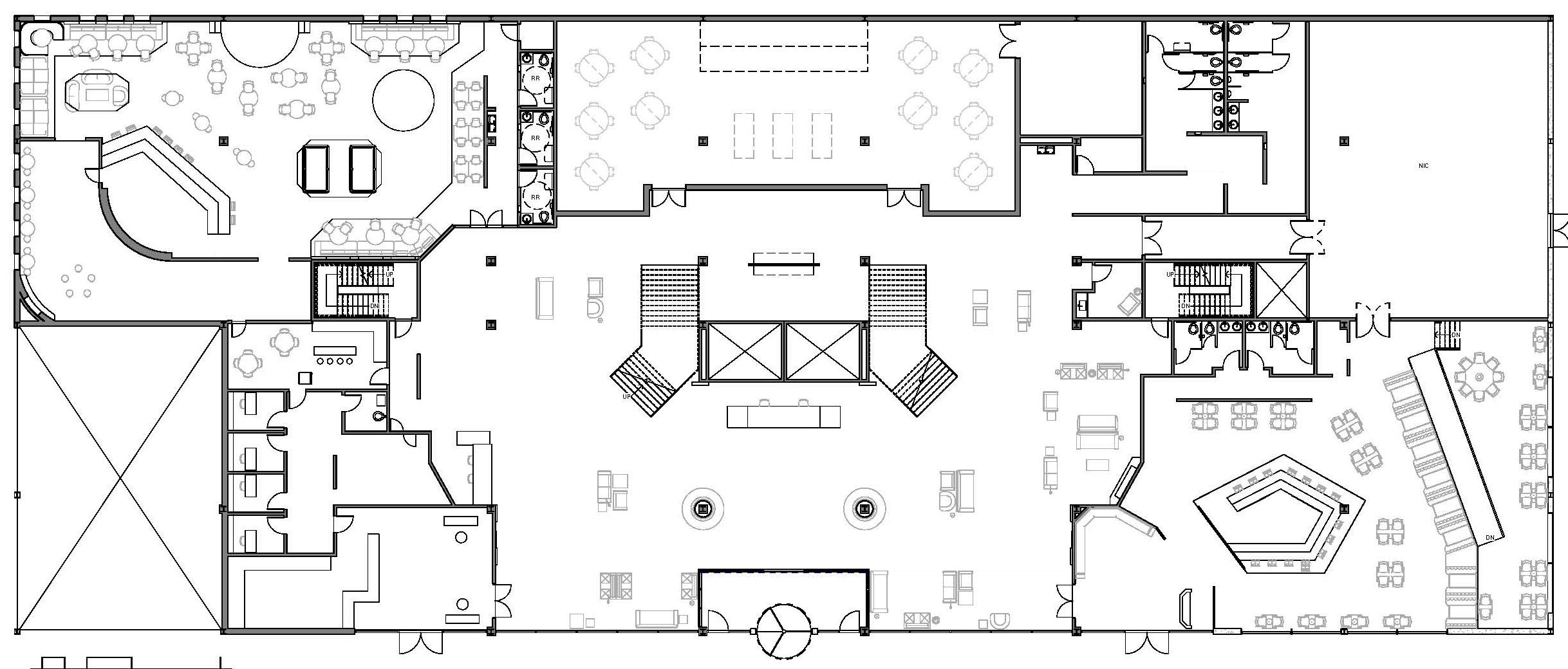

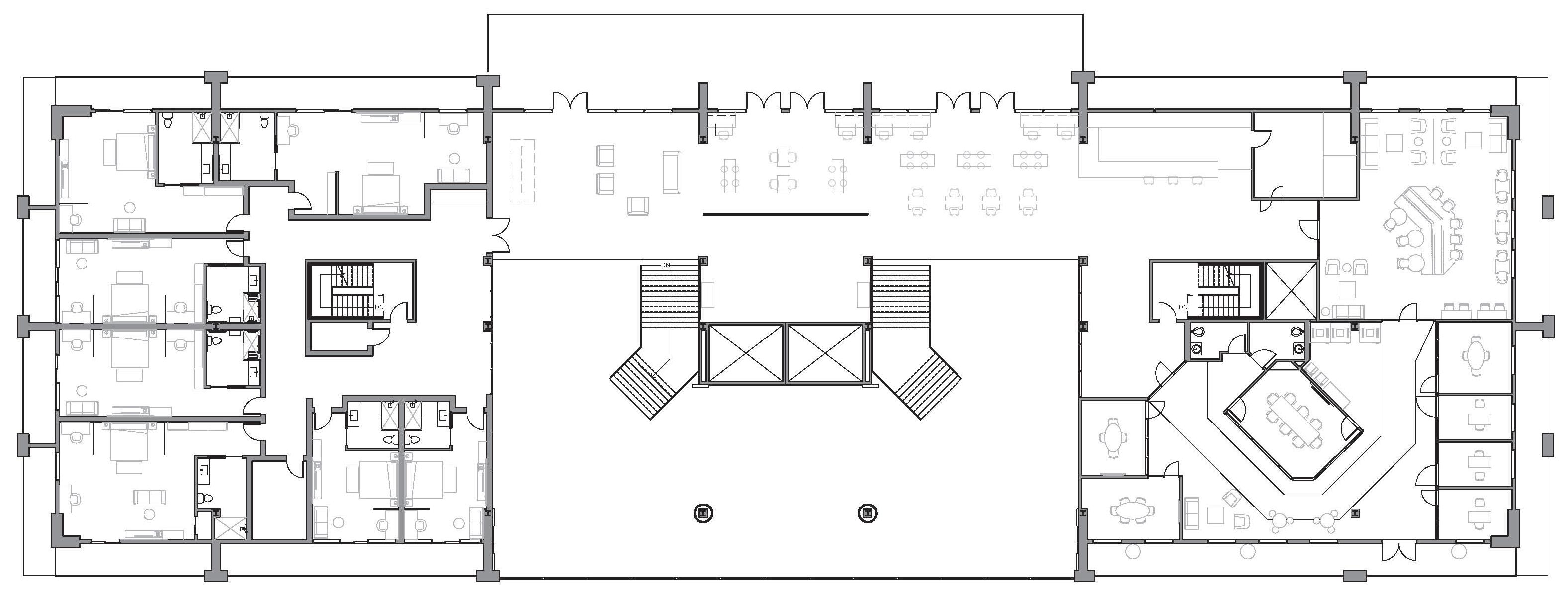
By: Kayla Krohn
By: Kayla Krohn
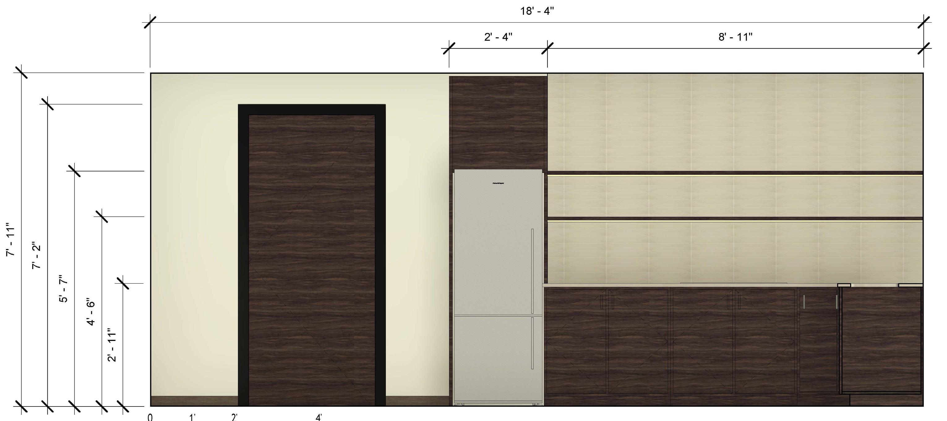
Elevation By: Kayla Krohn
By:
By:
By:

By: Kayla Krohn
By: Kayla Krohn
Elevation By: Kayla Krohn
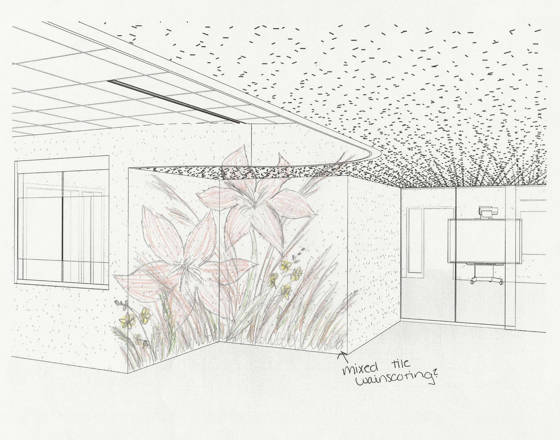
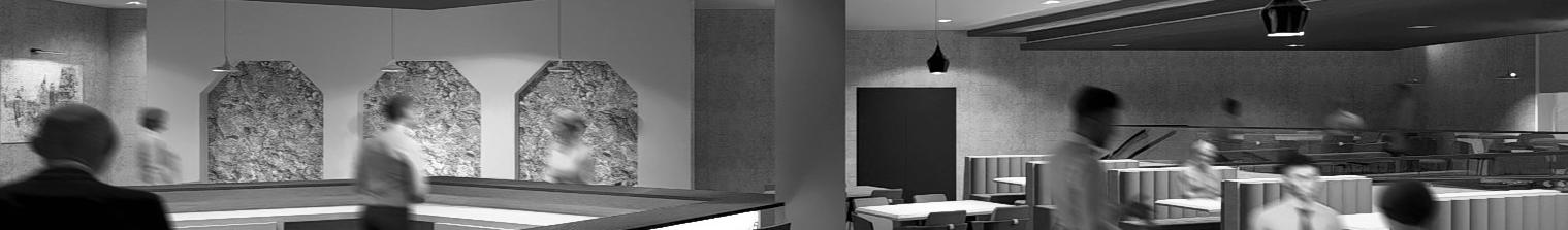
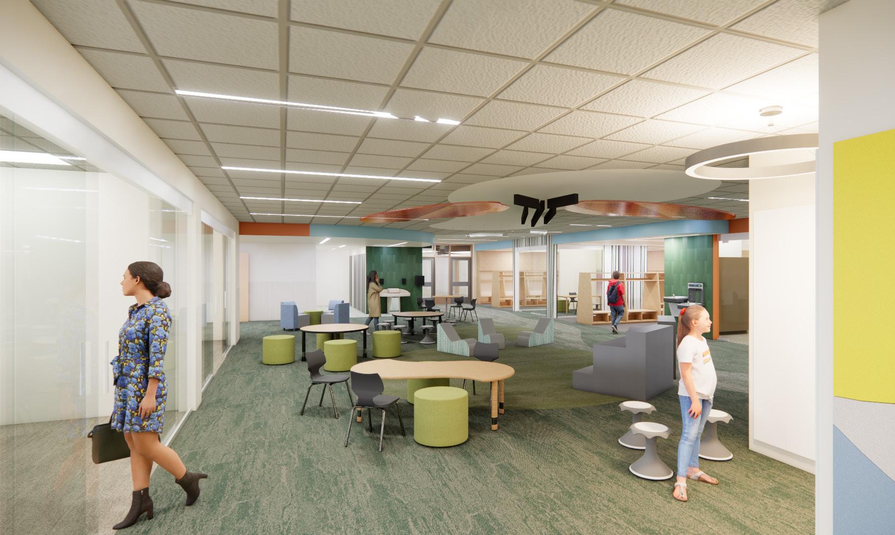
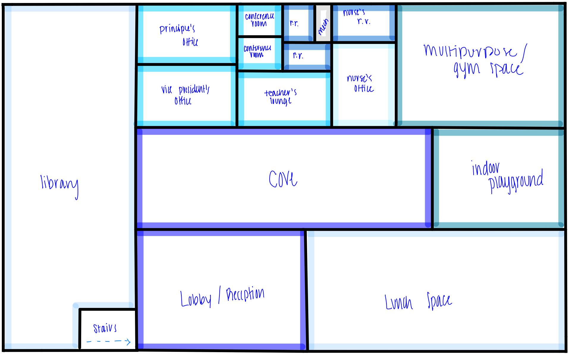
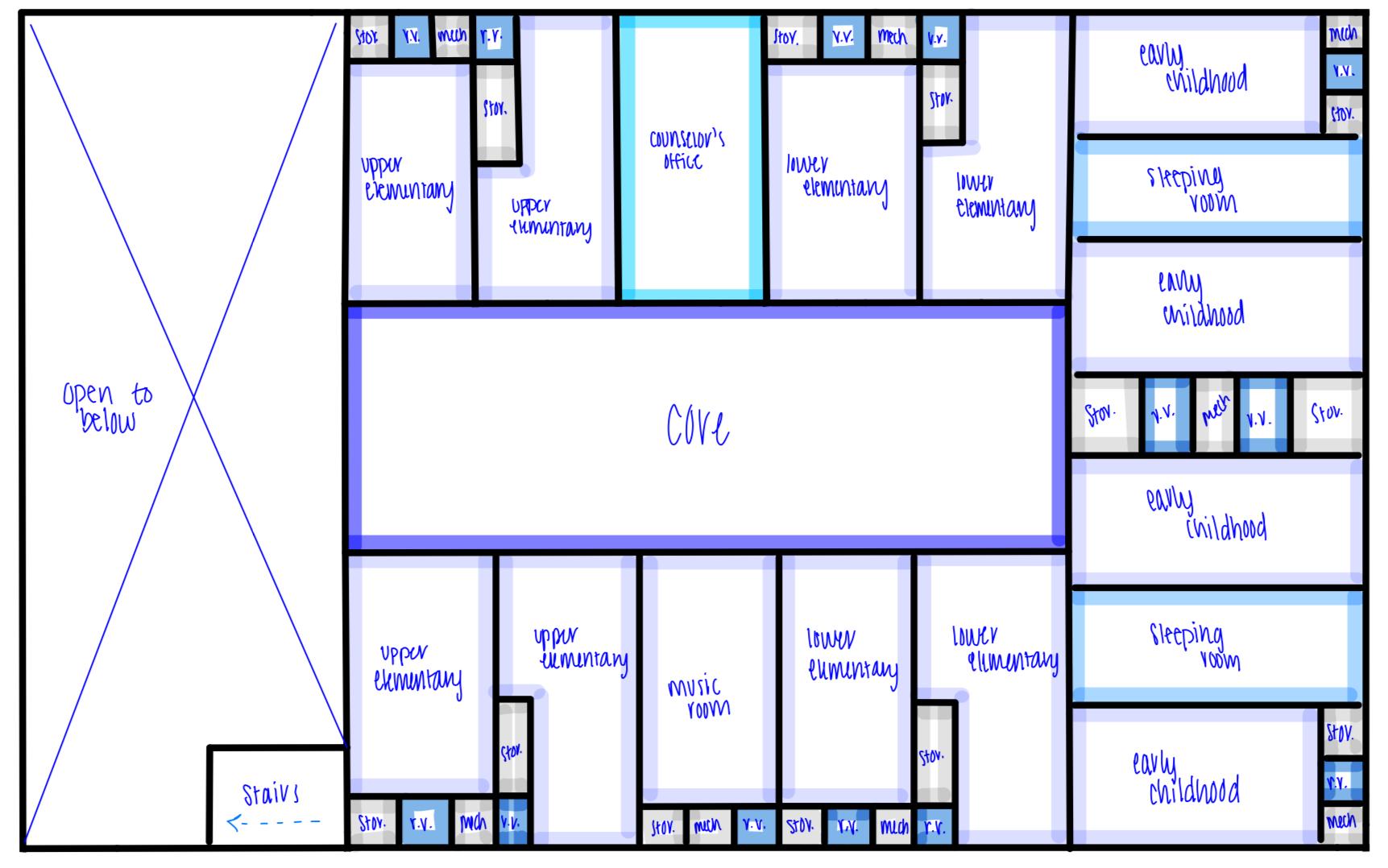
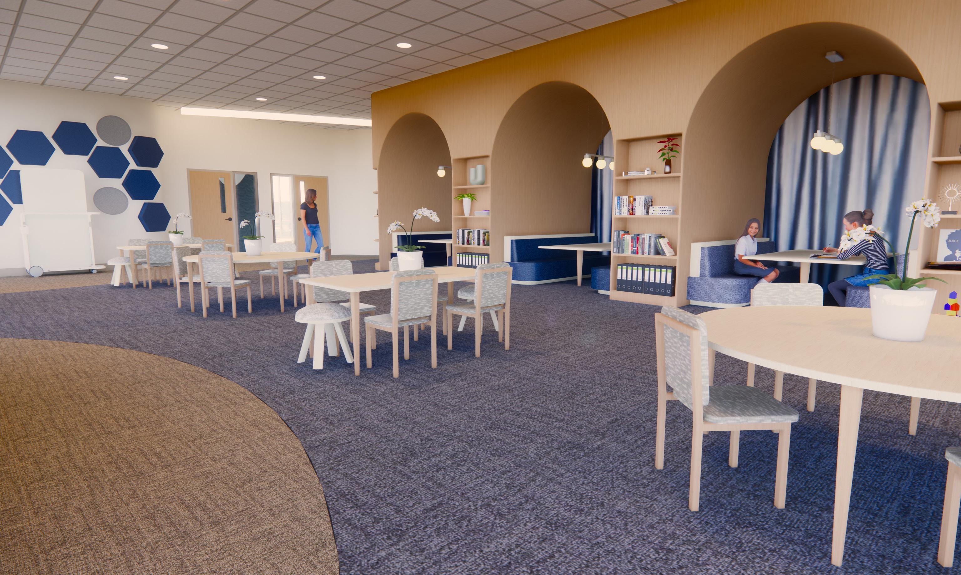
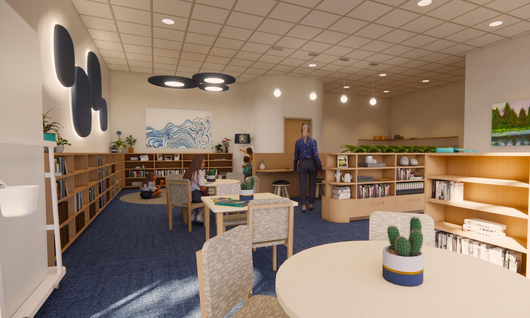
As an intern, I was tasked not only with working on construction documents and materials, but I was also able to work on some conceptual designs for a school’s learning pods.
For these spaces, the images show the progression from the first iteration in this sketch to the more solidified work that was being modified when I left.
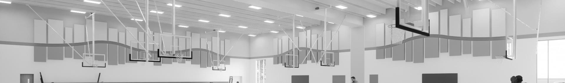
I was also tasked with working on an acoustical design for the panels in the gymnasium. Working closely with my team at Wold, we came up with the following renderings.
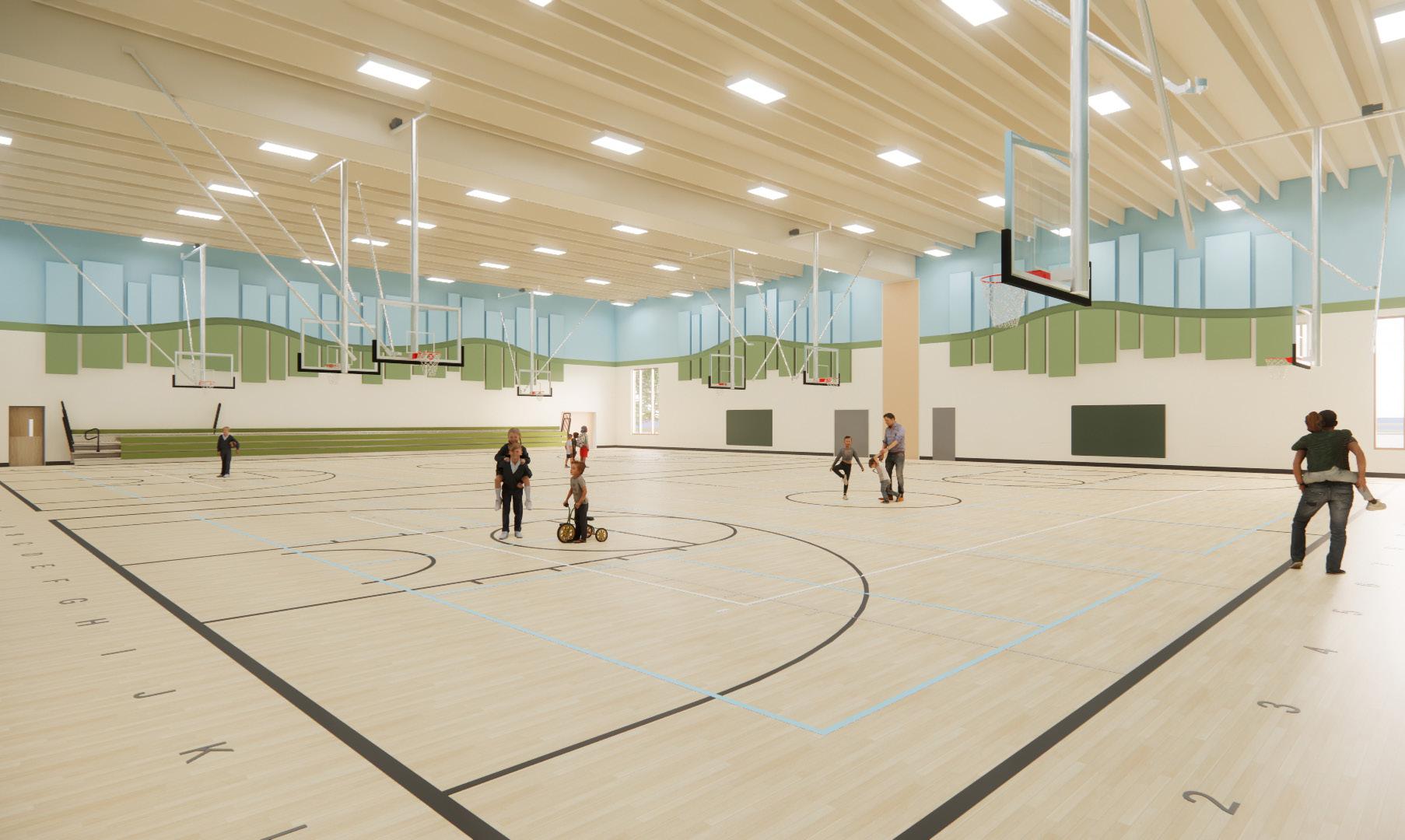
The panels in this gym are meant to relate to the hill portion of the prairie. The acoustic panels are intended to represent the feeling of being in the hills, and the connecting cafeteria also emanates this feeling by further immersing the user.
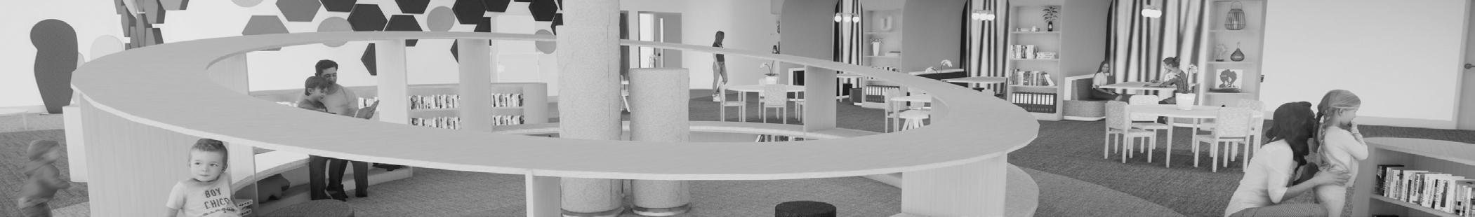
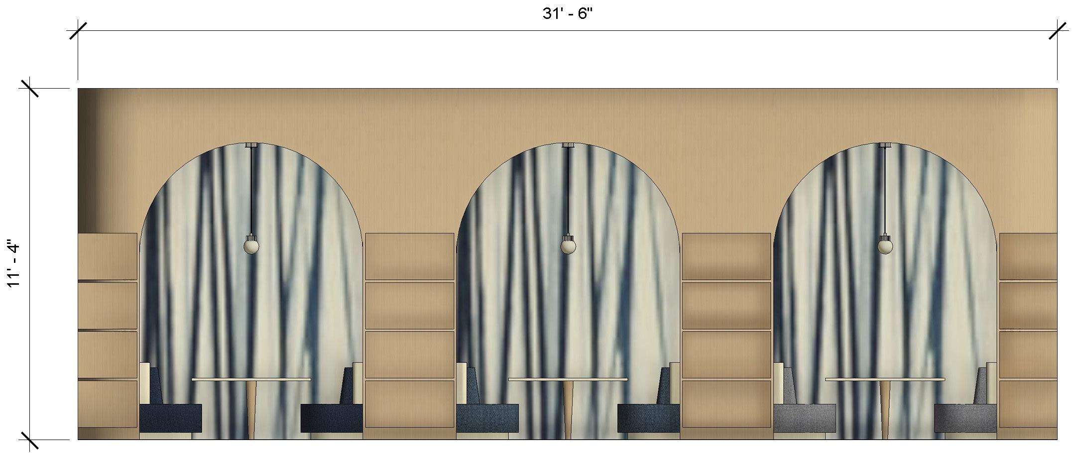
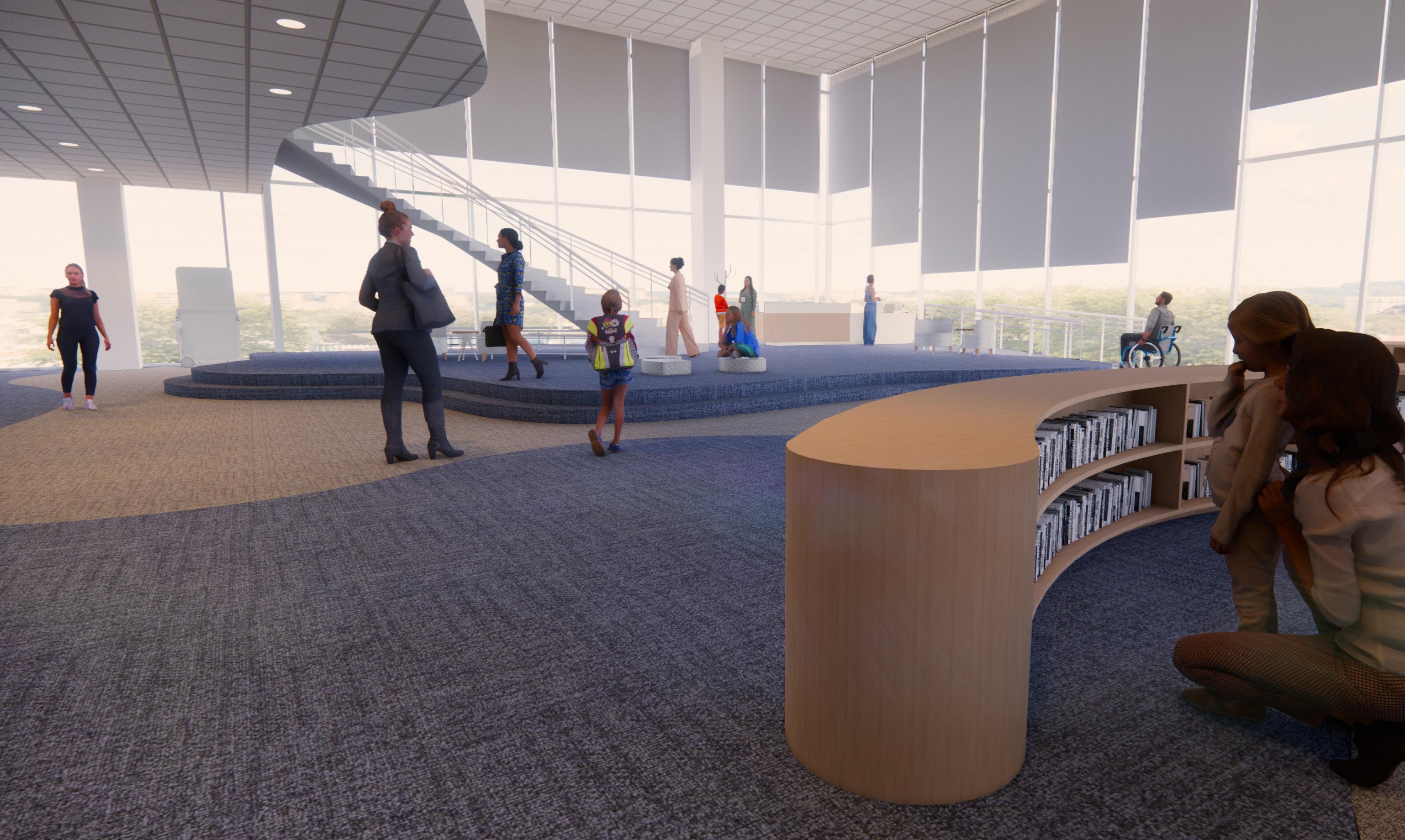
This image depicts the front entry space of the learning pod. In this space, we worked on creating an immersive experience for the students by considering what could be done on the ceiling. The lower-level pods were each assigned a specific flower to facilitate the experience of being within the prairie grass.
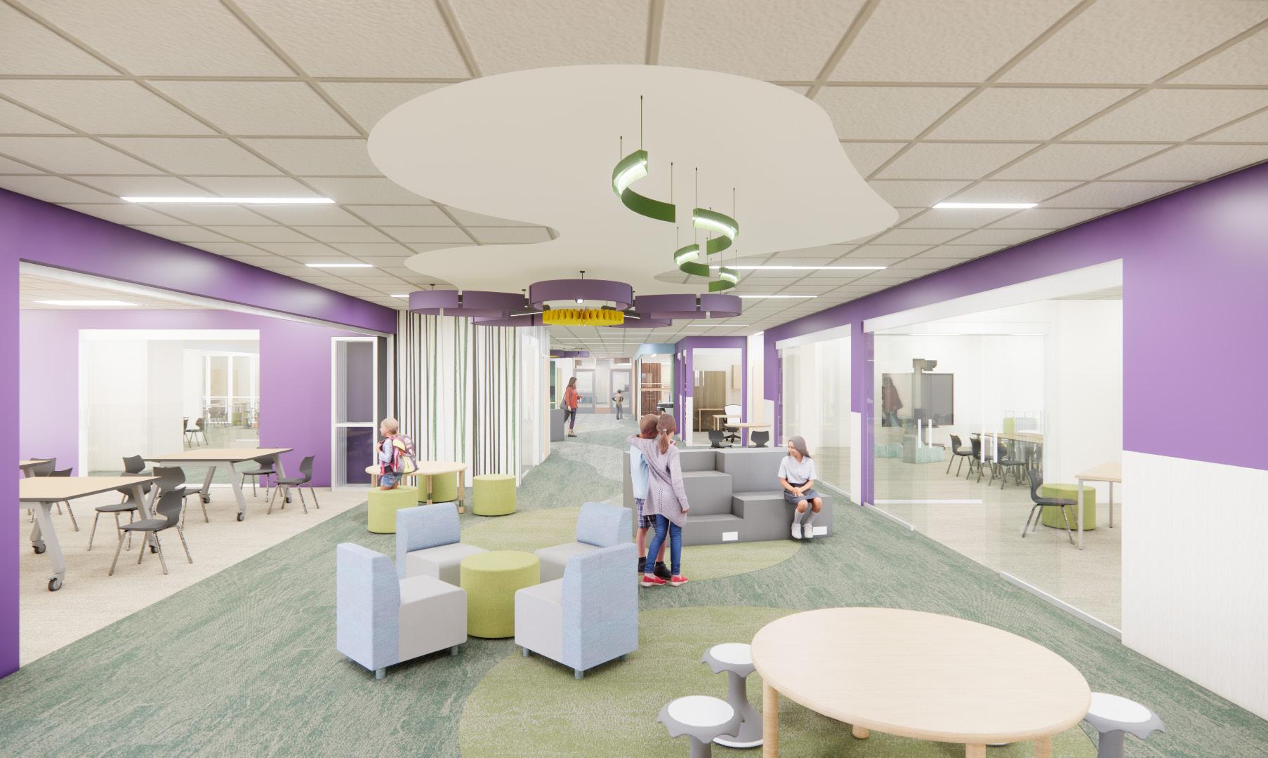
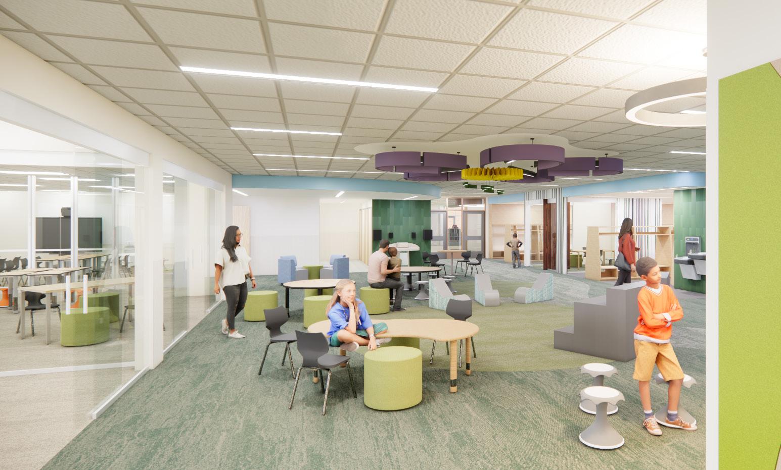
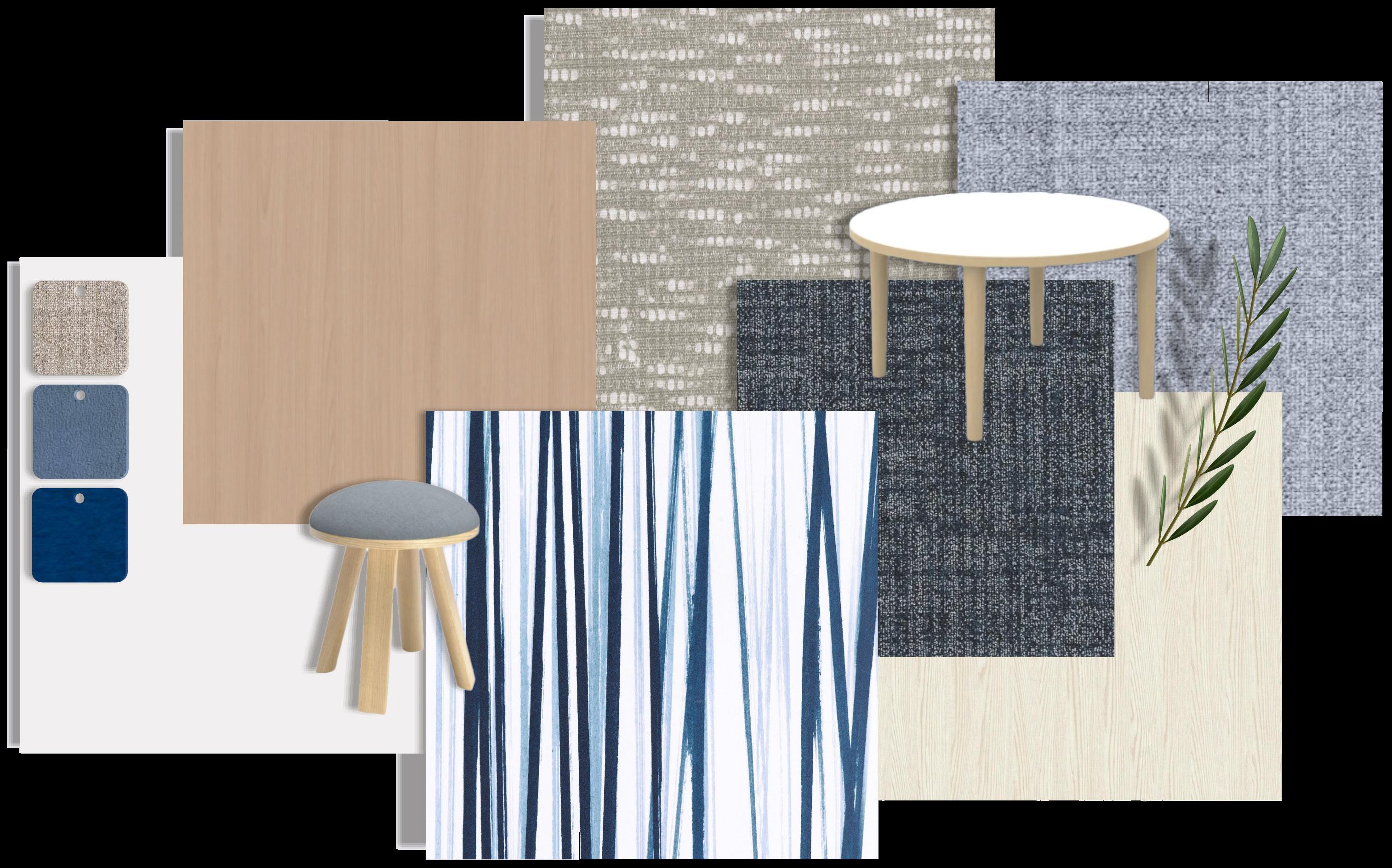
This image is of the back portion of the learning pod facing the entryway. The design was enhanced by exploring wall materials, such as the striped wallpaper, and their connection to the ceiling design. The flowers were used to assign colors to each pod and provide a unique identity within the space.for the user to connect to.
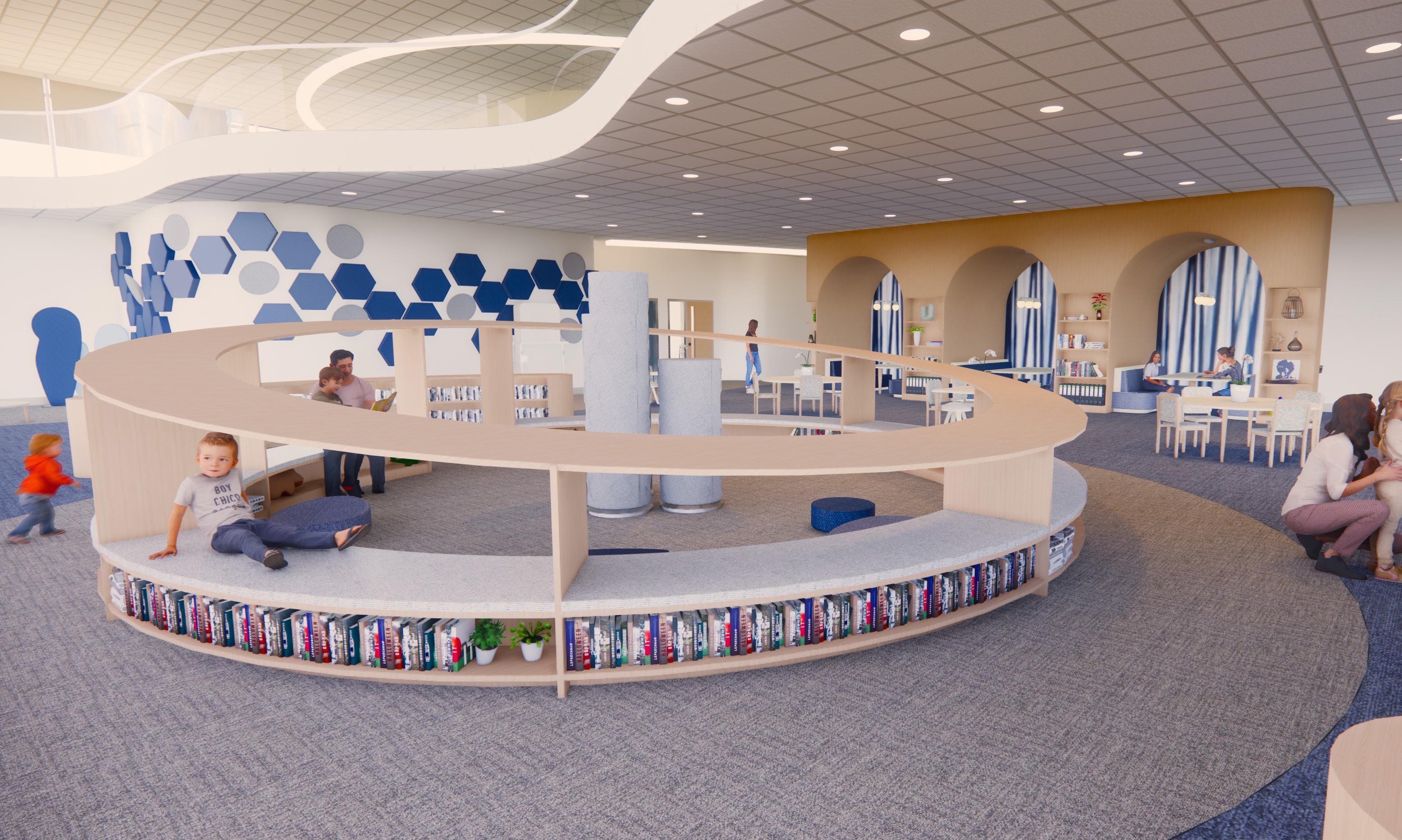
This image shows one of the upper-level learning pods and what one may see upon entry. The upper-level pods were each assigned a specific insect rather than a flower. The insects enhanced the experience of being above the prairie grass and the distinction between the two levels.
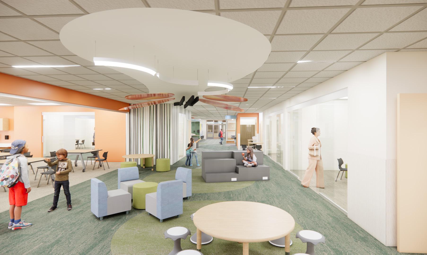
This view shows the materiality and wall design development on the back side of the learning pods. Here, we tested switching wall colors and how that space would be balanced. Each upper-level pod used a color reflected on the lower level and boasted a different insect to help curate an identity within the space.
1. Provide a structured environment that facilitates learning through a variety of tactile, auditory, visual, and kinesthetic devides such as balance chairs and acoustical wall panels.
2. Utilize natural elements to restore students’ focus and create a calm sensory experience (ART).
3. Create a third space for children / students by designing child-accessible spaces to enhance social connections and learning.
River rock embodies a transformational experience that is unique to each rock. In general, rocks start as sand or mud, building up to form rock before breaking down and starting the cycle over again. This continuous process is much like the human experience, as emphasized by Chinese culture. They believe that rocks serve as a guide for the human character, symbolizing longevity and strength. Other cultures, such as the Egyptians and Greeks, believe the rock also holds healing and protective properties as well. River rock, in particular, goes through a refining process that results both from the current of the water and from surrounding rock being upset. This transformation symbolizes a similar experience that is prevalent within the Montessori environment, enabling children to discover themselves in the best way they know and help others accomplish the same goal.
By: Kayla Krohn &
Summer Stehr
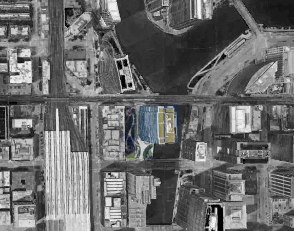
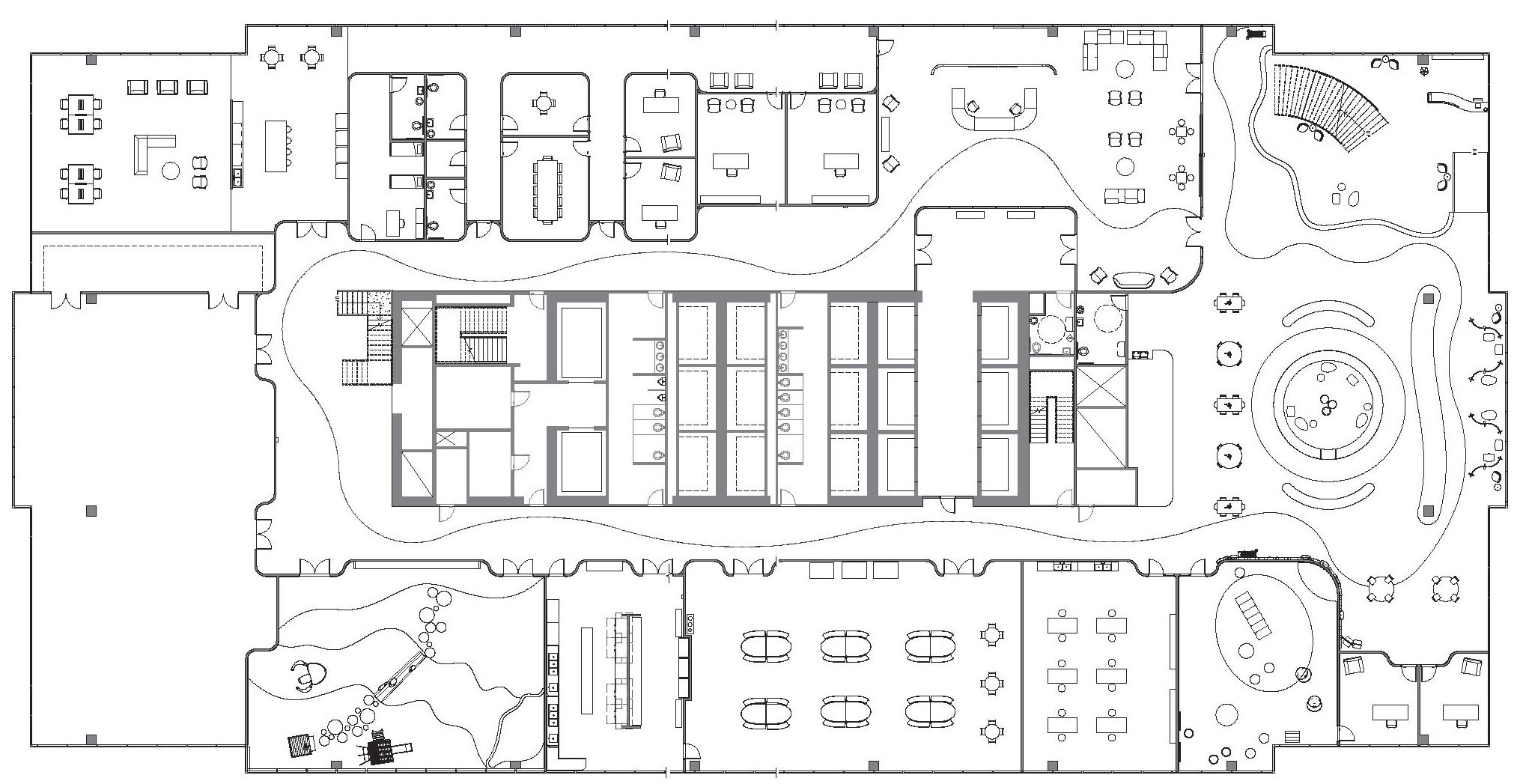
150 N Riverside, Chicago, Illinois
- Commercial space with leasable office space
- 2 acres -> over 75% is a landscaped public park
- Located off the west bank of the Chicago River
- On the north side of Chicago’s West Loop
- Tower is balanced through the use of water
- School is located on levels 25 & 26
Graphics By: Kayla Krohn
Graphics By: Kayla Krohn

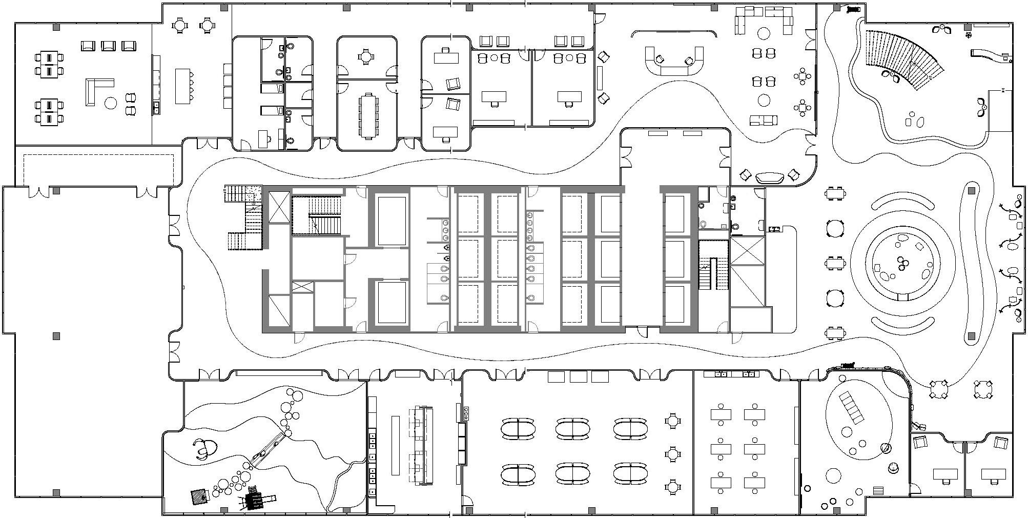

By: Kayla Krohn & Summer Stehr
- Level Two Access
Where:
Memorial Union on Iowa State’s Campus
When: Spring 2022
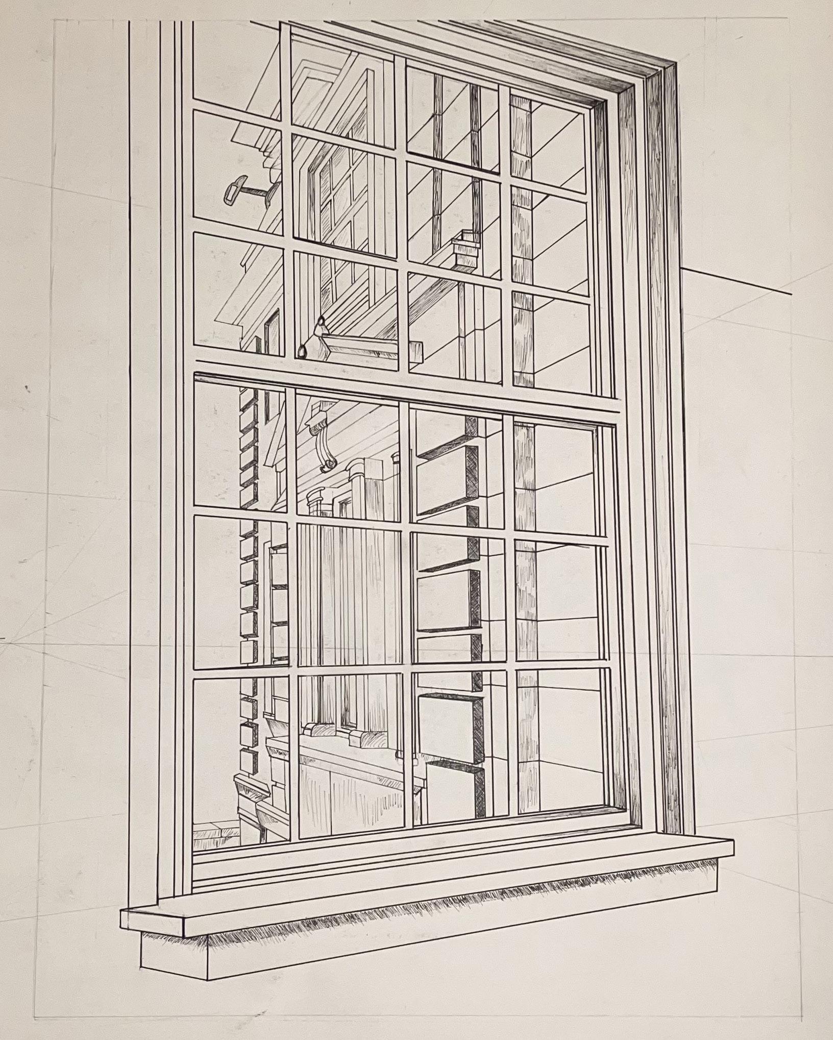
This two-point perspective was done in Micron ink on an 18-in x 24-in Strathmore sketch pad. We were tasked with finding somewhere in the building to create either a one-point or two-point drawing.
The specific location was in a back area that was tucked away from the heavy foot traffic of the students. The space had a nice view of the patio area and showed the beautfil structure of this old hotel.

Assisted by: Quincy Jagnow
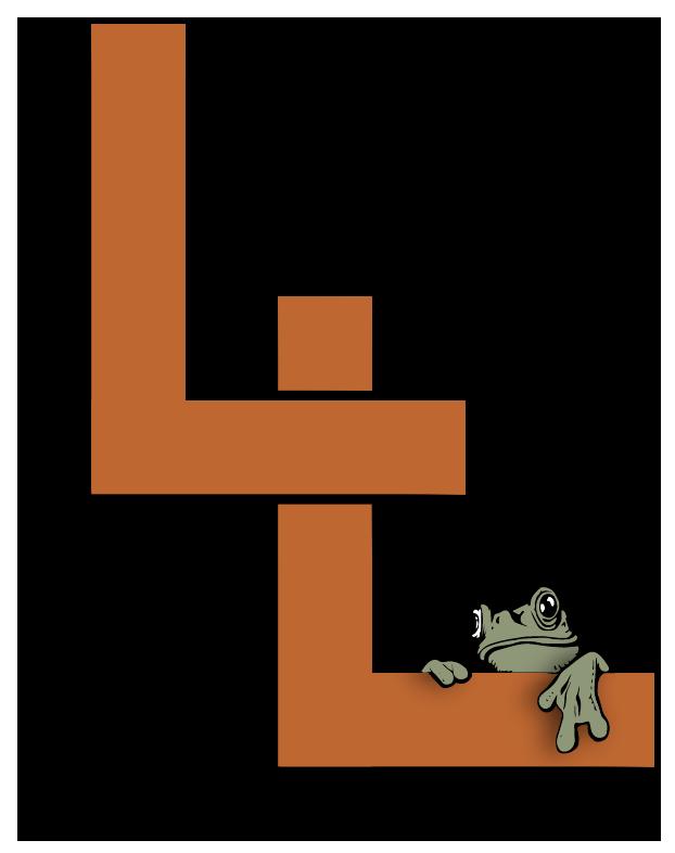
Medium: Adobe Illustrator
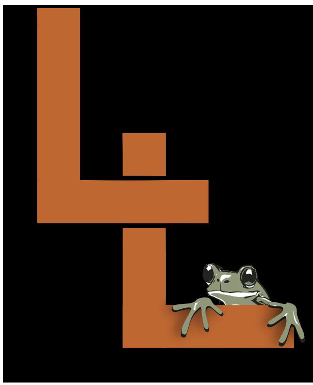
These three variations were made for a previous coworker’s start-up. The company is going to be called Leaping Lawns, so the two L’s were important. Additionally, he liked the use of a frog. Once we determined these components were essential, we reviewed the existing logos he got off Fiverr and began choosing the company colors. Based off the preliminary sketches and feedback, I was able to produce these three images.