
2022 GOTHAM TYPE SPECIMEN 03 GOTHAM CONTENTS April 2022 Type Specimen Magazine ALL ABOUT GOTHAM—THE TYPEFACE What Is Gotham ...............................................................................................04 Beginning & Association ...................................................................................08 Inspiration ........................................................................................................10 ALL ABOUT TOBIAS FRERE-JONES Background ......................................................................................................14 H&FJ ...............................................................................................................16 ALL ABOUT GOTHAM'S SUCCESS Use & Popularity ...............................................................................................20 ALL ABOUT GOTHAM—THE SPECIFICS Weights & Widths ............................................................................................24 Anatomy ...........................................................................................................28 Similar ..............................................................................................................30 Pairings .............................................................................................................32
ALL


GOTHAM— TYPEFACE.


Let's get down to the facts —What is Gotham? This article will start off by examining the history and the facts about Gotham. Gotham was designed by a type designer from the U.S. named Tobias Frere-Jones in 2000. And it was originally released by the type foundry Hoefler & Frere-Jones; which is now known to be as Hoefler & Co. (and don’t worry– we’ll dive deep into this drama on page 14). Gotham is referred to be known as a “simple, no nonsense” typeface. The established type designer, Frere-Jones, explained this era of type as, “not the kind of letter a type designer would make, but the kind of letter an engineer would make”. Gotham is one of the first American-made geometric and modern typefaces, prior to Gotham notable sans serif geometric typefaces such as Futura and others created from the European continent. Andrew Romano from Newsweek stated that Gotham is "Unlike other sans serif typefaces, it's not German, it's not French, it's not Swiss," he said “It's very American". So yes, Gotham is yet another sans-serif geometric typeface and at its core it is sans-serif, modern, and
geometric. The Gotham typeface has many different weights and is very versatile. This typeface is still fairly new and has taken the design world by storm. Ever since GQ ‘s exclusive licensing expired in 2002 and it was released to the public its popularity had grown. Gotham has become one of the most well-known and widely used typefaces of our time due to its versatility and affability loved by designers. Rather than the instincts of a type designer — Gotham's design was given an affability that’s usually missing from other geometric type designs. As seen in the image below,
rest of this type specimen magazine, we will dive deep into all that surrounds this highly publicized typeface. We will explore Gotham’s history, the type designer himself, the drama which ensued, and much more. Sit back and relax, we’ve got a lot to talk about.

Gotham was exhibited at the MoMA (Museum of Modern Art)— (seen below) with a number of other notable typefaces. With it's exhibition it was stated by the museum that “Gotham is one of the most successful typefaces of the early twenty-first century”. And “Gotham has a familiar quality even though it is newly designed. The letterforms are simple and straightforward—an engineer's idea of "basic lettering”. Throughout the
MoMA Typography Exhibition, 2011. Flickr, https://www.flickr.com/photos/laurenmanning/7095194425
MoMA Typography Exhibition, 2011. Flickr, https://www.flickr.com/photos/laurenmanning/6949111766/ in/photostream/

2022 GOTHAM TYPE SPECIMEN 07
ALL ABOUT GOTHAM — WHAT IS GOTHAM
"SIMPLE, NO NONESENSE"


08 GOTHAM TYPE SPECIMEN 2022
ESo why was Gotham even created? Just for fun? – Let’s find out. The Gotham typeface was initially commissioned by GQ magazine, whose editors wanted to display a sans-serif with a "geometric structure" that would look "MASCULINE, NEW, AND FRESH" for their magazine. Thank you, GQ! After the magazines exclusive license ended it was released for public use in 2002. GQ— originally known as the "Apparel Arts" from 1931-1958 to where it then acquired its name "Gentlemen's Quarterly" or more famously “GQ”. In 2000 they agreed that they needed something "that was going to be very fresh and very established to have a sort of credible voice to it," according to Hoefler. It’s important to note however, that Gotham is not used for the actual GQ logo, their logo that’s still used today (seen to the right) was actually made around 1967. Rather, it is mostly used for the cover lines and subtext (as seen in the top image to the left). And what is Gotham associated with?
Critics associate the Gotham typeface with New York City, in a sense that it is “blocky and no-nonsense” just like the architecture of the city. Another reason why it is associated with New York City is because it is one of the first American made geometric and modern typefaces. It’s also important to point out Gotham’s more recent association with many political uses now ever since it was used by Obama's campaign in 2008. After being used in Obama campaign it has risen to super star status. It is stated that Gotham is forever attached to New York city, it is said that it "Celebrates the attractive and unassuming lettering of the city". But wait, why is it even called Gotham? New York has a string of iconic references to its name. It’s a city that’s inspired the imaginations of many, never more so than as the fictional metropolis where Batman’s adventures were set. Gotham City is a ‘fantasy transposition’ of Manhattan, despite nobody ever saying so explicitly, often taking on the identity of the city’s noirish side. It just so happens that the Gotham typeface is based on the signage found mainly in Manhattan's signage — and that Gotham city was based on Manhattan as well. Are they connected? Sure— but are they related any other way? No. This is not Batman's Gotham.
GOTHAM
GOTHAM CITY
NO — THIS IS NOT BATMAN'S GOTHAM
GQ Magazine, June 2001. FontsInUse, https://fontsinuse.com/uses/15330/gq-magazine-june-2001-1
Empire State Building, 2019. Curbed, https://ny.curbed.com/2019/4/18/18484996/nyc-councilpasses-climate-mobilization-act-green-new-deal

2022 GOTHAM TYPE SPECIMEN 09 ALL ABOUT GOTHAM — BEGINNING & ASSOCIATION
New York has a string of iconic references to its name. It’s a city that’s inspired the imaginations of many, never more so than as the fictional metropolis where Batman’s adventures were set. Gotham City is a ‘fantasy transposition’ of Manhattan, despite nobody ever saying so explicitly, often taking on the identity of the city’s noirish side.
So, what was Gotham’s inspiration? Gotham was influenced by the design approach stemming from the 1920s era where many bare geometric typefaces were created, such as Futura — which was the main inspiration for Gotham. You can see this to the right, the two typefaces are almost identical at first glance. However, some noticeable differences are the somewhat larger set width of Gotham and the larger x-height of Futura. Also, a big inspiration for Frere-Jones while creating Gotham was the mid-20th century signage found in New York, more specifically–Manhattan. A big inspiration for the typeface was the lettering on Manhattan's Port Authority Bus Terminal sign (as seen to the right). Frere-Jones conducted an extensive study of New York City's vernacular lettering. A distillation of the "letters of paint, plaster, neon, glass and steel that figure so prominently in the urban landscape" (as seen below). He wanted Gotham to reflect the qualities and mannerisms of a draftsman. However, Unlike the signage that inspired it— Gotham has lowercase, italics, and is full of a range of widths and weights. The urban landscape inspiration and the perfect basic engineering of each character have made Gotham one of the most used typefaces of the early 21st century. Gotham is one of the latest geometric sans serif fonts to take on the world. It’s also interesting to note that Frere-Jones studied and was also inspired by the cast bronze numbers on the office buildings and cornerstone engravings — he really focused on how this defied time and wanted Gotham to have the same affect. The urban landscape inspiration and the perfect basic engineer-
ing of each character have made Gotham one of the most used typefaces of the early 21st century. Gotham is one of the latest geometric sans serif fonts to take on the world. It’s also interesting to note that Frere-Jones studied and was also inspired by the cast bronze numbers on the office buildings and cornerstone engravings — he really focused on how this defied time and wanted Gotham to have the same affect. Gotham is one of the latest geometric sans serif fonts to take on the world. It’s also interesting to note that Frere-Jones studied and was also inspired by the cast bronze numbers on the office buildings and cornerstone engravings — he really focused on how this defied time and wanted Gotham to have the same affect.
Kober, Eric. Bus to Nowhere, February 3, 2021. City Journal, https://www.city-journal.org/port-authority-misguided-plan-to-replace-midtown-bus-terminal
Siegel, Dmitri. Tobias Frere-Jones, type designer, August 2002. Typotheque, https://www.typotheque.com/articles/ tobias_frere-jones_type_designer

FUTURA
10 GOTHAM TYPE SPECIMEN 2022
ALL ABOUT GOTHAM — INSPIRATION
GOTHAM BOLD 82PT
FUTURA BOLD 82PT

2022 GOTHAM TYPE SPECIMEN 11 ALL ABOUT GOTHAM — INSPIRATION
TOBIAS FRERE


Let’s now dive into the type designer behind Gotham, Tobias FrereJones. In 1970, Frere-Jones (pictured below and to the right) was born in New York into a family of writers and printers. Being surrounded by this taught him from a young age the importance and power of text and eventually led to his passion for letter forms. In 1987 at age 16 he was prized a winner for the alphabet design contest from the type shop where he was stated to have a “promising future in graphics”. In 1992 Frere-Jones received his B.F.A (a Bachelor of Fine Arts) from RISD (The Rhode Island School of Design). After college Frere-Jones got a job at the Font Bureau in Boston where he worked for 7 years and eventually gained the position as senior designer. During his time at the Font Bureau, he created typefaces such as Interstate, Poynter oldstyle, and Garage Gothic. In addition to all his contributions to the company he also made 3 fonts; FB Reactor, Fibonacci, and Microphone for Fuse (which is a journal for experimental design). Over his career, Frere-Jones has designed
over 500 typefaces for retail publication, custom clients, and experimental Research. Frere-Jones states that he aims for a wide range in his work — he feels comfortable with working with traditional and grungy display type. Since 1996 FrereJones has been a part of the faculty at the Yale School of Art where he teaches typeface design. In 1999 Frere-Jones left the Font Bureau where he then began working with Johnathan Hoefler at Hoefler & Frere-Jones (Now known as Hoefler & co.) In 2006 he became the first American to receive the Gerrit Noordzij Award, presented by the Royal Academy of The Hague in honor of his special contributions to typography.
Today, Frere-Jones runs his own type foundry Frere-Jones in New York, where he continues to make original typefaces for retail licensing and custom clients. What can’t type designer FrereJones do? Today, Frere-Jones runs his own type foundry Frere-Jones in New York, where he continues to make original typefaces for retail licensing and custom clients. What can’t type designer Frere-Jones do? Today, Frere-Jones runs his own type foundry Frere-Jones in New York, where he continues to make original typefaces for retail licensing and custom clients. What can’t type designer Frere-Jones do?
Tobias Frere-Jones: Break Things Deliberately, May 2016. 99uAdobe, https://99u.adobe.com/videos/53989/tobias-frere-jones-break-things-deliberately

FUSE 94 leaflet, 1994. 8Faces, https://blog.8faces.com/ post/11140984938/fuse-leaflet
Tobias Frere-Jones, December 2018. Type Directors Club, https://www.tdc.org/profiles/tobias-frere-jones/

14 GOTHAM TYPE SPECIMEN 2022
ALL ABOUT TOBIAS FRERE- JONES — BACKGROUND
"I WAS THROWN OUT OF FRENCH CLASS FOR A DAY BECAUSE I WAS IN THE BACK OF THE ROOM DRAWING A LOWERCASE K. IT WAS THEN THAT I KNEW I SHOULD GO TO ART SCHOOL."


2022 GOTHAM TYPE SPECIMEN 15 ALL ABOUT TOBIAS FRERE- JONES — BACKGROUND
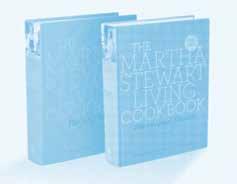
Man, oh man do we have some drama to discuss. We’re talking some seriously shady business! But let’s start on a lighter note and discuss the amazing works during their partnership. Frere-Jones left the Font Bureau and joined forces with Johnathan Hoefler. During Frere-Jones time with Hoefler they did work for companies like Wall Street, the Whitney Museum (see below) , Martha Stewart (see below), Nike, Pentagram, GQ, Esquire, and the New York Times. However, things did not end well between the two (Dun dun dun!) and Jonathan Hoefler and Tobias Frere-Jones got into “a bit” of drama. Sometime in 2014, the two became part of a $20 million legal battle over the ownership of the company. It was actually FrereJones who decided to file this lawsuit. This lawsuit claimed that Hoefler promised Frere-Jones a 50 percent stake in the company – which he then failed to deliver. So, Frere-Jones sued Hoefler for damages of what he said to be worth $20 million. Frere-Jones’ claim that was made to the Supreme Court stated the reasoning for this lawsuit to be “the most profound treachery and sustained exploitation of friendship, trust and confidence” by Hoefler. Apparently, Frere-Jones claims that he and Hoefler made a verbal agreement in 1999 to
become equal partners in a new type foundry. As part of the proposal, the claim says Frere-Jones brought a series of fonts to the new company, including Whitney and Gotham and he deserves to be compensated for (YES!). Frere-Jones says he then repeatedly asked Hoefler to transfer half of the ownership of the company to him. And at one stage, he alleges, Hoefler responded by saying, ‘Stop it. I’m working on it. Stop harassing me’. Was he really working on it though? Wait till you hear what he did next. In October 2013, instead of sharing ownership to Frere-Jones. Hoefler instead transferred HFJ shares to his wife! Making the couple 100 percent owners of the company! (Geez!) Talk about seriously shady business. After a while, the Hoefler & Frere-Jones foundry released a statement saying that FrereJones left the company, and it would from that time forward be known as just Hoefler & Co. This statement basically suggested that everything said by Frere-Jones was made up and that Hoefler&co. would remain an amazing place to work. Not much else was heard about the lawsuit after this. However, today documents show the lawsuit between Hoefler and Frere-Jones was settled out of court. And all other details of the settlement are strictly confidential. Did Frere-Jones get paid
what he deserved? Maybe? The truth is we’ll never really know but we’re sure this was a real learning moment for Frere-Jones and he’s much more careful with his business endeavors now. And truth is, he seems to be doing a lot better nowadays anyways (yes, we’re throwing the shade right back at you Johnathan). However, today documents show the lawsuit between Hoefler and Frere-Jones was settled out of court. And all other details of the settlement are strictly confidential. Did Frere-Jones get paid what he deserved? Maybe? The truth is we’ll never really know but we’re sure this was a real learning moment for FrereJones and he’s much more careful with his business endeavors now. And truth is, he seems to be doing a lot better nowadays anyways (yes, we’re throwing the shade right back at you Johnathan). However, today documents show the lawsuit between Hoefler and Frere-Jones was settled out of court. And all other details of the settlement are strictly confidential. Did Frere-Jones get paid what he deserved? Maybe? The truth is we’ll never really know but we’re sure this was a real learning moment for Frere-Jones and he’s much more careful with his business endeavors now. And truth is, he seems to be doing a lot better nowadays anyways
“Font Men” The Work of Jonathan Hoefler & Tobias Frere-Jones, 2014. Booooooom, https://www.booooooom. com/2014/03/12/font-men-work-jonathan-hoefler-tobiasfrere-jones/
Whitney Museum of American Art MendezNYC, https://mendeznyc.com/Whitney-Museum-Of-American-Art

Kenney, Nancy. The Whitney Museum of American Art, February 2021. The Art Newspaper,https://www.theartnewspaper.com/2021/02/22/whitney-lays-off-15-more-staff-membersciting-extremely-low-attendance

Typography Partners Part Ways in Money Fight, 2014. The New York Times, https://www.nytimes.com/2014/01/18/ business/media/in-dispute-typography-partners-part-ways. html
Font Gods Hoefler & Frere-Jones Split in Nasty Corporate Divorce, 2014. Gawker, https://www.gawker.com/ font-gods-hoefler-frere-jones-split-in-nasty-corporat-1503534833
16 GOTHAM TYPE SPECIMEN 2022
ALL ABOUT TOBIAS FRERE- JONES — H&FJ
JONATHAN HOEFLER AND TOBIAS FRERE-JONES OF US TYPE FOUNDRY HOEFLER & FRERE JONES ARE EMBROILED IN A $20 MILLION LEGAL BATTLE OVER THE OWNERSHIP OF THE COMPANY.


2022 GOTHAM TYPE SPECIMEN 17 ALL ABOUT TOBIAS FRERE- JONES — H&FJ
GOTHAM'S SUCCESS.
Find out just where you might have seen Gotham in the real world and just how popular the typeface has become.


WE CAN ALL SAY "THANKS, OBAMA!"
Ithink we can all agree on one thing; that we can all say “Thanks, Obama”. One of the most famous uses of Gotham is in the Obama presidential campaign and more specifically the HOPE poster (see above). Gotham is very versatile typeface and can be used in a variety of ways. It is also seen in a lot of logos just due to its familiar, neutral, yet affable qualities. Gotham has a large font family today and is very legible from a distance due to its wide width and geometric structure, yet it can also be used in smaller type sizes and still retain legibility. In past media, Gotham has been used in many ways. The most famous being in Barrack Obama’s 2008 election campaign. It also has been used in other branding efforts such as in the most recent Cartoon Network logo, the MSNBC channel, Coca-Cola (seen to the right), and SNL (Saturday Night Live) (seen to the right). It was also used at the World Trade Center, Coca-Cola, Saturday Night Live, and the US Democratic party, and Saks Fifth Avenue (seen to the right). It was also used by other political sources such as, the democratic party, Beto O'Rourke's candidacy (seen to the right), and Georgia’s office of the governor. In past media, Gotham has been used in many ways. The most famous being with President Obama
(Fun fact: Gotham is Obama’s favorite font). It also has been used in other branding efforts such as in the 2014 FIFA World Cup logo, and Twitter switched to using Gotham as well. It was also used on the cornerstone of the Freedom Tower at the World Trade Center site and is currently the font used for most of the MPAA title cards for film trailers in the U.S. Other entities to use Gotham include Coca-Cola, Saturday Night Live, Starbucks, Michigan State University, New York State University, and the Georgia Governor’s office of Customer Service! It was also used by Netflix until 2018 when they created their own typeface to reduce expenses and create their own style. It’s fair to say that Gotham’s success really took flight after being used for Obama’s campaign. Do we think that without this Gotham would’ve been as popular without it being used for the presidential campaign? It’s highly likely, Gotham has been used for many other notable uses other than the campaign. Gotham’s versatility makes it popular among designers. Gotham is neutral but yet still has affability which makes it a good choice for a number of different branding efforts. What can’t the Gotham typeface do? Versatility and affability— a perfect combination for a perfect typeface. How much more American can
that get? Other uses of Gotham include the Chicago 2016 Olympics, Nike “The Human Race 10k”, The Tribeca Film Festival, The Indianapolis Star, Clint Eastwood Gran Torino Movie, Spotify, The Inception Movie, DC Comics, Netflix (until 2018), world trade system, 007 Spectre Movie, and much more.
“HOPE” is Gotham, 2014. Slate, https://slate.com/ culture/2014/09/gotham-typeface-tobias-frere-jones-fontfrom-obama-hope-poster-defines-our-era.html

Beto O’Rourke U.S. Senate campaign poster, 2018. Fonts In Use, https://fontsinuse.com/uses/30993/cruz-cant-skate-betoorourke-u-s-senate-campa
I'm Going to Saks, 2010. Pentagram, https://www.pentagram. com/work/im-going-to-saks/story
Gotham’s impact, 2009. idsgn, http://idsgn.org/posts/ know-your-type-gotham/

20 GOTHAM TYPE SPECIMEN 2022
ALL ABOUT GOTHAM'S SUCCESS — USE & POPULARITY
HOW MUCH MORE AMERICAN CAN THAT GET?


2022 GOTHAM TYPE SPECIMEN 21
ALL ABOUT GOTHAM'S SUCCESS — USE & POPULARITY
ABOUT GOTHAM— SPECIFICS.


ABOUT GOTHAM— SPECIFICS.


24 GOTHAM TYPE SPECIMEN 2022 ALL ABOUT GOTHAM THE SPECIFICS — WEIGHTS & WIDTHS
A FONT WE CAN BELIEVE IN

Switching to the specifics, Gotham was developed to be used by professionals, Gotham has become an extremely large family supported in different languages and is very versatile. The Gotham font is fresh and masculine, and it has a very geometric structure. It’s a workhorse all around; its design doesn’t feature any unnecessary lines. There’s little contrast between the thick and thin strokes. The characters feature near-perfect circular curves. It has a particularly large x-height, which comes up to halfway between the ascenders and descenders. Originally, Gotham was introduced with an oblique as well as a range of widths. 4 weights plus italics, as well as 4 condensed weights, and
later expanded to 4 widths with 33 weights in total, each with italics. In 2009, Hoefler and FrereJones introduced new Narrow and Extra Narrow versions. More forward in April 2015 update Cyrillic and Greek characters were added to the typeface. And today, Gotham's complete package includes 66 styles and supports 60 languages! Gotham currently consists of lining and tabular figures, fractions, variety of monetary signs, Latin accents, Greek figures and Greek accents, Cyrillic and Cyrillic figures. In 2007, the Rounded variant was introduced due to a commission from Print magazine. On April 4, 2011, Hoefler and Frere-Jones announced that they had created a new wordmark based on Gotham— But with serifs for the use of President Barack Obama's 2012
campaign. In announcing the news, they wrote: "Can We Add Serifs to Gotham? For the President of The United States? Yes, We Can." — However, the design was not released publicly. Widths included in Gotham is regular, narrow, extra narrow, and condensed; each with the central weights from thin to black. Most of the strokes in Gotham are uniform and low contrast between thick and thin, however if one looks closely, you can see a very slight variation which is where Gotham gets it affability.

2022 GOTHAM TYPE SPECIMEN 25 ALL ABOUT GOTHAM THE SPECIFICS — WEIGHTS & WIDTHS
Gotham Rounded Typography, https://www.typography.com/ fonts/gotham-rounded/styles/gothamrounded Can We Add Serifs to Gotham?, 2011. Typography, https:// www.typography.com/blog/can-we-add-serifs-to-gotham
Gotham was introduced with an oblique as well as a range of widths. 4 weights plus italics, as well as 4 condensed weights, and later expanded to 4 widths with 33 weights in total, each with italics. We will see very round near-circular curves as well, with an x-height almost exactly in the middle of the ascenders and descenders. Gotham’s letterforms feature a tall x-height and wide apertures, the Gotham font is highly legible. Characters like "e" or "a" are a little larger than usual. While the letterforms in the Gotham typeface consist of a lot of geometric forms, you can see the variation in stroke weights. Similar to the inspiration from the handmade signs found and studied by Frere-Jones in Manhattan. Although the general form of many signs was similar, no template existed; some letters-x, j, and a handful of other Scrabble rarities--were missing, and almost no lowercase letters had been created in the first place. Frere-Jones and Hoefler spent months designing a complete 'alphabet. In the early draft, Hoefler's notes suggest subtle changes to the curves that define each letter's shape.


"YES, WE CAN."
After establishing the basic alphabet, the designers created a dozen variants: boldfaces, lightweights, and italics. For each, the spacing between letters also had to be defined--a process that involves the testing of more than ten thousand different combinations of letter pairs. FrereJones compares this vital balancing of black and white space to the weaving of fabric: Two individual threads of a similar color may be all but indistinguishable, but when they are loomed into cloth, the subtle differences become glaringly obvious.
Frere-Jones envisioned a public-building-vernacular aesthetic for Gotham, and began his research by photographing lettering on lower Manhattan walls, signs, awnings and windows. Design work begins with several key letters, such as a cap H, cap 0, lower-case n. From there it progresses to 210 characters.
Designed to celebrate Frere-Jones' return to his native city, Gotham takes both its name and its inspiration from a form of public lettering common to New York and indigenous to the US which appears on signs, in shop windows and on billboards. Says Hoefler: "Every designer has admired the no-nonsense quality of these anonymous signs at some point, which is perhaps how Gotham manages to feel strikingly new and comfortably familiar at the same time."
26 GOTHAM TYPE SPECIMEN 2022
ALL ABOUT GOTHAM THE SPECIFICS — WEIGHTS & WIDTHS
Evolution of a font, 2005. Gale Academic, https://go.gale. com/ps/i.do?p=AONE&u=uga&id=GALE%7CA139170423&v=2.1&it=r&sid=ebsco

2022 GOTHAM TYPE SPECIMEN 27 ALL ABOUT GOTHAM THE SPECIFICS — WEIGHTS & WIDTHS
Gotham, and began his research by photographing lettering on lower Manhattan walls, signs, awnings, and windows. Design work begins with several key letters, such as a cap H, cap 0, lower-case n. From there it progresses to 210 characters. Most of the strokes of Gotham are uniform and low contrast between thick and thin however, if you look closely, you can see a very some stroke variation. Gotham has very round near-circular curves as well, with an x-height almost exactly in the middle of the ascenders and descenders. Gotham’s tall x-height and wide apertures is what makes the typeface so highly legible. Characters like "e" or "a" are a little larger than usual. You can see in the image to the right the ‘A’ has a flat apex, and a horizontal crossbar. The lowercase ‘a’ showcases the variation in the stroke weight. The lowercase ‘y’ showcases the short descender. The ‘o’ has no stress. The ‘g’ is a single story and has an offset counter. The lowercase ‘k’ has an arm-leg junction in the middle. The uppercase ‘M’ has a pointed middle apex and flat terminals (All of Gotham has flat terminals). The lowercase ‘m’ showcases the same reflected shapes. The lowercase ‘n’ and ‘u’ are an exact reflection of each other. The lowercase ‘f’ and ‘t’ showcase an uneven and high crossbar. The lowercase ‘b’ showcases the offset counter. The lowercase ‘e’ also shows the horizontal crossbar. The lowercase ‘c’ also has a large aperture. And the uppercase ‘Q’ showcases the circular letterforms and the non-descending tail. These are a few of the many specific anatomy structures that Gotham presents. Tobias Frere-Jones stated that Gotham was "Not the kind of letter a type designer would make. It's the kind of letter an engineer would make. It was born outside the type design in some other world and has a very distinct flavor from that”. Focusing on more of the specific metrics of Gotham, it has short descender line of 16, an x-height of 52 which is half of the whole letterform. It also has a cap height to 70 and an extremely short ascender line that reaches to about 73. Gotham, and began his research by photographing lettering on lower Manhattan walls, signs, awnings, and windows. Design work begins with several key letters, such as a cap H, cap 0, lower-case n. From there it progresses to 210 characters. Most of the strokes of Gotham are uniform and low contrast between thick and thin however, if you look closely, you can see a very some stroke variation. Gotham has very round near-circular curves as well, with an x-height almost exactly in the middle of the ascenders and descenders. Gotham’s tall x-height and wide apertures is what makes the typeface so highly legible. Characters like "e" or "a" are a little larger than usual. You can see in the image to the right the ‘A’ has a flat apex, and a horizontal crossbar. The lowercase ‘a’ showcases the variation in the stroke weight. The lowercase ‘y’ showcases the short descender. The ‘o’ has no stress. The ‘g’
is a single story and has an offset counter. The lowercase ‘k’ has an arm-leg junction in the middle. The uppercase ‘M’ has a pointed middle apex and flat terminals (All of Gotham has flat terminals). The lowercase ‘m’ showcases the same reflected shapes. The lowercase ‘n’ and ‘u’ are an exact reflection of each other. The lowercase ‘f’ and ‘t’ showcase an uneven and high crossbar. The lowercase ‘b’ showcases the offset counter. The lowercase ‘e’ also shows the horizontal crossbar. The lowercase ‘c’ also has a large aperture. And the uppercase ‘Q’ showcases the circular letterforms and the non-descending tail. These are a few of the many specific anatomy structures that Gotham presents. Tobias Frere-Jones stated that Gotham was "Not the kind of letter a type designer would make. It's the kind of letter an engineer would make.
Nitiam

28 GOTHAM TYPE SPECIMEN 2022 ALL ABOUT GOTHAM THE SPECIFICS — ANATOMY
"NOT THE KIND OF LETTER A TYPE DESIGNER WOULD MAKE. IT'S THE KIND OF LETTER AN ENGINEER WOULD MAKE. IT WAS BORN OUT SIDE THE TYPE DESIGN IN SOME OTHER WORLD AND HAS A VERY DISTINCT FLAVOR FROM THAT."
Nitiam menihil iciermiliem serios, et, dis Mulius in Etravestror menihil.
axph
menihil iciermiliem serios, et, dis Mulius in Etravestror menihil.
nu ft b


THE REAL INSPIRATIONS FOR GOTHAM AND WHAT GOTHAM REALLY INSPIRED?
Originally, Gotham was intended to look a little more humanistic than the other geometric fonts such as Futura and Avenir, and it completes this task well, but in an extremely subtle way in how little things are changed on each of the characters. Over the last few years, it has been the inspiration for new fonts like Montserrat, Raleway, and metropolis. Gotham is a clean and no-nonsense font that really helped keep the minimalist movement going. And what other typefaces are similar to Gotham?
Gotham was intended to look a little more humanistic than the other geometric fonts (pictured on the left) such as Futura (released in 1927) and Avenir (released in 1988), and it completes this task well, but in an extremely subtle way in how little things are changed on each of the characters. And what is Gotham good for?


wGotham is very versatile and can be used in a variety of ways. Most often, one will see it in logos. Gotham has an extremely large font family and is very legible from a distance due to its wide width and geometric structure. Also similar to Gotham is a lot like Avenir when it comes to versatility and use, however it is a tad bit more humanistic, so it makes it a little more neutral. I would still venture to say it is not as neutral as Helvetica, and that it is still considered modern and fresh feeling. For Adobe users Gibson & Proxima Nova are also alternatives to Gotham — no muss no fuss modern geometric typefaces. While Gibson is not used as much, Proxima Nova a very popular choice in typography. And what did the Gotham typeface inspire after it? Over the last few years, it has been the inspiration for new fonts like Montserrat (released in 2010) and Raleway (released in 2012), and Metropolis (released in 2016). Clean and no-nonsense fonts that keep the minimalist movement going. In fact, while researching these It seems there may have been some drama surrounding the Metropolis typeface due to the infamous Johnathan Hoefler. It was stated by the typeface’s designer Chris Simpson that “Scrooge McDuck (Jonathan Hoefler) came and intimidated me with his lawyer. Between that and belligerent PRs (VMware, I’m looking at you), I gave up, if only for now, and made the repo private. Happy for anyone to fork it and do what they want.

30 GOTHAM TYPE SPECIMEN 2022
ALL ABOUT GOTHAM THE SPECIFICS — SIMILAR
Maybe if it didn’t have the name Metropolis, Hoefler would be less of an a$$ about it — Peace, C”. So, it’s possible that Hoefler was giving Simpson a hard time for the creation of Metropolis— possibly because of it being so similar? But while comparing the two you can see there are differences. However, if Johnathan is truly the shady menace, he’s portrayed to be then he might not care. On the next two pages you will see examples of just how versatile Gotham really is. Showcasing the possibilities for pairings with Gotham. Gotham makes a very good complement to modern serif typefaces and a usable body type. Examples shown here include pairings with Didot, Gotham (with itself), Adobe Garamond, Bookmania, Merriweather, SchoolBook, Freight, and Archer.
2022 GOTHAM TYPE SPECIMEN 31
ALL ABOUT GOTHAM THE SPECIFICS — SIMILAR
32 GOTHAM TYPE SPECIMEN 2022 ALL ABOUT GOTHAM THE SPECIFICS — PAIRINGS
2022 GOTHAM TYPE SPECIMEN 33 ALL ABOUT GOTHAM THE SPECIFICS — PAIRINGS

