

CONTENTS


4-11
ANOTHER VERNACULAR
Gender-Inclusive Luxury Retail Store
12-27
ARPÈGE
A Boutique Hotel Concept
28-33
CREATIVE CO-HOUSING
Multi-Family Project for LGBTQ+ Elders
34-39
CERAMIC LOFT
Live/Work Residence for Ceramic Artist
ANOTHER VERNACULAR
Project Type: Retail
Location: Soho, New York City
Software: AutoCAD, Sketchup, Enscape, Photoshop


CLIENT + CONCEPT
ANOTHER VERNACULAR
(AV) is a high-end, gender-inclusive lifestyle brand developed for this retail project. The line includes contemporary tailored clothing, footwear, bags, and apothecary products.
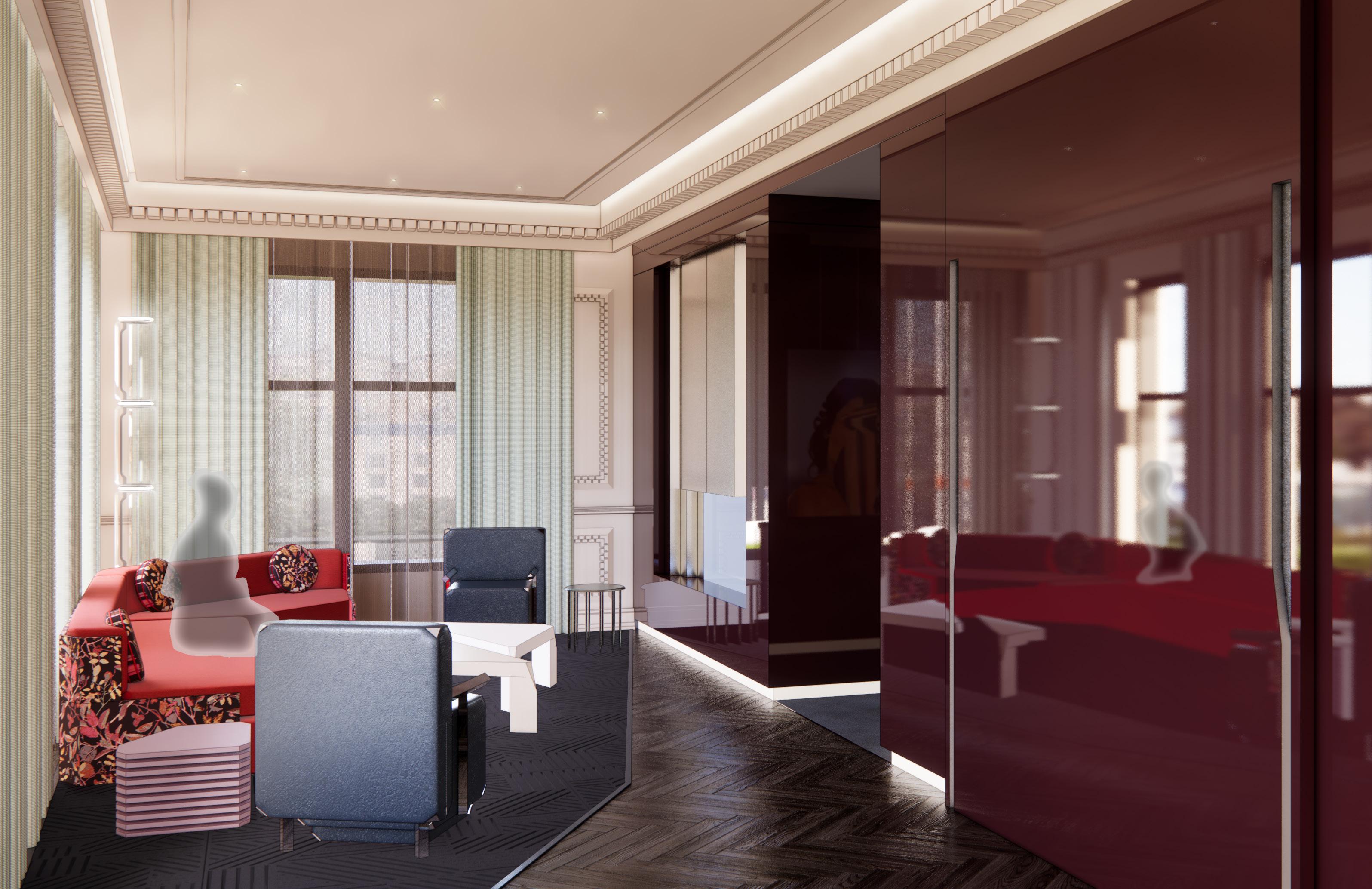
For the design of the New York flagship store in Soho, the design draws inspiration from the Light and Space art movement and stage set design. The visitor is met with a secondary facade of scrim partitions upon entering the store. These structural scrim elements highlight the ephemeral translucency of the material while defining each merchandising area. Reacting to volume and encasement, the sheer scrim structures act as visual separators while allowing an experience of discovery and voyeurism with each progression throughout the store.
BRAND IDENTITY DEVELOPMENT
The project includes visual creative direction and brand identity development. The stripped-back ‘AV’ logo presents a narrative of minimalism that is carried throughout the brand’s aesthetic.
The color palette, seen here applied to custom product packaging designs, relates to the contrasts of chroma and progression of tint versus tone. The editorial styling and lookbook concepts relay sartorial grit and a sense of irreverent refinement. Overall, elements of ‘soft brutalism’ are woven throughout the branding design.


5
Images Courtesy of Studio Nicholson VIEW FROM CASHWRAP

CLOTHING


6
ENTRY / WINDOW DISPLAY
CASH WRAP STAIRS
ROOM
CLOTHING / ACCESSORIES APOTHECARY WC
OFFICE BREAK
DRESSING ROOMS LOUNGE
BAR
WC
LEVEL
NTS
1 1
/ ACCESSORIES WET
STAIRS STOCK ROOM STOCK ROOM
LOWER
SCALE:
ANOTHER VERNACULAR
NTS
FIRST FLOOR SCALE:
CONCEPT
As the visitor moves through the store, lighter, desaturated elements are stripped away to expose structural framework throughout the retail display area.
Upon descending to the lower level, darker saturated materials are layered back into the design while the scrim display framework acts as light-boxes illuminating the space.

1 NORTH SECTION


8 ANOTHER VERNACULAR 2 3 1 4 5 6


MATERIALS
The First Floor materials introduce contrast in weight and translucent visual effects. Lighter neutrals give way to more saturated tones. Scrim partitions are used as space defining elements throughout the space, both vertically and horizontally, to direct the user and introduce motifs of containment versus release.
Natural Scrim, Partitions

Travertine, Flooring

Aluminum, Frame and Shelving

Marble, Display Pedestals

Portola Match Point
Limewash Plaster, Walls

Marble, Display Pedestals

Natural Scrim, Partitions and Curtains
High Gloss Veneer, Walls and Ceiling
Object Carpet Gloss
7920 Powder, Carpet
MATERIALS
The Lower Level creates a moodier, darker environment with high-gloss, dark wood veneer lining the walls and ceiling. The scrim partitions act as light boxes in this instance, illuminating both the product and surrounding areas. A lounge area introduces upholstered seating and mesh curtains, in a looser form, section off the fitting rooms.
Mayer Plaza Everglade Velvet, Upholstery


Marble, Display Pedestals

Aluminum, Frame and Shelving

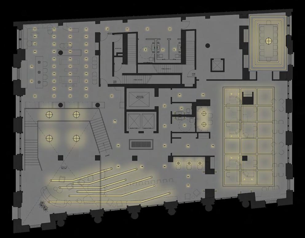
9 FIRST FLOOR PLAN 1 2 3 LOWER LEVEL PLAN 4 5 6


Custom display solutions utilize materials with contrasting weight and opacity. Hanging racks, display plinths, and shelving work in tandem with the scrim partitions, piercing through the material to connect the foreground with the structural backdrop.
ANOTHER VERNACULAR FIRST FLOOR PLAN LOWER LEVEL PLAN
RETAIL DISPLAY A A B B C D E


CUSTOM FURNITURE
Modular seating designs for the fitting room lounge area. The weighted pillows along the back of the sofa design are transposed scale to create a sloping bench design for the secondary seating area.


11 C D E
RETAIL DISPLAY DETAIL
ARPÈGE
Project Type: Hospitality
Location: Montreal, Québec
Software: AutoCAD, Rhino, Sketchup, Enscape


A new hotel concept for the fashion house Lanvin, ARPÈGE celebrates the brand’s historical connection to the birth of the French Art Deco movement while expanding into a more contemporary aesthetic. The hotel will cater to the fashion house’s current clientele, a global luxury client with a keen eye for art and culture.
Lanvin has historically maintained a diaphanous and delicate materiality that is carried across their collections. Currently the brand has expanded into streetwear, embracing sneakers, neo-tailoring, and technical fabrics. This juxtaposition between design trajectories provides the aesthetic basis for this hotel design. The signature “Robe de Style” silhouette brings about an angular parti. The dichotomy of floral patterns rendered in pixelation and grid motifs at various scales and transparencies carry throughout the project.


13
+ CONCEPT LOBBY Images Courtesy of Lanvin 0' 5' 10' 15' 20' 0' 5' 10' 15' 20' 1 2
CLIENT
LOBBY
RECEPTION
STAIR
RETAIL
WC
STAIR
WC
RESTAURANT
BAR
LOUNGE
SECOND FLOOR FIRST
FLOOR


14 ARPÈGE
RECEPTION
Ruhlmann Club Chair
Pierre Augustin Rose Palais Royal Froufrou Sofa
Dmitriy
Ian Felton Kosa Sofa
Christophe Delcourt LOB Low Table
& Co Arp Chair
Lambert & Fils
Gesture
Parállilo Lamp CF V9 bacter CF V2 Virus Series
Charlotte Biltgen Eileen Armchair
Silo
Lamp
Custom Oak / Nickel Inlay, Flooring
Metal Mesh Antique Nickel, Architectural
Moore & Giles Tribeca Glass, Upholstery
Pollack Satisfaction Aubergine, Upholstery
Maharam Scuba Cabernet, Upholstery Superstrata Metallic Plaster, Ceiling
Maharam Tempo Beehive, Upholstery
Maharam Metric Fog, Upholstery
Maharam Scape Raven, Upholstery
Burnished Nickel, Architectural Reception + Stair Sketch


CUSTOM LIGHTING
FIXTURE SYSTEM
INSPIRED BY LANVIN SNEAKERS

15
1 NORTH SECTIONAL PERSPECTIVE
FIRST FLOOR RCP
SECOND FLOOR RCP


ARPÈGE RETAIL SHOWROOM
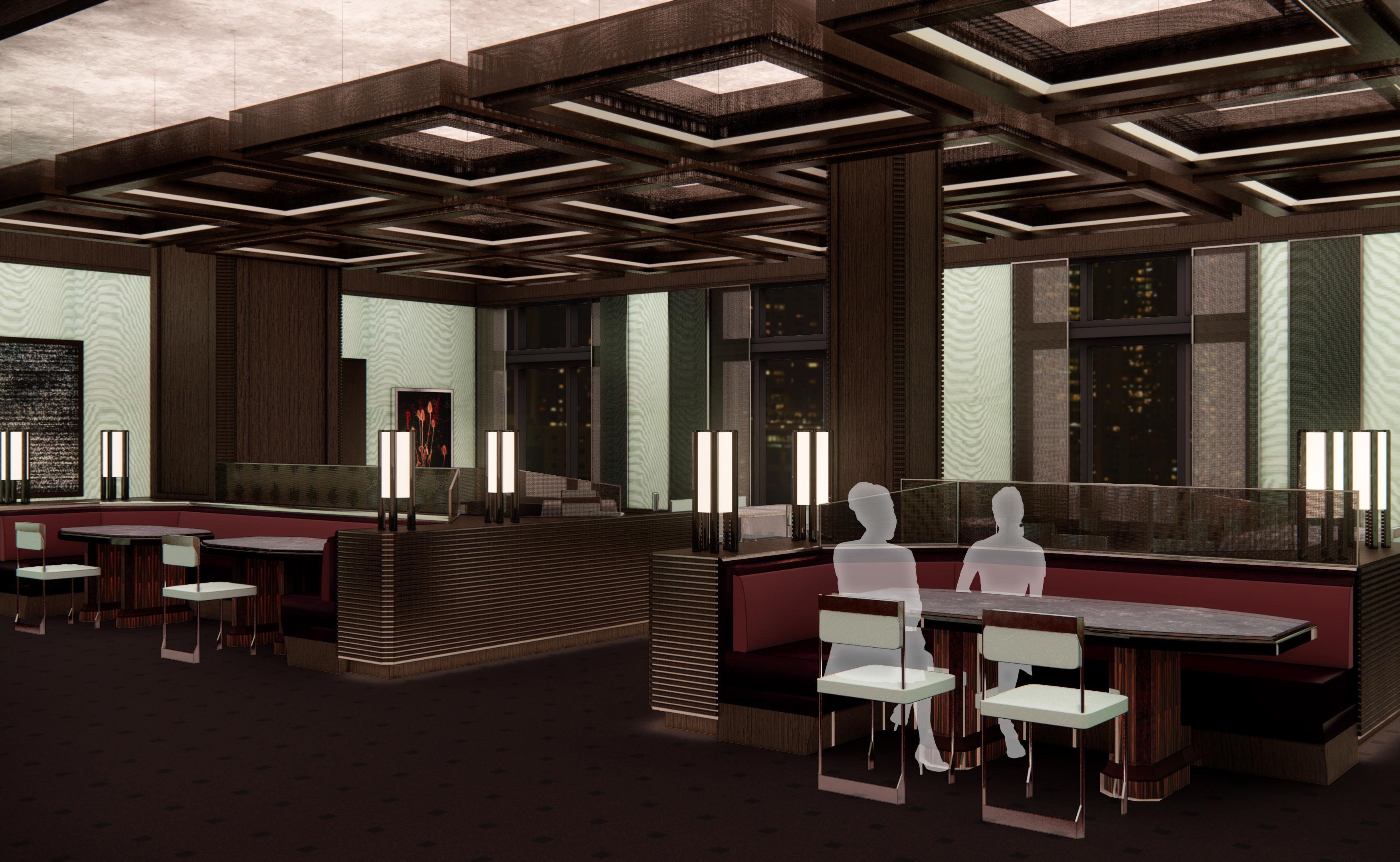
17 RESTAURANT MARGUERITE
MILLWORK DETAILING PROJECT
Drawings from an advanced detailing project inspired the retail store design. Motifs were adapted from French Art Deco projects and reinterpreted with considerations for depth, texture, and scale.

18 ARPÈGE 3 -4 -5 -10 -11 -8 -9 -1
NORTH ELEVATION 2
PANEL
4
HORIZONTAL
3
DOOR
1/2"=1'-0"
1/2"=1'-0"
SECTION, NORTH WALL
1/2"=1'-0"
SECTION, NORTH WALL
1/2"=1'-0"
SECTION, NORTH WALL
19 3 3"=1'-0" CROWN MOLDING SECTION DETAIL 4 6"=1'-0" CHAIR RAIL SECTION DETAIL 5 6"=1'-0" BASE BOARD SECTION DETAIL


CUSTOM DESIGN DEVELOPMENT
Expanded millwork details guide the development of complimentary ceiling designs. The coffered ceiling in the retail space is reflected in the restaurant with a grid of custom metal mesh light fixtures. The ceiling finish in the dining room is metallic silver plaster, highlighting the direct/ indirect lighting from the pendants.
Custom dining chairs echo the angular parti transcribed from the drop-waist “Robe de Style” silhouette. Layered pleats from the skirt direct linear metal fins applied to the custom dining banquette design. Integrated lighting fixtures bring illumination to the mid-level space, creating a warm glow across the dining room

20 ARPÈGE
A
2
WEST SECTIONAL PERSPECTIVE
A B C


21 B C
Project Type: Hospitality
Location: Montreal, Québec
Software: AutoCAD, Rhino, Sketchup, Enscape
- SUITE SUITE SITTING ROOM
ARPÈGE


23 0' 5' 10' 15'
WET BAR ENTRY DINING
DESK
POWDER TERRACE
SITTING ROOM
BEDROOM
CLOSET
10TH FLOOR PLAN
BATHROOM

24
ARPÈGE

25 BEDROOM
CUSTOM BED FRAME
BURL VENEER
WAXED ALUMINUM

ADJUSTABLE LED PANEL SLIDES ON TRACK FROM SCONCE HEIGHT TO BEDSIDE LAMP


STRETCHED SILICON RUBBER DIFFUSER

CUSTOM ADJUSTABLE
WALL SCONCE
SILICON RUBBER
POLISHED NICKEL
CUSTOM DESIGN DEVELOPMENT
The hotel suite displays a vibrancy of color and texture. Many materials, including nickel-plated metals, burl veneer, and macassar ebony veneer were selected based on their prominent use in French Art Deco furniture. Here they are utilized in uber-contemporary forms and juxtaposed with graphic printed upholstery, backpainted glass, lacquered surfaces, and translucent silicone rubber.
The bed frame integrates nightstand and seating surfaces into the design with a rhythm of linear planes and reveals. An adjustable wall light allows the user to move the LED panel along a track from sconce height down to reading lamp level. A strap of silicone rubber provides a contemporary texture while gently diffusing the light. The mixed media sofa continues an exploration of contrasts with an upholstery-wrapped panel shell surrounding the sofa.
ARPÈGE


27
CUSTOM MIXED MEDIA SOFA
CUSTOM STACKED SIDE TABLE
LANVIN INSPIRATION
OAK OXBLOOD
BENJAMIN MOORE OLD MONTREAL
HERRINGBONE STAINED
BACK-PAINTED GLASS
MOORE & GILES CARLYLE BLUEBELL
MAHARAM MESSENGER POPPY
MAHARAM SCAPE BLEND
BENJAMIN MOORE SEATTLE GRAY
BURL VENEER
SILICON RUBBER
POLISHED NICKEL
MACASSAR EBONY VENEER
CREATIVE CO-HOUSING
Project Type: Multi-Family
Location: Upper East Side, New York City
Software: AutoCAD, Sketchup, Enscape, Photoshop


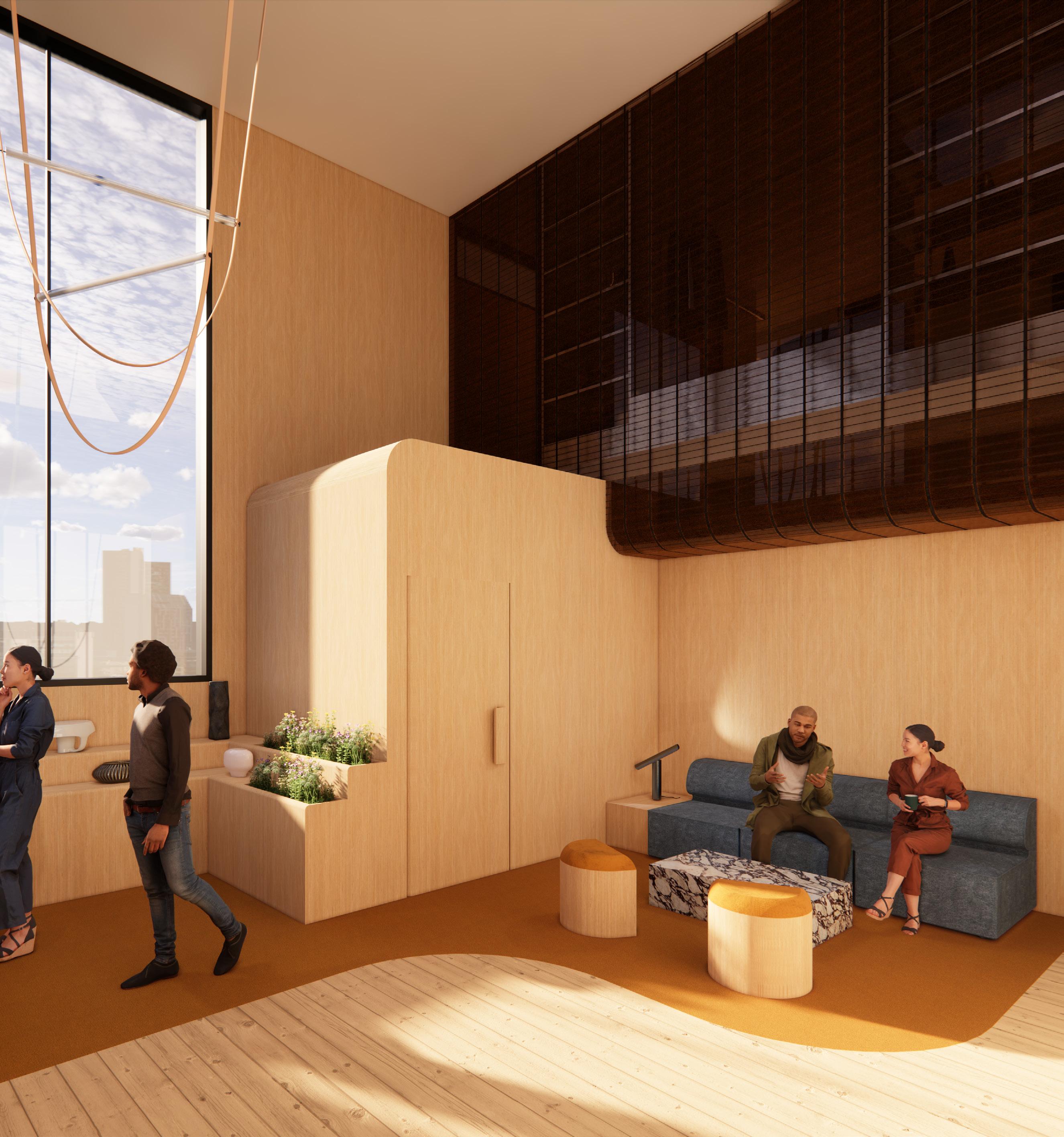
This co-housing community caters to LGBTQ+ elders with backgrounds in the creative and visual arts. The single-floor cooperative is located on the Upper East Side in New York City and will provide a mix of one to twoperson apartments and common areas for residents. Chosen family and care-giving have long been a central components of this community and will be a pillar of the co-housing experience. While continuing to celebrate and affirm the diverse backgrounds and experiences of LGBTQ+ elders, the project will support the diverse needs of this population and provide a welcoming space to continue community engagement.
The communal area is centralized on the floor and provides a Living Area, Dining Area, Kitchen, Laundry Room, Restrooms, and Gallery Space for the residents and their visitors. Different areas will support socializing for larger groups with flexibility for events and group dinners through to more intimate seating areas for privacy and oneon-one conversations. This programming will allow this group of like-minded individuals to continue to engage within their own community while welcoming guests and visitors to the space.
CONCEPT
Industrial Angular Rough Rigid Leather Metal Dark Moody
Natural Curved Soft Plush Velvet Sheer Light Soft Floral
MALE FEMALE
To reflect the inclusive and broad nature of the LGBTQ+ community, design elements highlighted across this project attempt to degender or queer traditional thoughts around the use of color, texture, form, and materiality.
In “The Crumple and the Scrape: Two Archi-Textures in the Mode of Queer Gender,” Lucas Crawford notes:
Consider how easy it is for us to recognize ways in which color is gender-coded and sexualized: pastels are innocent; a hunter-green hanky worn in the back right pocket means “daddy”; parents use pink and blue onesies to communicate the status of their child’s genitals to onlookers.
Texture is every bit as political as color, as thoroughly imbricated in gender and sexual norms. It slides, if slyly, into our designs, vocabularies, and tastes. Texture and gender are mutually defining.
29
CLIENT
Geometric LOUNGE


30 LOUNGE DINING KITCHEN GALLERY ENTRY OFFICE WC WC
DETAIL
FLOORING
Powder 0917
Object Carpet
Swan 0901
Object Carpet
Rosso Levanto
Marble
Marble
Verde Vecchio
Basketweave Marble Tile

ENTRY

32 CREATIVE CO-HOUSING KITCHEN


MATERIALS
Exploring and breaking traditional gender norms, high-contrast materials highlight variance in color, pattern, sheen, and textural handfeel.
Maharam Alpaca Velvet Alpine, Upholstery
Dark Stained Oak, Millwork


Polished Chrome, Lighting
Aged Brass, Lighting
Object Carpet Chicc 900 - 0917, Carpet
Oak Veneer, Millwork


Kunis Breccia, Tables

Maharam Deconstructed Rose, Upholstery
Maharam Mantle Kinetic, Upholstery
Verde Vecchio Quartzite, Countertop


33
GALLERY
GALLERY
Project Type: Residential (Live/Work)
Location: Tribeca, New York City
Software: AutoCAD, Sketchup, Enscape, Photoshop

CERAMIC LOFT

CLIENT + CONCEPT
Harvey Bouterse is an Antwerp-based ceramic artist. After a successful career in fashion, Bouterse discovered his love for ceramics after a sourcing trip to the Belgian countryside. He was drawn not only to the art form, but to the serene natural setting of the remote town where his European studio would eventually be located.
Bouterse requires a Live/Work loft in New York City that would allow him to expand into the market with a private gallery space highlighting his works for potential stockists and retail partners.
Taking design inspiration from his own ceramics practice, forms reflect varied aesthetics to his evolving work. Experimental sculptures highlight layering techniques, hand-formed material manipulation, wall-hung art pieces, light fixtures, and ceramic jewelry. The Ceramic Loft melds Bouterse’s metropolitan lifestyle with the agrestal Belgian landscape, the setting where he fell in love with the art form.


35
LOUNGE N
PLAN A N
FIRST FLOOR
A
MEZZANINE PLAN
ENTRY
GALLERY
LOUNGE STAIRS
WC OUTDOOR
KITCHEN
WORKSPACE
STAIRS
WC
BEDROOM
BALCONY
MATERIALS
Material choices reflect the dichotomy and contrast of the urban and natural environment. Organic forms built in hard materials carve out the space while contrasts in texture and surface finishes reflect the ceramic glazing process seen in Bouterse’s work. Inspiration is taken from the Japanese firing technique of Raku which connects the elements of fire, air, earth, and water, creating a unique glaze across the ceramic surface. The process of kiln firing is translated through amber-colored glass brick, creating a flame-like reflection and luster throughout the space.
5 SOUTH SECTION
SCALE:


527SA-2021/22-S Design and Drawing II
INSTRUCTOR:
AMY EVERARD
DRAWING TITLE:
SOUTH SECTION
DRAWN BY:
DATE:
SCALE:

KILE HOTCHKISS
2/18/2022
1/4" = 1'-0"


36 CERAMIC LOFT GALLERY
Oak Veneer
Object Carpet Chill 1240
Calacatta Viola Blackened Brass
Amber Glass Brick Robert Allen Mohair Titanium
Maharam Scape
Nighthawk
Polished Aluminum Portola Nomad
NEW YORK SCHOOL OF INTERIOR DESIGN 5
1/4" = 1'- 0"
SOUTH SECTION A

37
STAIR

38
BEDROOM
CERAMIC LOFT

39 BEDROOM
