
Purpose of Brand Guidlines
Brand guidelines are the set of rules that define the overall look and feel of your brand. They help you build a brand identity that your audience can recognize across all platforms. A comprehensive brand style guide outlines everything from your typography and color palette to your tone of voice as well as do’s and dont’s to keep everything cohesive.
Purpose of Brand Guidelines - Page 1
Table of Contents 03 08 13 16 18 20 Logo Graphics Color Photography In Use Fonts Table of Contents - Page 2
Logo
Logo Basics
Includes the main logo as well as a simple icon that can be used separate from the main logo in various ways; espcially in small spaces where the full logo cant fit.
Logo Spacing:
The purpose of this is to give your logo room to breath. No graphic elements of any kind should invade this zone
SKIN C R E Sol ions
Sol ions
SKIN C R E
Logos - Page 4
Logo Spacing:
Do: Don’t:
SKIN C R E Sol ions
SKIN C R E Sol ions
SKIN C R E Sol ions
SKIN C R E Sol ions
Logos - Page 5
Logo Contrast
This to make sure the logo can be read and seen clearly when placing on color or images.
Do: SKIN

Dont:
ions
ions
SKIN C R E Sol
SKIN C R E Sol
ions
ions
C R E
C R E
Sol
SKIN
Sol ions
SKIN C R E Sol ions SKIN C R E Sol ions SKIN C R E Sol
SKIN C R E
Logos - Page 6
Sol ions
Logo Misusage

Try to aviod manuiplating the logo as best you can where some manipulation can be used, try and avoid manipulating it in any of these ways.
Try and aviod:
Graidents
Drop Shadows
Rotating or flipping
Stretching
Cutting logo off
Outlining
SKIN C R E Sol ions SKIN C R E Sol ions SKINC RE Sol ions SKIN C R E Sol ions Logos - Page 7
Fonts
Logo Fonts
Quiverleaf CF Extra Bold
Sol ions
Poppins Light
SKIN C R E
Fonts - Page 9
Fonts and Usage
Poppins Bold
Poppins Semi-Bold
Poppins Bold used for headers and main Headlines. It can also be used in body copy to emphasize important information.
Poppins Regular
Always use this for any “Body Copy”; large amounts of text. Increasing the leading a little is encouraged. Leading is the space between the lines of text:
Adding a little space like this can make information easier to read.
Lorem ipsum dolor sit amet, consectetuer adipiscing elit, sed diam nonummy nibh euismod tincidunt ut laoreet dolore magna aliquam erat volutpat. Ut wisi enim ad minim veniam, quis nostrud exerci tation ullamcorper suscipit lobortis nisl ut aliquip ex ea commodo consequat.
Rather than this...
Lorem ipsum dolor sit amet, consectetuer adipiscing elit, sed diam nonummy nibh euismod tincidunt ut laoreet dolore magna aliquam erat volutpat. Ut wisi enim ad minim veniam, quis nostrud exerci tation ullamcorper suscipit lobortis nisl ut aliquip ex ea commodo consequat.
Poppins Light
Poppins Light Italic
Poppins light and light Italics is used for things like references, figures (info underneath a photo), pull quotes; just shouldnt be used for large amounts of text.
Fonts - Page 10
Fonts and Usage
Quiverleaf CF Extra Bold
Quiverleaf CF Extra Bold Itaics
Quiverleaf CF fonts can be used for shorter stand alone text, like quotes, statements, it is important to not overuse this font; otherwise primaraly stick to Poppins for most inforamtion.
The reason for this, is if over used, your logo can loose the uniquenes and flare it has and wont stand out as much; which is why I chose poppins for your main font. It is geometntric, simple and clean. So when you use Qiverleaf it will really stand out.
Since it is a relatively thin font stick to using Extra Bold but other weights can be used but I would avoid it
WHERE TO FIND/DOWNLOAD FONTS
Both Poppins and Quiverleaf CF fonts are Adobe fonts. You can also find and download Poppins from Google Fonts as well as many other sites for free. You can find and download Quiverleaf CF on many sites for free as well.
Fonts - Page 11
Examples
(Use of graphic element)
Quiverleaf CF Extra Bold font used for stand alone text.
(There is also a good amount of contrast to be able to read qoute.)
The best foundation you can wear is glowing happy skin
(Clean, more earthy style photography)

Fonts - Page 12
Graphics
Brand Graphics
This is a something that can be used as a consistant visual element used through out all your branding. This element can create immence amount of options depending on how close up you use it, or even the angle as well.
Where you can use the whole branch as an decrative element; its purpose is to be used in unique ways by zooming in on sections of the branch.
This is considered more of a background element so it shouldnt be super high contrast but rather blend in with the background more.
2.) Graphics - Page 14
1.)
Brand Graphics
Do: Dont:
Graphics - Page 15
Color
Brand Graphics
Sand Dollar
Sea Breeze
Boardwalk
Sea Oat
Shark Grey
HEX: #F0EEE9
RGB 240 238 233
PANTONE: 11-4201 TCX
HEX: #D7D6CE
RGB 215 214 206
PANTONE: 12-4300 TCX
HEX: #AEA692 RGB 172 166 146
PANTONE: 15-0309 TCX
HEX: #6A6A45
RGB 106 106 69
PANTONE: 18-0527 TCX
HEX: #414143
RGB 65 65 67
PANTONE: 19-0205 TCX
Colors - Page 17
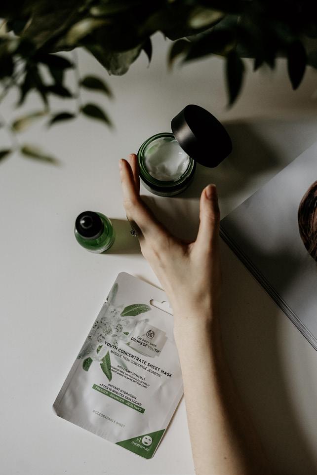
Photography
Photography
Something I feel is also imortant to incorparte into your rebrand, is photography styles; which can say a lot about a brand.
Do:


Since we are now leaning towards those very muted earthy tones, using photography to match it is important.
Rather than using very white stock style photos (which can seem very fake/out of touch). I think using photos that have warmer (earthy tones) and more intimate feel will really carry that feel you want your audeince to have.


Dont:

Photography - Page 19
In Use
In Use: Facebook
This is to show how your branding all comes togther and to give you an idea of the look and feel of how you would use your branding moving forward.

Clean earthy tone
Photography
Graphic Element

Sol ions
Good contrast, space between the logo and the edge
SKIN C R E
In Use - Page 21
In Use: Business Cards
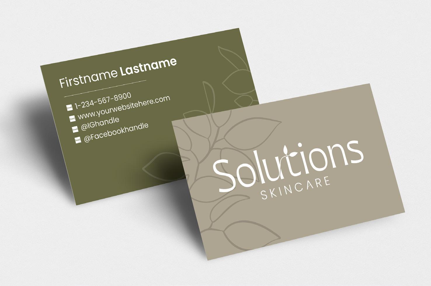
Poppins Font
-Poppins Bold
-Poppins Regular
Brand colors
-Sea Oat
-Boardwalk
15% opacity of either black or white for the leaf graphics
In Use - Page 22
In Use: Small Logo

In Use - Page 23