GRAPHIC ARTIST
Sophomore Graphic Design Portfolio

Vector
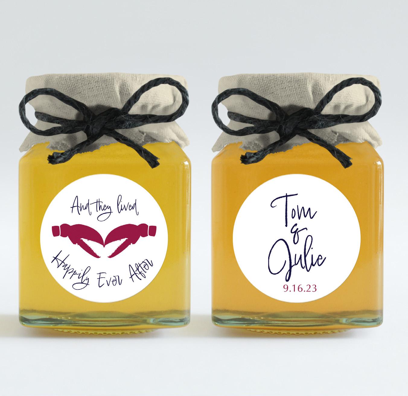
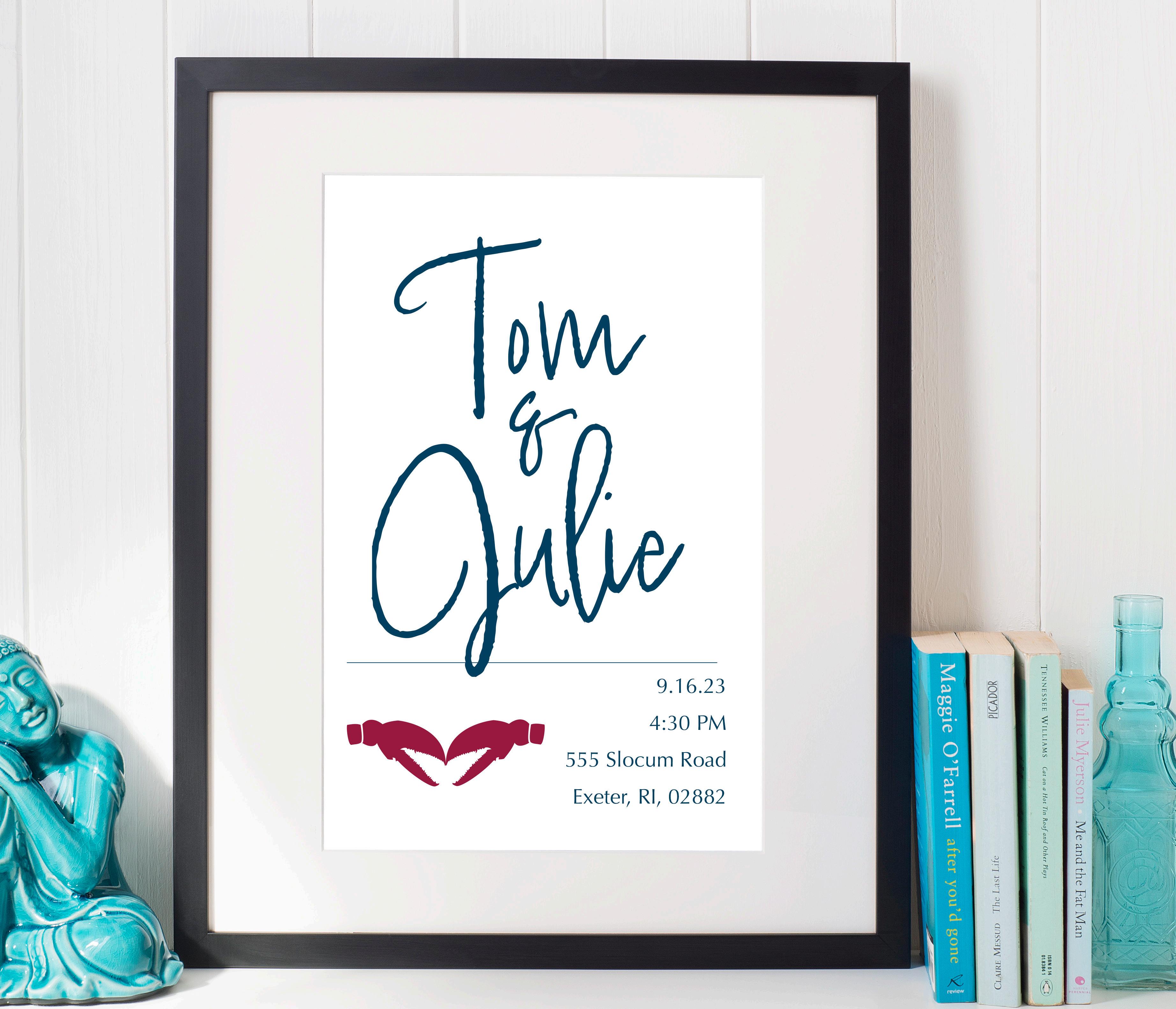
When my dad and Julie met, it was love at first sight. I aimed to evoke the same emotions with the custom design of their wedding labels for gummy lobster jars. Held at a casual, rustic clambake venue, the project allowed for creative expression in a chill yet elegant way. Our whole family loves Disney and has centered a lot of our aesthetic around it, so the “Happily Ever After” theme emerged. Portfolio led to expanding on the design, as I created wedding invitations inspired by oceanic motifs and Disney magic, maintaining a formal tone while capturing the event’s casual vibe. Modifying and expanding upon projects once it’s already over can be difficult, but as Walt Disney said, “it’s kind of fun to do the impossible!
Vector - Layout - Print - Typography
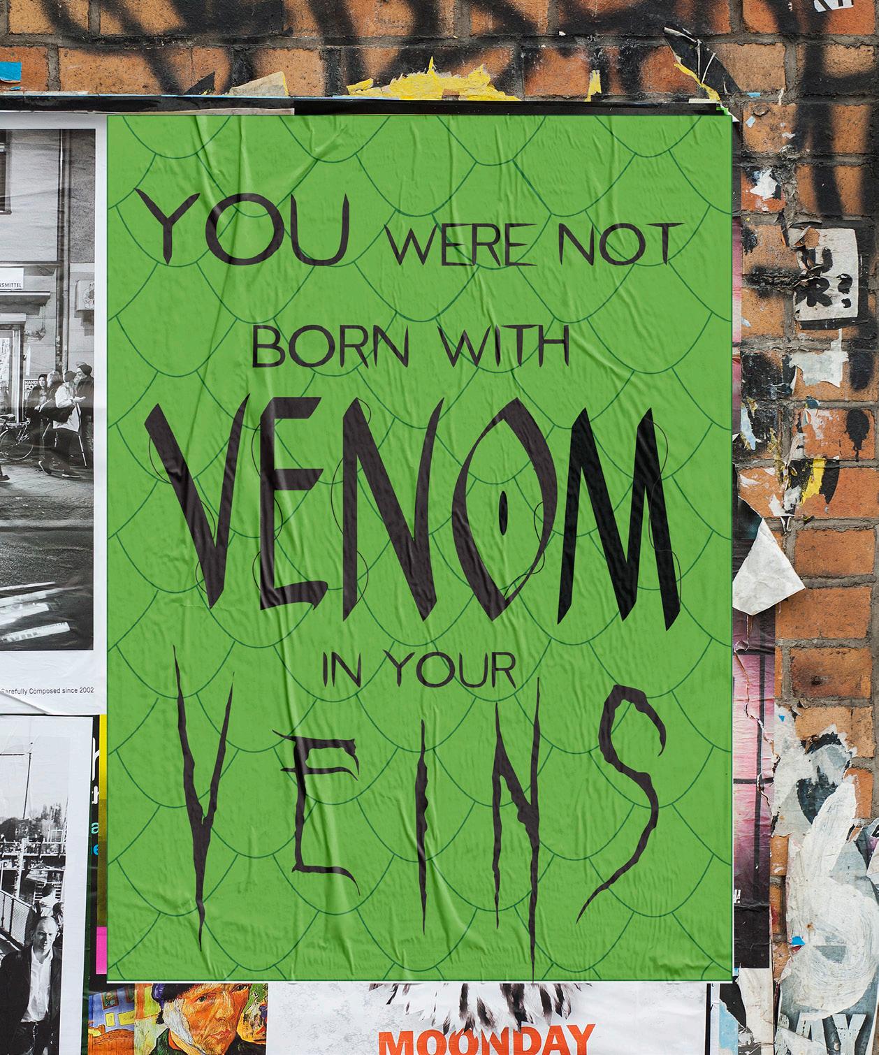
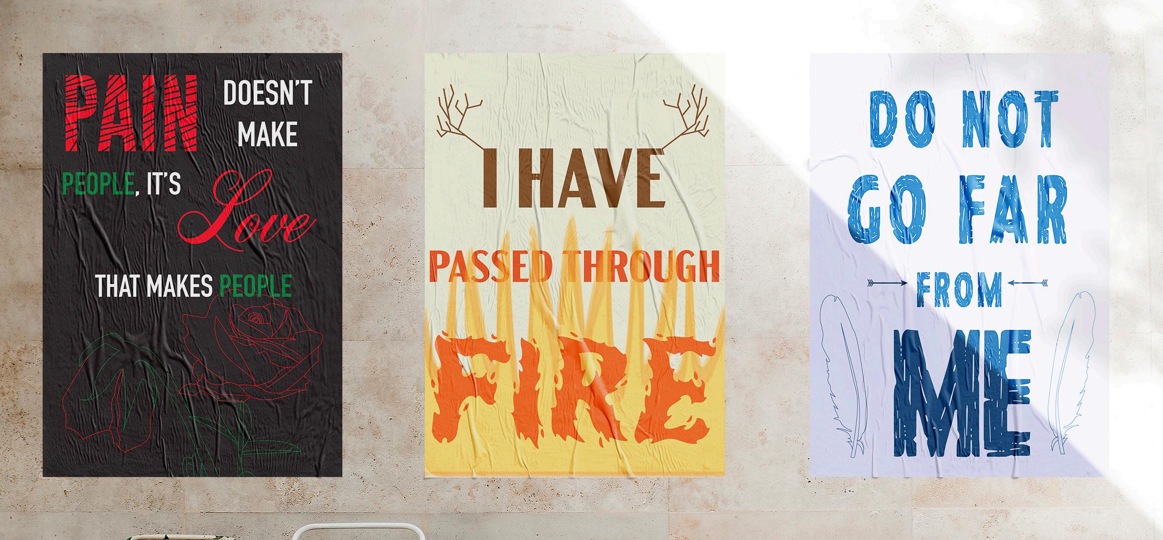
The project involved creating posters featuring favorite quotes, which led to picking quotes from the Dungeons and Dragons show, Critical Role. Each quote was interpreted creatively to reflect its meaning and context within the show. The project served as a way to showcase design skills and express personal interests in a creative and meaningful way. It highlighted the emotional depth found in the show Critical Role and allowed me to combine my passion for the series with my design abilities.
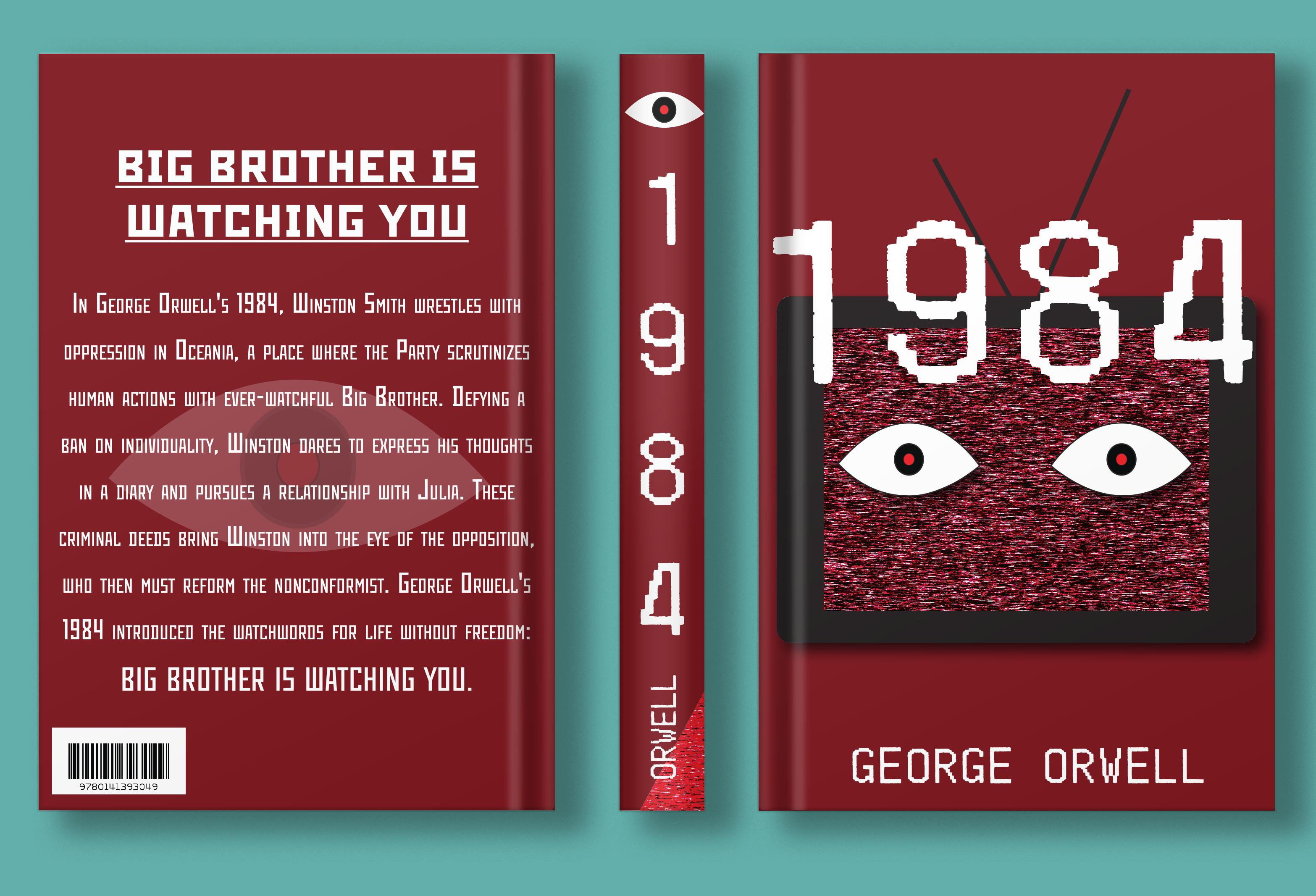
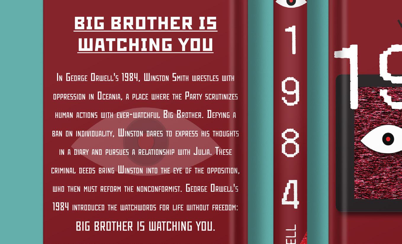
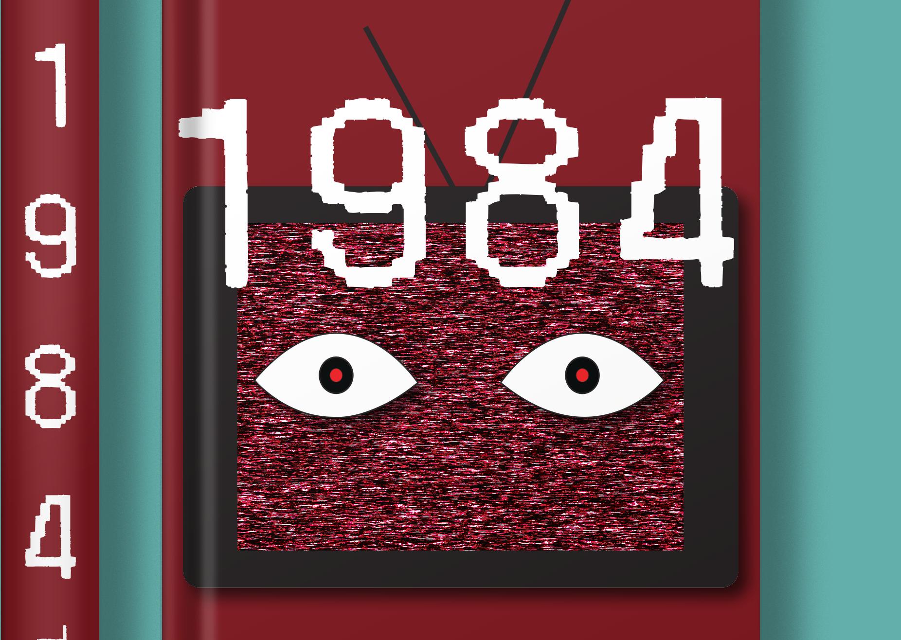
George Orwell’s dystopian novel “1984,” highlights repression and surveillance, incorporating elements of old technology and unsettling imagery. The front cover is designed to be jarring, mirroring the challenging themes of the novel, while the spine and back cover are more minimalist, focusing on conveying information. The inclusion of eyes throughout the design reinforces the concept of constant surveillance. Overall, the project showcases “1984” with elements of the modern analog horror genre that inspires me.
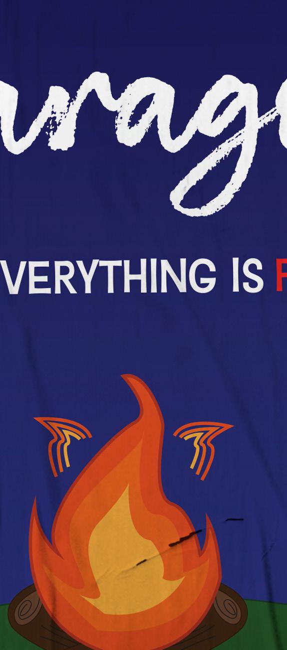
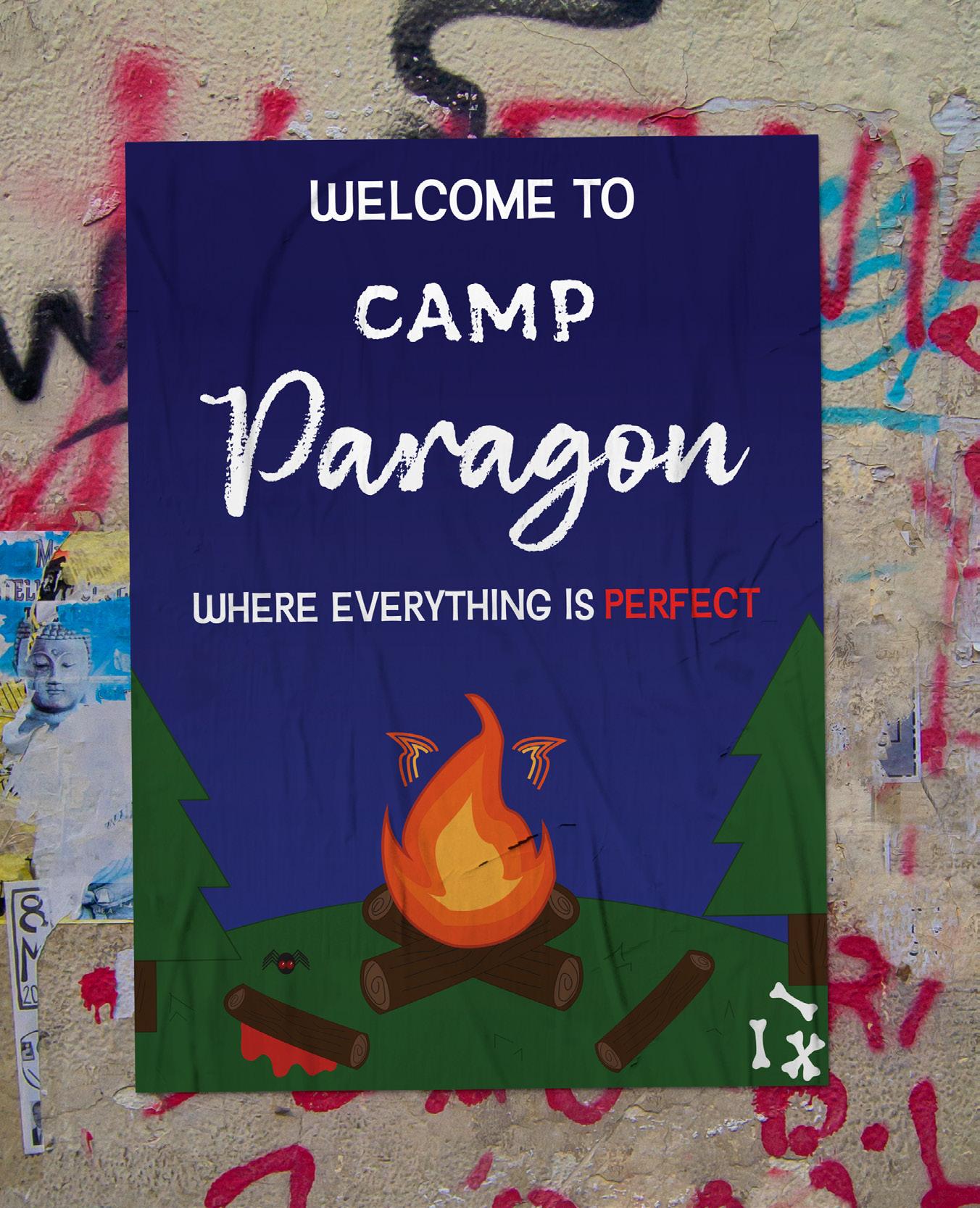
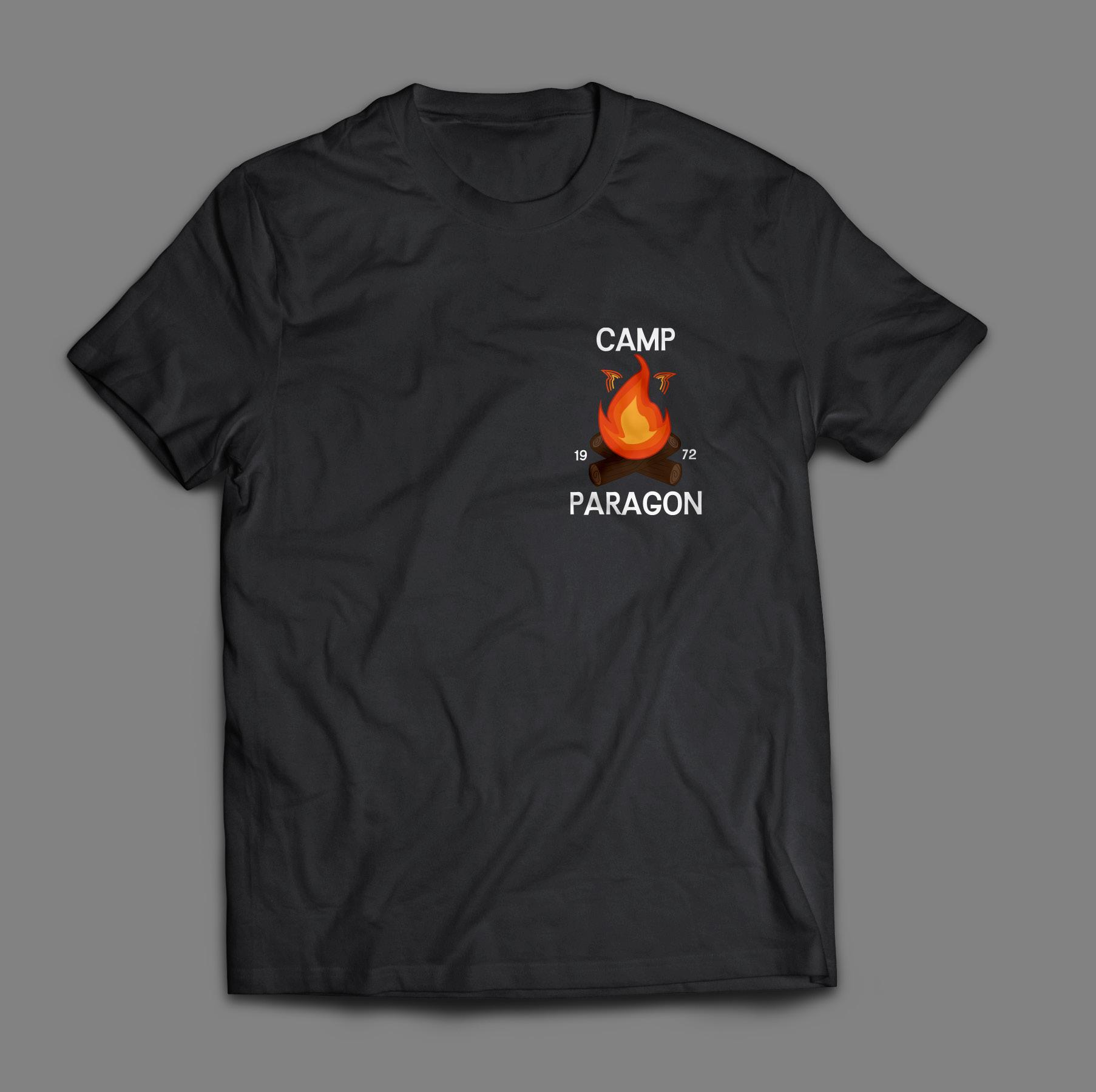
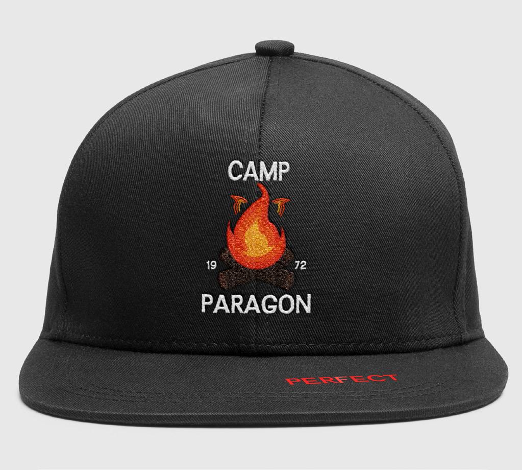
In 2022, the JWU Players brainstormed a chilling escape room concept set in a seemingly idyllic summer camp run by a cult. Initially, I created basic shirts to match the theme, but with newfound experience, I revamped the camp’s aesthetic, blending cheesy nostalgia with eerie undertones. The challenge lay in balancing story authenticity with visual appeal, achieved through deliberately gaudy design choices like gradients and handwritten fonts, subtly hinting at the camp’s sinister secrets.
Merchandising added depth, from simple shirts to baseball caps featuring the camp’s campy yet complex logo. As a horror enthusiast with a fear of blood, infusing innocence with darkness was gratifying, turning a typically wholesome setting into a spine-tingling experience.
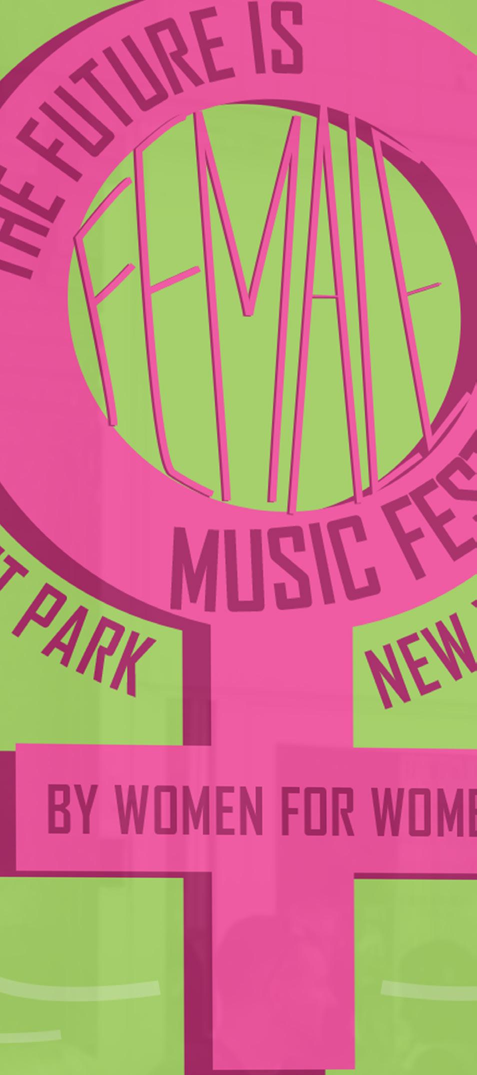
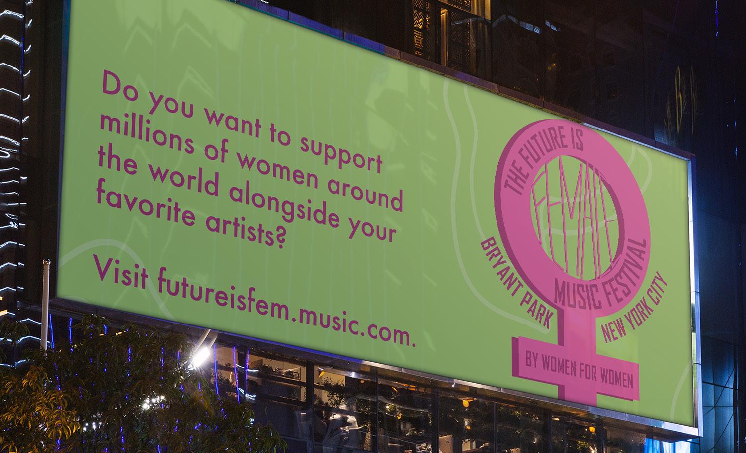
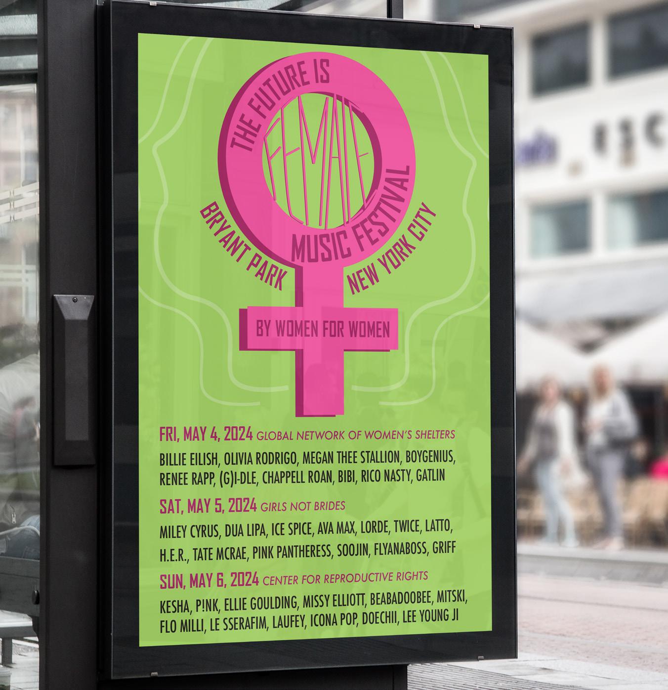
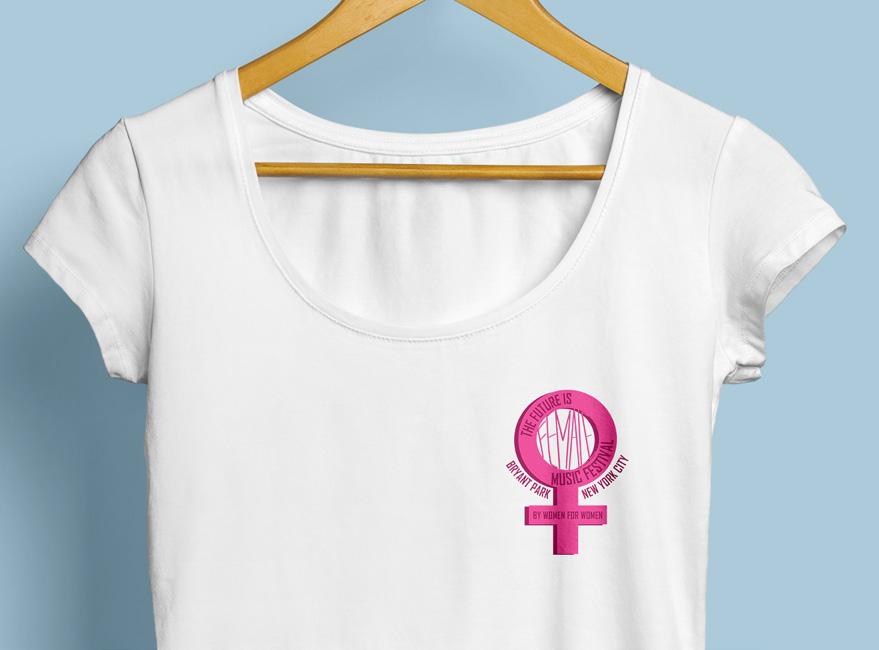
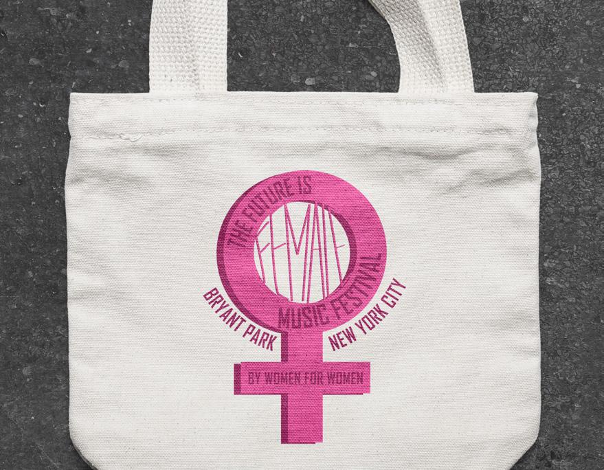
My feminist beliefs deeply influence my design projects, evident in my high school vector featuring the phrase “the future is female.” Inspired by female artists like Ke$ha and Britney Spears, I conceived “The Future is Female” festival, spotlighting diverse talents and supporting charities like the Global Center of Women’s Shelters. Selecting artists across genres, I researched venues and chose Bryant Park in New York City for its resonance with successful festivals. Enhancing the original design with subtle details, I expanded it into merchandise and billboards to promote the event’s charitable mission, underscoring the power of design in advocacy.
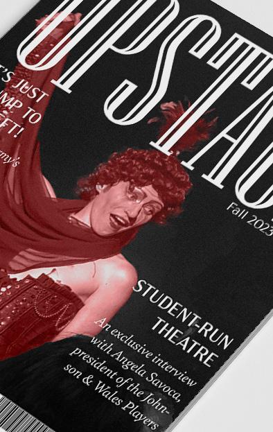
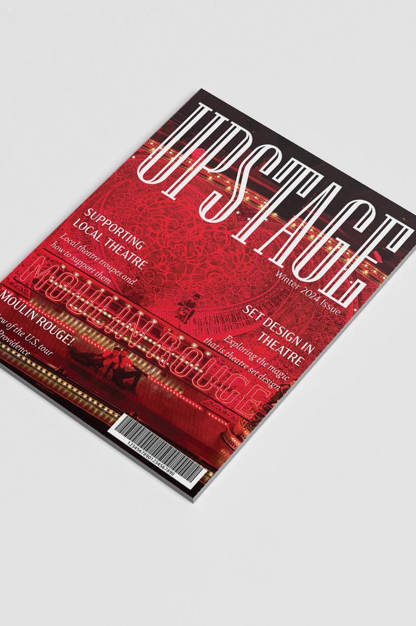
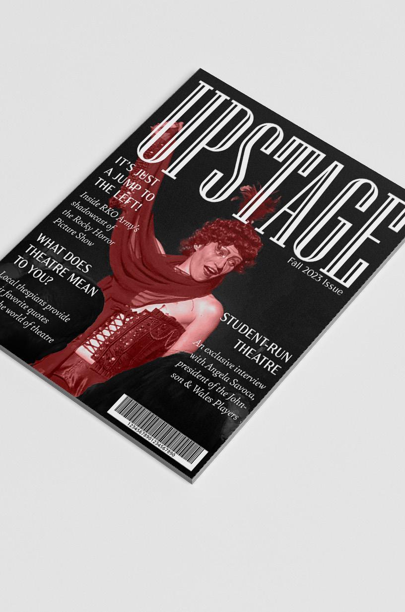
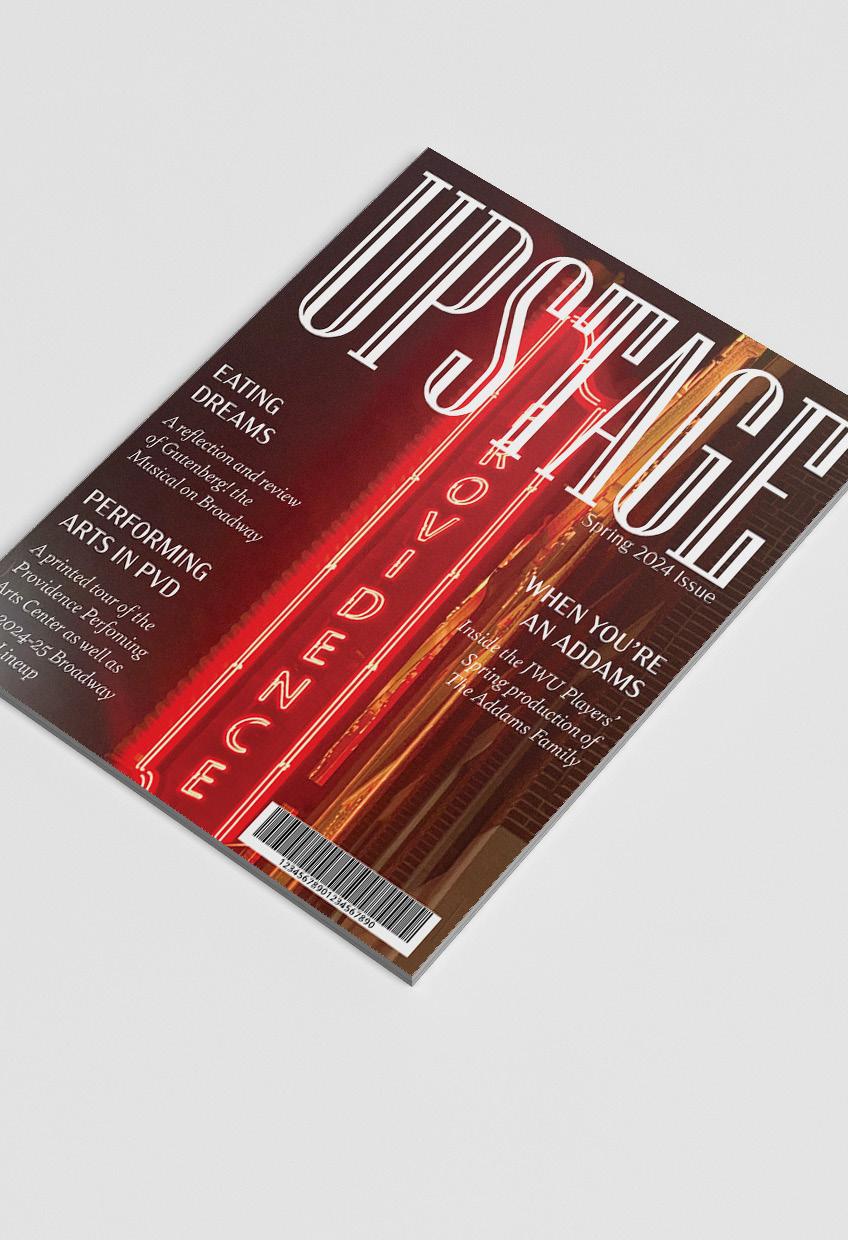
Combining my passions for design and theatre, I immersed myself in creating magazines for an editorial class, blending my love for both fields. The cover design became a focal point, leading me to develop a series of covers inspired by various theatre themes, using imagery from my experiences throughout the year. Employing fonts like Niagara, Acme Gothic, and Bely italicized, alongside meticulous spacing on a 6x6 grid, I crafted a cohesive layout that highlighted the importance of typography in editorial work. Through this project, I aimed to shed light on the often-underappreciated world of theatre, showcasing local productions and expressing my enduring admiration for the art form alongside my pursuit of graphic design.
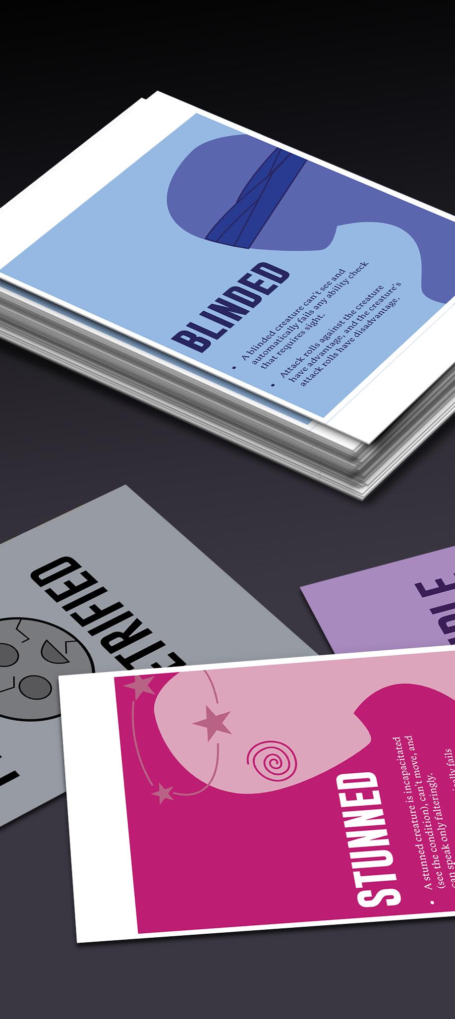
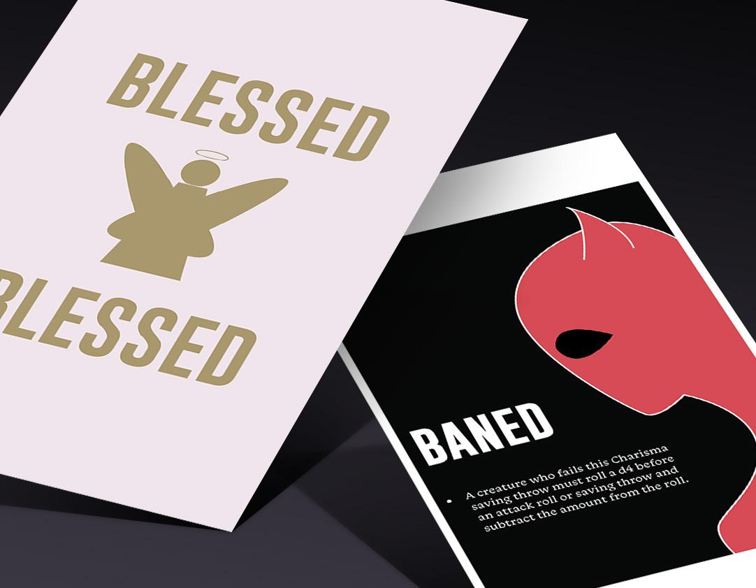
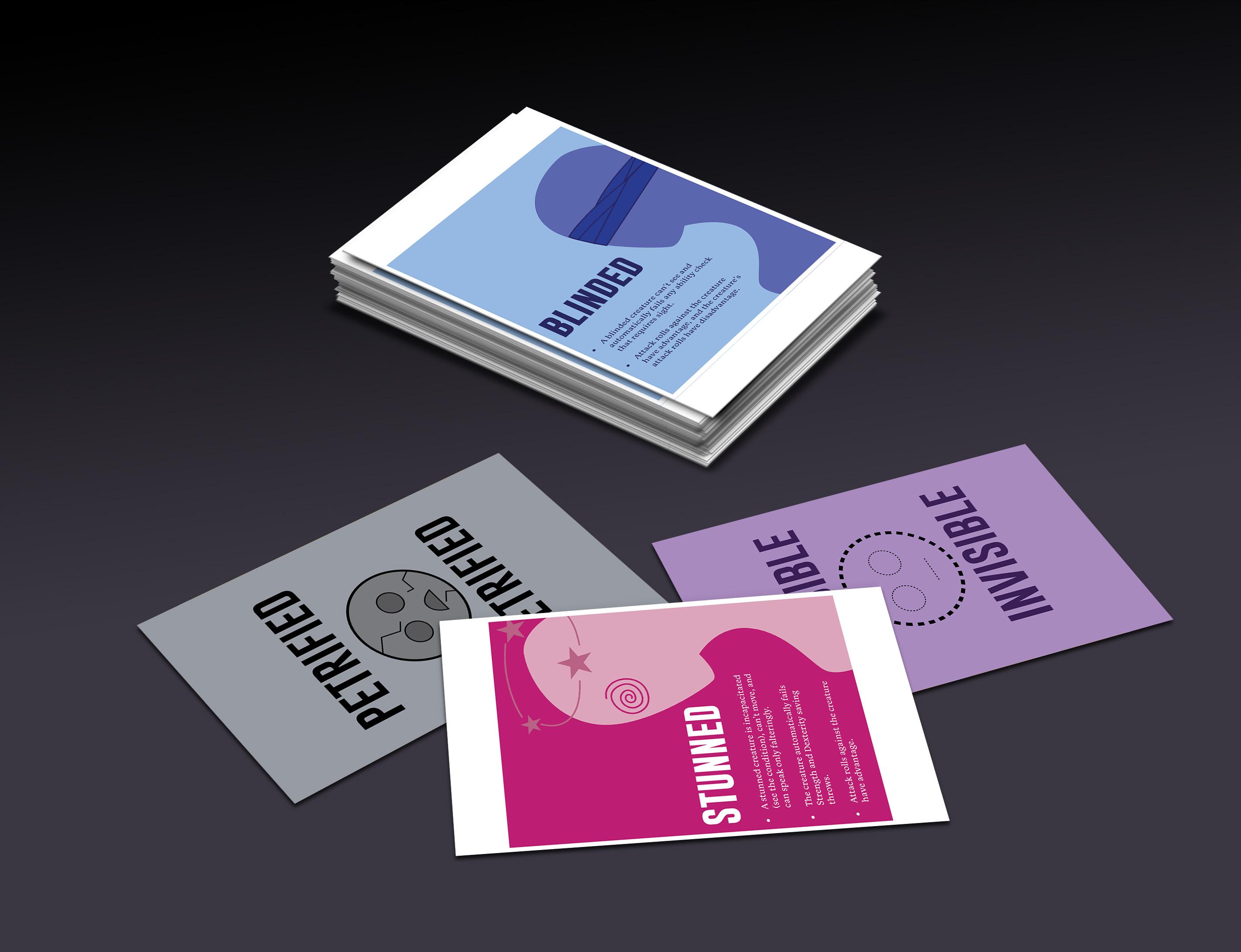
Vector - Layout - TypographyDungeons and Dragons has become a cherished hobby, leading me to design cards explaining various in-game status effects, such as poisoning or blindness, for my gaming group. Drawing from my passion and expertise in the game, I incorporated unique colors and symbols to distinguish each effect, ensuring practicality while maintaining visual appeal. Striving to infuse whimsy into typically mundane informational cards, I utilized bold colors and typefaces, merging my love for design with my enthusiasm for Dungeons and Dragons. This project not only showcases my design skills but also demonstrates the potential for creativity and usefulness when passions intersect with design endeavors.
Vector - Editorial - Collage
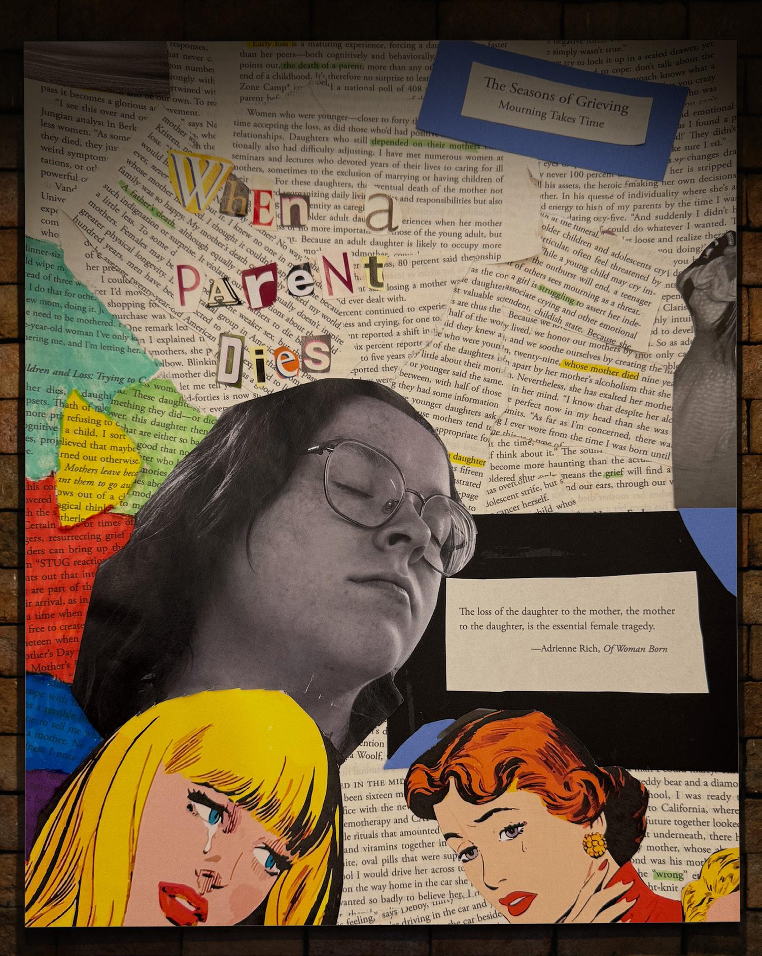
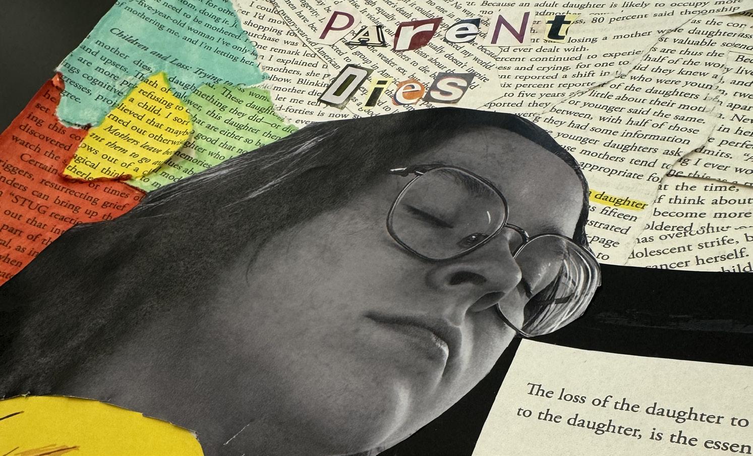
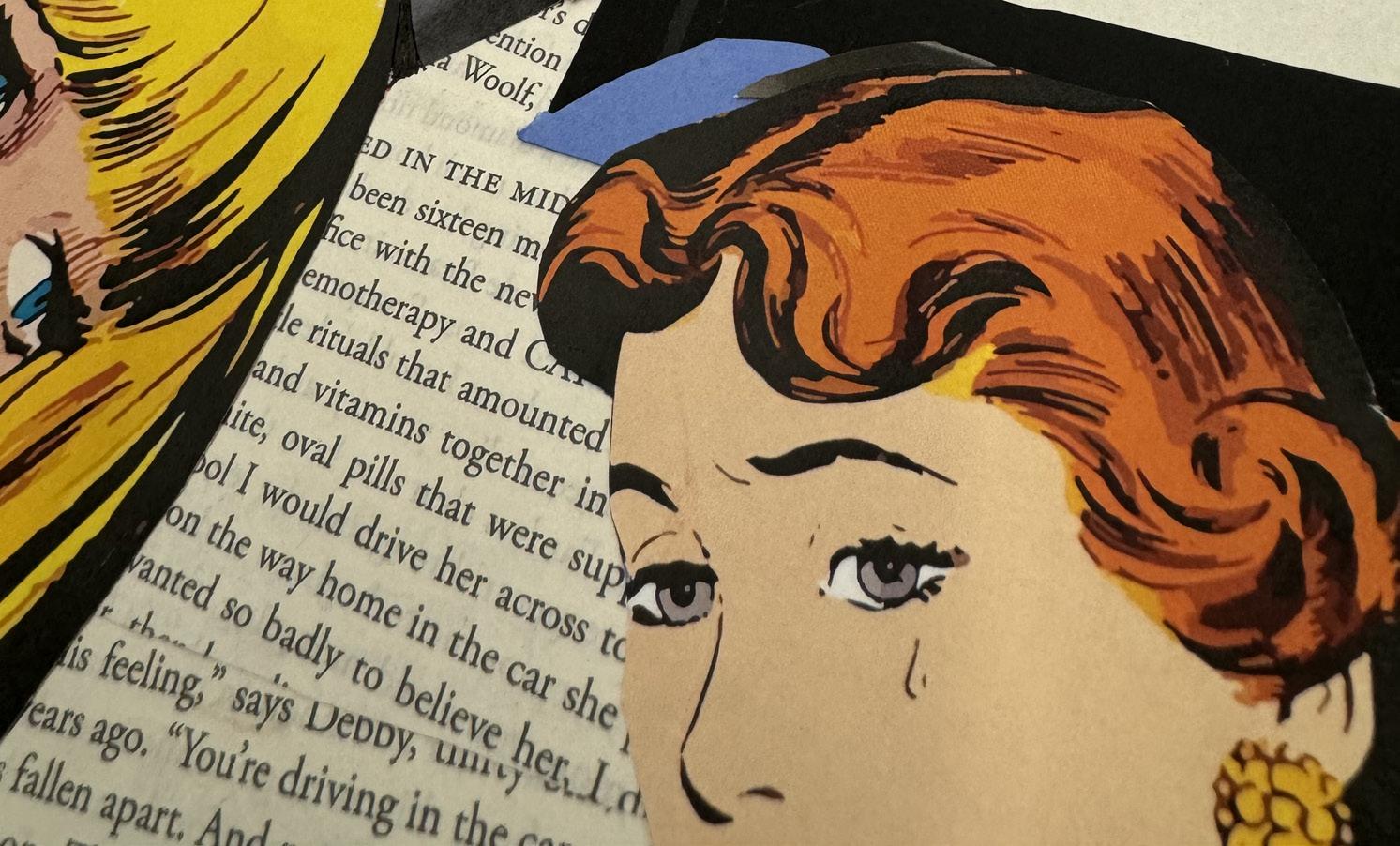
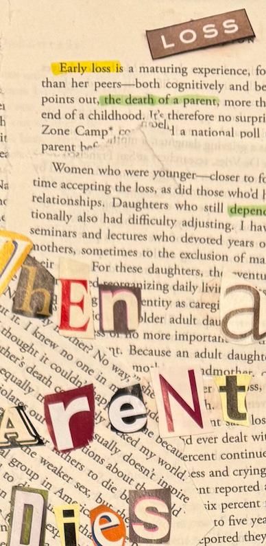
Experiencing profound grief after losing my mom at age eleven spurred me to find solace in art, eventually leading me to work in grief expressive arts. Transitioning this personal journey into my professional design portfolio, I sought to convey the complexities of grief through visual storytelling rather than words alone. Utilizing a repurposed book and relatable quotes, I crafted a piece that juxtaposed colorful imagery with black and white to reflect the internal turmoil of grief. This project encapsulated my growth from childhood art therapy to professional graphic design, illustrating the rewarding process of transforming tragedy into tangible expression.