In the Middle In the Middle 中文 English Chinese 英语 Bilingual Typography Guidebook about Chinese and English
1 CN / EN In the Middle
2 BILINGUAL TYPOGRAPHY GUIDEBOOK 01. History 3 History of Chinese Characters History of Latin Characters Formation of Characters 02. Type Style 13 Type Classification Hierarchy Oblique and Italic 03. Script Structure 37 Stroks Spacing 04. Writing System 75 Writing Direction Punctuation
3 CN / EN In the Middle IN THE MIDDLE
History
Chapter 1 History 4 BILINGUAL TYPOGRAPHY GUIDEBOOK
History of Chinese Characters
Oracle bone script / 甲骨文

Oracle bone script is the earliest mature writing system discovered in China. It was carved on hard bones with knives, with mostly straight and evenly thick strokes, a sturdy and powerful font, and a rectangular shape that was easy to carve. As an early form of writing, Oracle bone script still retained some pictographic elements.

Bronze script / 金文
Bronze script, also known as “zhongding wen 钟鼎文 ”, are the form of writing that was carved on sacrificial vessels during the Shang and Zhou periods. Most of the bronze script from the Shang Dynasty were pictographic characters representing clan emblems, so they had a strong pictorial quality and varied stroke thickness, appearing more like a pattern. By the end of the Shang Dynasty, bronze inscriptions had become more standardized, and longer inscriptions had already appeared.
5 CN / EN In the Middle
Xiaozhuan / 小篆
Xiaozhuan was a standardized form of writing created by Li Si on the basis of the large seal script during the reign of Emperor Qin Shi Huang. As a widely used script, Xiaozhuan was more standardized in stroke order, natural in composition, and dignified in character structure compared to previous scripts. Looking at the rubbings of stone tablets passed down to later generations, the calligraphy style of Qin Zhuan was free, powerful, and symmetrical, with characters arranged vertically.

Lishu / Clerical Script / 隶书
Lishu, or Clerical Script, was a turning point in the evolution of Chinese characters. It emerged around the same time as Xiaozhuan, which was the official script, but Lishu originated from the people. Lishu is characterized by its simple strokes and greater artistic expression. Its characters are wider and more horizontally spread, with a more dynamic sense of movement. Over time, Xiaozhuan was gradually replaced by Lishu due to its complexity, and by the Eastern Han dynasty, Lishu had reached its peak of development.

Chapter 1 History 6 BILINGUAL TYPOGRAPHY GUIDEBOOK
Regular script / Kaishu / 楷书
Regular script, also known as Kai Shu, evolved gradually from Li Shu and tends towards simplification with a more balanced and upright structure. It is also the modern standard for handwritten Chinese characters. In calligraphy, there is a saying “Han Li Tang Kai,” which refers to the evolution of Chinese calligraphy styles from Han (dynasty) through Li (Shu) to Tang (Kai) styles. The Tang Dynasty was the peak of the development of Kai Shu. Three out of the “Four Masters of Regular Script,” namely Yan Zhenqing, Liu Gongquan, and Zhao Mengfu, were from the Tang Dynasty and are relatively well-known.


Xingshu / Semi-cursive script / 行书
Xingshu originated in the Eastern Han Dynasty and is divided into two types: xingkai and xingcao. It developed from kaishu, or regular script. Xingshu addressed the slow writing speed of kaishu and the difficulty of recognition of caoshu. Despite being introduced in the late Eastern Han Dynasty, xingshu was not widely used until the appearance of Wang Xizhi in the Eastern Jin Dynasty, which made it truly popular.
7 CN / EN In the Middle
Caoshu / Cursive Script / 草书
Caoshu, or cursive script was developed during the Han dynasty as a way to simplify writing based on the regular script (or clerical script). The characters in cursive script may appear chaotic and wild with freely flowing strokes, but in fact, there are rules and conventions governing the formation of the characters. However, due to the simplification of the characters, it was difficult to distinguish between them, so cursive script could not replace regular script as the main writing style.


Songti / Mingti / 宋体 / 明体
The font now commonly known as "Songti" is generally considered to have originated during the Ming dynasty, also in China’s woodblock printing. This typeface is easy to engrave, with thicker vertical strokes and thinner horizontal strokes, taking advantage of the fact that Chinese characters have more horizontal strokes than vertical ones, to solve the problem of small gaps between strokes and uneven ink distribution, resulting in better legibility.
Chapter 1 History 8 BILINGUAL TYPOGRAPHY GUIDEBOOK
History of Latin Characters
Egyptian hieroglyph
Egyptian hieroglyphs were Ancient Egypt’s formal writing system with 1,000 distinct characters, combining logographic, syllabic, and alphabetic elements. Hieratic, demotic, and Proto-Sinaitic scripts were later derived from hieroglyphic writing, with cursive hieroglyphs used for religious literature.
Phoenician alphabet
The Phoenician alphabet, an early purely alphabetic script, marked the transfer to a regulated horizontal, right-to-left script and was derived from the older ProtoSinaitic script, which in turn derived from Egyptian hieroglyphs.
Uncial script
Uncial script is a majuscule script commonly used from the 4th to 8th centuries AD by Latin and Greek scribes. Uncial letters were used to write Greek and Latin, as well as Gothic, and are the current style for Coptic and Nobiin.
Carolingian minuscule
Carolingian minuscule is a style of writing developed in the late 8th century AD that standardized the script used for writing Latin in the Carolingian Empire.
9 CN / EN In the Middle
Greek alphabet
The Greek alphabet evolved from the Phoenician alphabet and was the first to have distinct letters for vowels and consonants. The Euclidean alphabet with 24 letters became the standard by the end of the 4th century BCE and is still used for Greek writing today.
Latin alphabet
The Latin or Roman alphabet was originally used by the ancient Romans to write Latin. It has remained largely unchanged and is used to write English and other modern European languages, with some additions.
Carolingian minuscule
Gothic script is a style of script used in medieval Europe from the 12th to the 16th centuries. It is characterized by its elaborate and ornate appearance, with pointed arches and intricate flourishes.
Chapter 1 History 10 BILINGUAL TYPOGRAPHY GUIDEBOOK
Formation of Characters Chinese
11 CN / EN In the Middle
English 丶 一 丿 ㇏ 亅 丨 ㇀ Logogram Phonogram
妈
Pictographic / 象形
Ideogram / 指事
Rebus / 假借
Ideogrammic compounds / 会意
Phono-semantic compounds / 形声
Transformed cognates / 转注
女 马 b e n bene benefit
Character
Chapter 1 History 12 BILINGUAL TYPOGRAPHY GUIDEBOOK Letter / Root
Word
13 In the Middle CN / EN IN THE MIDDLE
Type Style
14 Chapter 2 Type Style BILINGUAL TYPOGRAPHY GUIDEBOOK
15 In the Middle CN / EN
Type classification
Commonly used Chinese fonts include Songti, Heiti, Kaiti, and Fangsong, among others. Chinese fonts emphasize the smoothness and beauty of lines, and they typically appear more rounded visually. Commonly used English fonts include serif, sans-serif, and monospace fonts. English fonts prioritize the balance of space between letters and overall layout, appearing more linear and angular.
The differences in the style of Chinese and English fonts are due to the differences in the language and cultural background they represent.
16 Chapter 2 Type Style BILINGUAL TYPOGRAPHY GUIDEBOOK
Chinese typography
The evolution of Chinese typeface styles can be traced back to the development of Chinese characters. Ancient Chinese character fonts were influenced by calligraphy art such as seal script, clerical script, and regular script. With the development of printing technology, the font of Chinese characters also gradually diversified. In the Qing Dynasty, the government began to formally compile Chinese character dictionaries and promoted regular script as the standard font, making it one of the main fonts for writing Chinese characters. In modern times, the development of Chinese typefaces has also gone through different stages. At the beginning of the 20th century, with the influence of the West, Chinese typesetting began to use imitated Western typefaces, which were characterized by being relatively square and having more straight lines. Later, with the development of computer technology, Chinese typefaces gradually became more diverse. In addition to traditional regular, running, and cursive script, there are also different styles of typefaces such as imitation Song, black, round, and Song typefaces.
17 In the Middle CN / EN
Lishu / Clerical script / 隶书
Lishu is a font in Chinese calligraphy that originated in the Qin Dynasty. Its strokes are thick and powerful, with clear impressions on each stroke. The strokes of Lishu are mostly vertical lines with few inclinations, almost all of which are horizontal or vertical, and the font layout is rigorous and orderly.
Caoshu / Cursive script / 草书
Caoshu is a unique font in Chinese calligraphy known for its light and fluid strokes. It extensively uses ligatures and deformations, often extending strokes into other characters or weaving multiple characters together to create a distinctive style.
Xingshu / Semi-cursive script / 行书
Xingshu is a font in Chinese calligraphy that originated in the Eastern Han Dynasty. The characteristics of Xingshu are fluent and natural strokes with obvious changes in thickness, and sometimes slightly tilted lines, while maintaining a symmetrical and orderly layout overall.
Songti / 宋体
Songti is a commonly used printed font in Chinese calligraphy, originating from the Northern Song Dynasty. The font is characterized by its neat and symmetrical shape, clear and bright lines, and strong strokes. Due to its clear and distinct features, it is often used in printing, publishing, advertising design, and other fields.
18 Chapter 2 Type Style BILINGUAL TYPOGRAPHY GUIDEBOOK
Kaishu / Regular script / 楷书
Kaishu is one of the most commonly used Chinese calligraphy fonts. Its characteristics include a dignified and regular appearance, balanced and powerful strokes, and smooth and stable lines. The overall feel of Kaishu is square and solemn. Each stroke of Kaishu has a clear starting and ending point, and a unique form and rhythm.
Xingkai / 行楷
Xingkai is the evolution and development of Kai script based on Xingshu. Its characteristics are clear and concise characters, symmetrical and orderly strokes, smooth and stable lines, and an overall square feeling.
Fangsong / 仿宋
The strokes of Fangsong are uneven but natural and flowing, sometimes with variations and tilts, but the overall feel is still symmetrical and orderly. Its strokes are upright and vigorous, with clear and bright lines. Because of its steady and grand writing style, Fangsong is suitable for writing articles and letters.
Heiti / 黑体
Heiti is a commonly used printing font widely used in Chinese typesetting and design. Its characteristics are thick and full strokes, with small variations in stroke thickness, simple structure of characters, and smooth and flowing lines. The font of Heiti is relatively simple and clear, with a full and stable form.
19 In the Middle CN / EN
Round Gothic / 圆体
Lishu is a font in Chinese calligraphy that originated in the Qin Dynasty. Its strokes are thick and powerful, with clear impressions on each stroke. The strokes of Lishu are mostly vertical lines with few inclinations, almost all of which are horizontal or vertical, and the font layout is rigorous and orderly.
Meishuzi / Decorative / 美术字
Meishuzi refers to a style of calligraphy and lettering that uses exaggerated and decorative forms for street signage and advertisement, beginning in the early 20th century and proliferated between the 1930s and 1970s. The emergence of meishuzi coincides with Art Nouveau and Art Deco movements in the West. In some older literature, meishuzi is sometimes used interchangeably with type and typography. Some meishuzi have since been revived and converted into typefaces.
20 Chapter 2 Type Style BILINGUAL TYPOGRAPHY GUIDEBOOK
English typography
English typography can trace its style evolution back to ancient Rome, where Serif fonts such as Trajan and Times New Roman first appeared. With the development of modern technology, Sans-serif fonts began to emerge and gain widespread use, such as Helvetica and Arial. In the late 20th century, Display fonts began to receive more attention and application, such as Brush Script and Cooper Black.
Different font styles have different characteristics and applications. Serif fonts are suitable for formal text and print materials, Sans-serif fonts are suitable for digital and on-screen text, Display fonts are suitable for more design-oriented situations such as advertising slogans and posters, and Monospace fonts are suitable for situations that require neat typesetting, such as programming and data presentation.
21 In the Middle CN / EN
Serif font / 衬线字体
Serif is a typeface characterized by small decorative lines or strokes added to the ends of letter strokes. These small lines or strokes are called “serifs.” The serif typeface is often associated with a classic and traditional look, and is commonly used in printed materials.
Type Type Type Type
Display font / 展示字体
A display font is a typeface that is specifically designed for use in larger sizes, such as headlines or titles. Display fonts often have unique and eye-catching designs, with a focus on aesthetics and visual impact rather than legibility at small sizes. Some common examples of display fonts include script fonts, decorative fonts, and novelty fonts.
Sans-serif font / 无衬线字体
Sans-serif is a type of font that lacks the small projecting features called serifs at the end of strokes. Sans-serif fonts are often seen as more modern and minimalist because of their clean, simple lines. Because of the lack of serifs, they are often more legible in smaller sizes and on digital screens.
Monospace font / 等宽字体
Monospace fonts, also known as fixedwidth or non-proportional fonts, are fonts in which every character has the same width, regardless of its design. This means that each letter, number, or symbol occupies the same amount of horizontal space on a page or screen, making them ideal for programming, coding, or any application that requires precise alignment or spacing of text.
22 Chapter 2 Type Style BILINGUAL TYPOGRAPHY GUIDEBOOK
Typeface anatomy
Terminal / 收笔
Terminals in a Chinese character refers to both the beginning and end of a stroke, created by the pressing and pulling up of the brush.
Triangular terminal / 三角形收笔
Triangular terminals are a type of stroke ending unique to Song style typefaces, based on the ink pool at the end of a stroke. Triangular terminals can take a variety of triangular-like forms.
Rounded terminal / 圆形收尾
Round terminals are a type of stroke ending characterized by a rounded end. Typefaces with round terminals are sometimes referred to as Round Gothic.
23 In the Middle CN / EN
一 一
Songti / 宋体
Round Gothic / 圆体
Head / Begining / 头 Tail / End / 尾
Flat terminal / 平收尾
Flat terminals are a type of stroke ending characterized by a rectangular or nearly rectangular end. Flat terminals are mostly found in Hei style typefaces.
Flared terminal / 喇叭头
Literally a loudspeaker head, flared terminals are a type of flat ending, occurring at the beginning and end of a stroke, that arcs outward on both sides. Flared terminals can be found in early samples of Hei style typefaces.
24 Chapter 2 Type Style BILINGUAL TYPOGRAPHY GUIDEBOOK 永 一 一
Heiti / Source Han Sans Simplified Chinese
Heiti / 黑体
Serif / 衬线
In Chinese, there is no defined Sans-serif and Serif fonts. However, Chinese typefaces inspired by Western fonts, such as Source Han Serif and Source Han Sans, draw inspiration from Serif and Sans-serif fonts in Western typography. Unlike English typefaces, the Serif parts of Chinese fonts are relatively simple and more like an extension of the strokes, rather than the prominent decorative Serif in English typefaces.
25 In the Middle CN / EN
Sans-serif
/ 无衬线
As mentioned earlier, there is no specific definition of Sans-serif and Serif fonts in Chinese typography. However, there are Chinese fonts that resemble Sans-serif fonts in English, such as Source Han Sans and PingFang.
26 Chapter 2 Type Style BILINGUAL TYPOGRAPHY GUIDEBOOK
27 In the Middle CN / EN
Hierarchy
In typography, hierarchy refers to the arrangement of elements in a design or layout in a way that communicates the relative importance of each element. Hierarchy in typeface involves using variations in typography such as size, weight, color, and spacing to establish a visual hierarchy that guides the viewer’s eye through the design and highlights the most important information. The goal of establishing a hierarchy in typeface is to create a clear and organized layout that allows the viewer to easily navigate and understand the information presented.
28 Chapter 2 Type Style BILINGUAL TYPOGRAPHY GUIDEBOOK
制作甜点是一种有趣和富有创意的方式来满足你
的甜食口味。无论你是制作饼干、蛋糕还是派,
当你看到成品时,整个过程总是充满回报的。制
作美味的甜点的关键是使用优质的原料,如新鲜
水果和高品质的巧克力。同样重要的是要仔细遵
循食谱并准确测量你的原料。最后,不要害怕尝
试不同的口味和装饰,让你的甜点变得独特!
Making desserts is a fun and creative way to indulge your sweet tooth.
ExtraLight
Light
Weight / 字重
The weight of a typeface describes the width of the strokes and the amount of positive space those strokes occupy independent of type size. Heavier typefaces usually have thicker strokes, creating a denser interior.
Medium
SemiBold
Regular Regular
Bold Bold
Heavy
29 In the Middle CN / EN
制作甜点是一种有趣和富有创意的方式来满足你 的甜食口味。无论你是制作饼干、蛋糕还是派,
当你看到成品时,整个过程总是充满回报的。制
作美味的甜点的关键是使用优质的原料,如新鲜
水果和高品质的巧克力。同样重要的是要仔细遵
循食谱并准确测量你的原料。最后,不要害怕尝
试不同的口味和装饰,让你的甜点变得独特!
Making desserts is a fun and creative way to indulge your sweet tooth. Whether you’re making cookies, cakes, or pies, the process is always rewarding when you see the finished product. One key to making delicious desserts is to use quality ingredients.
30 Chapter 2 Type Style BILINGUAL TYPOGRAPHY GUIDEBOOK
Black Heavy Bold Medium Regular Bold Meduim Regular Light Light Thin ExtraLight SemiBold
Source Han Serif
Source Han Sans
31 In the Middle CN / EN
永 永 永 永 永 永 永 永 永 永 永 永 永 永
Simplified
Chinese
Simplified
Heavy Heavy Bold Bold SemiBold SemiBold Medium Medium Regular Regular Light Light ExtraLight ExtraLight
Chinese
F F F F F F
Font weight can be classified into several categories, including thin, extra-light, light, regular (or normal), medium, semi-bold, bold, extrabold, and black (or heavy). Some typefaces may also have additional weight variations, such as ultra-light or demi-bold. The weight of a font can affect its legibility, impact, and overall design aesthetic, and it is often used to emphasize or de-emphasize specific elements within a design.
32 Chapter 2 Type Style BILINGUAL TYPOGRAPHY GUIDEBOOK
F
Helvetica Neue
Times New Roman
Bold
Medium Bold Regular
Thin
Regular Light
33 In the Middle CN / EN
Oblique and Italic
Oblique and Italic are two different styles of typeface that appear similar but have distinct differences.
Italic is a style of typeface that is designed with a slanted and cursive appearance, often used to emphasize or add emphasis to text. It is usually designed with unique letterforms that are different from the regular upright typeface, and it is often used for titles, subheadings, and emphasized words in body text.
Oblique, on the other hand, is a style of typeface that is similar to italic but differs in the way it is created. An oblique typeface is simply a slanted version of the regular typeface without any changes to the letterforms. In other words, the letterforms are not specially designed to be italicized, but rather they are just slanted to the right or left.
34 Chapter 2 Type Style BILINGUAL TYPOGRAPHY GUIDEBOOK
斜体 斜体
The “italic” does not exist in Chinese characters. The so-called “italic” Chinese characters are actually just the rectangular characters slanted into a parallelogram shape with a certain ratio, known as oblique type. The popularization of computers has made it much more convenient to modify fonts, which has extended the Western practice of italics to Chinese characters. However, Chinese characters do not have the habit of slanted writing, and in traditional typesetting, italicized Chinese characters are usually not used.
35 In the Middle CN / EN
Source Han Serif - Regular
Source Han Serif - Oblique
Source Serif Variable - Regular
Italic
Source Serif Variable - Italic
Italic Italic Italic
There are two types of slanted fonts in English: oblique type and Roman type. The font that changes its shape after slanting is called “italic" (Roman type), while the font that is simply tilted to the right without any distortion is called oblique type.
36 Chapter 2 Type Style BILINGUAL TYPOGRAPHY GUIDEBOOK
Helvetica LT Std - Roman
Helvetica LT Std - Oblique
37 CN / EN In the Middle
Script Structure
38 Chapter 3 Script Structure BILINGUAL TYPOGRAPHY GUIDEBOOK
39 CN / EN In the Middle
Stroke
Stroke in typography refers to the visual characteristics and design elements that are applied to the letterforms of a typeface. It includes various modifications, such as the weight, width, slant, curvature, and ornamentation of the strokes that make up the letters in a typeface. In Chinese, there are eight basic strokes: Dot, Horizontal, Vertical, Left-falling, Right-falling, Rising, Angle, and Hook. In addition, there are some relatively complex strokes such as Horizontal-turning curved hook, Left-falling to dot, Vertical curved hook, and Vertical hook. These strokes are combined to form Chinese characters. In English, strokes refer to the individual movements or lines used to create letters, including Vertical stroke, Horizontal stroke, Diagonal stroke, Curve, Loop, Ascender, Descender, Crossbar, and Serif. These are common names for the strokes used in English handwriting, and different handwriting styles or calligraphic scripts may have additional or unique stroke names.
40 Chapter 3 Script Structure BILINGUAL TYPOGRAPHY GUIDEBOOK
Strokes in Chinese characters
Strokes are the most basic component of Chinese characters. The “Yongzi Bafa 永字八法” is actually the eight basic brushstrokes used in Chinese calligraphy to represent the general strokes of the character “ 永 ”.
41 CN / EN In the Middle 永 1 3 8 7 5 2 6 4
1. Dot / 点
2. Horizontal / 横
3. Vertical / 竖
4. Left-falling / 撇
5. Right-falling / 捺
6. Rising / 提
7. Angle / 折
8. Hook / 勾
start point
Dot / 点
start point
Angle / 折
end point
Horizontal / 横
start point
start point
end point
Rising / 提
end point
Short left-falling / 短撇
start point
end point
start point
Right-falling / 捺
end point end point
start point
start point
Left-falling / 撇
end point
Hook / 勾
end point
42 Chapter 3 Script Structure BILINGUAL TYPOGRAPHY GUIDEBOOK
永
Horizontal-turning curved hook
Slanting hook
Lying hook 卧勾
Vertical-turning 竖折
Vertical hook
竖勾
43 CN / EN In the Middle
横折弯钩
斜勾
Vertical lifting 竖提
Horizontal-turninghook 横折钩
Left-falling to dot 撇点
Vertical curved hook 竖弯钩
44 Chapter 3 Script Structure BILINGUAL TYPOGRAPHY GUIDEBOOK
Strokes in English characters
T I E H X Y C O
The formation of strokes in Latin script, also known as Roman script, typically involves the use of individual alphabetic letters (or characters) to represent phonetic sounds. The combination of these basic strokes, along with their direction, length, and placement, forms the different letters and characters in Latin script. These strokes are typically created with writing instruments such as pens, pencils, or brushes, and their formation follows specific rules and conventions of the Latin script’s typographic design.
45 CN / EN In the Middle
1 2 3 4
1. Vertical strokes
2. Horizontal strokes
3. Diagonal strokes
4. Curve strokes
46 Chapter 3 Script Structure BILINGUAL TYPOGRAPHY GUIDEBOOK
Source Serif Variable Regular, 90pt
1. Apex
2. Crossbar
3. Stem
4. Bowl
5. Finial
6. Ear
7. Counter
8. Arc
9. Open counter
10. Descender
11. Bar
12. Crotch
13. Foot
14. Link
15. Loop
16. Terminal
17. Stem
18. Shoulder
1 3 6 16 7 9 8 4 5 10 11 13 17 19 18 15 14 12 2
19. Ball terminal
Dot / 点
In English characters, the dot element exhibits a high level of consistency in terms of shape, proportion, and placement, while in Chinese characters, the dot element shows rich variations in shape, dynamics, size, and arrangement.
47 CN / EN In the Middle
Horizontal / 横
In Chinese characters, there are distinctions between long horizontal strokes and short horizontal strokes, with the horizontal stroke playing a role similar to a horizontal beam, and its length variation balancing the overall structure of the Chinese character. The relationship between horizontal and vertical strokes in Chinese characters is similar to that of horizontal and vertical strokes in Latin script.
Vertical / 竖
In Chinese characters, vertical strokes are typically used as structural components of Chinese characters. They can have varying lengths and thicknesses. In English characters, vertical strokes are used to form letters such as ’l,’ ’t,’ ’h,’ and ’d,’ but they do not typically carry the same structural significance as they do in Chinese characters. Vertical strokes in letters are usually of uniform thickness and length, following the design of the specific typeface being used.
48 Chapter 3 Script Structure BILINGUAL TYPOGRAPHY GUIDEBOOK
目
Bilingual logo pairing
special curl of “C”
he tip of the ascender stroke in “h”
consistent tilt angle
unique stem of “p”
continuous letters
49 CN / EN In the Middle
1. Chupa Chups logo
descender of “p” continuous letters
special curl of “s”
50 Chapter 3 Script Structure BILINGUAL TYPOGRAPHY GUIDEBOOK
1
51 CN / EN In the Middle
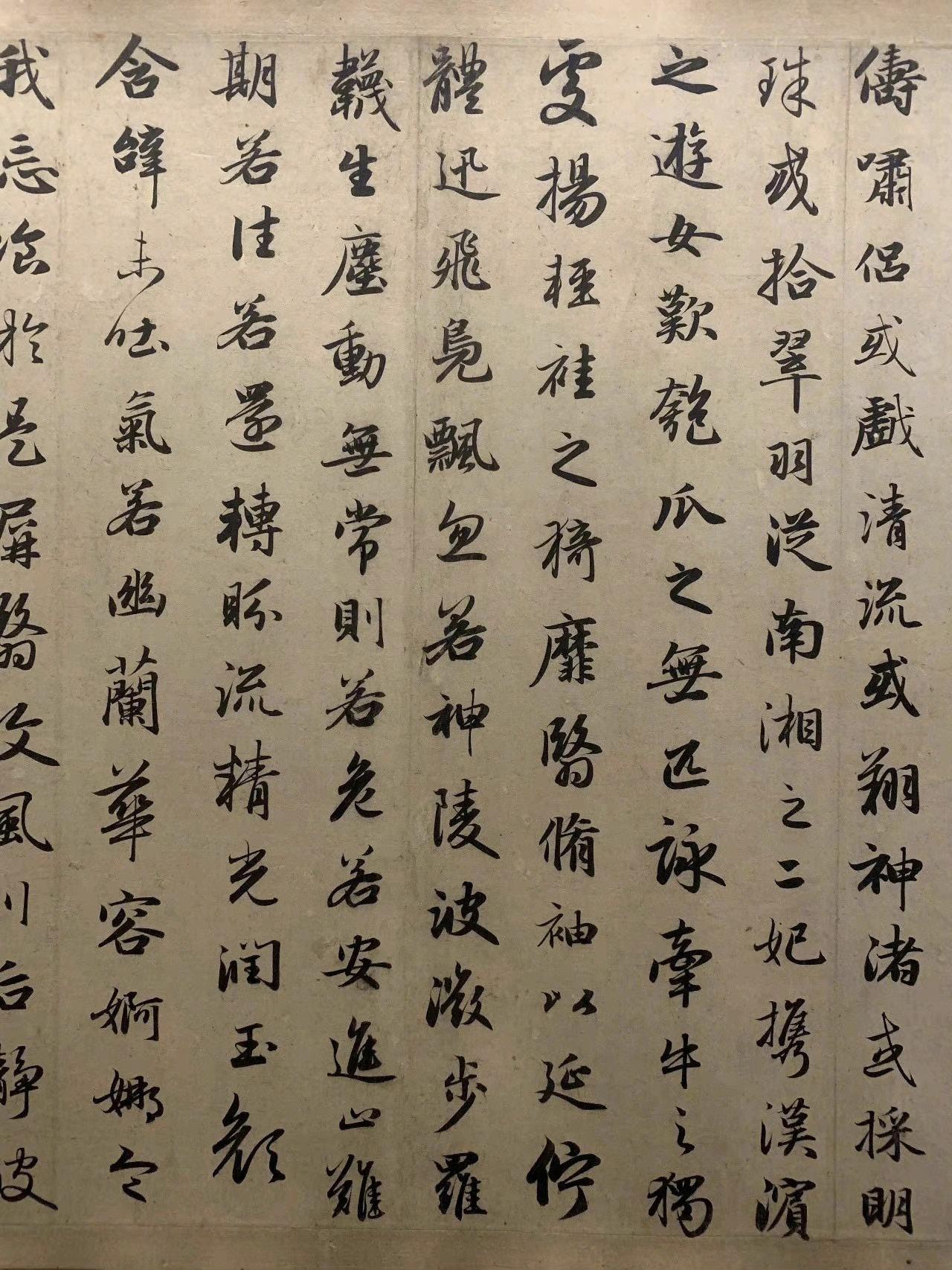
1
1. 《洛神赋》并序 , (The Ode to the Goddess of the Luo River), Mengfu Zhao
interconnected strokes
special curve
unique tail
In Chinese calligraphy, Xingshu bears some resemblance to the logo of Chupa Chups, such as the rounded shape, the smooth curves and the interconnected strokes.


52 Chapter 3 Script Structure BILINGUAL
GUIDEBOOK
TYPOGRAPHY
similar starting strokes on each character
similar tail
53 In the Middle
similar curve
similar connecitons between two characters
54 Script Structure BILINGUAL TYPOGRAPHY GUIDEBOOK
55 CN / EN In the Middle
56 Chapter 3 Script Structure BILINGUAL TYPOGRAPHY GUIDEBOOK
57 CN / EN In the Middle
Spacing
Spacing in typography refers to the amount of space between characters (letters, numbers, and symbols) and words in a text. Proper spacing is an important aspect of typography as it affects the readability, legibility, and overall visual appearance of text. Proper spacing helps to ensure that characters are visually distinct from each other and that words are easily recognizable.
58 Chapter 3 Script Structure BILINGUAL TYPOGRAPHY GUIDEBOOK
Face / 字面
Body frame / 字身框
Vertical centerline / 垂直中心线
Text frame / 字面框
Horizontal centerline / 水平中心线
Face / 字面
The character face specifies an inner bounding area within a glyph, and it is usually smaller than the area of the character body. Historically, it contains the printed part of the glyph (face) in lead type.
Body frame / 字身框
Body frame which refers to the outer box surrounding a typeface, roughly equivalent to the outer frame of asquare grid. During the era of metal type printing, the term “type box” actually referred to the size of the lead block that carried the individual pieces of type.
Text frame / 字面框
Text box which refers to the actual space occupied by a Chinese character within a typeface, and to a large extent reflects the characteristics of the font. The text box is not necessarily equal to or larger than the type box.
Horizontal center line / 水平中心线
The horizontal centerline divides a Chinese character into two parts, the upper and lower parts, which visually maintain balance.
59 CN / EN In the Middle
Central point / 中宫
Visual recognition range / 视觉识别范围
Vertical centerline / 垂直中心线
Center of gravity / 重心
The vertical centerline divides the left and right parts of a Chinese character, visually maintaining balance between them.
Visual recognition range / 视觉识别范围
The main part of the character’s structure is also the visual range of the character’s size.
Central point / 中宫
The central point refers to the middle cell of the Chinese square grid. In Chinese calligraphy, paying attention to the central point is important as it helps in achieving a balanced and harmonious composition.
Center of gravity / 重心
Center of gravity refers to the vertical position of the visual center point of a typeface. Chinese characters are designed within a square or rectangular area with regular and uniform density, and the center of gravity of a typeface is the geometric center of this square or rectangle.
60 Chapter 3 Script Structure BILINGUAL TYPOGRAPHY GUIDEBOOK
Baseline
Baseline is an imaginary line upon which the majority of the letters in a font sit, providing a consistent foundation for vertical alignment and spacing of type.
Ascender
Ascender is the part of a lowercase letter that extends above the x-height, which is the height of the main body of lowercase letters. Ascenders are typically found on letters like “b,” “d,” “f,” “h,” “k,” “l,”and “t.” The height of ascenders varies depending on the font, but they are generally shorter than the cap height.
Descender
Descender is the part of a lowercase letter that extends below the baseline. Descenders are typically found on letters like “g,” “j,” “p,” “q,” and “y.” The length of descenders also varies depending on the font, but they are generally shorter than the ascenders.
61 CN / EN In the Middle
Ascender Descender Baseline
X-height
X-height is the height of lowercase letters, measured from the baseline to the top of the main body of the letter (excluding ascenders and descenders). Typefaces that have larger x-heights are easier to read at small font sizes because the space between the letters is more pronounced, making them more legible.
Cap height
Cap height refers to the height of the capital letters in a font, measured from the baseline to the top of the uppercase letters.
Cap height
X-height
62 Chapter 3 Script Structure BILINGUAL TYPOGRAPHY GUIDEBOOK
Spacing / 字间距
In Chinese typesetting, letter spacing refers to the spacing between individual characters in a block of Chinese text. The letter spacing of Chinese characters is different from that of Latin characters. With the same font size, the smaller the letter spacing, the larger the font appears.
63 CN / EN In the Middle
Leading / 行间距
Leading refers to the vertical spacing between lines of text. It determines the distance between the baselines of two consecutive lines of text in a paragraph.
64 Chapter 3 Script Structure BILINGUAL TYPOGRAPHY GUIDEBOOK
Chinese characters, originally designed for vertical writing and typesetting, did not consider the issue of horizontal recognition in their structure. For example, characters like “ 甲 ” , “ 申 ” , and “ 由 ” have the component “ 田 ” located at the top, middle, and bottom positions respectively. When used in vertical writing or typesetting, simply aligning these three characters vertically makes reading smooth. However, when switching to a horizontal context, no matter how much adjustment is made, it is impossible to avoid vertical eye movements. Due to the composition of Chinese characters, different characters can have significant differences in the number of horizontal strokes, with characters with more horizontal strokes often being taller, which can easily result in visual imbalance in horizontally arranged Chinese characters.
65 CN / EN In the Middle
The different compositions of Chinese characters result in differences in width for individual characters. When used in horizontal writing, characters with fewer vertical strokes may not fully occupy the width of the character box due to the residual influence of their strong vertical writing genes. As a result, it is difficult to maintain visual consistency in the spacing between left and right text, causing pauses in reading rhythm. Therefore, it is necessary to adjust the character spacing based on the width of Chinese characters.
66 Chapter 3 Script Structure BILINGUAL TYPOGRAPHY GUIDEBOOK
not kerned
kerned
tracking set: 0
The quick brown fox
tracking set: 50
The quick brown fox
Kerning
In today’s digital world, kerning refers to the addition or reduction of space between two characters (or glyphs, to be typographically precise). Characters being kerned are referred to as a kern pair, and the amount of kerning can have either a negative or a positive value.
Tracking
Tracking is sometimes confused with kerning, but they are actually completely different.Tracking involves adjusting the spacing between the entire word, it is usually adjusted to better fill space or make individual words appear light, airy, and prominent.
67 CN / EN In the Middle
24dp
20dp 22dp
Line height, also known as line spacing or leading, refers to the vertical space between lines of text in a paragraph. It is the measurement from the baseline of one line of text to the baseline of the next line of text.
Line height is typically measured in points or pixels, and it can be adjusted to control the amount of space between lines of text in a block of text.
Line height
Line height, also known as line spacing or leading, refers to the vertical space between lines of text in a paragraph. It is the measurement from the baseline of one line of text to the baseline of the next line of text. Line height is typically measured in points or pixels, and it can be adjusted to control the amount of space between lines of text in a block of text.
Paragraph spacing
Paragraph spacing refers to the vertical space between paragraphs in a block of text. It is the extra space added between paragraphs to visually separate them from each other. Paragraph spacing can be adjusted to control the amount of space between paragraphs, and it affects the visual layout and flow of a document or text block.
68 Chapter 3 Script Structure BILINGUAL TYPOGRAPHY GUIDEBOOK
Chinese characters are visually larger than English letters because they are typically square in shape and occupy a similar amount of horizontal and vertical space, while English letters are often taller than they are wide. Additionally, Chinese characters are usually more complex and have more strokes, which can contribute to their larger visual size. When working on bilingual typesetting, wise adjustments should be made to enable the two languages to work together better without compromising readability.
69 CN / EN In the Middle
Helvetica Neue - Regular 12pt / line height: 14dp
The sun shone brightly on the sandy beach, casting a warm glow on everything around it. The waves gently lapped against the shore, creating a soothing rhythm that echoed through the air. A group of children ran along the water's edge, laughing and splashing in the cool water.
Source Han Sans - Regular 12pt / line height: 14dp
阳光明媚地照在沙滩上,给周围的一切都带 来了温暖的光芒。海浪轻轻拍打着岸边,营 造出一种令人宁静的节奏,回荡在空气中。 一群孩子在水边奔跑着,笑声和水花交织成 一片。在沙滩的尽头,一对情侣手牵着手漫 步,享受着这片刻的宁静。这是一个完美的 海滩日。
Source Han Sans - Regular 11pt / line height: 14dp
阳光明媚地照在沙滩上,给周围的一切都带来了 温暖的光芒。海浪轻轻拍打着岸边,营造出一种 令人宁静的节奏,回荡在空气中。一群孩子在水 边奔跑着,笑声和水花交织成一片。在沙滩的尽 头,一对情侣手牵着手漫步,享受着这片刻的宁 静。这是一个完美的海滩日。
Due to differences in font structure, it is not possible to ensure that the two languages in bilingual typesetting have exactly the same size and spacing, but visual balance between the two languages can be achieved. As seen in the above two paragraphs, when both languages are set at the same size, the Chinese text on the right appears slightly larger than the English text on the left; however, reducing the size of Chinese characters appropriately can lead to better visual balance between the two texts.
70 Chapter 3 Script Structure BILINGUAL TYPOGRAPHY GUIDEBOOK

71 CN / EN In the Middle
This is an example of an unsuccessful bilingual typesetting. Visually, the Chinese text on the right appears slightly larger than the English text on the left, and the line spacing is more loose. At the same time, because English uses monotype fonts, Chinese fonts may visually have a little mismatch with English fonts.

72 Chapter 3 Script Structure BILINGUAL TYPOGRAPHY GUIDEBOOK

73 CN / EN In the Middle
In this example, the visual size and spacing of the two languages are relatively balanced. By changing the width of the Chinese text column, it can also match better with the English text on the page.
74 Chapter 3 Script Structure BILINGUAL TYPOGRAPHY GUIDEBOOK
75 CN / EN In the Middle
Writing System
76 Chapter 4 Writing System BILINGUAL TYPOGRAPHY GUIDEBOOK
77 CN / EN In the Middle
Writing direction
Traditionally, Chinese is written vertically from top to bottom and right to left, and each column of text is read from right to left. This format is still used in some books and newspapers today, but for most modern writing, Chinese is written horizontally from left to right. English is written horizontally from left to right, with each line of text beginning at the left margin and continuing to the right margin. The next line begins immediately below the previous line, and continues to the right margin as well.
78 Chapter 4 Writing System BILINGUAL TYPOGRAPHY GUIDEBOOK
1. 《政治丛书提要》(The Summary of Political Treatises)

Qing Dynasty
2.《华英翻译金针》(The Golden Needle of Chinese-English Translation). Shangwu Yinshuguan, 1927.
79 CN / EN In the Middle
1
The evolution of Chinese typography from vertical to horizontal can be traced back to the 19th century, when many Chinese publishers began to experiment with horizontal layout due to the influence of Western countries. However, due to the unique characteristics of Chinese writing, including the vertical writing order and square-shaped characters, Chinese horizontal layout faced many technical and aesthetic challenges.
To adapt to horizontal layout, Chinese calligraphers began to rotate or alter the shape of Chinese characters to make them more suitable for horizontal writing. In addition, there were many changes in typography and typesetting technology, including the use of singlebyte character sets, the introduction of punctuation, and the use of Western-style line spacing.

80 Chapter 4 Writing System BILINGUAL TYPOGRAPHY GUIDEBOOK 2

81 CN / EN In the Middle
In modern times, both Chinese and English use horizontal typesetting, and the key to bilingual typesetting is to control the grayscale, distance, thickness, and size between the two languages within a moderate range.

82 Chapter 4 Writing System BILINGUAL TYPOGRAPHY GUIDEBOOK
83 CN / EN In the Middle
Punctuation
Punctuation refers to the system of symbols, such as periods, commas, question marks, and exclamation points, used in writing to indicate pauses, breaks, and intonation in order to clarify meaning and improve readability. It is an important aspect of written language that helps to convey the intended message with clarity and accuracy. Chinese punctuation marks, such as 、 , ? and ! , differ from English punctuation marks in both appearance and usage.
84 Chapter 4 Writing System BILINGUAL TYPOGRAPHY GUIDEBOOK
Period / 句号
Semicolon / 分号
Period / 句号
Comma / 逗号
Question mark / 问号
Indicates a pause at the end of a sentence.
Comma / 逗号
Indicates a pause in the middle of a sentence.
Pause / 顿号
Pause / 顿号
Exclamation point / 感叹号
Colon / 冒号
Middot / 间隔号
Indicates a pause between parallel words or phrases in a sentence.
Colon / 冒号
Indicates a list or an explanation that follows.
Semicolon / 分号
Indicates a pause between parallel clauses in a sentence.
Question mark / 问号
Indicates a direct question.
Exclamation point/ 感叹号
Indicates strong emotion, excitement, or emphasis.
85 CN / EN In the Middle
Dash / 破折号
Middot / 间隔号
Indicates the boundary between the month and the date; represents a syllable division in certain personal names.
Dash / 破折号
Indicates a quoted section; Indicates a specific title or emphasized portion; Indicates sarcasm or negation.
Ellipsis / 省略号
Indicates an omission in the text.
Quotation marks / 双引号
Indicates a quoted section; Indicates a specific title or emphasized portion; Indicates sarcasm or negation.
Book marks / 书名号
Indicates the title of a book, document, newspaper, etc.
86 Chapter 4 Writing System BILINGUAL TYPOGRAPHY GUIDEBOOK
Quotation marks / 双引号
Book marks / 书名号
Ellipsis / 省略号
Period
Indicates a pause at the end of a sentence.
Comma
Indicates a pause in the middle of a sentence.
Colon
Indicates a list or an explanation that follows.
Semicolon
Connects two closely related independent clauses
Question mark
Indicates a direct question.
Exclamation point
Indicates strong emotion, excitement, or emphasis.
87 CN / EN In the Middle
Comma Colon
Semicolon
Question mark
Exclamation point
Period
Dash Ellipsis
Quotation marks
Parenthesis
Ellipsis
Indicates that words have been omitted from a sentence.
Dash
Used for emphasis or to indicate a sudden break in thought.
Quotation marks
Indicate direct speech or a quote.
Parentheses
Encloses additional information or an aside in a sentence.
88 Chapter 4 Writing System BILINGUAL TYPOGRAPHY GUIDEBOOK
Pause / 顿号
The old, rusty, and abandoned car sat in the middle of the overgrown, weed-filled field.
Pause / 顿号
The park was filled with laughing children, chirping birds and blooming flowers.
Pause and comma
In Chinese, the pause is used to separate coordinate elements in a sentence, while in English, the comma is often used to separate coordinate elements in a sentence.
89 CN / EN In the Middle
那有辆老旧的、 生锈的、 被遗弃的汽车停在杂草丛生的 田地中央。
公园里充满了笑闹的孩子、鸟儿的啁啾声和盛开的花朵。
The New York Times
Book marks and Quotation mark
In Chinese, the book marks are used to represent books, documents, newspapers, and so on. In English, there are no book marks, and book and newspaper titles are usually italicized or underlined. Additionally, English commonly uses italics to indicate the names of articles, poems, musical compositions, movies, paintings, and proper nouns such as vehicles and spacecraft.
Chinese has a dash to separate words such as month and date or transliterated first and last names.
Middot
Chinese has a middot to separate words such as month and date or transliterated first and last names.
90 Chapter 4 Writing System BILINGUAL TYPOGRAPHY GUIDEBOOK
“Harry Potter and the Philosopher’s Stone” is the first book in the Harry Potter series.
《哈利·波特与魔法石》是哈利·波特系列的第一部。
《纽约时报》
marks / 书名号
/ 书名号 Book marks / 书名号 Middot / 间隔号
Book
Book marks
In Chinese, punctuation marks usually take up one character’s space, and quotation marks (“”) take up half of a character’s space. Chinese punctuation marks are typically placed directly after the preceding character, without any intervening space. English punctuation marks also take up one character’s space, but are usually followed by a space before the next word.
In Chinese articles, there is usually a two-character space at the beginning of each paragraph.
In English articles, it is customary to begin a new paragraph by indenting the first line or skipping a line to start a new paragraph.
91 CN / EN In the Middle
I went to the store yesterday to buy some fruit cake.
Beijing City
Wang Xiaoming
WeChat
Capitalization
In English, the first letter of every sentence, proper nouns, and some other words are capitalized, whereas in Chinese, there is no distinction between upper and lower case letters.
Proper names
In English, the beginning of certain proper nouns need to be capitalized, including names of people, cities, brands, and so on.
92 Chapter 4 Writing System BILINGUAL TYPOGRAPHY GUIDEBOOK
北京市 王小明 微信
我昨天去商店买水果蛋糕。


93 CN / EN In the Middle
The philosophy based on the texts of the Daodejing (道德经) and the Zhuangzi (庄子).
Parenthesis Source Han Sans
The philosophy based on the texts of the Daodejing ( 道德经 ) and the Zhuangzi ( 庄子 ).
Parenthesis Helvetica LT Std
Megan Johnson plans to visit both Beijing ( 北京 ) and Shanghai ( 上海 ) in 2023.
Parenthesis and number Helvetica LT Std
Megan Johnson plans to visit both Beijing (北京) and Shanghai (上海) in 2023.
Parenthesis and number Source Han Sans
It is very common to see two scripts side by side in the same line of text or paragraph. Although Chinese has its own numerals, Arabic numerals are preferred in Chinese text settings. The same goes for Western punctuation marks such as parentheses, dashes, commas, and colons. However, there is no clear consensus on how to vertically align Latin and Chinese scripts, which has led to a series of typesetting and orthography issues.
94 Chapter 4 Writing System BILINGUAL TYPOGRAPHY GUIDEBOOK
95 CN / EN In the Middle
Resourse
https://www.chinesetypearchive.com/#/ https://yimao.design/eastwestwesteast-info
https://source.typekit.com/source-han-serif/ https://www.academia.edu/2558554/A_descriptive_framework_for_ Chinese_English_bilingual_typography
https://arena-attachments.s3.amazonaws.com/19980807/f414d8bbf
f2e881a283154d965b336fe.pdf?1674476091
https://www.noahsheldon.com/feb?offset=1320743520000
https://ablackcover.com/Founder-Type
https://zhuanlan.zhihu.com/p/162984298
https://zhuanlan.zhihu.com/p/99504885
https://zhuanlan.zhihu.com/p/101183974
96 BILINGUAL TYPOGRAPHY GUIDEBOOK
97 CN / EN In the Middle
Chinese typeface
Source Han Sans Simplified Chinese
Source Han Serif Simplified Chinese 方正仿宋简体
方正书宋简体
楷体-简
圆体
方正超值体
English typeface
Sarabun
Source Serif Variable
Helvetica Neue
Helvetica LT Std
Roboto
Times New Roman
98 BILINGUAL TYPOGRAPHY GUIDEBOOK
This book is a comprehensive bilingual typography guidebook in Chinese and English, designed to help readers navigate the nuances of typography in both languages.
Designed by Keyu Li
In GD 326.01-Global Typography
Spring 2023
