PORTFOLIO 2023 TITLE TYPE Kevin Moreland #01 1
PORTFOLIO GRAPHIC, INTERACTION, & MOTION DESIGN 2023
Kevin Moreland

Branching Identities is an interactive website that serves as a reflection of my self-identity. This project I wanted to embrace the branching paths that shape the base of my identity. Those whom I take inspiration from or who have influenced who I am today are the roots of my identity. They supply me with my energy and fuel my growth. I am the trunk expanding with age and my branches are the different aspects of my identity that make me me. Finally, the leaves are what I bestow on those I encounter. My leaves may fall and leave a little bit of myself in the world.
Visit website: branching-identities.glitch.me


 PORTFOLIO 2023
Featured in .getElementByID(); End of Semester Show KCAI
 GD 2022
PORTFOLIO 2023
GD 2022
PORTFOLIO 2023
The Nelson-Atkins Museum of Art’s annual Lunar New Year festival returns for 2023 with “Year of the Rabbit”. The design direction was to keep tradition with past years via the color scheme but to reimagine the overall feel both typographically and systematically with the branding. The rabbit logo being the primary visual element needed to host many variations for a wide range of uses across the museum—physically and digitially. The 2023 branding is fresh and fun with its use arched typography. Additionally, the branding celebrates the many cultures who celebrate the the LNY. Signage, social media assets, and print were developed.
View motion graphic: here


Celebrate the Year of the Rabbit. Explore treasures from the Asian art collection and free exhibitions. Experience a variety of activities, dances, and music marking the Lunar New Year.

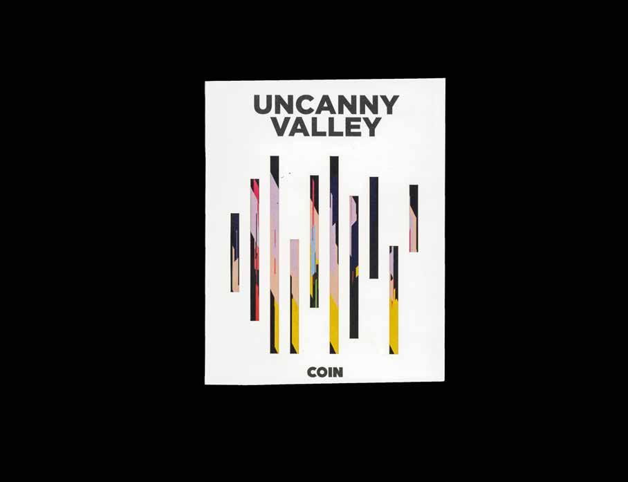
Created for the album Uncanny Valley by COIN (2022), this lyric book blurs the lines between technology and humanity. The ethos of the album focuses on the grey future we have with our relationship with technology. The lyric book encompases a tangible source of human story telling and that is interrupted by the interaction pulling up the actual lyrics. Using an NFC (near field communication tag and Figma prototype, the user launches the lyrics simply by tapping their phone to the tracks’s page. The visuals created for the book were made in TouchDesigner. Audio from each track was used to create subsequent audio reactive patterns—unique to the track. Shapes blurring song titles on velum is generated randomly via a keybound.
See the prototype at: here


Art Garden is a local Kansas City pop-up market/festival. Celebrating eighty local artists and makers, Art Garden values community and creativity. In this proposed rebrand, the essential question was how can a kinetic branding system be created to represent the brand’s vital source: people? The brand is comprised of a generative, kinetic typeface and series of dots that reflect the transformative nature of the festival. Variations in the color palette and a mix of geometric shapes reflect the diverse and creative vendors and visitors that make up the festival.
See the brand in action at: here


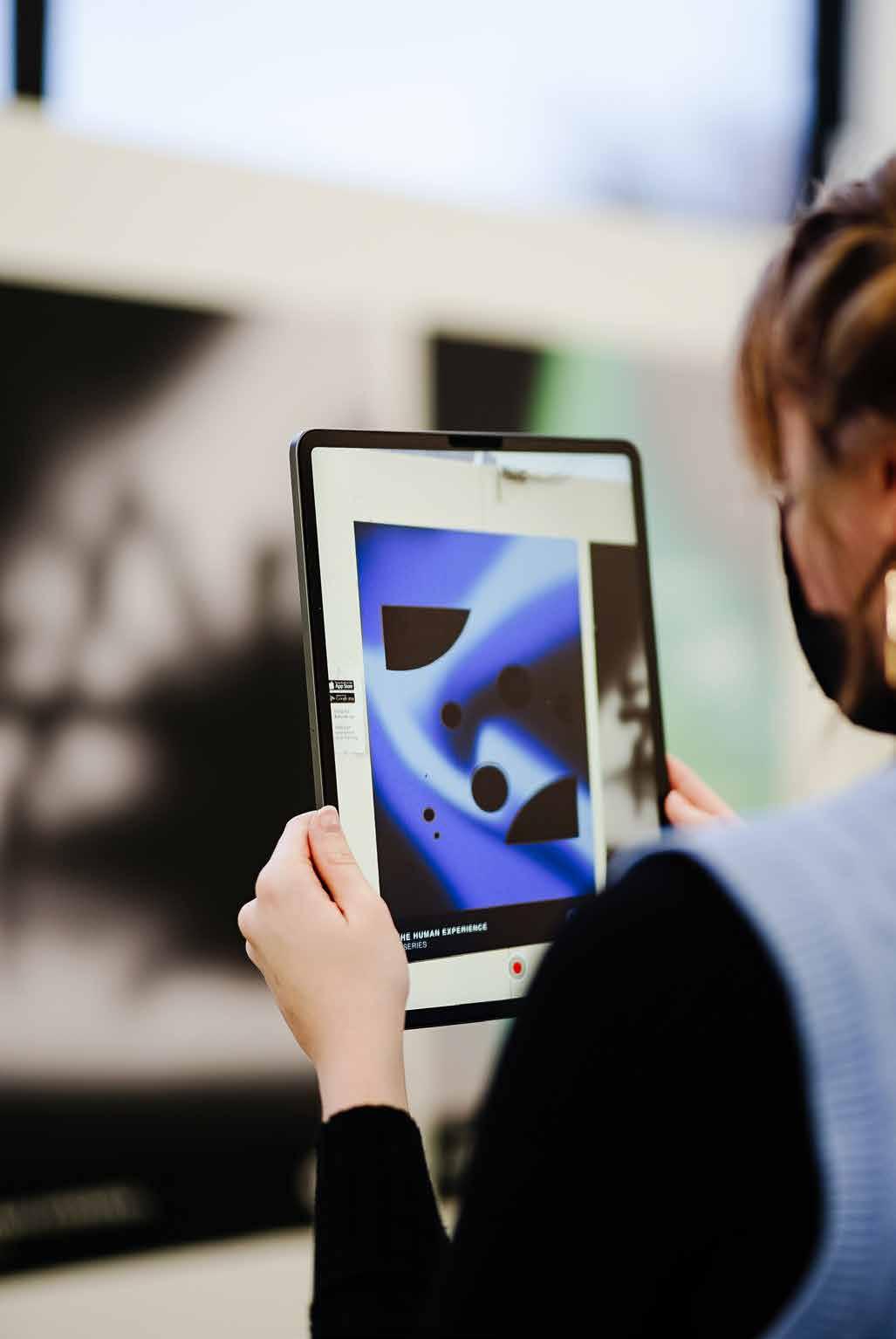
This poster series breaks down the “human experience” under three aspects that are reflective of humanity: community, war, and hope. The ethos of this project was to leave something that is a broader reflection of our human experience. Three quotes were chosen to mirror these experiences. They are sequencial and the secondary element of augmented reality reveals abstract visual representations based on both the experience and quote. Note the middle poster representing war is revealed along with the animation. While war causing much destruction, the focus on the first read is pulled to the flanking posters.


CrossFit Clarity is a Delaware CrossFit gym ran by entrepreneur, Cat Scherer, that believes that fitness should be built for everyone. The rebrand takes the mission of “CFC” and is a approachable, modern, and motivating. Utilising the fluid shape generated from the logo design, a weaving pattern was created to serve as an anchoring visual element. The colors are bright and standout against the mainstream choices by other CrossFit gyms


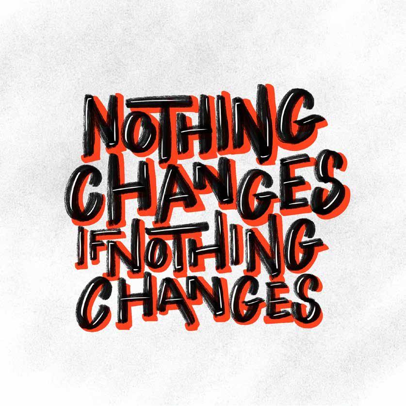
The following is a collection of hand-lettered designs.


Kevin is a Filipino-American graphic designer and current junior at the Kansas City Art Institute pursing a BFA in graphic design. His work focuses on the kinetic and interactive elements of a range of projects (but not limited to) branding, UI/UX, and motion graphics. He is foundational in typography, photography, design thinking, idea generation, and questionbased inquiry.

His personal practice investigates the intersection of the self in relation to technology and interaction. In his free time, he explores typographic form.
Resume available upon request
Website: kevinmorelanddesign.com
Email: kevinmorelanddesign@gmail.com