Kevin Alloway
Master of Architecture
May 2024
Northeastern University

1
2
ACADEMIC PROJECTS YIMBY THEN | NOW | LATER (UN)DEVELOPABLE SPINE ZIG-ZAG ACADEMIC EXERCISES POSTCARDS SUNDIAL TOWN MONUMENT VISUALIZING CLIMATE CHANGE RECONNECTED PROFESSIONAL PROJECTS HOME RENOVATION MUDROOM CONCEPT PROPOSED ADDITION BEACH HOUSE RENOVATION RENDERINGS PERSONAL PROJECTS NYSE: CADE TESSELLATING RUNSCAPES ARTWORK 3 17 39 53 73 107 113 115 117 119 123 125 127 129 131 135 137 139 3
ACADEMIC PROJECTS
1
2
YIMBY
THESIS STUDIO
FALL 2023 - SPRING 2024
YIMBY, short for “Yes in My Back Yard”, is a thesis proposal situated within the third-year research studio Public Housing: Confonting Apathy through Image and Influence. In this year-long studio, students have been tasked with taking a stance in the public housing debate, and proposing a design solution aligned with that stance. The final deliverable for this studio is not just a housing design, but a media campaign or representational strategy that endears that proposal to the public; to intentionally and judiciously use representation as a tool to change public perception around public, affordable, and low-income housing. The first half of the studio, the fall 2023 semester, was dedicated to research and developing a thesis, and the spring 2024 semester is focused on bringing that thesis to fruitition.
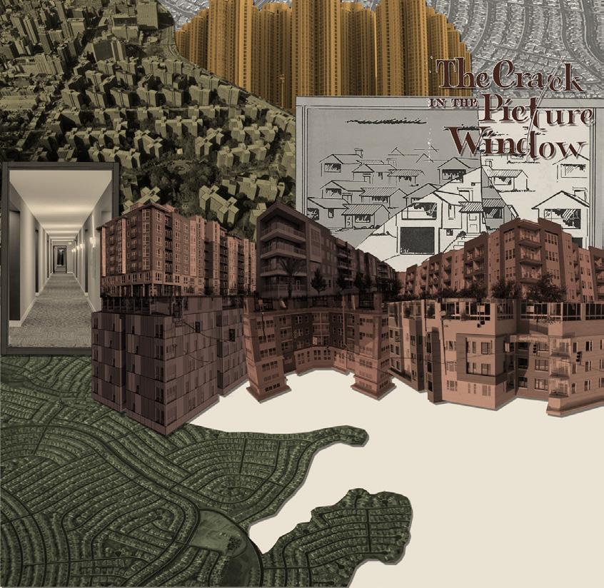
In YIMBY, I start with the stance that public housing has not worked in the United States, it’s not going to work, and if it were to ever become a viable solution, it is not the architect’s job to so drastically change the US’ economic, political, and social systems. Arguable, architects have historically had very little power in shaping the vast majority of our residential built environment, but there are opportunities to influence financial and regulatory systems with design. With this mindset, YIMBY seeks to promote the “Missing Middle” housing typology as a sustainable, communitycentric method of increasing housing supply and therefore also addressing affordability. The final product for this thesis will likely be a book or social media campaign that inspires conversation to encourage neighborhoods in urban peripheries to embrace welldesigned, infill housing in their midst.
The United States has an economic housing crisis and public housing is not a viable solution.

3
The solution to our economic housing crisis is affordability, a product of supply and demand.

But our housing crisis isn’t just economical, it’s also psychological, emotional, environmental, etc.

The solution to these facets of the housing crisis is design.
4
Zoning Laws
NIMBYism
Developer Incentives
Car-Centric Suburbs
If we know the solutions, what are the barriers?
Unproven Concept at Scale
Fair Housing Act Requirements
Code Requirements
Impact Fees
5
How can we fix that power imbalance?
POLITICS
Architects actually have very little power to meaningfully shape the residential built environment.
ECONOMICS
DESIGN
DESIGN ECONOMICS POLITICS
How can architecture start conversations about changing zoning laws, allowing for densification, combating NIMBYism, and promoting nondeveloper-led design?
How can we help create a dialogue that gets developers, city planners, community members, policy makers, and architects all on the same page and united in their efforts?
6
Place-Specific Ideations and Conversations
What City?

Atlanta, GA 68% Single-Family Zoning, by Minneapolis 70% Charlotte 84% New York 15% Arlington 89% Sandy Springs 85% Washington 36% Los Angeles 75% Chicago 79%
Urban Footprint
Source:
7
*Single family lots as a % of total parcels
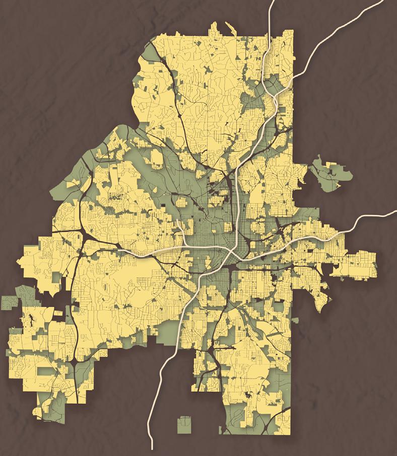
Single-Family by Area
GA
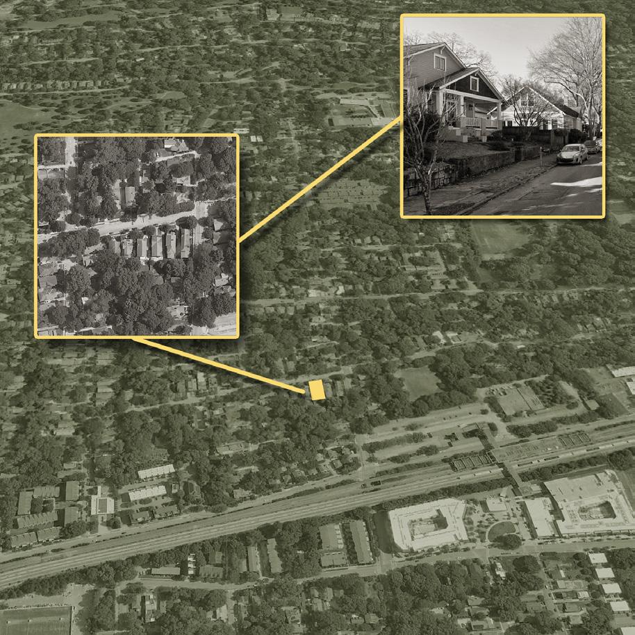
Candler Park, Atlanta
R-4 9,000 sf
x 120’) 8
Typ Lot: Sinlge Family:
(75’
Catalogue of Design Implications of Specific Code Revisions
What can you build on a typical single-family lot as-of-right? How many people can that house? How does it fit in with the neighborhood?
What happens if you switch to a multi-family designation? What can you build? How many people can that house? Does it still blend in with surrounding houses?
What if you change the FAR? Decrease the setbacks? Increase the height limit? Remove the parking requirement? Modify egress requirements? Allow more dwelling units?
In all these situations, with only minor changes to existing code requirements, is there a way to increase housing supply, and therefore decrease housing costs, while simultaneously not compromising the character of the neighborhoods being densified?
Single Family, R-4
Lot: 9,000 sf
Setback: 35’, 7’ 15’
FAR: 0.50
Single Family
Multifamily
FAR
9
Setbacks
Multi-Family, M-2
Lot: 2,000 sf
Setback: 10’
FAR: 0.348
Revised FAR
Lot: 2,000 sf
Setback: 10’
FAR: 0.50
Height Parking Egress ADUs 10
Representation and Visualization as Intentional Tools
How we communicate our ideas as architects matters. The style, methods, and tools we employ to draw proposals all impact how our work is perceived just as much as the design itself.
With that in mind, how can we inentionally leverage representation to bolster our arguments? Can we lean into the abstract and fantastical to spark imagination, and therefore intrigue, better than attempts at photorealism?
11
Does a rendering designed to imitate a 3D printed and chipboard model, or one mimicking a plastic doll house appeal to our psychological side and therefore make us more interested in, and therefore accepting of, what these designs propose?
12
This project is just in its exciting beginning phases. As work progresses into the Spring 2024 semester, there are still many questions to ask and topics to address. Some of these issues that I am still exploring and navigating are listed here.
13
Which City?
• Philadelphia
• Richmond
• Atlant a
• Dalla s
• Boston
Final Deliverables?
What types of drawings best accomplish my goals?
Does this go far enough in addressing public, affordable, and / or low-income housing?
Narrow or Broad? A specific neighborhood or a general, abstracted location?
Questions
Who should I talk with?
What kinds of people should I reach out to for imput?
Representation?
What style of representation? What’s most effective?
Architectural Style?
How much should these prototypes blend in with their context?
Anything else I should consider?
14
15
16
THEN | NOW | LATER
COMPREHENSIVE DESIGN STUDIO
SPRING 2023
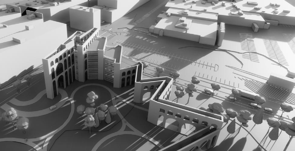
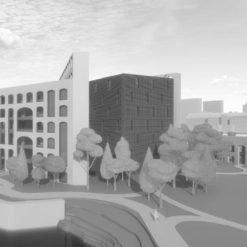
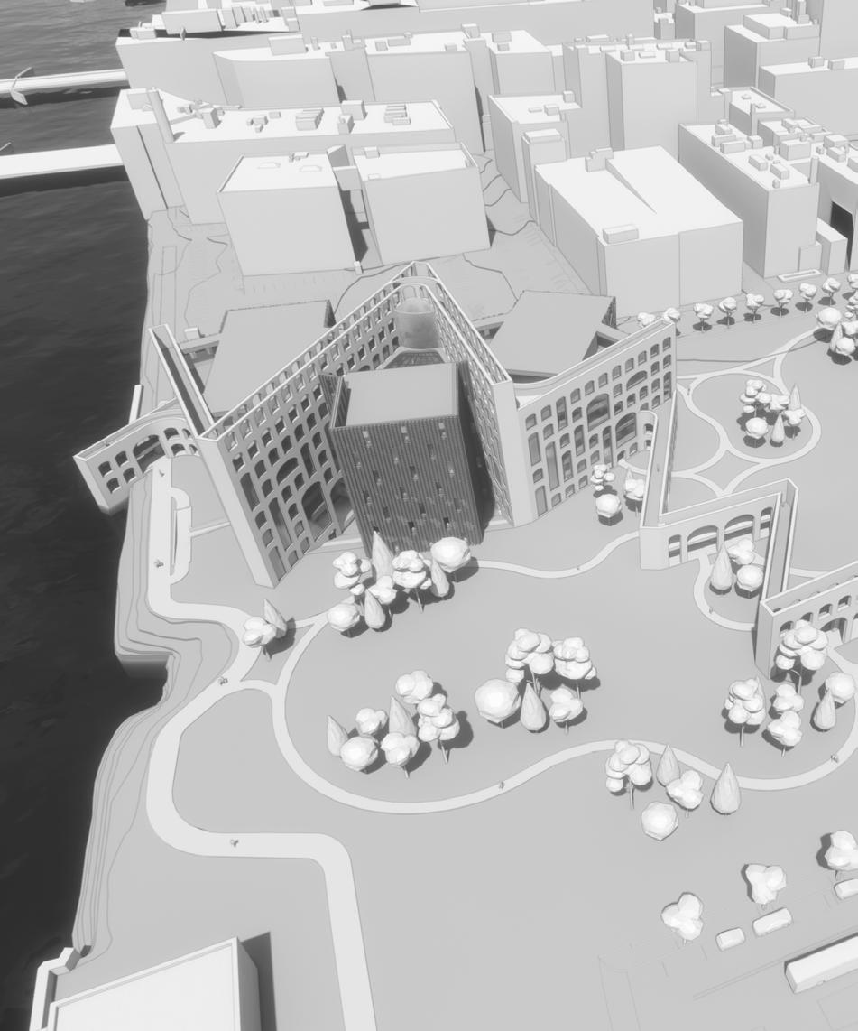
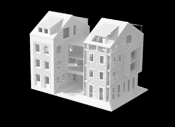
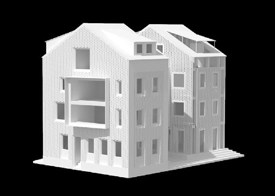
Comprehensive Design Studio, in conjunction with corequisite Integrated Building Systems, is primarily concerned with moving beyond purely aesthetic design proposals and instead considering the multitude of systems that go into bringing a building into reality, like structure, landscaping, MEP, and code.
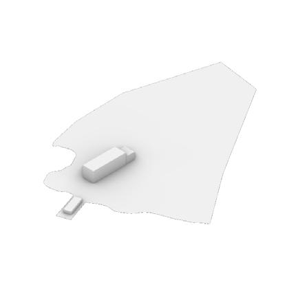
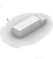
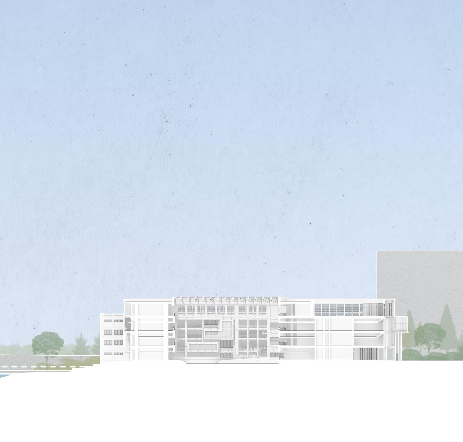
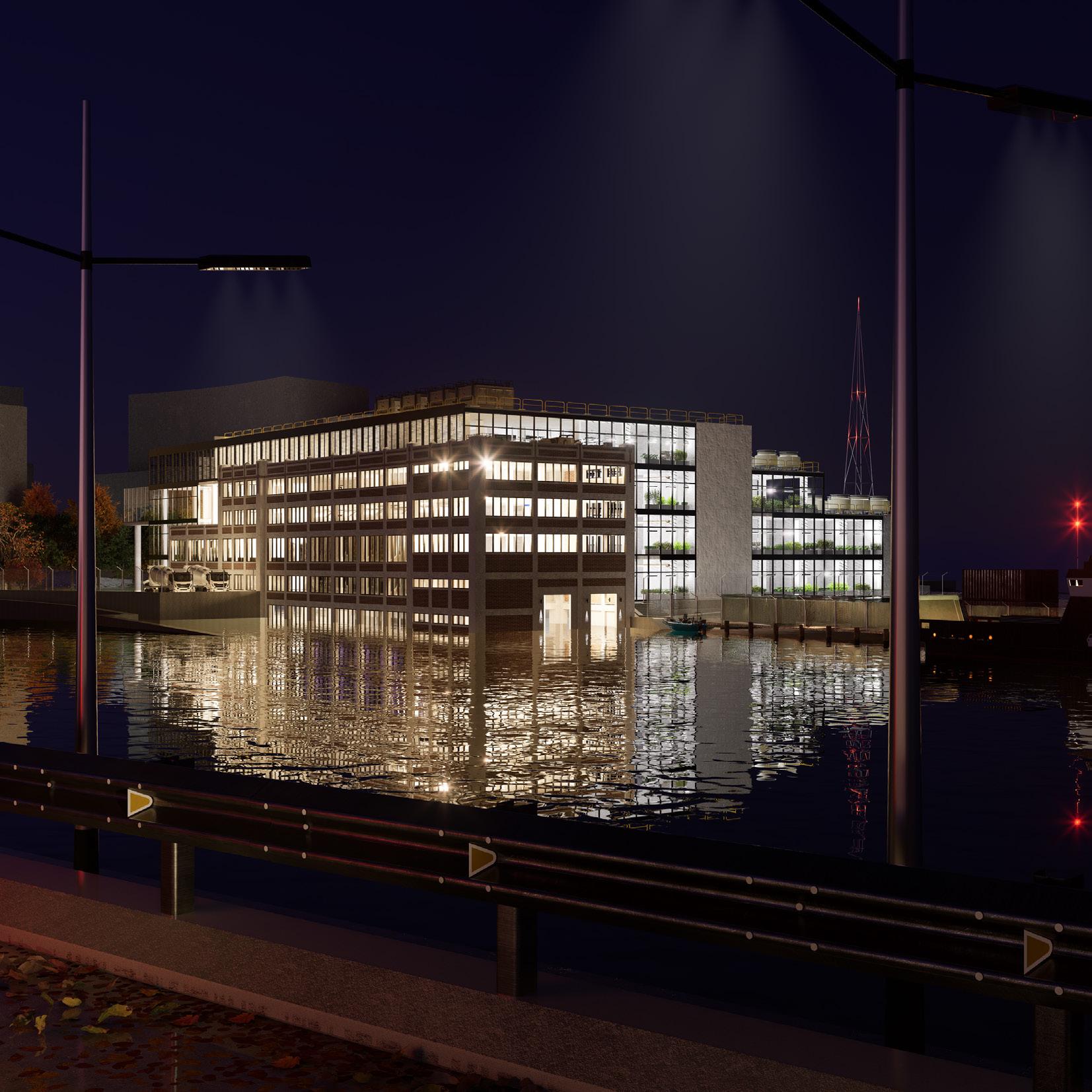
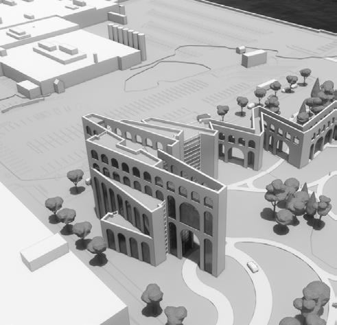
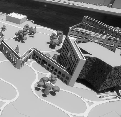
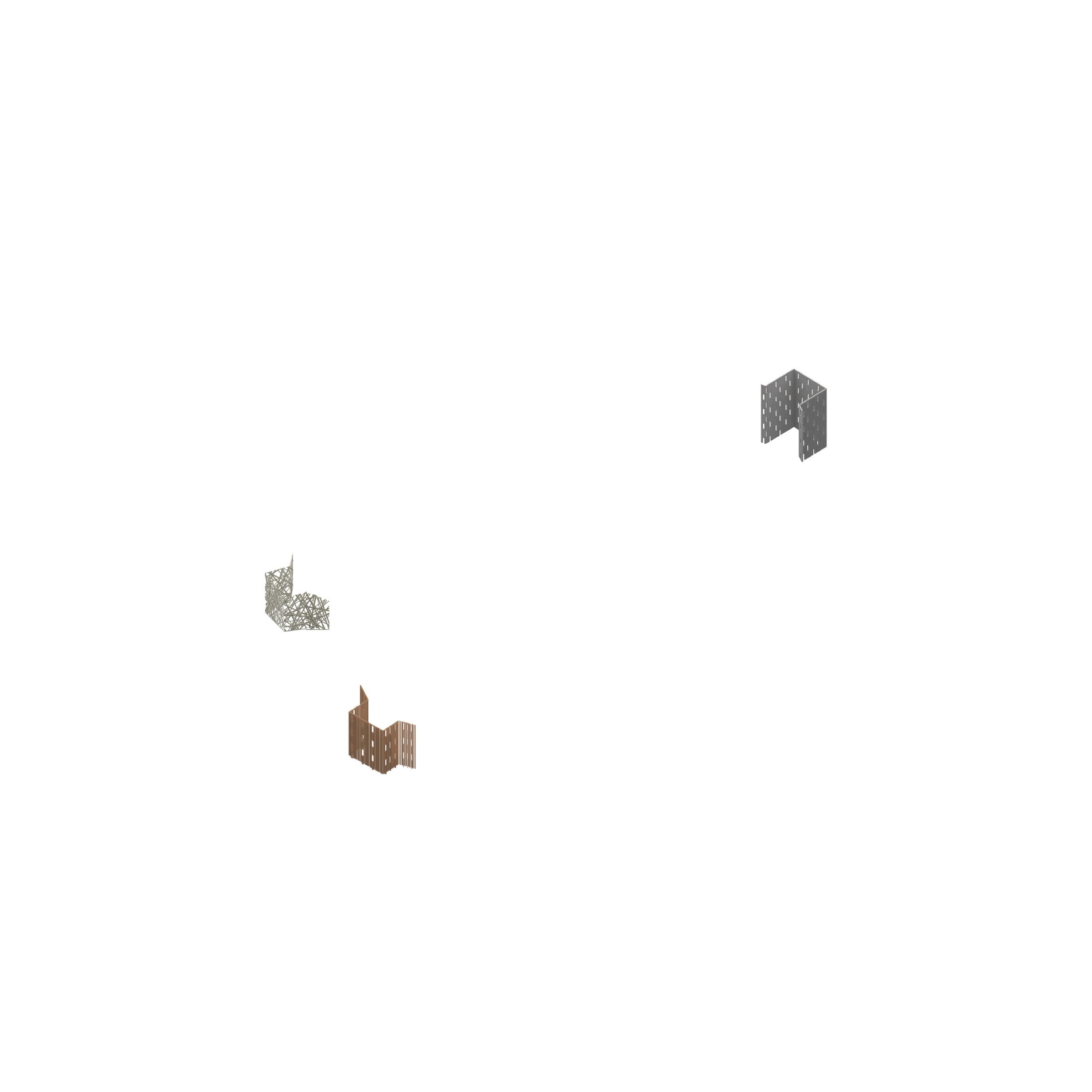
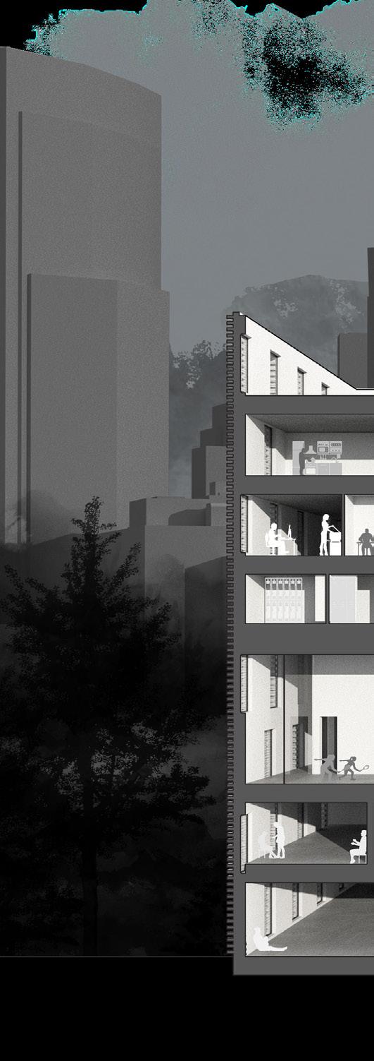
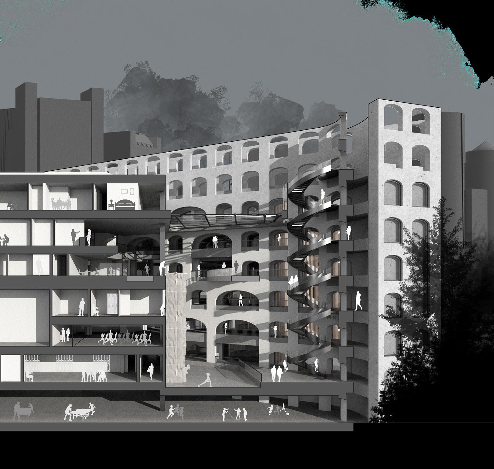
Working in pairs, students were first tasked with designing a structural module that could adapt to a variety of unknown sites and situations. Later in the semester, the location was revealed - a former B&M Beans factory in Portland, Maine - and students were asked to integrate that structural system into an overall site strategy. Next, program was announced; students were to develop a branch campus for Northeastern Univeristy’s STEM programs. Lastly, students had to take their original designs and reimagine them in the distant, unknown future.
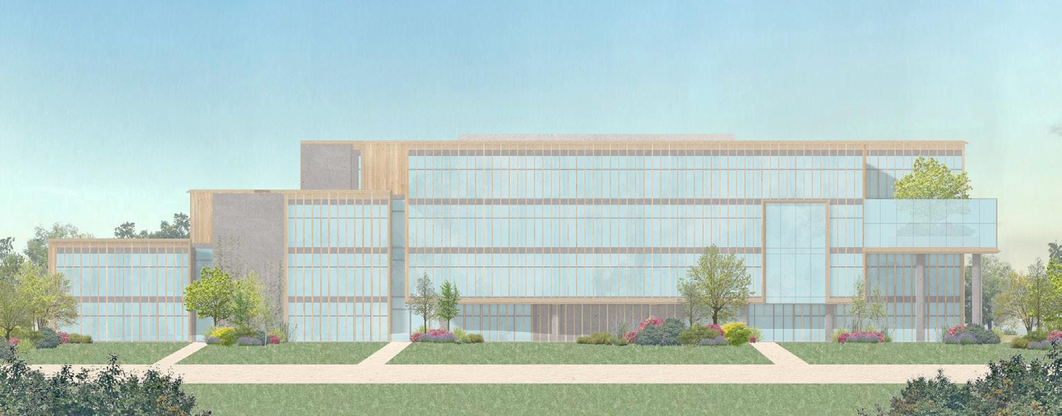
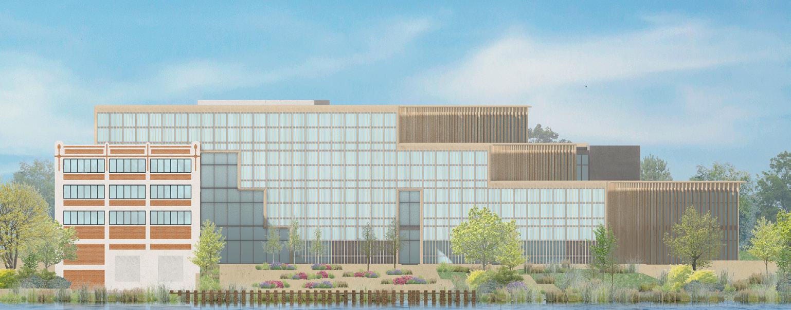
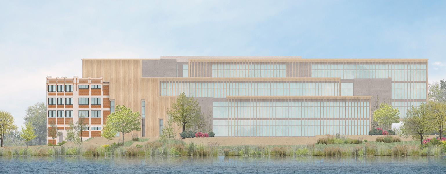
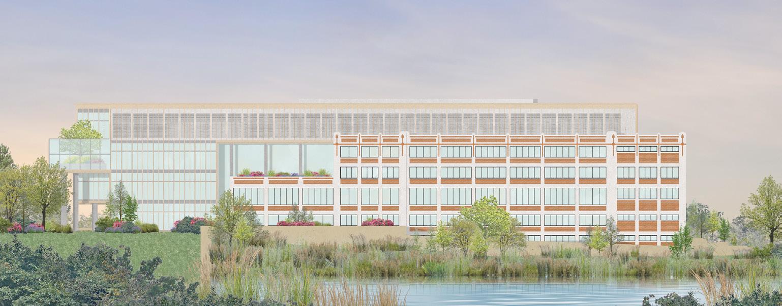
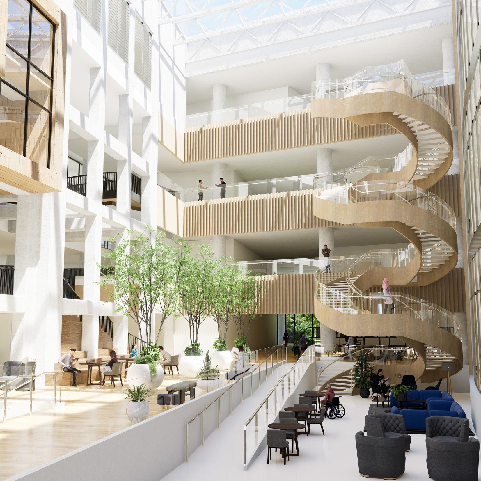
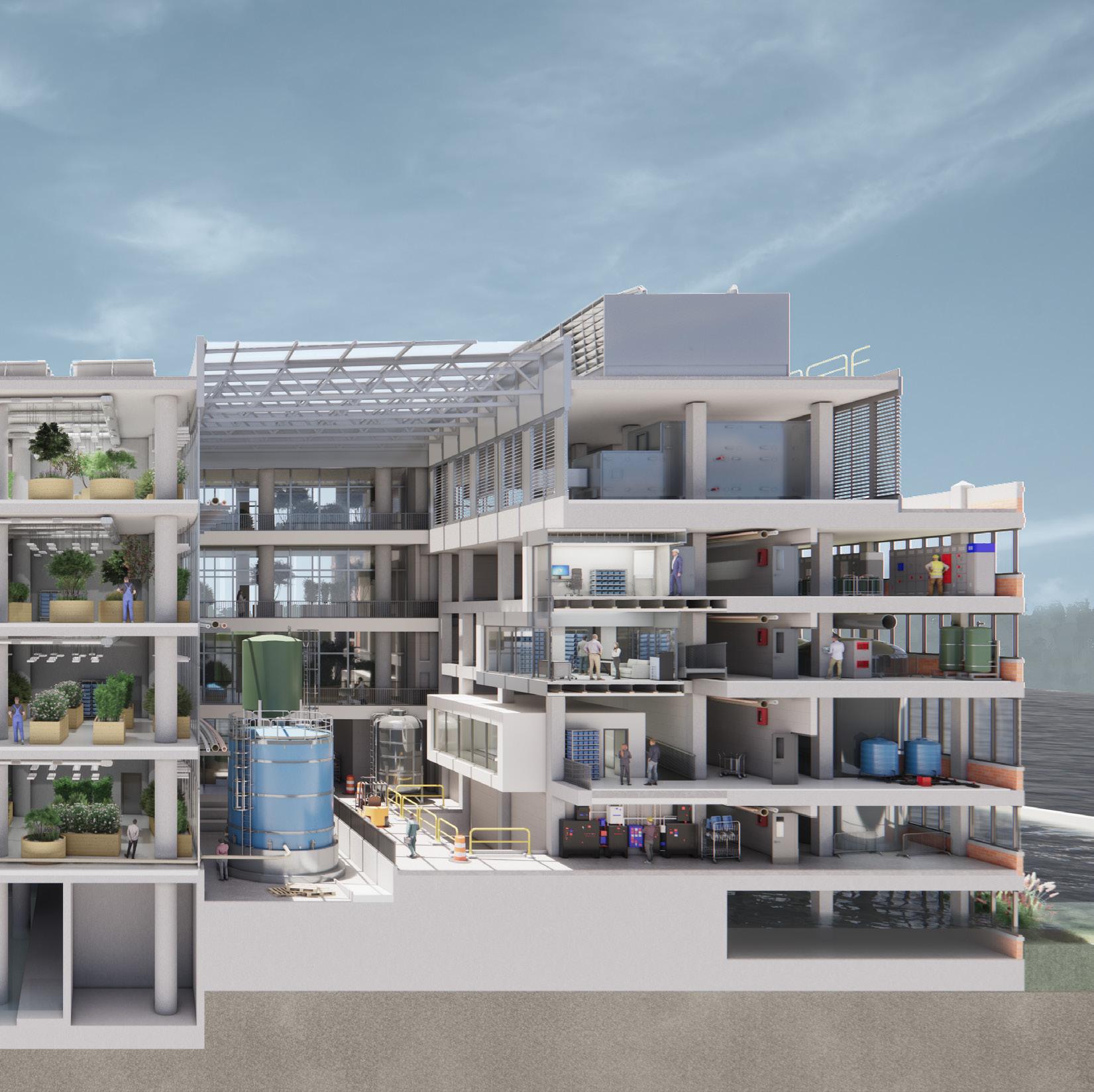
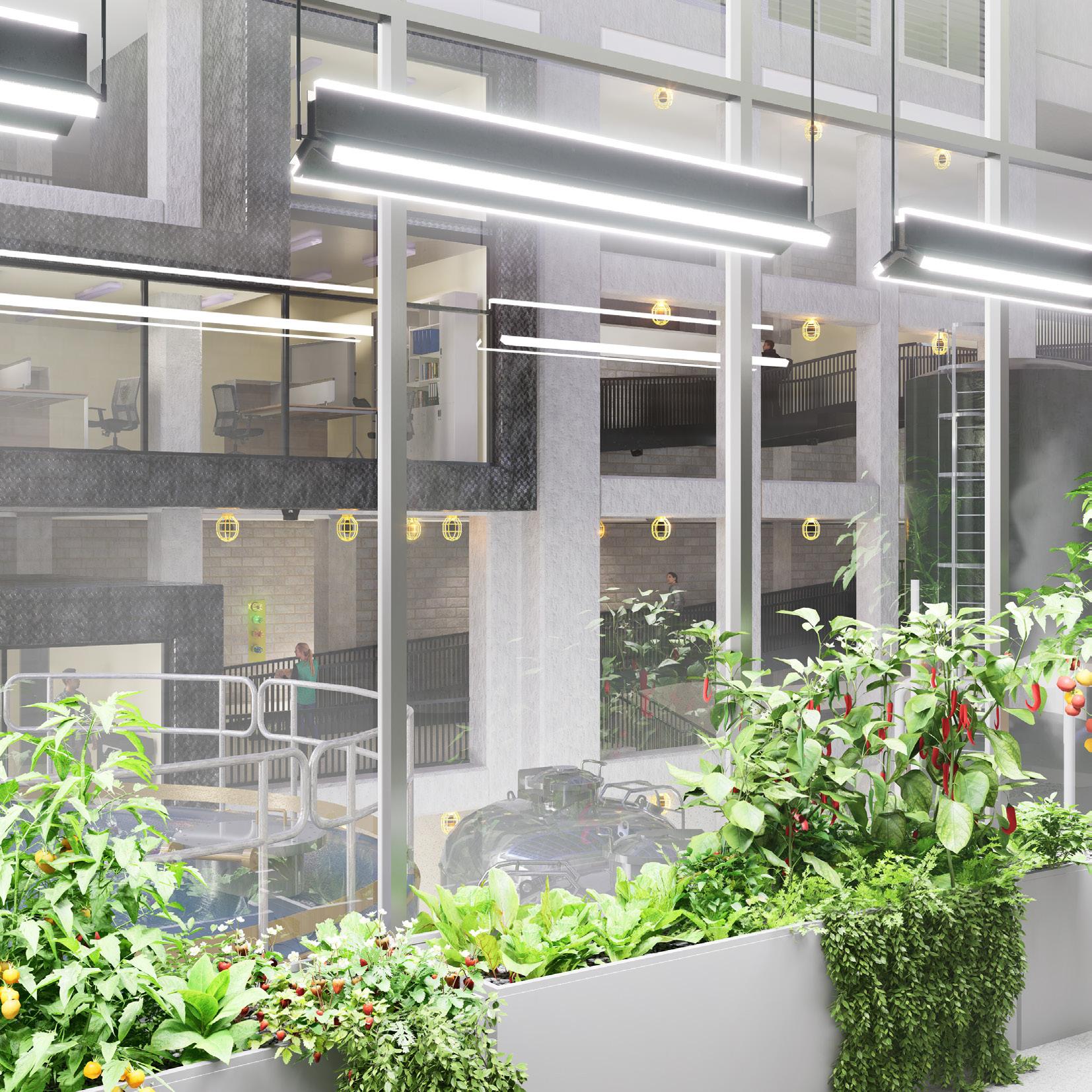
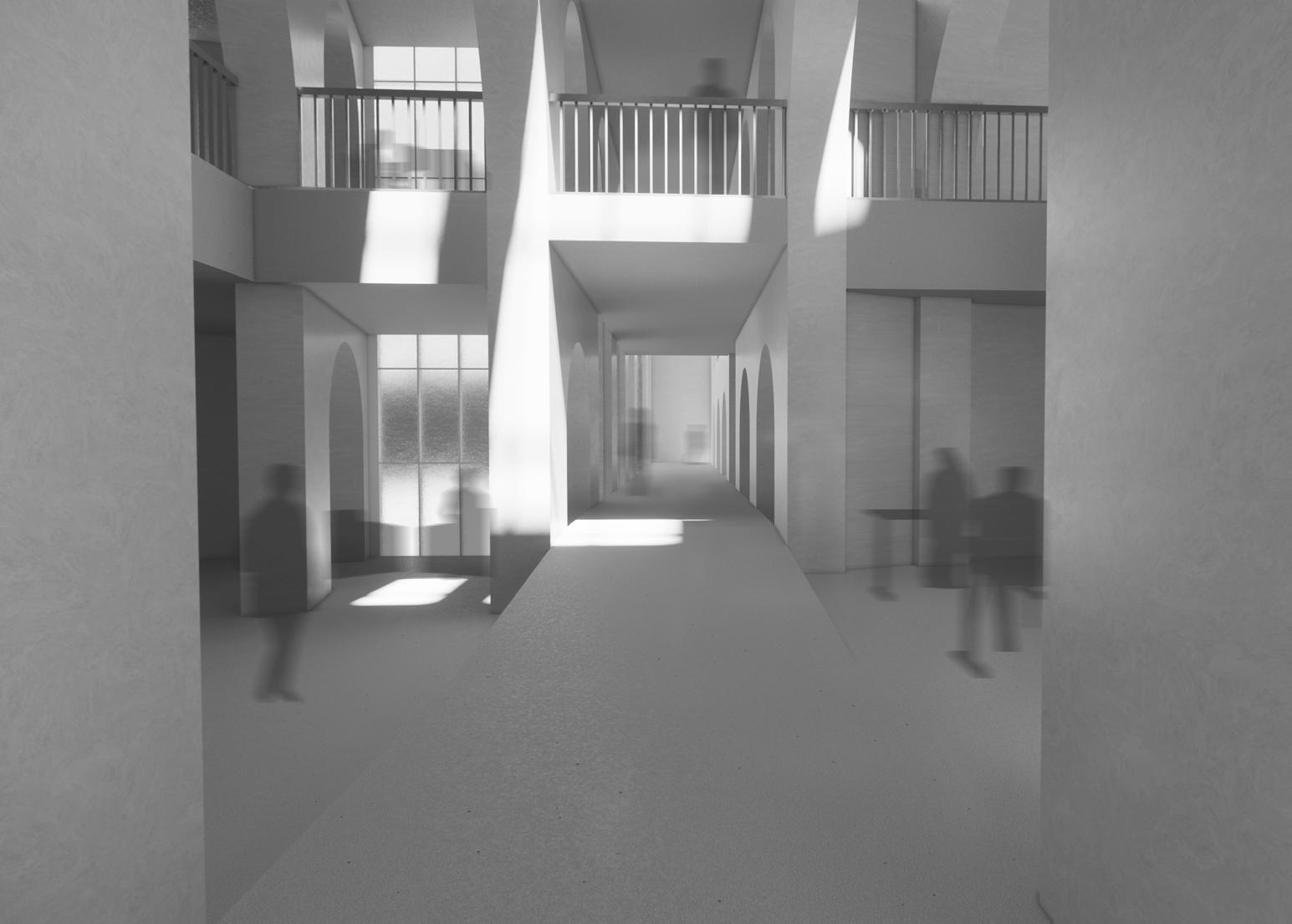
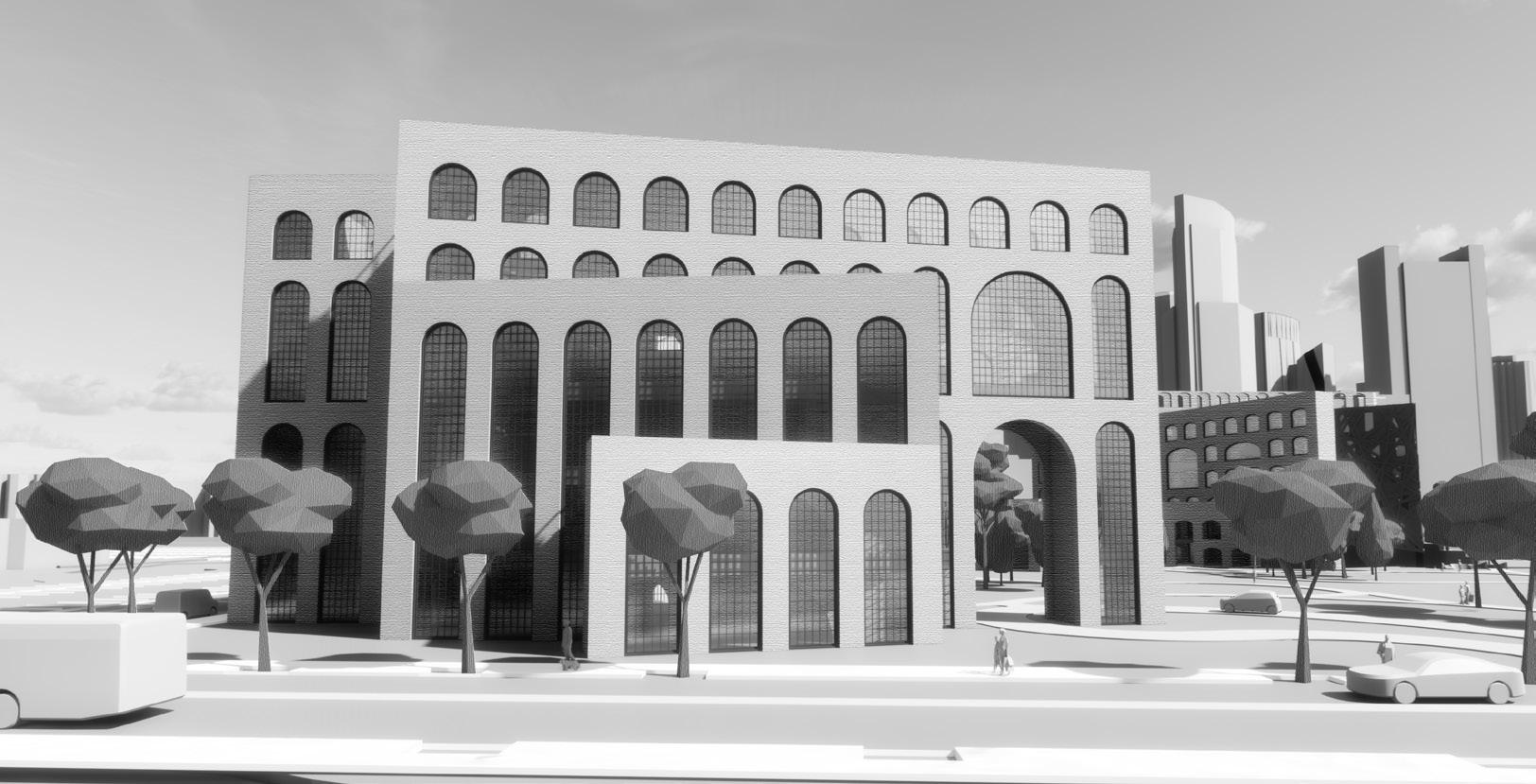
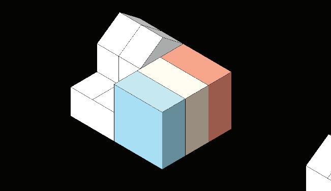
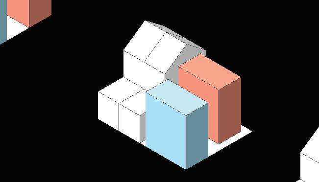
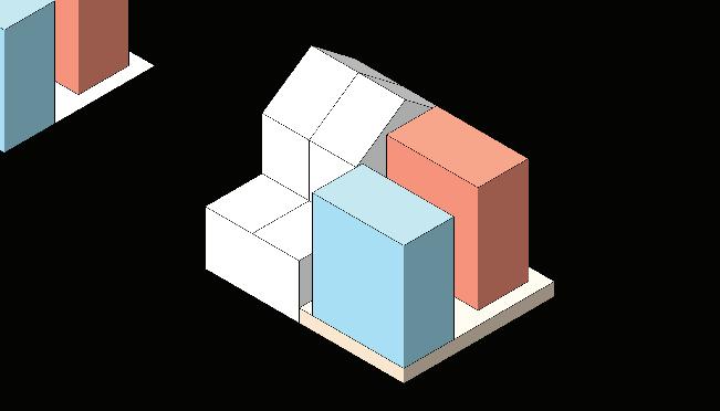
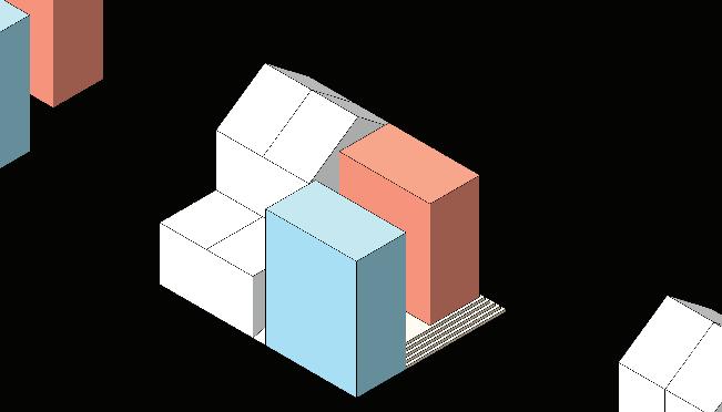
Our building is an experiment in longevity, perseverance, and adaptability. A series of wide, stepped, crescent terraces, supported by a sea of columns, hug the historic B&M building. A large atrium is carved out where the two buildings meet, helping to bring daylight into the interior, but also highlighting the differences between the two structures. Similar carving moves are made elsewhere around the building’s facade, to help break up the massing.
For the next few decades, we’ve crafted a program in-line with Northeastern’s vision; a collection of laboratory, educational, assembly, and office spaces working together as a hub of innovation. Looking further into the future, we’ve leaned into a more fantastical, extreme scenario to test the limits of our system, turning the building into a clean energy power plant and food production facility.
in partnership
work herein is my own. 17
*Design was developed
with Yue Xiao, but
18
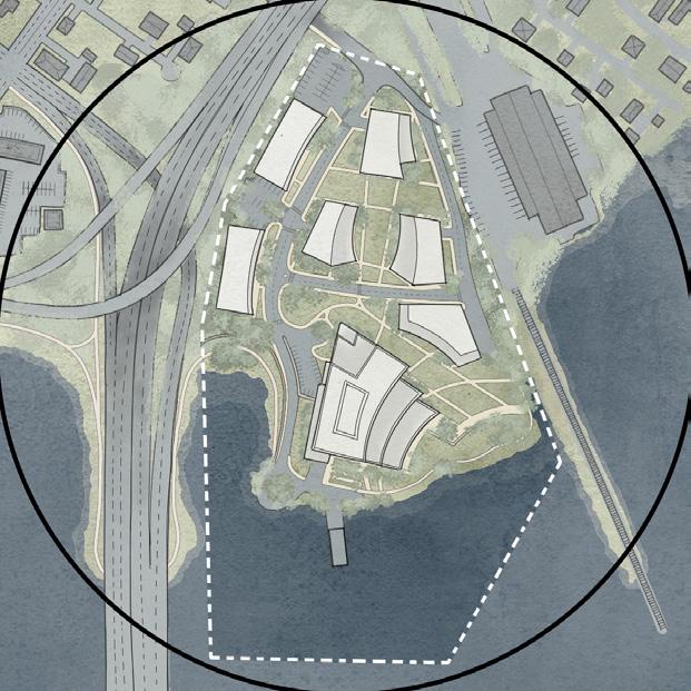
Site Plan 025 Si t e P l a n
19
Proposed21
The semester began with developing a utilitarian, adaptable structural system.
Next, the location was introduced and a site strategy developed.
Lastly, programs were integrated into the design, with an emphasis on flexability and versatility.
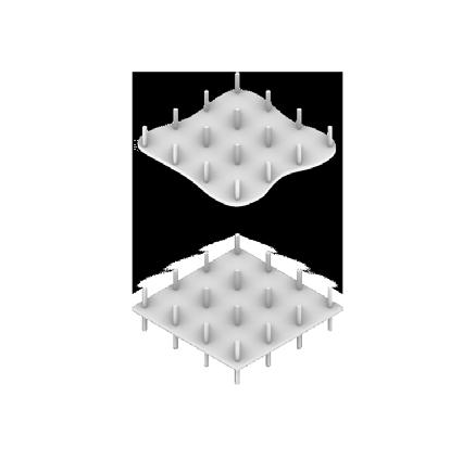
TWO-WAY SLAB
Concrete is robust, durable, and plastic, and can therefore persevere over time.
AXIAL SITE STRATEGY
Landscaped “Green” axes connect adjacent neighborhoods to the water through the site, and determine building massing and location.

BALANCED SPECIAL MOMENTS
Program balanced unique, special moments to endear the building to its users while other, more generic components ensured utility and flexibility.


DEVELOPMENT
Existing Building
Initial New Massing
Shape to Site
Carve Massing
Open Interior
Wrap Facade
Carve Facade
20
Current Proposal
BUILDING ORGANIZATION
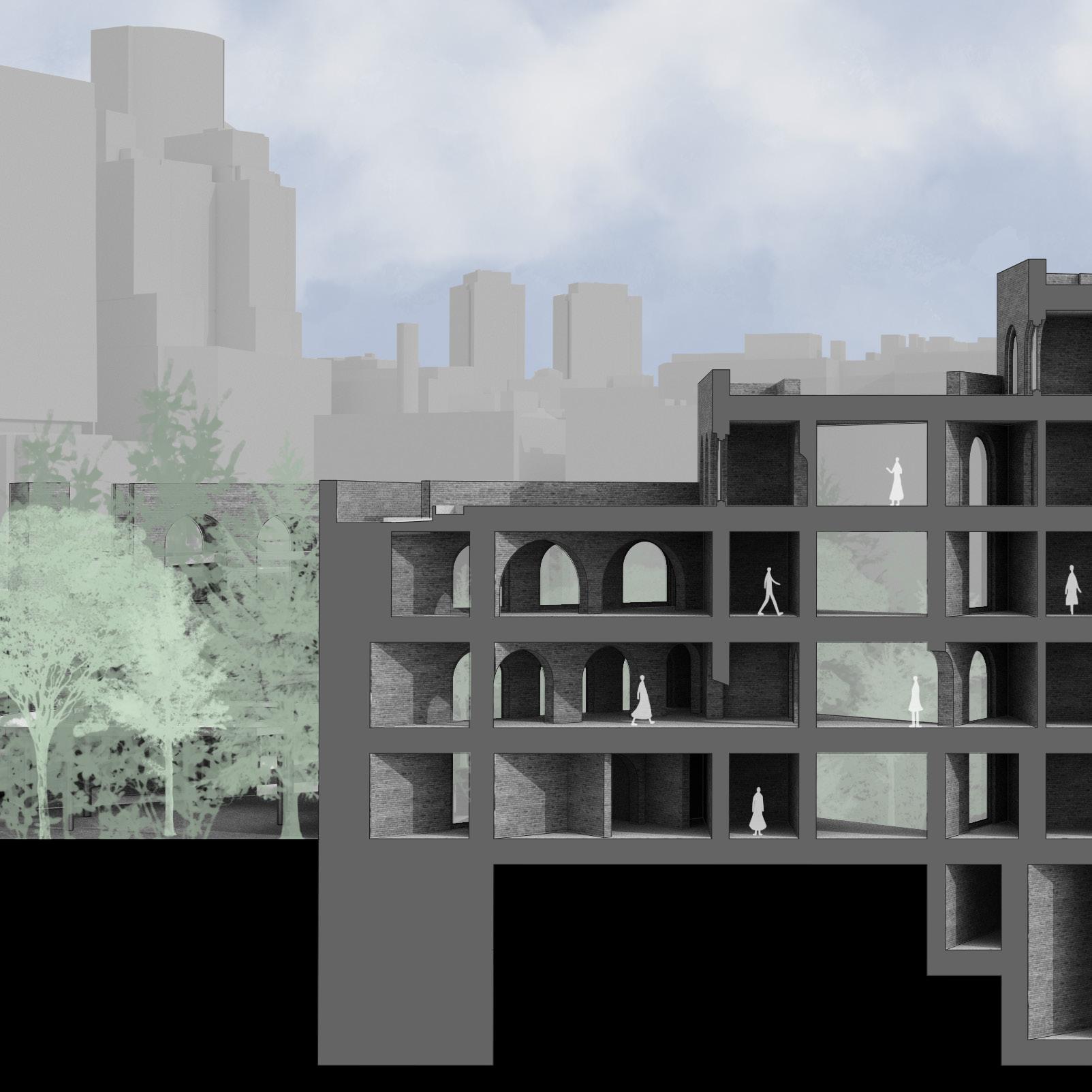
The B&M buildling’s lower FTF heights lend themselves well to office, work, and meeting spaces.
The taller ceilings in the new addition accomodate a wider variety of programs, including labs and classrooms.
The floorplates of the two buildings align on the first and fourth floors, but in between, the open central atrium highlights the jusxtaposition of the old and the new, and a series of ramps, landings, and stairs stitch the two buildings together.
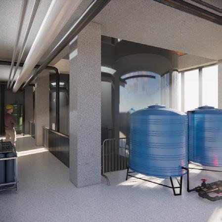
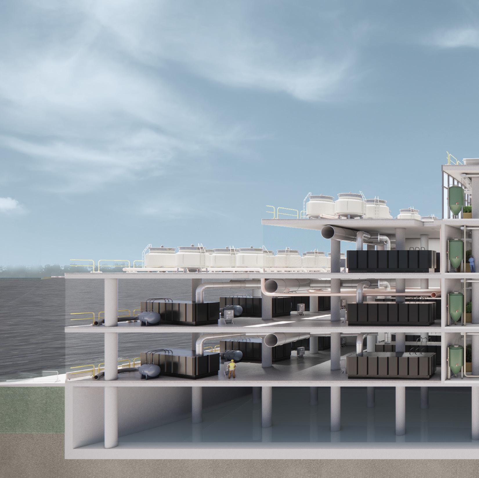
The basement, only under the northern half of the building to protect equipment from enroaching tides, is designed to flood.
Floors 0 - 2 include offices, classrooms, labs, collaborative work spaces, social programming, and roof gardens.
The third floor primarily contains the internal and external mechanical penthouses.
-0.5 0.0 0.5 1.0 1.5 2.0 2.5 3.0 1. 2. 3. 4. 5. 6. 7. 8. 9. 21
7. Classroom
8. Classroom
9. Classroom
10. Dry Lab
11. Dry Lab
12. Lab Storage
13. Classroom
14. Write-up
15. Wet Lab
16. Write-up
17. Wet Lab
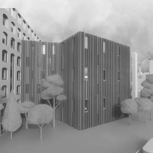
DYNAMIC FACADE
The slatted timber facade that wraps the building adapts to each orientation. On the southern side, it includes an occupiable, operable double-skinned facade for natural climate control in both the winter and summer (depicted below). On the eastern and western facades, the timber members deepen to act as vertical shading devices. On the northern face, they are shallower and more widely spaced to facilitate daylighting.
Extensive Roof Garden
Operable
DoubleSkinned
Facade
Angled
Finished
Ceiling for Daylighting
Occupiable
Balcony
Shading Devices
MEP Space
Perimeter
Heating Foundation
Piles
11. 12. 13. 14. 15. 16. 17.
10.
1. Covered Patio
2. Bookstore
3. Cafe
4. Faculty Offices
5. Loading Dock
6. Atrium
5’ 30’ 50’ 15’ 22
NORTHERN ELEVATION - 7:00 AM
SOUTHERN ELEVATION - 3:00 PM
23
 EASTERN ELEVATION - 11:00 AM
24
WESTERN ELEVATION - 7:00 PM
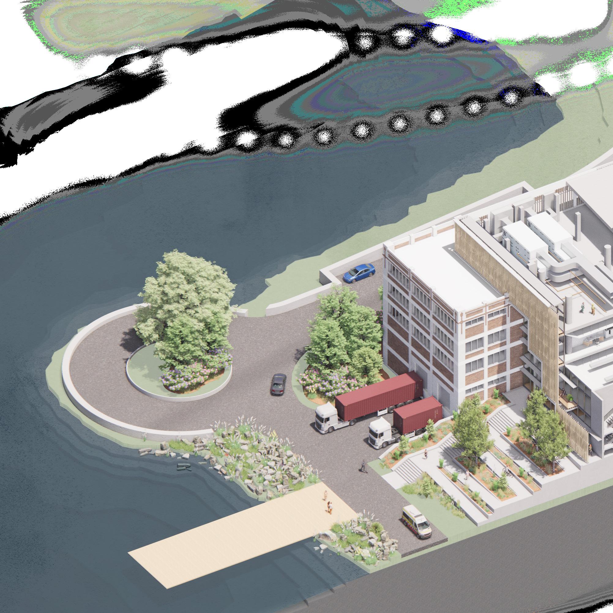
1. The shoreline is filled with rocks and native plants to not only provide habitat, but to also mitigate erosion and and help with flood control.
2. A small spur of road is continued along shore, reaching just 150’, which is the maximum dead-end distance allowed for fire truck access
3. A large staircase and ramp system connects the waterfront to the main atrium of the building, continuing the north-south axis defined in the site plan. The elevation change also serves to protect against flooding.
4. The loading dock is tucked into the basement of the B&M building and hidden from the rest of the site with landscaping
5. The double-skinned facade on the southern side of the building is carved away in portions to gesture at the carvings happening behind them on the interior of the building.
6. Where it is not carved away, the double-skinned facade not only helps trap air and keep the building warm in the winter, but is occupiable and has operable windows so it can be enjoyed in the summer months as well.
7. The top floor contains the building’s mechanical systems. Given the wide footprint and large open space in the center, the building has two separate ventilation systems, one for the north side and one for the south, which allows more efficient air flow as well as smaller ductwork.
8. Finished ceiling panels are angled away from exterior walls, making the building appear less dense from the outside but also allowing more daylight to penetrate the interior.
9. Egress stairs are contained within concrete cores, which act as shear walls and provide lateral stability to the column and post-tensioned slab system.
10. 16’ floor-to-floor heights and no deep beams or girders allow for ample space to run MEP in hallways and above program spaces.
11. Two smaller cores flank the atrium and provide spaces for restrooms as well as additional opportunities for vertical plenums. Given the choice to use post-tensioned slabs, which can be hard to cut apart later on, we opted to overly-carve out the floor plate now and give plenty of space to run MEP vertically.
12. Drains on the roof collect rain water, stored as graywater in the basement
13. The core, defining moment of the project atrium, carved out between the new and used as a space of congregation, socialization.
14. Graywater collection tanks (see note
15. Above the atrium is a large skylight, which to better penetrate into the deep floor third floor, near the glass roof, are louvers mechanical equipment, to allow rising collected and recycled.
 1.
3.
4.
2.
6.
5.
7.
8.
1.
3.
4.
2.
6.
5.
7.
8.
25
which is treated and (see note 14).
project is the central and old buildings congregation, circulation, and 12) which allows daylight floor plates. On the louvers into the rising hot air to be
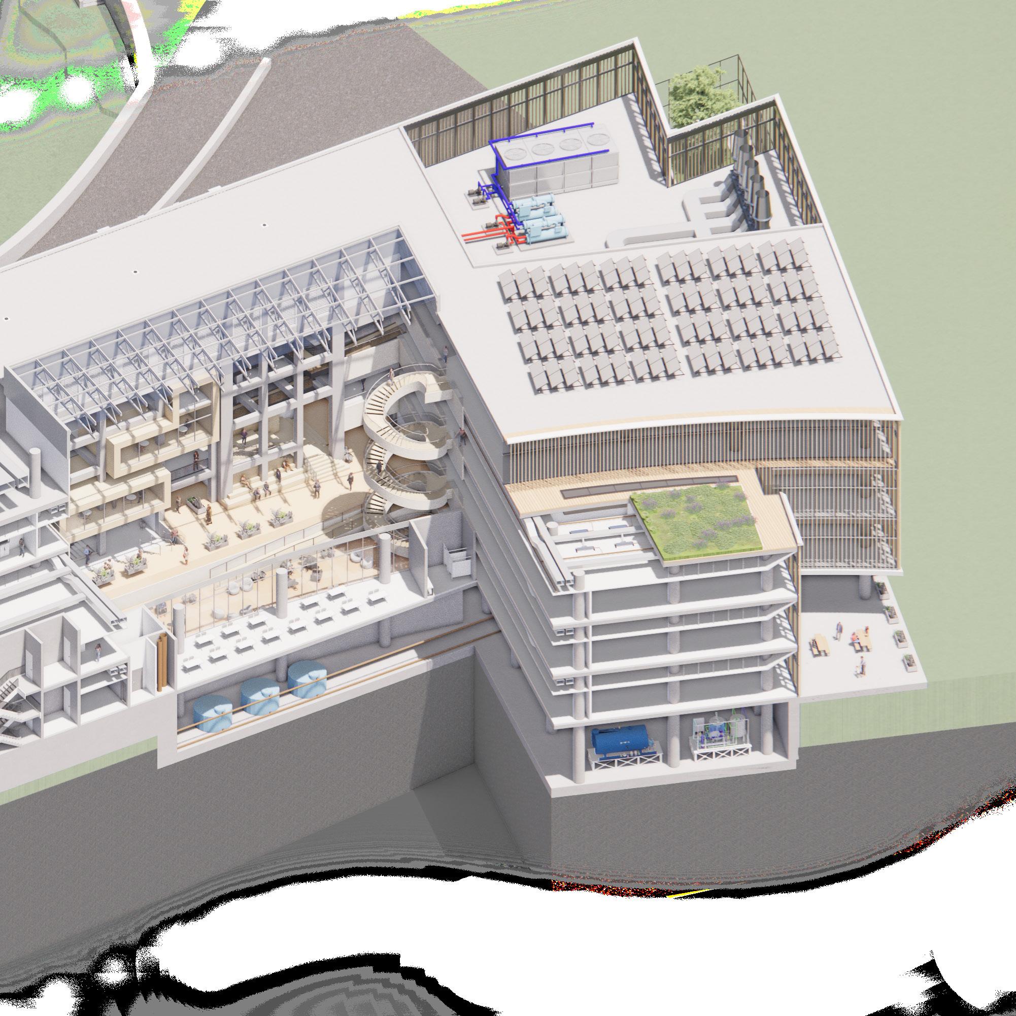
20. Some of the mechanical equipment, like water and sewer, are located in the basement. Because of the project’s proximity to the floodplain, the
basement is only located on the side of the building furthest away from the shore, and all equipment are elevated on skids, so that in the case of flooding, they remain protected.
21. Extensive roof gardens sweep across the curving terraces of the building, helping to keep interiors cooler in the summer, decrease site water runoff, and provide habitat to local insects and birds.
22. Shading devices on the eastern facade continue the same language as decorative elements on the southern one ,but here they are deeper and more vertically-oriented, to help reduce morning sun glare.
11. 14.
16.
12. 13. 15.
19. 20. 17. 21. 18. 9. 10.
16. Since the mechanical systems are located primarily within the top floor, large portions of the roof are open and available for solar panels.
17. Given Portland’s cold winters, only the equipment that needs to be outside is outside. This includes chillers and exhaust fans.
18. Skylights following the curves of the building cut into the floor plates to bring natural light deeper into the interior halls.
19. Active chilled beams are the primary HVAC system used in the building given their efficiency and the fact that they don’t need as large a duct as traditional ventilation systems.
26
22.
27
28
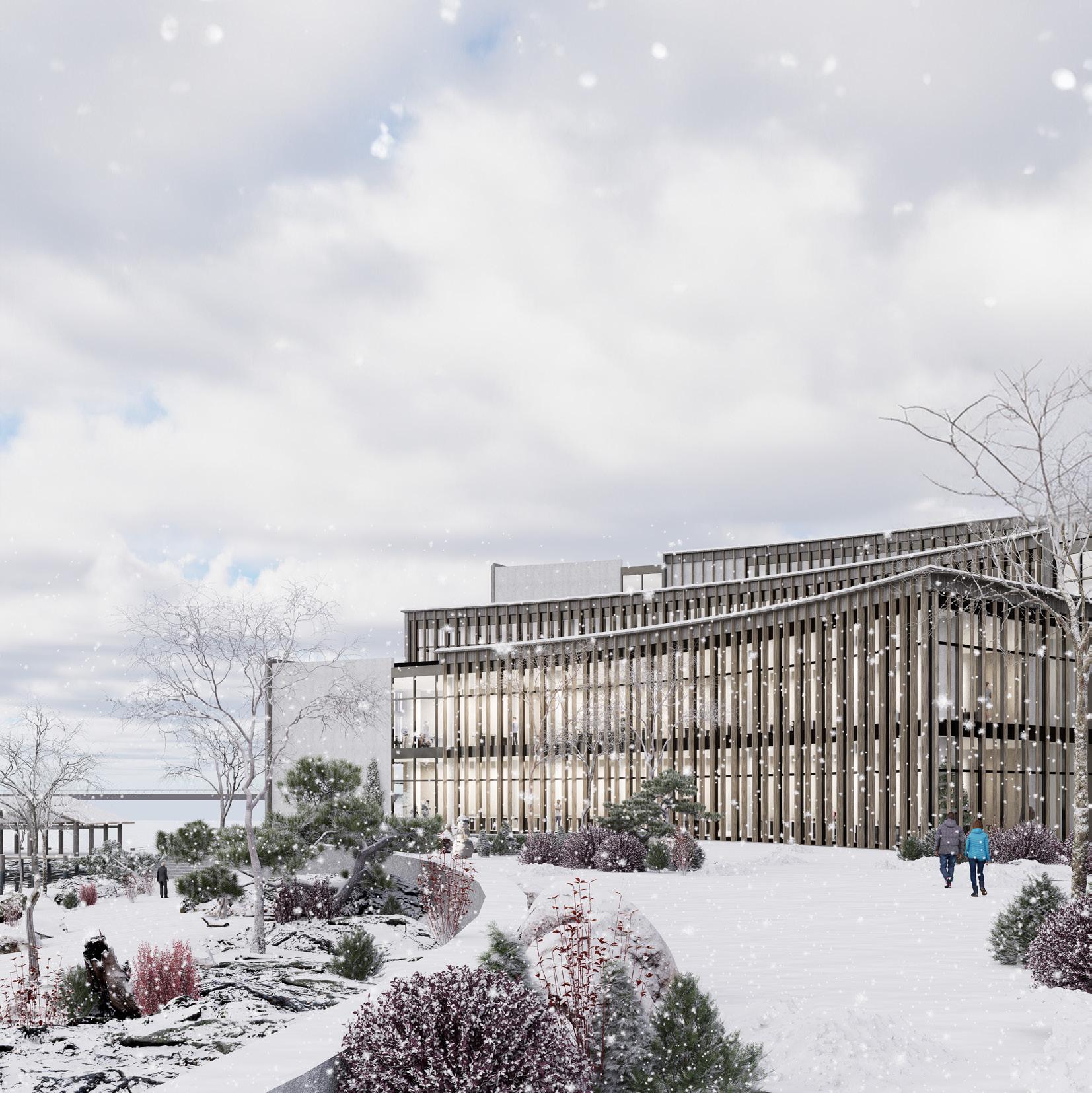
For the first stage of its life, the building sits well above the tides and just out of the AE Flood Zone. A series of retaining walls help guard the campus from flooding. The walls themselves are layered to soften the approach from shore to the school. Wetlands also assist with flood management, aid in pollution filtration, restore habitat, and provide a living classroom for the school.
2025
High Tide, 2100
29
High Tide, 2025
2100
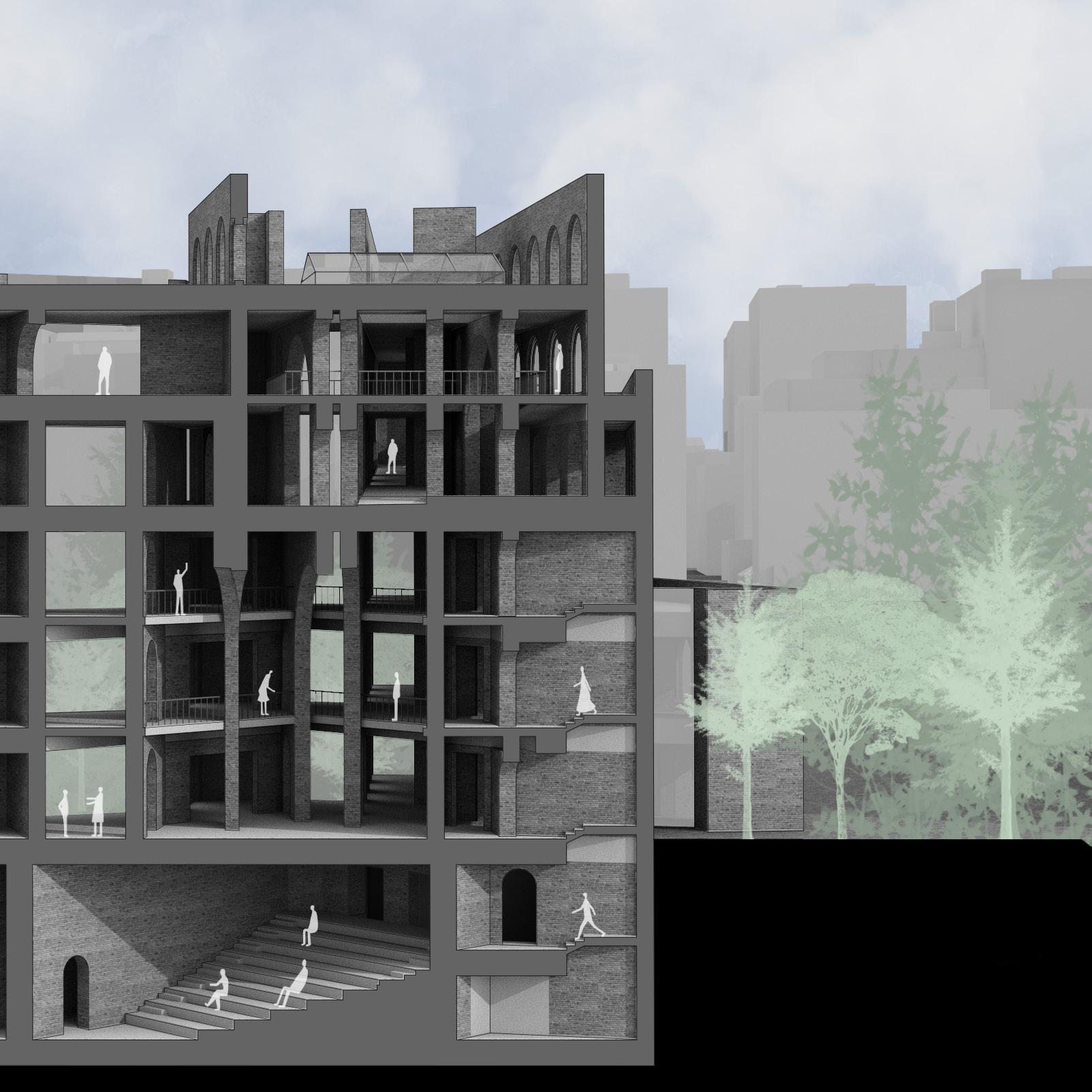
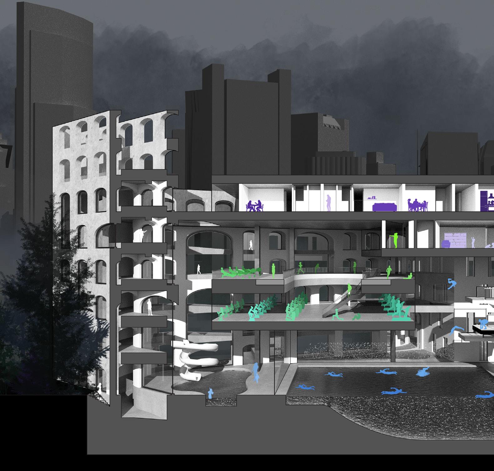
Portland, as well as the world, has changed dramatically by the turn of the next century. Sea levels have risen about 7 feet, and the tides now regularly flood the basement floors of the original B&M building. The building’s program and many of its more ephemeral facade elements may have faded over time, but the concrete structure remains intact, allowing for adaptations and new uses.
30
BUILDING ORGANIZATION
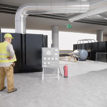
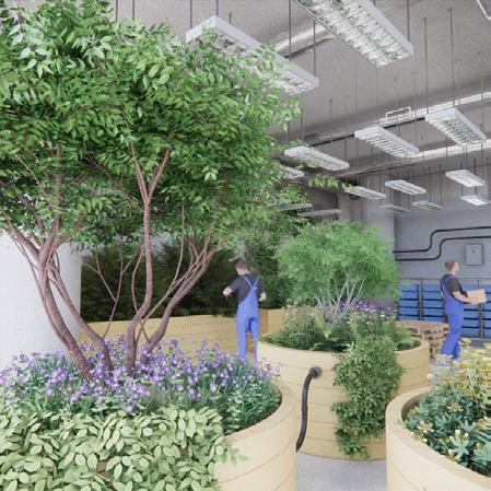
This future scenario imagines a world, around 2100, with a greater reliance on renewable energy, higher sea levels, continued inequitable access to fresh food, and freshwater scarcity. Portland’s energy production, storage, and transmittal are dispersed accross as series of micro-grids and food production is localized. Northeastern’s building takes on a new life, as what is essentially a giant, rechargable battery and greenhouse.
FUEL CELL BANKS
A single duct, constant-airvolume system operates in the greenhouse given the constant ventilation needs across the space. A water-based chiller and chimney are on the roof while the boiler and cold water chiller are on the ground floor
The fuel cells themselves require cooling towers, but as they are outdoors, they have no “spaces” that require additional cooling or ventilation.
Hydrogen storage rooms, per IBC, require negative pressure and ventilation systems located at the highest points of the room.
Water, now inundating the ground floor of the B&M building during high tide is pumped, filtered and electrolyzed using renewable energy in times when supply exceeds demand. The resulting hydrogen is used to power fuel cells sitting in the eastern poriton of the building when the community’s energy demands exceed what renewables can supply. The other byproducts of the fuel cells, heat and fresh water, are used to run a hydroponic greenhouse operation in what was previously the central atrium.
GREENHOUSE ELECTROLYSIS PLANT
The offices use DOAS
active chilled beams and an air chiller located on the roof.
Electrolysis systems produce a lot of heat and need cooling, but the rooms they are in do not. Basic
by fans and
wall openings.
Energy Recovery Wheel Water Storge Fan Room Chimney Warm Hydroponic Water Hydrogen storage
ventilation
provided
louvered
is
Excess heat generated by the fuel cells can be used to preheat electrolysis machines.
Excess heat from the fuel cells can be used to heat the water for the hydroponics system.
Water for
in during high tides 31
with
electrolysis is drawn
1. Loading Dock
2. Storage
3. Electrolysis
4. Filtration
5. Water Collection
6. Irrigation Tanks
7. Greenhouse
8. Greenhouse
9. Fuel Cells
10. Greenhouse
11. Greenhouse
1.
2.
3.
7. 8. 9. 10. 11.
4. 5. 6.
30’ 50’ 15’ 32
5’
33
34
35
36
37
38
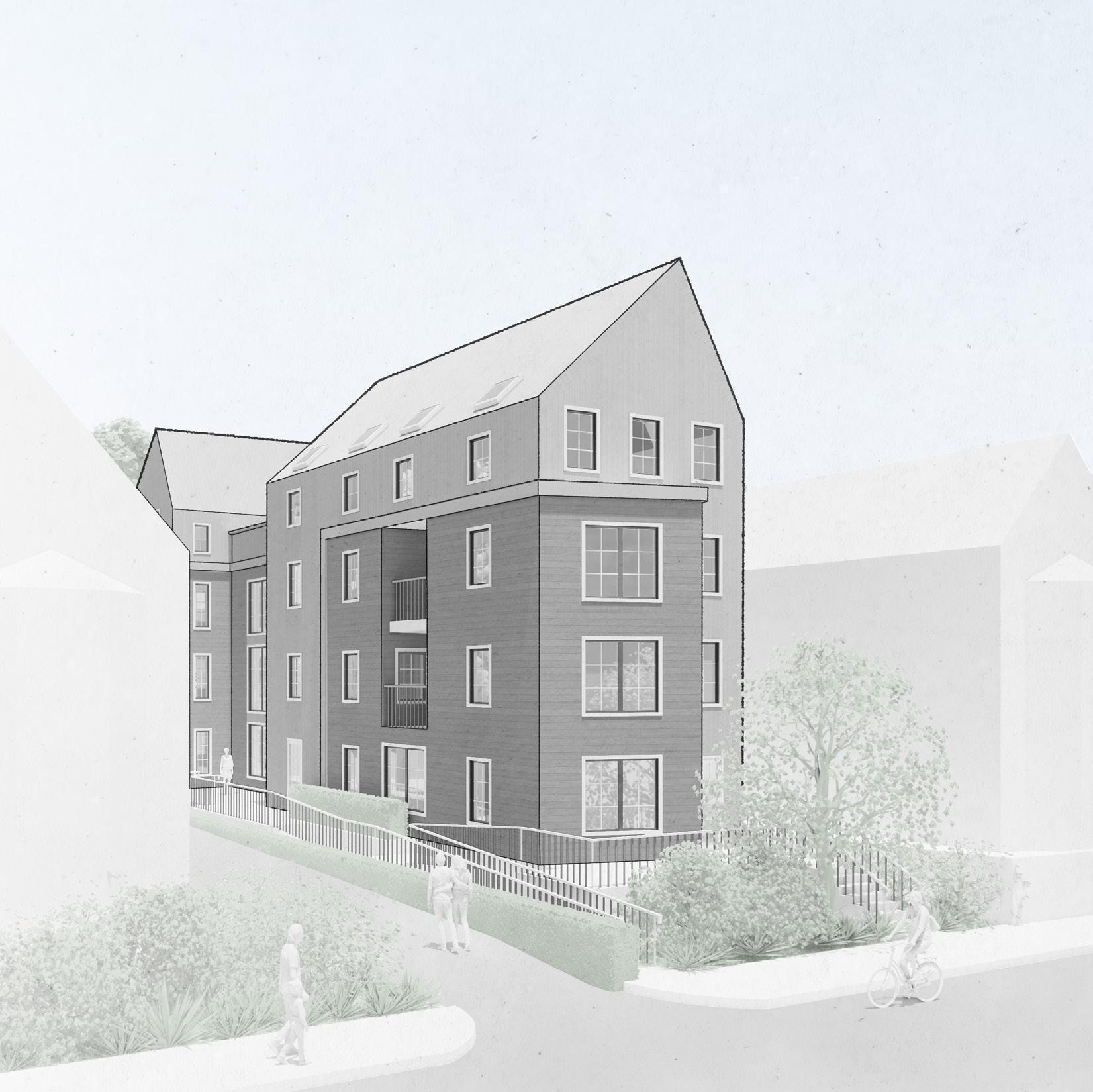
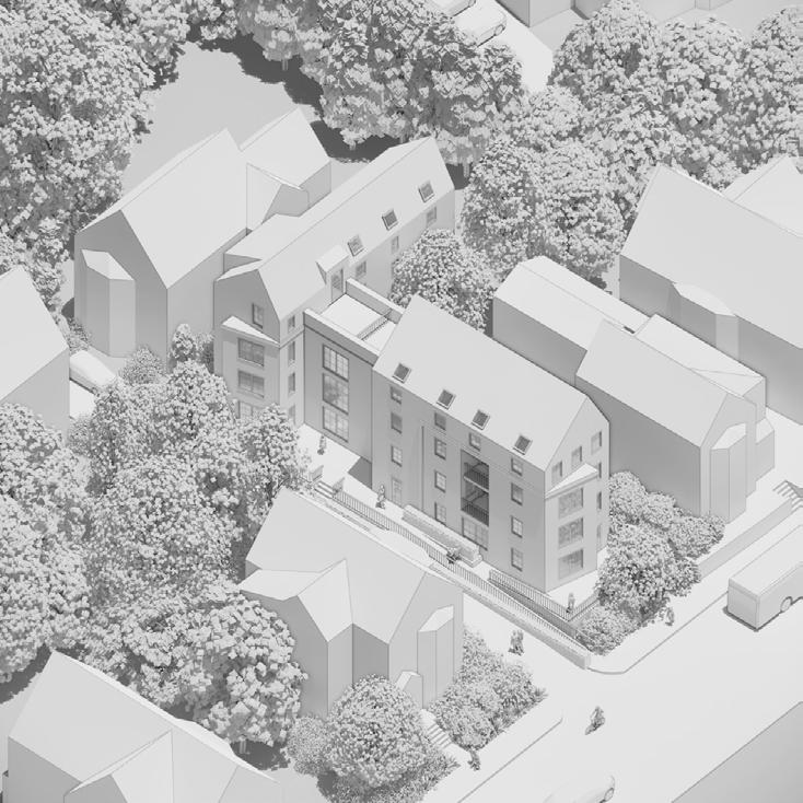
(UN)DEVELOPABLE
OPTION STUDIO - PUBLIC LAND FOR PUBLIC GOOD FALL 2022
The Public Land for Public Good studio focuses on increasing community resilience through unique, tailored interventions on small, Boston-owned lots that have been labeled “undevelopable” by the city. The first half of the semester focused on research, and the second focused on design. Students explored a range of topics, including food insecurity, arts-access, education, transportation, and small businesses. (UN)DEVELOPABLE focsuses on housing, and specifically homeownership and its relation to identity, place-making, and economic ownership.
Although housing is an outcome of this project, its main goal is to foster ownership, both in the literal and figurative senses. Ownership, representation, and presence are key variables in a community’s structural system.
Unless all members have a stake in the system, there is no chance of the community flourishing. How can you better your life if you have no control over the factors that influence it? Why should you care what happens to your neighborhood if it doesn’t recognize you? Our local points of interest and social interaction have to reflect our unique needs and preferences, and they have to be easily accessible. We should own our own residential spaces, or at the very least, pay rent to a landlord who we know and who is a real person in the community.
In this project, a group of efficient, yet dignified residencesdesigned for a range of individuals and lifestyles - are integrated into an established neighborhood and grounded to the community with a dedicated space for locally-owned commercial enterprises.

39
40
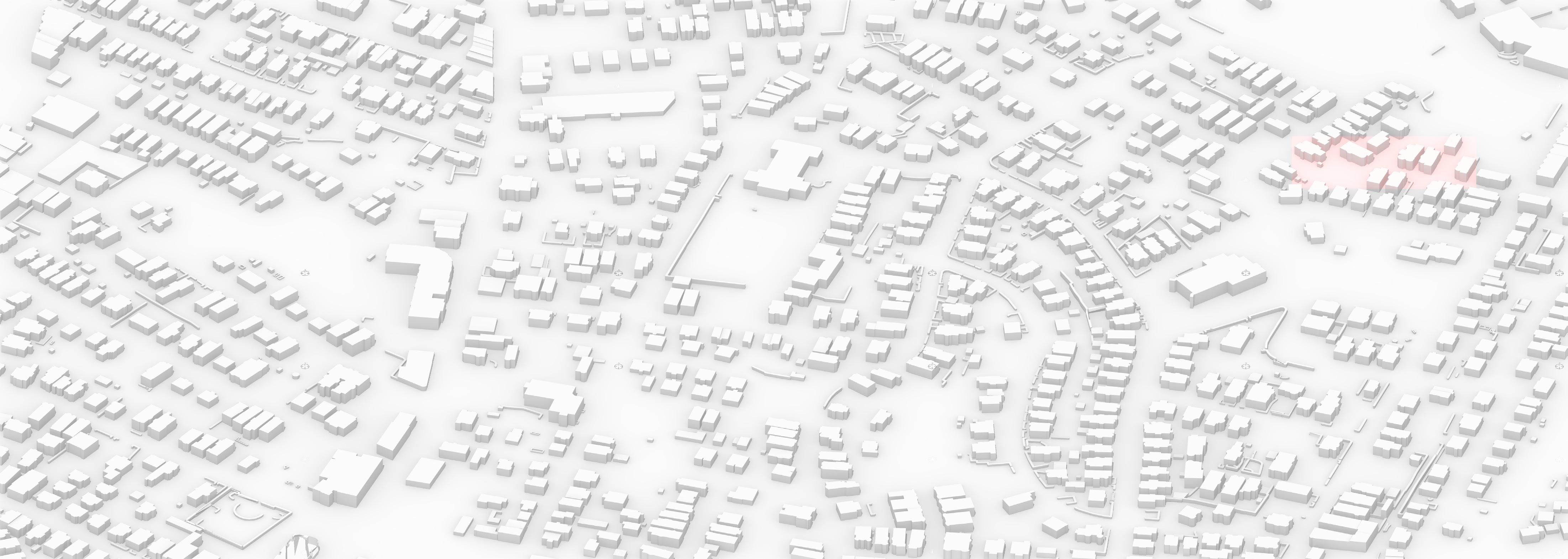
This collection of Boston’s “undevelopable” sites is located on the Roxbury / Dorchester border of the city, near John Winthrop Elementary. Each student in the studio was assigned a site and was instructed to develop a proposal for that location to meet an unmet need need of the community, which was identified during the initial research phase of the semester. These programs included housing, small-business incubators, markets, transportation hubs, artist studios, libraries, food halls, and communal work spaces.
This specific proposal is a mixed-use residential and commercial project that aims to supply “Missing Middle” housing but also opportunities to boost the local economy via a dedicated space on the ground floor for local entrepreneurs to set up shop. The project also stands on the belief that mixing residential, community, and commercial programs in one location strengthens residents’ feeling of place in a neighborhood than if each program was separate.
41
42
Bay Window
RESPONSE ORGANIZATION
Four Bedroom
One Bedroom
Massings are sized and shaped according to local context, including pitched roofs and an interpretation of a bay window. The building intends to acknowledge the neighborhood’s aesthetic, but not copy.
Human-scaled fenestration
References to the local vernacular architecture are also replicated on the unit-scale, with appropriatelyscaled apetures, windows on multiple facades, porches, and bay windows.
Two Bedroom
One-Bedroom
Coffee Shop
A community and business space on the ground floor anchors the residence to the wider community. Three one-bedroom flats and two duplexes are grouped around a communal staircase.
Units are divided in a series of economically-sized zones, to fully meet the requirements of modern life, including a defined threshold, living room, dining space, kitchen, bathroom, office and bedroom.
Central Stair Accessible Unit
Pitched Roof
Outdoor Spaces Bay Window Entrance Living Kitchen Bathroom Bedroom Office Dining
43
The sequence through the building emphasizes the public/private gradient, with separate public entrances to the ground-floor community space, and a shared, semi-private stair tower for residents.
Roofs are pitched at an angle optimal for solar panels. Wet walls and plumbing lines are concentrated in specific locations for efficiency. Shared laundry facilities help lower cost-of-living expenses.
The public/private gradient continues within the units. A distinct entrance shields more intimate rooms, semi-public areas for guests are near the entrance, and private spaces are at the end of the sequence.
Prefabricated furniture, identical across units, are used to define spaces and provide residents greater agency in shaping their living environments.
Public Entrances
Resident Entrance
Roof angled for solar panels
Stacked Wet Walls
Public
Private
Closet and TV Cabinet
Built-In Banquette
Desk and Bookshelf
44
Shared Laundry
SEQUENCE ECONOMY
GROUND FLOOR
Coffee Shop: 700 sf
Unit 1 (Accessible): 870 sf
SECOND FLOOR
Unit 2: 870 sf
Unit 3: 750 sf
1’ FLOOR PLANS 5’ 10’
45
THIRD FLOOR
Unit 4: 1,680 sf (Level 1 - 870 sf)
Unit 5: 1,460 sf (Level 1 - 750 sf)
FOURTH FLOOR
Unit 4: 1,680 sf (Level 2 - 800 sf)
Unit 5: 1,460 sf (level 2 - 710 sf)
46
5’ 10’ 1’ 47
UNIT 1 COFFEE SHOP UNIT 2 UNIT 3 UNIT 4 UNIT 5 48
 UNIT 3
UNIT 1
UNIT 4
UNIT 3
UNIT 1
UNIT 4
49
UNIT 2
UNIT 3 UNIT 5
COFFEE SHOP
50
COMMUNITY PATIO
51
52
SPINE
DESIGN TACTICS
FALL 2022
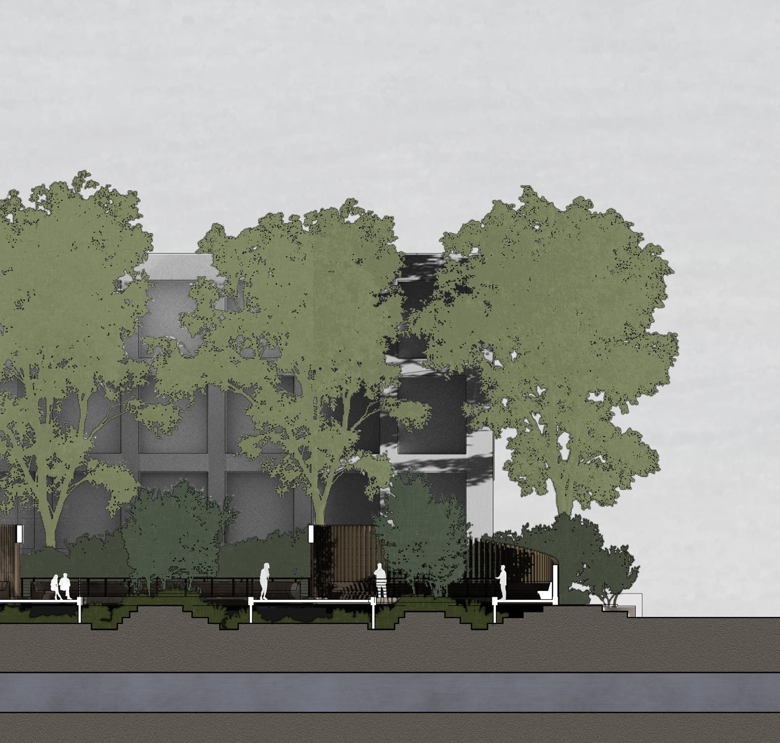
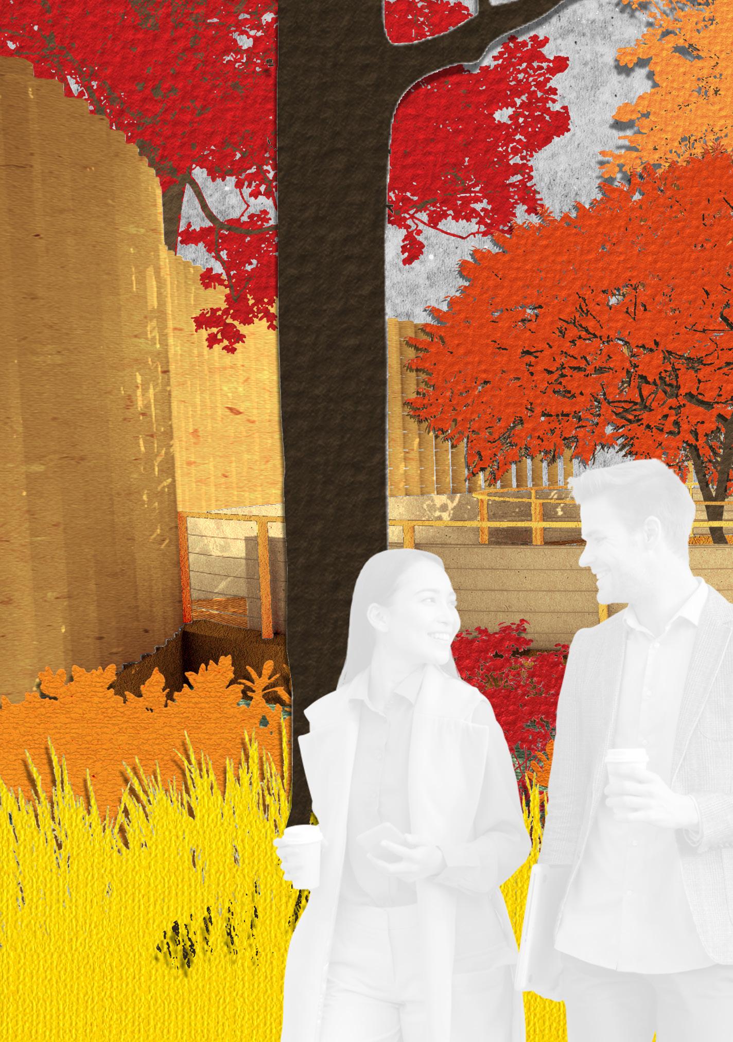
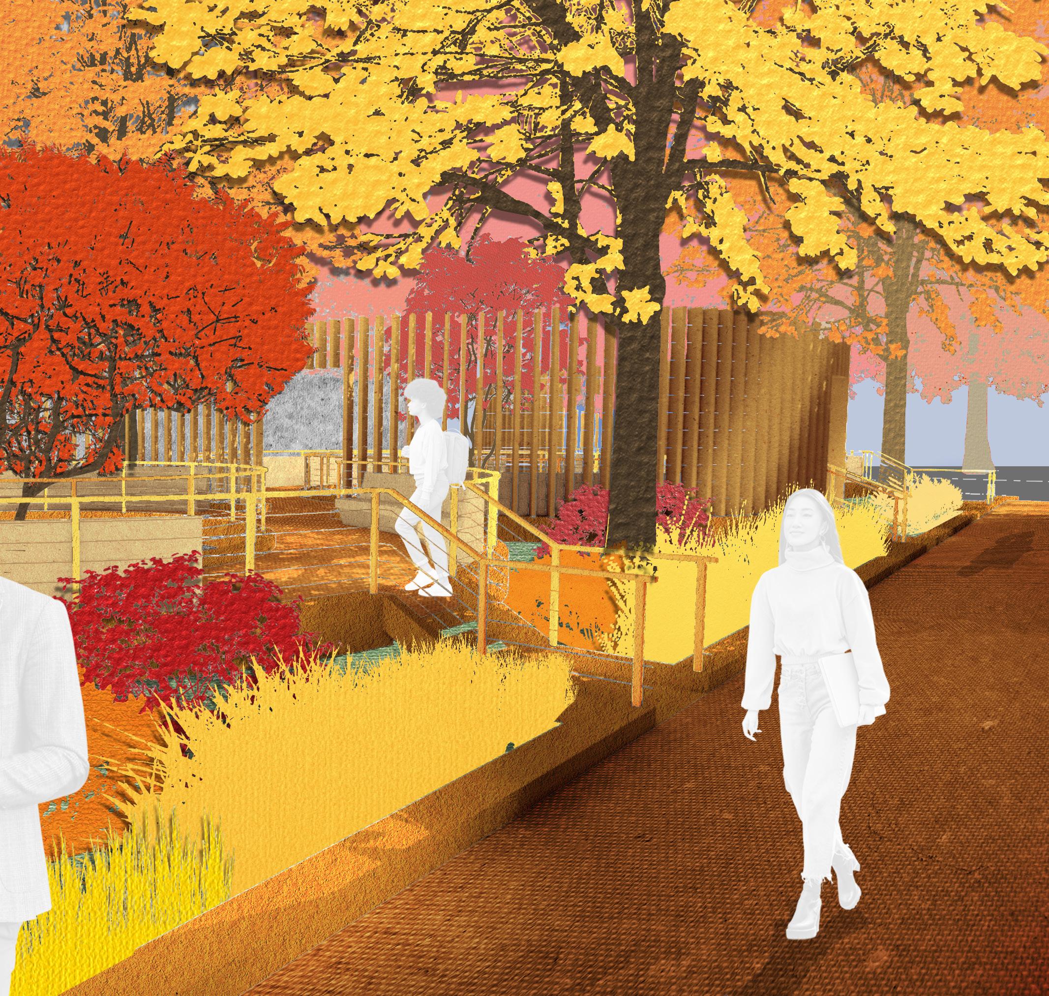
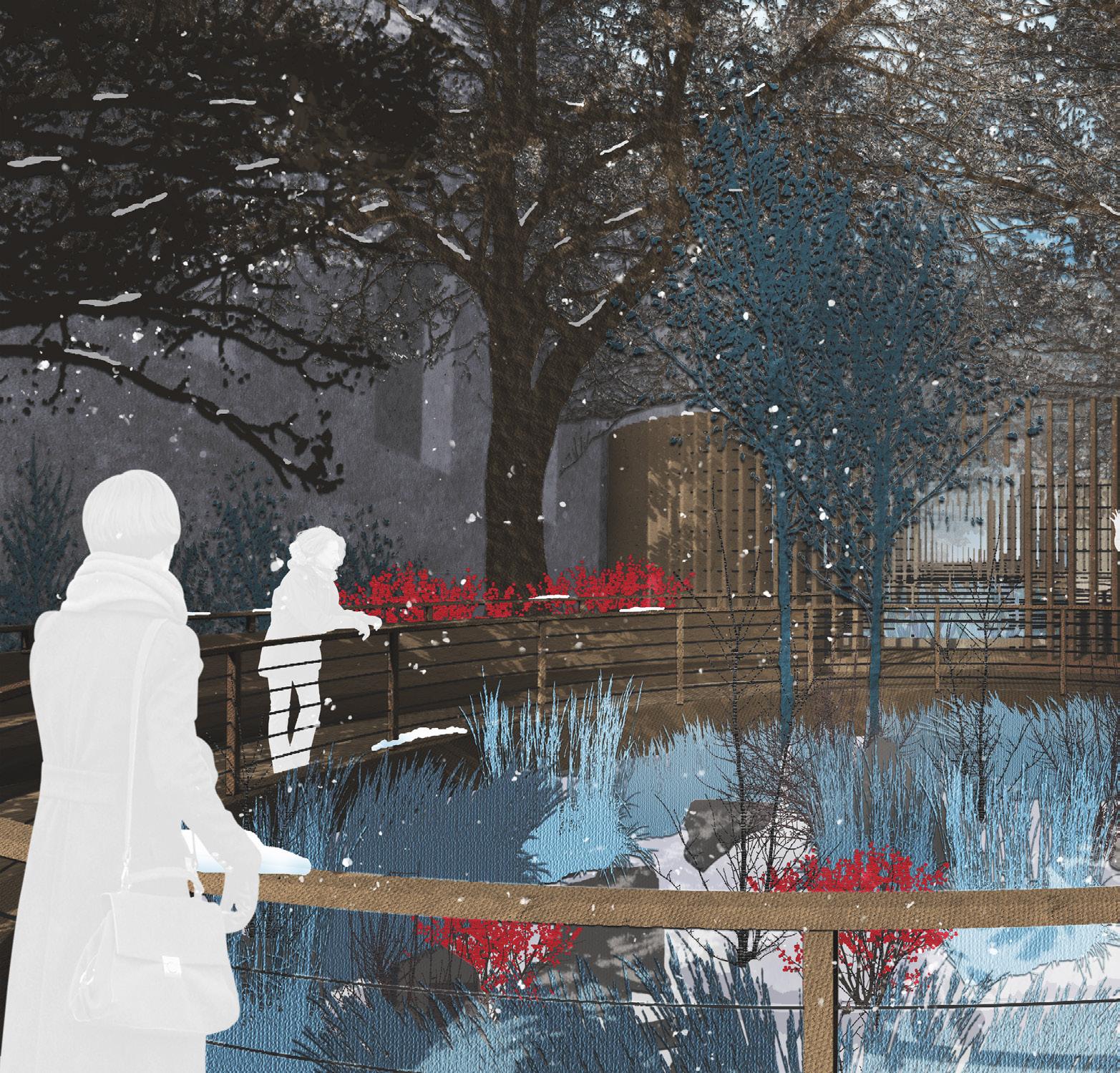
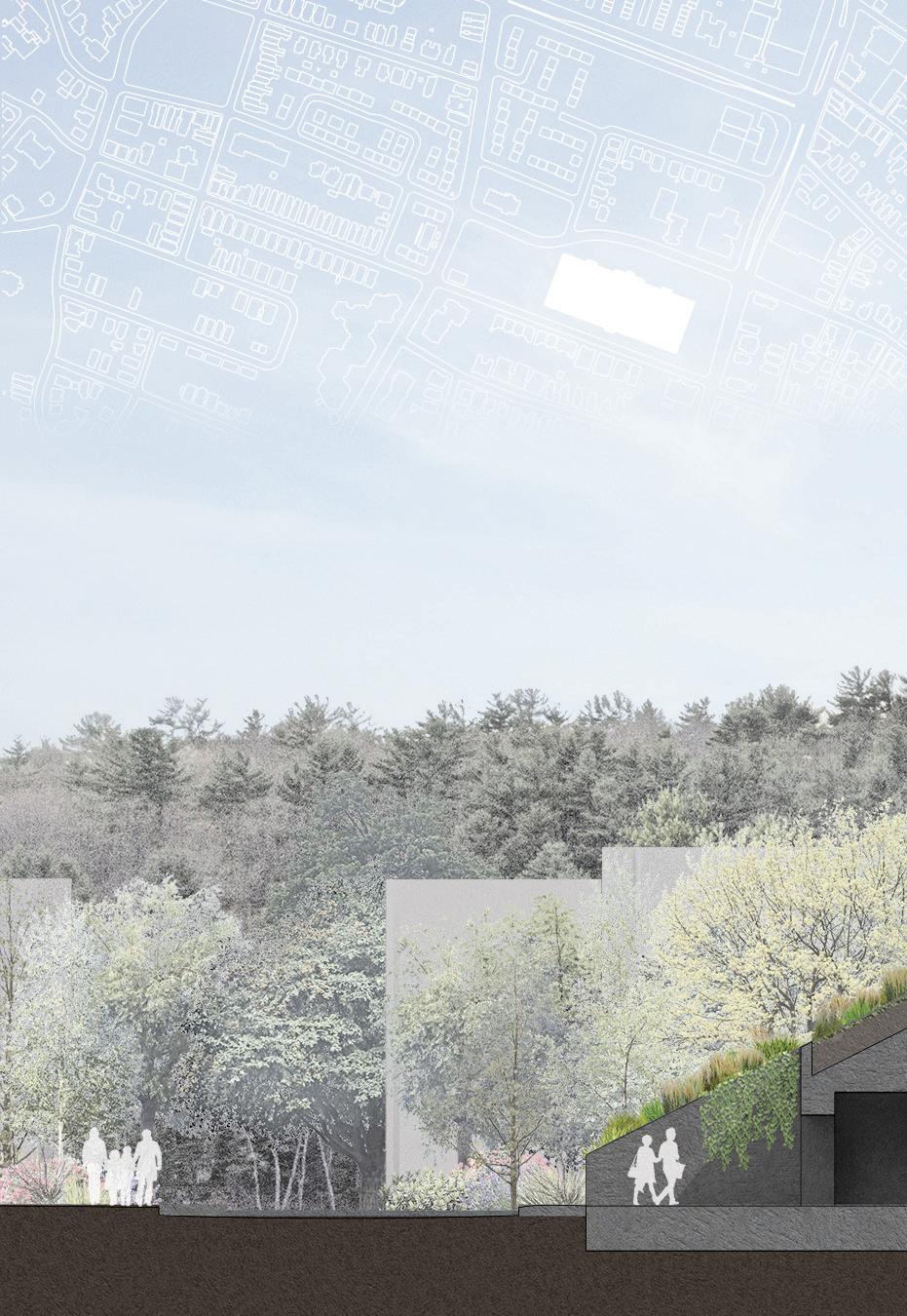
SPINE transforms the existing Stony Brook Sewer Easement into a meaningful space of relaxation, contemplation, and ecosystem rehabilitation. The existing site onsits of a wide, direct asphalt path from Fenway to Hemmenway Street. Two rows of oak trees flank the path along with a few street lights. The southern side of the site is flanked by a Northeastern University academic building, and the northern side by apartments. Underneath the site, unseen, is a culverted river that eventually empties in the Muddry River, just across the street.
A primary purpose of the new design is to connect the Northeastern Campus to the Back Bay Fens park. To do this, it’s essential that the park become a special place in its own right, and not a mere space of transition like it is today. Because it is separated from the university and the park by roads, it is an island of its own and therefore has the opportunity to grow into something special and unique.The park achieves this balance of unique identity and relation to its neighboring programs through three primary tactics: hydrology, vegetation, and circulation.
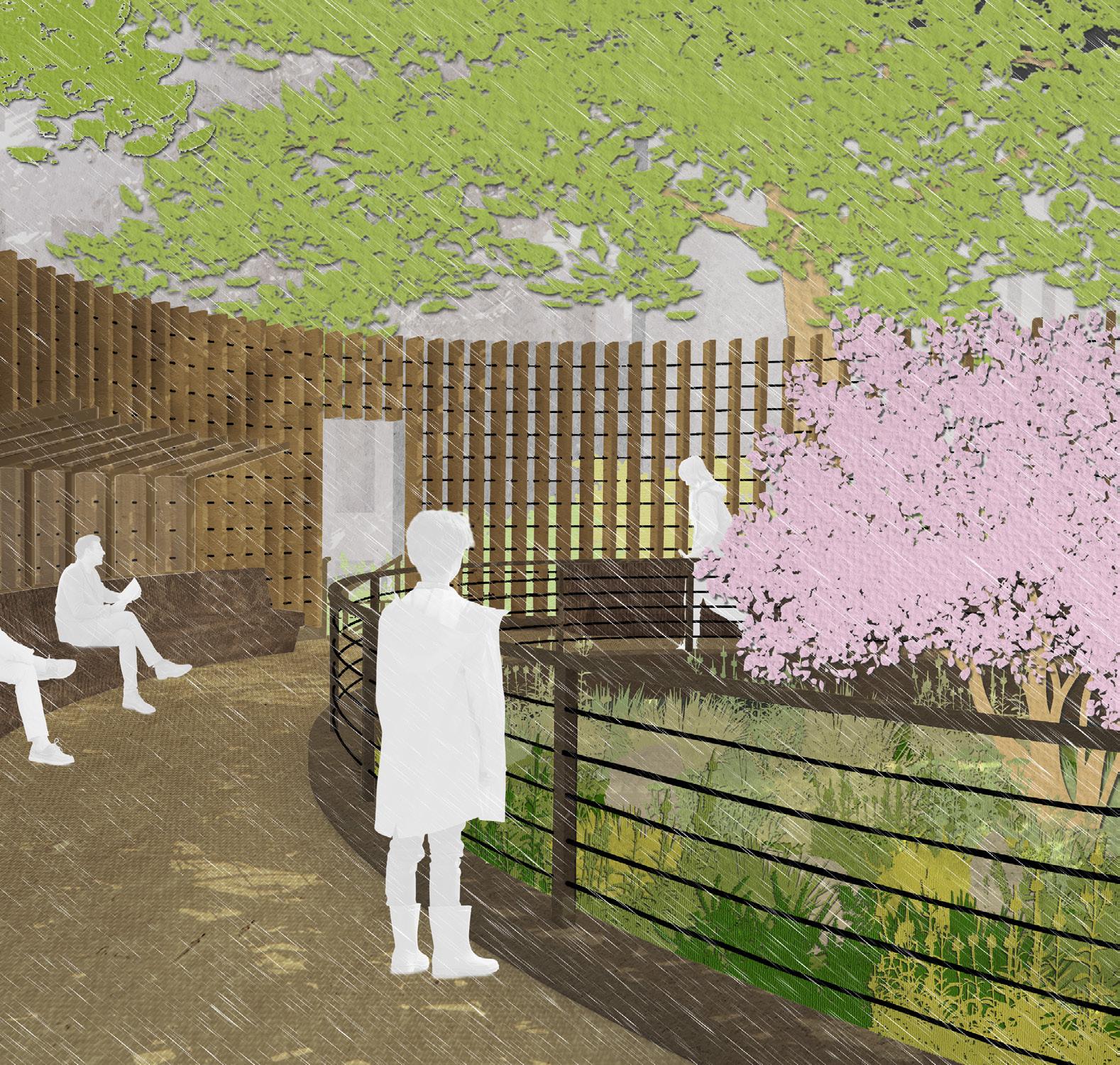
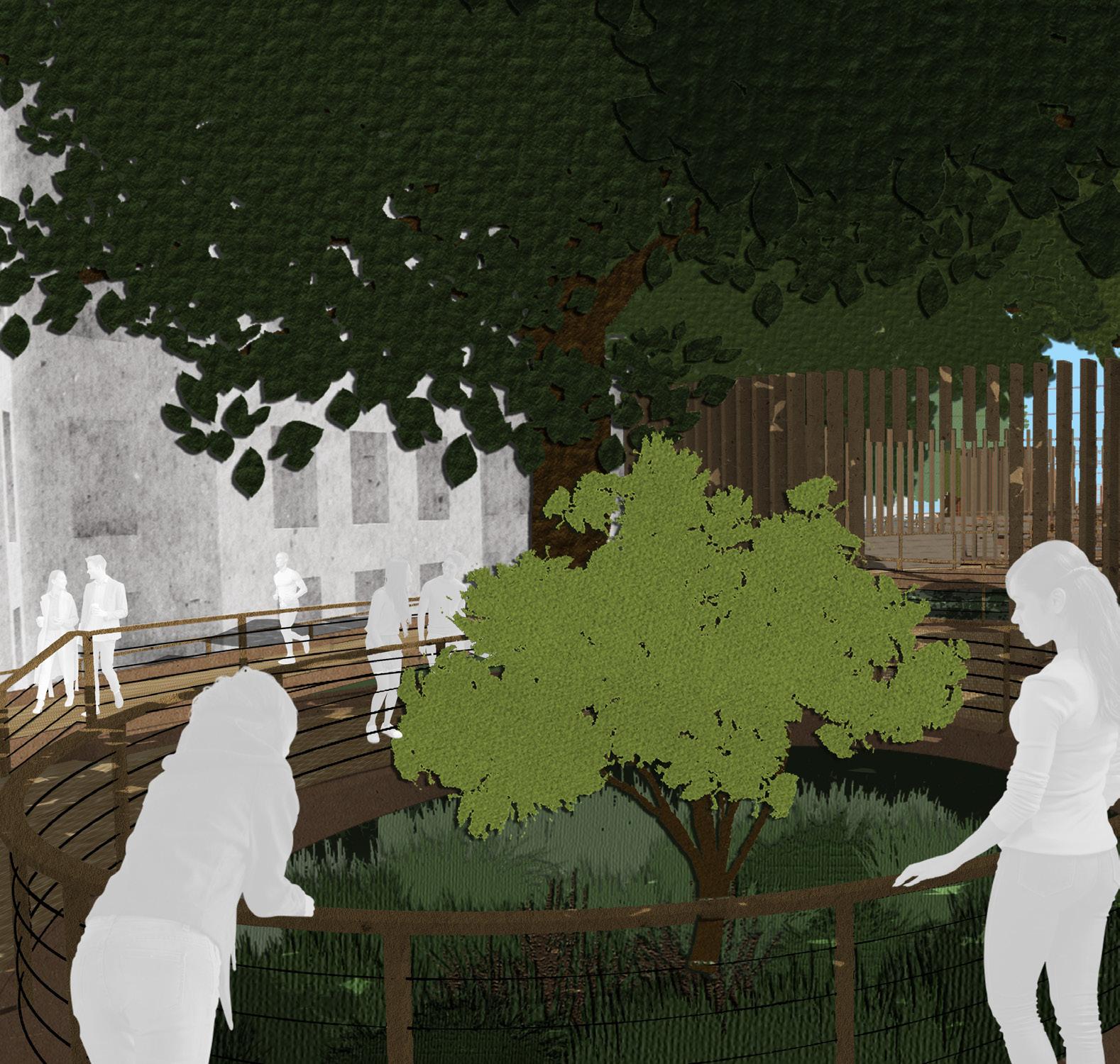
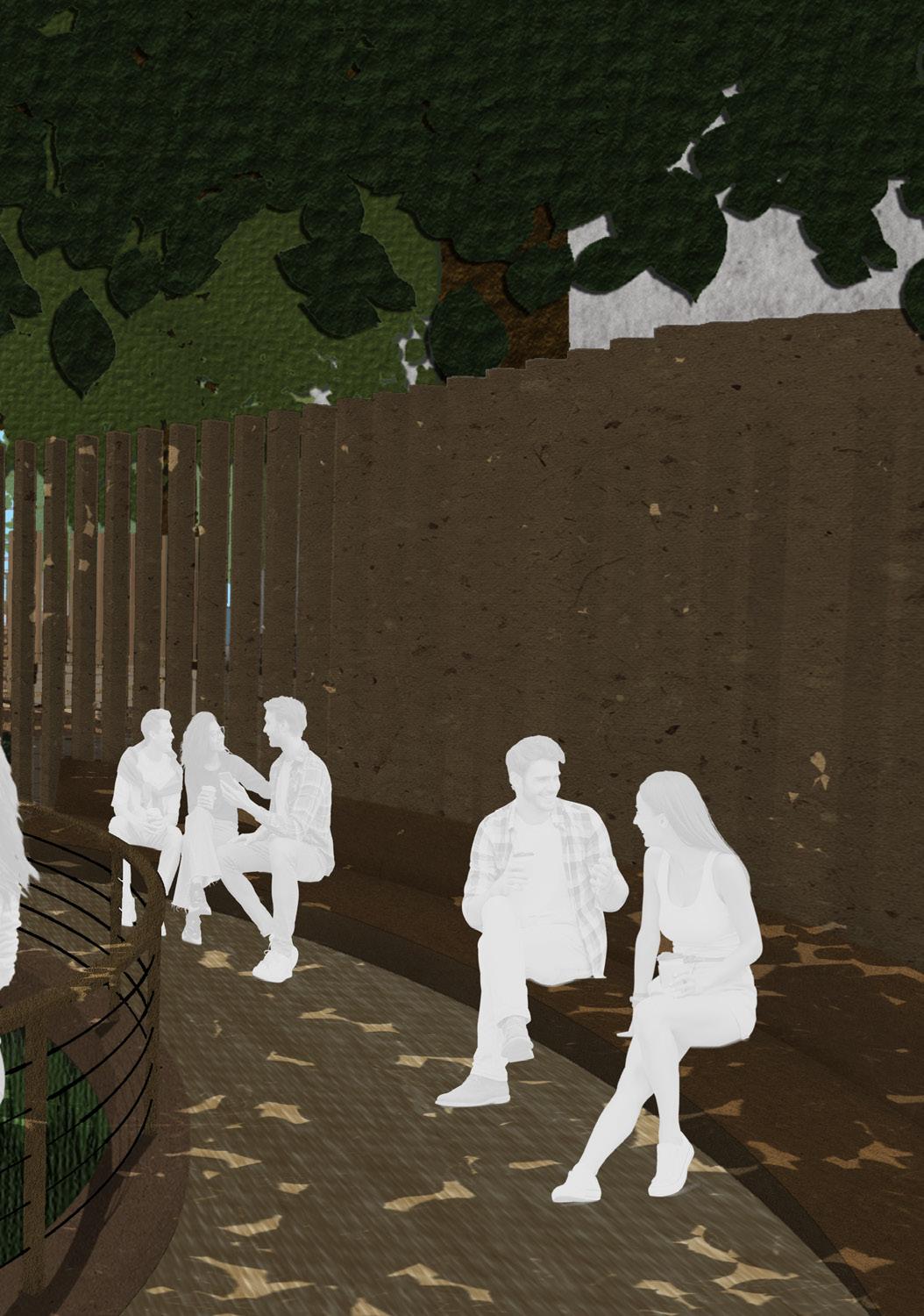
A series of dry-wells are dug to assist in storm water management and water filtration, while also acting as a nod to the culverted river that runs underneath. In each of these basins, an island filled with native plants rises up, adding to the forest-like atmosphere already created by the towering pin oaks. Circular boardwalks with benches and the occasional overhang for shelter surround these islands, allowing for slow meandering and places of rest. Finally, tying each space together and again appealing to the idea of a miniature forest, is a spine of slender wood columns that snakes through the site and lends the park its name.
53


54
CONDITIONS & CONTEXT
The Stony Brook Sewer Easement juts off of the park and abuts the Northeastern Campus to the south. Although isolated by roads, it is similar to the adjacent park in that it is also shaded and has a culverted stream running beneath
it that empties first into the Muddy River and eventually into the Charles River. It is also an important circulation path in the neighborhood, connecting the university to the park and the city beyond.
 PHRAGMITES
DREDGING
DAYLIGHTING
PHRAGMITES
DREDGING
DAYLIGHTING
55
STONY BROOK SEWER EASEMENT
DAYLIGHTING


Prior to 2016, 2 72” culverts carried the water along this section of the park. Now, the river has been exposed to the air, which boosts the health of the ecosystem and provides greater room for expansion in the event of a flood.
DREDGING PHRAGMITES


Phase 2 of the restoration project will remove ~71,000 cubic yards of sediment from a 15’-30’ channel running the length of the park. The soil will be dried on-site and then relocated inland.

Phragmites are an invasive species that’s clogging up the river. Phase 2 of the project will remove all phragmites, providing a chance for native flora and fauna to thrive while also increasing the watercarrying capacity of the river.
56
EXISTING SITE PLAN
A MORE ACTIVE REDESIGN
HYDROLOGY
To continue the water management efforts of the Muddy River Restoration project, dry river beds are dug along the center of the park. The approximately 8,000 cubic feet of excavated earth is redistributed around the site, some into islands in the middle of the river beds, and some along the edges, to funnel water runoff into the center wells.
The Muddy River is in the middle of a multi-year restoration project, which includes operations such as daylighting, dredging, and removal of invasive phragmites. The goals of this project are not only aesthetic, but also functional. Once complete, the Muddy River and Emerald Necklace should better be able to filter pollutants, assist in storm water management, and provide habitat for local flora and fauna.
The goals and tactics of the broader park restoration efforts are mirrored in the design of this new park in the Stony Brook Sewer Easement.
VEGETATION
The existing pin oaks are left untouched. Three of the original trees have been replaced at some point over the years, but they will be left to grow until the arboreal colonnade is complete again. These ten trees will be supplemented by other native, low-maintenance trees, bushes, and grasses to make the park feel like a miniature forest sanctuary in the middle of the city.
CIRCULATION
The existing direct linear path through the site is shifted north between the buildings and first row of trees. A second, slower circulation path consists of a series of four circular boardwalks that surround the wells and forested islands. Elevated boardwalks were chosen over traditional paths to minimize the amount of impervious surfaces. The fire exit from the southern building is maintained.
N
57
58
Hemenway St N 10’ 59

60
6:00 AM 10:00 AM SUN STUDY SECTION 61
2:00 PM 6:00 PM 62
SPRING
Even during light spring showers, small pavilions covering portions of the benches allow users to continue to enjoy the park. The shelters are made of wood and glass so they don’t darken the naturally shadowed site.

63
64
65
SUMMER
Dark leafy trees provide plenty of cool shading during hot summer afternoons. Long benches circling the perimeters of the boardwalks present opportunities to pause and take a rest.
66
FALL
Bright reds, oranges, yellows, and golds of fall foliage complement the rich wood tones of the boardwalks and wooden spine. Here, the relationship between the linear direct path and the circuitous circular ones, and how both weave between the pin oaks, is apparent.
67
68
69
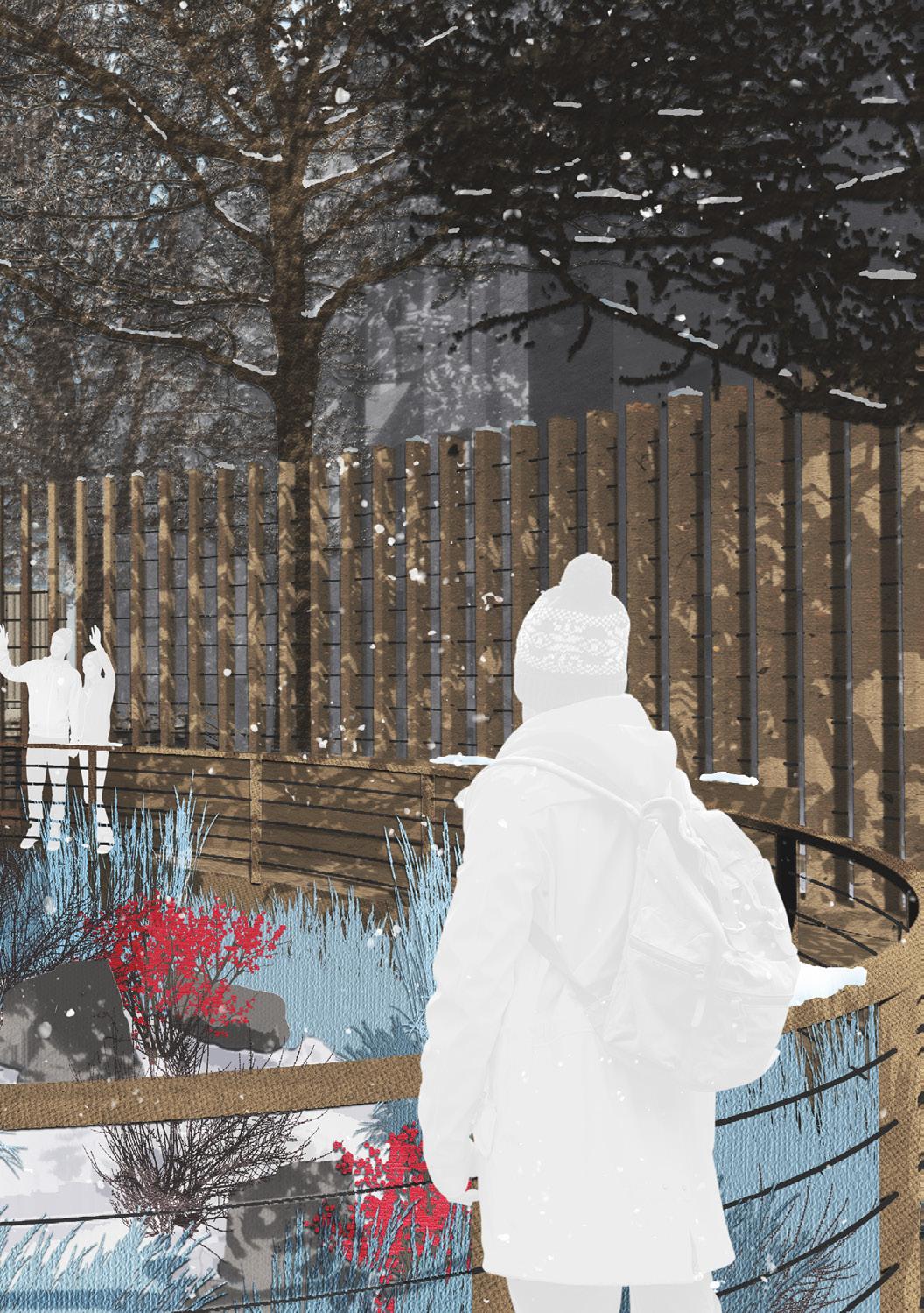
WINTER
Even when all the leaves have fallen off the trees and the days have turned grey and bleak, winter-berries provide bright colors in the park. Snow collects on the different surfaces, adding further depth and texture to the experience.
70
71
72
ZIG-ZAG
GRADUATE SKILLS STUDIO
SPRING 2022
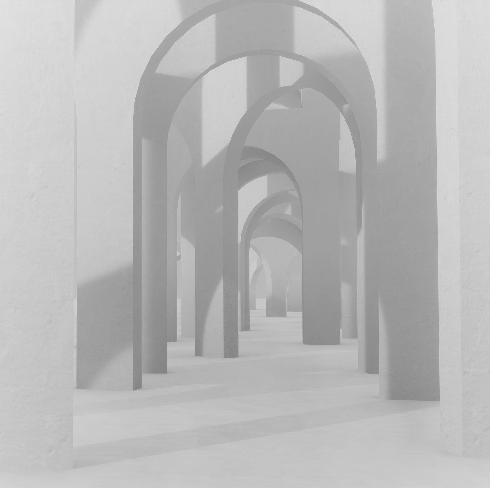
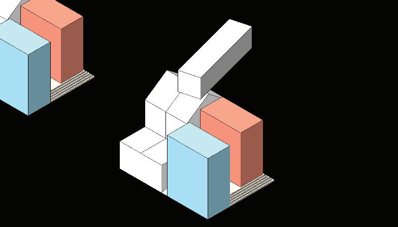
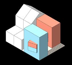
ZIG-ZAG is a mixed-us project in Boston’s Fort Point neighborhood consisting of a library in the southeast corner and a community athletic center in the northwest corner. Connecting the two projects is a zig-zagging spine, which dances across the site and coalesces at either end to form the aforementioned programs. The spine not only ties the site together and connects the waterfront with the historic neighborhood, but also provides a playful folly for visitors to interact with as they travel throughout the parking-lot-turned-park. The zig zag itself is made out of modular prefabricated concrete elements, which can be arranged in a variety of ways, and readily assembled on site.
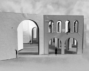
The library, which was imagined as the first phase of this development, is carved out of overlapping lengths of the zig zag and is primarily concerned with the experience of traveling across and through a series of arches. The library is more than just a repository for books, but also houses dedicated offices and meeting spaces for community organizations.
The athletic center forms at the other end of the site, and starts with the same language of the library, but offers a reinterpretation. Here, the experience is centered on traveling along the zig zag path, with arches used as a framing device for the variety of programs nestled within the open spaces made by the spine. Just as the library is more than just a library, the athletic center also aims to offer more to the community by providing spaces for childcare services, as well as a full floor of residential units.

73
74
Fort Point Channel

BinfordStreet
NeccoCourt
AStreet
N 10’
75
DIAGRAMMATIC MODELS
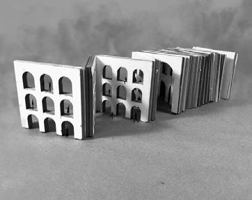
This project drew inspiration from an early diagrammatic model.
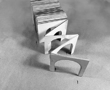
It consists of a series of folded panels, each progressively thicker than the previous one.
Each panel also contains a different pattern of arches at various scales.
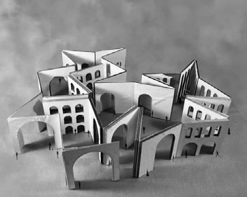
The model can be folded in a variety of ways to create interesting moments between the angles and arches.
SITE & NARRATIVE
Acknowledge I-95 running below and across the site.
Connect the waterfront to the adjacent neighborhood.
FORM & ORGANIZATION
Slow down circulation across the site.
Create open and closed spaces throughout.
Strategically dance across the subterranean highway.
Final Zig-Zag, expanding and contracting across the site.
The basic building block is a 12'x12'x12' cube.
It borrows the arch from the adjacent historical buildings.
Each block is made of prefabricated components.
Modules can be arrayed linearly or stacked vertically.
Larger modules retain the same original proportions.
76
LIBRARY 77
NARRATIVE
The library starts with a repeated series of the the standard 12'x'12' module of prefabricated arches. They are arranged horizontally and stacked vertically.
The 12' arch spacing is maintained, creating a variety of unique openings and spaces as modules overlap. Some arches are combined into larger openings, but the same underlying 12' pattern remains unbroken.
The blocks are rotated on alternating ends to achieve the site's zig zag pattern. The angles of the rotation are informed by the available locations for footings given the highway that runs underground through the site.
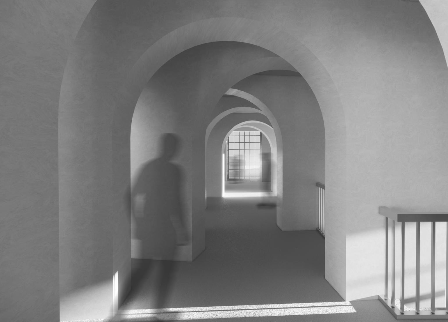
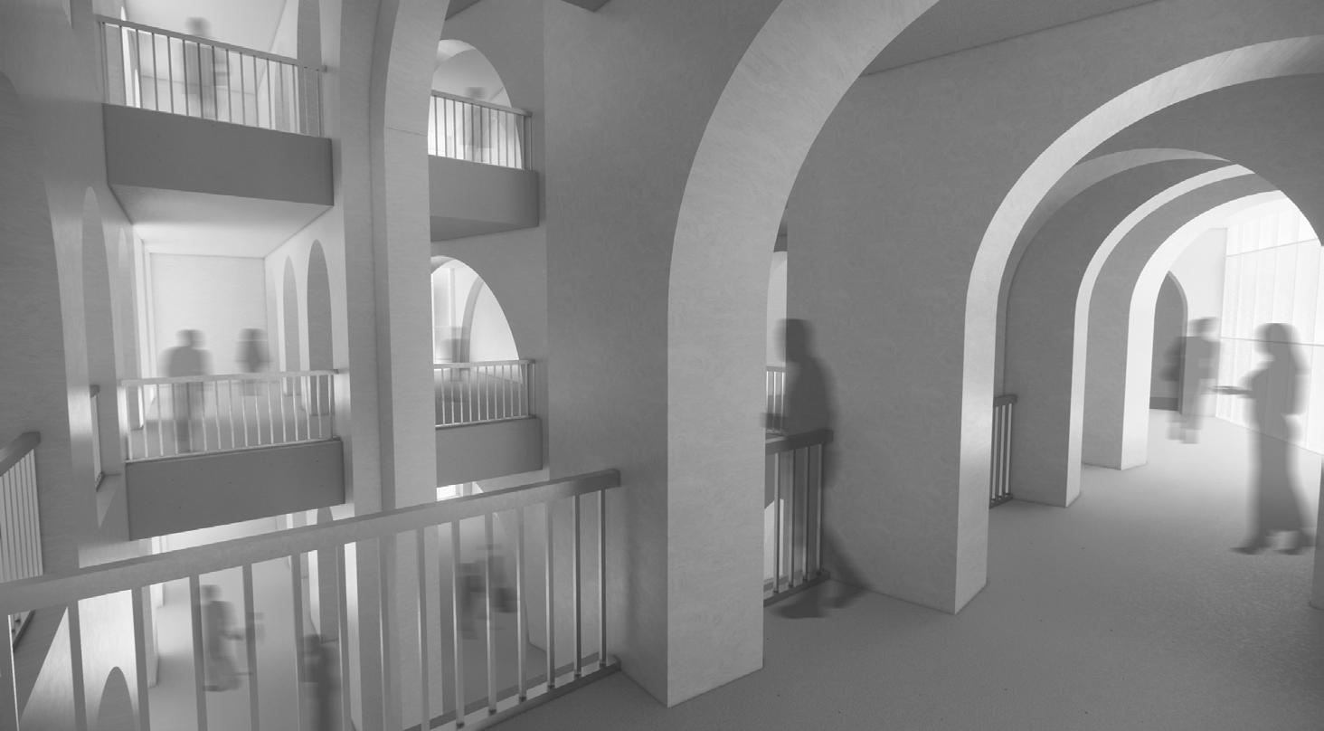
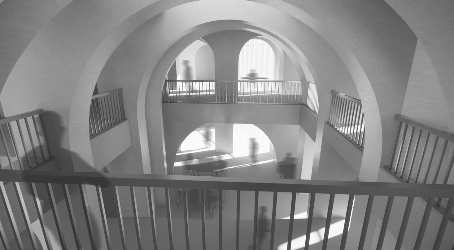
The experience of the library becomes one traveling perpendicularly through a series of arches, and of opening and closing spaces. The exception is the 4th floor, where the external path along the zig zag continues into the library, and the experience is flipped to one of travelling along the spine.
78
Primary Program BOH, MEP, Services Vertical Circulation BASEMENT GROUND SECOND
1. Bike Storage
2. Loading Dock and Trash
3. Houseless Re-entry and Career Services
4. Circulation: Special
5. Re-shelving
6. Front Desk
7.
Circulation: AV / Digital
8.
Circulation: Periodicals
2. 1. 3. 4. 5. 6. 8. 7. 9. 10’ N 10’ 10’ 10’ THIRD 79
9. Staff Lounge
 FOURTH
10’ 10’ 10’ 10’ 80
FIFTH ROOF
81
View from second floor atrium
82
View from fifth floor reading room
Program BOH, MEP, Services BASEMENT GROUND SECOND 10’ 10’ 10’ THIRD 83
Primary
E G H
1. Outdoor Ambulatory
2. Cafe
3. Circulation: Non-Fiction
10’ N 1. 2. 3. 3. 3. 4. FOURTH FIFTH ROOF 10’ 10’ 10’ 10’ 84
4. Reading Room
85
86
87
88
89
ATHLETIC CENTER
NARRATIVE
The athletic center also starts with the standard 12'x'12' module, continuing on from the library across the site.
The zig zag is opened up, emphasizing the in-between spaces and allowing room for program to infill. This provides built-in opportunities for phasing, allowing development timelines to better aling with budgets.
The 12' spacing is still maintained, but this time the zig zag path never overlaps. Arch sizes, still in 12' intervals, corelate to the size of the spaces and programs they overlook.
The experience of the athletic center is one of traveling horizontally along the zig zag, with vertical circulation and MEP running through the corners, and programs nestled in the larger open spaces.
90
91
Connecting all three of the primary program spaces is the zig-zagging spine. The central section of each path is raised slightly up above the floors of the abutting programs, providing people along the route with a different perspective, as if upon a city wall. To enter each program, users travel along the zig zag, and as they turn the vertex, they descend along a ramp, changing direction in the X, Y and Z planes. The change in direction coincides with and highlights the change from circulation zone to program space.
The inserted primary programs between the corners of the zig-zag offer opportunities to experiment with materials and facades. Here, three different approaches are taken, each providing not only a distinct and varied aesthetic for its part of the building,but also a method for shading and privacy. From left to right in the central diagram are a crisscrossing GFRC facade, a skin of slender vertical wood slats, and a thick, perforated brick masonry shell.
92
BIRDS EYE VIEW
GROUND FLOOR
The ground floor contains the lap, diving and childrens' some BOH programs. On plan right, an open-air skate accessed from a path that starts plan-left and slopes
10’ N
The view of the athletic center and housing block from above, looking east. The primary programs nestle between the prefabricated concrete spine, which starts at the Fort Point Channel and continues across the site, eventually coalescing into the library.
93
childrens' pools, locker rooms, rock-climbing wall and skate park is carved into the ground, which can also be down along the zig-zag.
SECOND FLOOR
On the second floor, a viewing area over looks the double-height pool space and the rock-climbing wall continues to stretch through the central atrium. Here are also squash courts, fitness studios, and a basketball court. The zig-zag spine on this floor mostly runs outdoors, eventually leading to the library.
10’ N
94
THIRD FLOOR
INTERIOR RENDERINGS
a
10’ N
The third floor contains the primary cardio area, which looks out across the four-story high-dive space. Also on this floor are fitness studios (left), changing rooms (center), and boxing equipment on mezzanines above the basketball space (right).
95
Above,
view from outside the thifd floor locker rooms, a perspective along the indoor track on the fourth floor, atrium on the left. The windows of the apartments are
rooms, looking out across the central atrium. Below, floor, with yoga studios on the right, and the central are just visible beyond the atrium's skylight.
FOURTH FLOOR
Here, an indoor track breaks up the usual circulation pattern, cutting across the zig-zag, but still fitting neatly within the pattern of arches of the 12' module. This floor also contains additional cardio equipment, locker rooms, a yoga studio, and a weight room.
10’ N
96
FIFTH FLOOR
The fifth floor is where the building begins to transition from athletic center to a community and residential space. There are offices for the gym, but also childcare spaces for a range of ages, and work spaces for the building's residents.
SIXTH FLOOR
The top floor is residential, containing studio, one-bedroom, communal laundry spaces and exterior courtyards.
10’ N 10’ N
97
INTERIOR RENDERINGS
one-bedroom, and two-beroom units. There are also
98
Above, a view from the fifth floor looking down and out onto the weight room on the fourth floor, and across at office space on the fifth floor. Below, a sample living area of an apartment, demonstrating how the perforated masonry facade can be configured to emphasize views or shading.
99
SOUTHERN BLOCK
The southern most wing, clad in the criss-cross of GFRC panels, floats above a skatepark that has been carved out into the ground. Stacked above this are basketball courts, mezzanine levels with boxing equipment, a weight room contained within an indoor track, work spaces, and apartment units. A lightwell on the left side of the section illuminates the interior of the building. The different floors within this wing shift as they stack, allowing obvservation and light into spaces below. Finally, in the background is the zig-zag spine, the arches in which corelate in size with the programs they abut.
100
CENTRAL BLOCK
The middle space, with the masonry facade, has underground space for outdoor activities, locker rooms, a central atrium with a circular stair and rock climbing wall, squash courts, fitness studios, gym BOH programs, and apartment units. Running along the outside of the squash courts on the second floor is the exterior path along the ziz-zag spine that starts at the Fort Point Channel and continues on to the library at the other end of the site.
101
102
103

NORTHERN BLOCK
The northern-most block, adjacent to the Fort Point Channel, is clad in timber and holds the pool spaces, cardio room, child care programs, and apartment units. On the far left of th section is the public path that starts near the waterfront and winds underneath the building, along the zig-zag, and out to the skatepark on the other side. The shapes and sizes of the floor plates in this section are largely informed by the requirements of the 4-story high-dive space on the right of the section.
104
ACADEMIC EXERCISES
105
106
POSTCARDS
THESIS STUDIO
FALL 2023
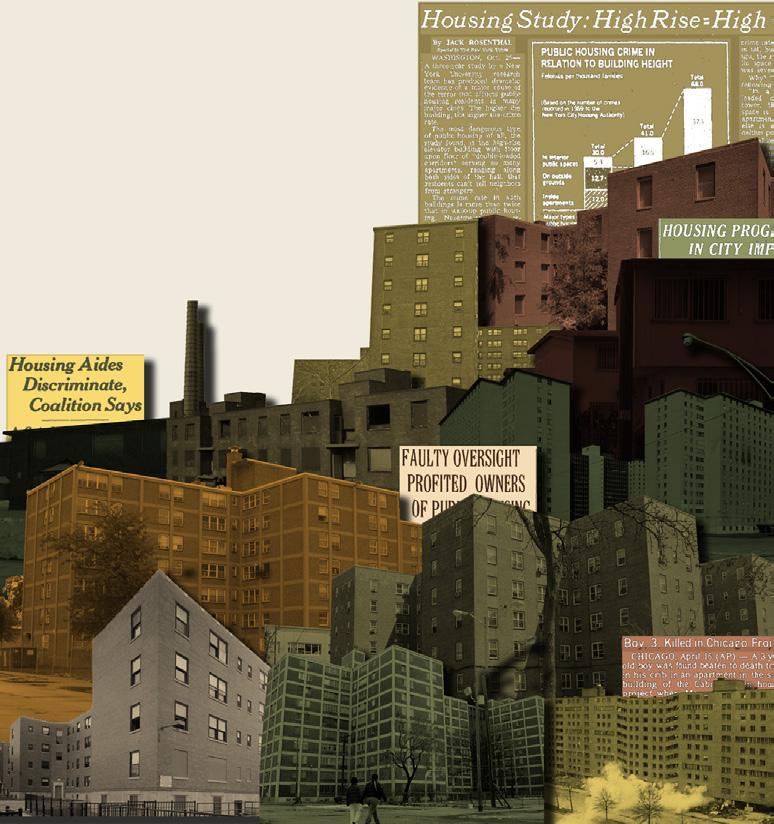
The fall 2023 studio, Public Housing: Confronting Apathy Through Image and Influence, began with a precedent study that took particular interest in how we, as architects draw and represent buildings. The facade is often how the public experiences a building, but it is rarely in the perfect condition in which it is portrayed in architectural marketing materials. With that in mind, students were encouraged to make these drawings exhibit signs of age, wear and tear, and as if they were actively lived-in.
In addition to representation, these precedent studies also included copious data collection and analyzation, so that buildings’ underlying logics and information could be compared between various public housing projects. This included metrics for privacy, density, daylight access, efficiency, collectivity, and oudoor access.
In the end, each precedent study was neatly packaged into a postcard, with one side displaying a line drawing of the facade, and the other a typical floor plan, a unit floor plan, and the precedent’s data. In total, 50 different post card were produced, providing a solid base of usable research for the remainder of the studio.
oa d e c p da 85 viviendas sociales en cornellà Peris+Toral.arquitectes 107
by Kevin Alloway
barcelona, spain
unit area: 840 sf
4’
7
far
6.0
number of units typology
housing tenure
public
number of stories 8’
85 courtyard
program
building area climate
mixed-use
137,940 sf mediterranean
density [d]
collectivity [c] efficiency [e]
outdoor access [oa]
privacy [p] daylight access [da]
cornellà
108
oa d e c p da gifu kitagata apartment building SANAA gifu, japan by Kevin Alloway 109
unit area: 674 sf
4’
10
number of stories 16’
far housing tenure
1.7
number of units typology
public
107 linear block
program
building area climate
single-use
131,680 sf humid subtrop.
density [d]
collectivity [c]
efficiency [e]
outdoor access [oa]
privacy [p]
daylight access [da]
110
by Kevin Alloway
Müller.Feijoo ourense, spain
oa d e c p da viviendas públicas vilar
3 & 5
111
unit area: 563 sf
4
far housing tenure
2.7
number of units typology
3’ public
number of stories 8’
3 row house
program
building area climate
mixed-use
3,900 sf mediterranean
density [d]
collectivity [c] efficiency [e]
outdoor access [oa]
privacy [p] daylight access [da]
112
SUNDIAL
STRUCTURES
FALL 2022
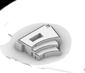
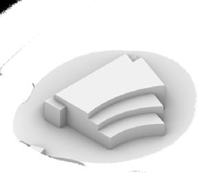
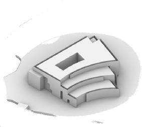
The SUNDIAL is a proposed wooden pavilion on Northeastern’s Centennial Common. The overall ring shape drew inspiration from the curved edges of the quad, and the individual wedges that array around the pavilion’s center and comprise the ring, were informed by the multitude of paths that converge at this spot.
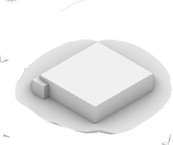
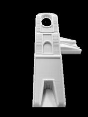
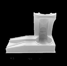
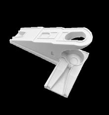
The nature of these wedge-like segments also lent the pavilion its name. Just as a sundial is divided into 12 sections, so to is the pavilion. Furthermore, the tilting and splaying of each segment’s roof creates strong patterns light and shadow, also reminiscent of a sundial’s function. The importance of lighting extends to the structural design as well. Given the relatively short spans in this project (approximately 20’ at the longest), each roof could have been supported with solid 18” deep glulam beams. Instead we opted for a series of trusses comprised of smaller, thinner members, which create an airier atmosphere and allow for a fun play of shadows as the sun path moves throughout the day.
The roof and deck provide some shelter from the elements. The 12’ walkway provides program space for people to study, for clubs and organizations to table, and for spectators to stand during a show or concert. On the inside of the ring, the grassy field is as it was before, but inhabitants now have a greater degree of privacy as the pavilion shields them from the rest of the busy Northeastern Campus.
INITIAL
H K L 27’-6” 5’-0” 2’-0” 9’-9” 1’-6”4’-0”1’-1” 2’-2” 8’-10” FINAL DESIGN 113
CONCEPTS
STRUCTURE & COMPONENTS
Roof: 3”:
• 3” T&G decking. Avg length ~4.5’. Longest piece is 9.5’ (3’ Cantilever).
Roof supports:
• 5, 4.5” X 8” beams. Spaced ~3.5’ apart at inner edge of roof, ~6’ apart at outer edge of roof
Trusses:
• 3 trapezoidal trusses, made of 4” x 6” members.
• Large truss: span ~ 21’, height ~6.5’
• Middle truss: span ~18’, height ~5’
• Small truss: span ~15’, height ~4’
Columns and Girders:
• Columns are 12”’x12”’, 11’ OC along grid-lines A-L, 15’ OC along grid-line 1, and 21’ OC along grid-line 2
• Girders are 12” x 18”’ x 10’
Floor:
• 3/4” decking on top of 3/4” sheathing
• Floor beams are 4.5 ” X10” x 10’, 6.5’ OC along grid-line 2
• Floor joists are 2”x8”, 2’ OC
15’-0”TYP 20’-8” 11’-0” 11’-0” TYP TYP TYP G B D E 1 2 17’-2” 14’-9” 6’-8” 3’-3” 3’-5” 3’-9” 9’-6” 5’-10” 5’-7” 5’-6” 26’-5” 23’-0” 14’-9” 17’-11” 15’-0” 3’-3” 3’-2” 3’-4” 3’-9” 13’-9” 15’-2” 16’-9” 5’-4” E E E 1 2 17’-2” 14’-9” 6’-8” 3’-3” 3’-5” 3’-9” 9’-6” 5’-10” 5’-7” 5’-6” 26’-5” 23’-0” 14’-9” 20’-8” 17’-11” 15’-0” 5’-6” 5’-6” 3’-3” 3’-2” 3’-4” 3’-9” 13’-9” 15’-2” 16’-9” 18’-7” 21-0” 6’-3” 5’-7” 5’-4” 5’-4” 1’-0” 10’-0” 1’-0” 10’-1” 2’-3” 2’-0” 2’-0” 2’-0” 2’-3” 15’-0” F F E F 1 1 2 1 17’-2” 6’-8” 3’-3” 23’-0” 5’-6” 5’-6” 3’-3” 3’-2” 3’-4” 3’-9” 13’-9” 15’-2” 16’-9” 18’-7” 21-0” 6’-3” 5’-7” 5’-4” 5’-4” 1’-0” 10’-0” 1’-0” 10’-1” 2’-3” 2’-0” 2’-0” 2’-0” 2’-3” 11’-0” 15’-0” 20’-8” F E F 1 1 2 2 1 17’-2” 14’-9” 6’-8” 3’-3” 3’-5” 3’-9” 9’-6” 5’-10” 5’-7” 5’-6” 26’-5” 23’-0” 14’-9” 20’-8” 17’-11” 15’-0” 5’-6” 5’-6” 3’-3” 3’-2” 3’-4” 3’-9” 13’-9” 15’-2” 16’-9” 18’-7” 21-0” 6’-3” 5’-7” 5’-4” 5’-4” 1’-0” 10’-0” 1’-0” 10’-1” 2’-3” 2’-0” 2’-0” 2’-0” 2’-3” 15’-0” E F E E F E 1 1 1 2 1
2’-2” 8’-10” 2’-2”
8’-10”
2’-2” 55’-10”
82’-2” 5’-0” 13’-4”
27’-8”
1. 2. 3. 4.
*Design was developed in partnership with Yue Xiao, but work herein is my own. 114
5.
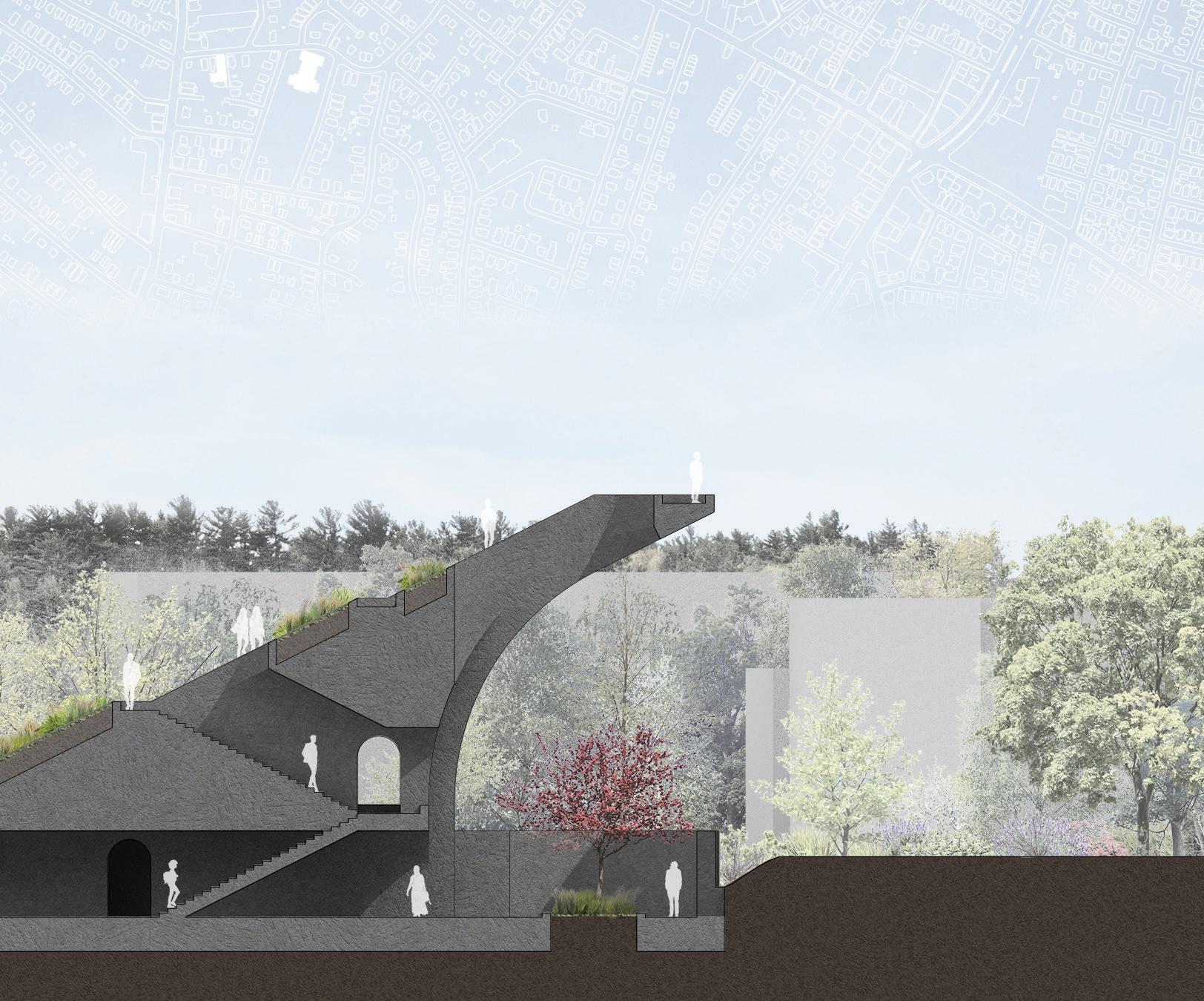
TOWN MONUMENT
OPTION STUDIO
PUBLIC LAND FOR PUBLIC GOOD FALL 2022
As a warmup exercise for the semester, and to begin to get familiar with the site, each student was assigned a plot on which to develop an experimental proposal. In addition to being allocated a piece of land, each student was randomly assigned a series of attributes and adjectives which had to be incorporated into the design. This project was meant to embody the words: “physical”, “recognition”, “acceptance”, and “air”.
This monolithic installation was intended to be a strong “physical” presence in the neighborhood, but it’s slender outcropping that rises into the “air” and above the streets give it a lightness that contrasts with its heavier, grounded base. The monument itself is situated between two schools, the local public elementary and one of Boston’s premier magnate K-12 schools. The series of staircases built within the installation allow visitors to move up and above the treeline and rooftops, “recognizing” the proximity yet disparities between the two schools, but the return set of stairs on the other side only allows them to ambulate back down to the groud and “accept” the situation as is.
115
116
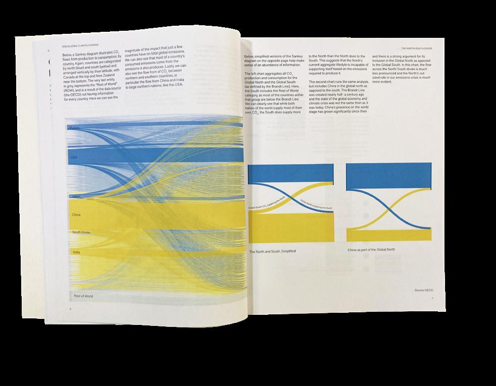
VISUALIZING CLIMATE CHANGE
INFORMATION DESIGN
MAPPING STRATEGIES
FALL 2022
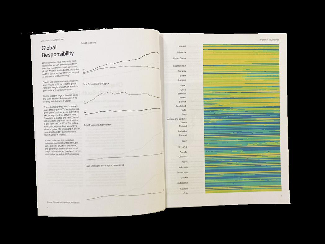
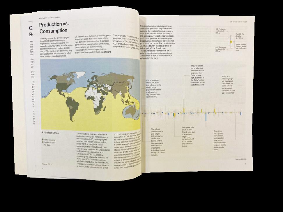
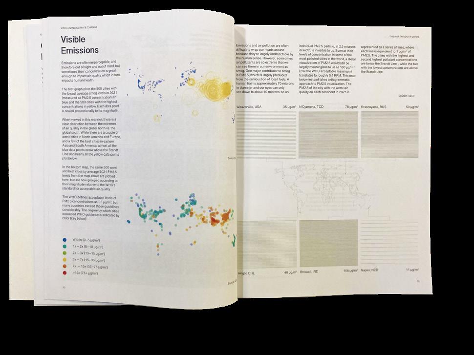
Visualizing Climate Change: A Collection of Visual Essays is a book of graphics conveying various themes around the subject of global warming. While the basis for the illustrations were researched and factual, the primary goals of the class were to think creatively about data representation and to improve graphic storytelling skills.
The book is divided into chapters, each researched, designed, and edited by a different member of the class. Samples of my contributions, which focused on climate change as it relates to the Global North vs. the Global South, are included here.
117


118
RECONNECTED
GRADUATE SKILLS STUDIO FALL 2021
RECONNECTED is a duplex in Boston’s Chinatown, situated just off the Greenway and adjacent to a future park. One half of the residence is for a young family and is designed around a “thick/thin” strategy, while the other is for a single artist and is designed as a free plan. The two houses are reminiscent of the traditional brick row houses of the neighborhood, but are opened up and elevated to provide community access to the site. Inspired by architect Ang Li’s installation on the site, stoop culture, which alongside the historic row homes has been disappearing in the face of gentrification, is reintroduced into the neighborhood via a stepped-plinth which invites community members to congregate and recreate on the site.
Brick is used in a nod to the neighborhood’s history with the building material, and it is incporporated differently into each house according to that residence’s design principle. For the thick/thin house, heavy brick walls are punctured to form windows and doors, while in the free plan, large swathes of the facade are covered by brick screens, which separate the walls from the structure.


1 5 1 8 9 2 2 10’ 1 1 8 9 2 2 10’
1. Studio
2. Bath
3. Flex
4.
Laundry Artist (Free Plan) Ground Floor
Continue precedent Elevate for privacy Rotate to face park Soften boundary Open up for community Reconnect Shift for access Final 119
Third Floor
120
6 3 4 7 7 6 5 11 10 3 8 10 3 9 2 2 2 2 2 4 10 6 3 4 7 7 6 5 5 11 10 3 8 10 3 9 2 2 2 2 2 4 10 6 3 4 7 7 6 5 11 10 3 8 10 3 9 2 2 2 2 2 4 10 6 3 4 7 7 6 5 11 10 3 8 10 3 9 2 2 2 2 4 10
5. Living 6. Dining
7. Kitchen 8. Primary Bed Plan) Family
9. Closet 10. Bedroom 11. Study
(Thick / Thin) Community
Second Floor
Fourth Floor
PROFESSIONAL
121
122

HOME RENOVATION
b Architecture Studio
Drawings from a partial home renovation located in a Boston suburb. The proposal was delivered via a product the firm calls a Schematic Design Booklet, which allows clients to enlist the services of an architect only during the earlier design portions of a project - to a point just beyond traditional schematic design.
Credit:
Modeling completed by multiple individuals. Drawings and renderings completed predominantly by me.

123
124
ARCHITECTURE
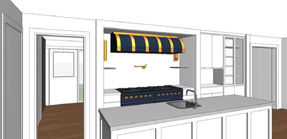
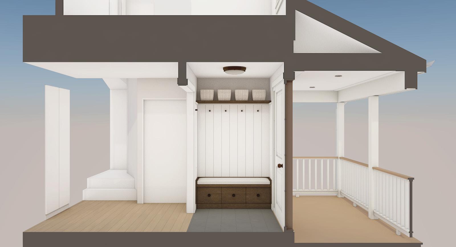
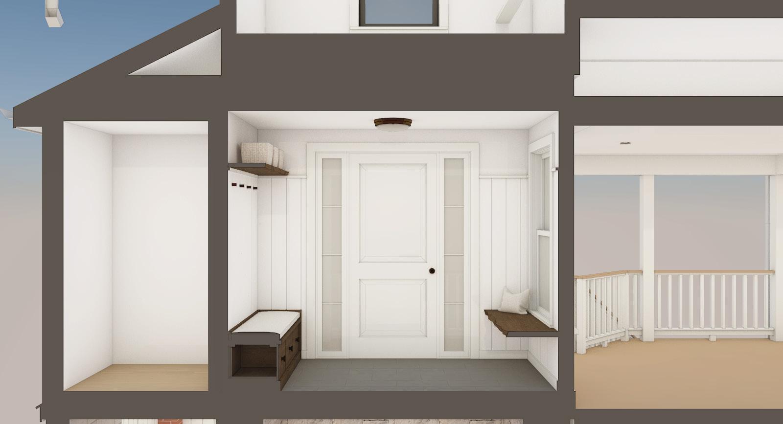
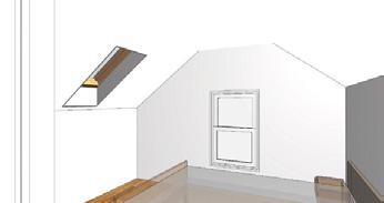
b Architecture Studio
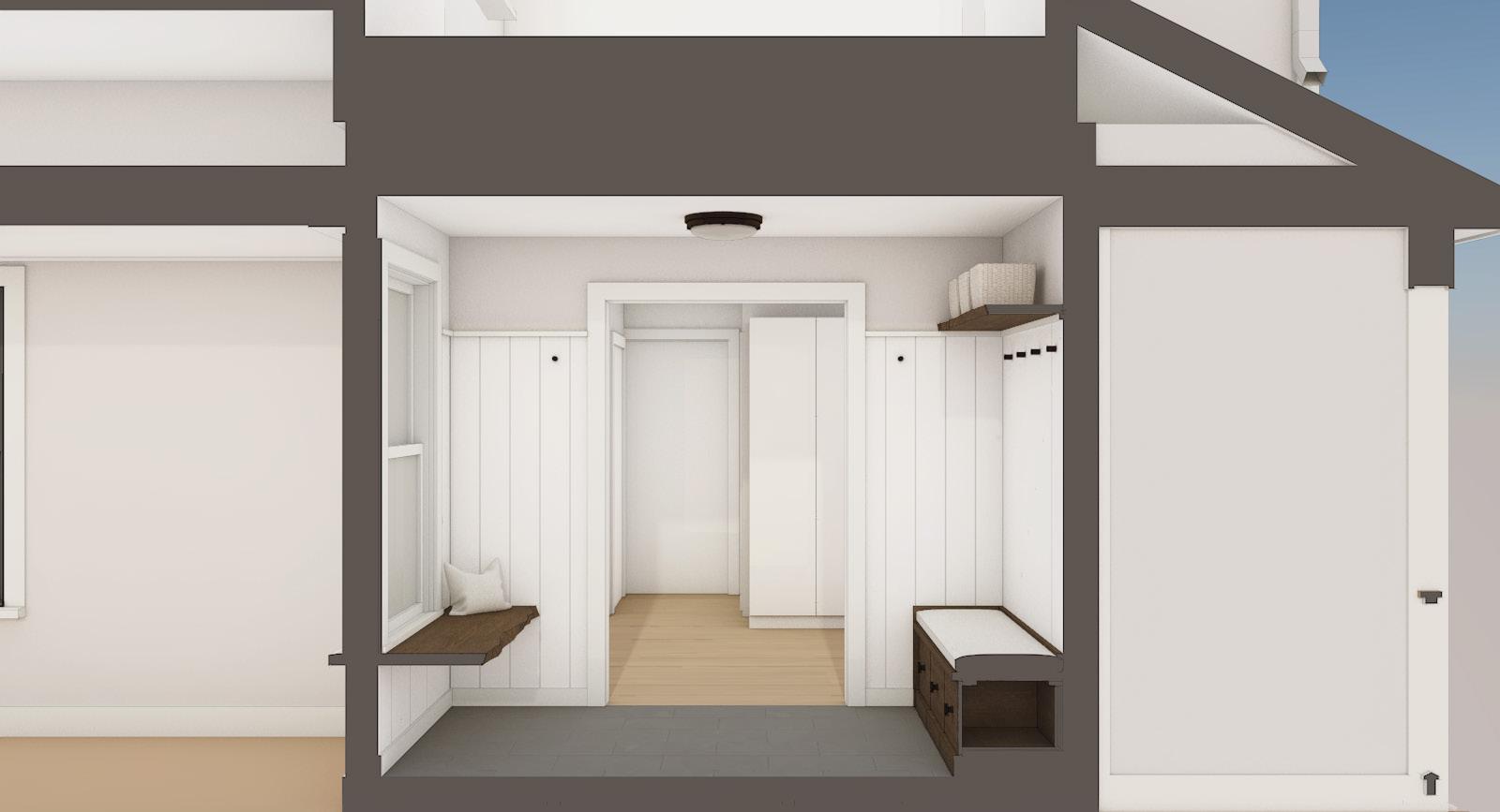
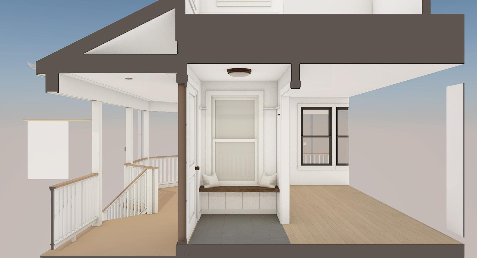
During the CA phase of a larger, wholehome renovation, clients in this Boston suburb asked for conceptual design drawings for a new mudroom entrance, to be completed in phase 2 of their project.
Credit:
Modeling and drawings completed by me.
1"
COAT
6"
CUSHION
BUILT-IN
VINE STREET ARCHITECTURE STUDIO INC
FOR CONSTRUCTION
- PLAN & RENDERS | 8/18/23 Winchester Osterville, MA 781.756.0515 SEE ISSUE FOR CONSTRUCTION DRAWING SET, DATED 12/16/2022, FOR ADDITIONAL INFORMATION 3 4 1 25.2 COAT HOOKS BENCH W/DRAWER STORAGE AT FLOOR LIVE-EDGE PLANK FLOATING SHELF LIVE-EDGE PLANK FLOATING BENCH PAINTED VERTICAL BOARDS W/ CAP AT ALL WALLS SCALE: 1/2" = 1'-0" 1 PROPOSED ENTRY PLAN NORTH EAST DESIGN NOTES: 0124 www.barchstudio.com 4 VINE STREET
4
NOT
5.1
STUDIO INC NOT FOR CONSTRUCTION
- INTERIOR ELEVATIONS | 8/18/23
Osterville, MA 781.756.0515 CL CL CL CL 1'-8" 4'-6" 1'-8" 3 1/2" 1'-1 1/2" 3" 4'-6" 1 1/2" 1" 1'-5 1/2" EQ EQ EQ EQ EQ EQ EQ EQ
5.2
Winchester
X 1" CAP W/ BEVELED PROFILE, TYP. PAINTED PLASTER FINISH, TYP.
HOOKS, TYP.
PAINTED FINISH,
WOOD SHELF W/ LIVE EDGE
WOOD BOARD W/
TYP. FLOATING
BENCH W/ DRAWERS. WOOD
MATCH SHELF
TO
ABOVE.
TYP. SCALE: 1/2" = 1'-0" 1
SCALE: 1/2" = 1'-0" 2 SOUTH SCALE: 1/2" = 1'-0" 3
SCALE: 1/2" = 1'-0" 4 NORTH 0124
FINISH PANEL,
EAST
WEST
MUDROOM CONCEPT
125
NORTH EAST
WEST
SOUTH
5.2 SEE ISSUE FOR CONSTRUCTION DRAWING SET, DATED 12/16/2022, FOR ADDITIONAL INFORMATION 5.1 www.barchstudio.com STUDIO INC CONSTRUCTION 8/18/23 MA | 781.756.0515 3 1 2 5.2 PROPOSED ENTRY PLAN
NOTES: BOARDS W/ CAP AND BASE TRIM FIXTURES TO MATCH DOOR HARDWARE BENEATH WINDOW W/ LIVE EDGE HOOKS, AND FLOATING SHELF 0 1 2 4 126

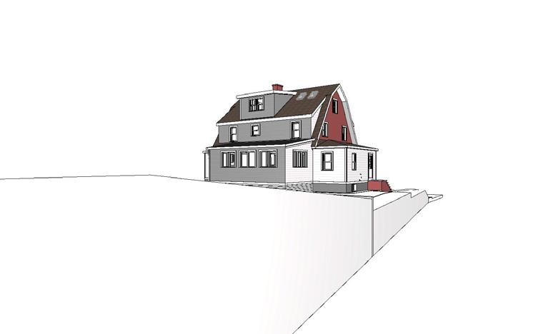
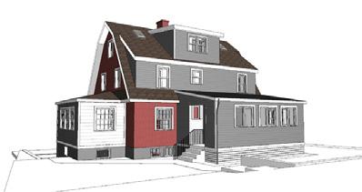
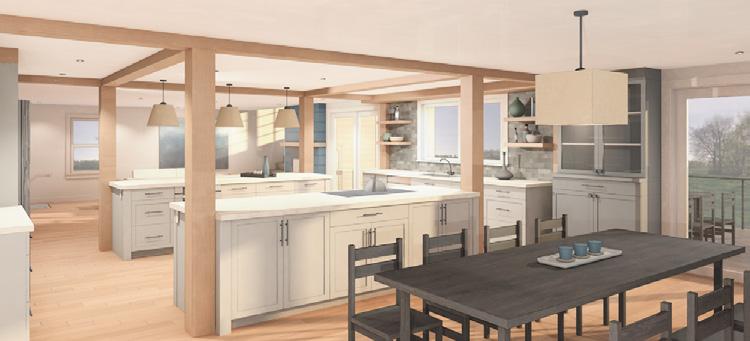
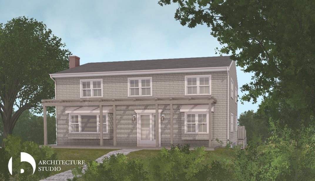
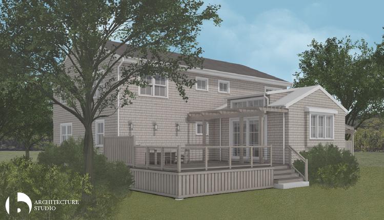
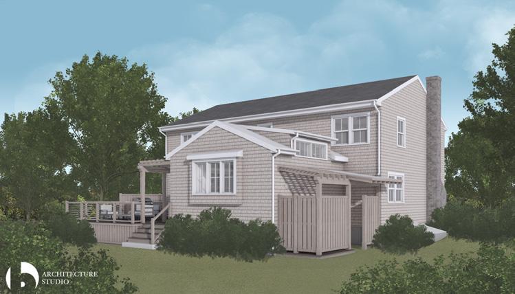
PROPOSED ADDITION
b Architecture Studio
After receiving an initial proposal for a substantial home renovation and attic expansion, clients in this Boston suburb asked for a revised project of a more limited scope. This proposal was able to meet many of their original goals while remaining concious of their budgetary concerns.
Credit:
Modeling completed by multiple individuals. Drawings and renderings predominantly completed by me.
www.barchstudio.com 184 LAWRENCE ROAD ARCHITECTURE STUDIO INC NOT FOR CONSTRUCTION SCHEMATIC DESIGN BOOKLET | 8/9/23 Winchester Osterville, MA 781.756.0515 W.I.C BED 1 BED 2 BED 3 BATH 2 CL. CL. CL. L. CL. CL. L. C DN UP FT WR FT FT FT FT FT FT ASPHALT SHINGLE ROOF ASSEMBLY BELOW ASPHALT SHINGLE ROOF ASSEMBLY BELOW EXTERIOR WALL BELOW, TYPICAL FINTUBE BASEBOARD, TYPICAL EVALUATE & REPAIR ROT DAMAGE AT EXISTING CONSTRUCTION JOINT SCALE: 1/8" = 1'-0" 1 EXISTING/DEMOLITION SECOND FLOOR PLAN EXISTING/DEMOLITION PLAN NOTES: 1. REMOVE ALL SUNROOM INTERIOR FINISHES. 2. REMOVE ALL BATHROOM FINISHES & FIXTURES. 3. REMOVE & REPLACE ALL EXISTING SINGLE PANE WINDOWS. 4. REMOVE ALL FIN-TUBE, WALL RADIATOR , & PIPING AT HEATING SYSTEM ASSEMBLIES. 4. REMOVE EXISTING SUBFLOOR ASSEMBLY AT ATTIC. 5. REMOVE ALL SUNROOM EXTERIOR SIDING & TRIM ASSEMBLIES. 6. REMOVE & REPLACE ALL EXISTING ROOFING ASSEMBLIES 0248 NW SHADED AREA INDICATES NEW CONSTRUCTION INDICATES EXISTING STRUCTURE TO BE REMOVED EXISTING CONSTRUCTION NEW WINDOW www.barchstudio.com 184 LAWRENCE ROAD ARCHITECTURE STUDIO INC NOT FOR CONSTRUCTION SCHEMATIC DESIGN BOOKLET | 8/9/23 Winchester Osterville, MA 781.756.0515 2 A-12 2 A-12 1 A-11 1 A-11 1 A-12 1 A-12 2 A-11 2 A-11 3' 2'-7" K UP EVALUATE & REPAIR EXISTING PLUMBING LINES AT BATH 2 BED 1 BED 2 BED 3 BATH 2 BATH 3 W.I.C STAIR DN P P TILE FLOOR, TYPICAL POST & BEAM, TYPICAL PROVIDE STAIR HAND RAILING PER CODE, MATCH EXISTING NEWEL POST, TOP RAIL, & BALUSTERS PROVIDE GUARD RAIL PER CODE, MATCH EXISTING NEWEL POST, TOP RAIL, & BALUSTERS WOOD FLOOR, PATCH AS REQUIRED WOOD STAIR TREADS, MATCH EXISTING FLOORING, TYPICAL PAINTED WOOD RISER, TYPICAL BUILT IN DESK CABINET, #204, SIZE: +/-1'-6" X 3'-6" BUILT IN HANGING CLOSET CABINET #205, SIZE +/-2' X 8' BUILT IN SHOE & SHELVING CABINET #206, SIZE: +/-1' X 3'-2" SCALE: 1/8" = 1'-0" PROPOSED SECOND FLOOR PLAN PREVIOUS BATH 3 CONCEPT 0248 NW SHADED AREA INDICATES NEW CONSTRUCTION INDICATES EXISTING STRUCTURE TO BE REMOVED EXISTING CONSTRUCTION NEW WINDOW A-13 www.barchstudio.com ARCHITECTURE STUDIO INC EXTERIOR PERSPECTIVES INTERIOR PERSPECTIVES www.barchstudio.com 184 LAWRENCE ROAD ARCHITECTURE STUDIO INC NOT FOR CONSTRUCTION SCHEMATIC DESIGN BOOKLET | 8/9/23 Winchester Osterville, MA 781.756.0515 W.I.C BED 1 BED 2 BED 3 BATH 2 CL. CL. CL. L. CL. CL. L. C DN UP FT WR FT FT FT FT FT FT ASPHALT SHINGLE ROOF ASSEMBLY BELOW ASPHALT SHINGLE ROOF ASSEMBLY BELOW EXTERIOR WALL BELOW, TYPICAL FINTUBE BASEBOARD, TYPICAL EVALUATE & REPAIR ROT DAMAGE AT EXISTING CONSTRUCTION JOINT SCALE: 1/8" = 1'-0" 1 EXISTING/DEMOLITION SECOND FLOOR PLAN EXISTING/DEMOLITION PLAN NOTES: 1. REMOVE ALL SUNROOM INTERIOR FINISHES. 2. REMOVE ALL BATHROOM FINISHES & FIXTURES. 3. REMOVE & REPLACE ALL EXISTING SINGLE PANE WINDOWS. 4. REMOVE ALL FIN-TUBE, WALL RADIATOR & PIPING AT HEATING SYSTEM ASSEMBLIES. 4. REMOVE EXISTING SUBFLOOR ASSEMBLY AT ATTIC. 5. REMOVE ALL SUNROOM EXTERIOR SIDING & TRIM ASSEMBLIES. 6. REMOVE & REPLACE ALL EXISTING ROOFING ASSEMBLIES. 0 2 4 NW SHADED AREA INDICATES NEW CONSTRUCTION INDICATES EXISTING STRUCTURE TO BE REMOVED EXISTING CONSTRUCTION NEW WINDOW www.barchstudio.com 184 LAWRENCE ROAD ARCHITECTURE STUDIO INC NOT FOR CONSTRUCTION SCHEMATIC DESIGN BOOKLET | 8/9/23 Winchester Osterville, MA 781.756.0515 W.I.C BED 1 BED 2 BED 3 BATH 2 CL. CL. CL. L. CL. CL. L. C DN UP FT WR FT FT FT FT FT FT ASPHALT SHINGLE ROOF ASSEMBLY BELOW ASPHALT SHINGLE ROOF ASSEMBLY BELOW EXTERIOR WALL BELOW, TYPICAL FINTUBE BASEBOARD, TYPICAL EVALUATE & REPAIR ROT DAMAGE AT EXISTING CONSTRUCTION JOINT SCALE: 1/8" = 1'-0" 1 EXISTING/DEMOLITION SECOND FLOOR PLAN EXISTING/DEMOLITION PLAN NOTES: 1. REMOVE ALL SUNROOM INTERIOR FINISHES. 2. REMOVE ALL BATHROOM FINISHES & FIXTURES. 3. REMOVE & REPLACE ALL EXISTING SINGLE PANE WINDOWS. 4. REMOVE ALL FIN-TUBE, WALL RADIATOR & PIPING AT HEATING SYSTEM ASSEMBLIES. 4. REMOVE EXISTING SUBFLOOR ASSEMBLY AT ATTIC. 5. REMOVE ALL SUNROOM EXTERIOR SIDING & TRIM ASSEMBLIES. 6. REMOVE & REPLACE ALL EXISTING ROOFING ASSEMBLIES. 0 2 4 NW SHADED AREA INDICATES NEW CONSTRUCTION INDICATES EXISTING STRUCTURE TO BE REMOVED EXISTING CONSTRUCTION NEW WINDOW www.barchstudio.com 184 LAWRENCE ROAD ARCHITECTURE STUDIO INC NOT FOR CONSTRUCTION SCHEMATIC DESIGN BOOKLET | 8/9/23 Winchester Osterville, MA 781.756.0515 W.I.C BED 1 BED 2 BED 3 BATH 2 CL. CL. CL. L. CL. CL. L. C DN UP FT WR FT FT FT FT FT FT ASPHALT SHINGLE ROOF ASSEMBLY BELOW ASPHALT SHINGLE ROOF ASSEMBLY BELOW EXTERIOR WALL BELOW, TYPICAL FINTUBE BASEBOARD, TYPICAL EVALUATE & REPAIR ROT DAMAGE AT EXISTING CONSTRUCTION JOINT SCALE: 1/8" = 1'-0" 1 EXISTING/DEMOLITION SECOND FLOOR PLAN EXISTING/DEMOLITION PLAN NOTES: 1. REMOVE ALL SUNROOM INTERIOR FINISHES. 2. REMOVE ALL BATHROOM FINISHES & FIXTURES. 3. REMOVE & REPLACE ALL EXISTING SINGLE PANE WINDOWS. 4. REMOVE ALL FIN-TUBE, WALL RADIATOR , & PIPING AT HEATING SYSTEM ASSEMBLIES. 4. REMOVE EXISTING SUBFLOOR ASSEMBLY AT ATTIC. 5. REMOVE ALL SUNROOM EXTERIOR SIDING & TRIM ASSEMBLIES. 6. REMOVE & REPLACE ALL EXISTING ROOFING ASSEMBLIES. 0 2 4 NW SHADED AREA INDICATES NEW CONSTRUCTION INDICATES EXISTING STRUCTURE TO BE REMOVED EXISTING CONSTRUCTION NEW WINDOW www.barchstudio.com 184 LAWRENCE ROAD ARCHITECTURE STUDIO INC NOT FOR CONSTRUCTION SCHEMATIC DESIGN BOOKLET | 8/9/23 Winchester Osterville, MA 781.756.0515 2 A-12 1 A-11 1 A-11 1 A-12 1 A-12 2 A-11 2 A-11 3' 2'-7" K UP EVALUATE PLUMBING BED 1 BED 2 BED 3 BATH 2 BATH 3 W.I.C STAIR DN P P TILE POST & BEAM, TYPICAL PROVIDE STAIR HAND RAILING PER CODE, MATCH EXISTING NEWEL POST, TOP RAIL, & BALUSTERS PROVIDE GUARD RAIL PER CODE, MATCH EXISTING NEWEL POST, TOP RAIL, & BALUSTERS WOOD STAIR TREADS, MATCH EXISTING FLOORING, TYPICAL PAINTED WOOD RISER, TYPICAL BUILT IN SHOE & SHELVING CABINET #206, SIZE: +/-1' X 3'-2" SCALE: 1/8" = 1'-0" 1 PROPOSED SECOND FLOOR PLAN PREVIOUS BATH 3 CONCEPT NW SHADED AREA INDICATES NEW CONSTRUCTION INDICATES EXISTING STRUCTURE TO BE REMOVED EXISTING CONSTRUCTION NEW WINDOW
127

A-3 A-4 A-5 www.barchstudio.com LAWRENCE ROAD ARCHITECTURE STUDIO INC CONSTRUCTION DESIGN BOOKLET | 8/9/23 Winchester Osterville, MA 781.756.0515 UNFINISHED ATTIC 7' 7' NAILER ABOVE COLLAR TIES ABOVE, TYPICAL GAMBREL ROOF ASSEMBLY BELOW CHIMNEY FRONT PORCH ROOF ASSEMBLY BELOW REMOVE EXISTING BATH EXHAUST VENT ASSEMBLY MODIFY EXISTING WASTE STACK ASSEMBLY AS REQUIRED TO SUIT PROPOSED WORK EVALUATE LEAK & WATER DAMAGE FOR REPAIR AT EXISTING WINDOW & FLASHING ASSEMBLIES EVALUATE LEAK & WATER DAMAGE FOR REPAIR AT EXISTING WINDOW & FLASHING ASSEMBLIES GAMBREL ROOF ASSEMBLY BELOW C DN SCALE: 1/8" = 1'-0" EXISTING/DEMOLITION ATTIC FLOOR PLAN EXISTING/DEMOLITION PLAN NOTES: ALL SUNROOM INTERIOR FINISHES. ALL BATHROOM FINISHES & FIXTURES. REPLACE ALL EXISTING SINGLE PANE WINDOWS. ALL FIN-TUBE, WALL RADIATOR & PIPING AT HEATING ASSEMBLIES. EXISTING SUBFLOOR ASSEMBLY AT ATTIC. ALL SUNROOM EXTERIOR SIDING & TRIM REPLACE ALL EXISTING ROOFING ASSEMBLIES. 0248 SHADED AREA INDICATES NEW CONSTRUCTION INDICATES EXISTING STRUCTURE TO BE REMOVED EXISTING CONSTRUCTION NEW WINDOW A-6 www.barchstudio.com LAWRENCE ROAD ARCHITECTURE STUDIO INC CONSTRUCTION DESIGN BOOKLET | 8/9/23 Winchester Osterville, MA 781.756.0515 2 A-12 2 A-12 1 A-11 1 A-11 1 A-12 1 A-12 2 A-11 2 A-11 5' 7' 7' 5' 5' 7' 7' 5' BED 4 BED 5 BATH 4 6'-8" 6'-8" SHOWER NICHE FRAMED ON THE FLAT LINEN CLOSET HALL SKYLIGHT ABOVE, TYP. WALL SPRING HEIGHT +/- 4'-3" WALL SPRING HEIGHT +/- 5'-4" WALL SPRING HEITHG +/- 6'-4" AIR HANDLER WALL SPRING HEIGHT +/- 4'-3" EXISTING WINDOW TYP OF 2 TO REMAIN. VERIFY DIMENSIONS W/ EGRESS CODE. C DN SCALE: 1/8" = 1'-0" PROPOSED ATTIC FLOOR PLAN 0248 SHADED AREA INDICATES NEW CONSTRUCTION INDICATES EXISTING STRUCTURE TO BE REMOVED EXISTING CONSTRUCTION NEW WINDOW www.barchstudio.com 184 LAWRENCE ROAD ARCHITECTURE STUDIO INC NOT FOR CONSTRUCTION SCHEMATIC DESIGN BOOKLET | 8/9/23 Winchester Osterville, MA 781.756.0515 4'-4" 5'-4" DINING BED 3 ATTIC UNFINISHED BASEMENT BED 2 KITCHEN SUNROOM BED 4 PROVIDE INSULATION AT ROOF FRAMING & EXTERIOR WALLS AT AREAS OF WORK, TYP. RIDGE BEAM, TYP. BATT INSULATION AT INTERIOR PARTITIONS & CEILINGS, TYP. SHADING INDICATES REINFORCED FRAMING, TYP. FINISH CEILING FLAT. COLLAR TIES ABOVE. ATTIC SUNROOM SCALE: 1/8" = 1'-0" 1 BUILDING SECTION WEST SCALE: 1/8" 2 BUILDING 0248 www.barchstudio.com 184 LAWRENCE ROAD ARCHITECTURE STUDIO INC NOT FOR CONSTRUCTION SCHEMATIC DESIGN BOOKLET | 8/9/23 Winchester Osterville, MA 781.756.0515 LIVING BED 1 SITTING BATH 3 AIR HANDLER BED 5 CLOSED CELL SPRAY FOAM INSULATION, TYP FINISH CEILING FLAT. COLLAR TIE ABOVE. NEW STAIR SHADING REINFORCED FRAMING, REVIEW DESIGN WITH SCALE: 1/8" = 1'-0" 1 BUILDING SECTION EAST 2 0248 A-6 www.barchstudio.com 184 LAWRENCE ROAD ARCHITECTURE STUDIO INC NOT FOR CONSTRUCTION SCHEMATIC DESIGN BOOKLET | 8/9/23 Winchester Osterville, MA 781.756.0515 2 A-12 2 A-12 1 A-11 1 A-11 1 A-12 1 A-12 2 A-11 2 A-11 5' 7' 7' 5' 5' 7' 7' 5' BED 4 BED 5 BATH 4 6'-8" 6'-8" SHOWER NICHE FRAMED ON THE FLAT LINEN CLOSET HALL SKYLIGHT ABOVE, TYP. WALL SPRING HEIGHT +/- 4'-3" WALL SPRING HEIGHT +/- 5'-4" WALL SPRING HEITHG +/- 6'-4" AIR HANDLER WALL SPRING HEIGHT +/- 4'-3" EXISTING WINDOW TYP OF 2 TO REMAIN. VERIFY DIMENSIONS W/ EGRESS CODE. C DN SCALE: 1/8" = 1'-0" 1 PROPOSED ATTIC FLOOR PLAN 0 2 4 8 NW SHADED AREA INDICATES NEW CONSTRUCTION INDICATES EXISTING STRUCTURE TO BE REMOVED EXISTING CONSTRUCTION NEW WINDOW A-5 www.barchstudio.com 184 LAWRENCE ROAD ARCHITECTURE STUDIO INC NOT FOR CONSTRUCTION SCHEMATIC DESIGN BOOKLET | 8/9/23 Winchester Osterville, MA 781.756.0515 UNFINISHED ATTIC 7' 7' NAILER ABOVE COLLAR TIES ABOVE, TYPICAL GAMBREL ROOF ASSEMBLY BELOW CHIMNEY FRONT PORCH ROOF ASSEMBLY BELOW REMOVE EXISTING BATH EXHAUST VENT ASSEMBLY MODIFY EXISTING WASTE STACK ASSEMBLY AS REQUIRED TO SUIT PROPOSED WORK EVALUATE LEAK & WATER DAMAGE FOR REPAIR AT EXISTING WINDOW & FLASHING ASSEMBLIES EVALUATE LEAK & WATER DAMAGE FOR REPAIR AT EXISTING WINDOW & FLASHING ASSEMBLIES GAMBREL ROOF ASSEMBLY BELOW C DN SCALE: 1/8" = 1'-0" 1 EXISTING/DEMOLITION ATTIC FLOOR PLAN EXISTING/DEMOLITION PLAN NOTES: 1. REMOVE ALL SUNROOM INTERIOR FINISHES. 2. REMOVE ALL BATHROOM FINISHES & FIXTURES. 3. REMOVE & REPLACE ALL EXISTING SINGLE PANE WINDOWS. 4. REMOVE ALL FIN-TUBE, WALL RADIATOR & PIPING AT HEATING SYSTEM ASSEMBLIES. 4. REMOVE EXISTING SUBFLOOR ASSEMBLY AT ATTIC. 5. REMOVE ALL SUNROOM EXTERIOR SIDING & TRIM ASSEMBLIES. 6. REMOVE & REPLACE ALL EXISTING ROOFING ASSEMBLIES. 0 2 4 8 NW SHADED AREA INDICATES NEW CONSTRUCTION INDICATES EXISTING STRUCTURE TO BE REMOVED EXISTING CONSTRUCTION NEW WINDOW 128
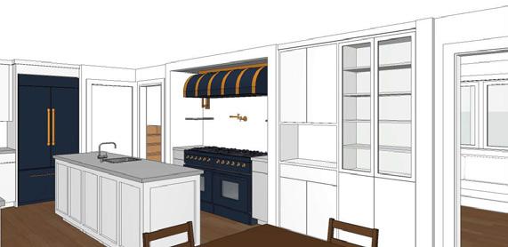
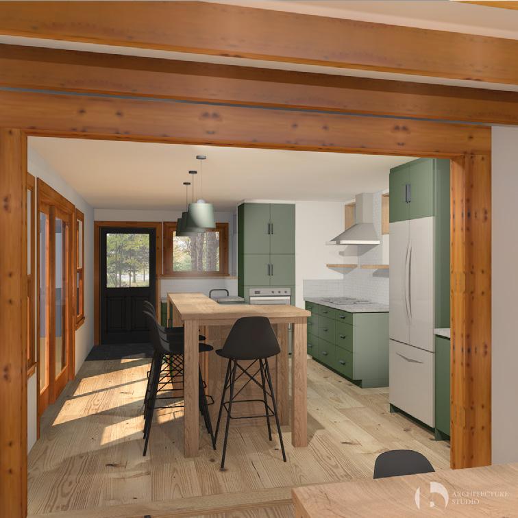
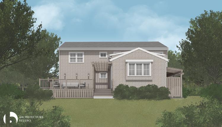
RENOVATED BEACH HOUSE
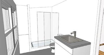
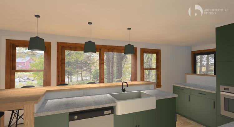
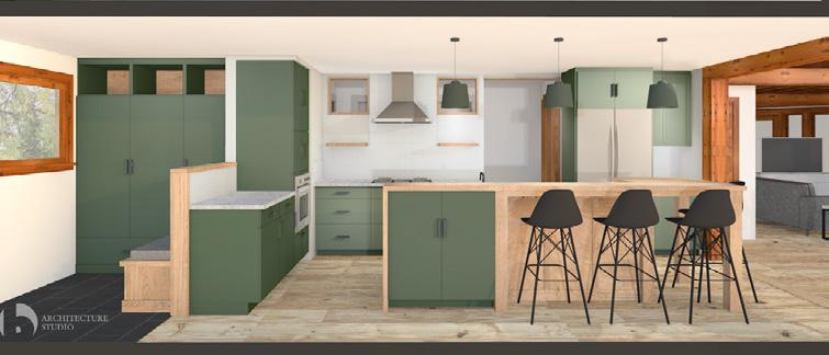
b Architecture Studio
The owners of this Cape Cod beach house were looking to update the majority of their primary living space, including a new kitchen, dining, and living area. It was important to them to make the low ceilings feel as tall as possible, retain the original pine trim, and prioiritize views toward the ocean. The drawings here are from the beginning of the CA phase.
Credit:
Modeling completed by multiple individuals. Drawings and renderings predominantly completed by me.
www.barchstudio.com HINKLEY RESIDENCE ARCHITECTURE STUDIO INC NOT FOR CONSTRUCTION ASK 2 - CEILING & WALL FINISHES| 8/16/23 Winchester Osterville, MA 781.756.0515
TO DINING
KITCHEN
STAIR
TO SITTING
TO FRIDGE www.barchstudio.com HINKLEY RESIDENCE NOT FOR CONSTRUCTION ASK 2 - CEILING & WALL FINISHES| 8/16/23
LIVING
TO KITCHEN
KITCHEN
DINING
TO
FROM BANQUETTE
LIVING
SITTING
TO
DINING
SITTING
TO
129

ARCHITECTURE STUDIO INC
Winchester Osterville, MA 781.756.0515
HINKLEY RESIDENCE
ASK-1 RCP| 8/16/23
SEE CONSTRUCTION DOCUMENTS DATED 6/8/23 FOR ADDITIONAL INFORMATION.
1.5 1.6 1.2
www.barchstudio.com DINING MODIFY EXISTING FINTUBE RADIATOR UNITS AS REQUIRED TO SUIT NEW WORK THIS AREA EXISTING BEDROOM CEILINGS & FIXTURES TO REMAIN IN PLACE EXISTING BATHROOM FIXTURES, FINISHES & CEILING TO REMAIN IN PLACE KITCHEN LIVING BATH 1 CL. VERIFY IN FIELD EXISTING HARDWIRED SMOKE & CO DETECTORS PER CODE REVIEW ALL KITCHEN, LIVING, & DINING SWITCH LOCATIONS IN FIELD WITH ALL PRIOR TO INSTALLATION RECESSED CEILING HOOD, CENTERED ABOVE COOKTOP. COORDINATE W/ CEILING JOISTS AS REQUIRED. HEATING, VENTILATION, & AIR CONDITIONING SYSTEM TO BE DESIGN BUILD BY GENERAL CONTRACTOR PER CODE. COORDINATE HVAC UNITS WITH LIGHT FIXTURES. REVIEW & CONFIRM ALL FINAL HVAC UNIT & GRILL LOCATIONS WITH OWNER & ARCHITECT IN FIELD PRIOR TO INSTALLATION CL. CL. BEDROOM 1 BEDROOM 2 REF. DW WEATHER PROOF EXTERIOR POWER OUTLET, TYP. EXTERIOR WALL SCONCES ON TIMER SWITCH AT BASEMENT, REVIEW FINAL LOCATION IN FIELD WITH ALL PRIOR TO INSTALLATION PROVIDE UNDER SHELF LED TAPE LIGHTING AT ALL SHELVING. LOCATE ADJACENT TO VALENCE. COORDINATE SELF BRACKETS, TYP. PAINTED NICKEL GAP FINISHED CEILING, WITHIN FRAMING BAYS, TYP. EXISTING RINSING STATION TYP. D 3D 4D 3D 3D D T 3D 3D 3D 3D D D 3D D D HATCH INDICATES PAINTED PASTER CEILING, TYPICAL ATTIC ACCESS, REVIEW LADDER SIZE & EXISTING FRAMING CONDITIONS IN FIELD WITH ALL PRIOR TO INSTALLATION COORDINATE WALL CABINET DOOR SWING WITH LIGHT FIXTURE CLAD EXISTING ATTIC JOISTS W/ 3/4" PAINTABLE BIRCH PLYWOOD, TYP. DINING LIGHT TO BE CENTERED ON TABLE BELOW. REVIEW LOCATION BEFORE INSTALLATION. PROVIDE POWER AT BACKS OF BUILT-INS, TYP. TRIM TO MATCH ROOF SLOPE. PAINT TO MATCH, TYP. 4D DL1 C1 C1 C1 C1 C1 DL1 DL1 CO SD SD SD GFI GFI GFI GFI GFI GFI WP WP WP P1 C1 DL2 DL2 DL2 DL2 C1 C1 C1 C1 C1 C1 C1 C1 WW C1 WW PROVIDE POWER TO ALL APPLIANCES, TYP. STAIR S1 S1 S1 S1 PAINTED PLASTER SOFFIT CEILING AT HOOD, TYP. RANGE/ HOOD PROVIDE POWER AT ISLAND PER CODE, TYP. S2 S2 S2 S1 S1 UC UC MICRO. S1 4D PAINTED NICKEL GAP FINISHED CEILING, TYP. PROVIDE POWER AT BUILT-IN BASE 1X6 PAINTED PERIMETER TRIM OR PICTURE RAIL LOW PROFILE LED FIXTURES GIVEN JOISTS ABOVE SCALE: 1/4" = 1'-0" 1 PROPOSED FIRST FLOOR REFLECTED CEILING PLAN REVIEW REMOTE OPERATION OF KITCHEN EXHAUST HOOD SEE LAYOUT RCP FOR CEILING FINISHES RCP NOTES: 0124 1.4 www.barchstudio.com HINKLEY RESIDENCE ARCHITECTURE STUDIO INC NOT FOR CONSTRUCTION ASK 2 - CEILING & WALL FINISHES| 8/16/23 Winchester Osterville, MA 781.756.0515 +/7'-2" +/7'-2" LIGHT FIXTURE, TYP. BEAM, EXISTING FINISHED BEAM FRAMING, TYP. FINISHED JOIST FRAMING, TYP. ANGLED FINISH PANEL. MATCH ROOF SLOPE. NICKEL GAP FINISHED CEILING, TYP. PAINTED PLASTER WALL, TYP. NICKEL GAP WALL FINISH, TYP. +/- 3'-2" +/7'-8" +/6'-7" +/6'-8" +/1'-1" FINISHED BEAM FRAMING, TYP. FINISHED JOIST FRAMING LOCATION. ANGLED FINISH PANEL, TYP. MATCH ROOF SLOPE. NICEKL GAP FINISHED CEILING, TYP. LIGHT FIXTURE, TYP. PLASTER SOFFIT FOR RECESSED HOOD. COORDINATE WITH CEILING JOISTS. STRUCTURAL BEAM AND FINISH FRAMING LOCATION NICEKL GAP FINISHED WALL, TYP. +/6'-7" +/7'-2" +/7'-8" +/7'-2" EXISTING CEILING JOISTS, VIF. BEAM, EXISTING BEAM FINISH FRAME, TYP. PAINTED PLASTER CEILING PICTURE RAIL LIGHT FIXTURE, TYP. EXISTING JOIST, TYP. CEILING JOIST FINISH FRAME, TYP. ANGLED FINISH PANEL. MATCH ROOF SLOPE. NICKEL GAP CEILING, TYP. PAINTED PLASTER WALL NICKEL GAP WALL FINISH, TYP. PLASTER SOFFIT FOR RECESSED HOOD +/7'-2" +/6'-8" +/1'-1" +/6'-7" +/7'-2" +/- 5'-1" FINISHED BEAM FRAMING, TYP. FINISHED JOIST FRAME, TYP. EXISTING CEILING JOISTS, TYP. LIGHT FIXTURE, TYP. NICKEL GAP FINISH OVER EXISTING DRYWALL, TYP. NICKEL GAP FINISHED CEILING, TYP. EXISTING PLASTER WALL, PAINTED. CEILING FIXTURE. FINAL LOC. TBD PICTURE RAIL BEAM, EXISTING PAINTED PLASTER CEILING FINTUBE BASEBOARD, TYP. CAP COORDINATE HOOD AND EXHAUST W/ JOISTS SCALE: 1/4" = 1'-0" 1 KITCHEN WEST SCALE: 1/4" = 1'-0" 2 KITCHEN & LIVING EAST SCALE: 1/4" = 1'-0" 3 KITCHEN & DINING SOUTH SCALE: 1/4" = 1'-0" 4 KITCHEN NORTH 0124 130
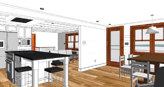
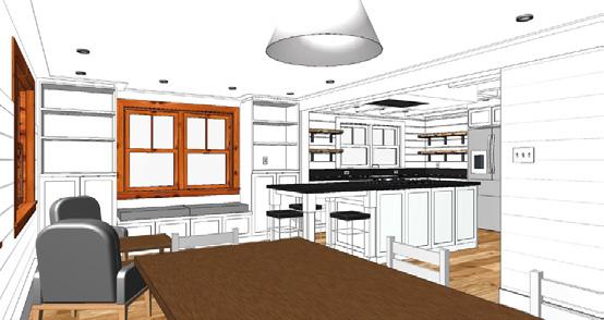
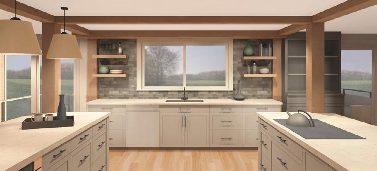
RENDERINGS
b Architecture Studio
Renderings of four different projects, which were included in client communications and marketing materials.
Credit:
Modeling completed by multiple individuals. Renderings completed by me.
131
132
PERSONAL
133
134
NYSE: CADE
EQUITY RESEARCH REPORT
SUNTRUST ROBINSON HUMPHREY
SPRING 2017 / SUMMER 2020
INVESTMENT REPORT TO MUSEUM EXHIBIT
My background is in finance. After I graduated from college, I worked at SunTrust Robinson Humphrey as an equity research associate where my job was to research and write reports on stocks to help fund managers decide whether or not they were good investments. I was on a team that covered banking stocks, and in my last year in this role, I co-authored a report on Cadence Bancorportation (Ticker: CADE), a regional community bank based in Texas and the Southeast United States.
In 2020, as I began to more seriously consider transitioning careers, I reimagined my old work and experiences as immersive, interactive three-dimensional spaces in an effort to relate my old-world to my future.
These translations are structured as museum exhibits and the ‘museum’ is laid out in the way the investment report was organized, which essentially runs down the bank’s income statement.
A bank earns most of its money on the spread between the interest it charges on loans and the interest it pays on deposits.
This spread is called net interest income (NII) and the net interest margin (NIM) measures the profitability of the loans.
Loan yields, interest earned as a % of outstanding balances, and deposit costs, interest paid as a % of deposit balances, correlate with the federal funds rate, which is set by the Federal Reserve.
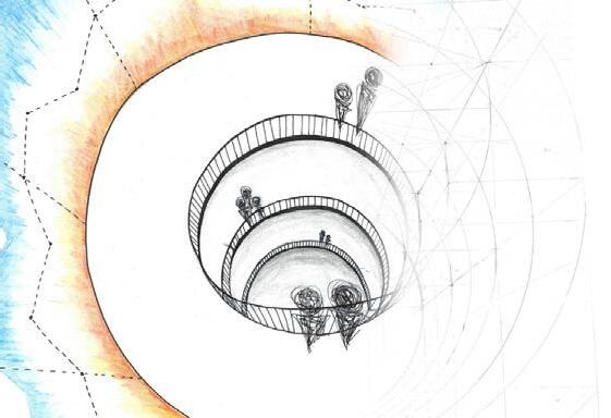
Loans are existence; aspect of are alike types on can play and credit
In this exhibit, suspended spheres. slice along of CADE’s time, and each sphere subgroup sized proportionately to the dollar that category.
Numbers quickly seem of dollars without the size physically amounts just overhead, remind enormity a small bank
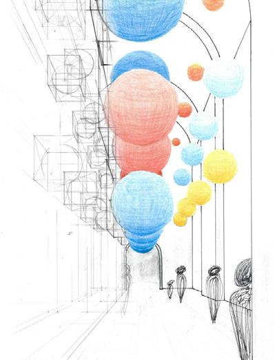
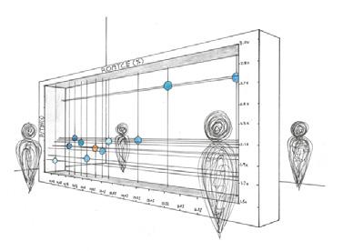
Deposits are the primary funds for a bank’s lending operations and they say a lot about the bank’s profitability and growth potential.
A central display shows a map of CADE’s footprint, the southeast US. The map displays data about the bank’s deposit base, such as market share, median income, and population growth rates.
As an alternative to digital, four images are lenticularly printed on each of the two display faces, allowing visitors to see how 8 different data sets overlay onto the map depending on where they stand in the room.
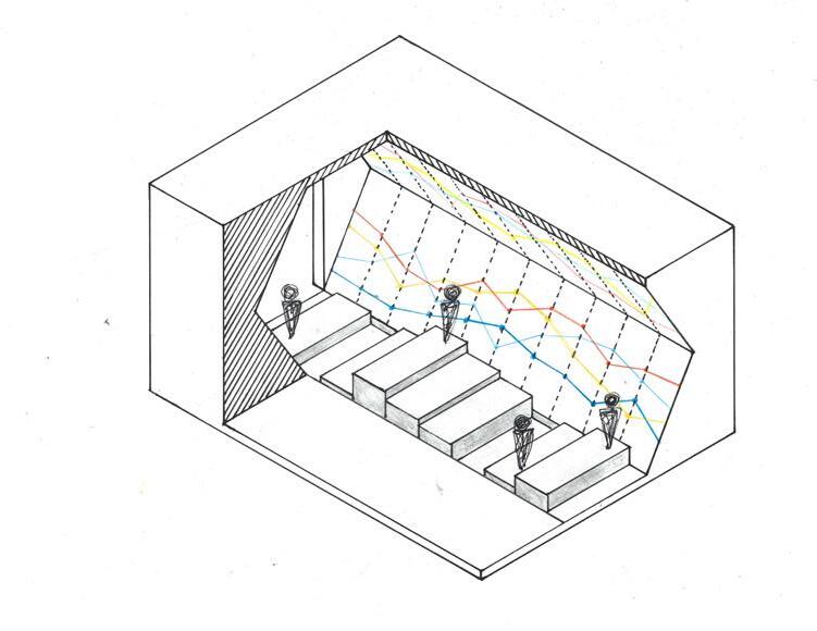
In this exhibit, the federal funds rate is inscribed in a spiral up a tower. Blue light is projected above the line and orange below, representing CADE’s loan yields and funding costs, respectively. The white space between equates to the NIM, and the variations in its shape and size
Money earned from charging interest on loans Interest paid to depositors Expenses associated with credit risk (risk that loans go bad) Non loan-related income (e.g. ATM fees) Non deposit-related expenses (e.g. employee salaries) Measure of money-making ability (net interest income / average assets) Buffer for credit losses (loan loss reserve / loans) Measure of operational efficiency (noninterest expense / revenue) Interest Income (Interest Expense) Net Interest Income $500 ($200) $300 (Loan Loss Provision) Noninterest Income Pre-Tax income ($50) $100 $100 (Noninterest Expense) ($250) (Taxes) ($30) Net Income $100 EPS $0.47 Shares Outstanding 150 Net Interest Margin (NIM) Loan Loss Ratio (LLR) Efficiency Ratio 3.50% 1.00% 41.67% BANK MODEL BASICS: HOW BANKS MAKE MONEY Tables and graphics in this portfolio are recreations and similar in concept to, but not direct replications, of those in the original report. All data within are non-material, nonproprietary and publicly available. All charts and tables are for illustrative purposes only and not all data within are historically accurate. This report does not represent an investment recommendation nor does it represent the opinion of SunTrust Robinson Humphrey.
of the empty space around the federal funds line represents the bank’s loan and deposit betas at each point in time.
start at the bottom of the tower at the beginning of 2012 and wind their way up through time.
Museum-goers
135
are core to a bank’s existence; they drive nearly every of the P&L. Not all loans and the mix of loan on a bank’s balance sheet a big role in profitability credit risk.
exhibit, CADE’s loans are suspended from the ceiling as Each perpendicular along the hall is a snapshot CADE’s loans at a point in and within each slice, sphere represents a key subgroup of loans. Spheres are proportionately according dollar value of loans in category.
Numbers in Excel or on paper seem small. Billions dollars get thrown around any real concept of of these values. By physically representing the dollar amounts at a large scale and overhead, the exhibit helps visitors of the sheer enormity of the money that even bank like CADE controls.
The last major financial component pertains to the credit quality of its loans.
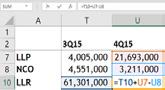
On the income statement is the “Loan Loss Provision” (“LLP”) and on the balance sheet is the “Loan Loss Reserve” (“LLR”).
The LLR is a buffer that acts to soften the blow of loans that unexpectedly go under. As new loans are made, the LLR is increased with the LLP and the size of the LLP is determined by historical rates of default for that particular type of loan. The LLR is decreased with Net ChargeOffs (“NCOs”), which are existing loans that have actually gone bad and are thus removed from the buffer accounts.
Rather than evaluate loans individually, loans are grouped into “buckets” based on common characteristics, and LLRs are constructed for each bucket.
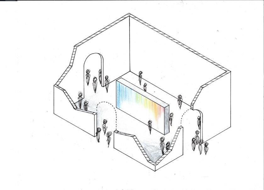
This exhibit turns the bucket metaphor into reality. Each bucket represents a fiscal quarter.
Water from the previous bucket (LLR0) is pumped into its neighbor. Next, water pours in from the ceiling, representing new LLP for the period. Finally, water drains out from the bottom into a pool, representing NCOs. The process cascades along the hall, starting at 1Q13 and ending at 1Q17.
The last step is valuation. CADE, like most banks, is valued using price-to-tangible book value (“P/TBV”). Plotting CADE’s P/TBV vs. its return on average tangible common equity (“ROATCE”) and comparing it to other banks gives investors a sense for how good CADE is at using its balance sheet to produce returns, and how cheap or expensive it is vs. peers.
A linear regression of the data indicates “fair value” based on current market sentiments. Stocks that fall below the best-fit line are relatively undervalued while ones that plot above are considered overvalued.
P/TBV vs. ROATCE is only one way of valuing a bank, and in this exhibit, the chart from the report is translated into a 3D, moving model. Each dot on the chart can move along wires in the X and Y directions, depending on what metrics are being compared.
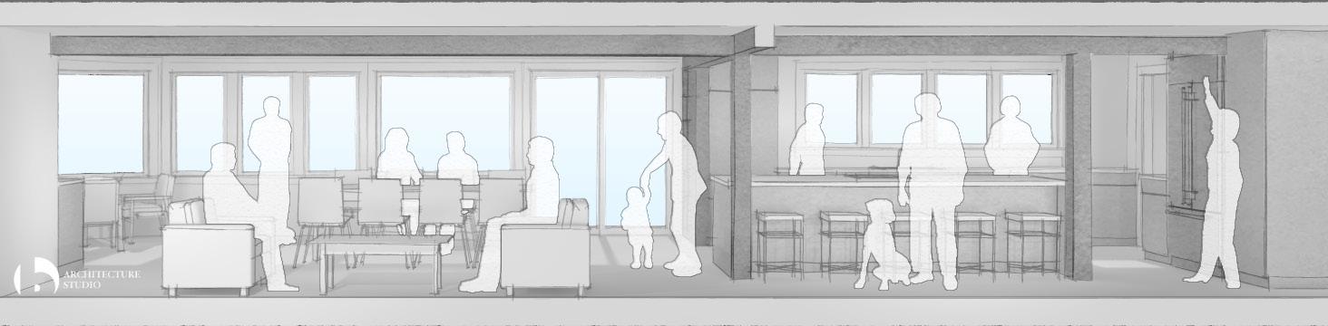
After lending, the next biggest impacts on a bank’s P&L are ancillary fees from non-lending operations and noninterestrelated expenses.
On the lower half of the right side of this exhibit, noninterest income components trace along the length of the hall. On the angled top half of the wall, the drivers associated with each fee income component run in parallel. The set up on the left side of the hall is the same, but with noninterest expense instead.
On the floor, where the two sides of the hall come together and where noninterest income and expense intersect, is the efficiency ratio. The efficiency ratio at each point in time is represented by a raised or sunken block. Guests step and climb up and down the blocks as they move through. The higher the block, the higher the efficiency ratio and the more claustrophobic the guest feels as their head nears the ceiling. The lower, better efficiency ratio blocks give the guests more room, making them feel more comfortable and associate the good feeling with the good operating metric
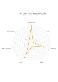
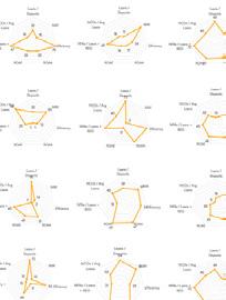
Although unrelated to its existing operations, a major point in the investment thesis for CADE was the potential to grow via acquisitions. The report included a list of possible targets screened from a database based on various qualities,
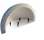
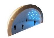
like ROAA, credit quality, efficiency, etc... To make a long list more visually interesting and comprehensible, this exhibit displays the same potential acquisition targets, but via the standard museum feature: the planetarium.
The Loan Loss Reserve is calculated as: LLR0 = LLR1 + LLP NCO
136
TESSELLATING RUNSCAPES
PERSONAL WORK
FALL 2020
I run almost daily. I enjoy the competition against others and my past self during races, but I also find the training runs relaxing and renewing. It’s where I think most creatively and what I’ve always turned to in the face of an academic, work or personal problem.
While running can be a freeing experience to help open the mind, running the same streets over and over can get repetitive. Inspired by this, I created a set of tessellating tiles that build an environment along a running path and can be arranged in endless ways to build new and different “runscapes”. The tiles and the patterns in which they can be arranged catalyze the creative thought process while also providing a sense of structure and framework.
GREEN

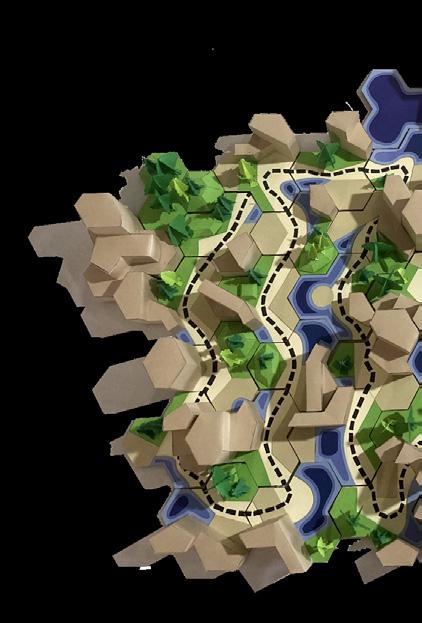


SOCIAL COMPILED


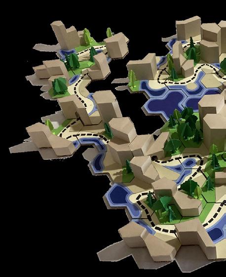
STRUCTURE
WATER
Each piece contains four programs (structure, green space, water features, and social areas) surrounding a central path. To ensure consistency no matter how the tiles are arranged, the path on every piece always runs between two non-adjacent vertices while the programs abut the midpoints of the edges. The set contains ten unique building designs, with four tiles of each design, plus two separate green space, water feature, and structure tiles, for a total of 46 pieces. 137
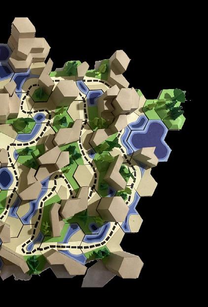
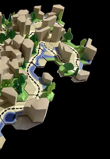
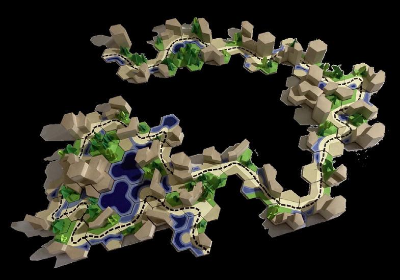
138
ARTWORK
2019 - 2024
The following pages exhibit a collection of sketches, drawings, and paintings from the past several years. Work is created from observation, imagination, and reference, and includes a variety of mediums.


139


140
SKETCHES


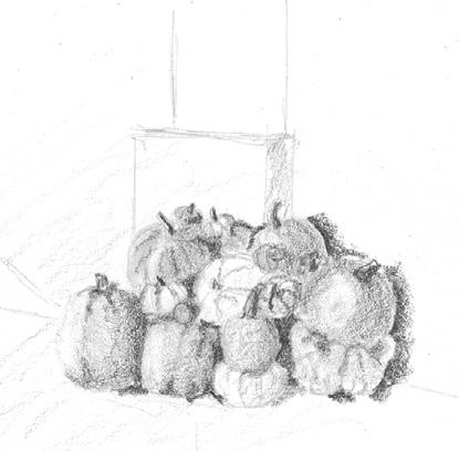
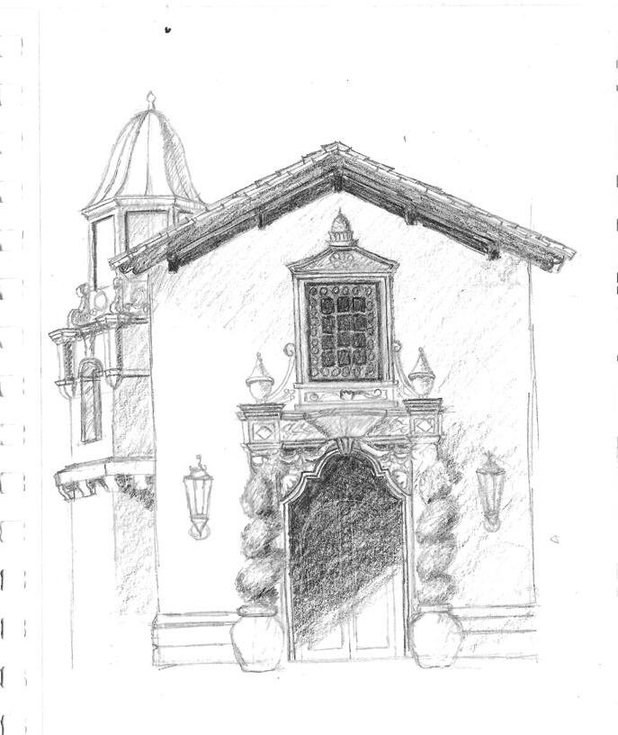

141

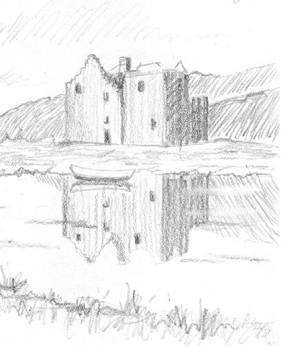


142
Morning Kitchen, Pencil, Photo Reference, Purple Cherry Architects
Amsterdam Canal, Marker, Photo Reference
Still Life, Charcoal, Observation
Joshua Tree National Park, Digital, Photo Reference
Home for Christmas, Watercolor, Photo Reference, Visbeen Architects
Night Lake, Pen and Ink, Imagination

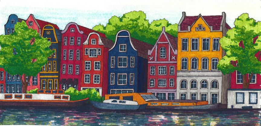 LEFT TO RIGHT:
Palácio da Pena, Watercolor, Photo Reference
LEFT TO RIGHT:
Palácio da Pena, Watercolor, Photo Reference
143


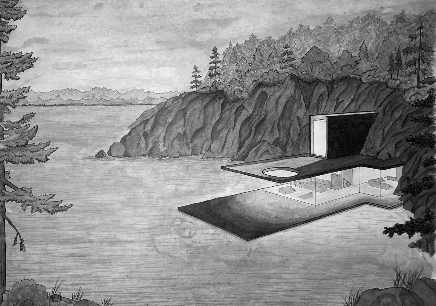
144
145
146
