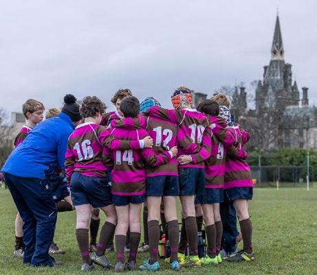
Royal Highland & Agricultural Society of Scotland annual report
Royal Highland & Agricultural Society of Scotland annual report
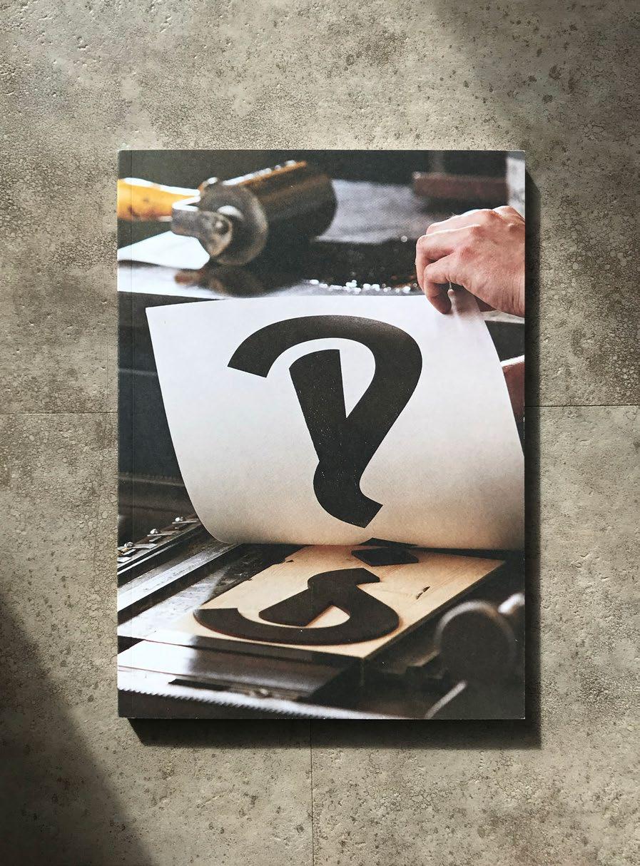
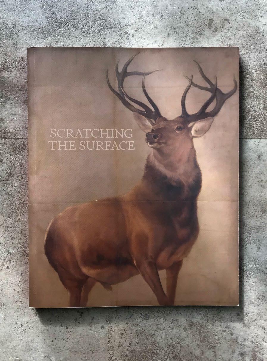
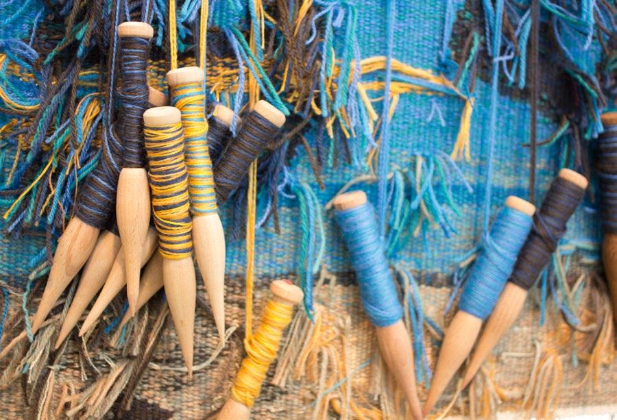
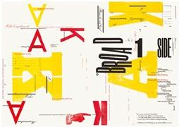
Interrobang, a survey of modern letterpress techniques
printing that truly drives him. In fact one of the descriptions of his craft that comes closest can be credited to design doyen Mike Dempsey who suggested that what Kitching practiced was ‘letterpress typographic design and printmaking’. It’s possible that the need to categorise Kitching as a letterpress printer stems from a modern obsession with letterpress itself, but his own passions come from a different place.
In fact his inspirations can be traced back to his contemporaries at the very earliest days of the British graphic design industry, in particular the work of Fletcher, Forbes and Gill. He reaches for a copy of their red portfolio book from 1963, and turns to a project for the publisher Anthony Blond and the Blond Education imprint (a lower case ‘e’ sits on the curve at the top right of a capital ‘B’). ‘This is what I was brought up on really, and I’m still looking at this and I’m not looking at that.’ The ‘that’ in question is a piece from a selection of digital letterpress Alan has collected where the design is embossed by means other than pieces of type, with a font that is predistressed, not worn from decades on press. ‘It doesn’t do anything for me – it’s nothing to do with letterpress. It’s just printing old copy type’. The simple choreography of the ‘B’ and the ‘e’ and the thinking that put them together is what Kitching still aspires to.
Kitching was born in Darlington during the Second World War. He would set his first type by hand at school (in a print room that held just two sizes of Gill Sans) and completed an apprenticeship as a compositor at the start of the 1960s. ‘I started out my apprenticeship at night classes. I learned how to cast off, to judge how many words per page and all that sort of thing. You had to learn a certain amount of Latin, French and Greek. You covered all sorts of bits and pieces – all quite ancillary
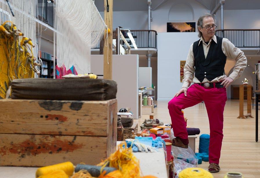
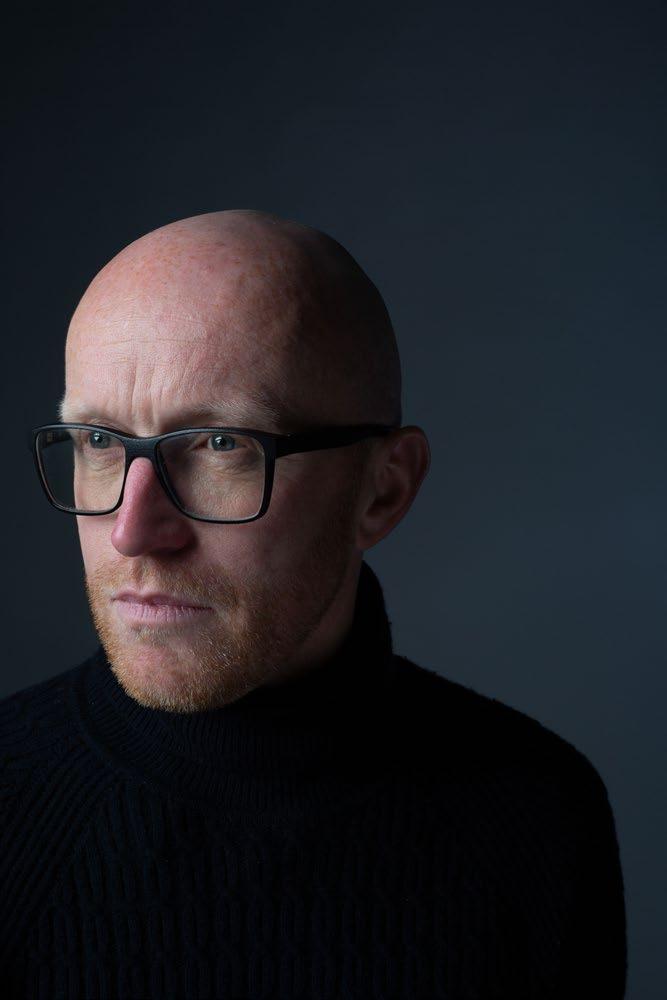
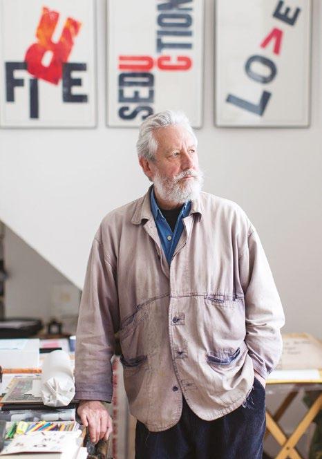
The paradox of print: Alan Kitching and a love of letterpress
From the pioneers of graphic design to the curious paradox of letterpress printing, Patrick Baglee talks to Alan Kitching about his work, his inspirations, and how he had to go back to find a way forward.
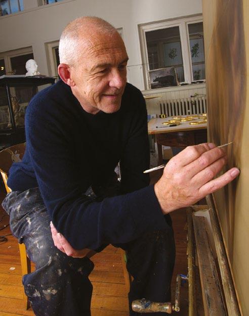
When you step inside Alan Kitching’s Kennington workshop, low to your left there is a table, against the sill by the window. It’s been through the wars. It’s about a foot and a half tall, three feet square and squat. On each of the four corners the wood is worn through. Iron nails hold the limbs together. Ink has blackened and dried to form a patina as dark as the night sky in layers too numerous to estimate. It is an artefact of a former world, all beaten by industry. It will probably see us all out. But in this place, its context is re-established.
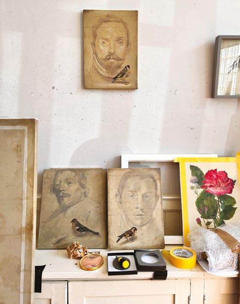
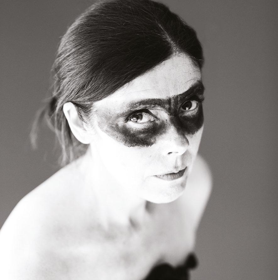
That’s because in Kitching’s workplace you are surrounded by both beautiful work and the raw, bruised materials that produced it. To the modern eye, much of the machinery is arcane, but the work is not. On one wall are posters from his work for the National Theatre and on the other, a wonderfully evocative portrait of Celia Stothard, his partner and supporter in every sense, who he married in 2007 and lost to cancer in 2010. He works from the former alehouse they had made their home. It is also home to one of the most remarkable and remarkably preserved collections of letterpress type in the country.
A tour of the workshop is a relatively brief affair. From the studio at the front and through a small hallway there is a workshop that houses more type and the presses on which Kitching creates the majority of his work. Shelving at eye level and above head height houses more type, carefully catalogued.
A record player and vinyl albums occupy their own carefully chosen space. In the cellar, type has replaced kegs. It is, by any measure, a riotous assembly. At its heart stands the calm, considered figure of Alan Kitching.
To many, Kitching is the epitome of the letterpress printer, though he himself does not really regard himself as such, in part because of an innate humility, but also because it’s not the
to the printing. You would do proofreading and you gained knowledge of all sorts of arcane things. Printing is involved with all of the arts and you build it up over the years. You gain that sort of knowledge by the by really. You’ve got to. That’s what you’re handling all the time. People would come with all sorts of work – I was at a jobbing printers – setting plays or Shakespeare, so you learn like that, by osmosis.’ But jobbing printing was already a long way from what Kitching saw as his future.
It was during his apprenticeship that Kitching would first come across the work of Swiss typographer, teacher and author Jan Tschichold. ‘I discovered Tschichold in a magazine called The British Printer. It was usually full of machinery but every so often they used to have a two page article about a designer or a new typeface and that’s where I first saw Tschichold’s work and I thought it was very exciting and interesting’. Yet though his eyes and horizons widened, he was actively discouraged from exploring some of Tschichold’s more progressive ideas by a somewhat conservative teaching staff. ‘My tutor wouldn’t allow me to follow the style Tschichold used for address lines where he replaced commas with full points with a space either side. I did this on a job when I was about 16 and my tutor said, “You can’t do it like that, you have to put the commas in”. That was a bridge too far for him’.
Luckily, on the completion of his apprenticeship and after a brief spell at another jobbing printers Kitching found himself in an environment that would allow him the freedom to follow these influences and his own instincts working with someone for whom a different approach was a natural state of affairs. Taking a role as technician at the School of Art at Watford College of Technology, he came into contact with a host of the period’s design luminaries, but chief among them was Anthony Froshaug,
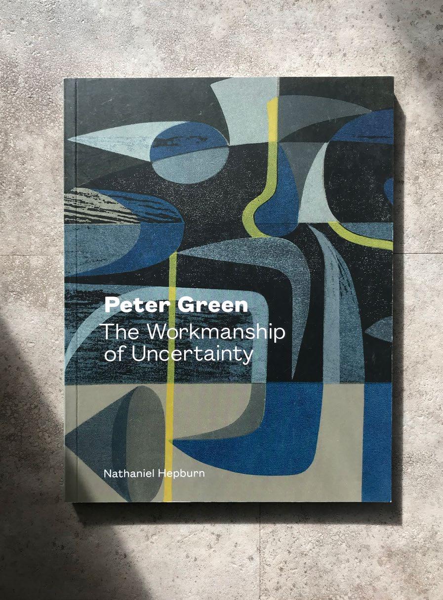
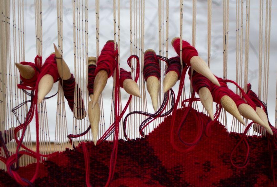
The Workmanship of Uncertainty, a monograph on printmaker Peter Green
of Art Foundation Courses and their national assessment. Green has always seen himself as a teacher/printmaker and did not see any of this work as being separate from his work as an artist.
As the 1990s cuts to the Higher Education system began to be felt, Green decided to take early retirement from Middlesex. If he had hoped for a quieter period then he was to be proved wrong. Middlesex appointed him Emeritus Professor, and almost the whole decade was taken up with advisory work including course consultancies, visiting lectures, external examining and post-graduate tuition at Camberwell School of Art, Goldsmiths College and the Royal College of Art, as well as further regular printmaking Summer Schools.
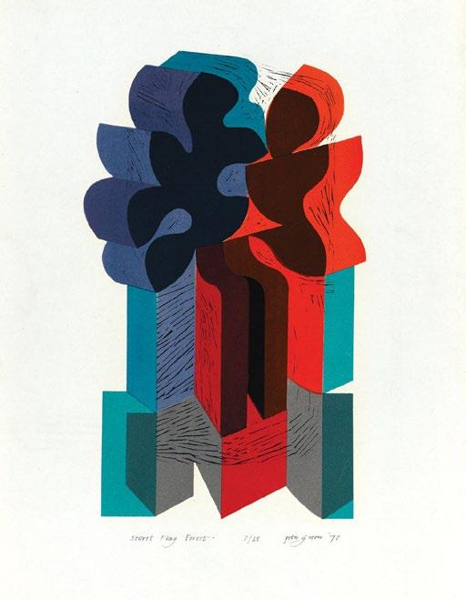
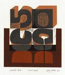
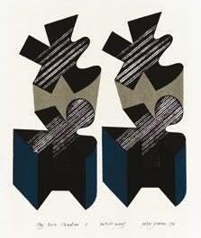
Throughout this period, Green continued to develop his printmaking until he had established a production process, which continues to this day. It is a technique which first emerged while working for LGA and evolved in the successive decades. Green does not work from prepared drawings or designs but the images emerge naturally as part of the process of exploration and development. Green will first prepare a key block, maybe from plywood or often now MDF, which he cuts with a Stanley knife and after proofing will then develop the image with added colour printed through paper stencils on top of the initial image from the block. “The lovely thing about using things like cheap old wood … it removes the fear of making a mistake and spoiling an expensive block, and that is very important. So in other words you’ve got no inhibitions, the process doesn’t inhibit you, you can explore the potential of a cut mark, and the way in which a mark changes according to the material you use. It doesn’t change very much, but as you know I just use basically a Stanley knife and the odd gouge to clear out the things. And any pattern marks emerge from the process of cutting.”
Even into his 80s when age makes other dexterous tasks harder, Green prides himself in his ability to control with absolute precision the tool in his hand. The key block extends across the width or height of the work – sometimes indicating a horizon with the straight edge of the
1978
CHAPTER THREE
The intense activity of the London Graphic Arts association began to slow down into the 1970s and by 1975 Peter Green was no longer working with them. A national boom in the print market had come to an end and there were generally few outlets for exhibiting and selling although Green regularly took part in the “tremendously significant” Pictures For Schools annual exhibitions. He also continued to exhibit with the Royal Society of Painter-Printmakers (RE), however it was a time of little energy within the society, and Green felt compelled to briefly join the Printmakers Council and the Society of WoodEngravers to find further opportunities to exhibit his latest works.
A few dealers were selling his prints around the country, and architects who had bought from LGA continued to seek out Green’s work for show homes and office buildings but, for Green, the feeling of being part of a creative printmaking community outside of education was missing. It was not income that Green was seeking, but outlets for his prints with related discussion, criticism and encouragement. Green continued to print despite concerns about the growing pile of works in his plan chest unseen and unsold. Yet it would seem impossible that there was a time when he was not printing and he confesses that: “If I am not in the work-room for a few days or weeks I feel lost. I always want to get on with another print, you always tend to think the one you are working on is going to be ‘it’ and really get near to achieving what you want. It never quite works like that but you start the next print with the same sense of optimism”. Green may have felt somewhat lost without these exhibiting communities during this period, the work he produced continued to evolve and his teaching career was reaching new heights. It was not until the revival of the RE, initially under Anita
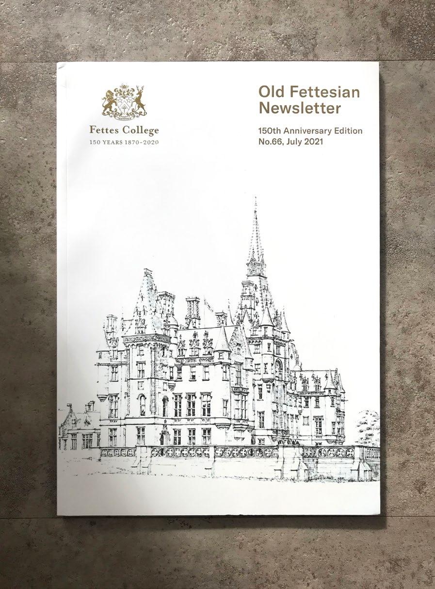
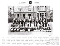
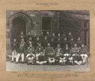
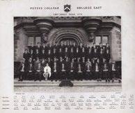
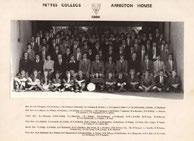
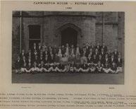
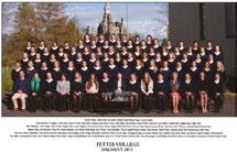
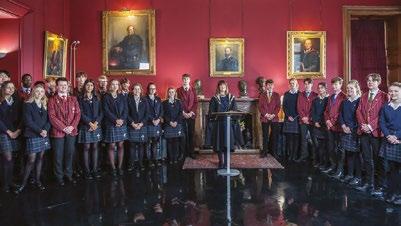
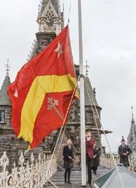
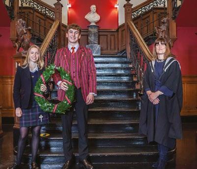
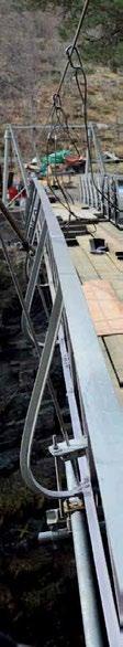
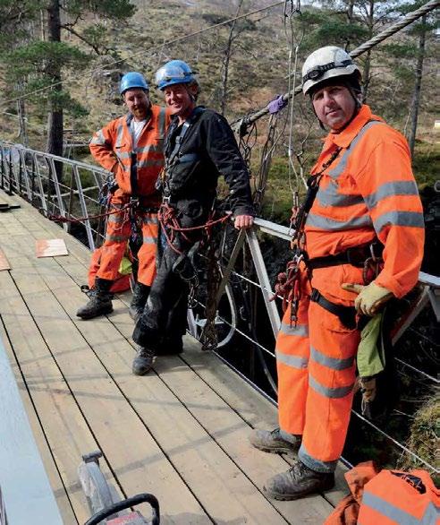
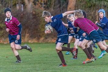
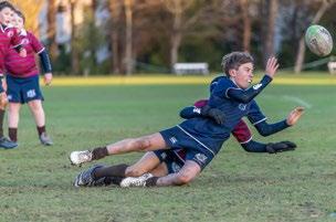
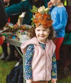
College, Fettes North brochure
College, Fettes North brochure
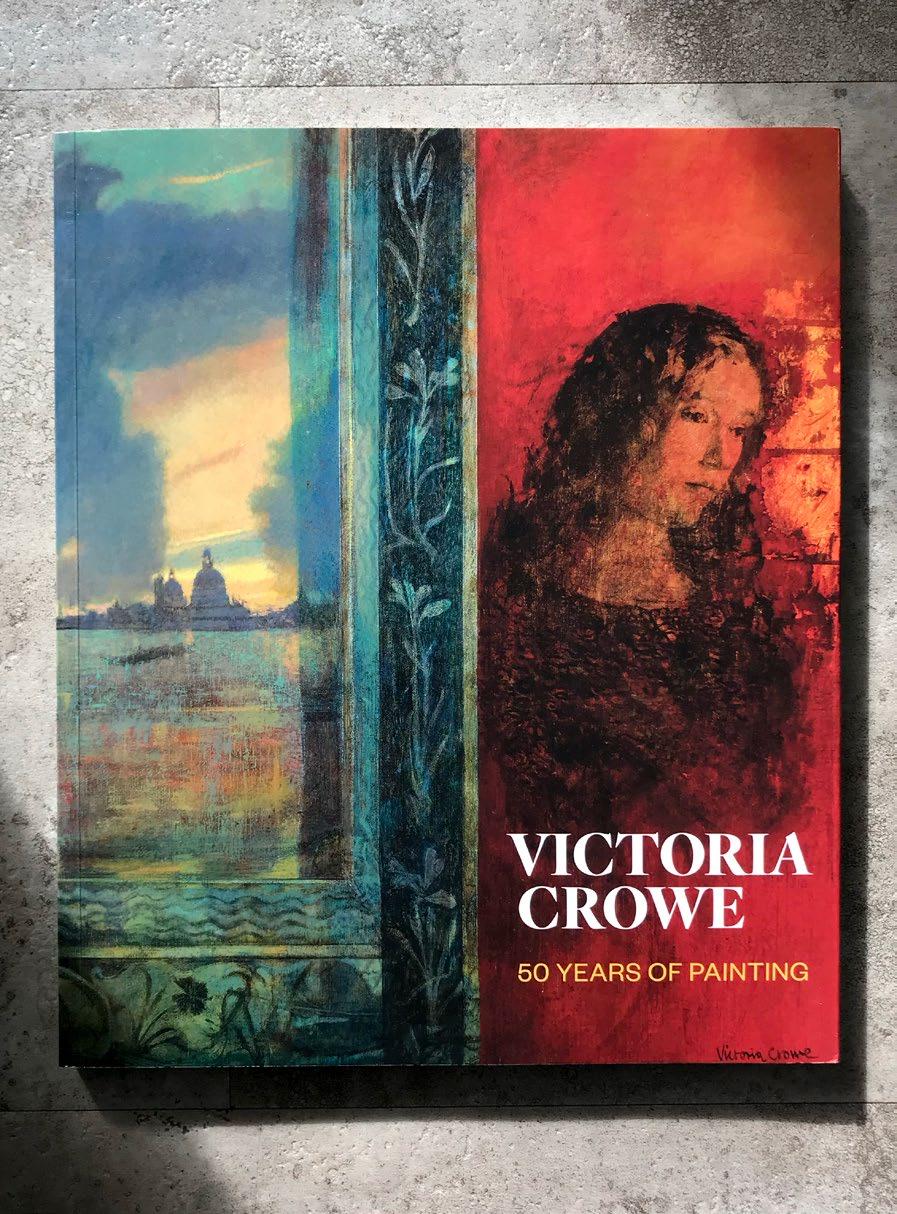
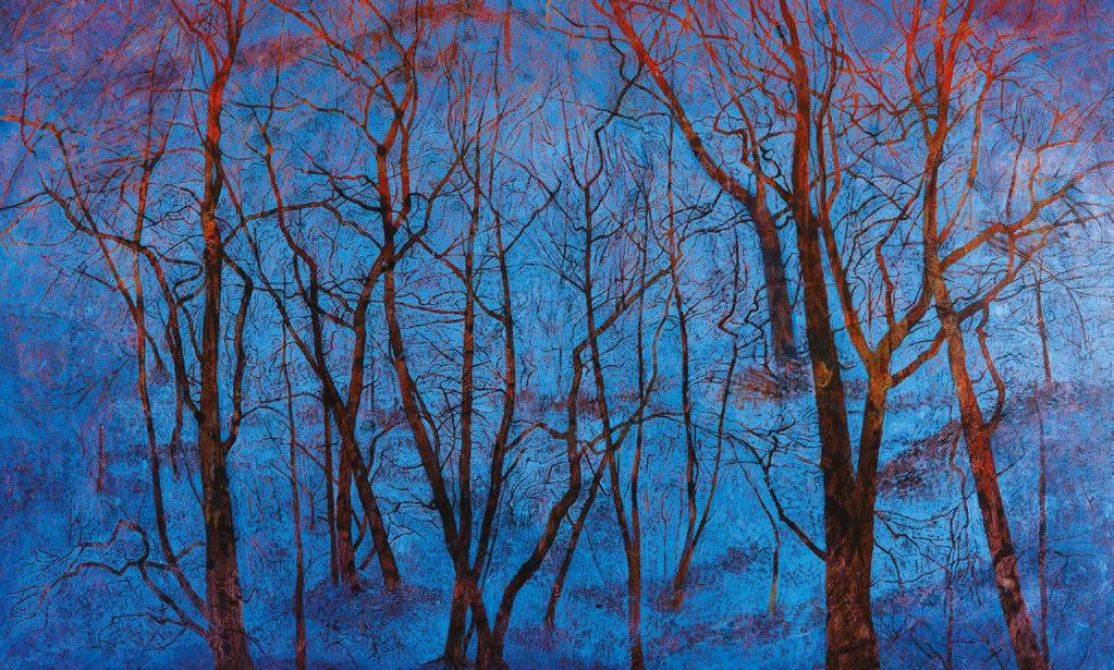
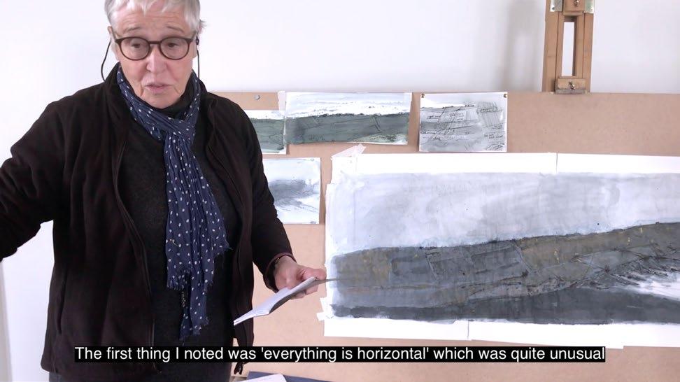
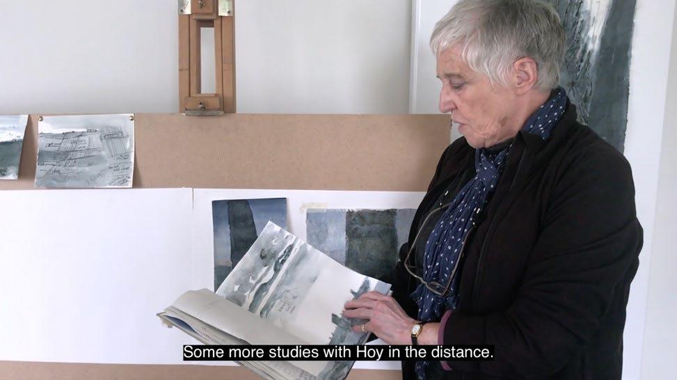
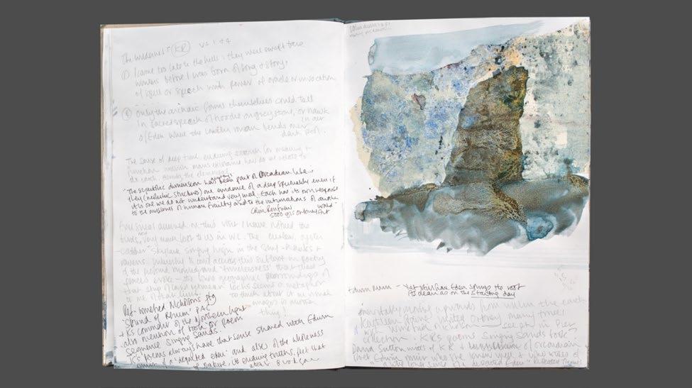
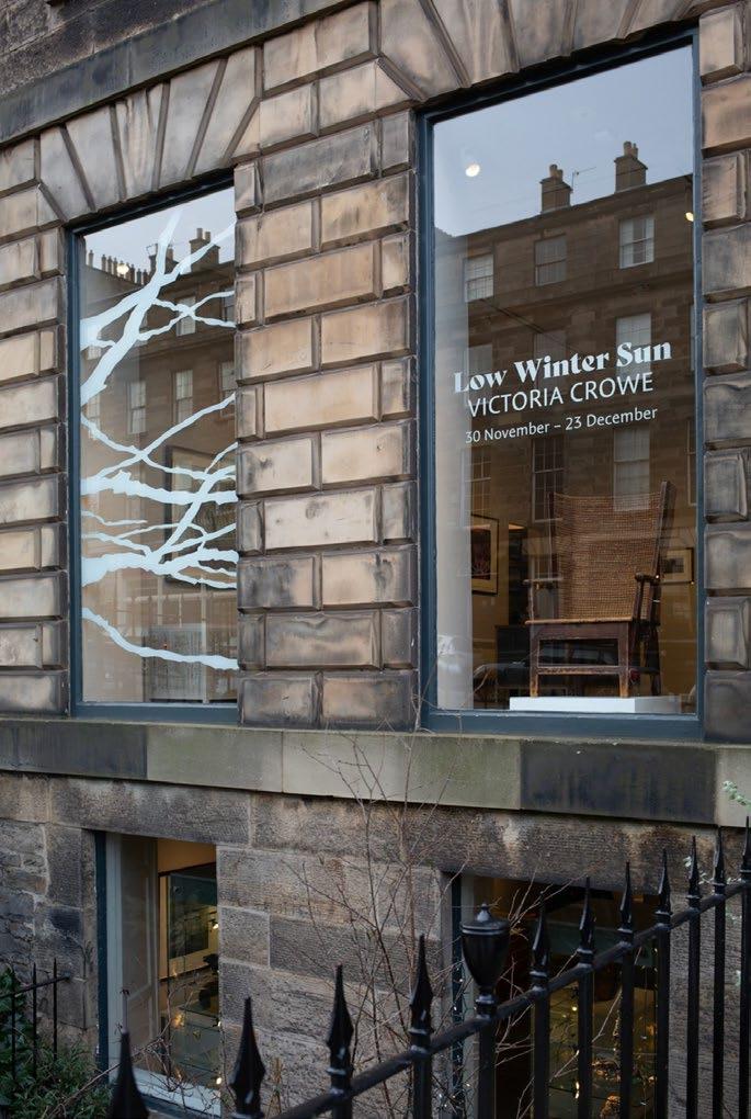
Victoria Crowe: 50 Years of Painting, monograph to accompany a major retrospective