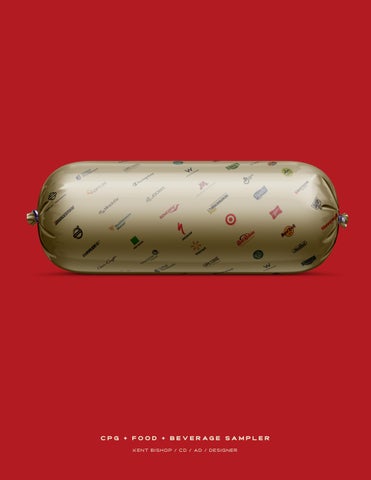
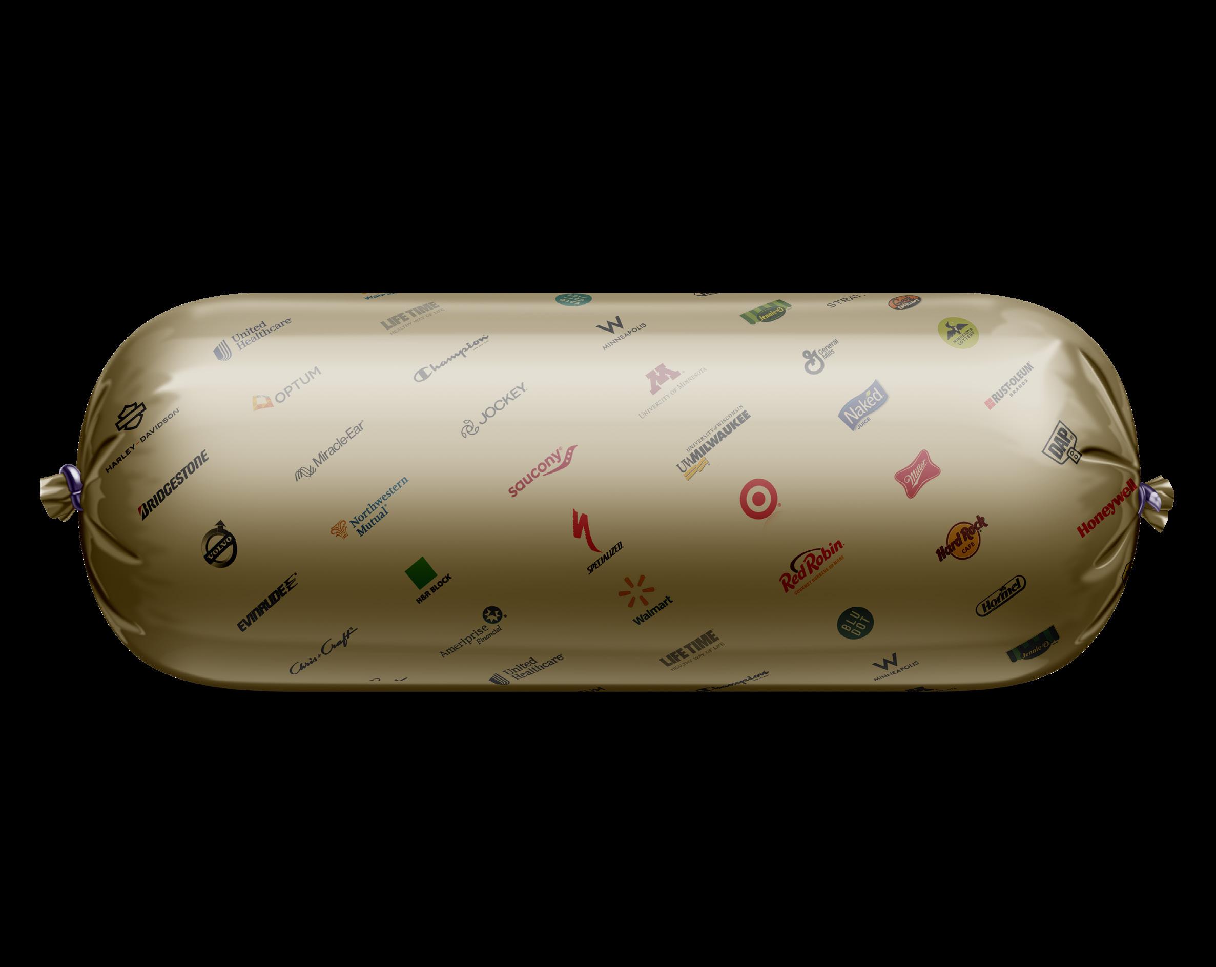
CPG + food + beverage SAMPLER
kent bishop / cd / ad / designer
HELLO! I AM GLAD THIS BOOK FOUND HANDS. THIS PAGE-TURNER WORK I HAVE DONE WITH I THRIVE ON COLLABORATION CHALLENGES CLIENTS BRING FUNCTIONING AS AN EXPERIENCED ADDED HORSEPOWER IN SCENARIO-- I WOULD LOVE YOU, WHILE DOING WHAT
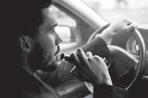
PHOTO SHOWN: this photo was created for an organization supporting young skateboarders working to get sponsored.
“groundchucked” represented THE PUNISHMENT these kids put their bodIES through to pursue their dreams.
AWARDS: communication arts / ADVERTISING photography issue
MINNEAPOLIS ADFED / THE SHOW / GOLD photographer: David thomas markley
FOUND ITS WAY INTO YOUR
PAGE-TURNER IS A BRIEF LOOK AT PAST CPG BRANDS BIG & SMALL.
COLLABORATION AND SOLVING DESIGN BRING MY WAY. WHETHER EXPERIENCED DESIGNER OR IN A, “BEAT-THE-CLOCK” LOVE TO FIND A WAY TO HELP I LOVE. Thanks FOR TAKING A LOOKKENT
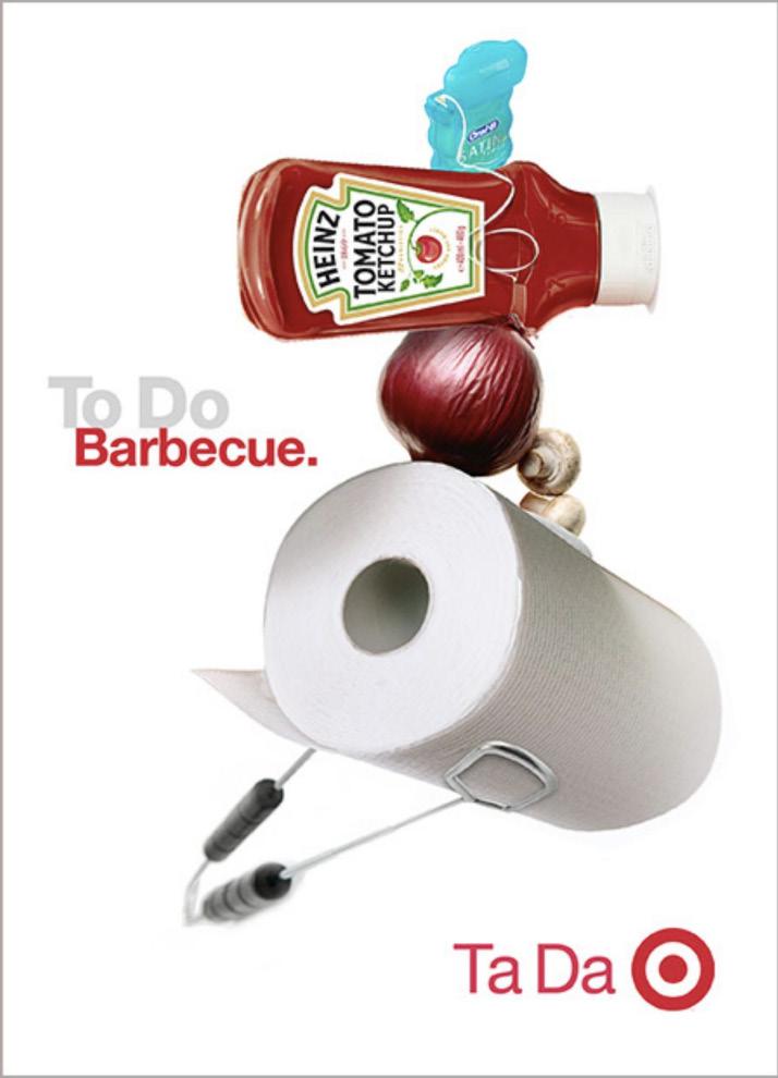
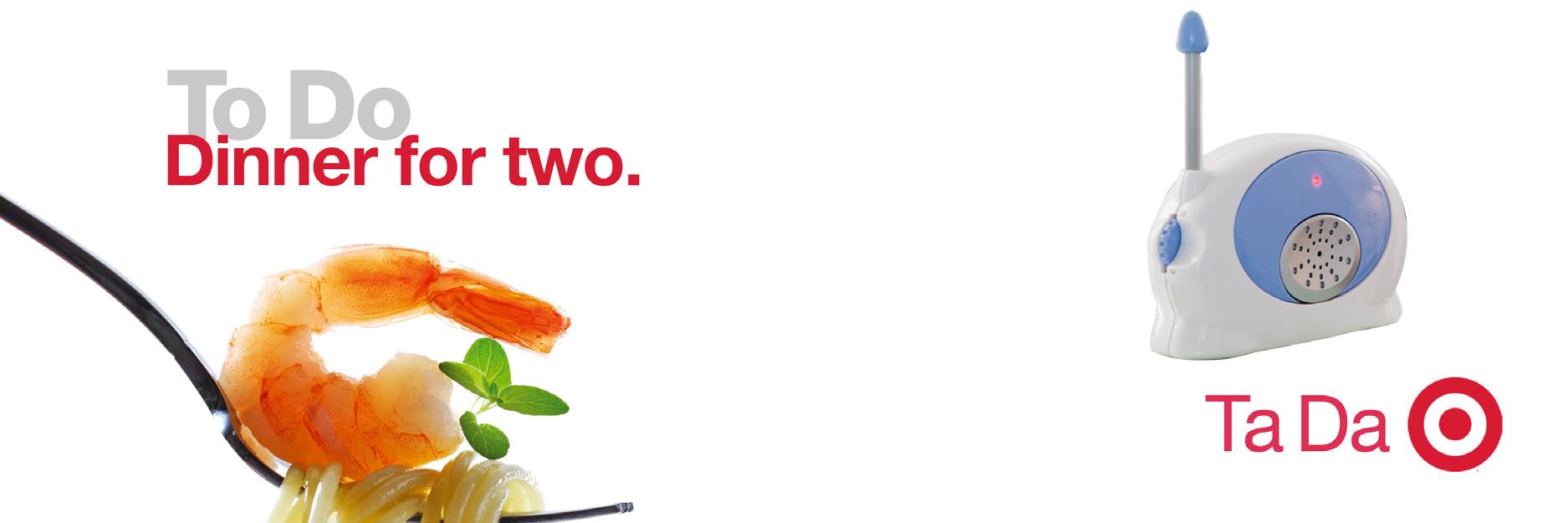
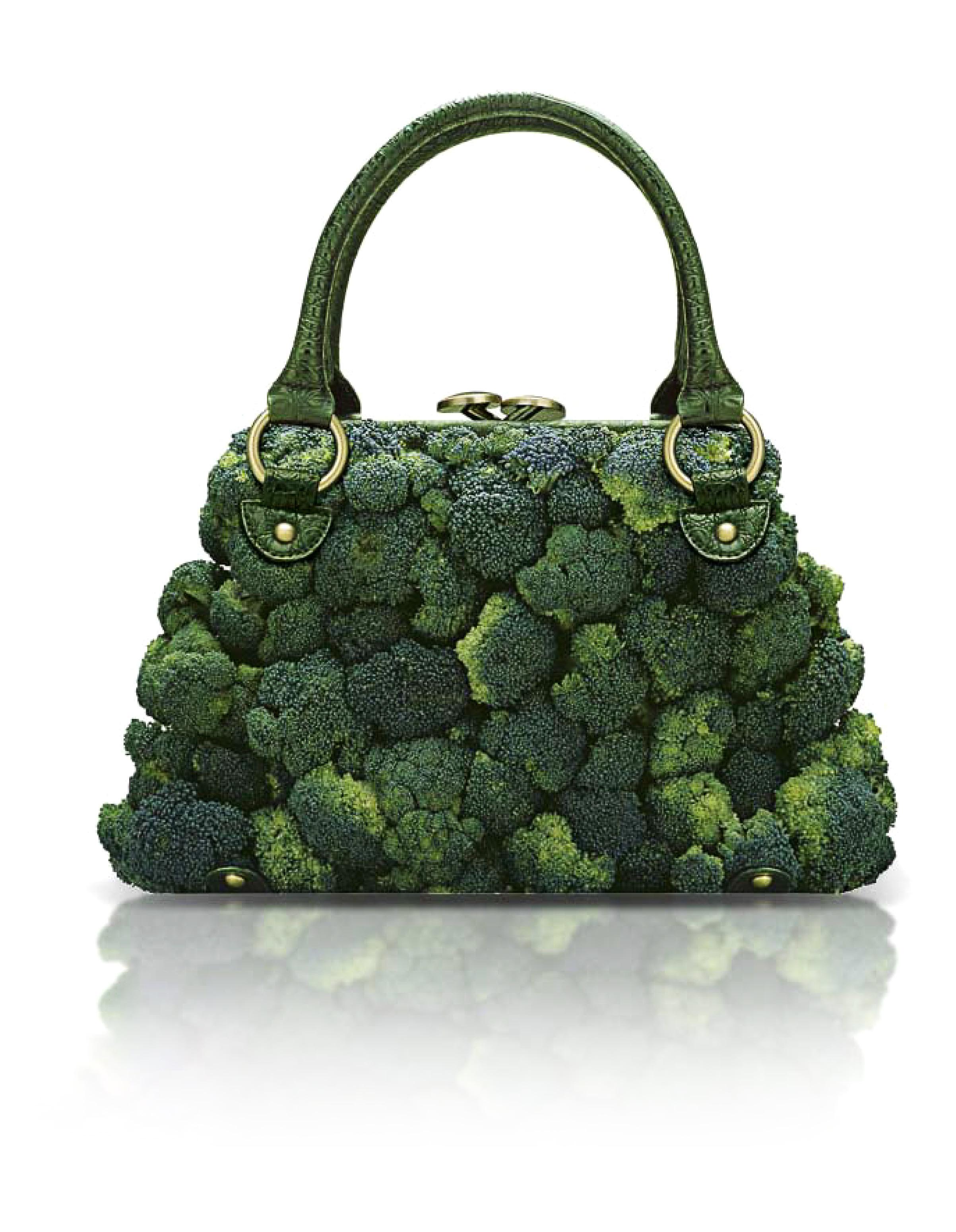
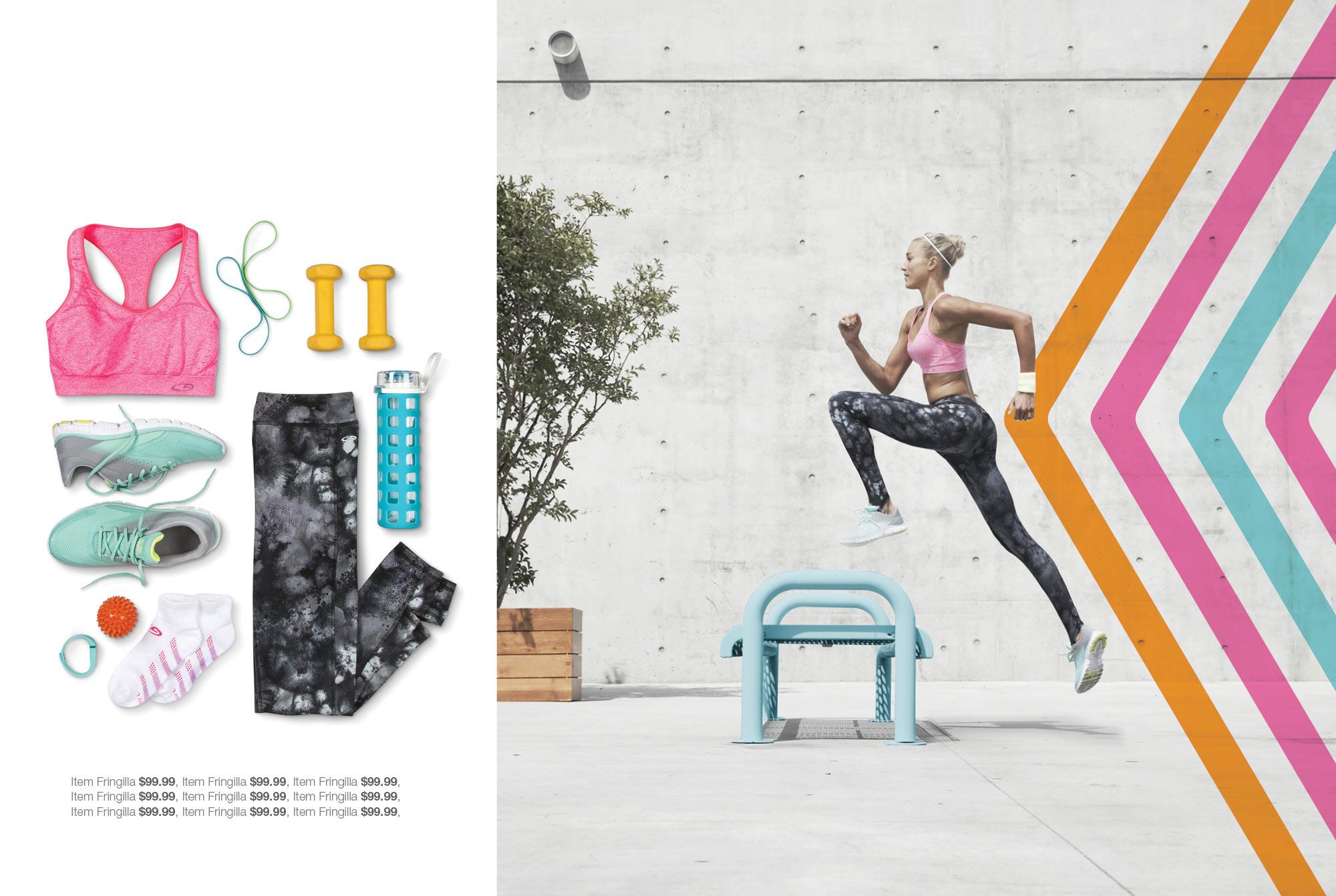
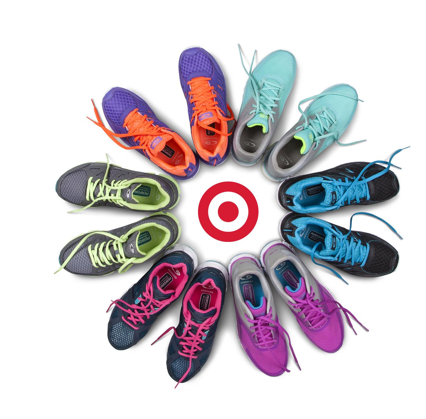
aSamples from Campaign concepts created to, “Take share from Grocery”. We demonstrated this by activating the magic that is Target-- One trip to purchase groceries, while also conveniently discovering items not found at the supermarket.
To Do Ta Da
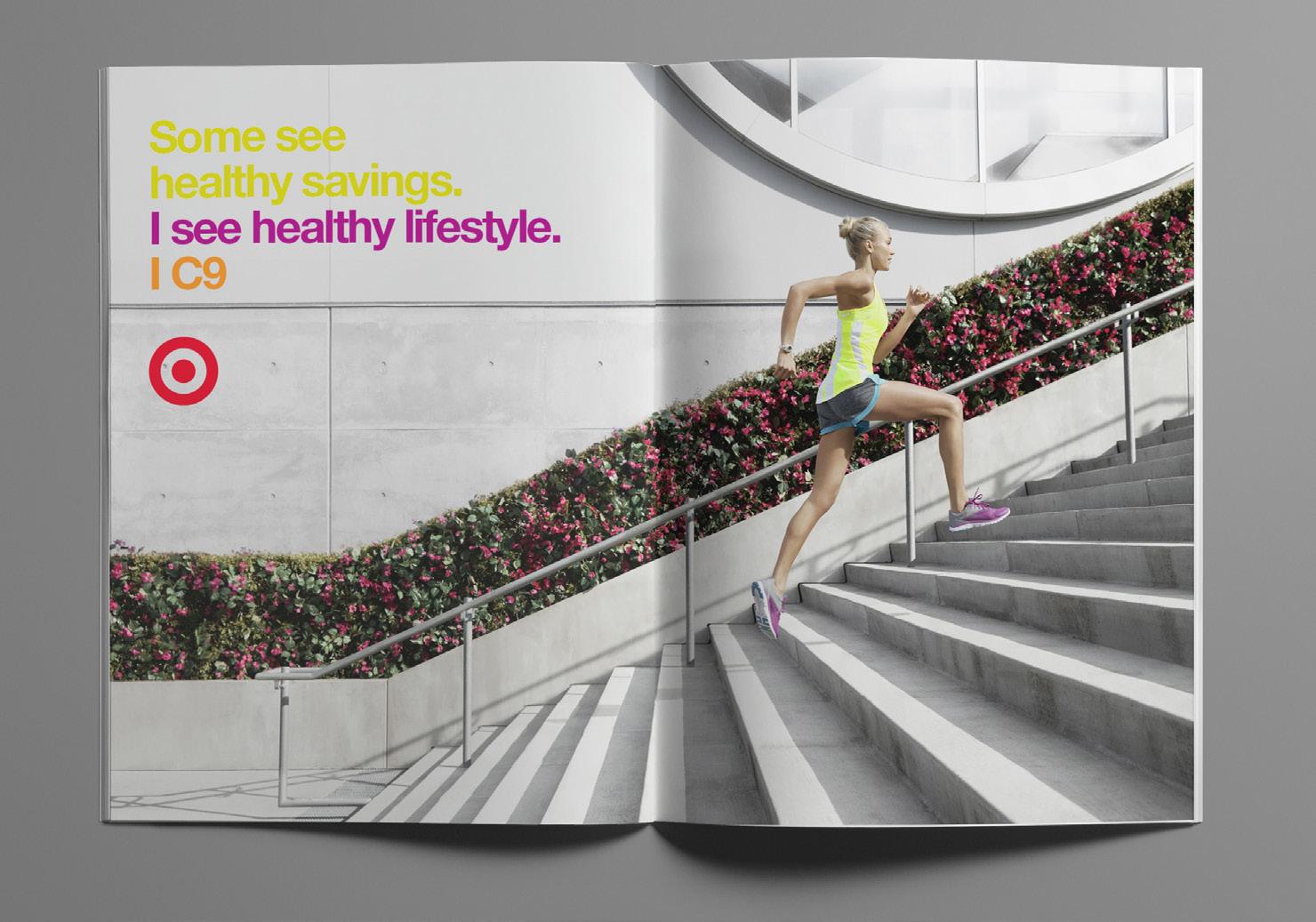
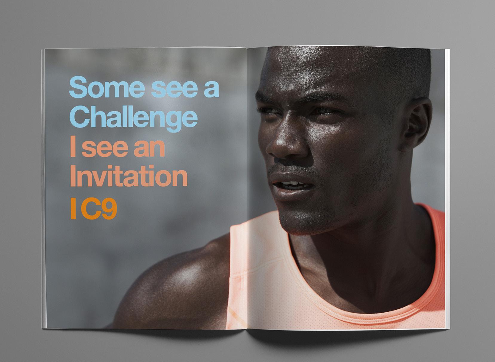
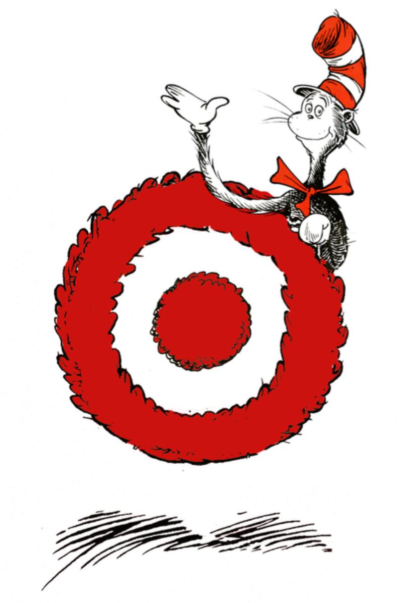
aSamples of print and photography from the IC9 Champion launch. (below is the Seussified Bullseye to support Target’s Community Reading Initiative -Creating the fluffy Bullseye was easy, the tricky part was chaperoning it through the layers of lawyers.
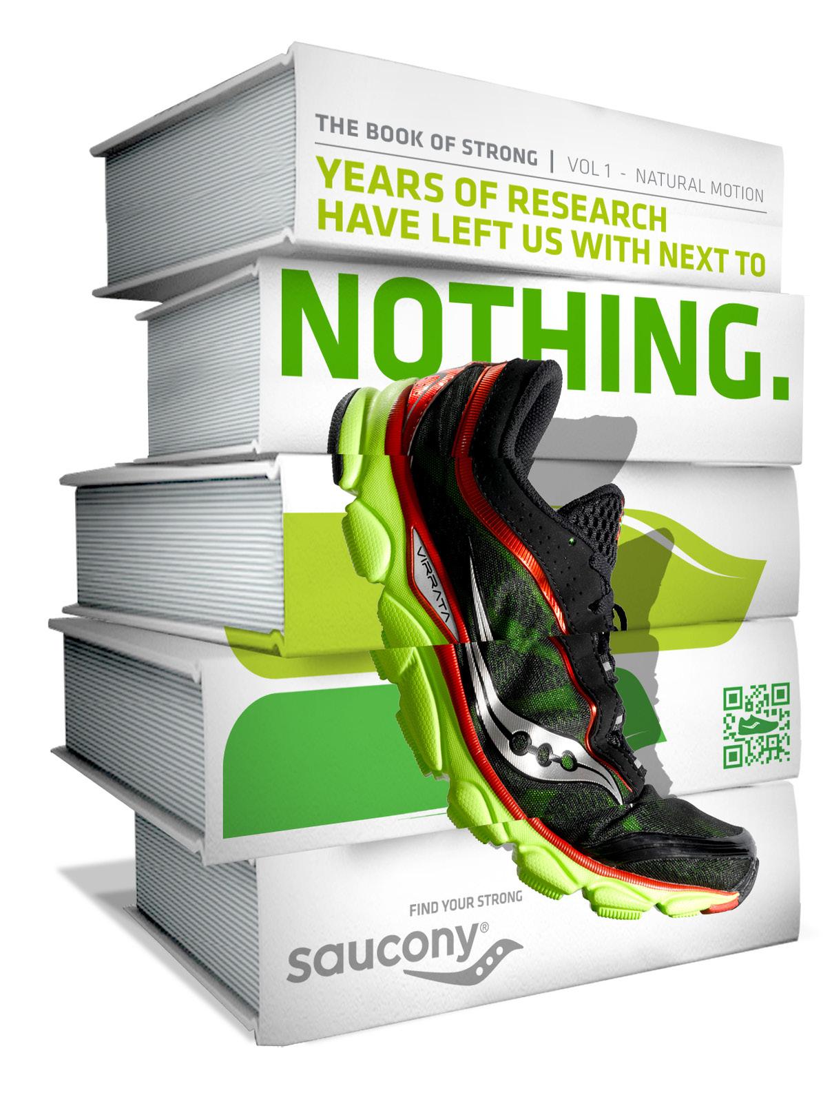
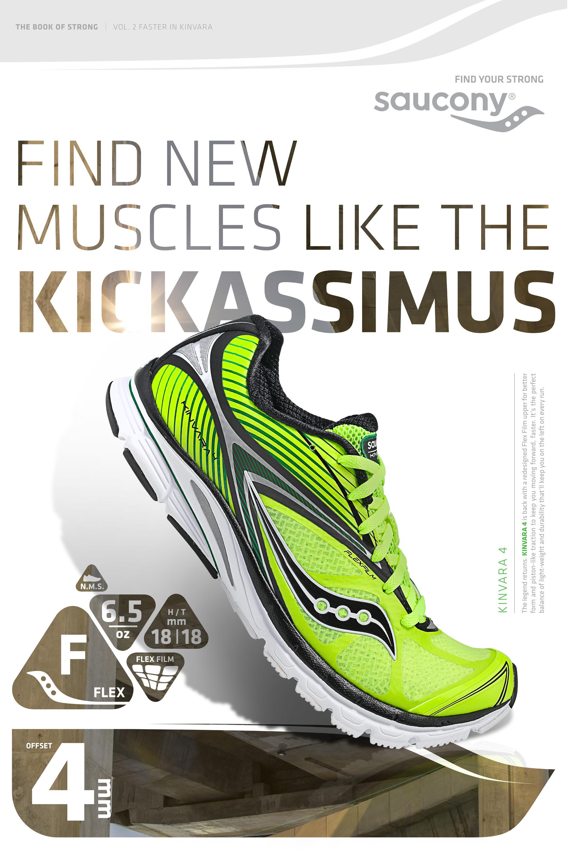
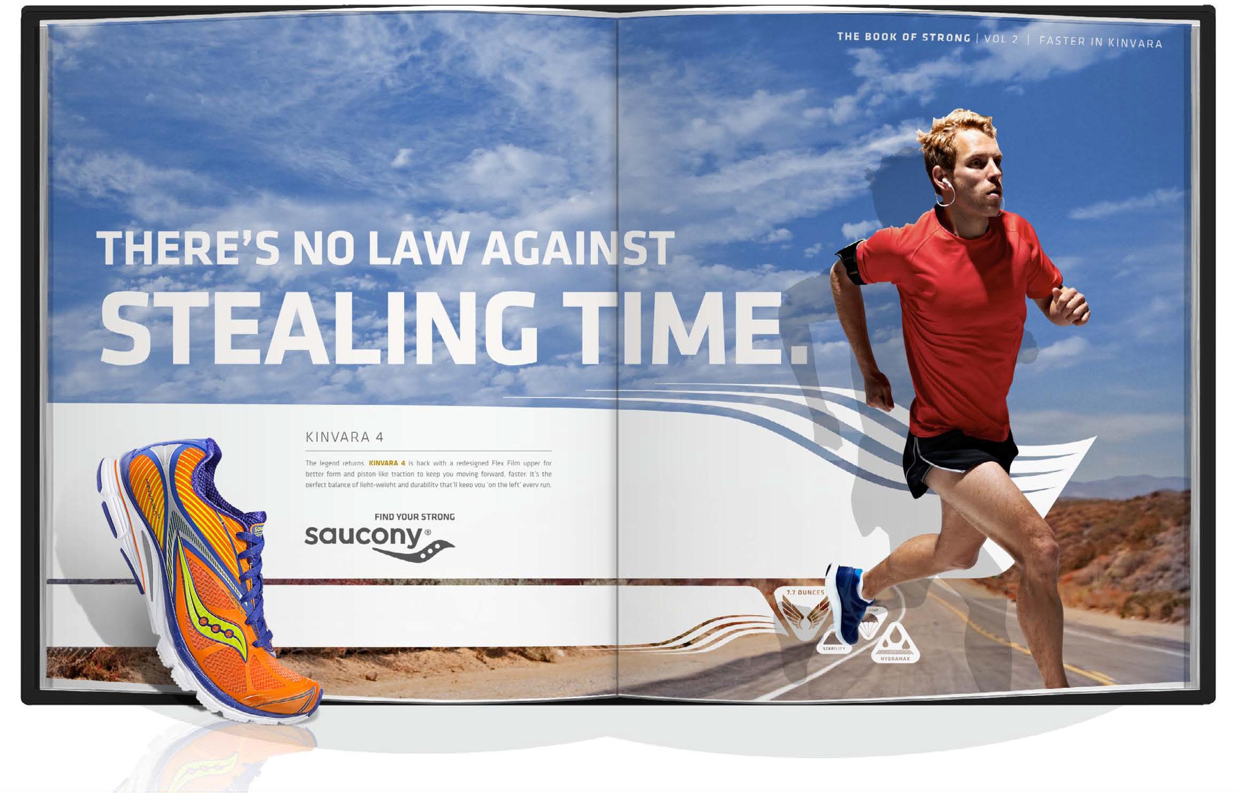
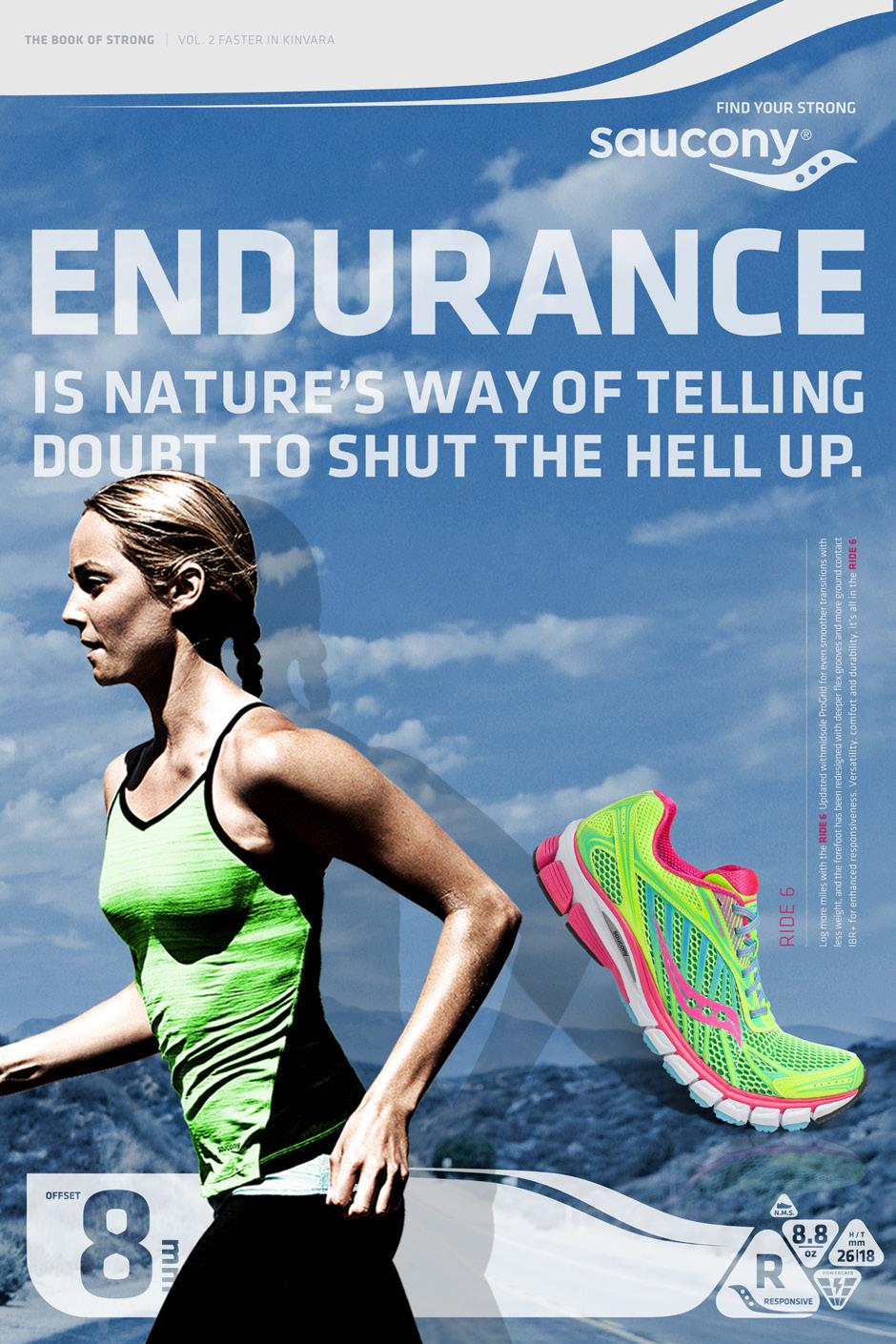
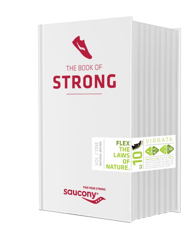
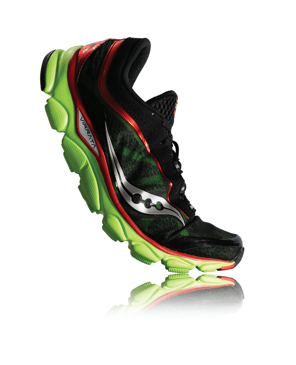
aThis Multi-faceted Campaign for Saucony Running was created as part of a large and talented team of writers and designers while working at Olson. After winning the business, this work set the table for their upcoming new product launches.
We leveraged the fact that, “the more you know about running shoes, the better Saucony compares”. We were uniquely qualified to write the book on running because Saucony exclusively makes running shoes vs the Mega-players like Nike that attempt to service every category.
a More than just a concept, we had to create and implement a design system that could be utilized across all media, at all levels, to ensure a consistent voice.
THE LAWS NATURE.
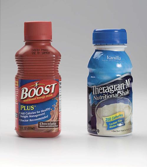
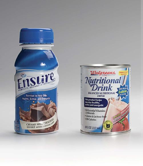
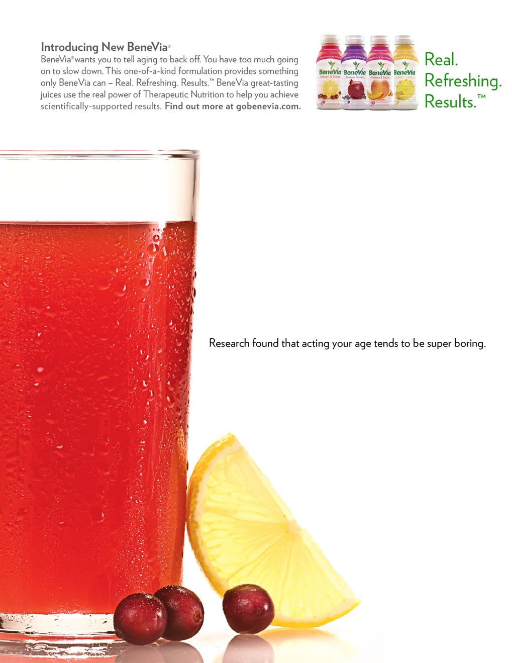
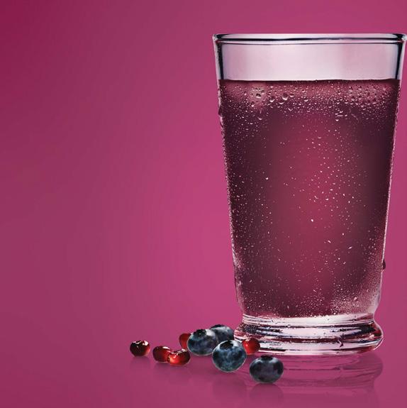
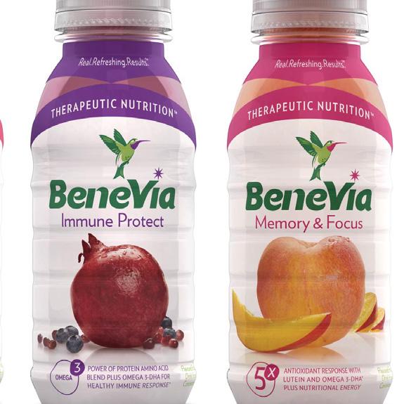
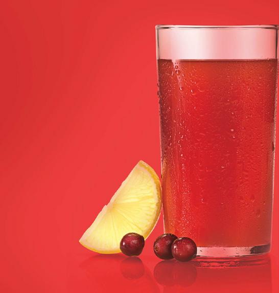
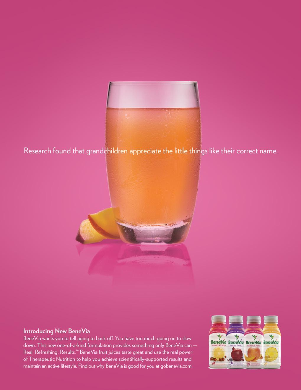
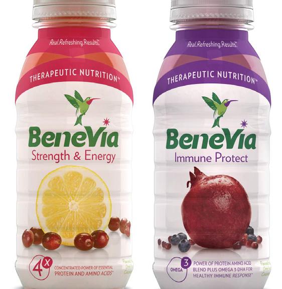
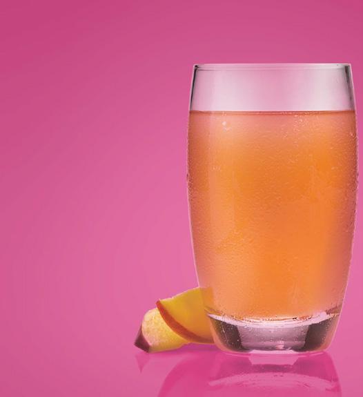
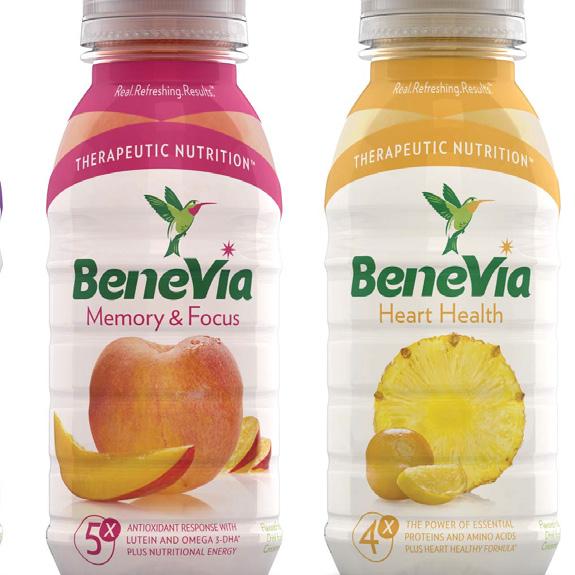
aCategory: Aging - Adult Nutrition Supplement
aThis work was created for the launch of a challenger brand in a category dominated by heavy, thick, chocolate & vanilla shakes.
We were charged with creating the launch campaign, but once engaged, we convinced the client to redesign the packaging. The existing packaging did not differentiate the brand as a beverage that was actually enjoyable to drink, while providing all of the health benefits of the established competitors.
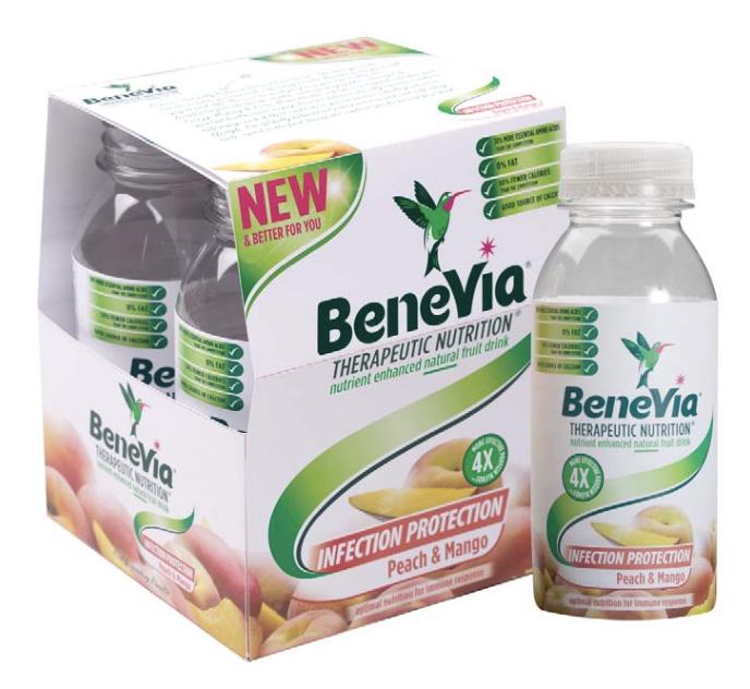
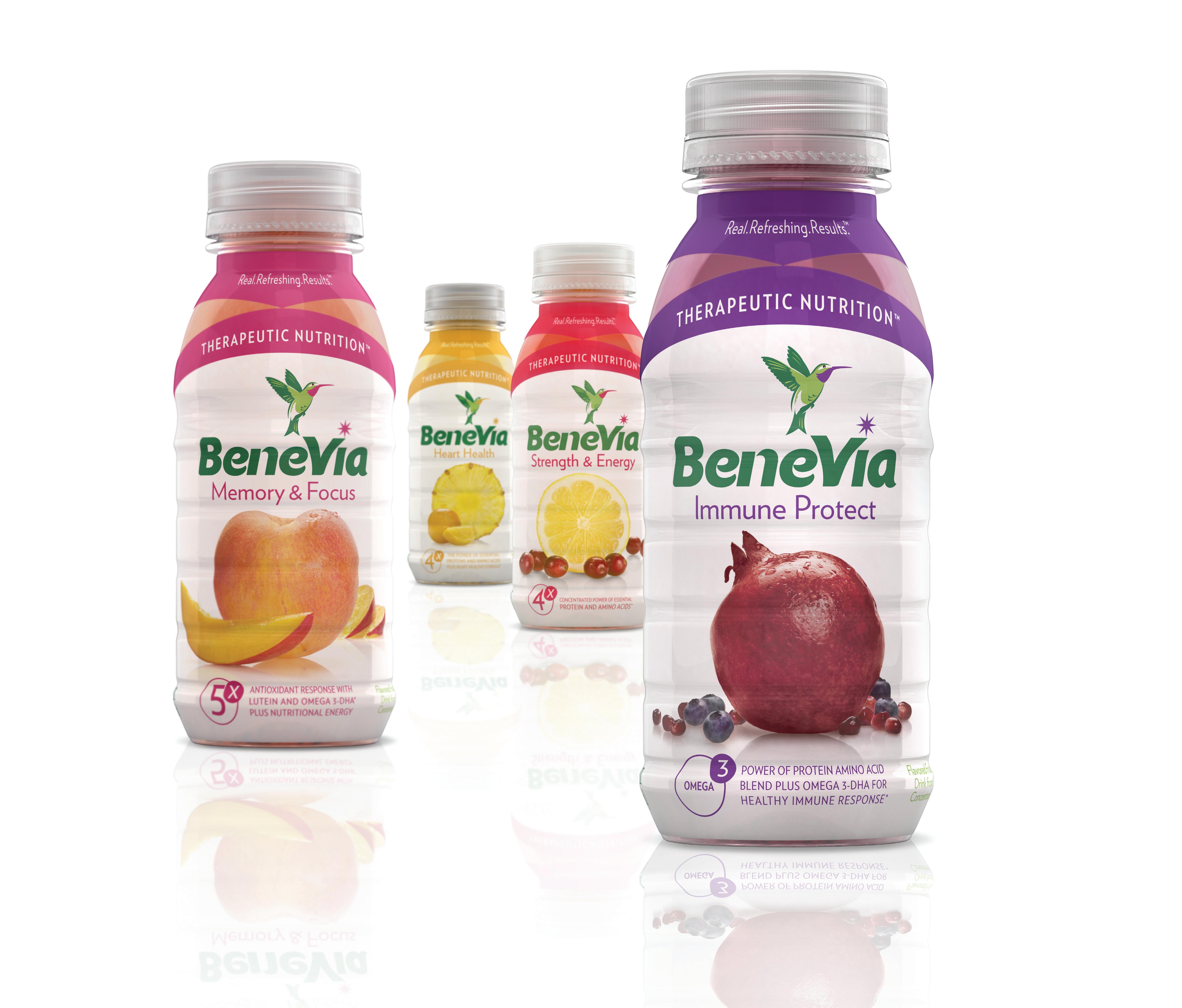
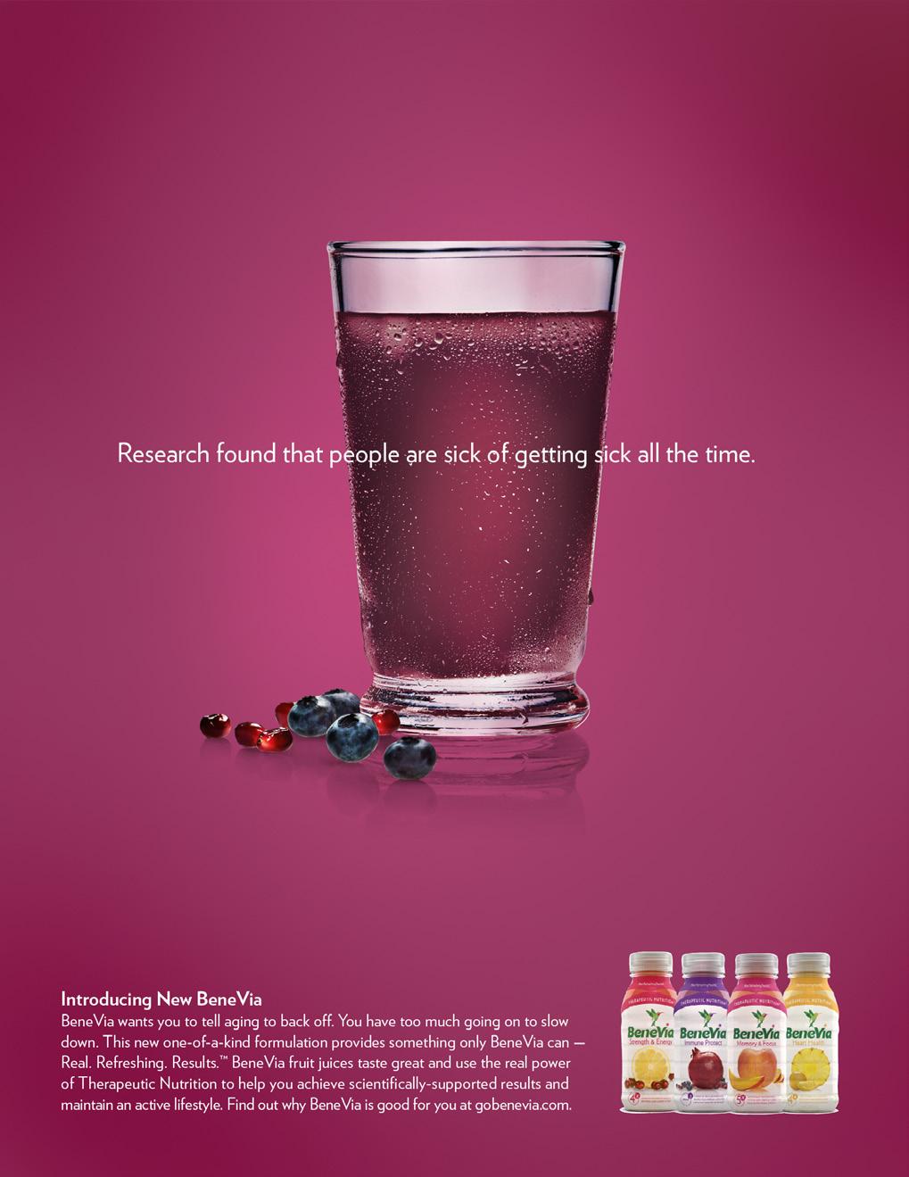
aFinished Packaging that never hit the shelves
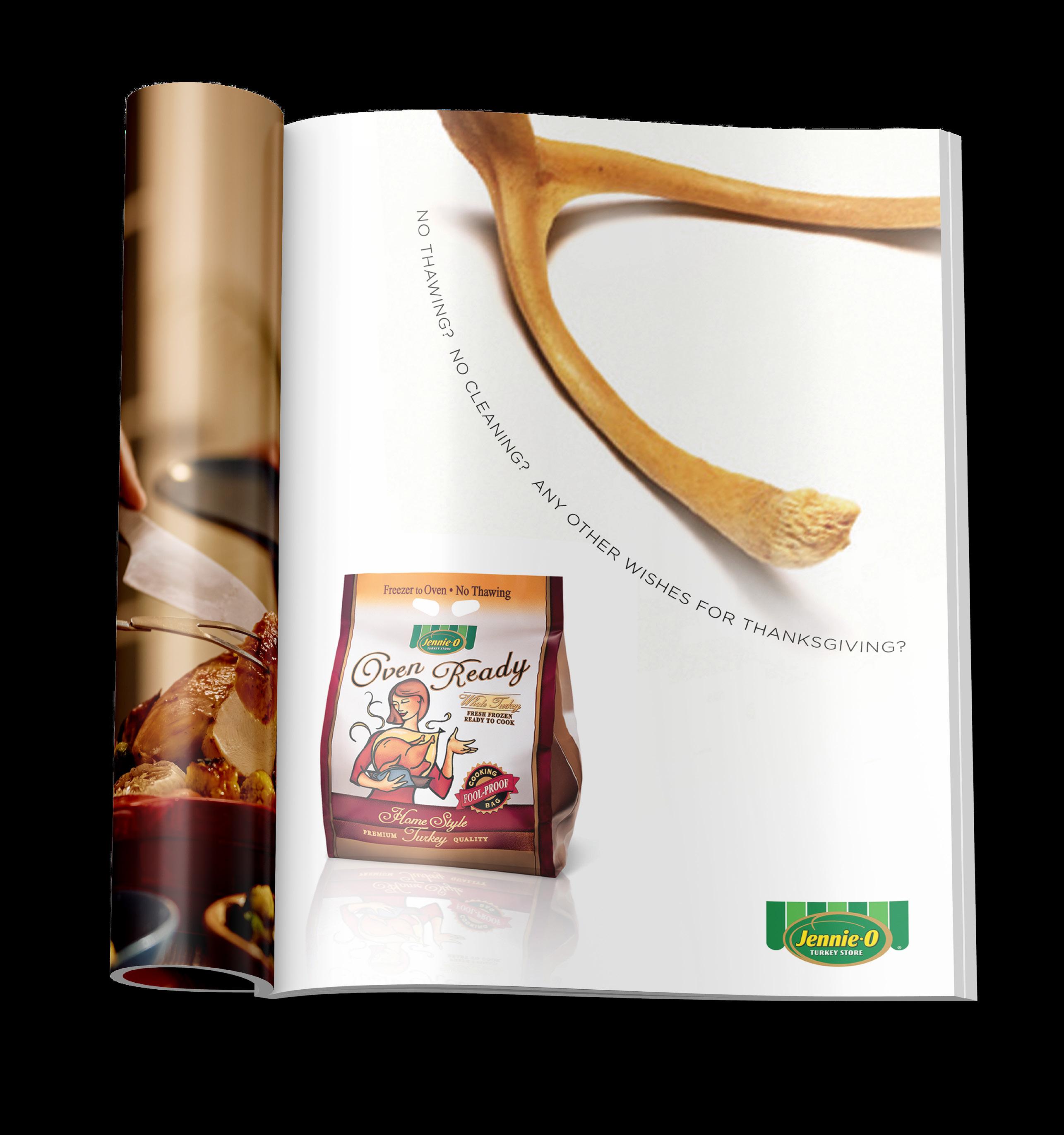
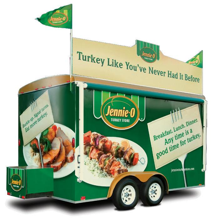
a Just an ad created during Time at an agency with Jennie-O as a prominent client. This client provided many opportunities to enjoy photo direction for days on food sets everywhere. When upper management referred to the look as, “Stark and esoteric” it was a rare moment when I actually appreciated the focus group folks that took my side in a landslide.
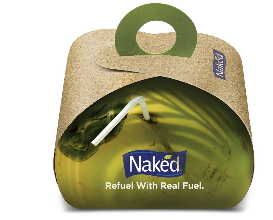
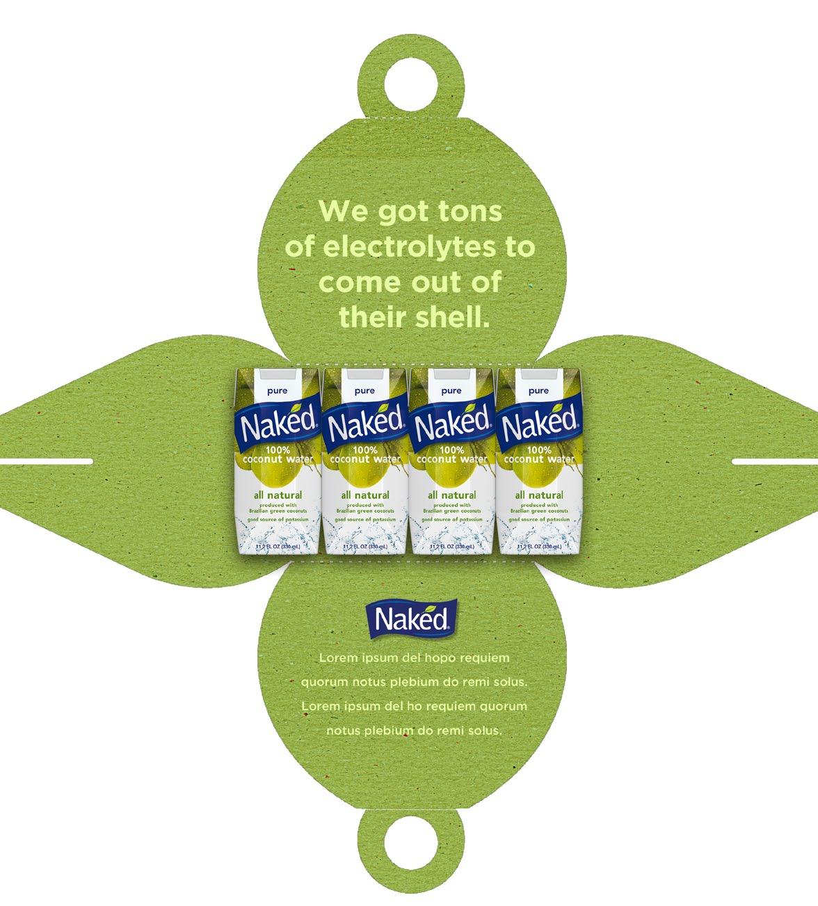
aNot a campaign, but this mailer was a PR Package put together for Pepsi to grab attention of the press & educate them regarding the restorative benefits of coconut water.
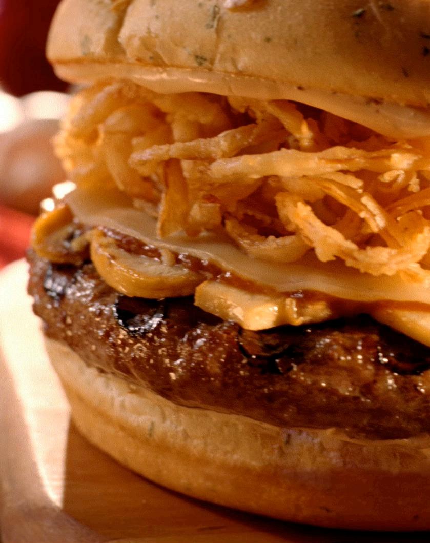
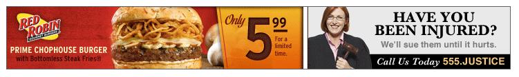
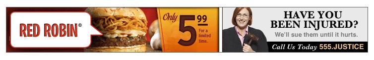
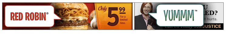
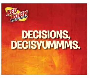
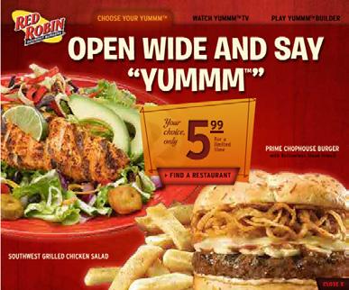
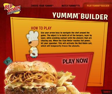
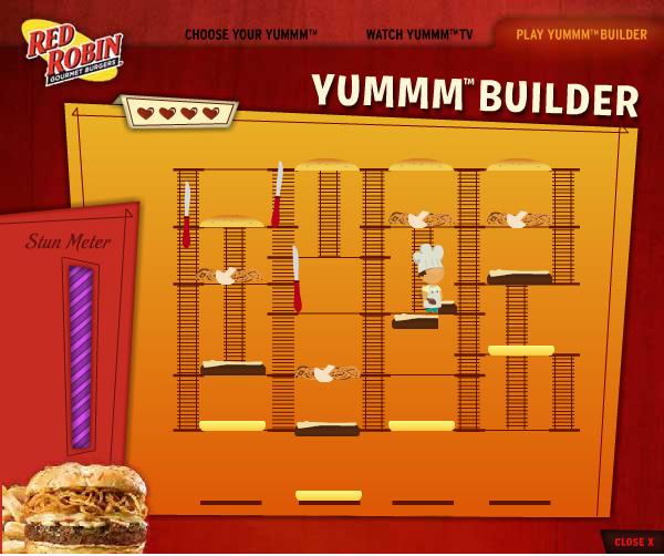
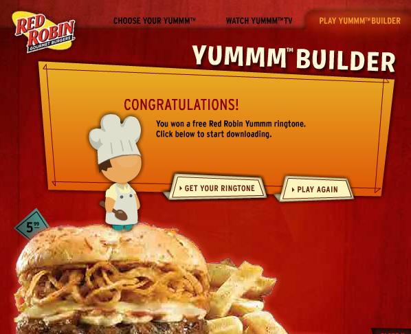
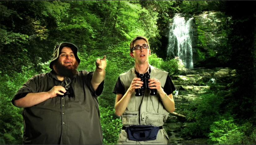
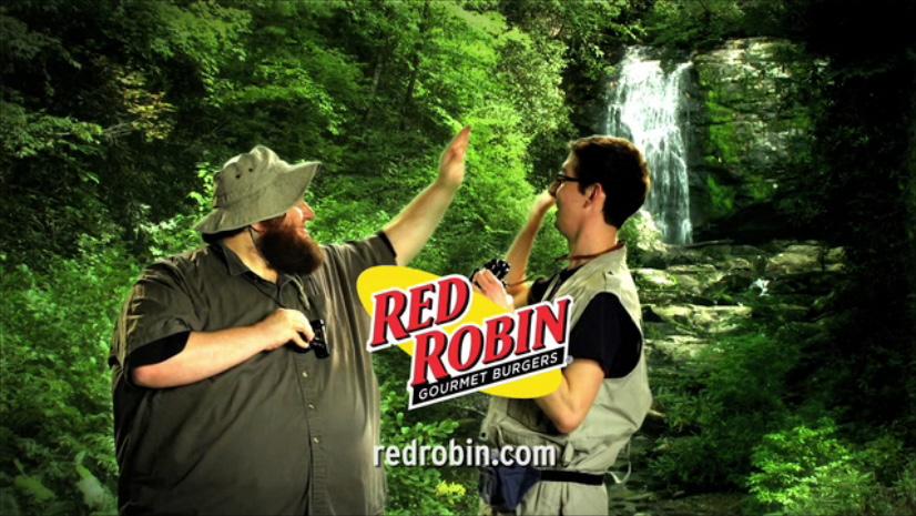
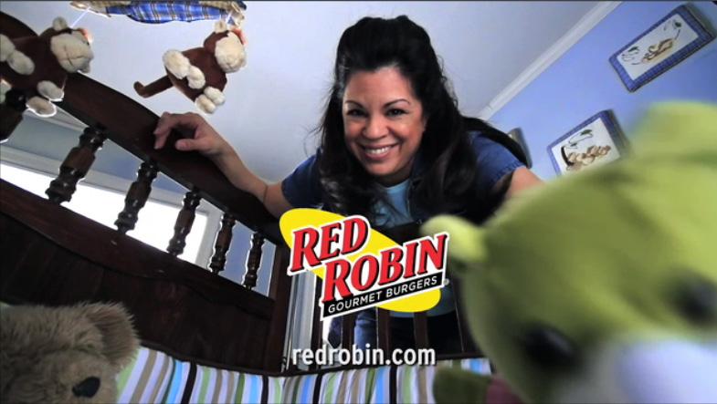
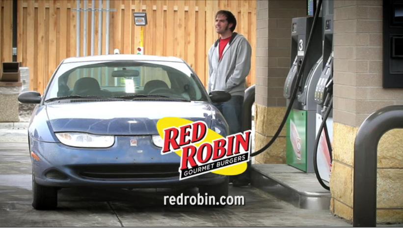
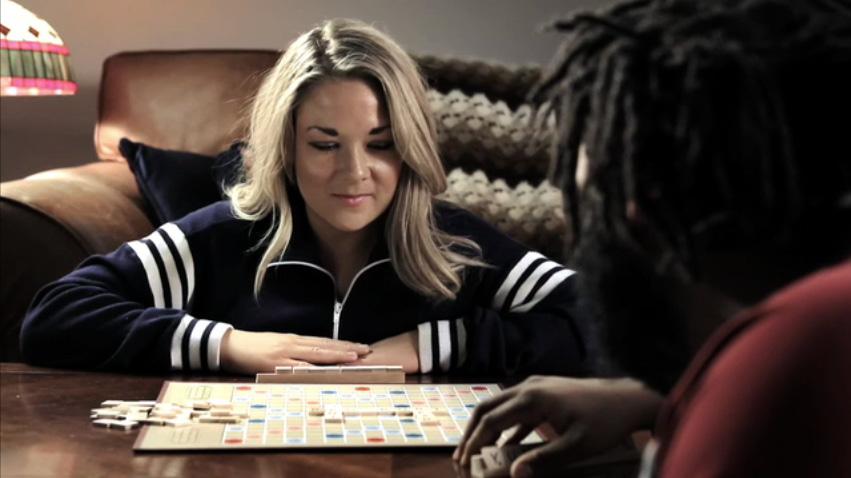
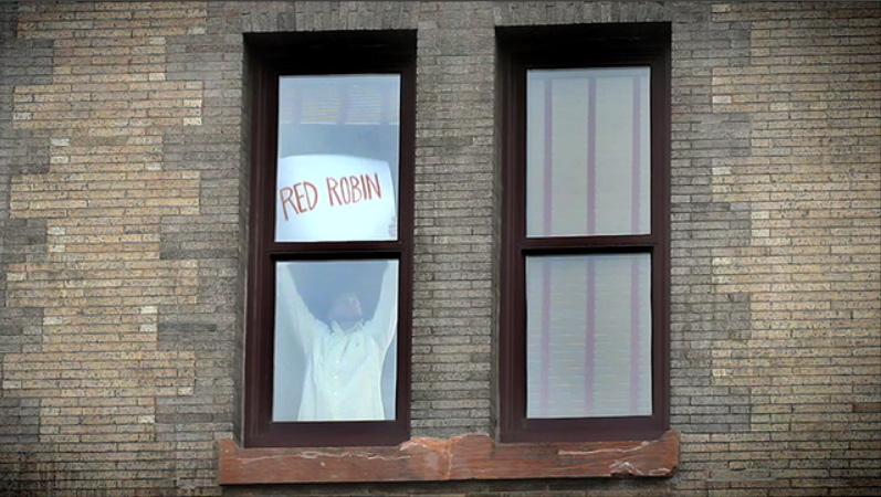
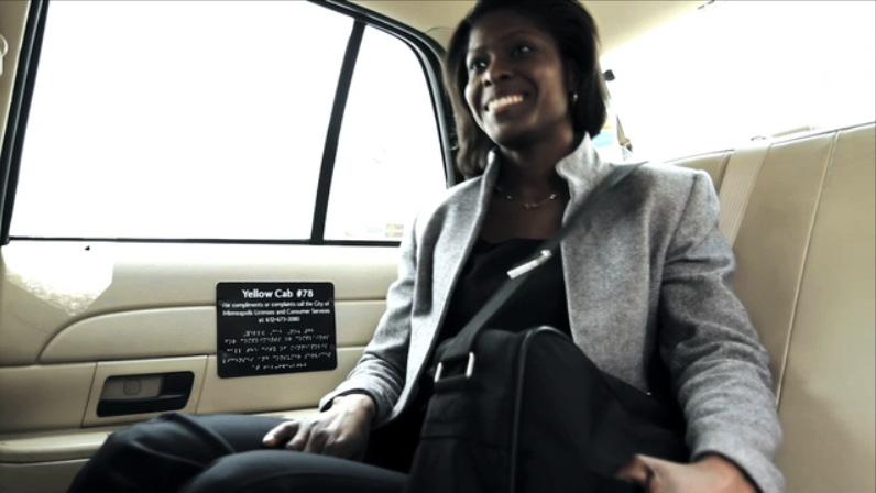
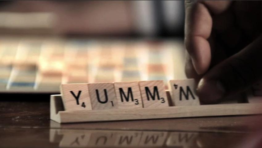
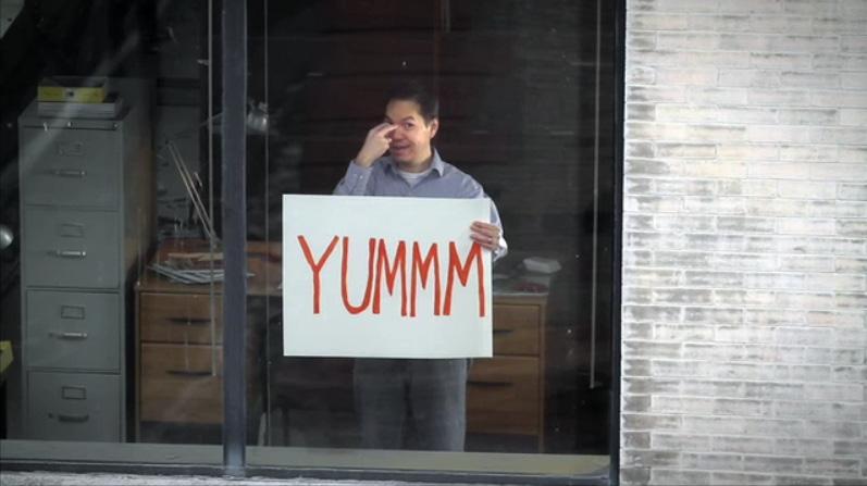
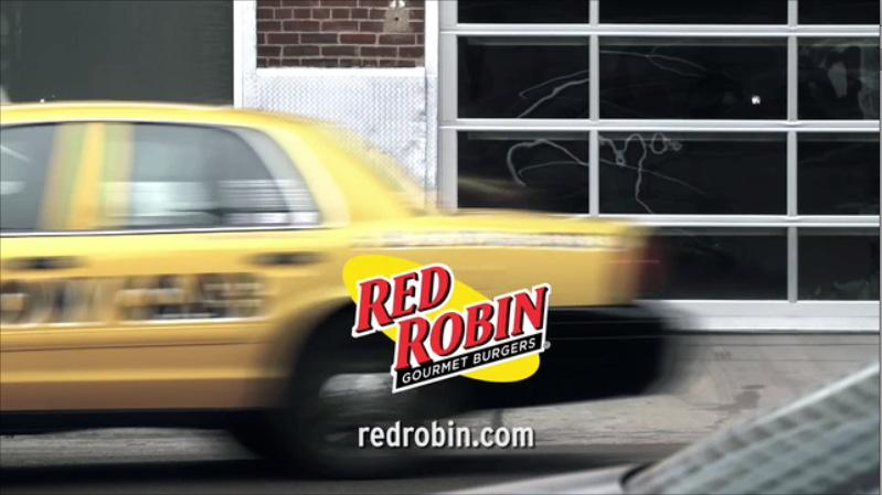
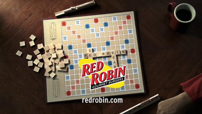
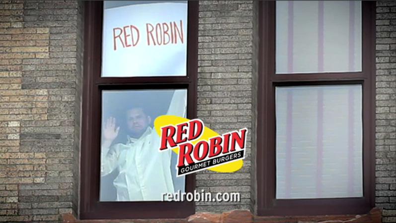
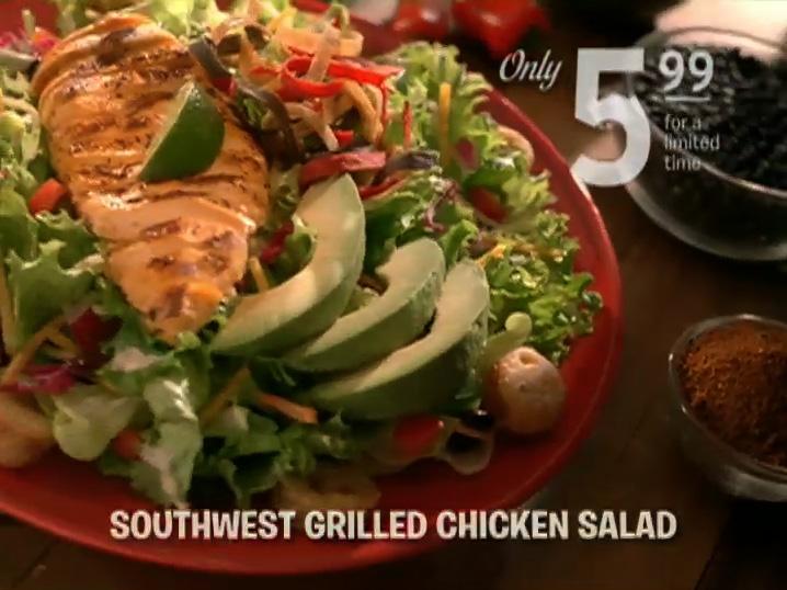
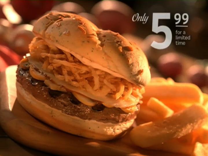
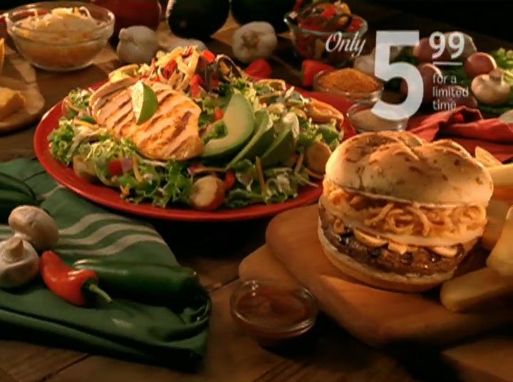
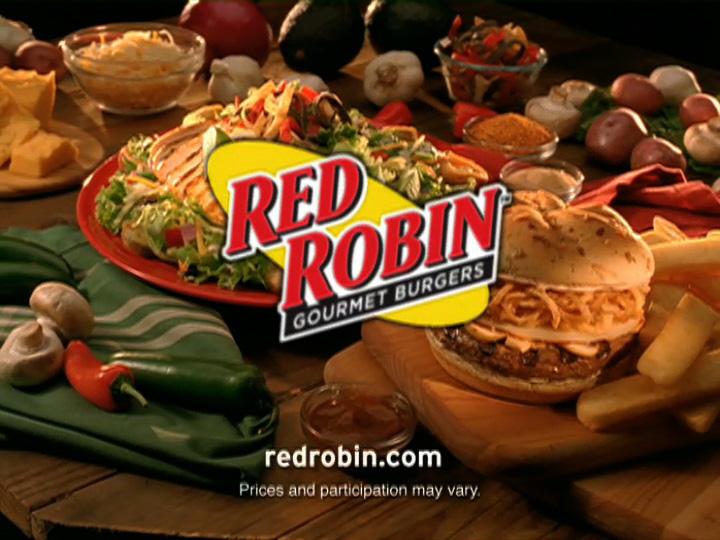
aI worked with Red Robin during my time at Periscope. The YUMMM campaign was launched through numerous TV Spots, Interactive Ads, Gamification apps, (and any other media you could think of) to get people answering the call for YUMMM!
a15 second vignettes (leading to the food as hero) were incredibly efficient at delivering the YUMMM call & answer
KEY LEARNINGS:
The memorable now tied the BECAUSE product imagery, Not as fun Robin, but
LEARNINGS:
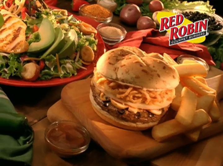
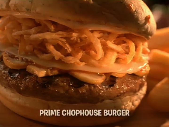
memorable focus group results were that people the YUMMM to the mouth-watering menu
BECAUSE we directed the client to invest in their imagery, MAKING THE MENU THE HERO!
fun as finding out Sasquatch is a fan of Red but just as satisfying.
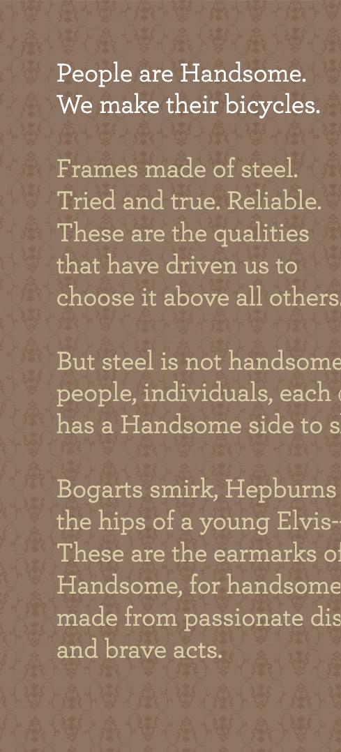
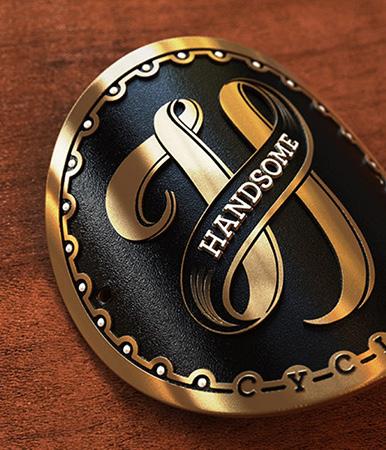
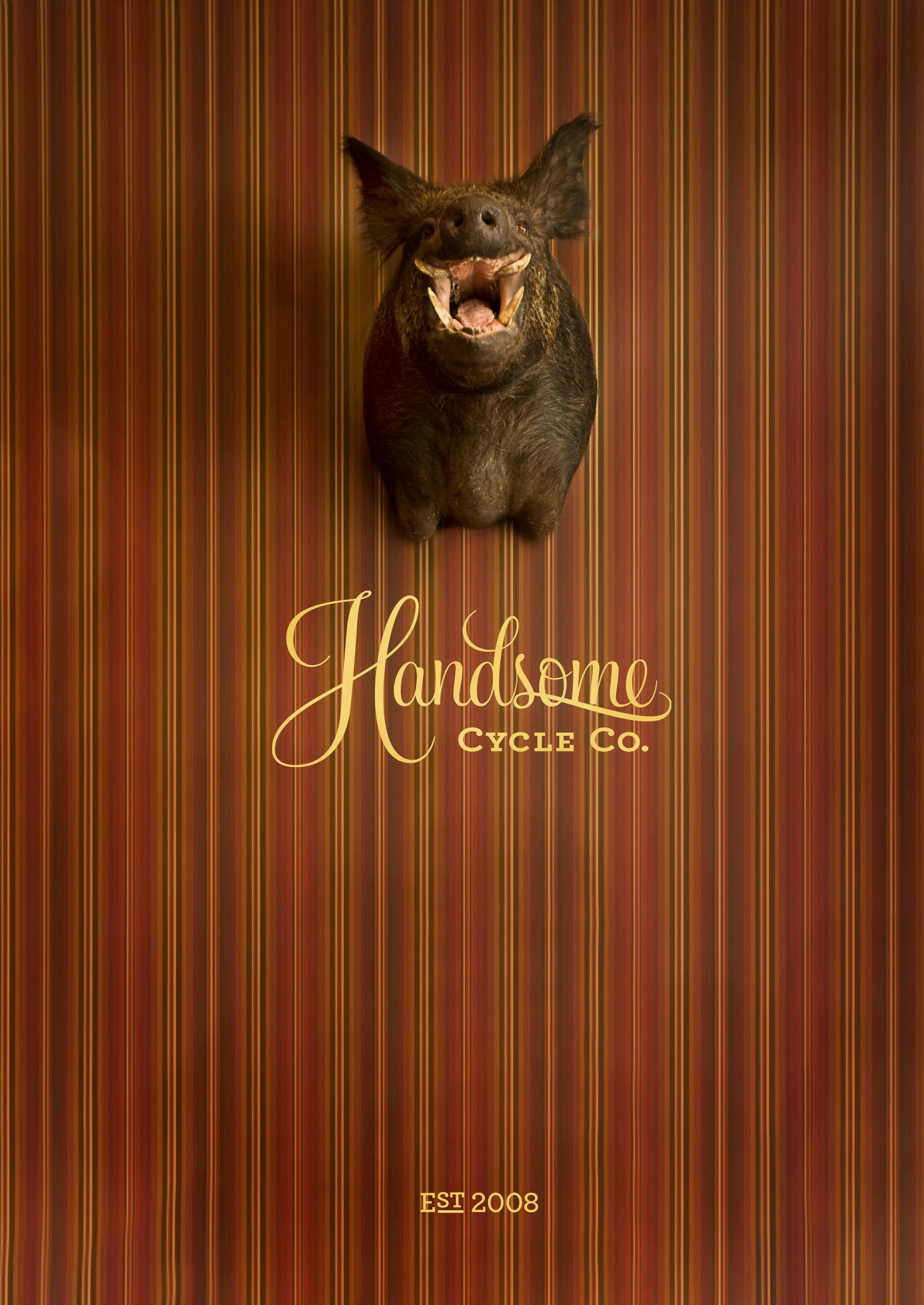
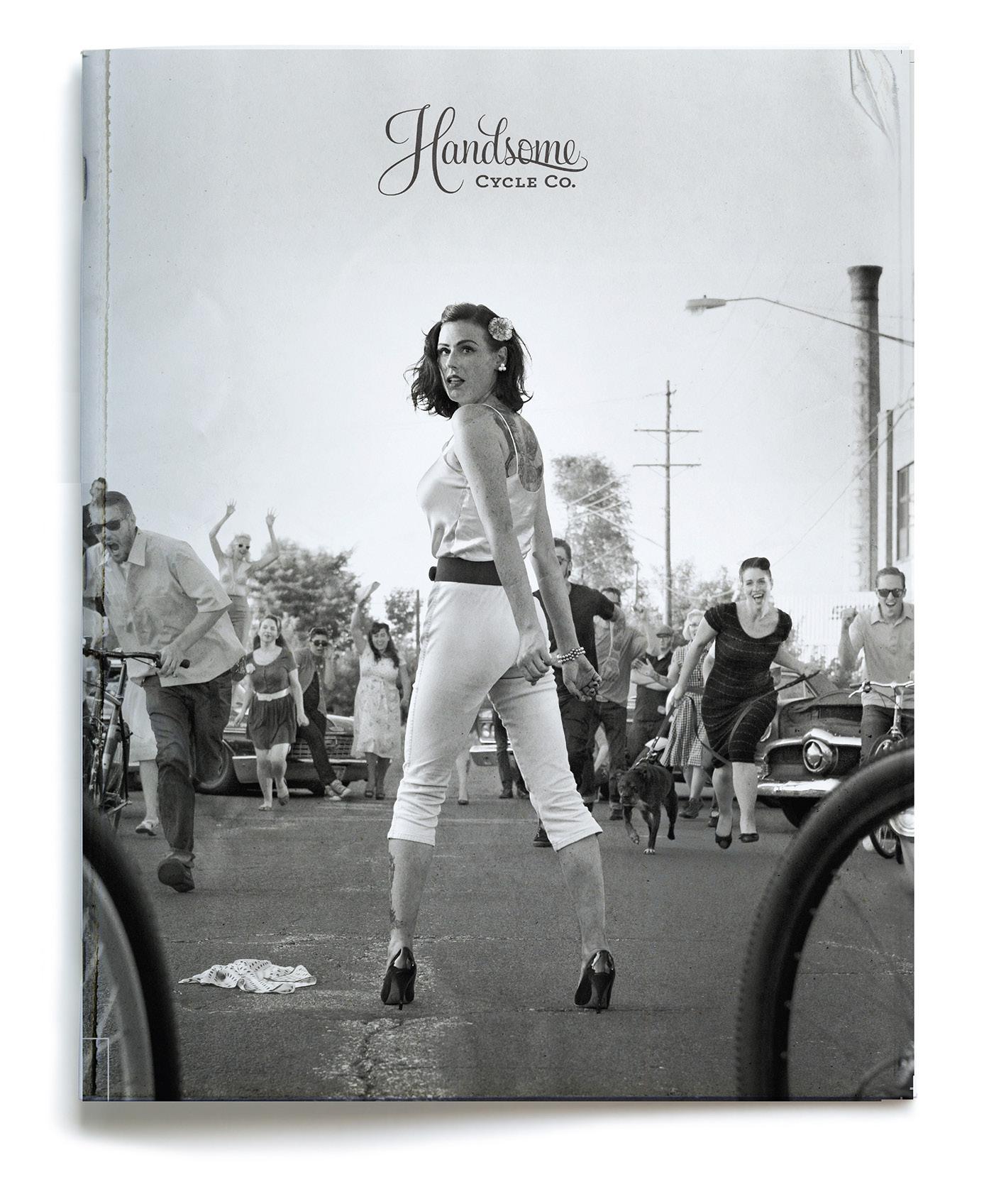
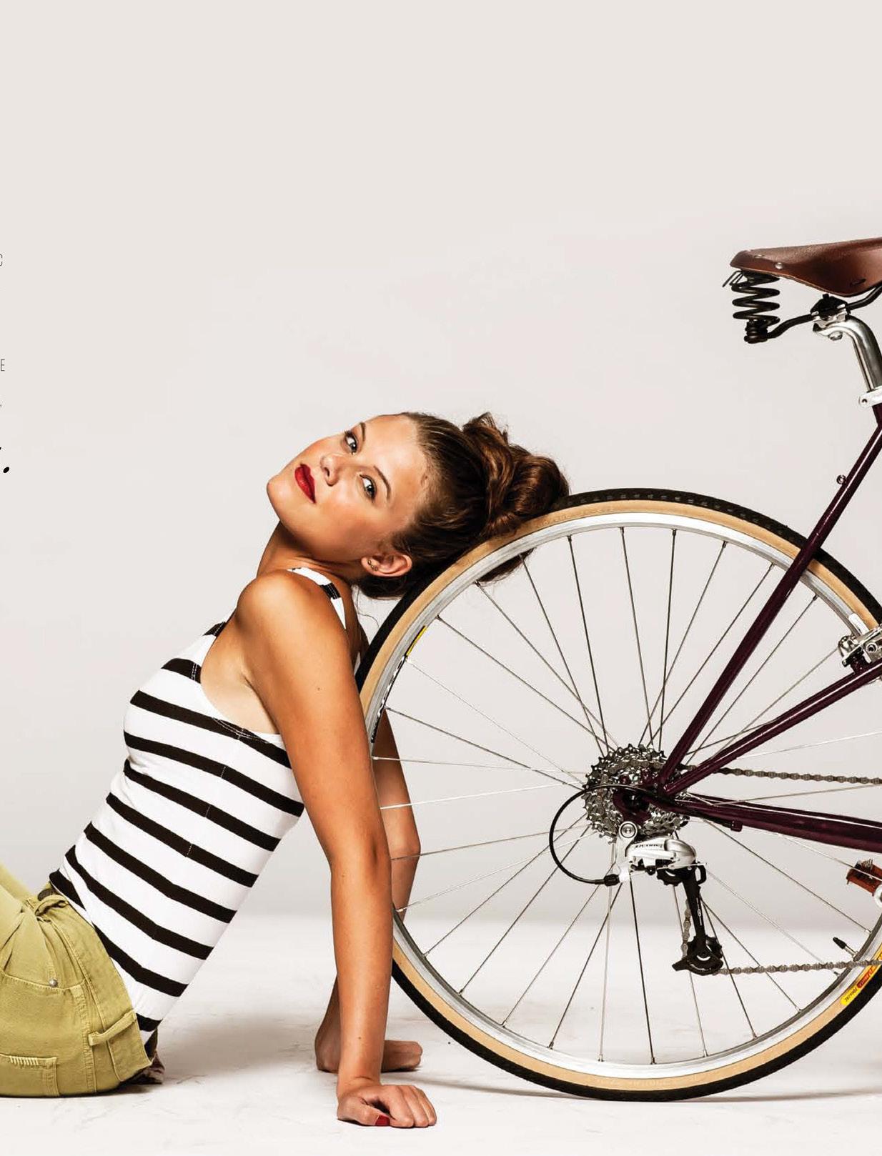
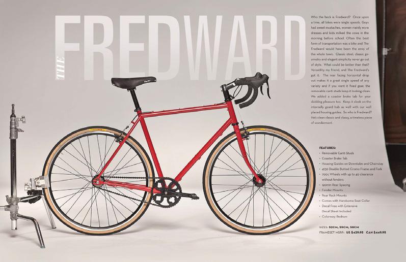
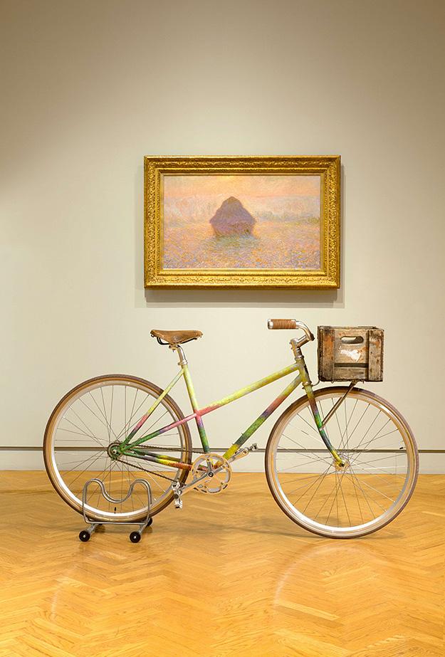
a There was not a hipster-driven-mustache trend in 2007. It can be traced back to the introduction of Handsome Cycles. Two friends came to me and felt we could create a new line of bicycles fed by our belief that more people everywhere would ride more if it was enjoyable.
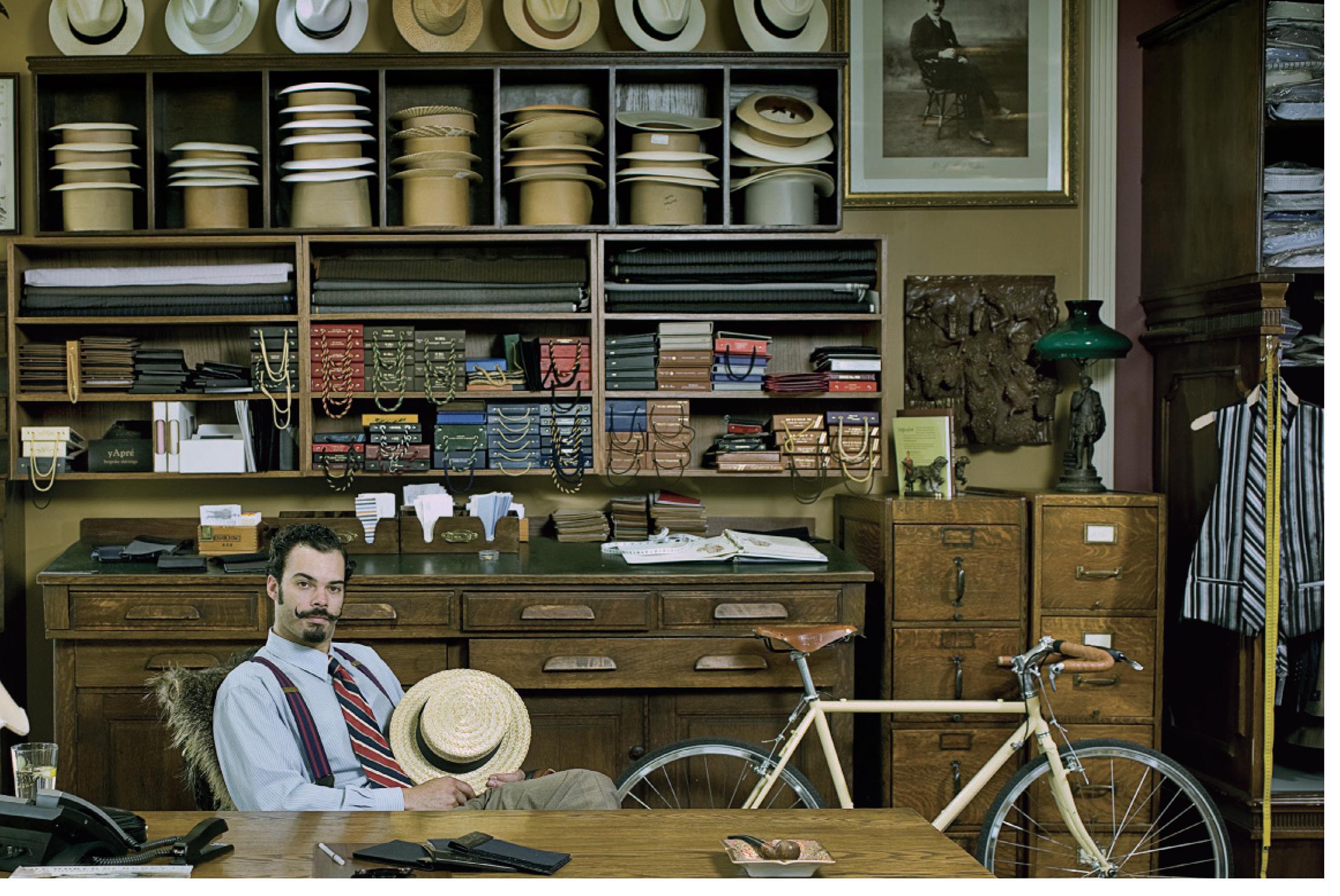
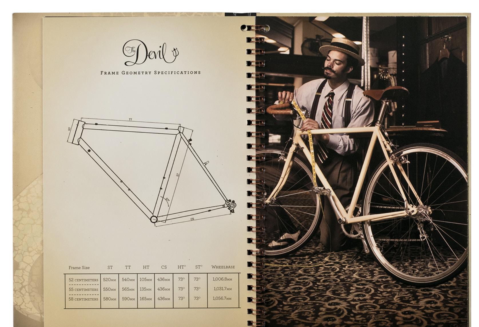
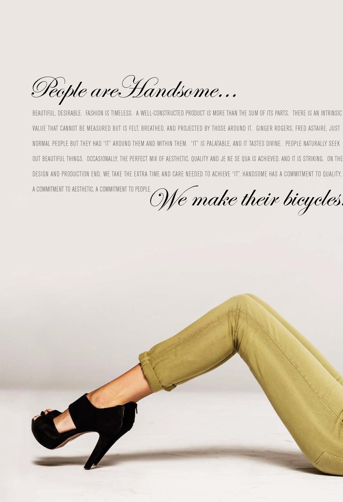
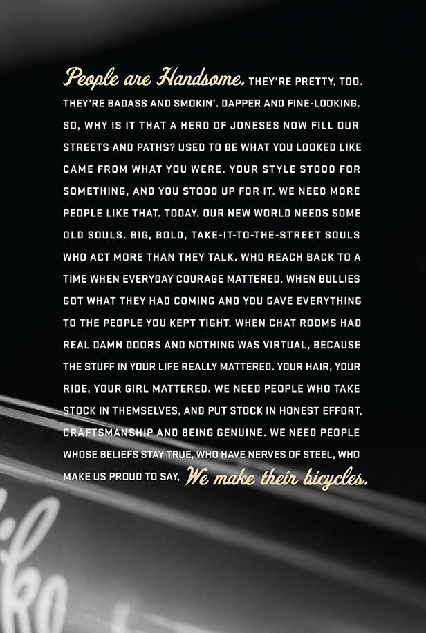
aThe product drove our brand position, “People are Handsome. We make their bicycles”. AS A MINNESOTAN, I am compelled to share that all of the work on the next few spreads (a small glimpse of 8 yrs. working on the brand ), had a total budget of $ 0.00. This first year campaign was shot four days later on a Sunday, with Mr. Mustache Jim, and the only actual bicycle we had built. Great results for a side hustle.
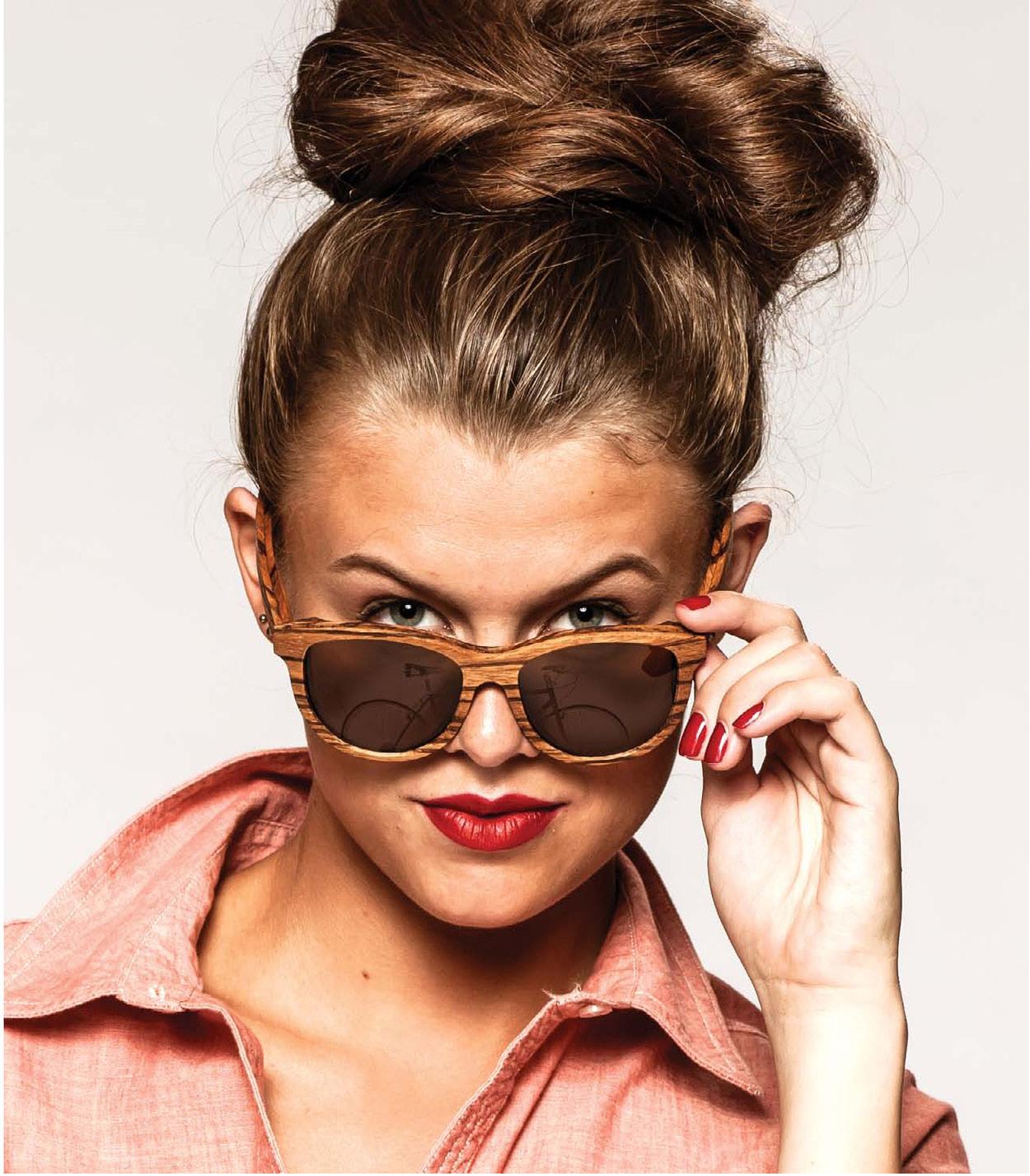
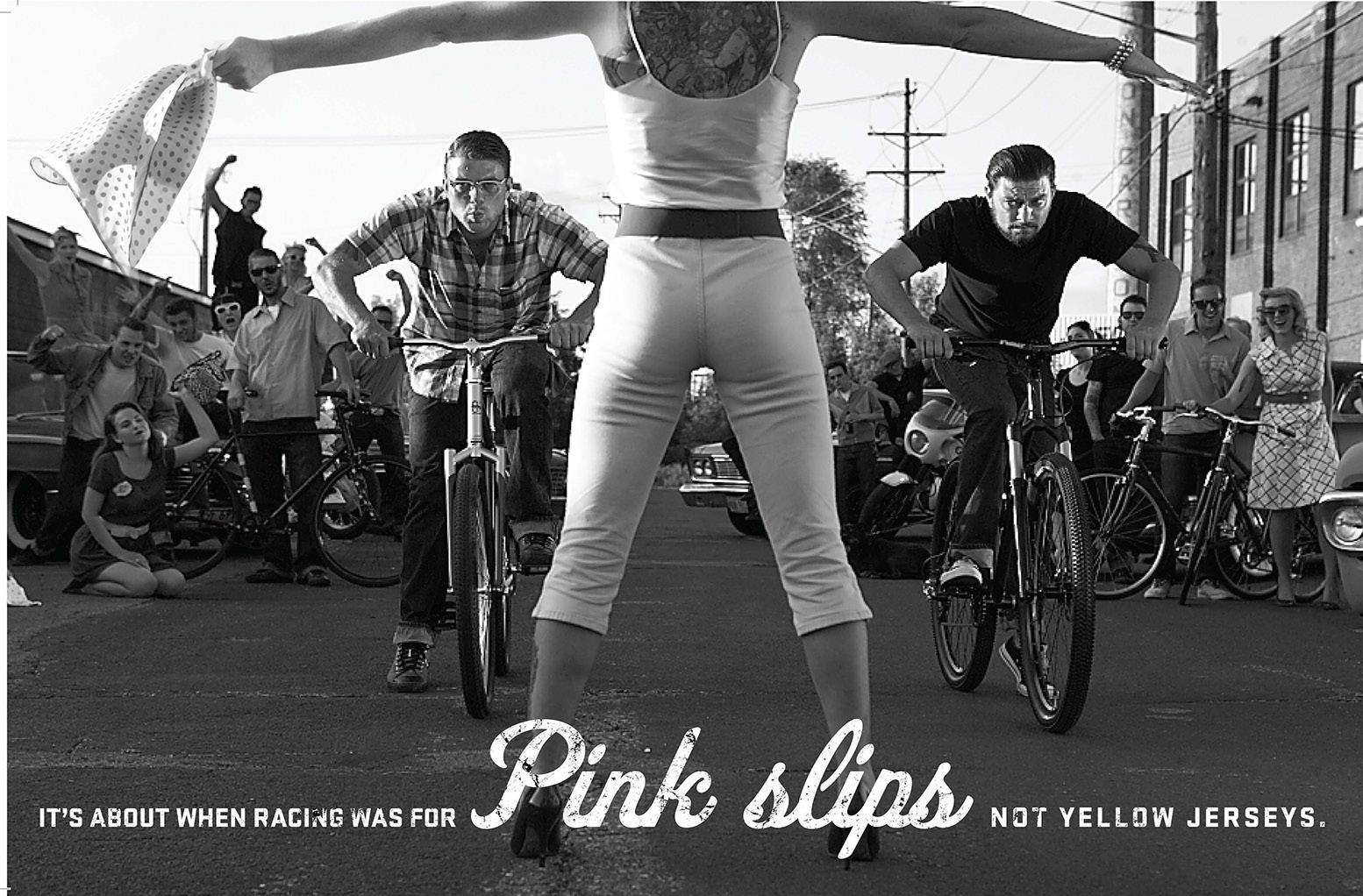
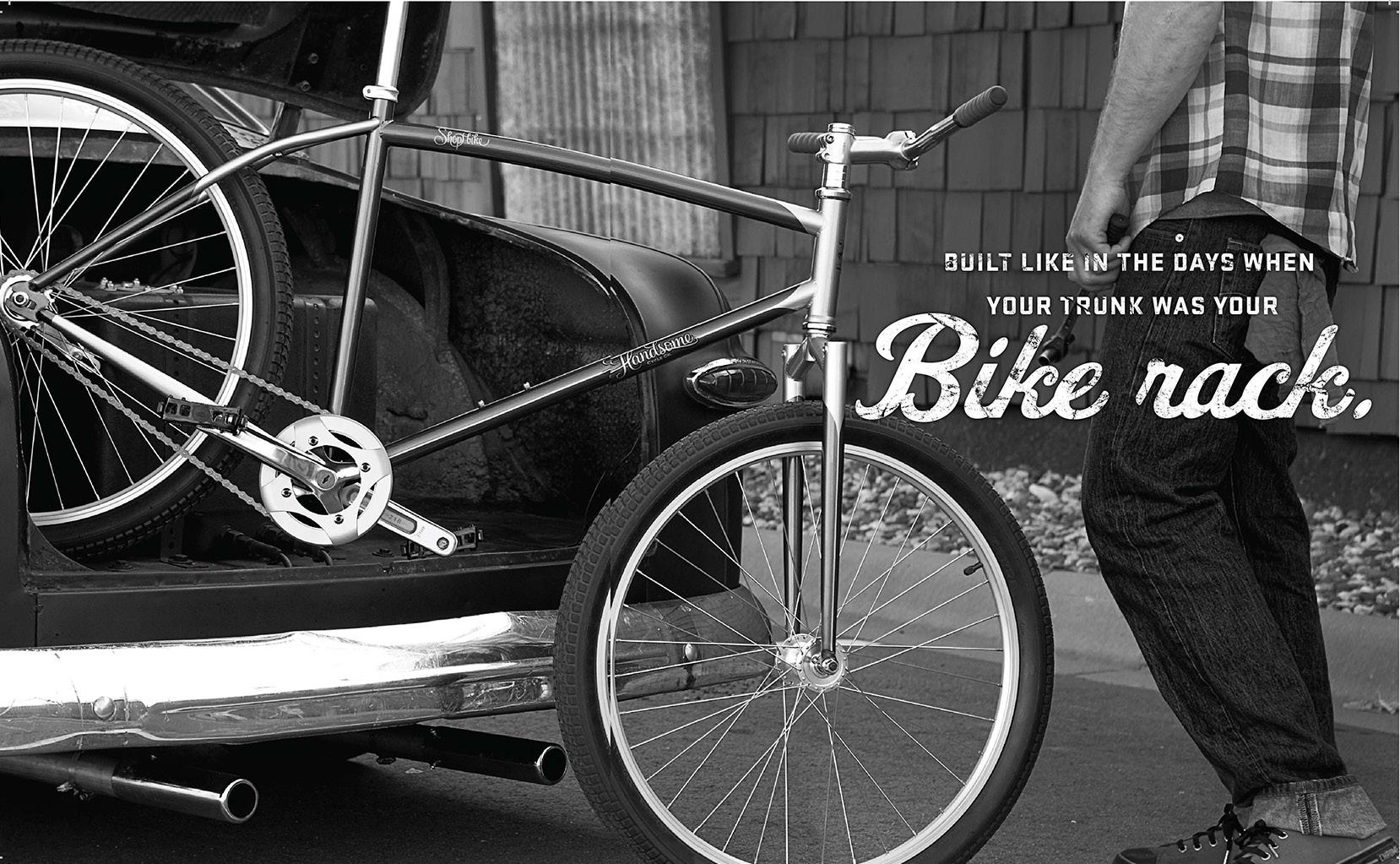
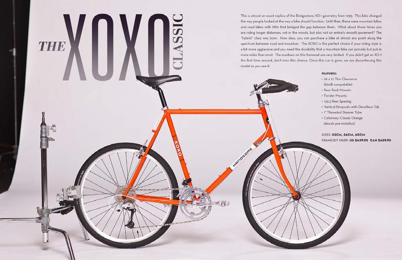
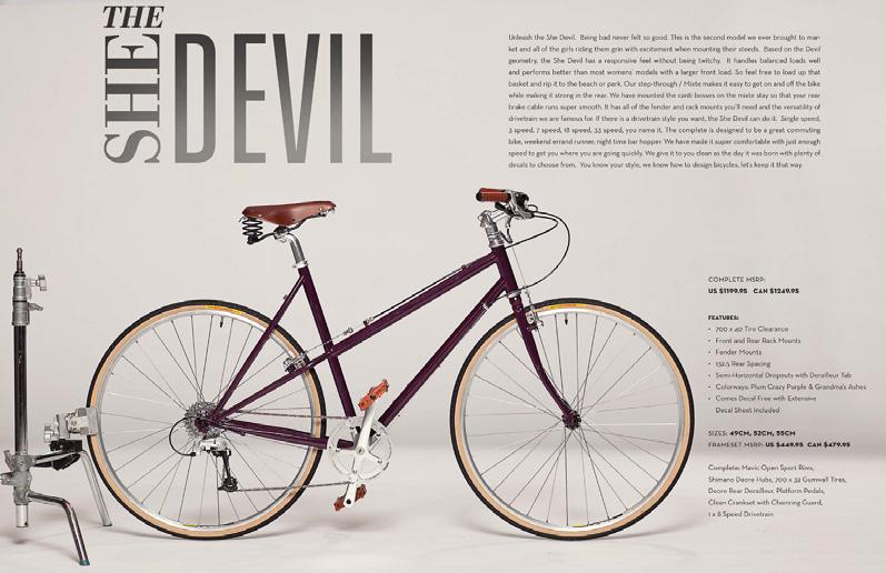
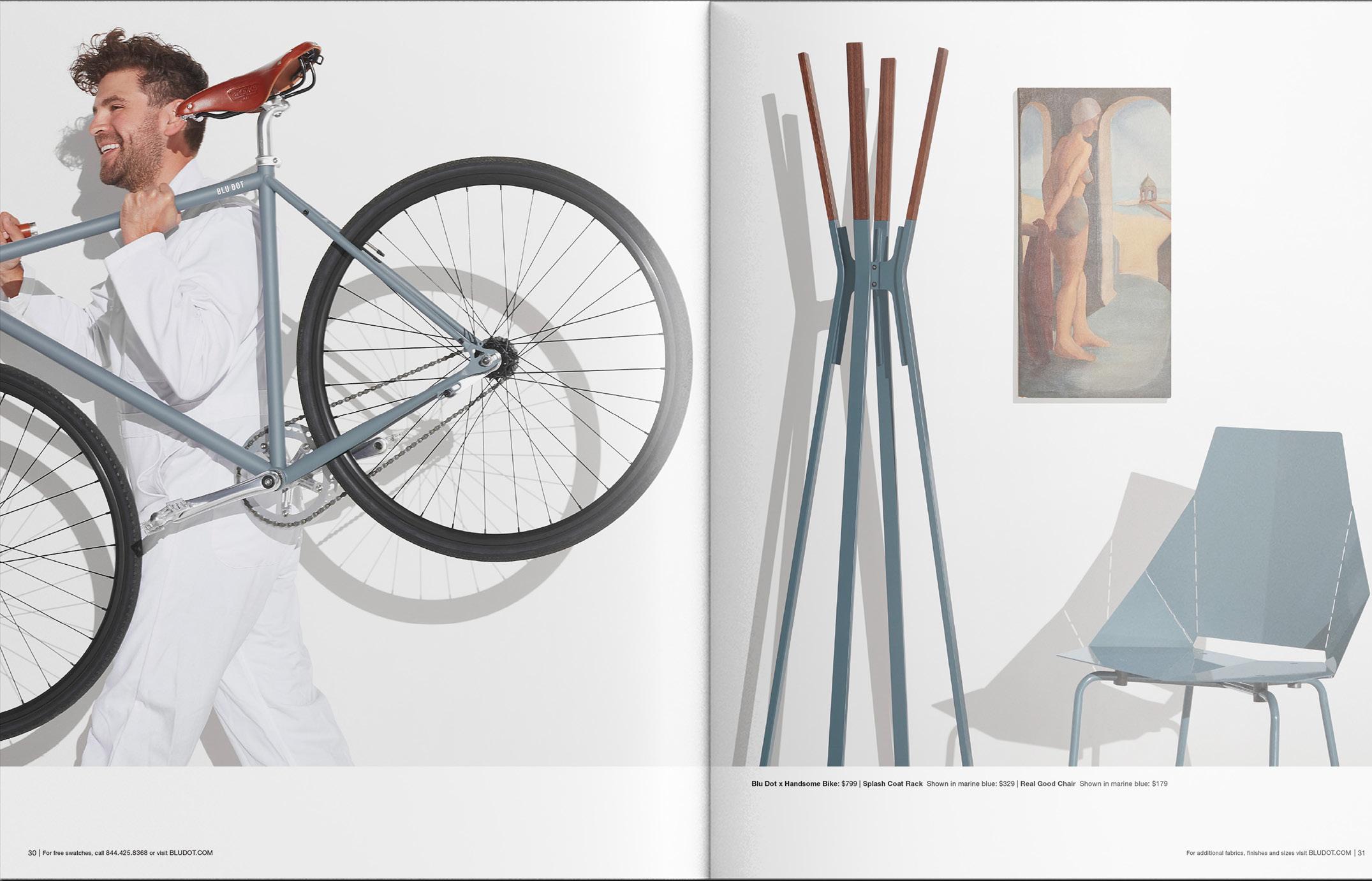
a Every year we would create a Handsome Catalog to feed our B2B & B2C marketing needs for the season. Whether creating a fashion look for a behind the scenes vibe, or convincing my project manager (below) and a bunch of friends to drink PBR on a closed street-the look evolved. What didn’t change was creating a desirable aesthetic to frame an authentic product. Cosmetics come and go, Staying true is Handsome.
Pictured above: A uniquely Handsome collab with Blu-dot [a design-centric furniture company]
a Ultimately, when we decided to open a flagship store, we sold a majority stake to the talented folks at KNOCK -it was invigorating to become a client, working with their talented team, to take Handsome to the next level. I was able to then focus on our product via paint schemes, apparel, and arranging collabs with like-minded brands like MartinPatrick3.
a
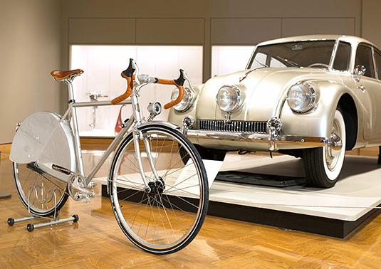
a Pictured: Art Installation collab with MIA
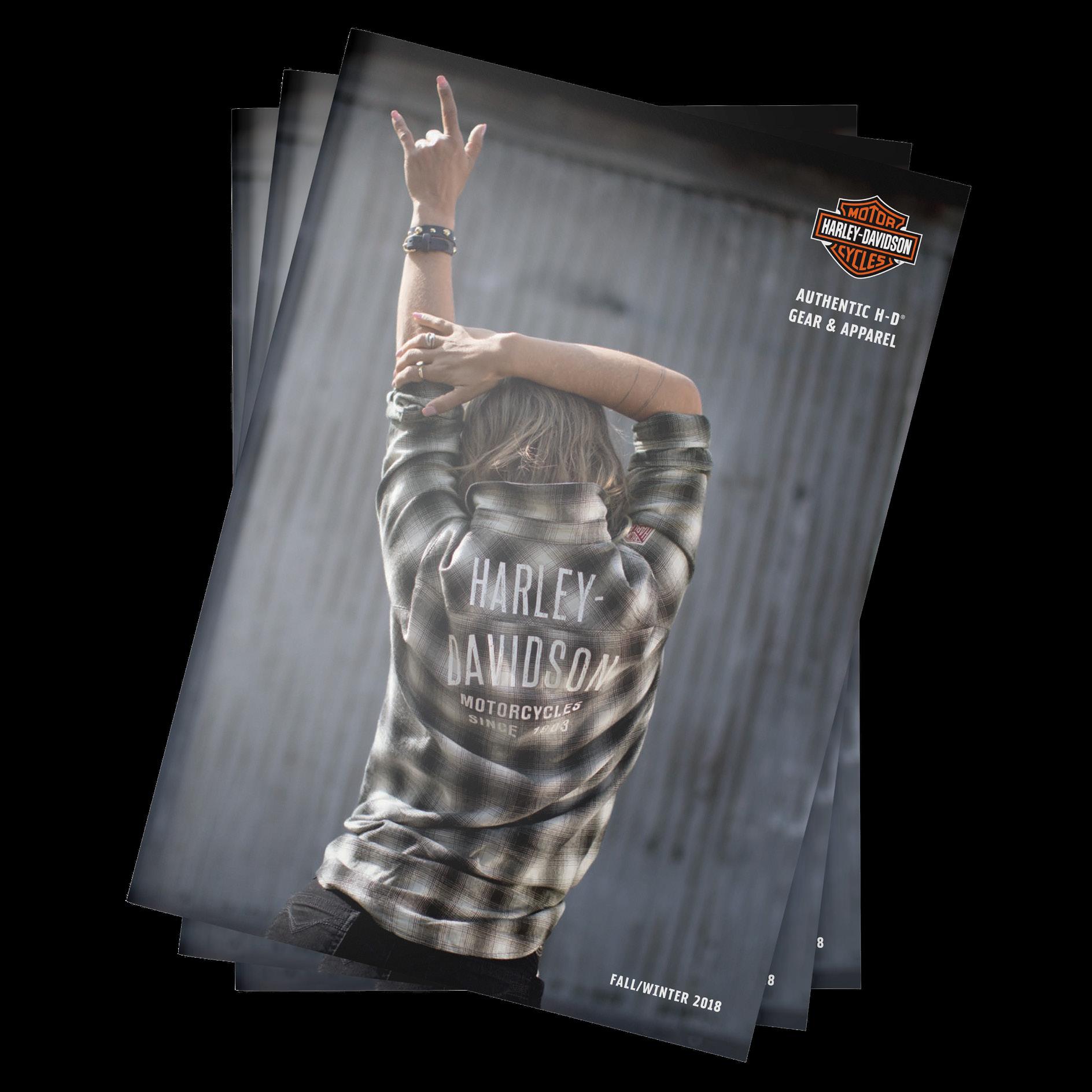
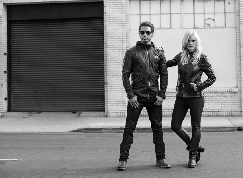
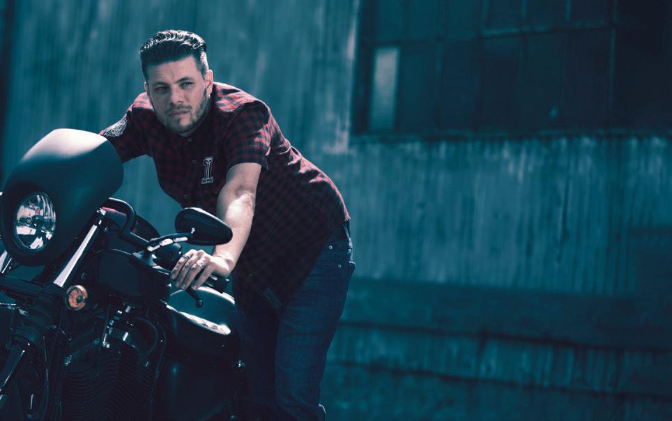
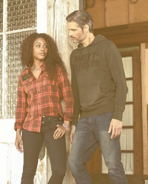
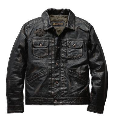
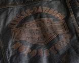
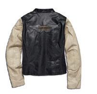
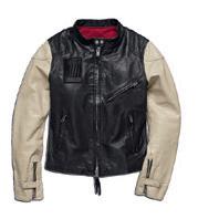
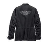
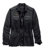
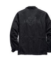
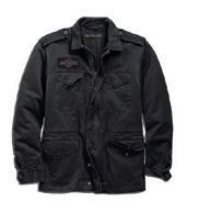
a After the sale of the bike company, I spent three years in a consulting role with Harley-Davidson. Their soft goods sales were flat and their brand was fragmented due to dealers working indivdually- it was the wild west.
The result was annual double-digit growth, and just as importantly, the creation of a new retail approach moving forward based on best practices culled from other leading enthusiast brands.
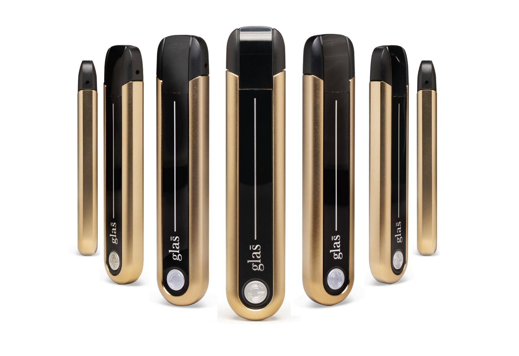
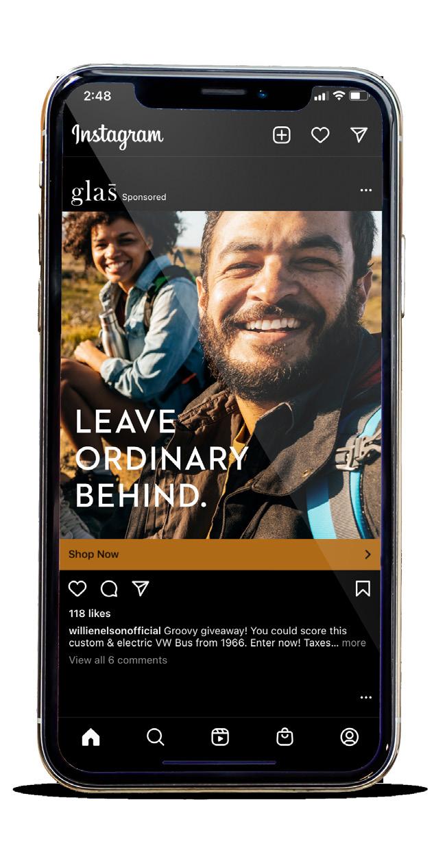
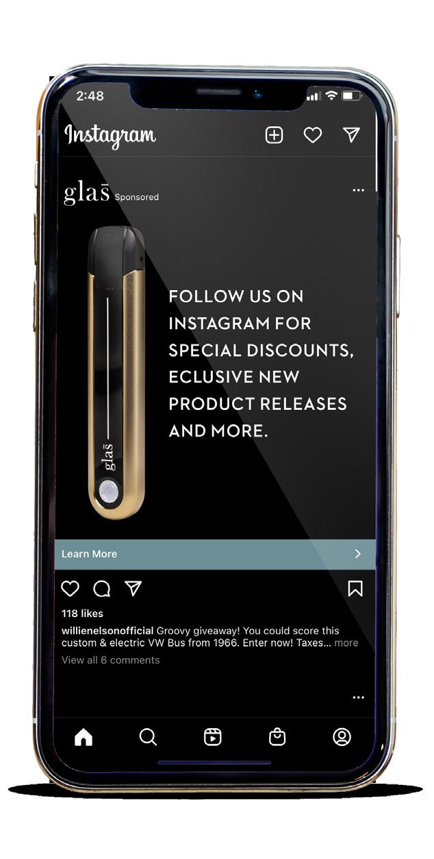
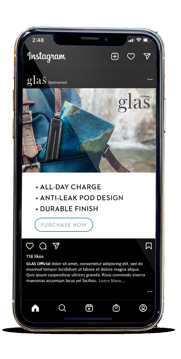
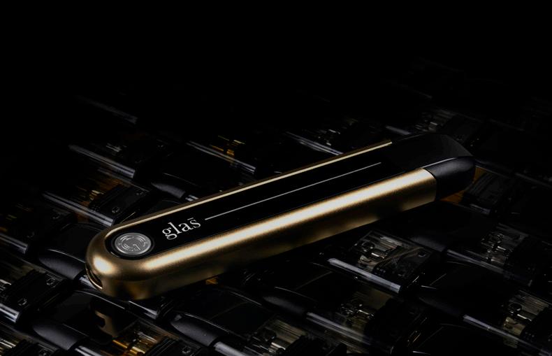
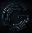
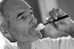
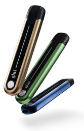
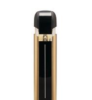
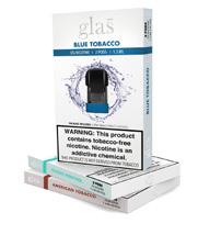
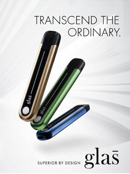
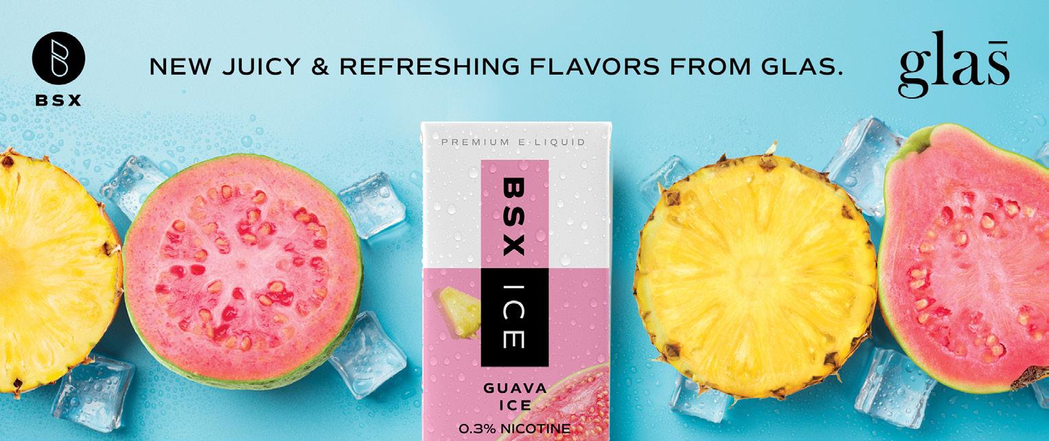
a Glas is a alternative tobacco company based in Los Angeles. They have had success over the years, but the brand had suffered due to rapidly changing regulations. Entering the convenience-store space, along with other emerging markets, required completely different strategies to grow as a brand.
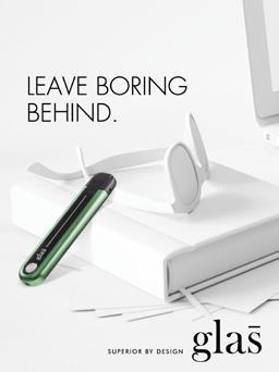
BRAND POSITION SUPERIOR BY DESIGN
SUPERIOR BY DESIGN
Nothing compares with Glas. Not other devices. Not combustibles. A beautiful instrument built with superior technology and paired with an array of award-winning flavors, Glas offers a matchless experience—pure and simple. We help smokers quit smoking without sacrificing taste or pleasure. The Glas experience is premium, unrivaled, and unforgettable in every way.
SUPERIOR BY DESIGN
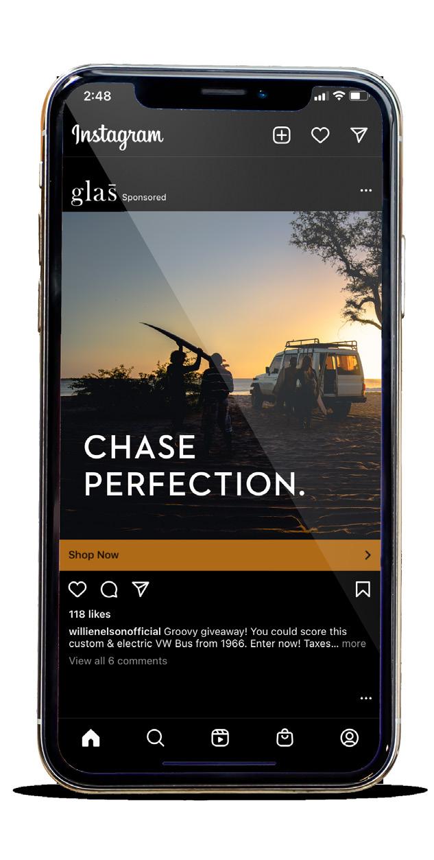
a We created a brand guidelines for their internal teams and created an initial set of advertisements, messaging statements and visuals to be applied across all media.
a Marketing in a heavily regulated category definitely presents complexities not present in other CPG segments.
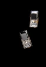
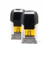
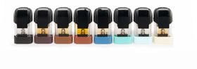
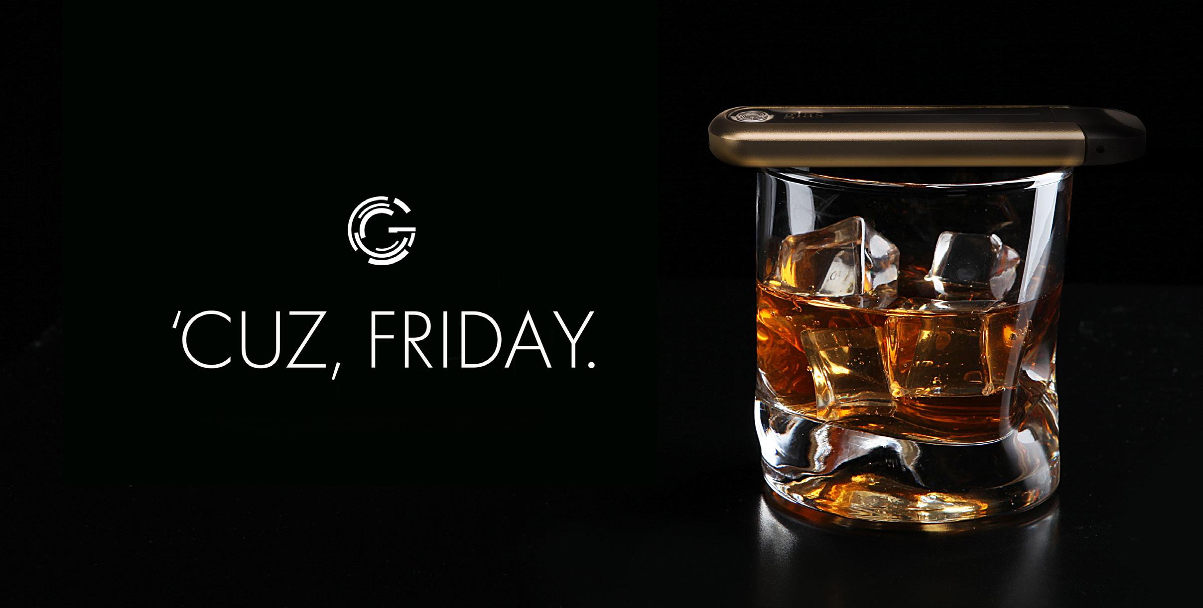
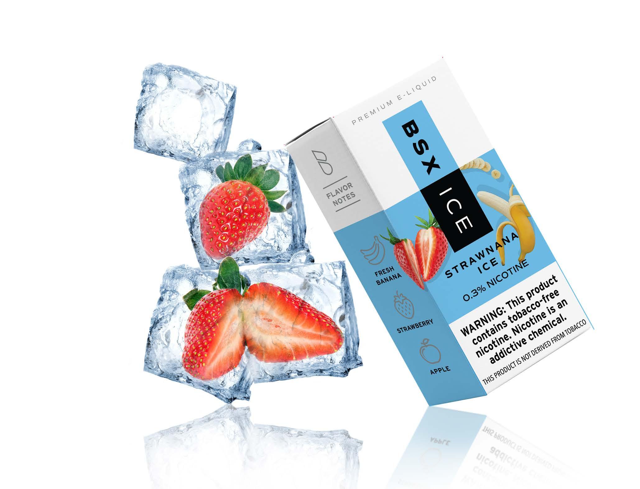
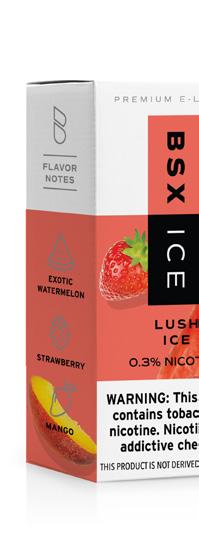
a Established, online marketing (above) reinforced the premium vibe that consumers had come to enjoy. New opportunities in-store meant creating a sub-brand based on disposable technologies. This audience put Glas in direct competition with a younger/ transactional audience, this required a bright//fresh approach (below) to compete.
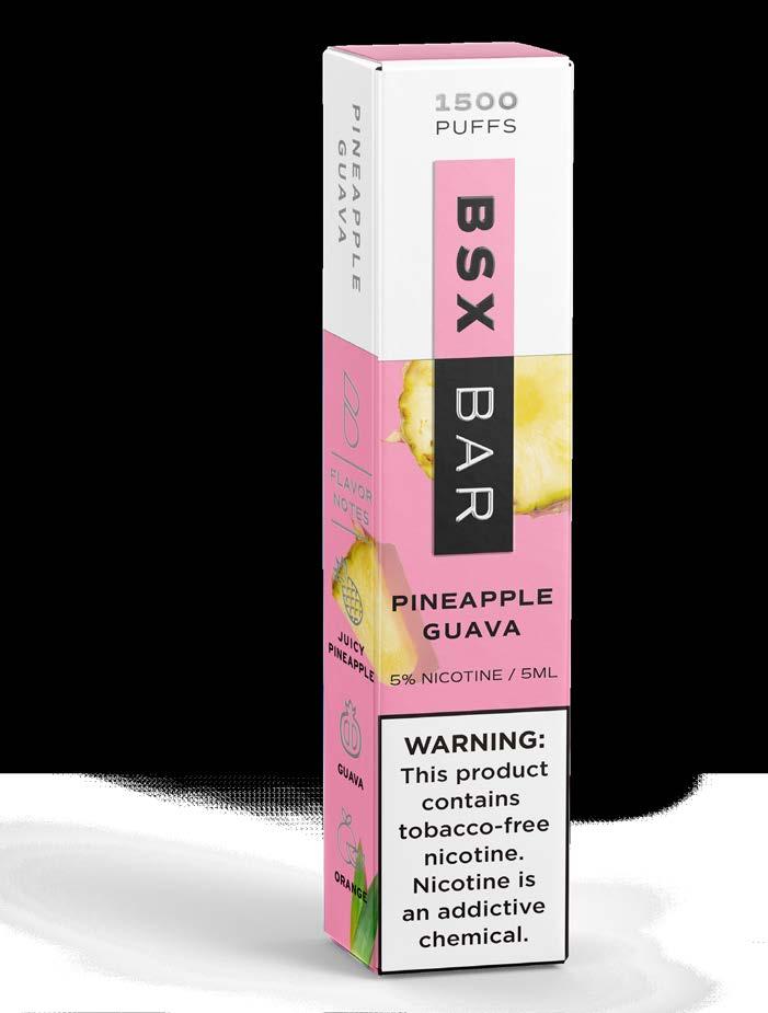
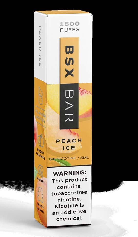
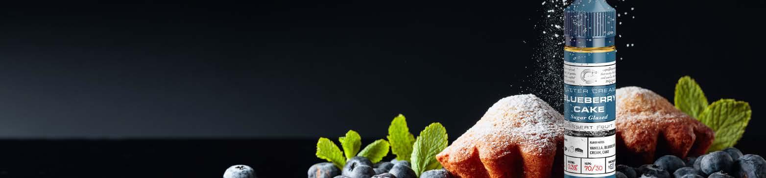
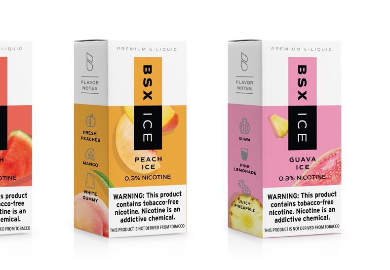
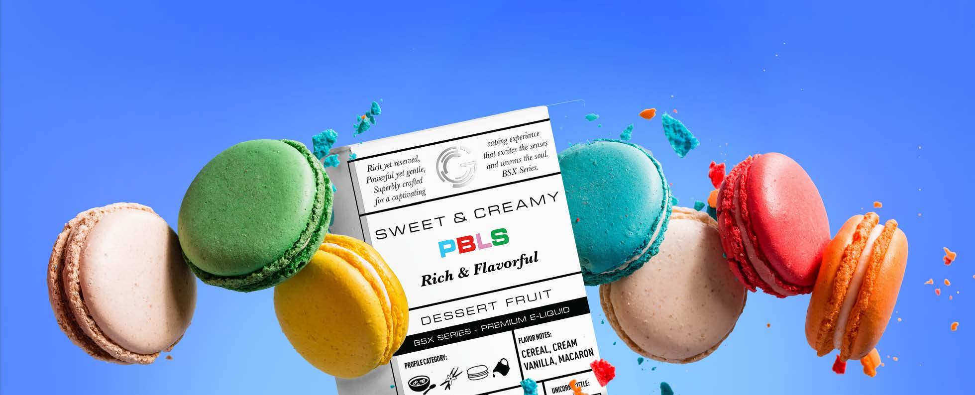
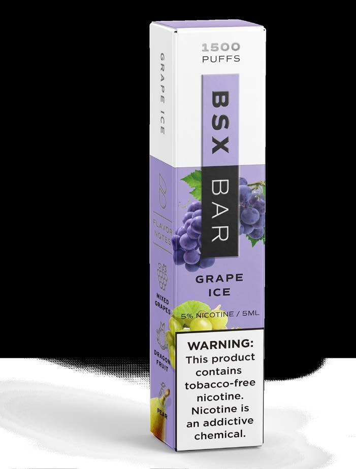
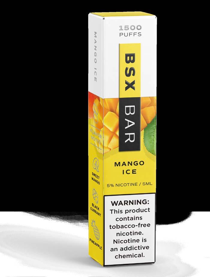
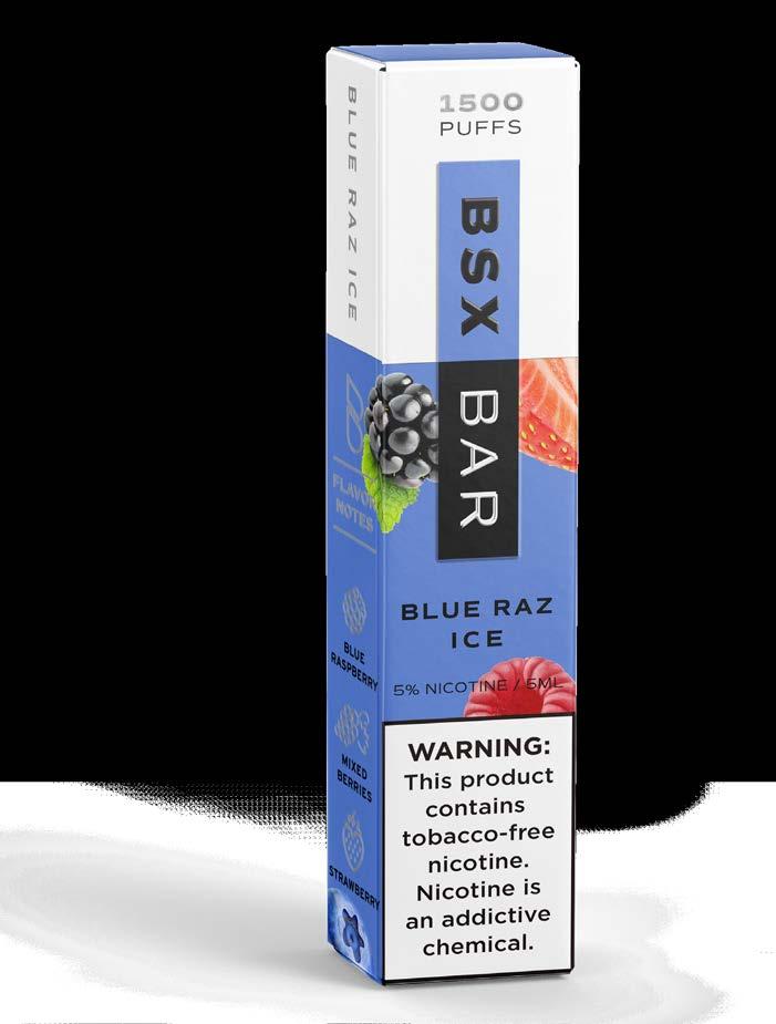
BSX. NEVER BASIC.
BSX FLAVOR. BEYOND THE BASIC.
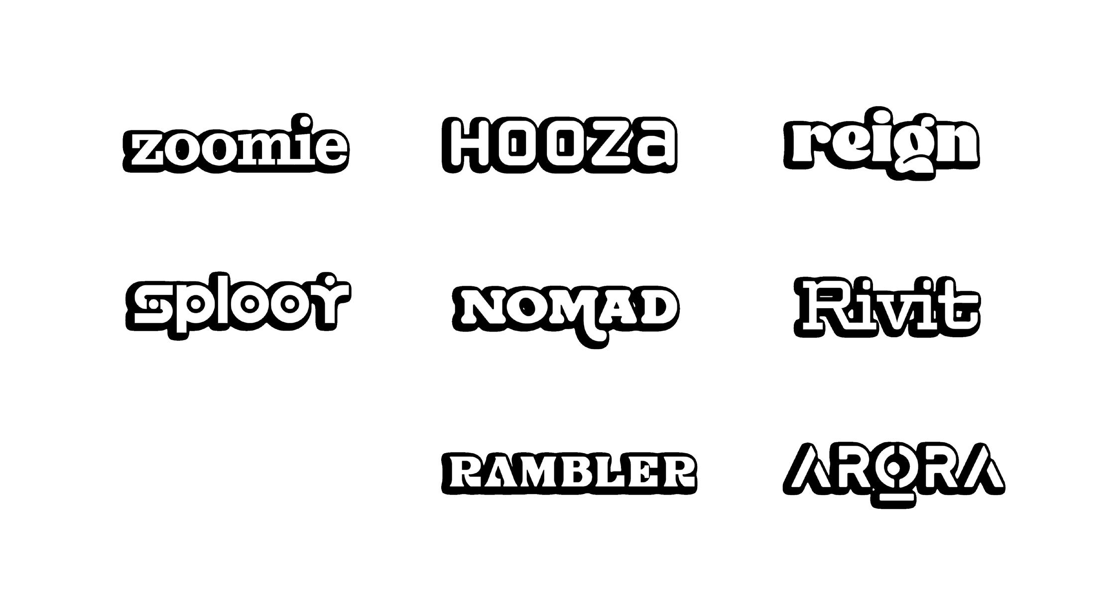
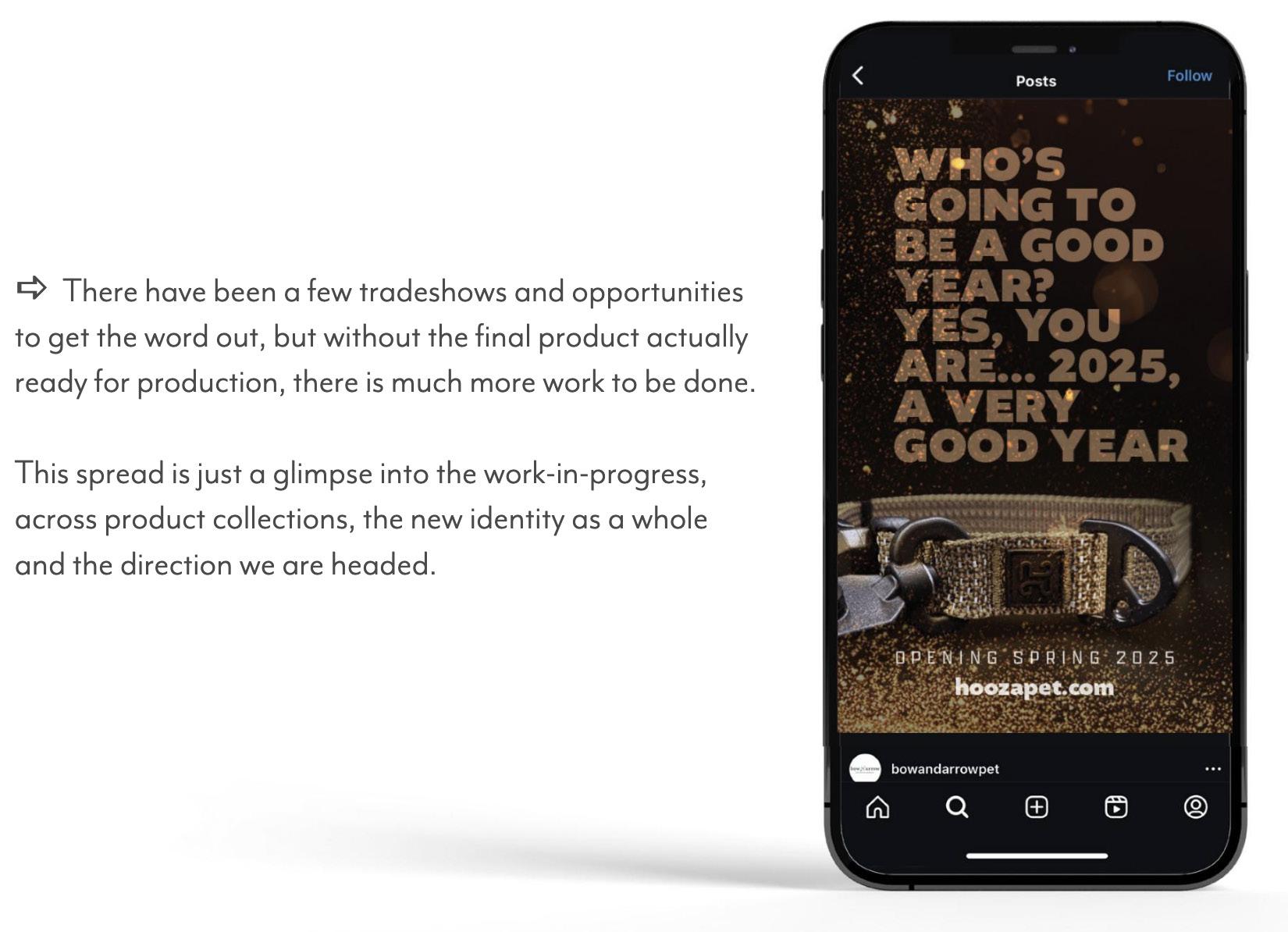
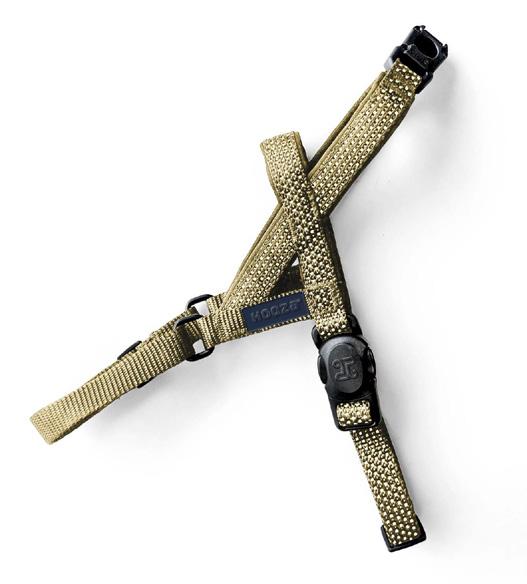
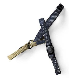
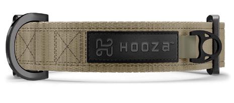
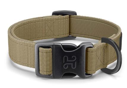
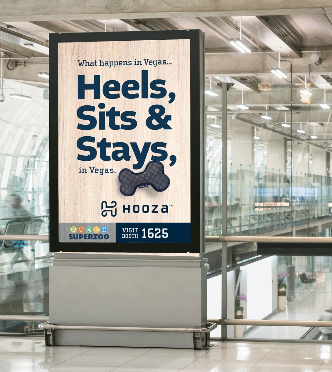
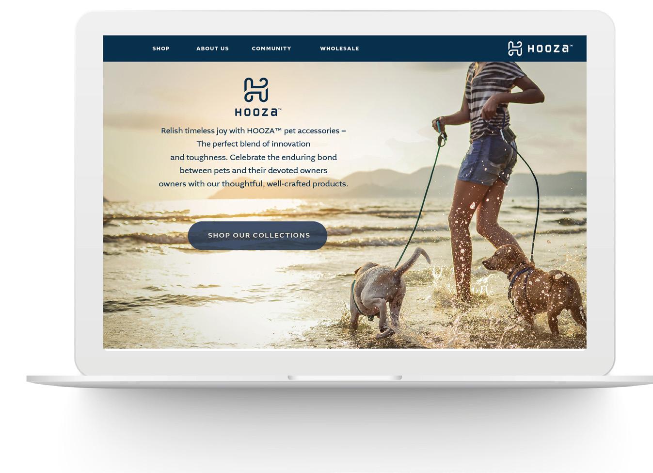
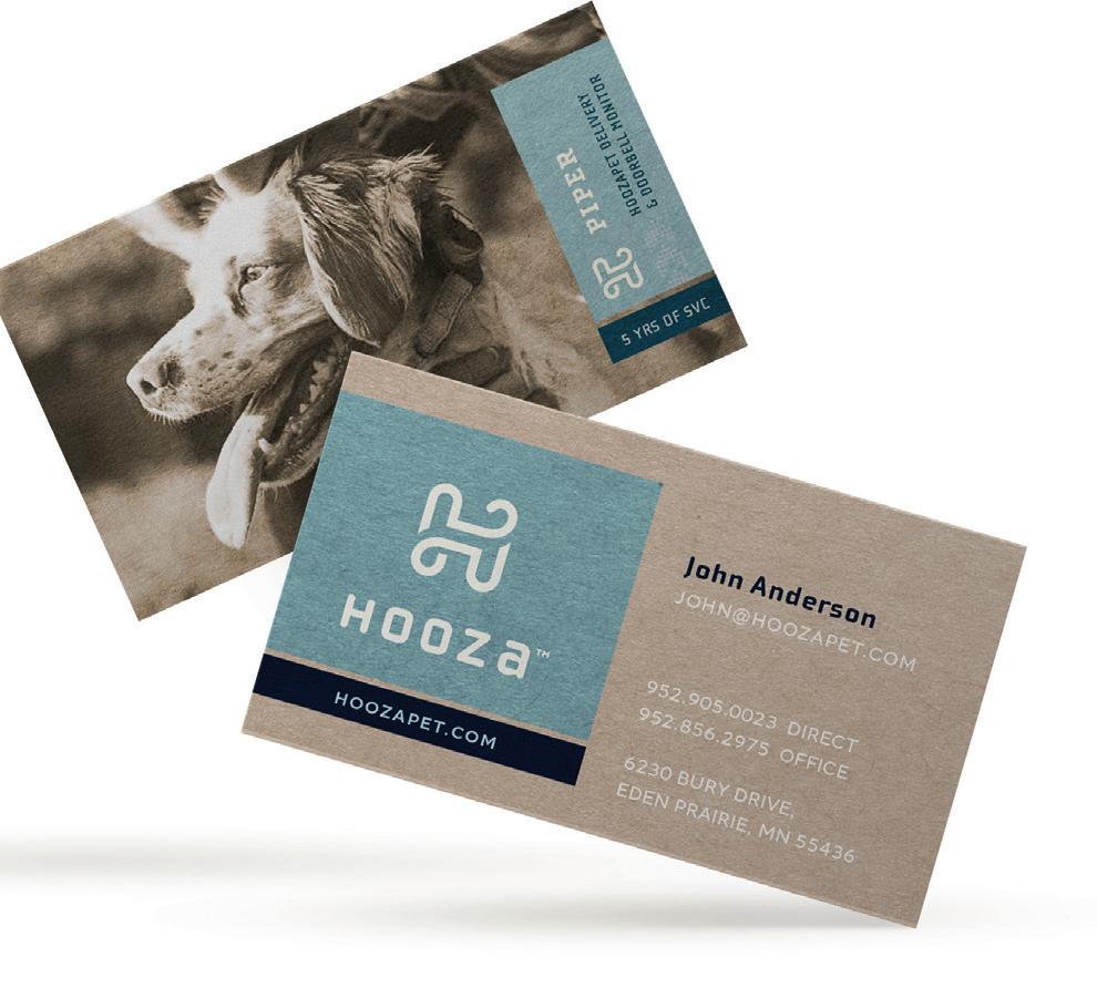
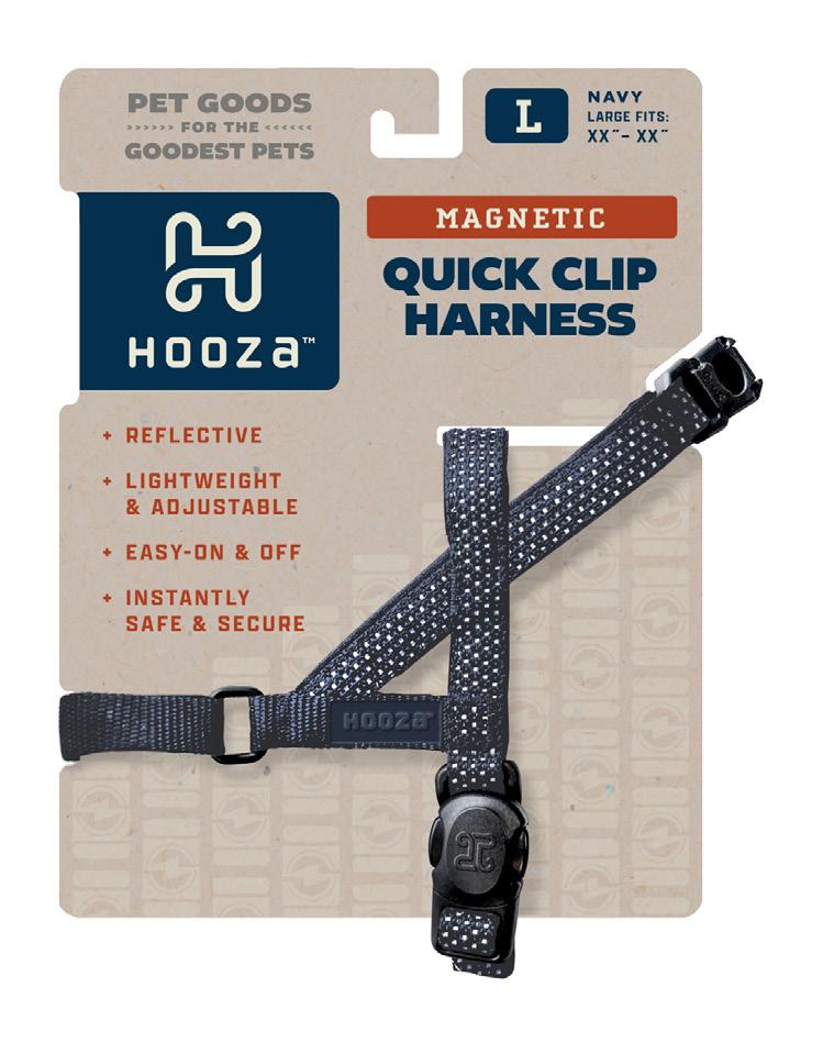
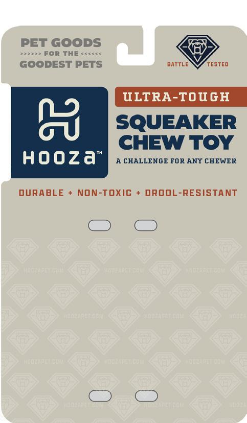
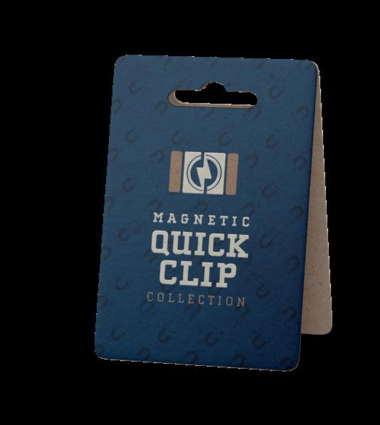
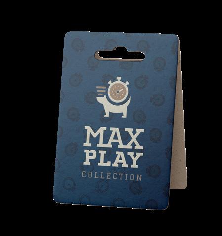
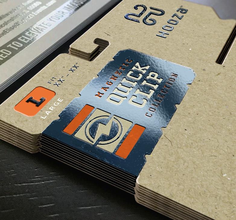
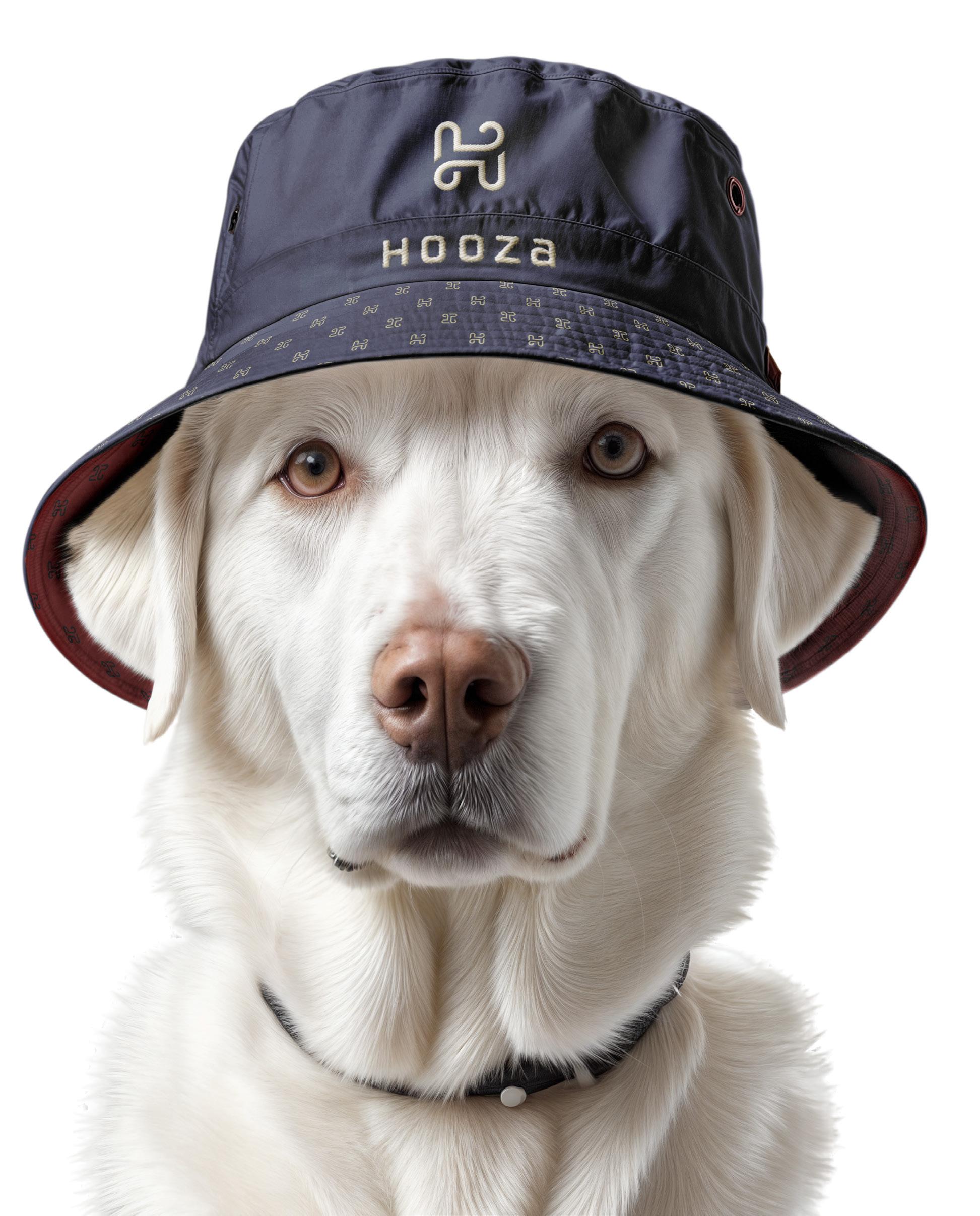
a This past year I have been working on establishing a new brand of pet goods for an established company in the market that currently supplies a vast amount of the products currently avaiilable, simply as a white label supplier. They came to us with a name and just wanted a logo. The name they had chosen was far too common to legally own, or for that matter, to be searched without a slew of large companies appearing at the top of the list. We went backwards and generated numerous names that had potential and landed on HOOZA™. We are currently working to create products and marketing to fit the positioning we have established, “Pet Goods for the Goodest Pets.”
a There have been a few tradeshows and opportunities to get the word out, but without the final product actually ready for production, there is much more work to be done.
This spread is just a glimpse into the work-in-progress, across product collections, the new identity as a whole and the direction we are headed.
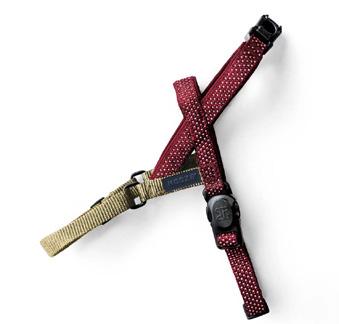
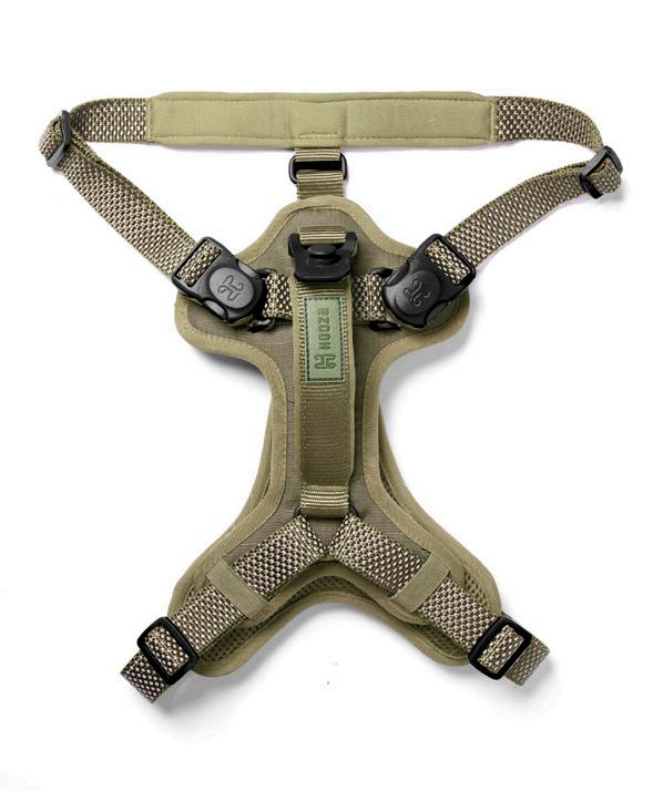
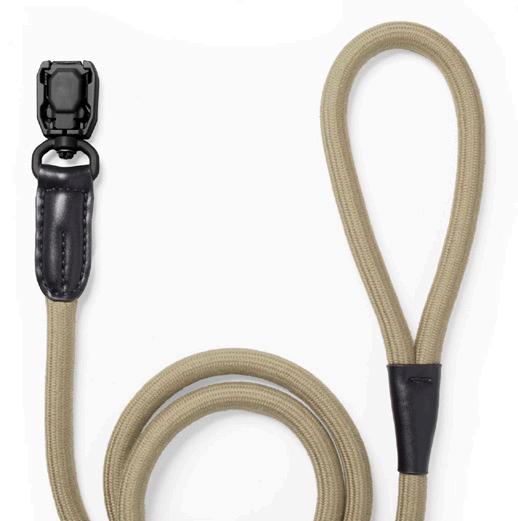
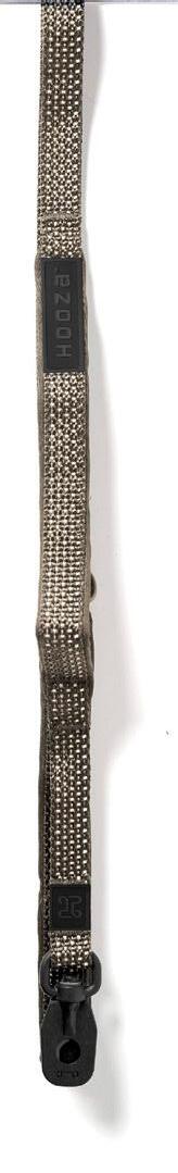
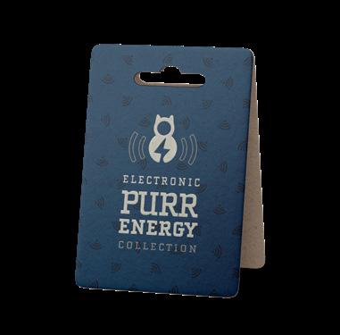
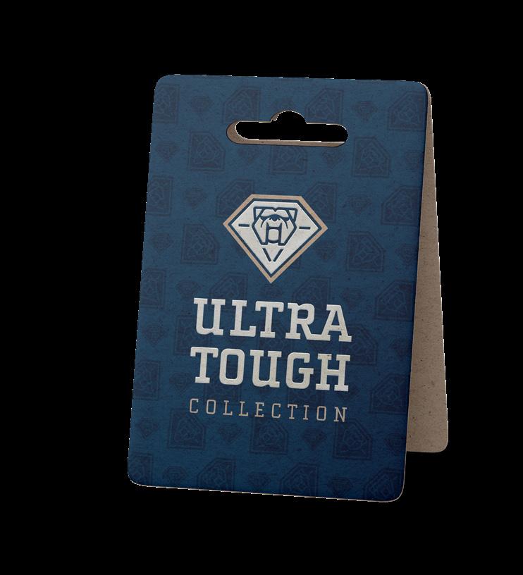
HARNESS, LEASH & COLLAR COLORS + STYLES
EACH APPLICATION RINGS TRUE TO THE BRAND, WHILE PUSHING THE CONSUMER’S ATTENTION TO OUR PRODUCTS FIRST AND FOREMOST.
EACH APPLICATION RINGS TRUE TO THE BRAND, WHILE PUSHING THE CONSUMER’S ATTENTION TO OUR PRODUCTS FIRST AND FOREMOST.
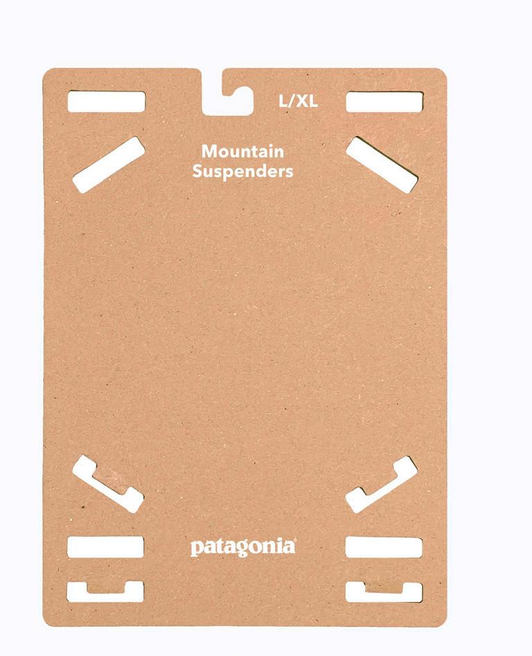
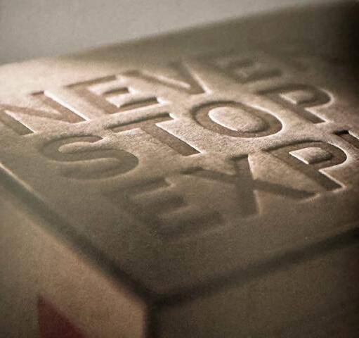
Printing Techniques and paper stock cost PENNIES. But the perception of the product is dramatically increased, which leads to “VALUE” in the consumer’s eyes.
Using refined uncoated cardstock-pale cardstock in designs add a layer of refinement and is frequently used by industry-leading outdoor brands.BUT, more importantly can handle a wide variety of colored products.
spot UV Varnish will Accentuate
(this was an earlier design, but wanted to share how it can showcase content.)
Using
thanks for taking a LOOK AT A FEW CHAPTERS FROM MY BOOK. PLEASE CONTACT ME IF YOU WOULD LIKE TO SEE SAMPLES SHOWCASING A PARTICULAR DISCIPLINE (LOGO/IDENTITIES, BRAND DEVELOPMENT, ADS, ETC.) I LOOK FORWARD TO THE OPPORTUNITY. HAVE A GOOD DAY. HELLO@KB.DESIGN / 612.730.4907