01Well Public House
Spring 2023 |Technical Studio | Boston, MA

This technical studio project was an exploration of place, localness, and domesticity within a public restaurant + bar in Boston, Massachusetts. The reuse project was located in Beacon Hill and called for Programmatic, Schematic, and Design Development phases while considering the technical integration of building systems and assemblies.
Through the exploration of localness and what this project meant in Boston, I chose a land-to-sea concept that honored the old and the new within the building through a series of abstractions and interventions.
4

5
Well Public House is located in the historic neighborhood of Beacon Hill in Boston, Massachusettes. Farm-to-table in New England encompasses some of the most diverse, closely sourced selections of cuisine. Not only is there rich soil to the west, but the east is home to incredible Atlantic sea life.
Boston is a city of connection, from the first public garden in the country to the first public beach. Boston is home to many “watering holes”, Well Public House is its newest addition. The restaurant is a land-to-sea concept, but it doesn’t seek to explore the contrast between the two, rather the commonalities. In its physical form, the building welcomes curves, topographic layers, and materials that are inspired by the land which flows from rich soils to the sandy sea bottom. Dishes are complimentary, classic, and of course, farm-to-table.

6
Well Public House | Technical Studio
Site + Context + Collateral


7
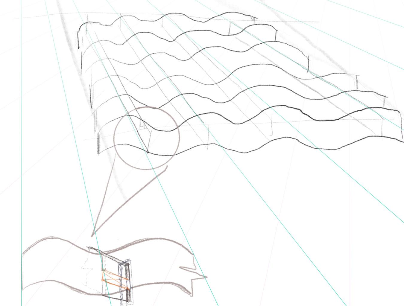
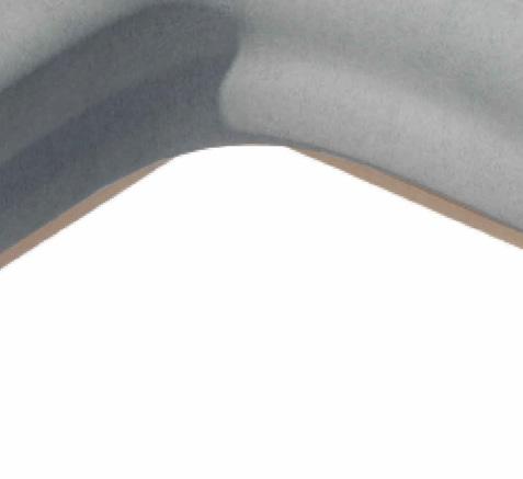
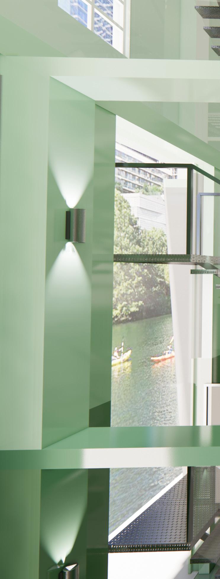
The ceiling began as a smooth, flowing form of a water drop radiating out into looser, more abstract rolling forms as if moving from sea to land. Its topographic form came about as a desire to merge and blur the lines between land and sea, seeing these elements as one rather than very separate conditions. Constructed with LED cove lighting, the ceiling is illuminated throughout the building, enhancing its organic form.

8 D D GFI 42" GFI 42" GFI GFI GFI GFI GFI 10' - 1" 9' - 6" 11' - 4 1/2" 12' - 0" 10' - 1" 10' - 8 1/2" 13' 6" 2' - 5 3/4" 2' 6 1/4" 2' - 6 1/2" 2' - 5 1/2" 2' 3 1/2" 4' - 4 3/4" 8' - 3" 10' 2" 10' 6 3/4" 7' 9" 2' Sound Attenuating Insulation Smoke Barrier Finish Floor Structural Floor 1/4" = 1'-0" 1 Plan A1 RCP WITH FURNITURE D D D D D D D GFI 42" GFI 42" GFIGFI GFI GFI GFI GFI GFI 10' - 9 1/2" 12' - 2 1/2" 11' - 4 1/2" 10' - 8 1/2" 10' - 8" 10' - 6" 10' - 1" 10' - 1" 9' - 6" 11' - 4 1/2" 12' 0" 12' - 0" 10' - 8 1/2" 10' - 8 1/2" 11' - 6" 10' - 1" 10' - 8 1/2" 13' - 6" 2' 5 3/4" 2' - 6 1/4" 2' - 6 1/2" 2' - 5 1/2" 2' - 3 1/2" 2' - 3 3/4"2' - 2 1/4" 5' - 4 3/4" 4' 2 1/2" 4' 8 1/4" 4' - 4 3/4" 2' 0 3/4" 6' - 9 3/4" 8' - 6" 8' - 6" 26" 26" 25" 25" 7'0" 6'8" 8' - 3" 10' - 2" 10' - 6 3/4" 7'9" 2' - 8 1/4" 2' 9 1/4" 1' - 9 1/4" 1' - 9 1/4" 9' - 6 1/2" 6' 8 1/4" 2'11 3/4" 11' - 1" 1/4 Gypsum with Level 4 finish to prepare for Interior Venetian Plaster Finish 2" Main Runner Cold-Rolled Steel Channel Wire Ties 1.5" Main Runner Cold-Rolled Steel Channel CNC 1/2" Plywood Sound Attenuating Insulation Smoke Barrier Finish Floor Structural Floor 2000k LED Strip Light 1/4" = 1'-0" 1 Plan A1 RCP WITH FURNITURE 1 1/2" = 1'-0" 2 Ceiling Detail 1 SUMMER SOLSTICE WINTER SOLSTICE 5:00 PM 7:45 PM
Well Public House | Technical Studio
Ceiling System


9 D D D D GFIGFI 10' 9 1/2" 12' - 2 1/2" 11' - 4 1/2" 10' 8 1/2" 10' - 8" 10' - 6" 10' - 1" 12' - 0" 10' - 8 1/2" 10' - 8 1/2" 11' - 6" 2' 3 3/4"2' 2 1/4" 5' - 4 3/4" 4' 2 1/2" 4' 8 1/4" 2' 0 3/4" 6' - 9 3/4" 8' - 6" 8' - 6" 26" 26" 25" 25" 7'0" 6' 8" 8 1/4" 2' 9 1/4" 1' 9 1/4" 1' 9 1/4" 9' 6 1/2" 6' 8 1/4" 2' 11 3/4" 11' - 1" Insulation WELL PUBLIC HOUSE BOSTON, MA KAYLEE TURNER verified prior to installation. All M.E.P. And I.T. Systems are to be concealed Within the wall or ceiling cavity. Coordinate location and power requirements of electrical devices with mechanical, plumbing, architectural and fire protection drawings. All electrical work and material is new and shall be provided by the contractor unless otherwise noted. Wiring shall be as per National Electrical Code (NEC). Provide suitable concealed blocking, supports, GENERAL NOTES All work shall be done in accordance with applicable codes and standards. See A001 & A002 for code reference. SUMMER SOLSTICE WINTER SOLSTICE SUMMER SOLSTICE WINTER SOLSICE 5:00 PM 7:45 PM
Restrooms

The restrooms took shape as inspiration from a snail’s shell, an animal that occupies both land and sea. Two of the gender neutral restrooms are ADA Compliant, one offering a left transfer and one a right transfer.
Luminous pearl-like penny tiles line the interior of the stalls, while the intimate shared space of the restroom is blanketed in a monochromatic deep ocean blue in the form of penny tiles and plaster.
10 PF3 PF3 F1 F1 F1 F1 F1 3' - 11 3/4" Left Transfer 33" 3' - 2" 8' 0" DOOR DROP CEILING 2' - 6" 1' 9 3/4" 1'2 1/4" 8' - 9 1/4" 1/2" = 1'-0" 1 Plan A1 Bathroom 3/4" 2 ELEVATION 3/4" = 1'-0" 4 ELEVATION SINK (S) 5' - 0" 300 3 300 2 300 4 PF3 PF3 PF3 F1 F1 F1 F1 F1 F1 PF2 3' - 11 3/4" Right Transfer Left Transfer 33" 3' - 2" 4' - 2 1/4" 33" 3' 0" 1' 8 3/4" 3' 3" 2' 1 1/2" 1'8" 8'0" DOOR DROP CEILING 4' - 5 3/4" 3' - 7 1/4" 0' - 10 1/4" 0' - 9 1/4" 3' - 8 3/4" 4' - 6 1/4" 2' - 6" 1' 9 3/4" 1'2 1/4" 8' - 9 1/4" 1/2" = 1'-0" 1 Plan A1 Bathroom 3/4" = 1'-0" 2 ELEVATION BATHROOM EAST 3/4" = 1'-0" 3 ELEVATION BATHROOM NORTH 3/4" = 1'-0" 4 ELEVATION SINK (S)
Well Public House | Technical Studio

5' - 0" 300 3 300 2 300 4 PF3 F1 PF2 Right Transfer 4' - 2 1/4" 33" 3' 0" 1'8 3/4" 3'3" 2'1 1/2" 1'8" 4' - 5 3/4" 3' - 7 1/4" 0' - 10 1/4" 1' - 2 1/2" 2' - 0 1/4" 1' - 6" 3' - 2 3/4" Transfer Side 0' - 9 1/4" 3' - 8 3/4" 4' - 6 1/4" 3/4" = 1'-0" ELEVATION BATHROOM EAST 3/4" = 1'-0" 3 ELEVATION BATHROOM NORTH


12 6'1 1/4" 1'7 1/2" 1'4 1/4" 2'7" 3'0" 1/2" PLYWOOD 1" PLYWOOD 2X4 LUMBER 2" 5" 17" STAINLESS STEAL 4" ADA 902.3 27" 5" 31" ADA 306.2.3 21" 1/4" MARBLE 1X4 LUMBER 2X6 LUMBER STONE STEEL SUPPORT 12" X 18" 1 : 6 2 Section Bar Detail 1 1/2" = 1'-0" 5 BAR DETAILS Well Public House | Technical Studio
Field verify dimensions and report any discrepancies immediately.


Dimensions are provided for design intent. Installer shall field verify all openings prior to fabrication of assemblies and shall allow for shim spaces, joints, sealant, etc. as required.


Any substitutions must be approved prior to procurement.

Any substitutions must be of equal or better performance to material, finishing, or feature specified.


Contractor is responsible for cleaning all areas after construction.
SHEET NOTES

The dimensions on this sheet are based off of the face of finish. All dimensions are to face of finish, or edge/centerline of structure.


GC to field verify all dimensions prior to construction and/or installation of any equipment, accessories, etc. If a discrepancy is identified, please notify MHOA immediately.

13 19' - 10 3/4" 6' 1 1/4" 1' 7 1/2" 1' 4 1/4" 2' 7" 3'0" 3' - 2" 18' - 7 1/2" 1/2" = 1'-0" 1 Plan A1 Bar 1/2" = 1'-0" 3 BAR NORTH 1/2" = 1'-0" 4 ELEVATION BAR WEST 2 Plan A1 100' - 0" DATE SCALE WELL PUBLIC HOUSE BOSTON,
As indicated 01/06/2023 200200 BAR
MA
Furnishings


Furnishings incorporate tactile materials such as leather and performance velvet in muted tones. Each piece is intended to let the ceiling feature take center stage, but for the occupant to enjoy the tactility and the detail of the furnishings they are interacting with. The dining table features burl wood and accent tables are abstract and curving, complementing the ceiling and wall geometry.

14 S1 T2 T2 T2 T2 C4 C4 C4 C4 C4 C4 T5 T5 T5 T5 1/4" = 1'-0" 1 Plan A1 Furniture T5 S1 S1 T2 T2 T2 T2 C4 C4 C4 C4 C4 C4 T5 T5 T5 T5 1/4" = 1'-0" 1 Plan A1 Furniture T5 S1
Well Public House | Technical Studio


15 S1 S1 S1 C4 C4 C4 C4 C4 C4 B2 B2 B1 B1 B2 C4 C4 C4 T3 T3 68" B1 C6 C6 C6 C6 C6 C6 C6 C6 C6 C6 C6 C4 T1 B1 C6 S1 S1 S1 C4 C4 C4 C4 C4 C4 B2 B2 B1 B1 B2 C4 C4 C4 T3 T3 68" B1 C6 C6 C6 C6 C6 C6 C6 C6 C6 C6 C6 C4 T1 B1 C6


16
Kovi Velvet Upholstry
Stained Ash End Panels by Caleb Woodard Furniture Co.
Kovi Velvet Upholstry
Well Public House | Technical Studio
Stained Ash End Panels by Caleb Woodard Furniture Co
GENERAL NOTES
All work shall be done in accordance codes and standards. See A001 & A002 reference.
Verify existing conditions prior to commencing Do not scale these drawings.
Except where otherwise noted, dimensions the face of studs, centerline of structure, centerline of openings.


Field verify dimensions and report any immediately.

Dimensions are provided for design intent. shall field verify all openings prior to fabrication assemblies and shall allow for shim spaces, sealant, etc. as required.
Any substitutions must be approved prior procurement.
Any substitutions must be of equal or better performance to material, finishing, or feature specified.
Contractor is responsible for cleaning all construction.
SHEET NOTES
Dimensions are provided for design intent. shall field verify all openings prior to fabrication assemblies and shall allow for shim spaces, sealant, etc. as required.


Any substitutions must be approved prior procurement.
Any substitutions must be of equal or better performance to material, finishing, or feature specified.


Cotton Batting + Textile
2" High Density Foam

2x4 Lumber
1/2 Plywood
Felt Padding
1x4 Lumber Springs
21" 14" 2" 3" 19" 36" 9" 30"


18 Plan A1 100' 0" Plan A1 100' 0" Plan A2 115' 0" Plan A2 115' 0" Plan A3 124' 0" Plan A4 Plan A5 142' 0" Roof A Plan A0 90' 0" Plan A0 90' 0" 2 103 2 103 Plan A0 Mech 92' 0" Plan A0 Mech 92' 0" 1/8" = 1'-0" 1 Building Section N 2 Plan A1 100' 0" Plan A2 115' 0" Roof A Plan A0 90' 0" Plan A0 90' 0" 2 103 2 103 Mech Plan A0 Mech 92' 0" Plan A1 Plan A1 Plan A2 Plan A2 Plan A3 124' 0" Plan A4 133' 0" Plan A5 Roof A 156' 0" 90' 0" Plan A0 Mech 92' 0" Plan A0 Mech 92' 0" 1 103 = 1'-0" Building Section N 1/8" = 1'-0" 2 Building Section EW Well Public House | Technical Studio

19 DATE SCALE WELL PUBLIC HOUSE BOSTON, MA ALLISON GASKINS LYSA JANSSEN MARLA SMITH CONSULTANTS KAYLEE TURNER 1/8" = 1'-0" 01/06/2023 103103 BUILDING SECTIONS
02 End Cap Market
Fall 2022 | Informal Retail | Austin, Texas
In a traditional grocery retail environment, brands fight for prime real estate in the store, spending thousands to catch the attention of new buyers for just one month out of the year. End Cap Market occupies prime real estate in East Austin, Texas, and serves local, up-and-coming consumable packaged goods vendors as a space to launch new products, providing an equitable display of their goods. This informal retail project uses traditional grocery retail elements to evoke feelings of nostalgia, but also rejects retail norms to change how users experience a grocery environment and how they perceive the products on display.

20

21
Project Site | Context


The retail environment isn’t unlike real estate development. Prime real estate within the store and on the shelves is a hot commodity. These illustrations portray the typical grocery environment, influenced by consumer behavior and the land it occupies.

22
End Cap Market | Informal Retail


24 End Cap Market | Informal Retail
Along with the abstraction of a grocery cart applied as a screen in the space, the ceiling above the coffee stand + point-of-sale features semitransparent red glass suspended with translucent string and lit with track lighting. These rectangular pieces are an abstraction of a red sale tag but take on a new life as a dense display of lit glass. The counter is reminiscent of a vintage grocery display in contemporary form.


25
Ceiling Feature | Point of Sale

26 End Cap Market | Informal Retail
The window display is a series of rectangular red oak boxes that rotate slightly along structural poles. These rectangular units represent products that take shape as a display system of their own, a peak from the outside of what one could expect to see in the space.


27
Window Display
The ceiling features a dropped plenum that surrounds the retail display and houses a warm but traditional grid of tube lighting.
The exposed ceiling above is painted in a monochromatic, sweeping motion of deep red to create a cohesive moment among the exposed mechanical systems that one might see in their neighborhood grocer.
Directional LED lights illuminate the products below.
28 Track Light LED Ribbon Light Tube Light
End Cap Market | Informal Retail
Diagrammatic Reflected Ceiling Plan

29
Shelf System
The retail space uses one sweeping motion of a floor-to-ceiling shelf system hugged on either side with an abstraction of the metal grocery basket and mirrors suspended above to create an illusion of infinite display. This arrangement encourages users to travel through the space out of curiosity and to experience the products as their own beautiful finish rather than haphazard placement. Built-in and free-standing seating invite visitors to linger.

30
End Cap Market | Informal Retail

31
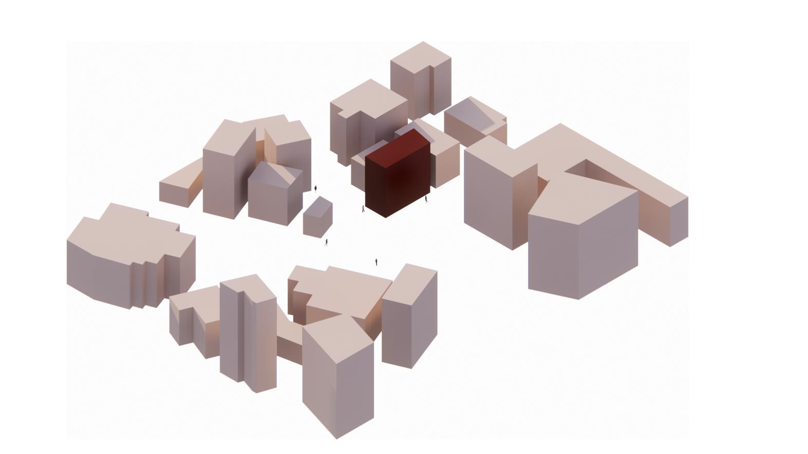
03Cenote Gym + Gallery
Spring 2022 | Core Studio II | Austin, Texas
Cenote Gym & Gallery occupies the historic Seaholm intake facility, which passed water from Ladybird Lake to the power plant. True to its name, Cenote invites its occupants to sink deeply into the cave-like building and into themselves. Each of the four levels submerges the occupants with a monochromatic pallet, while open circulation offers total visibility of the structure’s grand depth. The programming dictates that the building serves as a gym and art gallery, each typology has the privilege of privacy from the other, but both have mirrored experiences of the building and full access to the view of Ladybird Lake.
32

33
Gym Program
As the monochromatic color pallet deepens through the levels, the exercises in the gym progress from light movements of cardio and yoga down to upper body weighted exercises, and the darkest lower level houses “the cave” where the most grounded and heaviest exercises take place.


34 Seaholm Gym + Gallery | Core Studio II
On the gallery side, the experience progresses similarly, the higher levels are well-lit, providing a simplistic backdrop for the work on display, while the lowest level is a temporary home for digital works and film features.

35
Gallery Program
Exploded Axonometric


The building, divided both horizontally and vertically, creates equitable experiences. The vertical division of the space denotes the change from a specific program to circulation and the fully exposed depth of the building shared by both gym and gallery guests.


36 Seaholm Gym + Gallery | Core Studio II

37


38 Seaholm Gym + Gallery | Core Studio II


39
C-House Case Study
Spring 2022 | Digital Drawing
The C-house is comprised of a nested private residence within a multilevel coffee shop in the heart of Tokyo, Japan. Its unique “egg” like architecture utilizes exposed columns that permeate and intertwine with the building. Through a case study drawing exercise, I sought to understand the site, highlighting its most distinctive architectural features while acknowledging the old world that surrounds its modern facade.
Drawings + Laser Cutting

The color pallet is Inspired by traditional Japanese art. The diagrammatic drawings communicate the story of this public and private site, depicting movement that curves from every direction on a busy public street. Utilizing the Epilog laser cutter, I used portrayed the C-House through layered materiality.


40 0 04


41 1”: 2000’
Utilizing the Kuka robot arm, the C-house case study color pallet is portrayed in its most vibrant form-with neon highlighter and warm gold markers. Diagonal lines in the facade mimic the diagonal structure of the building and the blue box represents the floating residential “yolk” in the center of the building.


42 1/2” = 1’
C-House Case Study | Digital Drawing
Architectural Drawing + Kuka Robot Drawing


43 1/4” = 1’ 1/8” = 1’
05

Sculptural Exercise Bar
Spring 2022 | Core Studio II | Collaboration with Kate Tenenbaum


The exercise bar is 7’ long and exactly 20 lbs heavy, weighted with lead, sand, metal, and wood for balanced precision. The bar is purposefully asymmetric to achieve its sculptural nature in an upright position. The flat end lends itself to resting upright, while the other end is rounded. The handles accommodate the human hands’ proportions at the width one might want to hold the bar when horizontal. The gradient further emphasizes its asymmetric nature and merges the independent pieces together into one form.

44


45
Textile + Tile Design

Spring 2022 | Interior Construction
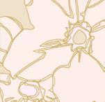
Inspired by Fen Guo’s illustrations in her book, “Block Island”, these textile and tile patterns fit together like the most satisfying puzzle pieces. Designed to be slightly irregular, the pattern is a twist on a classic pattern.
46 Textile Design 06
GUO’S BLOCK ISLAND

I loved that this shape itself felt timeless and familiar- its lines in the illustration were just slightly imperfect and soft, making an orthogonal shape more organic. I pictured this creating a unique version of a classic checkered pattern.


Sketching this form by rotating 90 degrees showed an interseting pattern, but resembled the qualities of a puzzle too much

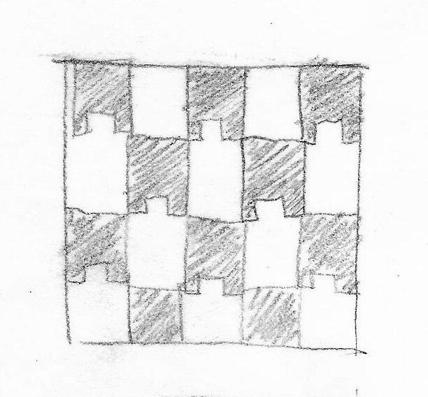

The simple stacked illustration with voids inbetween has more flow, but also complexity within its void spaces


THE ILLUSTRATIONS


VECTOR LINEWORK
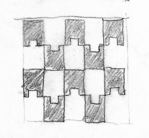
After exploring a few iterations of pattern and repetition, I was drawn to the simplicity of this soft shape in the form of a classic pattern. I kept the slight curvature of the lines that the original illustration also had, it created a slight wavy nature to the pattern that almost tricks the eye into thinking its not really there, a subtle effect.

47
FEN
I chose these illustrations from Fen Guo’s Block Island because I felt a sense of fimiliarity with the composition and shapes. While abstract, the work is classic in its simple geometry and I loved the slightly imperfect edges of each part.
EXPLORING
Chair by BluDot with custom Textile
Designed and made by hand through the process of forming a plaster mold, these tiles are specifically designed to lay close together, forming a narrow gap for mortar. Included in the same collection as the fabric, it takes inspiration from Fen Guo’s illustrations but takes on the shape on all four sides.

48 Tile Design 4.5” 3.75” 2” 1.85” .75”
Handmade Clay Tile


49 SPECIFICATIONS