
Table of Contents
Identity
1.1 Mission Statement
1.2 Tagline
1.3 What We Do
1.4 Why We Do It
1.5 Our Values
Visual Identity
2.1 The Logo
2.2 The Brandmark
2.3 Clearspace and Minimum Size
2.4 Logo Use
2.5 Logo Misuse
2.6 Colour Palette
2.7 Brand Typeface
2.8 Illustration Style
2.9 Restaurant Imagery
2.10 Farmer’s Market Imagery
Brand In Use
3.1 Business Cards
3.2 Corporate Stationery
3.3 Exterior Branding
3.4 The Menu
3.5 Packaging - Restaurant
3.6 Packaging - Farmer’s Market
3.7 Brand Merchandise
3.8 Website
3.9 Instagram
02TABLE OF CONTENTS
01 Verbal
02
03
1.1 Mission Statement 1.2 Tagline 1.3 What We Do 1.4 Why We Do It 1.5 Our Values Verbal Identity 01 03VERBAL IDENTITY
Mission Statement
We aim to make Organic, Sustainable food more fun, accessible and less daunting.
The Greenhouse is a new dining experience, making organic, healthy food more playful and appealing.
04VERBAL IDENTITY
Tagline
Organic Singaporean Cuisine, with a Hands-on Twist.
Our tagline communicates The Greenhouse’s goal to serve Organic Singapore cuisine, with a special twist. It has a sense of playfulness and mystery, inviting viewers to come explore more.
05
VERBAL IDENTITY
What We Do
The Greenhouse is a restaurant, located at the junction of Fort Canning and Clarke Quay, serving Singaporean Fusion Cuisine. We provide a refreshing haven in the city where people can reconnect with nature and relax. We do this by bringing the greenery indoors and letting diners be at one with nature. We also have an organic garden at Fort Canning that diners can visit.
We have have a hands-on approach to food and dining. Diners can pluck their own produce for their meals ,straight from the plants in our organic garden, giving them the confidence that their food is fresh.
At night The Greenhouse turns into a cocktail bar, serving a variety of vegetable and fruit based drinks.
We also feature a Farmer’s Market in the restaurant where people can buy produce grown at our garden. They can also buy our handmade products and merchandise there.
06
VERBAL IDENTITY
Why We Do It
We target college students, people in their 20’s, who need affordable but healthy food options. We aim to steer them towards a healthier way of living.
We do this by making an unique dining experience, where they can have fun and be at one with nature.
Our prime location in the junction of Fort Canning and Clarke Quay also ensures that more youngsters explore the area, driving more people into the wonders of Fort Canning.
07
Organic, healthy food need not be boring and expensive. Everyone should be able to afford to eat healthy food. It’s never too late to start eating healthy.
VERBAL IDENTITY
Our Values
Organic & Natural
We use only organic produce in all our food. Most of it is directly sourced from our garden at Fort Canning or our farms at Kranji. We also outsource some produce from Quan Fa Farms. All paper used is made from recycled newspapers and magazines. All cloth is ethically sourced cotton and the dyes are plant based.
Affordable & Fair
We aim to make organic food and produce affordable to everyone. To do this, we have multiple promotions throughout the year. We also pay our staff well above the minimum wage and we have multiple employment benefits. People from all backgrounds can work with us and we aim to be as diverse as possible.
Fun & Playful
We want to make healthy dining fun and interesting. This led to the hands-on dining experience that we offer. We convey our fun spirit in our branding through the use of bright, playful colours and bold illustrations.
Friendly & Inclusive
We are a company that values inclusivity and community. As a brand, we want to interact with our consumers and give them the best experience we can. We aim to satisfy all their needs. We have gluten free and vegan options for almost all our menu items so that all diners can enjoy. The restaurant is also accessible by wheelchairs and other disability aids.
08
VERBAL IDENTITY
09 2.1 The Logo 2.2 The Brandmark 2.3 Clearspace and Minimum Size 2.4 Logo Use 2.5 Logo Misuse 2.6 Colour Palette 2.7 Brand Typeface 2.8 Illustration Style 2.9 Restaurant Imagery 2.10 Farmer’s Market Imagery Visual Identity 02 VISUAL IDENTITY
The Logo
The primary logo is the preferred logo and should be used in all instances where possible. It consists of a recognizable symbol made from the G of the name.
10
VISUAL IDENTITY
The Brandmark
The brandmark is a supporting character and must be used with discretion. The brandmark should also been used in place of the logo when reproduced below the minimum size.
For further information on miminum size refer to page 12.
Primary Colour
Primary Mono
Primary Mono Reversed
11
VISUAL IDENTITY
Clearspace & Minimum Size
Clearspace and minimum size are important to retain legibility and establish brand clarity.
Clearspace
Where is the width of
in the word mark
Minimum Size
Print:
Screen:
12
VISUAL IDENTITY
“o”
0.5”
32px
Logo Use
Examples of approved Logo Usage.
Leaf Green used on Beige or other light neutral colors.
Beige used on a solid primary color.
Beige used on a solid primary color.

White used on images & photographs.
True Black for limited use only. Used when color printing is not available
True Black for limited use only. Used when color printing is not available
13
VISUAL IDENTITY
Logo Misuse
To preserve the integrity of the brand identity, avoid misusing the logo in any of the ways shown here.
Do not use unspecified colours or colour combinations for the logo.
Do not use any colour other than White on images or photographs and do not place logo over low contrast area of image.
Do not stretch, squeeze or distort any part of the logo. Always scale uniformly.
Do not add any effects such as a Drop Shadow to the logo.
Do not change the typface of the logo.
Do not outline the logo or mark
14
VISUAL IDENTITY
15 These are the colors associated with The Greenhouse. Beige, Sunrise and Leaf Green are our primary brand colours. Oak is our secondary colour and Lemon is used as an accent colour. Colour Palette VISUAL IDENTITY Beige Sunrise Leaf Green Lemon CMYK : 4 7 23 0 RGB: 242 233 219 HEX: #F2E9DB Pantone: 9224 C CMYK 2 72 100 0 RGB 239 106 0 HEX EF6A00 Pantone 3564 C CMYK 74 23 100 8 RGB 76 141 43 HEX 4C8D2B Pantone 363 C Oak CMYK 42 61 97 37 RGB 111 77 32 HEX 6F4D20 Pantone 1405 C CMYK 3 8 86 0 RGB 251 222 64 HEX FBDE40 Pantone 114 C
Brand
Typography
Metallophile Sp8 is our brand typeface. These are the weights that may be used across collaterals.
Our Brand Tone is very casual and friendly. To emphasise this, we do not use text in full capitals anywhere in the brand design.
Headlines
Typeface: Metallophile Sp8 Medium
Leading: Font Size x 1
Kerning: Optical Tracking: 0 Case: Title Case Colour: Leaf Green or Sunrise
The Greenhouse Summer Farmer’s Market is Back!
Body Text
Typeface: Metallophile Sp8 Light
Leading: Font Size x 1.2
Kerning: Optical Tracking: 0
Case: Sentence Case Colour: Oak
Summer is here and we’ve added new seasonal produce to our Farmer’s Market! Look out for our best-sellers such as the Summer Daze Juice and our Grape Jame.
16
VISUAL IDENTITY
Illustration Style
We use a hand-drawn illustration style across all branding. All lines are uneven and all image/photography frames are also uneven.
The main pattern is inspired by kitchen tiles to bring in a sense of familiarity and homeliness.
17
VISUAL IDENTITY
Food Imagery
Food images have a hand-made touch and feature raw produce or plants in the background. Colourful, bold bright images are used. Images involving diners are candid and relaxed.


18VISUAL IDENTITY
Farmer’s Market Imagery


Official product images have a neutral coloured background to emphasise focus on the product. They are sometimes paired with plants or other nature themed backgrounds.


Images of the actual Farmer’s Market are vibrant and candid. They sometimes feature people and interactions, showing our emphasis on community.

19
VISUAL IDENTITY
20 3.1 Business Cards 3.2 Corporate Stationery 3.3 Exterior Branding 3.4 The Menu 3.5 Packaging - Restaurant 3.6 Packaging - Farmer’s Market 3.7 Brand Merchandise 3.8 Website 3.9 Instagram Brand In Use 03 BRAND IN USE
Business Cards


21
BRAND IN USE
Corporate Stationery

22
BRAND IN USE
Exterior
Branding

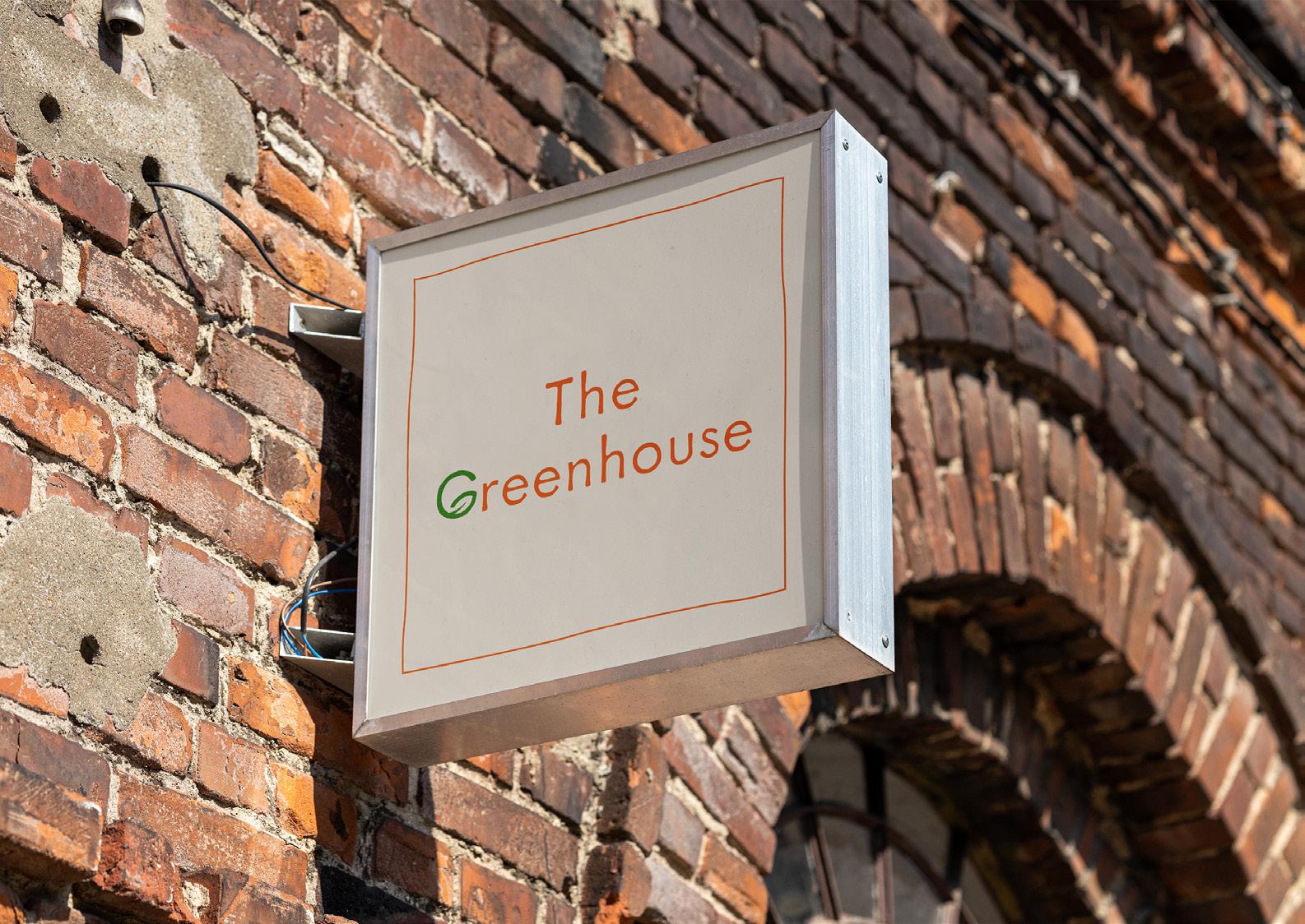
23
BRAND IN USE
The Menu

24
BRAND IN USE

25BRAND IN USE

26BRAND IN USE
Packaging (Restaurant)


27
BRAND IN USE
Packaging (Farmer’s Market)


28
BRAND IN USE
Merchandise


29
BRAND IN USE


30 Website BRAND IN USE


31


32
BRAND IN USE


33
Thank
You! 34