KAITLIN FURBUSH

KAITLIN FURBUSH
ARCHITECTURE + DESIGN
Selected Academic + Professional Work (2014-2024)
224.595.2575
katiefurbush@gmail.com
linkedin.com/in/kaitlinfurbush
issuu.com/katiefurbush/docs/portfolio
As a passionate Designer and aspiring Architect pursuing licensure, I specialize in creating thoughtful details, revitalizing neglected environments, and contributing to every stage of the design process.
Currently pursuing my Master’s degree, I am dedicated to expanding my skills to enhance the emotional well-being and material conditions of all people through architecture, because in the built environment, we are all stakeholders.
• Adobe Suite (AI, PS, ID, PR)
• Revit
• AutoCAD
• Rhinoceros
• Sketchup
• Enscape
• ArcGIS Pro
• Microsoft Office
• Digital & Hand Rendering
• Photo Retouching
• Quality Control
• Space Planning
• Marketing
• Branding & Rebranding
• Detail Oriented

University of Minnesota - Twin Cities
• Emphasis on sustainable design, facade detailing, urban design and visualization
• Studied landscape architecture abroad in Istanbul, Turkey in 2023
• Studio Representative, Spring 2024
University of Wisconsin - Milwaukee
• SUPERjury Merit Award winner in 2013 and 2015
• Graduated Cum Laude with an emphasis in visualization
• Continued mentoring and guest reviewing since graduation
University of Minnesota // Minneapolis, mn
• Currently instructing and advising pre-design students entering the program in Design Fundamentals II
• Assisted in Architectural History After 1750 in Spring 2023 by grading essays while teaching writing skills and architecture analysis
Quorum Architects, Inc. // Milwaukee, WI
• Began work as an Intern and physical model maker, advanced to an architectural design role
2022-2024 (Expected)
2012-2016
2016-Present
2016-Present
• Responsibilities include site measuring, space planning, creating proposals and presentations, schematic design, design development and working as the lead rendering artist
• Mentoring of all incoming interns and UW-Milwaukee “externs”
• Led 2018 marketing materials rebranding
DDCA Architects // Crystal Lake, IL
• Worked primarily on detailing residential projects, creating a company portfolio and acting as assistant to the Principal in Charge
• Taught an intro to Photoshop course to current and incoming employees
Creative Artistries // Crystal Lake, IL
• Worked as a student teacher while attending art school
• Taught students (ages 6-18) painting, sculpting, color theory, perspective and basic design composition
2015
2010-2014


Minneapolis, mn
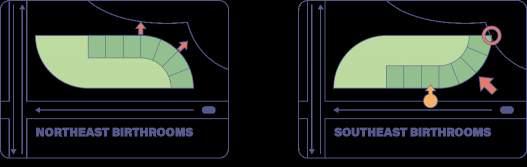
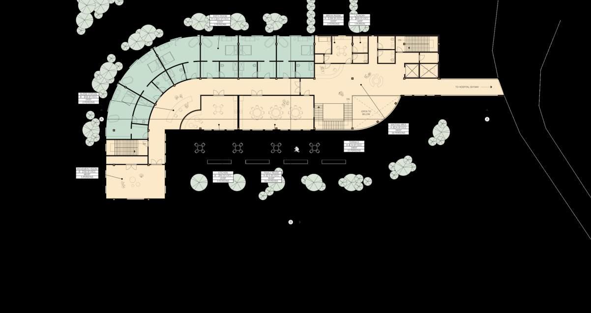
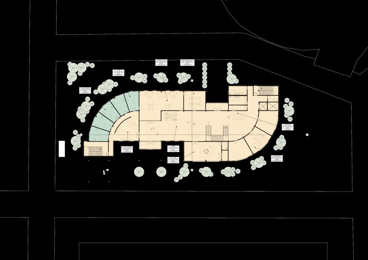
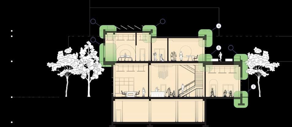
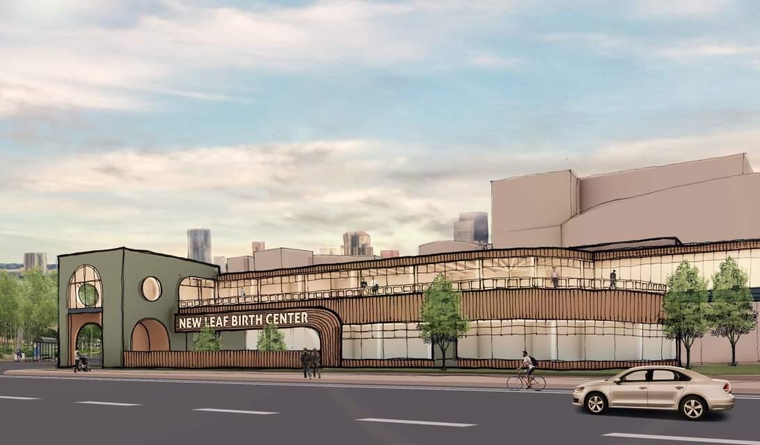
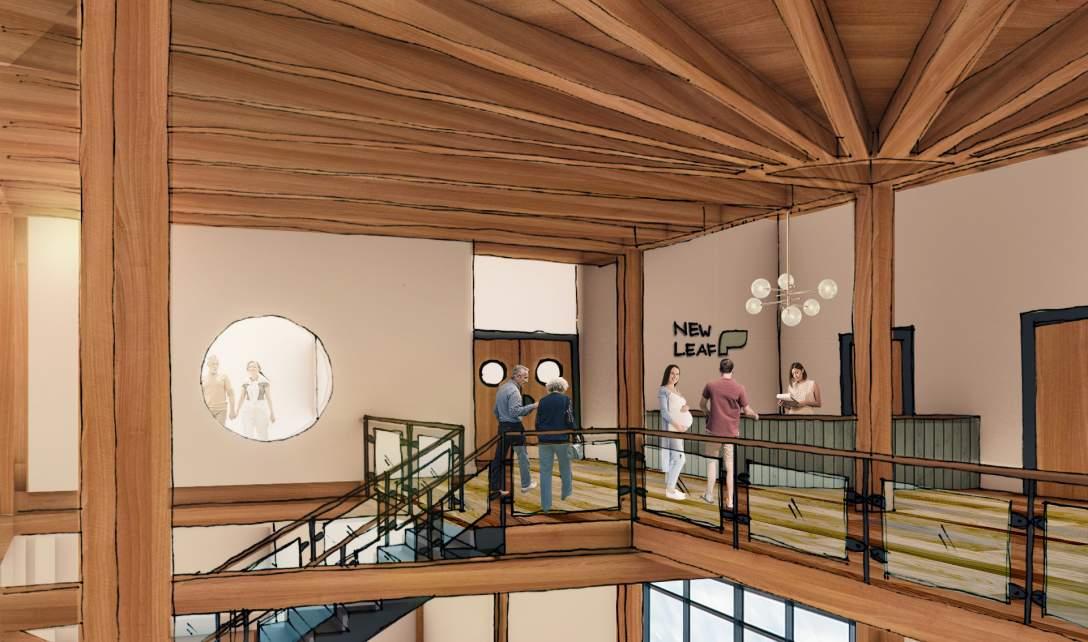
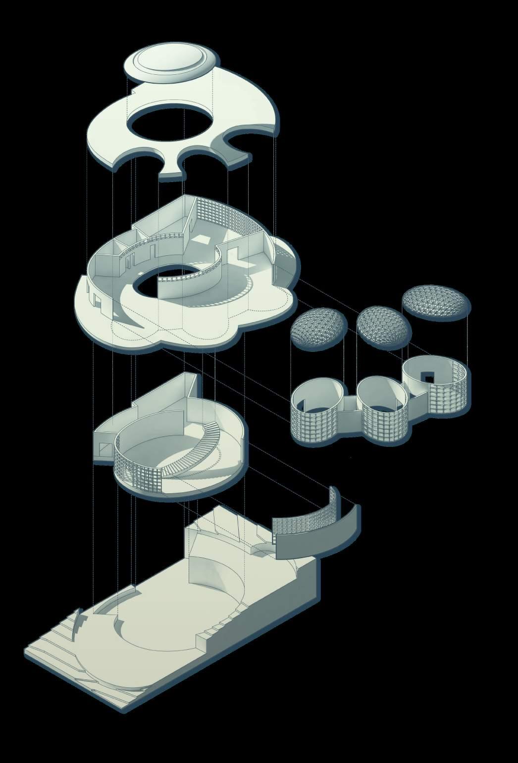
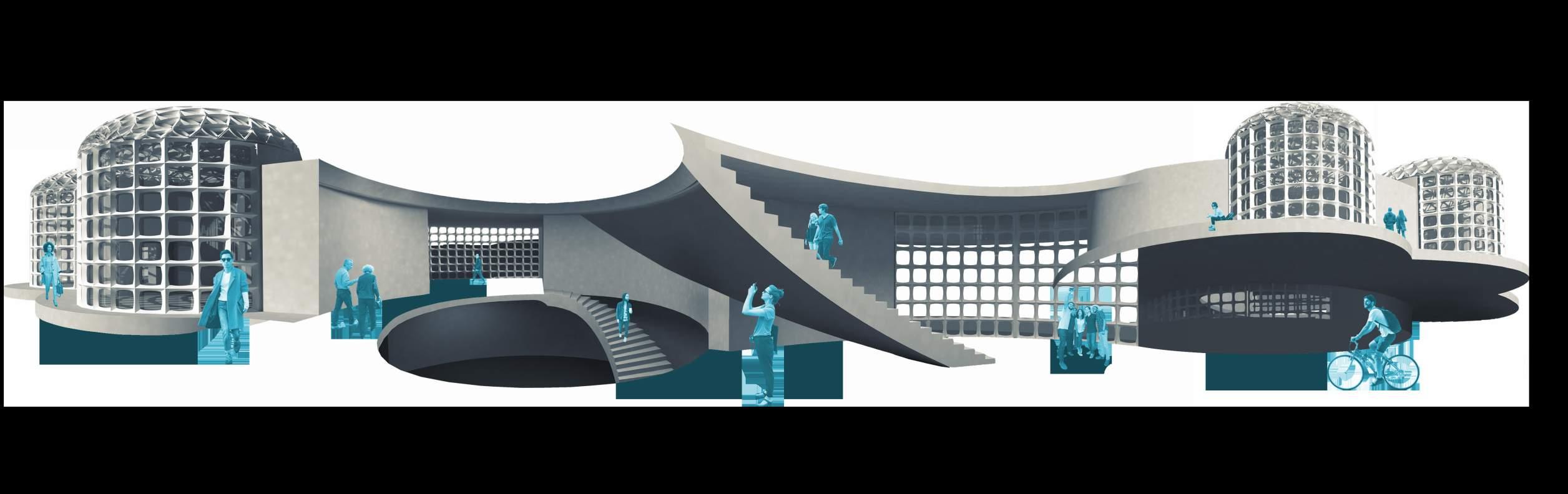
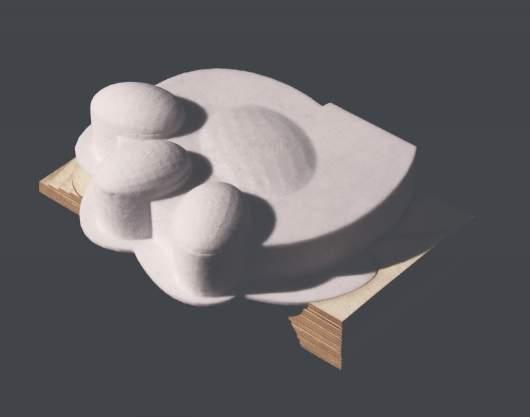
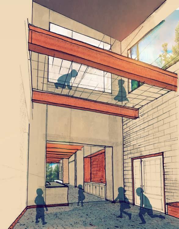
There are many ways in which life begins: an egg in a nest, a mother and baby in a birth center, a new leaf on a branch. The New Leaf Birth Center will provide a peaceful and holistic journey for mother and baby during what could otherwise be a stressful and emotionally taxing experience. Though the primary program of the building is a birthing center, the design provided for a front facing community and family entrance to the south for easy access to the juice bar, daycare, sexual wellness clinic and community classrooms, as well as private birthing drop off access at the north which opens to a bright ceremonial staircase, encouraging taking the stairs to help with labor.
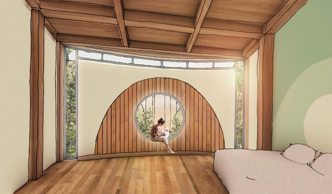
All birth rooms are located at the Northwest corner of the building, providing views to nature as well as soft Northern light, as these are meant to be contemplative internalized spaces, not bright and active. Southern exposure is reserved for the public areas such as the classrooms and family gathering space, with access to the adjacent southern terrace. The massing is informed by that of two leaves, mother and baby, with the curved faces responding to adjacent buildings and creating a peaceful transition from womb to world.
In response to the prompt for a net positive building, the selected structural system for this building is mass timber with cross-laminated timber decking. In addition to photovoltaic panels to offset carbon emissions, use of natural light was maximized by energy mapping of footcandles, spatial daylight autonomy (sDA) and annual sun exposure (ASE).
EUI, or Energy Use Intensity, quantifies a building’s energy consumption per unit of floor area over time, crucial for assessing efficiency and guiding sustainability efforts. While lower EUI values signify higher efficiency and reduced environmental impact, achieving a negative EUI (net positive building) can be challenging, particularly in specialized facilities like medical buildings, where higher energy consumption is inherent to operational needs. Regardless, EUI is a vital benchmarking tool for improving energy performance and guiding sustainable practices.
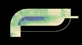
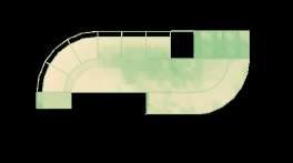
Baseline Concept
Optimized HVAC
Optimized Envelope PV Panel Offset

Saint Paul, mn
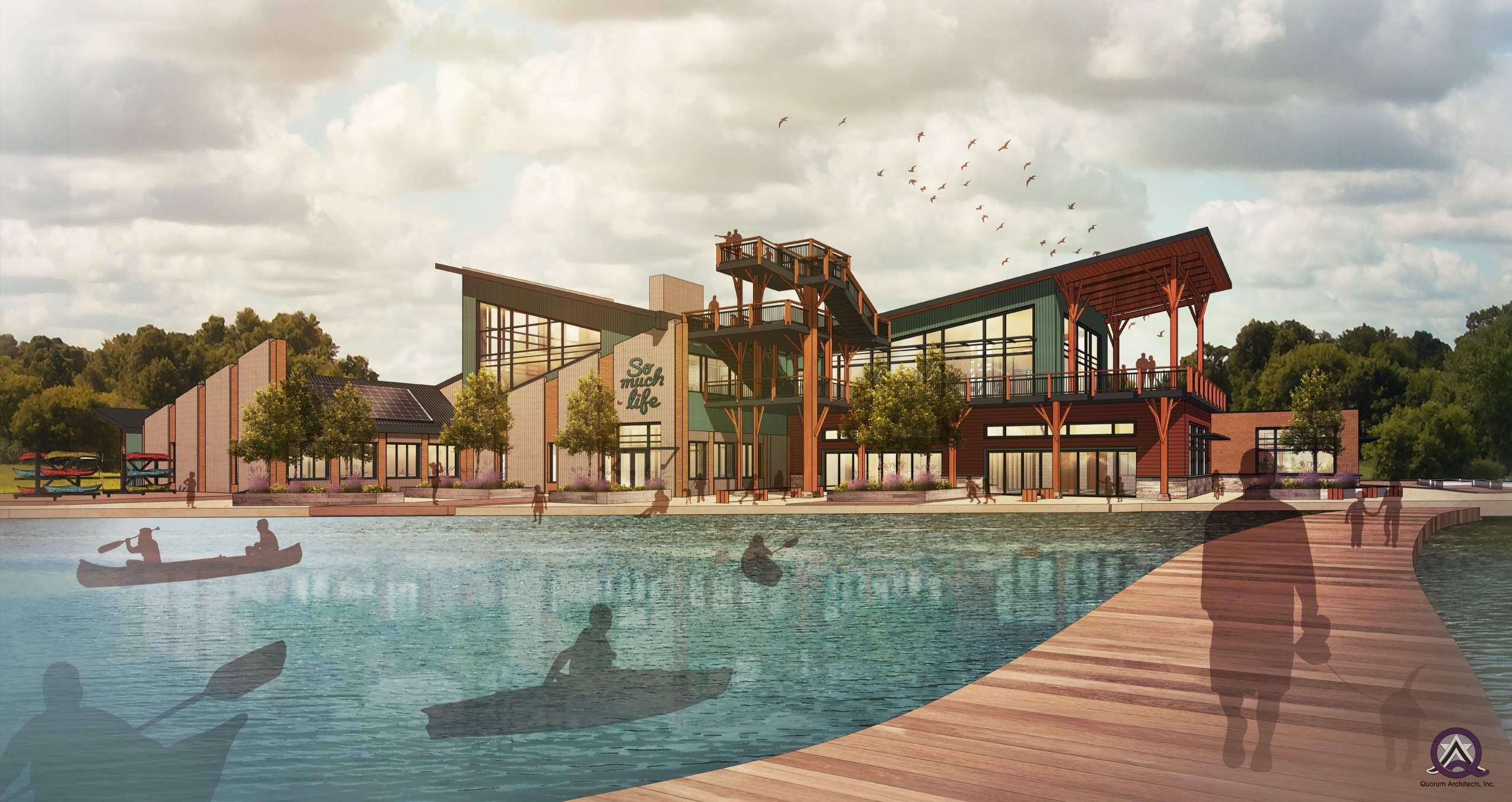
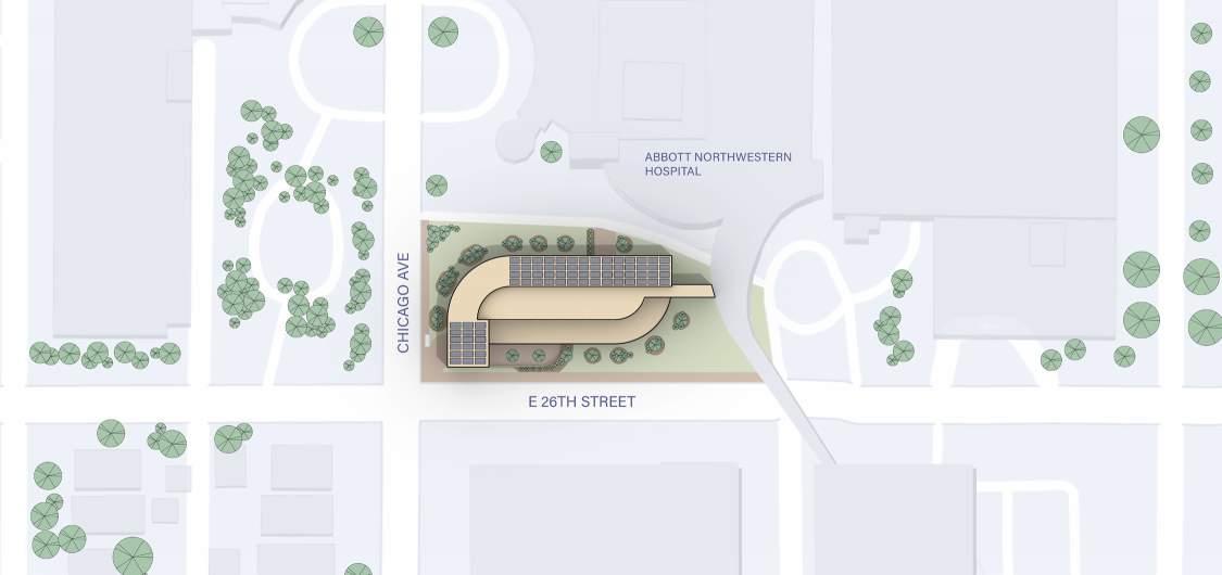
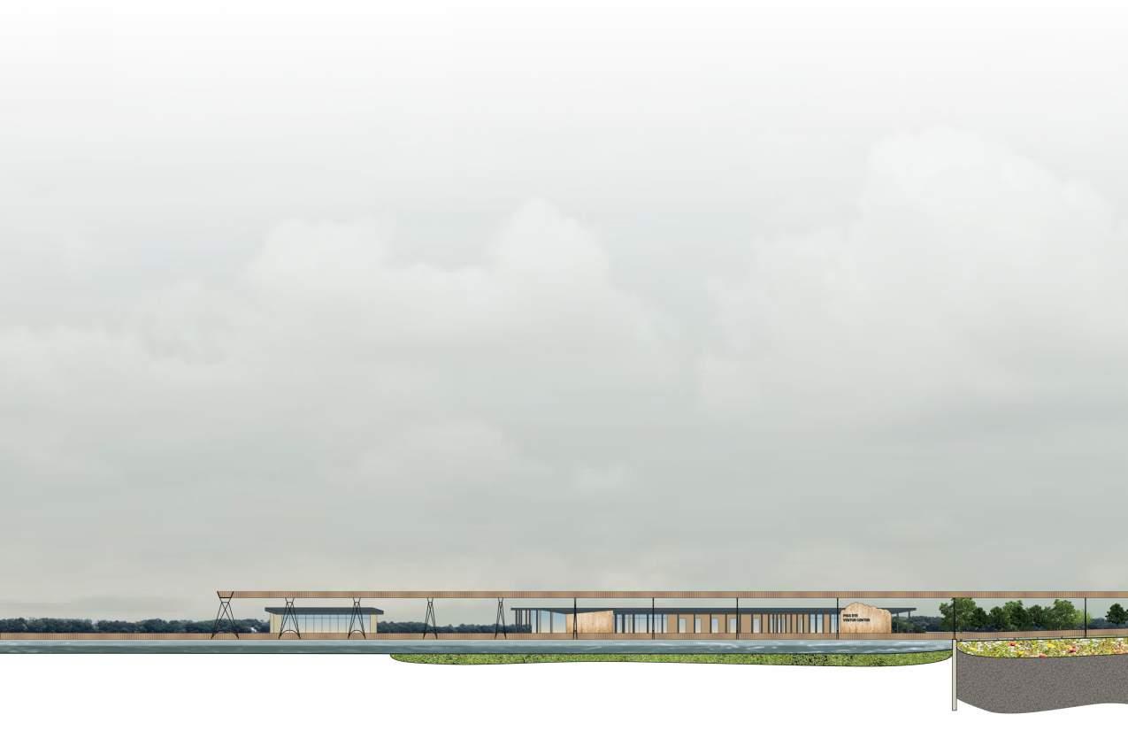
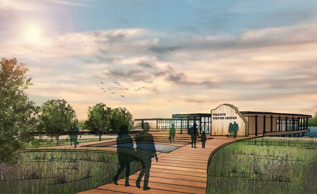
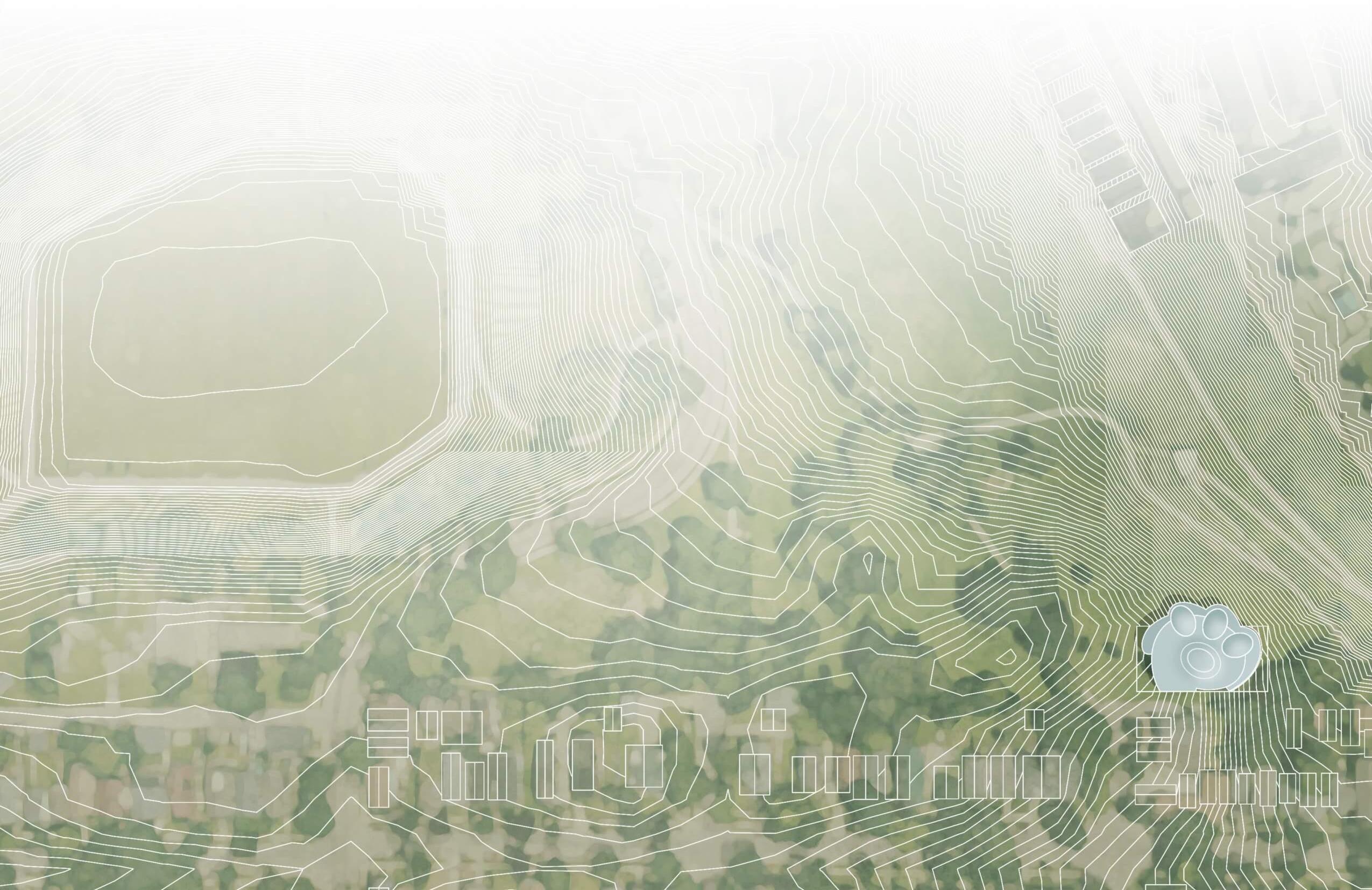
This intervention aims to seamlessly blend Pig’s Eye Park with Pig’s Eye Lake, inviting visitors to embrace the unique beauty of the natural environment at the water’s edge. Previously, accessing the lake from the park was challenging. To address this, a carefully planned network of boardwalks, pathways, and architectural elements was designed to connect the park to the marshy shore. Meticulously curved pathways seamlessly merge with the and celebrate the existing landscape, showcasing attention to detail by adapting to contours. The intervention culminates in a shoreline boat house and visitor center, providing amenities and educational experiences to appreciate the lake’s beauty and biodiversity. The visitor center harmoniously integrates with its surroundings, combining architectural intent with environmental sensitivity. A lagoon offers a dynamic recreational experience, allowing visitors to rent small watercraft and explore the lake at their leisure.
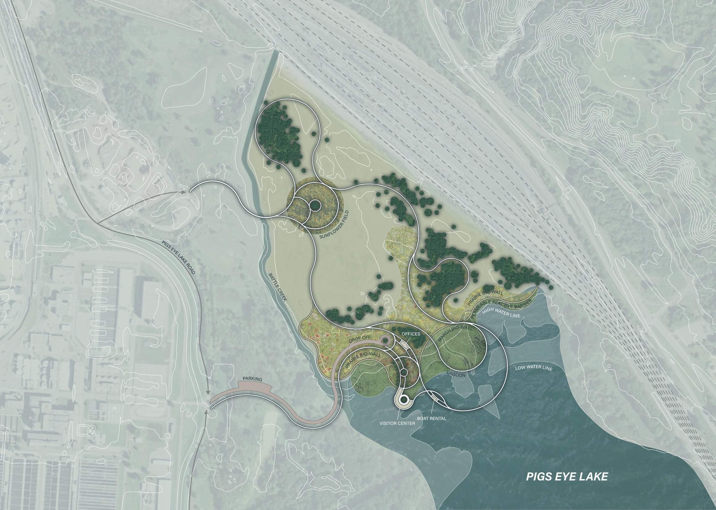
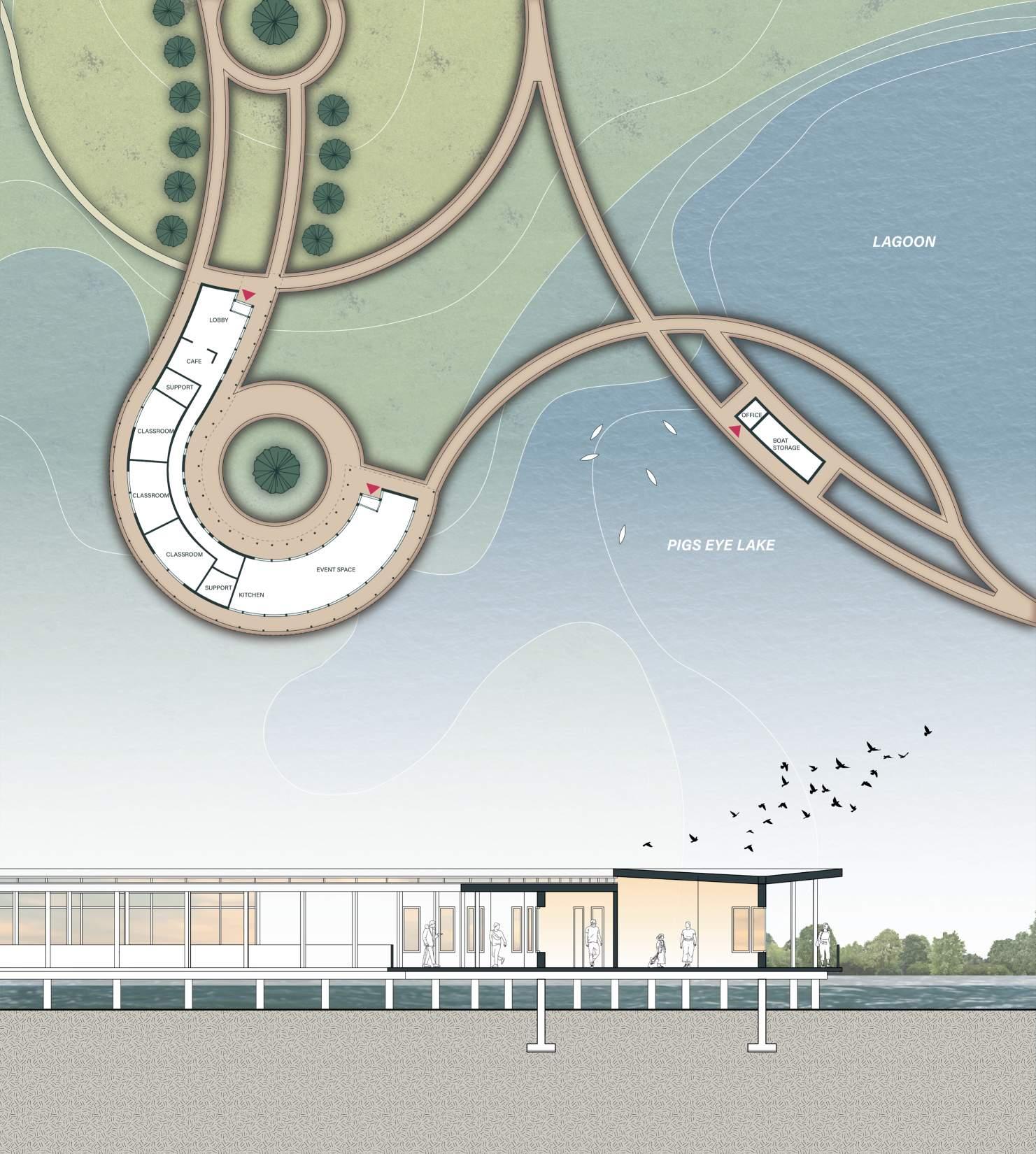
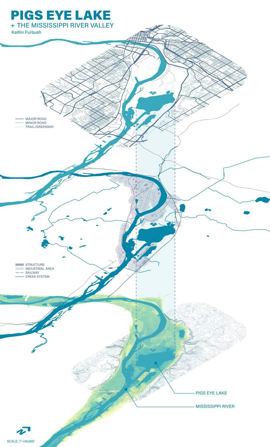
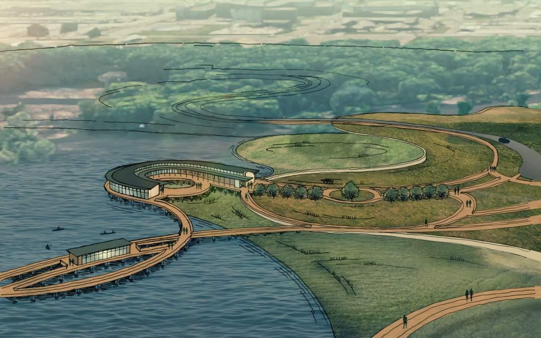
Addressing PFAS contamination, a bioremediation plan will introduce an innovative bio-wall of prairie and marsh plants known for mitigating heavy metals, such as sunflowers, cattails and cannabis, as well as a permeable reactive barrier (PRB). The PRB, constructed of limestone with the ability to filter out dangerous chemicals before they enter the lake, weaves through the designed pathways, sometimes expressing its materiality, such as at the entrance of the visitor center. This allows for unique barrier conditions visitors can experience at different elevations throughout their two mile adventure through the different landscapes of the park.
Site Section
Elevational change implemented through this design plays a key role in the understanding of the site. Through this initiative, accessibility is improved, maximizing the ecological and recreational value of the site and fostering a deeper connection with this previously underutilized natural asset.
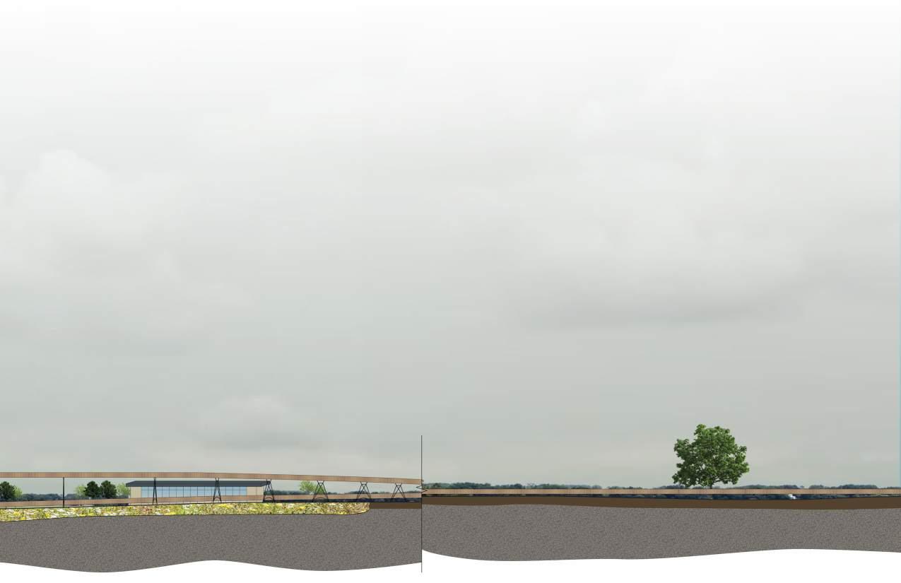
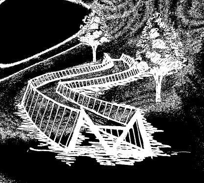
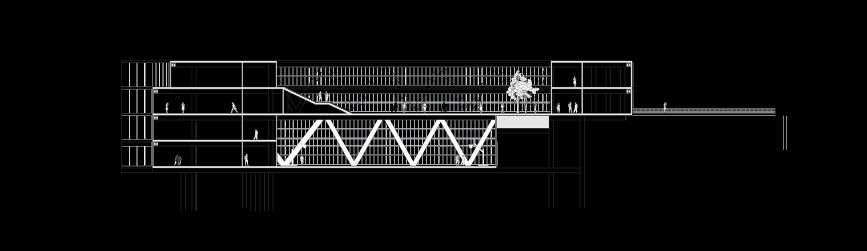
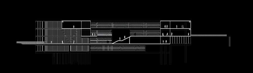
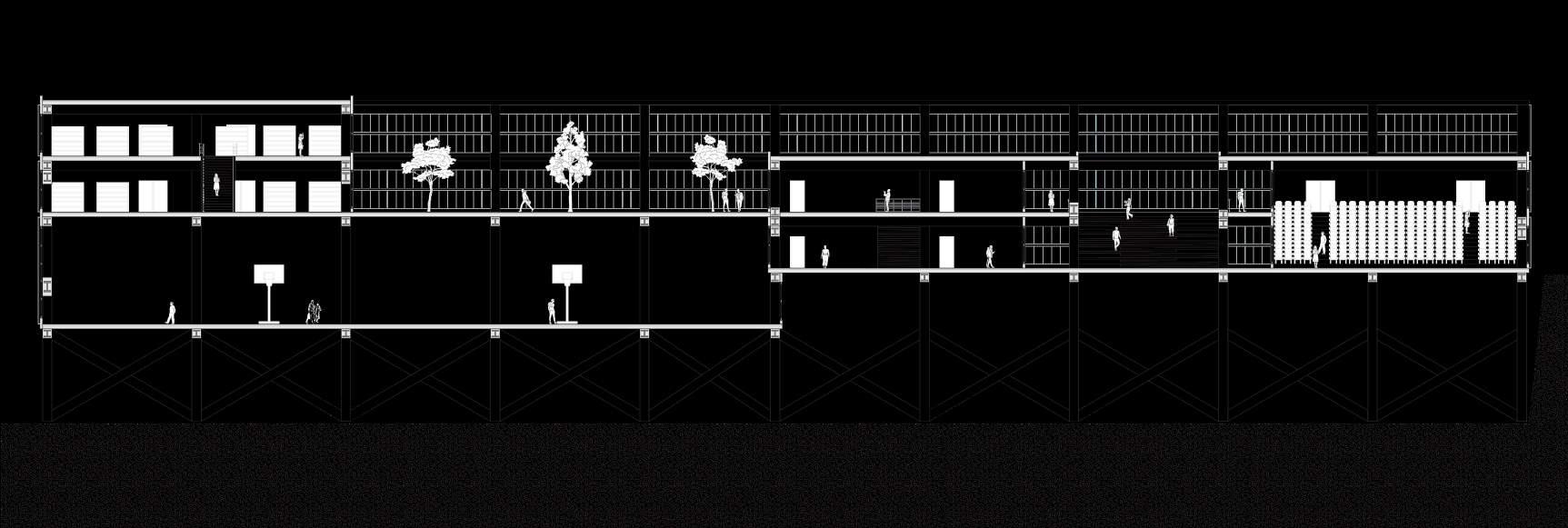
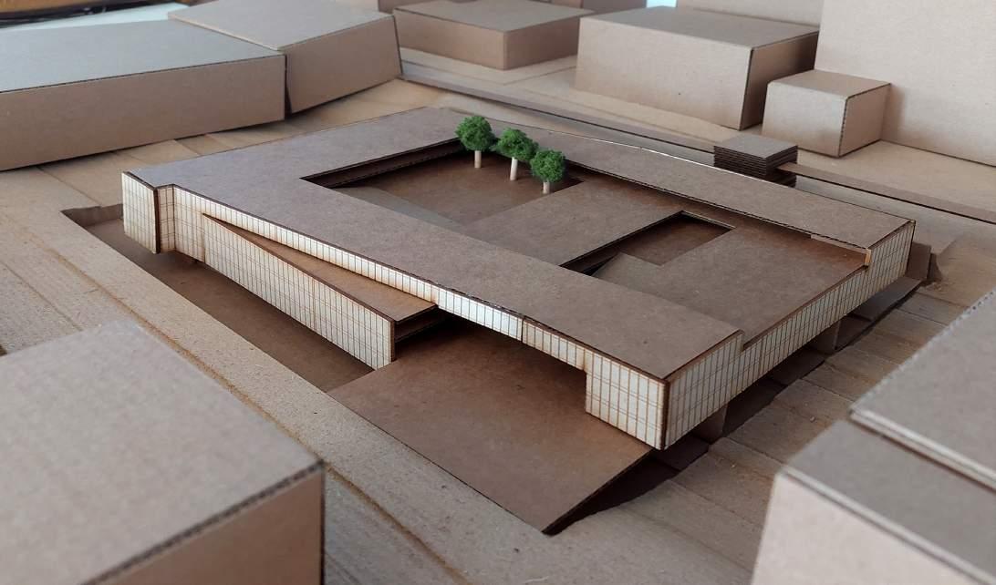
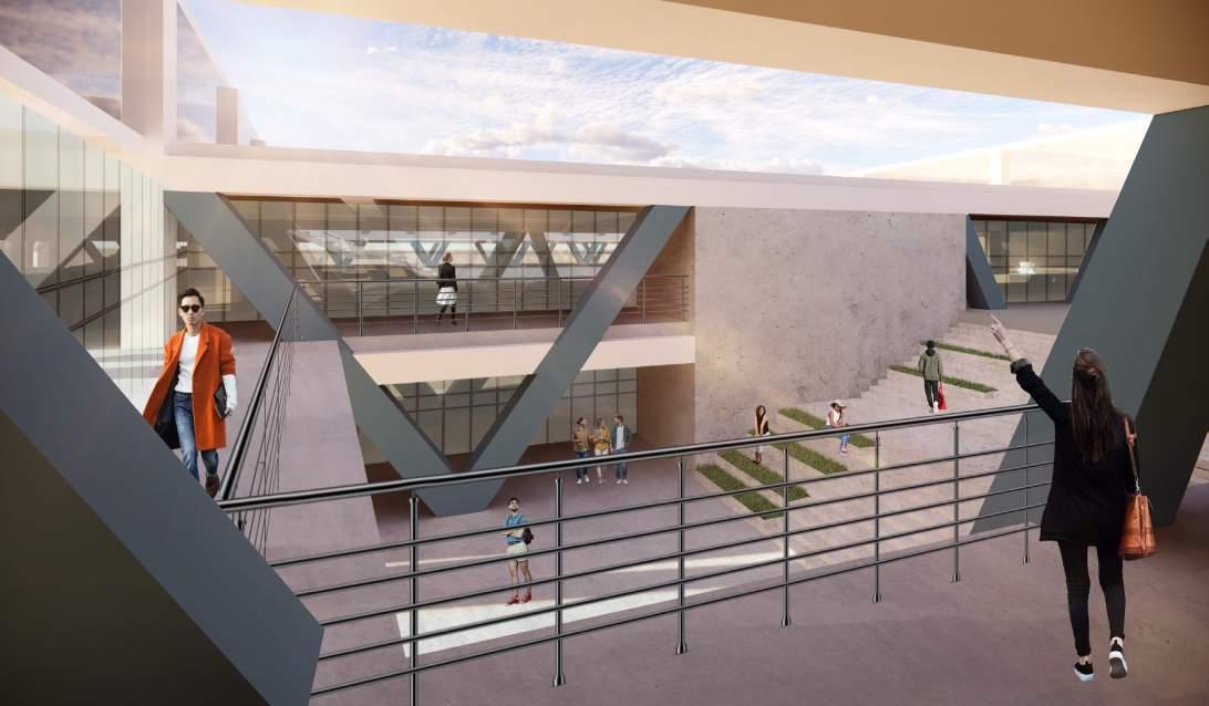
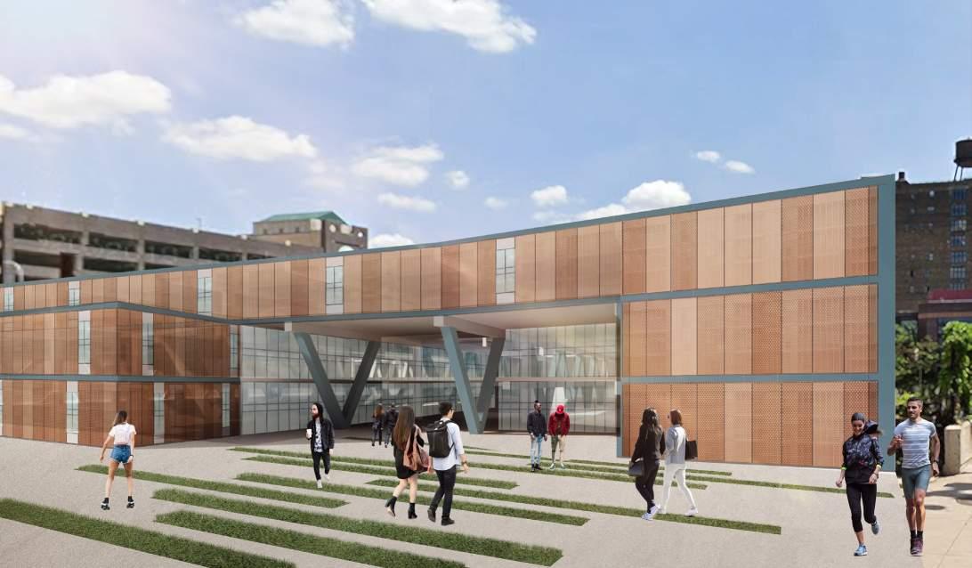
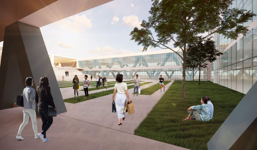
This studio project revolved around the design of an urban high school situated above the bustling I-394 freeway in downtown Minneapolis. I began with an in-depth exploration of various architectural elements such as ramps, bridges, platforms, stairs, and corridors, all of which were integral to the site’s unique context. Through thorough analysis of precedent projects and case studies, I gained valuable insights into spatial organization and educational functionality.
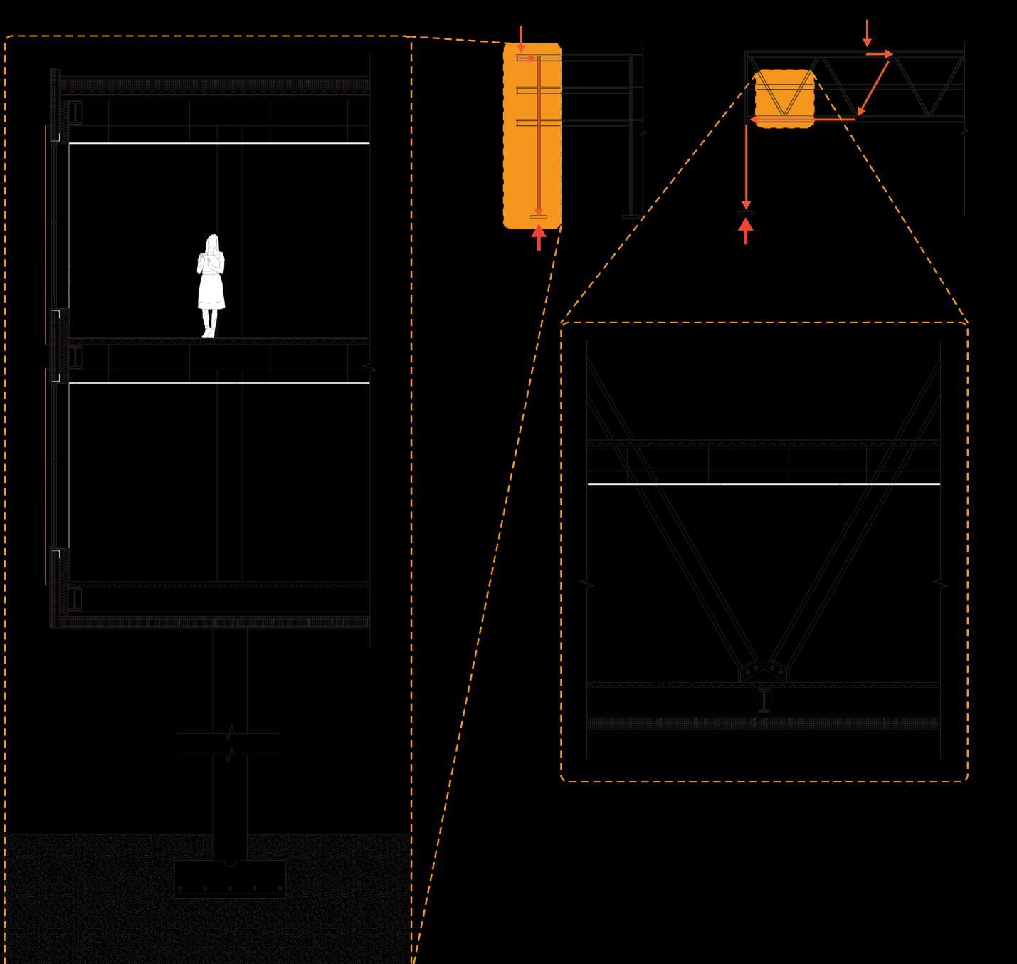
As the project progressed, I envisioned a dynamic school layout characterized by an S-shaped configuration, encompassing two distinct courtyards, one public and one a private enclave for students. Deliberately integrating smaller programmatic elements along the periphery, such as classrooms, allowed for natural daylighting. The design’s centerpiece is the creation of expansive learning spaces, spanning the lanes of the highway within two-story Warren V-trusses and boasting a bridge inspired length of 128 feet.
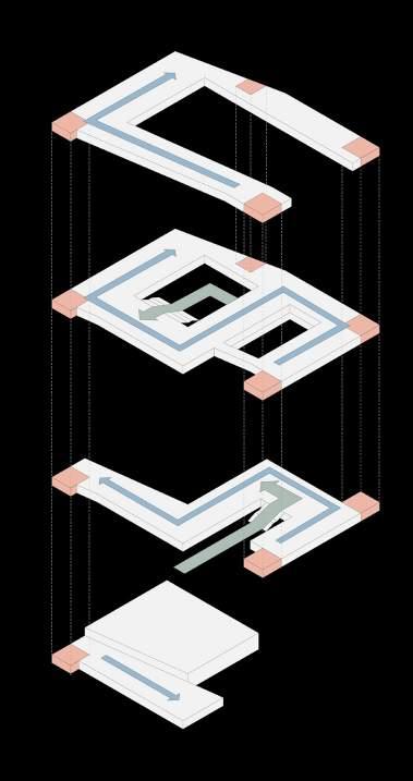
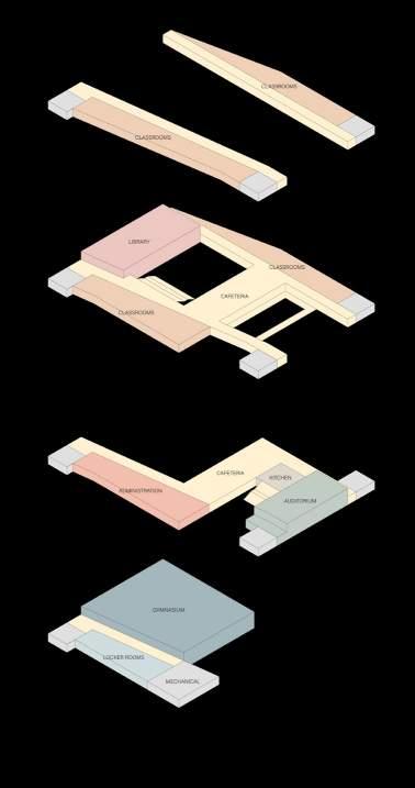
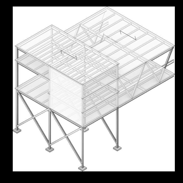
Two story learning spaces such as the cafeteria, library, auditorium, and gymnasium are large and provide students with a sense of agency and exploration. They are uninterrupted by columns as the Warren trusses provide the necessary structure to span great lengths in steel. The structure is left exposed for the students, providing occupiable spaces as well as functioning as a teaching tool. Integral to this design proposal was structural feasibility. I embraced the structural system not as a hindrance but an oppurtunity to create dramatic forms and expansive open spaces. The column grid was influenced by the highway beneath, making organic sense of disparate urban forms. Protected coutyards allow for outdoor activity and expression while providing a safe haven and sound buffer from the highway running below.

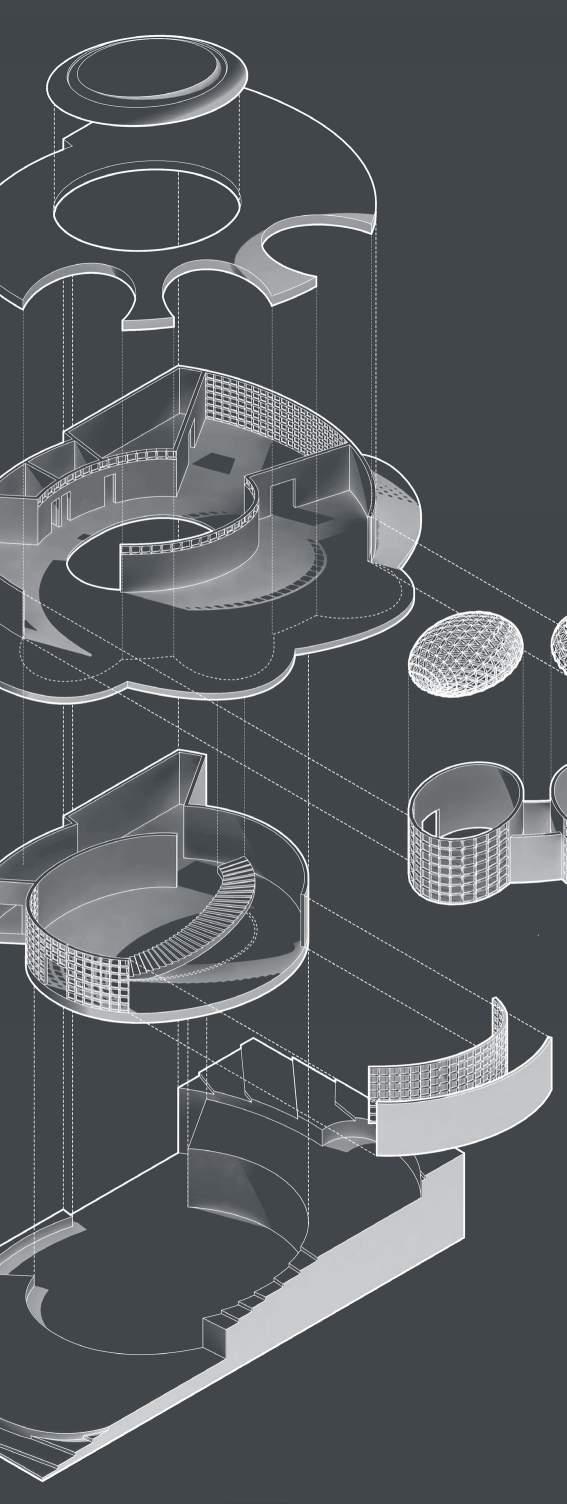
For this project, located on the steep northern hillside of the Milwaukee River, I was tasked with designing a small gallery space for Milwaukee’s Brewers Hill neighborhood.
The gallery would only be able to feature limited artwork based on size, so I chose to lean into the angle of the discerning art gallery. I designed a space only suited to house a few exhibits at a time with a preference for installation art work, as the hillside exposure to bright southern light would not be suitable for more delicate mediums. Many design solutions followed under the pretense of creating a blank canvas of a space with ample daylighting and structure to support hanging installation works. The building aims to compliment without distracting from the artists’ work by acting as another installation art piece as opposed to a simple building within which art resides.
Visitors enter the gallery from the second floor into the atrium, where they can chose to immediately descend the monumental staircase into the main gallery area, or enter the smaller arterial galleries. Their doorways spiral and meander the guest toward the staircase and ultimately to the same place. From the main gallery, an outdoor event space looks down into the valley and daylight is plentiful from the southern light despite being on the lower floor.
Where other galleries aim to minimize natural lighting to protect the work, this Hillside Gallery invites it in and encourages guests to step outside and not only experience the bright city reflecting off the river, but the light or the stars at night through skylights.
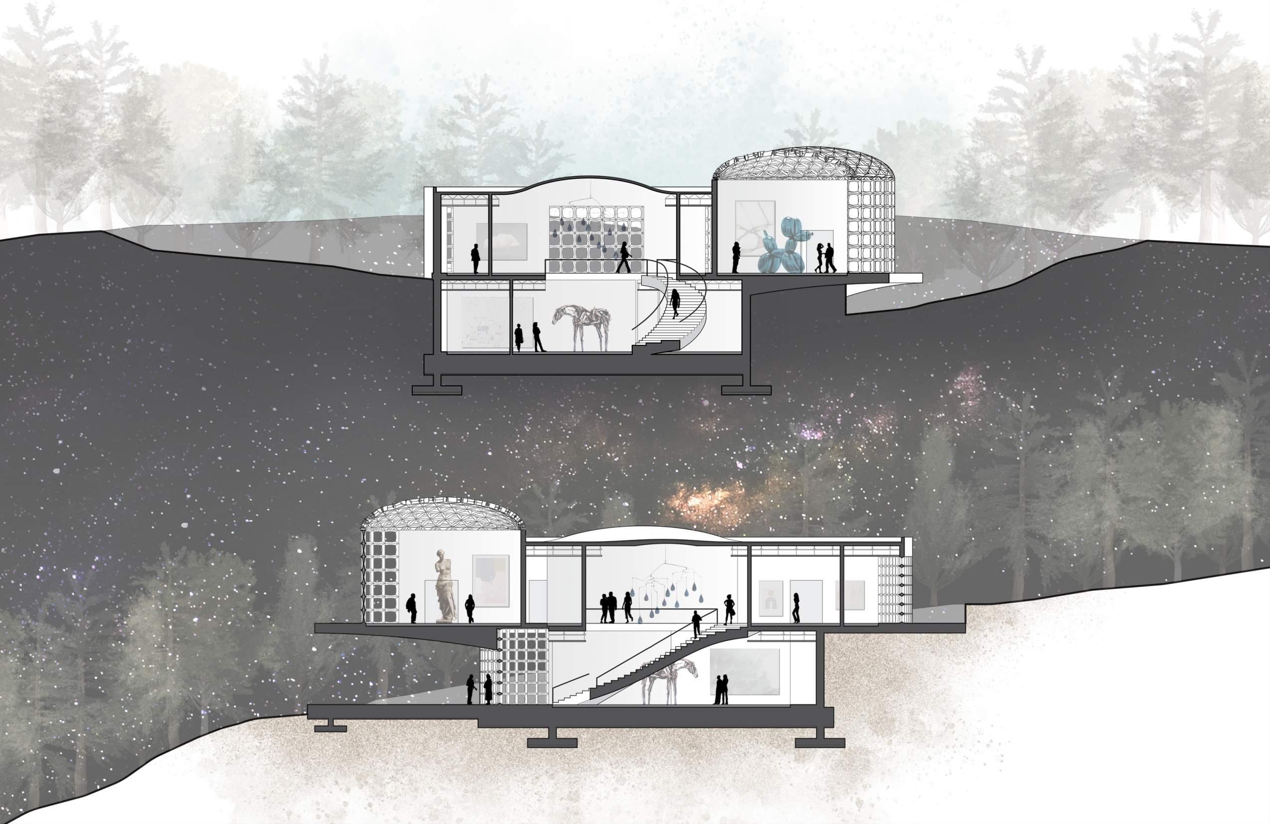 East-West Section
Milwaukee, Wisconsin
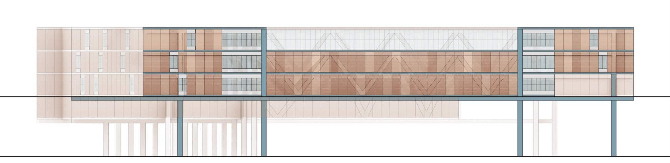
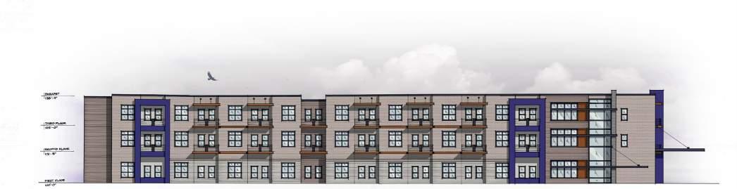
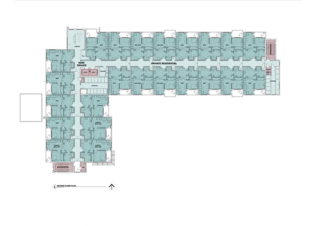
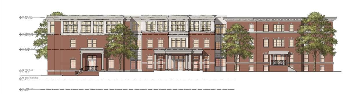
While working at Quorum Architects, Inc., Victory Manor was the first project I was able to see through to completion. The 4-story mid-rise, multi-family building anchors the northwestern corner of Westlawn Gardens, a revitalization of a low income neighborhood by the Housing Authority of the City of Milwaukee. In addition to assisting in construction details and creating all graphics for the project, I led the team in photographing the final interior spaces. Many of the following graphics have been featured in Quorum Architects’ Whitepaper Publication that I assisted with, Impacting the Built Environment: Designing Affordable Housing for Veterans.
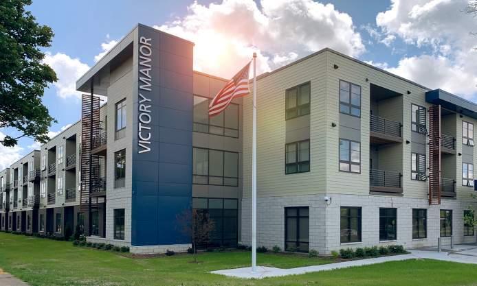
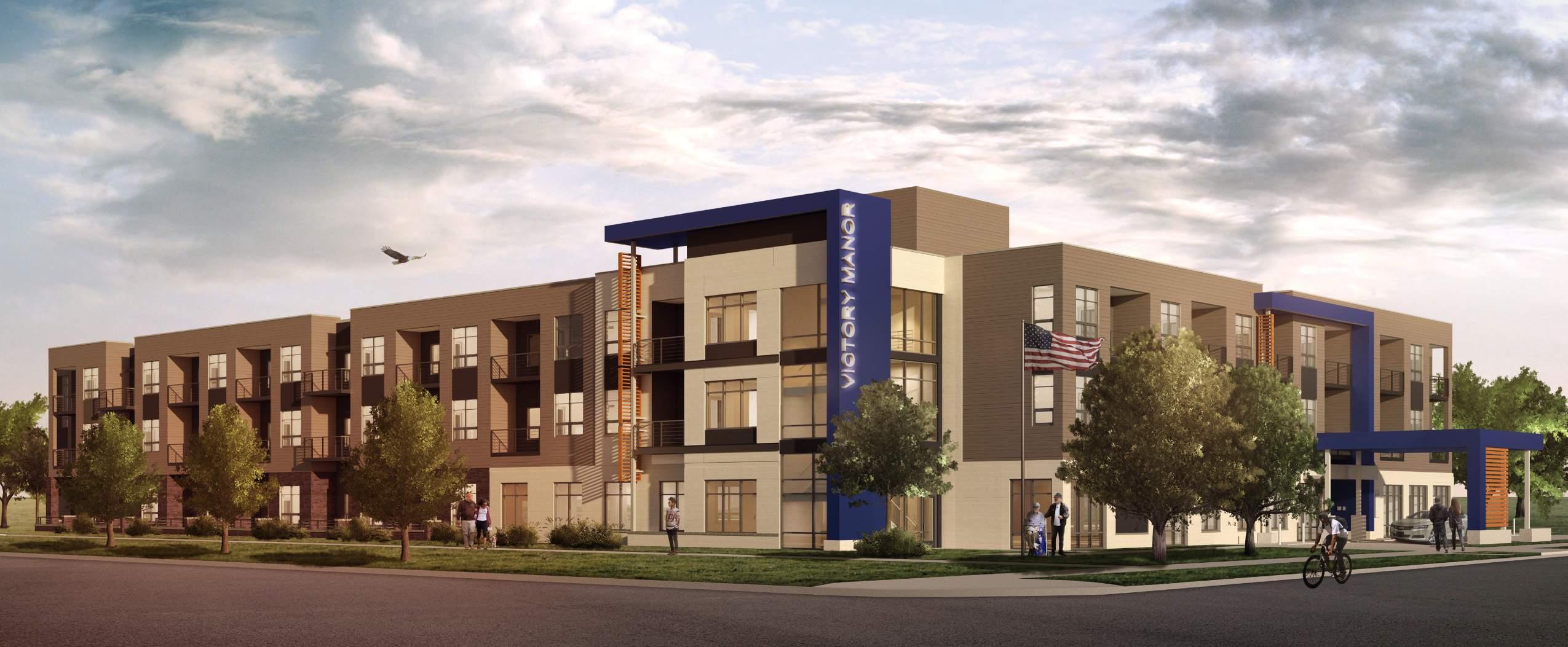
Victory Manor was primarily designed with the interests of residents in mind. The building caters primarily to homeless and displaced veterans with several units devoted exclusively to veterans.
All one bedroom units and common spaces were designed with calming colors of blues, greens, and warm browns to evoke nature and a sense of peace. Design also prioritized straight lines, repeating patterns and easy to understand delineation of spaces. Proposed exterior materials changed as the building use shifted from public, to private, to semi-private spaces.
All of these streamlined design decisions stemmed from months of research on the sensory experience of PTSD patients. We wanted to create a space that felt safe and predicable, yet clean and calming to the residents.
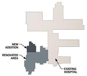
The team on the Westlawn Gardens project is comprised of multiple firms across the country.
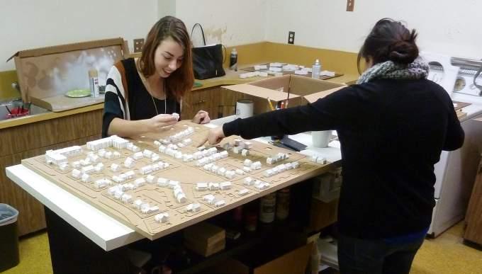
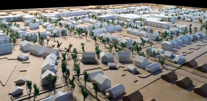
To date, Quorum Architects’ work entailed designing Victory Manor, the pool house, and fabricating a site model of the 8-square-block housing development.
The model we created measures 4’x8’ with a 3’x3’ replaceable section showing the existing context.
Over 800 townhomes and multi-family units were 3D printed and installed after I modeled the 53 unique designs.
The model resides in the leasing offices at Westlawn Gardens and has proven an effective marketing tool for visitors to interact with.
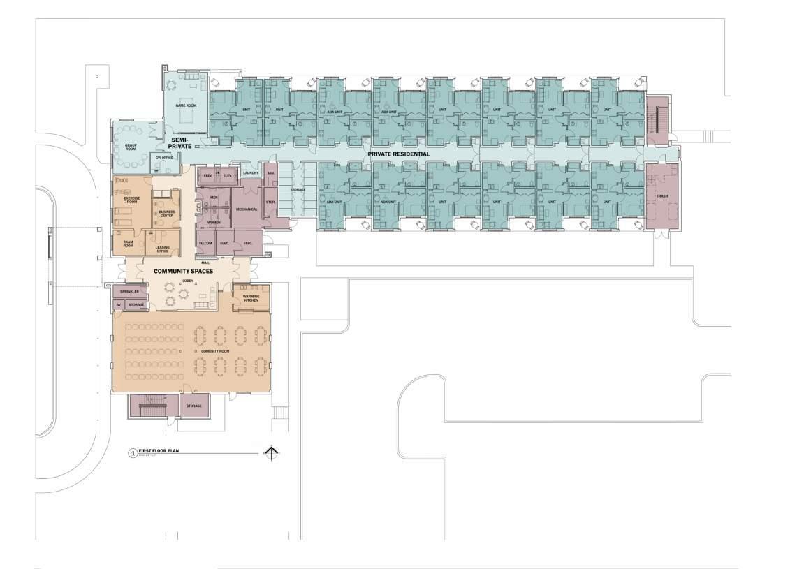
 First Floor Plan
North Elevation
Upper Floor Plan
First Floor Plan
North Elevation
Upper Floor Plan
Various Locations, WIsconsin
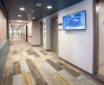
Rogers Behavioral Health is the biggest client at Quorum Architects. This non-for-profit organization encompasses dozens of inpatient and outpatient facilities throughout the United States, concentrated in southeastern Wisconsin. Most of my work focused on these local projects; my participation began during schematic design and extended through to marketing photography of finished projects.
These projects hold a dear place in my heart because I believe we can create spaces that have a quantifiable impact on the healing journey.
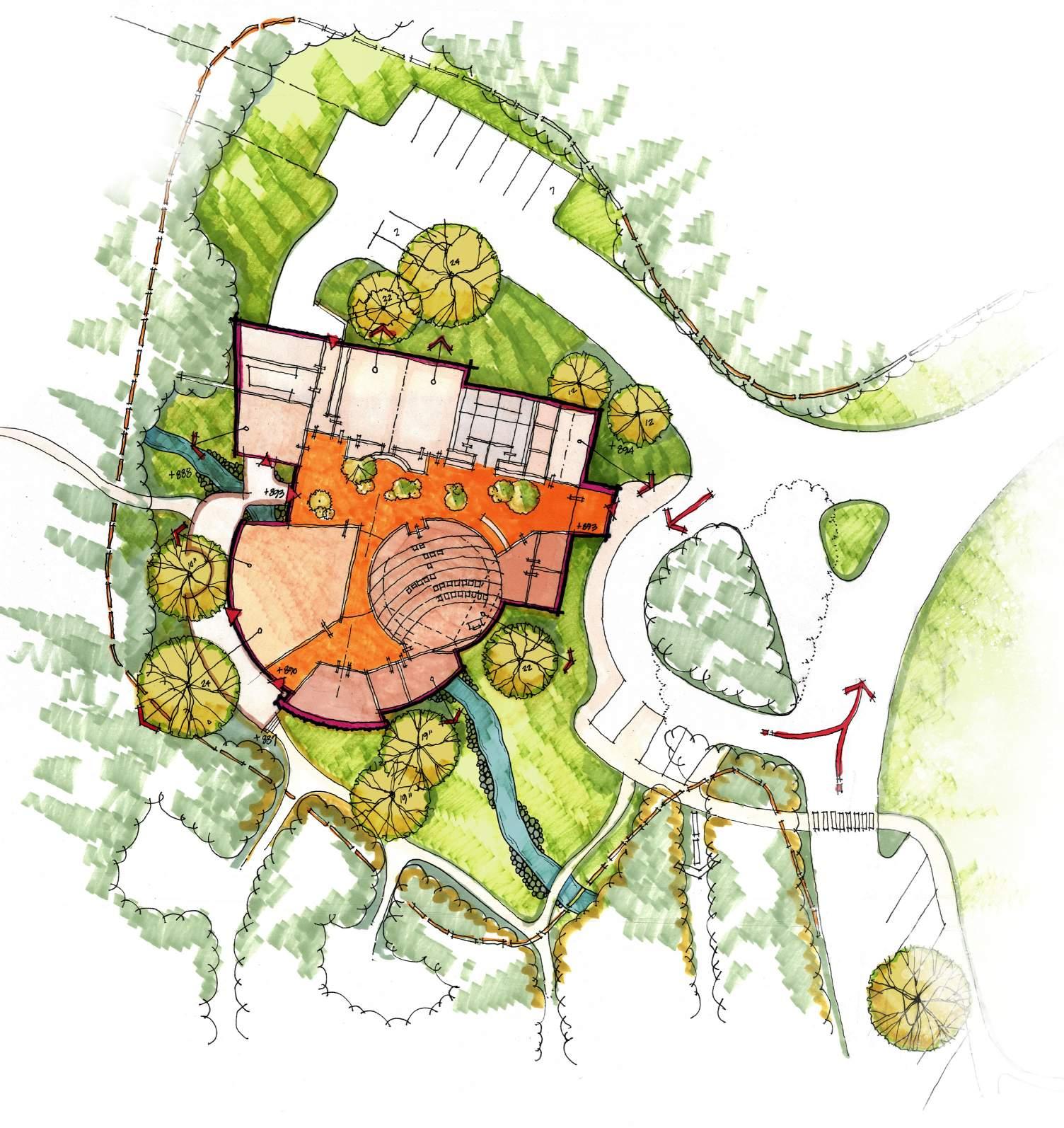
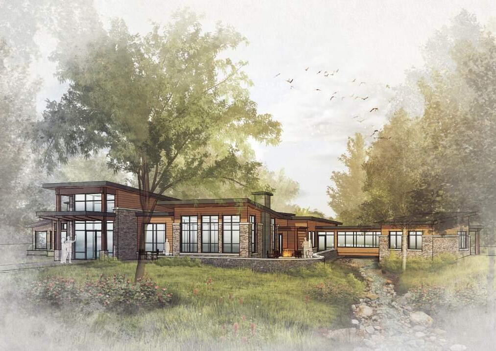
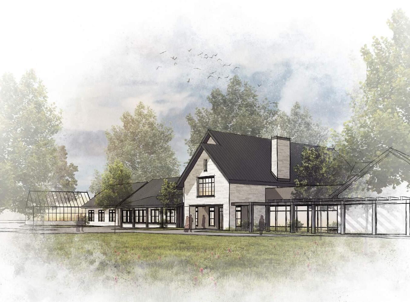
This project is still in the early phases of design and will function as a center for visiting family activities, assemblies, worship and fitness at Rogers main hospital campus in Oconomowoc. My work for this consisted of creating renderings and other marketing materials to help raise money for the project.
I aimed to emphasize the connection to nature in these renderings as Rogers, specifically their main campus off the Nemahbin Lakes, recognizes exposure to nature as an integral part of the healing process.
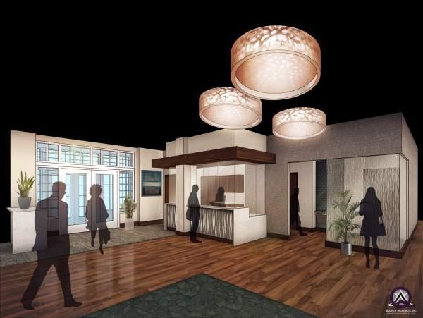
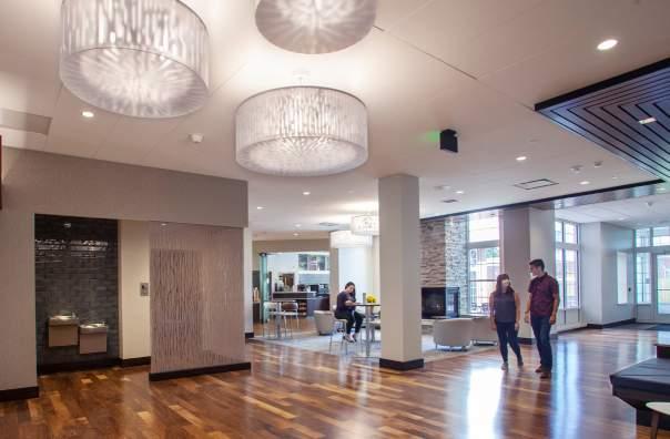
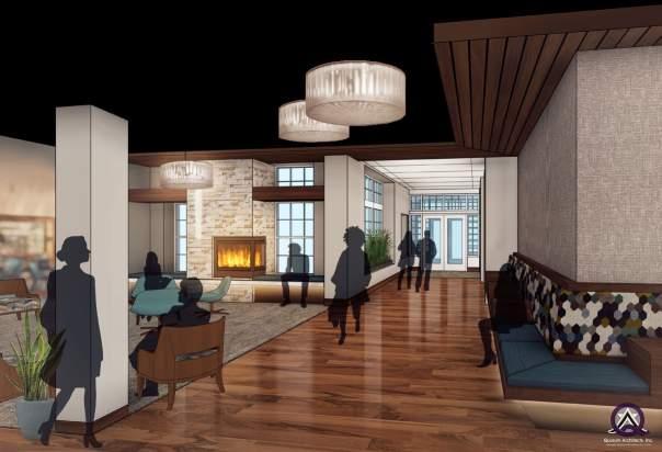
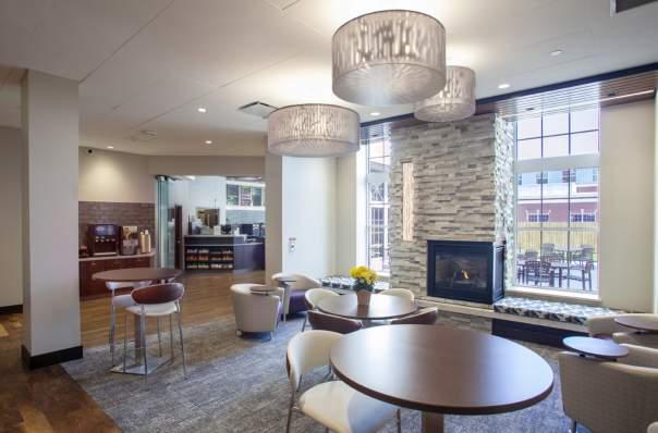
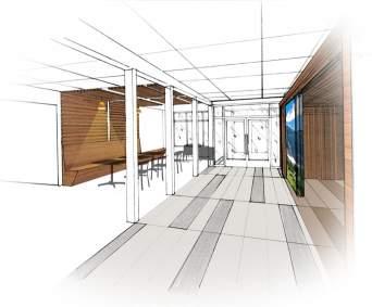
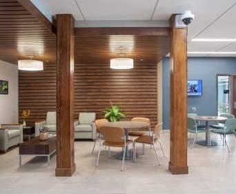
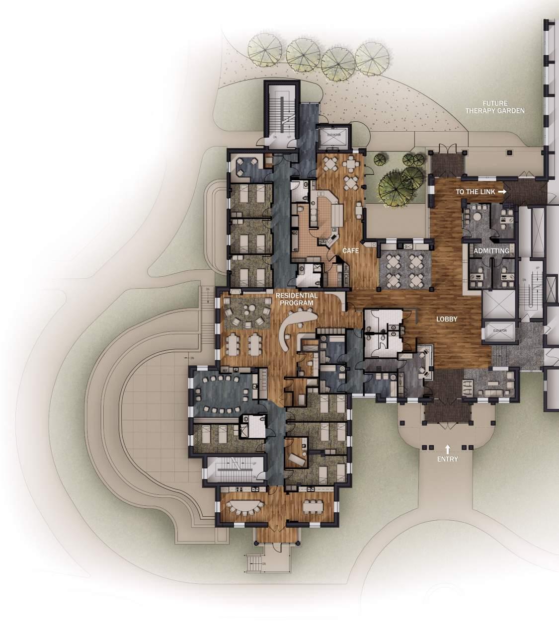
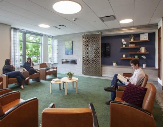
The main Oconomowoc building required a big renovation to provide for the growing client base and expansion of treatment programs. The first phase of work consisted of the West Wing inpatient facility and adjacent Lobby. Future work will involve expanding the footprint of upper floors, addition of stairwells and greenhouses, and further integration into surrounding landscape. Our inspiration for the lobby was the aesthetic of a hotel lobby. Where as the previous space was just a reception desk and waiting room, the renovation introduced a cafe, fireplace and seating area where staff, patients and family would feel comfor table to gather.
I created renderings, plans, elevations and other display materials for this project which were displayed in the main lobby. Accuracy, in lieu of aesthetics in renderings and attention to phasing was vital as large changes can be stressful to patients if not handled delicately.
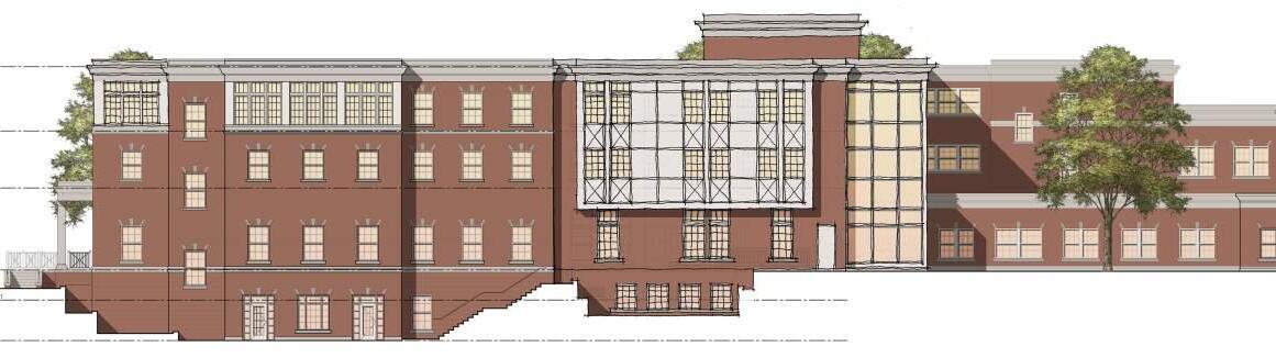 South Elevation
West Elevation
South Elevation
West Elevation
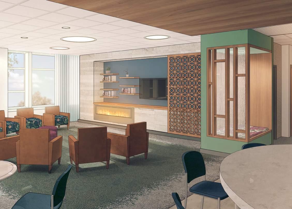
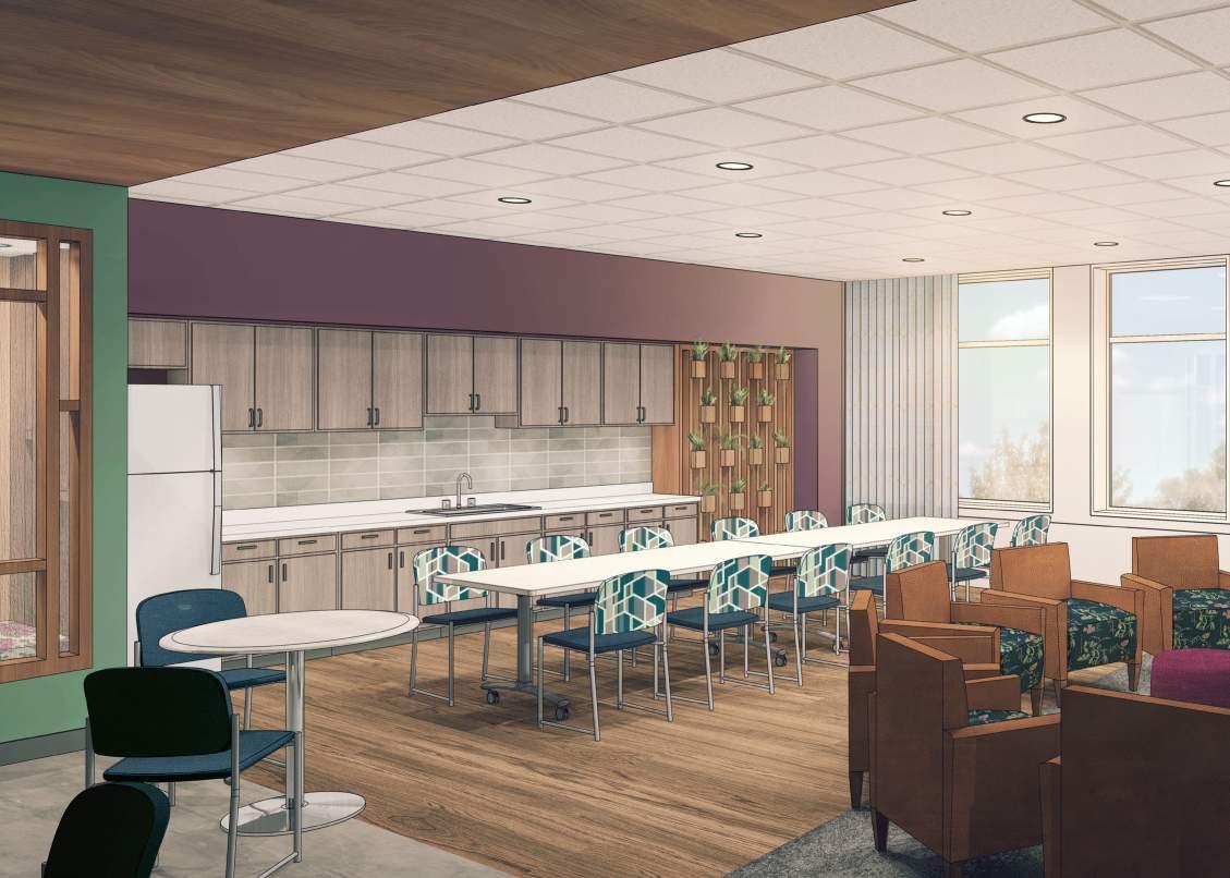
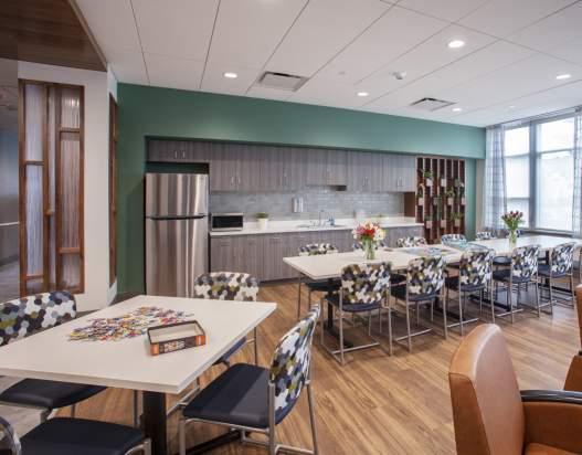
Our design concept for the interior of the Eating Disorder Facility was “Urban Zen Garden”. We implemented tactile, floral textures and natural woodwork to bring the calming outdoors inside.
I created a series of renderings, initially to help the team work through color schemes, and then to help sell the client on our concept. Prominently featured are frosted glass “phone booth” spaces. These nooks provide a place for patients to relax and reset while still remaining in the sight line of the central nursing station. Later, I led our team in the staging of this space.
 Second Floor Plan
First Floor Plan
Second Floor Plan
First Floor Plan

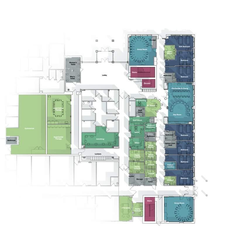
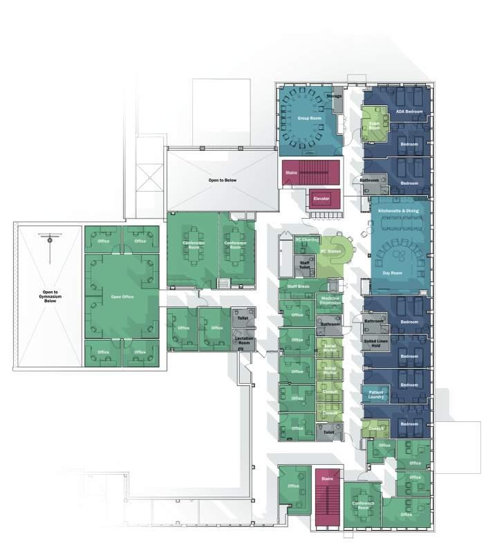
For the OCD Wing I assisted my team in design research to help make the correct decisions when it comes to treating this specific illness. For example: At other Rogers facilities, hands-free sensor faucets are standard. However, we found that such a design choice would only reinforce anxieties of OCD patients. We created a questionnaire and conducted staff and patient interviews to learn more about their experiences.
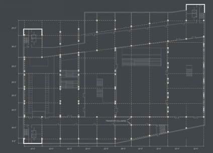
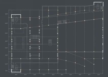
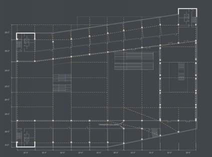
I compiled all of our research into a space need programming report where I organized adjacencies between departments, calculated relative square-footages and organized space plans.
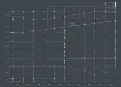
The adjacency needs diagram shows how patients move through the space, getting closer to the natural environment of the Lake Nemahbin bluffs as they travel deeper into their treatment. These diagrams are the best way to structure large amounts of information into an understandable visual format without having to shuffle through pages of spreadsheets. I chose to make this diagram axonometric to show the connection between floors on a very sloped site.

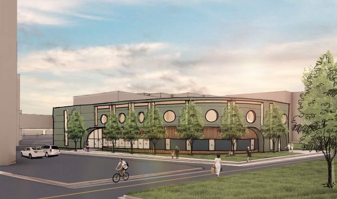
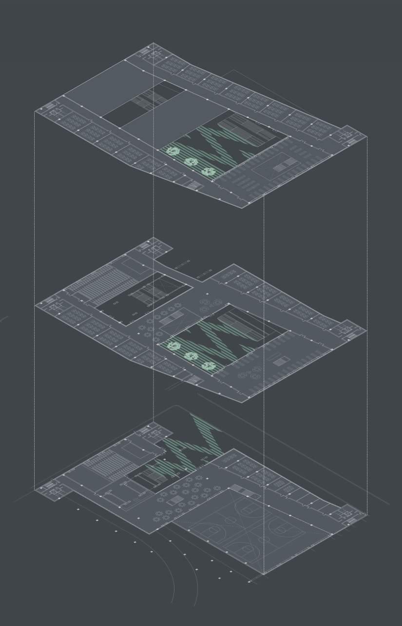
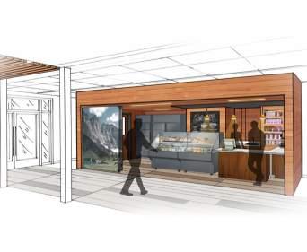
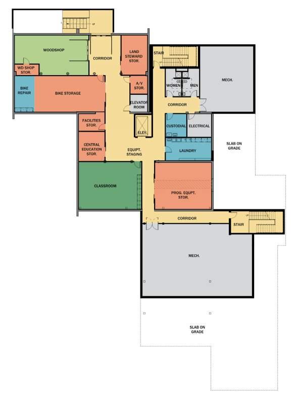
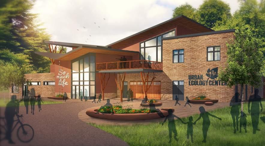
Another project I was heavily involved in at Quorum was the renovation and expansion of the Washington Park Urban Ecology Center (UEC). UEC is a non-profit organization that connects students and adults to nature through community events, classes and rentable equipment. Renovation of Washington Park’s UEC follows those of the Menomonee Valley and Riverside branches.
The existing fluted concrete building was to be expanded upon. Our aim was to connect the building to the surrounding nature and adjacent lagoon while including all desired programming. My work began by putting together a programming report which we assembled by meeting with each department to discover their space and adjacency needs.
After determining programming needs, the design team had to decide how to expand the structure to remain. Increasing the footprint outwardly squeezed programming too close to the treeline, but upward expansion threatened to block views of the lagoon. We chose to expand the building upward and mitigated site line issues by creating a butterfly roof. As well as maintaining sitelines, the butterfly roof compliments the angles of the existing fluted concrete fins and creates opportunities for rainwater collection which waters gardens and provides gray water for plumbing.
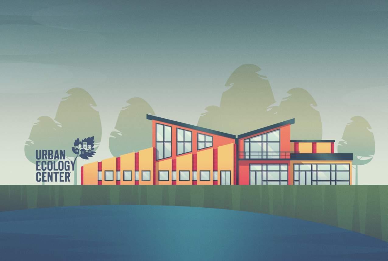
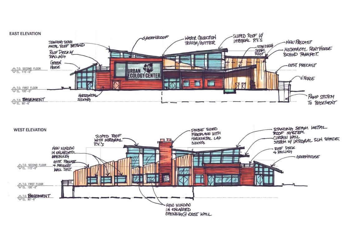
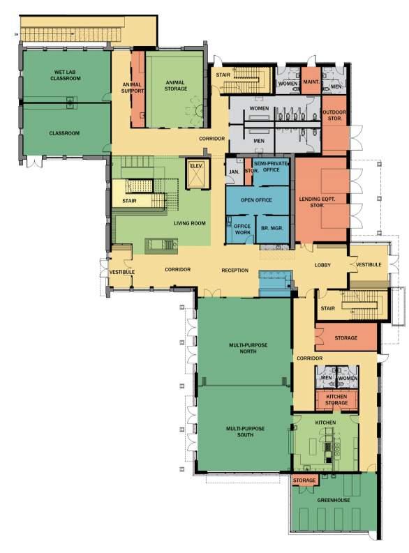
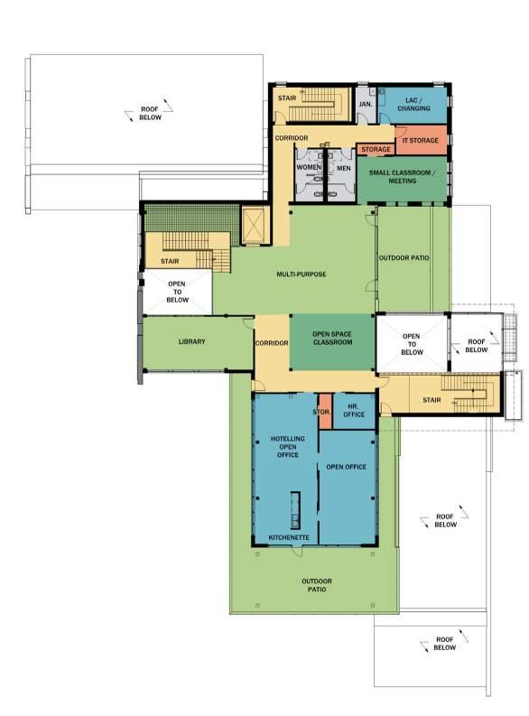
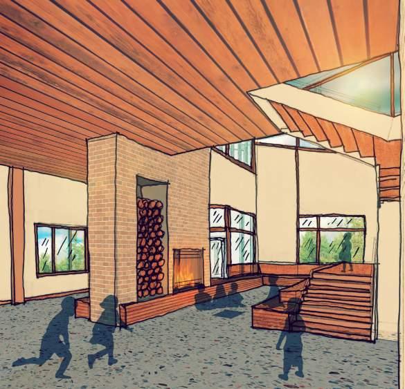
In regards to space planning, all important spaces were programmed to fit within the footprint, with the most trafficked spaces getting the best views of the lagoon. The goal of this design was to blend the natural with the built environment through use of materials, sitelines and the playful energy of the natural world.
As with any community project, there were many design iterations for which I had to create marketing materials. These displayed in the three UECs throughout Milwaukee to garner community feedback. Early iterations suggested replicating the fluted concrete while later ones proposed stripping the facade and introducing quirky design moments like tree-trunk pillars, wooden garage doors, and amorphous stone planters. Our final design fell somewhere in-between with visible concrete remaining but fun design elements infused throughout.
 Basement Floor Plan
First Floor Plan
Second Floor Plan
Basement Floor Plan
First Floor Plan
Second Floor Plan
Besides collecting, analyzing and formatting data for the space needs program for this project, I also provided all renderings and graphics, formatted construction drawings for presentation purposes and assisted on drawing and detailing. This was my favorite project I contributed to during my time at Quorum Architects. The use of color, materials, whimsical design and community engagement made me feel I was a part of something bigger that I know will have a tangible positive impact on the neighborhood.