
Out Of This World Design.
Katie Flynn
Illustration & Design
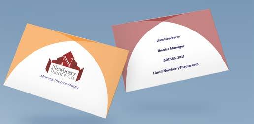
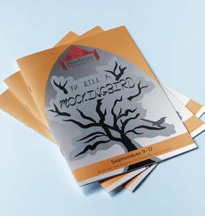
Newberry Theatre Company

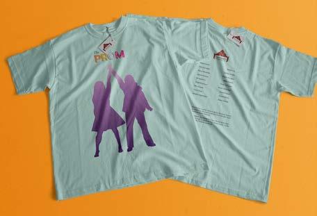
Lights, Camera, Color!
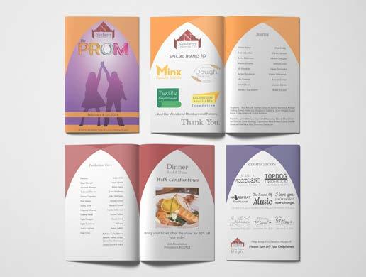
Newberry Thearew Co. is a new generations theatre. Theatre is for everyone, so it’s essential for NTC to have a welcoming ambiance. NTC uses the classic bold, dark colors like the theatres of old, but uses them frequently against a light background to still get across the new-age feeling.
Font Finale
Keeping a theatre classic while also giving it a modern update is heavily impacted by one very impotant thing; typography. In order to do this, I paired a serifed, heavily decorated font, Academy Engraved, with a plain yet modern sans serif, Greycliff. By doing this I’m able to offset the bold historic feeling with a reminder that this theatre embraces modernity through Greycliff.
Branding Off Broadway
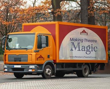
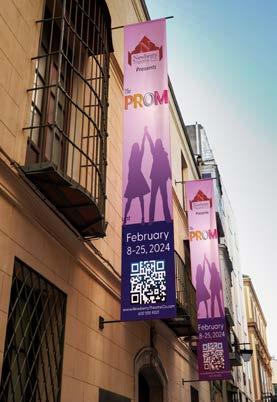
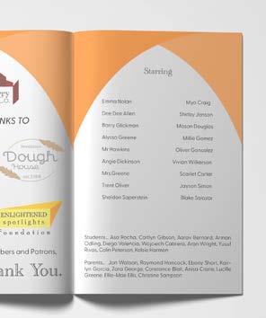
When your shows are larger than life, you need your marketing to have a fine balance to it. The main goal of advertising theatre is to get people in seats. A traditional way to market upcoming shows for theatres is through a combination of in and out-of-home marketing. Most commonly, through the use of banners. For The Prom, banners advertising the show will be placed around the city, increasing in quantity the closer you get to the theatre, on various buildings and fixtures. By featuring a QR code, we will create an ease of ticket purchase. Many theatres also choose to utilize a cross-promotion and strategic alliances with other local businesses, this way they both benefit with profits and increased customers. In this case, NTC is parterning with a local Providence restaurant, Constantinos. Having NTC promoted at Constantinos as something to do in the city, and NTC promoting Constantinos in the program you receive when seeing a show as somewhere to eat after your theatre exeperience.
Editorial, Branding, Advertisment, logo development, typography
Illustration,
IPAF Annual Report

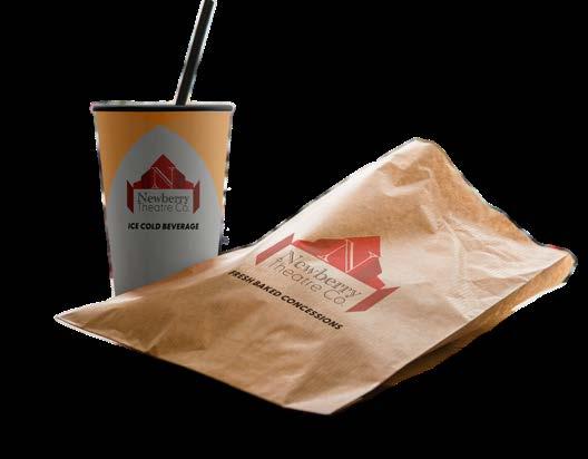
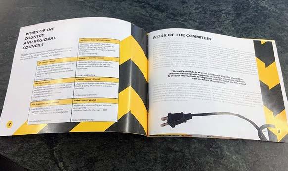
Safety, Safety, Safety!
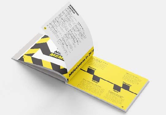
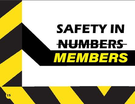
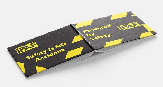
IPAFis a company that promotes the safe use of powered lifts worldwide. For a company all about safety, their branding is anything but. IPAF’s stylescape features the bold color choices of yellow and black, paired with two sans serif fonts of various thicknesses. Since i needed to stick to their stylescape for this project, I had to make some very careful decisions when planning this editorial spread. Firstly, I needed to make a very thourough grid. Early on i had the idea of caution tape since it so naturally matched IPAF’s color scheme and safety standards, so I knew the amount color in this project would need to be delicqtely handled. A grid makes it easier to see not only alignment of elements on the page, but also to visualize just how much each color is featured on the page. There is one thing I did find extremely easy with this color scheme though; yellow and black are always readable on each other.
What’s Big About Safety?
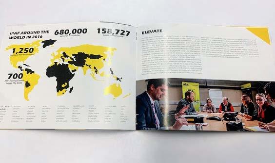
One reason I have such a love for editorial is how much I can do with typography. By establishing a typographic heirarchy, I can easily display the important information by using various font weights, thicknesses, etc. This is crucial for this type of report that is all corporate jargain, so you can quickly get to the information you need. To achieve this, I utilized a font with a large family that included a variety of weights and styles, so I could easily change styles and weights for various emphasis as needed while keeping the ultimate consistancy, since it’s still all the same font.
Picture Your Report
Taking custom photography for this report was a challenge. Since I didn’t have access to any powered lyfts, and couldn’t use any stock photos, I had to make due with what I was able to find around the office. In the end, I was able to find various power chords and tools to photograph and manipulate in photoshop to create the reports completed look.
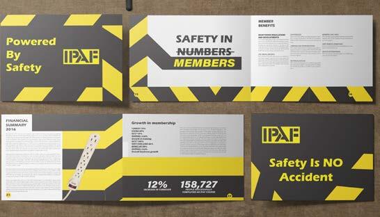
Editorial, Branding, Typography, Photography, Illustration
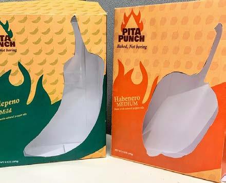
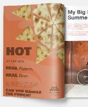
Pita Punch
Spice Up Your Advertising
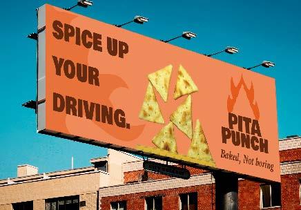
Do you ever think about how many chemicals are used to add flavor to your snacks? Well, Pita Punch does! By utilizing the natural oils of some of the worlds hottest peppers, they’re able to create healthy, delicious pita chips. Such a bold, spicy snack needs some advertising that packs a serious punch. Pita Punch knows snackers are everywhere, so we advertise everywhere- through traditional out-of-home marketing in magazines and billboards, to web ads customized to consumers individual browsing trends.
Pita Product Packaging
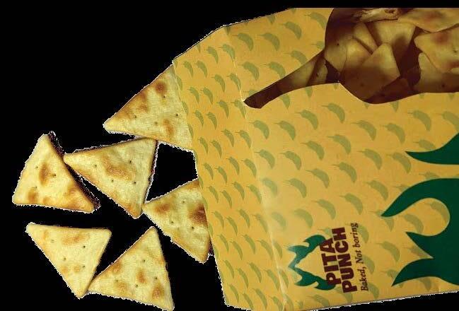
When you’re marketing a food product, it’s important to let the consumer know exaclty what they’re getting. In our case, the consumers need to know that our product is not only all natural, but spicy, so there’s no unclear messaging about the flavoring of the chips. To do this, we utilized a visual coding strategy I like to call “green means go.” It is a basic, universally recognzable system to relay the heat of the various chips- the more green, the more mild, the more red the hotter it is.
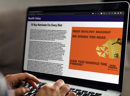
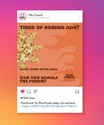
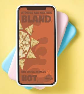
Eating Up Editorial
If you’re a sucker for a good editorial ad, take a close look at Pita Punches various ads. In this campaign, titled “can you handle the punch?” there are six demonstrations of various targeted ads- with the potential for hundreds more. Good ad campaigns need multiple legs to stand on. By using a basic tagline- “can you handle the punch?” we’re able to change the accompanying headline to fit various situations we can advertise in- for example, on a highway billboard, a health website, or in a magazine. This ad campaign not only entices the consumer throught its bold font and colors- but challenges them, We aren’t suggesting you try Pita Punch, we’re daring you. Can you handle the punch?
Packaging, Branding, Editorial, Photography, Advertising
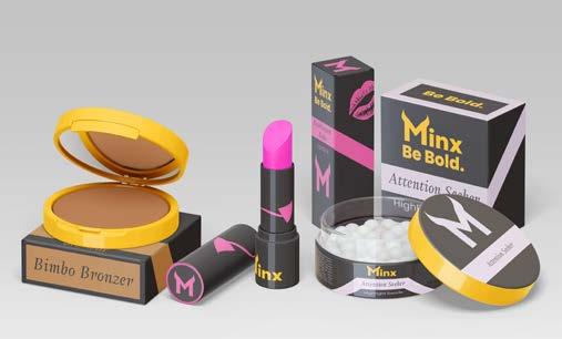
Minx Body & Cosmetics

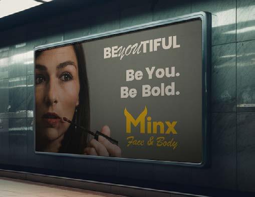
BeYOUtiful Products
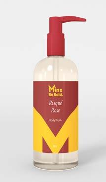
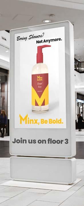
Cosmetics packaging should always be two things; luxe, and consistant. Minx Beauty boasts a variety of dark colors, contraWWsted yet complimented by a bold, gold accent. All minx packafing also presents various brand elements; devil horns and tails to represent how daring and sexy their products will make you feel, a display font to identify the product or color you’re buying, and a complimenting sans serif to describe exactly what the product is.
Be Bold, Be You.
Advertising beauty can be a tricky subject. There’s a fine line between advertising beauty products to enhance your natural beauty, and advertising to force beauty standards upon unassuming customers. in order to be clear about Minx’s intentions to inspire natural beauty and help consumers feel more confident in their own skin, there was only one word to use, beYOUtiful.
Easy On The Eye(shadow)
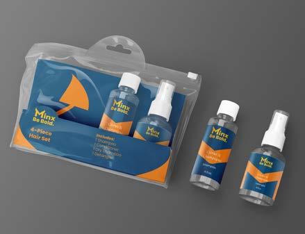
Visual coding is incredibly important, but also incredibly easy to overlook. If all the different products produced by Minx were to use the exact same color scheme, it would be hard to easily identify which products were which. In order to combat this, three dark, daring colors were chosen to identify different product groups. Black for cosmetics, red for body care, and blue for hair care. These dark yet neautral colors are able to compliment both the gold accent color of Minx as well as the cosmetics products color.
Editorial, Branding, Advertisment, logo development, typography
Illustration,
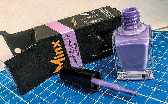
inx inx inx is a beauty brand dedicated to one thing- making you look and feel your most daring. Manufactured in Providence, RI, 02903 Directions Remove Brush Paint Nails Let Dry. Enjoy! Net Qty .44 Oz Caution: Use only as directed. Misuse may lead to injury Contact poison control or doctor if swallowed Lavish Lavender Nail Polish © 2022 inx inx is a beauty brand dedicated to one thing- making you look and feel your most daring.
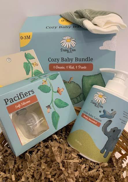
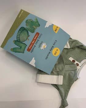
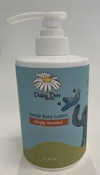
Daisy Den Baby Products
The Story Of Parenthood
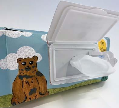
Daisy Den’s branding themes itself as a fairytale; because every expecting parent is awaiting their babies story to unfold. To communicate this, we chose to utilize a hand-done watercolor illustrations, vectorized to properly display on printed content. These paired with light, natural colors and serif fonts creates the essense of a storybook on every piece of DaisyDen packaging. The versatility of a storybook theme allows us to adjust the illustrations, such as pacifiers growing on a vine, or a bear ready to wipe his face with the with the Daisy Den baby wipes.
Labels, Boxes, Bags...
A brand with a wide variety of products requires a wide variety of packaging. Luckily, a solid branding guideline can make this a breeze. All packaging was made using the font’s cookie and noto serif Telugu, as well as a pastel color palette in order to keep everything looking consistent. By doing this. no matter if you have a label, bag. or box, you’ll be able to identify that it is a Daisy Den product. These products are also packaged differently than typical baby products in order to expand their market, not only will new mothers want to buy these to start their parenthood journey, but they also make great gifts for baby showers since they’re already packaged in cute, appealing designs.
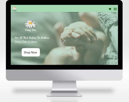
Beyond The Box; Expanding To Web And Photography
Packaging is important, but it’s not everything. Branding, however, is. So when expanding into web and product photography we knew we had to keep our branding consistent across all forms. To achieve this on our website. we continued using our brand established fonts as well as our pastel color palette. especially our lovely daisy green. Four photography. we wanted to communicate our naturalness immediately. To do this we decided on a photo shoot within all-natural looking basket. A lovely earthy brown paper is used. as well as a wicker basket in order to communicate our all natural goal, as well as how cute our products are, and how we can also be used for gifts in addition to your standard baby products.
Typography,
Illustration, packaging, Ui/UX,
Photography
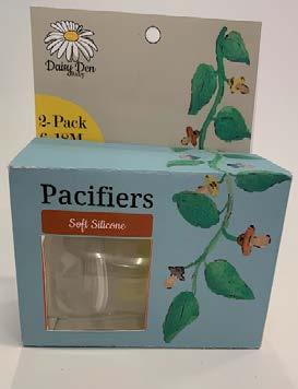
2-Pack 6-18M Curved For Comfort BPA Free & BPS Free Uses less & cleaner plastic Daisy Den Daisy Den Daisy Den Welcome To The Den $5.99 Daisy Den, Springfield MA 01056 Soft Silicone
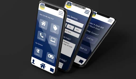
Geek Squad Redesign
The 90’s Called, They Want Their Branding Back.
If you go to the current Geek Squad website, there are many things that will flagranlly make themselves clear. One is that nothing about this brand has changed since the 90’s, since all of their logos and branding elements are the same as when Best Buy first bought them out. Then there’s the fact that the website itself also probably has not been touched since the 90s, in form of user interface and functionality. So, we had some work cut out for ourselves. We needed a functioning website and branding that could exist in the 21st century
Geek Squad, No One Remembers You Before Best Buy.
Let’s be honest, the merger of Best Buy and Geek Squad was so long ago, the fact that they were once their own entity is now a moot point. So, it’s time to completely merge. To do this we took Best Buy’s colors of yellow and blue and applied them to geek squad. we also revamped their logo to a more modern badge. while also keeping a nice nod to their original niche by incorporating the tie from their old uniforms
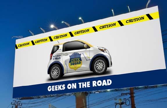
Caution: Geeks Advertising
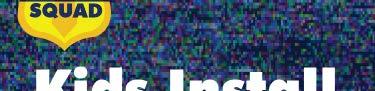
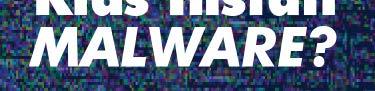
We decided to capitalize on another thing geek squad is known for, their geek mobile! Not only is it a great advertising asset because it’s a recognizable piece of the geek squad culture, but we can also revamp it so it fits the 21st century style.instead of the old black and orange van. For this reason we decided to go with an electric car to really show that we’ve modernized, and we put the blue and yellow elements all along the car to show that this is a Best Buy company after all. Finally, we wouldn’t be modern without some social media advertising. We went with something simple to recognize, the bane of our tech-obsessed existence; a blank. static screen. This way the recognizably annoying phenomenon will grab the consumersx attention in order to increase our retention time, and then click through rates.. Plus, wouldn’t you panic if your kids accidentally installed malware?


Illustration, Editorial, Branding, Advertisment, logo development, typography
ABEST BUY CO .
GEEK SQUAD
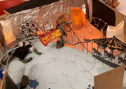
3D Experience Diorama
3D design, illustration, prototype/physical development
The Hands Can Create What The Mind Can’t
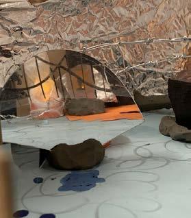
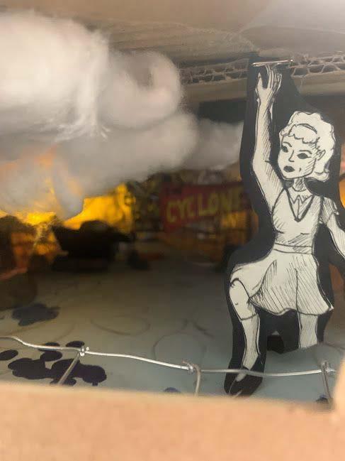
Many designers choose not to include hand done projects in their portfolios. However, I find that including hand done projects demonstrates that design skills go beyond the computer. In this example I was able to create a 1:12 model of a real room, and demonstrate my knowledge of spatial design by creating an exhibit to live within it. This exhibit walks you through a song from broadway musical Ride The Cyclone titled ‘The Ballad of Jane Doe.’
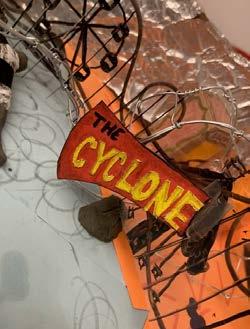
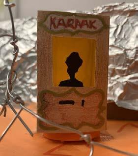
A Tragic Diorama
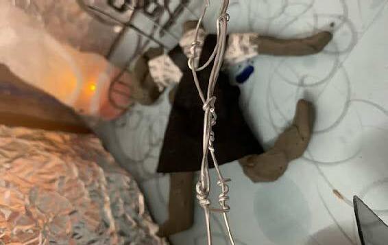
The ballad of Jane Doe is a very depressing song that goes through the story of a girl losing her head, making her spirit unable to rest or move on to the after life. To portray this I made use of acetate in order to make a dividing wall with carnival scene painted on so I wouldn’t have to fully build it in the space. Instead, I could represent that it was there but focus on more important parts of the story. Such as Jane’s body in the background, the roller coaster itself being made of wire running through the diorama. and her spirit reaching towards the heavens. Through the use of broken mirrors. I was able to highlight some of the most important parts of the piece such as the roller coaster sign itself, as well as the fortune tellers box.
Expression Through Multi-Media
This piece is a beautiful amalgamation of both wet and dry medias. Clay. paint, and markers were all wet media that were able to help tie this piece together. There are many dry medias used in this such as various colors of paper, acetate, crayons and typical craft supplies you can find at any dollar store. My favorite example of these two coming together is on Jane Doe’s body herself. I used a very wet plasticina clay and paper gently stuck to said clay in order to create her school uniform. By creating the dress directly on her, I was able to adjust it to portray the distress of the body in real time and didn’t have to worry about a stiff, lifeless piece of clothing. In addition to these I also had some less common medias used in this piece, such as wire. fake candles, and broken mirrors.

Aquarium On-site Ad Concept
Collaboration Is Key
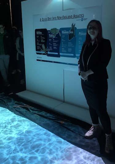
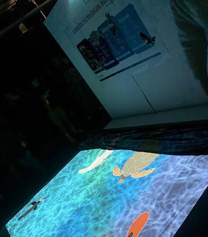
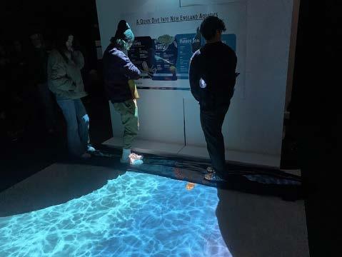
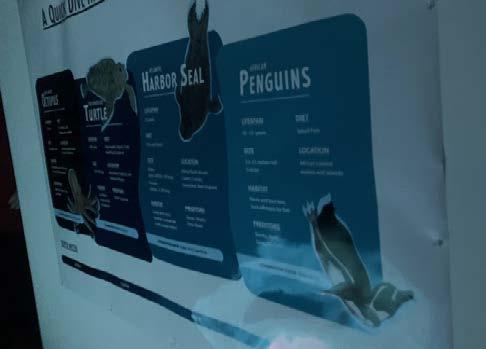
Collaboration was integral in this project in two very different ways. One being that this is a collaboration between an aquarium and an airport, and the collaboration between me and my teammates as well. The goal of this project was to portray the feeling of New England Aquarium as an ad at Logan Airport using deisng, illustration, and animation. To do this. we have beautifully illustrated animals on a infographic wall, describing multiple facts about some animals you can find at New England Aquarium. <eanwhile the same animals swim around on the floor saying hello to all who pass by.
An Ocean Of Design
One of the main things we wanted to portray in this exhibit was the ocean. In order to do this, we decided to focus on depths that each individual ocean animal would live at and make it darker depending on where the animal was. This light to dark blue pattern follows through both the infographic wall hanging, as well as the floor animation. In addition a great deal of typographical layout and design was used in order to keep this easily readable on such a large format print. We used a large variety of sizes and styles in our font family in order to keep everything separated into a hierarchy that was understandable.
Watery Wayfinding
One of the biggest challenges in this project was giving you the illusion that you are under the water during viewing. TThe animation portrays this by having the swimming animals. and also a water effect that was achieved by using multiple layers that filtered through each other in order to give it a moving water effect. Another way we achieved this was through our illustrations, our animals had to be in specific positions to seem as if you and them were experiencing the underwater world. Our seals and Penguins had to be diving down into the ocean since they tend to stay near the top while our octopus had to rest on the bottom and our turtle had to float along the top. This helped portray death as well as keep the piece balanced.
Advertising, branding, illustration, editorial, print, display set-up
Bowen Wayfinding
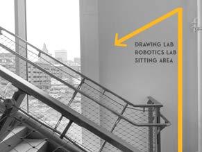
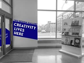
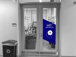
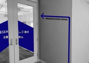
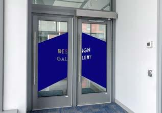
College Is Confusing.
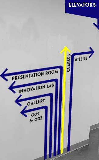
Finding your way through FAFSA is hard enough- navigating your schools buildings shouldn’t be. Bowen was one of the worst laid out buildings I had ever been in and there was absolutely no wayfinding, and everyone agreed with this sentiment. . So we set out to make a plan to fix it. For my solution, I utilized a bunch of different typographic hierarchy to not only create wayfinding in the building, but also some visual interest as well. For a building that houses so many amazing artists, the walls are often very bare.
Typographic Direction
I‘m of the opinion that wayfinding needs to be basic, and you can’t get more basic than arrows and words. The easiest way for you to find something is when I spell it out for you. So I decided to use a combination of a sansarif font and geometrical shapes in order to display the building directions. These elements also easily translated into decoration for the building as well, such as the ‘creativity lives here’ sign for the gallery. This is in a very confusing building, so I made sure to label everything, using door wraps, graphics icons, any design element I could to get the point across as easily as possible.
Third Place’s A Charm.
This wayfinding project was actually a competition between classmates to decide whose wayfinding would be featured in the building. I won 3rd place. so while a majority of my design is not used, when going through the building today you can definitely see where there were some inspiration.
Editorial, Branding, Advertisment, logo development, typography
Illustration,
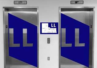
Presentation Room iNNOVATION lAB Project Lab Gallery CourtYARD Willies 002 Print lab LL Bio Lab Physics Lab 200 202 Design Office Rest Room 215 217 Network Lab MAc lab 204 St ai r St ai r Stair 2 Drawing Lab Robotics Lab Stair Rest room 1 304 302 Stair CAD Lab Chem Lab Bio Lab 322 324 Mac Lab Mac Lab Ma terials Rest room Stair St ai r 3
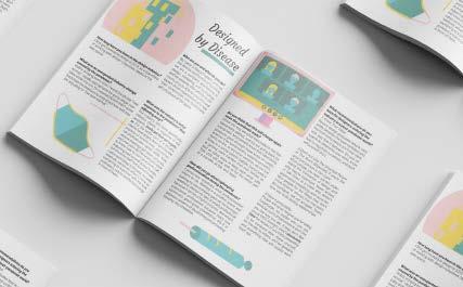
Innovatory Minizine
Illustration, Editorial, Branding, Advertisment, logo development, typography
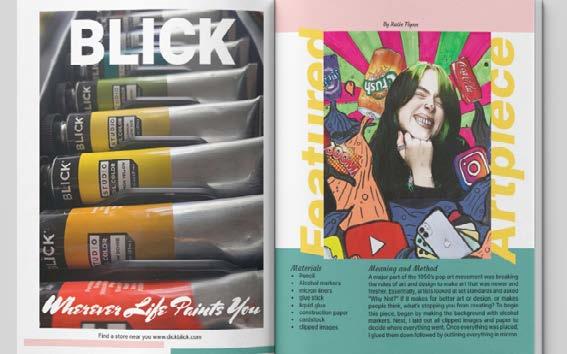
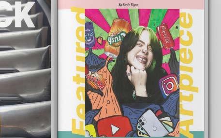
Let’s Design A Design Magazine
When tasked with creating a magazine on a topic of my chosing, an art and design magazine was the obvious choice. With the projects requirments being a research article, an interview, an advertisement, and an art piece, there were a bunch of ideas coming to mind.
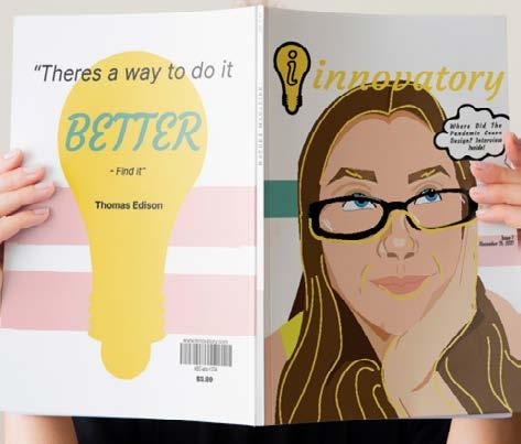
For the artists, the innovators, the creatives
Finding a name for this magazine was harder than initially planned. Deciding on innovatory took a bit of time, theasauruses, and red pen scribbles. Ultimately I found the perfect fit, and the ‘i’ in the name fit very well into a logo design I had already been sketching, a lit light bulb to represent the ideas that creatives discover every day.
Covers aren’t easy, especially with your face
The cover of innovatory went through a lot of different stages. Originally, the cover was going to have more of a comic book feel, with a photo of my face that had been carefully outlined to look like it had been inked into a comic book. However, the style didn’t sit quite right with the other design elements. which resulted in the illustrated cover. For the back cover, a simple Thomas Edison quote to tie off your reading, “there’s a way to make it better.” Not only a good quote for creatives to remember, but also fitting considering Innovatory’s use of the lightbulb.
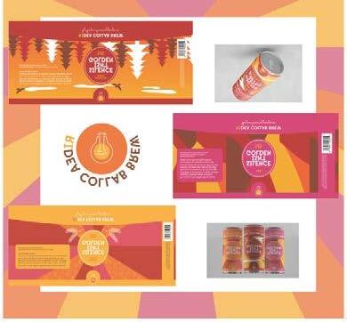
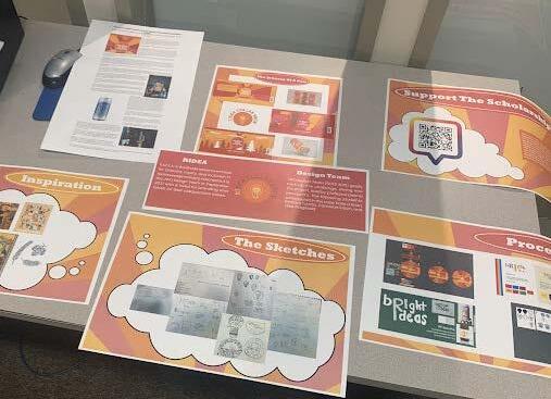
Culinary Museum Exhibits
Creative For Culinary
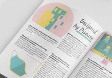
The Culinary Arts museum displays century’s worth of artefacts about one of the only things everyone needs to survive- food. While working with the museum, I designed more exhibits than could ever be displayed on two pages- anything from typographic displays describing cooking in the 1700’s, to highlighting modern chefs on their achievments.
Exhibit Design & Installation
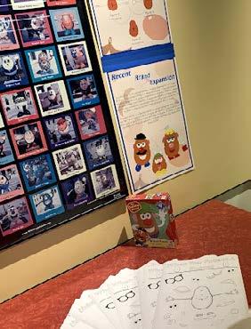
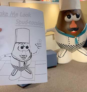
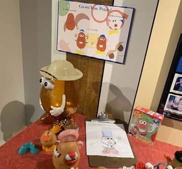
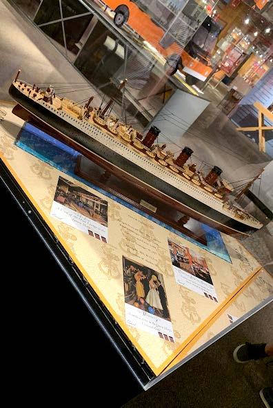
One of the most important things to learn while working at a museum is not only how to design to portray information, but also how to design practically for the space you’re provided. Not to mention the lessons in how to respect your budget for test printing! The biggest exhibits I designed for the culinary museum are “the story of a can” for a craft beer collaboration, the history of a titanic sister ship. and a collaborative experience featuring Mr. Potato Head. Of course, tiny projects matter too, these included; modernizing almost all signs or plaques in the museum to a more modern style, various coloring sheets to encourage the museums interactivity, photo editing and archiving, among other daily design tasks for on-site events..
Interactivity Is Key
One thing many museums fail to do is to include their audience in the exhibits and experiences. ‘Build it and they’ll come” may be true, but “hang it up and people will stare at it” is less safe of a bet. The solution to this was to make activities such as coloring pages and infographics to enhance the expeirence of various exhibits. After all, why just learn about Mr. Potato Head when you could build your own? Or why sit and look around a vintage diner, instead of coloring in your very own to bring home?
Illustration, Editorial, Branding, Advertisment, logo development, typography

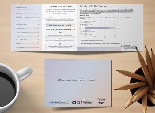
National Student Ad Competition
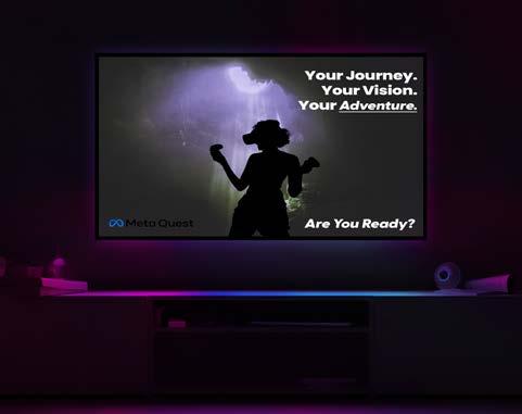
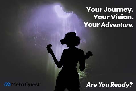
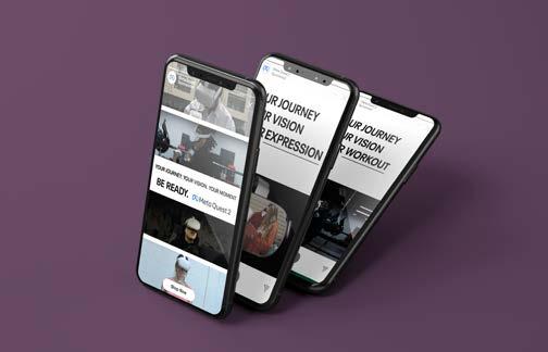
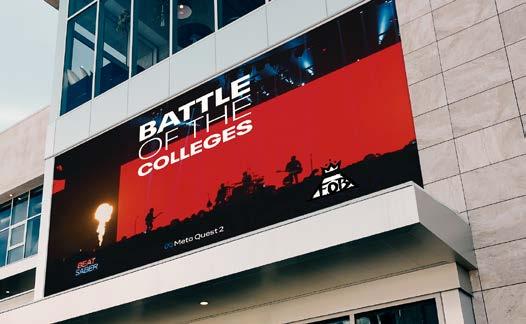
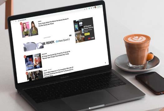
Your Journey, Your Vision, Your Ad Team.
META and the National Student Advetising Competition set college students everywhere on a mission- to create META’s next marketing campaign. Complete eith working alongside industry professionals, and access to Meta’s design databases and VR equipment. This campaign took hours of research, sketching, prtotyping, and production to meet Meta’s requirments and standards. Our constraints were reaching the highest amount of college students possible through our ads while also staying within a budget of ten million dollars.
A Meta Campaign
Any branding work to do with a comany as big as Meta, previously facebook, is staying brand focused. While there is an obvious benefit of recognizability for a company this big, there is also a pre established brand story you’re responbible to continue telling. So, with the brand change from facebook to nmeta, we also took a more fun turn with the branding. To do this. we stuck with Meta’s basic sans-serif font, and incorporate Meta’s expansions into pinks and purples.
Oh, The Places You’ll Go.
With the Meta Quesr, you can go anywhere and do anything. Since our target market was college students, we wanted to make sure our ads included different majors and interests to grab attention and increase our click through rates. By adjusting our tagline, we made the Quest an asset for everyone, from art, to fitness, or to those just looking to have some fun.

Illustration, Editorial, Branding, Advertisment, logo development, typography
Katie Flynn Illustration & Design (413) 657-2166 KatieCreates.me Katiecreates24@gmail.com See You Soon