LINDSEY
INTERIOR DESIGN


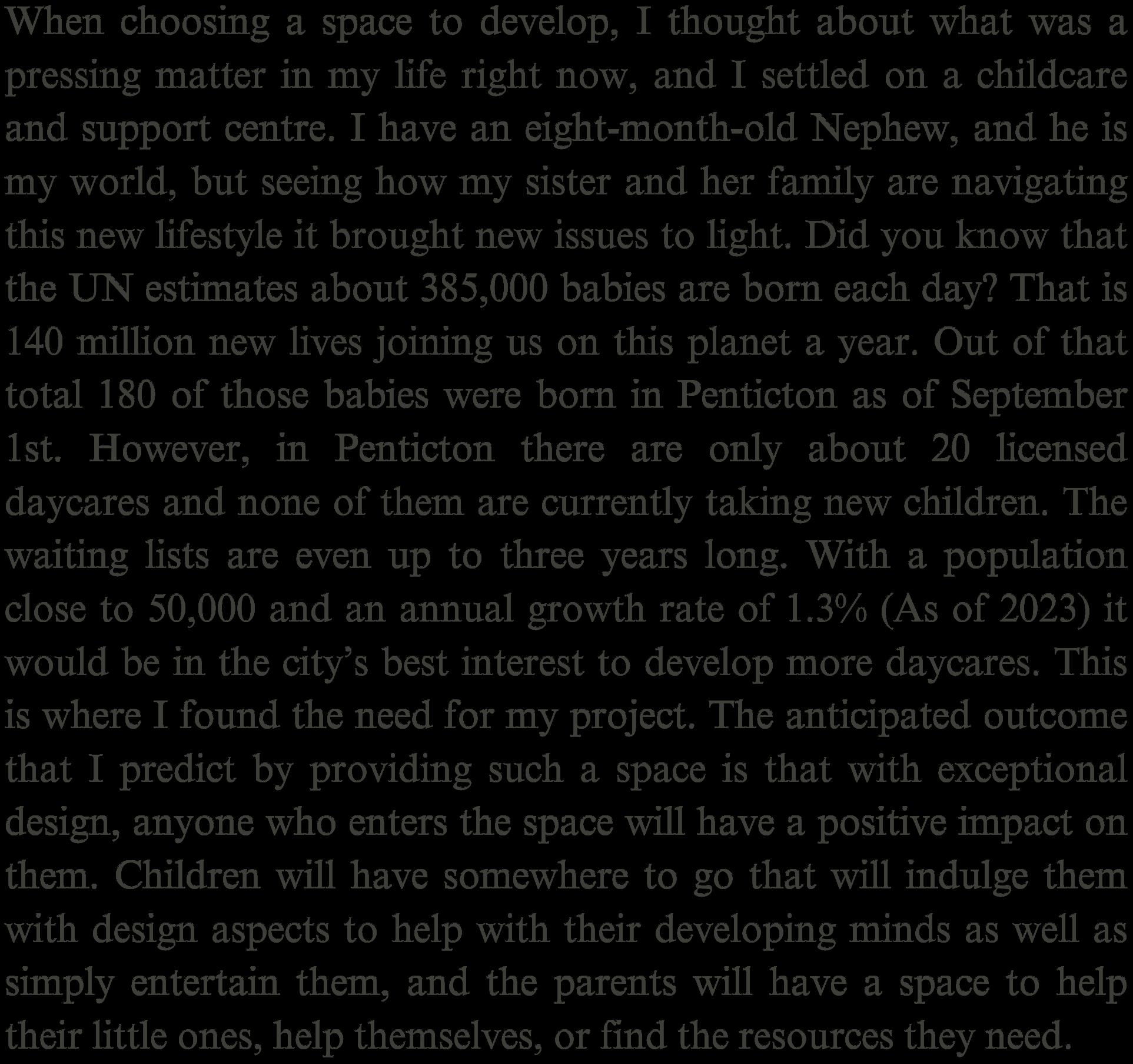
I am a dedicated and inspired worker who gets along with everyone and always gets the work done. Growing up in Penticton my family was always moving houses. The longest amount of time I have lived in one house was about eight years. For a brief moment I had even lived in Red Deer, Alberta. Though with each new house and surroundings I had the freedom to rearrange my space to my enjoyment. This, along with a computer game called The Sims, has shaped me into the designer I am today.


I often find that I have a desire to create and design things, inspired by the smallest things that surround me. There are many instances from my childhood that reflect this. Instead of buying most of my toys I would grab paper, tape, scissors, and some colorful markers and make household items. I remember making a paper fridge, a table, beds, and multiple paper-thin people. Even then, when I had dolls to play with, I would fluff up my blanket and use the ruffles as layers in a house. A few years later, when I was old enough to use a computer, my older sister introduced me to the game called The Sims. Since then I have put in many dedicated hours creating a multitude of houses and interiors. Along with a child- hood of living through renovation projects, this has helped me pursue my passion for Interior Design. I look forward to the day that I will be able to help my clients to create beautiful spaces, that reflect them and bring comfort.


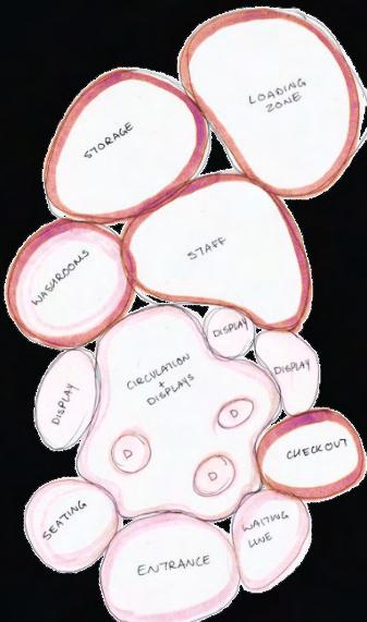


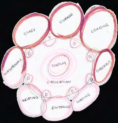
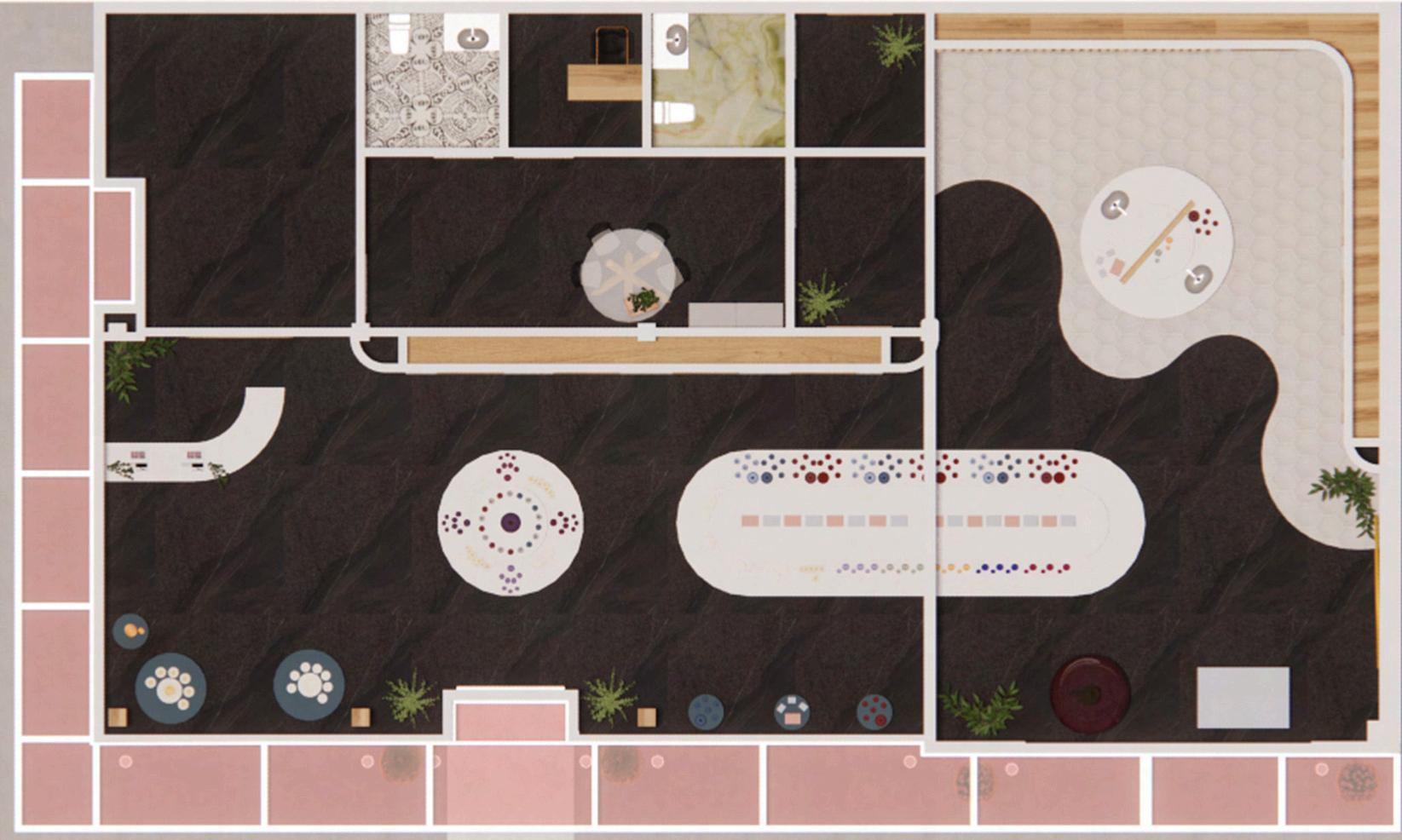
Starting with bubble diagrams I looked at how the store could be centred around the displays and circulation those needed. Staff areas, storage, washrooms, and then checkout and entrance being pushed to the sides.


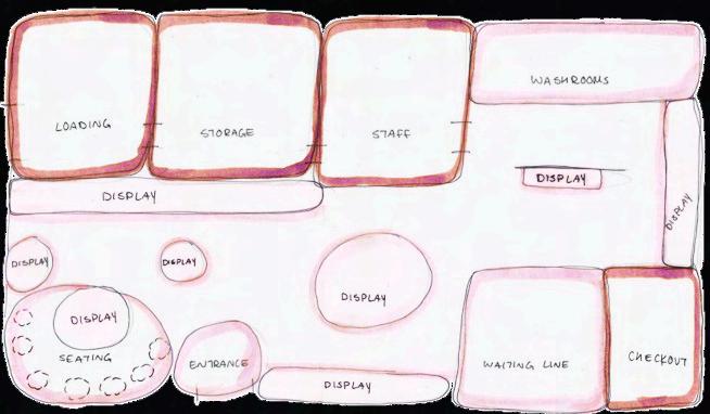
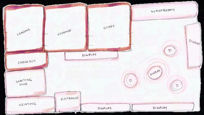
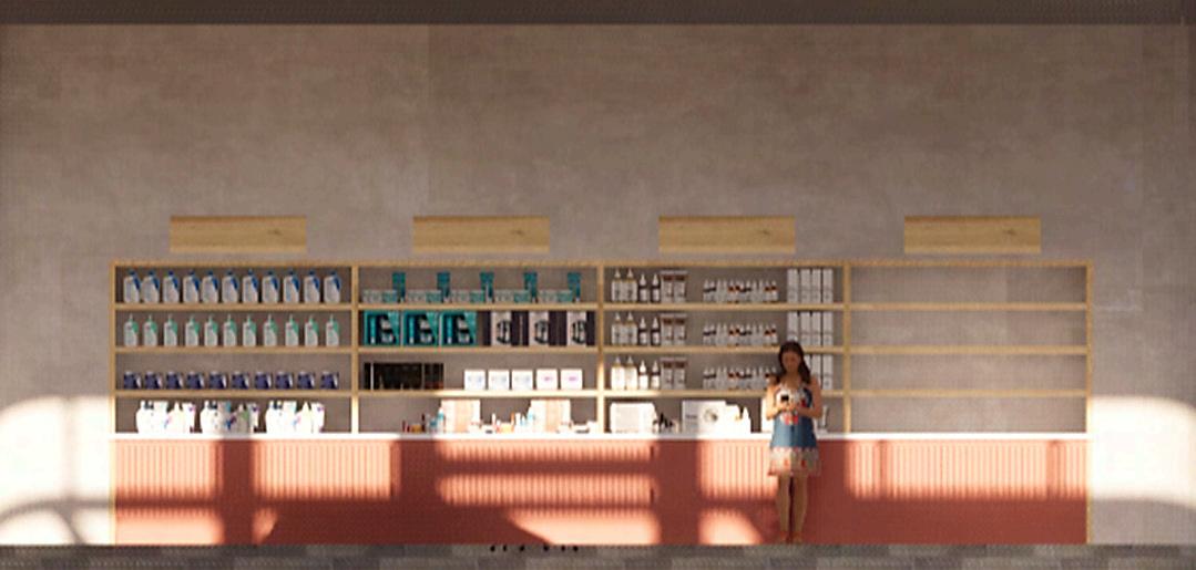
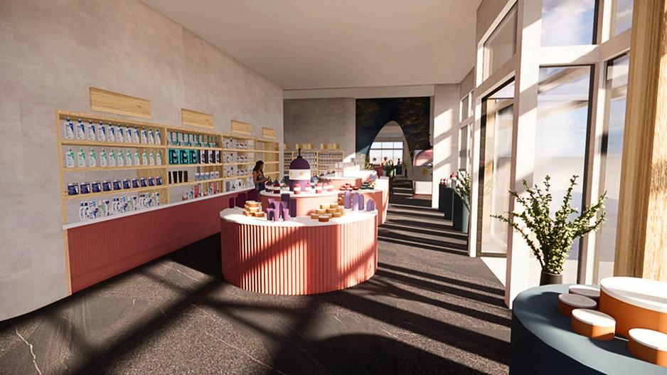
Moving into blocking diagrams there were a few things I knew I wanted to lay things out. Such as the loading/storage, staff, and washrooms to be at the back of the store. In the first diagram I was playing around with there being a small seating area in the corner where a display would be centered in it. Probably just showcasing the item of the week that would hopefully get you curious about the rest of the store. Washrooms were also pushed to the back where a full height divider would hide them just a bit but not make it impossible to find them. For the second diagram we were trying to see how we could maximize the amount of wall displays. Which included moving the check out to the other side of the store. In this diagram we were also playing around with some circle displays that would be center around one, which were inspired by some sun aspects.


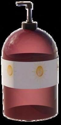

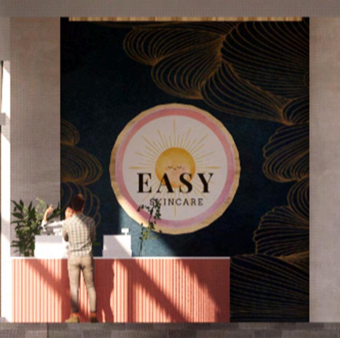
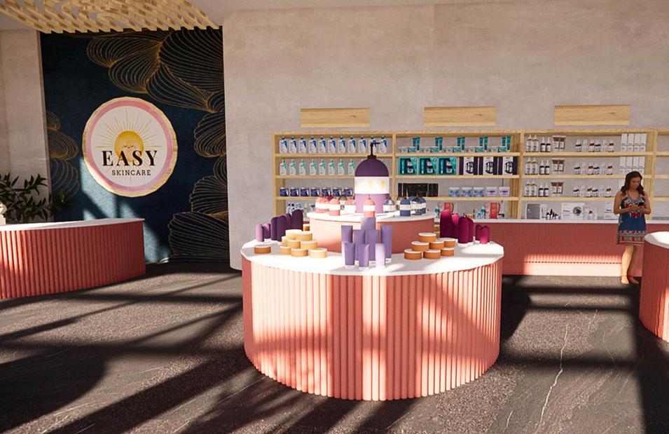
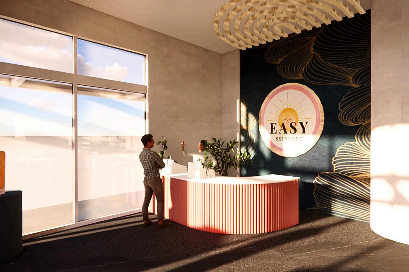
When developing the logo I wanted to have a sun as the main aspect. To bring in warmth and comfort to the store’s design. I did play around with variations, but ended up liking the face on the sun as it brings a cheery, playful mood to the overall. The pink ring was decided on as that is one of the main colors used throughout the store and is always in sunsets.


CHECKOUT


DISPLAY WALL


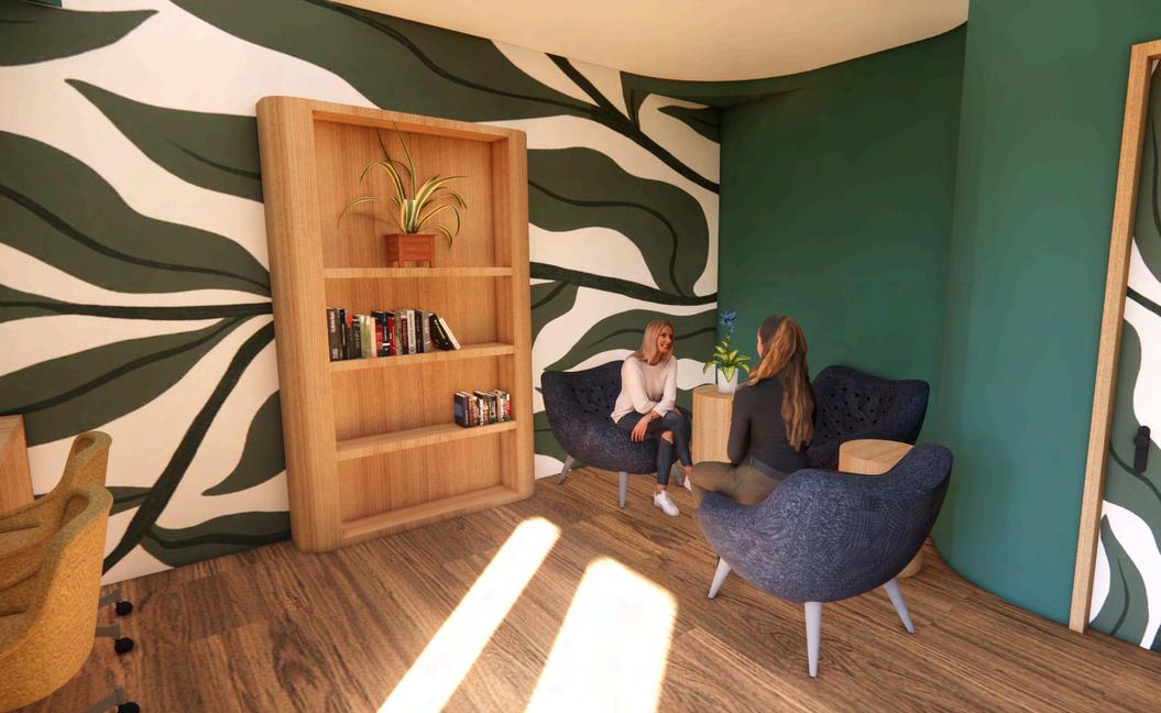
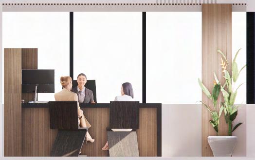
RESOURCE LIBRARY
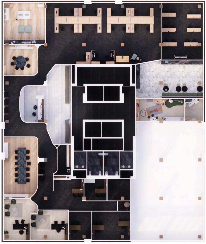
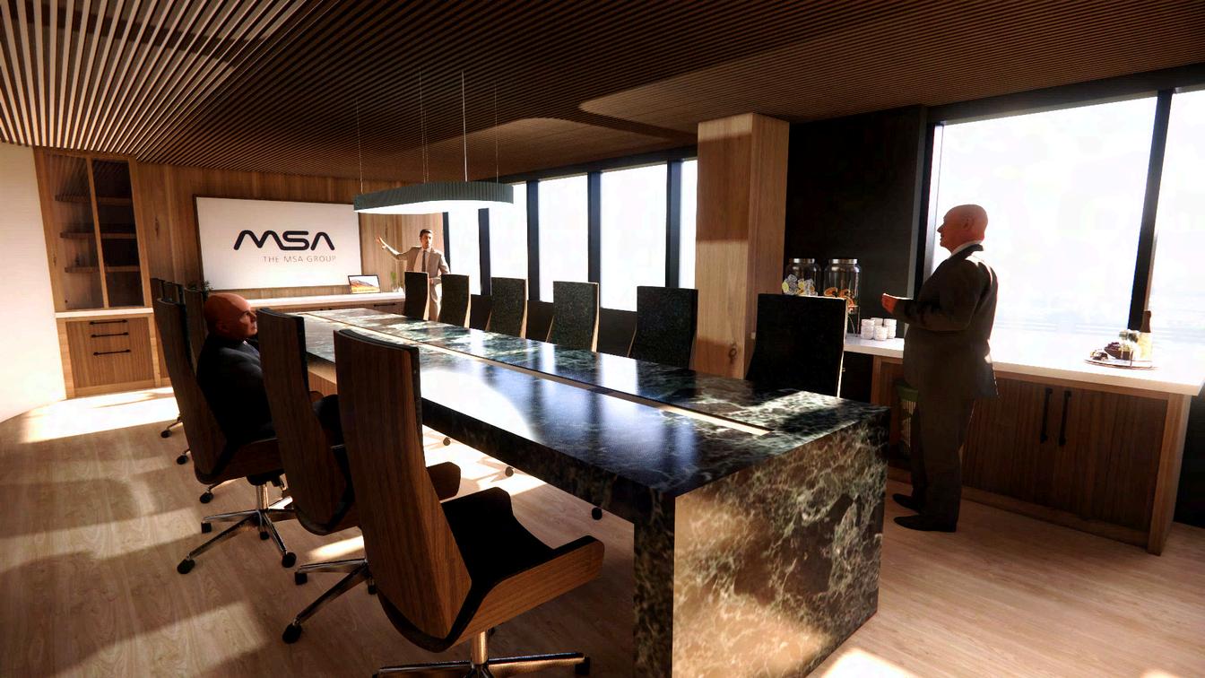
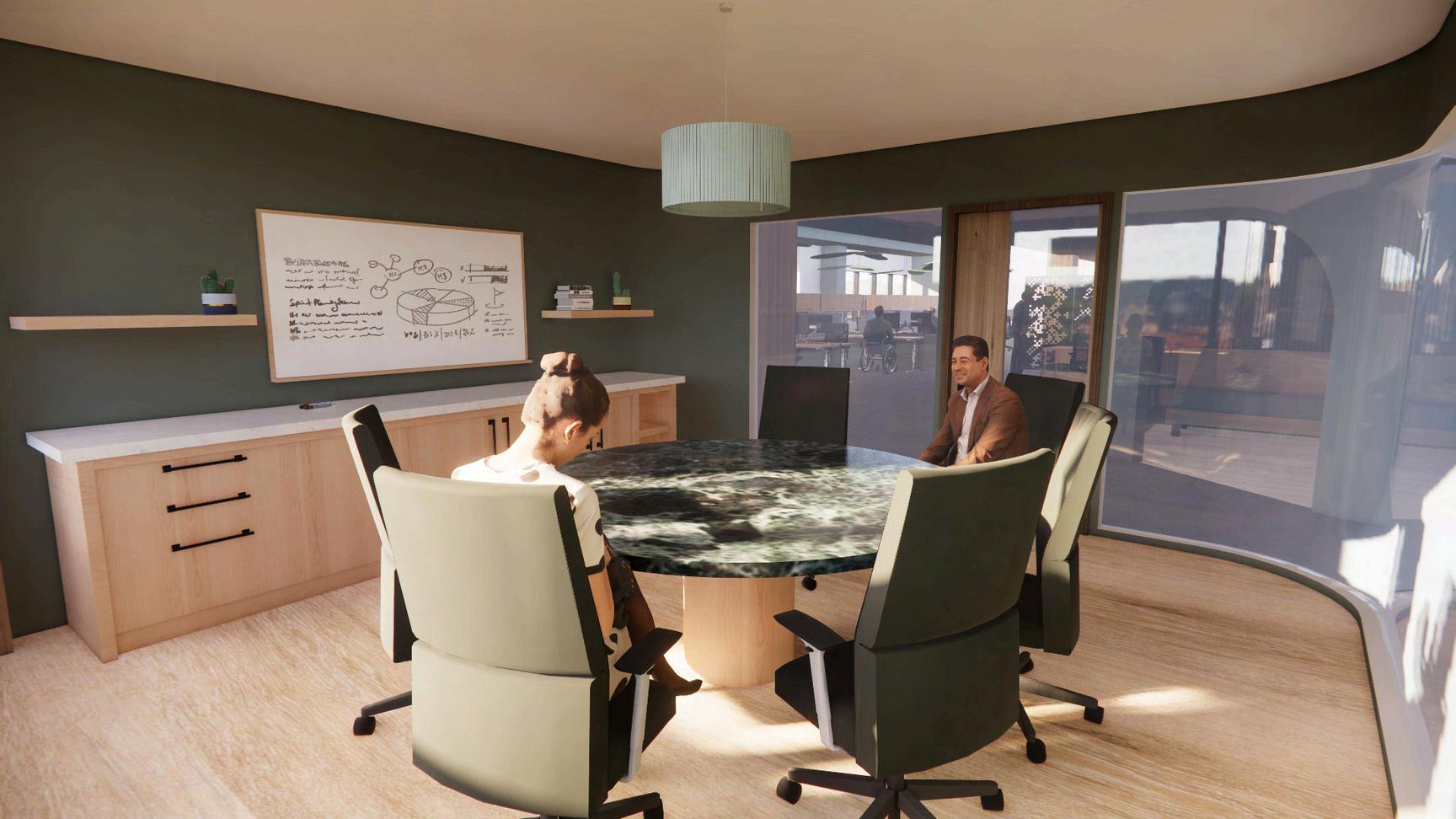
BOARDROOM
SMALL MEETING ROOM ACCOUNTANT
CHAIRMAN
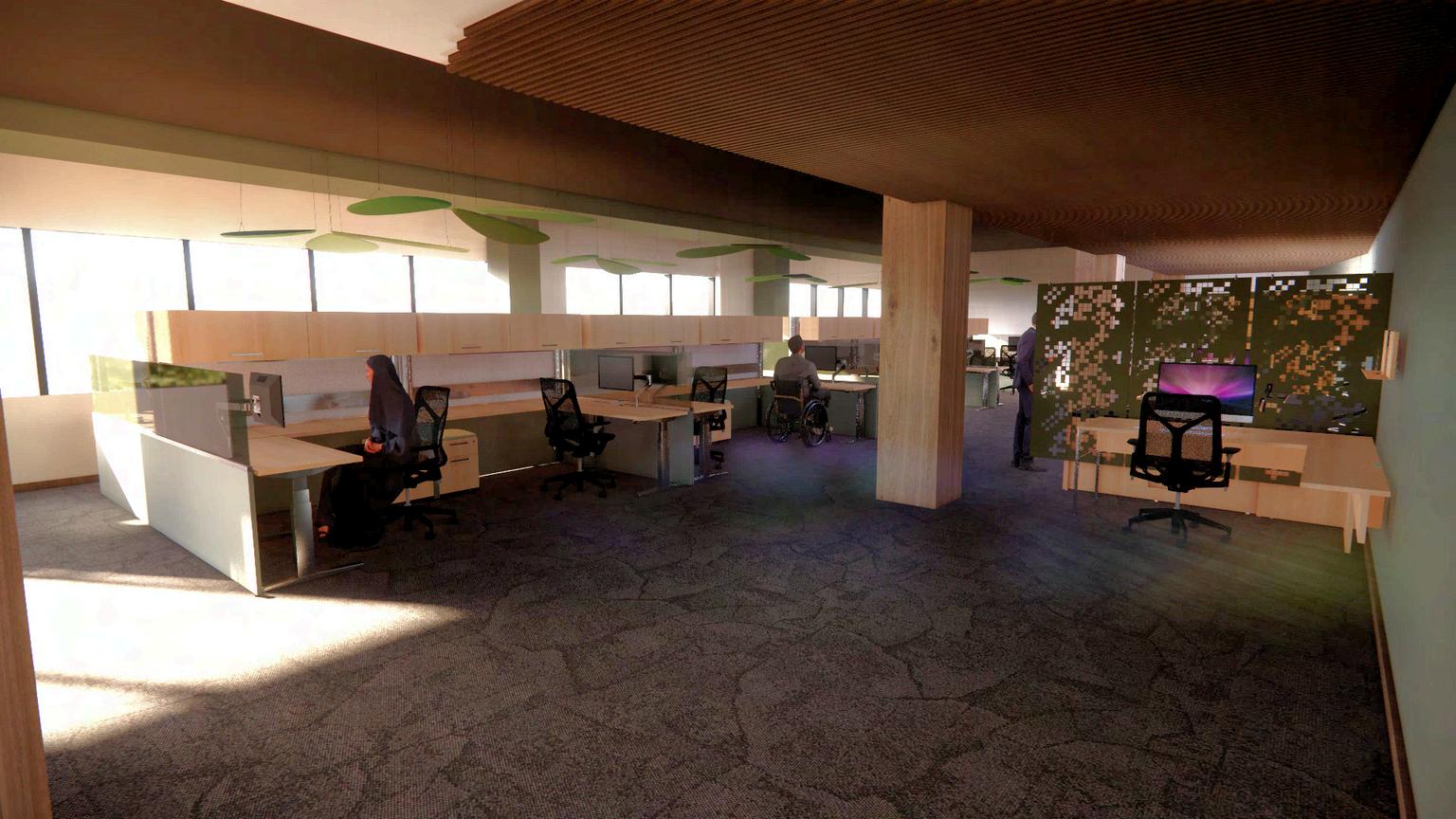
GEOLOGISTS
DIRECTORS


WASHROOM
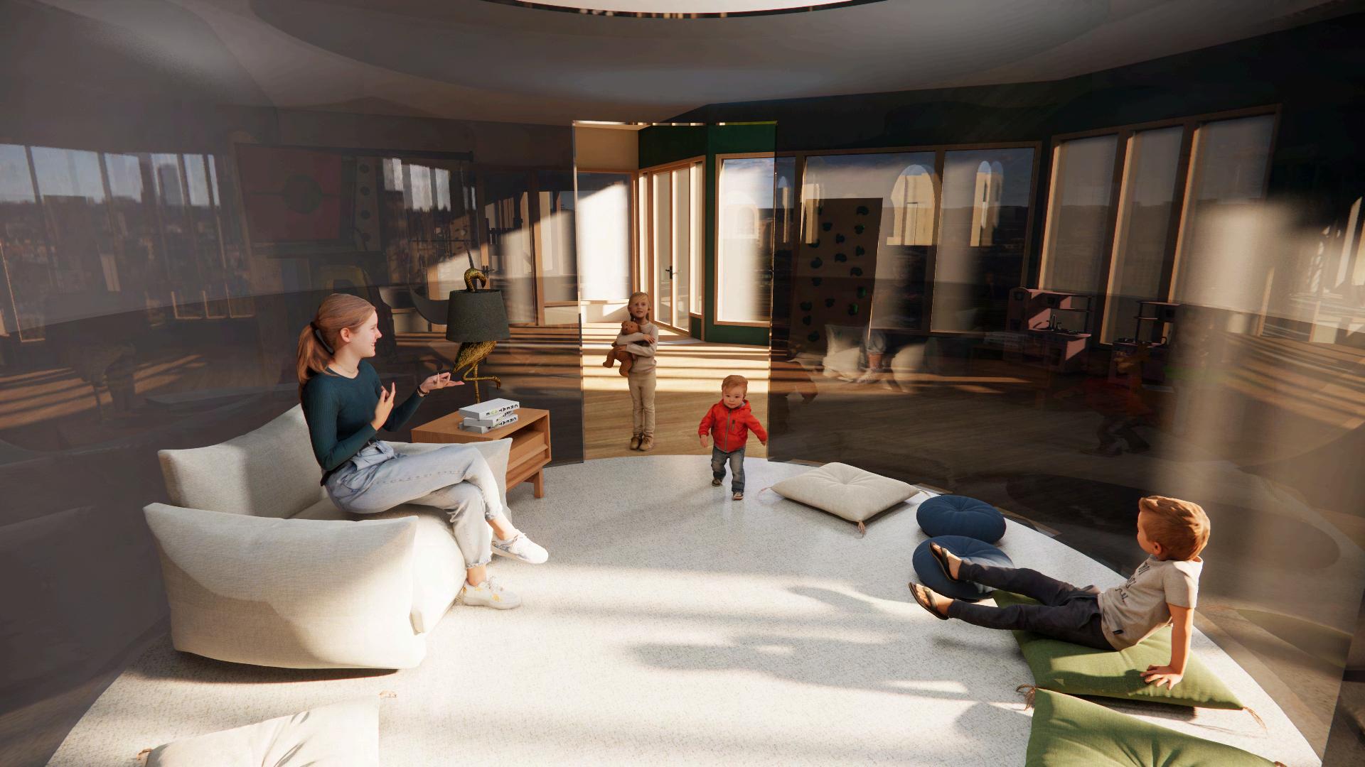
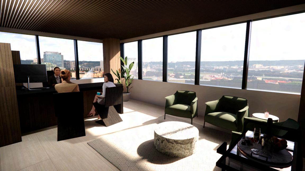
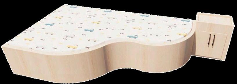
LIVING AREA
ENTRY
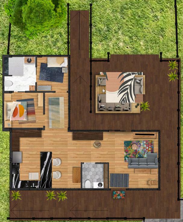


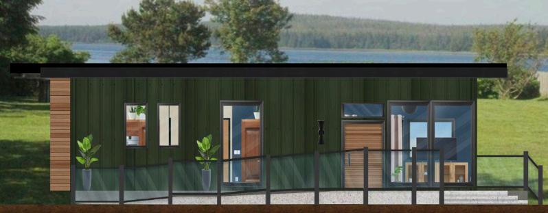
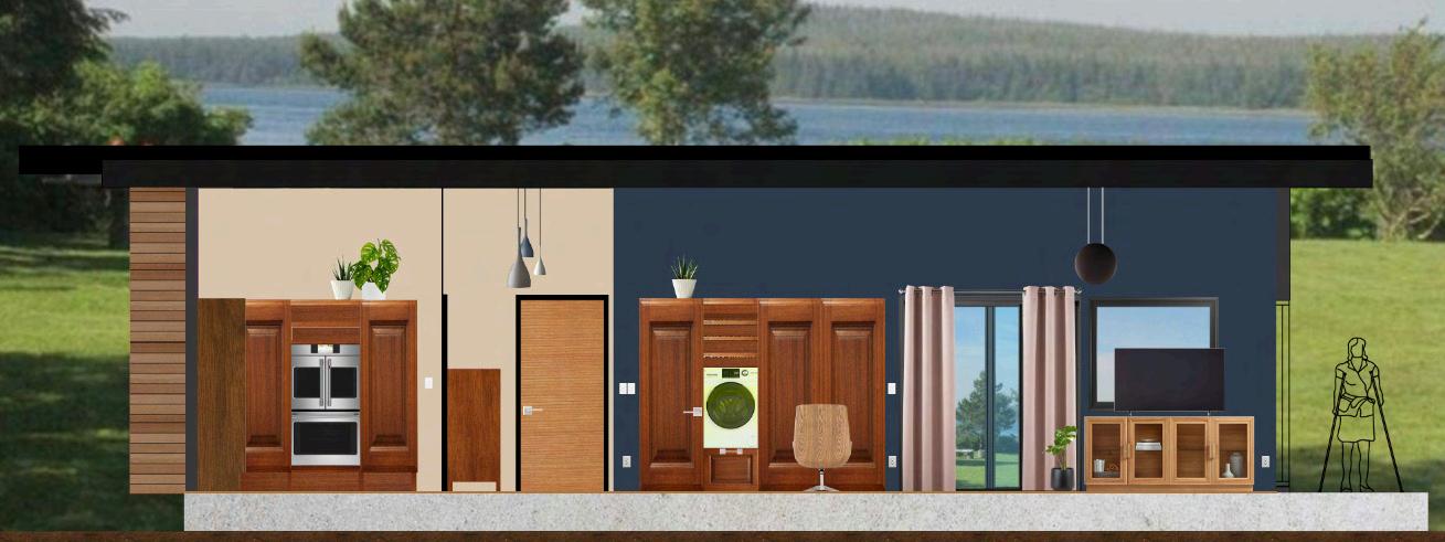

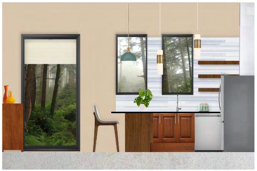
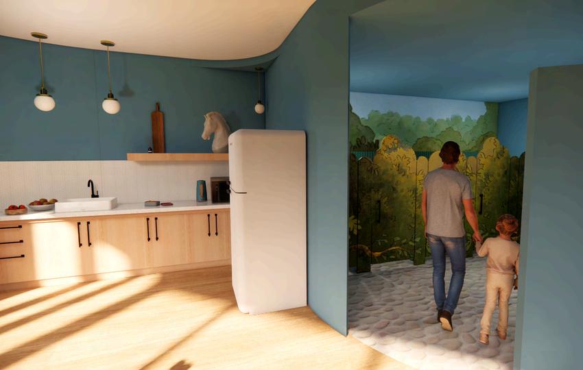
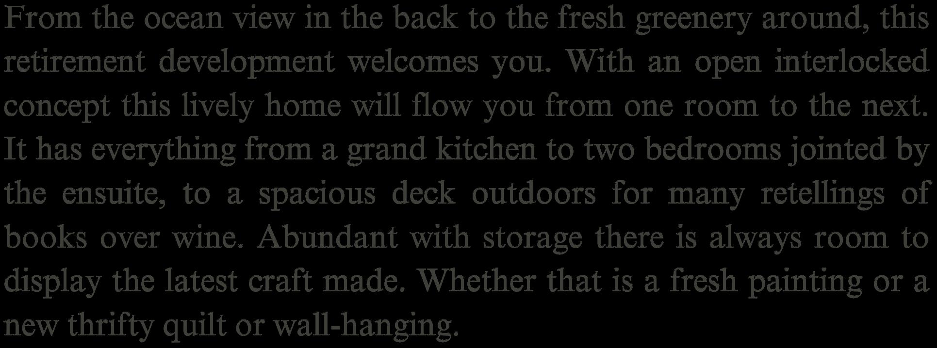
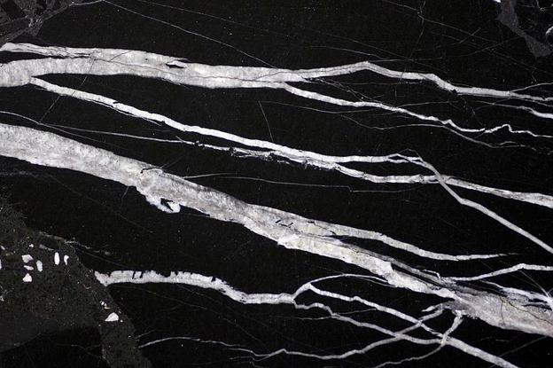
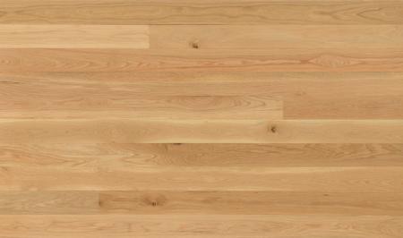
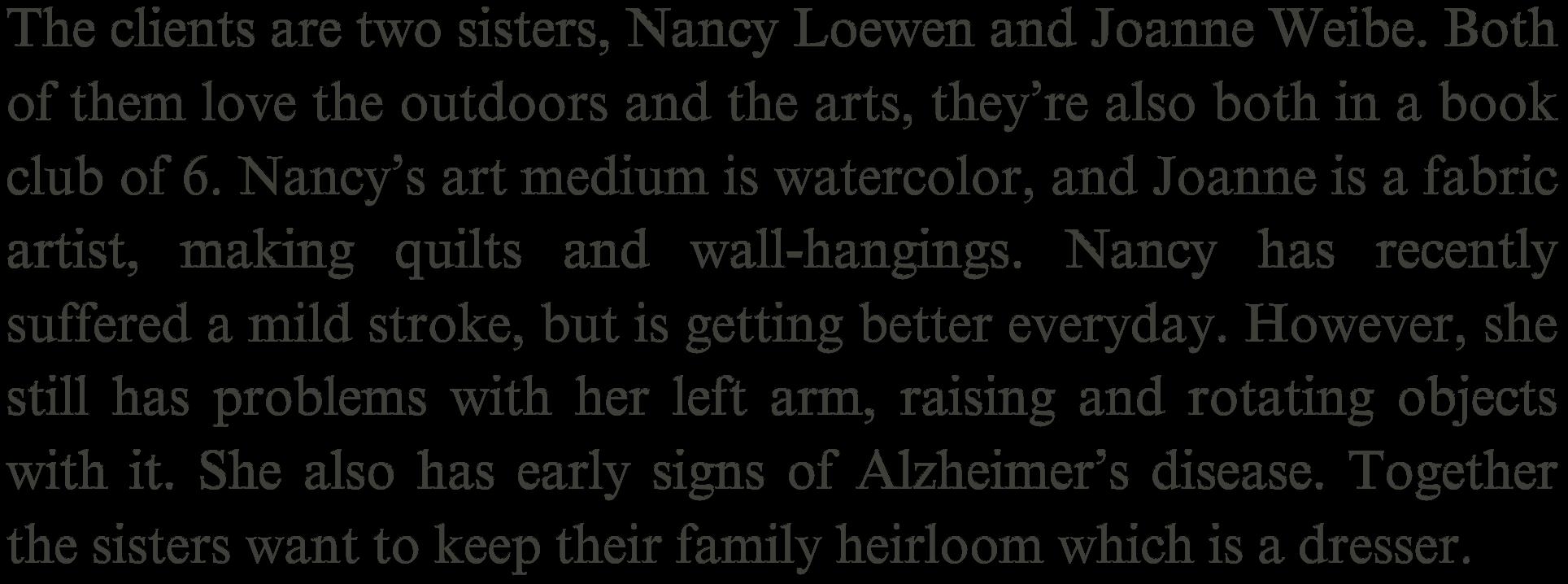
Considering Nancy’s needs here for the kitchen, I decided to go with contrasting tones throughout the space. From the light backsplash to the dark countertop. There are easy alterations able under the counters incase of someone in a wheelchair. Along with the see throughout portion in the fridge to help with any confusion that may later come with Nancy’s Alzheimer’s.