Mission Statement Logo logo requirements logo color variations minimum size Color primary colors Typography typefaces Application advertising additional collateral 1 2 3 4 5
1 Mission Statement
Hub is a central place where people can access low- and no-carbon transportation options such as bikes, scooters, transit, or car sharing.
Mobility
Color 2
Color 1
The Logo Mobility hub is made using a two tone color combo as specified by the color guide (pg. 3). These are spot colors made with CMYK values on Adobe Illustrator 2023.
Our logo is the center of our brand. It is simple, friendly, readable, and gives a nod to transportation and connection, which are at the core of Mobility Hub’s values.
The Logotype
The Logotype
The logotype should be colored only using specified brand colors, as shown in the color guide (pg. 3). The two color hues used in the logo must be di erent than the background color in which the logo is placed.
2 The Logo
Logotype Positioning
The logotype can be used either by itself as a mark, or with two text combinations.
The first is the logotype above the type, with the two words in line with eachother. The logotype should be the same width as the letters “ILIT” in Mobility
The second is the logotype to the left of the type. In this one, the type is stacked uniformly together. This means that the word mobility should be the same width as the word hub when in a stacked position.
Clear Zone
The logotype should have spacing around all sides equal to the width of it’s vertical strokes.
Space around total logo equal to width of vertical stroke.
Width equal to Logotype
Width of logotype equal to “ILTY” in Mobility
Words aligned with each other
width of Mobility and Hub are equal and centered
2.1 Logo Requirements
Hues
The logotype can be used with its two primary colors, Minnesota Green and Minnesota Blue, found on the color guide (pg. 3).
When used with white, Green must always be on the left portion of the logo, while blue is always on the right.
Other Colors
2.2 Logo Color Variations
Mobility Hub can be used a few ways with color: - 1 hue + white - 2 hues - all white - all black
These are the only colors to be used within the logotype. This is in order to establish a strong brand presence with a particular color pattern and to properly showcase what Mobility Hub stands for. All White One Hue (green) 1 Hue + White, with green on the left 1 Hue + White, with green on the left 1 Hue + White, with blue on the right All Black
2.3 Minimum Size
is no limit on the maximum size of the logotype!
Sizing
order for the logo to stand as strong as it possibly can, there is a minimum size needed in order to accomplish this. These measurements ensure the logo is accomplishing what it needs to. 7.5mm 6mm 6mm 3.3mm 30mm
There
Minimum
In
3 Color Guide Our color guide is simple, straightforward, and recognizable. Please stick to these specified colors for all branding associated with Mobility Hubs. Minnesota Green CMYK 100 60 10 53 RGB 0 56 101 HEX 003865 PMS 2955 C CMYK 0 0 0 0 RGB 255 255 255 HEX FFFFFF PMSCMYK 0 0 0 100 RGB 0 0 0 HEX 000000 PMS Process Black CMYK 65 0 100 0 RGB 120 190 33 HEX 78BE21 PMS 368 C Minnesota Blue White Black
4 Typography One typeface. Three styles. The font used for the logotype wordmarks Used for branding purposes. Used for branding purposes when a lighter weight is necessary. KLAVIKA BOLD REGULAR KLAVIKA REGULAR
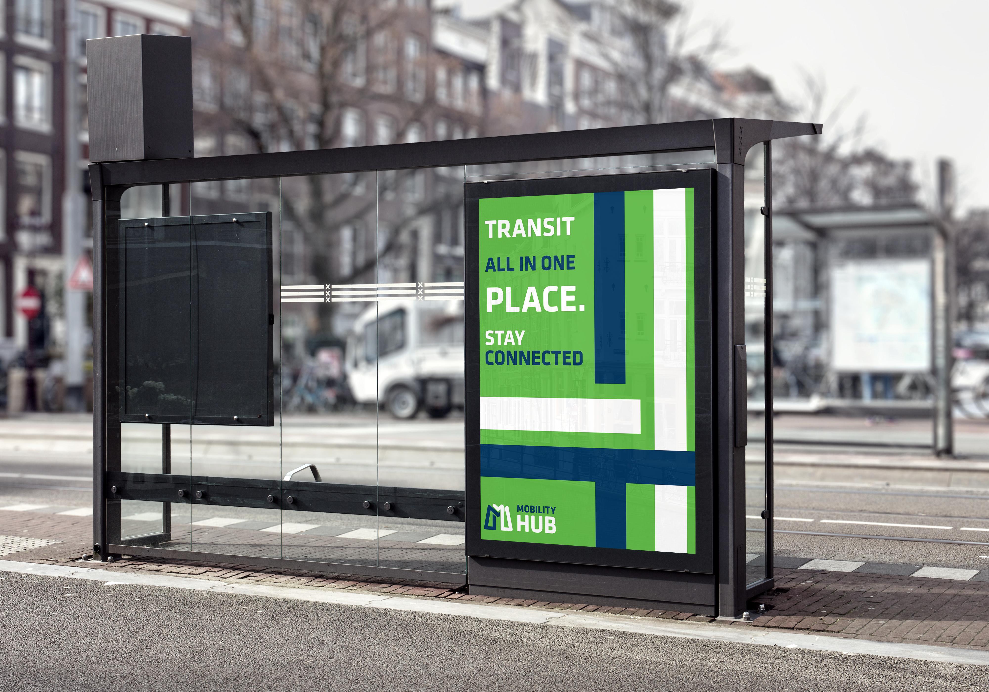
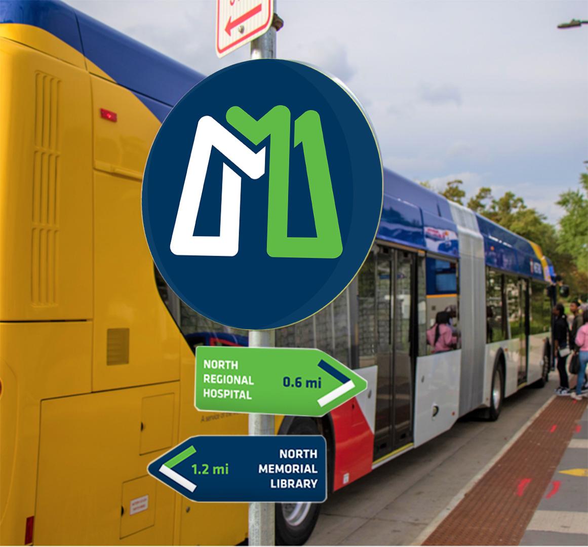
5 Application
hub can vary drastically, but must follow
written above. Colors must also be within palette.
Branding for Mobility
all rules


