


 by Kailey Wilkens






This woman, whose work we’d never seen, whose name we never heard, nevertheless shaped the way we draw, design, and even exist as women -Sarah Rich, Leave Me Alone with the Recipes

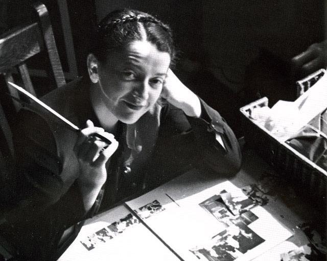











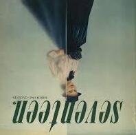
Titled as one of the first notable women in design, Pineles’ success didn’t just come out of nowhere. After immigrating to New York from Austria at 13 years old, Pineles developed a love of creativty to then study at Pratt Institute from 1927–1931, Pineles had a job in developing models for store window fabric displays at Comtempora, as she went on to join more high-end recognizable brands in New York including Condé Nast a multi-media based company in which she found her love for all things editorial, beginning to create projects of her own. From there, she was soon credited for her prominent art direction in many renowned publications, including Glamour, Seventeen, and Charm. Through these practices, we can see where she developed her playful modernist style through various treatments of illustration, image, and type.
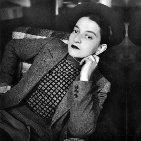

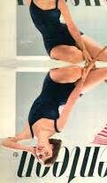
Cipe Pineles is credited with being the first woman to incorporate illustration and fine arts into the mainstream and mass-market media, she curates specific styles for the aesthetics of the magazines, with seventeen focusing on transitional photography or vogue being curated of multiple photographs, including handmade illustrations to other work. Pineles found a way of turning her art styles to fit into a multitude of differing brands.
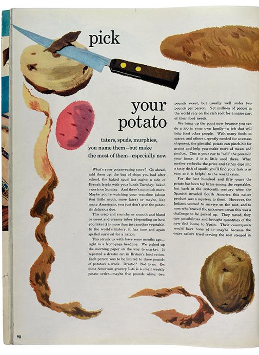
Pineles has a very clean aesthetic but in a sense of being natural with her hand made elements, in which I see her as a very “handson” artist. her work has been admired for decades and in this element of crafting to make a high end magazine become editoirial with design elements, we can see how the public has reacted to this new shift inn media and use her as instrpiation, even unkowingly given the lack of publication of her identity.
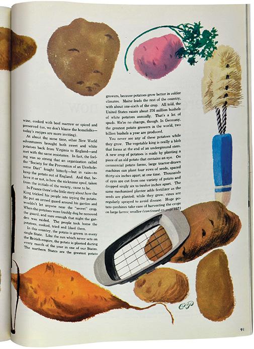
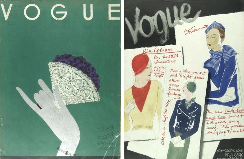
“We tried to make the prosaic attractive without using the tired clichés of false glamour. You might say we tried to convey the attractiveness of reality, as opposed to the glitter of a never-never land.”
—Cipe Pineles

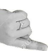

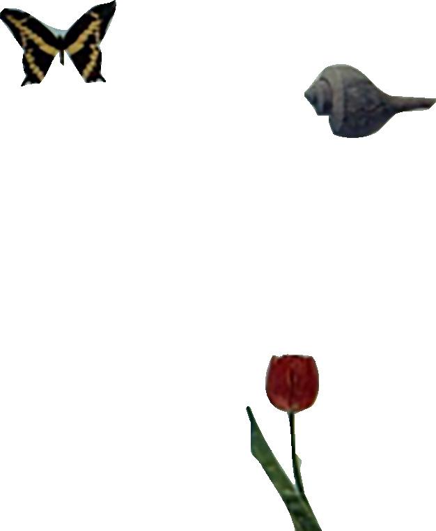
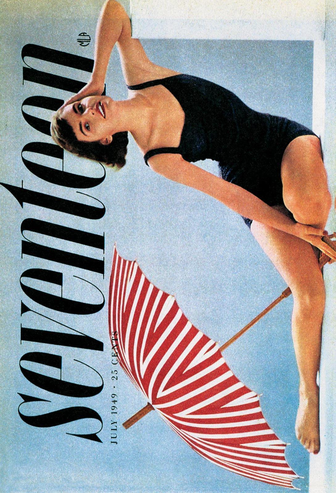
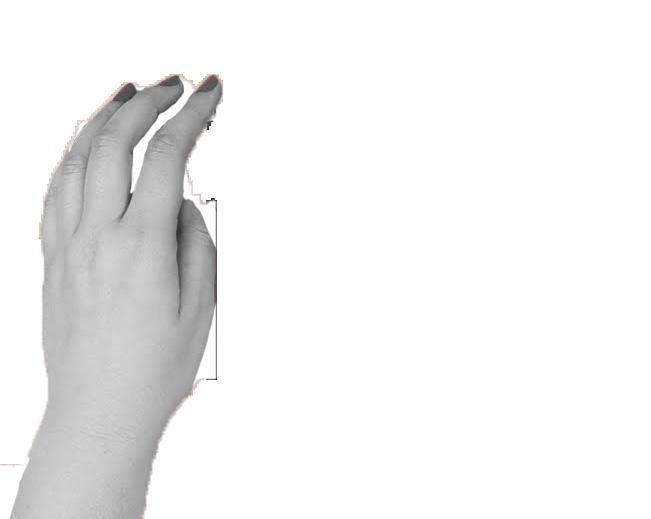
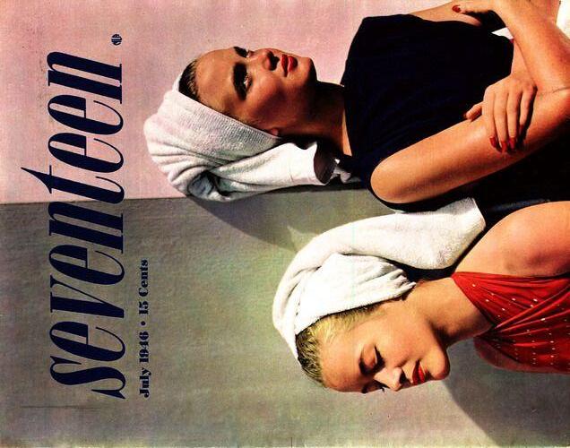
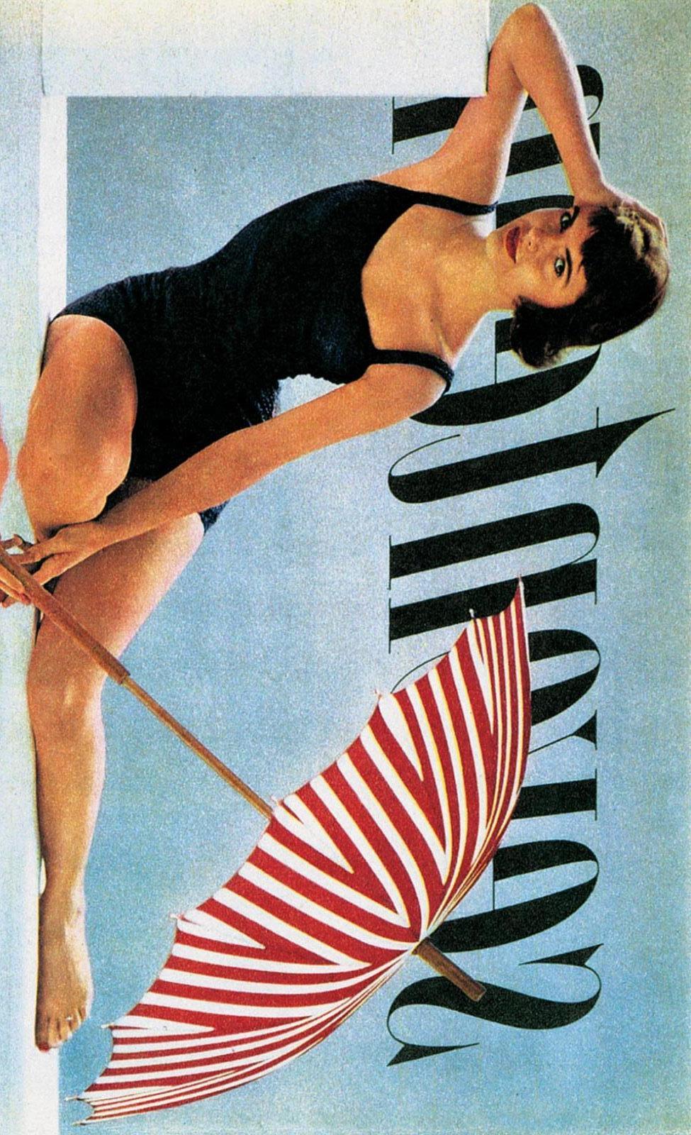
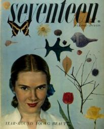
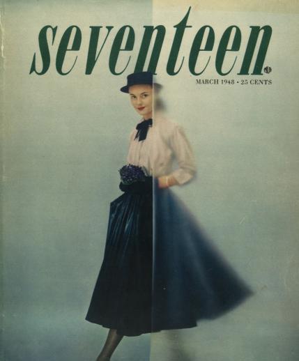

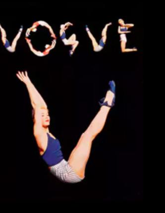
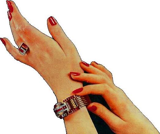


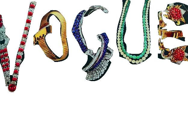
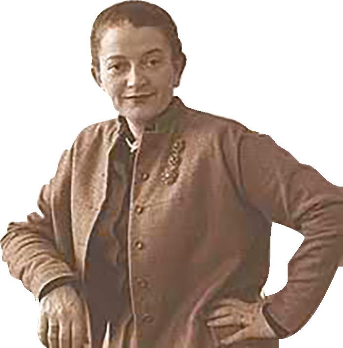

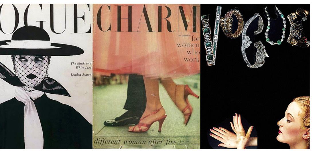
Through Vogue, Pineles’ editorial style takes more of a literal sense, in the most simplistic way possible. Pineles’ signature collage-ry takes form in a high-brow fashion, playing with more feminine elements, where editorial became more high fashion than just experimental, as she she gained inspiration from the official art director who hired her, M.F. Agha.


“for women who work”
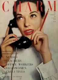
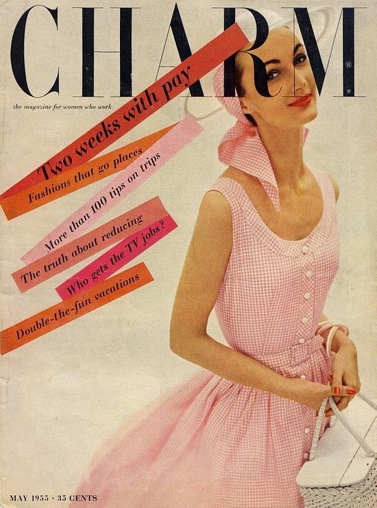
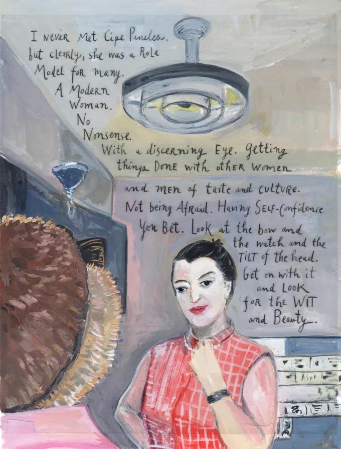
Pineles was very proud of her accomplishments over time as multiple well known art director magazines, as her favoite works of Charm magazine was what she called “the first feminist magazine”. Her inspiration became broadly surroudning the glamorazation of being a women, in feminine features with warm tones of pinks and pops of reds, and the confidence of women in their individuality in everyday life.
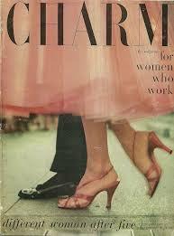
She would often make fashion spreads of women at work, showing clothes for working women where she would gain inspiration for the look on location! Through this art choice, she successfully brought in an audience to both satisfy professional women, who were interested in beauty and fashion, as always, but as well inspire their professional careers and their new place in the world.


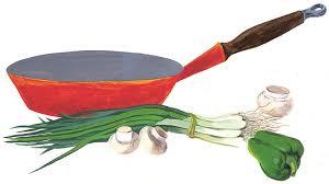


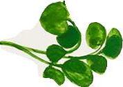

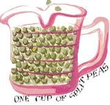

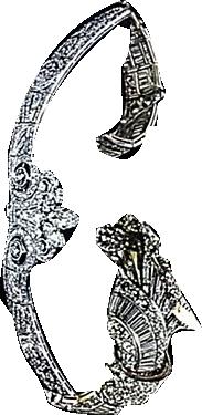
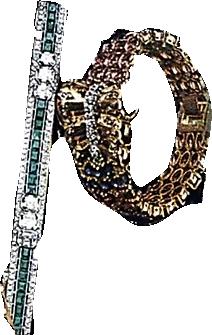
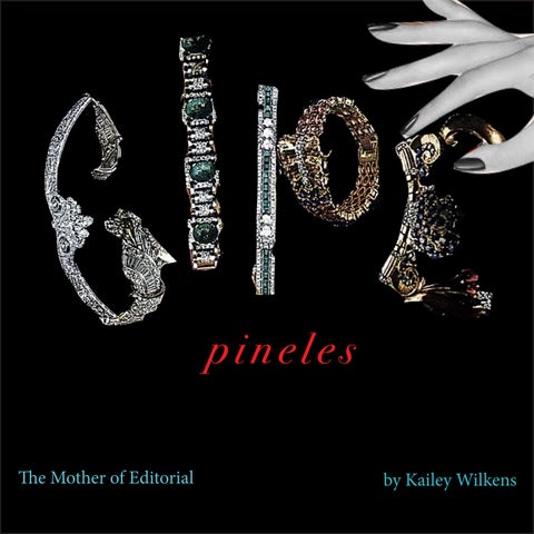
While Cipe Pineles was known for piecing together objects to replace letters as visual puns, she found a way to become known as the American figurative typography trend. Pineles’s design philosophy focused on the notion of respecting and taking her readers’ visual education seriously, by showing the best artworks and innovative design solutions, as her love for bringing together elements spread to ingredients creating ancestral recipes, to illustrate to honor those who creativly came before her.

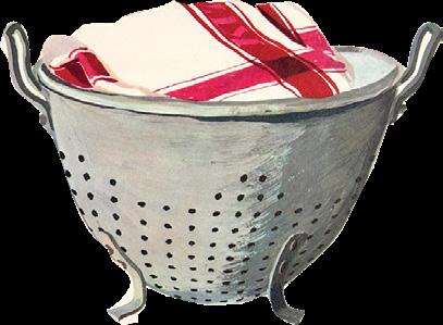
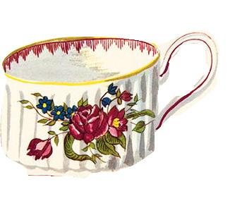

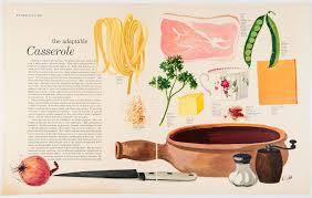

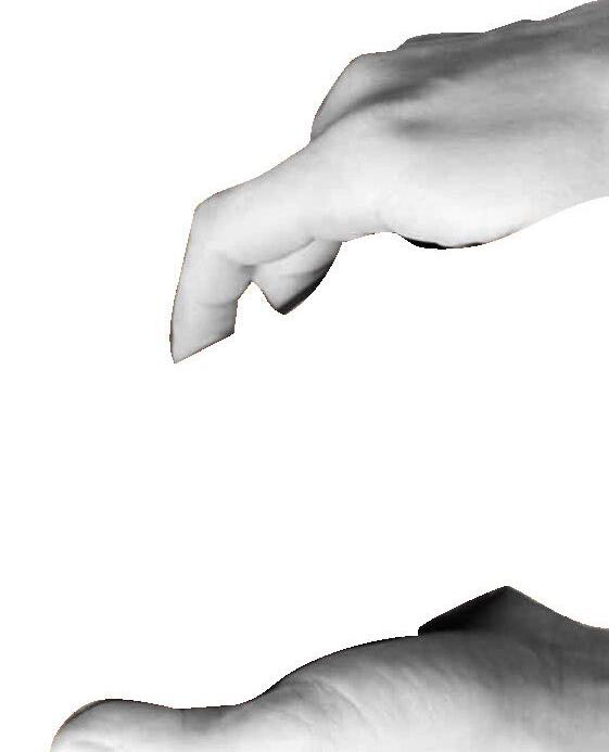
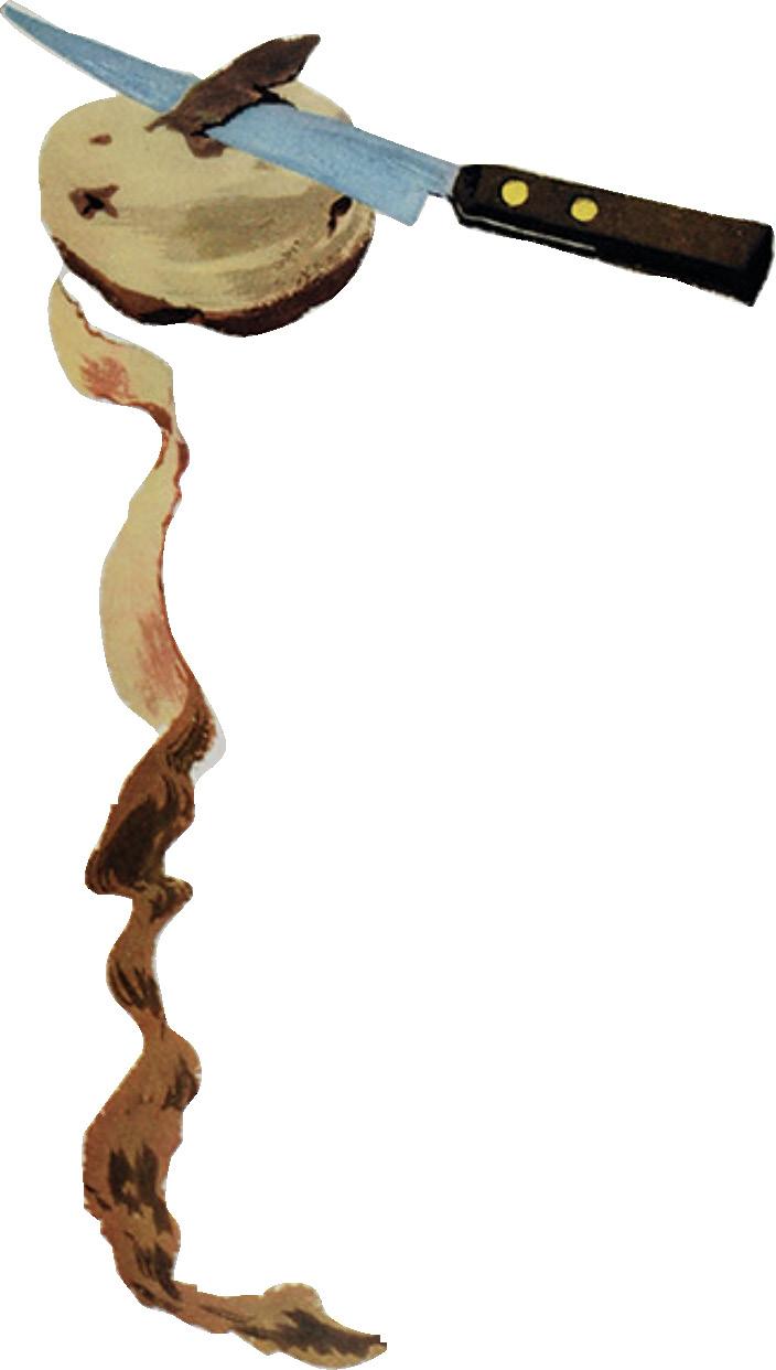
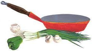
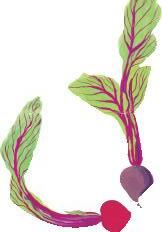
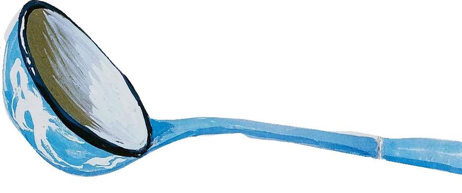
Her transitional style merged into her love for illustration, adding her touch of creativity to her hobby of cooking in her cookbook “Leave Me Alone with the Recipes” in which each homemade traditional Jewish recipe is included with her vibrant and cheerful ingredients with original illustrations to fit each step of her process, alongside critics call typography written in a most unusual, meticulously hand-lettered typeface.

Although noted as primarily faceless throughout her success by articles proclaiming her great artistry throughout the decades, we can see inspiration of Pineles in many different medias in bringing such a broad idea of “editorial” in multiple fashions, encompassing the lives of the creatives of our generation, and those to come. “Her use of the page is both brilliant and brave,” admires Jane Sayer, Director of Visual Strategy at Smith Design. “She combines images, white space, and typographic balance to achieve layouts that are witty, charming, and dynamic. Her spreads tell a visual narrative independent but complementary to the verbal narrative.”








Credits: https://opusdesign.us/ wordcount/celebrating-women-in-design-cipe-pineles/ https://www. eiblehudsonvalley.com/2022/in-defense-of-food-illustration/ https://smithdesign.com/blog/women-in-design-cipe-pineles/
