B Y K AT H R Y N P U R C E L L • P H O T O S B Y T E R R Y A L L E N
C
Color is powerful. It is transformative.
FINDING ‘TARA’ RECHARGING A VICTORIAN-ERA BED & BREAKFAST THROUGH COLOR
The right color has the ability to metamorphose the way a space is perceived, whether it’s the size, the degree of formality, or the ambiance. Color can transport the viewer to another time, another place, and even another mood. A quaint bed and breakfast in Madison, Ga. provides the setting for such a transformation. When Karen and Peter Wibell purchased the Brady Inn, a Victorian-era cottage, last spring, the décor was dated, and the rooms lacked a coherent style. The Wibells enlisted the help of painter Molly Lesnikowski of Red Doors Studio in Rutledge, Ga. to transform the space. Thus, the seasonlong project began. Karen Wibell and Lesnikowski began their work in the original Brady house. The hand stenciling on the friezes provided a unifying element throughout the parlor and four bedrooms. The stenciling was completed in 1987, when the private residences were converted to a bed and breakfast. “[The stenciling] dictated, because we did not want to walk away from the best part of what was here– the colors,” Wibell says. The color wheel provides basic hue choices that can be manipulated through value (the lightness or darkness of the color) and saturation (the intensity of the color) into an infinite amount of shades. When it comes to color and interior decorating, texture and pattern can also be added to the equation. With a blank wall as a canvas, the possibilities for transformation are endless.
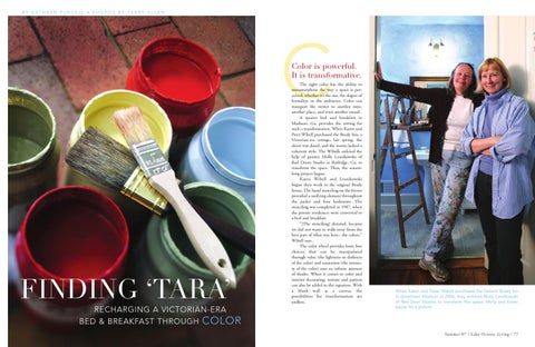
When Karen and Peter Wibell purchased the historic Brady Inn in downtown Madison in 2006, they enlisted Molly Lesnikowski of Red Door Studios to transform the space. Molly and Karen pause for a picture.
Summe r 07 | L ake Ocon ee L ivin g | 77
I
“It’s got a very sultry feeling to it which I think is what a lot of people are looking for when they come to Madison.”
In the parlor, the pair chose to extract a Cheyenne red from the stenciling for the walls. While red is the color of heat and has the capacity to evoke a highly emotional response, it is manipulated in the parlor to elicit a more social atmosphere. Lesnikowski chose paint with powdered plaster mixed in, giving the walls a suede effect that reflects and refracts light at different angles so that there is no flat color. Coupled with the lighting, the suede effect helps to soften the otherwise bold red, giving the parlor a warm, inviting ambiance, perfect for chatting with close friends or new acquaintances.
Painted a cheerful shade of butterscotch, the MacIntyre bedroom welcomes overnight guests to the Victorian South. OPPOSITE: The parlor received a coat of Cheyenne red paint with powdered plaster mixed in, giving the walls a suede effect.
“I think, with the deep, dark red, it makes the space more intimate,” Wibell says. “While some colors expand the space, this one really anchors it. I wasn’t trying to make the room feel bigger; I want it to be an intimate room. It lends itself to having a good conversation.” Adjacent to the parlor, the MacIntyre bedroom is a cheerful shade of butterscotch that is perky enough to be welcoming, but muted enough for the walls of a bedroom. Again, the color was pulled from the stenciling in the frieze and the paint has a suede effect,
giving the room a hazy feel. Yellow hues are commonly associated with cheerful subjects like the sun. The room itself is large and the color, unlike the red paint in the parlor, doesn’t allow a precise definition of the room’s dimensions. Across the hall from the MacIntyre bedroom is the very feminine Sarah Brady bedroom. Karen says the Brady family invited a decorator to plan this room. The peach color on the walls, again with the suede effect, is refined and elegant, what one would expect from a lady during the Victorian era.
Summe r 07 | L ake Ocon ee L ivin g | 79
OPPOSITE PAGE & BELOW: The additional cottage in the Brady Inn was built between 1910 and 1915 and converted to a bed and breakfast in 1988. Wibell created a suite in the addition by linking three of the guest rooms. She chose a tropical theme for the suite, reflecting the aspirations of the Victorian-era British Empire.
C
“Color can transport the viewer to another time, another place, and even another mood.”
ABOVE: The gentleman’s bedroom is painted a strong camel color. The frieze of deep red with hunter green trim lends the room a hunting theme. Its bathroom features a mural of rolling hills and open countryside.
Summe r 07 | L ake Ocon ee L ivin g | 81
The room glows when the light bounces off its walls. “It’s totally soft,” Lesnikowski says. “It’s almost like makeup– intimate and pretty.” The last bedroom in the Brady’s main house is the Patrick Brady bedroom. Painted a sueded moss green, the walls in this bedroom emit a fresh, earthy vibe. The color of foliage, green is a cool color, which makes it relaxing; it recedes and does not fight for attention. “It creates interest,” the painter explains. “It’s different, but it’s not busy; it’s not self-important. We want the color, rather than the wall, to be visible. To me, it almost looks like it’s got moss or lichen on it.” While the Brady’s main house was well-established with Victorian-era antique furnishings and stenciling dictating the color palate, the additional cottage space was a blank canvas waiting for décor and color. Wibell and
Lesnikowski wished to carry the time period and mood throughout both houses, but the addition presented a challenge. After careful consideration, they themed each of the rooms in a way that less formally continues the ideas put forth in the Brady’s main house. Given a hunting theme because of the artwork present in the room, the walls of the gentleman’s bedroom were painted camel and the frieze was painted in a deep red with hunter green trim. Both the wall and the border have a faux leather finish. The color combined with the finish make the room rugged in a sophisticated way. And, while it is clear where the walls are, the color is downto-earth and not overpowering. Camel is strong and solid. The windowless bathroom, a decorating challenge, is now the real joy of the room. A mural on the walls features rolling hills and open country-
side. It seems as though a group of horseback riders and a pack of dogs will gallop by at any moment on a foxhunt. “A bathroom without a window is a challenge,” Lesnikowski says. “It’s a challenge to have a positive experience in it and it’s a challenge to decorate it. That’s why we had that kind of ‘whimsical’ in the bathroom, because it could look plain.” In juxtaposition to the gentleman’s bedroom, the lady’s bedroom is classic with a twist. Lesnikowski striped the walls in darker and lighter variations of mauve and used a “ragging” effect to soften it even more. The frieze in this bedroom is blue, and because of the ragging and the bluebirds hidden throughout, is reminiscent of sky. Karen observed that striped wallpaper was in fashion at the time the furniture in the room was crafted. The bedroom keeps up with its time but is
Oconee Cultural Arts Foundation perspectives pottery show Septemer 1st - 19th
A S t a t e w id e s h o w o f Fi f t y G e o r g i a p o t t e r s O ve r 4500 po t s f o r s a le
E x h i b i t s , S a le s , W o r k s h o p s , S t u d i o T o u r s
O p e n d a i ly T u e s da y - S u nd a y
34 School Street
Wa t k i n s v i l l e , G A Details at ocaf.com
Kelly King
Bridget Fox
Timothy Sullivan Vernon Smith
Rebecca Wood
Glenn Dair
Dewitt Smith
Tina Reuterburg Ron Meyers
82 | La k e Oc o n ee L iv i ng | Su mm e r 0 7
Matthew
Kathy Adams
Don Penny
tel 706.769.4565
Annette Gates
Stephen Hawks
also able to maintain its ladylike theme. “I think it’s really sweet,” the painter says. “We didn’t want it to be too decadent; we wanted it to recede.” The final room in the Brady Inn is actually a set of rooms that Wibell chose to make into a suite. She knew some guests– large families and groups on their way to University of Georgia football games, for example– needed a larger space without the heavy antique element. Wibell decided on a tropical theme for the three rooms. The outer bedrooms have pale yellow walls with a similarly toned green frieze, while the walls of the sitting room in the middle are the reverse– blanched green walls with a pale yellow border. The border in the sitting room contains a verse from the Shaker Hymn, “Tis a Gift to be Simple, When we find ourselves in a place that’s right, ‘Twill be in the valley of Love and Delight.” Wibell’s inspiration for the suite was borne from the history of the British Empire. “We talked about how, in the Victorian Period, the Empire was everywhere,” Wibell says. “They were fascinated with different places in the world– India, the Caribbean, Japan.” “We wanted a little of that foreign kind of feeling,” Lesnikowski says. “Then we tried to fit colors that reflected that.” The Brady Inn’s transformation was complete by the end of last summer. Though the Victorian Era has long since past, the feeling and ideals of that period live on in the bed and breakfast, reminding guests that the Victorian South has not died. “It’s got a very sultry feeling to it which I think is what a lot of people are looking for when they come to Madison– that real Southern, sultry, lazy, relaxed feeling,” the painter maintains. “That kind of ‘Tara’ that nobody can find.” Kathryn Purcell is the managing editor of The Morgan County Citizen in Madison, Ga.
Christopher
Summe r 0 7 | L ak e Oc on ee L iv in g | 83