Savannah College of Art and Design
INTERIOR DESIGN


Savannah College of Art and Design

My name is Juliana Sanchez, an interior designer dedicated to reimagining spaces for a more inclusive and sustainable future. Born and raised in Costa Rica, I developed a deep respect for nature and culture, which influence my design philosophy today. I believe that spaces should serve everyone by embracing neurodiversity, sustainability, and functionality to create environments that are both innovative and welcoming.
NCIDQ (IDFX) Adobe Photoshop
Skills
Revit
Enscape
SketchUp
Autocad InDesign
Adobe Creative Suite Hand Sketching
Languages
English- Fluent French- Intermmediate
Spanish- Native
Education
Savannah College of Art and Design
Atlanta, GA
B.F.A Interior Design, 2025
Accolades
2024 IIDA Best of the Best Student Design Competition Winner
Dean’s List: 2022, 2023, 2024
Theresa Butler Interiors Aug 2024 - Present Office Manager | Interior Design Intern
Collaborate in all phases of the design process, from conceptual development to project completion, ensuring client-centered results.
Produce detailed hand renderings and visual presentations to communicate design concepts effectively.
Manage client relationships by addressing inquiries, presenting proposals, and fostering ongoing engagement with both existing and potential clients.
Oversee digital presence by maintaining and curating website content, as well as creating engaging social media posts to promote brand visibility.
Set Designer
Managed set design budget, ensuring effective allocation of resources.
Jan-Mar 2023
Sourced pieces and materials in accordance with the film’s concept to enhance the narrative and visual aesthetic.
Collaborated closely with the director and production team to translate creative concepts into tangible set designs.
Installed and dismantled furniture pieces used on set, coordinating logistics and timelines to ensure smooth transitions between scenes.
Brand Representative
Assisted guests in finding desired products, providing exceptional customer service.
Feb-May 2022
Managed new shipments by sorting and counting items, promptly updating stock records to optimize efficient store operations.
Collaborated with the visual merchandising team to style window and product displays.


01 CANTERBURY COURTS HEALTHCARE DESIGN
02 RISE PAVILLION HOSPITALITY DESIGN


Located in Buckhead, Atlanta; this senior living community strives to create a space for those with autism spectrum disorder to not only live, but thrive. Canterbury’s mission is to foster lives of possibility and independence for older adults with ASD, while providing the necessary care and attention to each and every resident.

ASD is a bio-neurological developmental disability that presents itself differently from person to person. It presents itself through diffulties in communicating and reading social cues/ body language.
About 5.4 million adults in the United States are on the autism spectrum

Independence: The space will foster independence through intuitive wayfinding and color coding social vs. silent spaces.
Though ASD does not affect life expectancy, the mortality rate is twice as high for those in this group due to accidents alone.
Along with common aging challenges, there are commorbidities associated with ASD that cause overstimulation and risk of injuries through falls.

Sensory Inclusivity: The environment will integrate natural light, texture variety to provide soothing interaction as well as feature quiet zones and sensory retreats.

Safety: Landmark elements, rounded corners, and soft materials will be located in stratigic areas to maximize safety throughout.
Enclosure as a Means of Separation Between Resident and Guest Spaces:
Clearly delineating resident vs. guest spaces is incredibly important to minimize guest wandering and maintain routine amongst residents.
9:00 p.m.
Once done socializing, resident heads up to the apartment to prepare and eat dinner, as well as get ready to go to bed.
8:00 p.m. After class the resident heads to a social zone to hang out with neighbors.
6:00 p.m. A this time the resident heads to their daily yoga class, trying to avoid guest spaces.
4:00 p.m. By 4, guests start to head out. The resident heads to the sensory pods to wind down.
2:00 p.m.
At around 2 guests start to arrive for lunch. They are greeted by the resident and directed into the dining space.
12:00 p.m.
By noon they make breakfast and head down to check the vegetable garden and spend some time outdoors.
10:00 a.m.
Most residents a re late-risers so they start their day around this time.


Social areas are distinguished by orange materials, and individual areas are distinguished by blue materials. This places the pressure of approaching social situations on the built environment rather than the individual , aliviating the possible discomfort those with ASD encounter in certain interactions. Applying the Research in the Overall Floorplan
Guest areas, like the large dining space and and social lounge, are grouped together and located directly beside the main entrance. This serves in minimizing the likelyhood of residents crossing paths with guests if they do not wish to. Additionally, the halls that lead to resident areas are narrrow and feature lower ceilings to create sense of privacy and discourage wandering.

This design concept is inspired by subtle symphonies while placing textures at the forefront of the sensory experience.
It prioritizes the residents’ ability to navigate the textural landscape, promoting independence and selfassuredness.
With the concept in mind, I started iterating a variety of material options that provided the appropriate texture without being visually overstimulating.

This space features a variety of seating options as well as designated social vs. individual zones.


By utilizing flooring material changes, way-finding becomes clearer and more intuitive for users.

Seating options all have a different texture that users can interact with to ground themselves.

All tables in the dining space have rounded corners to minimize injury in case of an accident.


The main color of this space identifies it as a quiet/individual area. It features flutted felt and fabric-wrapped panneling to control noise and provide a comfortable experience.

Again, characterized as an individual space, this studio uses individual mirrors across felt pannels to delineate individual spaces. This promotes a sense of privacy and security.

This space is inspired by the song “Where this Flower blooms” by Tyler, the Creator ft. Frank Ocean as a way to celebrate musicians and their artistry. This son talks about loving yoursrelf, as well as aspects of the Black-American experience. Growing into loving your self is arecurring cycle full of both, hard and beautiful moments.
Celebrating black voices cannot be properly done without aknowledging the need for change towards a future of equal opportunity.
“Where this Flower Blooms” has an easy going beat with a strong rythym that encourages the user to move with music.

The following line especially inspired me to create this space:
“Tell these black kids they can be who they are, dye your hair blue and I’ll do it too.”
As the song mentions, growing is not easy but it is beautiful.

The space creates a recurring cycle by taking the user on a journey of ups, downs, ins, and outs.
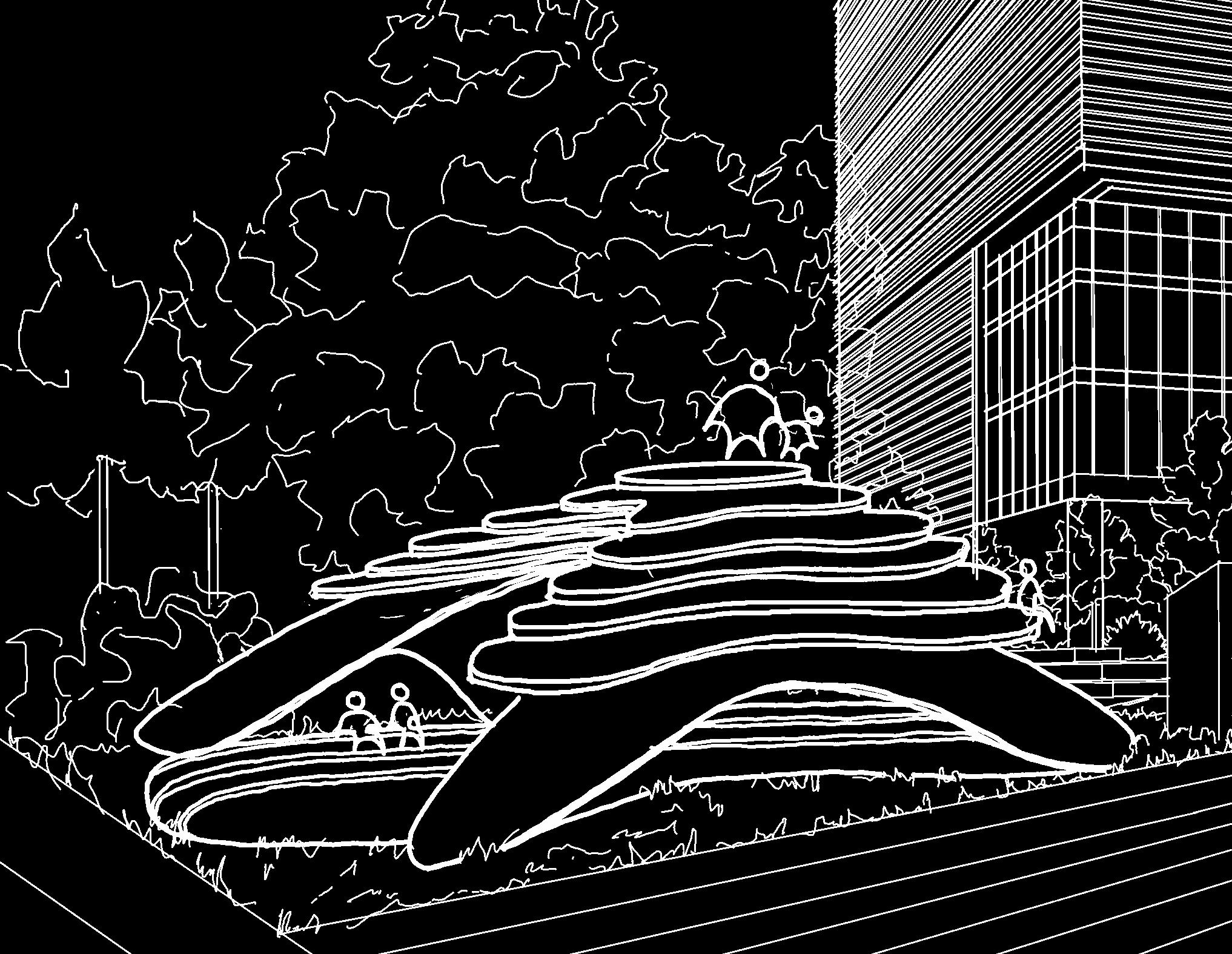
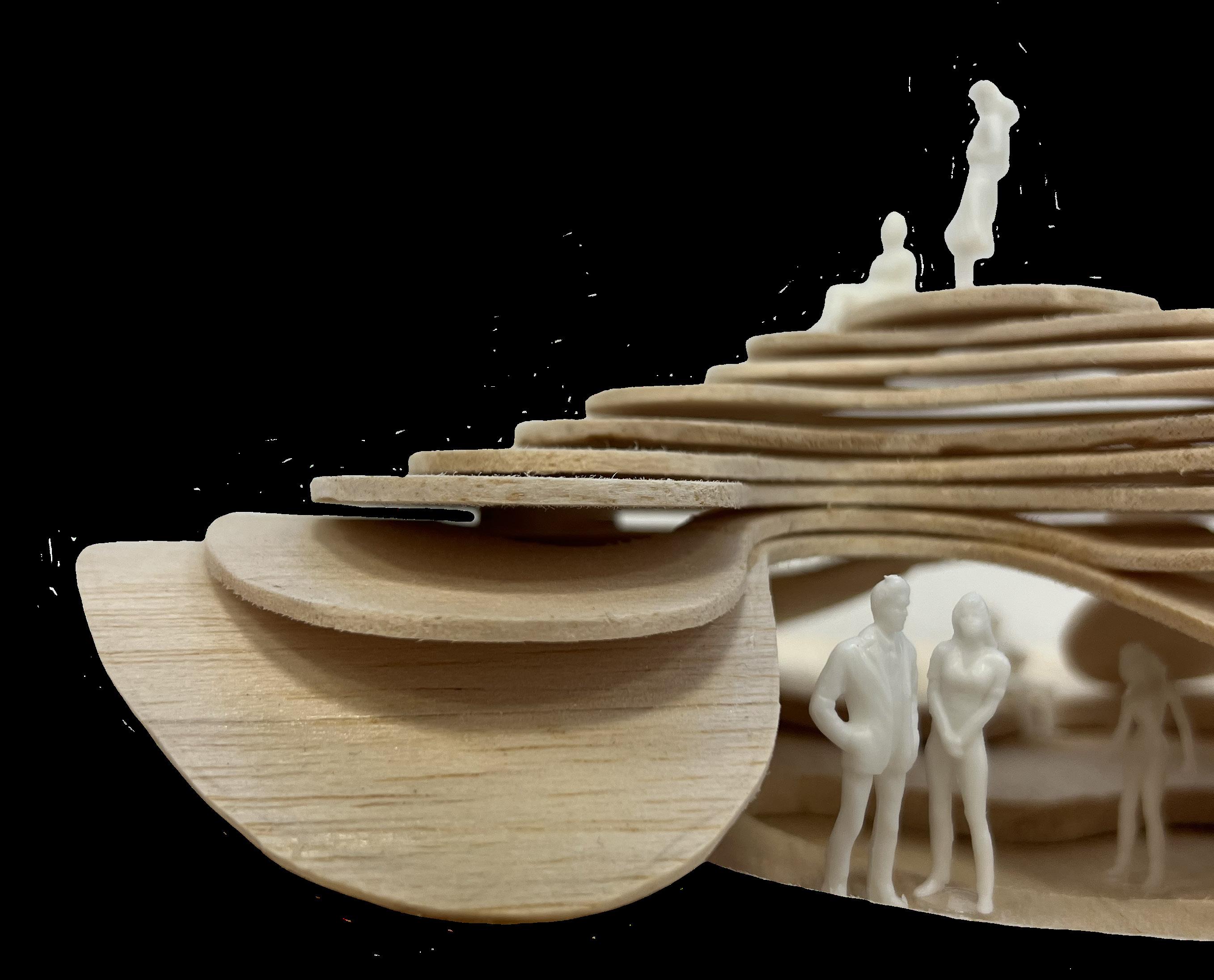
It is a structure that can be fully experienced, as the user is able to move around it, underneath it, and over it.

The first step of the journey , unawareness, takes place before the space is revealed
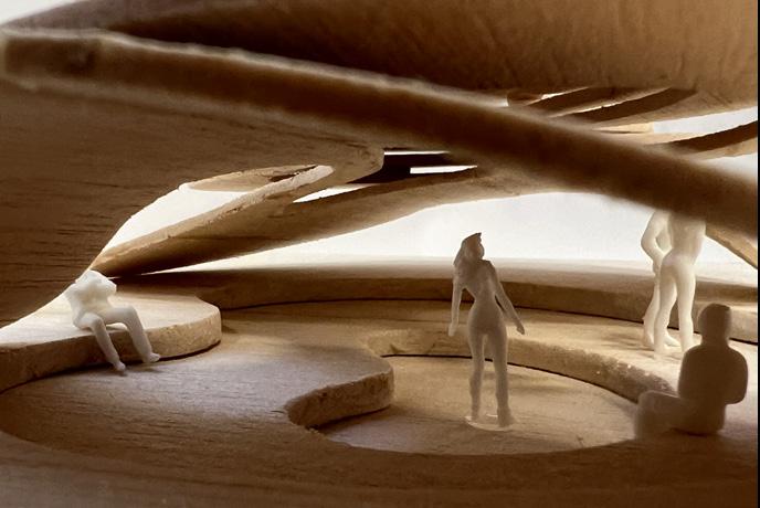
To reflect the feelings one might experience during this journey, I created moments that reflect both, the positives and negatives.
Upon reaching the pavillion you start wondering what the place is. That is stage 2: curiosity.
At the top, y ou know exactly what to do next, you are confiden t in yourself and your choices. You might even feel pride and self-love. This is the final stage: Security.
You continue up, and as you reach the top you feel accomplished, which is stage 7: growth.
As you enter, the space expands into a series of curvilinear forms that evoke peace This moment vitalizes you and now you feel optimistic (Stage 6)
The curiosity is too strong so you step in anyways. This is stage 5: Perseverence
The depressed plane invites you in, but the obstructed view into the space creates a sense of unease (Stage 3: Discomfort), so you hesitate (Stage 5: Resistance)

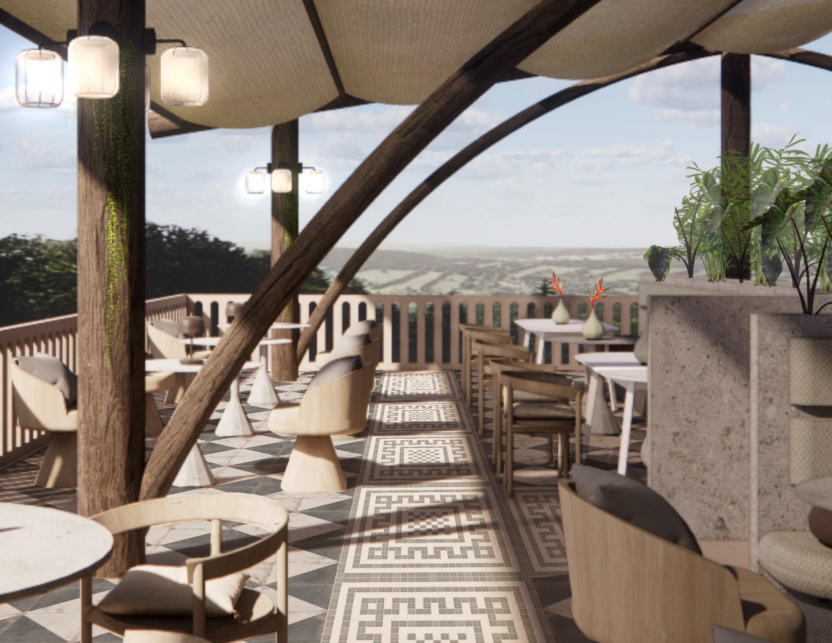
Located in Uvita, Costa Rica, Selva is a high-end rooftop culinary experience that celebrates Costa Rican Cuisine. The space is particularly known by its sustainable features, such as, the rooftop vegetable garden, composting system, solar panels, and rain water collection system.
Costa Rica is an incredibly biodiverse country with a huge focus environmental conservation. This made it important for the space to take part in that iniciative.

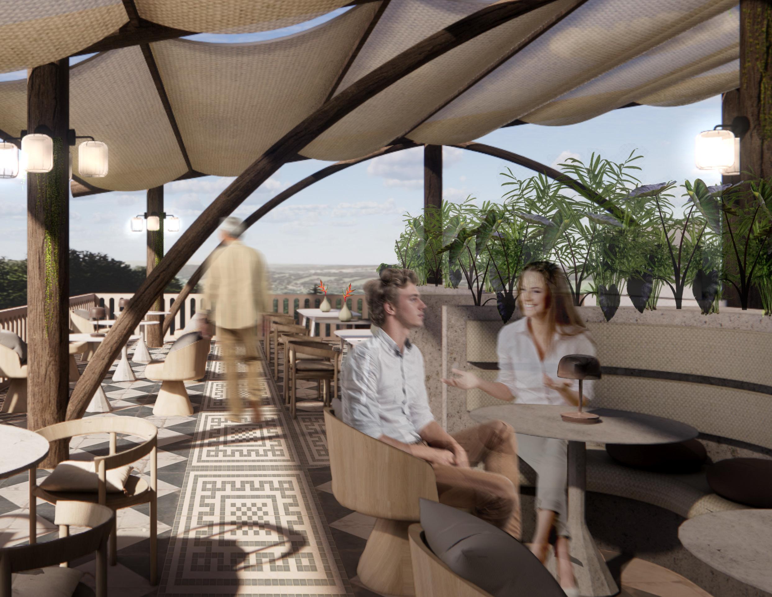
This space includes a rooftop vegetable garden that produces the products used in the restaurant. This garden will be sustained by a rainwater collection system that doubles as an overhead element that provides shade in the Bar & Lounge area. The space is also powered by a solar system located above the kitchen and B.O.H space.
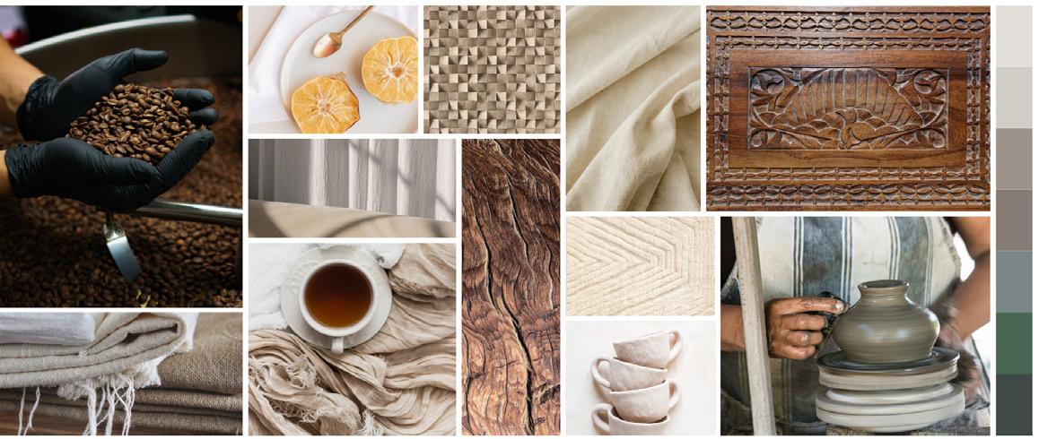
Inspired by Costa Rica’s lush rainforests and tranquil beaches, this concept combines organic textures, earthy tones, and tropical elements to create a harmonious space.
This concept celebrates Costa Rica’s natural beauty and cultural heritage through its design by combining the ideas of serenity/relaxation with vitality/life/energy.
Above the dining area, the space features a retractable roof made of a weatherproof transparent fiber to provide protection while letting light through . This allows for the space to be used year-round.

Located at the Bar & Lounge, these structures were inspired by the trees found in the area. They sereve as weather protection for guests and a water collection system for the garden.


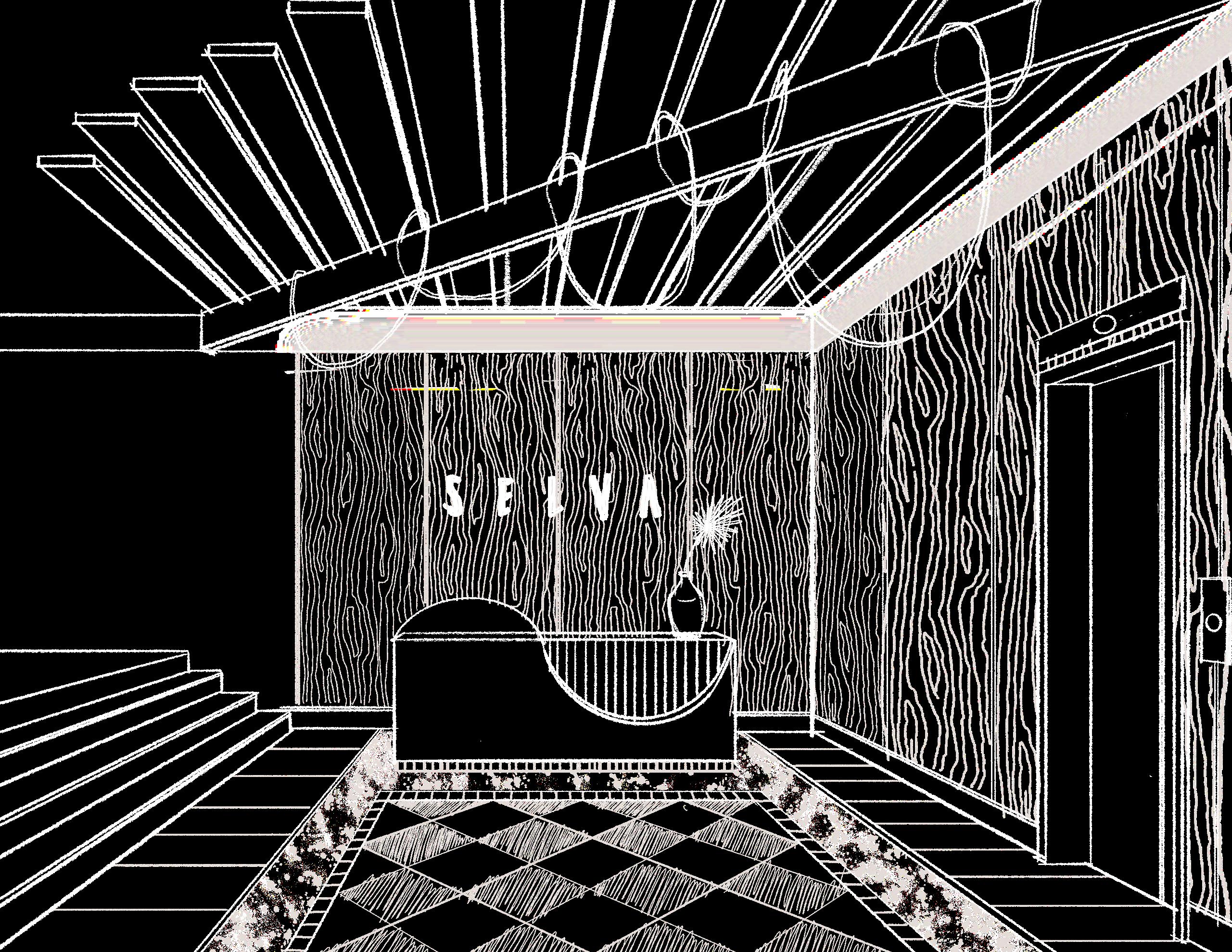
The curvilinear shapes on the booth and beams come from the prevalence of whales in the area , and the mosaic tile patterns are inspired by local craftsmanship and tradition to pay homage to the culturally rich site.
These elements converge to create an immersive dining experience rooted in Costa Rican identity and ecological mindfulness.
The design of the rooftop dining space draws direct inspiration from the sweeping curves of Bahía Ballena (Whale Bay). Local flora is thoughtfully integrated throughout the space, softening architectural edges and reinforcing a sense of place.

Cultural heritage is celebrated through custom wood-carved table partitions, adorned with patterns reminiscent of Costa Rican carretas, a nod to artisanal craft and storytelling.
These partitions are more than decorative: they offer diners privacy while cleverly concealing support stations for staff, ensuring seamless service.


BREDA Inc. is one of two sub-brands started by parent company MEGHANI. This parent company was founded in 2006 by the Meghani family. It is now led by the third generation of family members, Amir and Shabeena Meghani. BREDA itself was founded in 2009 as a lifestyle brand with the goal of reimagining classics with modern elements.
The team at BREDA Inc. is dedicated to creating “ inclusive collections, collaborations, and conversation s— celebrating individuality and ever-evolving personal style.”
They specialize in timepieces that include traditional and ring watches. Their design approach consists of a mesh of classic, and modern motifs.
BREDA strives to “foster a strong sense of community by providing a platform to tell stories and share experiences , building meaningful connections”
As a company, BREDA relies on collaborative work between the different teams needed to run the company and create beautiful designs.
Qualitative
High degree of collaborative spaces with access to private areas, clean and timeless branding, modern take on classics , and focus on physical and mental well-being.
Quantitative
1 wellness space, 60% of spaces to have the ability to be collaborative, minimum of 2 enclosed meeting rooms, 1 space for product photography, 1 clear reception area, 50+ seats to accommodate local team and potential visitors.
Analysing Daily Events and its Participants to Determine Sqft
By connecting the user to the event, I discovered that there were 3 clear groups: High Occupancy , Medium Occupancy, Low Occupancy.
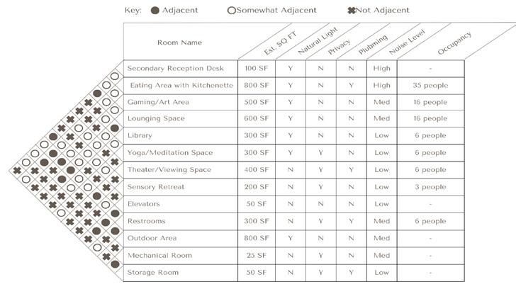
After analyzing the event map, I created an adjacency matrix.
Owners
Team Managers
Product Design
Engineering
Marketing
Accounting
Photography
Sales
Wellness Coordinator
Tech Support
Receptionist

Team Meetings
Cross-team Meetings
Company-wide Meetings
Client Meetings
Product Photography
Individual Work
Collaborative Work
Wellness Time
Social Time
Lunchtime

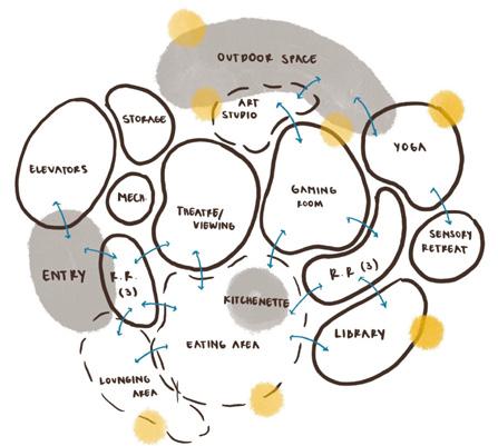
Once adjacencies were identified, I created a blocking diagram that evolved into the first set of test-fits.
These have a focus on maximizing natural light, managing acoustics, and fostering a sense of community.
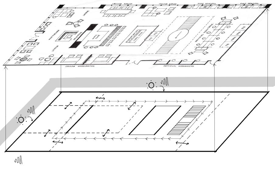

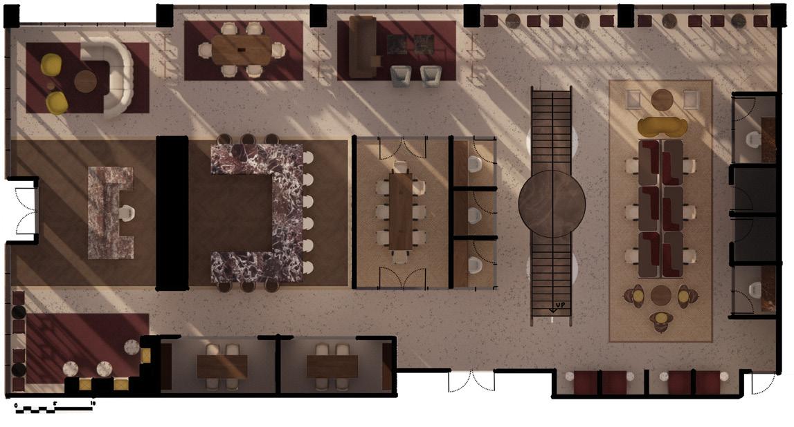
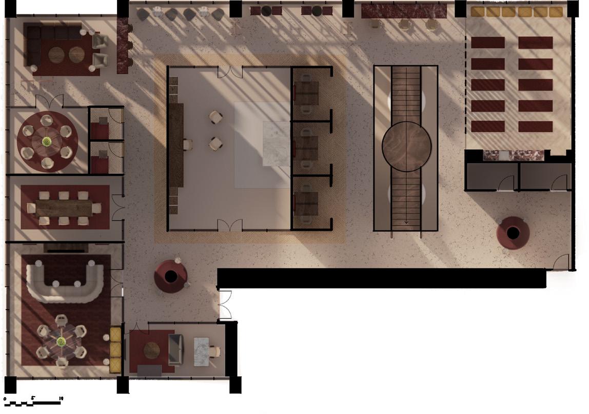
This floorplan puts community and collaboration front and center (literally!), to reflect the brand’s mission and vision. The main paths of circulation are located around social spaces to encourage interaction. Additionally, the materiality and color scheme reflect the idea of classics with a modern twist.
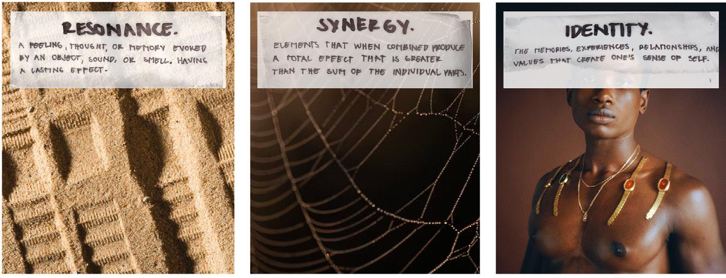

The idea of spaces that resonate with you came from the brand’s commitment to reimagining classics and crafting timeless pieces.
Central to the design concept was the idea of synergy. The rhythmic ticking of a watch and the parts of the pieces within Breda’s collections led to rhythmic patterns throughout the overall design.
BREDA pride’s itself in f ostering self-expression, and lifting the voices of creatives, making identity a priority. This presented itself through the feature of custom elements.

Upon entrance, BREDA watches will be displayed overhead to highlight that creativity and self-expression that is so integral to the brand. This will also give space for damaged watches to have a second life.
This display will be backlit to highlight the forms of the watches while creating reflections off of the metals. This will be visually interesting, functional, and space-saving.
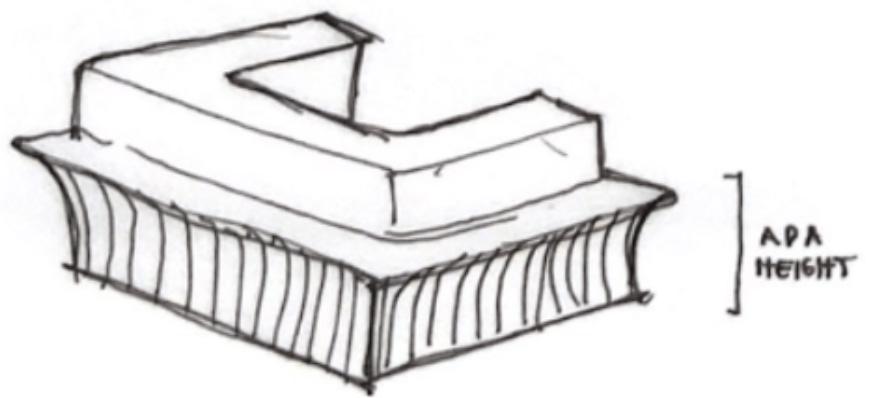
This custom desk design combines the classic forms of greek columns while adding a curvilinear aspect to speak to modern times. This approach directly reflects BREDA’s creative direction.
Additionally, it features an ocre stone that reflects colors that are often used by the brand.

Reception

This space is central on the main floor. This is a strategic move as it maximizes opportunities of interaction between team members in order to build a stronger community.
There are also four different break out spaces directly adjacent in order to prolong those desired interactions.


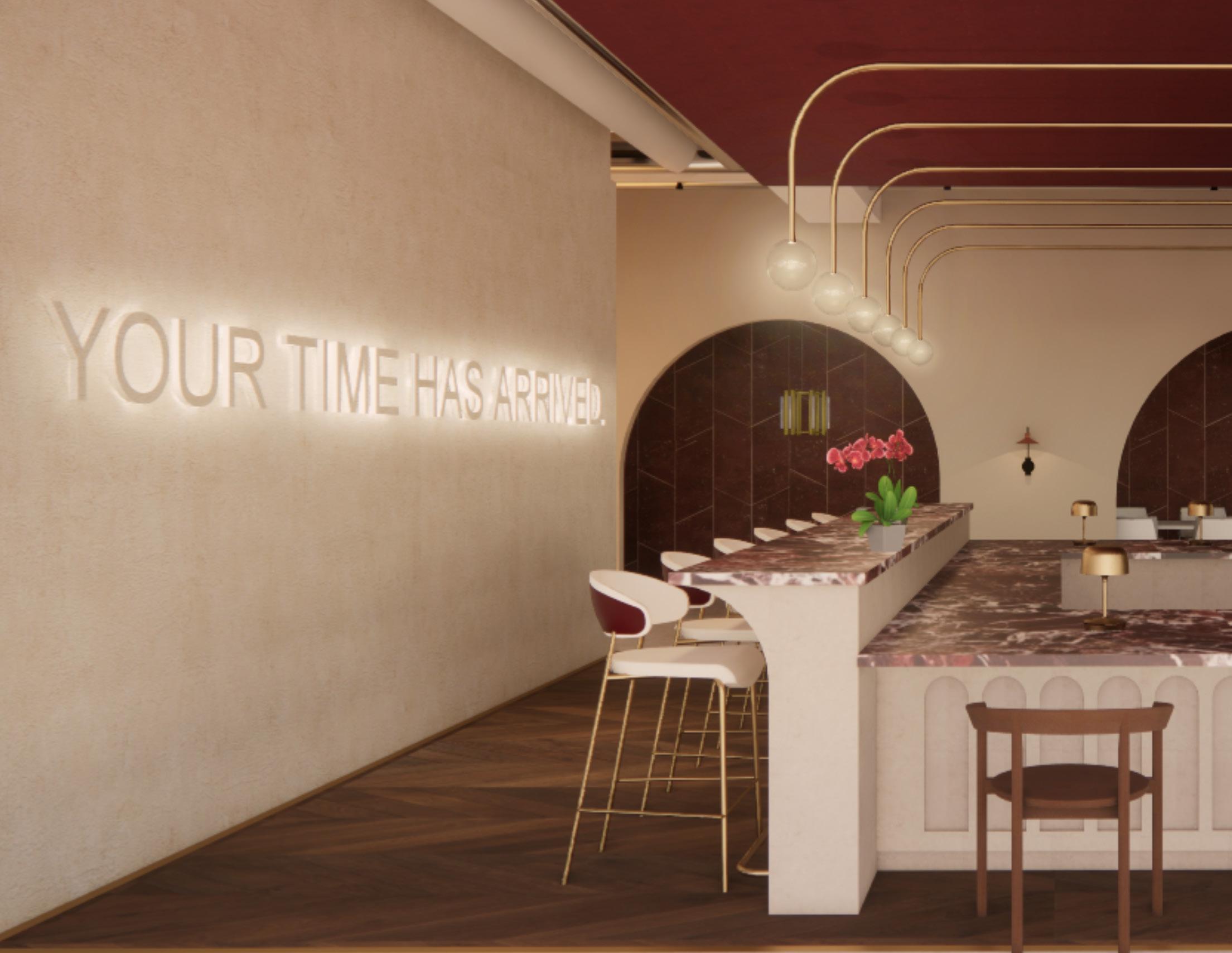
“Your time has arrived.” is a direct homage to the brand’s packaging. I took inspiration from the dust bag by utilizing the same material on the wall and letters, and backlighting them to create that sleek and seemless look.
The phrase itself came directly from BREDA as well.
Similar to the custom reception desk, the cafe design combines the classic forms of greek columns while giving them a curvilinear aspect. This reflects BREDA’s goal: the creation of modern classics.
This space also features a series of custom lights that create a modern feel while providing ample lighting. The overall form the lights create help in delineating the space without the need for walls , this speaks to BREDA’s commitment to embrace community.

When selecting materials it was important to embrace the idea of rythym, such as the ticking of a watch. Addtionally, these colors and patterns are directly related to those present on the brand’s website and overall image.

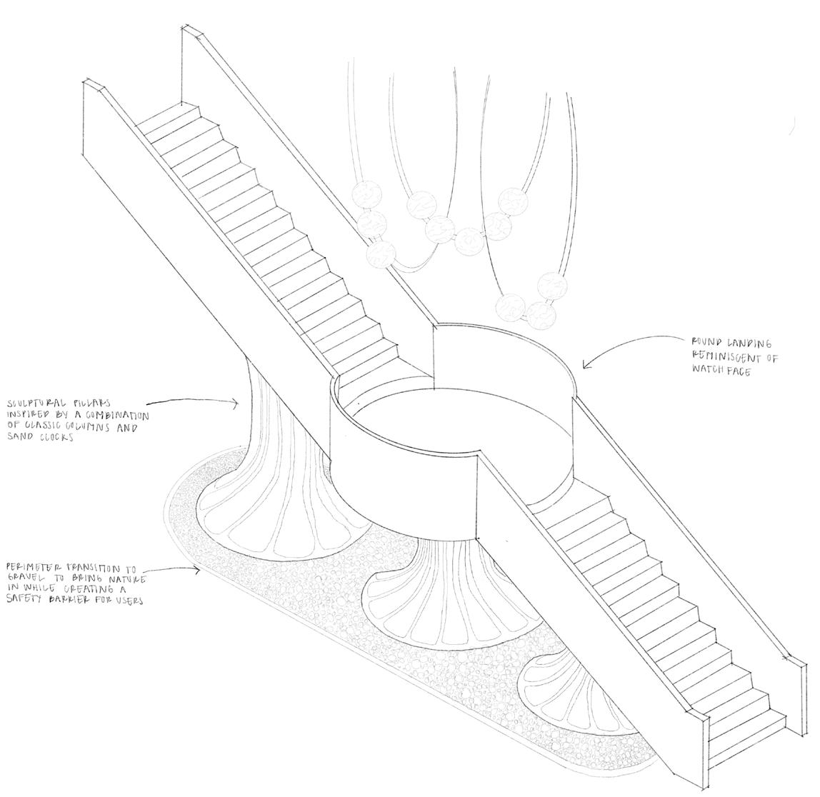
The staircase design for BREDA headquarters was born from the company’s deeprooted values—community, storytelling, and the seamless blending of modern and classic design
Drawing from this, the conceptual basis of the staircase combines the form of a classical column and an hourglass, both timeless symbols of structure and the passage of time.

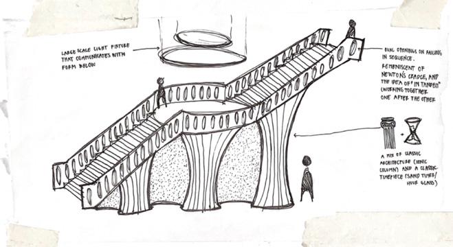
A striking feature of the design is its oversized, circular landing, which serves as a moment of pause. From a plan view, the form of the staircase resembles a watch face, a subtle but deliberate reference to BREDA’s core product .


The circular motif and radial flow evoke the precision, craft, and aesthetic clarity that define BREDA’s approach to design, turning the staircase into both a sculptural centerpiece and a brand storytelling device.

I took inspiration from the shape of the watch face itself on elements such as the mirrors in the yoga studio and the sconces in the conference room to hone into the identity of BREDA even further. In the wellness space, I decided to break up the mirror to create a sense of privacy for those participating as well as accentuate that idea of rythym.


Juliana Sanchez Duran
Savannah College of Art and Design julianasanchezduran@gmail.com