HUMAN CONDITION
Human Connection
belonging unity society posters satisfaction influence facial expression economy nature
family friends
Gender sexual orientation relationships words rights will
Dreams imageappearance vision expectations hope community espect conflict collaboration emotions media ads campaigns learn life characteristic

Color communication creativity expression steem self-disco
edom
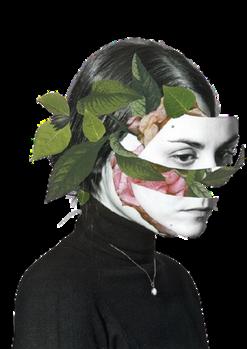
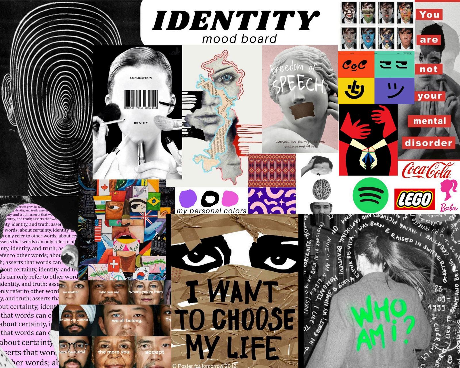
IDENTITY
childhood NEVER STOP GROWING actions knowledge music volunteer strength change values language potential skills trust
Memories concerts
Experience
trav countries culture tradition
Hobbies adventure activities
Religion be
As a new student in graphic communication, I started this project to build a basic understanding of the creative process. I began by looking at posters and designs based on the theme Identity and Human Connection, which helped me see how other designers show ideas visually.
To learn more, I also looked at other people’s portfolios, mind maps, and mood boards. This gave me ideas on how to structure my own work and present my thoughts clearly.
Creating the mind map was the hardest part for me. I wrote down any ideas I could think of, but I sometimes find myself being stuck. I found it hard to think in new or creative ways. I often think too literally, which made it difficult to explore and branch out ideas. This showed me that I need to work on thinking more creatively. Despite that, I was able to use a digital tool which is pixlr for drawing some of the graphic elements in my mind map. It is a way for me to practice my drawing skills and get used to the tool.
After the mind map, I made a mood board that visually explored how the theme could be expressed through graphic communication. For this part, I focused on different designs that resonated with me personally. This felt easier and more natural because I enjoy working with visuals and arranging design elements. In addition, I chose the images that made an impact on me and it is also how I see identity.
I chose to do the mind map first because I knew it would be the most difficult for me. It gave me more time to work on it. Overall, this task showed me both my strengths and the areas I need to improve as I keep learning graphic communication.
BarbaraKruger
(Born 1945) A groundbreaking American conceptual artist best known for her bold text-and-image works that challenge power, identity, and consumer culture.
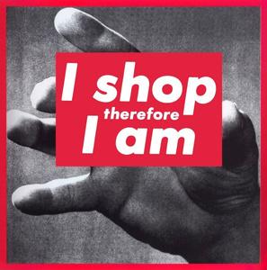
Before becoming an artist, she worked as a graphic designer for magazines like Mademoiselle and House and Garden, which strongly influenced her visual style. Kruger’s iconic red, white, and black artworks challenge viewers to question social norms and mass media. Her most famous work, “Your body is a battleground”, remains a symbol of feminist art and protest.
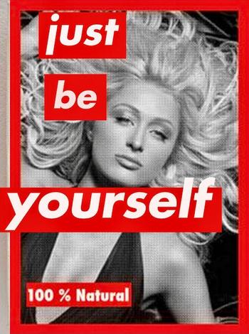
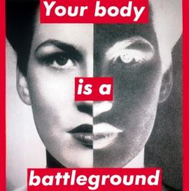
Barbara Kruger’s often explores how society shapes the way we think about ourselves and others. Kruger tries to say that we are constantly surrounded by hidden messages in media that tell us who we should be, what we should want, and how we should act. She wants us to stop and think critically about those messages, rather than just accept them. She gets this message across by combining powerful words with strong images. Her use of contrast, scale, and familiar advertising styles grabs attention and creates a serious, sometimes confrontational mood. Kruger’s art encourages us to look deeper at everyday things and question how society, media, and power affect our beliefs, choices, and identity.
This work features a black-andwhite image of a glamorous woman, styled like a fashion or beauty magazine cover. Bold red text boxes interrupt the image, displaying the phrase “just be yourself” in white lowercase letters. At the bottom, another red label reads “100% Natural”, which is ironic given the heavily styled and possibly edited photo. The image uses Kruger’s signature style influenced by advertising and propaganda design.
Kruger’s use of formal elements like color, noise texture, contrast, scale, and bold typography grabs the viewer’s attention. The red and white text boxes are placed purposefully over the face and body, both highlighting and interrupting the “ideal” beauty image. The work critiques society’s unrealistic beauty standards and the pressure to “be yourself” in a world that defines beauty. Kruger is likely questioning the truth behind media images and how they affect identity and selfworth.
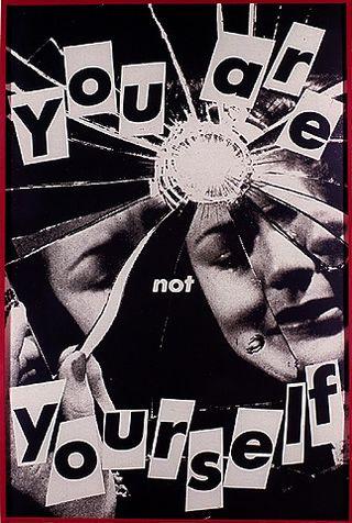
This work by Barbara Kruger shows a black-and-white photograph of a woman’s face fractured by a smashed mirror. The cracks break the face into fragments, so her identity looks split or unstable. On front of the image, Kruger has placed bold, cut-out style text that reads: “You are not yourself.” The words are big, uneven, and slightly chaotic, which makes them stand out against the photo.
The broken reflections and the collage-style text make the work feel unsettling and tense. This work is about identity and self-perception. By combining the shattered mirror and the bold statement, Kruger seems to be questioning how much control we really have over who we are. It could also be a critique of society and media, which often tell us how we should see ourselves. The overall mood feels confrontational and thought-provoking, making the viewer reflect on the pressure on personal identity. This work is similar as the other one as they both talk about identity and self-worth but with very different elements.
Her artworks are simple but unique and I was inspired when I noticed how attention-grabbing her works are. I think that is what makes her works strong because they grab your attention straight away. I do like her work because I am able to learn through them. Her works makes me think deeply and I feel i’m being reached out to. When I read her works, it reminds me of myself and the society. What makes her work powerful is that it looks a bit like advertising, but instead of trying to sell something, it makes you question yourself and the world around you. It does not feel distant or hard to understand. The phrases she uses are short, clear, and direct, making you stop and think. Her works stand out because they are visually striking but also meaningful, exploring different themes.
The key elements that I might borrow from the artist are colour, texture, and typography. I will also borrow some of her themes of fragmentation, truth, and contradiction. I want to try to play with bold statements that seem simple at first but have deeper, meanings when looked at closely while using visual techniques (contrast, symbolism, text placement, and color) to show how identity or reality can feel fractured.
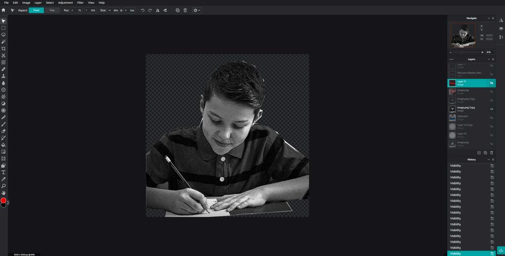
I then cut out the boy and made the image black & white just as Kruger’s works. I lowered the exposure, sharpened it a bit and I added noise to give it texture.
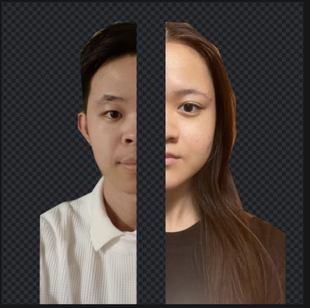
I searched online for a picture of a student to be my primary image and theme. This is how it looked like before I started editing.
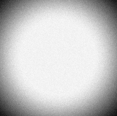
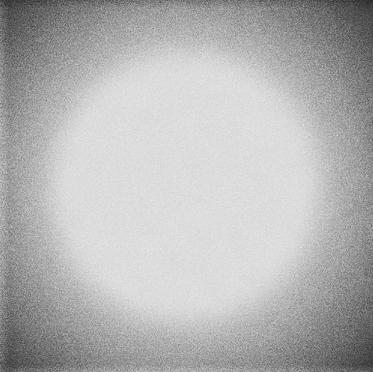
I moved on with my background. I experimented with two same white background but with different levels of saturation, vignette, noise, and exposure.
Response
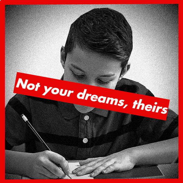
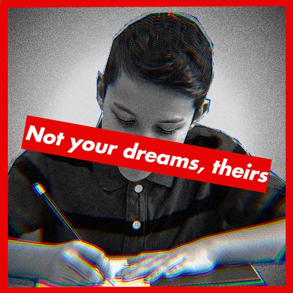
In my works, I used several visual techniques to communicate my message, inspired by Kruger. The image is in black and white, which creates a serious tone and draws attention away from distractions so the focus stays on the child and the message. I used the red borders and a red text box just like Kruger’s works. The placement of the text directly across the child’s face is significant because it symbolically silences or covers their individuality, suggesting that their own dreams are being overshadowed by others’ expectations. I chose the same bold white typography as Kruger’s which is Futura Bold Oblique. The composition, with the child centered and shown writing, emphasizes themes of schooling, pressure, and control. This act of writing becomes symbolic of being forced to follow instructions or pursue goals that are not their own. My work gives a a protest-like aesthetic that reinforces the idea: “Not your dreams, theirs.”
In this work, I added a glitch called fringe on the image of the boy because it gives an intense pressure in terms of schooling and expectations. I also decide to add it in my work because I thought it leaves an impression on the child and the mental awareness that children have because of what is happening around them.
Background B
Background A
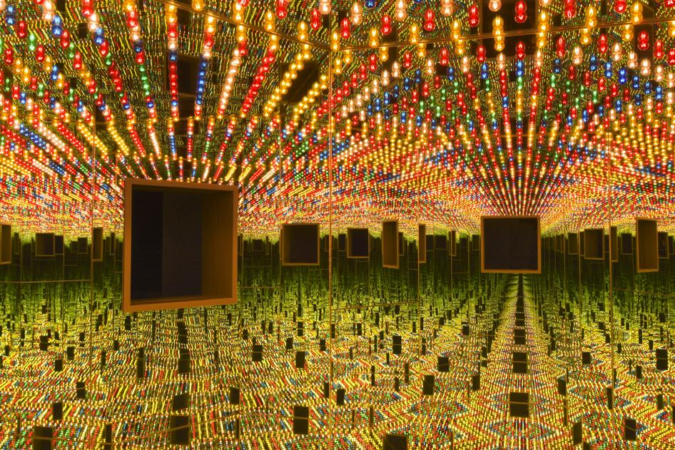
YayoiKusama
(Born 1929) A Japanese artist whose obsessive use of polka dots and immersive installations have made her one of the most influential and recognizable figures in contemporary art.
Her work spans painting, sculpture, performance, and large-scale environments, often exploring themes of infinity, self-obliteration, and mental health. Kusama began her career in Japan and later moved to New York in the 1950s, where she became a key figure in the avant-garde scene. Today, she is one of the world’s most influential living artists, with her Infinity Mirror Rooms attracting global audiences.
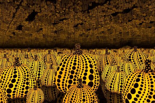
Infinity Nets
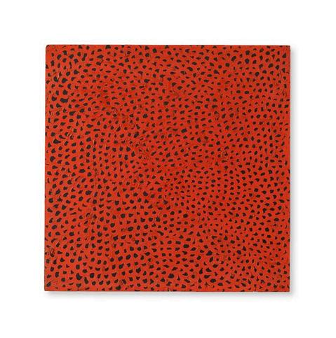
This is a large canvas filled with countless tiny, looping brushstrokes that form a continuous net-like pattern. At first they look calm and minimal, but the closer we look, the more detailed and endless they feel. Kusama uses repetition, rhythm, and 2 colors to create both order and intensity, while the small gaps between strokes suggest infinite space. The work reflects her ideas of obsession, time, and infinity, showing how simple marks can build into something vast. I think the process was both meditative and overwhelming, turning her personal struggles into an artwork.
Much of her work is about obsession and the attempt to make an overwhelming inner world. Her famous polka dots and infinity rooms are not just decorative patterns but symbols of her desire to break down the boundaries between herself, others, and the world. Kusama often explores how the self can feel both small and limitless when placed within endless repetition. Her mood ranges from playful and dreamlike and almost claustrophobic, reflecting both wonder and anxiety. Kusama tries to say that art can be a way of coping with fear, obsession, and personal struggle, while also experiencing connection. She communicates this through bold use of pattern, color, repetition, and immersive spaces that physically surround the audience. Her works invites viewers to step inside her vision and reflect on connection, identity, and wonder.
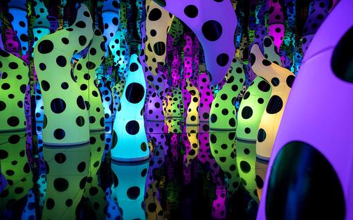
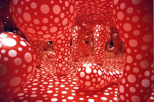
Dots Obsession
This work by Kusama shows an entire room covered in red and white polka dots, with large organic shapes rising from the floor and hanging from the ceiling. The mirrored walls multiply these forms endlessly like a living landscape. The shapes are strange, resembling oversized roots or fungi. Kusama uses strong visual contrast with the bold red background and white dots. Repetition and rhythm are the key design principles, as the polka dots cover every surface evenly, blurring the difference between objects and space. The use of mirrors transforms the room into an infinite environment where there are endless boundaries. By turning simple dots into something overwhelming, she makes us think about infinity, transformation, and how repetition can change the way we see reality.
Her work shows how simple elements such as dots, repetition, and scale, can communicate ideas. Her installations inspire me to experiment with pattern and space to express personal feelings in a visually powerful way. Through her works I can feel her identy and what she wants to protray. In addition, her works are memorable which gives a clear visual identity.
In my own work, I want to borrow Kusama’s theme of infinity and repetition, using pattern (dots or a different shape) to show how small, simple ideas can grow into something powerful.

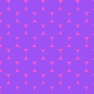
Since I am feminine, I decided that pink will be my background colour.
I used these colours except for black because I thought that it was not appropriate for me.
I then manually created a mediumsized purple circle. I repeated it, filling up the negative space that produced a sun or glass like shape.
The hard part was organizing the position of the circles because it would create an imbalance if the circles were not in line.
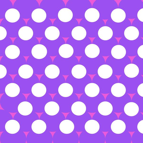
In this work, I added white circles in the middle of 3 purple circles, and I eventually created flowers. Flowers also symbolise femininity and innocence. I chose this design, as I really like the simplicity and the visuals.
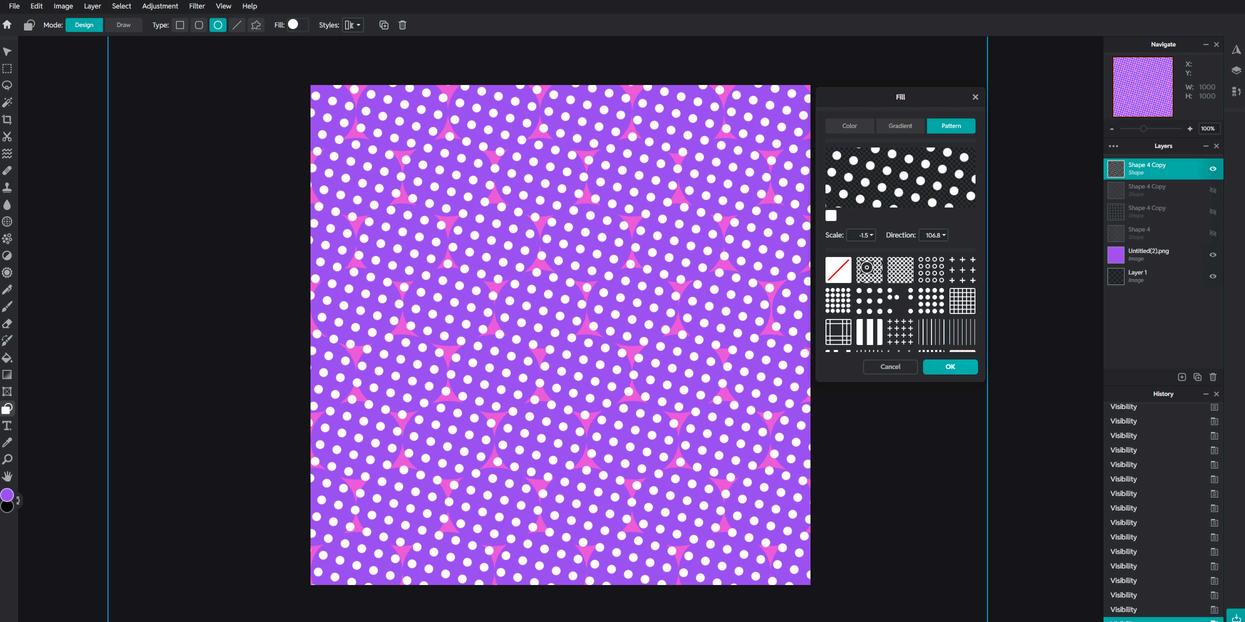
I wanted to add more dots, but manually adding them was tiring, so I explored my application and saw a tool that I can use to create infinite shapes or patterns. I added it over my design and slanted them a bit to create symmetry and balance.
The key techniques are pattern and repetition through the use of bold geometric shapes. I combined circles to create a rhythmic, eyecatching surface design. The use of symmetry and alignment gives the pattern balance and structure, while the bright colours make it visually engaging. There is contrast because the white circles stand out strongly against the purple background. This also gave my pattern an orderly and harmonious look with my use of symmetry and alignment. Overall, this work was successful because it demonstrates how shapes and limited colours can be arranged to produce a dynamic composition with a never ending pattern.
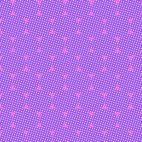
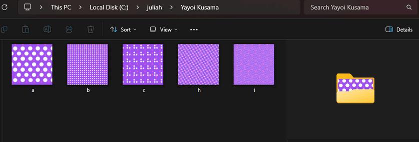
The difference for this work is that there are infinite number of small white dots that cover the whole design and background, in a slanted way. My goal for this work is to show how simple and small geometric shapes can build into something vast, just like in Kusama’s Infinity Nets.
The personal colors that I had chosen in my works, creates a strong contrast and adds a playful, vibrant mood that mirrors my personality and identity.
I experimented with the white dots and chose two designs that fits best and are visually appealing. other designs
I first made a draft of my idea that came to my mind, based on Kruger and Kusama.
More
Responses
I then added the infinite or repetitive dots to cover my background as a symbol of endless boundaries.
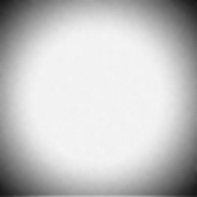
I took a white background and adjusted the vignette because I like adding emphasis on the center. I wanted it smooth so I edited it as it is.
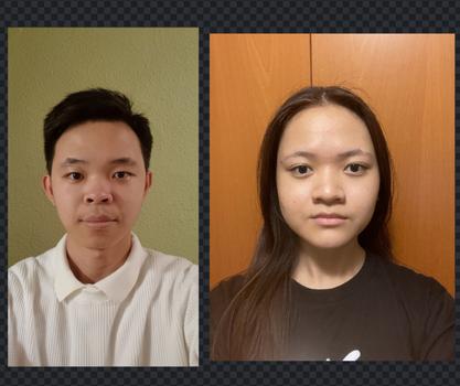
Separate pictures of me and my brother
Edited in BW, lowered the exposure, sharpened a bit, and added grain & noise.
I noticed that it was not visually appealing to have the shoulders short or cutted off, so I spread them out on both sides, in order to maximize the space.
My work needs improvement because it would be better if I took more pictures or figured out a way to align myself with my brother’s face. It is not balanced, and it's quite obvious.
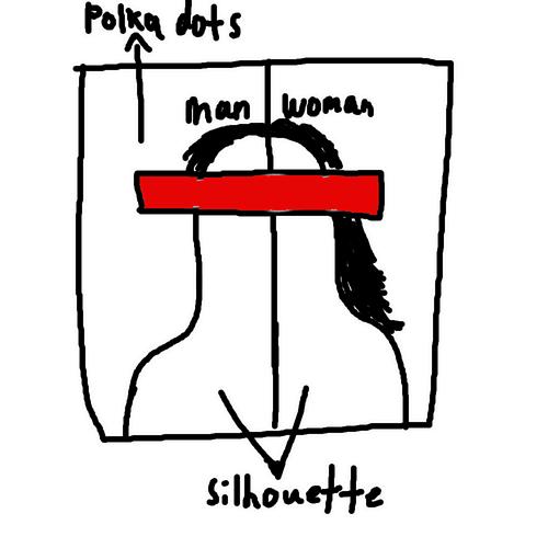
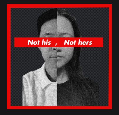
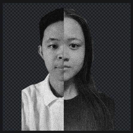
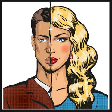
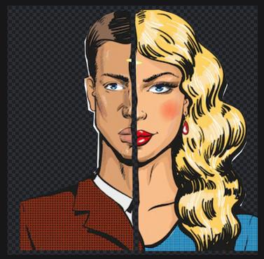
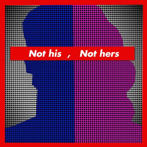
In this first work, I used a photographic collage style combined with halftone texture to highlight the contrast between male and female identities, while also suggesting their merging.
Idecidetomake2
separateworksusing realpeopleandan imagefromthe internet.Italso containsthesame stepsbutindifferent styles.
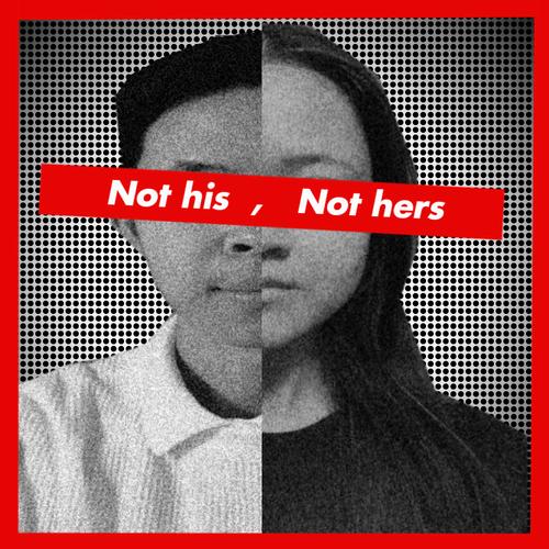
These two works explore gender identity and breaking binary labels, shown in the phrase “Not his, Not hers.” I placed the text across the eyes to symbolise blindness and ignorance to stereotypes. Using different styles; one realistic and the other abstract I combined contrast, colour, and text to challenge fixed ideas of gender. Together, the works show how the same theme can be expressed in multiple visual approaches, emphasising that identity cannot be limited to one category
In this case, I lowered the saturation or lightness of the images to the max, to create a silhouette.
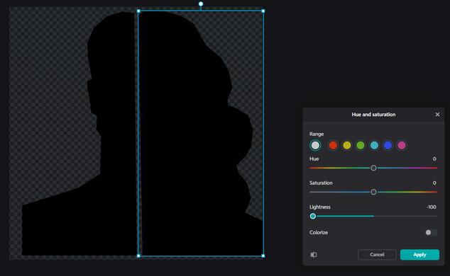
In this work, I moved to a more graphic, pop-art inspired style, using bold colour (blue and pink) and silhouettes to symbolise gender stereotypes in a simplified way.
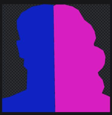
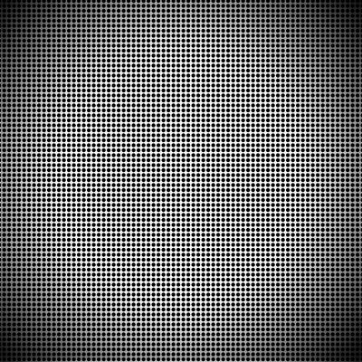
I layered the repeating dots over the silhouette to show how people are often seen as part of a pattern or category, instead of as individuals. By doing this, I wanted to suggest that identity is more complex than the surface patterns we place on people.
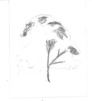
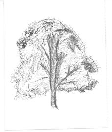
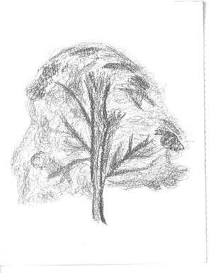
I saw this tree in my neighborhood, and I decided to add it to my portfolio because it also reminds me how “nature” as a metaphor can shape our identity.
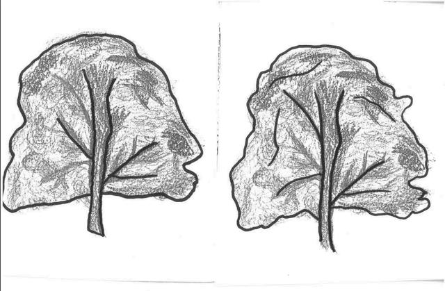
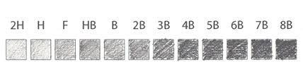
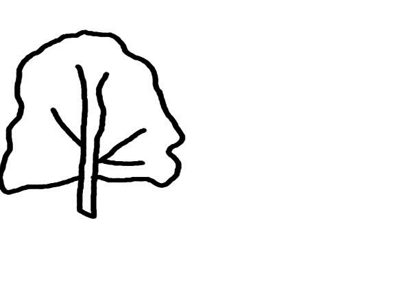
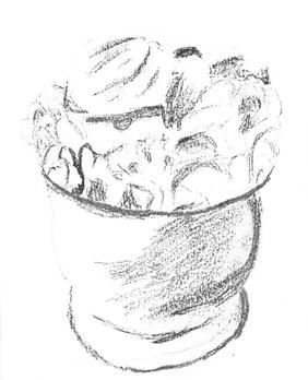
I used the pencil grading scale to do my observational drawings. I started off with HB, 2B, then 4B as the darkest. Smudging helped create the effect and texture of the tree. I then used my marker to draw the 10-line version. I simplified it in a vector layer for the final icon. This icon successfully communicates the object because of its clear structure of a tree.
Airpods are a symbol of my hobby because I always listen to music and I bring it with me wherever I go.
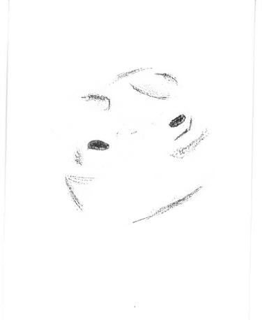
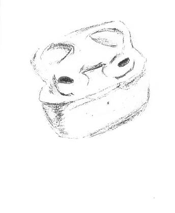
In this work, I began with an observational sketch of wireless earbuds in their case, focusing on line quality, form, and shading to suggest depth. I used hatching to capture the 3D structure realistically from different angles. I used the charcoal pencil from light to dark shade. After this, I did the simplified 10-line version, and then by removing detail and emphasising the contour lines, I made the final 5-line icon. The final vector outcome transforms the object into a stylised, cartoon-like character. This process demonstrates my ability to move from realism to stylisation, using drawing to reimagine ordinary forms in a more playful way.
Drawn From Life, Rooted in Identity
I am not that satisfied with my icon outcomes because the lines do not look as smooth as they should be. However, with Clip Studio Art, I could edit the vector lines and adjust the curves. Overall, it was easier to only use 5 lines to capture what makes the object recognisable.
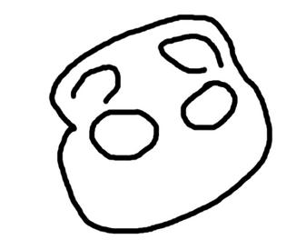
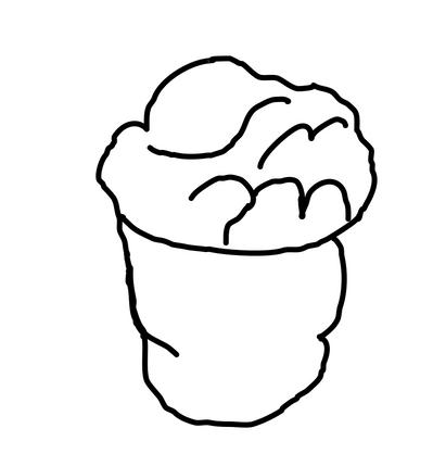
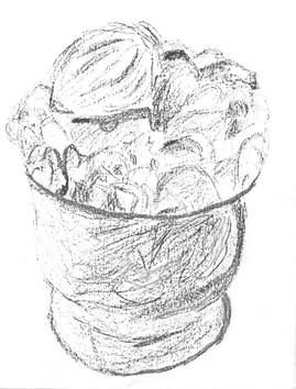
My favorite dessert from the Philippines is called “halo-halo”. It is part of my identity because I grew up eating this dessert and it always made me feel at home.
I did the same technique as the tree, but the difference is that this work has more detail, which was challenging to draw. What I did is that I increased the stroke on the left side of the cup and added a subtle shade on the right side. I gave subtle shade on the toppings as well. I also drew rough strokes, giving the cup texture, instead of it being smooth.
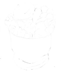
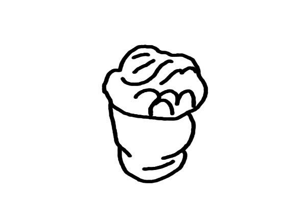
10-line version
5 line version
final icon
final icon