Typography: GRA3225C
T
Typography as Form, Information, and Meaning
by Jules Bonifay
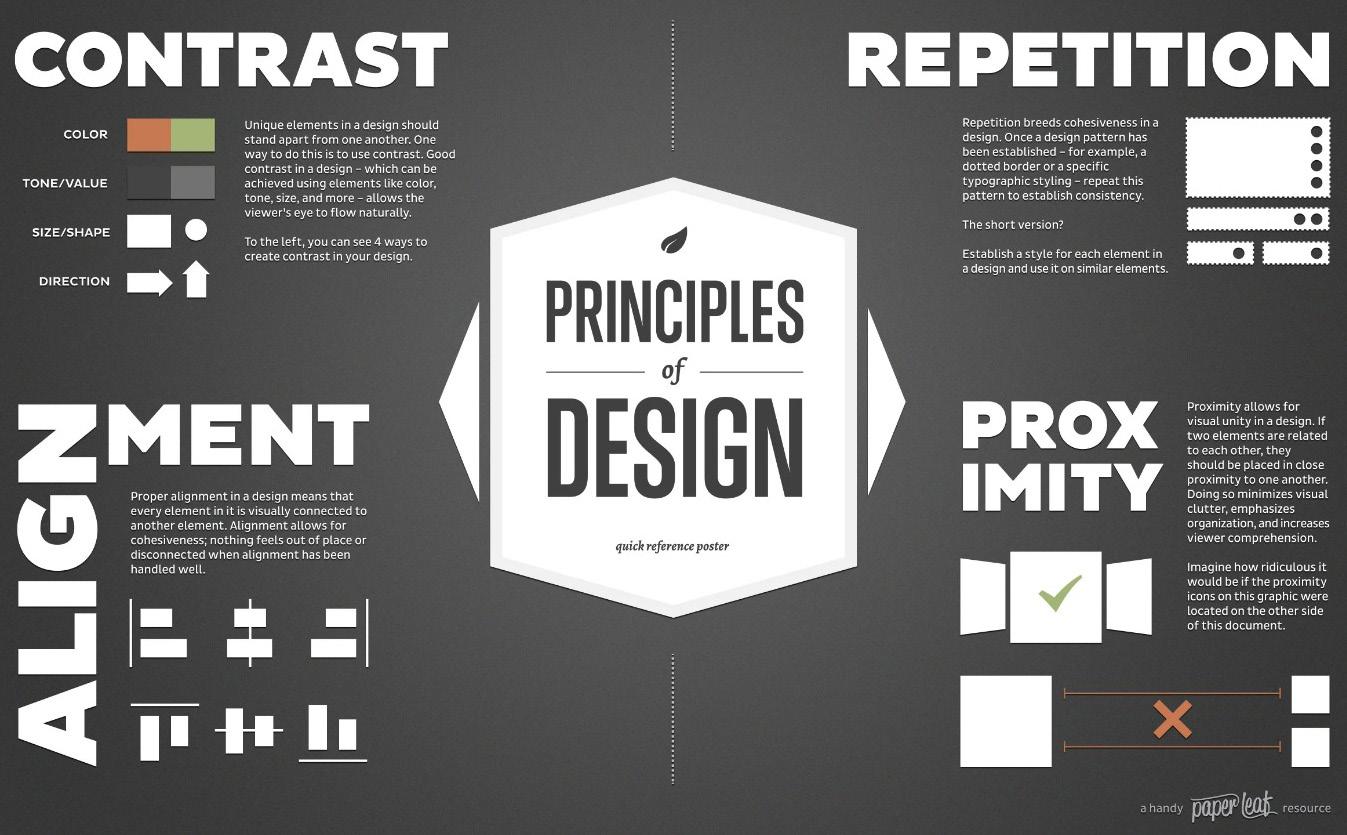
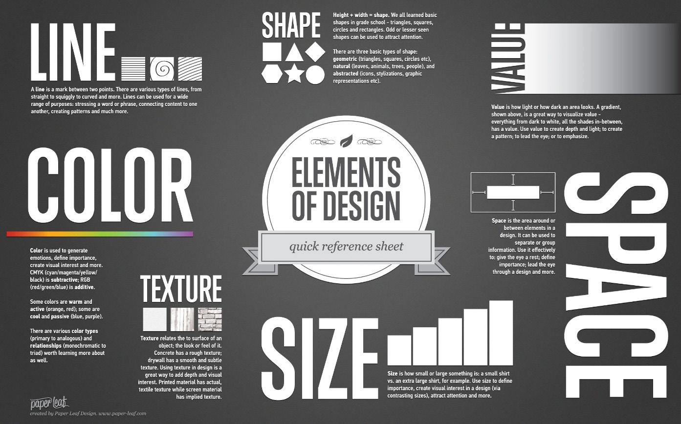
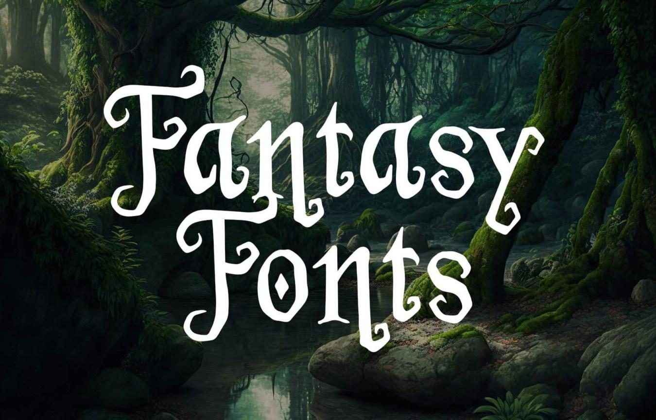
Fantasy books span across many topics but the style follows a specific pattern each time. It’s not often that this criteria is changed but with countless sub genres of books in the publishing world nothings impossible. The typical style you’ll see is a serif font with decorative ornaments used to give the font more character. There’s also a large chunk that use a silver coloring or metal look on the letters themselves. The majority of these examples I’ve selected follow these common trends applied to designing a cover for a fantasy book. Although the main focus of this book is to deep dive into the typography itself, it’s important to understand why these design choices were made. There are a multitude of steps involved in getting a cover ready to print and the font is just one of the many moving parts of the system. It’s always important to keep the elements and principles of design in mind when you start a design. These core fundamentals are easy to fall back on when something isn’t working in the overall composition.

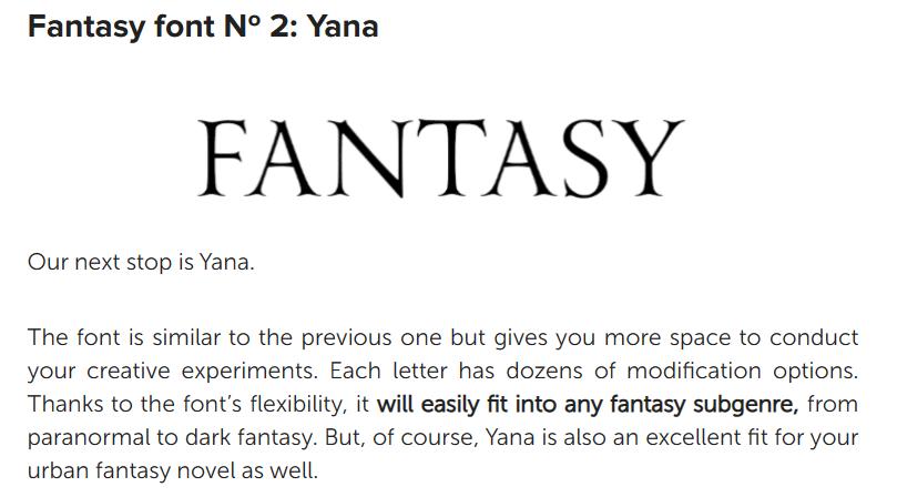
Most of the type fonts you see are some variation of these 5 but obviously not limited to them. These have been fine tuned to be used as they are or with some minor adjustments to fit the books specific title. In 1 the font is exaggerated with the extending strokes and curves. In 2 you see more of a standard use of serifs that have a bit of curve on each foot, swash, arm, and etc. Other than the serifs the style is mostly angular and follows a specific guide to how the letters work with each other. On 3 the letters are manipulated and skewed in varying lengths on the stems and strokes.
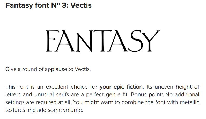
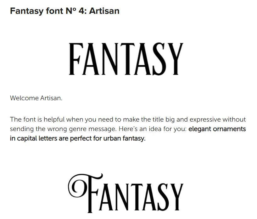
For the 4th font the serifs are still present but the letters are more condensed. The x-height is also taller it seems. As shown it is also easy to add decorative ornaments to letters that fit for the title of the book. With this font it’s up to the designer to make the call on where the font needs changes on specific letters so that the title doesn’t become crammed together and difficult to read.
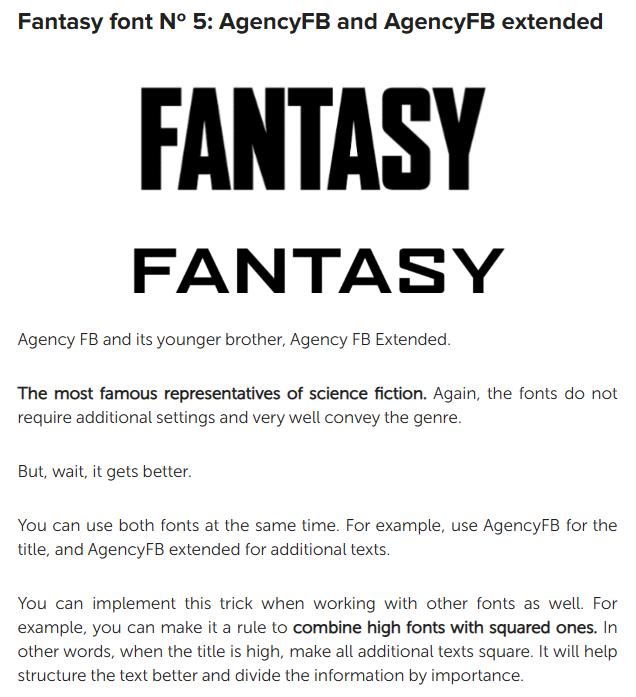
For the 5th in the top 5 a sans serif font is used. Although it breaks the unspoken rule that serifs are primarily used it does represent a sub genre of science fiction. With this font is can be used for more than just the title. When used as an extended variation it can be used for subheading.
Editing Fonts
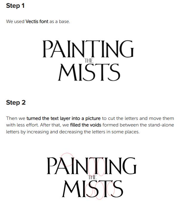
In these photos you’re given step by step instructions on how to edit a font in a way that eliminates the negative space the font has naturally when typed out. When starting this process it’s good to note the major eye grabbers that you see and want to fill. In this case the red circles show you those gaps. After making note of them you can begin to manipulate the letters individually so that the negative space is minimal.
Once they are to your liking you can look for other points of tension that stand out such as how the T and S have a tension point that is then eliminated by connecting the two into a singular stroke.


Serifs In Fantasy
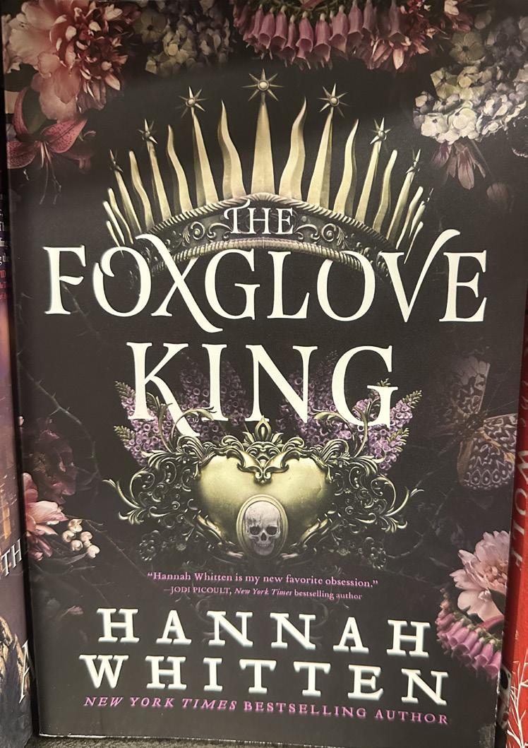
Serifs are the most commonly used style of font when it comes to the fantasy genre. With examples like The Foxglove King by Hannah Whitten you see this loud and clear. There’s no shortage of stylization done to the letters individually as you see the X has been stretched beyond the normal. Additionally you see this done on the V and K with the K in king being on the more subtle side as it is covered partially by the
design below it. The O in Foxglove also has a break in the natural flow of the circle leaving it with a more memorable touch to it

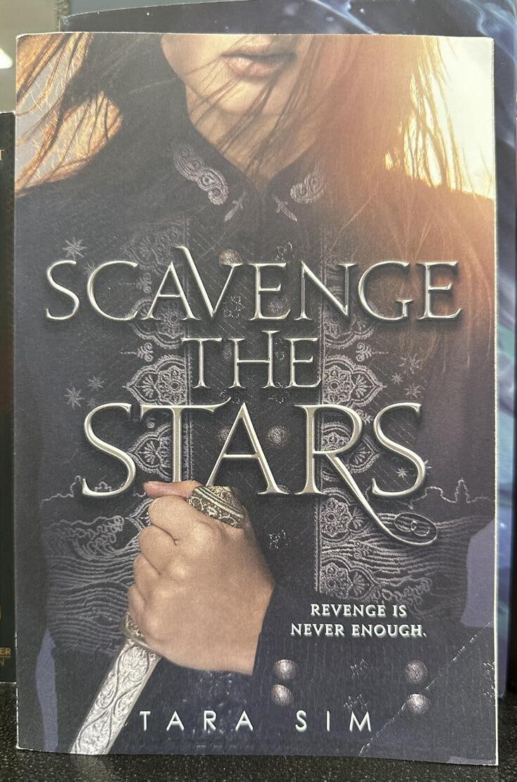
For the book These Violent Delights by Chloe Gong the same use of serifs is applied here. There are the elongated letters and in this case you can see how the type design was manipulated even more. Certain letters are brought closer together to fill the negative space more efficiently. If you look at the L and E in Violent of the title you can see where the E was brought up higher and fitted into the shape of the L so that the chunk of negative space is eliminated. The first E in the word These also does a similar design where the E is fitted into the S beside it. Scavenge The Stars by Tara Sim is another example that is similar to The Foxglove King. They both have the letters manipulated in some way by lengthening a portion of a stroke of a letter. You could argue that the T in stars is manipulated on the serif itself. When compared to the T above it you can see the t is even on both sides of the cross stroke but in the word stars the T is angled on the cross stroke. If you look at the word the in the title you can also see the stem is extended in the letter H on the right side of the letter.
 Sorcery of Thorns
Lady Smoke
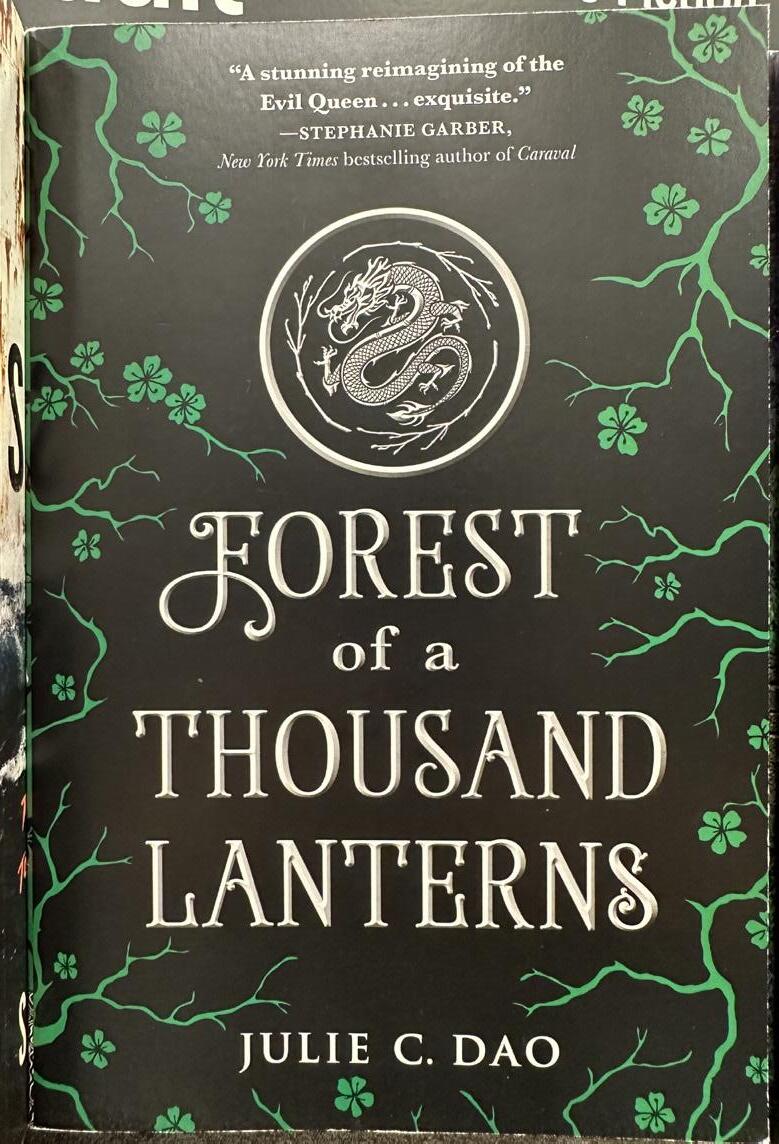
Forest of a Thousand Lanterns
March’s End
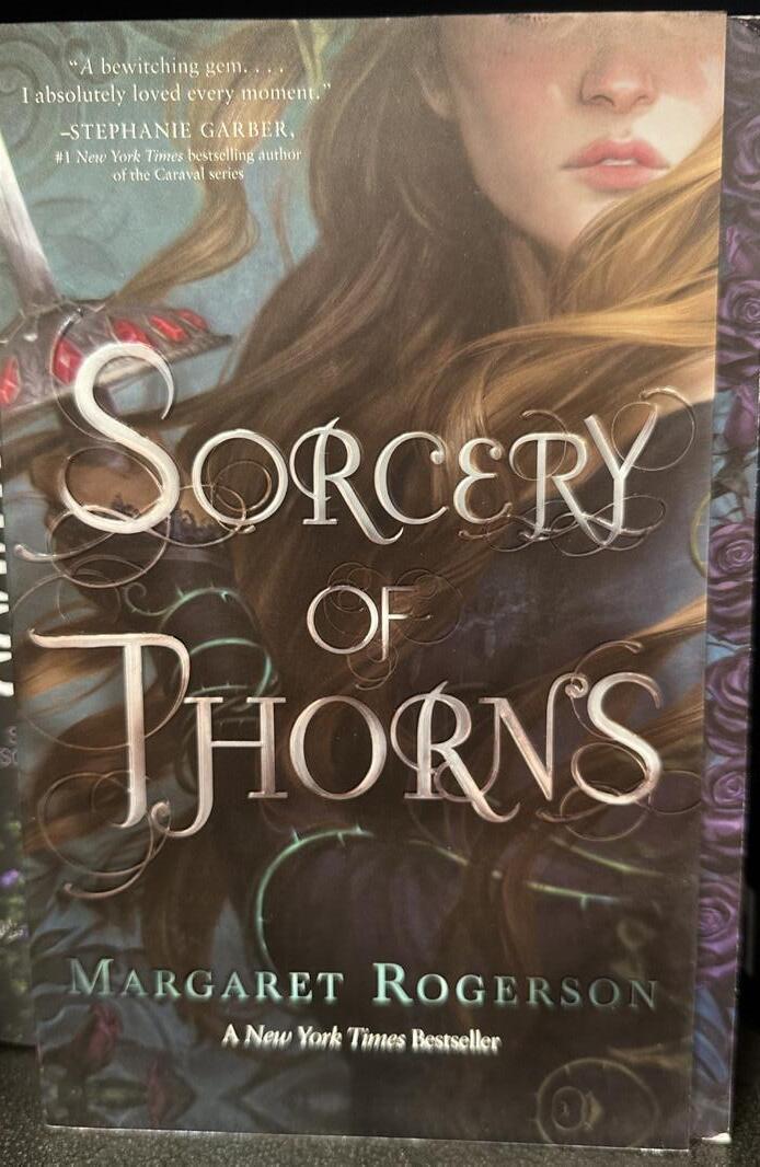
Sorcery of Thorns
Sorcery of Thorns has serifs following the unspoken rule of using them in the title. This style however almost has a script like feel to it. There are stylized ornaments coming of some of the letters such as the T,R,N and H more noticeably.
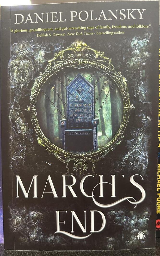
March’s End
In the title for March’s End there is minimal modifications done to the type but they are more bold and noticeable. You can see the decorative ornaments coming off of the H and flowing into the S and the E in end being stretched under almost underlining the word.
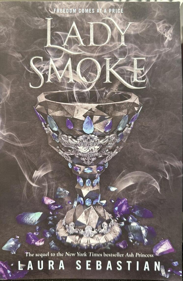
Lady Smoke
Lady Smoke has a mixture of the 2 previous examples in that it is a serif font but has script like features as well. The L and K being extended out almost direct the eye along the words as you read which can be helpful when you want the book to stand out against others.
Forest of a Thousand Lanterns
For the Forest of a Thousand Lanterns serifs are used but the serifs themselves aren’t the normal pointed style you usually see. They have a more curled look and don’t appear as rigid specifically in the foot of the letters which have a curved foot that doesn’t sit flat.
The book Sister of Starlit Seas by Terry Brooks is a great example of how manipulating the letters can be appealing on the cover. Each letter is carefully adjusted so that it can fit into the letter beside it while still remaining readable at a glance.
Here you can see how the T was made taller so that the cross stroke can sit above the S and A comfortably.
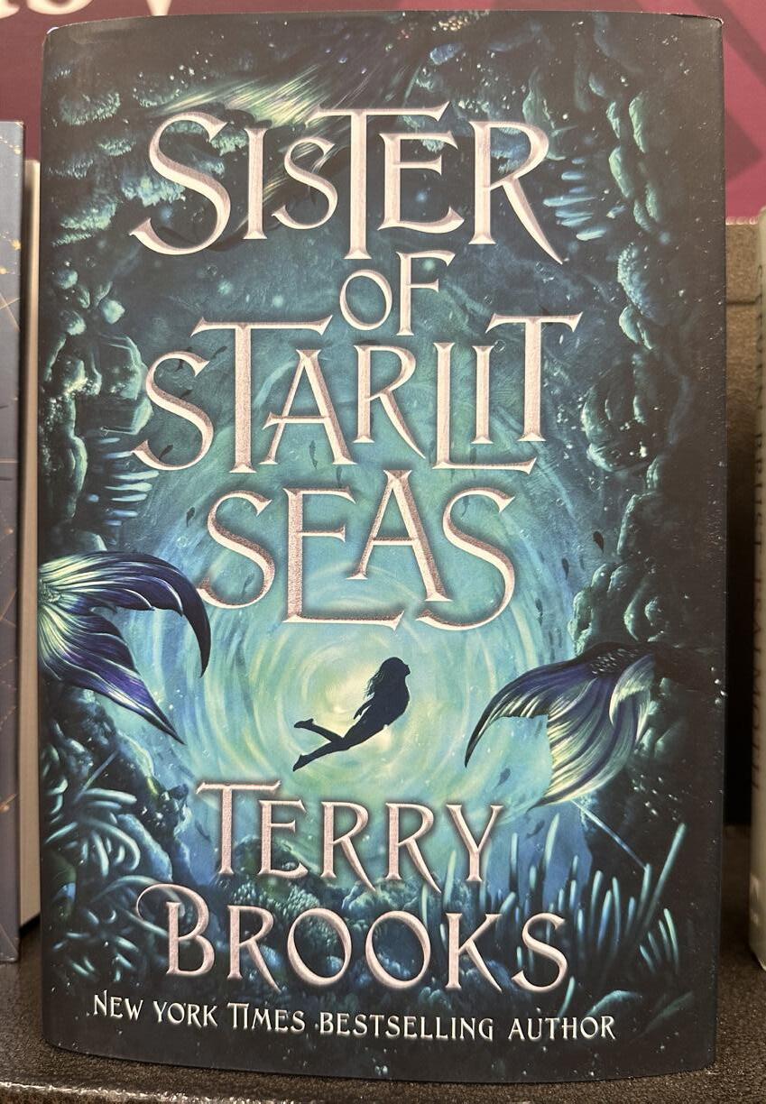
Here the A has a longer stroke on the right side but is also placed slightly higher so that the E and S can frame it along the bottom.
For the authors name on the front it shouldn’t be the main focus so there is limited editing done so that it doesn’t distract from the title itself. There is some small modifications done to the B but it is done in such a way that it looks as though it was originally like that.
The design for the E here extends under 2/3 of the A without meeting the S so there is equal space like the rest of the letters have to eliminate tension points.
The T here creates a rule essentially for how it is manipulated to fit text later in the title in the word starlit which uses the same method to fit the letters together

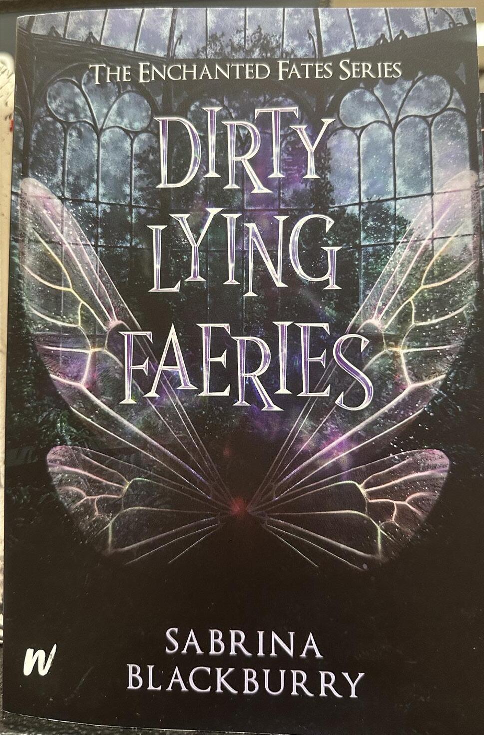
Dirty Lying Faeries
By Sabrina Blackburry
For this cover the title has varying heights for each of the letters. Doing this helps with the movement on the page and visual interest. It also plays into how faeries are known for their mischievous personalities and somewhat wicked sense of humor. Having the letters jumbled leads into the chaotic personality of what the book title says and what the content might involve. Using font as a way to describe the content of the book can also be a useful marketing tool when trying to gain an audience for your book if you aren’t a well know author yet.
Curious Tides
By Pascale Lacelle
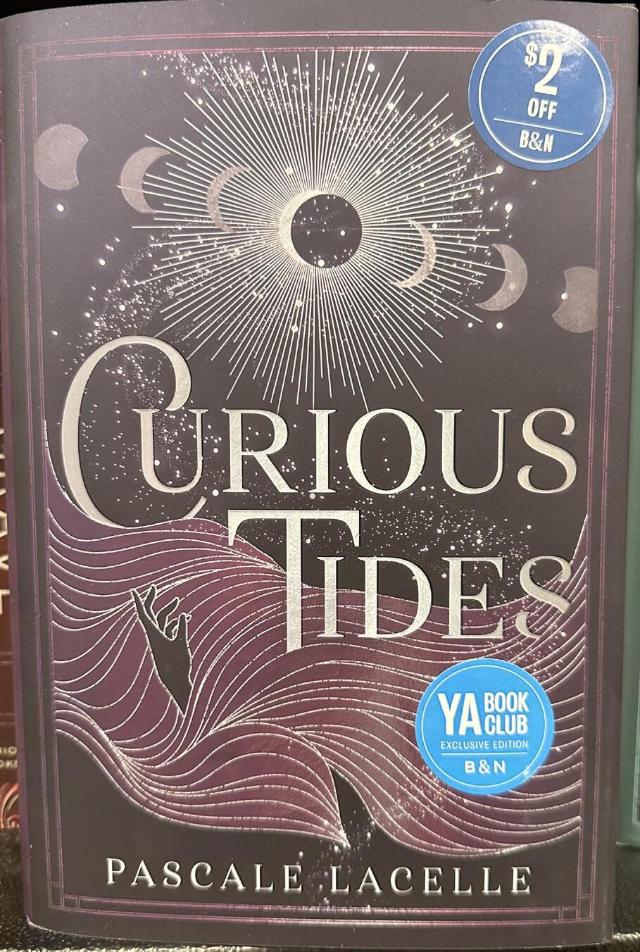
For the book Curious Tides by Pascale Lacelle there are some adjustments made to fit the font into the first letter on C and T. Almost like they are holding the rest of the word. The way the C curves also helps the tone of the book by looking fluid in motion considering the title involves the word tides. Rather than having the text lay directing on top of the cover it’s intertwined into it and has some portions covered giving it depth. Having the title in the silver also ties in the covers details while still being bold enough to stand out against the silver accents used in the design.
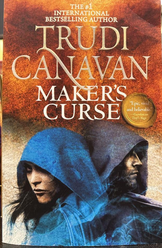
In this book cover of Maker’s Curse by Trudi Canavan, the focus isn’t necessarily on the title. Here you see the authors name in a larger font size than the books title. This is done sometimes when the author is more well known and uses the name as a marketing technique for selling books. Having the name larger and done in the same style gives it an easily memorable look that can be picked out on a shelf by someone who enjoys that authors books. The stroke on the N in the last name Canavan is similar to a signature. It connects the N and T and almost becomes a design of its own.
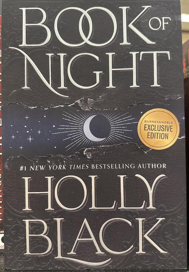
Another example of an author that has their name in a larger font size is Holly Black. While this cover uses a similar technique its using type hierarchy differently by still having the books title along the top. The font size appears to be the same also rather than having the author name overpowering the title. Even though someone might not know this author seeing it in this style can be more memorable than having the authors name smaller. Once again this create a signature of the sorts and having the stylized L in the name gives it a unique touch that be spotted on shelves of varying bookstores.
In Jim Butcher’s The Olympian Affair you get a taste of the same style of having the author name larger and placed at the top of the cover. With the design cover having the swords point up creates nice visual movement. The font uses the traditional serif style and only uses different font sizes to differentiate the importance of each bit of text on the cover. The series name having the lowest visual hierarchy as it’s only meant to be informational towards the book so you know it’s in a series. The same concept is applied to the #1 New York best selling author portion of text thats smaller at the top of the cover. Although it is relevant and important information it’s not meant to be the first thing you see on the front.
The Olympian Affair
By Jim Butcher

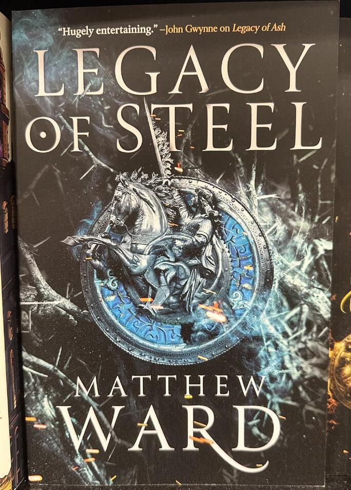
Legacy of Steel
By Matthew Ward
The focus on this book cover is the title but is followed up with the authors last name in terms of visual hierarchy. At the lowest of hierarchy you have the small text at the top of the cover. This is a more subtle way of referencing a book is in a series. You get a small, short and concise review of the previous book in the series. Typically this is followed up with more reviews that are paraphrased on the back giving highlights with descriptive words. The yellow/gold font being used at the top is a bit different that the rest of the color pallete which helps it stand out even as small as it is. However the background is black so using a noticeable color isn’t completely necessary to have bold contrast.

Anatomy
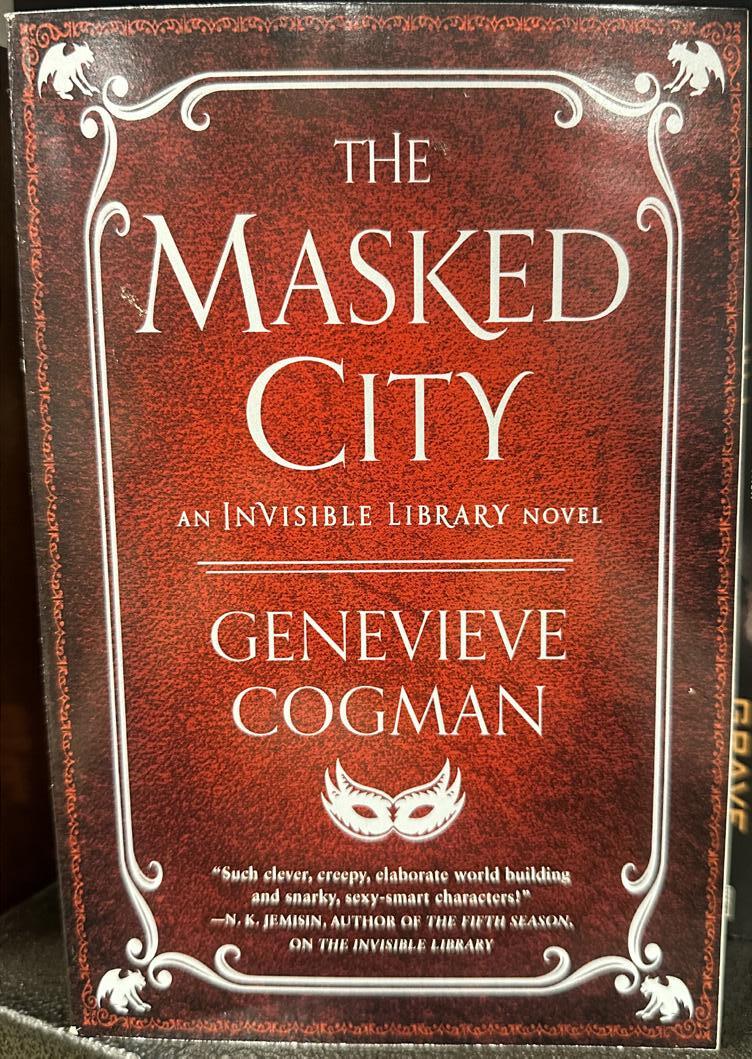
While some fonts can be design to be used as is, it’s sometimes helpful to modify them in some way to give the cover more visual interest. On The Masked City by Genevieve Cogman you can see how the leg of the K in masked is extended past the descender height. the M and C at the beginning of each part of the
title is slightly bigger. Doing this gives it the appearance of how it would look if lowercase were included in the title.

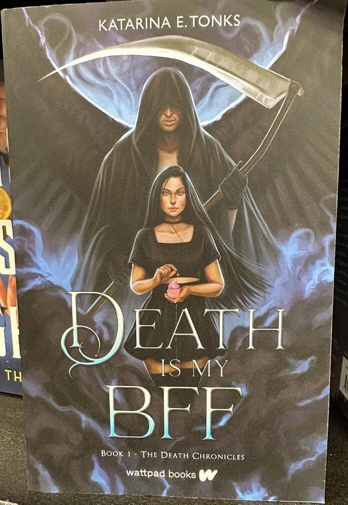
The cover of The Last Dragon King by Leia Stone is done with the more popular serif style and like most others in all caps for the text. Having all caps allows the potential buyer of the book to read a typeface more quickly. This font style used is not heavily modified and in fact appears to be used as it was designed. It does however have thinner strokes on some of the letters that give it a nice variation of weight on each word. For Death is my BFF by Katarina E. Tonks you also have thinner strokes on the letters. You also get a decorative ornament coming off of the letter D in the title. the serifs in this font all seem to look standard and sit flat on the baseline of the text. It pairs well with the sanserif font used for the authors name at the top of the cover.
The City of Dusk
The Midnight Kingdom
By Tara Sim
 By Tara Sim
The City of Dusk
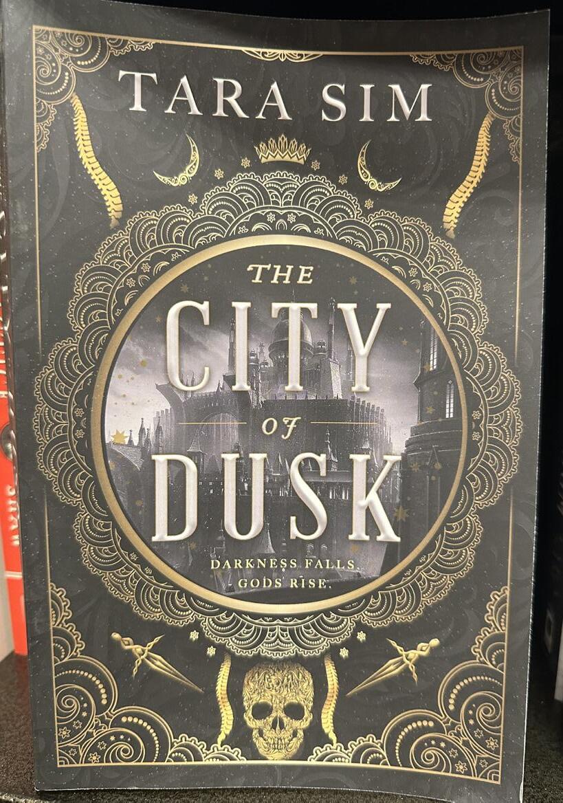
The City of Dusk by Tara Sim has a specific style for the series. The center text is encased into a circle that doubles as an image behind it. The gold design work surrounding the center allow the font in the gray/white stand out against the cover. There’s also a frame around the design that extends only on the sides where the circle breaks those barriers emphasizing the title itself.
The Midnight Kingdom
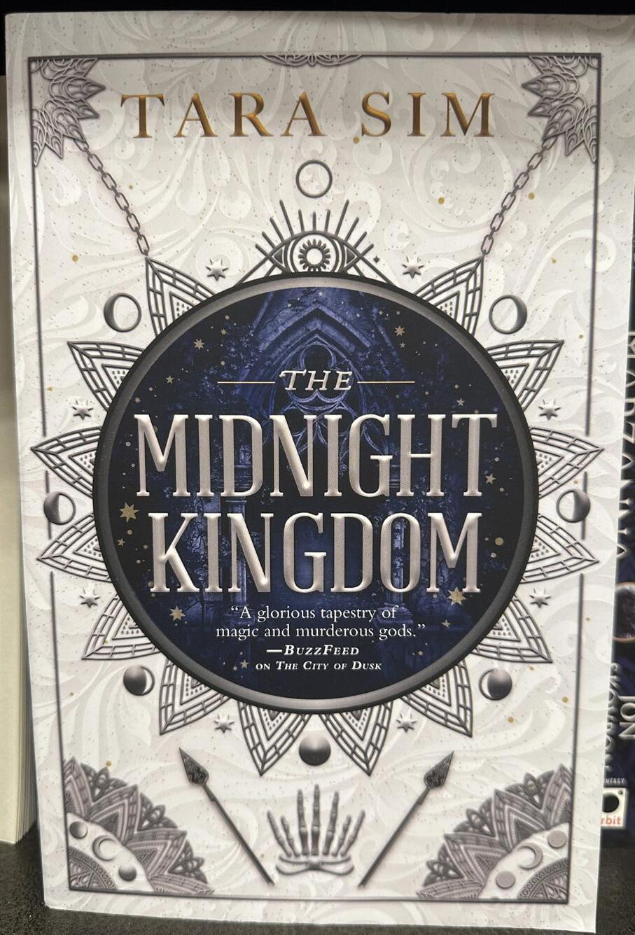
Following the theme of the series the second book in the installment has the same general layout with some decorative design changes. There is also a color pallete change included. Having the same font style and design allows a potential reader an easy way to spot the second book on the shelf just by layout and type alone. This creates balance across the series as a whole and develops a style specific to the series.

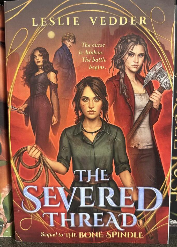
This book cover goes with a main character as the central focus and a contrasting colored font along the bottom half for the title. With this style of a cover you want the characters to have the same emotions as the font. The characters appear to be ready to fight so having a more pointed serif style font is key to matching that tone.

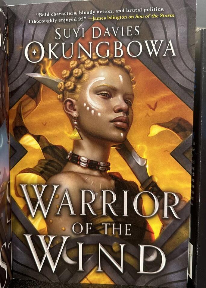
The cover for Warrior of the Wind also implements the same style of having the main character on the front for a focal point. The font choice however is a thinner serif style. This thinner style works well with the given title seeing as wind is light and airy so you’d want that to be conveyed through the font.
Following the theme of the main character this book does a similar look as well. The main character is portrayed in a possible scene from the book and uses the top of the cover for the title. Since the top has less details since it’s the cloudy sky the font doesn’t have to fight to be seen clearly like it would lower on the cover page. The authors name at the bottom however does have a tad harder time showing through the light color behind it.
The Heart of Betrayal
By Mary E. Pearson


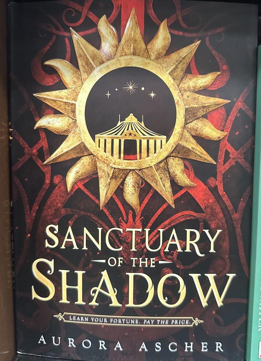
Sanctuary of the Shadow
By Aurora Ascher
This cover uses a stylized serif that has little ear like wisps coming off the letters to give them a unique look. The main emphasis is on the word Shadow in the title having the most modifications. In this books first edition print run the edges were sprayed with similar star like designs to match the cover and font color pallete. Having that balance between the colors in the design and font can create a sense of balance that you wouldn’t have if colors didn’t match. If you were to swap out the font color for a deep blue it suddenly wouldn’t match the sun anymore and you would lose that unity that is created in sticking to a color pallete.

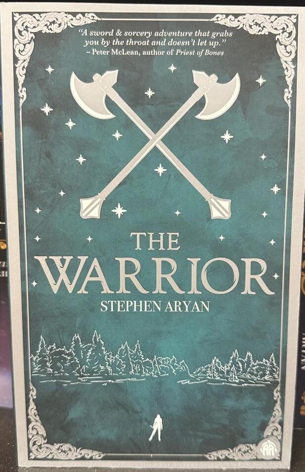
The Warrior
By Stephen Aryan
The cover of The Warrior by Stephen Aryan has a minimalistic design with a complementary font choice added in the same color as the trim of the design. The font does have some hairline cuts in it throughout the letters giving it a worn down look that you’d expect from a potential warrior. On The Queen of Days by Greta Kelly’s cover there’s a metallic mask and a silver serif font to match it. The font is still able to stand out due to the shading and highlights along the letters that help them pop off the cover page.
The Queen of Days
By Greta Kelly


Picking a cover image can make or break how the type looks over top of it. Common images that work in fantasy are depictions of main characters or a specif object in the book.
Having a sense of what your genre is about can be incredibly helpful when deciding how you start a cover design. The font speaks the audience and coveys the theme.

The imagery needs to match the words on the cover to some degree. If for example you put a crown on the front you could pair it with a more regal looking metallic font to imply royalty or nobility. If you use an illustration of what a character would look like you might look into the traits they have and the tone of the book. Using that information to decide how to manipulate the font to appear more rigid or fluid based on the theme.


The color of your type should match the tone of the book as well. Typically in fantasy books you have forest green, deep purple, golds, and silvers. Although it is not limited to these colors. If a book is about royalty you might choose a purple theme paired with a silver or gold font to imply that through color.

Choosing the right font can help distinguish the genre of book. Fantasy tends to use serifs as they appear more elegant and classic. When it comes to the alignment it’s commonly done as a center alignment so that your eyes are directed to the title.


Making sure theres a proper visual hierarchy is key to a memorable book cover. Primarily you’ll see the title at the top of the hierarchy but also the authors name can be at the top as well. Maintaining balance is just as important. When you have a longer book title it might be useful to make supporting words such as the, and, as, of and etc in a smaller size so that they take up less space on the cover but are still present. The spine and back cover can be done in various ways but should use the same fonts for the spine. The back can be a more legible font when used for the books description as you want more readability than style in this case.

While following all the necessary steps, its always good to take a step back and look at the cover as a whole.
Decide what works and what doesn’t. There might end up being tension in the letters that you only see when you look at the whole. Or the type could be sending the wrong symbolism for the books genre. By then end you want a font that not only is legible but also represents the book and is enticing without altering the text beyond what can be easily read off the shelf.


When you think the work is done theres still final checks that pertain to final submission for actual publishing. The size for saving the files along with spell checking is included. The thumbnail should be kept in mind as you want the digital depiction to be clear and just as easy to see when it’s in an online format.

After all is said and done, creating a typeface that holds up against all these tip and tricks is no easy task. There’s no simple way to create the perfect font style but with all this information you know what to look for. Keeping all the design elements and principles applied to what you’re creating is a solid way to start.

References
https://miblart.com/blog/fantasy-book-cover-fonts/
https://pennbookcenter.com/what-font-do-books-use/
https://www.bookishelf.com/how-to-design-a-book-cover/
https://www.thebookdesigner.com/book-cover-design-10steps/
https://www.penguin.co.uk/articles/company-article/howbook-covers-are-designed
https://99designs.com/blog/book-design/book-coverdesign/
https://blog.reedsy.com/guide/book-design/elements-of-abook-cover/
Spring 2024




 Sorcery of Thorns
Lady Smoke
Forest of a Thousand Lanterns
March’s End


 By Tara Sim
