INTERIOR DESIGN SELECT WORKS PORTFOLIO

My design philosophy is grounded in the belief that interiors shape the way we feel, think, and connect. I’m drawn to the relationship between emotion and space – how materials, light, and form can quietly influence our mood or tell a story.
I approach design as a both self-expression and storytelling, taking inspiration from fashion, art, and the raw textures of nature. My process blends creativity with purpose, ensuring each concept feels both evocative and functional.
Each project is an opportunity to create a sensory experience – to craft spaces that feel lived-in, meaningful, and deeply personal.

Let’s Connect.

I grew up in Perth on semi-rural land, surrounded by nature and a strong family foundation - an environment that shaped my appreciation for grounded spaces and honest materials. Creativity has always been part of my life; I played music, studied art and explored makeup artistry, each shaping my eye for composition and texture.
Interior design brought these interests together. Throughout my studies, I’ve developed strengths in presentation, rendering, documentation, material selection and crafting interiors with depth. Influenced by Kelly Wearstler, eclectic design and tactile contemporary spaces, my work explores the balance between character, mood and refined.
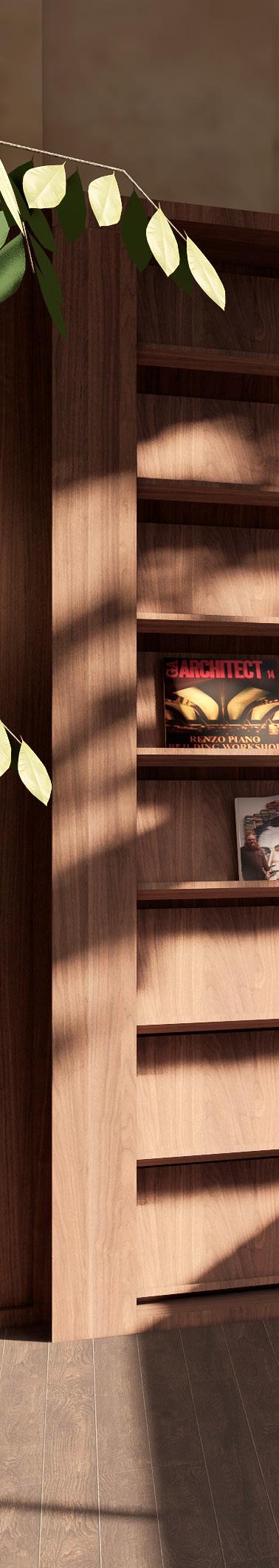
I’m instinctively drawn to unique pieces - furniture and objects with their own beauty. I often customise or redesign elements to ensure every component feels intentional and authentic to the space.
Curiosity underpins my practice. I love learning, researching and integrating new knowledge into each project. Detail-driven and dedicated to craftsmanship, I’m continually evolving as a designer and building a thoughtful, masterful practice.
SOFTWARE PROFICIENCY
AUTOCAD
REVIT
LUMION
SKETCHUP RHINO
ENSCAPE
INDESIGN
PHOTOSHOP
ILLUSTRATOR
MICROSOFT OFFICE
SPOTIFY OFFICE
Hospitality
Workplace Design
Typology
Hospitality Design
Area
70m2
Software
Autocad, SketchUp, Lumion, InDesign, Photoshop
Year
Semester 1, 2025
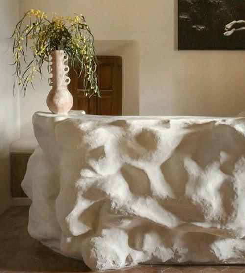
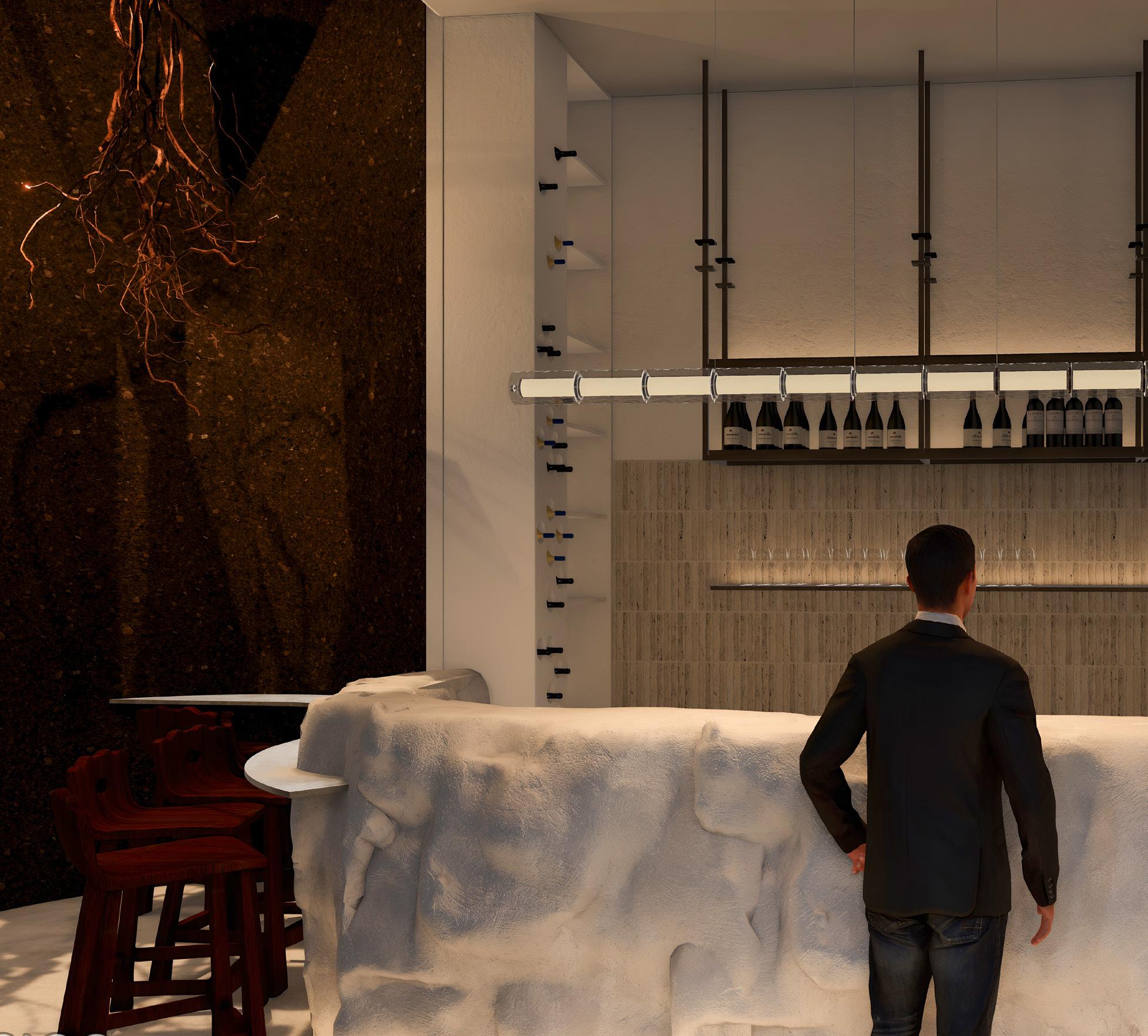
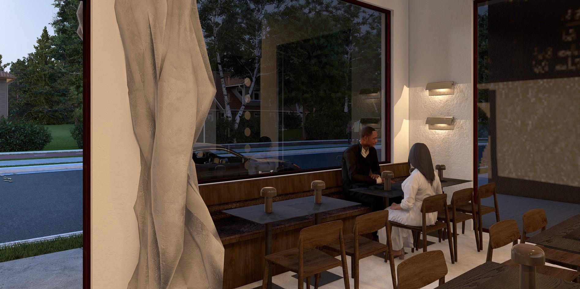
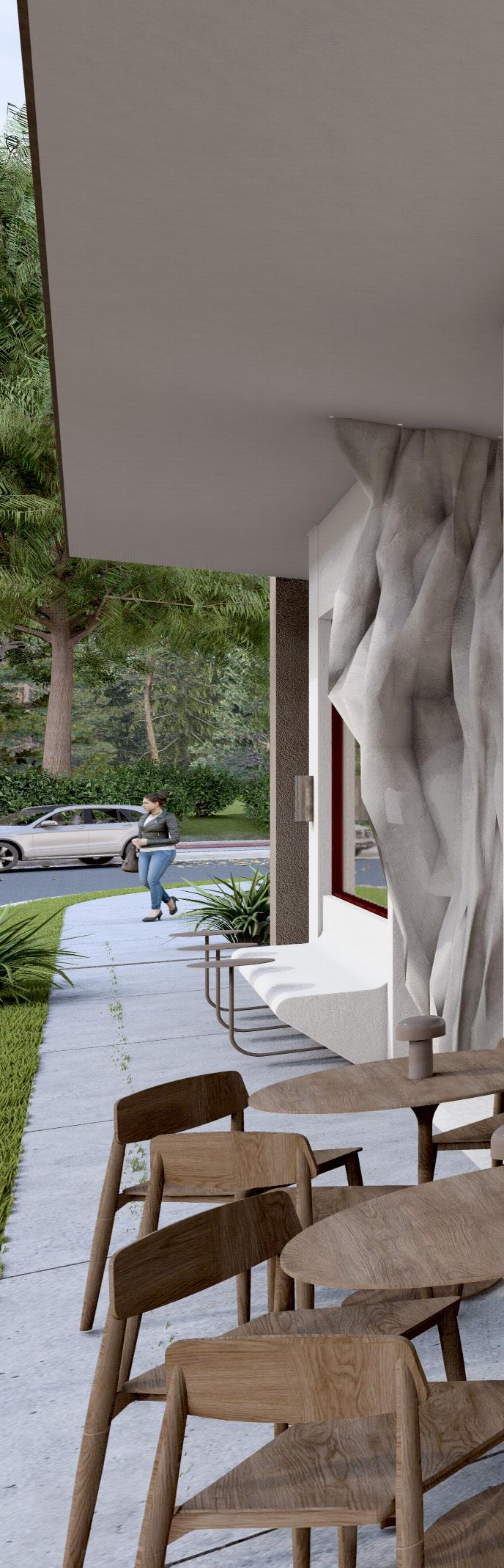
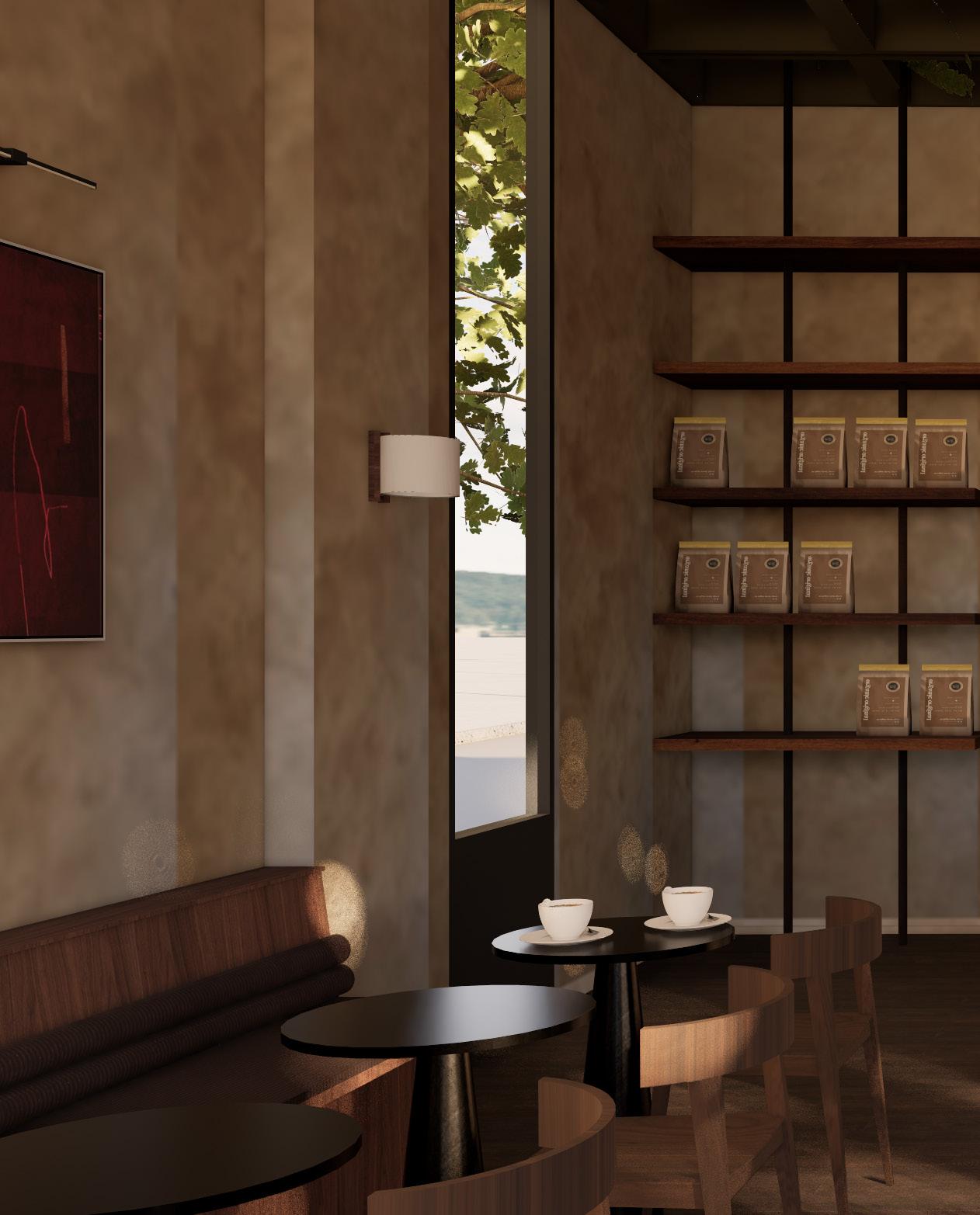
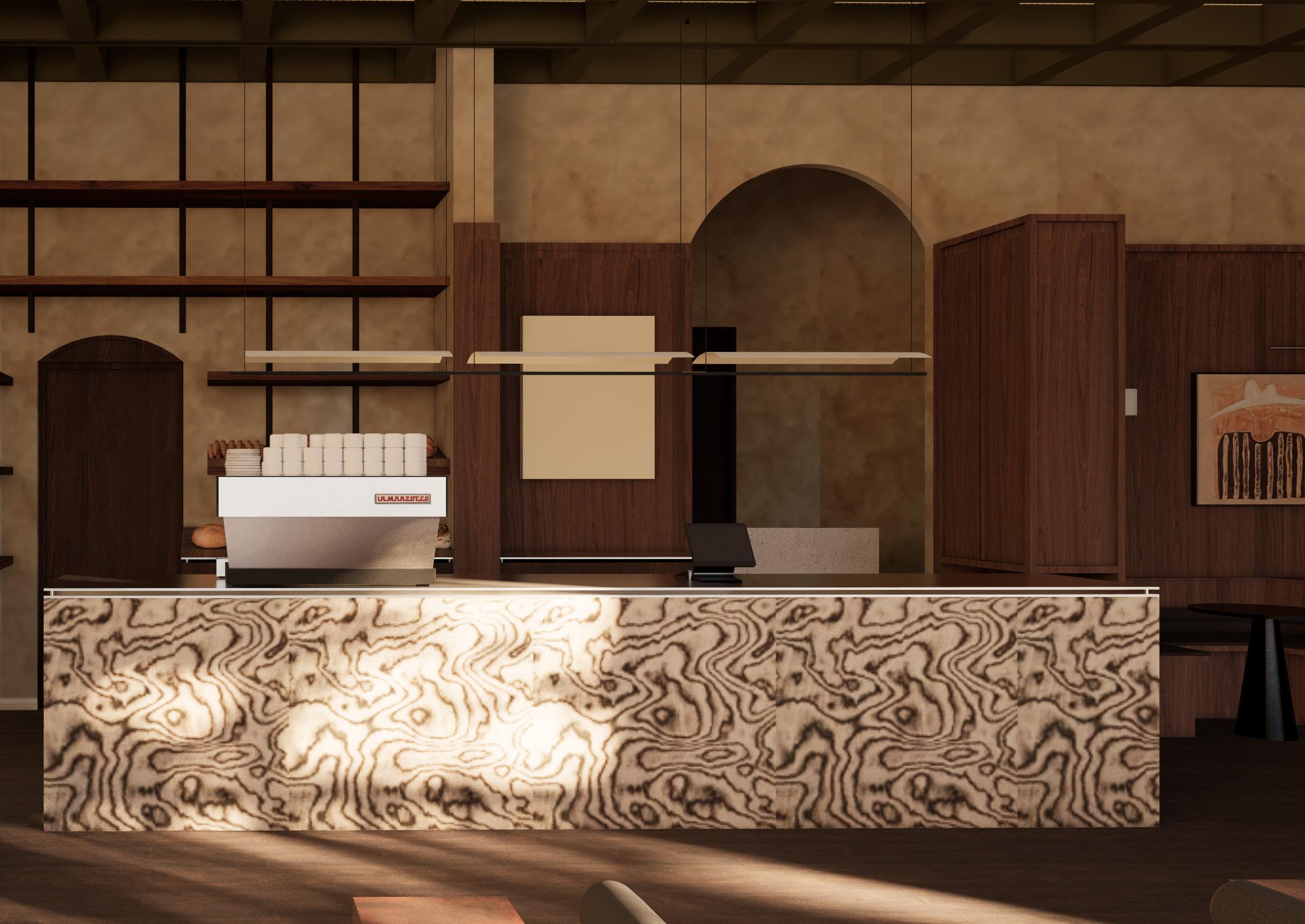
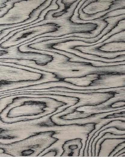
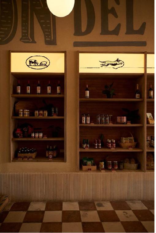
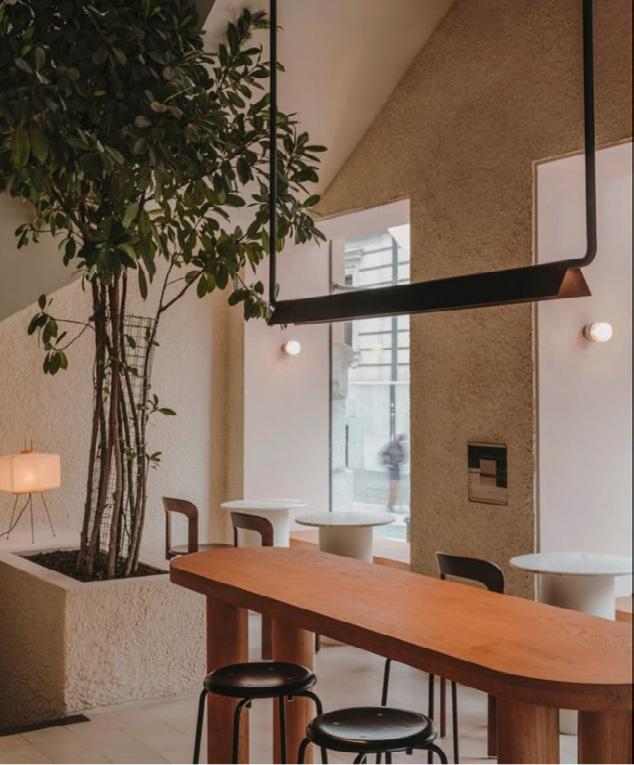
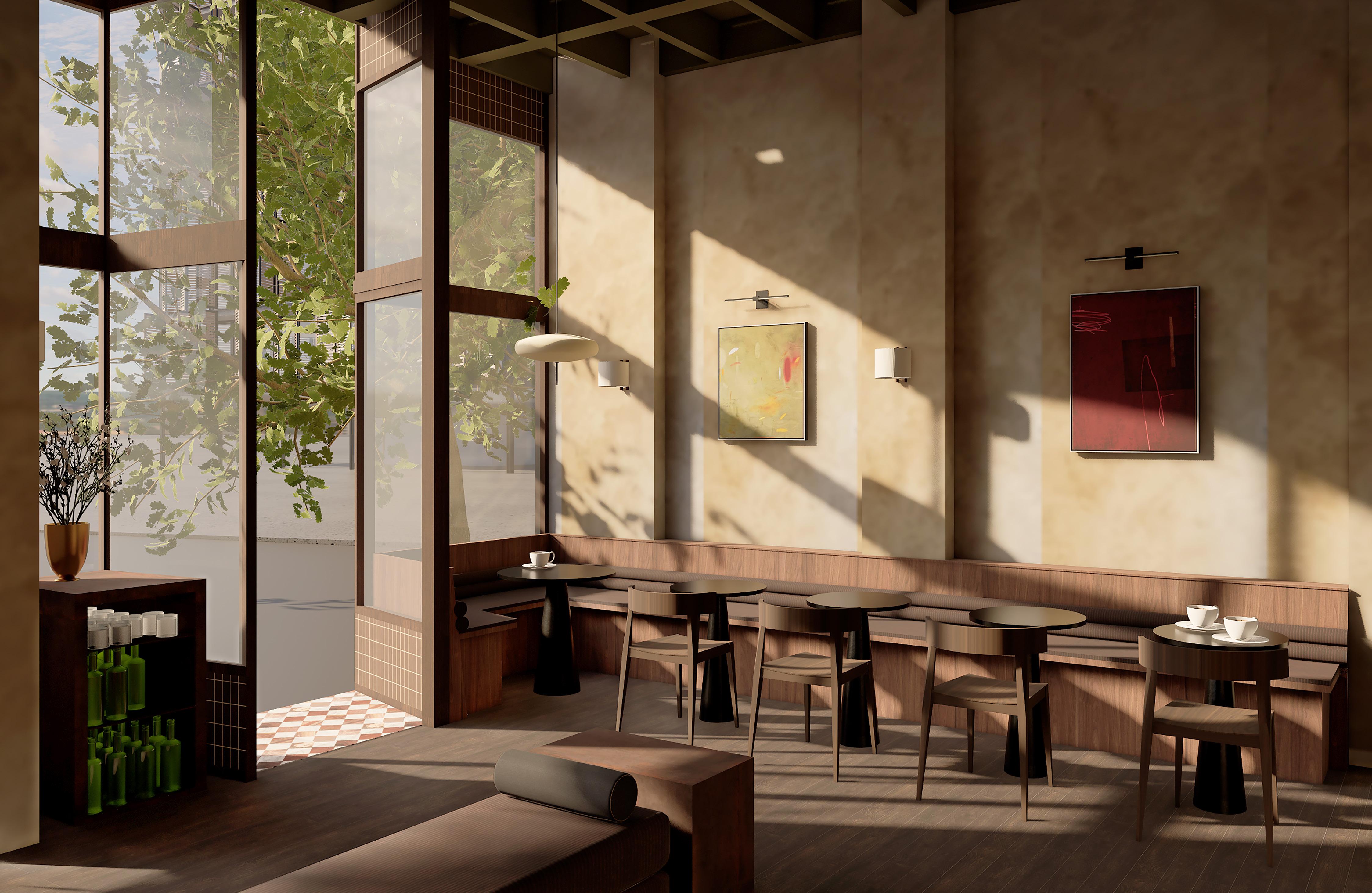
Forma Terra brings a grounded and textural identity to Electric Lane. Natural materials such as rammed earth, carved stone, cork and wood create a calm and sculptural atmosphere.
The design strengthens its connection to the laneway by allowing dining to spill outdoors and sit comfortably within the street. This creates a seamless relationship between inside and out.
Soft ambient lighting and a muted palette define the relaxed character of the venue. A sculptural bar anchors the space, while raw textures and refined details establish a contemporary neighbourhood bar with a clear sense of place.


MATERIALITY / MOODBOARD


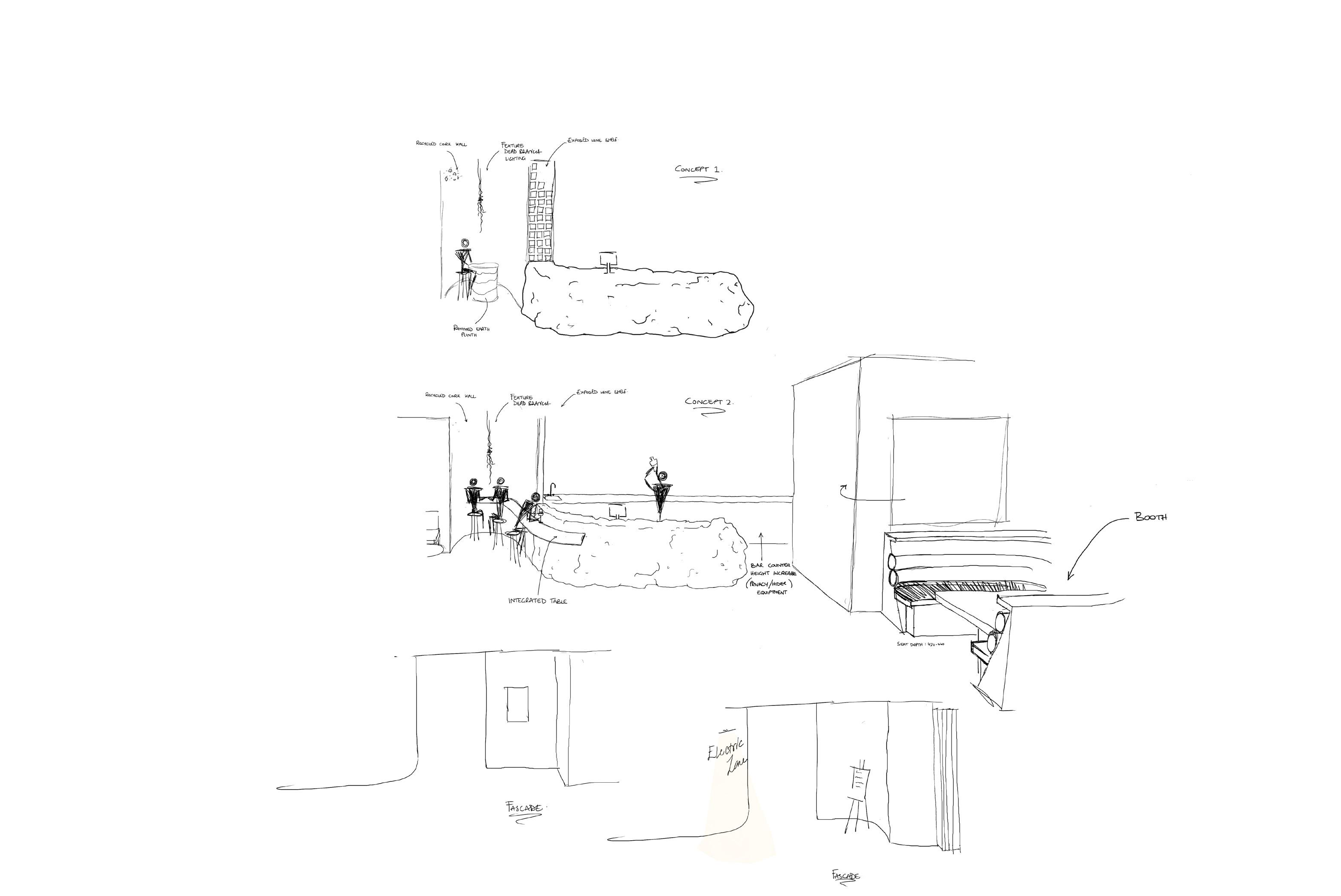
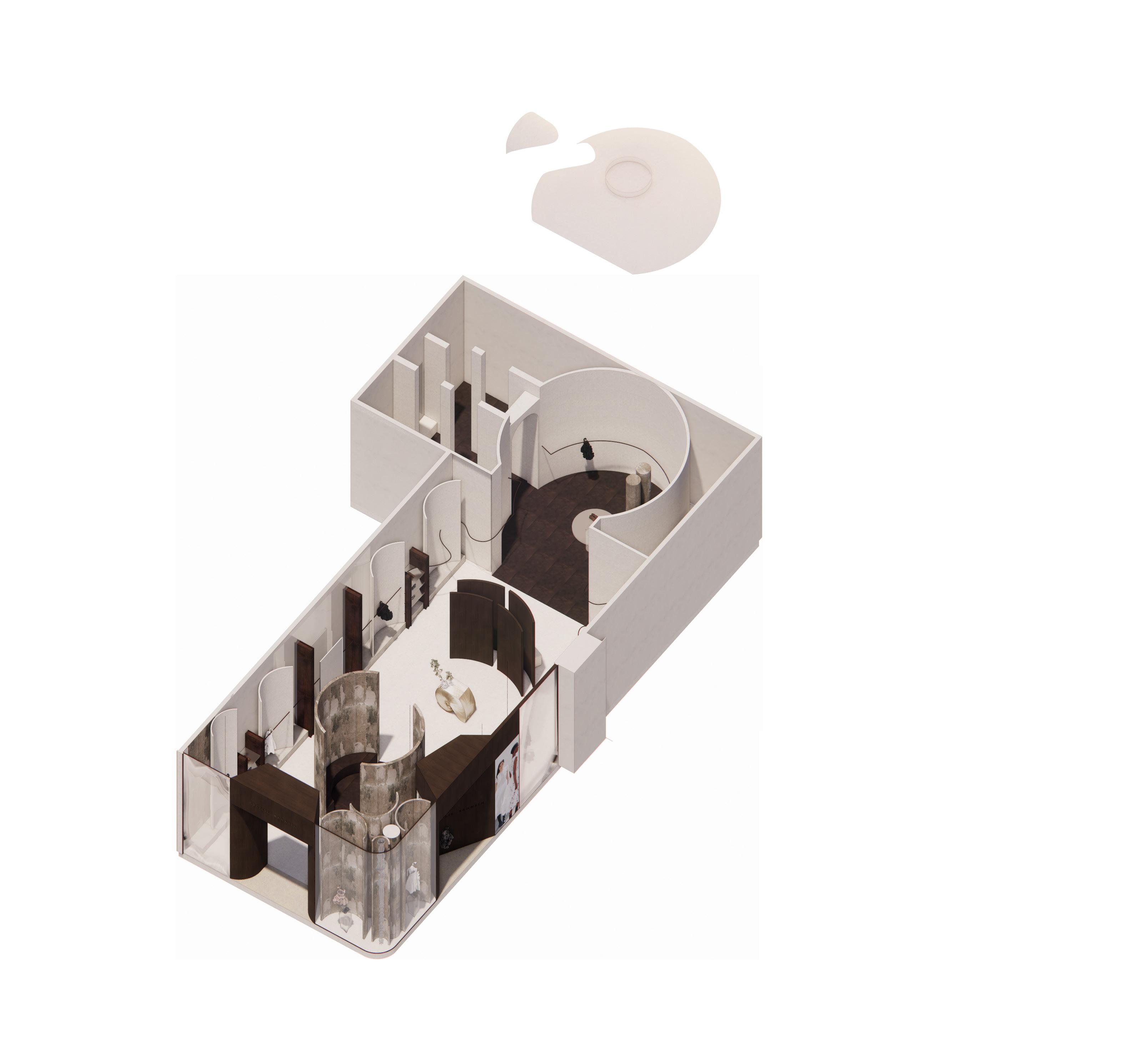
Spatial zoning & Sculptural bar Geometry

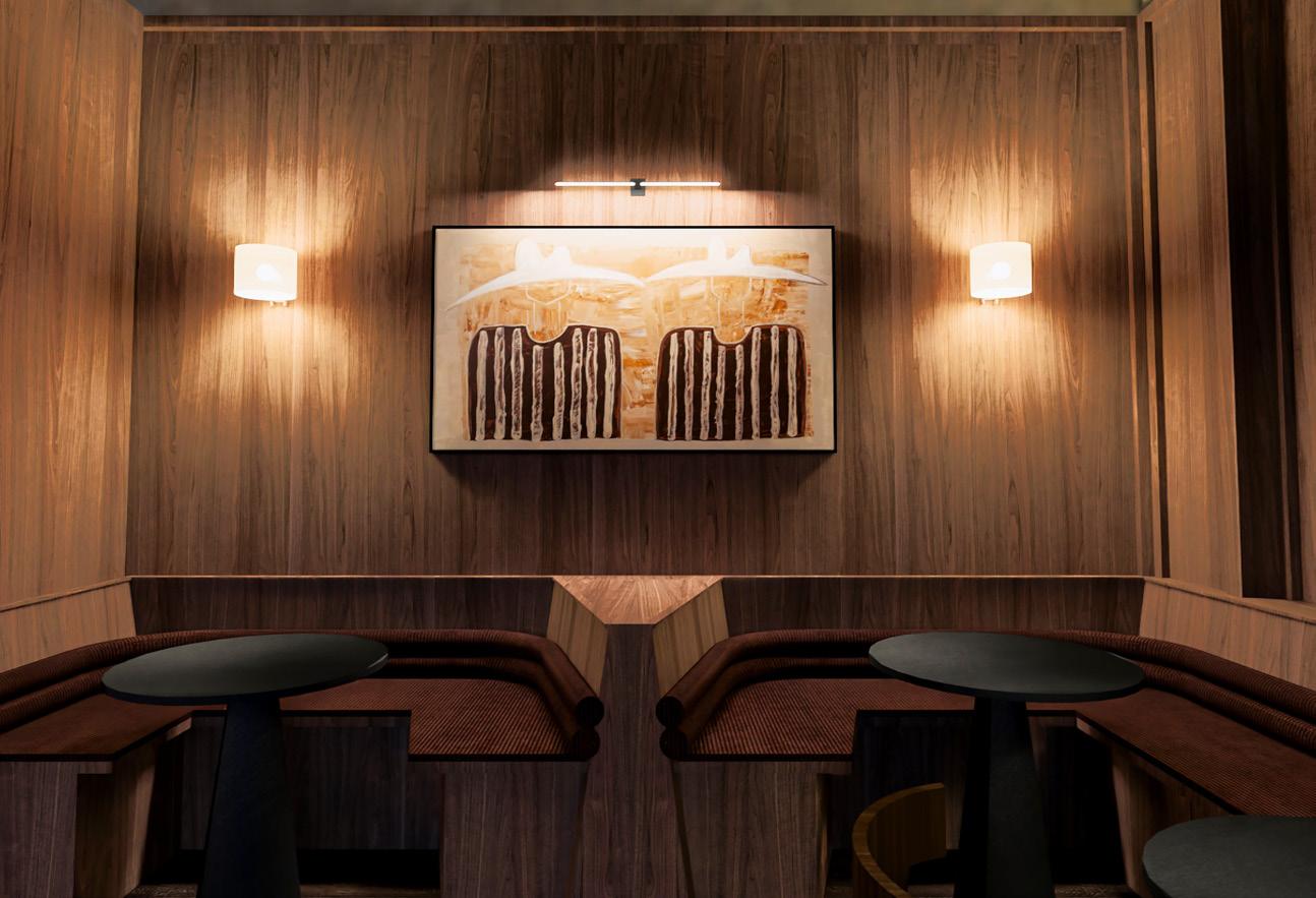
The sculptural column is repeated both inside and out to maintain a consistent architectural language.
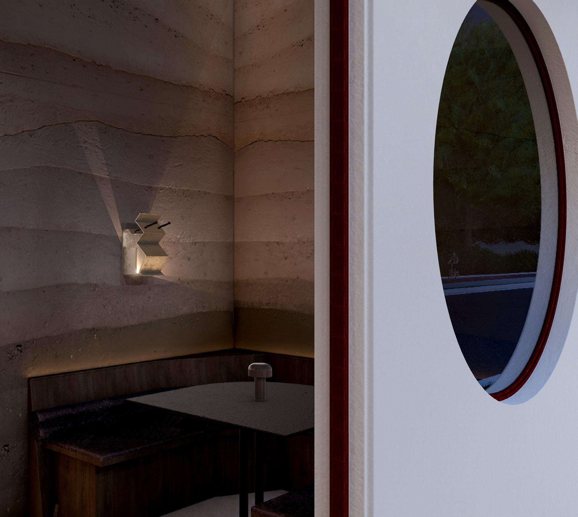
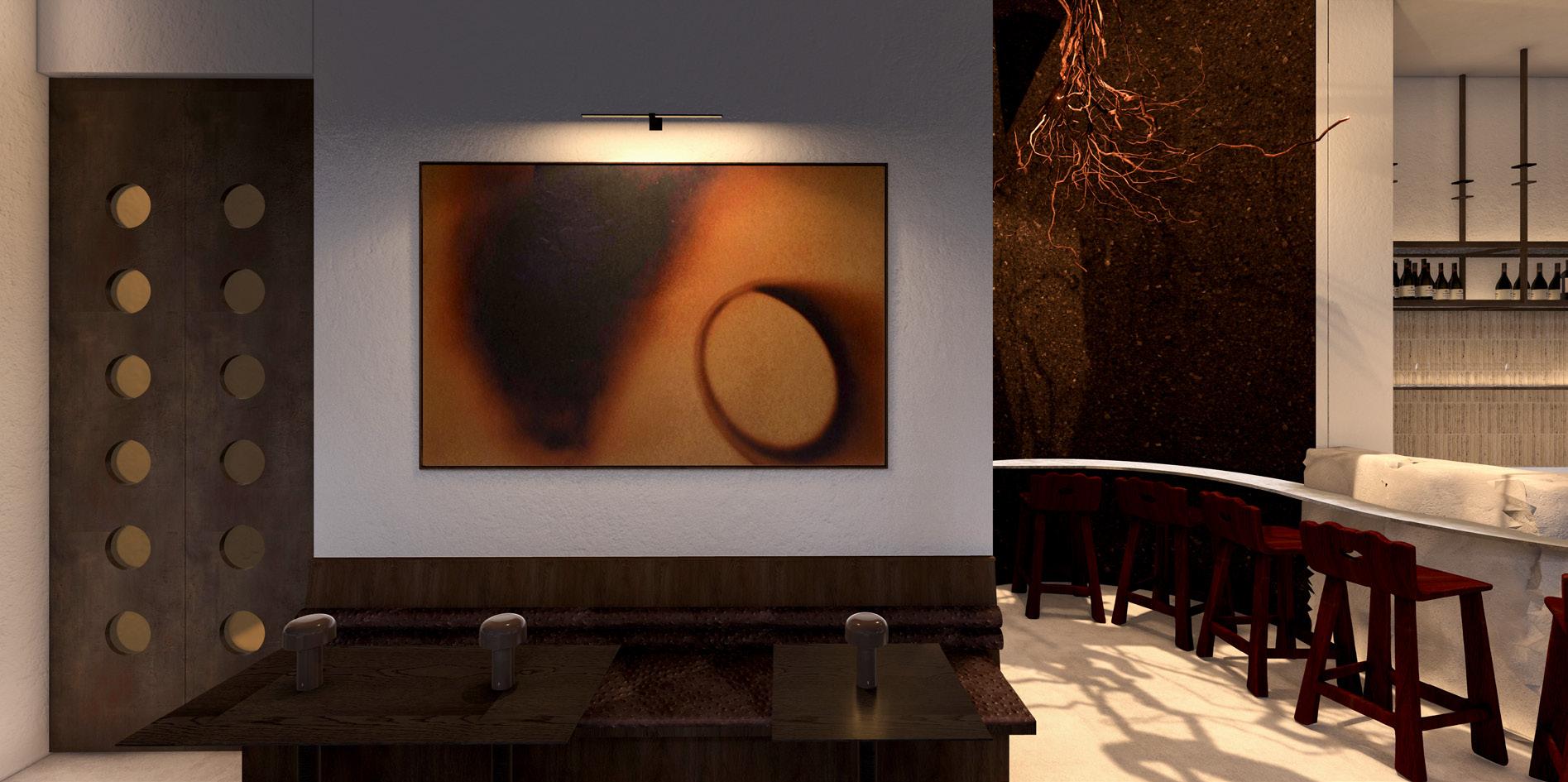
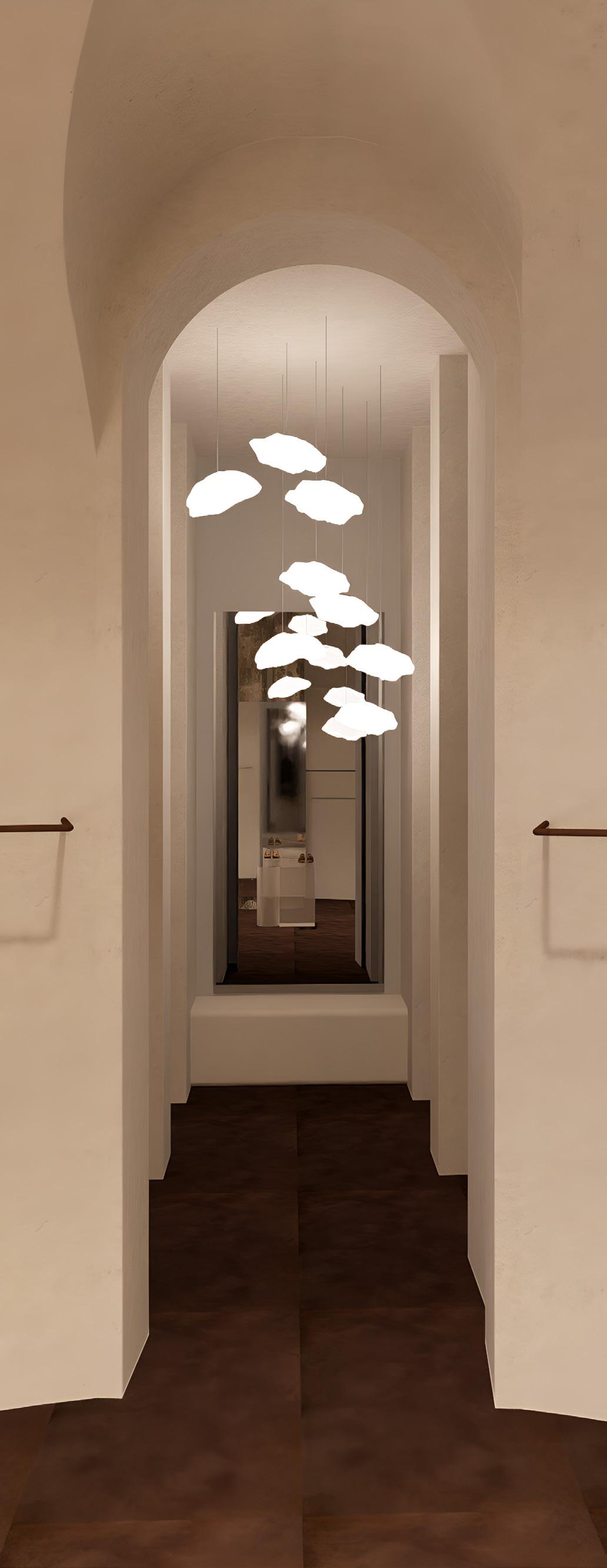
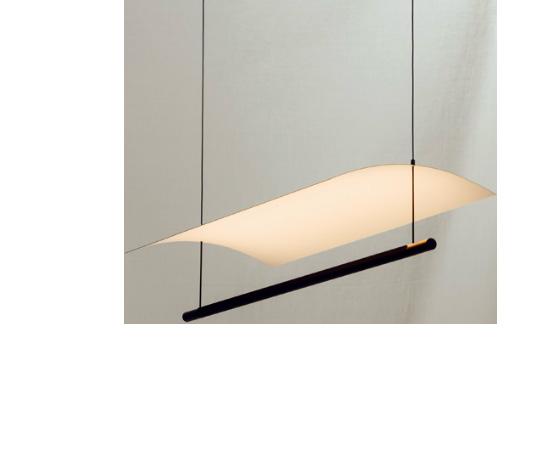
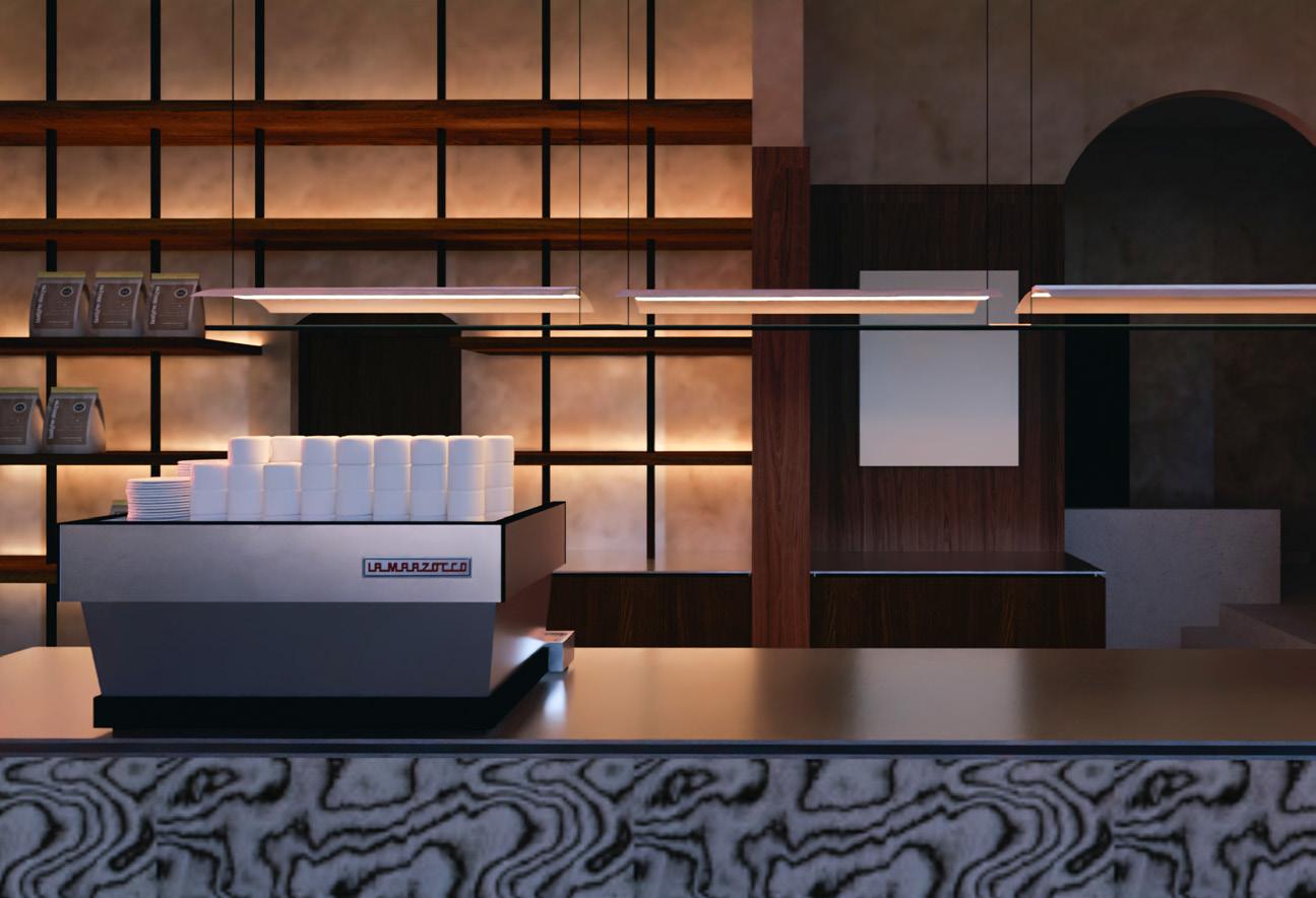
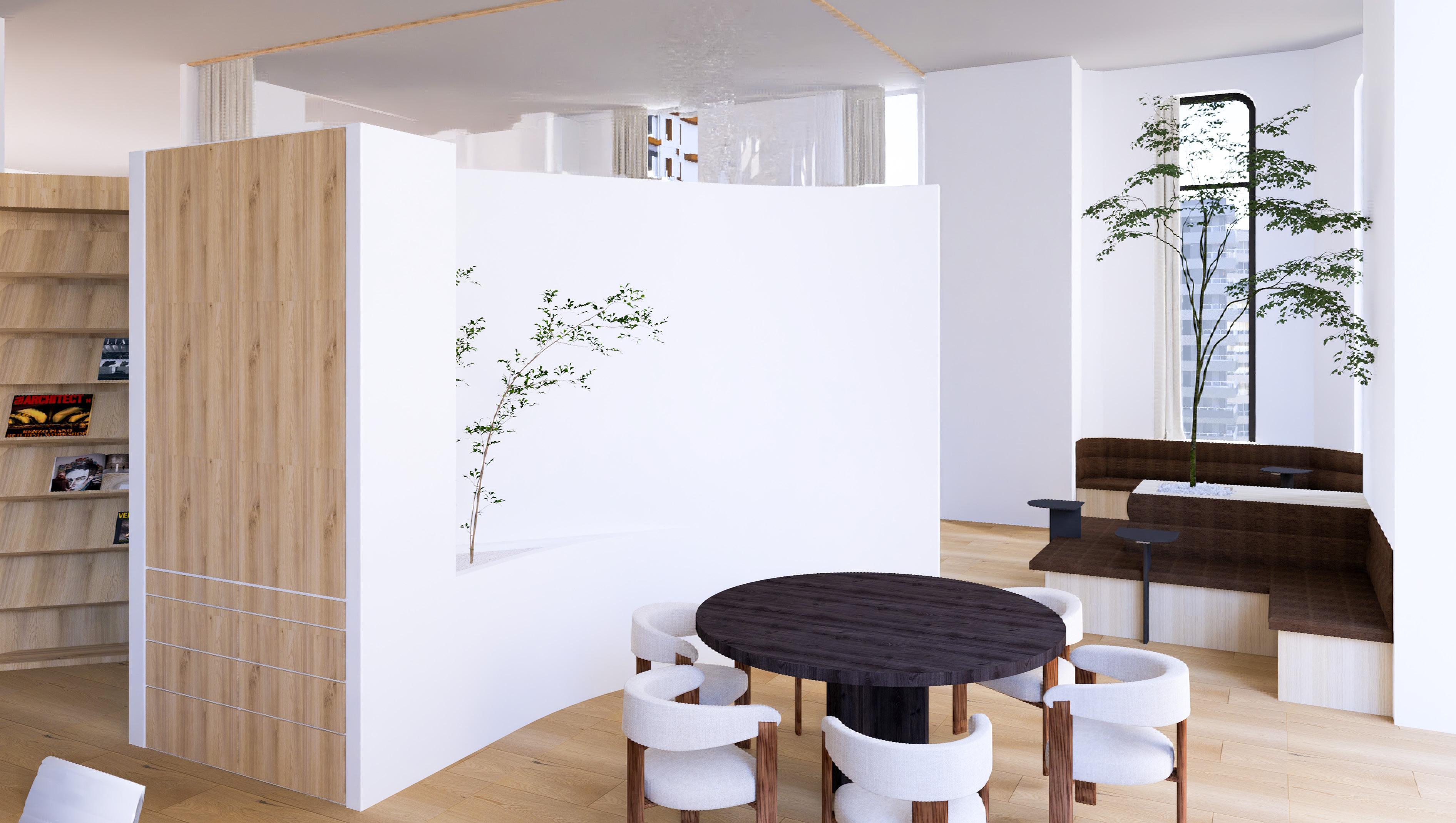
This view highlights the layered materiality within the space. A custom sculptural pendant introduces an organic focal point, complementing the warm cork alcove and guiding the transition toward the main bar area. The circular window detail adds rhythm and reinforces the crafted character of the interior.
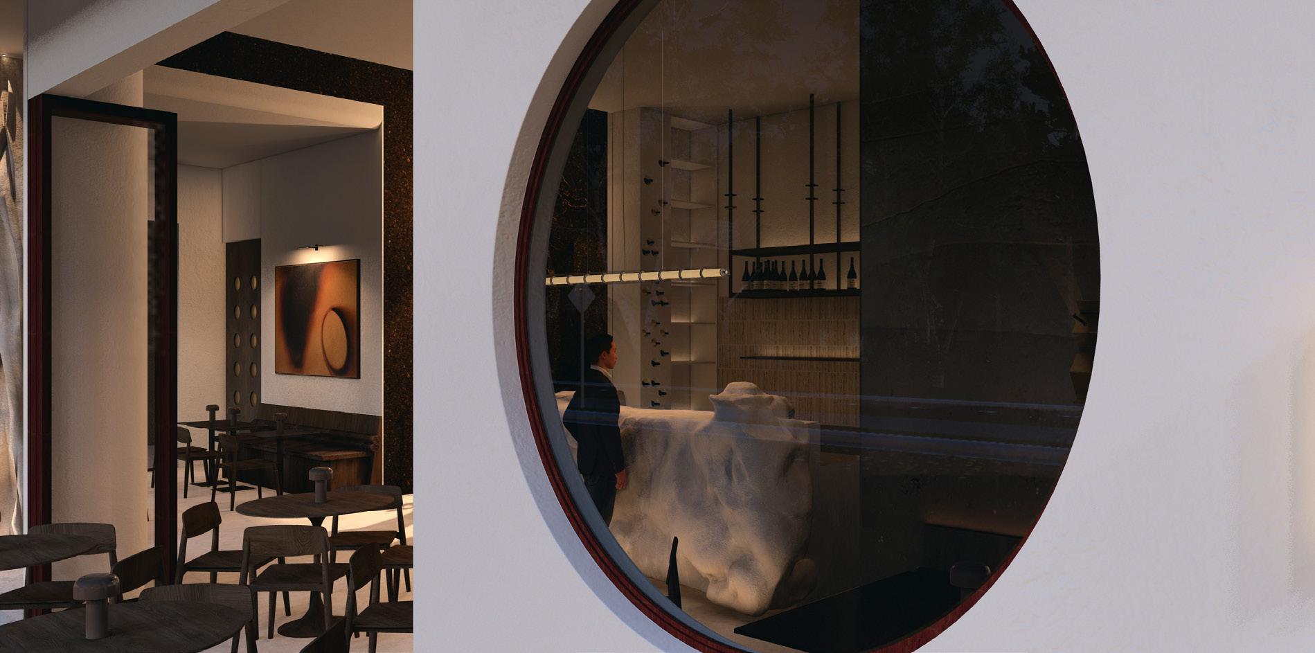
A framed view through the circular window reveals the spatial sequence of the bar, offering a quiet moment that connects the exterior to the interior.
Forma Terra is shaped by a study of erosion, weight and natural form. The concept focuses on how sculpted surfaces and grounded materials can create a quiet sense of permanence within a small hospitality setting. The design establishes a calm rhythm through simple geometry and considered spatial transitions, allowing the venue to feel both intimate and open to its surroundings.
Typology Retail Design
Area
15m2 / 47m2 / 141m2
Software
Autocad, SketchUp, Lumion, InDesign, Photoshop
Year
Semester 2, 2025
This project interprets Cecilie Bahnsen’s distinct design language through a series of spatial studies that move from temporary installation to permanent retail. The focus is on translating her soft sculptural forms and quiet materiality into environments that feel refined, immersive and intentional. Each phase builds on the last, gradually shaping a complete spatial identity for the brand.
- remove corten steel hugging concrete columns - tiling a different shade of concrete through entry
I - POP-UP STORE
Where the brand language begins - simple, sculptural, and experimental.
II - RETAIL STORE
A refined spatial language developed into a permanent retail environment.
III - FLAGSHIP
A heightened spatial identity that brings the entire narrative together.
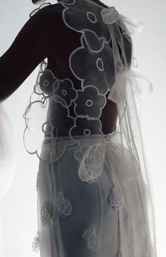
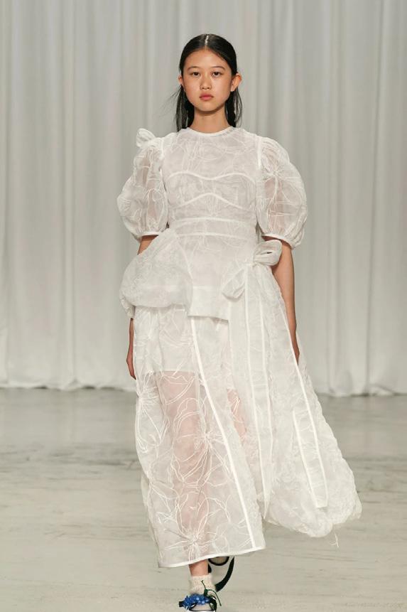
characterised by voluminous forms, sheer layers and intricate handwork. The pieces are delicate yet purposeful, balancing softness with a contemporary edge.

Soft, sculptural and refined, with a focus on quiet material expression.
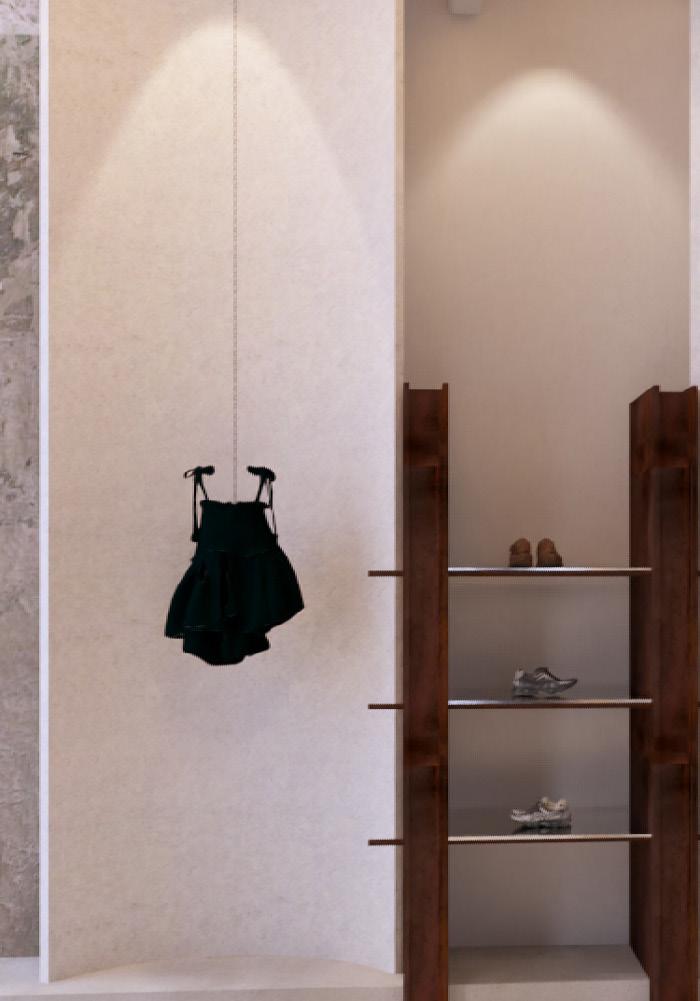
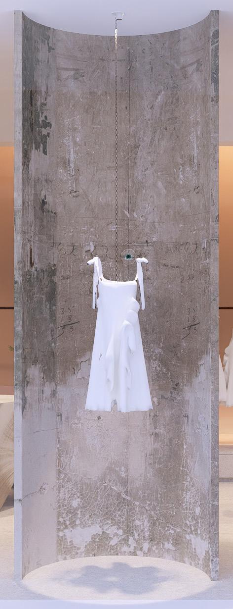
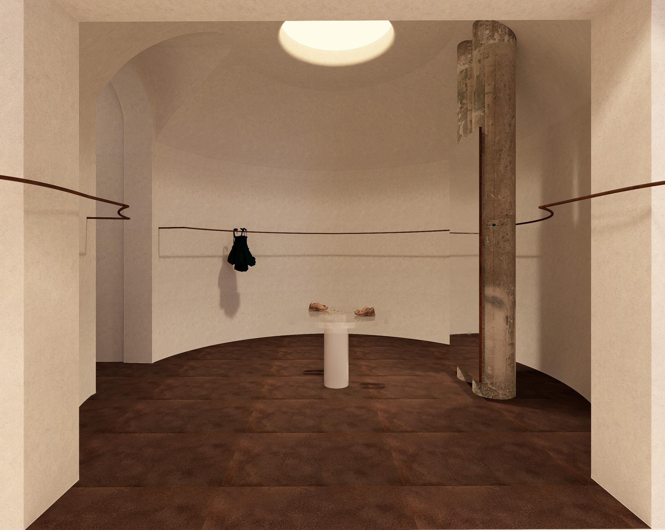
This phase introduces the Cecilie Bahnsen spatial language through a temporary installation designed for Dover Street Market. The extracted floral motif becomes the foundation of the concept, extruded into a sculptural concrete form that frames clothing and object displays. Subtle brand cues are woven through light, including a focused spotlight that casts a soft floral shadow around the dress form. The installation tests early ideas in form, materiality and atmosphere, establishing the conceptual groundwork for the permanent retail phases that follow.
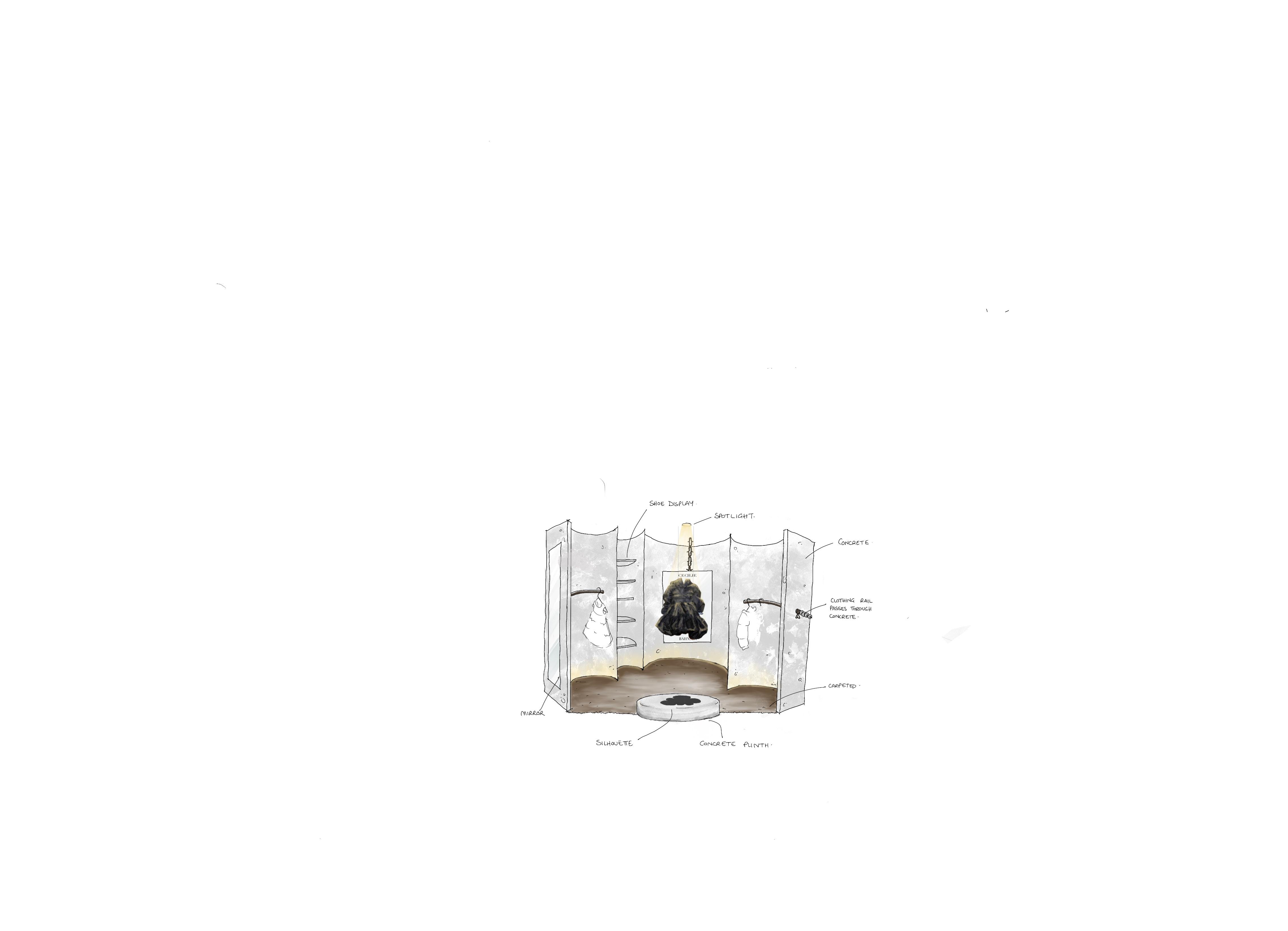
1. Brand Motif
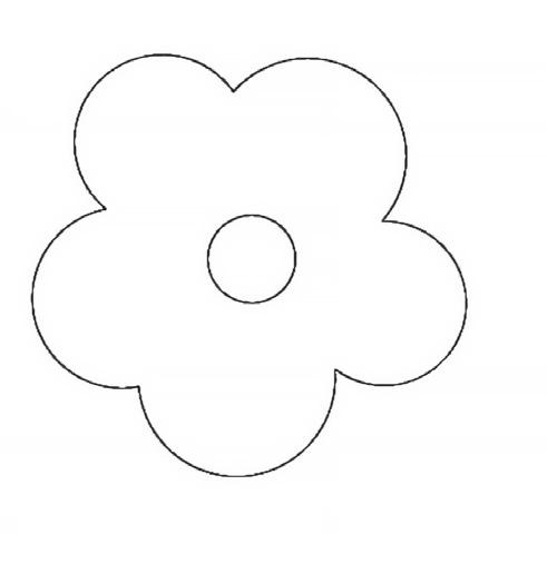
Cecilie Bahnsen’s iconic floral symbol becomes the conceptual starting point.
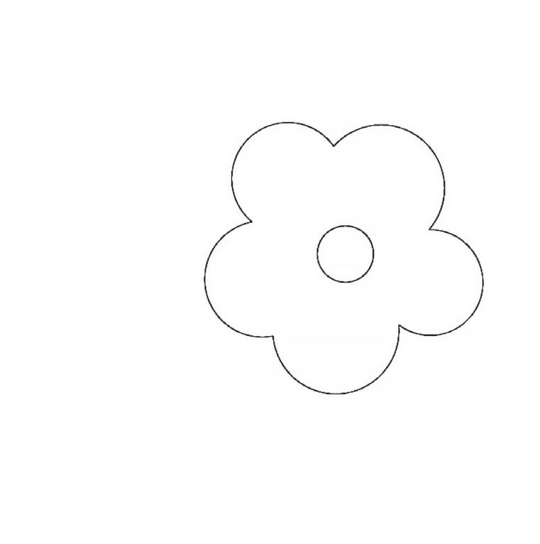
2. Form Extraction
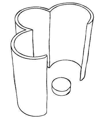
The motif is halved to reveal a new contour, establishing the guiding geometry for the spatial design.
3. Spatial Translation
The extracted profile is extruded to form a sculptural concrete module - the foundation of the store’s architectural language.
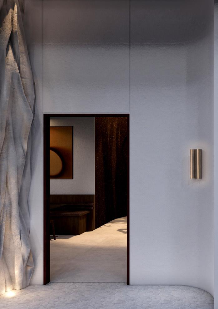
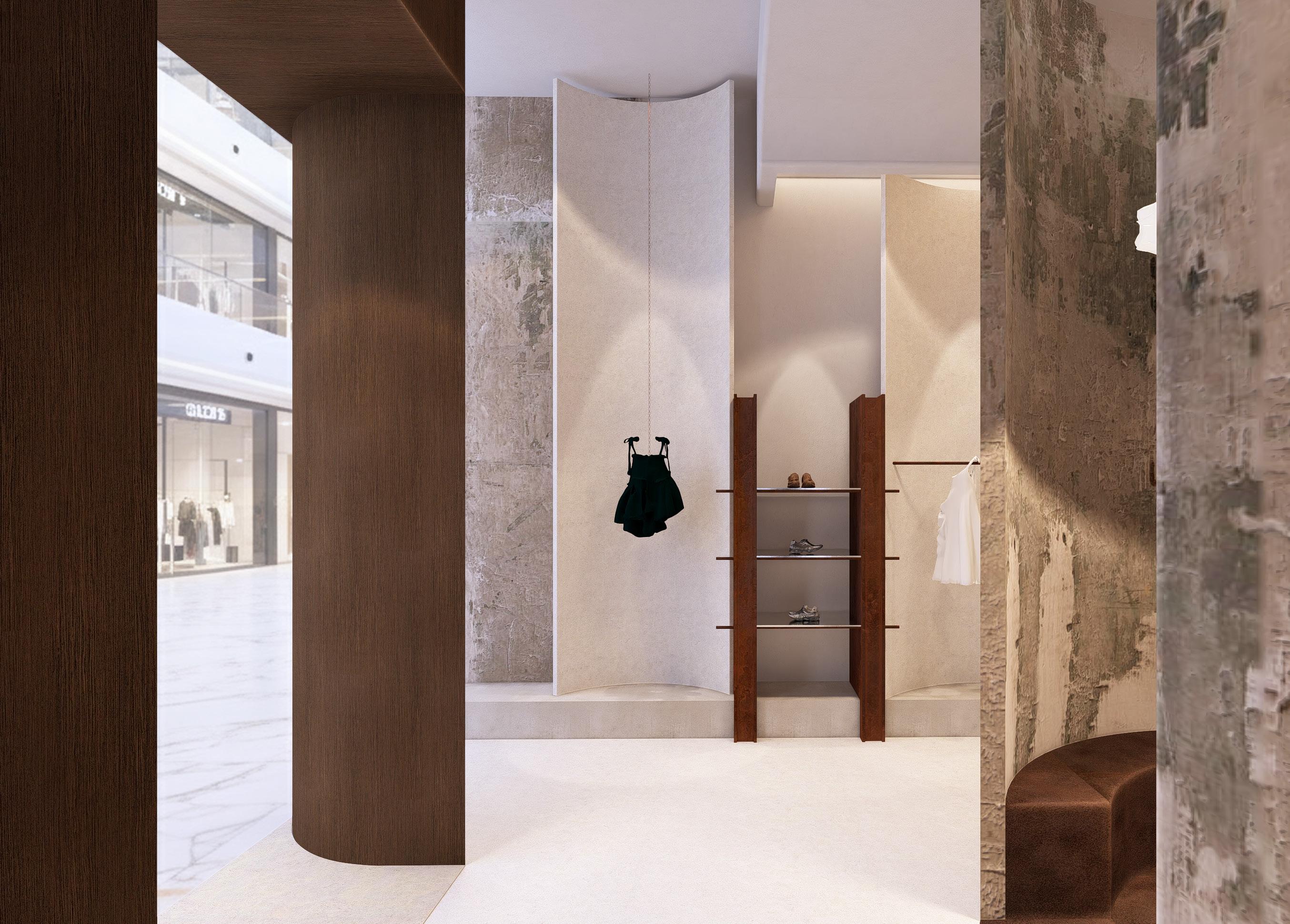
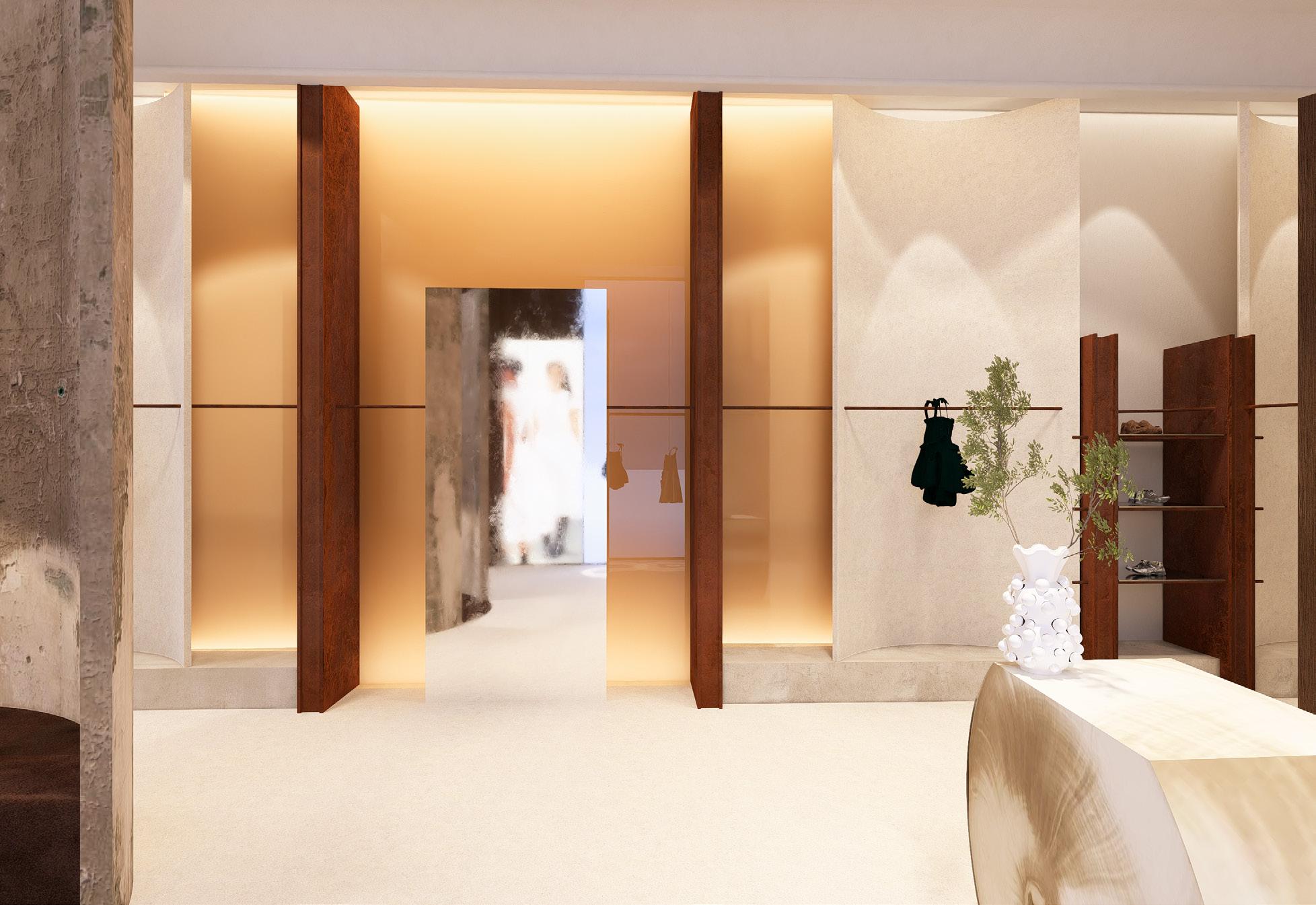
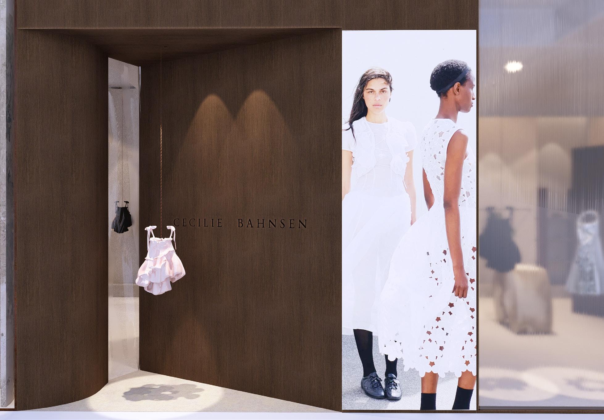
Phase II develops the concept into a permanent retail environment that balances Bahnsen’s delicacy with a more sculptural, brutalist material language. The single concrete extrusion explored in the pop-up becomes a series of curved half-cylinders, opening clearer sightlines into the store while retaining the brand’s signature silhouette-driven geometry Subtle floral shadows beneath the garments continue the motif in an understated way, allowing the clothing to remain the focus. Inside, a floor-to-ceiling glowing glass wall introduces a sense of softness and lightness, creating a luminous backdrop for the collection. Branding is integrated directly into the architectureembossed in concrete and cut into corten-like doors so that the warm glow illuminates the identity as the store transitions from open to closed. This phase refines the concept into a calm, sculptural and enduring spatial expression.
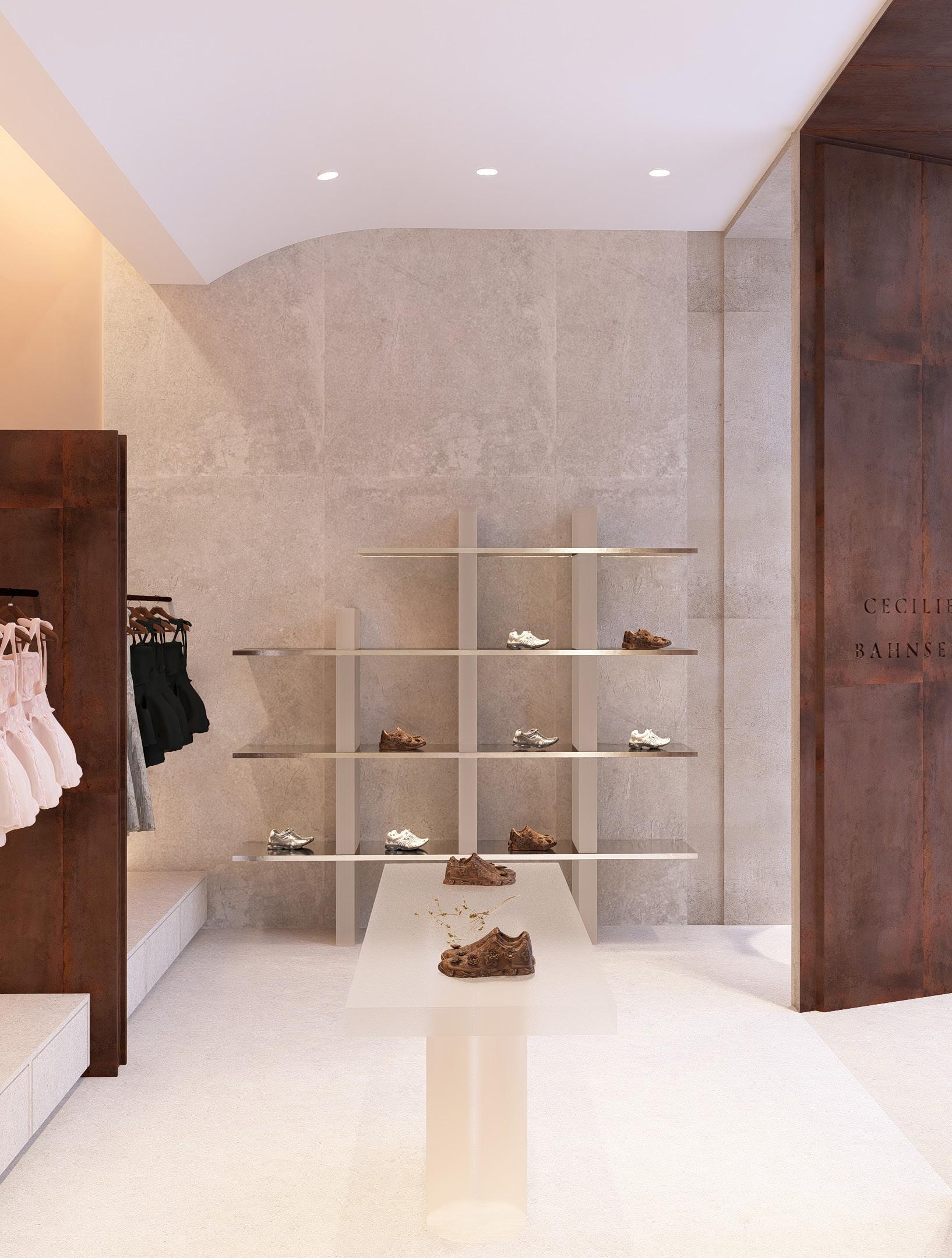
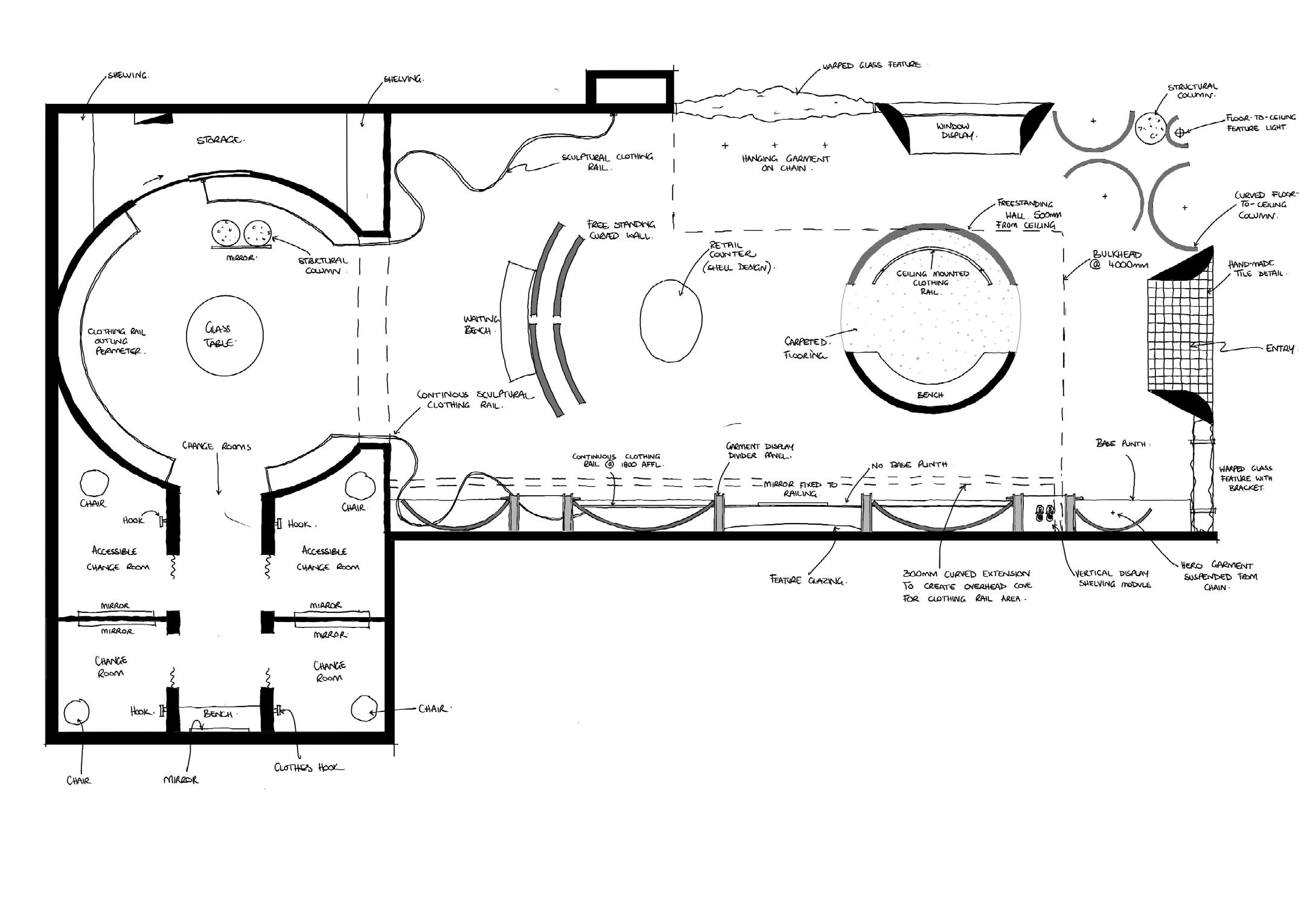
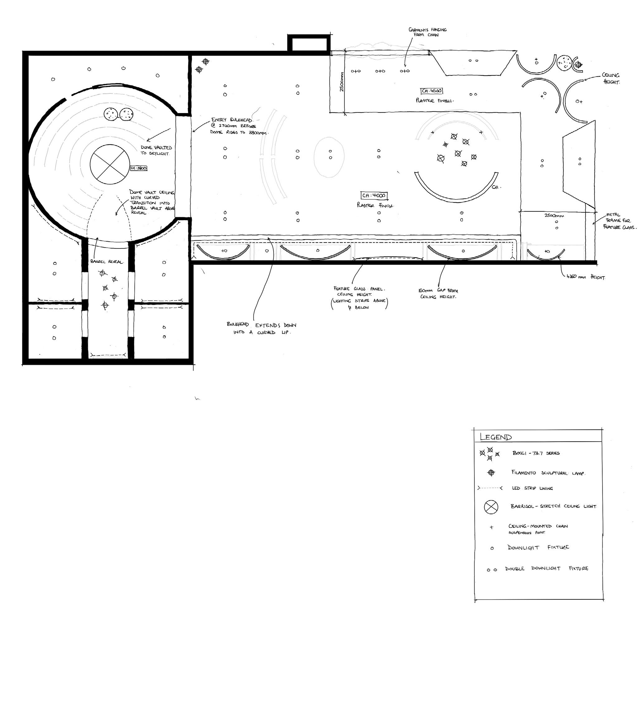
The flagship translates the established spatial language into a fully resolved retail environment. Clear sightlines link the entry to the curved alcove, shell-formed reception counter, sculptural partitions, and the domed reveal at the fitting rooms.
Material shifts—Micro-Cement walls, tinted-architectural glass, warm Corten accents, and deep brown carpet—define each zone and create a structured circulation path. Integrated lighting emphasises form and highlights key garments without overpowering the space.
This phase consolidates the brand into its most refined expression: disciplined planning, controlled views, and a cohesive material system that presents Cecilie Bahnsen with clarity and intention.

Key spatial moments


‘Atmosphere is built in the quiet details..’
Typology
Hospitality Design
Area
88m2
Software
Autocad, SketchUp, InDesign, Enscape and Photoshop
Year
Semester 1, 2025
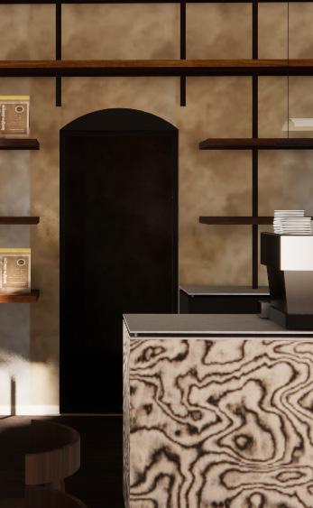
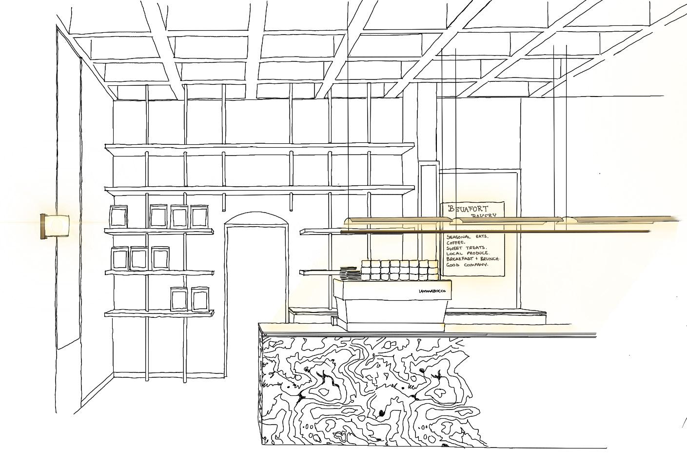
This project reimagines a heritage shopfront on Beaufort Street as a warm, contemporary café and lunch bar. The design focuses on creating an inviting atmosphere for students, workers and locals by introducing defined seating zones, a clear flow from entry to ordering, and a visually engaging servery. Materials and lighting are chosen to create a calm, welcoming atmosphere while remaining sensitive to the site’s heritage character.


3.
4.
5.
7.
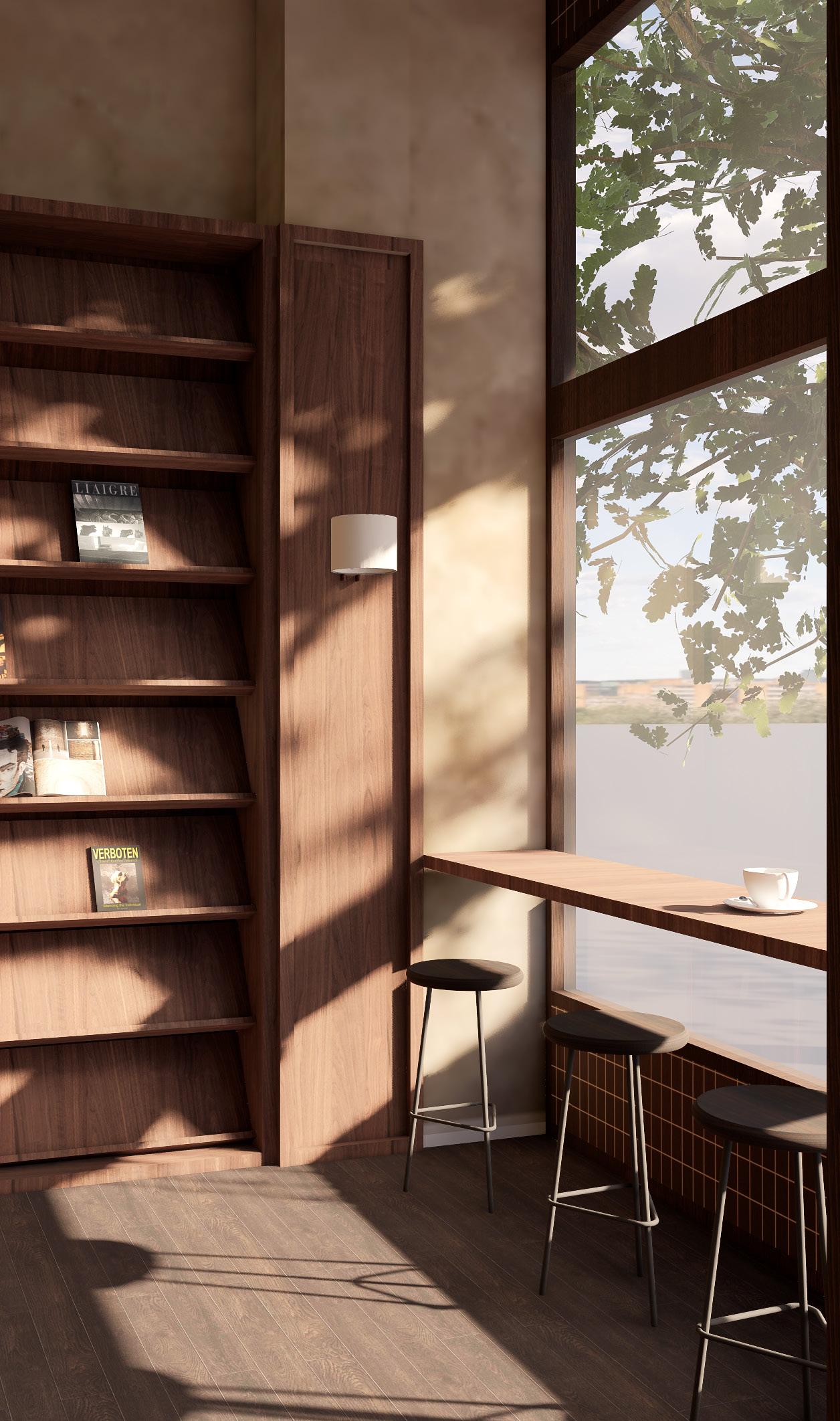
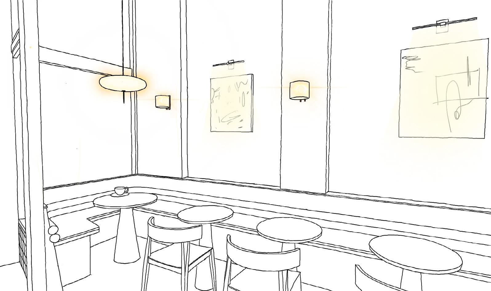
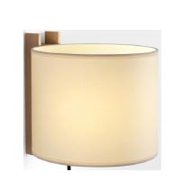
To echo Beaufort Bakery’s timeless warmth, I curated a lighting system that casts a soft, enveloping glow. Each fitting was chosen for its ability to create intimacy within the space, supported by DALI-enabled control for subtle shifts in tone and brightness.
‘A calm space for creative work to unfold.’
Typology
Workplace Design
Area
623m2
Software
Autocad, SketchUp, Enscape, Lumion, Photoshop and Illustrator
Year
Semester 1, 2025
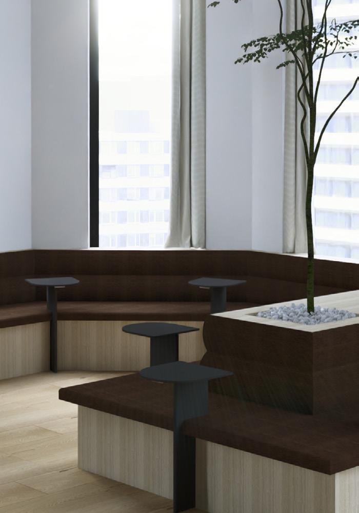
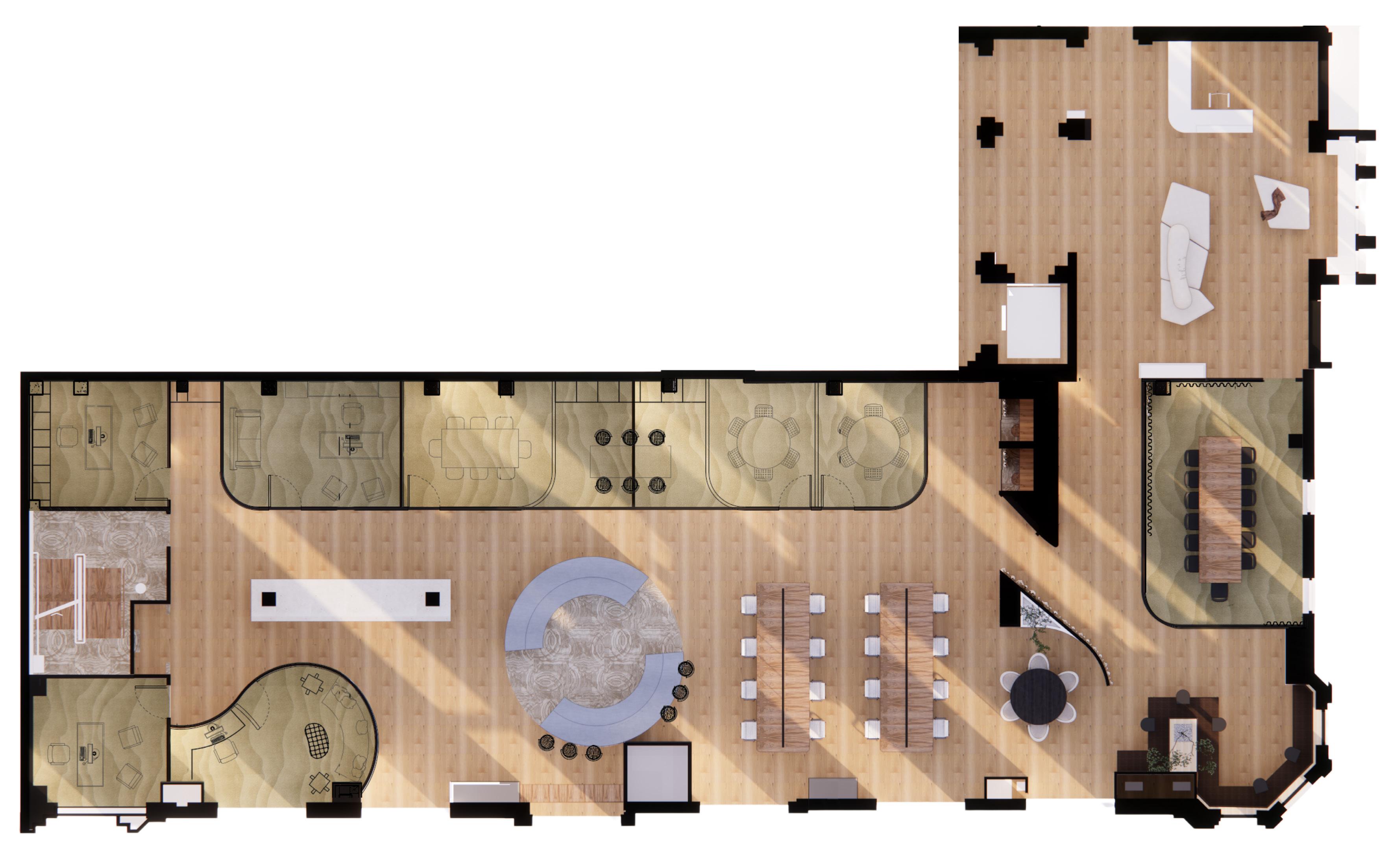
This workplace concept for Spotify creates a flexible and intuitive environment that supports focus, collaboration and creative flow. The design balances warm materiality with soft acoustics to provide a calm backdrop for makers, engineers and content teams. Clear zoning shapes the rhythm of the space, moving from quiet work areas into collaborative hubs. Custom seating and integrated greenery introduce moments of pause. The overall atmosphere reflects Spotify’s identity as a global creative platform; adaptable, human centred and quietly immersive.The overall atmosphere reflects Spotify’s identity as a global creative platform: adaptable, human-centred, and quietly immersive.

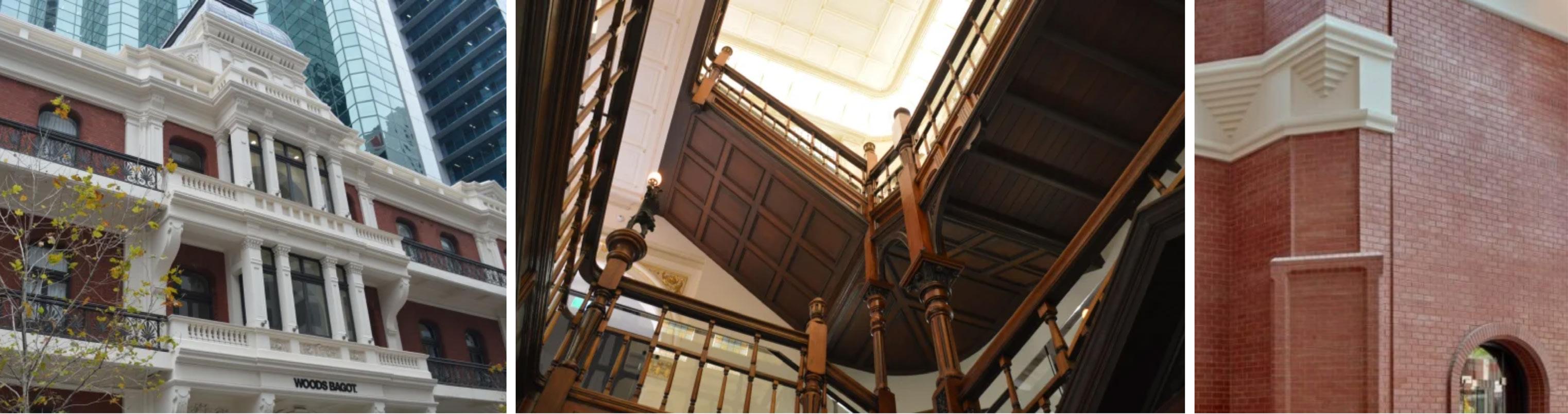
Spotify Office – Palace Hotel, 108 St Georges Terrace
Located within Perth’s CBD, the site offers a dynamic urban backdrop that aligns with Spotify’s identity as a global creative brand. The existing building geometry, natural light patterns, and surrounding context informed the workplace layout, acoustic strategy, and material direction, grounding the design in both place and brand culture.
‘Design is most powerful when it strengthens our connection to place..’
Typology
Urban Design
Location
Washing Lane, Perth City
Software
Autocad, SketchUp, Lumion, Enscape and Photoshop
Year
Semester 2, 2025
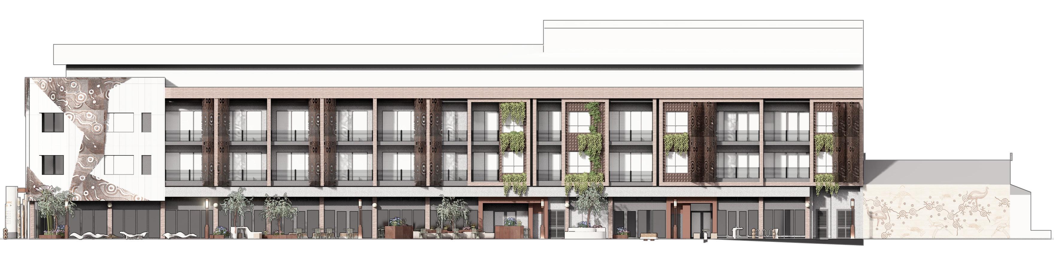
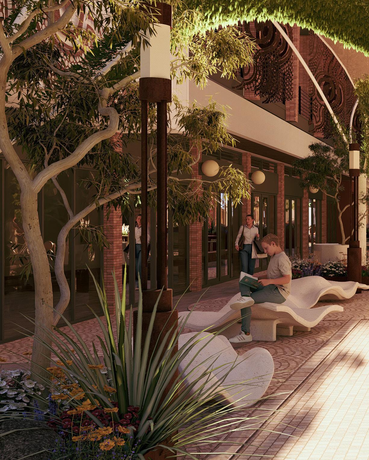
This group project investigated how Washing Lane could be transformed into a more cohesive and culturally responsive public environment. Guided by the City of Vincent brief, the proposal examined the laneway’s existing spatial conditions, patterns of use and material character to identify opportunities for improved comfort, connection and community engagement.
Our approach drew on the Noongar six-season calendar as a framework for understanding how the laneway could evolve throughout the year. By integrating natural materials, native planting and subtle moments of shade and rest, the concept aimed to soften the hard urban edges of the corridor and create a public space that feels more grounded in Whadjuk Noongar Country. The intention was to deliver an activation strategy that supports everyday movement while also encouraging people to pause, gather and engage with the laneway in more meaningful ways.
- remove corten steel hugging concrete columns - tiling a different shade of concrete through entry
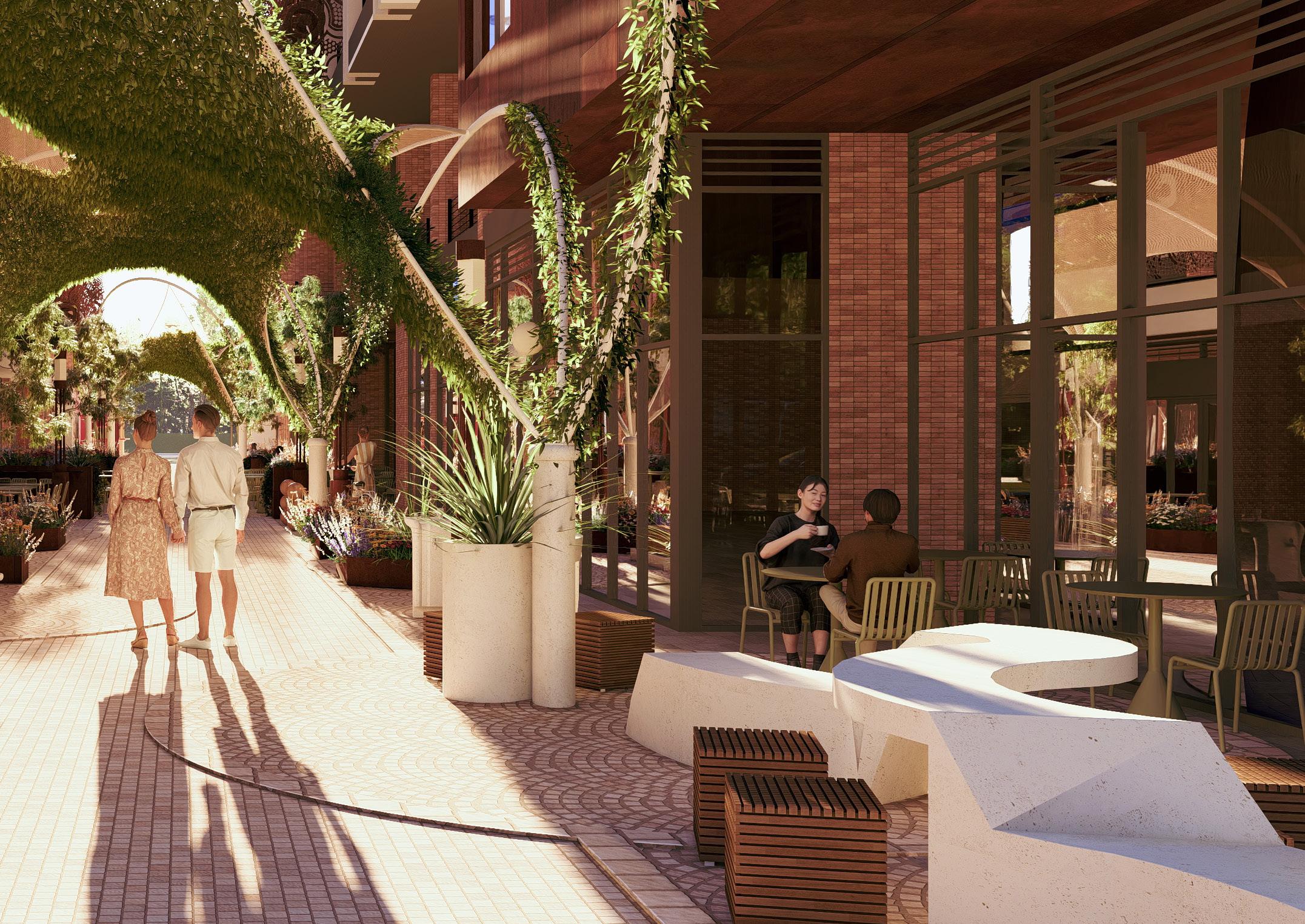
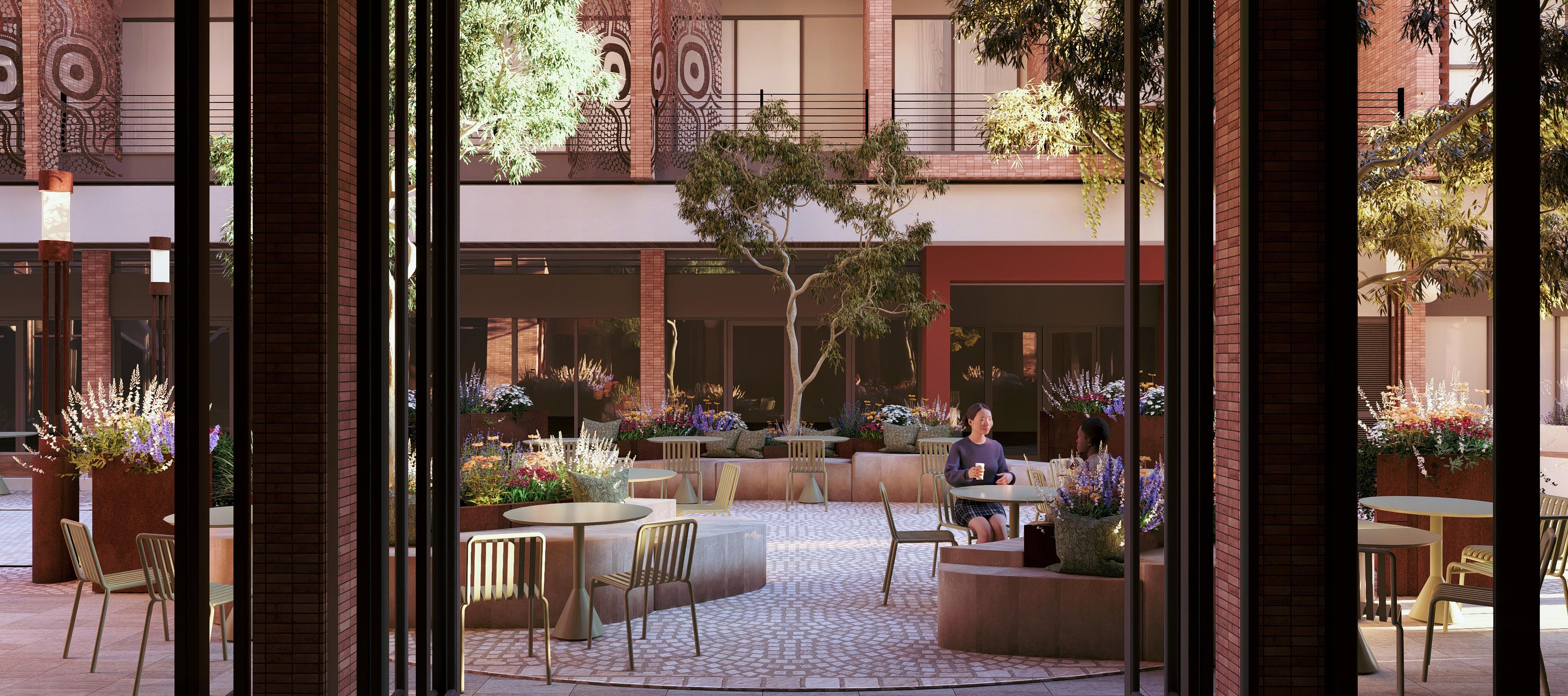


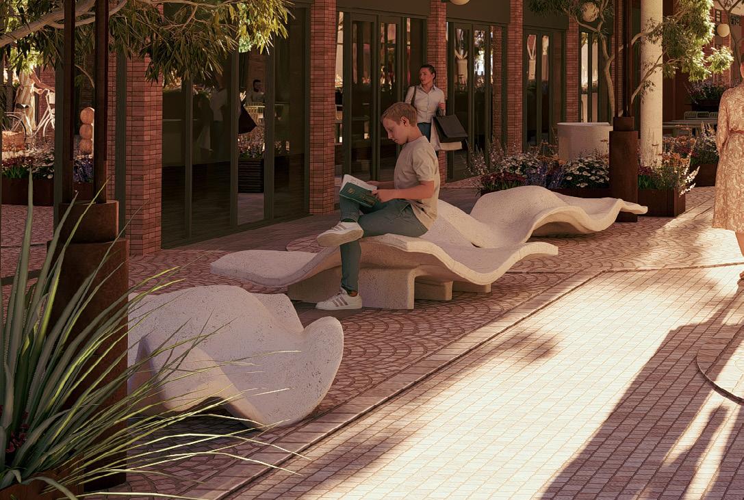
A quieter section of the laneway designed for rest and slower movement. Custom café seating, reading nooks and soft planting create a comfortable place to pause, supporting everyday use and a calmer atmosphere.
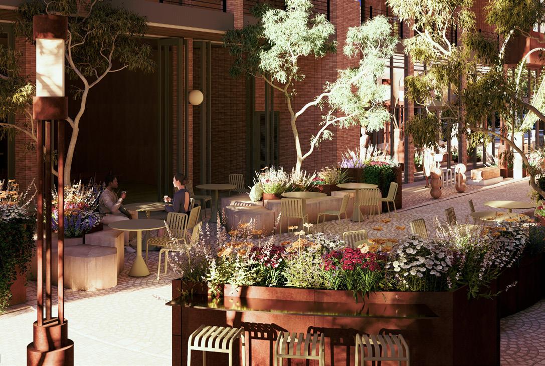
The social centre of the laneway, shaped for eating, drinking and casual interaction. This zone accommodates the bar opening, communal tables and flexible seating arrangements that allow people to gather and share the space.
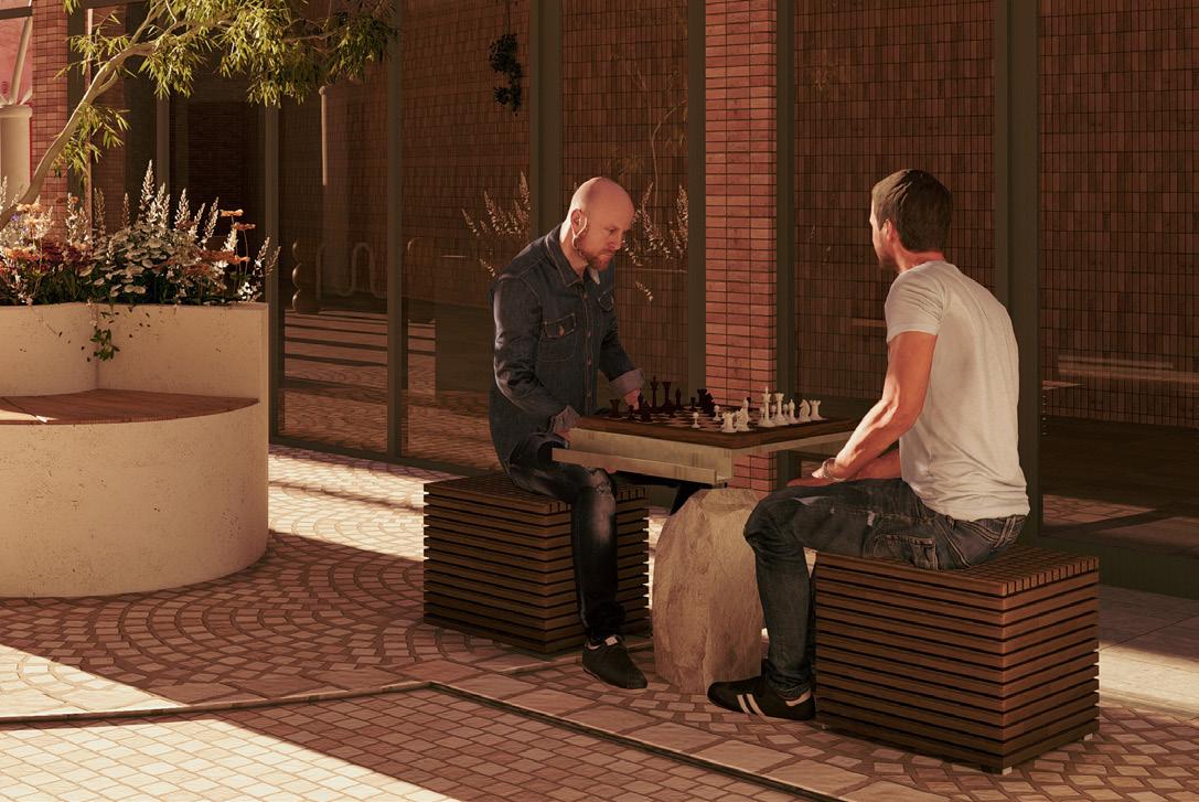
The most active end of the laneway, anchored by the food truck area. This zone encourages movement, play and engagement through interactive game tables and open edges for lingering, bringing vibrancy and activity to the corridor.