CREATIVE CULTURE
BY JOSIE DAVIES
INTERIOR AND SPATIAL
DESIGN STUDENT
40714177
CONTENTS
• 1st Project – Moon (pg, 1-2)
• 2nd Project – Disability (pg, 3-4)
• 3rd Project – Stop signs (pg, 5-6)
• 4th Project – Addiction (pg, 7-8)
• 5th Project – Paper back (pg, 9-10)
• 6th Project – The sea (pg, 11-12)
• 7th Project – Personal space (pg, 13-14)
• 8th Project – Entrances (pg, 15-16)
Our first assignment was to talk about the difficulties that could arise if you were trapped in a rocket in outer space. After quickly refining our ideas with a mind map, we started the exercise. The task was to outline the problem and solution in a story board format.
This assignment taught me the importance of an idea board since it enables you to record all of your first ideas for later reference and helps you refine your greatest concept for the best outcome.

Group work, drawn story board-
Showing the problems of cleanliness, therefore as a solution a cleaning rota would need to be put in place.

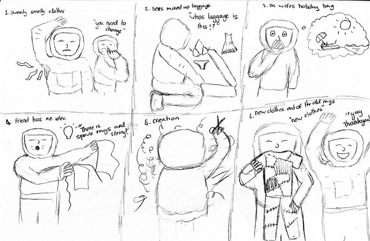
Individual work, drawn story board-
Showing the problems of limited clothes and living in small proximity, therefore a solution would be using other handy resources to craft your own necessities.
How has the moon has affected design?
Rational
The moon can be captured within many different things such as, artwork, technology, historic features, modern products and much more. Yet the lighting the moon reflects can only be presented in different ways yet the beauty is kept natural.
“The moon is the most well-known indirect lighting known to humanity. It receives light from the sun to gently shines above us, and is strongly associated with our feelings from ancient times.” -Hiroto Yoshizoe


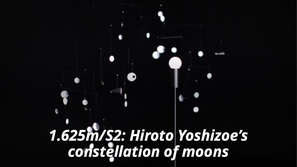

Hiroto Yoshizoe’s work (background) -
He focuses on using light to give a space a mood whether it’s a sense of peace or makes you feel uneasy.
His aim for this design was to emulate the moons lighting in that it gathers light from the external environment and gives the impression of gently shining to our eyes.
The surrounding darkness highlights its features, just like the moon. The black and white surfaces emerge and vanish as each item rotates in its own orbit.
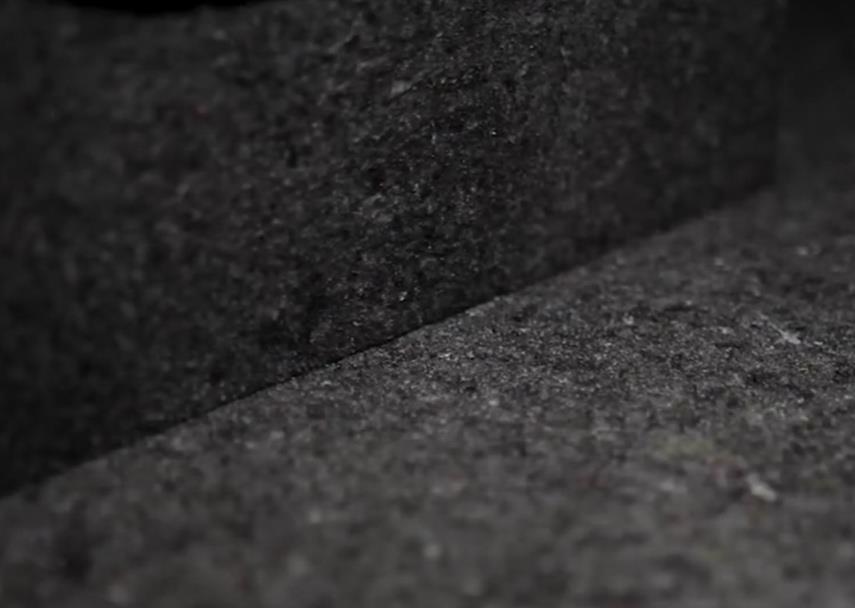
Yoshizoe created a new surface for his light to be exhibited on. It's crafted from recycled elements and before touch appears to be stone with similar sparkles that can be seen in ore minerals. Yet when felt it’s a spongey material with an elastic coating. This controls the colour and texture as well as providing the strength.
Our 2nd week assignment was to walk around Edinburgh and identify locations that have been made more accessible to people with disabilities. We concentrated on the area surrounding Merchiston. We worked here as there should be many options to enhance a disabled person's daily life in this location; it has bus routes, stores, cafes, a university campus, and other businesses.
This assignment taught me the value of visual investigation. I was able to put myself in the shoes of a disabled person by walking about and seeing places from a fresh perspective. I usually don't notice different disabled access points because I don't need them. However, I became aware of how frequently something showed up and how much variation there is when I looked around only to find these points. As an alternative, we may have gathered and discussed ideas, but this approach causes numerous locations to be missed and forgotten about.

Group work- `Idea board
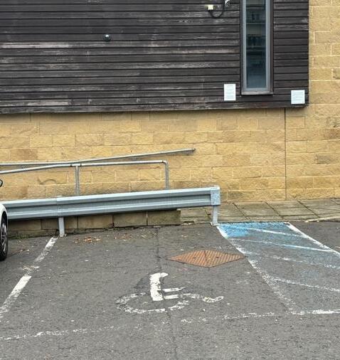
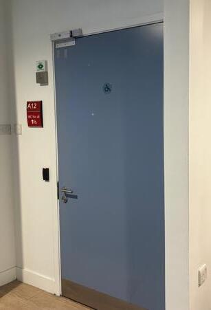


Wider doors, ramps, dropped curbs, disabled parking spaces and automatic doors are simple but effective for those in need of a wheelchair. The extra space to manoeuvre can be crucial for not only making disabled people more comfortable but making a safe area for quicker exits or entrances for example in case of a fire.


On many busses there are now accessibility ramps that electronically come out if someone is in need for one.
However, this can be daunting and maybe even embarrassing for holding up the bus. Therefore, food and other delivery services are more popular for those who struggle physically or mentally to avoid these interactions.


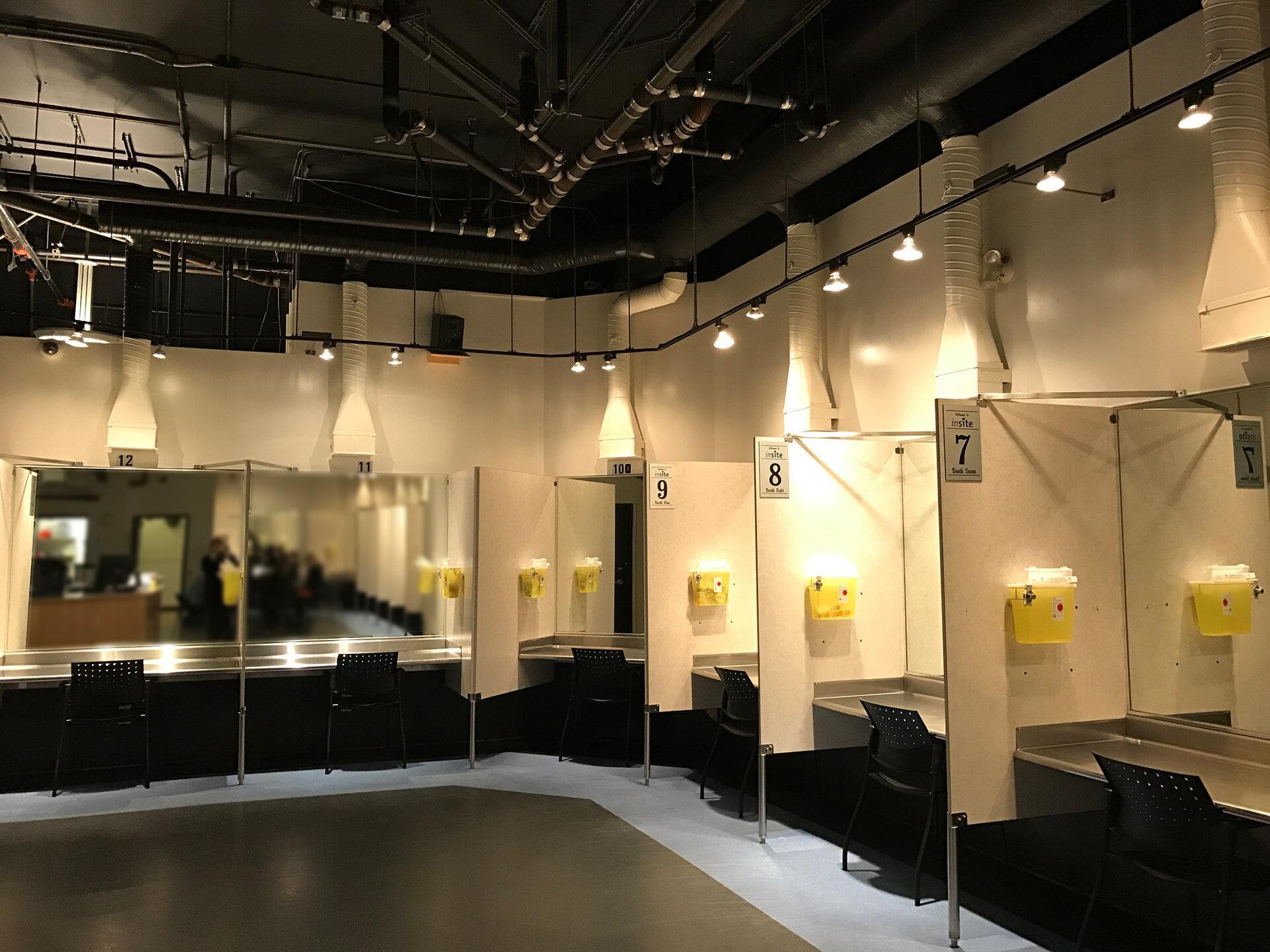
Sensory disabilities don’t go unnoticed in architecture either. To alert those who are visually impaired of an upcoming danger tactile paving is used, this could be before a road or a set of stairs to allow them to take the correct precautions. Even those with just weak eyesight, yellow stripes can be put at the start and end of the steps, so they stand out and less tripping accidents occur.


Ramps are not the only alternatives to stairs. Chair lifts, lifts and escalators are all electrical ways of moving between floors, although it is a more expensive way the practicality is more efficient than a ramp for indoors. A ramp can only have a gradient of 1:12 which can be a challenge for the space you are given compared to the height you want to achieve.
I learnt how to see things from an additional perspective in this task. This is crucial in design, in my opinion, because your first idea is almost never the best. (It shouldn't be.)
Our 1st task was to walk around Merchiston Campus and find as many stop signs as we could.
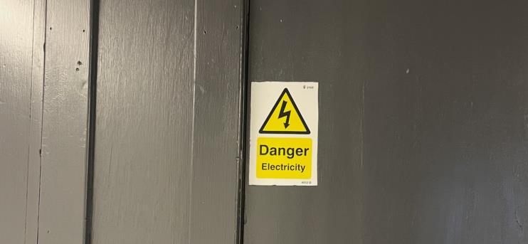


There are many stop signs in architecture that make you stop for safety. This could be a warning sign, a traffic light, road works, a restricted area sign and many others.
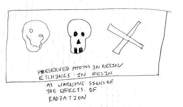
Our 2nd task was to create a stop sign that will turn people away from danger and still last in 1000 years time.

Group work sketches of idea

To some danger is exciting and people love to push the big red button. So how do we make something look dangerous without making it enticing? We produced a variety of ideas, including architectural and sensory interventions that indented to dissuade people from getting near the danger zone.
Including spikes, smell, a large drop to scare those of height, clear signs, model corpses, mines, Thornes and a big wall to block
What makes you stop in design?
However technically not all stop signs must be a sign. It can just be something that makes you stop and stare for example in interior and architectural design…
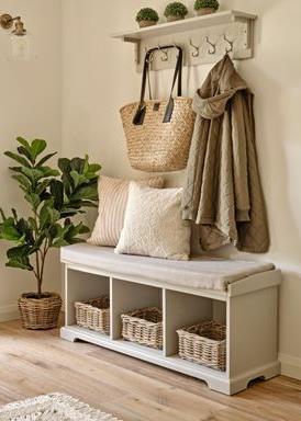
A cloak rack forces you to take a moment to put your shoes away and hang your coats up. Perhaps it's only a subtle feature wall that causes you to take notice. Since there is only one busy area in the space, it creates a sense of simplicity by focussing your attention on just one feature and encouraging you to pause and take a closer look.

Having unique features in an interior design can be quite important. It adds value to the space and makes me pause with curiosity.

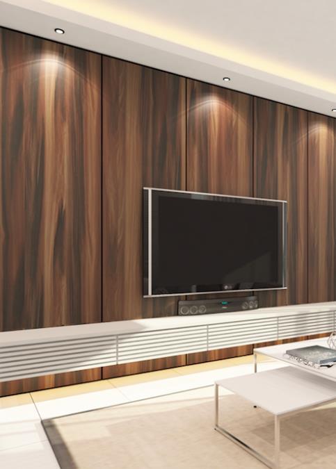
A design's exterior is just as significant since it provides an initial indication of what to expect. However, the exterior of this design seems quite perplexing in comparison to how the internal levels will seem inside, which makes me stop and find it intriguing.

The site's location is crucial. I always pause when I see the view. Perhaps it would be in a city where I could watch people interacting, the sea where I could gaze at the horizon and find peace, or the countryside where I could observe the wildlife.
Our task was to visually note and make a poster on addictions that we see more and more often in a modern-day world.
I learnt from this task that keeping your options open is important, for example having many different sketches of posters or even having a list of topics to choose from is key to finding the best outcome.

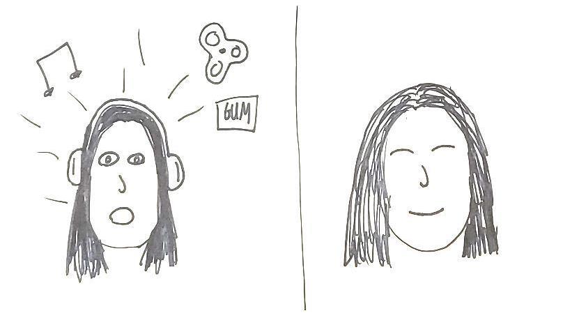

Groupwork- sketches of the addiction to constant entertainment and stimulation. The need for chewing gum, constant noise, a fidget toy, or some sort of activity is becoming increasingly popular.

How can designers help addition?
In an article called ‘Without Space We Cannot Heal: Design Insights Into Addiction’ by Hannah Leyland I have learnt, There are now few places where individuals with addiction can receive assistance: detox centres, rehabilitation centres, emergency departments, support groups, group homes, supportive housing, and outpatient programs. These areas frequently have significant entry obstacles in terms of money, society, and psychology.
Designers must acknowledge these stigmas and personal biases. A message of care should be conveyed through the design of these areas to individuals who battle addiction. Designers are not educated to empathise with this experience, much less to think spatially about assisting public health initiatives to treat it. If society accepts these facilities as respectable, dignified places and when they are a routine part of treatment, we can make important improvements and eradicate the negative stigmas connected with addiction and related mental health issues.
Our task was to read a short text called ‘AnAttempt At ExhaustingA Place In Paris’ by ’Georges Perec’ and create an illustration for the front cover of the short story.
In this task I learnt the importance of group work and gathering other people's opinions in addition to your own data collection.
Following our separate readings of the text and underlining of our own ideas, we convened as a group to visually explore ideas by sketching phrases and scenes that spoke out to us. This was effective since we all remembered various scenes and noticed details that others had overlooked. For instance, my key event in the story was that he saw everything in a clockwork fashion, but other group members thought it was important to note that he saw the world from an outsider's point of view.
Frequently mentioned ideas were…
• He was watching from an outside perspective.
• It was like he was excluded from the inside world.
• He kept seeing the same things each day like clockwork, including busses every hour, pigeons, people, buildings and people sitting in the same places.
• He sat inside looking out a café window.


As shown with the camera reel, my finished design depicts him repeatedly seeing the same things.
The title, author, and translator are all included in my design.

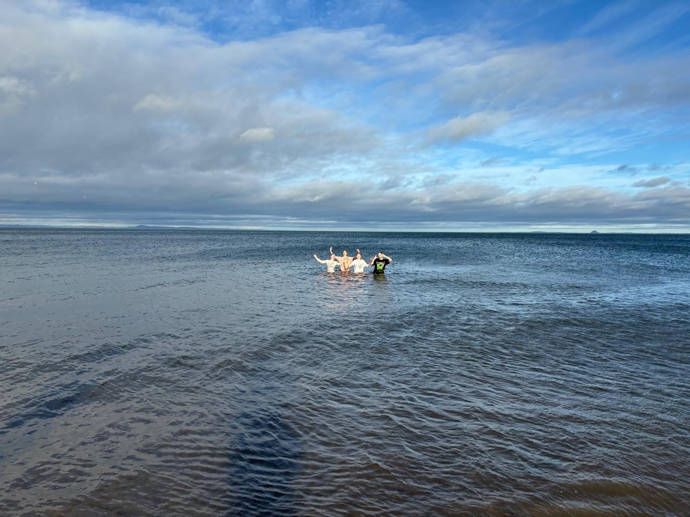
Our task was to visit the beach or look out to the beach and note how being by the seaside makes us feel.
This assignment taught me how vital it is to visit the proposed project site because it gives you a firsthand look at the feelings people have there. As a result, you may focus your project on understanding the needs of the client while also going above and above to highlight the positive emotions they have in that area.
At the beach I feel -calm -at ease -love -joy -fresh -comforted -inspired

Our second task was to create a post card on how the sea makes us feel as apposed to a “I wish you were here” post card.
My post card is created on adobe illustrator, and it shows why/how I feel love when I'm by the beach.

Our 7th project task was to develop a personal space. My response was to make a calming area as it gives you the time to breathe and to have your own thoughts without many distractions.
Through this work, I discovered that sketching your design in situ is a useful method for rapidly creating a design that complements the surrounding environment and fits the site, both of which can be reflected in your design.


Personal space area sketch- includeselectric fire, window, curved sofa, corner table, book shelf, dimmed lights and a mirror
7th project- personal space
Our second task was to create another space in a different area in Edinburgh.
My chosen location is at Portobello beach along the promenade.
I considered what individuals would like to do in their own quiet space by the beach in order to adapt my design to the area. I decided on a location for bird viewing as a result. My space's interior features include an electric fireplace, comfortable beanbags for lounging, a window bench for sitting upright and seeing the birds, an information board, and a corner table with a cabinet underneath to store information cards about the birds.


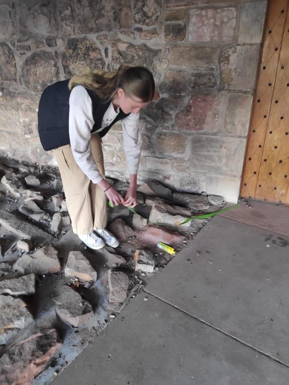
Our task was to find an entrance around Merchiston campus and use tape to make the entrance more appealing.
We chose the area under the Merchiston tower.
I discovered from this work that it can be helpful to physically mock up a design in situ because it makes it easier to visualise and might inspire other ideas. You can get a sense of measures from it as well. Since it's merely a rough temporary mockup, you can quickly test what works and what doesn't, which could save some time while creating project sketches.

Entrance before…

During…
Leading lines to the door to attract eyes and guide them to the entrance.


Adding an arch way on the walkway before the door to attract people walking by.
Adding a window so the entrance looks less threatening.
Adding greenery around the door so there is more colour in this dark area to make it more appealing and warming.
Making the door larger with an arched top as it seems more comforting and draws you in rather than a low roofed rectangle door.
Making entrances appealing can be crucial in any design as they are important in many objects and all spaces. You should be dawned to them not opposed.


Finalized mock of design
Seen in the image above. This entry appeals to us because it features a big door, a walkway that leads to it, windows, lighting, greenery, and a high arc that softens the harshness of the design. All of which we attempted to represent with the tape in our mockup.