
ORTFOLIO
BACHELOR OF INTERIOR ARCHITECTURE + DESIGN
JOHN TAYLOR RAABE
01 02 03
04 05
ASCENDING
INCLUSIVE DESIGN | TESTACCIO, ROME FALL 2024
STEM LIBRARY
LIBRARY DESIGN | FAYETTEVILLE, ARKANSAS SPRING 2024
GREEN LEAF LIVING
RESIDENTIAL + HOSPITALITY DESIGN | PADREBORN, GERMANY SPRING 2023
NEXT NETWORK OFFICE
OFFICE DESIGN | DALLAS, TEXAS FALL 2023
FARMINGTON FIRST LOBBY
CHURCH DESIGN | FARMINGTON, ARKANSAS FALL 2023

/Johnraabe


1 PROJECT ANALYSIS
GROUPPROJECT:(JULIEDEPETRIS(IARD)
This project focuses on collaborating with an Association for People with Autism, interior design students are challenged with the design of a multipurpose Care Center located inside one of the roman former slaughterhouse pavilions. This particular proposal is a site that focuses on biking and rock climbing to provide knowledge and skills for people with ASD.
The project site is in the former slaughterhouse of Testaccio district, in southern quadrant of Rome, where the Aurelian Walls meet the Tiber River. The Testaccio project site is characterized by its mixed activity and use: cultural, residential, commercial, and educational. The site itself allows for possibilities of design with the preexisting structure put also includes the exterior site located on the north side.


CONCEPT STATEMENT
Our design integrates the themes of ascending, directional, and balance. This use of terms can be seen through our design choices including, materials, colors, and programming. The space mirrors these three attributes on the interior and exterior of the space. These three main vocal points are also mixed with elements gathered from research on members with ASD to create a space that provides a learning experience a long with a place to grow community.

ASCENDING BALANCE
The concept of ascending is prominently showcased through the central staircases— interior and exterior—and the three key forms introduced within the interior space.

DIRECTIONAL
Directional elements are highlighted through the strategic use of color and the flow of the floor plan.

Lastly, balance is achieved through the design's thoughtful combination of tones and material transitions.


GROUND FLOOR
MEZZANINE FLOOR
KEY:
GYM/ROCK WALL 1. 2.RESTROOMS
CORRIDOR SEATING 3. CAFE/GRAB & GO 4. RECEPTION/ WAITING 5.
6. BIKE REPAIR
7. BIKE LEARNING
8. BIKE PARKING
9. THERAPY ROOMS
10. PRIVATE OFFICES


2
3
Privacy is required when developing spacing for ASD members. As the many of the programs (offices and therapy rooms) suggest an isolated experience. The mezzanine space generates this isolated atmosphere, unlike the rest of the floor plan.
Signage is a key design choice to have in mind when designing for members of the ASD community. Providing clear and colorful signage allows provides members with ASD easy circulation and direction.


ESSENTIAL PROGRAMS
The floor plan provides spaces for both the elements of Rock climbing and Biking. The bike and rock wall spaces provide the members of the ASD community with learning attributes that will help prepare them for jobs in the real world.
The jobs and knowledge provided here help members with ASD learn:
1. Communication Skills (providing interaction with customers and members of the community),
2. Help Develop Routines (cleaning off equipment and bikes) &
3. Learning Cognitive Behavior
These spaces also provide an area that allows members of the ASD community to learn both biking and rock climbing, to hobbies that provide health and physical activity.


BIKE REPAIR AREA

3
1

2
BAR SEATING PULL-OUT
Bar Seating is located closest to the cafe as it provides users with seating to enjoy a cornetto and coffee alone or together. The desk space provides optimal room for users to enjoying a bite to eat while allowing space to put their laptops while working on work or just having fun.
SEATING

The pull-out seating built into the right side mass provides users with the ability to move the seating around creating many different variations. The seating has handle bars located on the side as the seating has wheels on the bottom providing users with ASD the ability to fidget.
3
BENCH SEATING
The singular bench seating gives users a space to relax alone or together as the bench provides optimal room to lay down or seat two. This intern with pullout seating provides multiple variations where someone can sit alone or together. There is also tables allowing for users to sit there food or computers while relaxing.


PROJECT ANALYSIS 2
This project is renovation of a preexisting building in Fayetteville. The goal behind this project is to design a Library of Things for the community of Fayetteville, AR. A Library of Things is a space that lends to the community a opportunity to both lend and donate items that are not of particular value to them but might be to others. This particular proposal focuses on items that involves the subject of STEM learning.

The project site is located in the former Center for Math Science Education, located in Fayetteville on N West Ave. This site provides possibilities for design throughout its three floors and attached parking lot. This site is located off of Dickson and the University of Arkansas bringing about heavy foot traffic from the college community.

CONCEPT STATEMENT
Fluid Fusion is an innovative interior design concept that harmoniously incorporate the elements of stacking and shifting to create a modern aesthetics and the need for versatile environments, this concept seamlessly blends functionality with artistic expression. The stacking and shifting is seen throughout the central structure which is used to divine circulation throughout the tree outside levels.

The ground floor focuses on the E in STEM, Engineering. This is seen through the furniture design, in the gear shaped lounge area and seen in the interactive elements like the VR space.

SCIENCE
The second floor focuses on the S in STEM, Science. This can be seen in many of the key elements including the DNA shaped reading space and the interactive Periodic Table wall.
GROUND FLOOR
KEY:
1.RECEPTION KIDS LEARNING AREA 2. CENTRAL LIBRARY 3. GEAR SEATING AREA 4.
The Third and Final floor focuses on Space and the T in STEM, Technology. This floor provides many technology spaces including a lab for 3D printing and laser cutting. The main aspect is the hanging planets and telescope that allow for a learning experience.
5. STAIR
6. STOR
7. REST
RCASE RAGE ROOMS

SECOND FLOOR

KEY:
STUDY AREA
ARCHIVE SPACE
STUDY AREA
DNA SEATING AREA
5. PERODIC TABLE 6. STAIRCASE
7. STORAGE
8. RESTROOMS
RECEPTION/WAITING AREA

1

LOUNGE/VR AREA

2
DESIGN INTENTIONS
1 When designing for a range of ages, many materials become essential to the flow & environment of the space. Located above each space, is acoustic panels with built in lighting. The acoustics are used to help deal with the noise requirements that is present when dealing with programs that require different noise ranges.
2
3 Another essential to learning spaces is hands on aspects. Included in many of these spaces is fun activities like a VR space or The touch screen periodic table located on the second floor.
When designing in a bigger space the need for clear circulation is essential. This is seen through the use of zoning through material changes and color changes.


STUDENT
BUILT IN DESIGN
Located in the center of the space is bench seating in the shape of a gear. The seating area provides a space for all ages to read but more focuses on kids as the floor houses the kids learning area. The space is open providing easy access and views for parents when brining their kids.
The seating located in the center of the space takes that shape of a DNA strand as the form rotates and connects as it ascends. This seating creates a space for guests to read as the exterior of the seating holds a variety of books to choose from.
The center piece and main structure of this project is modeled after the Tianjin Binhai library and how the form fluctuates through its depth and height to create a fluid form.


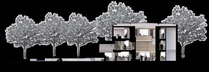
3 PROJECT ANALYSIS
This project focuses on taking a pre existing building located in the center of Paderborn, Germany, and making it into an adaptive reuse project focused on designing for the aging community in Germany. The project consists of many different programs, ranging from restaurants and cafes to pools and libraries. This space provided many amenities to allow guests a range of activities.
This project is located in Paderborn, Germany. The proposed site, is rich with history as it has been both a hospital and church. The site consists of two full floors and a third floor that consists of three small sections. Located around the site is many parks and streams, allowing the residents to take in the views or a breath of fresh air.


CONCEPT STATEMENT
The purpose of this project is to design an adaptive reuse space that helps the aging community of Paderborn Germany. The intention behind the programming and material selection is to emulate the atmosphere of a cave. The main aspects derived from the cave like space, is through sensory aspects, creating a threshold between many of the the programs, and balancing the use of external and artificial light, as lighting is the most key aspects of a cave.
SENSORY
A key element of caves is the environment it creates through sensory aspects. The use of water both in the Restaurant, Bar & Cafe and Entrance Hall help connect you to the environment through sounds.


THRESHOLD
Threshold can be seen in the use of materials as the change creates a sepeartion between spaces. Like the light tones and soft materials used in the residential unit vs the hallway which uses dark tones and rough materials. This can also be seen in the entrance hall as it works as the central threshold.
Balance can be seen through the use of lighting, as the space uses light wells to create vocal moments like the entrance hall, but then shifts between a light space like the entrance hall and a more dim space like the hallway.


GROUND FLOOR


SECOND FLOOR

THIRD FLOOR


2
balance the space. The mixture of natural daylight from the curtain wall and the lighting fixtures provide in optimal amount of light that can be adjusted based on the user.
When dealing with a space that provides only exterior views on the facade the key to this design was to program according to the essential daylight needed for each program. This intern is why the sun room is located next to the bedroom, providing morning light to the essential spaces.
3
Circulation and furniture spacing is essential to such tight residential unit. This intern is why furniture size and placement are key to making a comfortable but open environment.

MATERIAL LEGEND
Grey tile flooring
Light wood flooring
Dark wood veneer
Dark stone wall (shower)
Light grey Cotton upholstery
Grey concrete
Light grey brick
Brushed nickel hardware


One of the particular vocal points of the space is the bar area, specifically the bar back/drink wall. Due the importance of this piece, the design was essential to drawing in peoples focus. The design utilizes a water like backing and task lighting to highlight the use of stone and the drinks itself.


THE BAR & CAFE AREA
The intention behind the bar space and its many elements are based in its programming in a general aspect of spacing and the overall program of the building itself.
The Bar & Cafe utilizes the 3rd floor/ highest point of the building, to allow guests an amazing birds eye view of the neighboring community, providing both view points at sunrise and at night to see the lights of the lively city.
The Bar & Cafe provides many amenities that highlight both of its functions. The immense amount of lounge seating provides areas for people to indulge in an early morning coffee.
Whereas the night life is highlighted by the two major dance floors located in the center of the space, the pool table areas and the bar back selection of drinks for a night of mingling.
DANCE & LOUNGE AREA


4
PROJECT ANALYSIS
This project focuses on the design of an Office building in Dallas Texas. This building is for NEXT, a global architecture and interior design firm located in LA California. The proposed design implements both communal, touchdown and privates spaces for the office and all of its staff. This project design dives into the Dallas Community taking inspiration from the neighboring buildings and culture. This particular design takes inspiration from Dallas’s metro system.

The proposed site is located in Dallas on Victory Avenue, adjacent to the American Airlines Center (Basketball and Hockey stadium). The proposed area itself is a renovation located on the third floor of the Victory Commons One (A class a Office Building). The space is 11,000 square feet and provides possibilities of design for a mezzanine floor.

CONCEPT STATEMENT
My concept is a network based on the definition of “a group of systems of interconnected people or things. A network is visually seen as an intersection of lines but a network in a place of work can be the start of a community. Many people know about the train system that runs throughout the city of Dallas. The train system is a long network of lines moving together to bring people closer to other neighboring communities.
COMMUNITY
Networking through the use of community in its design is similar to the metro in how different programs connect all the staff and guests.

DIRECTION
The use of color and strategic programming defines the elements of direction in this design as it provides the circulation that connects the firms branches.

DESIGN
Networking through design is seen in the design of this project as its programming provides clear connections between the different branches, providing easy collaboration between interiors and architects.


GROUND FLOOR

KEY:
PRIVATE OFFICES 1. 2.WORKSTATIONS MEETING ROOMS 3. HUDDLE ROOMS 4. SMALL MEETING OR PHONE ROOMS 5. CLIENT PRESENTATION ROOM 6. TRAINING CLASSROOM 7. RECEPTION AREA 8.
9. RESOURCE CENTER
10. WORK CAFE
11. MOTHERS ROOM
12. WELLNESS ROOM
13. INNOVATION LAB
14. DESIGN LIBRARY
15. NETWORKING SPACE
1

RECEPTION DESK/ WAITING AREA

RECEPTION DESK/ WAITING AREA AXON
DESIGN INTENTIONS
1
When designing for a office space the design needs to be present throughout the space, as the typical organization of spacing can drown out the intent. The next concept is highlighted through the
represents the metro system that networks the community around Dallas.
2 3
When designing for a office space, seating is an essential element in the design process. Seating ranges from comfortable lounge seating in the waiting area to durable office seating that is used constantly. Seating variety is the key to a good office layout, one that provides optimal needs depending on the user
The last key element to designing a office is programming. When designing a office layout is key but the circulation that defines how to move around provides guests and staff alike with an optimal experience


Light Grey Concrete flooring - semi gloss
Yellow and Grey nylon carpet fiber
Light grey textured nylon carpet fiber
Grey woven acoustic paneling
Regal Blue cotton upholstery
Dignity Blue cotton upholstery
Azure Tide cotton upholstery
Naval cotton upholstery
Light wood veneer

CLIENT PRESENTATION AREA


MATERIAL STAND
The material panel is pushed into access as it pulls out from the wall, providing optimal storage space


PRIVATE OFFICE LAYOUTS
There are 8 private offices in total and 3 different layouts. All private office layouts allow for privacy while still being able to maintain a connecting visual betweent the office and workstations. This is done through the half wall tinted windows located in every office. Signage is applied on the exterior of every office to allow guests to identify which office number and who is located within each space. Every office is ADA accessible, providing optimal wheelchair accessibility for guests and workers alike.
1


2
3


5
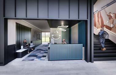
PROJECT ANALYSIS 5
This project focuses on the renovation of the lobby for Farmington First Baptist Church. This project proposes design for a new Welcome Desk, Seating Area, Entrance Area and Lobby Restrooms. This area is the first site for new and existing members of the church. This project came with a proposed budget and meetings between the Pastor and our team.
Farmington First Baptist Church is located in Farmington, AR on Rheas Mill Rd. Farmington Arkansas is home to approximately 10,4000 people. The neighboring School district provides the church with a variety of age rages. The site itself is three buildings divided into ages, that being the Kids, Zone, the Edge and the main Church Area, where this project primary focus.


COLOR PALLETE
The main color palette that was focused on in our group, was the different shades of blue that where located in the FARMINGTON FIRST BAPTIST CHURCH logo. Throughout the walls, extrustions and murals, the colors are prominent due to its importance from the client. When designing the mural on the left wall, all colors of the logo where represented to be considered as a vocal point for guests. This wall is commonly used to take pictures as it was previously decorated for different holidays and provides a backdrop for guests family pictures. The color palette was something that the client stressed a lot. The color palette provided with the budget only allowed for minimal painted walls to highlight things like bathroom entrances, the walls with display screens, and the large extruded service at the entrance of the sanctuary.
MOTTO WALL
TThe motto for the church is extruded on the left side of the lobby, providing a backdrop for people to take pictures in front of it.
WELCOME DESK
The welcome desk is place for guests to ask questions while also grabbing freshly brewed coffee before enjoying the service.


THANK YOU
JOHN TAYLOR RAABE