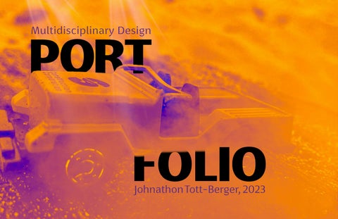
Multidisciplinary Design
 Johnathon Tott-Berger, 2023
Johnathon Tott-Berger, 2023
a multidisciplinary designer who enjoys creating engaging content that connects people together.
My designs combine a blend of digital and analog tools.
It’s good to believe in something.
I believe that good design puts the user at the center while allowing for inclusion, equity and trust.
BS - Visual Communication Design
San Francisco State University 2020
AA -Liberal Arts
City College of San Francisco 2017
Photojournalism
Exhibit
City College of San Francisco 2016
Epsilon Pi Tau
Honors Society
Beta Beta Chapter
2019-present
AIGA@SFSU President
San Francisco State University 2019-2020
DesignGuild
Vice President
San Francisco State University 2019-2020
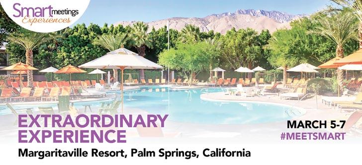
At Smart Meetings, we produce a digital and print magazine that reaches over 40,000+ subscribers in the Meetings and Events Industry.
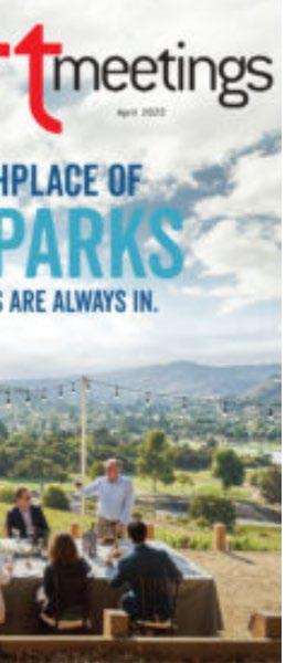
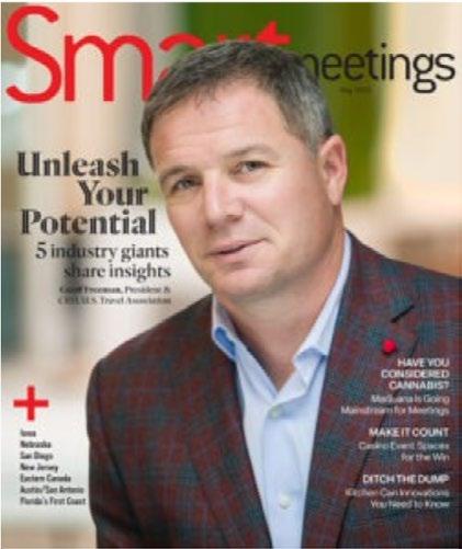
Along with the magazine, Smart Meetings hosts 6-12 events annually that connect meetings and events industry suppliers and planners through the events.
Magazine Layout: Adobe CC
InDesign
Illustrator
Photoshop
Acrobat
Usages: Business to Business product
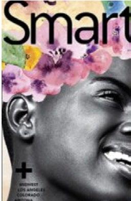
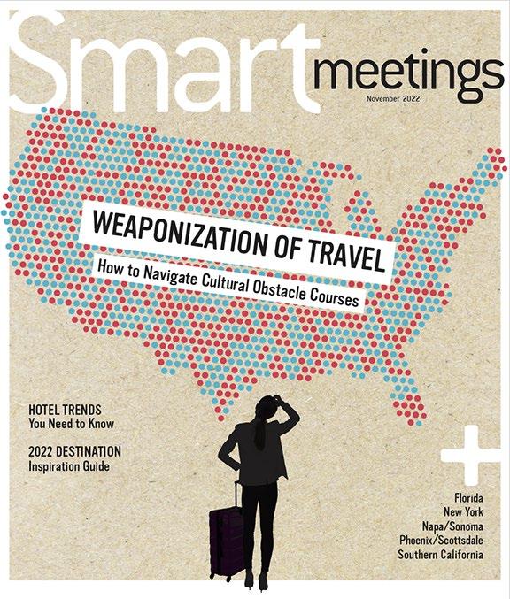
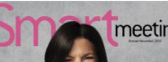
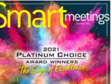
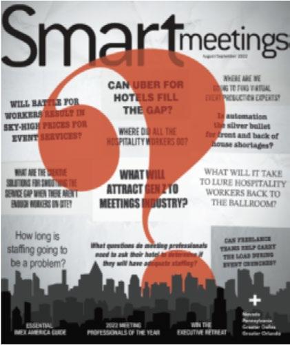
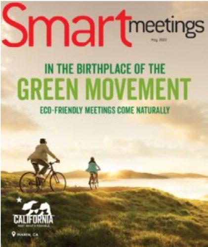
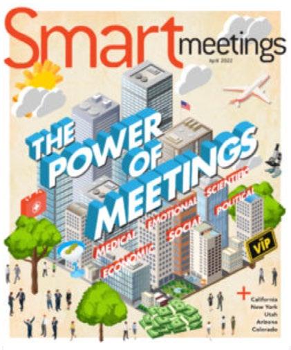
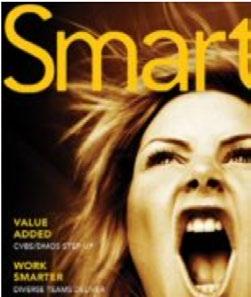
Photo descriptions: (clockwise from top left) Digital cover design for May 2023, Digital cover design for November 2022, Postiche layout (Piet Mondrian), Feature layout, Front of Book Column.
Cover Animations: Adobe After Effects
Premiere Pro
Animate Media Encoder
Usages:
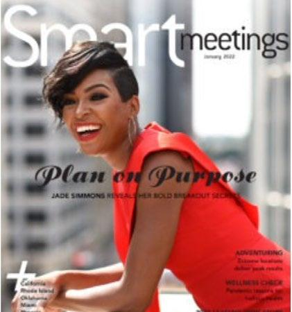
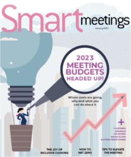
January 2023
February 2023
April 2022
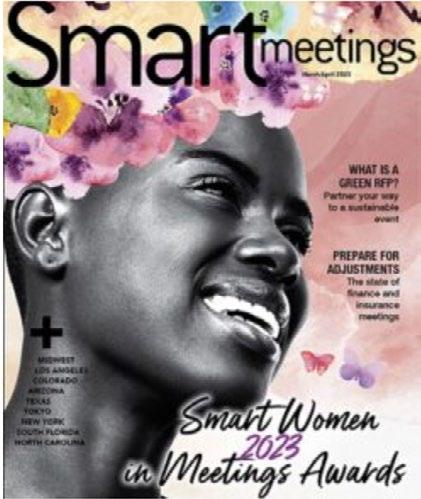
April 2023
December 2022
Event Assets: InDesign | Illustrator | Power Point
Usages:
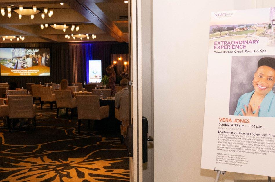
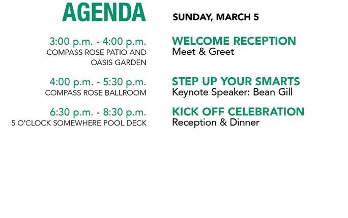
Wayfinding | Informational | Timekeeping
Descriptions:
(clockwise from top left)
Countdown Timer [hero image], Posterboard and letter-sized agenda, Posterboard for Event speaker next to ballroom with countdown timer holding image displayed on large screen.
Webinar Banners: Adobe Illustrator
Usages: Programmatic and email campaigns for webinar promotion
Descriptions
(Clockwise from top left) Pre-registration for May 2023, Preregistration for April 2023, Pre-Registration for June 2023, Registration banner for June 29th, 2023, Registration banner for June 22, 2023
**Pre-reg banners were set-up to increase early registration and have proven to be successful
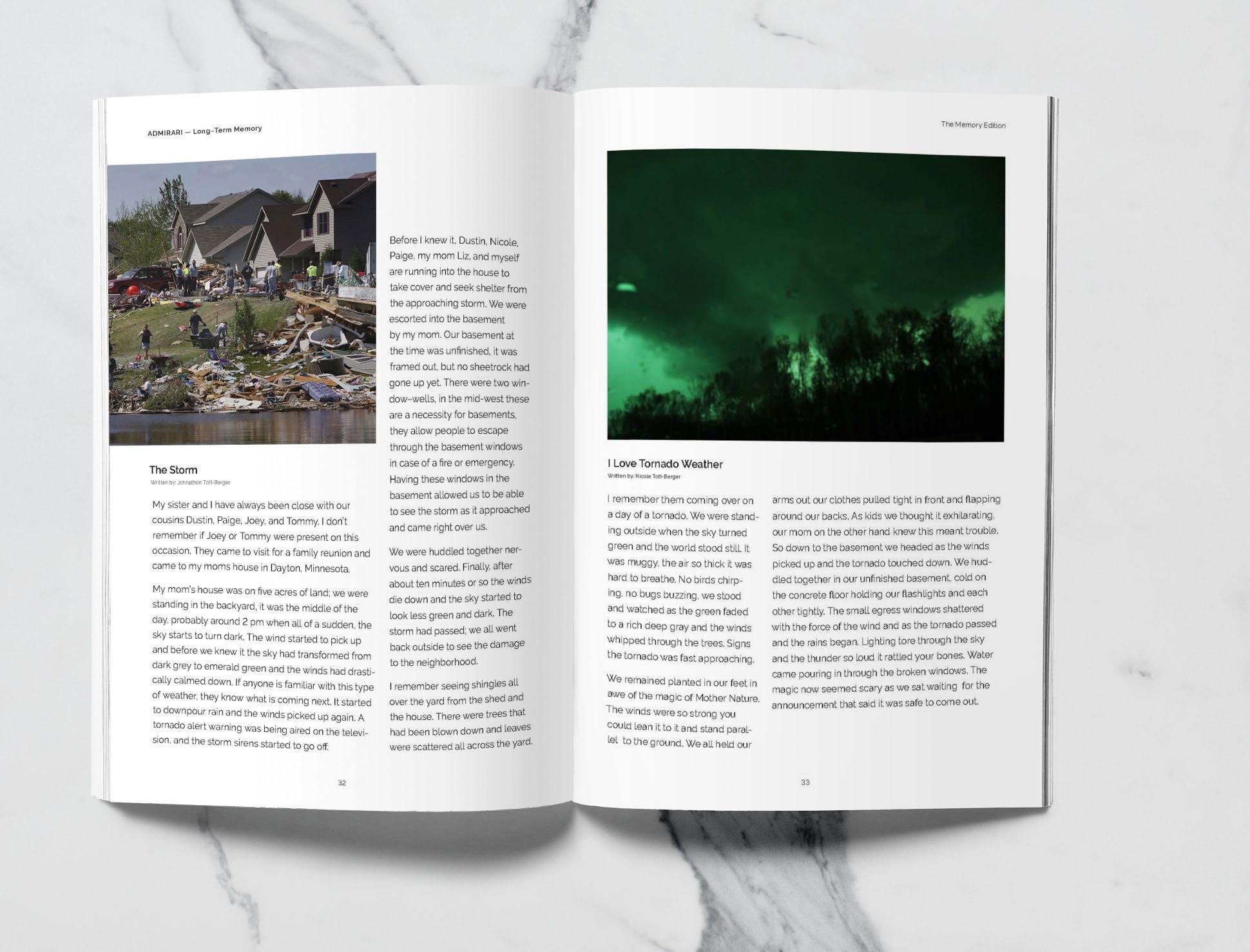
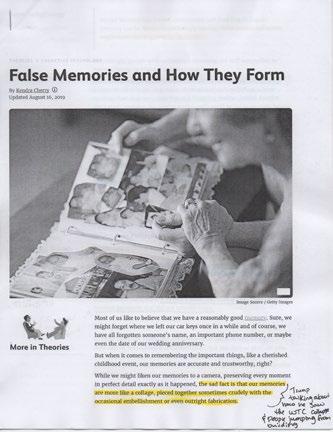
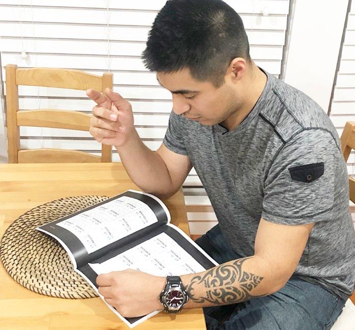
Admirari is a human interest magazine that explores different topics that make us uniquely different yet similar.
The magazine looks to bring people together by sharing information that people connect to while bringing awareness to important topics.
This issue explores memory, its benefits and harms that occur, how we can sharpen our memory and engages with the audience through visual activities that are meant to create nostalgia.
The first column shows different magazines within the same genre/ aesthetic. By reviewing their works and designs it gave Admirari a base for what is present and ways to set itself apart.
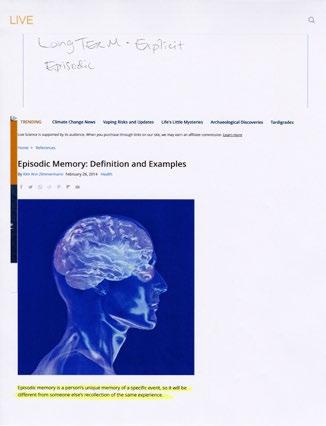
The second column shows different types of research that went into the production of the magazine.
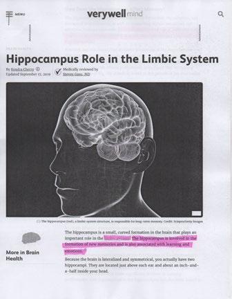
Not being an expert on medical conditions, Admirari needed to get outside information through peer review articles, interviews, and audience feedback that would eventually shape the content of the magazine. The audience questionnaire helped identify areas where there were similarities and differences between our audeince members and defined topics they wanted discussed in that magazine issue.
 Johnathon Tott-Berger
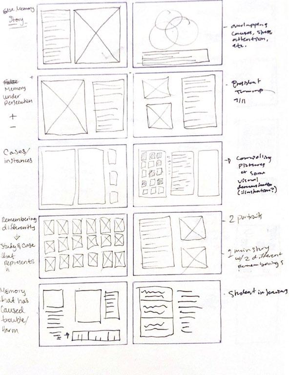
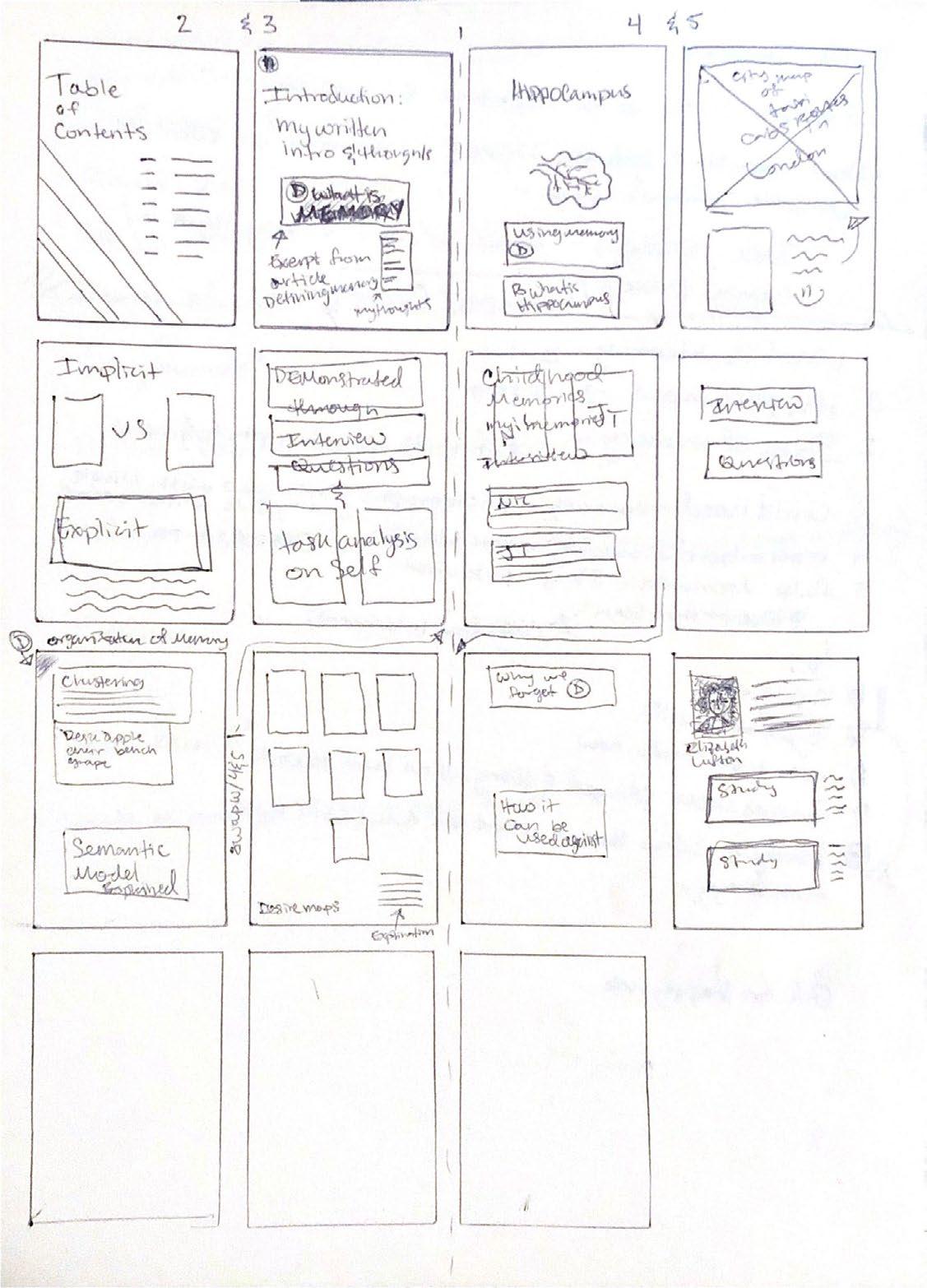
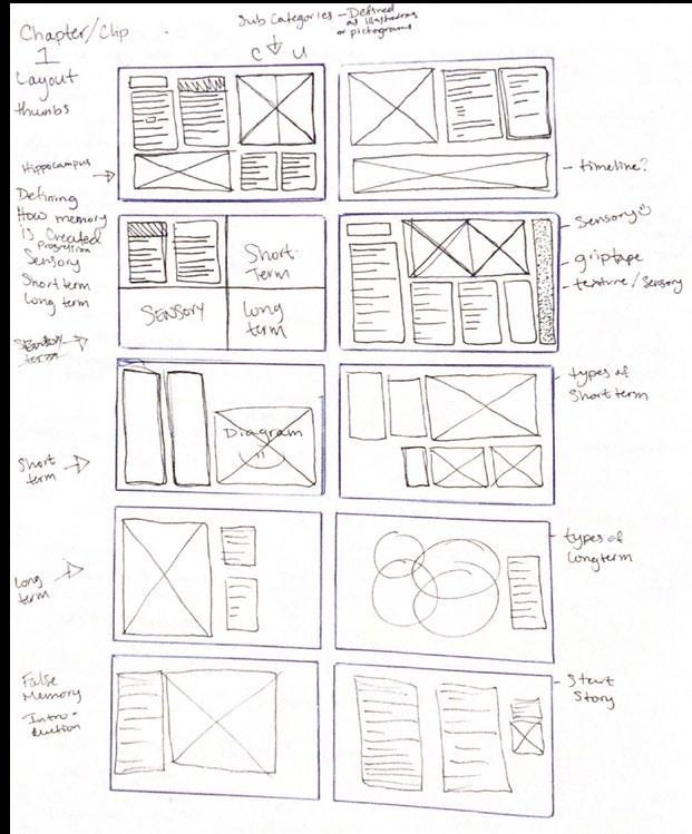
Concepts and Design Aesthetic ideas for different pages helped get a better feel and direction for each section of the magazine. Having a map really helped to organize the content by the areas of memory while the thumbnail skteches offered quick ways to visualize how the layouts might look.
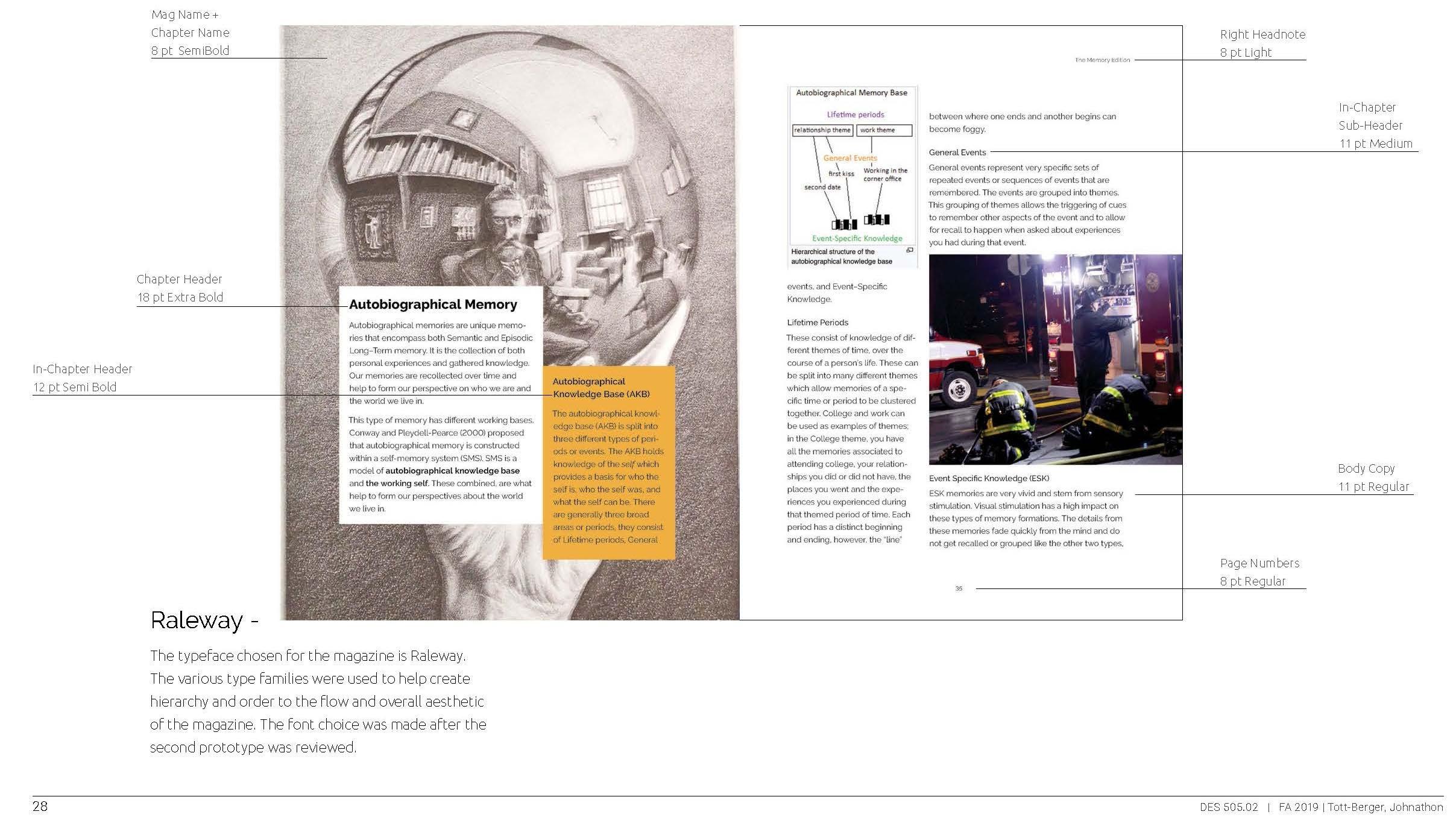
Creating the style guide helped define styles for the text which include font name, font family and font size.
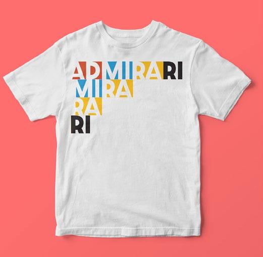
Iterations from the cover and logo designs were used to create interesting shirts that illustrate the palyfulness of Admirari.
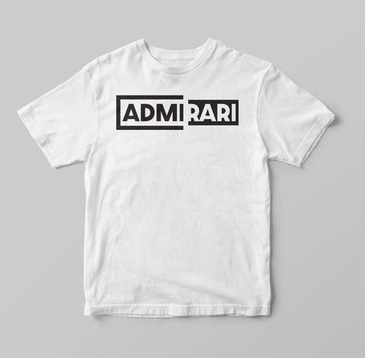
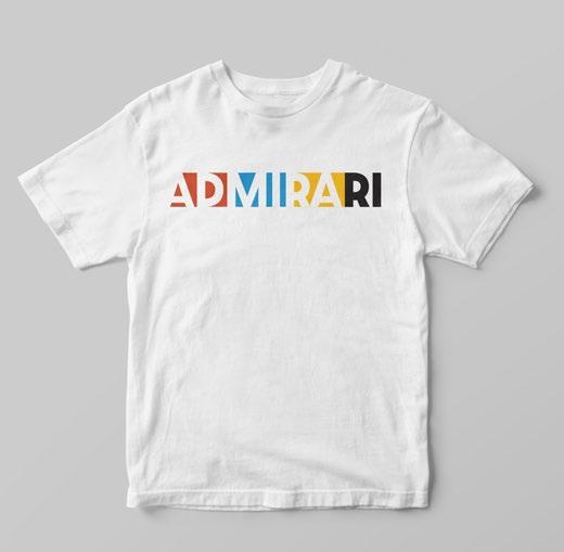
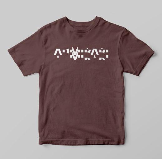
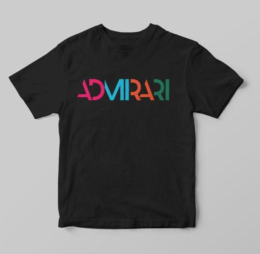
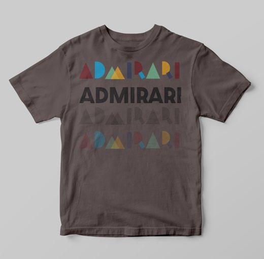
These shirts will help generate funding for other issues and offers an opportunity to collaborate with bay area printing companies.
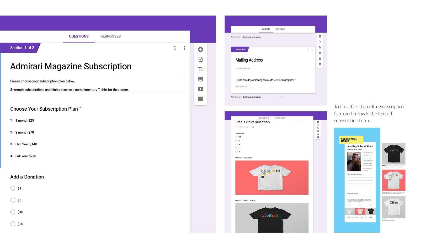
By creating an online subscription and write in subscription form, the magazine can manage and track its audience numbers.
There is an incentive to buy 3 months which gives you an Admirari t-shirt.
To see the full form click here.
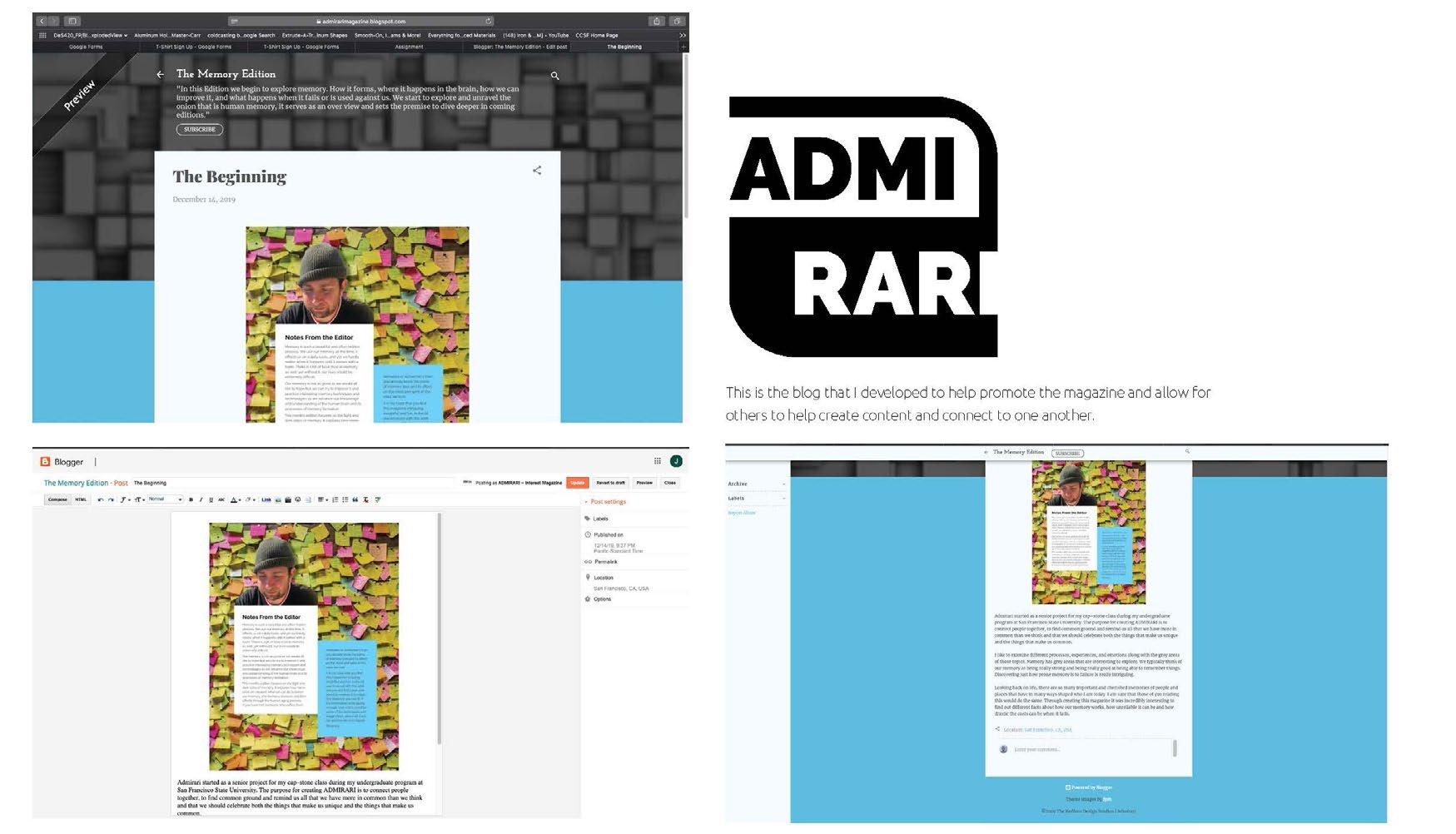
Blog Blog pages allow Admirari to interact with their audience while sending out highlights and articles.
johnnytotts@gmail.com
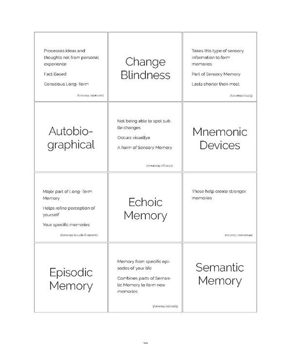
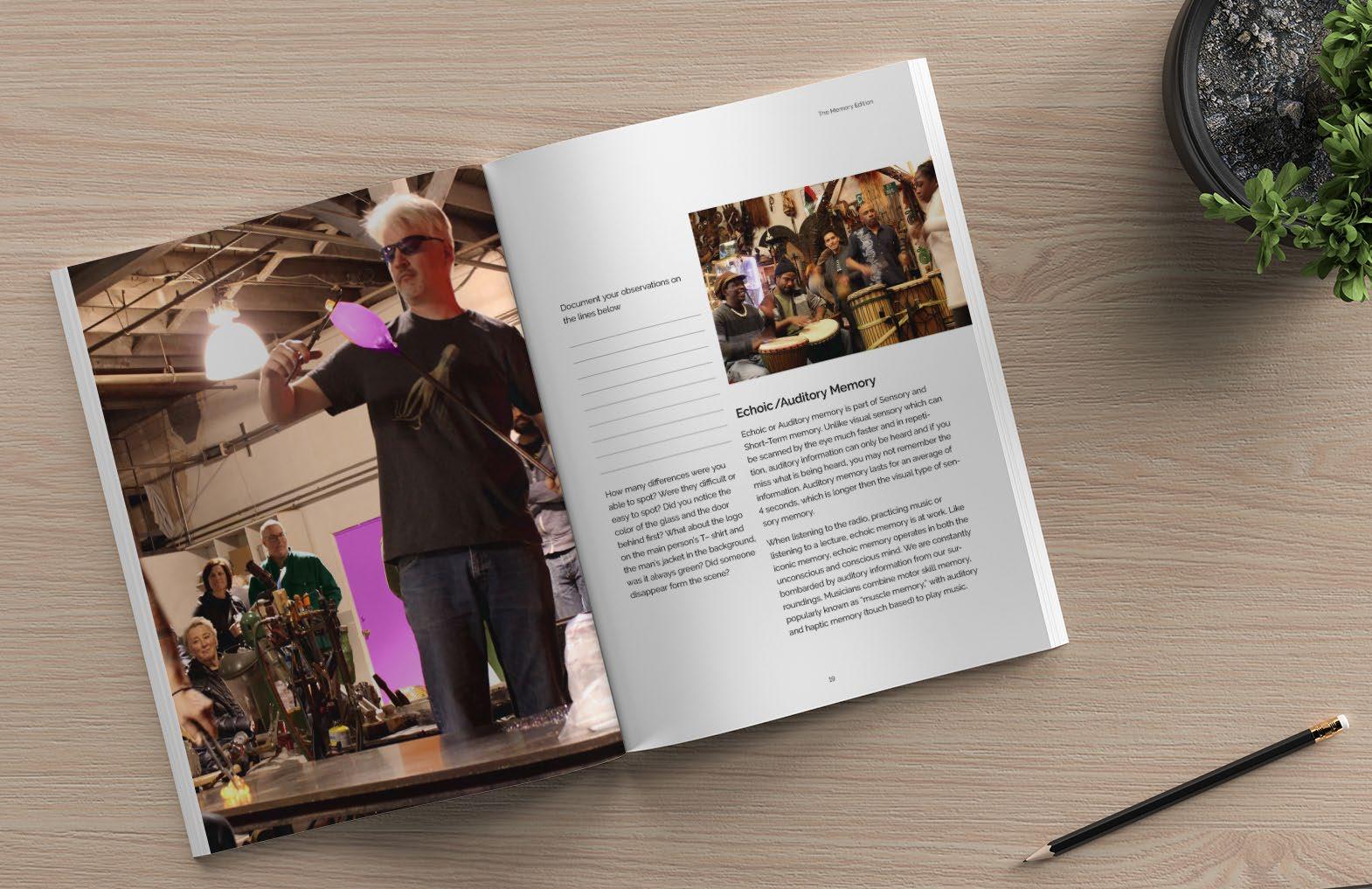
The memory card game was recreated in a flip up version for the magazine and created a fun way to recall information from the issue.
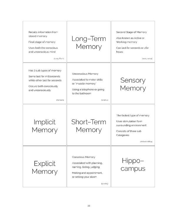
In this way, the magazine not only entices interaction but illustrates techniques and tactics first hand while offering a sense of nostalgia.
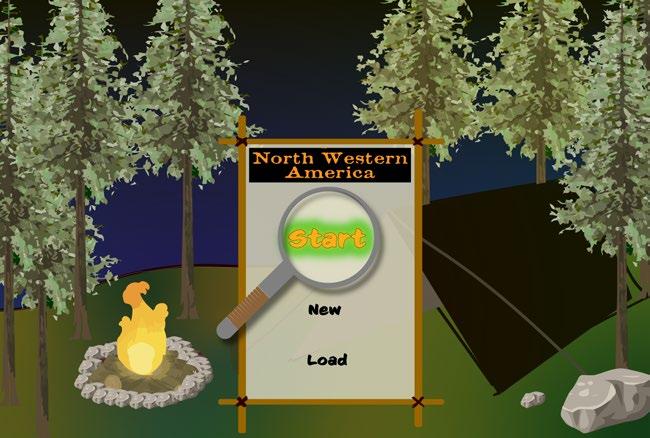
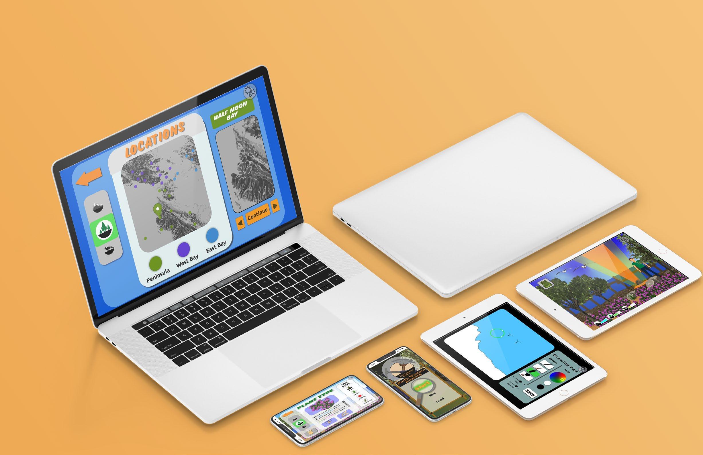
The premise for this project is to combine video games and playing outdoors while passing on an appreciation and understanding for the world we live in.
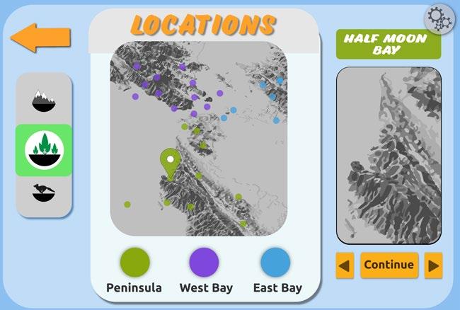
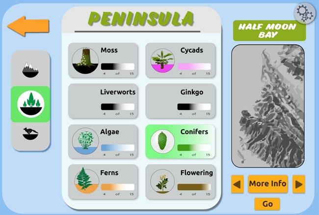
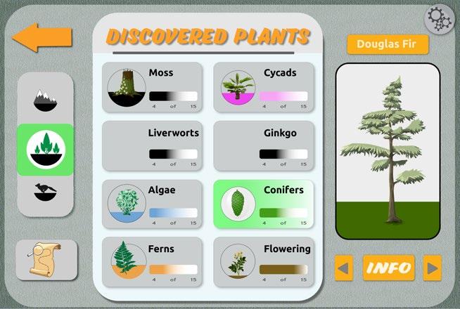
Users will explore the environment around them while learning about the different ecosystems and why they are important to that region. There are different collectables and explorable regions.
SKILLS:
Sketching | Research | Photoshop | Illustrator | InDesign
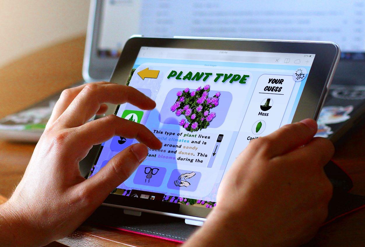
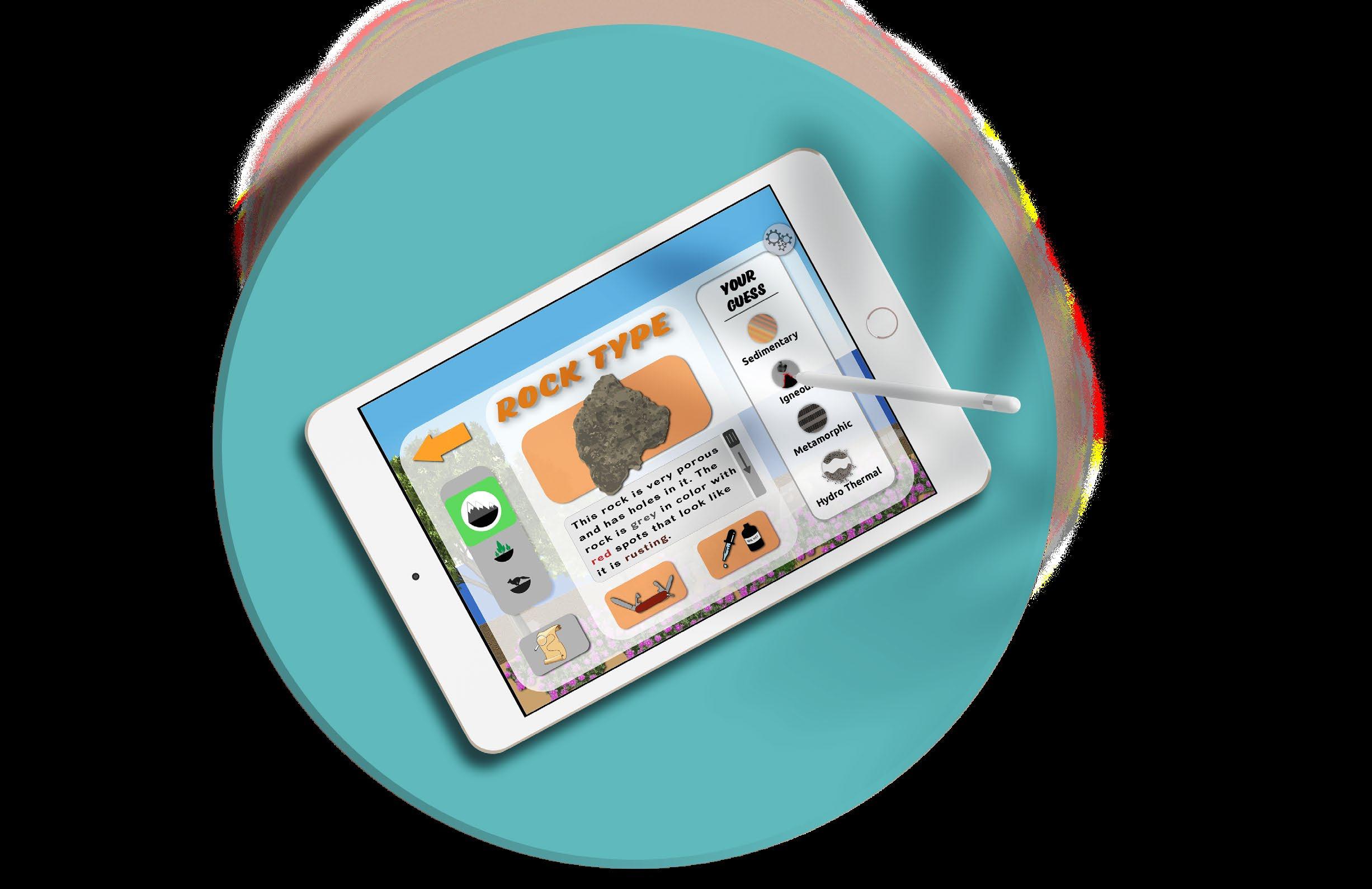
Different icons and graphic elements were needed to represent explorables, collectables and other important interactions.
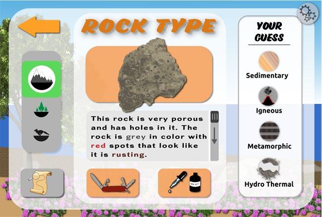
On the top row, the icons for three of the four rock families are shown. The bottom row shows the icons for the different types of collectables like rocks, plants and animals.
HydroThremalHere you can see one of the varios rock pages created for the game.
In this view the user is being asked which family of rock the type they found belongs to.
The army knife and acid dropper are tests that can be conducted to help the user pick which family the rock belongs to.
Two different fonts were used for the graphic elements of the game. Eds Market Bold Slant is the primary font used for big headings. Ubuntu, because of its legibility, was used for the smaller elements that need to easily read.
The primary colors are used a lot in various forms for the different collectables and locations. The secondary colors are used for each sub area.
Primary colors
Secondary colors
Different pages from the game helping to illustrate the graphic direction of the game and its visual elements.
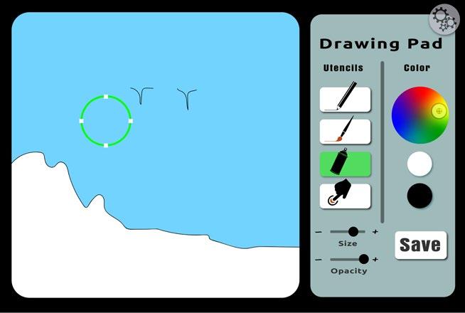
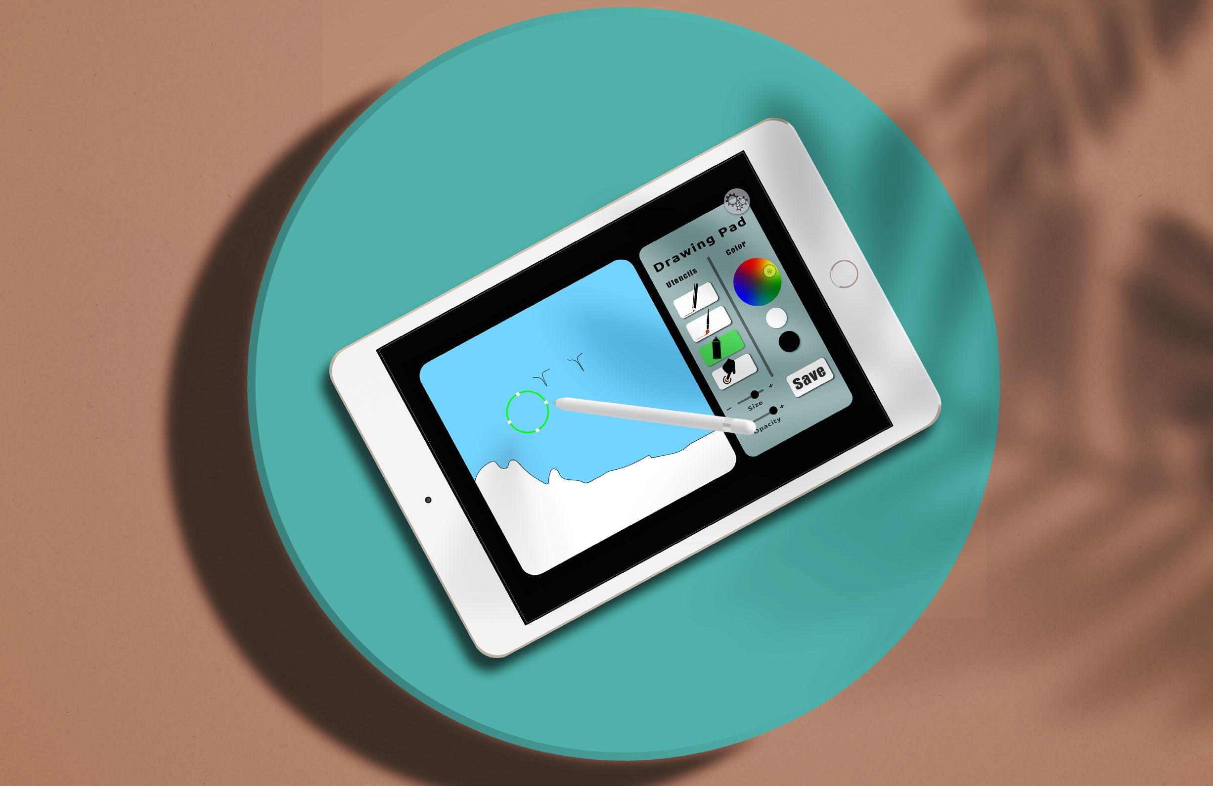
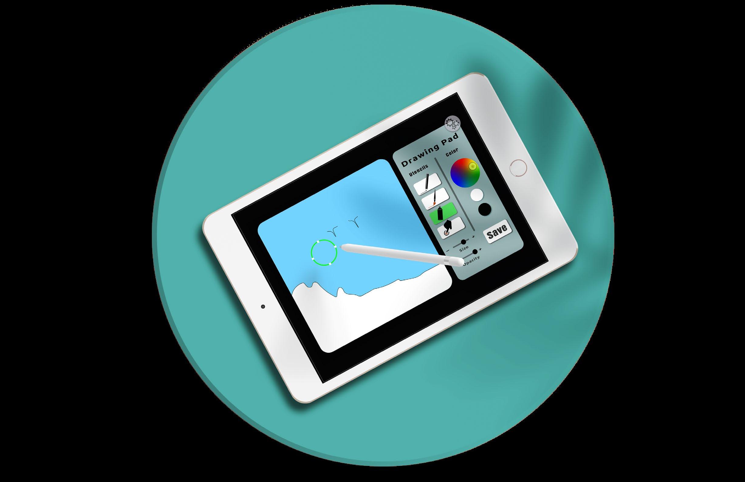
The drawing area is an inspiration taken from my Arts in Education course at San Francisco State University where there was an emphasis on journaling and drawing to document the world around you. This page is my digital version of that.
The magnifying glass hover-over on the main screen page illustrates some user interface elements.
The premise for this project was based around our school’s 50th anniversary of the student strike lead by the Ethnic Studies Department.
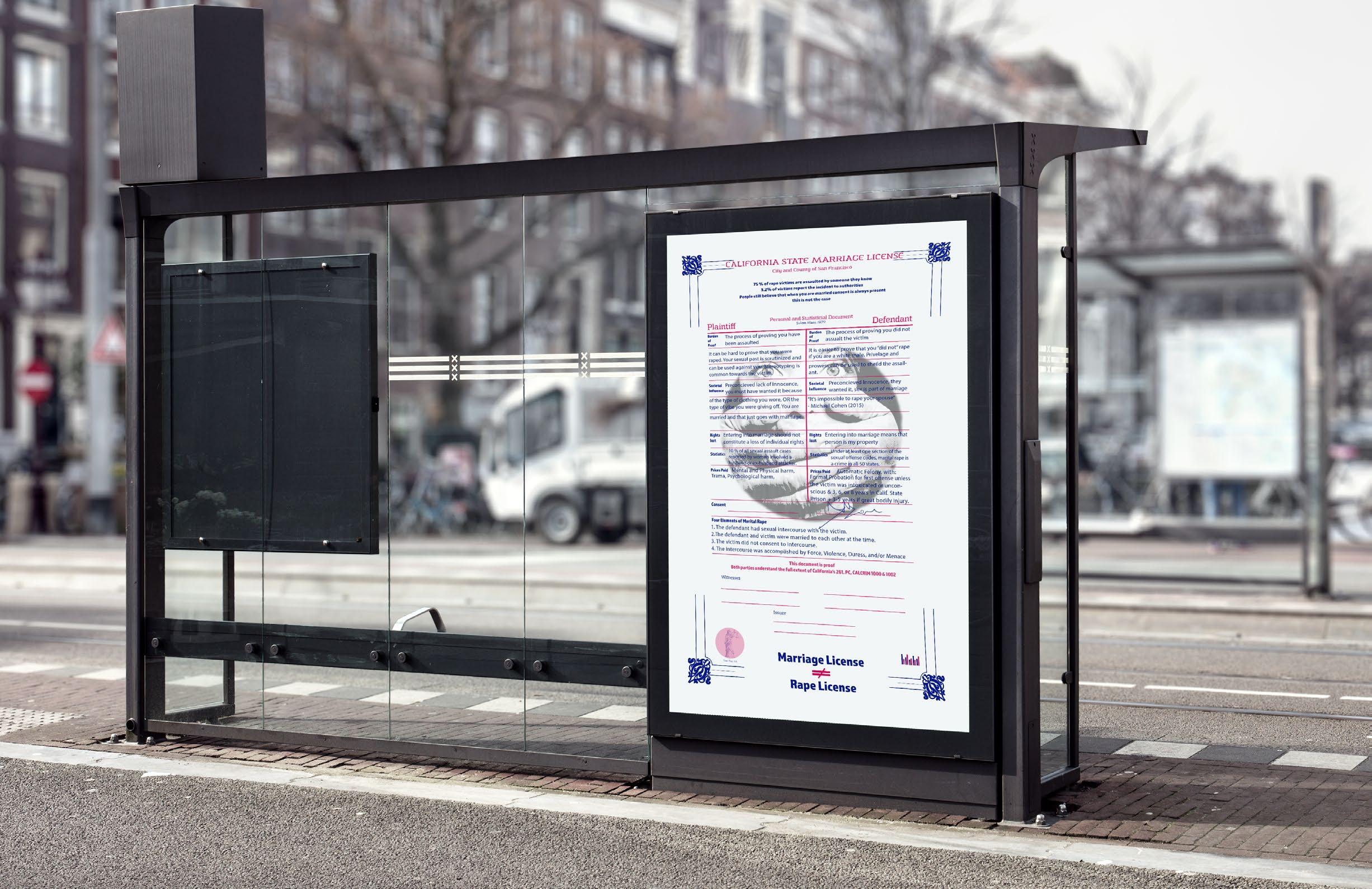
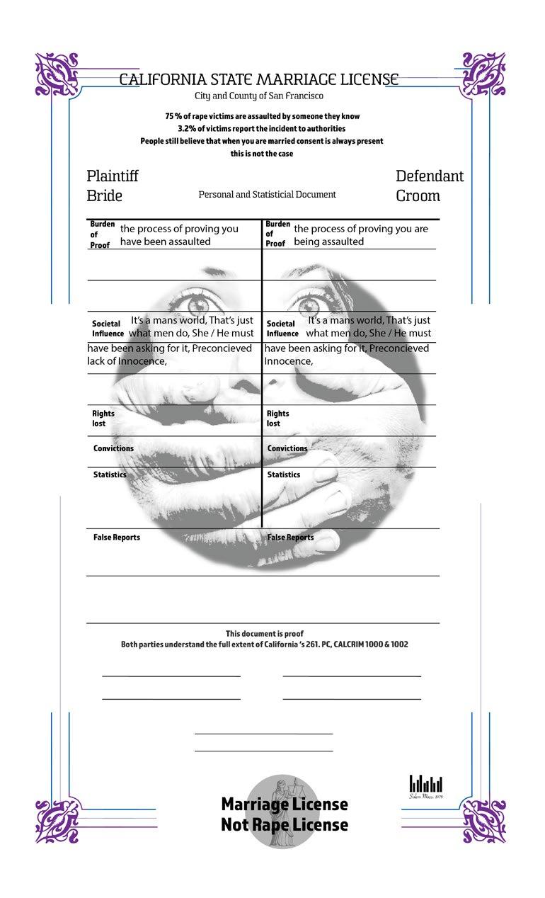
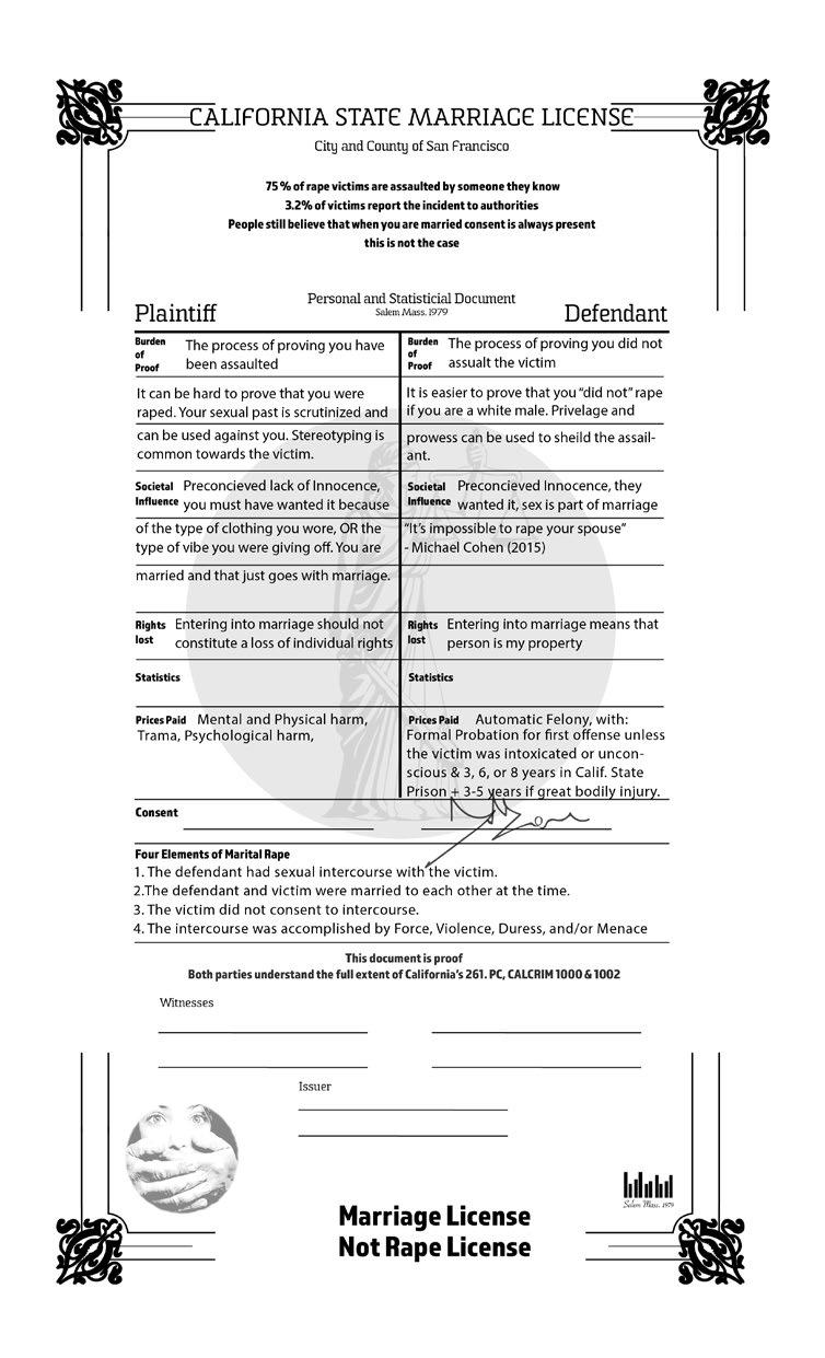
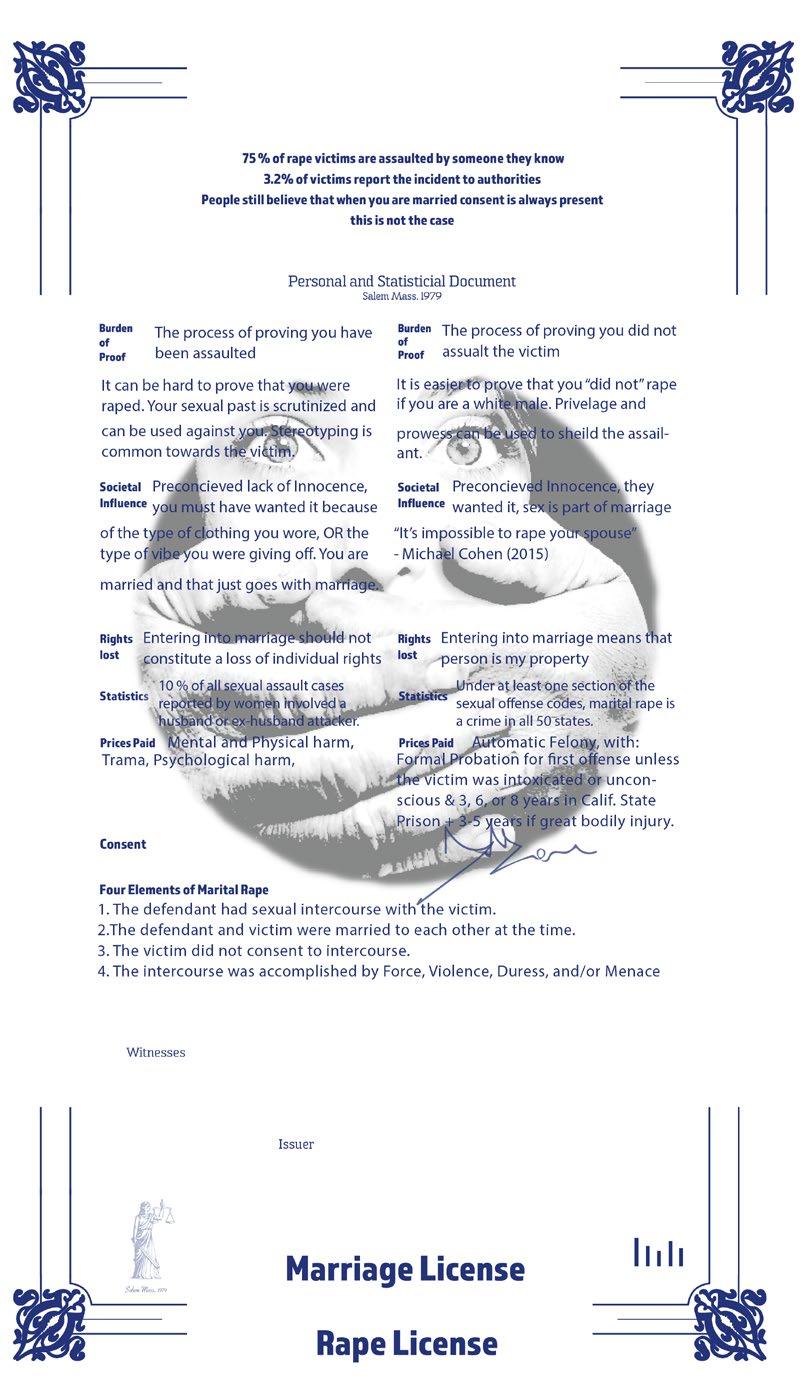
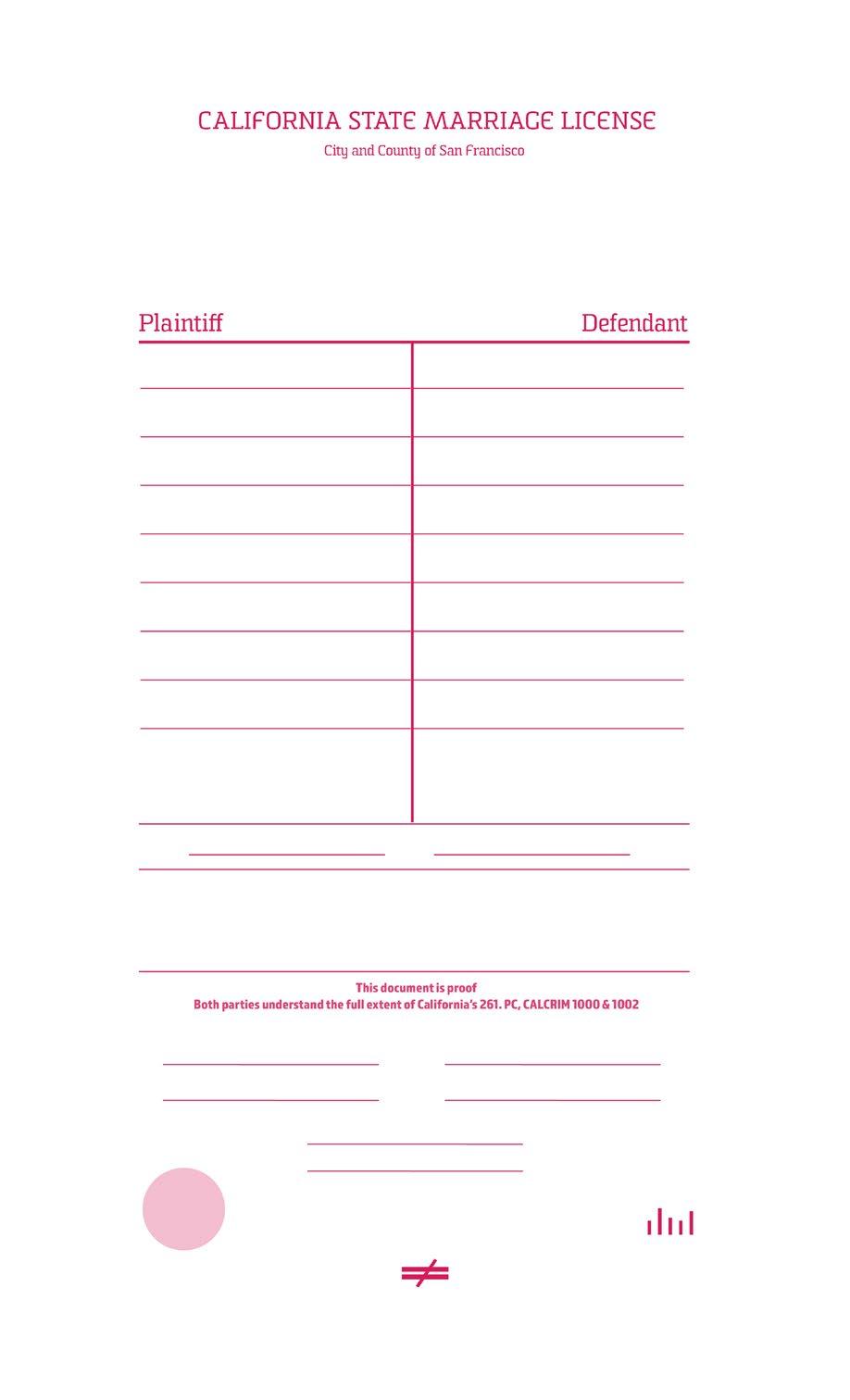
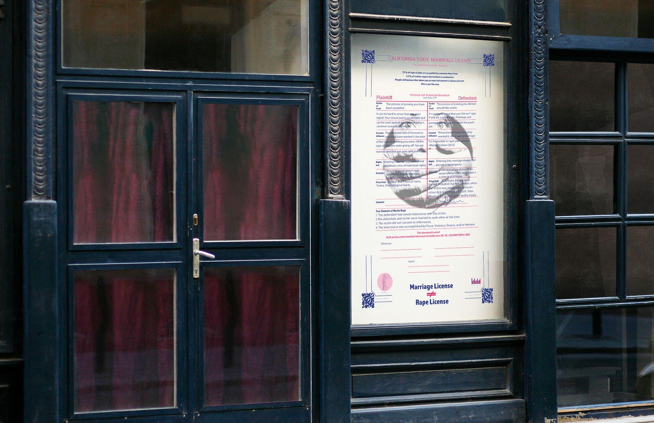
Marital rape is a form of domestic violence that is not well known or talked about and the impacts that marriage has on women and how they are viewed after marriage.
A Risograph printer was used to produce the final product.
This machine requires the printed colors to be separated into individual pages then scanned and printed individually.
Skills:
Sketching | Research
|
Photoshop | Illustrator | InDesign
| Color Separations | Printing
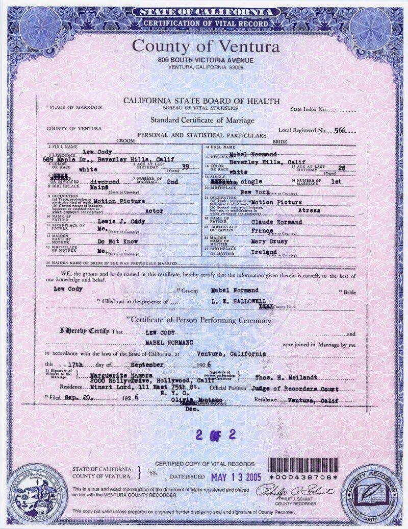
California state marriage license Combining elements from license Finding data and info for answers
The colors shown to the right are the colors used for printing the design on the risograph.
The white color in the deisgn and print comes from the paper.
Sommet Slab is used for the government written text and which has a slab serif that gives the font the appearance of weight, strength and stability.
Myriad Pro is used on the text that answers the questions and was chosen because of its san-serif appearance which makes the text easier to read.
Almaq is used on the bolded questions because of its ability to maintain ledgability and strength at lower font size.
For this project, the blue, red and black colors of the design needed to be printed onto their own sheets of paper to be scanned by the risograph.
Thus creating three “printing plates.”
The blue and black plate are shown stacked together in the image to the far left.
Each color needed to be on its own plate because the risograph printer’s scanner scans in black and white.
If all the colors of the design were left together and scanned as one image, the blue and red colors would be interpreted as values of black.
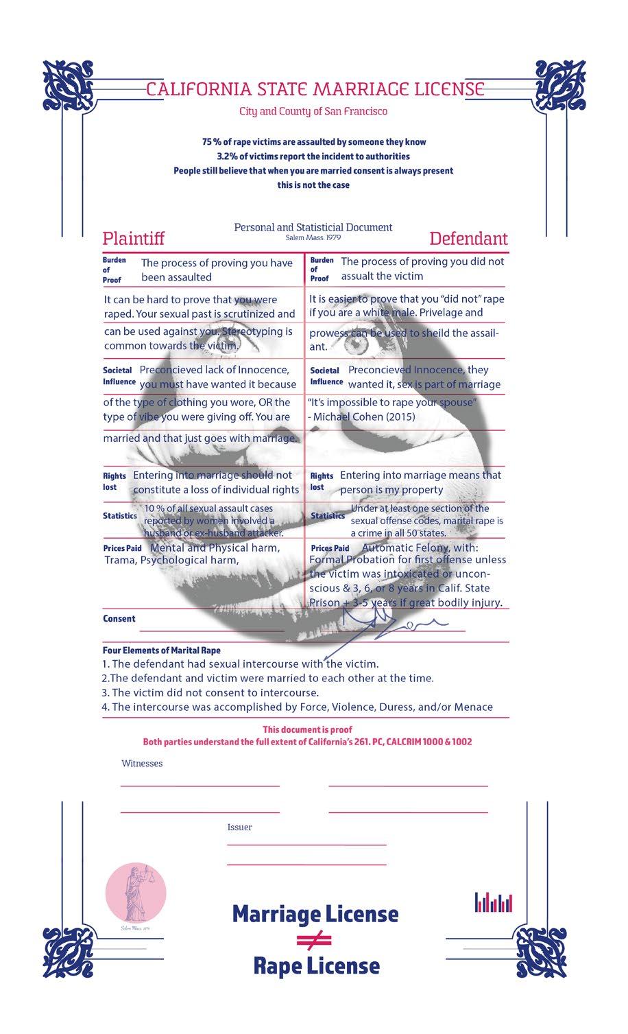
The final printed piece with all the elements put together and ran 100 prints total. For each color, every page needed to be run through the machine separately.
The process creates a bit of variation between each print which I found very unique and interesting.
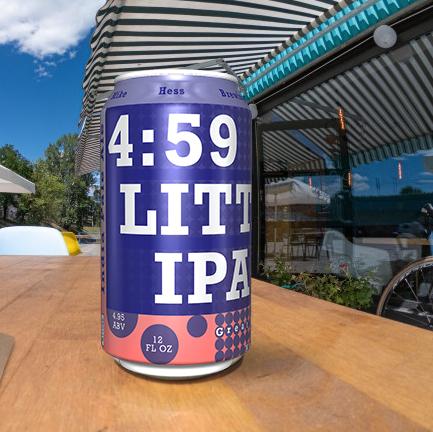
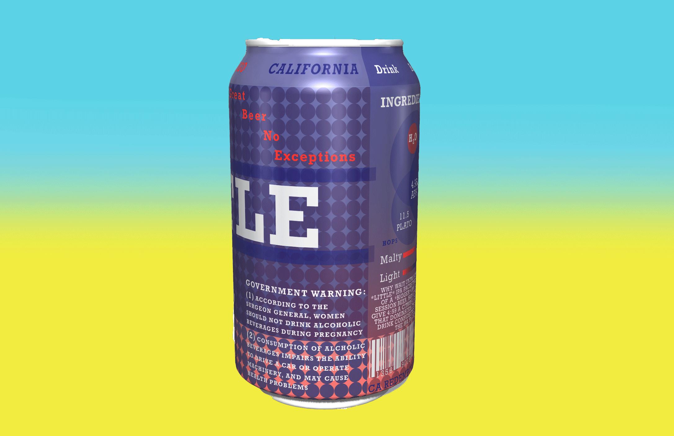
This project was an exercise in redesigning a logo using only Typography and a few graphic illustrations.
We were asked to think about how the can would read in its three dimensional environment and were challenged to intrigue users to twist the can around in their hands.
Skills:
Photoshop | Illustrator |
Paste Up | Cutting | Grids |
Sketching
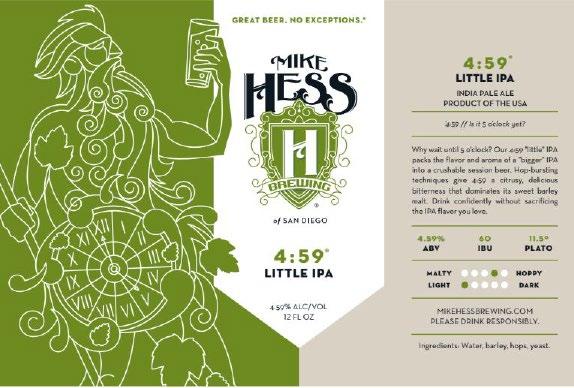
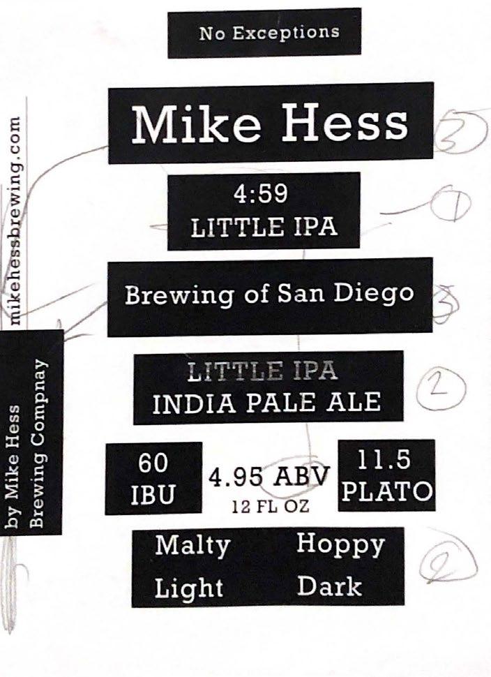
The image at the top left of this page is the original can I chose for this project. The image at bottom left show how I reduced the design to its typographic elements and restructured the hierarchy for the first iteration.
The text on the top right was all the text from the original can that was cut out and placed onto an index card and used as a guide for the dimension of the actual can.
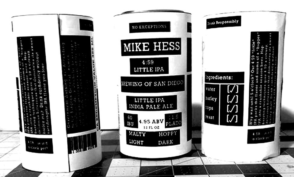
With all the text broken down and a first iteration created, it was time to print the design out and mock it up in real life.
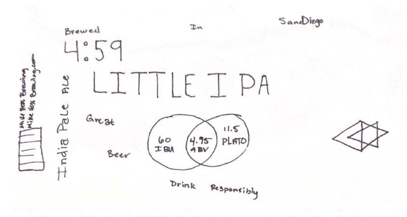
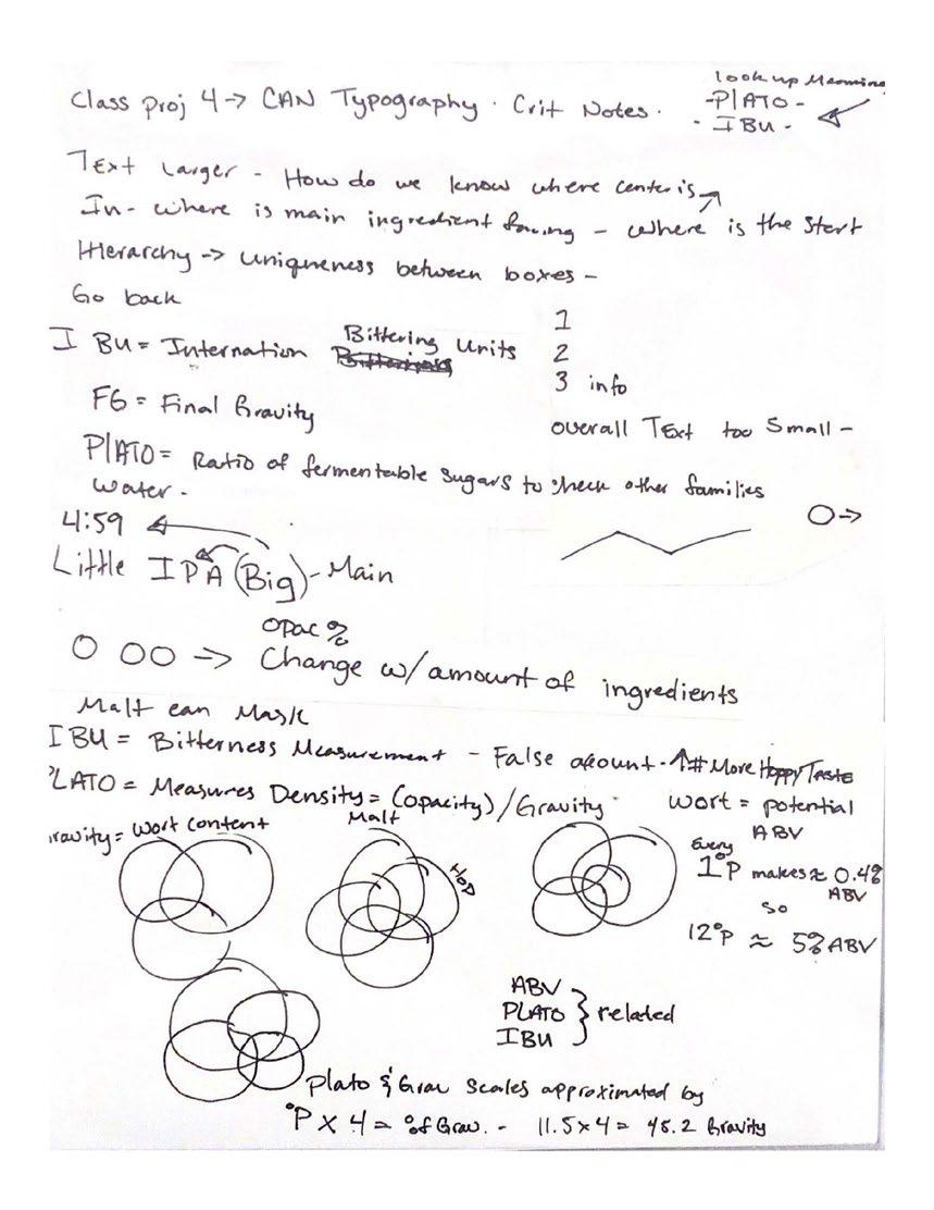
The process started by breaking the cans original design down into its main components and then rearrange them using a new typographic hierarchy.
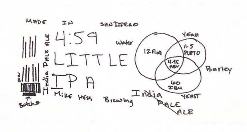
Hand sketching allowed to get the thoughts onto paper and visual the information found through the initial discovery process.
The sketches were then applied into digital form and physical prototypes were made of different itterations.
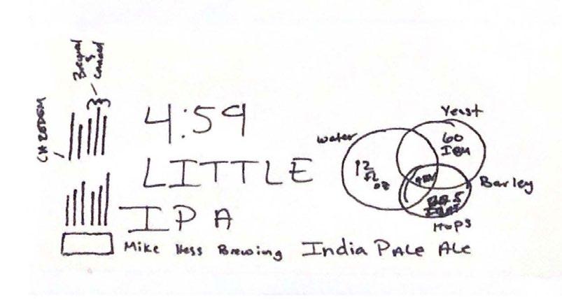
There were two initial colorway choices for the design but was narrowed down to the blue and red colorway for its soft smooth purples.
By using the can as a third color and transparency to create gradation, the design was able to go from two colors to a three color multi-tone print.
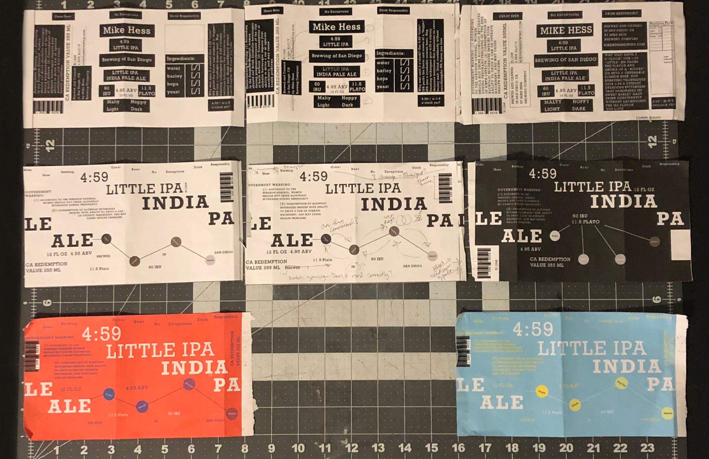
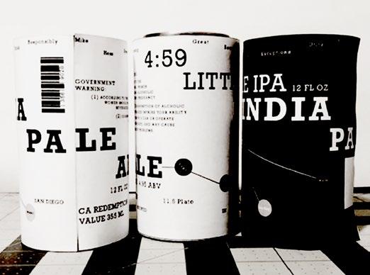
There were several iterations created and for each one and a physical mock-up was also created.
This allowed me to be able to physically see the design and how the wrapping effect would create the user engagement intended.
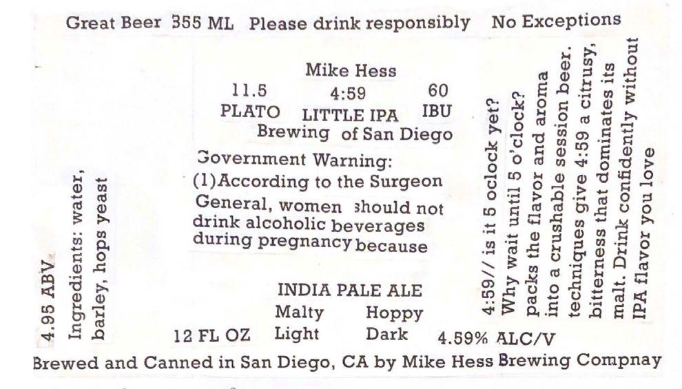
WHY WAIT UNTIL 5 O’CLOCK? OUR 4:59 *LITTLE* IPA PACKS THE FLAVOR AND AROMA OF A *BIGGER* IPA INTO A CRUSHABLE SESSION BEER. HOP BURSTING TECHNIQUES GIVE 4:59 A CITRUSY, DELICIOUS BITTERNESS THAT DOMINATES ITS SWEET BARLEY MALT. DRINK CONFIDENTLY WITHOUT LOOSING THE IPA FLAVOR YOU
This is the final design that was created for this project. The way the letters wrap around the can does create engagement by sparking curiosity and the need to finish reading something that is cut off or hidden. The color ways play toward the sunset and chill vibes of relaxing and drinking a beer right after a long day.