


Creative Direction
While coming up with ideas for City Yoga, I searched for images that reflected the company line of:
“A calm within a busy city life.”
This Moodboard represents a tranquil setting of feeling at peace underneath the sky, giving a sense of calm within the City.


Purple evokes spirituality and introspection orange to represent energy and vitality Blue to signify calmness and balance
Hex #58337a
C=80 M=92 Y=15 K=4
R=88 G=51 B=122
H=271 S=59 B=48
Hex #ea9e8e
C=6 M=47 Y=40 K=0
R=234 G=158 B=142
H=10 S=39 B=92
Hex #004770
C=99 M=69 Y=32 K=18
R=0 G=71 B=112
H=202 S=100 B=44
Hex #020203
C=91 M=79 Y=62 K=97
R=2 G=2 B=3
H=217 S=42 B=1
Hex #fffef5
C=0 M=0 Y=6 K=0
R=255 G=254 B=245
H=54 S=4 B=100
Together they create a palette that aligns with the holistic and serene aspects of Yoga practice. Black and white symbolise balance, clarity and the union of min and body.
Do and Do Not’s of colour combinations
safe to combine these colours with eachother. when it comes to having a varitation online.
Not safe to combine these colours with eachother. As the colour contrast is not enough to be viewed online for those that have colour blindness or sight difficulties.
City has a strong foundation so it has bulk and more straight lines to represent city buildings
Yoga is more curved to represent the flexibilty that yoga gives to people when they stretch.
A person sitting to represent the people and the arms stretched in the air to show that they are having a good time in the classes.
The c straightens at the top to act like a idicator of where the buiness is located in the city.
Colour VAriations of the City Yoga logo so can see what works with what colour and how it would look like. should it be any other colour or multiple colours at once, safe bet would be to use either the pure black logo or the pure white logo variation.
Primary Font
Encode sans Narrow - Bold
Headers & Titles
abcdefghijklmnopqrstuvwxyz
ABCDEFGHIJKLMNOPQRSTUVWXYZ 1234567890
Secondary Font
Subheadings
abcdefghijklmnopqrstuvwxyz
ABCDEFGHIJKLMNOPQRSTUVWXYZ
1234567890
Supporting Font
Body Text
abcdefghijklmnopqrstuvwxyz
ABCDEFGHIJKLMNOPQRSTUVWXYZ 1234567890
Body Text Body Text Body Text Body
BODY TEXT BODY TEXT BODY TEXT
Body Text Body Text Body Text Body
BODY TEXT BODY TEXT BODY TEXT
Body Text Body Text Body Text Body
BODY TEXT BODY TEXT BODY TEXT
Welcome to the beginning of a transformative journey, where each breath is an opportunity for growth and each stretch a step towards self-discovery. Today marks the inaugural day of our yoga studio.
Osaka AubreyEither a metal or arcylic lightbox to be behind the reception desk. Cy would best represent the front of house as the bold letters allow for for more light to be shown and when the light isn’t on the letter would still be viewable for customers to understand.
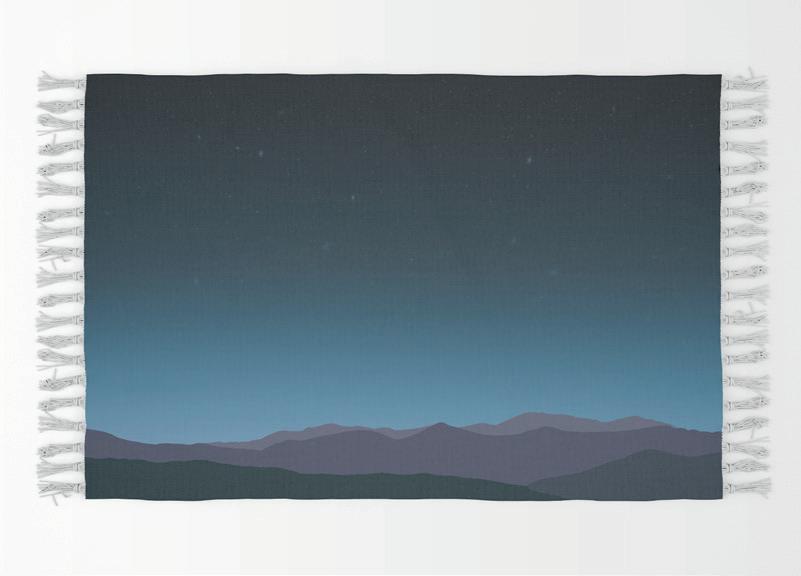
can be either painted or wallpapered onto the ceiling so when night time classes are on that the customers can see the night sky when doing their stretches. To give that sense of calm within the city.


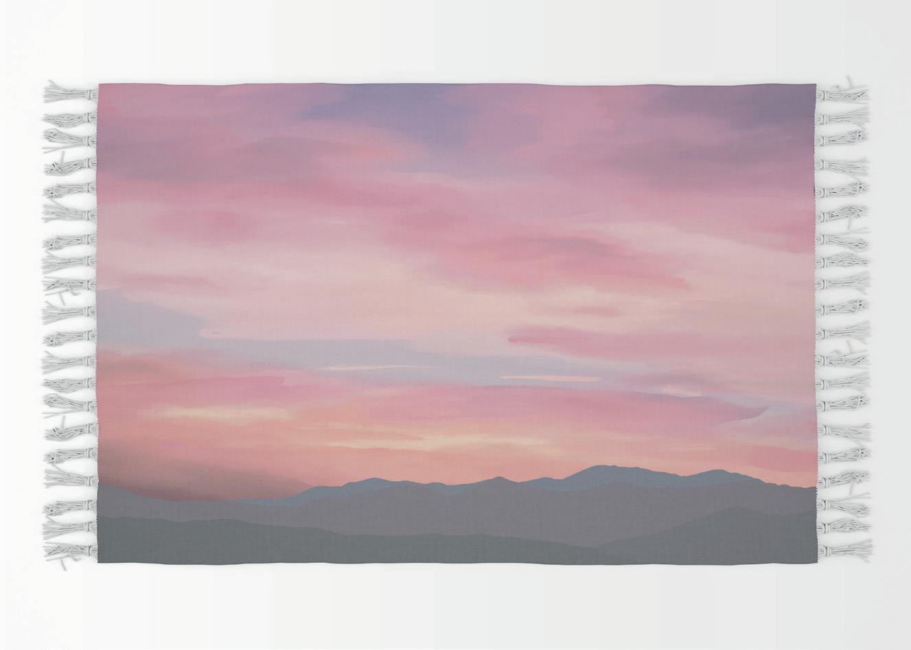
This sky is however printed onto a sheet of fabric that can either be automatically round out or in, by an awing machine, in the morning to have a nice sky to be viewed while doing morning excerises, or manually rolled in or out to be on hooks on the wall.


Notepad:
Some people like to have a physical piece of paper to write their to do list on, so it’s on view within their work space or can be stuck somewhere else like the breakroom.
Pens:
Ties in with the ceiling of the yoga studio as well as a company pen with logo colour variations.
Office Paper:
Along with the Favicon it has different positions to do with yoga and relates back to the yoga studio company.


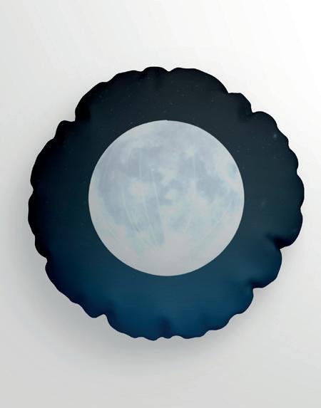
Limited ediotionMeditation pillow: It provides comfort and support for the spine, hips and kness. promotes proper alignment and helps to prevent discomfort or strain, allowing relaxation qnd hone concentration on poses/exercises.
Yoga blanket: is very versatile in that it can be folded to act like a pillow, similar to the mediation pillow. to practice their poses/exercise upon, or can even provide warmth and comfort when just need a moment to relax and regulate.


Graphic Designer - £2400
Brand Guidance:
Book - £20+
PDF - £10
Reception Light:
Illuminated Logo - £175 - £346
Ceiling Graphic:
Wall Mural - £190+
Wallpaper - £34/m2
Office Stationary:
Sticky Notepad - £315 (50 Units)
Office Paper - £78 (1000 Units)
Pens - £75.50 (100 Units)
Promotional Items:
Meditation Pillow - £ 1500 (50 Units)
Yoga Blanket - £ 1000 (50 Units)
Graded Unit 2 Project by: Joanne Haugh Date:01/05/2024