THE PORTFOLIO OF JIAYU WANG MFA
GRAPHIC DESIGN

RESEARCH
STRATEGY / SOLUTIONS
00/10

THE PORTFOLIO OF JIAYU WANG MFA
GRAPHIC DESIGN

RESEARCH
STRATEGY / SOLUTIONS
00/10
2021 2024
THE PORTFOLIO OF JIAYU WANG MFA GRAPHIC DESIGN
RESEARCH
STRATEGY / SOLUTIONS
00/10
Deliver, embodies both the purpose and responsibility that drive my approach to design and life. In life, “deliver” means fulfilling promises, showing up with intention, and bringing value to every action. In the realm of design, it signifies my commitment to not only meet project objectives but to exceed them by creating work that resonates, inspires, and connects.
My portfolio delivers a journey from concept to completion, where creativity, strategic thinking, and precision come together to fulfill specific goals and connect with audiences. I aim to deliver how design can effectively communicate messages, solve problems, and bring visions to life, embodying the essence of meaningful and memorable experiences.
01/10 02/10 03/10 04/10 05/10 06/10 07/10 08/10 09/10 10/10
RETAIL COMES INTO THE HEART OF NATURE
EasyWild Branding
ENHACE LIFE WITH EVERY STEP
Blind People & Guide Dogs
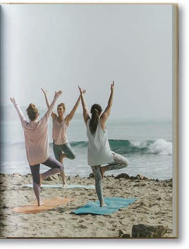
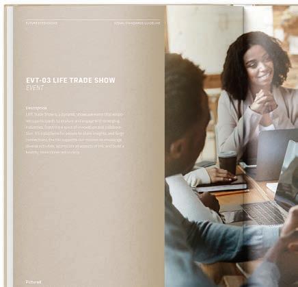
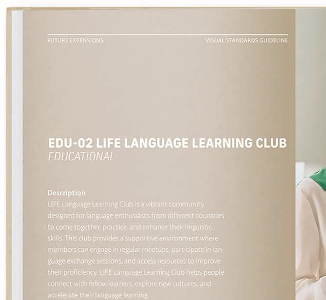
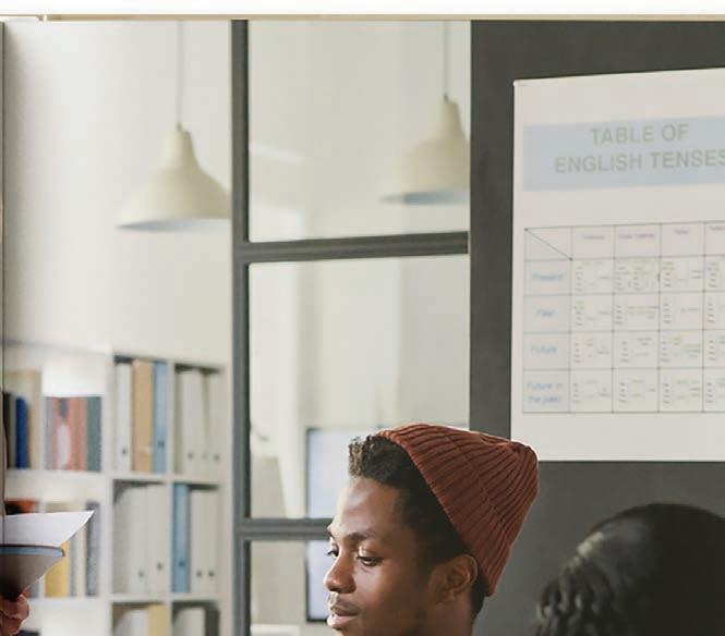
PARTICIPATE CONNECT APPRECIATE
LIFE Rebranding
CRAFT MEANING THROUGH TYPOGRAPHY
Book Typography Redesign
FROM DIGITAL TO MATERIAL
eCAADe Conference Promotion
VISUALIZE THE MOTION OF GRAPHICS
Book Commercial Video
VALUE FROM INNOVATION
FujiFilm Annual Report
DEEP DIVE INTO BLUE
Color Experiments Posters
SPACE TRAVEL COMPANION TO MARS
Space Travel Companion Design & Promotion
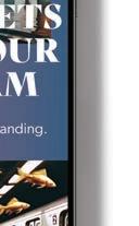
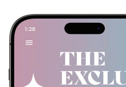
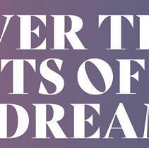
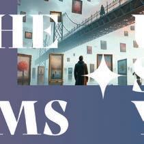
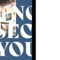
UNCOVER THE SECRETS OF DREAMS
MFA Thesis Project

01/10
AI for Designers
COURSE
AI for Designers
PROJECT
INSTRUCTOR
Jeff Carino
SEMESTER EasyWild Branding
Spring 2024
RETAIL SPACE DESIGN BASED ON AI TECHNNOLOGY
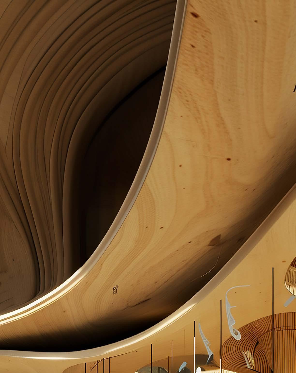
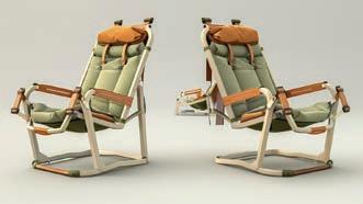
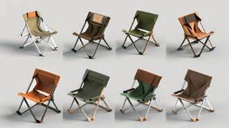
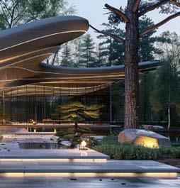
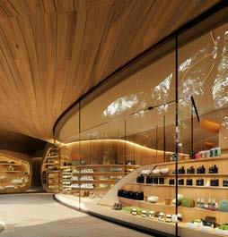
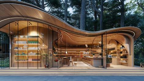
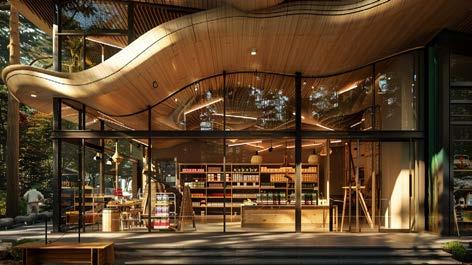
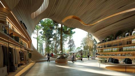
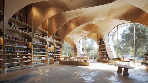
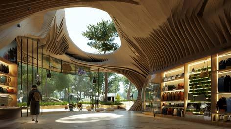
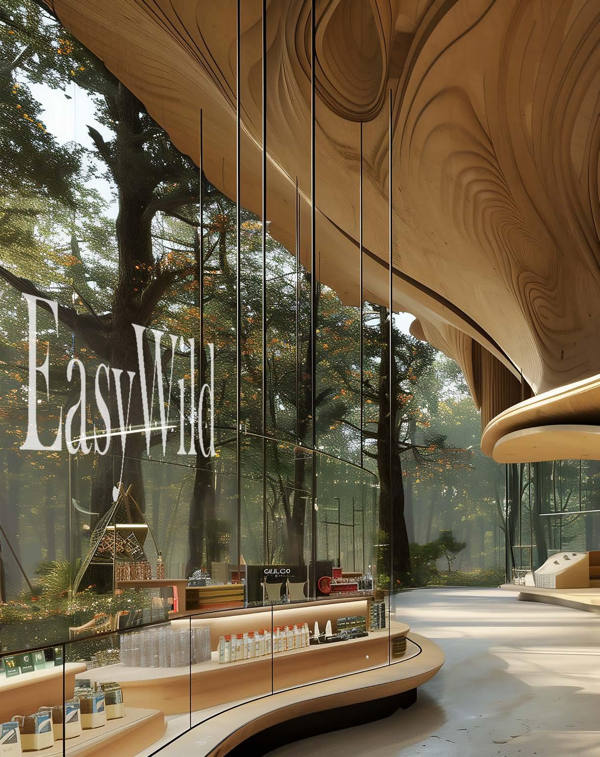
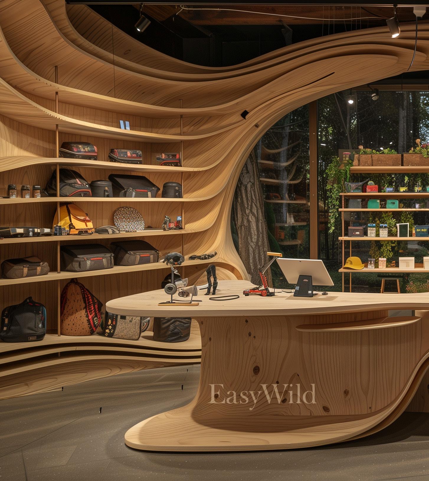
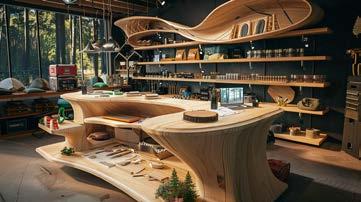
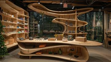
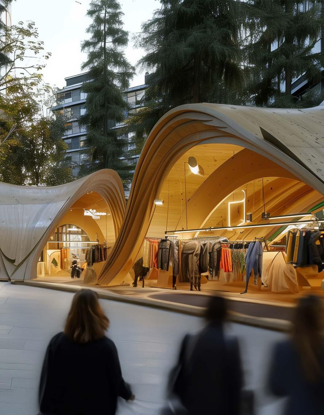
The establishment of this outdoor brand advocates closeness to the natural environment, encouraging people to explore the outdoors and feel the beauty of nature. I hope to combine nature with innovation, so I came up with an idea to bring nature indoors into the space and build a retail store for the brand in nature. Using artificial inelligence tools, I was able to push the boundaries of creativity and ensure that the visuals closely matched the brand vision.
PROJECT
EasyWild Retail Branding
DISCIPLINES
AI Design
Brand Visual Identity
Packaging & Product Design
Spatial Design
OBJECTIVE
APPROACH
Through background research of outdoor brands, a brand that combines natural simplicity with innovation was defined, bringing the harmony of nature into the indoor environment and enhancing the overall experience. The use of AI tools enabled designers to unleash greater creativity and originality in the concept, ensuring that the visual performance was more closely aligned with their vision and more impressive.
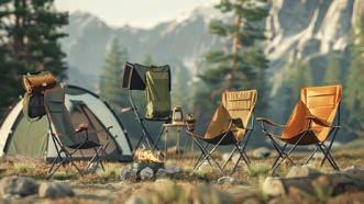
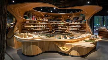
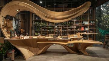
By building retail stores in national parks and major urban centers, the brand encourages outdoor exploration activities to cultivate a harmonious relationship between cities and nature. Based on AI technology, I realized my ideas visually. The green and orange colors express the positivity of the outdoor experience. The retail stores’ exterior and interior design, which are built on wooden features, show the connection between the city and nature, echoing the theme.
DELIVERABLES
Based on the AI technology, create outdoor camping products and a retail space that resonates with outdoor enthusiasts and supports a harmonious connection between city life and nature.
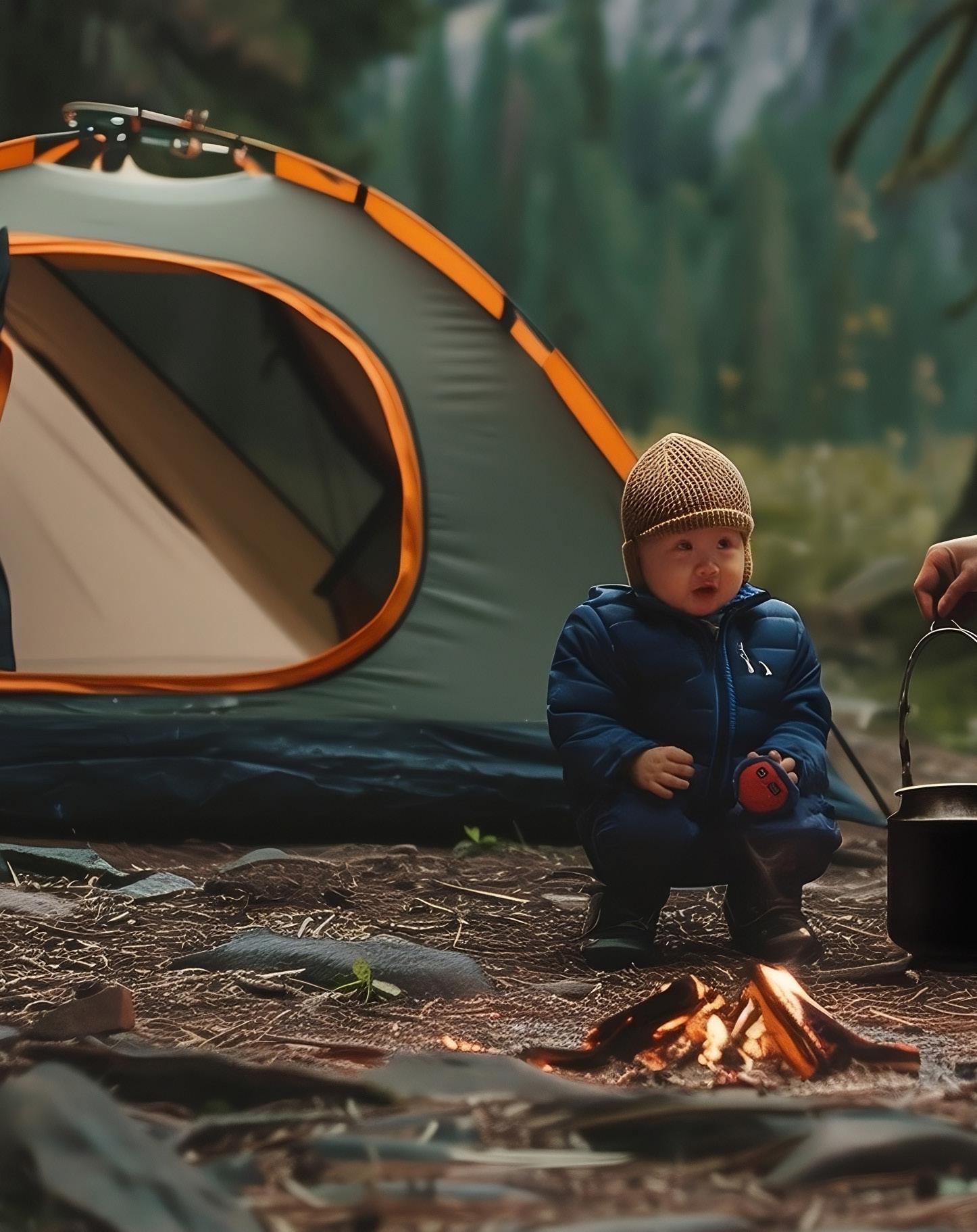
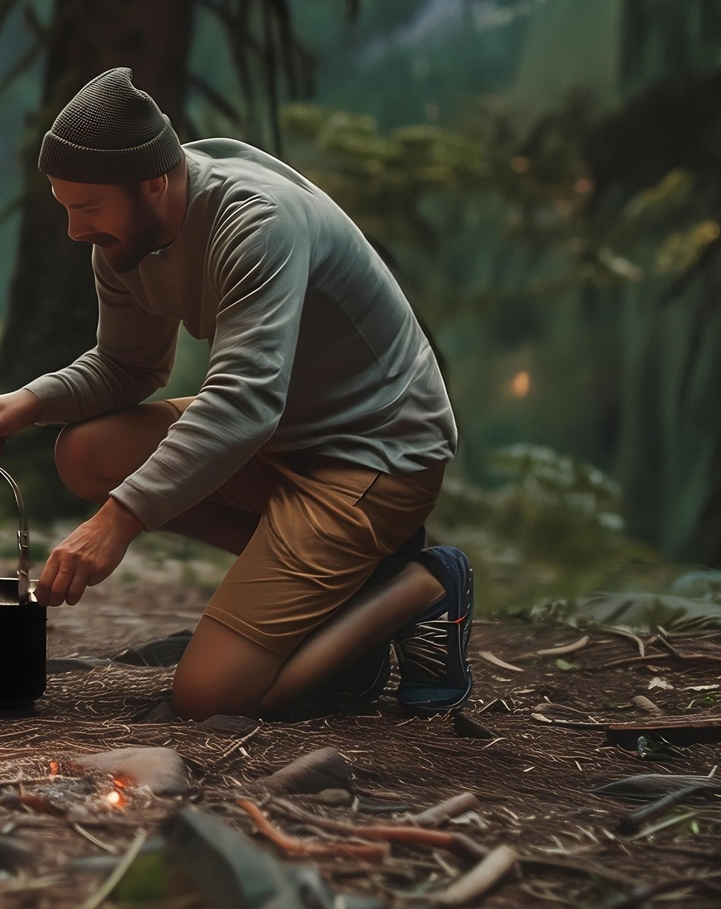






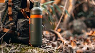

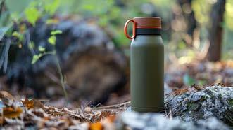

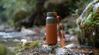

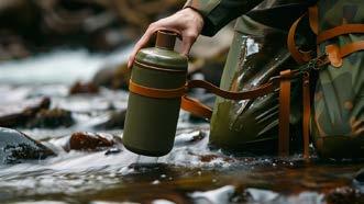
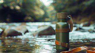


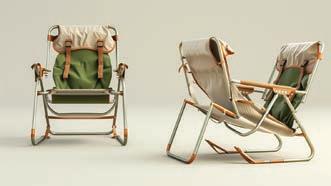


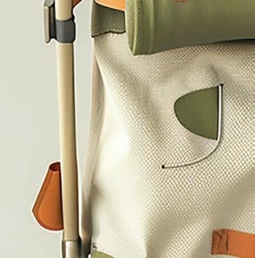
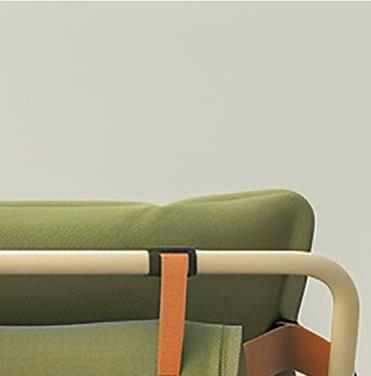
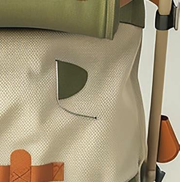
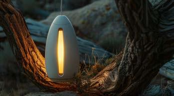
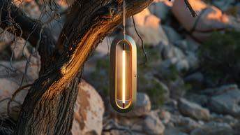
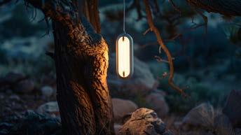
Explorations of camping product design via Midjourney.






















02/10
Visual Thinking
COURSE
Visual Thinking
PROJECT
Blind People & Guide Dogs
INSTRUCTOR
Hunter Wimmer
SEMESTER
Fall 2022

BLIND PEOPLE & GUIDE DOGS, COHESIVE BRANDING FOR SOCIETY PROBLEM SOLVING
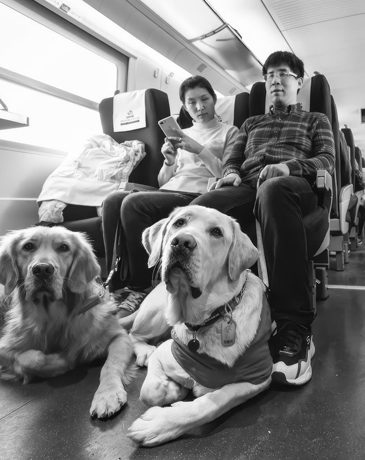
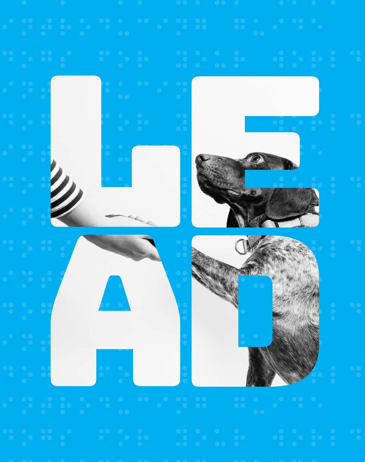
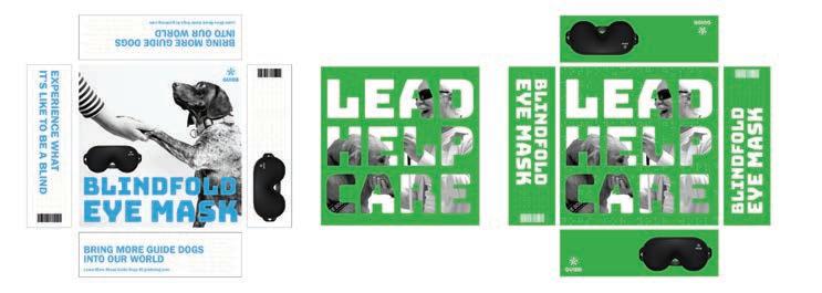
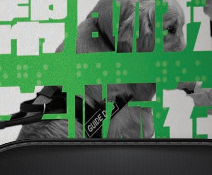
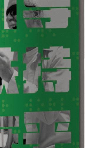
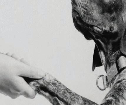
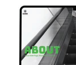
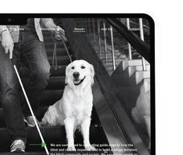
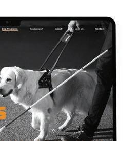
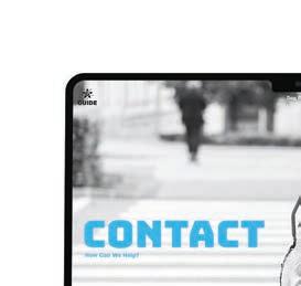
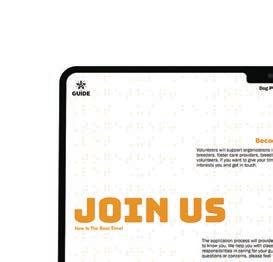
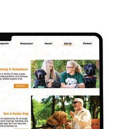
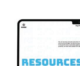
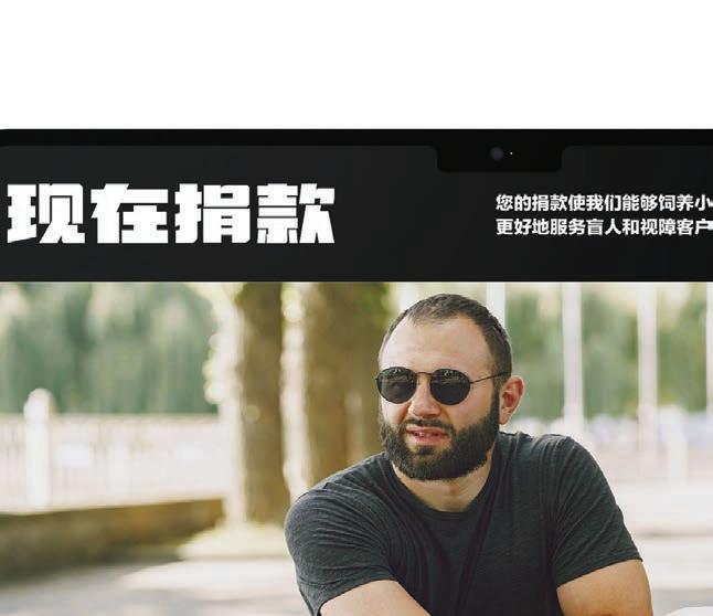
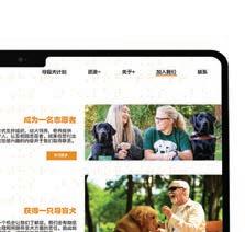
Regarding this project, I took a problem-solving, research-based approach to address the signifiant gap in resources and awareness for the guide dogs for the blind people in Shanghai. My design thinking focused on promoting community understanding through clear, impactful visuals and bilingual messaging. Each design deliverable worked within a cohesive design system based on the values of interaction, integration, and recognition to encourage community support and elevate the cause of guide dogs in Shanghai.
PROJECT
Blind People & Guide Dogs
Problem-Solving Branding
DISCIPLINES
Brand Identity
Logo Identity
UI/UX Design
Packaging & Product Design
Environmental Design
OBJECTIVE
APPROACH
In Shanghai, China, there were about 90,000 blind and visually impaired people in 2021, but only about 40 guide dogs were available in the city. I used a problem-solving, research-based approach to identify this topic. This enabled me to create a high-profile visual system that addressed this existing social issue and enabled community understanding in two languages.
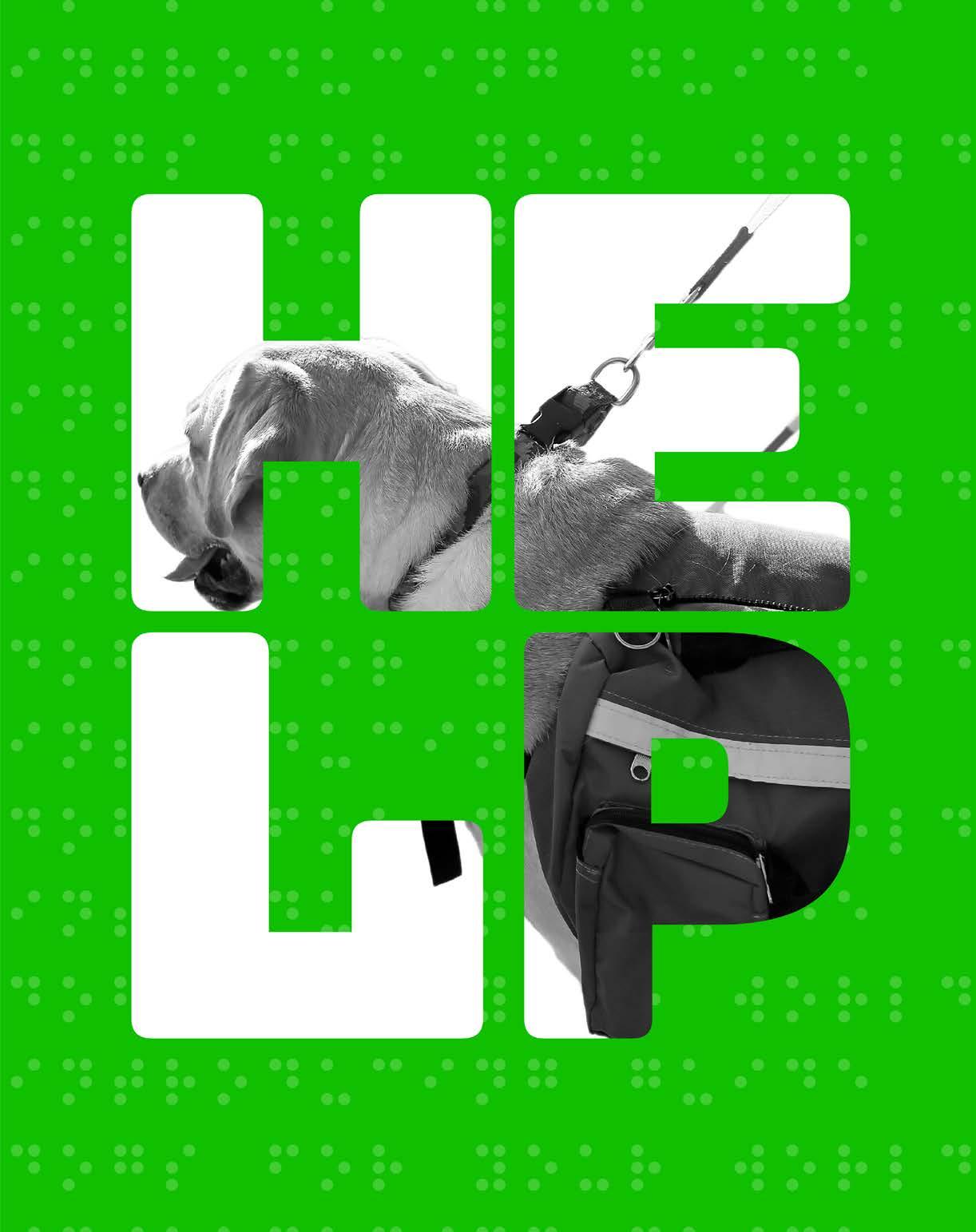
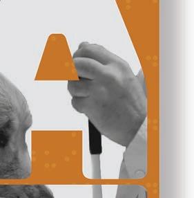
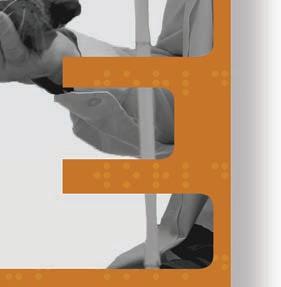
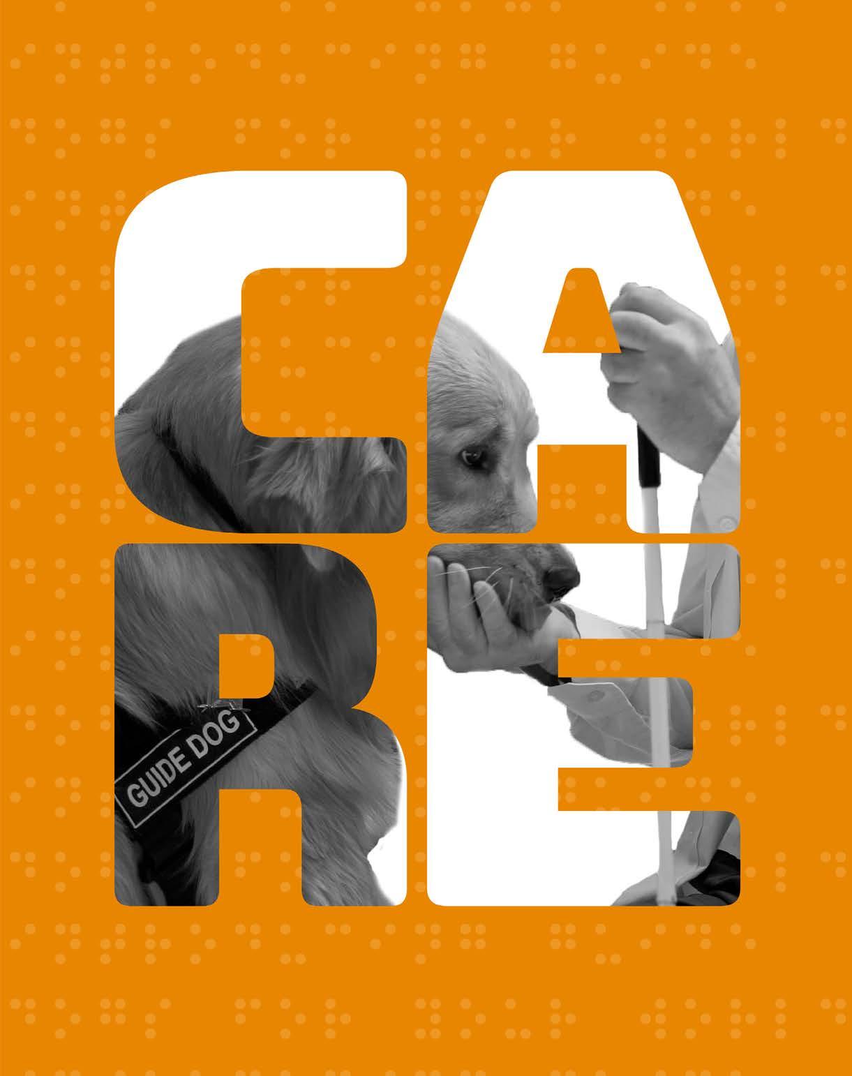
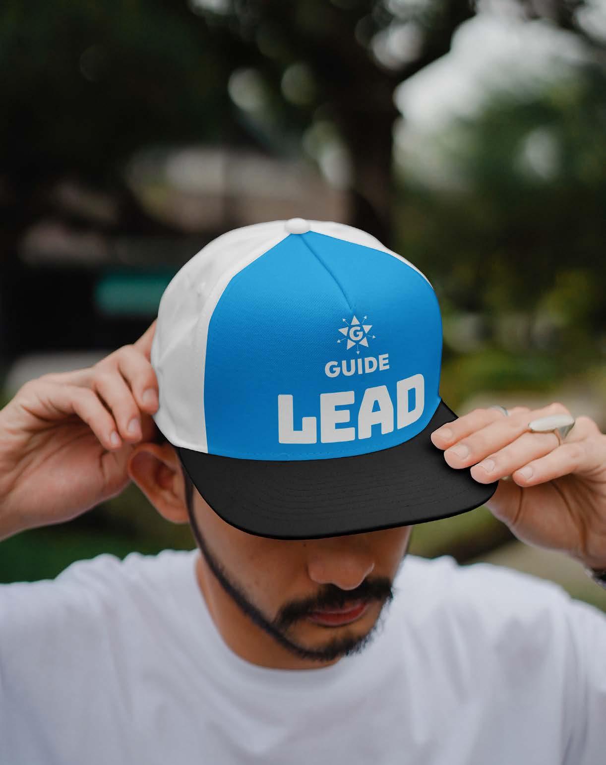
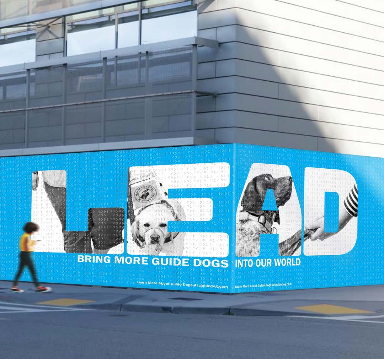
Through this problem-solving project, society will pay more attention to understanding and valuing the service of guide dogs for the blind, as well as support the training of a higher numbers of guide dogs. Design deliverables include a series of posters, website prototypes, and volunteer event products. The whole design system is based on the theme of interaction, integration, and approval by using three key words: LEAD, CARE, HELP.
DELIVERABLES
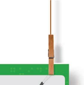
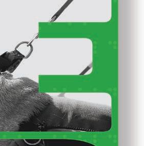
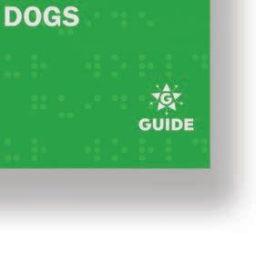
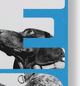
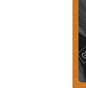
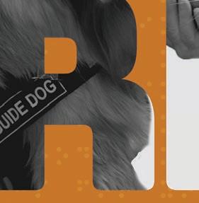
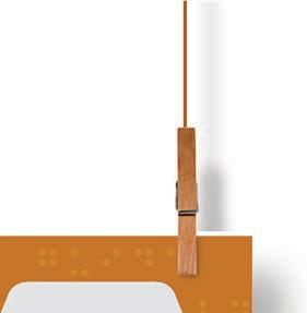
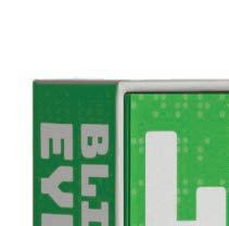
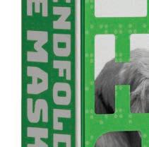
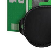
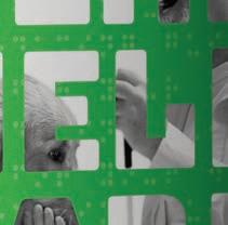
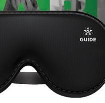
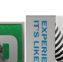
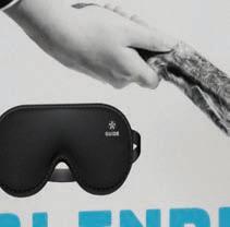
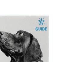
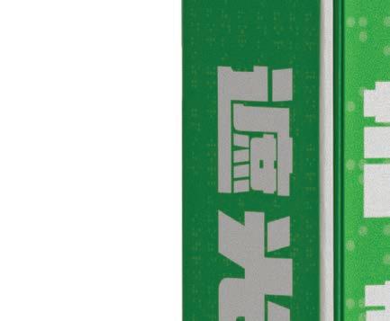
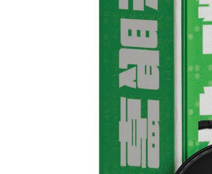
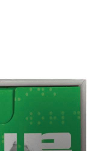
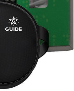
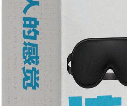
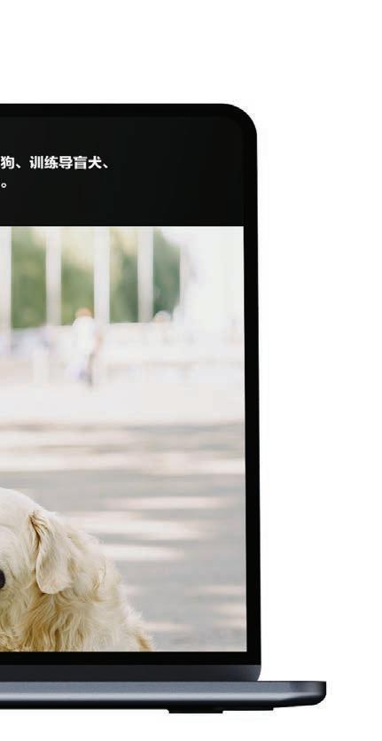
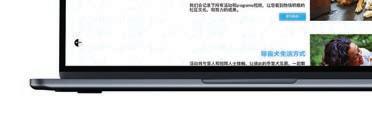
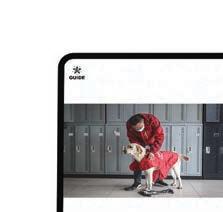
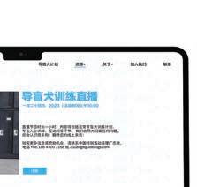
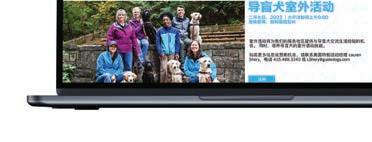
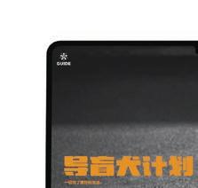
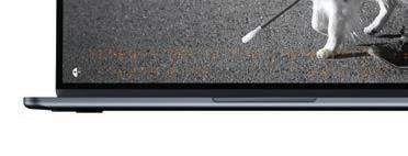
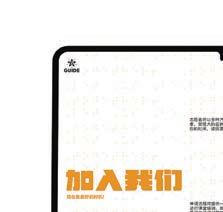
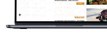
The design deliverables for this bilingual project include a poster series, Braille texture walls, a website, and products for charity events, all aimed at raising awareness and support for guide dogs through impactful, inclusive visuals and tactile elements.


































































03/10
COURSE
The Nature of Identity
PROJECT
INSTRUCTOR
Hunter Wimmer
SEMESTER LIFE Rebranding
Spring 2024
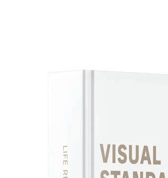
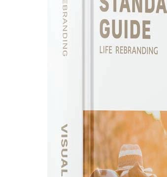
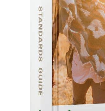
LIFE REBRANDING WITH STRATEGY, STANDARDS, AND DEVELOPMENT
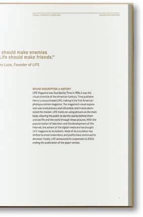
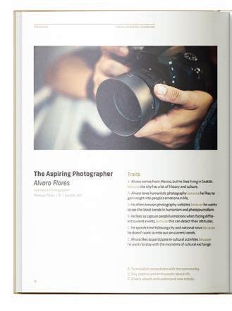
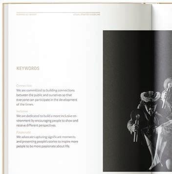
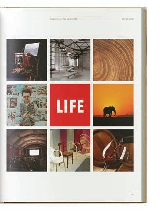
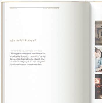
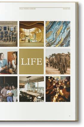
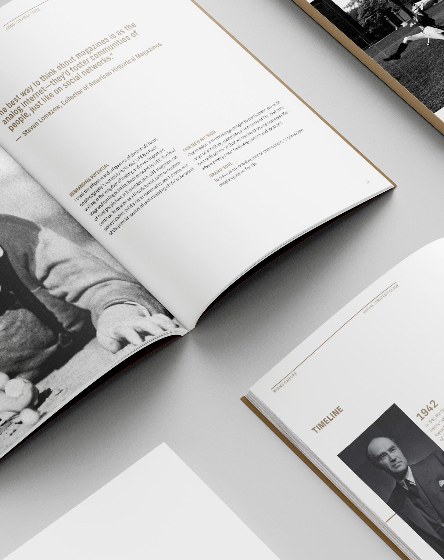
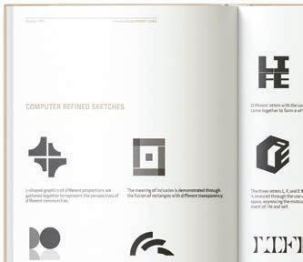
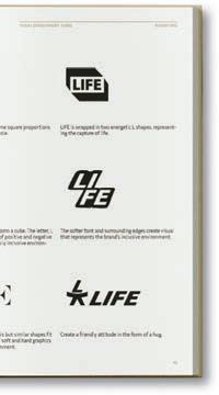
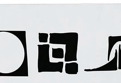
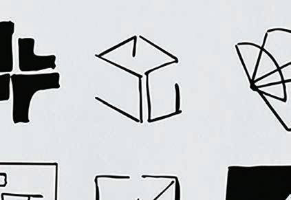
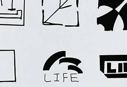
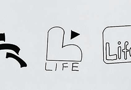
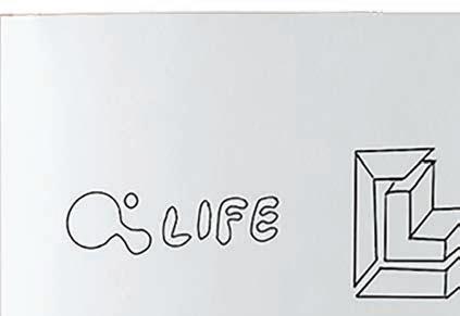
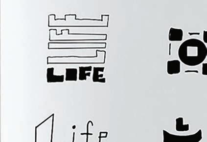
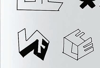
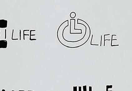
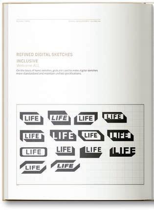
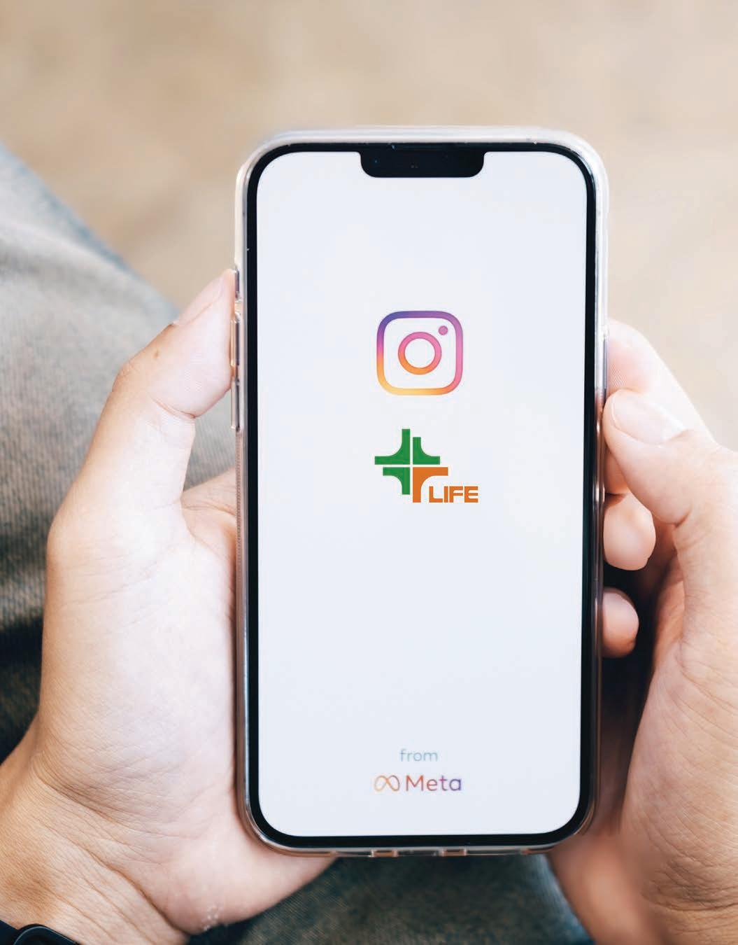
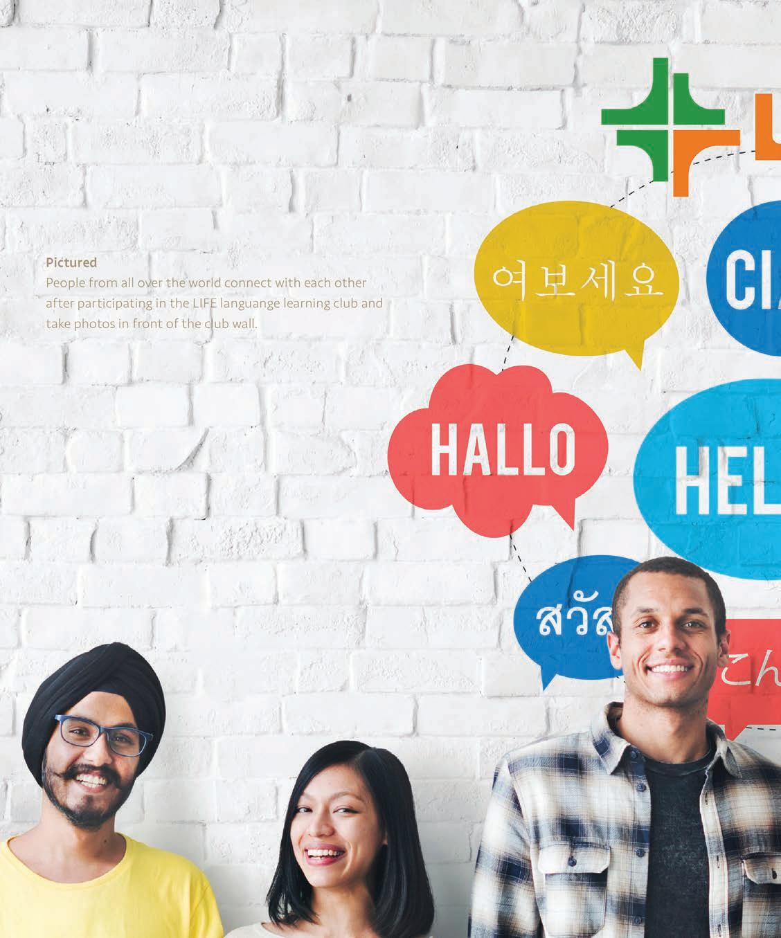
I focused on capturing LIFE’s legacy while aligning it with the values and needs of contemporary audiences. In order to maintain its iconic presence by building a visual identity that fosters community, enhances inclusivity and shares appreciation for everyone’s life. The three guides—visual strategy, development, and standards—provide a cohesive framework to strengthen LIFE’s mission, offering clear direction for creating visuals that resonate with and empower readers, making LIFE a trusted, enduring source of insight and connection.
PROJECT
LIFE Rebranding
Brand Identity
Logo Identity
UI/UX Design
Packaging & Product Design
Environmental Design
OBJECTIVE
APPROACH
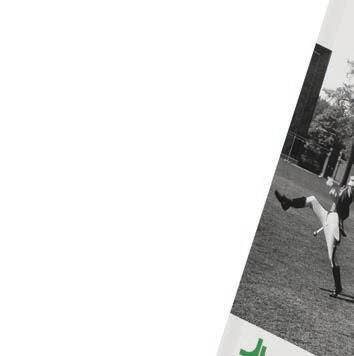
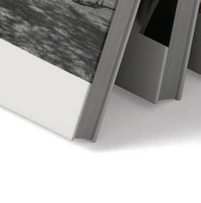
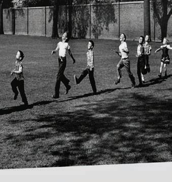
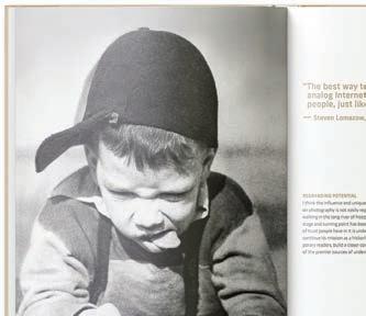
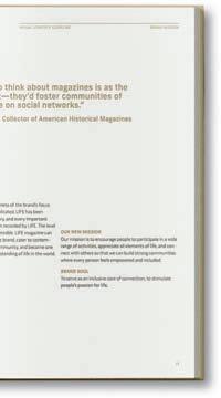
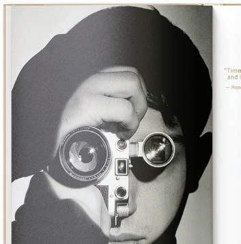
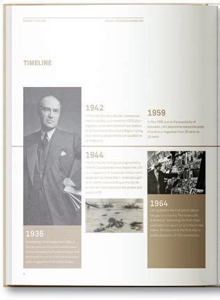
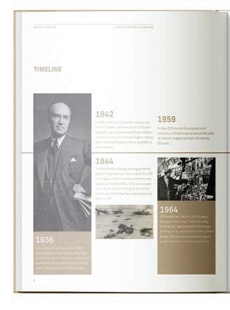
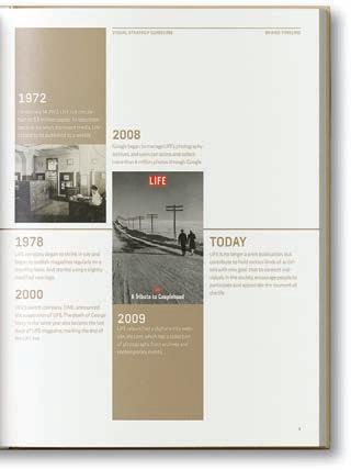
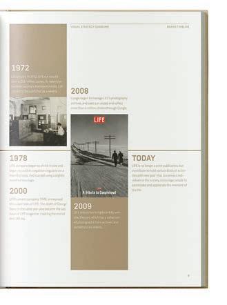
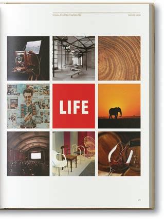
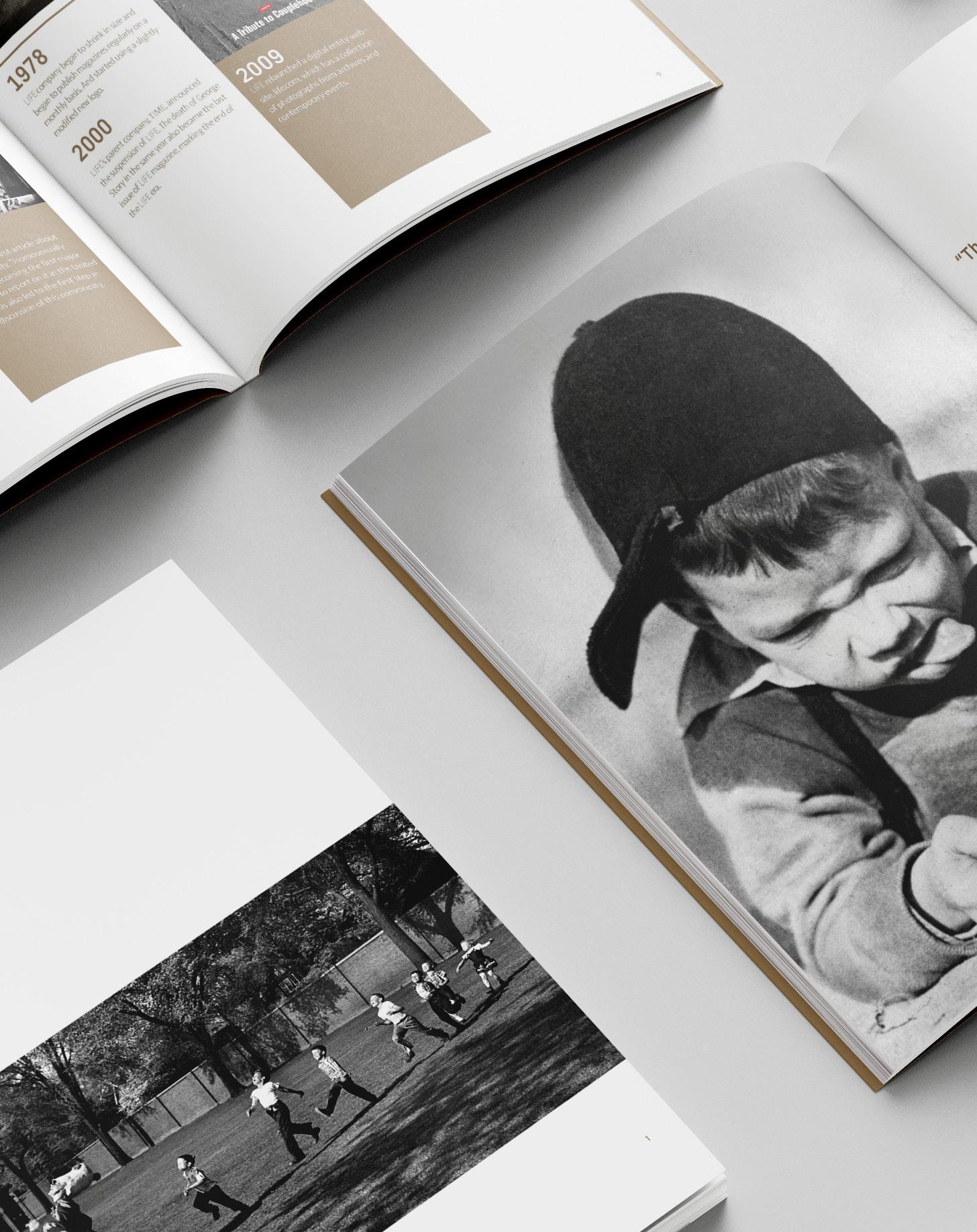
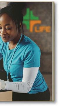
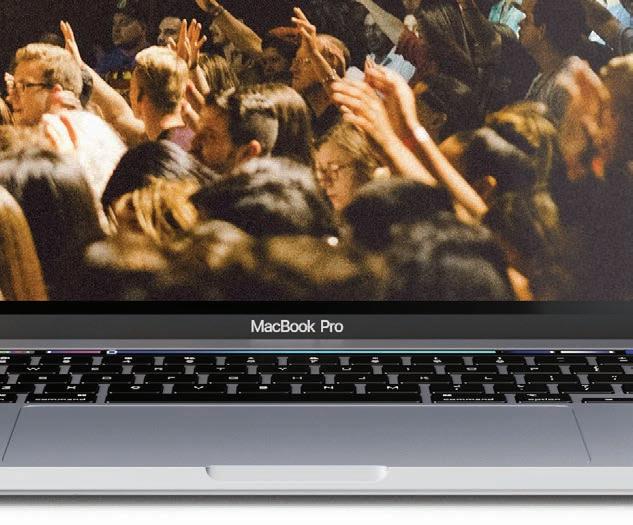
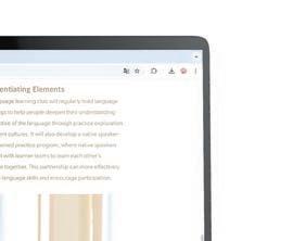
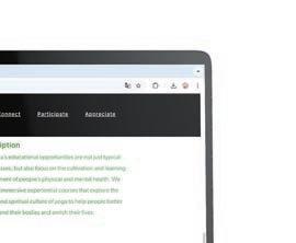
The influene and uniqueness of LIFE’s focus on photography is not easily replicated. LIFE has been walking in the long river of history, and every important stage and turning point has been recorded by LIFE. The level of trust people have in it is undeniable. LIFE magazine can continue its mission as a historic brand, cater to contemporary readers, build a closer community, and become one of the premier sources of understanding of life in the world.
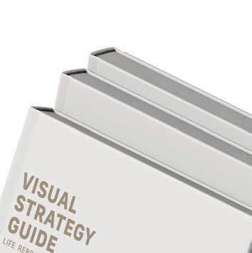
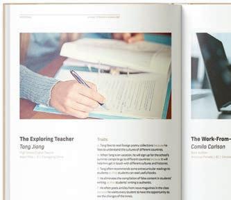
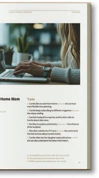
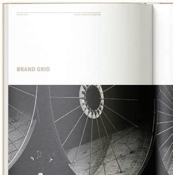
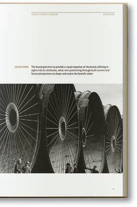
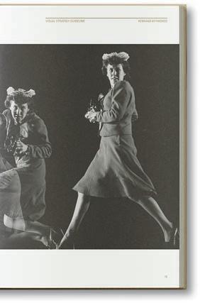
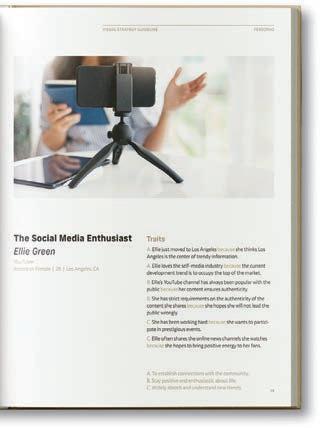
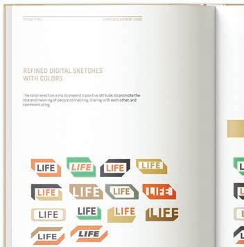
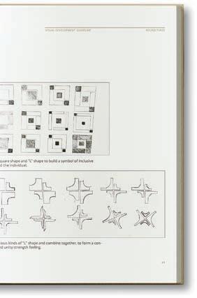
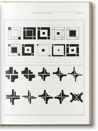
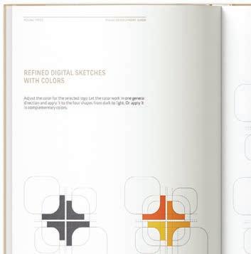
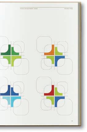
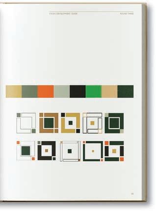
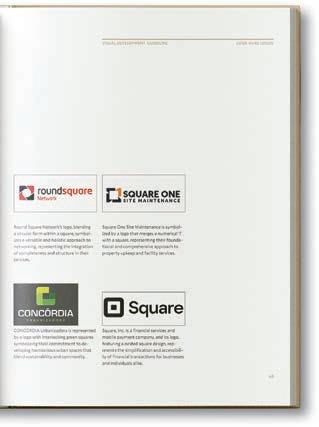
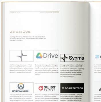
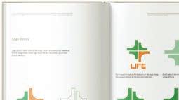
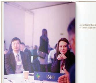
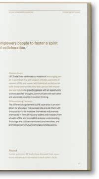
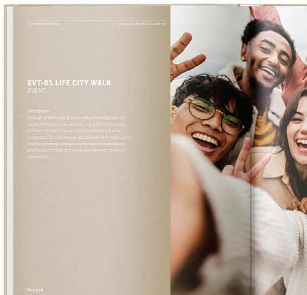
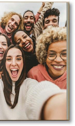
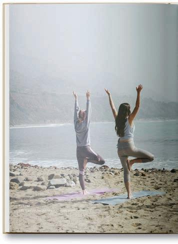
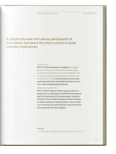
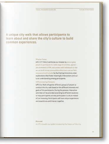
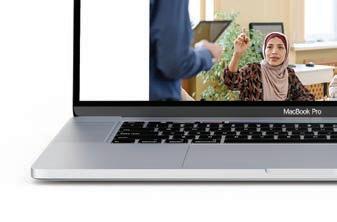
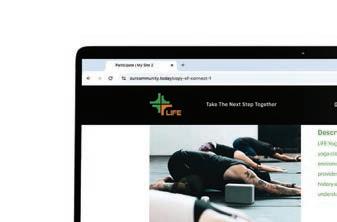
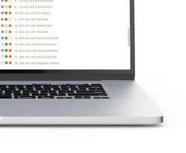
The approach of the LIFE rebranding project centers around reinforcing the brand’s mission to encourage people to participate in a wide range of activities, appreciate all elements of life, and connect with others so that we can build strong communities where every person feels empowered and included. The project produced three guidelines: visual strategy guide, visual development guide, and visual standards guide. These documents collectively form a comprehensive framework for the rebranding efforts, providing clear guidance on how to align the brand’s visual identity with its core values and strategic objectives.
DELIVERABLES
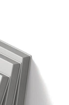
A visual strategy guide, visual development guide, and visual standards guide, forming a cohesive framework to align LIFE’s rebranding with its core mission and values.















































































































04/10
COURSE
Type Composition
PROJECT
Book Typography Redesign
INSTRUCTOR
John Nettleton
SEMESTER
Spring 2022

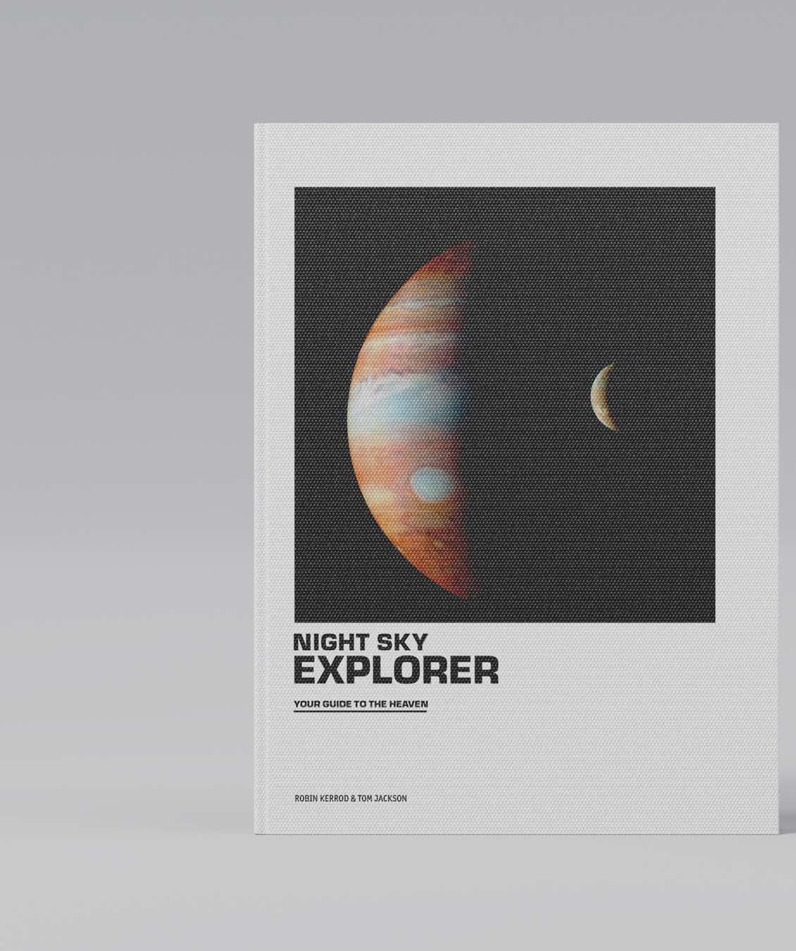
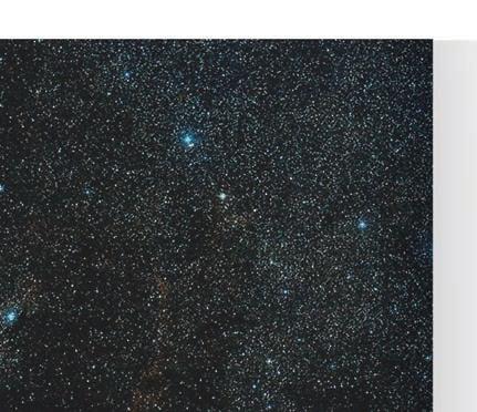
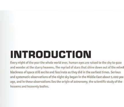
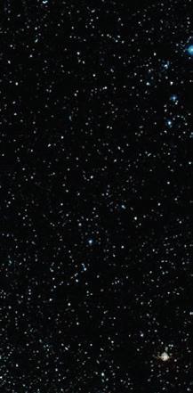
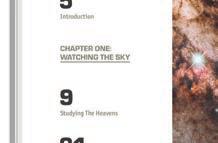
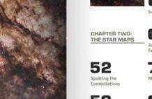
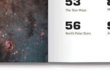
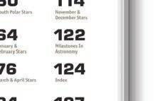
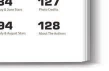
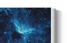
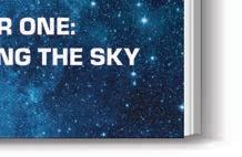
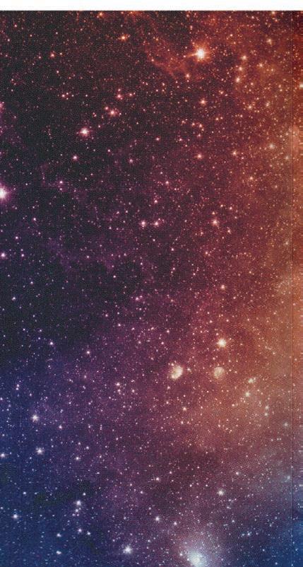
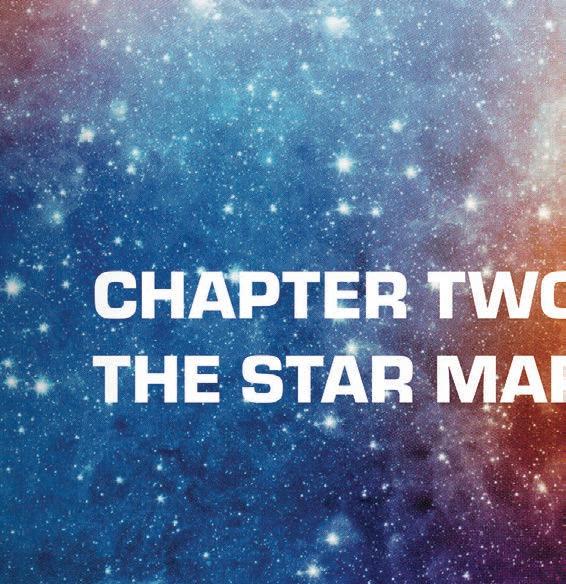
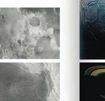
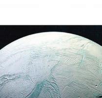
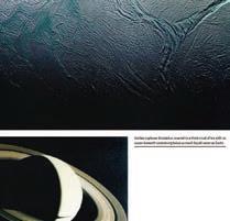
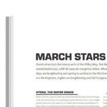
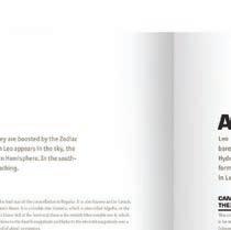
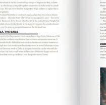
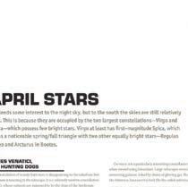
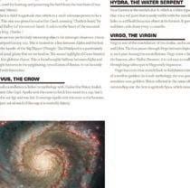
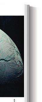
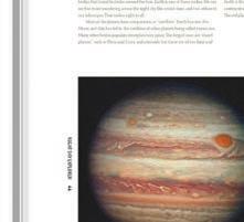
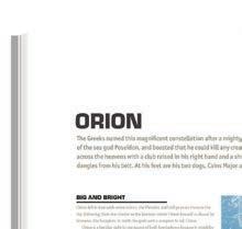
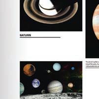
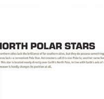
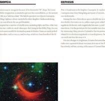
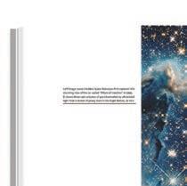
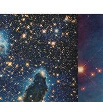
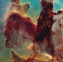
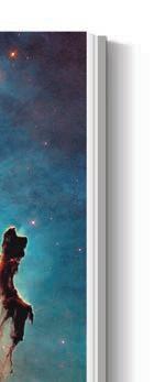
COFFEE-TABLE BOOK TYPOGRAPHY REDESIGN
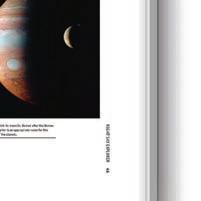
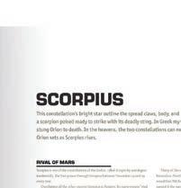
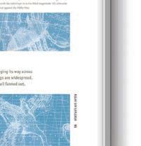
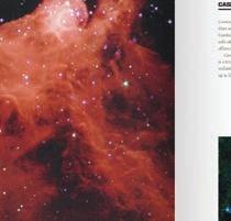
My design thinking is centered on creating an immersive, visually harmonious experience that guides readers to explore the vast universe. By changing the original layout of the book to combine the magnificent and beautiful, the goal is to present information in a clear and attractive way. The readers are offered a journey through the pages of the book that presents the universe in a way that balances information and visual images.
PROJECT
Book Typography Redesign
DISCIPLINES
Typography
Editorial Design
Type Composition
OBJECTIVE
APPROACH
Select a coffee-table book with intuitive, beautiful images and essential components like text, captions, titles, and subtitles. The goal is to redesign the book, enhancing both the cover and the interior content to make the visuals and information clearer and more engaging, creating a more informative and visually appealing typography.
Exploring the universe through a fresh design perspective, where visuals and text are seamlessly combined to guide readers. By thoughtfully integrating imagery with compelling typography, I aim to present the vastness of the universe in a way that feels accessible and engaging. Enhancing the reading experience, allowing the richness of the cosmos to unfold within the pages of the book, the new typography composition offers readers both clarity and wonder as they navigate through its vastness.
DELIVERABLES
A redesigned coffee-table book that focuses on a strong composition of typography and images.






















































05/10
Type Systems
COURSE
PROJECT Type Systems
INSTRUCTOR
John Nettleton
SEMESTER eCAADe Conference Promotion
Fall 2022
ARCHITECTURAL DESIGN CONFERENCE PROMOTION
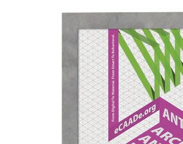
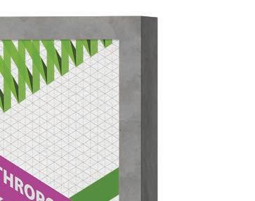
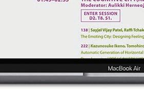
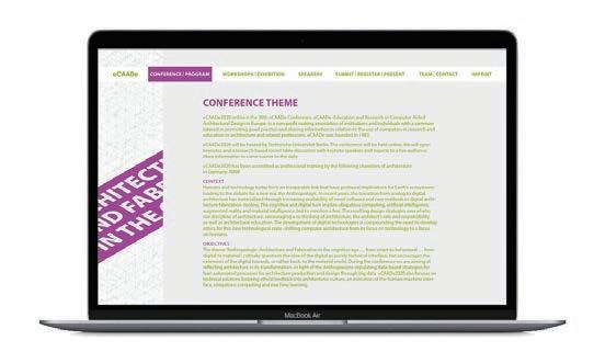
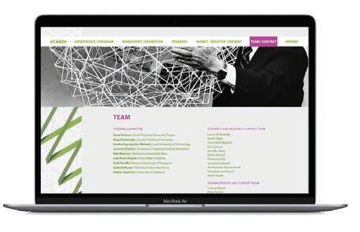
Through the dynamic and vibrant graphics that reflet the intersection of technology, architecture, and materiality in modern architecture. My goal was to create a cohesive visual experience that resonates with the conference’s forward-thinking themes. Each of the deliverables was carefully designed to capture the essence of the conference and engage attendees in a visually cohesive journey.
PROJECT
eCAADe Conference Promotion
DISCIPLINES
Type Systems
Brand Identity
Editorial Design
UX/UI Design
OBJECTIVE
APPROACH
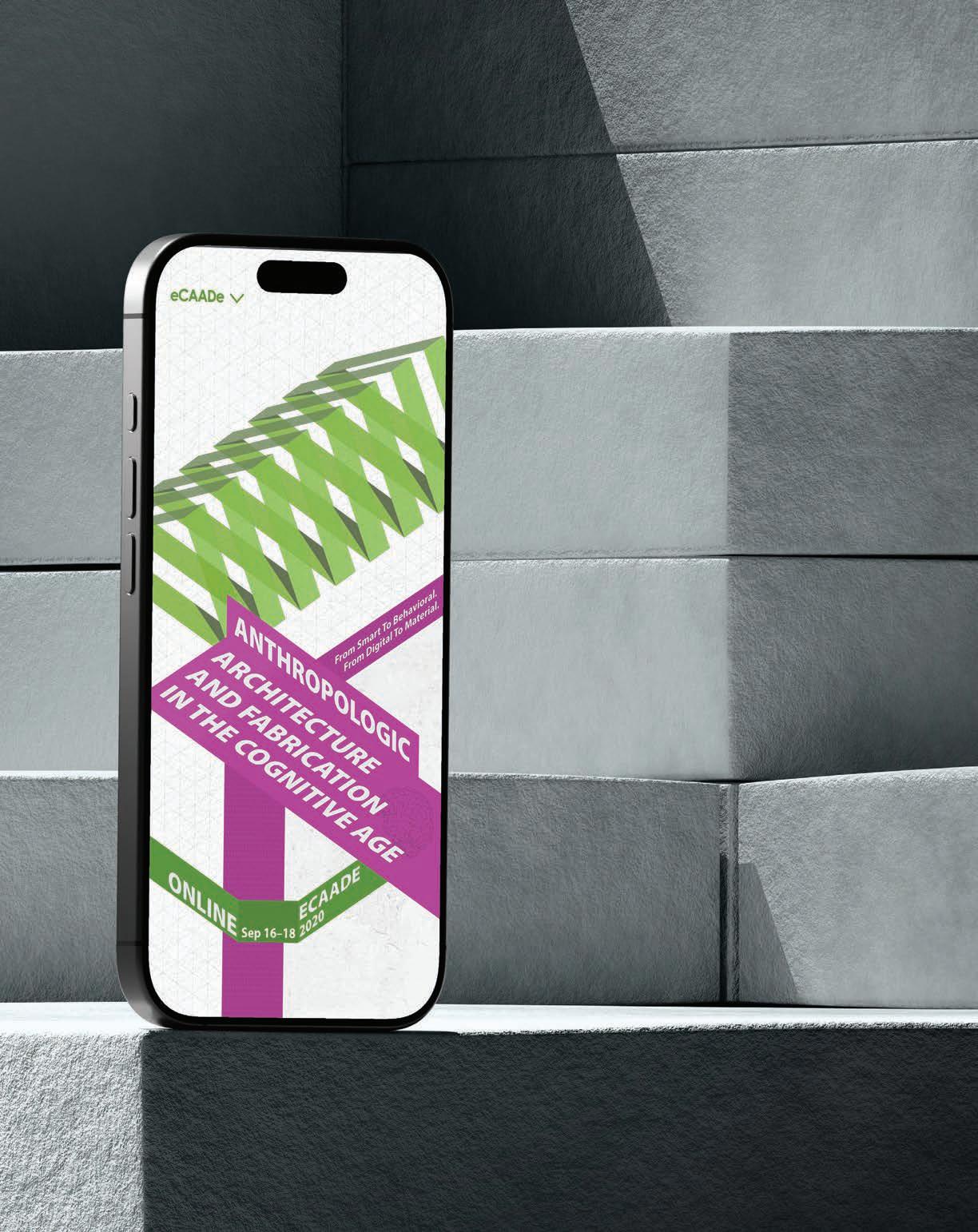
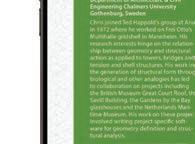
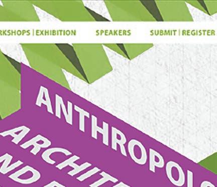
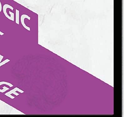
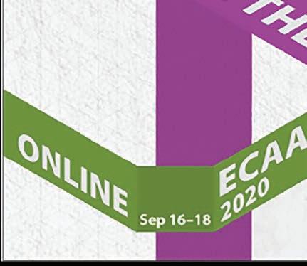
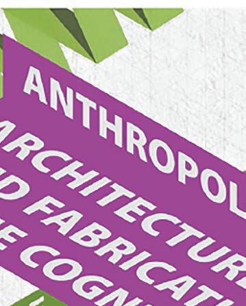
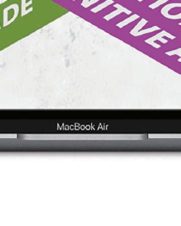
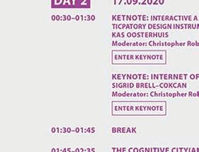
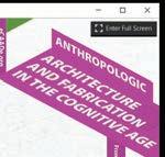
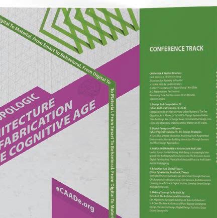
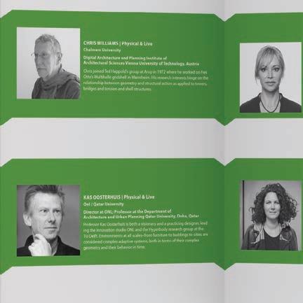
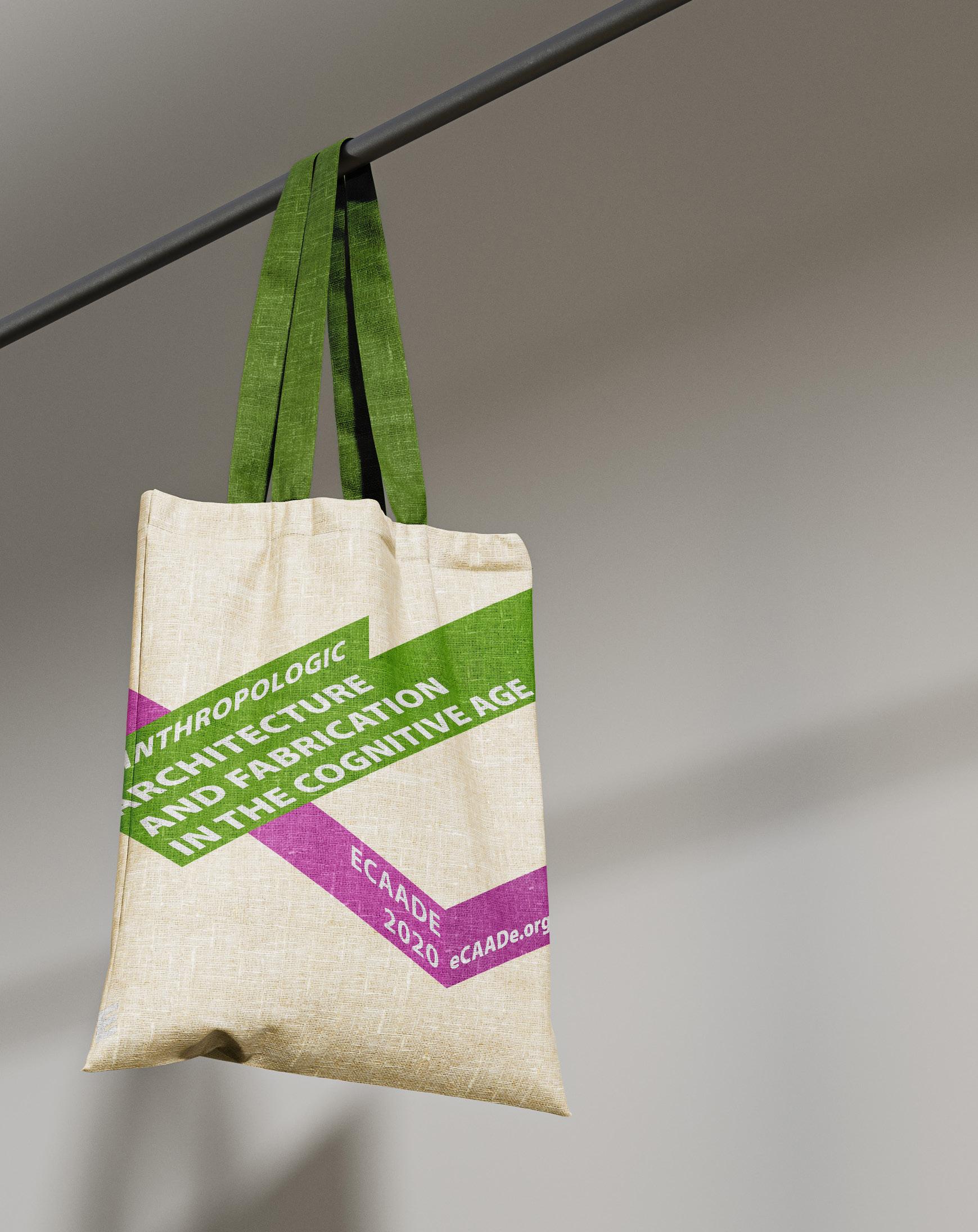
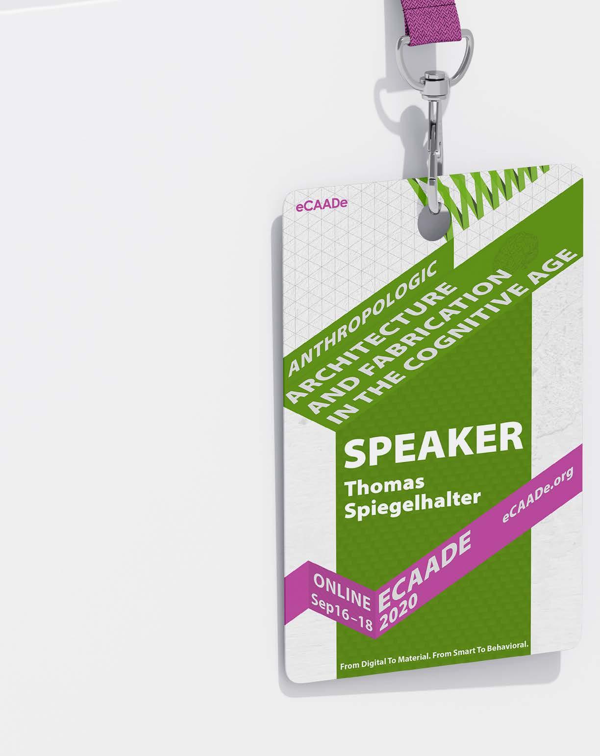
eCAADe2020 online is the 38th eCAADe Conference. eCAADe – Education and Research in Computer-Aided Architectural Design in Europe. The theme was “Anthropologic – Architecture and Fabrication in the cognitive age: “From smart to behavioral. From digital to material.”
DELIVERABLES
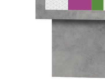
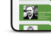
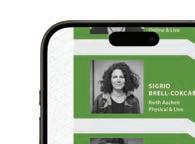
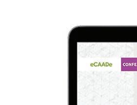
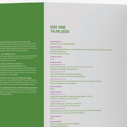
Identify an existing design conference, and create a new comprehensive visual system to showcase the theme and concept of the conference. I aimed to combine the theme of architecture through vibrant graphic elements. Design conference materials include the poster, a website and app prototype, a program schedule for the speakers, an ID card, and a postcard.
A redesigned coffee-table book that focuses on the strong composition layout of words and images.
















































06/10
Motion Graphics
PROJECT Motion Graphics COURSE
SEMESTER The Commercial Video
INSTRUCTOR Fall 2023
Frank Pietronigro
THE COMMERCIAL VIDEO
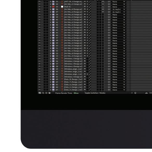
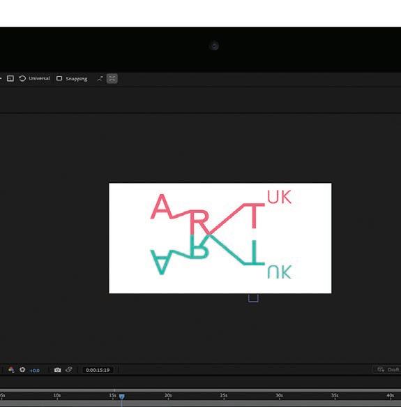
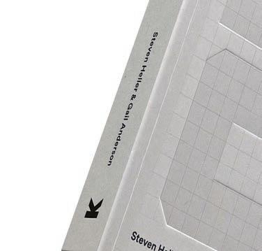
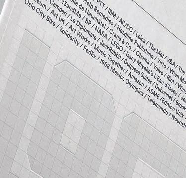
This project is to delve into the relationship between various kinds of logo shapes through motion graphics, exploring simple transformations and movements that bring graphic elements to compose the logo idea. By taking this concept further, I aimed to create a compelling commercial video for The Logo Design Idea Book by Steve Heller and Gail Anderson, using animation to highlight the dynamic transitions of logo components and simple line movement, to illustrate the core ideas of logo design in an engaging way.
PROJECT
The Commercial Video
DISCIPLINES
Motion Graphics
Visual Design
Storytelling
OBJECTIVE
APPROACH
To effectively produce a motion graphic book commercial, it’s essential to consider crafting a compelling sales promotional video. The primary goal of this initiative is to significantly enhance book sales by vividly showcasing the unique value and benefits of the book, thereby enticing the target audience to make a purchase.
Develop a book commercial video for the book, The Logo Design Idea Book . The cover and content from the book were used as resources, the book style, theme, and visual content were used as the basis for the video. The graphics of different logos are used as secondary design materials in Adobe Illustrator to show the transition of logos from a dynamic perspective. The idea is to create a connection based on the existing logo designs to prove the value of the book.
DELIVERABLES
A motion graphic commercial video that dynamically showcases The Logo Design Idea Book , highlighting the evolution and impact of logo design through animated transitions.

















































































“A logo does not sell, it identifies.”
— Paul Rand


07/10
Type Systems
Type Systems COURSE
PROJECT
INSTRUCTOR
John Nettleton
SEMESTER Fujifilm Annual Report
Fall 2022
2021 ANNUAL REPORT REDESIGN
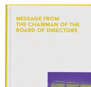
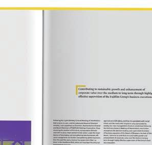
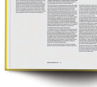
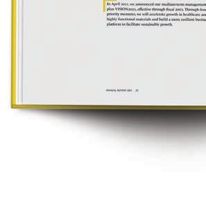
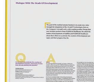
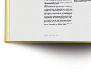
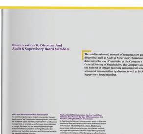
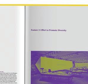
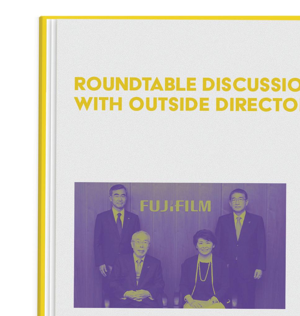
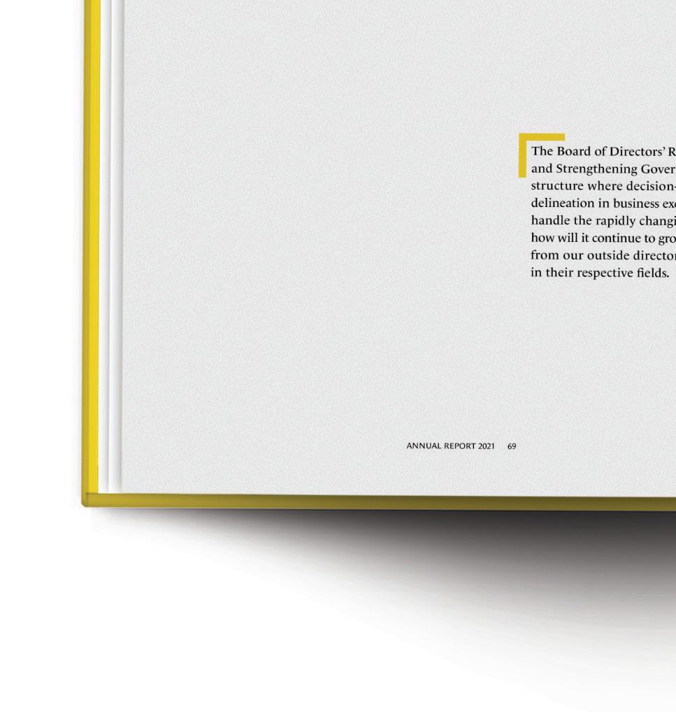
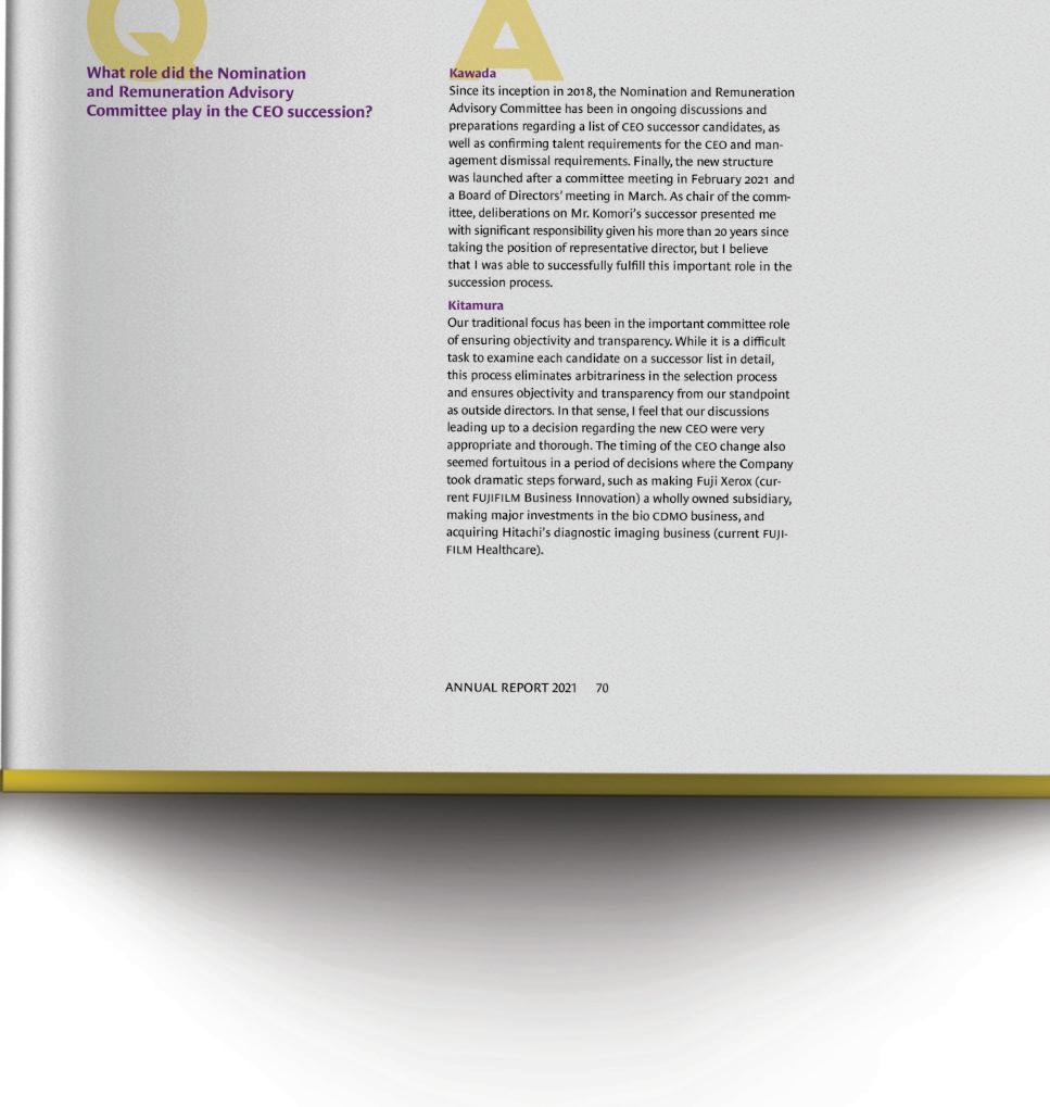
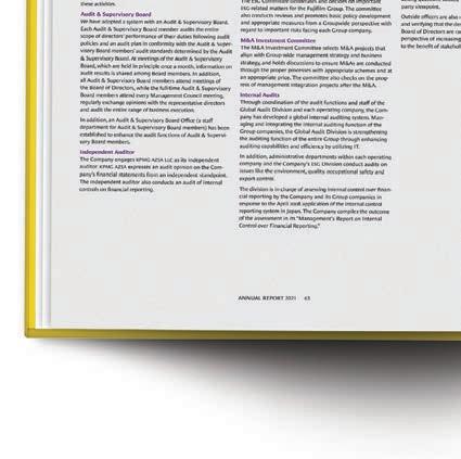
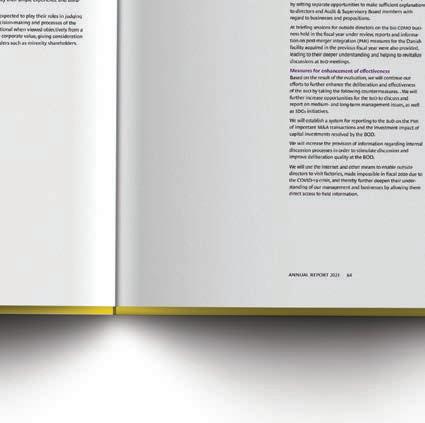
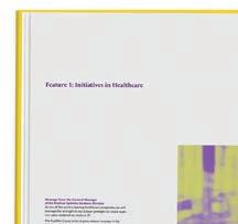
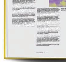
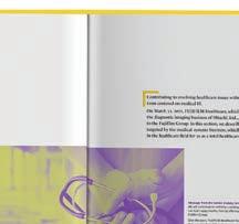
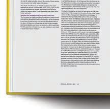
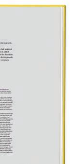
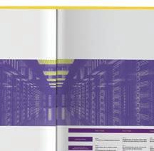
I focused on bringing the report’s visual presentation into line with Fujifilm’s new vision, “Value from Innovation”. I worked to incorporate the spirit of innovation throughout the typography. The presentation of text and data has been optimized to make the information more intuitive and easy to read. The overall layout is both vibrant and coordinated, improving the report’s readability and appeal and better interpreting Fujifilms brand core driven by innovation.
PROJECT
Fujifilm Annual Report
DISCIPLINES
Type Systems
Editorial Design
Book Cover Design
Printed Matter
OBJECTIVE
APPROACH
FUJIFILM Holdings is a holding company with two operating companies, FUJIFILM Corporation and FUJIFILM Business Innovation Corporation. Fujifilm Group is developing its global business with the overarching goal of creating a healthier and more sustainable world. Fujifilm Group is making efforts to actualize sustainable innovation across the group, enhancing innovative technologies and creating new business value.
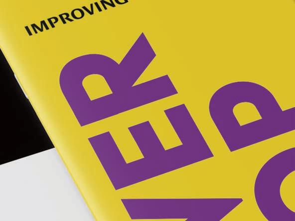
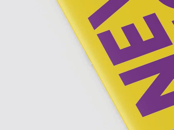
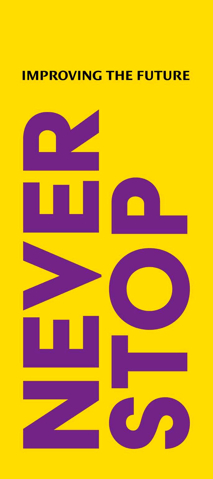
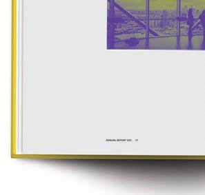
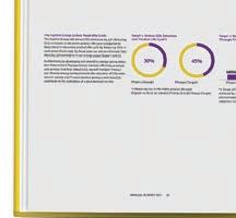
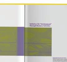
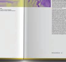
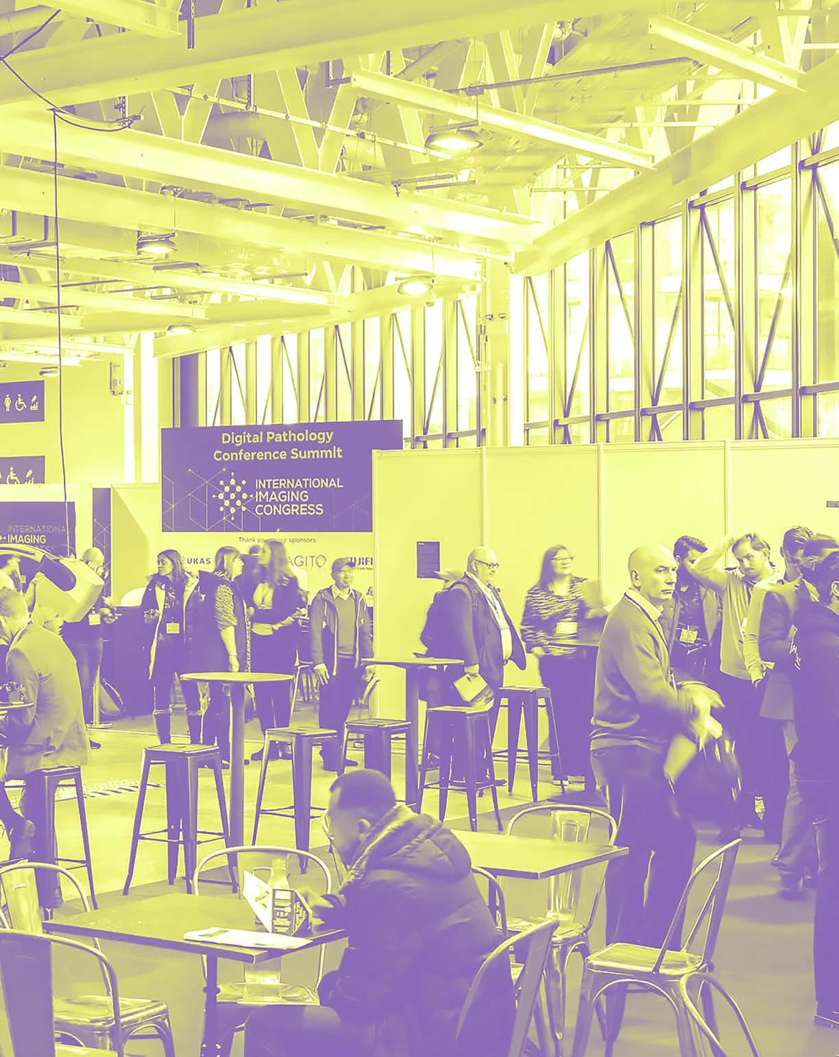
I revamped the visual effects, layout, and content of the Fujifilm Annual Report to better align it with the company’s goals of sustainability and innovation. This redesign makes the report easier to read and gives it a fresh, modern look. Yellow and purple, the two primary colors, along with duotone image processing, create a visually striking appeal. The presentation of text and data has been restructured to be more intuitive and innovative. Additionally, the internal layout is both dynamic and cohesive, significantly enhancing the report’s overall attractiveness and legibility.
DELIVERABLES
The redesigned Fujifilm Annual Report align with the brand’s vision of creating value through innovation.










































08/10
Type Experiments
Type Experiments COURSE
PROJECT
SEMESTER Color Experimental Poster Series
INSTRUCTOR Spring 2023
Kathryn Morgan

EXPERIMENTAL POSTER SERIES
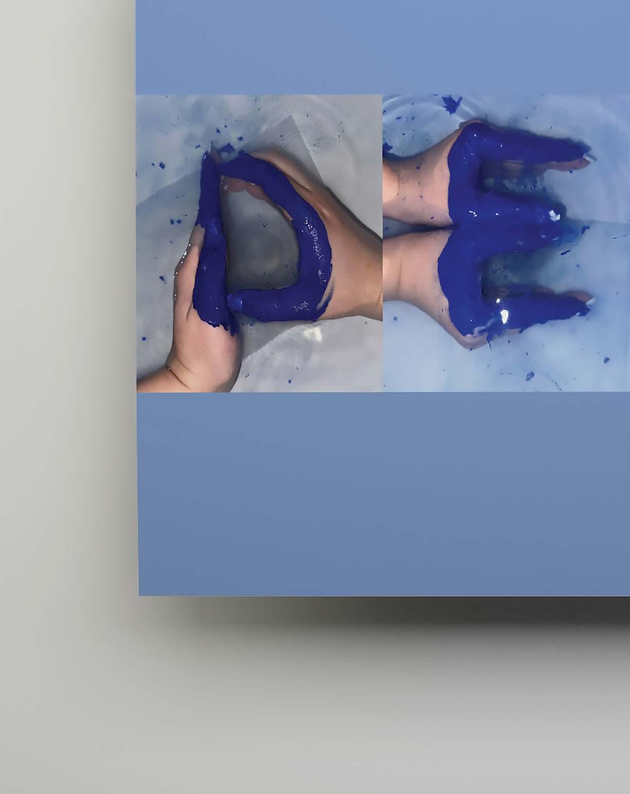
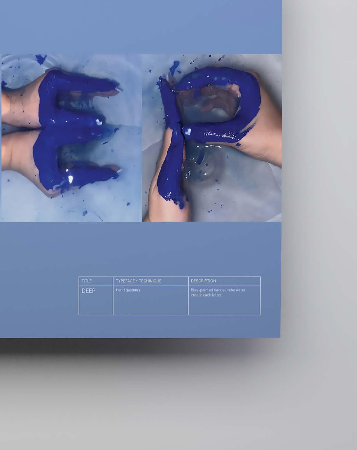
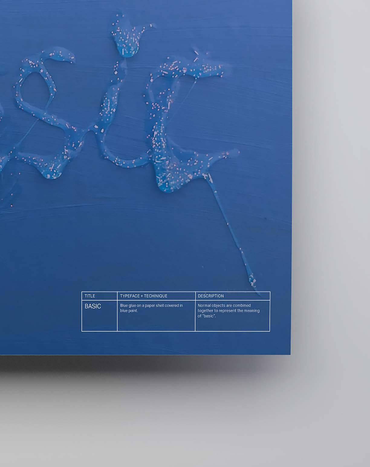
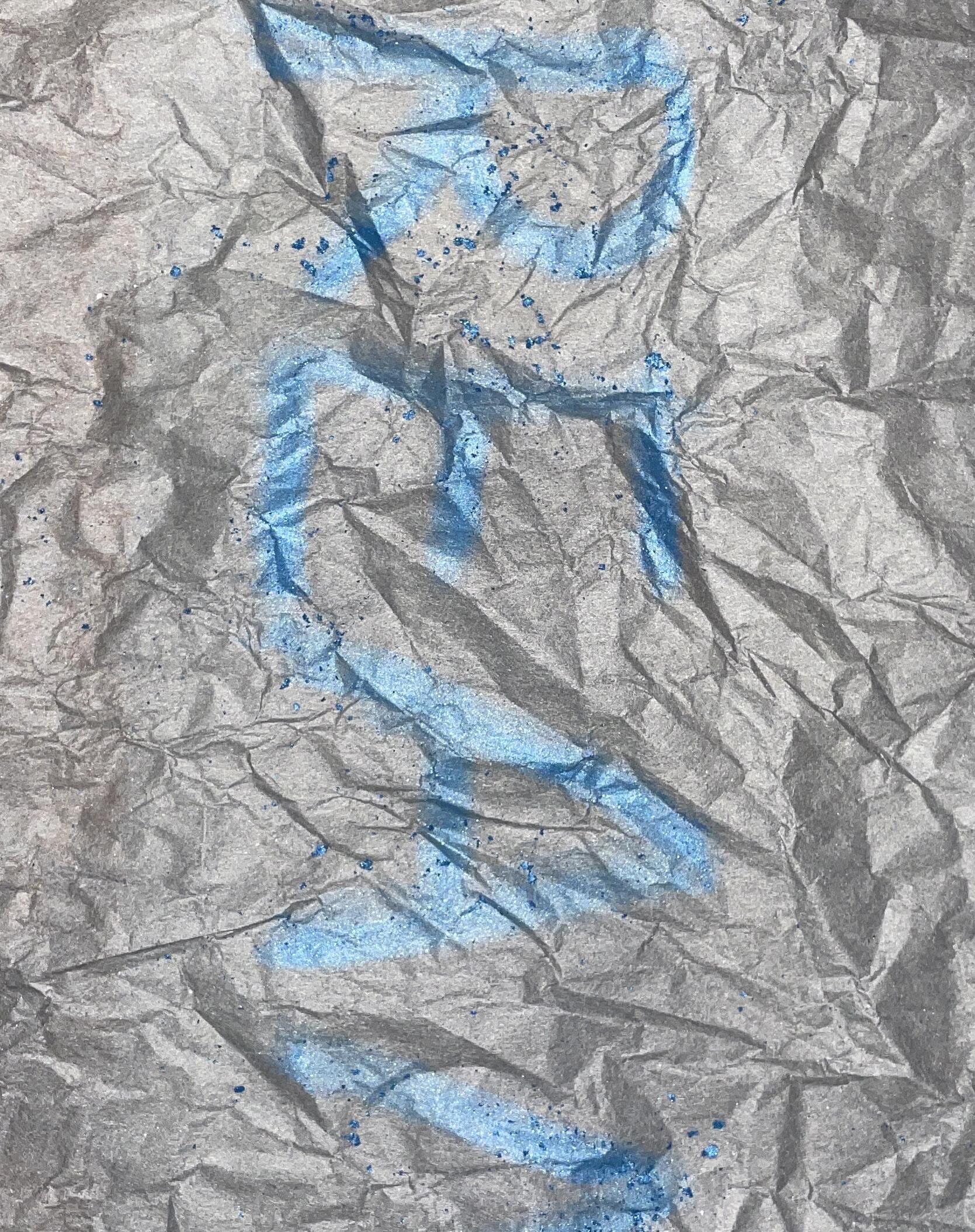
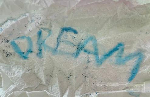
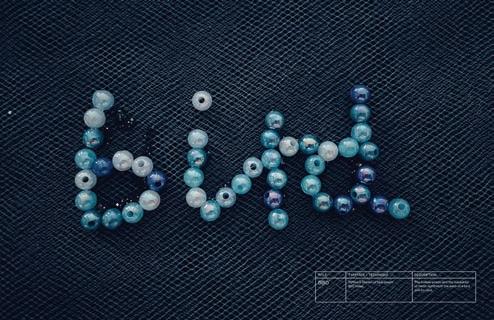
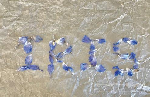
To explore the color blue deeper, I experimented with various mediums to convey different meanings, such as paint, fruit, hands, and mixed materials, with different words and associations. The resulting typefaces convey the unique qualities of the color blue. Each of the 12 posters express a different meanings or emotions associated with the color blue, utilizing unique techniques and visual styles to reflect its depth and versatility.
PROJECT
Color Experimental Poster Series
DISCIPLINES
Color Theory
Media Exploration
Visual Communication
OBJECTIVE
APPROACH
Select a color for typography experiments and explore its associations, symbolism, and various combinations of meanings. Through design experiments, communicate the multifaceted appearance of the color by utilizing different media and creative techniques. The final outcome will be a series of posters that visually express the depth and versatility of the selected color in both form and meaning.
The project involves a deep exploration of the color blue, focusing on its associations and meanings across different contexts. The process began by selecting a range of blue shades and experimenting with various media, such as paint, fruit, hand figures, and mixed media. Each poster will interpret a distinct meaning or emotion tied to blue, expressed through typography and design elements. The final deliverables will consist of 12 posters, each utilizing a different medium and visual style, to communicate the multifaceted nature of blue in both form and meaning. This approach ensures a diverse yet cohesive representation of blue across various artistic interpretations.
DELIVERABLES
An experiment poster series that highlights the multifaceted nature of the color blue.






DELIVER JIAYU WANG / MFA PORTFOLIO
DELIVER 180 JIAYU WANG / MFA PORTFOLIO
PROJECT 08/10
180 PROJECT 01/10




09/10
Nebu
COURSE
NASA Sponsored Collaborative Directed Study
PROJECT
SEMESTER Space Travel Companion Design & Promotion
INSTRUCTOR Fall 2023
John Guenther & Claudia Dallendorfer
A CROSS-DISCIPLINARY COLLABORATIVE PROJECT SPONSORED BY NASA
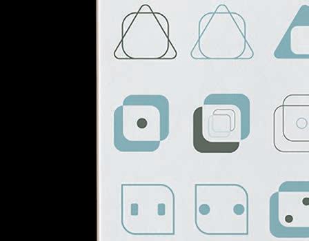
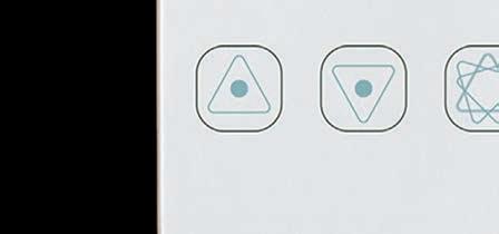
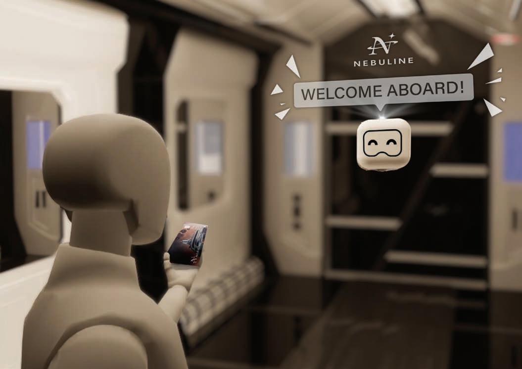
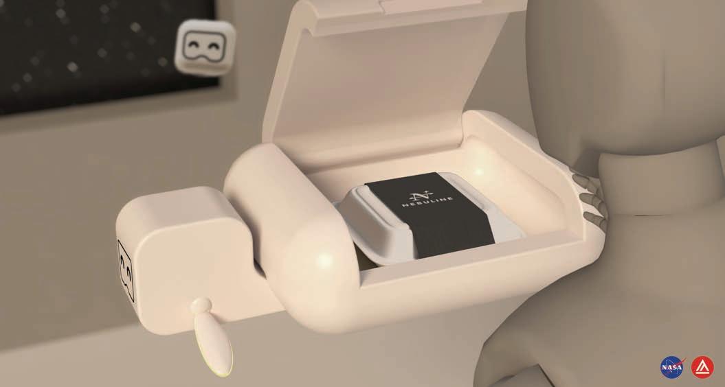
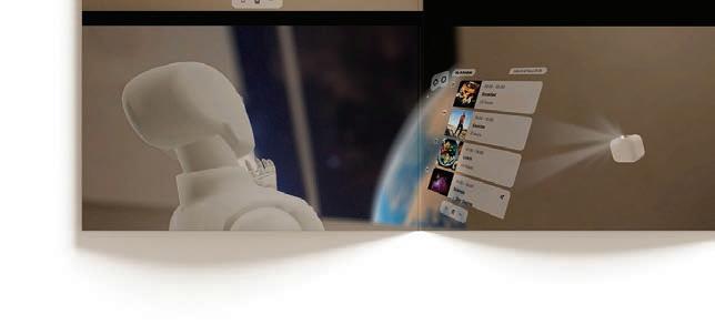
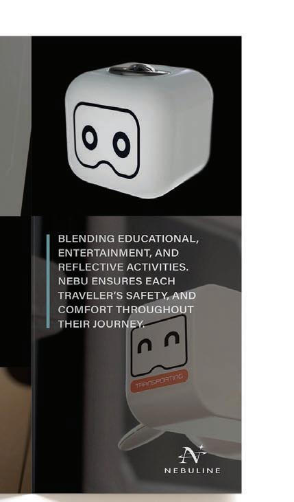
Nebu was a truly interdisciplinary collaboration, combining graphic design, UI/UX, and industrial design. In our team, I was responsible for background research with our team members, ensuring the promotion of the Nebu robot and NebuLine, and creating a cohesive visual language. With UI/UX design and industrial design team members, we created a robot that felt physically safe and approachable in the space environment, as well as promoted the Nebu Line space tour.
PROJECT
Space Travel Companion Design
DISCIPLINES
Cross-Major Team Work
Figma
Visual Communication
Logo Design
Promotion Design
Printed Matter
Storytelling
OBJECTIVE
APPROACH
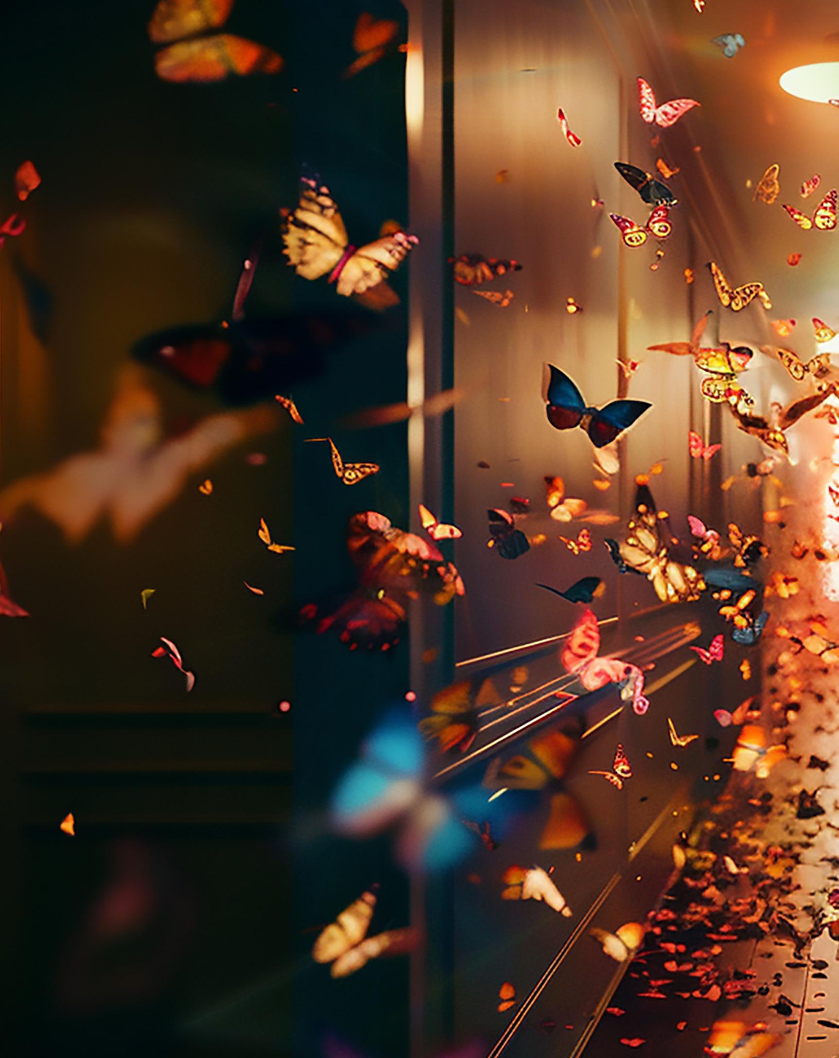
The NASA-sponsored project is to create a space travel companion for Mars missions that enriches the astronaut experience through cutting-edge technology and thoughtful design. The focus of the project is Nebu and Nebu Line, an in-vehicle robot designed to offer astronauts and people, not only a sense of safety but also entertainment and interaction during the Nebu Line space tour.
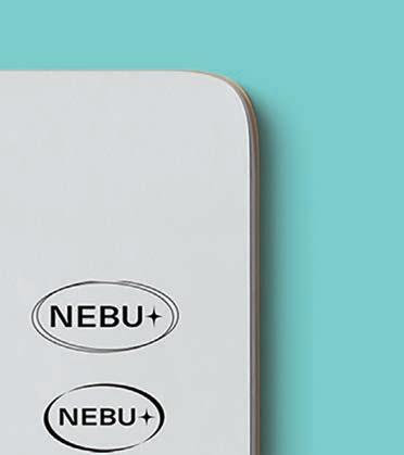
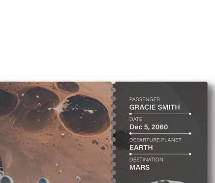
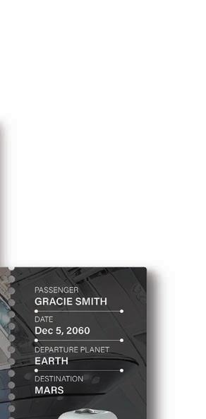
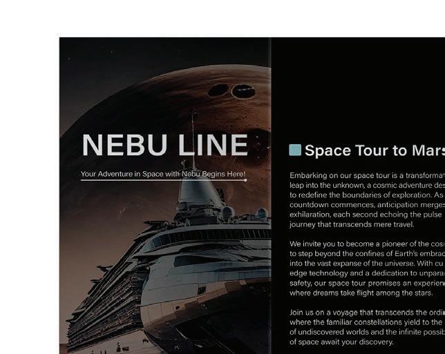
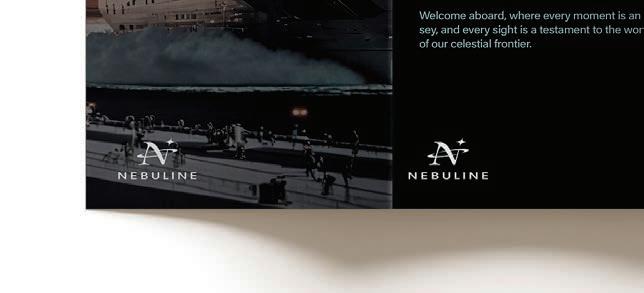
This project involved a collaborative group effort between graphic design, UX/UI design, and industrial design to bring Nebu, the in-vehicle robot, to the Nebu Line space tour. As the graphic designer, my role included the feasibility of in-depth research on the project in the early stage, establishing a cohesive theme that aligns with space travel and Nebu’s interactive nature, designing the identity that reflects its space and companion-like essence, creating a promotional flyer to highlight Nebu’s key features, and crafting a futuristic spaceship ticket that enhances the excitement of the journey. This ensures a unified and engaging design that communicates Nebu’s functionality and appeal.
DELIVERABLES
To promote Nebu and Nebu Line, focusing on enhancing the space travel companion experience duing the space tour to Mars.








PROJECT




10/10
MFA Thesis Project
COURSE
MFA Thesis
PROJECT
Explore Your Dream
INSTRUCTOR
SEMESTER
Spring 2023
Fall 2023

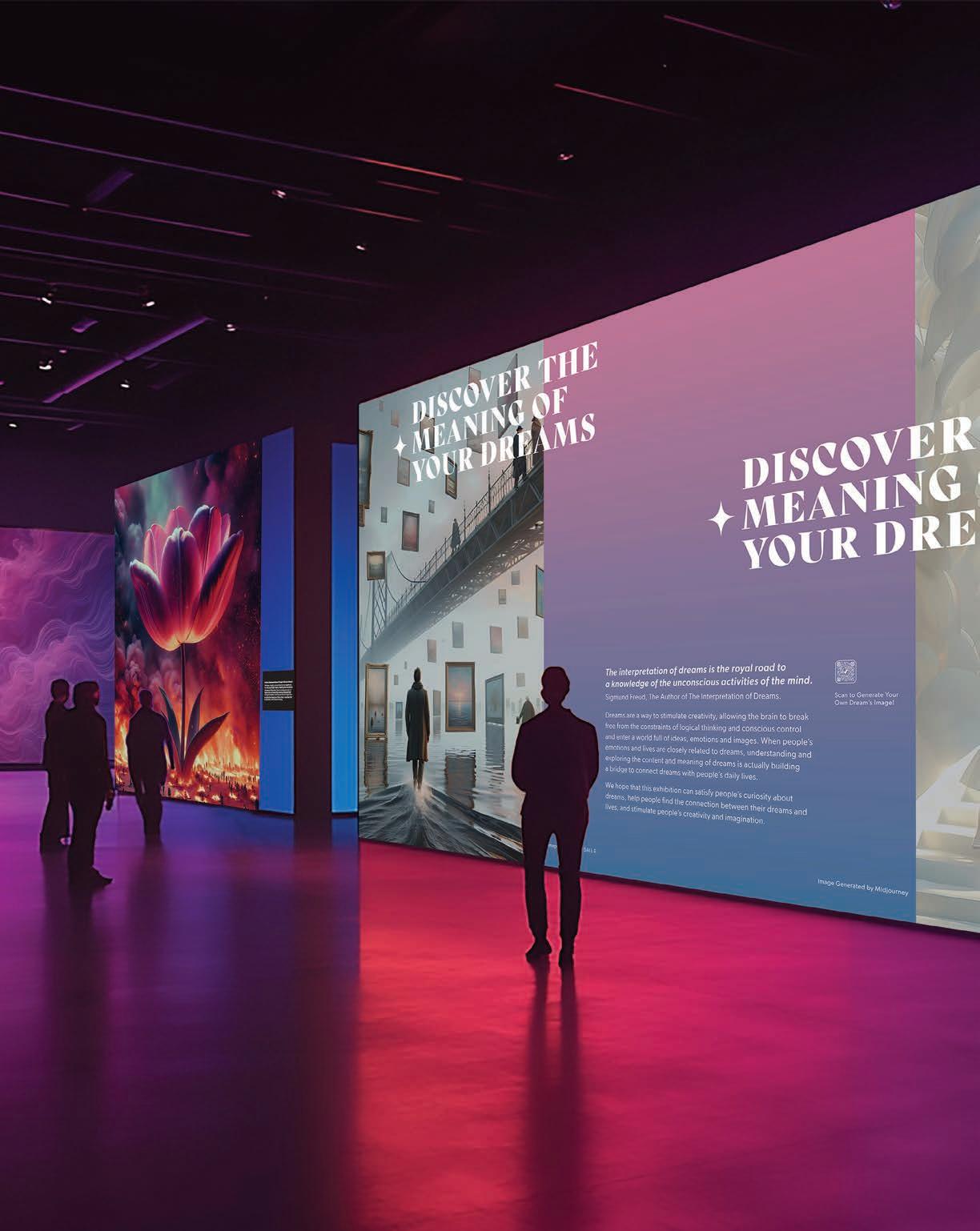
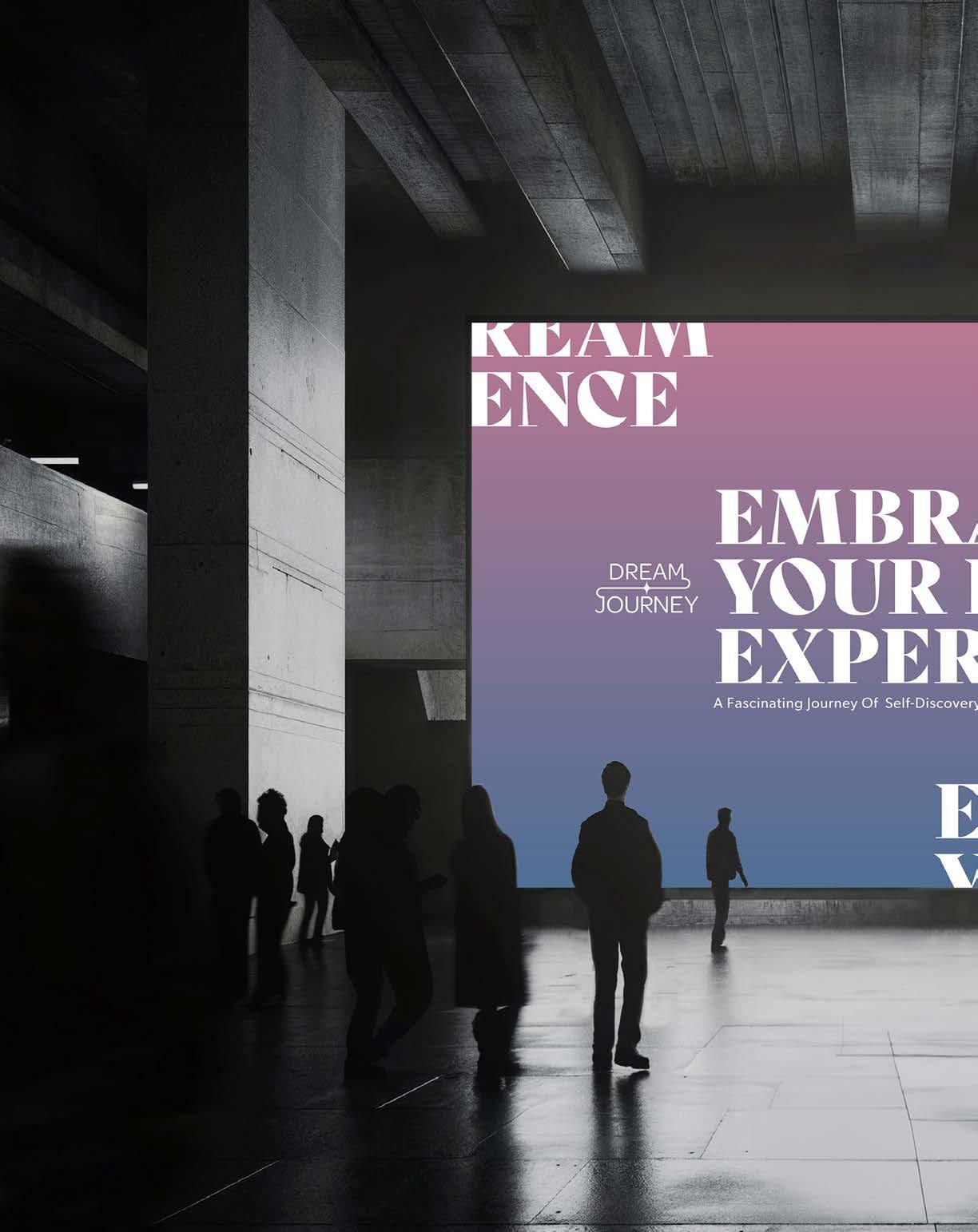
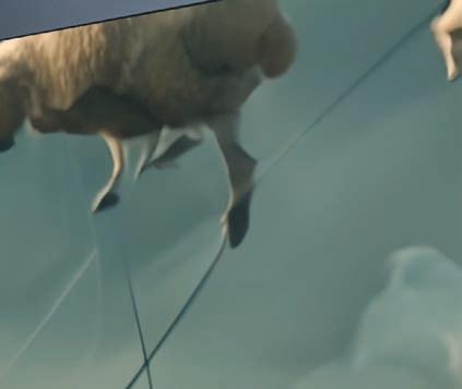
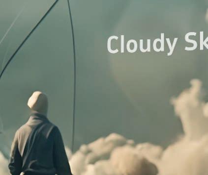
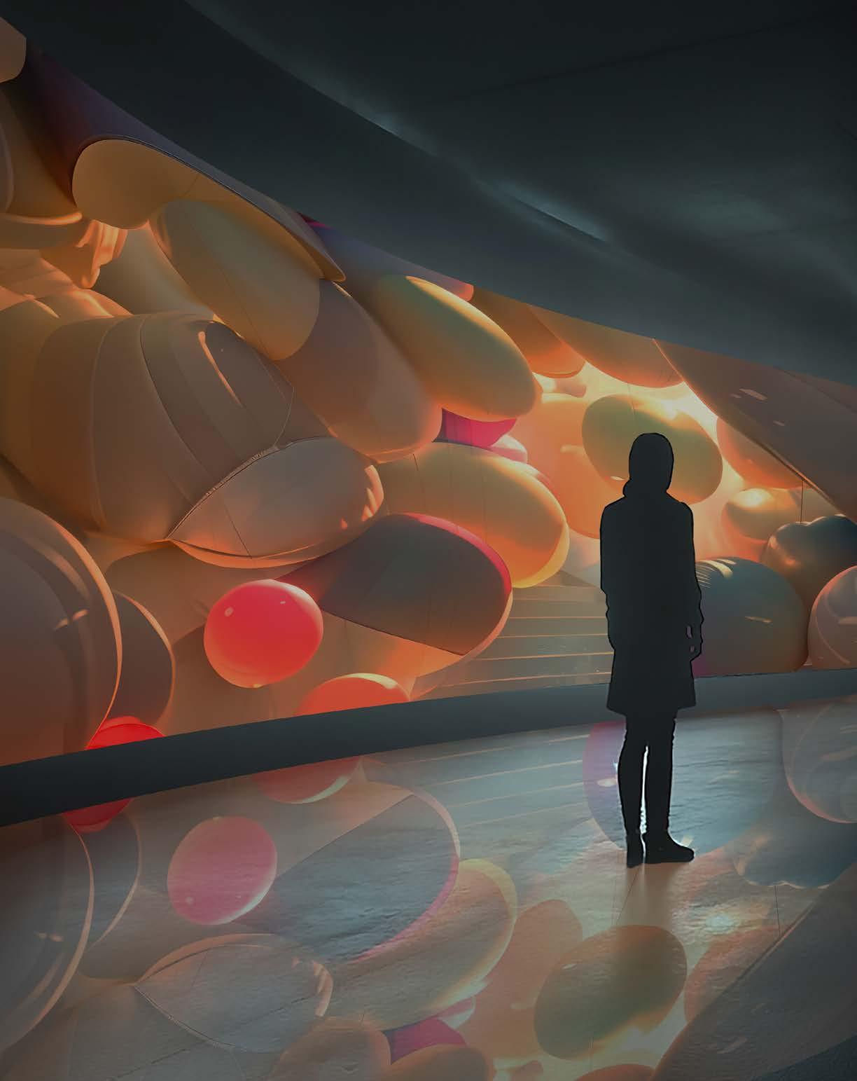
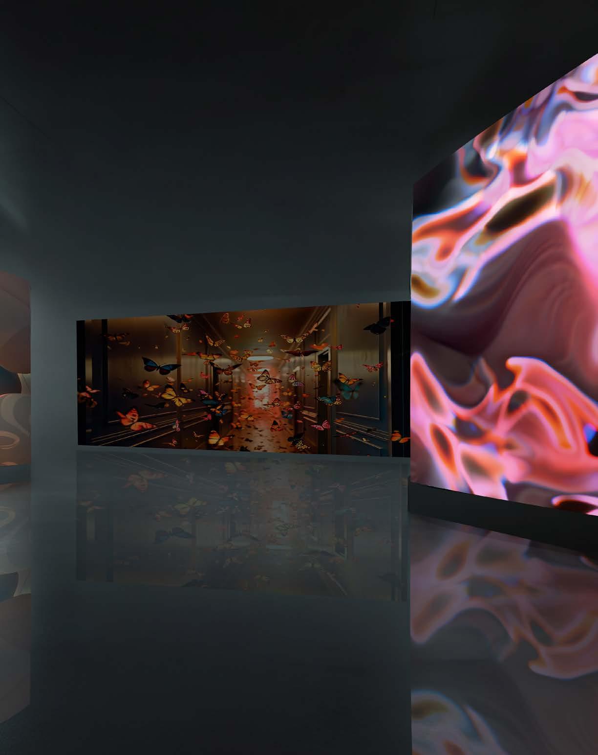
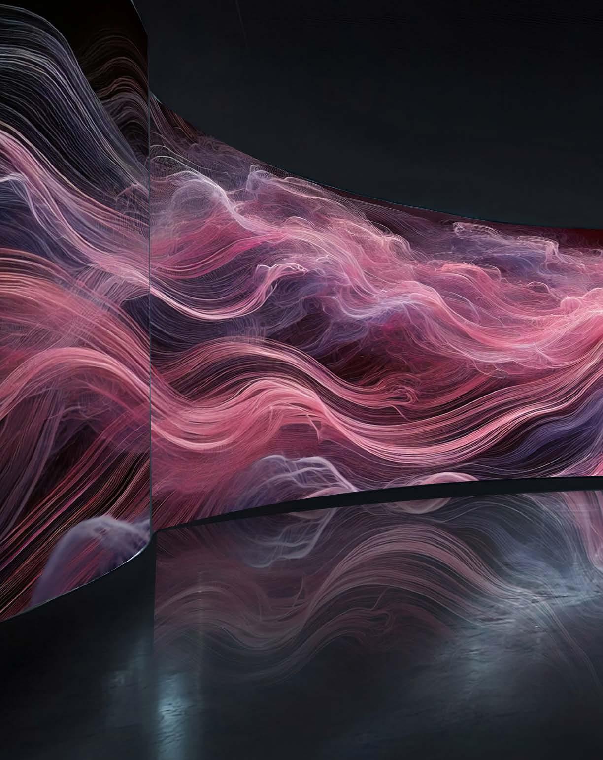
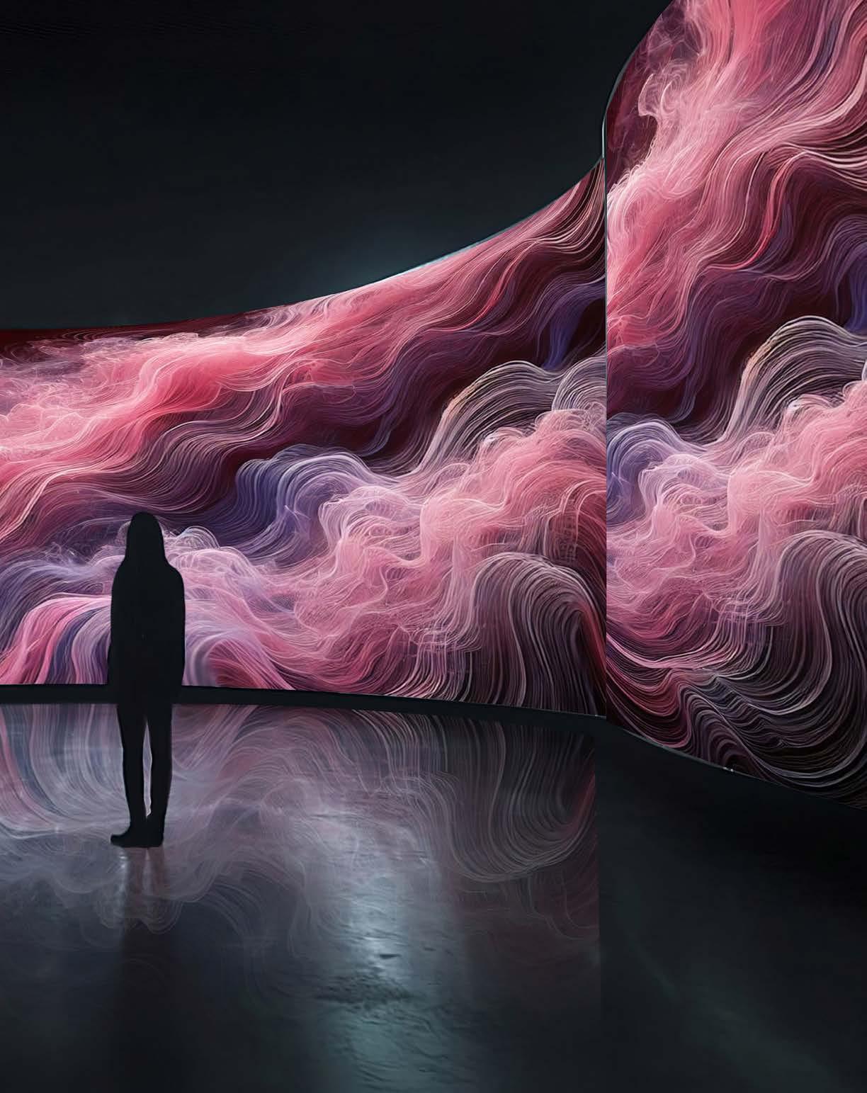
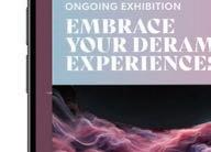
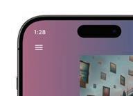
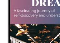
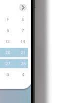
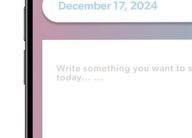
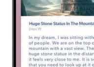
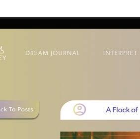
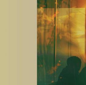
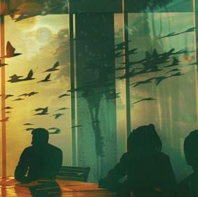
From preliminary investigation research and strategy formulation to creative experiments and user testing, I focused on transforming the abstract visual of dreams into a tangible immersive experience through visual and interactive design. The goal is to build a connection between people’s surreal dream and their daily life in an immersive and easy-to-understand way.
PROJECT
Dream Journey
DISCIPLINES
AI Design & Video
UI/UX Design
Branding Visual
Environmental Design
Motion Graphics
Video Editing
Editorial Design
Typography Setting
Printed Matter
OBJECTIVE
APPROACH
This Master of Fine Arts thesis project is an extensive, multi-semester study focused on addressing a real-world problem through graphic design. The objective is to explore how design can effectively solve the issue and implement innovative solutions that showcase advanced design thinking. The project encompasses a comprehensive process, including in-depth research, strategic development, creative exploration, user testing, and the final execution of design outcomes.
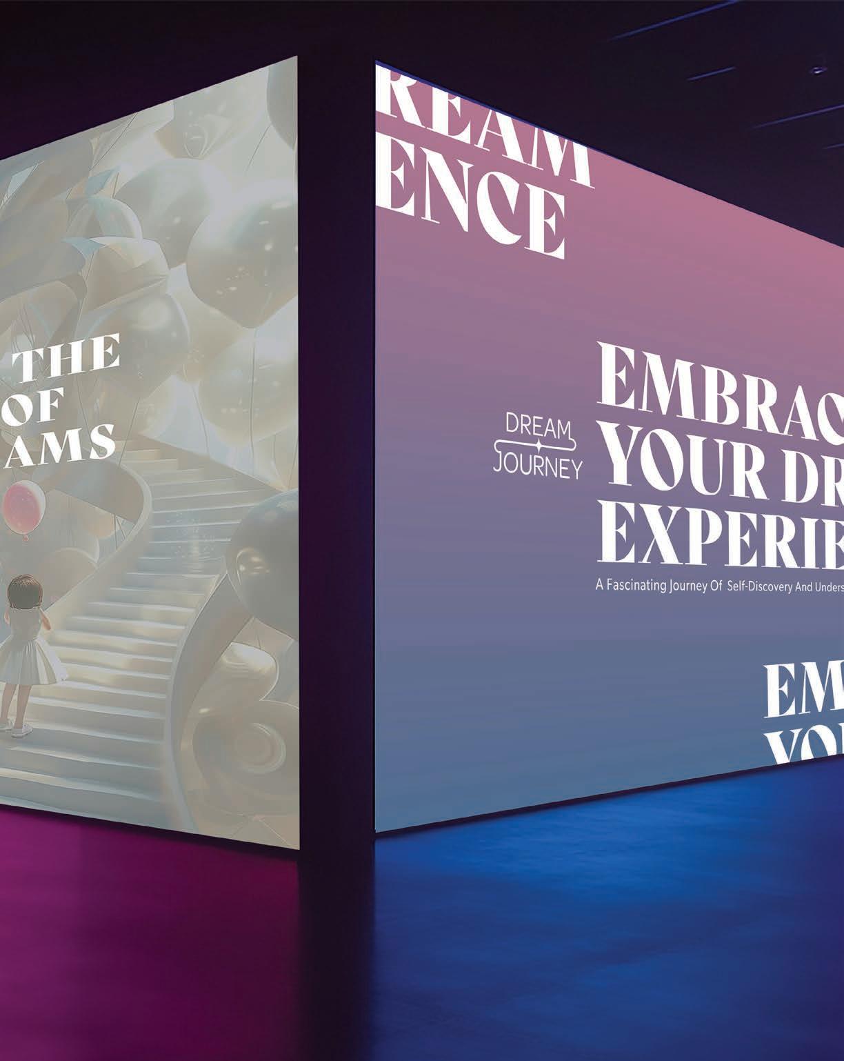
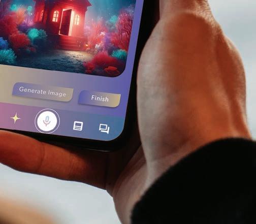
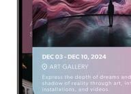
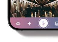
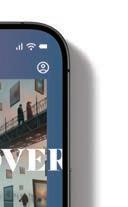
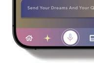
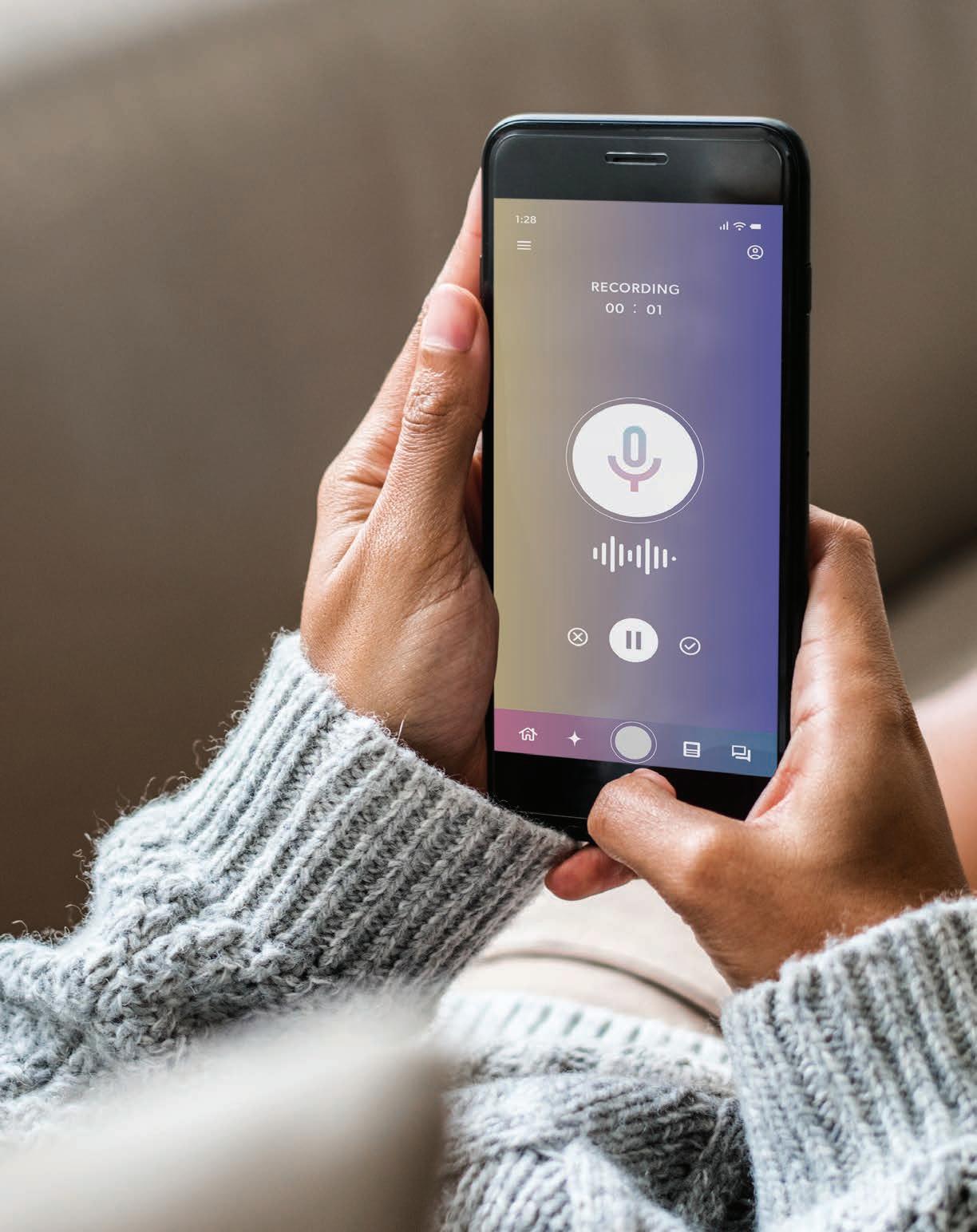
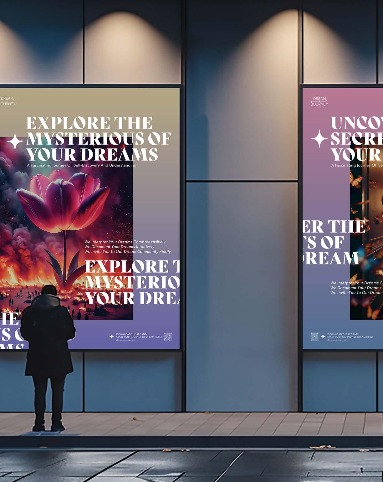
Based on artificial intelligence technology, I aimed to transform the abstract concept of dreams into a tangible immersive experience through visual communication, design and interactive elements. By integrating the development of web and app prototypes, I designed a variety of deliverables for spatial experience, including a poster series and dynamic displays that bridge the gap between the subconscious world of dreams and daily life. This approach encourages visitors to explore, interpret and connect with their dreams in a creative and relaxed environment, making dream exploration an engaging personal journey.
DELIVERABLES
An app and web prototype, along with an immersive exhibition, all crafted to translate dream concepts into interactive, tangible experiences.


















PROJECT





















































TO MY FAMILY
To my mom and grandma, your support and understanding are the power that has brought me to this stage of my life. I am very grateful for your efforts, which have given me the opportunity to pursue my design dreams without any concerns. Love you.
TO MY INSTRUCTORS
Thanks to Mary Scott, John Nettleton, Jeremy Stout, Hunter Wilmmer, Jeff Carino, Frank Pietronigro, Kathryn Morgan, John Guenther, Claudia Dallenderfer, Phill Hamlet, and William Culpepper. Thank you for your guidance, help and inspiration, which have enabled me to grow into a professional designer that I am proud of.
TO MY FRIENDS
Thanks to my friends. It is my luck to meet you guys in this vast world. You support and encourage me all the time. Keep giving me great confidence to face the difficulties along the way. Thank you for your company.
TO MYSELF
You did it! Jiayu. You have never given up on pursuing your design dreams. I know you have paid a lot of hardship and tears to get here. You have been working hard to prove yourself, live up to your family’s expectations and your own life. I believe you can get what you want, and you must firmly believe that hard work will always pay off. I will wait for you in the next stage of your life. See you there.
SCHOOL
INSTRUCTOR
Mary Scott
DEGREE Academy of Art University
Master of Fine Arts, School of Brand Communication, Graphic Design
BOOK TITLE
Deliver
CONTACT
Email jiayuwang0128@gmail.com Website jiayuwangdesign.com
COPYRIGHT © 2024 JIAYU WANG
PRINTING AND BINDING
PAPER STOCK
Mohawk Superfine Eggshell 100# Text
PHOTOGRAPHY Blurb.com
Unsplash Midjourney / DALL•E
TYPEFACE
Ogg Franklin Gothic Garamond
All rights reserved. No part of this publication may be reproduced in any manner whatsoever without permission and transmitted, distributed, in any fomr or by any means, including photocopying, recording and other electronic or mechanical means. Student project only, no part of this book is for commercial use.
