to whoever’s hands this lands in, find what is truly yours in this world





to whoever’s hands this lands in, find what is truly yours in this world


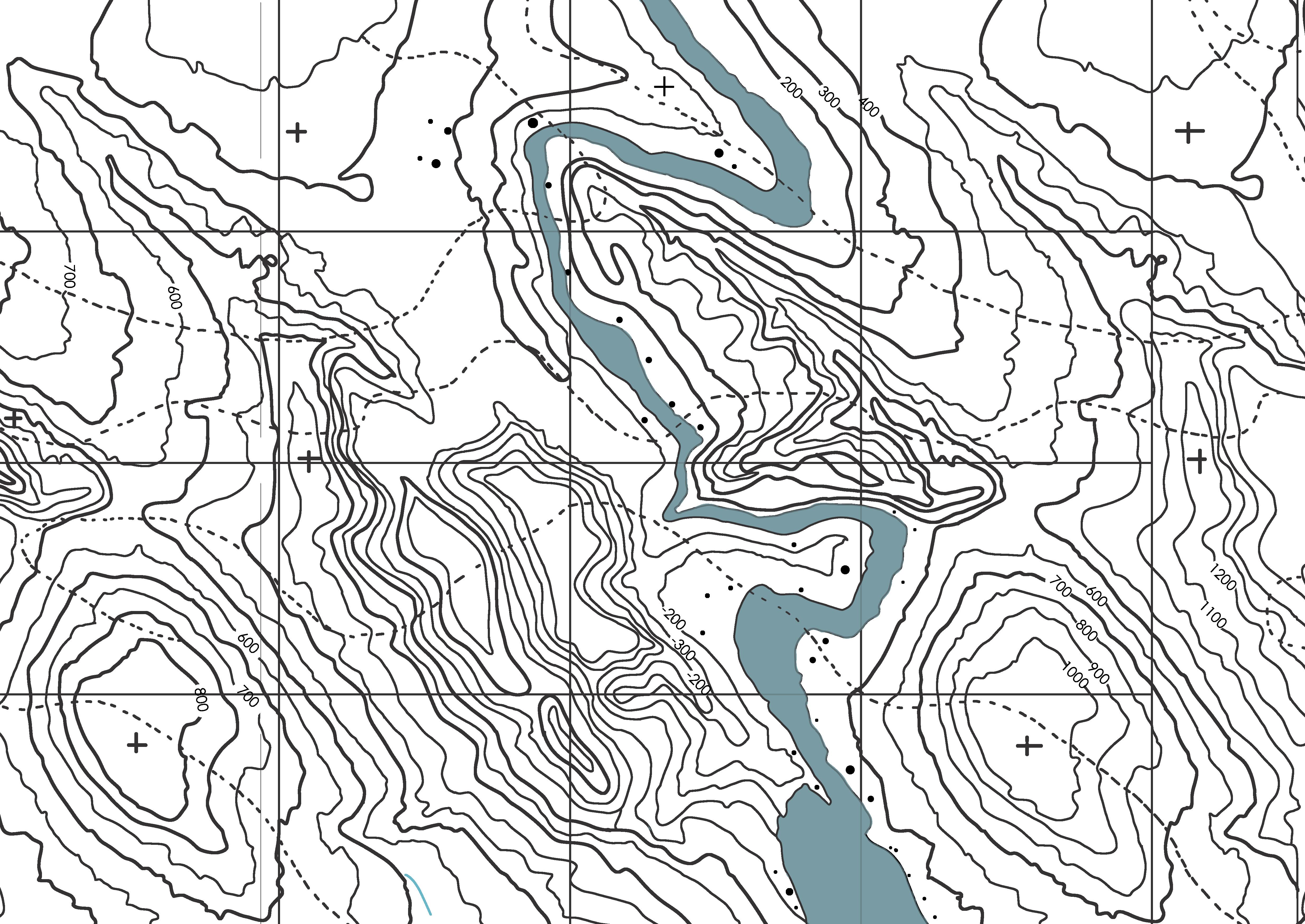
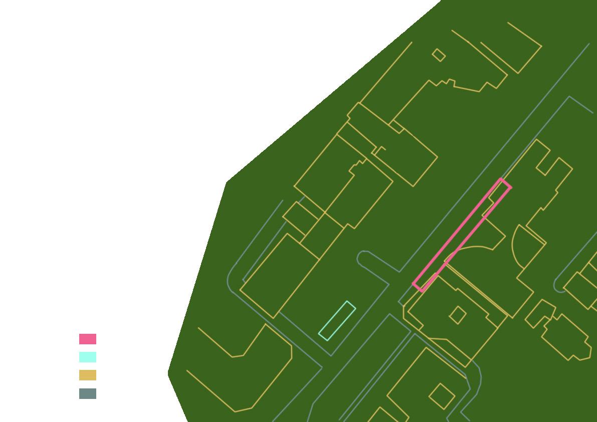
Fragment of a town is a project which allows for creative and ambiguous thinking. Walking through the city then concluding the statement of what the city is all about. Results subconciously reflect on what the person walking the line is interested in and the line.


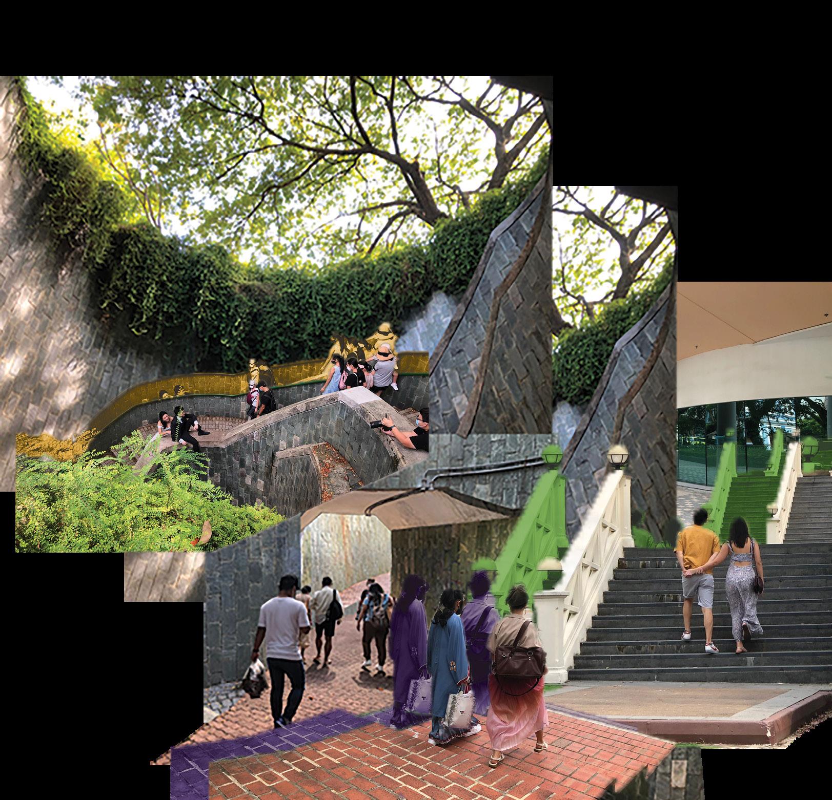
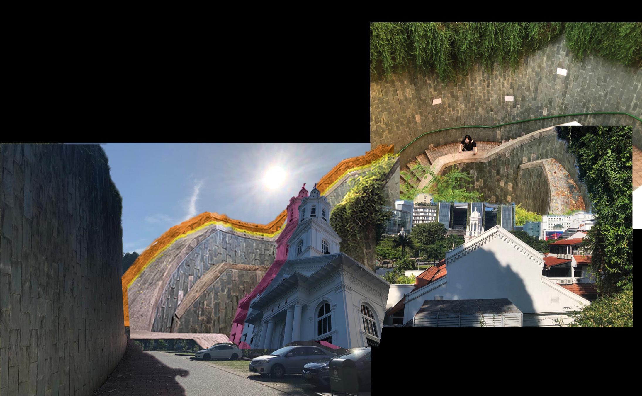
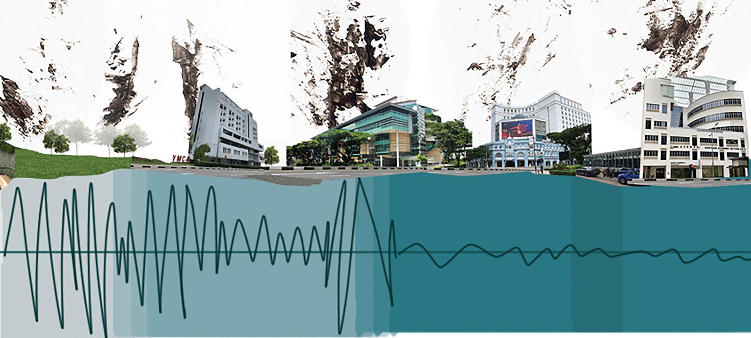
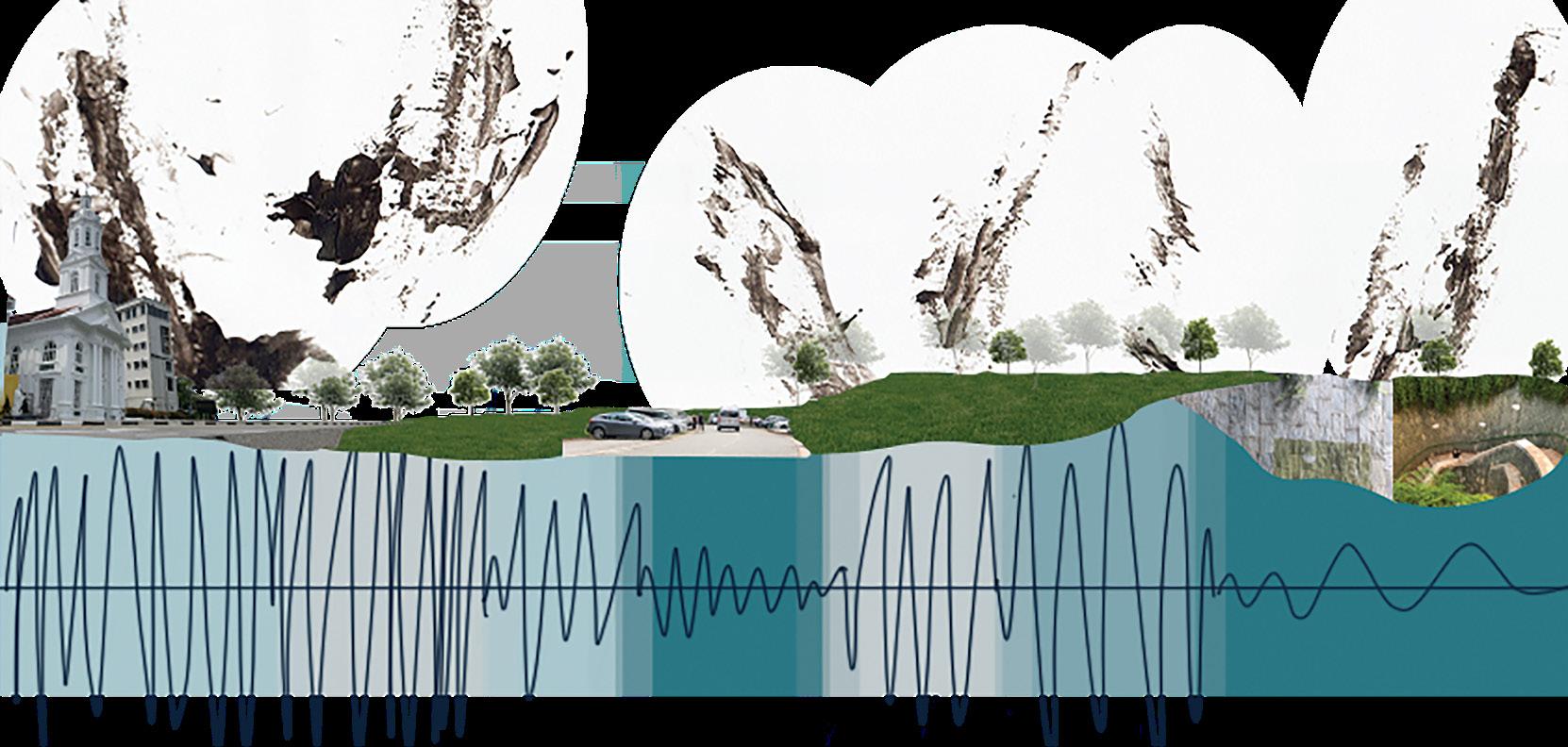
My slice passes through spaces like Church of the Sacred Heart, Fort Canning Carpark C, the spiral staircase in Fort Canning, YMCA, SMU as well as Rendezvous Hotel and lastly, NAFA.

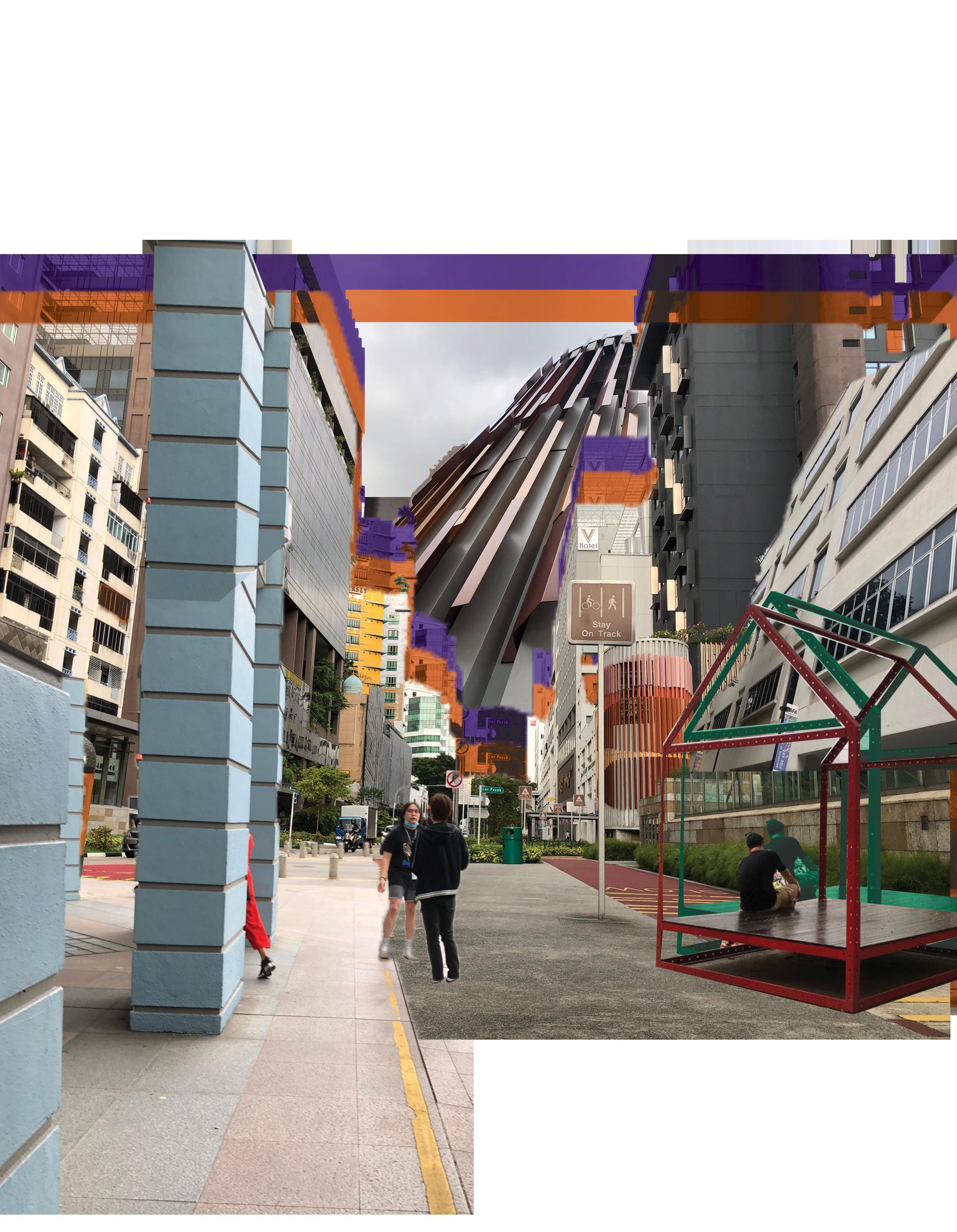
Walking the slice, I took notice of the atmosphere, how people dressed, how people and behaved in different spaces.
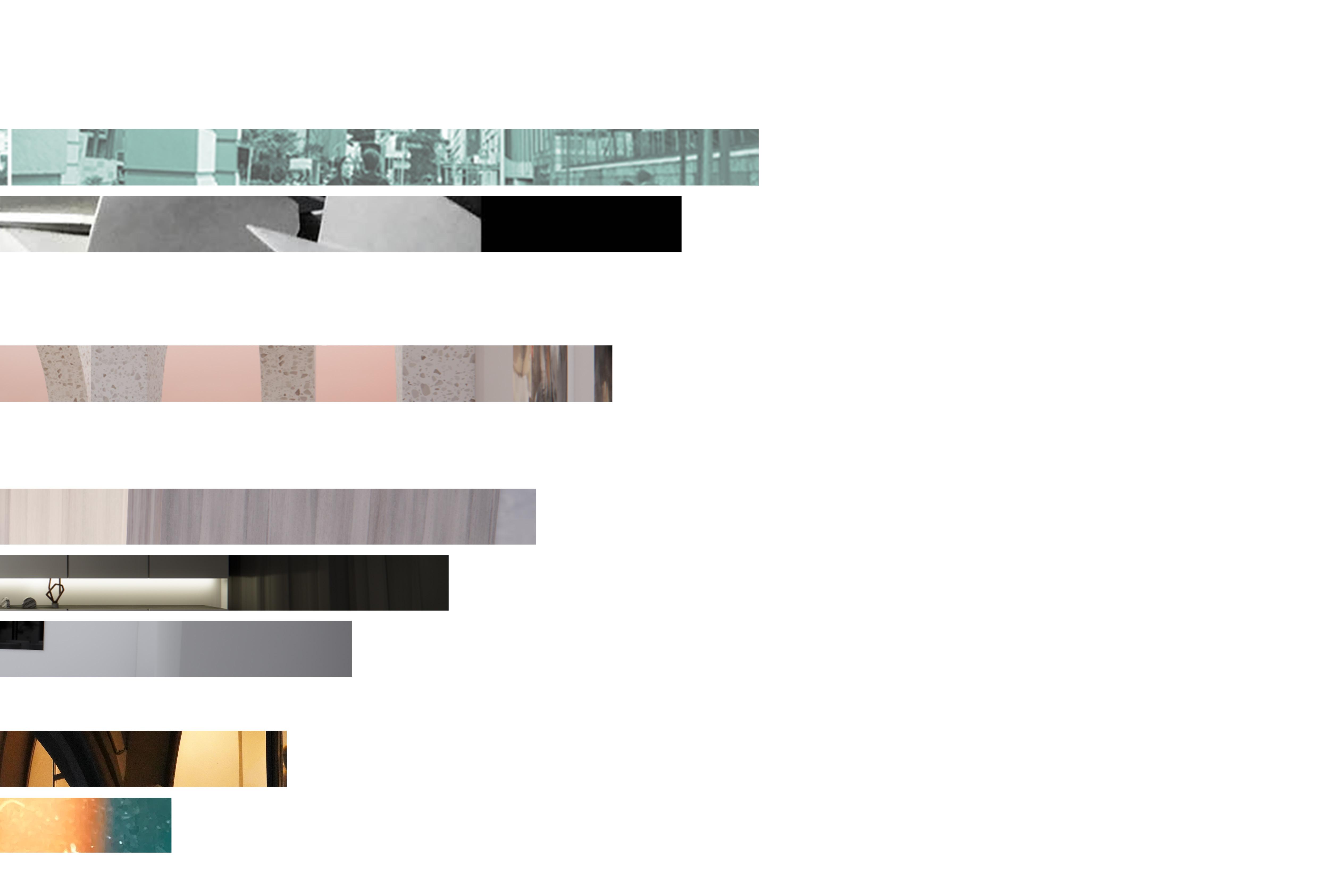
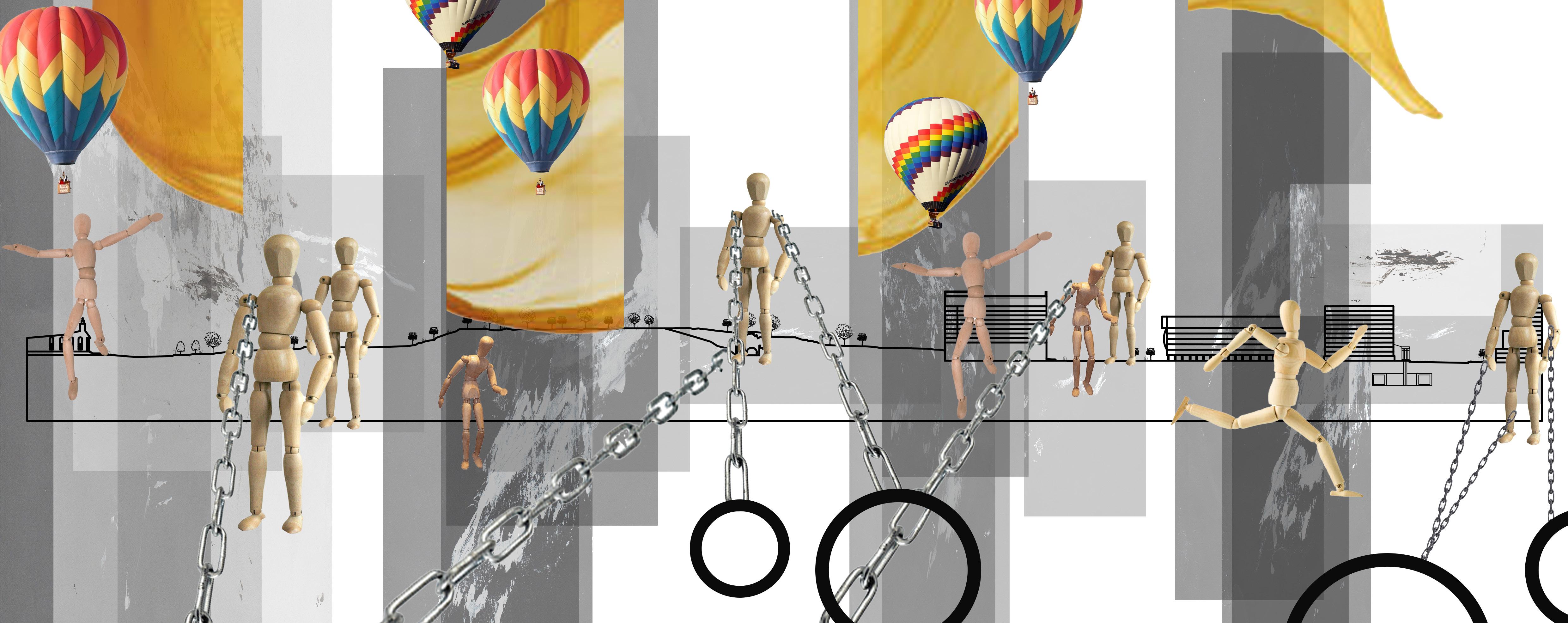
I turned all the images I collected in my walk into a collage because thats how I imagined the line to be in my head and the many important landmarks can be shown in one image.

The sense of transparency was apparent within the slice. Glass, bodies of water, as well as an installation made of frames where seen throughout the walk. Other than the literally meaning, to be see through, transparency also meant honesty and how people talked in the slice.
The sense of neglect can also be observed. Places where artificial lighting was lacking as well as overgrown plant in private property implies the sense of neglect.
Unpredictable would be how I would describe the site in general. People were longboarding where they were not supposed to. An unexpected site of 2 girls picnicking under a tree next to Carpark C of Fort Canning and finally Cosplayers/ performers walking around Fort canning dressed in their unique costumes.
The Fort Canning spiral staircase is a popular place where newlyweds take their bridal pictures in.

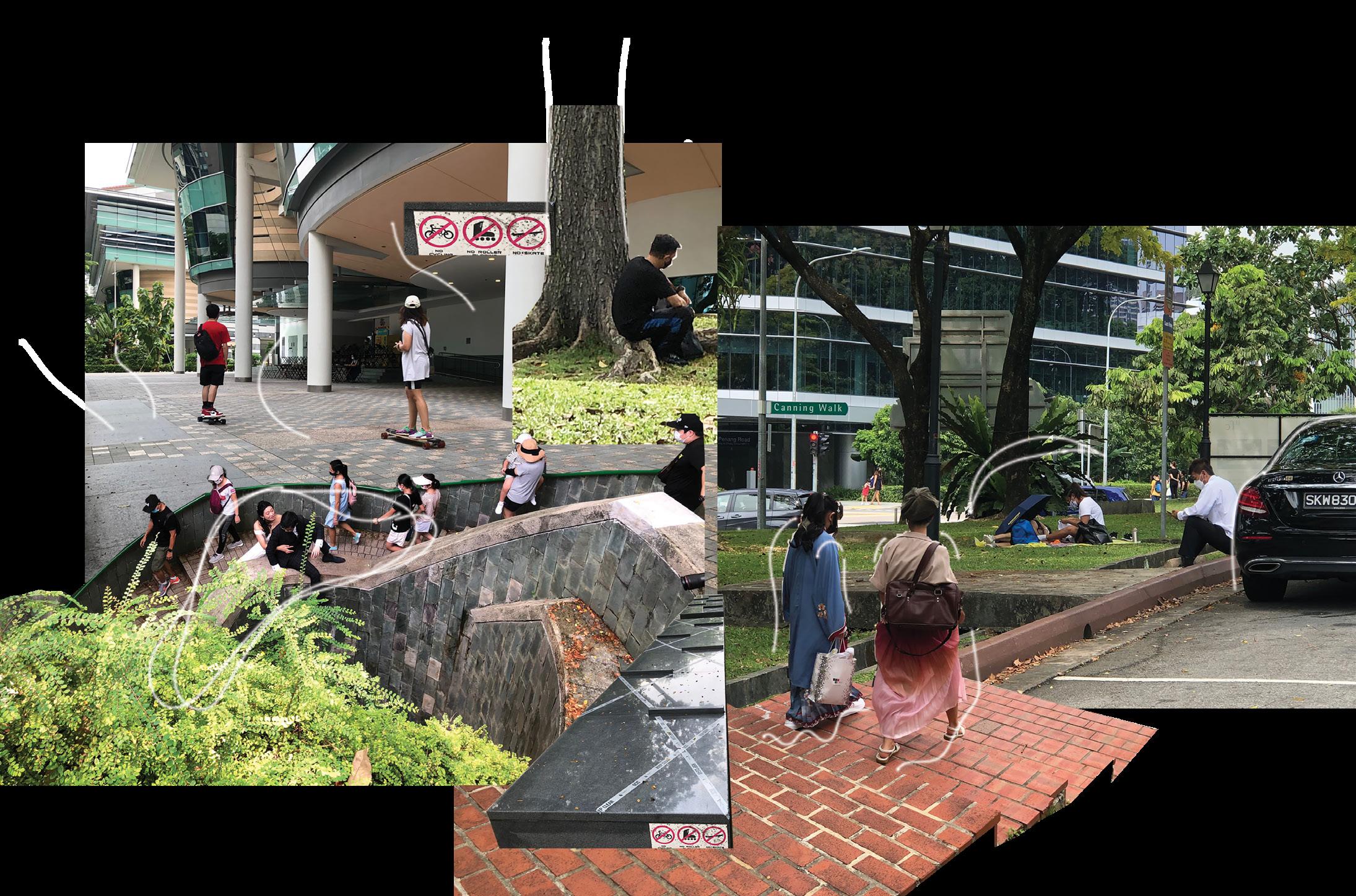
Using the wearble device I made, which allowed ne to capture movement based on surrounding and movements.
I realised that there were some regions where there are less data collected than the other areas. Comparing this data to the concentration of people in each area. There is less data where the space is more crowded. The movements collected when I am moving around my slice can be seen as me trying to feel space because I do not want to risk accidentally hitting someone.
Since I was documenting arm movements using paint on paper, i categorised my data into three that I can analyse. The first type of data is straight data. There are clear strokes implies repetitive bending and stretign of the arm. Some obstacles in the environment that might affect this is the presence of a railing at the site. The second type of data is more disorderly and smudged out .
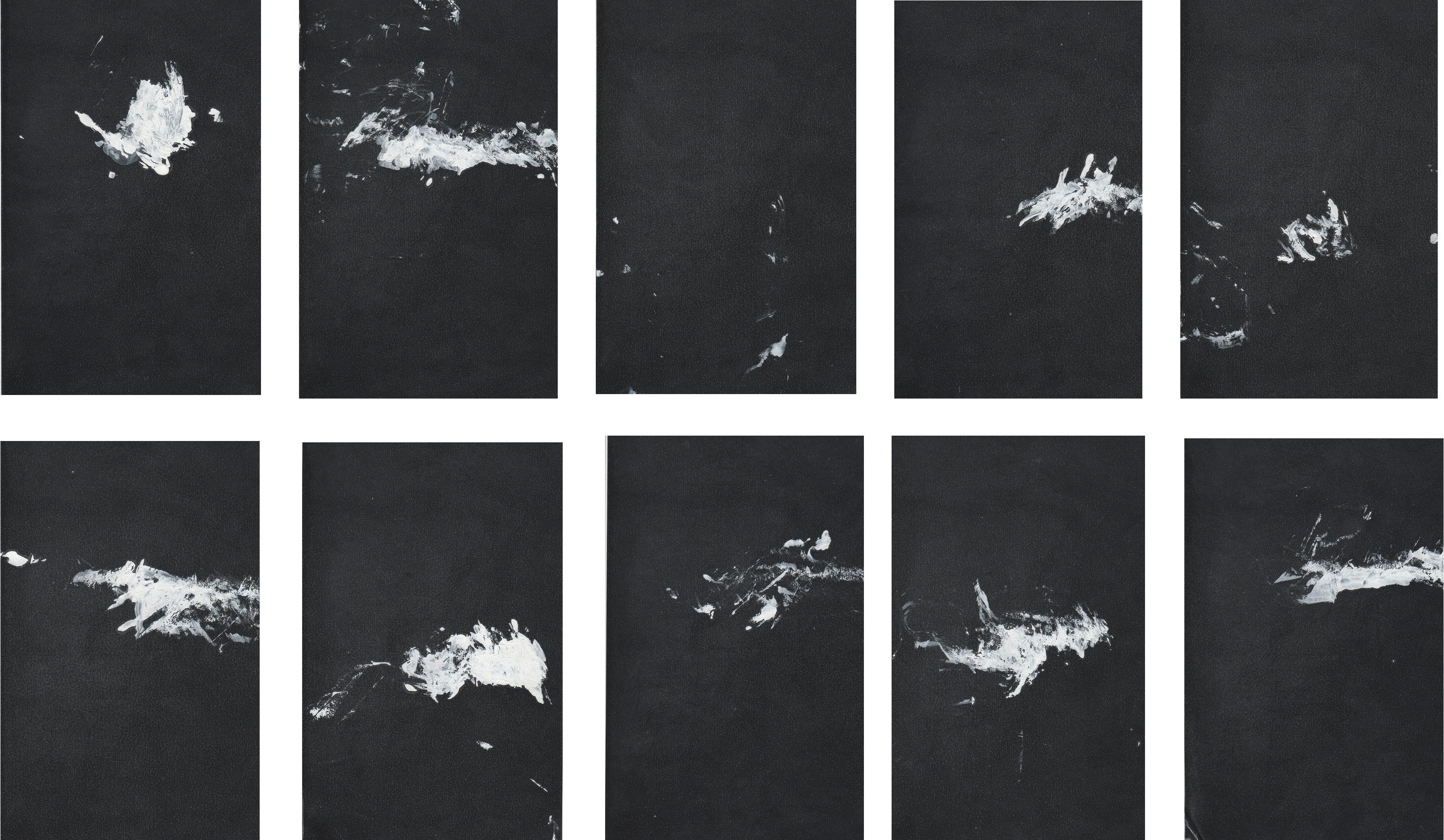
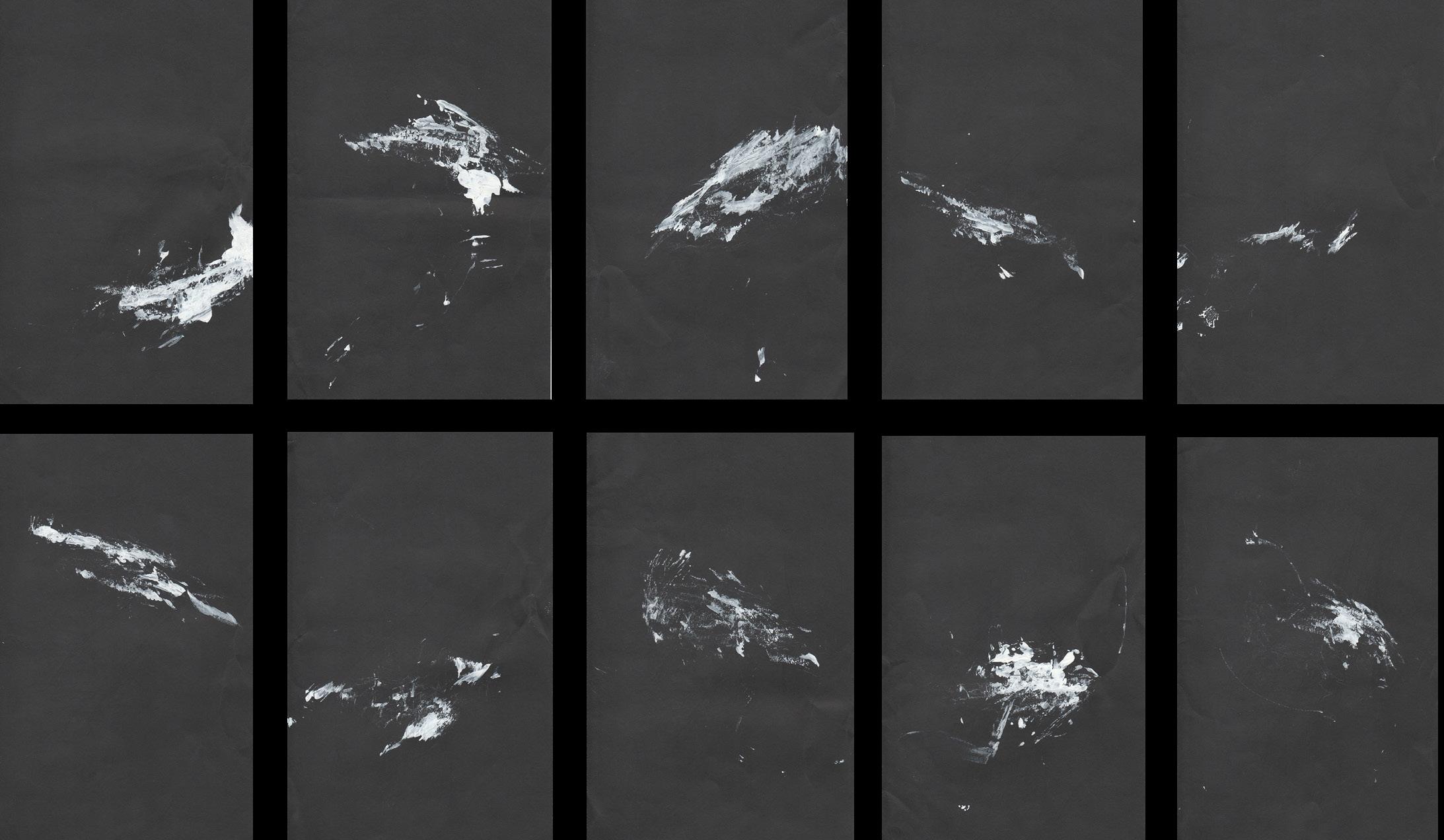
This implies the randomness of my arm when its outstretched. There is also a lack of objects and structures for me to grasp onto.
The last type is a hybrid of both typed of datas. There were most likely a railing or a wall present as well as an open space.
The clear strokes going off in side can also be seen which implies a repetitive movement. Smudged areas are caused by waving my arms around for my on safety.


My slice is a city of inclination. This interpretation on what inclination means in this project. Where the regions are darker, I layered and compacted pictures of my data. The visuals in those regions implies lightness in movement, Where there regions are lighter, fewer or no images of my data are within that area. The visuals then imply that there is rigidity and restrictedness in movement.



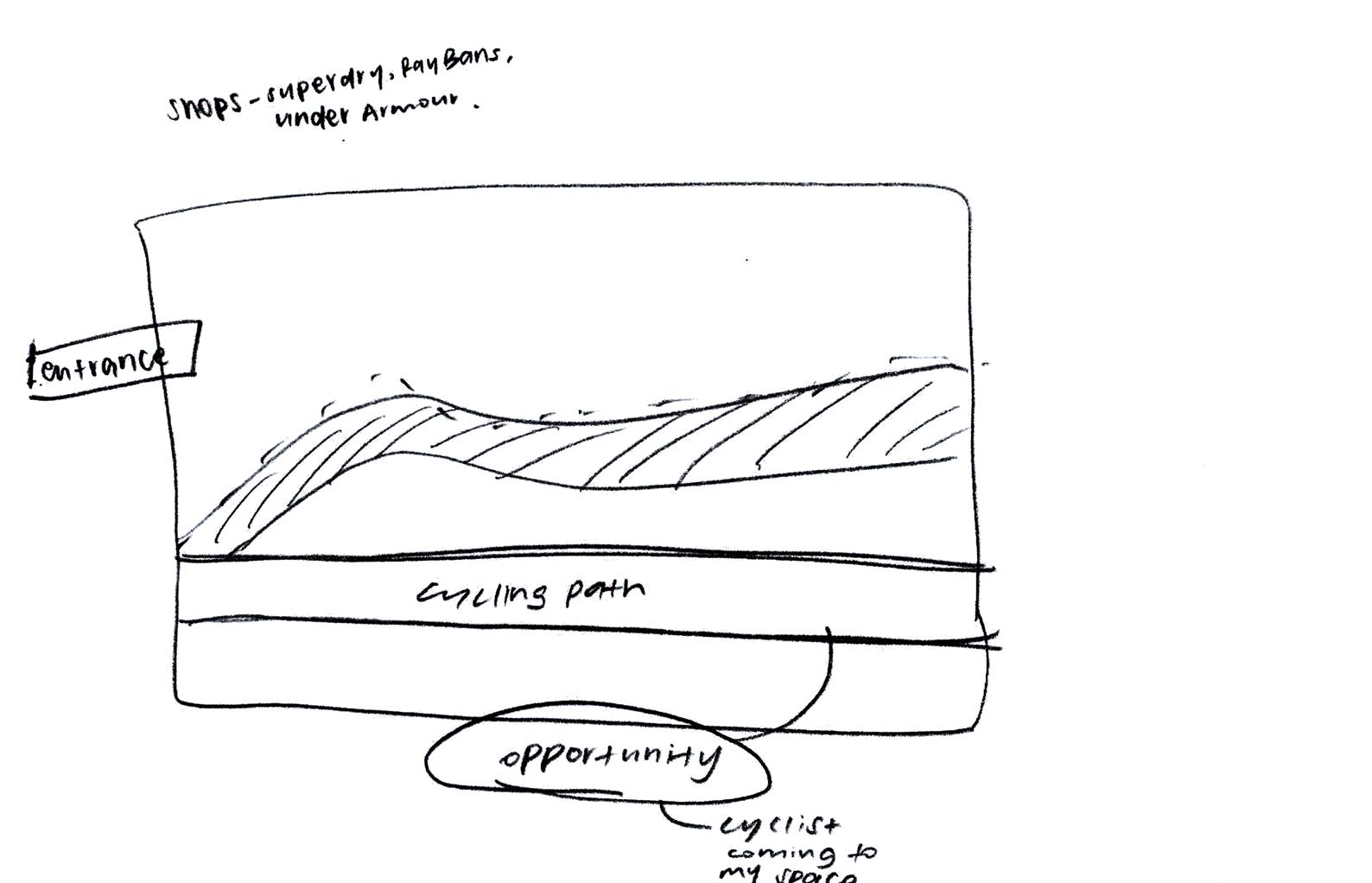
While I was at the site, there were many opportunities for a bike stop.
1.Bike stands with bicycles locked in are prominent in the area which must mean that people who frequently come here cycle. These people must be aware of the cycling path here.
2. Even though there are designated areas to return rental bicycles, people still leave their bikes outside of the yellow box.
3.Budget hotels like Hotel Mi, Hotel Bencoolen are located here. Their main visitors/ guests here are backpackers or travellers who could use a transportation to get around the city with ease.
4. On weekdays, art students from Laselle, Nafa and SOTA roam around the area in search for food or an area to rest in after school. A space where they can take a break and chill while catching up with their friends could benefit them.
With all these 4 observations and reasonings, I saw that the opportunity for a bike shop where people can take a break in as well. This space also helps organise the evergrowing demand for rental bikes.


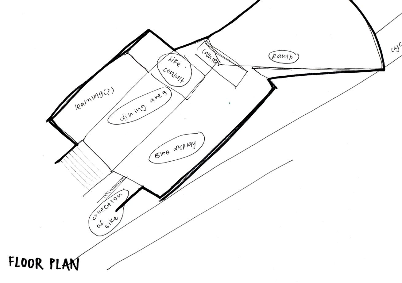
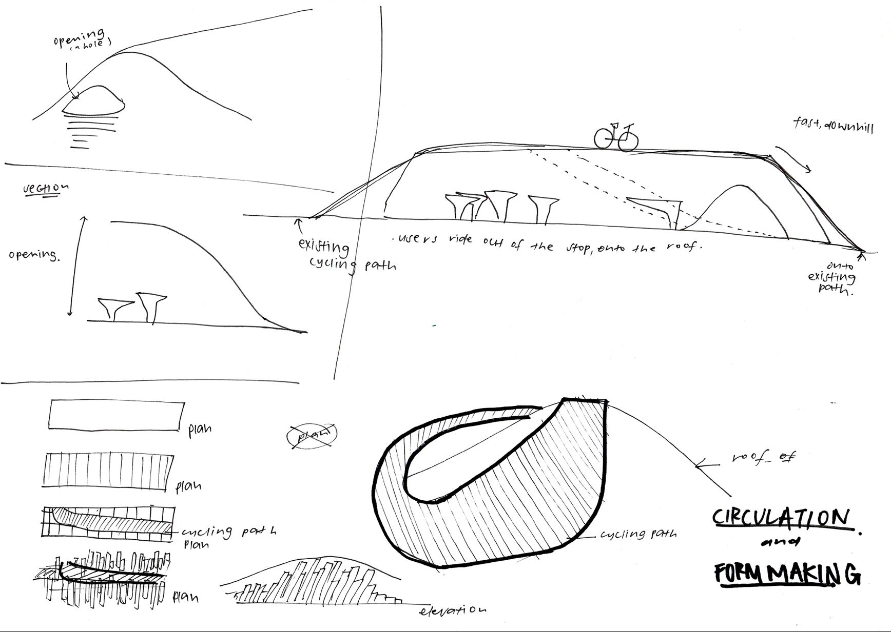
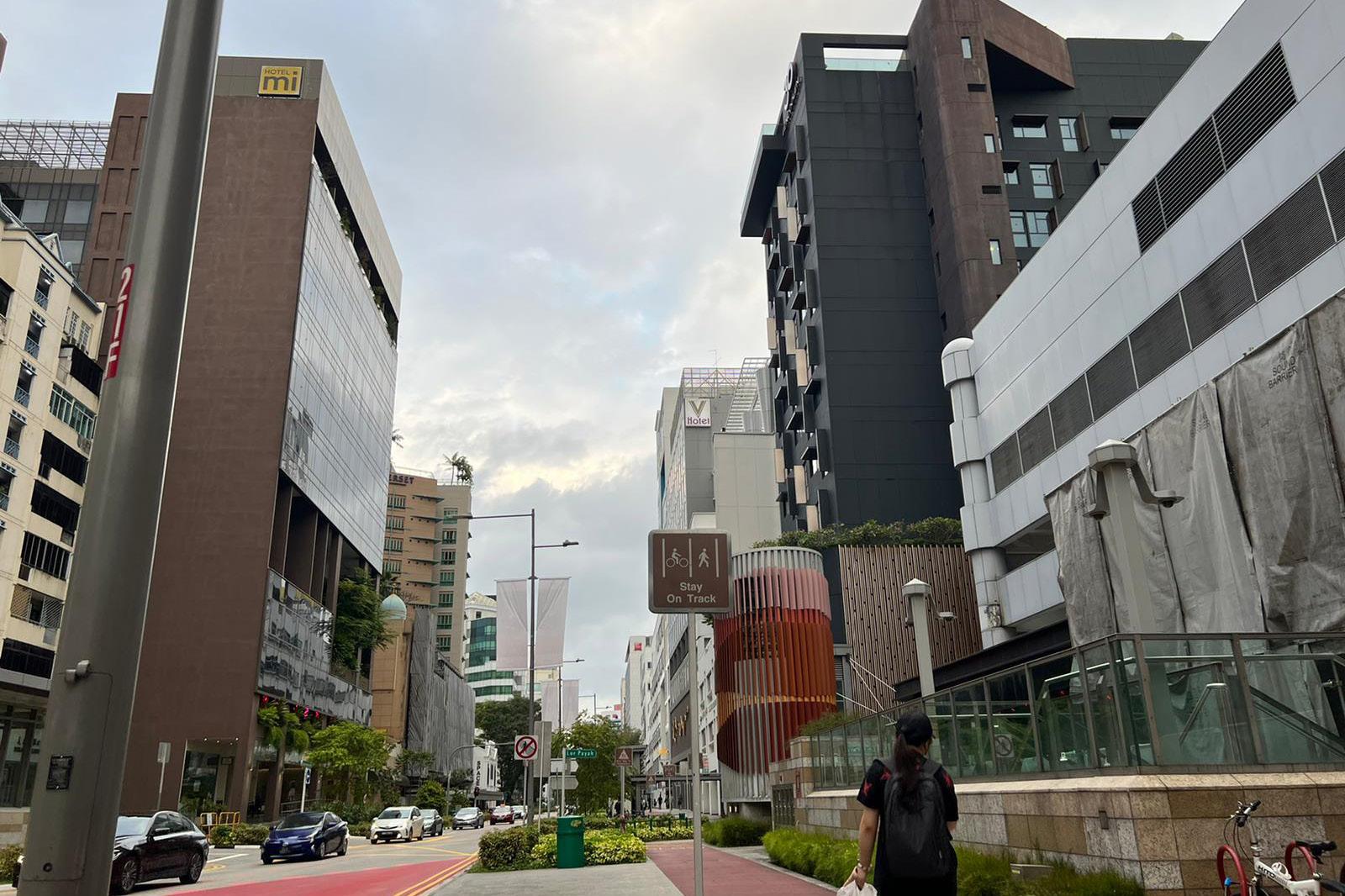
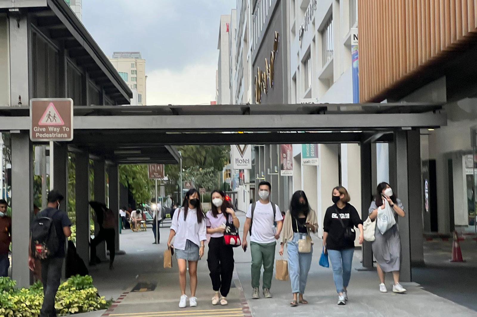
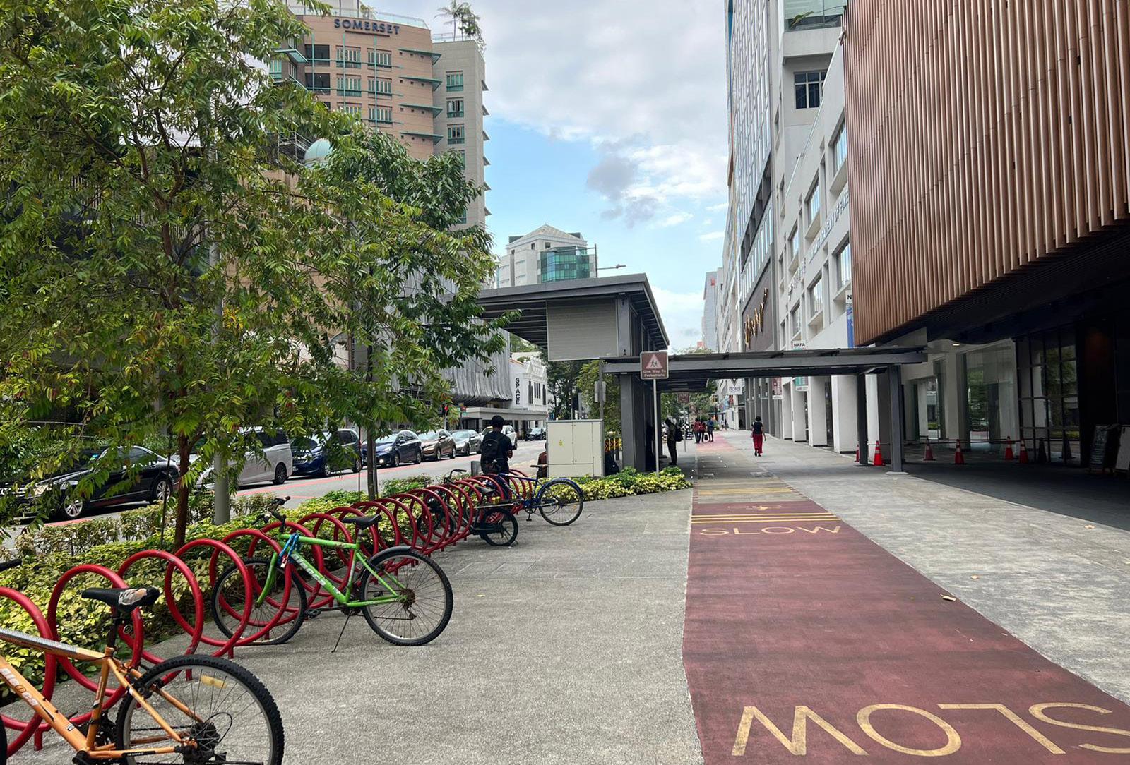
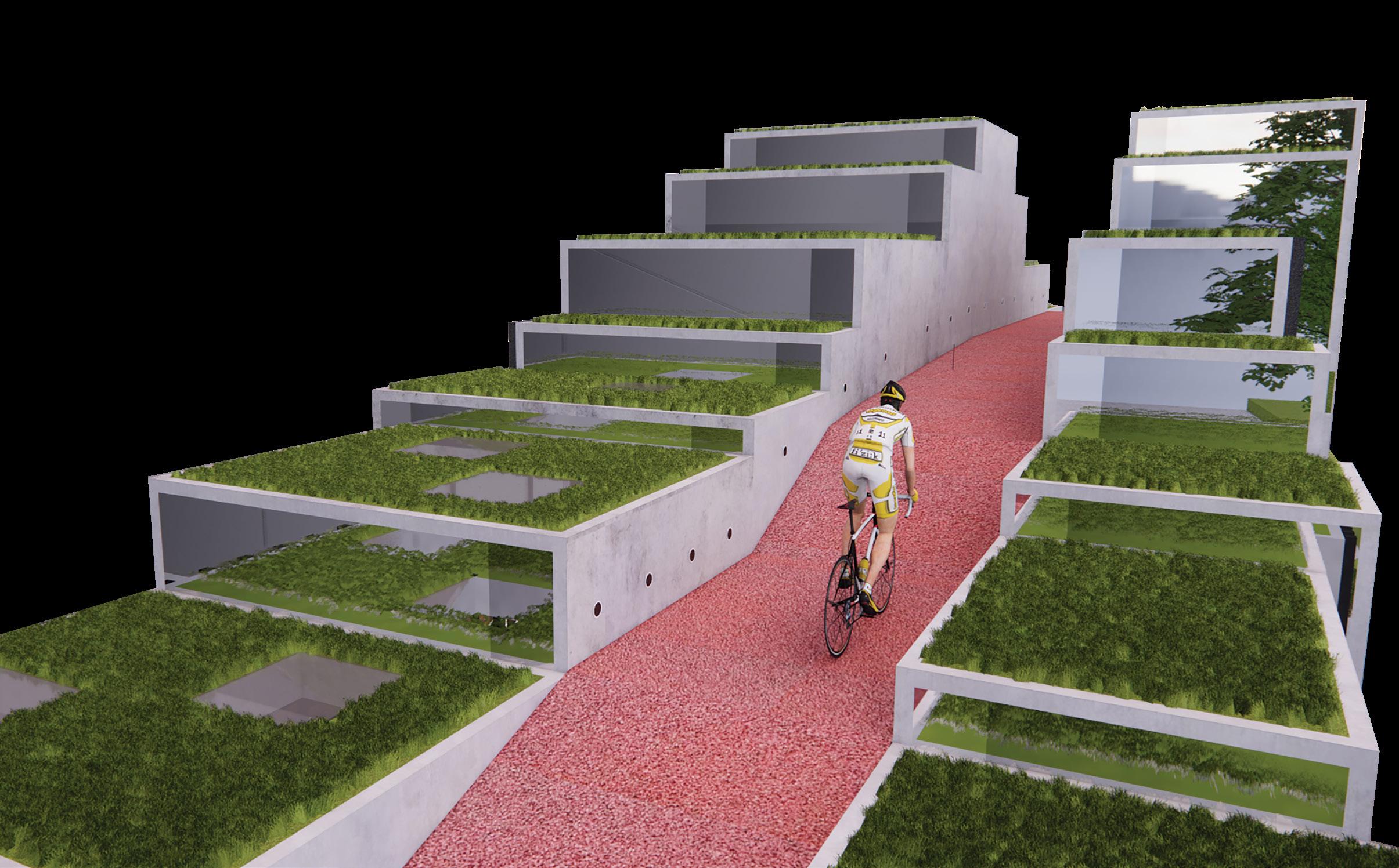


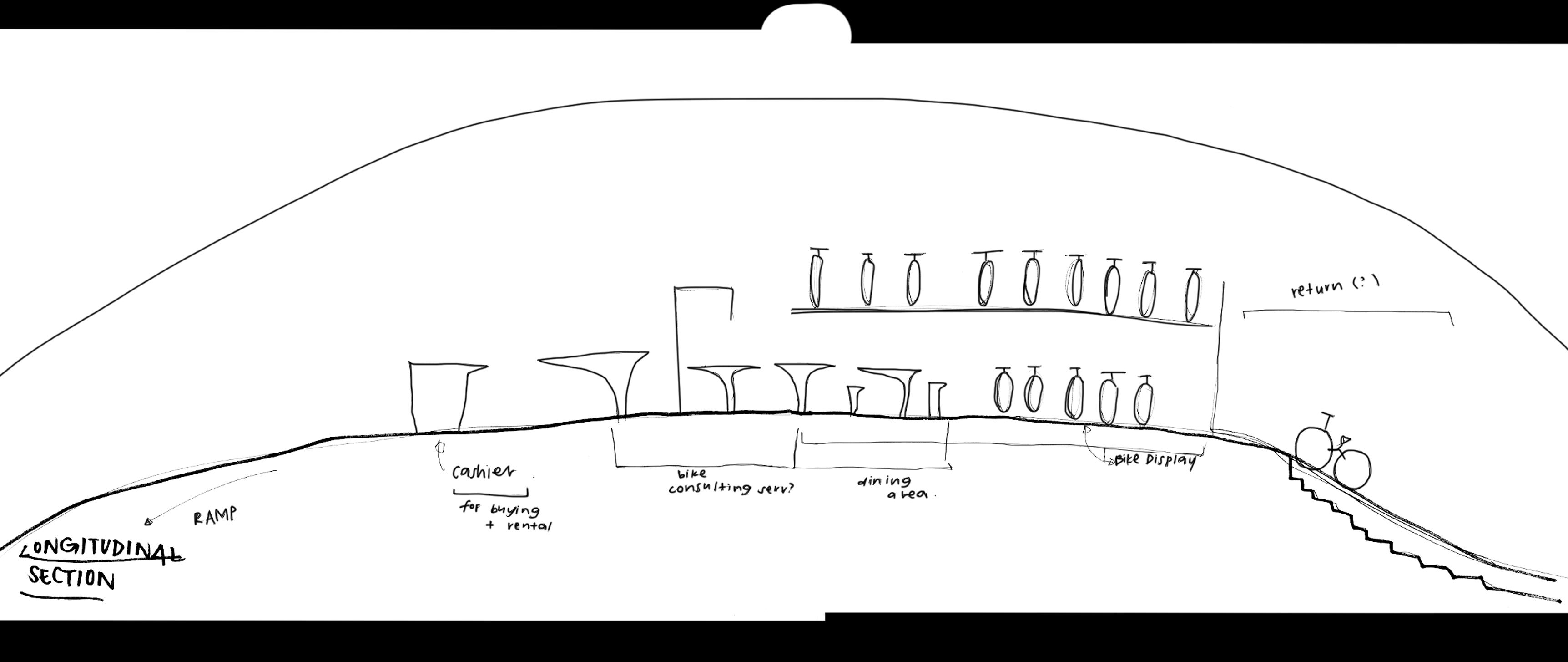
Bike Stop at Bencoolen encourages more people to choose cycling as a sustainable mode of transportation. With cycling becoming more popular, more stops like these are required where cycling paths are. This is a transitional space where people can learn dine and buy. It is fitting to introduce a bike stop into this stretch along the line because many people tend to cycle through this area. This also encourages people staying in Bencoolen to rent a bike and return it at the end of the day.
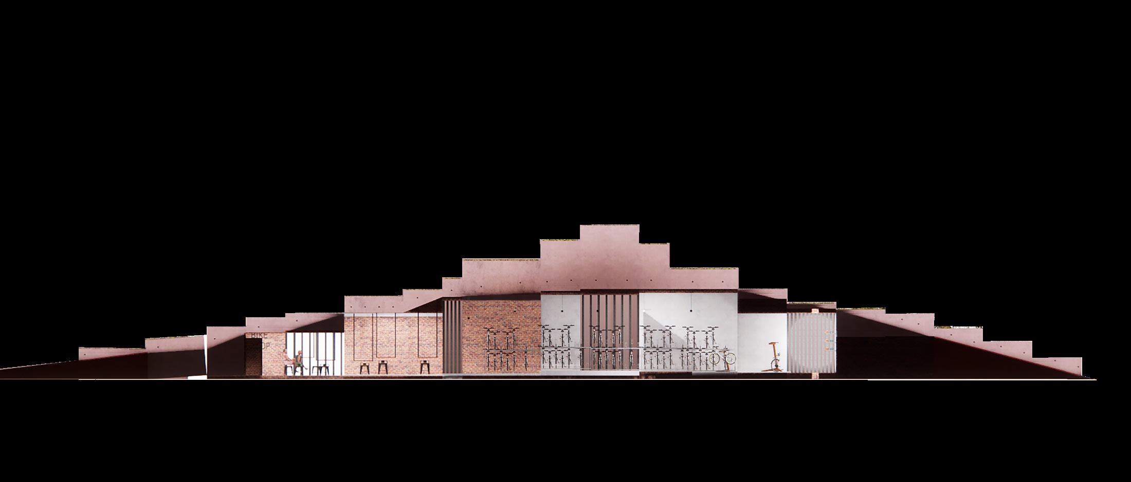
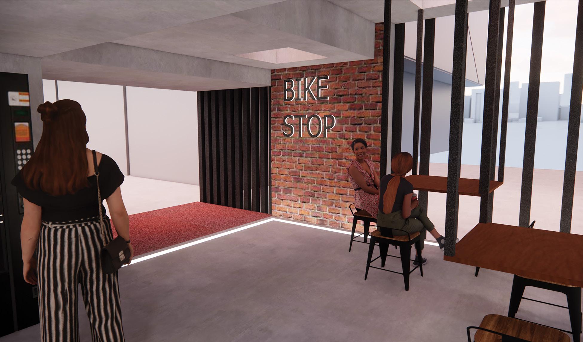
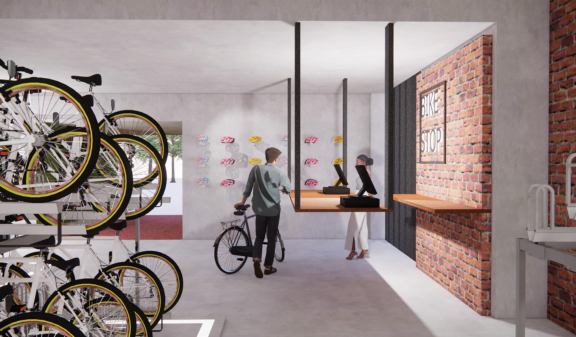
Zones in the Bike Stop includes counter and helmet display, bike display, bike repairs, dining area and lastly, fast lane. Within these spaces, concepts of lightness and ridgidness can be experience throughout the space. The form of this building was inspired by the oval shape I was trying to create and with a added geometric touch.
This zone is where bike shoppers make their purchase for their biking essentials. The countertop is suspended from the ceiling and the helmets on display appears to be floating. These features in the zone help give a sense of lightness in the space that links back to what inclination is all about.
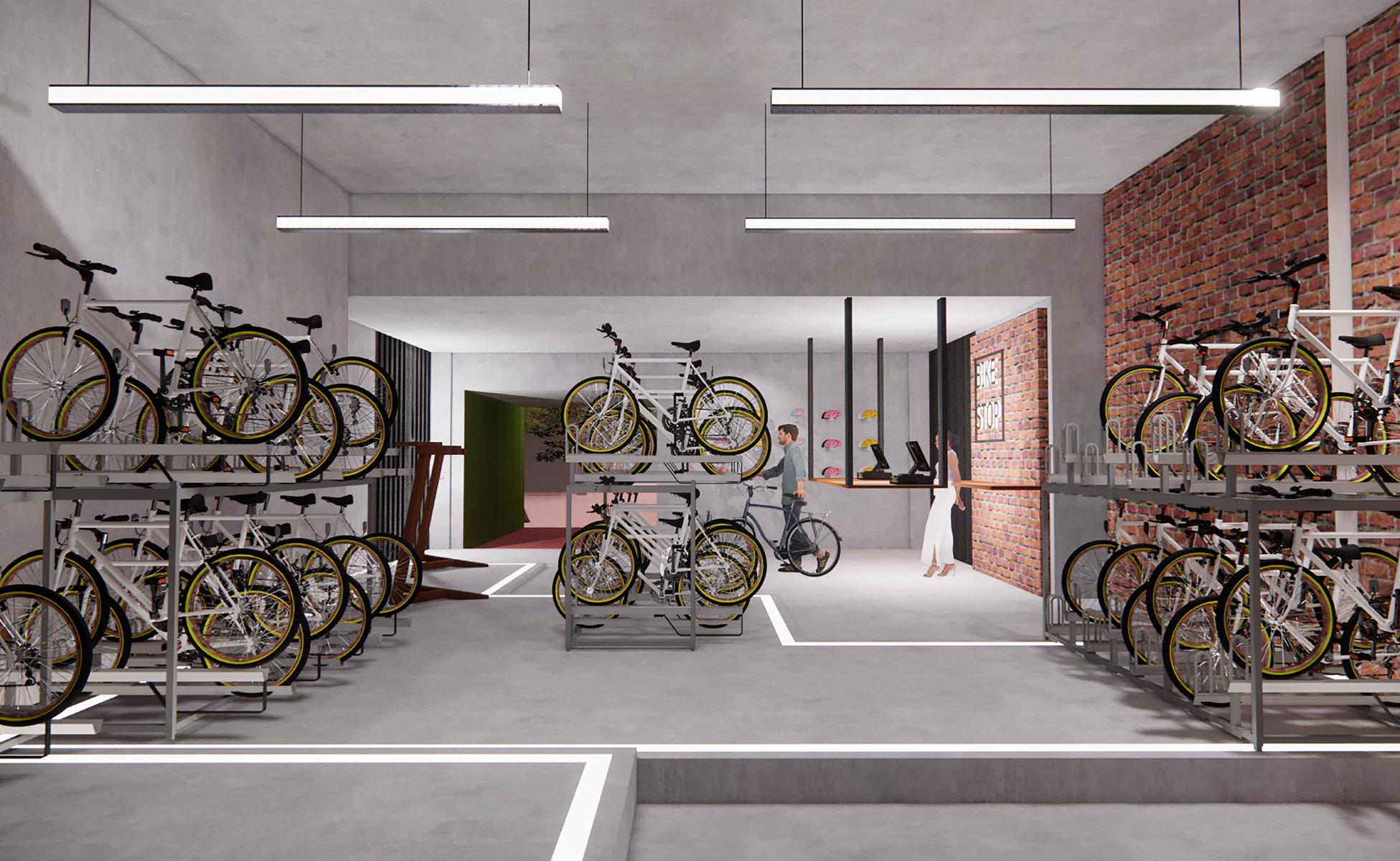
A bike consultant will be placed, can helpthose interested in buying a bike, to choose one that is suitable for them.
A corner where bikers can fix their chains and brakes on their bike or even reinflate their wheels.
Children, accompanied by their parents can learn the basics of riding a bike. A trainer will be present to ensure the safety of the children.
A dining area with tables that suspend from the ceiling and roof windows so that the area is well lit. This area is comfortable for people to stay while catching up with their old friends. However, it is also for cyclist to take a quick break before continuing their route.
Similar to the desk at the countertop, the tables at the dining area are suspended from the ceiling, suggesting a sense of lightness, linking back to inclination. Each table is located beneath a roof windows so natural lighting can light up the table tops. People tend to sit where the tables are brightly lit because they are more welcoming.
The roof level is meant for cyclist who do not
wish to take a break at the Bike Stop. This zone acts as a hill
The downslope is called Fast Lane, where cyclist will increase their speed for a slight adrenaline rush.


This project is about challenging the mindset and drift away from preconceived thinking. It has made me self aware about the differences between premeditated and non-premeditated thinking in my decicion making, thus, increasing my sensitivity in my design approach.
This project, unlike many others, does not have a logical flow with a clear outcome. It is a surreal journey that requires the disconnection of the mind to another place.
In this place, I uncovered brand new possibilities that become my own language.


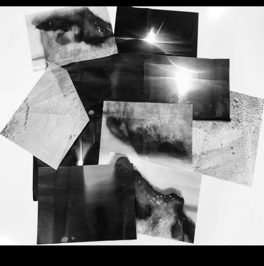
During the beginning stages of the project, abstract and confusing process allowed my brain to stray away from regular thinking process and allow me to create something that was unique to me. I made a collage of 10 images and there. The ten images were pictures of melting cotton candy, a puddle of water on the ground as well as a candle flame. Since the images were grayscaled, streaks of light, shadows and textures can be observed on each individual image.
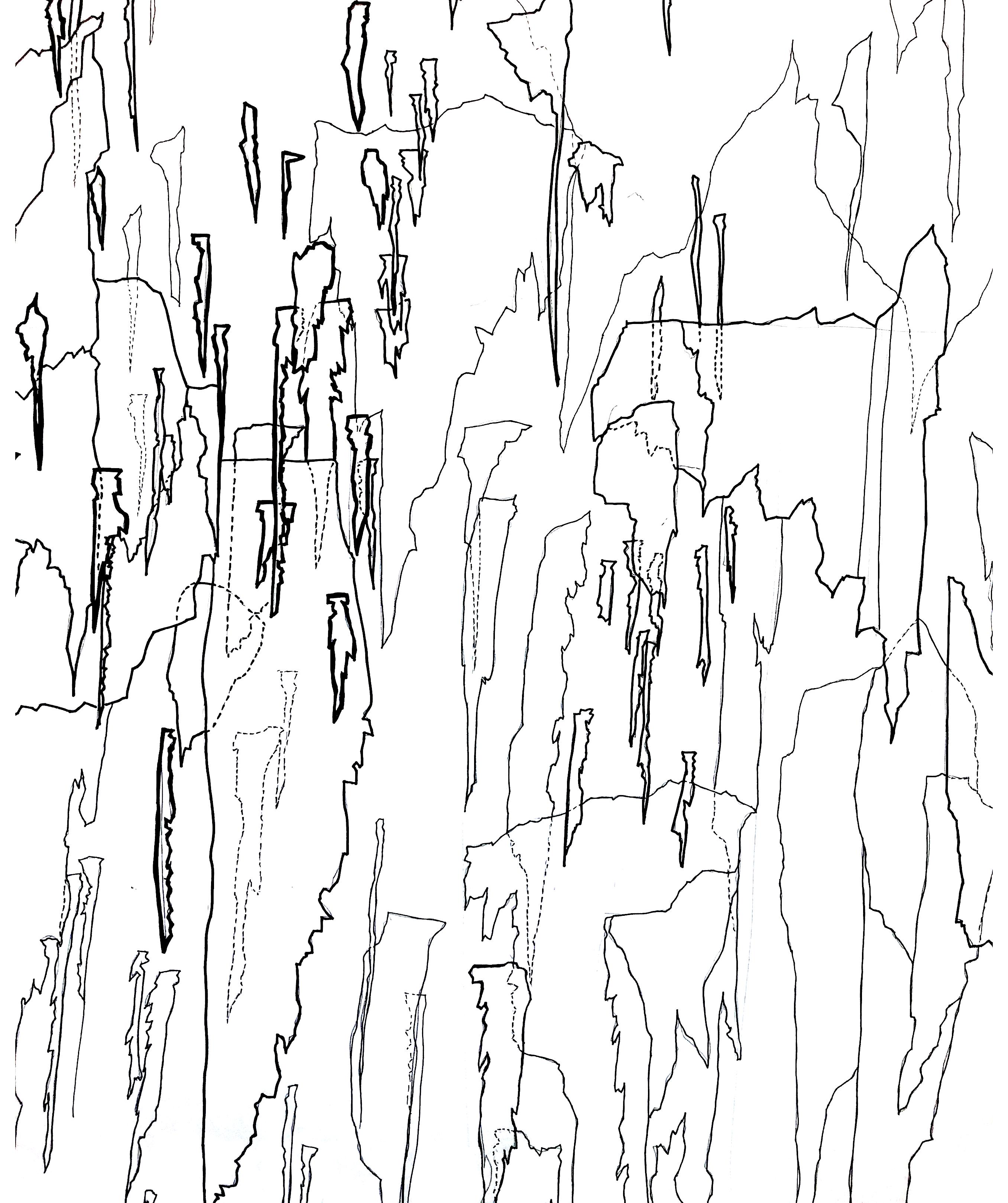
After the collage, I traced out lines and shapes from the collage which formed a flat plan. This was then imagined as a sectional view
The height and shapes of the figures were in the space was not shown on the plan so creativity and imagination had to be used to create something different.
As shown on the right side of the page, I went with the first thing I thought about which was sharp iceberg-like shapes. Lineweights as well as dotted lines show the depth and x-ray of the space respectively.
Transforming the space from a fnb dining area to a spa and wellness centre was one of the toughest part of the project. The flow at which people walk through the spa has to be logical and smooth because we prioritise the guests’ experience.
Waiting lounge, bathrooms and treatment rooms have to has to be within close proximity. Meeting rooms are to be tucked where customers will not be able to see or access. Destruction and construction of walls were kept to a minimum because of high costs. Other than the spa treatment, the four of us also decided on an area for a nail salon, sauna and a small swimming pool that over looks the green view. This gives customers a full luxurious experience when pampering themself at the spa.
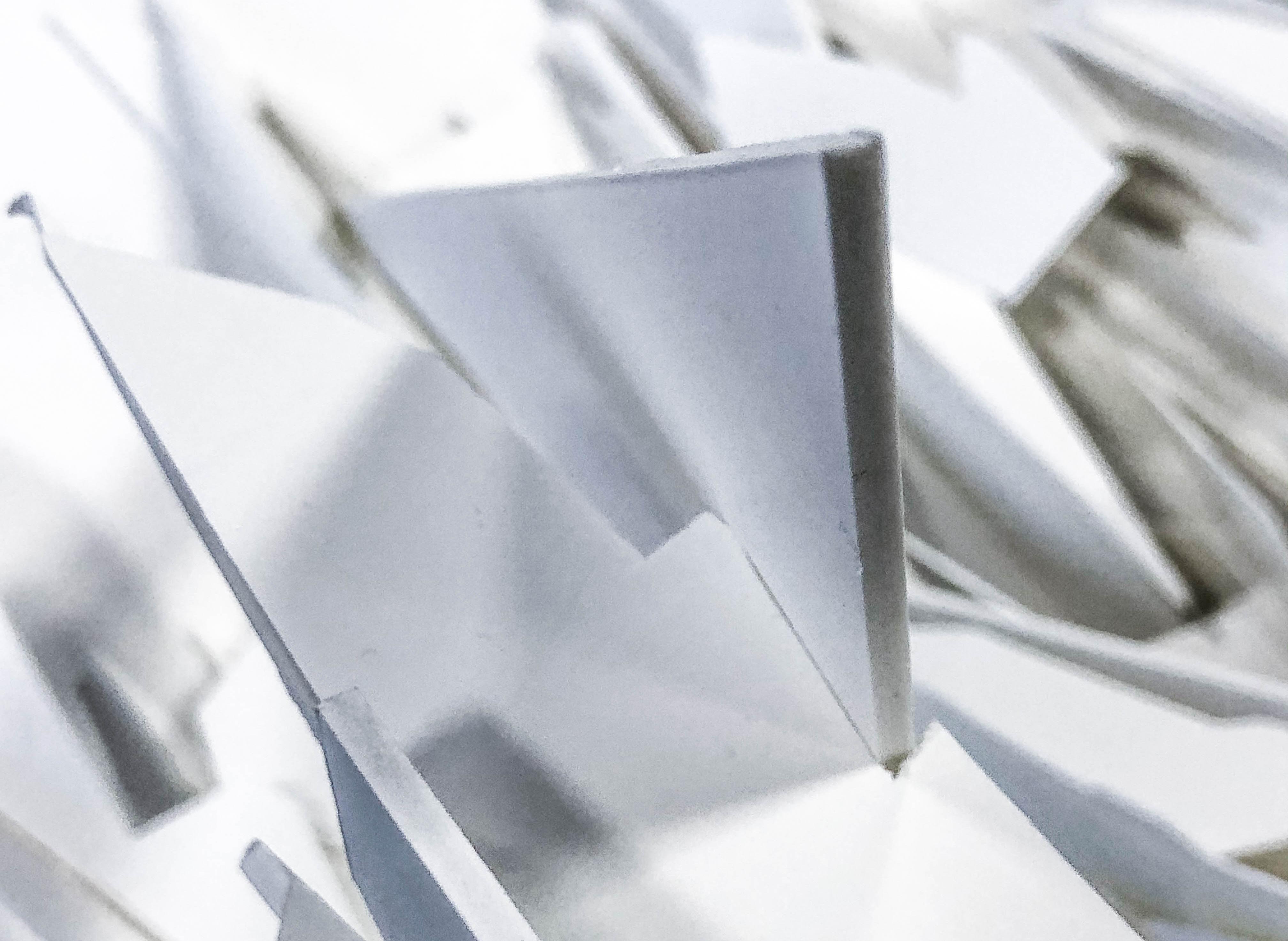
Models made in this stage of the development was made with white foam boards and carefully constructed so it is a 3d versions of of the section drawing.
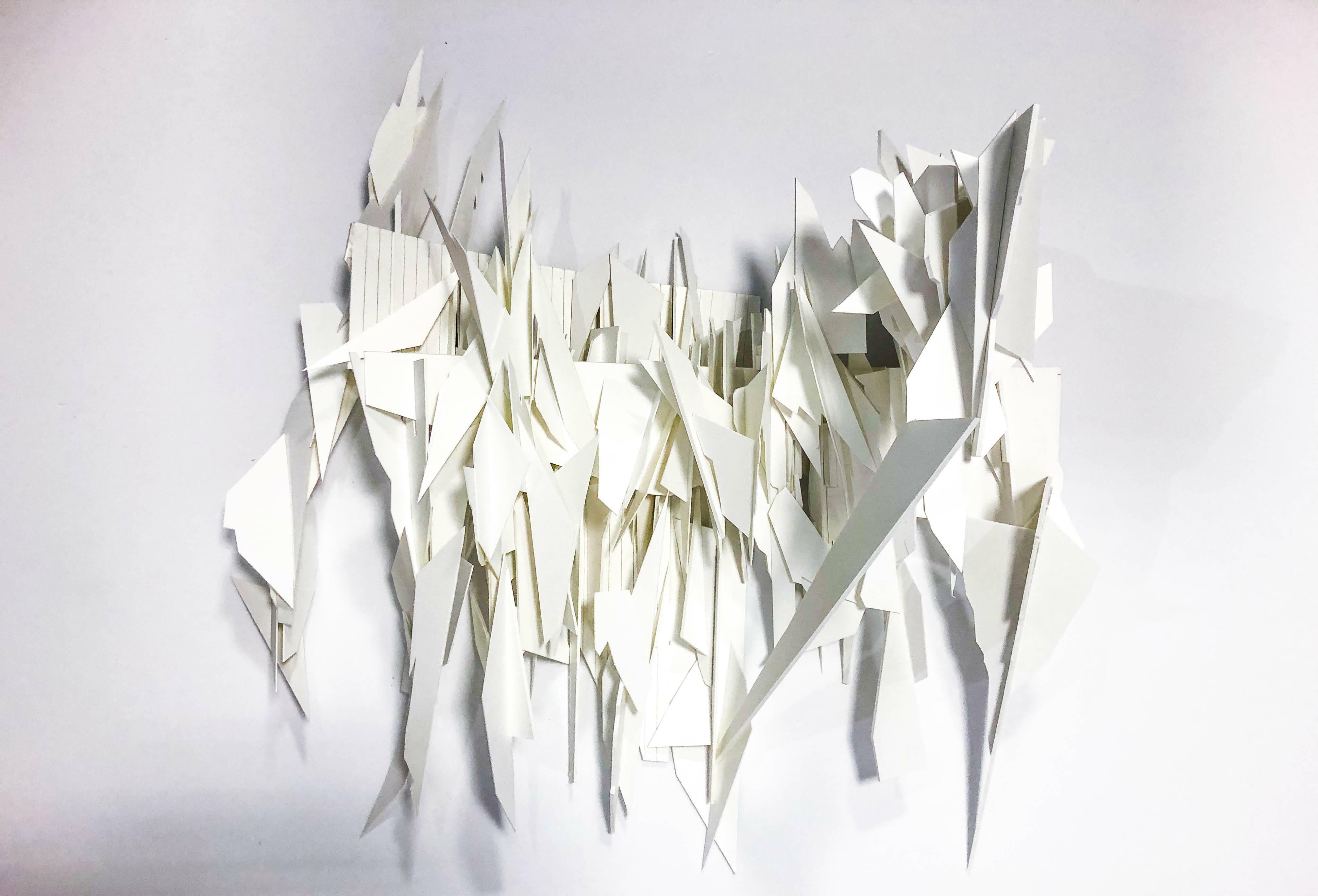
I found interesting spatial qualities using the power of lighting to create depth inside of my model. Connecting each part of the model together was challenging because it was not shown in the sectional drawing. The images
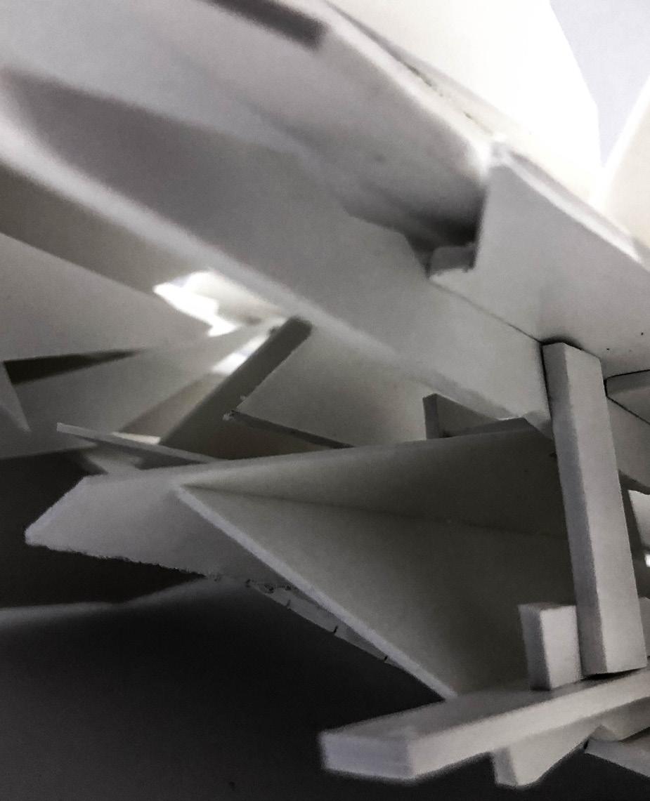




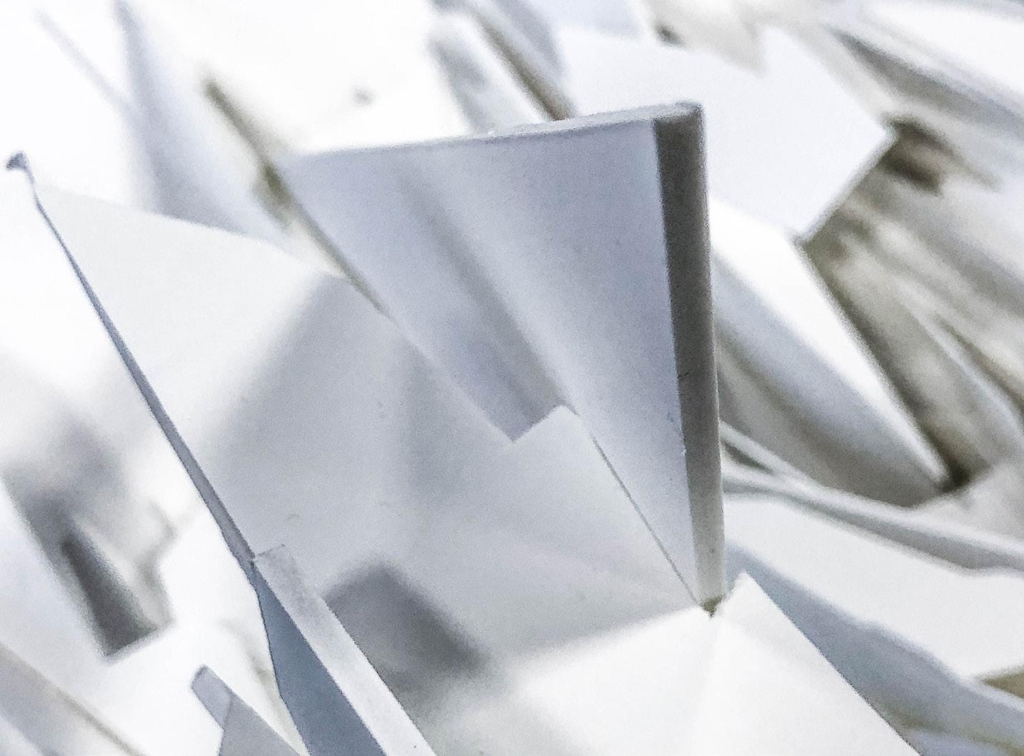
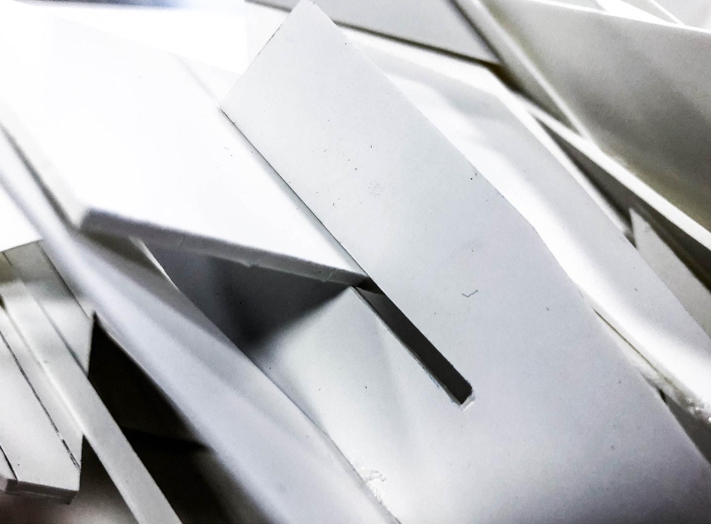

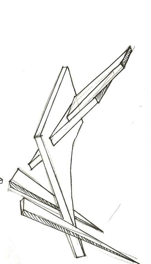
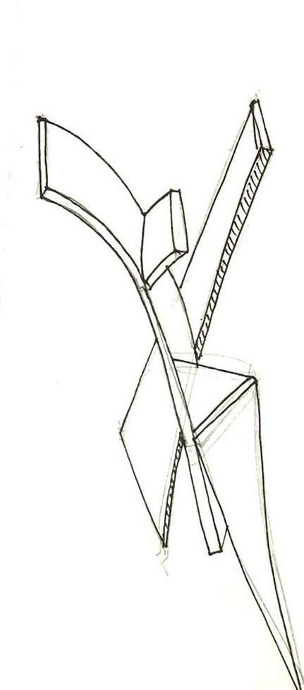


After making the model, interesting joints are then extracted out and reduced into stick drawings. With these simple stick drawings, a new 3d form can then be drawn, that 3d drawing can then be made into small study models using white foam boards.
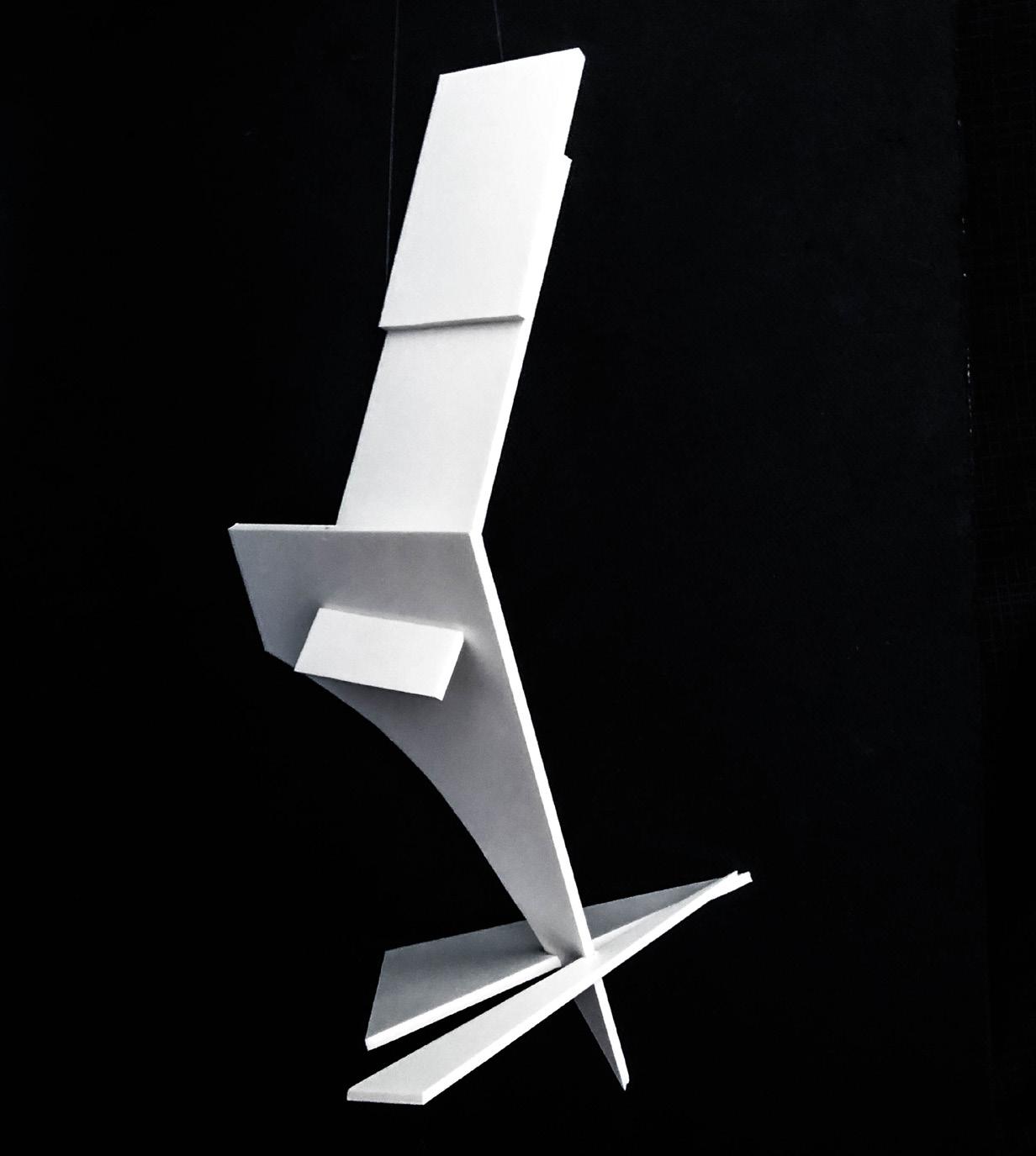
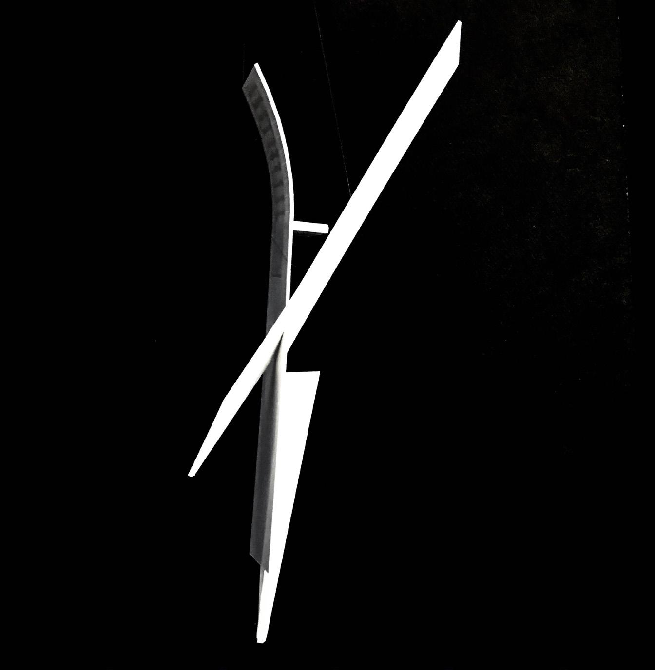
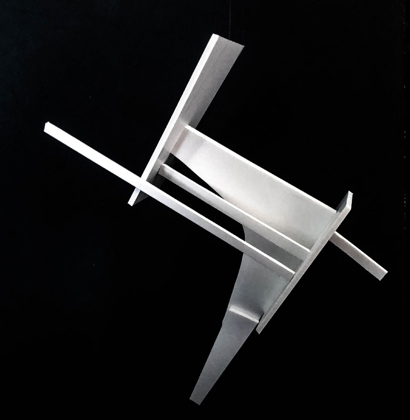
By reducing and redrawing, the form of each model changes slightly with each evolution but still remains related. The form of the product looks unique because there was no space for pre-conceived ideas for these stages.


The modular blocks, that are about 30cm big, can be stacked up in different ways.With many modules, as shown in the line work on the right.Multiplying and stacking up these block like structures, a lattice structure that can be manipulated and bent in any way.
With these modules, objects and walls can be made by stacking these modules up.
Impression of how the space will look like in Funan Mall.

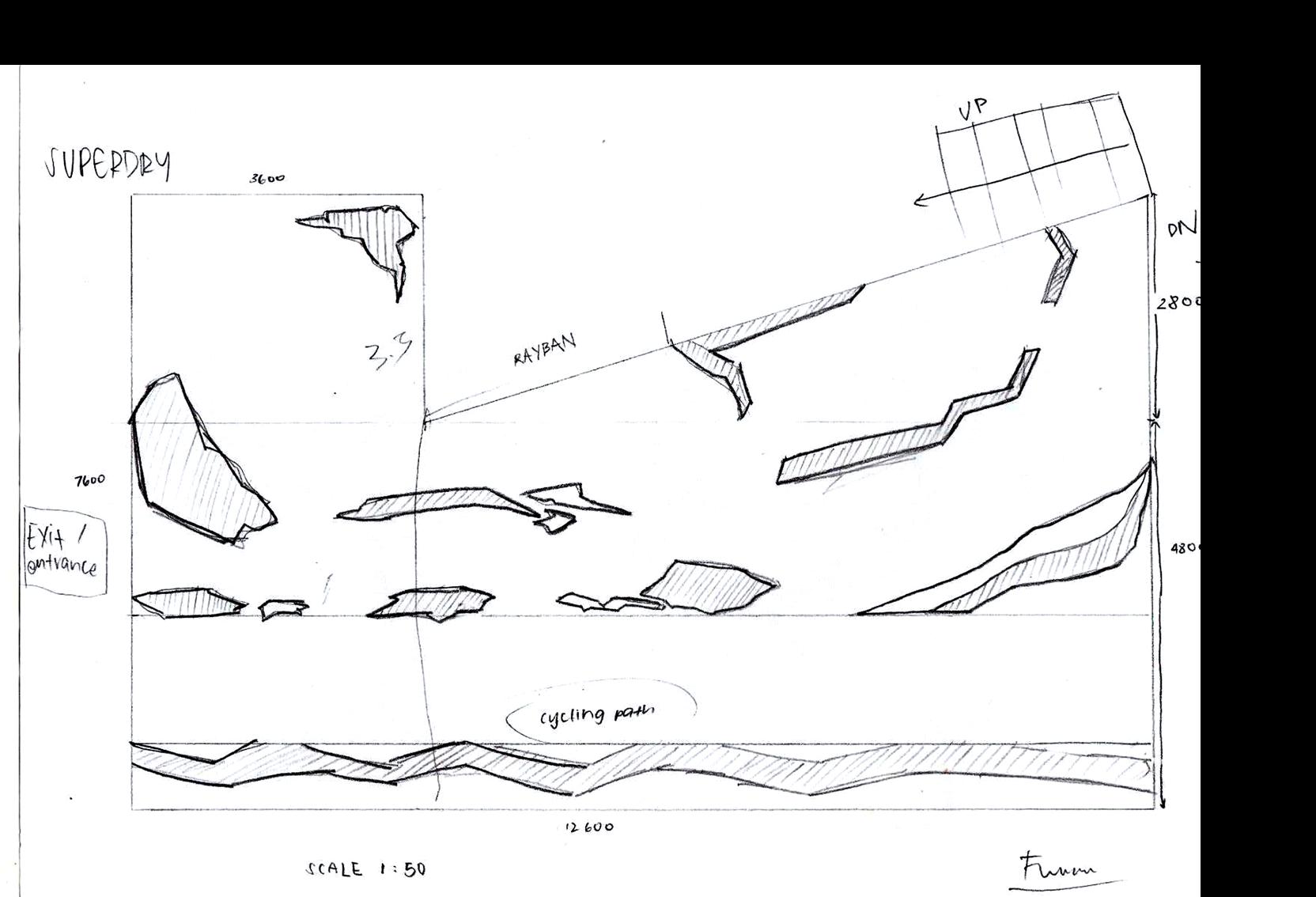
In an eye-catching mall like Funan, I had to really make my design stand out. The form of the facade is inspired by crumpled pieces of paper. Different textures and quality of paper are used to experiment with folds and creases that add to the spatial qualities.




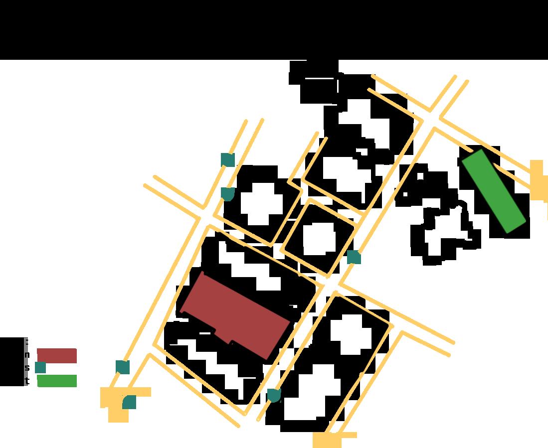
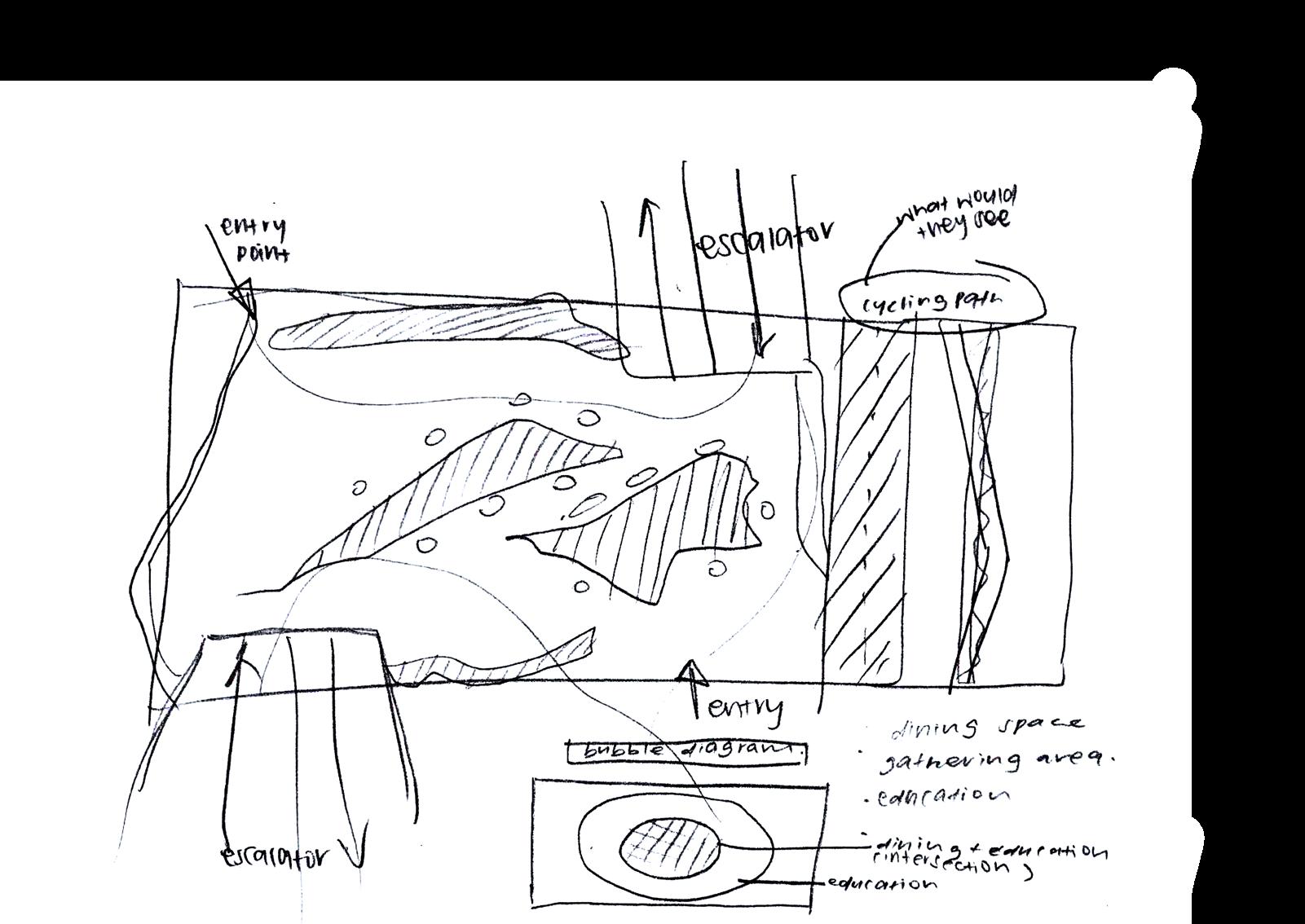
I chose this specific location is because it is near the entrance and there is high circulation of people, especially near the 2 escalators. the intentions are to get allow people to pass by The Cosmos and hopefully be intrigued by the space.
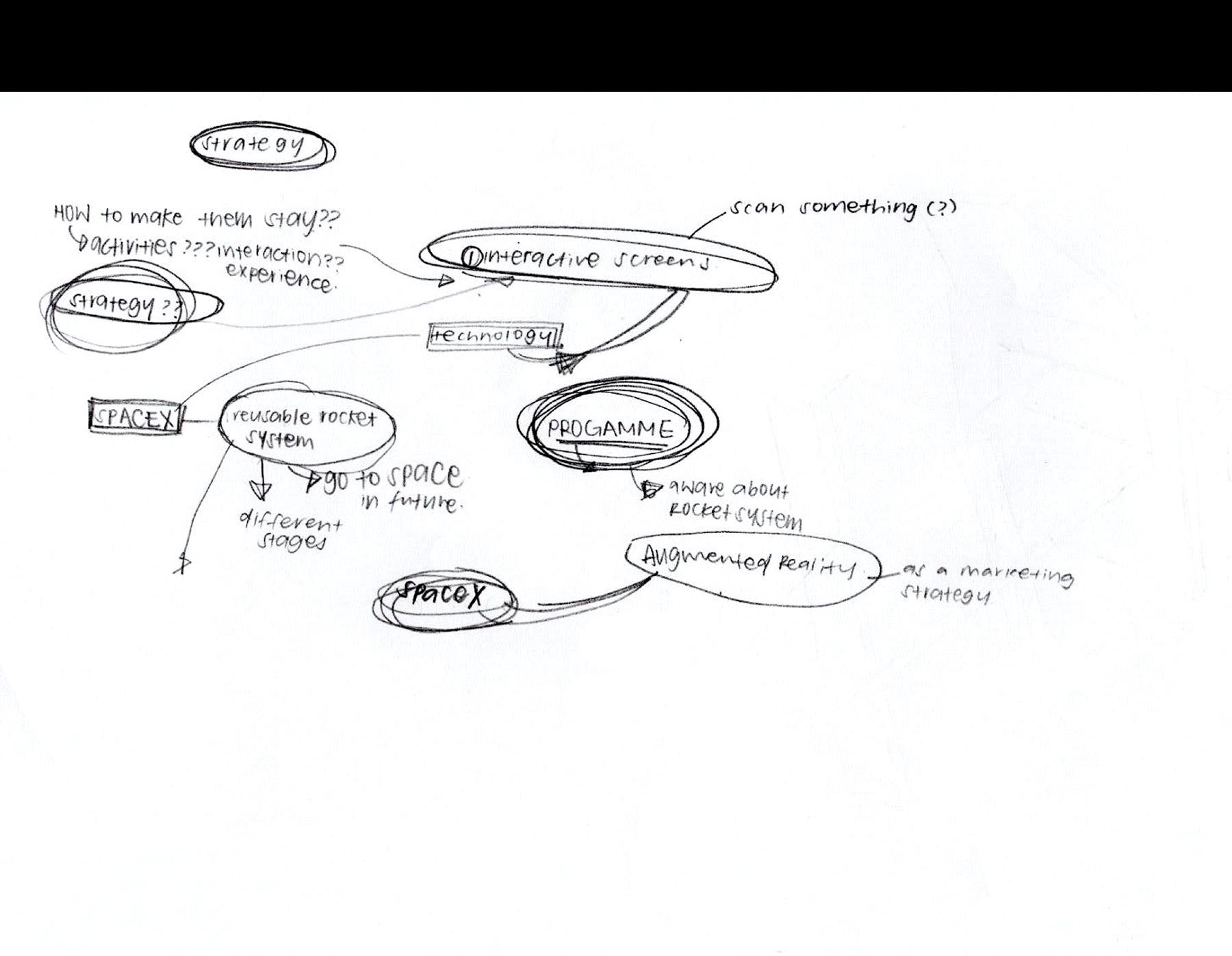
Multiple floorplans were drawn to visualise which set up is the best for the flow within the chosen location in Funan Mall. I also made an analysis on how people should gather in the cosmos and i concluded that sitting on the floor at different elevations is the most comfortable and appealing to my target audience ages 15 to 30. The developmental stages also included deciding what type of programme I will have in my space so as to successfully promote SpaceX into Funan Mall. I ran through many programmes before finally settling with a gathering space.
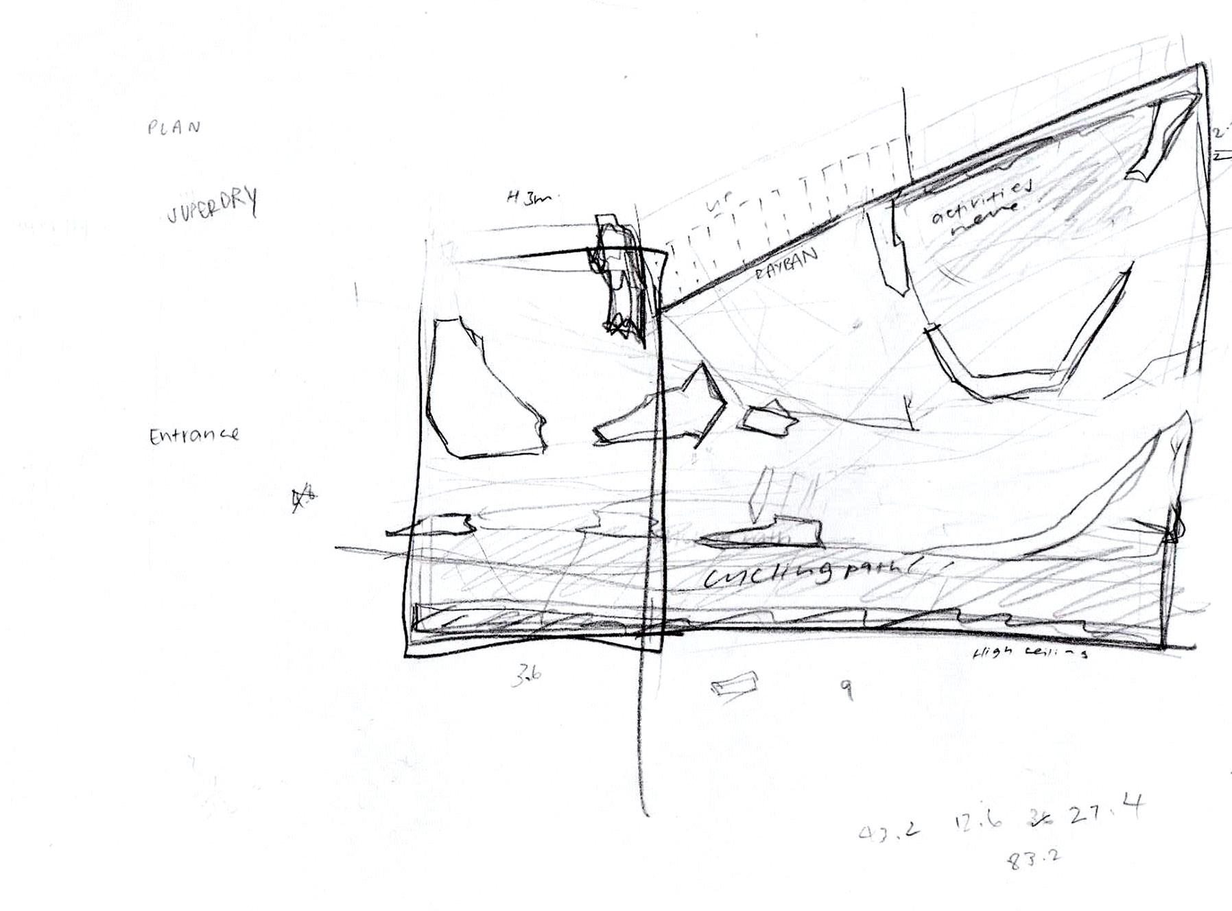
This modular block is chosen out of the five variations that was made because of the use of negative space within one block. This implies that the form will be more loosely fitted and people can look through the holes in the walls as compared to a solid module block that does not have negative space.


From data and infomation that I have collected, I have noticed that there are some food vendors where there are inadequate seating area for them to dine in. I have then created a space, called The Cosmos, where people can learn about Space Technology by SpaceX while dining with their loved ones.


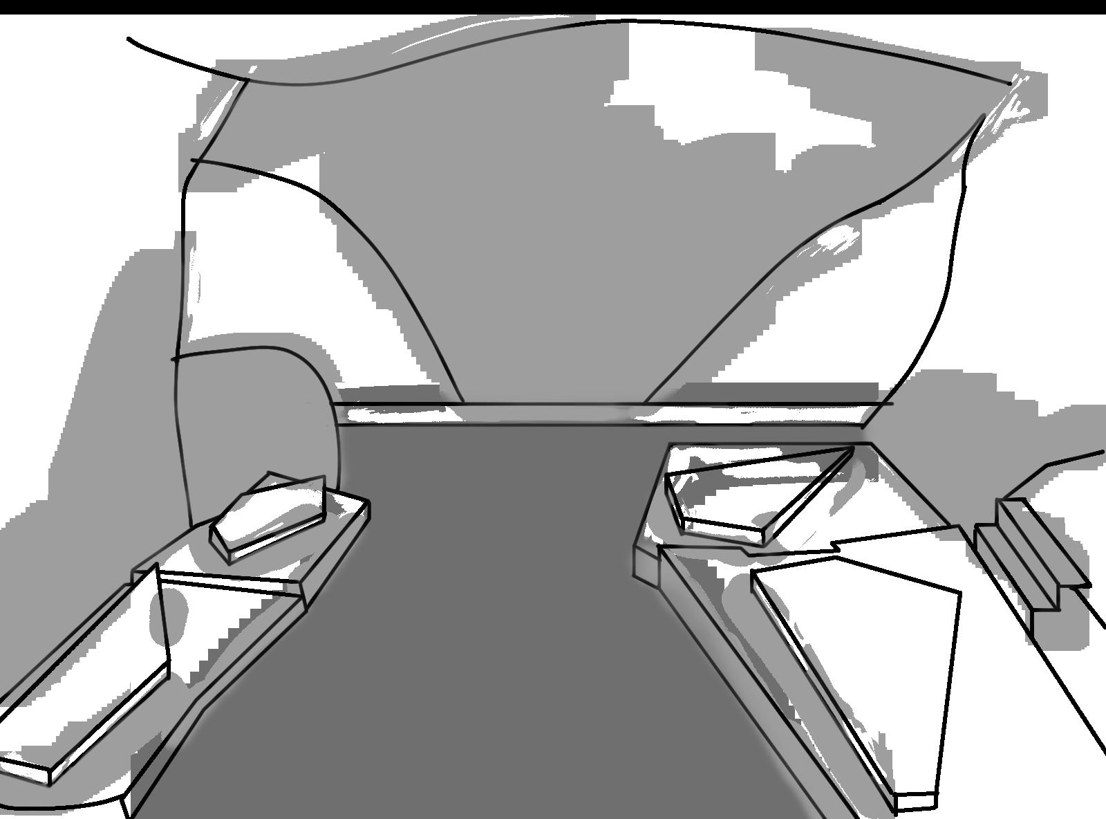
Once people enter The Cosmos, they will receive a notification from their phone that prompts them to view the area, Using Augmented Reality (AR) to further engage and educate them while they dine in. Information about rockets and their stagescan be seen through each individual phone. Furthermore, each phone projects different space-related information so friends will be inclined to share each others’ infomation.

Pryve is a collaborative project consiting of 3 other people who were involved in the space planningand brand identity.

I contributed to the rendered floorplans and 3d visualisations of the space.
The project was to redesign an fnb area into a spa where people can come and get pampered.
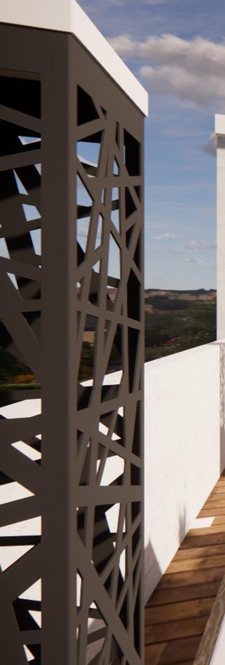
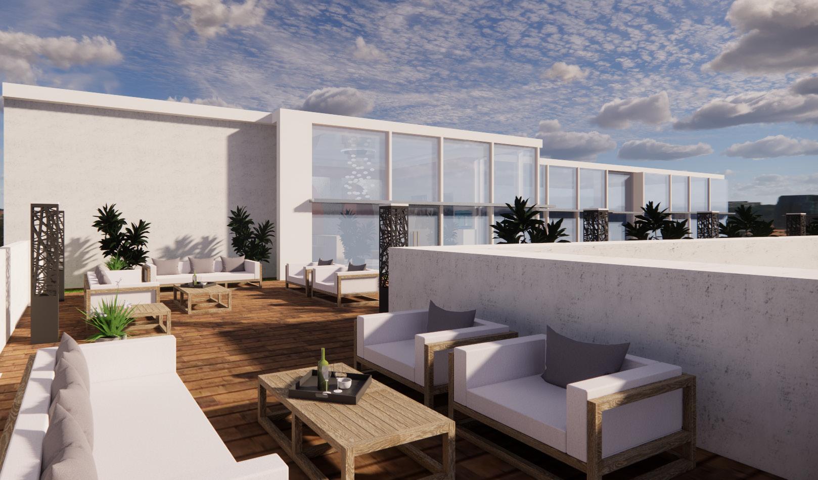
A high-end interior designer listens to a client’s vison and translate that into a one-of-a-kind look where every aspect perfectly fits together to create a brilliant end product. To understand the ‘ perfect fit’ design is the heart of luxe interior aesthetic. The gift of luxury means the state of comfort and convenience, where the interior environment and the systems that make it function smoothly serves the users. It should feel warm and inviting, and unique in its characteristics at the same time invoke an emotion of extreme well-being.

What remains consistent and the more important experience is the one when walking into the room and instantly feel relaxed. When luxury interior design is rooted in the cohesive combinations of shapes, colours and textures, it always feels right and deeply enhanced an experience in which all human senses are engaged.
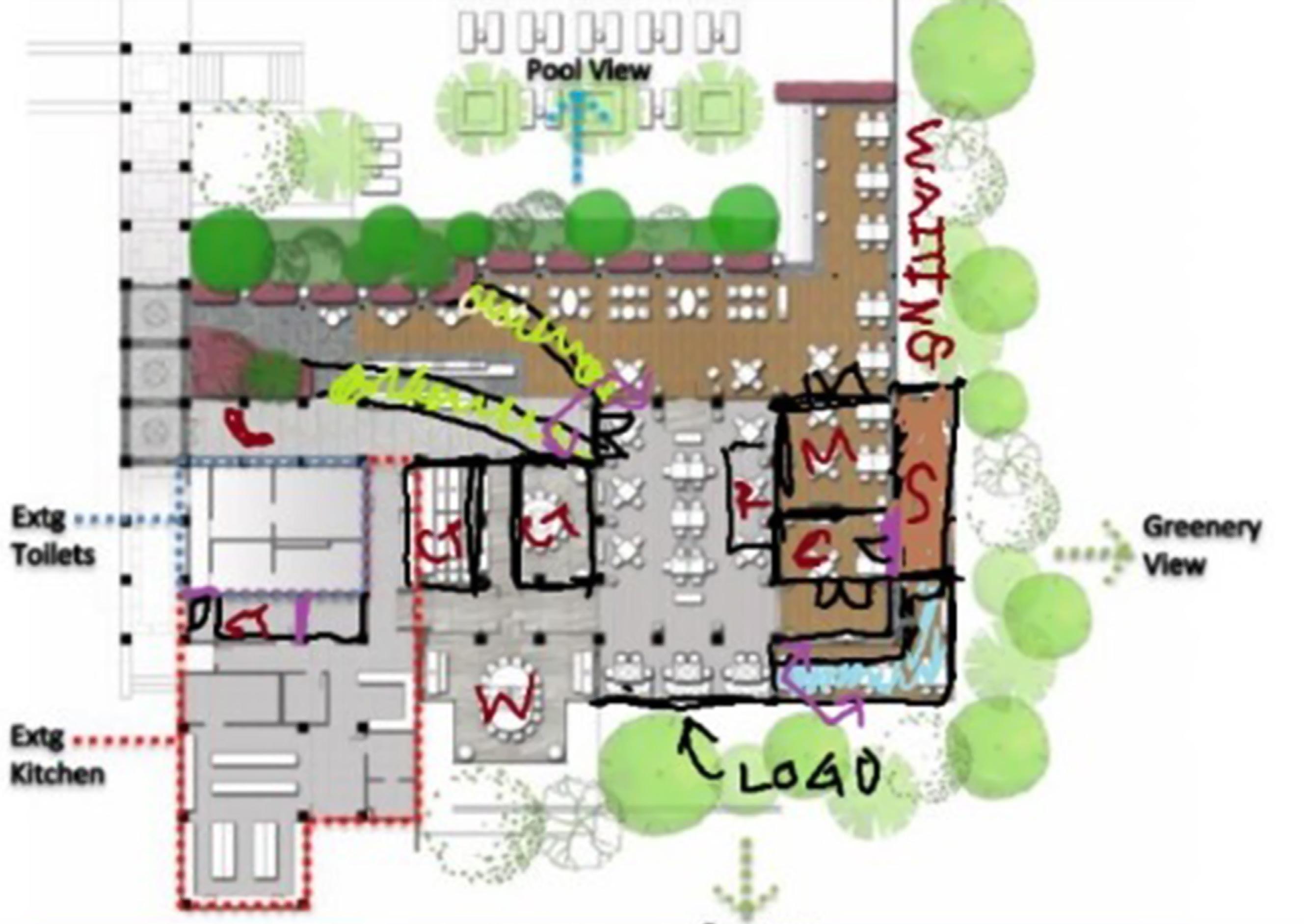
Transforming the space from a fnb dining area to a spa and wellness centre was one of the toughest part of the project. The flow at which people walk through the spa has to be logical and smooth because we prioritise the guests’ experience.
Waiting lounge, bathrooms and treatment rooms have to has to be within close proximity. Meeting rooms are to be tucked where customers will not be able to see or access. Destruction and construction of walls were kept to a minimum because of high costs. Other than the spa treatment, the four of us also decided on an area for a nail salon, sauna and a small swimming pool that over looks the green view. This gives customers a full luxurious experience when pampering themself at the spa.
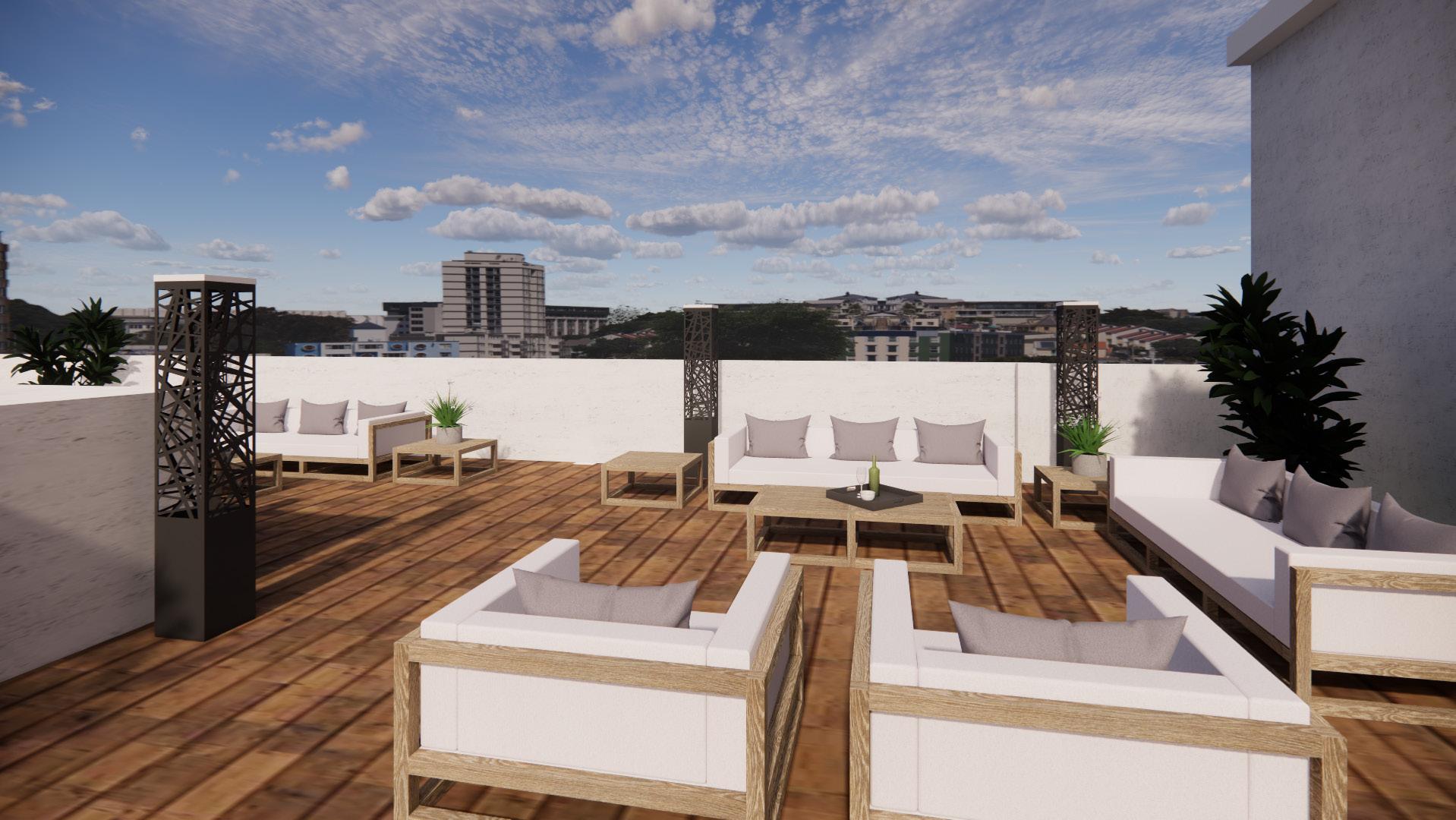
We planned it so that when customers have to enter the reception area before they are able to access the outdoor seating. Only paying customers are allowed to access the seating this is to ensure the exclusivity of the area.
Creating a company for this project was most smooth-sailing part of the project. Our team had similar mindsets on how we should proceed with the functionality and aesthetics of the spa. We also agreed on making our brand all about the fluidity, inclusivity and cleaniness.
This commercial spa is located on a hill so there is a stunning view from the outside. Guests are welcomed to enjoy the outdoor seating with a drink.
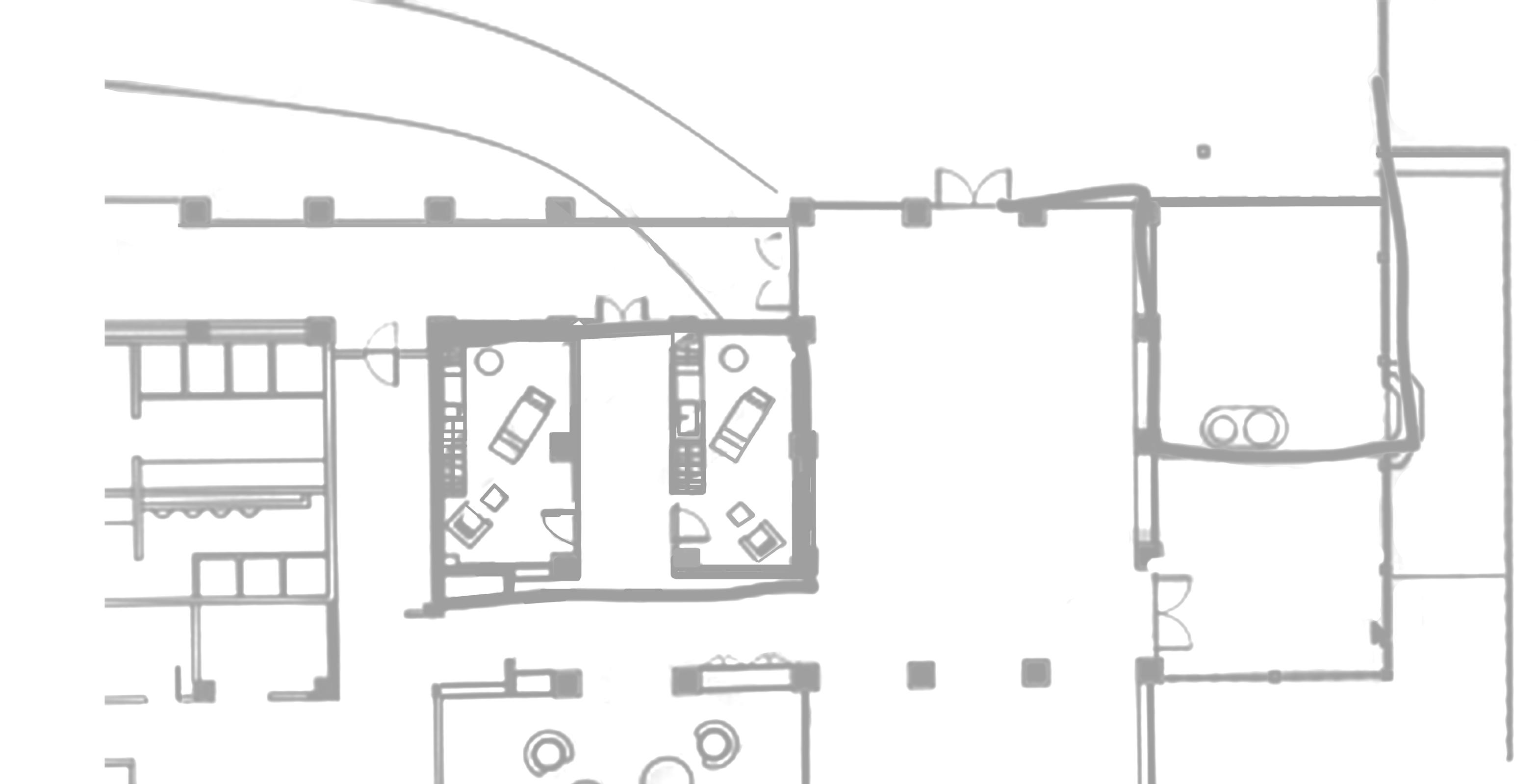
Changing Rooms with connecting saunas
individual changing rooms for those who would like to change into their appropriate attire for the spa treatment.
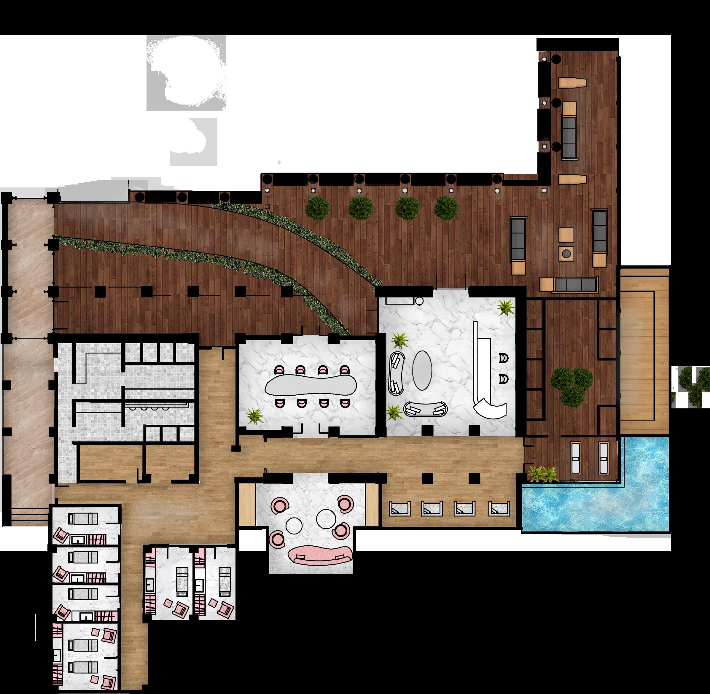
Individual rooms or couple rooms are available for spa treatments.
Other than the waiting area in the reception, guests are also allowed to use this room for more privacy while waiting.
A spacious and comfortable area for staff to convene.
An exclusive outdoor pool with tanning beds
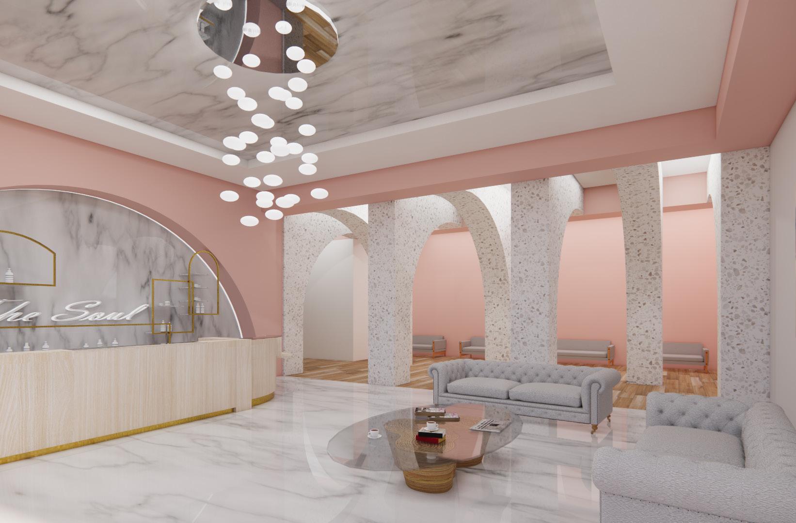
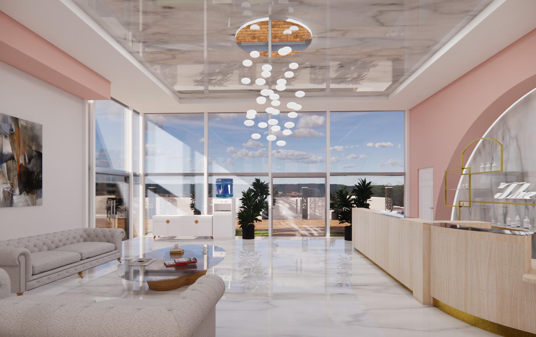
The grand reception with large windows and high ceilings is where guests and staff handle admin matters.
The theme chosen was grand and luxurious because we wanted Guests come to the spa to relax and feel pampered so the environment should evoke similar emotions.

The space has to have at least 5 spa treatment rooms, a reception area , a lounge and a meeting room
Large windows in the reception invites natural lighting to stream into the space as well as a view for those sitting inside.
This commercial spa is located on a hill so there is a stunning view from the outside. Guests are welcomed to enjoy the outdoor seating with a drink.
Changing Rooms with connecting saunas individual changing rooms for those who would like to change into their appropriate attire for the spa treatment.
An exclusive outdoor pool with tanning beds
The grand reception with large windows and high ceilings is where guests and staff handle admin matters. An exclusive outdoor pool with tanning beds
The grand reception with large windows and high ceilings is where guests and staff handle admin matters.
Other than the waiting area in the reception, guests are also allowed to use this room for more privacy while waiting Meeting
A spacious and comfortable area for staff to convene. ng.
Individual rooms or couple rooms are available for spa treatments
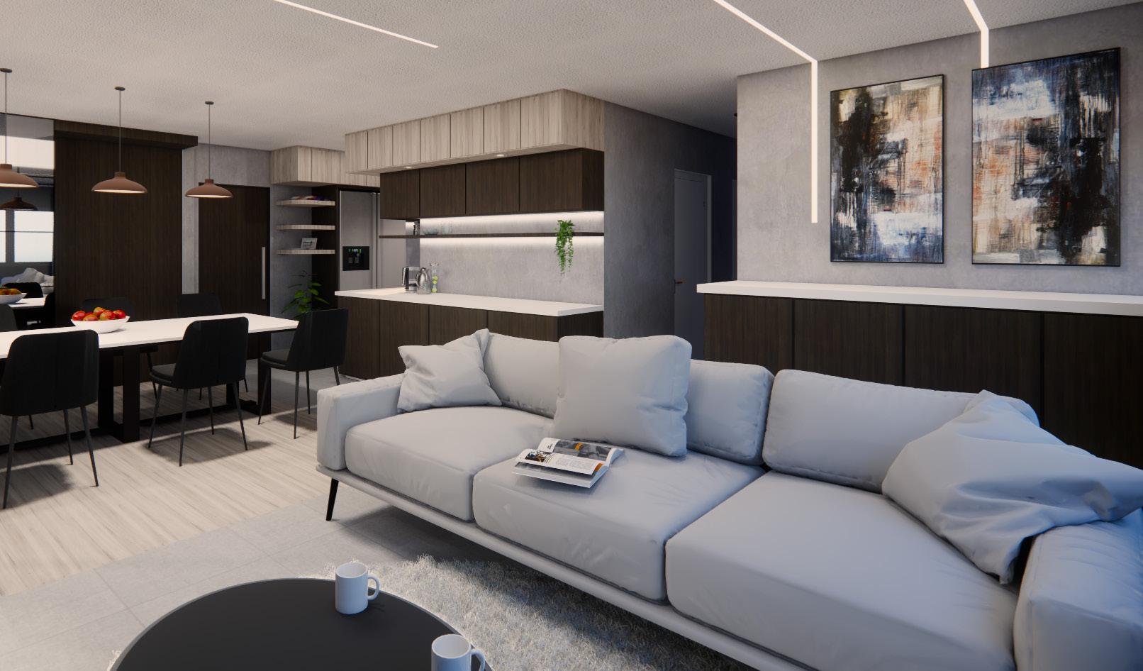
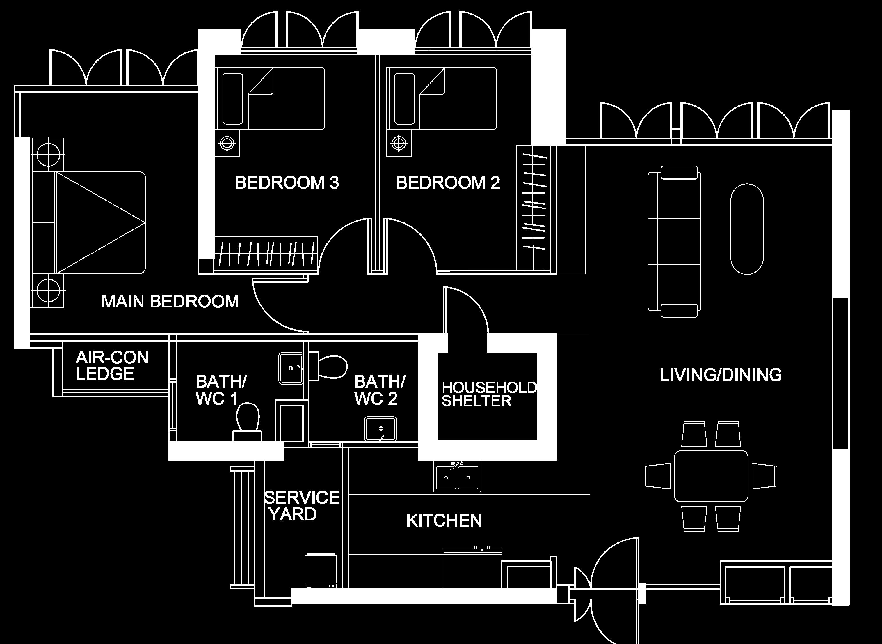
This project has a industrial modern theme and only master bedroom, living room and kitchen was required. Many dark woods, limewash paint were used throughout the residential area so as to make the space appear rustic. Only the kitchen, living room and master bedroom were required.
Inspired by the repurposed factories from the Industrial Revolution, the modern industrial interior embraces exposed architectural elements like pipes, bricks and concrete. This style also inclused Edison light bulbs, open floor plans and also a cool neutral palette.
This project was done using AutoCAD and Sketchup

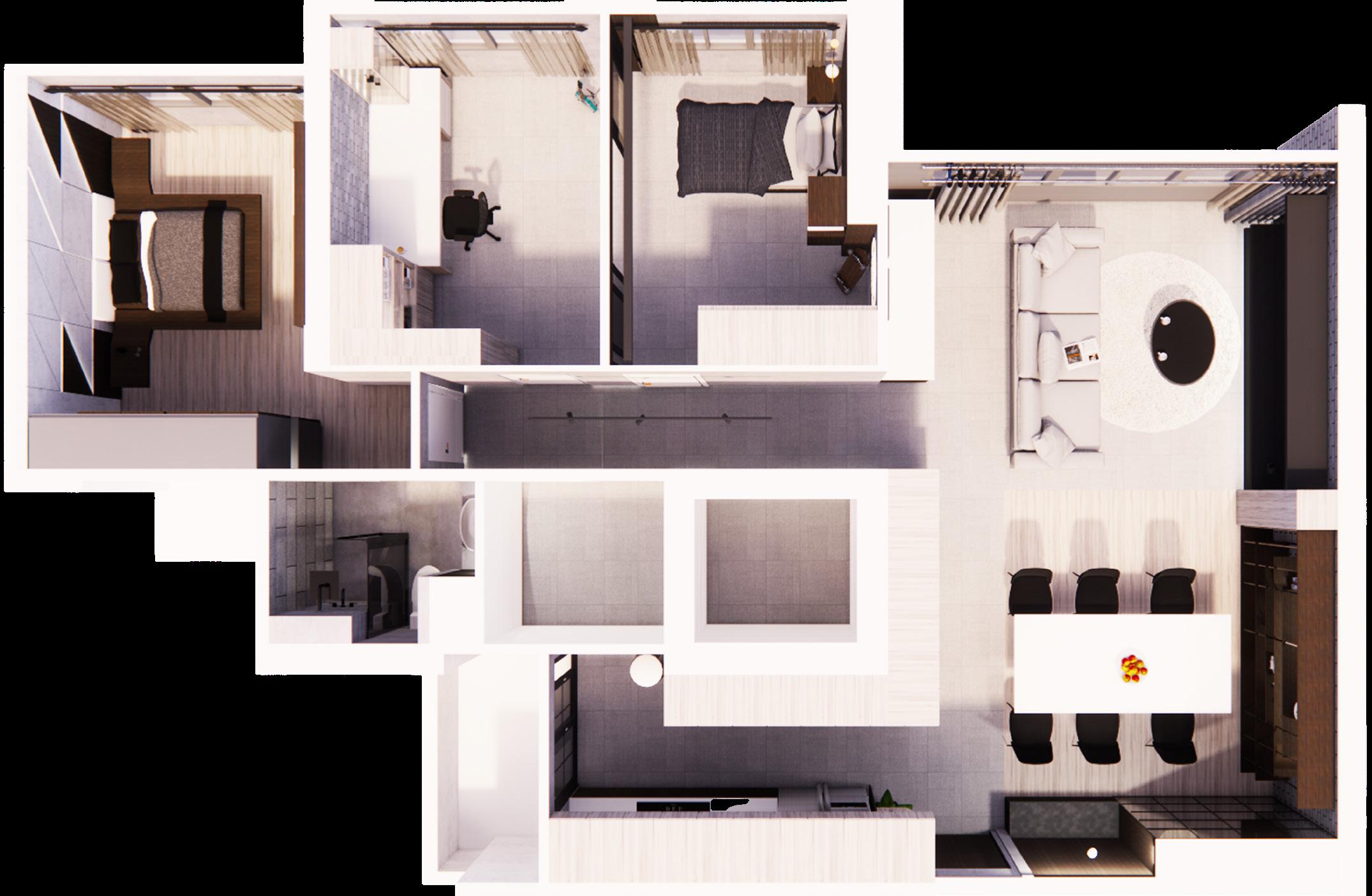
Masterbedroom has a feature wall where lighting is used to highlight certain features.
Wall between the two bedrooms is removed and replaced with sliding glass door.
Bedroom 3 is a study room with tables and storage.
Separating living and dining room using different floor materials.
Shoe storage and seating area at the entrance
Open concept kitchen for a bigger appearance of the entire living and dining room. Layered top cabinets with different materials add more depth into the cooking space.
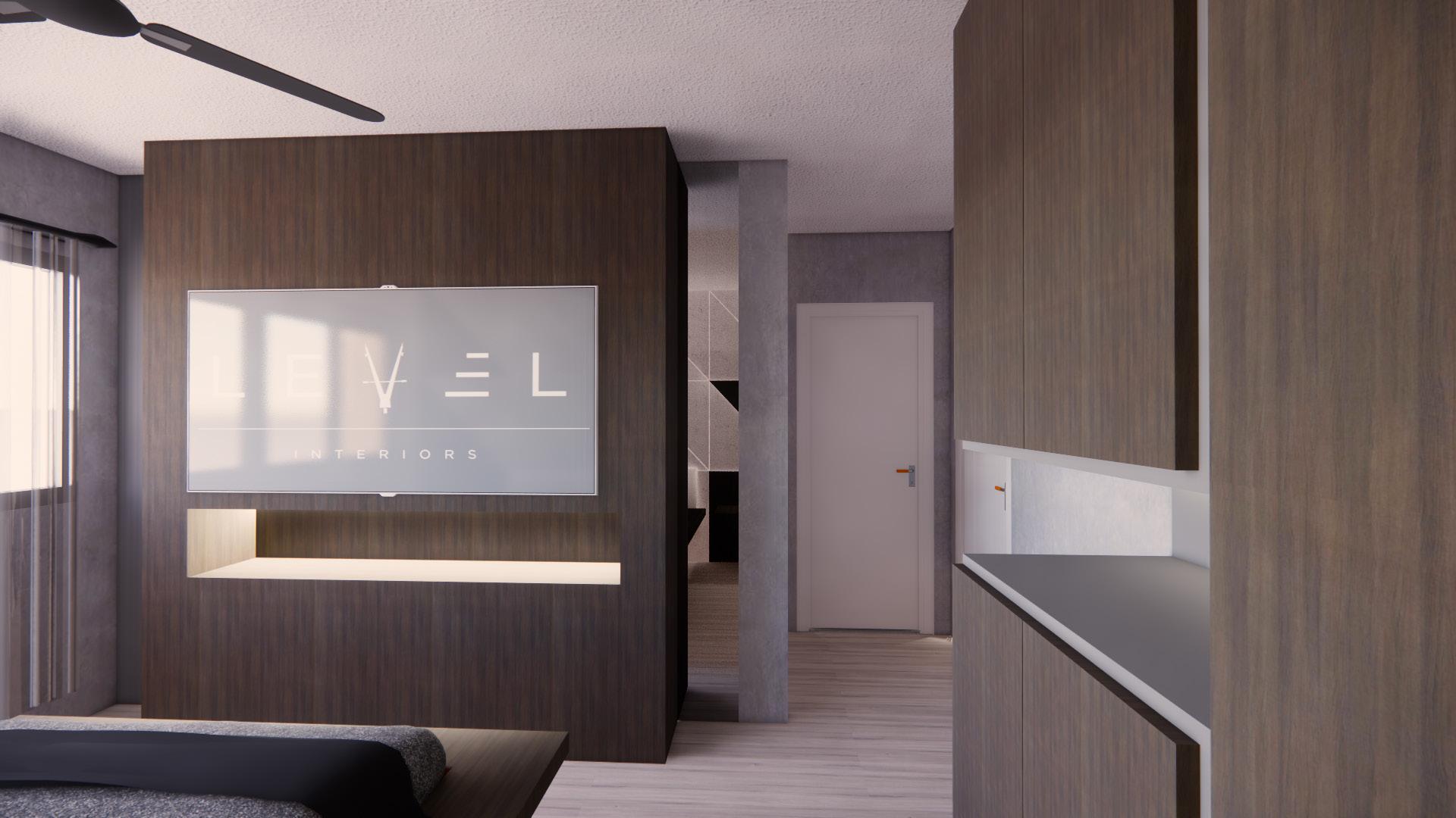
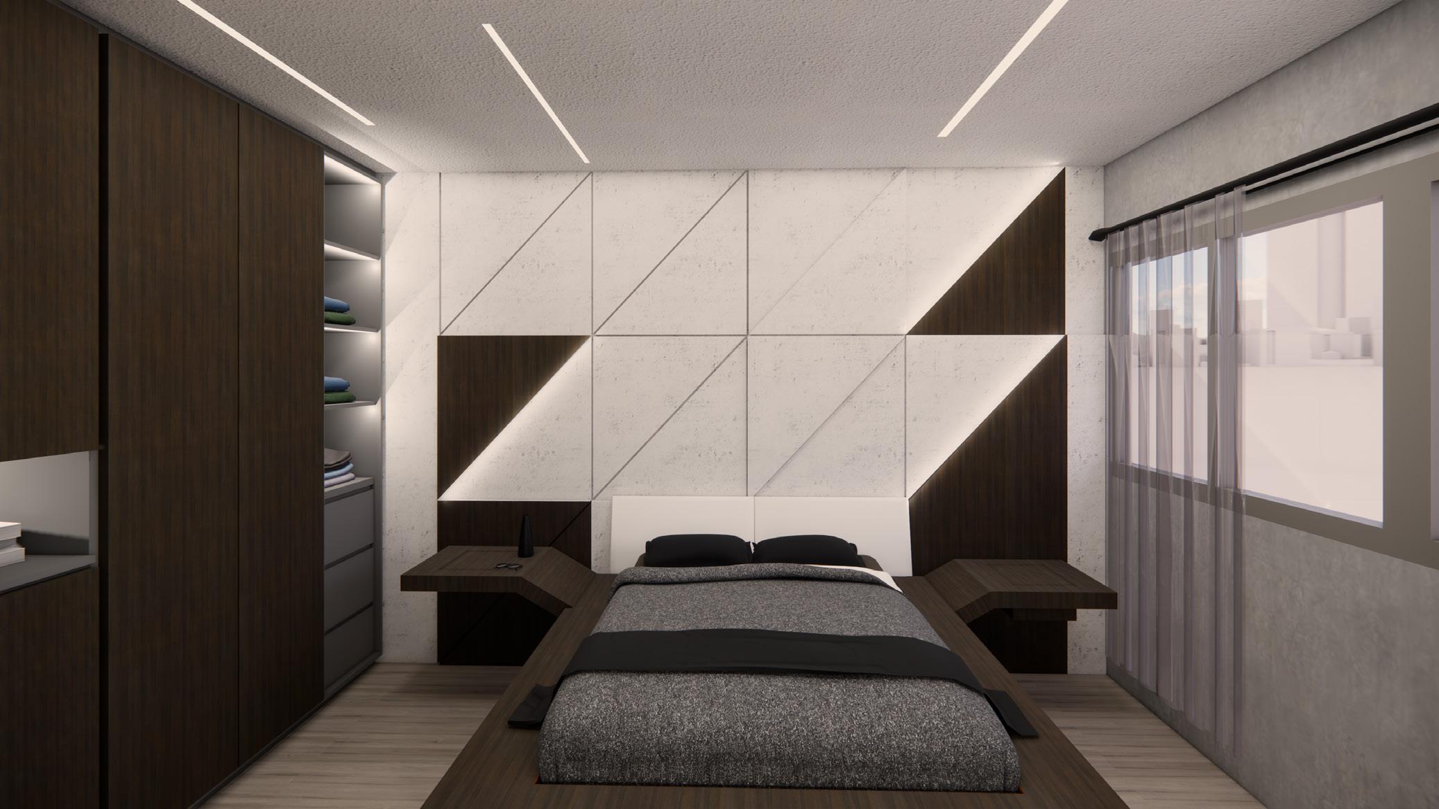
The design encouraged indoor-outdoor living. Rich and luxurious woods such as walnut are regularly used. In adition, accents of black and dark greys are used too to better blend the colours in the room together.

A geometric pattern on the featire wall is requested because the owners of this house liked how regular, geometric forms fitted into their house.
Even though materials can seem cold and rough , separatedly, together they create this cozy and warm santuary that the owners can spend their days in.
Comfort and warmth was the most important statement in designing this house. So before the planning of the house, specific materials and finishes were already chosen. Even though, the materials may seem cold as a standalone, with the correct lighting and pairing with other materials to create a cohesive warm space for living.

An open concept kitchen was proposed to merge and blur the lines betwen the dining room and the kitchen.

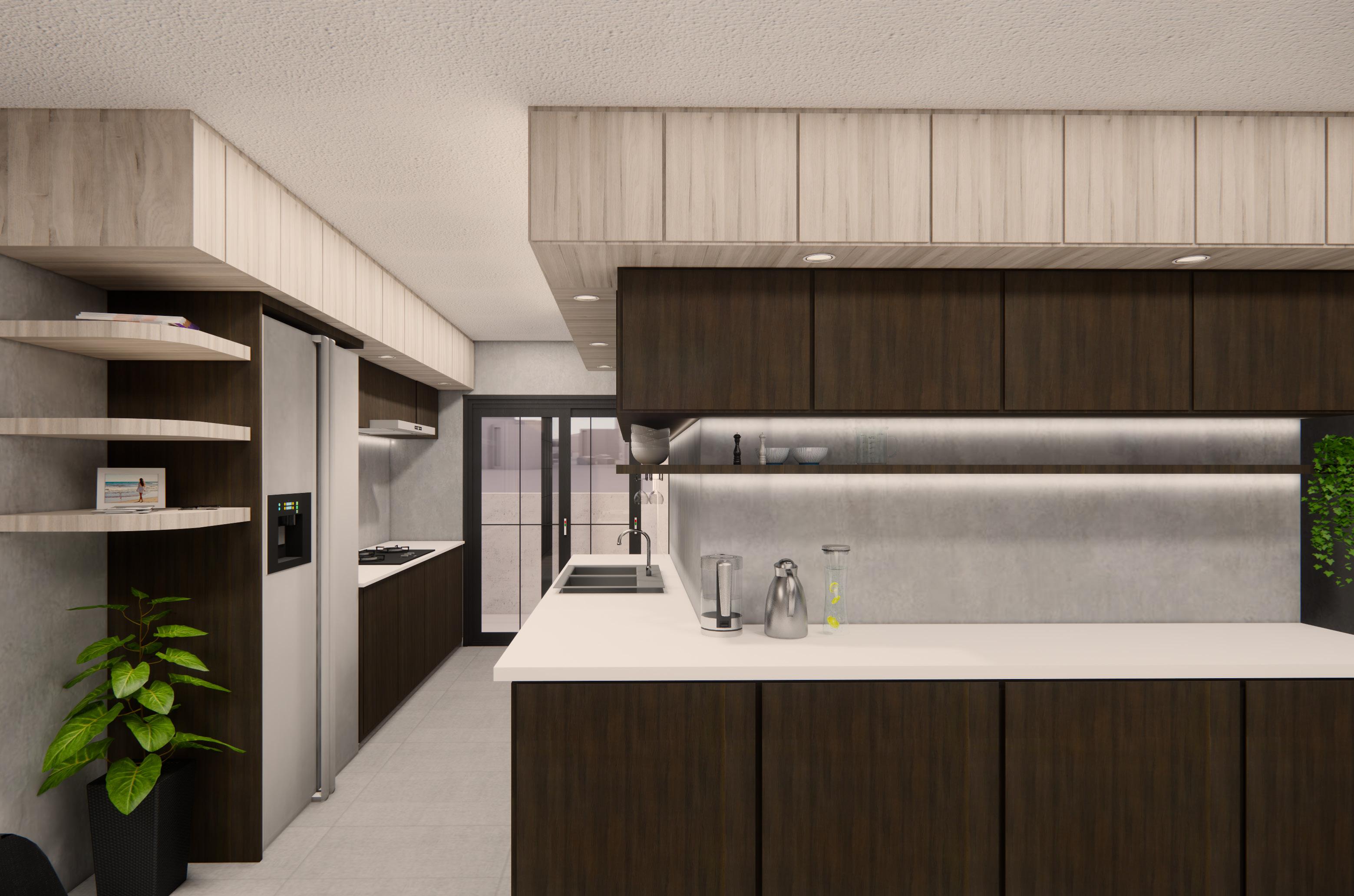
Extra kitchen countertop that stretches towards the dining area also allows the area to feel very spacious.
The top cabinets are layered for more depth and more importantly, opportunities for storage.
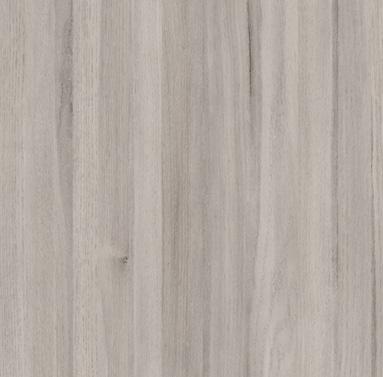

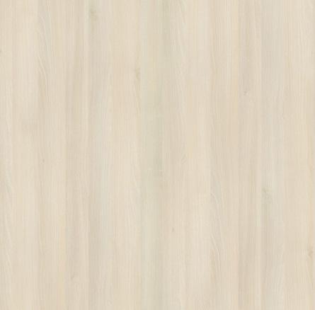
Equipment that are seldom used can be stored up in the higher cabinets.
The wall between the two rooms were hacked down and replaced with a glass sliding door to open up both rooms.
In the bedroom, thick wooden shelving that appear to be floating on the side of the wall create a simple but interesting way to display items. Under each block is also lined with LED lights to further highlight the displayed. The thick blocks further enhance the geometric and structural concept that can be seen throughout the house.
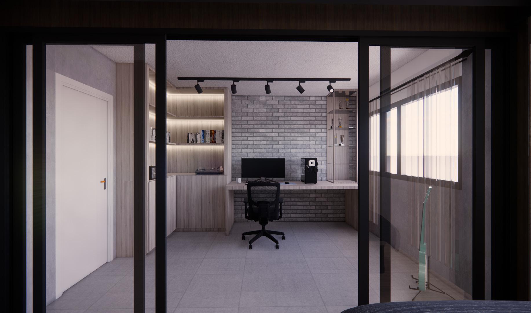

Strip lighting and LED lighting are also used for a more industrial and rustic look . The materials in both of the rooms match the rest of the house so as to create a coherent home.

This project was the last project that was done for my 6-month internship at Lev3l and it tested my ability to do space planning for a residential as well as come up with different ideas. The spaces that were required were the living room, kitchen, 2 bedrooms and a common bathroom.
In the making of this project, it was kept in mind to use as many curves and false walls as possible.
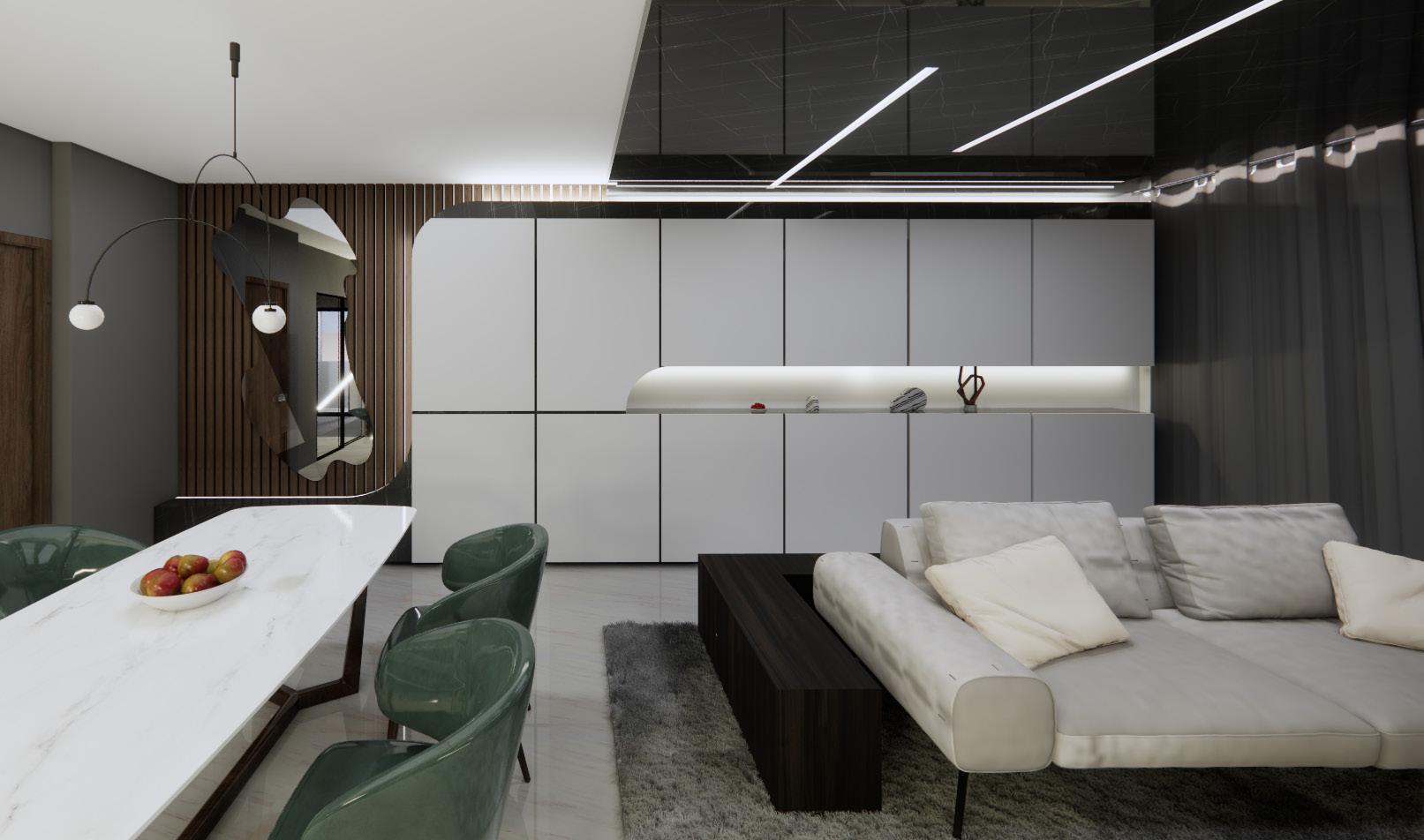
Associated with high standards of living that is sophisticated yet singple, Modern Luxe takes inspiration from modernism, which reflects a fussfree approach to life.
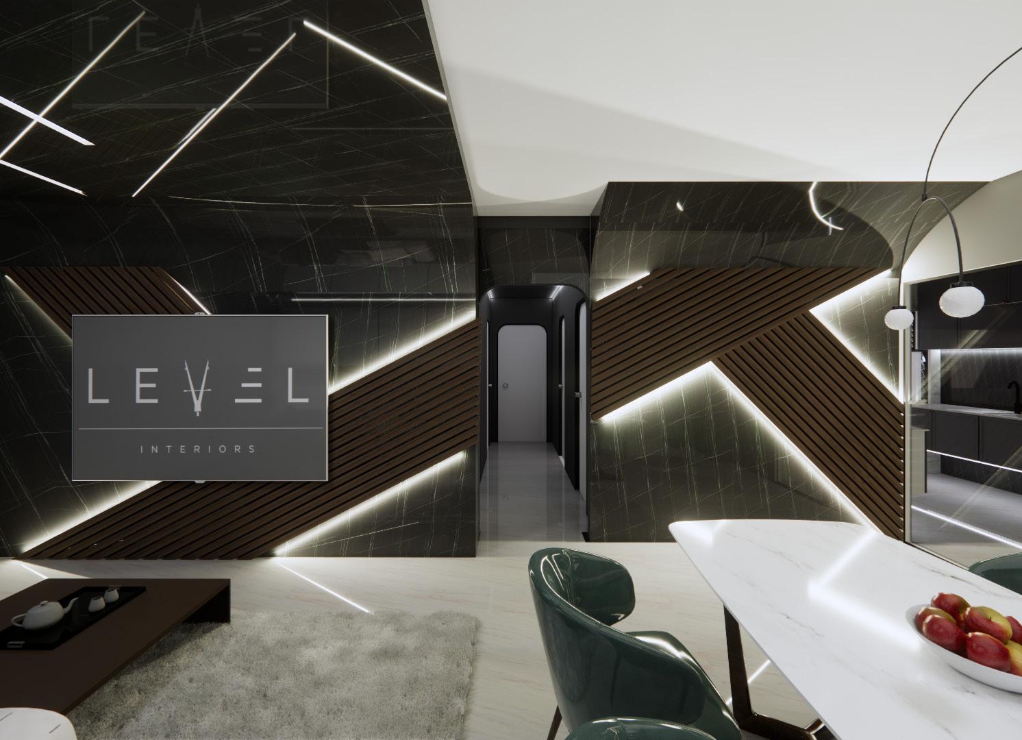

The style is put together through a variety of styles, colour palette, decorative details and furniture arrangements..In modern luxury interiors , sturdy fabrics such as cotton, linen and silk are commonly used.
This project was done using AutoCAD and Sketchup.

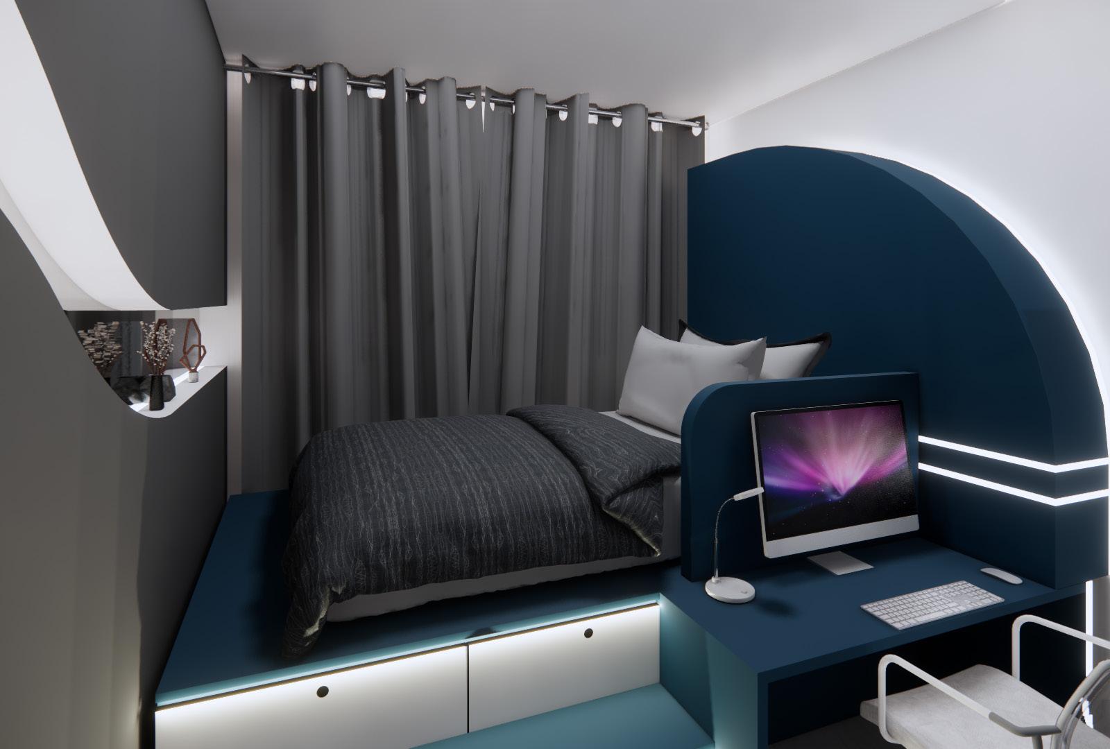
Bed on a platform with storage on steps Dark blue and black colour theme
Loft-style bedroom for children. minimal, brightly-coloured
Full-height carpentry on back wall. Curved form that connects to seating area at the entrance.
Display in carpentry.
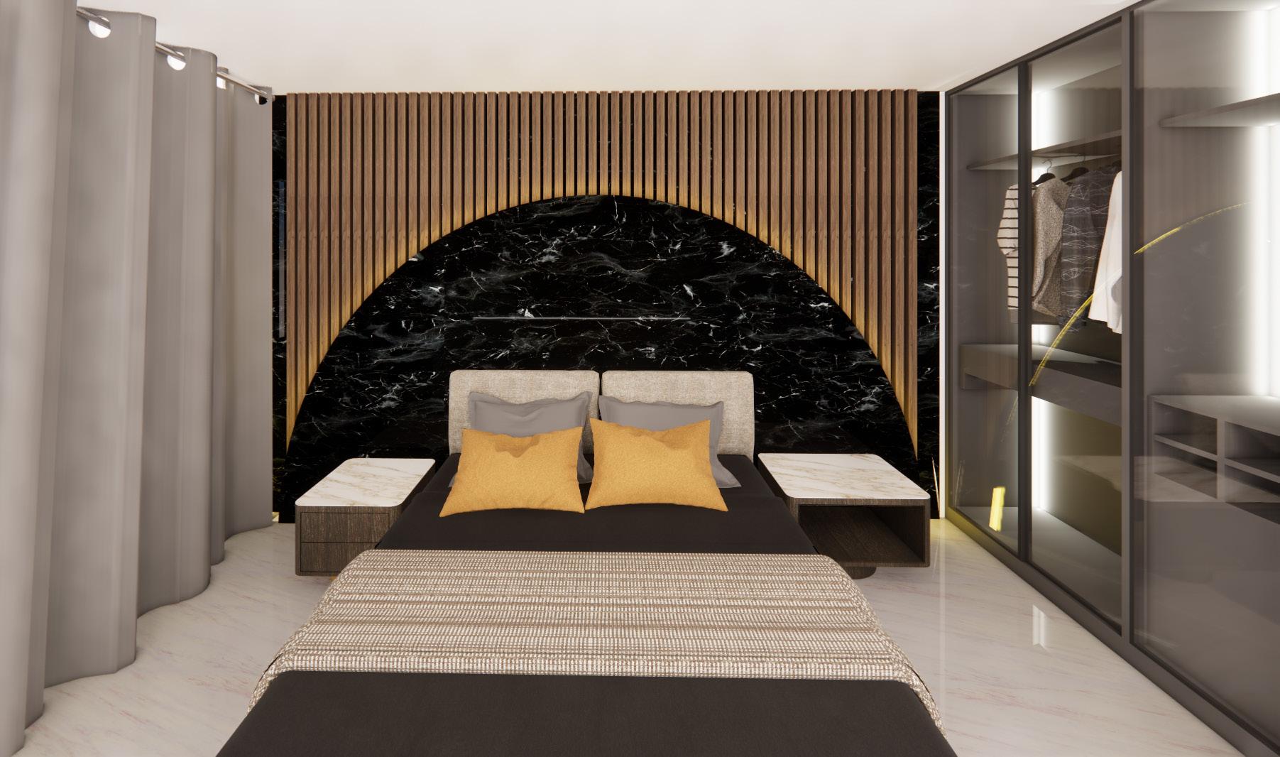
Feature wall to include fluted panels and curves. Glass sliding doors for wardrobe.
The feature for the master bedroom was designed to highlight the importance of the king-sized bed.Many layers were put into this feature wall, with the consideration of materials, such as the fluted panels and the marble arch and even the lighting on the walls. The design in this room is more grand and authoritive than the rest of the rooms in this house from the level of details to the materials. This bedroom in particular was made so the owners of this house feel like their house is like a 5-star hotel and bold designs did not scare them.
In modern luxe homes, the right lighting must be chosen for the perfect home interior design. Steering away from the conventional lighting you see in typical Singaporean homes, we incoorporated interersting light fixtures for an elegant look. Furthermore, warn lighting are used to create a homey and sophisticated environment.
Both bedrooms were designed with a different layout as the 2 people who will be occupying this space both had very different personalities.
Bedroom 1 was for a 9-year-old girl who loves Muji and minimalistic look.
For the design, I proposed a loft idea so that she can get her own cozy corner on the higher level where the bed is. A warm light-coloured wood was used throughout the room so that it would make her feel home-y and comfortable in her own space.
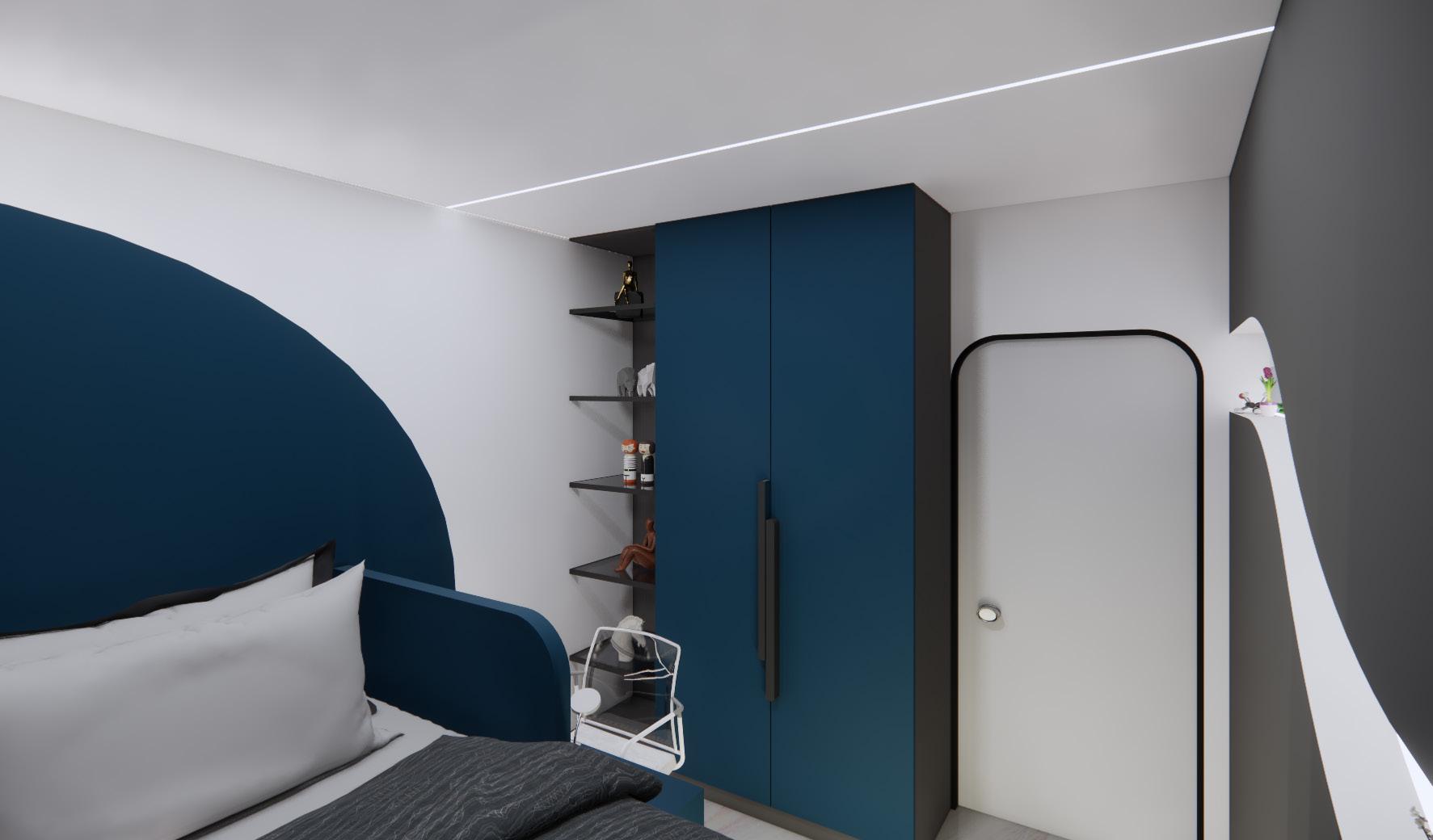
The second bedroom was for a 14-yearold sister who enjoyed darker colours and was obsessed with figurines . I proposed a platformed bed so that there would be extra storage in the platform steps as well as the curved display area in front of her bed as well as in the wardrobes. These 2 bedrooms were not only a space for them to sleep and do their homework in. It was their safe space where they can express themselves and look forward to coming home to everyday.
Both bedrooms were designed with a different layout as the 2 people who will be occupying this space both had very different personalities.
Bedroom 1 was for a 9-year-old girl who loves Muji and minimalistic look.
For the design, I proposed a loft idea so that she can get her own cozy corner on the higher level where the bed is. A warm light-coloured wood was used throughout the room so that it would make her feel home-y and comfortable in her own space.

The second bedroom was for a 14-yearold sister who enjoyed darker colours and was obsessed with figurines . I proposed a platformed bed so that there would be extra storage in the platform steps as well as the curved display area in front of her bed as well as in the wardrobes. These 2 bedrooms were not only a space for them to sleep and do their homework in. It was their safe space where they can express themselves and look forward to coming home to everyday.
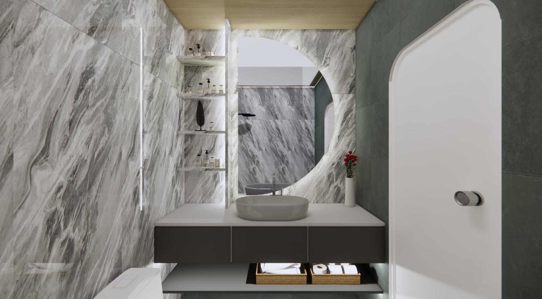
The most overlooked space in this house would be the common bathroom but I made sure to match the materials and design of this bathroom to the rest of the house. The most prominent object in this room, the semi circle mirror with back lights, brings a sense of luxury and focus when one looks into the mirror. The glossy marble laminates were used for an expensive look.
Lengkong Tiga Project is a minimalistic residential project. Colours rarely go beyond grayscale. A simple but functional space for a family of three to comfortably come home to everyday.
Minimalism is about prioritising the essential. A minimalist interior is stripped to its core funtions, realised using limited materials, neutral colours and simple forms. This avoids excess ornamentation to achieve a pure form of elegance. The final expression of a minimalist design appear effortlessly simple.
This project was done using AutoCAD and Sketchup.

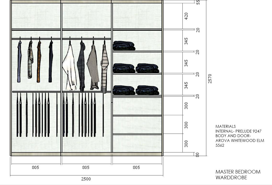
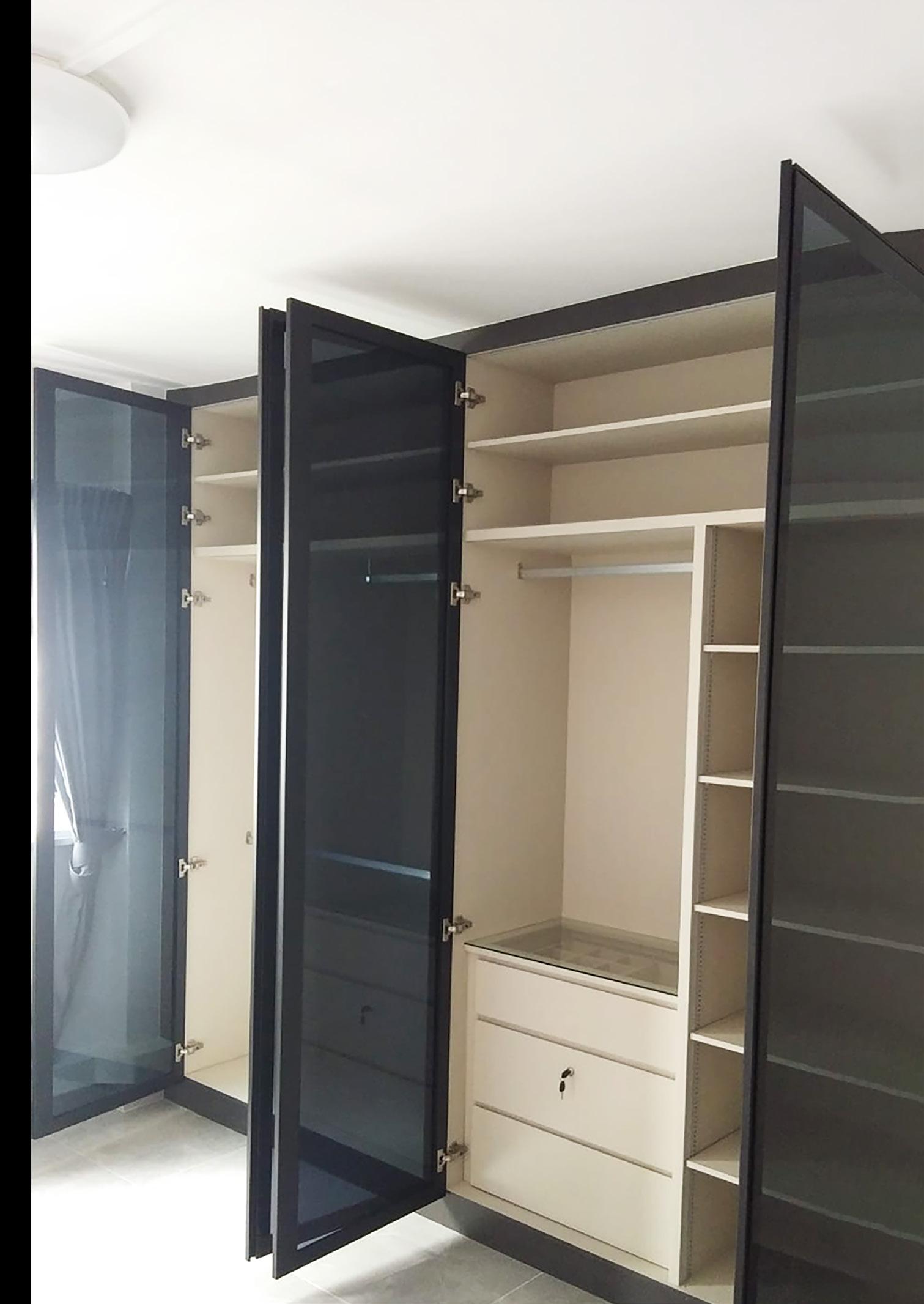
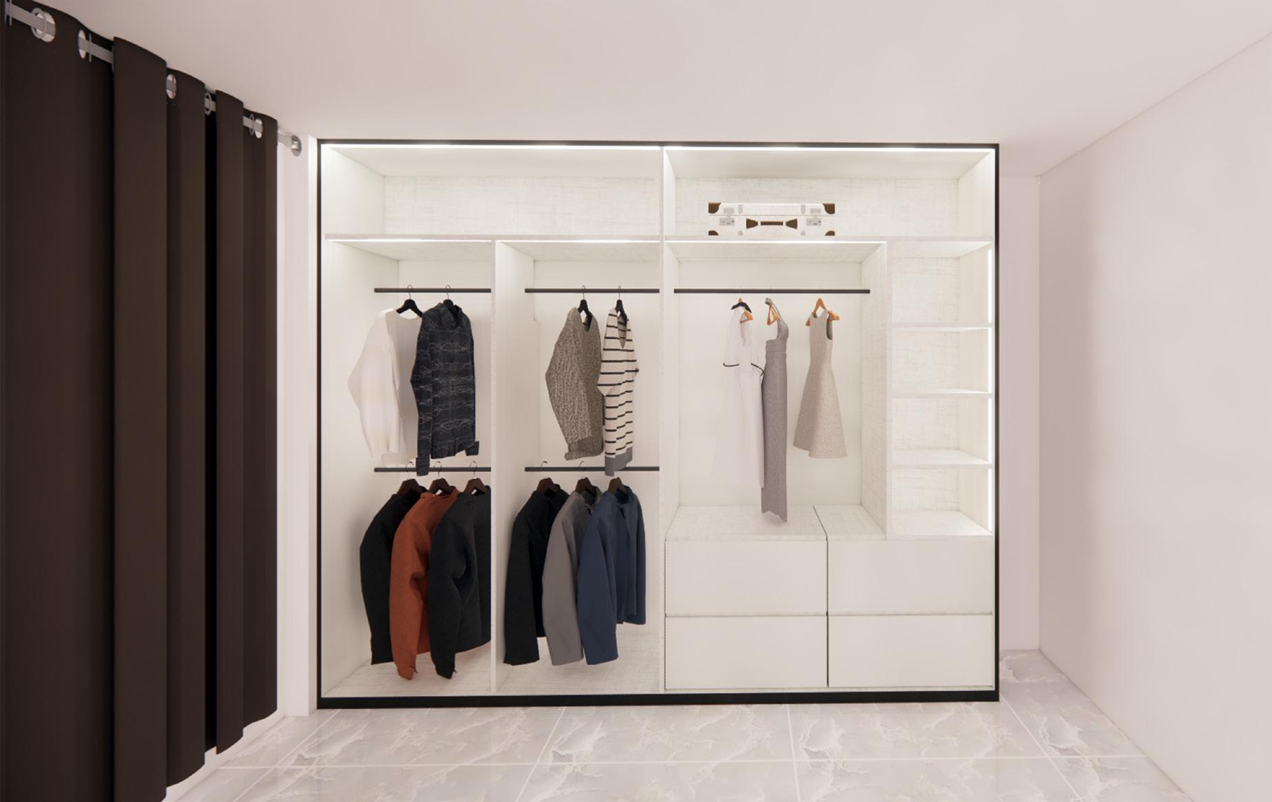
Built-in wardrobe with ample hanging space and folding space.
Internal lighting for cabinets
Masterbedroom wc material- glossy grey marble for walls
Grey granite for the floor.
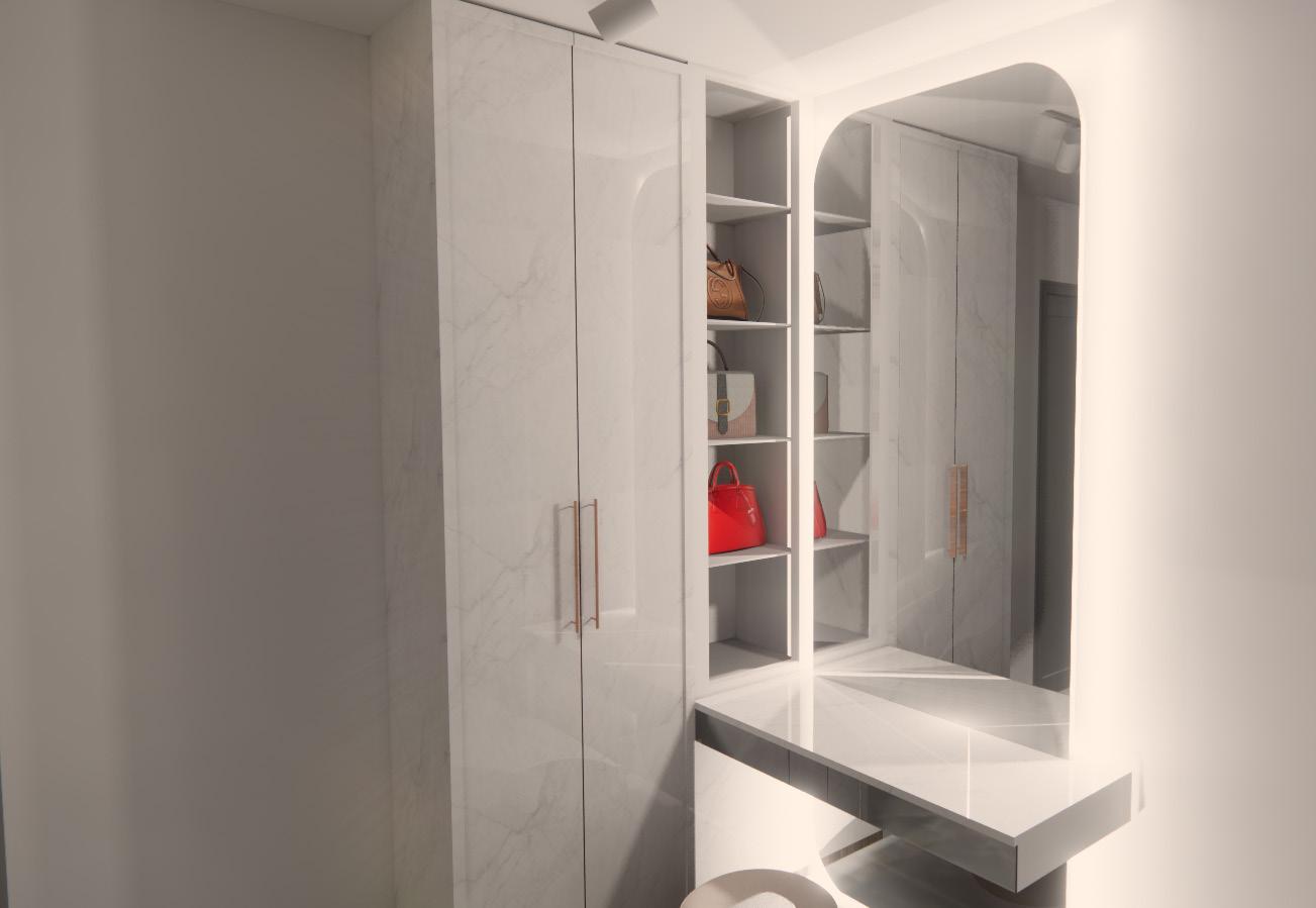
Full-length mirror and vanity open cabinets and full- height built-in wardrobe at the side for storage.
Built-in wardrobe with tinted glass doors and sufficient space for bag display.

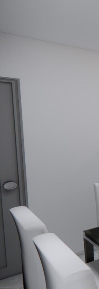
False ceiling 900 between living room and dining area.
Cove lighting on each side and 4 downlights on the false ceiling.
Bedroom 2 Guest Room
To be as flexible and adaptable to other needs so there is no need for built-in furniture in this room. All furniture will be freestanding.
Living room only a small tv console is needed .
Lengkong Tiga Project was one of my biggest project during my internship at LEV3L Interiors. This was also the first project that was assigned to me in the 6 months I was working there. The first few stages were the spatial planning around the house and also doing up on the electrical and lighting plans.
The clients wanted their dream house to be grey-toned minimalism and focusing on the simple aesthetics and functionality of the space. Many 3d visualisations were required to convey infomations and designs to the clients.






The very last stage was the production of construction drawings for the clients’ approval Seeing the end product was very satisfying especially after working on this project for long.


