All content comes from course work at Wake Technical Community College and is produced by Jose Gonzalez. All descriptions and text were written by Jose Gonzalez unless specified otherwise. Any part of this publication may not be reproduced or replicated without the permission of the author.
Connecting with Nature
Professor Baxter Wilson | Summer 2022
Steelcase Competition Entry
Professor Professor Odjaghian | Fall 2023 PADDINGTON’S TOY SHOP
A Colorful Spin on Toy Shops
Professor Andrea Bachi | Spring 2024 OISHI
Organic Forms and Sushi
Professor Andrea Bachi | Spring 2024
SUSTAINABLE DEVELOPMENT PROPOSAL
Affordable Housing and a Green Approach for the Community
Professor Jess Anastes | Spring 2024
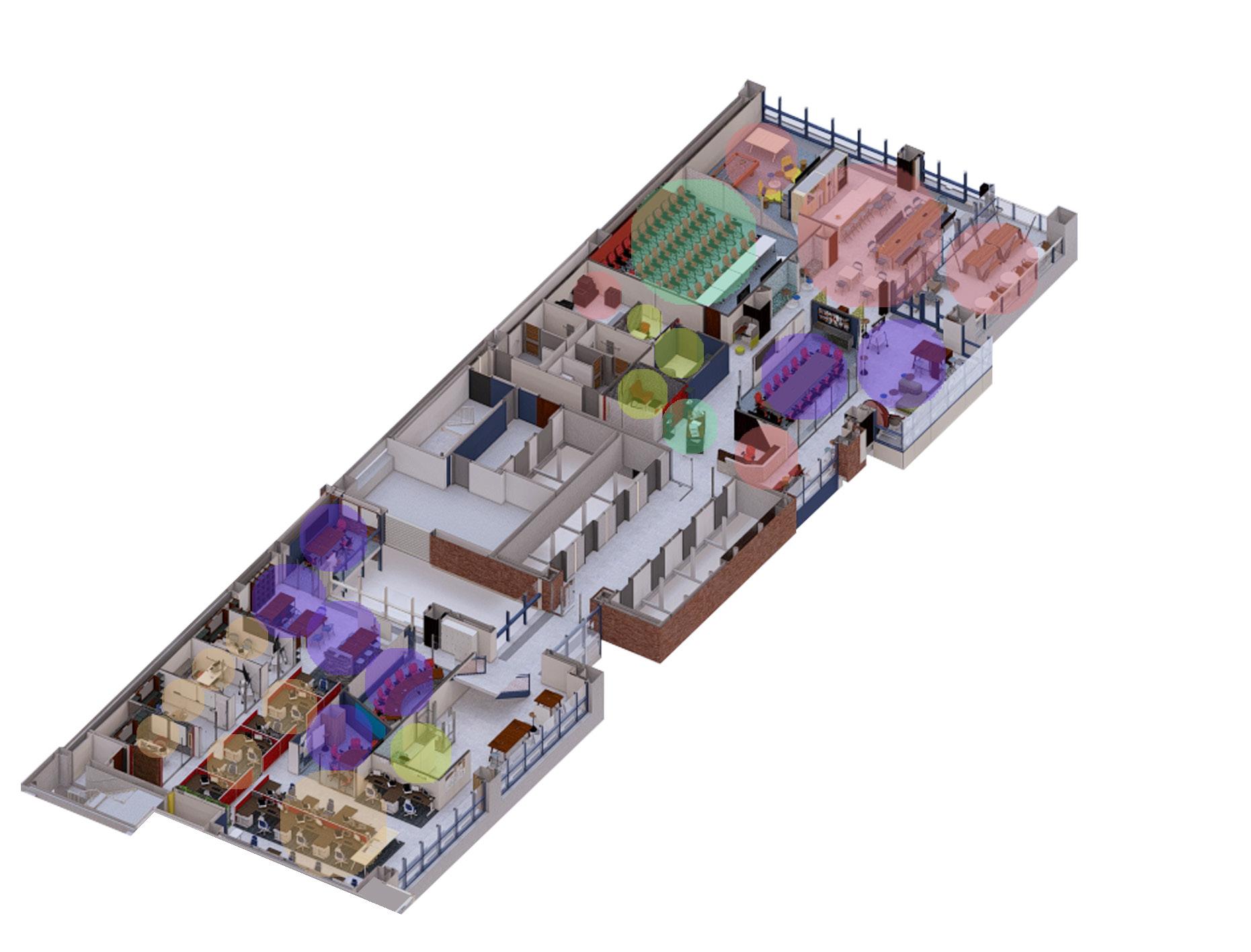
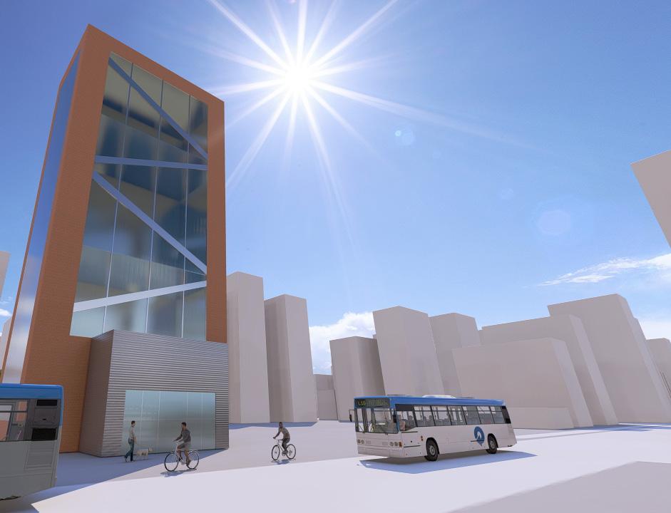
CORPORATE OFFICE
Connecting With Nature
Wyoming, US
Instructor: Baxter Wilson
Architectural BIM I
Summer 2022
Client: Confidential
Autodesk Revit, Lumion, Photoshop
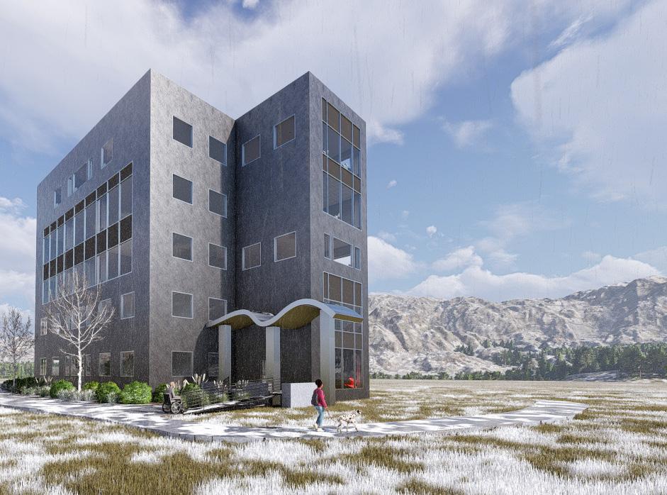
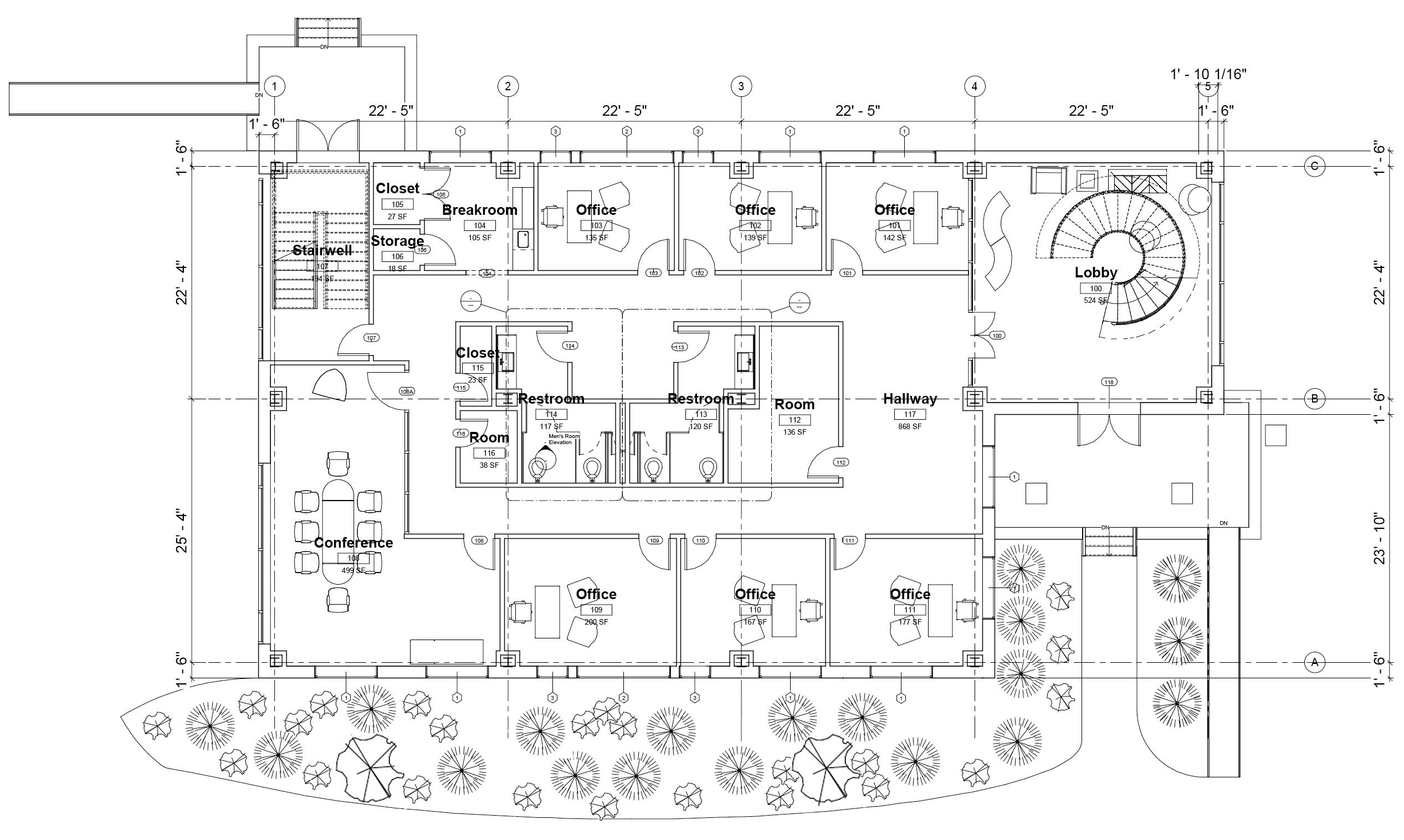
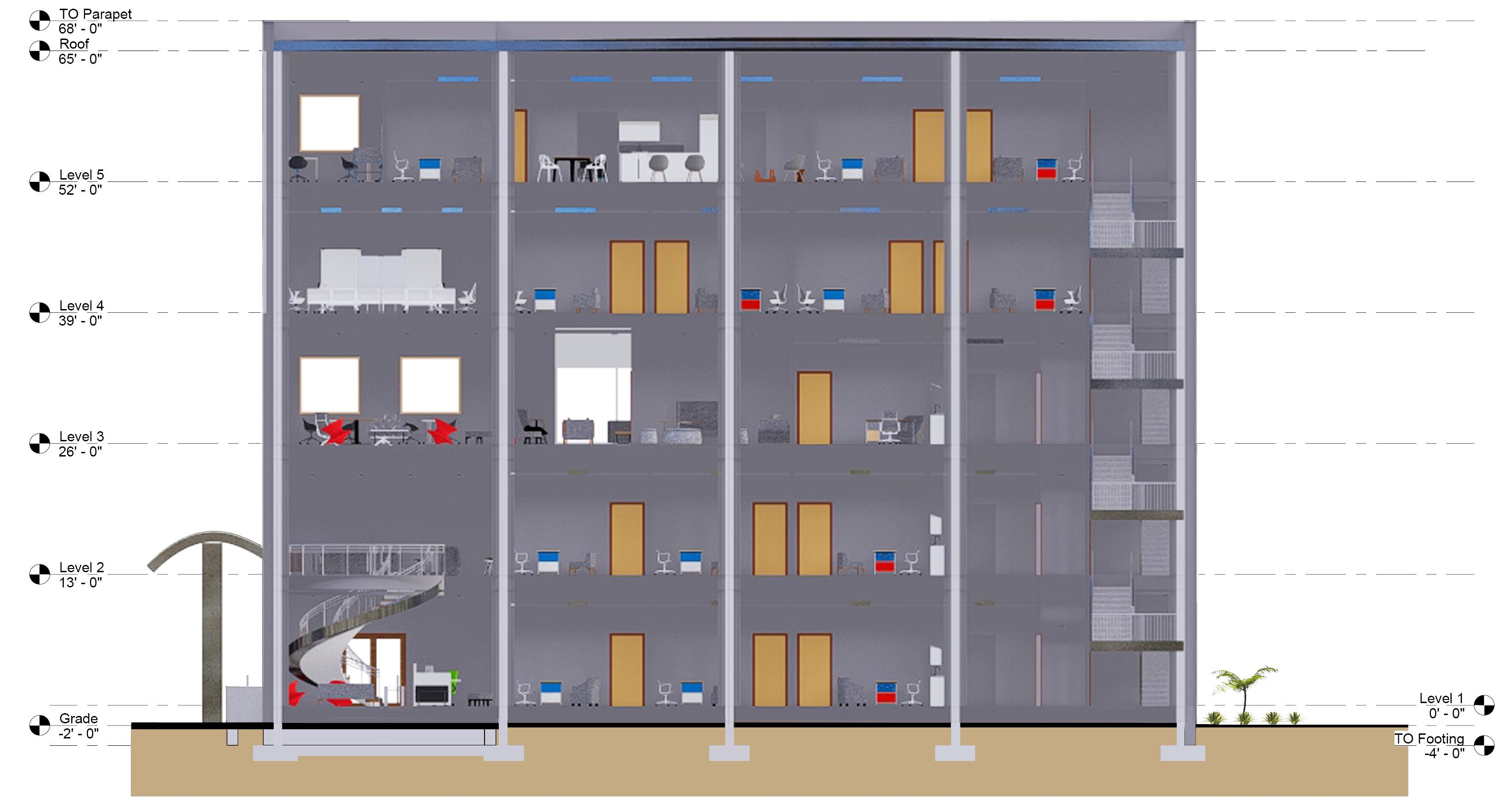
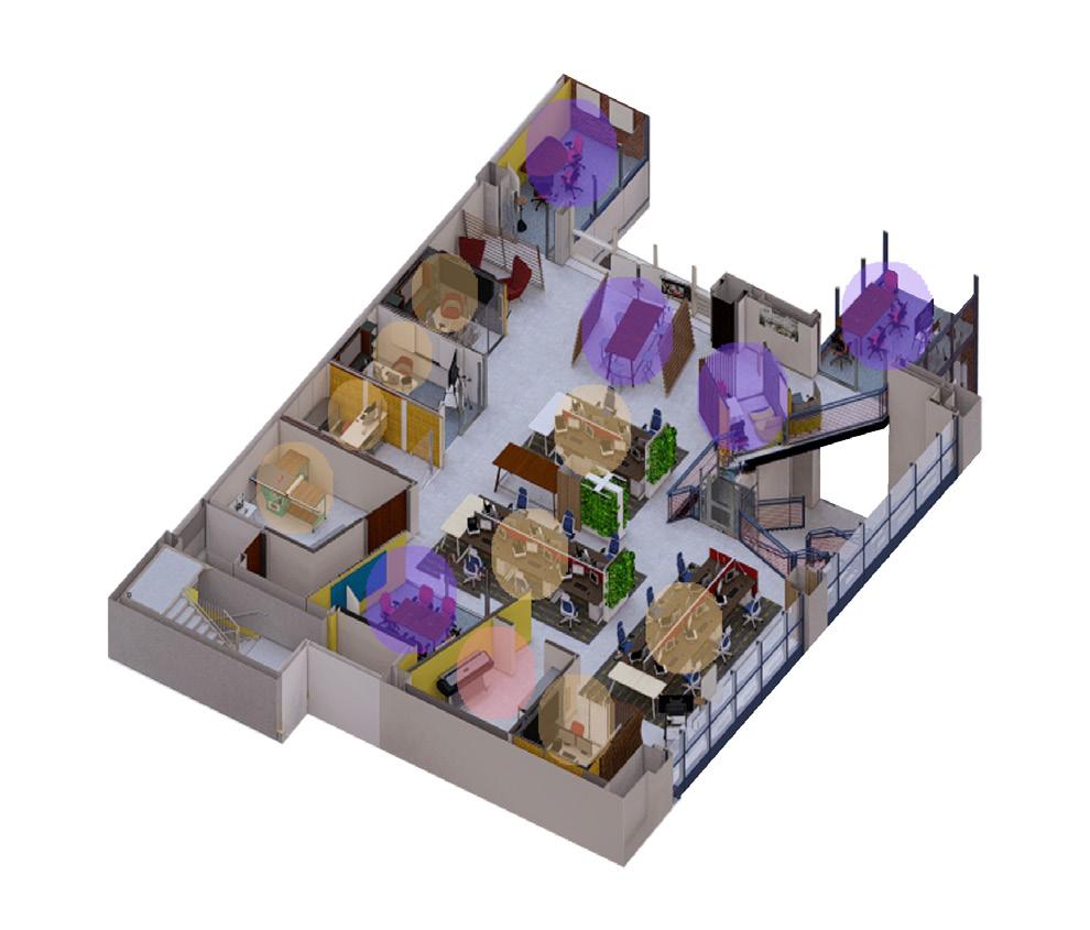
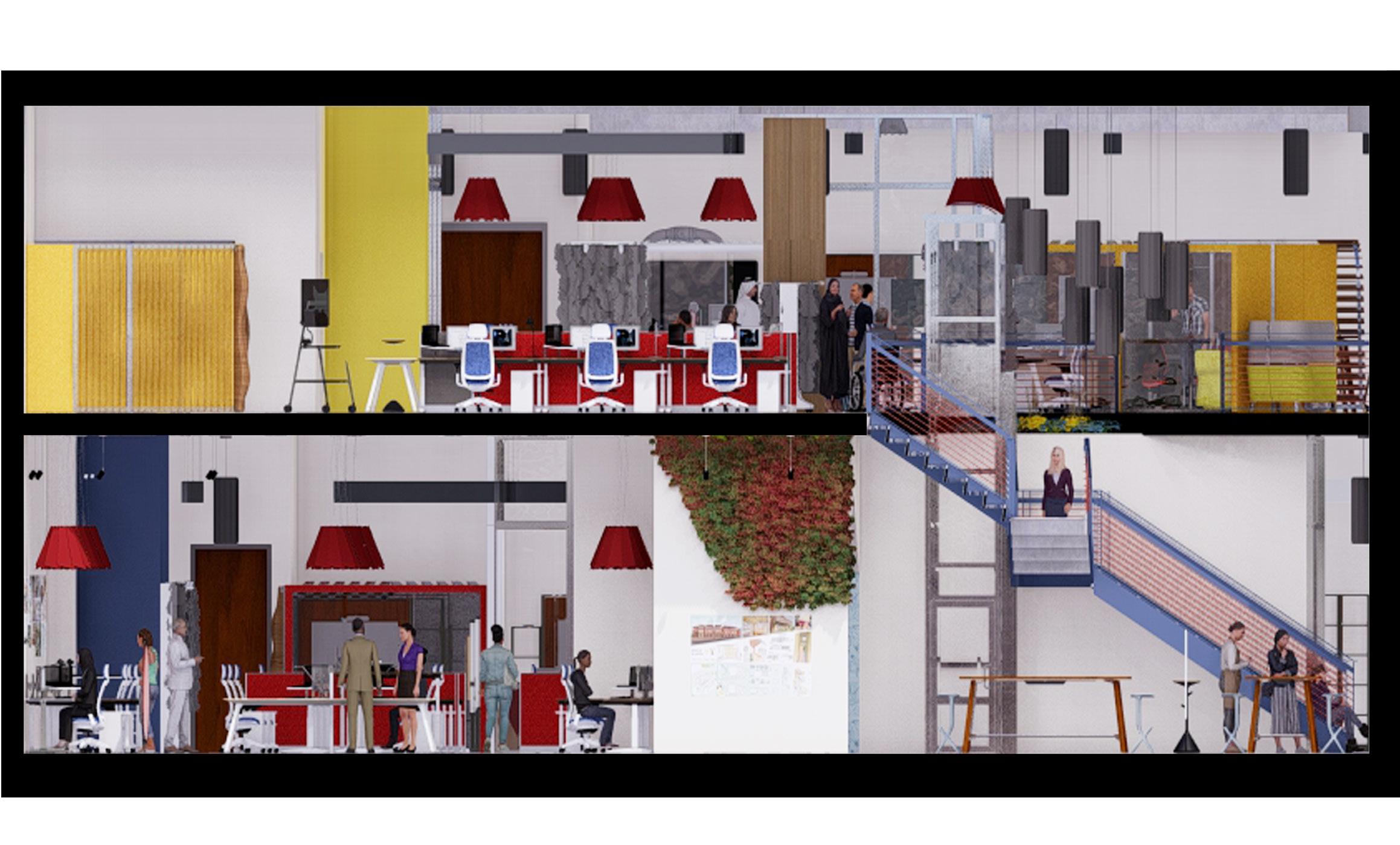
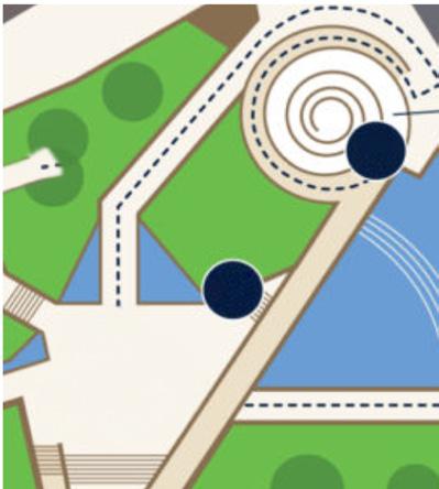
Located in the heart of Wyoming, USA, this project aims to establish a connection between man-made materials and the natural beauty of the surrounding landscape for a private tech company. The office space spans five floors and is designed to support both independent and collaborative work, allowing the company’s work environment to thrive. The stainless steel exterior, inspired by Frank Gehry’s Walt Disney Concert Hall, reflects the landscape from a distance, celebrating the beauty of nature while fostering a connection to it for the occupants. The exterior was precisely designed to prevent issues such as excessive glare, potential temporary blindness, and increased temperatures in certain areas.
Exterior view.
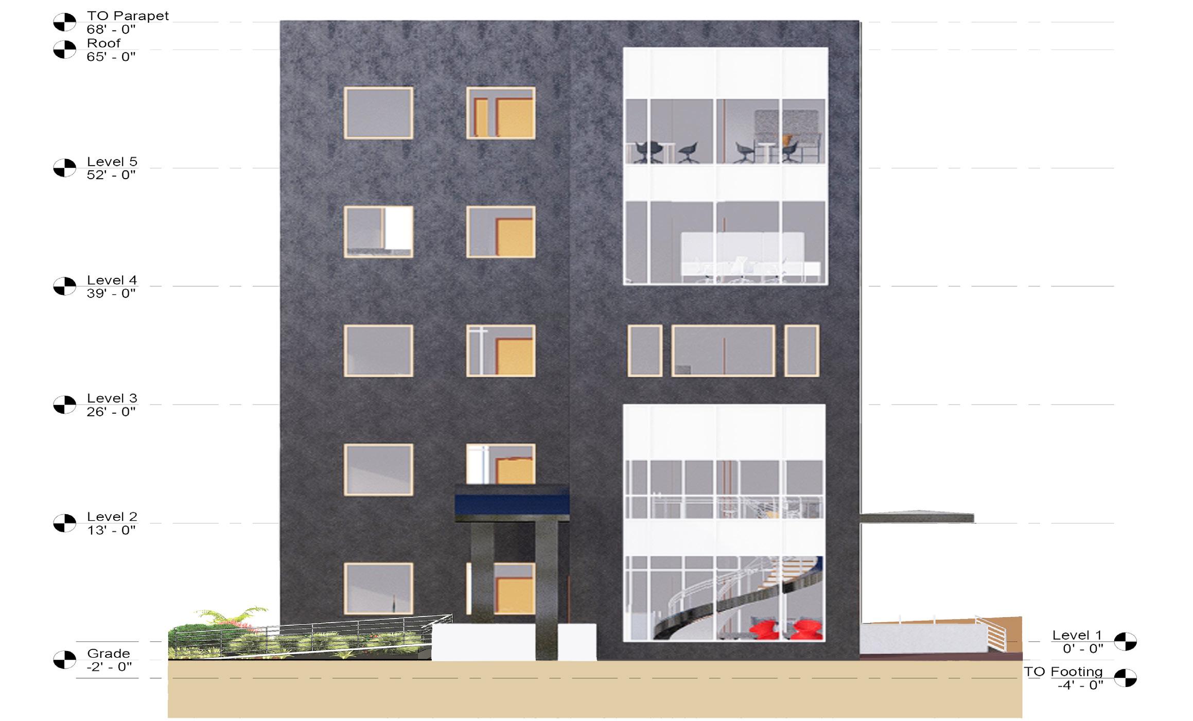
East elevation of
South transverse section of the office.
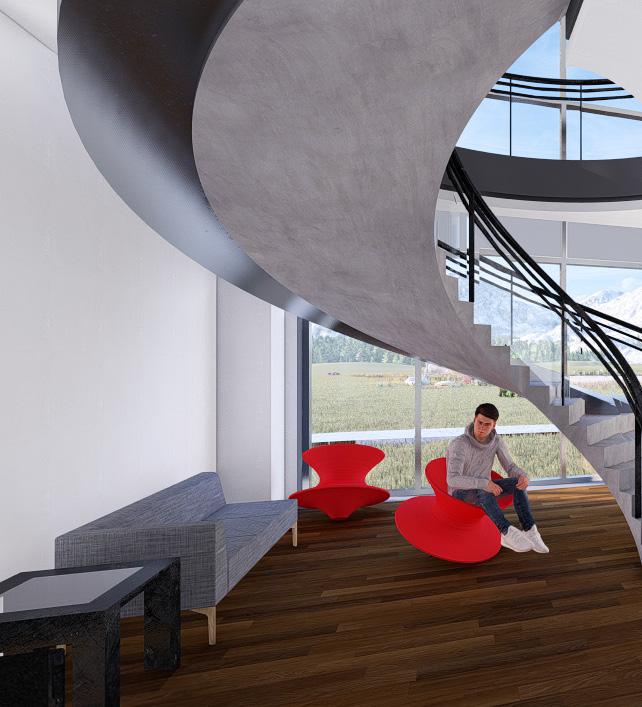
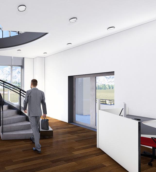
View of the lobby and monumental staircase.
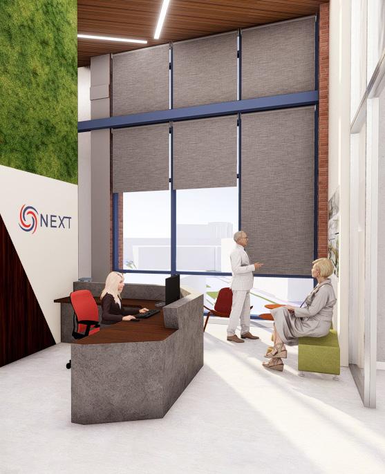
NEXT
Steelcase Competition Entry
Dallas, TX
Instructor: Isabelle Odjaghian
Commercial/Contract Design I Fall 2023
Client: NEXT
Autodesk Revit, SketchUp, Lumion, Photoshop
NEXT is a forward-thinking global architecture and design firm with 3,000 professionals collaborating across 27 offices worldwide. The scope of work included planning and designing NEXT’s new office in Dallas, TX, spanning approximately 11,000 square feet, with a mezzanine level ranging from 1,000 to 4,000 square feet.
The proposed design draws inspiration from the Chapel of Thanks-Giving Square, a monumental landmark near the NEXT office in Dallas. Addressing the global challenge of respecting individuals regardless of gender, race, culture, or identity, the design of the NEXT office is deeply rooted in inclusivity. The Chapel of Thanks-Giving, renowned for its spiritual significance as a refuge where people of all backgrounds can express themselves freely and without judgment, serves as a fitting symbol. It inspires a space designed to break down societal barriers and celebrate diversity. As an innovative design firm, NEXT continues to push boundaries and redefine what’s possible in architecture and design.
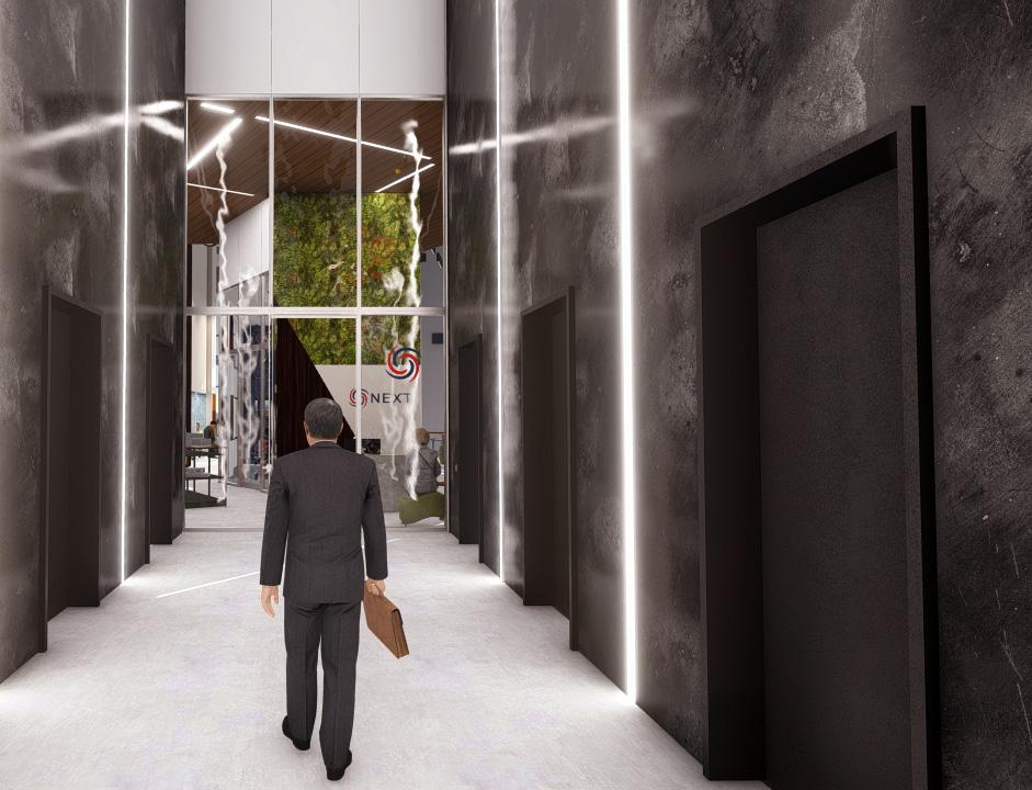
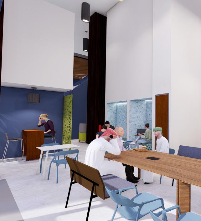
With the lobby featuring 30-foot ceilings, it was essential to incorporate
incorporate signage for wayfinding to assist both occupants and visitors.
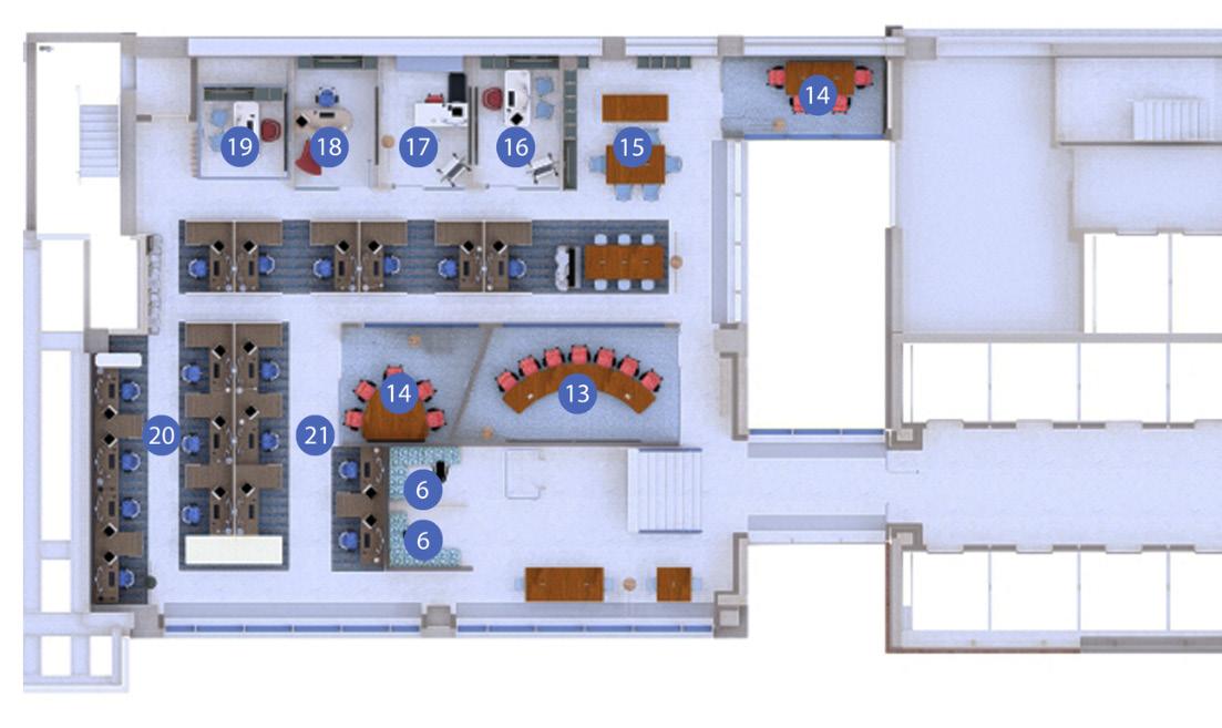
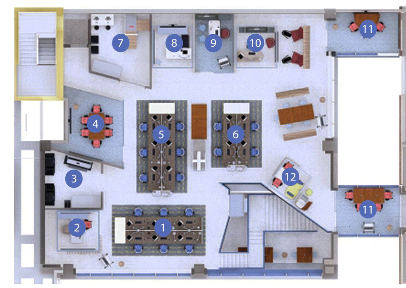
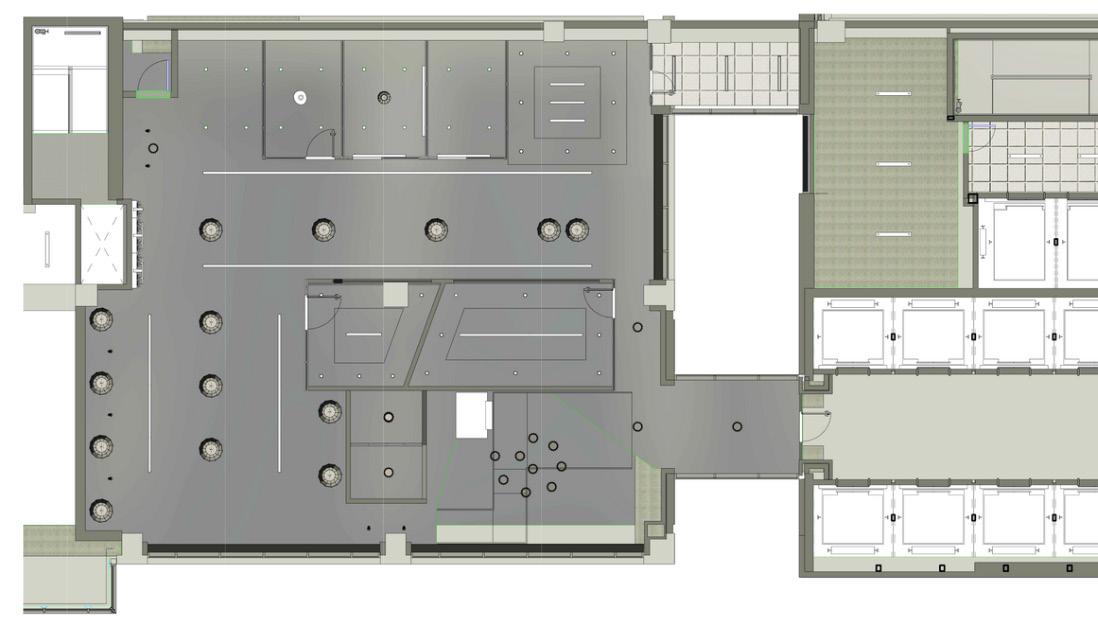
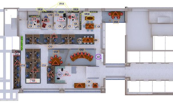
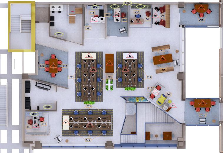
LEVEL 4 FLOOR PLAN
Scale: 1/8” = 1’-0”
1. Education Workstations
2. Managing Director’s Office
3. Resource Center
4. Meeting Room
5. Corporate Workstations
6. Healthcare Workstations
7. Lab Shop
8. Studio Director’s Office
9. Design Director’s Office
10. Studio Director’s Office
11. Huddle Room
12. Small Meeting
RESEARCH
Neurodiversity in the workplace involves fostering an inclusive environment that supports individuals with diverse neurological conditions. Incorporating soft lighting and comfortable seating helps create a calm and soothing work atmosphere. Flexible workstations enable employees to choose setups that align with their unique working styles. A color-coded signage system aids in wayfinding throughout the office, reducing anxiety and promoting a sense of ease for users. Retreat spaces are
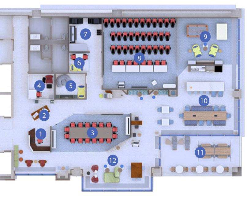
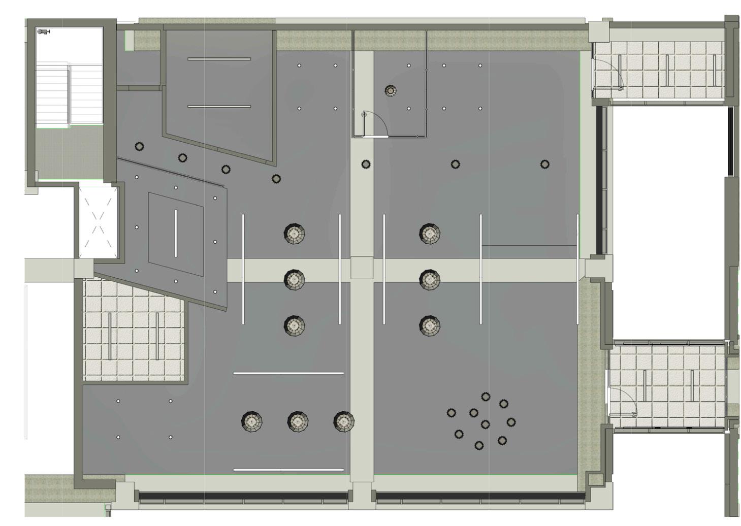
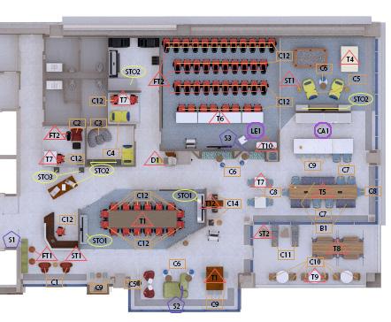
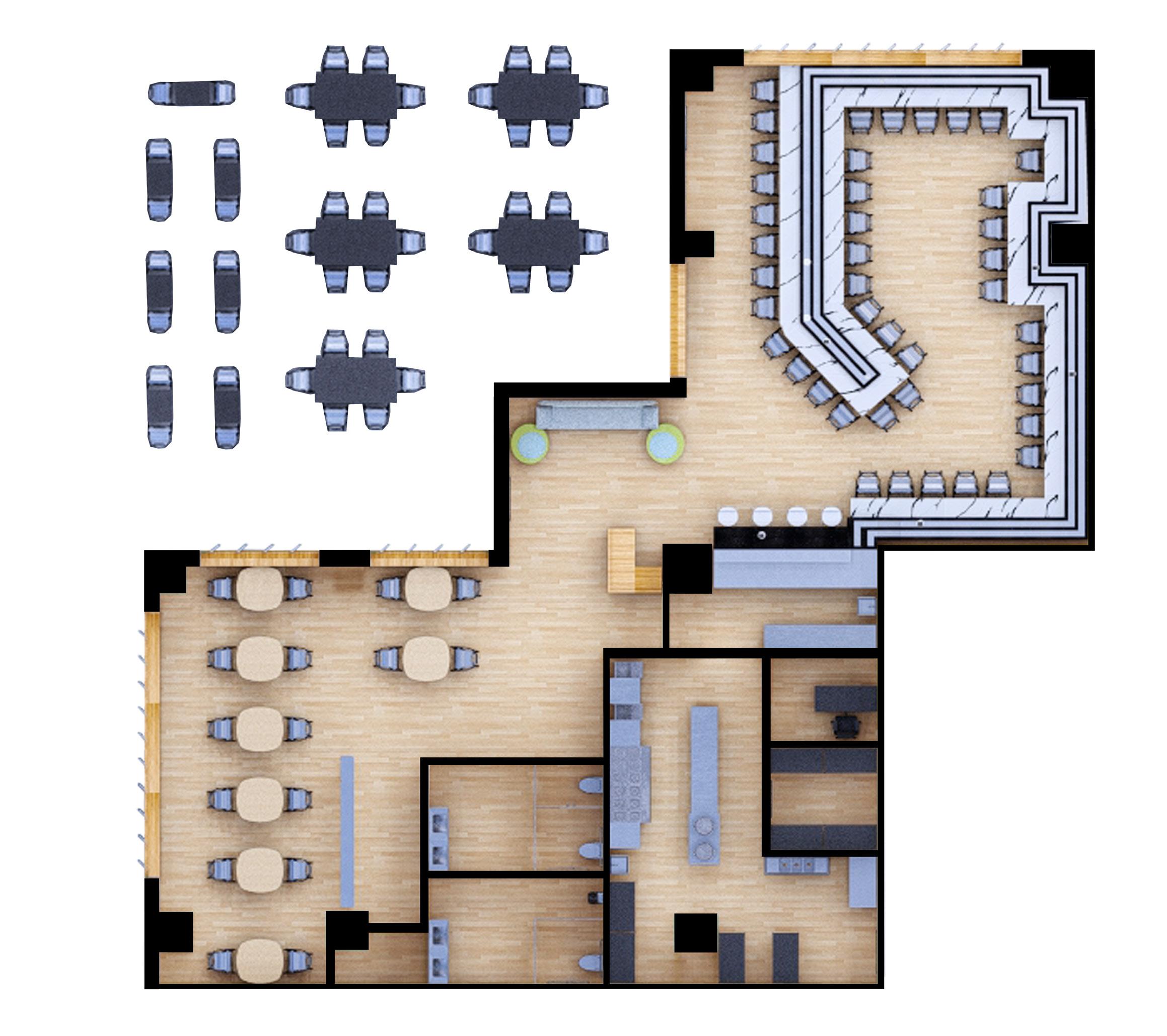
LEVEL 3 FLOOR PLAN
Scale: 1/8” = 1’-0”
1. Reception
2. Pin-Up Space
3. Client Presentation
4. Lactation
5. Wellness Room
6. Small Meeting
7. Resource Center
8. Training Classroom
9. Game Room
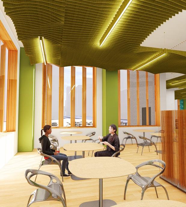
10. Work Cafe
11. Terrace
12. Flex Stations
13. Meeting Room
14. Huddle Room
15. Design Library
16. Design Director’s Office
17. Studio Director’s Office
18. Design Director’s Office
19. Studio Director’s Office
20. Healthcare Workstations
21. Corporate Workstations
thoughtfully designed for employees to take breaks and recharge, offering comfortable seating and a connection to nature.
Ergonomically designed furniture ensures employee well-being and supports a focused work environment. Features such as adjustable chair and desk heights and chairs with proper back support accommodate various needs and enhance comfort.
The Glory Window of the Chapel served as inspiration for both the logo and the color scheme of the office design.
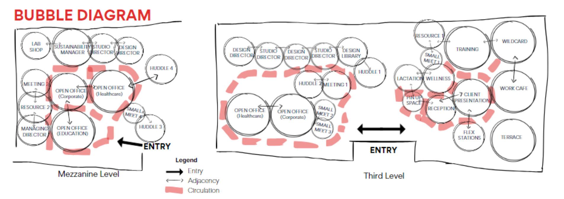
The initial layouts of the previous plans lacked the unique geometric features present in the final layout.
LEVEL 4 RCP
Scale: 1/8” = 1’-0”
All Eureka Lighting fixtures and the majority of the Focal Point fixtures are baffled to enhance acoustic treatment and control in the high-ceiling office space.
In addition to their role in improving acoustics, the Eureka Mute and Mill fixtures are designed in a spiral shape, creatively incorporating the NEXT logo.
Level 3 reflected ceiling plan.
DIVISION OF SPACE Collaboration Learning Retreat Focus
LEVEL 3 RCP
Scale: 1/8” = 1’-0”
LEGEND
Focal Point
Seem 1 Wall-to-Ceiling
Focal Point AirCore Blade
Focal Point Seem 1 Acoustic Direct/ Indirect
Eureka Lighting Mute
Focal Point Mora Build Wave
Social
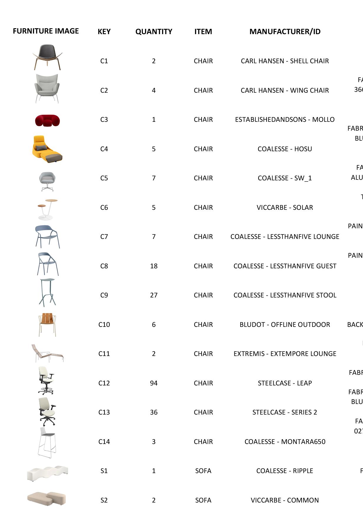
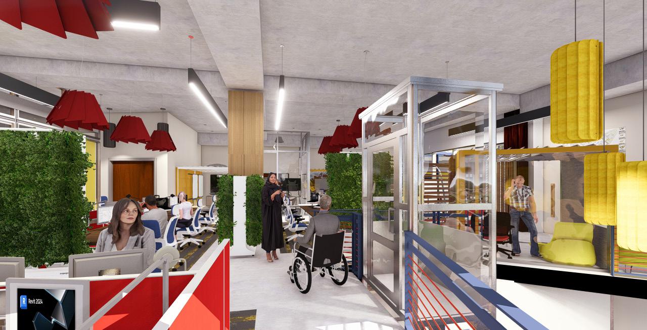
FURNITURE SCHEDULE
Chairs, Stools Desks, Tables
Storage Systems Benches Cabinets, Lockers, Podium
All furniture selections feature fabrics and finishes with recyclable content, highlighting the project’s commitment to a green design approach.
The extensive selection of ergonomic furniture systems provides occupants with a variety of accommodations for different needs, including focused work, lounging, and retreat spaces.
The small meeting pod on the edge of the mezzanine allows a creative way for occupants and visitors to enjoy the view and the use of a high-ceiling space.
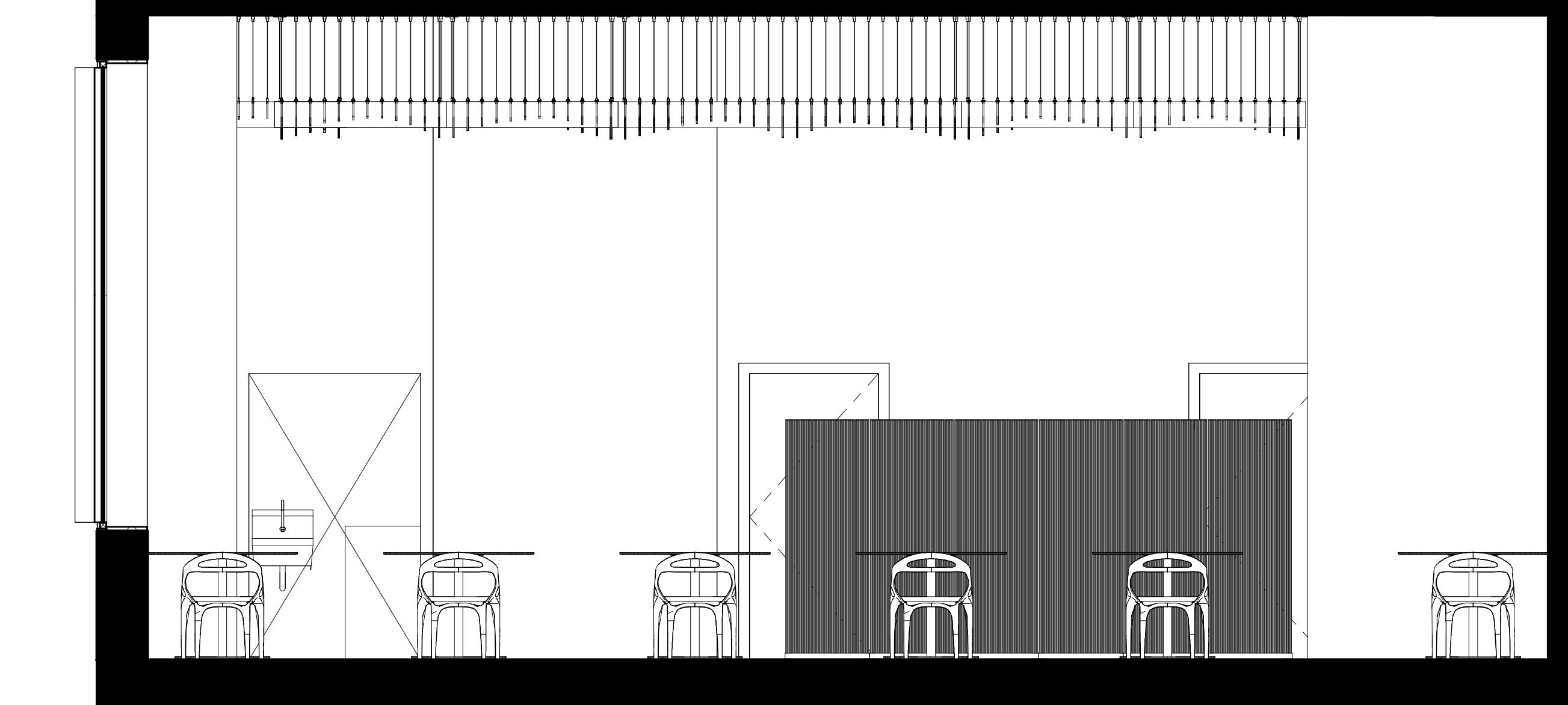
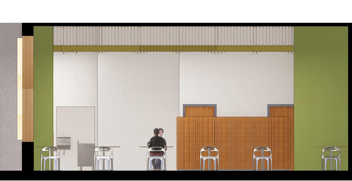
West section cut of the office.
The reception area is designed to make a lasting first impression. Workers and visitors are welcomed by the warmest face in the office, reflecting the vibrant atmosphere at NEXT.
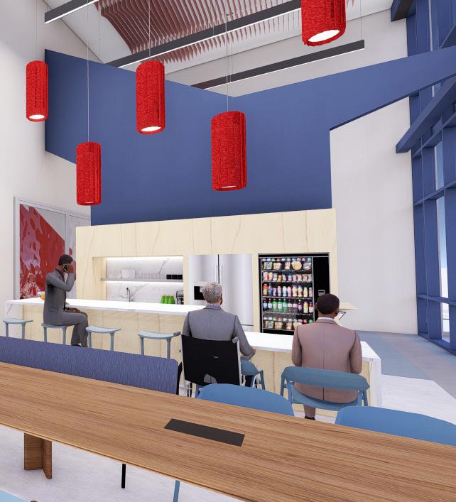
The work cafe and game room are both separated from the workspaces to provide a quiet environment for those who cannot function with loud noise. The wall separating the cafe and
game room draws inspiration from the shape of the trail at the park that leads to the chapel.
PADDINGTON’S TOY SHOP
A Colorful Spin on Toyshops
Raleigh, NC
Instructor: Andrea Bachi
Capstone/Interior Design
Spring 2024
Client: Paddington’s Toy Shop
Autodesk Revit, SketchUp, Lumion, Photoshop
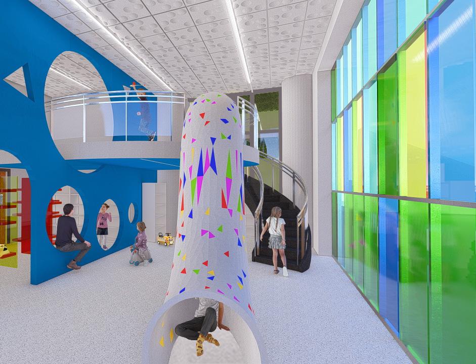
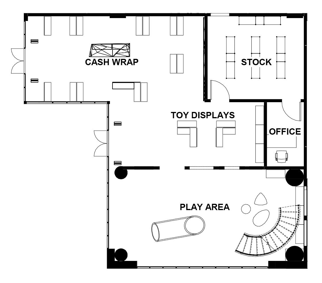
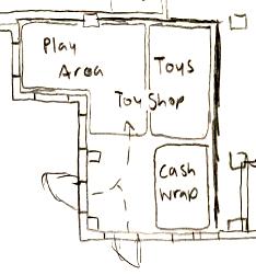
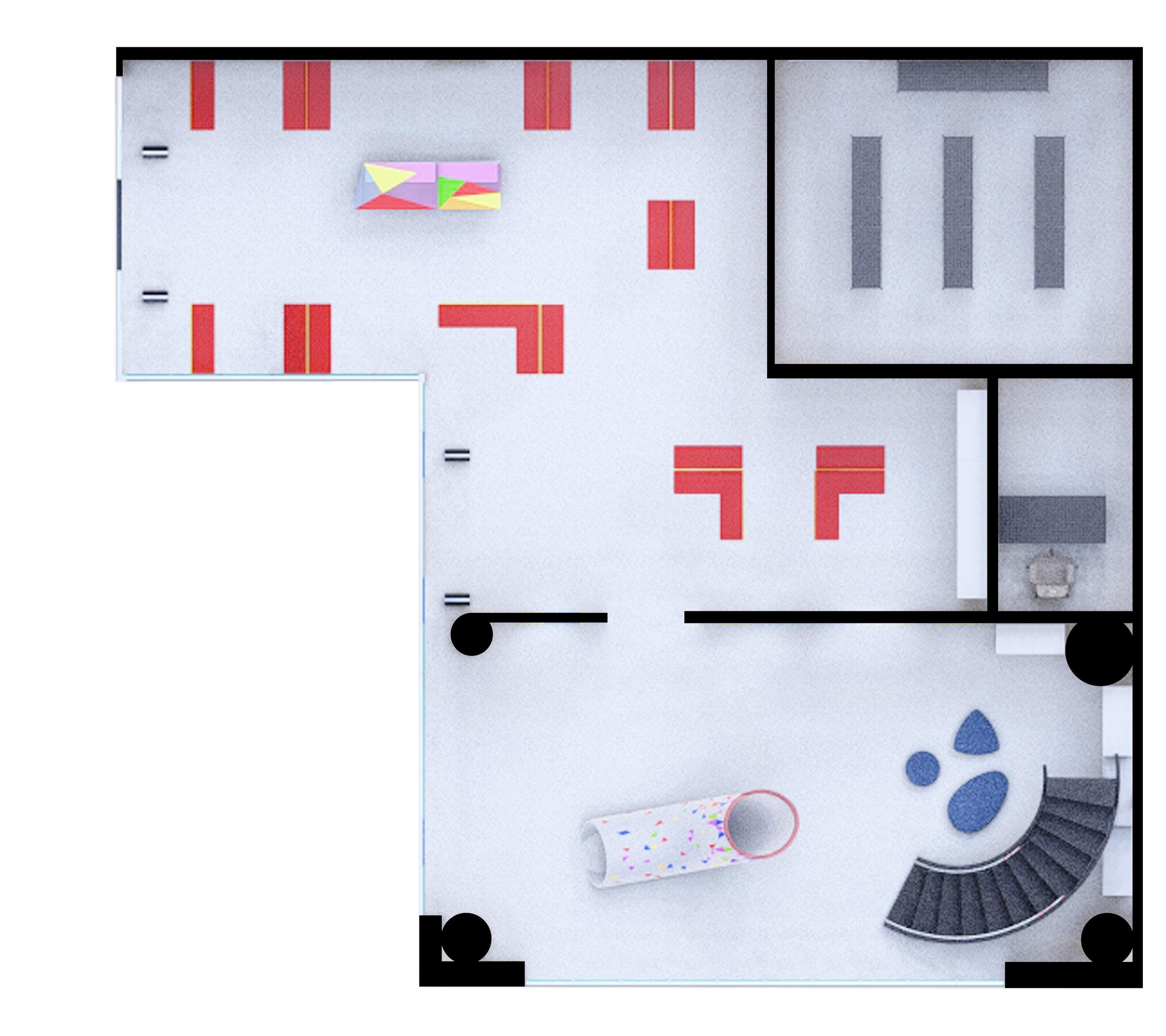
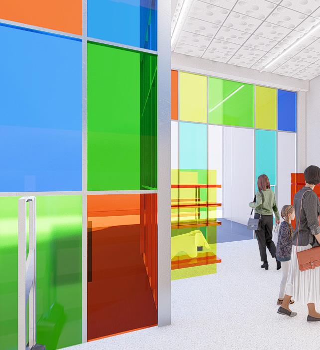
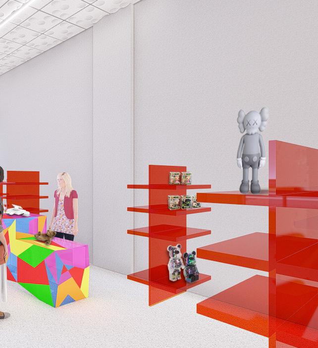
Paddington’s is a high-end toy shop specializing in toys, games, dolls, and accessories for kids and teens. This proposal aims to create a fun and joyful experience through vibrant colors, unique items, and interactive elements, offering a diverse selection of toys to cater to all interests. The design layout is designed to provide an unforgettable experience that encourages clients to return.
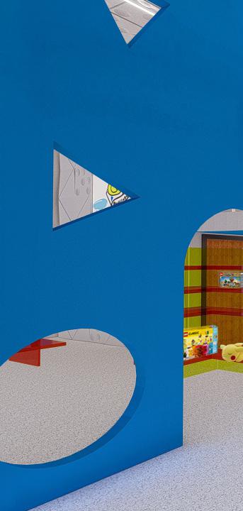
Inspired by the vibrant patterns of a kaleidoscope, the design concept appeals to the current generation of kids and teens, who are attracted by technology, lights, and bold colors. This theme integrates these elements to resonate with all age groups. Geometry is used to establish interactive features for children, while colored glazing draws clients into the store and guides them toward the toy displays. Color theory enhances the overall user experience: blue energizes occupants while helping to cool them down after active play in the play area, orange creates an energetic and inviting atmosphere, and red, most importantly, stimulates spending.
A view of the play area showcases the interactive partition, which serves
serves as a playful touch for kids and as a spot for parents to settle down, watch their children, or take a break.
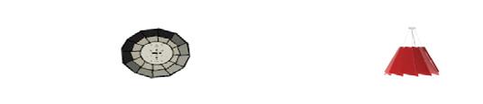
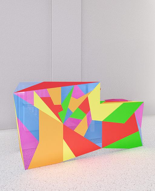
The proposed layout of the toy shop.
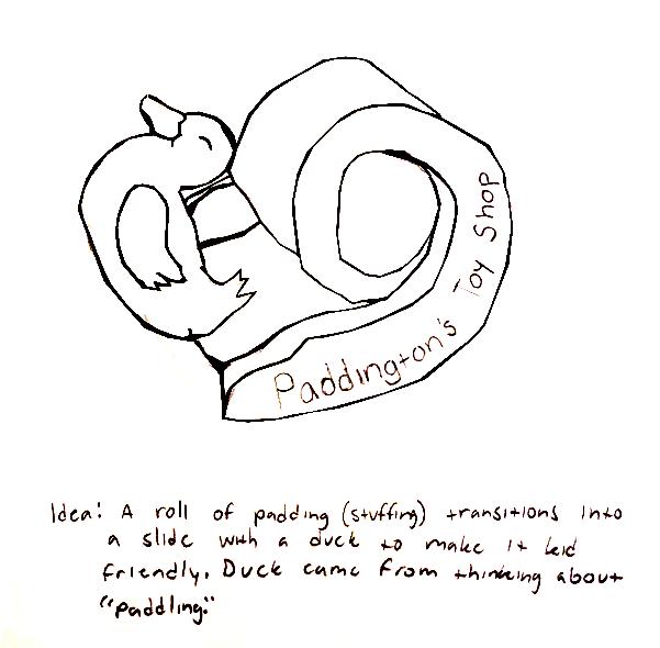
Block diagram of an initial layout that later changed due to circulation issues around the store. Sketch and thought process behind Paddington’s logo. Kaleidoscope inspiration image.
The proposed layout focuses on functionality and sound management. The cash wrap provides a clear view of both entrances to address theft concerns, while the play area is situated away from merchandise but remains within visual sight. The toy displays, inspired by the kaleidoscope concept, are strategically designed for theft prevention with transparency. These displays are distinguished by colors and are separated based on different age groups, catering to children from 1 to 18 years old.
The play area features a mezzanine, which creates a unique element and encourages kids and parents to stay in the store longer. The blue color on the partition helps keep the room and its occupants cool by lowering blood temperature, which is essential in a space where kids are active. The ceiling tiles provide a unique visual feature and help absorb sound, which is important because the playroom is surrounded by glazing.
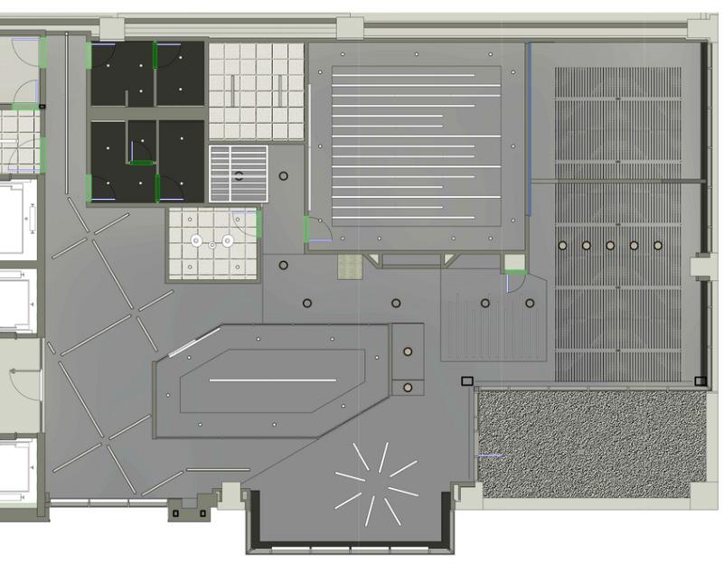
Rendered floor plan of the toy shop.
STOCK
OFFICE
PLAY AREA
TOY DISPLAYS
CASH WRAP
- 3 7/16"
- 8 9/16" 1/2" = 1'-0" 1 Front of Retail Cashwrap
Elevation of the front of the cash wrap.
Elevation of the back of the cash wrap.
Back of Retail Cashwrap
View of the cash wrap and the front shopping area.
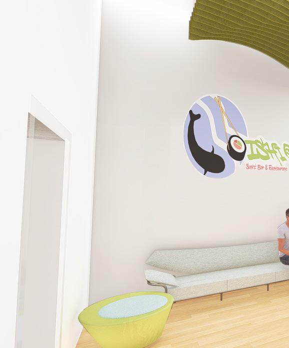
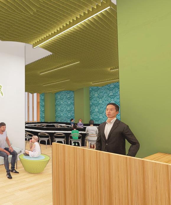
OISHI
Organic Forms and Sushi
Raleigh, NC
Instructor: Andrea Bachi
Capstone/Interior Design
Spring 2024
Client: Oishi
Autodesk Revit, SketchUp, Lumion, Photoshop
Oishi is a quick-service restaurant designed to serve the residents and occupants of Two Hannover Square, as it is located on the main level, as well as the community of Raleigh. The restaurant aims to create a hip, trendy, and modern atmosphere that is also fun, bright, and full of energy.
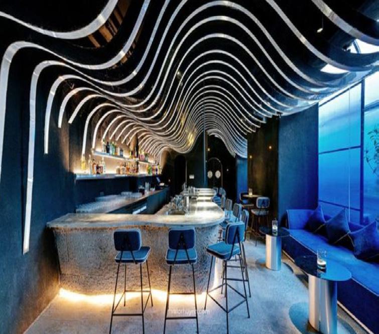
Inspired by an image provided by the client that highlights the natural beauty of Mother Nature, featuring topography curves, grade changes, and bodies of water, the design approach reflects these themes. Curvilinear geometry is used to mimic the contours of topography, while textured accent walls resemble fish scales, aligning with the association to sushi.
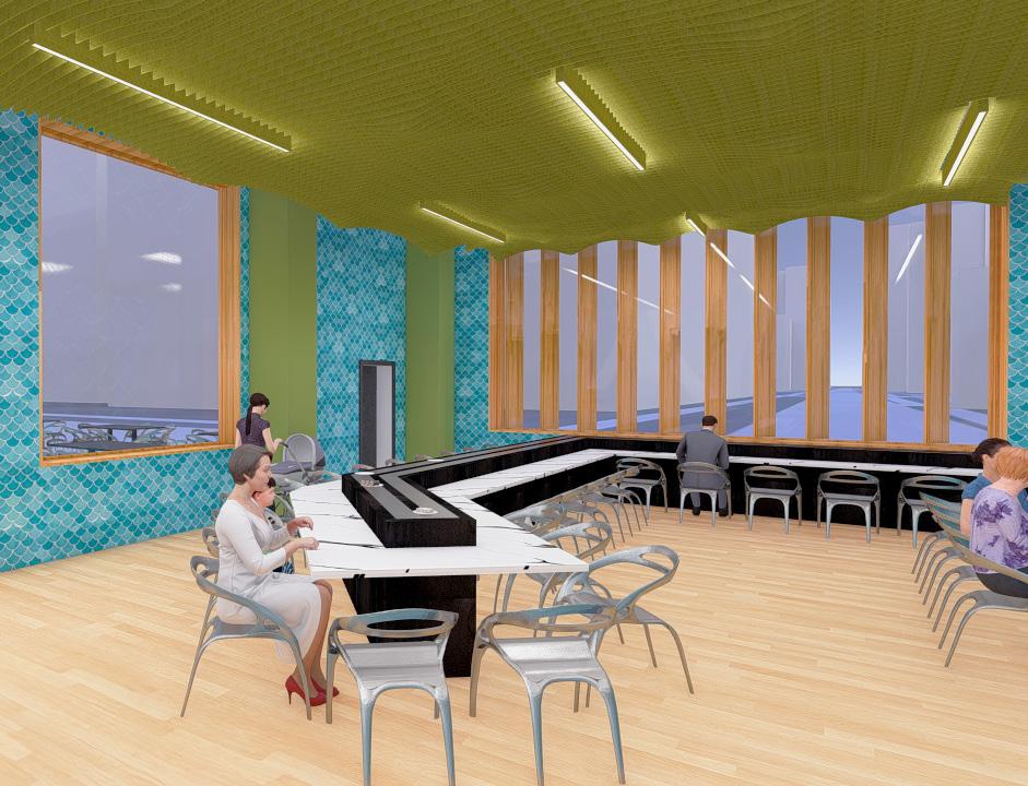
View of the conveyor belt-style dining area of the restaurant.
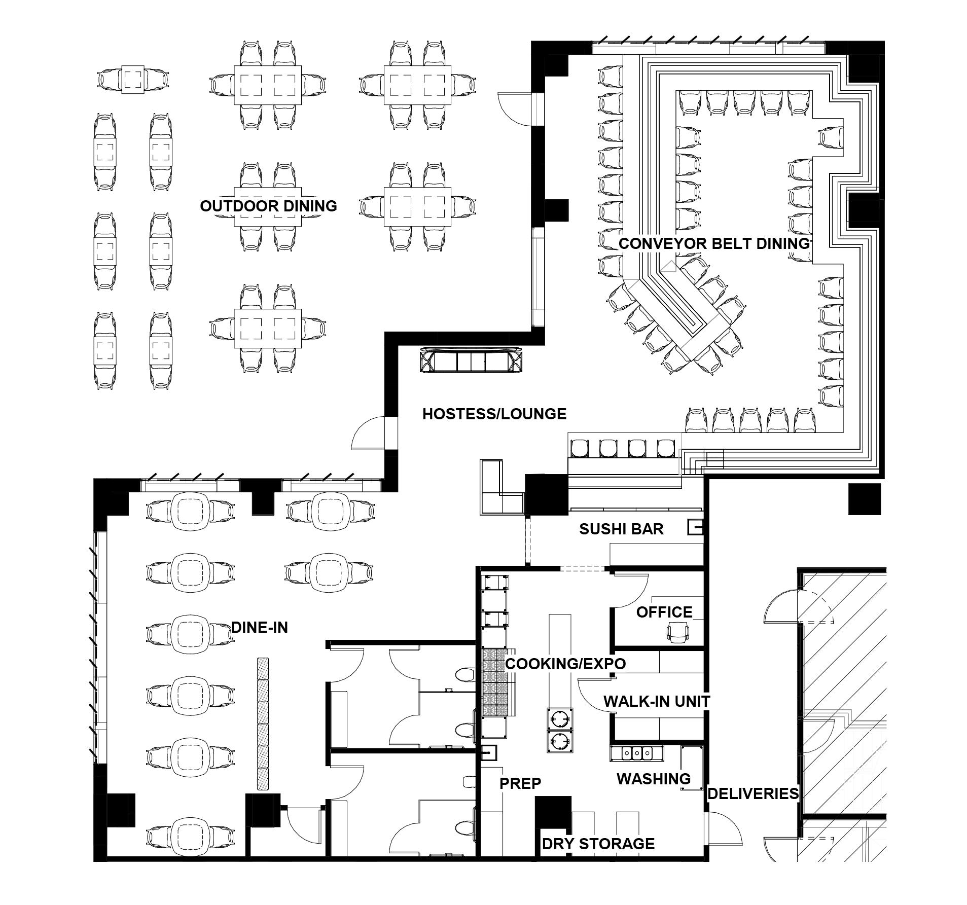
The proposed layout of the restaurant.
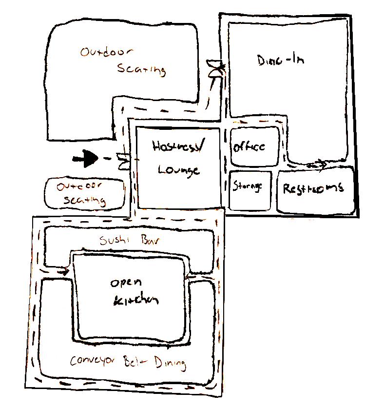
The previous block diagram showed circulation, but the layout was later adjusted due to concerns about compliance with ADA standards. Client’s inspiration image.
Inspiration image for curvilinear forms throughout the restaurant.
OUTDOOR/DINING
The final proposal for the restaurant accommodates both quick-service and dine-in experiences. While local sushi restaurants in the Raleigh area are typically warm and inviting, the client’s inspiration image emphasized a hip and modern aesthetic, requiring a fresh approach that still resonates with the local vibe. The layout features a conveyor belt integrated along the wall. The angle of the belt optimizes seating capacity and improves circulation, ensuring smooth movement for customers leaving on the conveyor belt side and those accessing the restrooms. The dine-in section features seating designed to encourage quick turnover, as the client emphasized the need for a quick-service
CONVEYOR BELT DINING
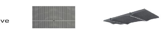
restaurant. The use of bamboo adds a creative and effective touch, with stick dividers providing privacy for guests entering and exiting the restroom. The louvers were strategically placed, as the restaurant is located on the south side of Two Hannover Square. During development, the orientation of the sun was considered, and it was determined that the afternoon sun would be strong and direct. The louvers, set at a 60-degree angle, help mitigate this intense sunlight, ensuring a comfortable space while also serving as a unique feature for the restaurant.
Rendered floor plan of the restaurant.
SUSHI BAR
Section cut of the dine in area.
Rendered section cut of the dine in area.
View of the dine in side of the restaurant with an emphasis on the bamboo louvers showing their impact with the sun orientation, as that was an issue during the design development stage.
View of the hostess and lounge area. The two Leland Pluto ottomans are creatively designed to mimic a sushi roll.
SUSTAINABLE DEVELOPMENT PROPOSAL
Affordable Housing and a Green Approach for the Community Raleigh, NC
Instructor: Jess Anastes Green Bldg & Design Concepts Spring 2024
Client: East College Park
Autodesk AutoCAD, SketchUp, Lumion, Photoshop
East College Park, located in Raleigh, NC, is a neighborhood situated right off New Bern Ave. New Bern Ave is known for housing low-income residents, but in recent years, the establishment of more high-priced homes has driven up rents, forcing many out of the neighborhood. Although new builds in the area are often marketed as affordable, they are frequently beyond the reach of these low-income residents.
The goal of the mixed-use development portion of this project is to improve the current layout of the neighborhood, making businesses and essential services more accessible for residents. It emphasizes green design and, more importantly, aims to prevent gentrification by proposing a neighborhood that allows these residents to live comfortably and feel valued. The proposal seeks LEED Platinum certification, which will be achieved by reducing the parking footprint, incorporating electric vehicle charging stations to lower CO2 emissions, and using permeable paving to manage rainwater and enhance water quality. Commercial tenants will utilize dual-flush toilets, and compact building models will further support sustainability.
Exterior view of the proposed mixed-use mass model.
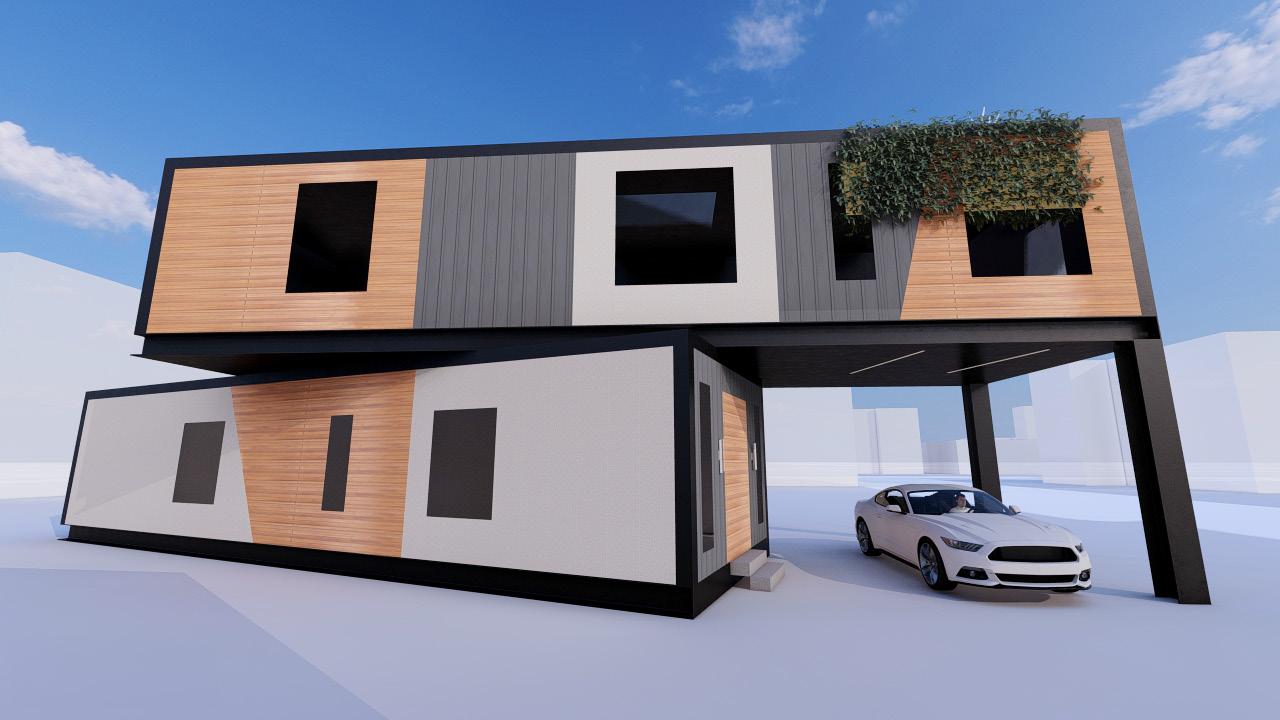
The goal of the residential housing portion of this project is to enhance a current new build in East College Park by focusing on green design while prioritizing the prevention of gentrification through the proposal of an affordable yet luxurious house. The proposal aims to achieve LEED Platinum certification.
This goal will be accomplished through several strategies:
Landscaping: Using drought-tolerant Bermuda grass to reduce irrigation needs.
Exterior Materials: Incorporating sustainable materials like hempcrete and bamboo for exterior siding.
Energy Efficiency: Installing tinted windows to regulate heating and cooling, as well as adding a large skylight on the second floor to maximize daylighting.
Green Roof: Featuring low-maintenance greenery on the roof to reduce summer heat gain; these plants will thrive with minimal intervention.
Indoor Air Quality: Using paints and flooring free of harmful VOCs.
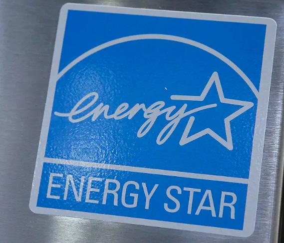
Energy Savings: Installing LED lighting fixtures and Energy Star appliances to reduce energy bills.
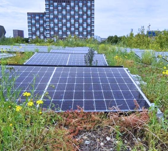
Clean Energy: Equipping the home with photovoltaic panels to convert sunlight into electricity, powering appliances such as the dishwasher and clothes washer.
Recycled Concrete: Utilizing crushed concrete as aggregate for base courses or as backfill around homes.
Insulation: Using natural sheep wool for insulation.
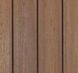
Composite Wood: Employing composite wood for structural elements, decks, benches, trellises, and window and door frames. This material avoids formaldehyde emissions.
Hempcrete: Highlighting hempcrete’s sustainability, as its lime content requires about 80% less energy to calcine compared to traditional concrete.
Crushed concrete.
Energy Star appliances.
Hempcrete texture.
PV panels.
Sheep wool insulation.
Composite wood texture.
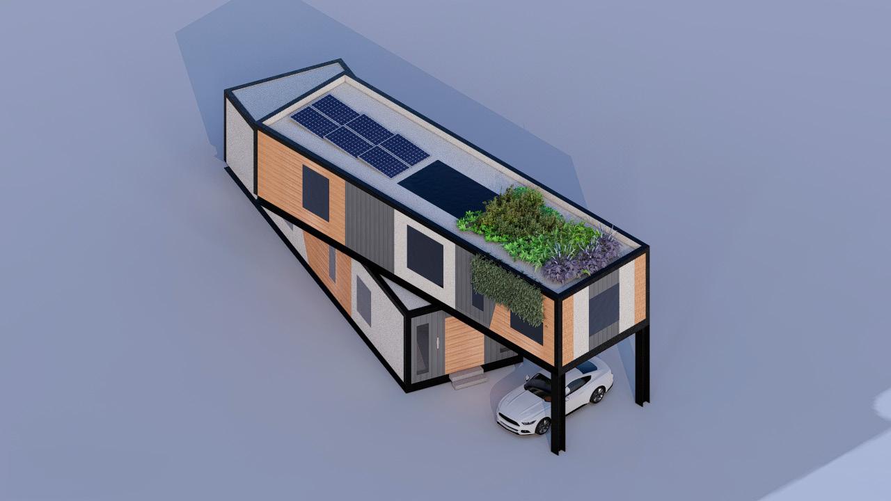
Exterior view of the proposed residential mass model.
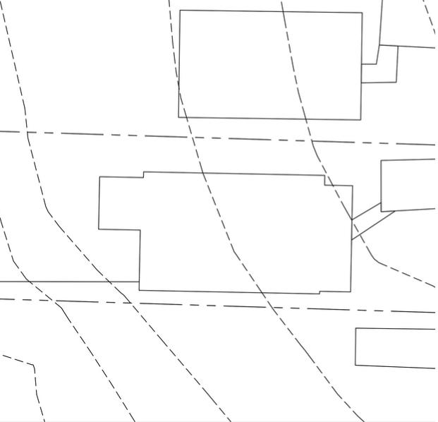
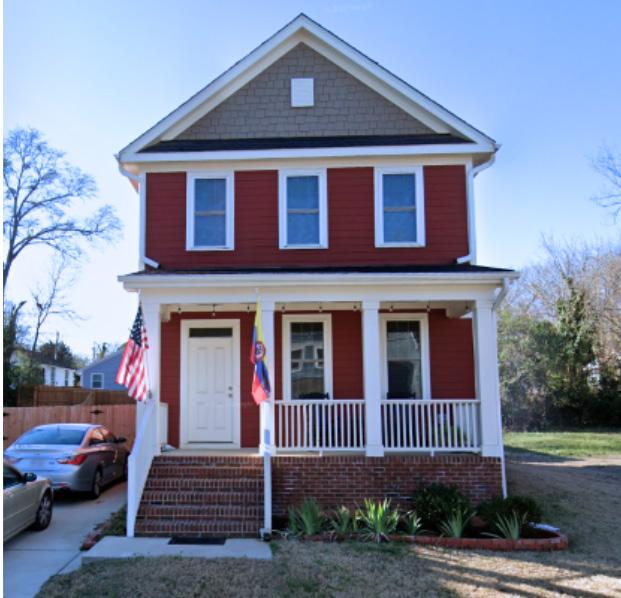
Existing facade and footprint.
Current site with grade changes.
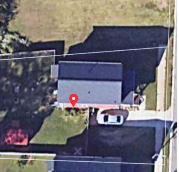
Aerial view of current site.
Exterior view showcasing the use of different materials and tinted windows.
Aerial view of the proposed mass model, showcasing the skylight, photovoltaic panels, and greenroof.
MISCELLANEOUS WORK
Mixed Mediums
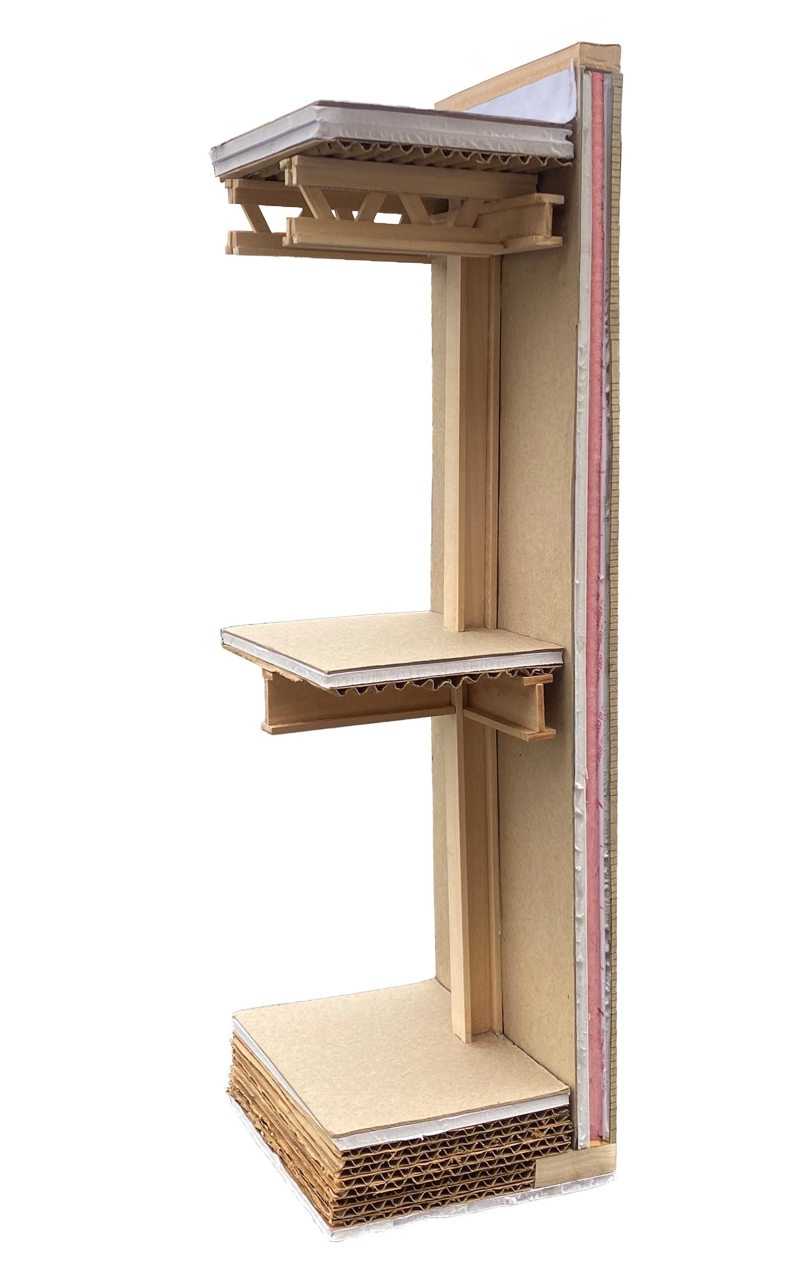
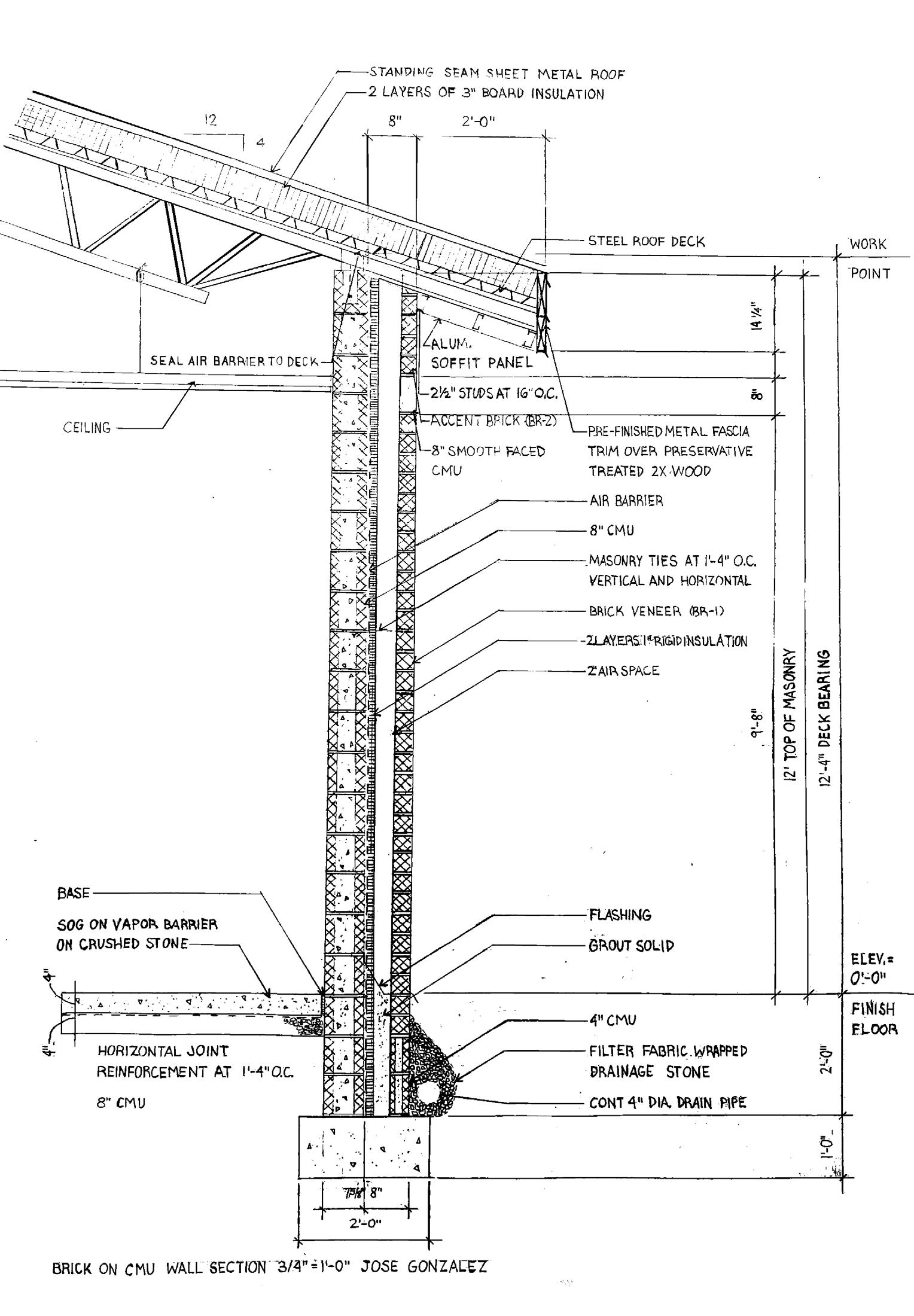
A section of a brick-on-CMU wall from Richland Creek Elementary School by Small Kane Webster Conley Architects, drafted using Autodesk AutoCAD. A chipboard model of the brick-on-CMU wall section.
(From left to right) Brick on CMU. Chipboard model.
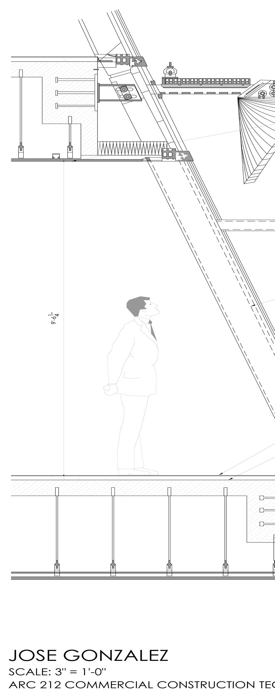
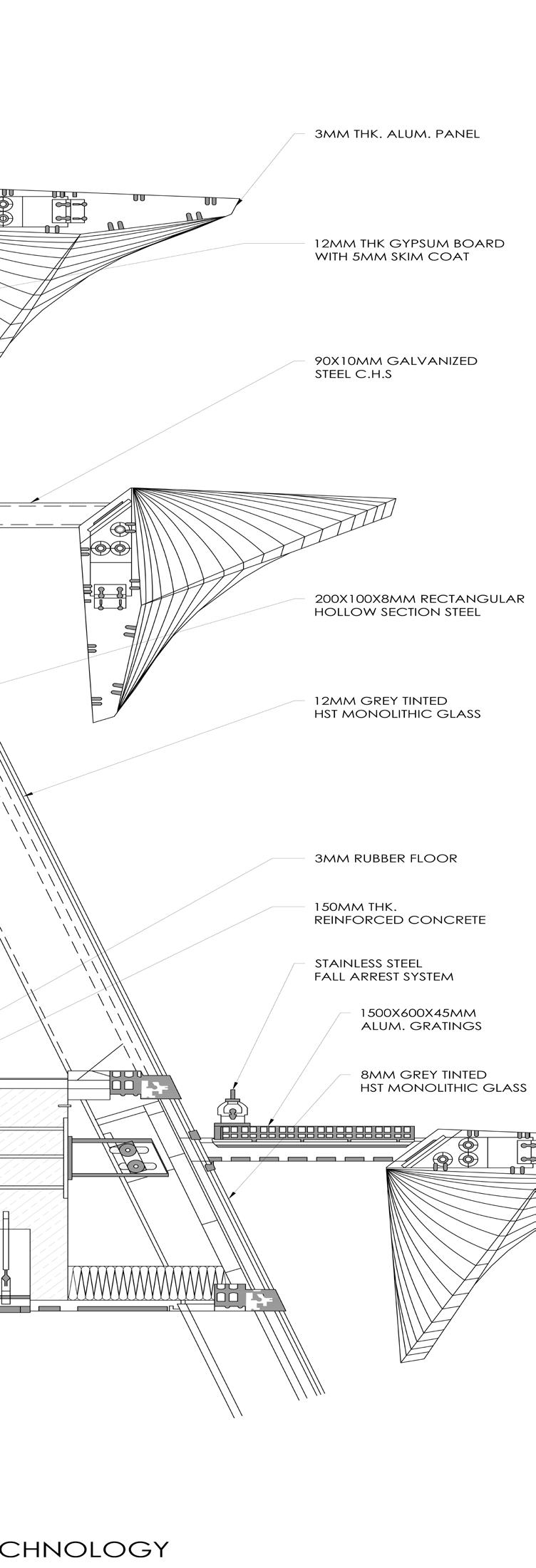
The Jockey Club Innovation Tower by Zaha Hadid Architects was drafted using Autodesk AutoCAD. A brickon-CMU wall section of Richland Creek Elementary School by Small Kane Webster Conley Architects was handdrafted on 11” x 17” paper.
(From left to right) Jockey Club Innovation Tower. Brick on CMU.
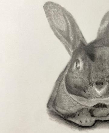
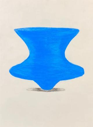
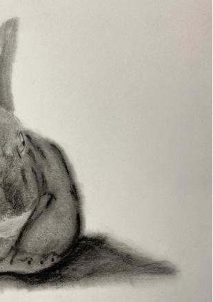
The portrait of my bunny, Saint, was done with graphite pencils on 8.5” x 11” Bristol vellum paper. The hand rendering of the Magis Spun Chair was done with colored pencils on 8.5” x 11” drawing paper. The Highball glass was completed with colored pencils on yellow construction paper.
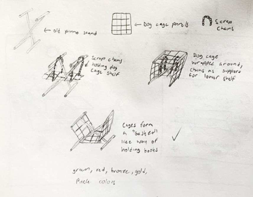
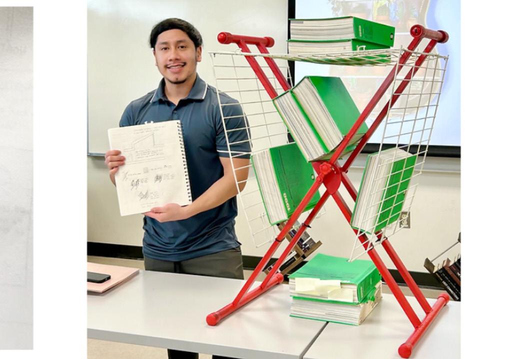
Sketches of a sustainable bookcase featuring 100% recycled materials were created. The final sketch was approved for construction. Materials included an old piano stand, dog cage panels, spray paint, and old zip ties. The picture of myself with the built bookshelf demonstrates its strength in holding heavy books, which was the intended purpose.
(From left to right) A portrait of my bunny, Saint. Magis Spun Chair.