It’s a phrase that we’ve learned from Steve Nudelberg, one of our co-collaborators in creating this year’s color forecast. This concept is something we try to practice every day. We are living in an age when information is coming at us fast and furious, and looking to the horizon, there’s no slowing down anytime soon.
It’s a phrase that we’ve learned from Steve Nudelberg, one of our co-collaborators in creating this year’s color forecast. This concept is something we try to practice every day. We are living in an age when information is coming at us fast and furious, and looking to the horizon, there’s no slowing down anytime soon.
consider what’s in front of you. We don’t take it lightly that you are giving this Gemzine your attention, and we invite you to explore it further. We’ve poured our heart and soul into these pages through a collaborative effort to inspire you. This issue was crafted with intentionality and compassion. Now, on to this year’s theme.
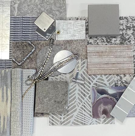
There’s a beautiful tension that exists in this year’s color selections. Think of the sexiness of an unaltered belly laugh or the strengthened relationship that forms on the other side of a respectful yet challenging debate with a loved one. The common thread in this year’s collection of color is a lean toward elements of nature, such as earth, air, and water. You’ll discover an organic balance between our surroundings and the creations of humans on this planet.
consider what’s in front of you. We don’t take it lightly that you are giving this Gemzine your attention, and we invite you to explore it further. We’ve poured our heart and soul into these pages through a collaborative effort to inspire you. This issue was crafted with intentionality and compassion. Now, on to this year’s theme.
It’s a beautiful duality that brings one key word to mind: serendipity.
I hope you enjoy this as much as we did creating it for you.
There’s a beautiful tension that exists in this year’s color selections. Think of the sexiness of an unaltered belly laugh or the strengthened relationship that forms on the other side of a respectful yet challenging debate with a loved one. The common thread in this year’s collection of color is a lean toward elements of nature, such as earth, air, and water. You’ll discover an organic balance between our surroundings and the creations of humans on this planet. It’s a beautiful duality that brings one key word to mind: serendipity.
I hope you enjoy this as much as we did creating it for you.
Living creatively,
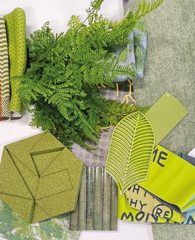
A clear choice to kick off the year, Verdant Voltage and vivid. It brings to mind feelings of prosperity and growth, yet the vibrancy of this particular hue of green is unexpected.
feels natural, fresh,
Fresh
JANUARY
Verdant Voltage
The JTI Gems in our Weekly Task Meeting
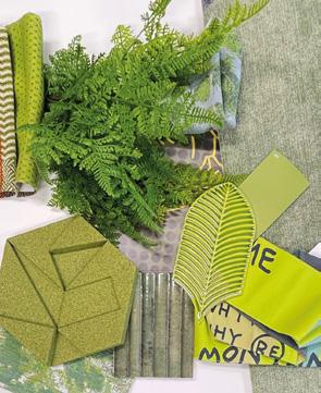
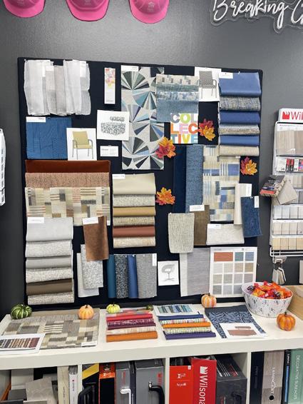
To maintain a balanced look when using bold botanical prints, pair them with plain or subtly textured fabrics and simple furniture to prevent the space from feeling overwhelmed. For a modern aesthetic, try mixing the botanicals with complementary stripes or geometric patterns.
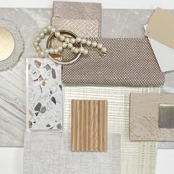
Rich
DESIGN tip
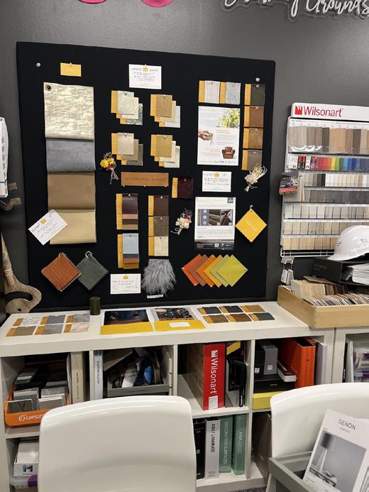
When working with deep, rich hues or dark wood tones, balance them with mid- to light-neutral materials such as creamy marble, textured linens, or soft upholstery. This contrast keeps the space from feeling heavy, allowing warmth and texture to shine and creates a cozy, enveloping atmosphere without losing sophistication.
PANTONE 7533 C
Saddlebridge
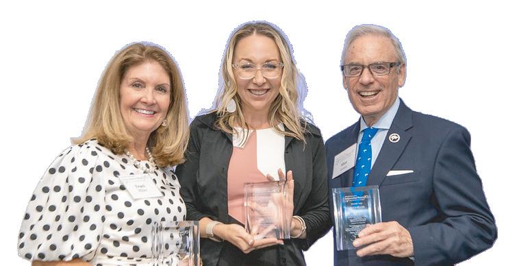
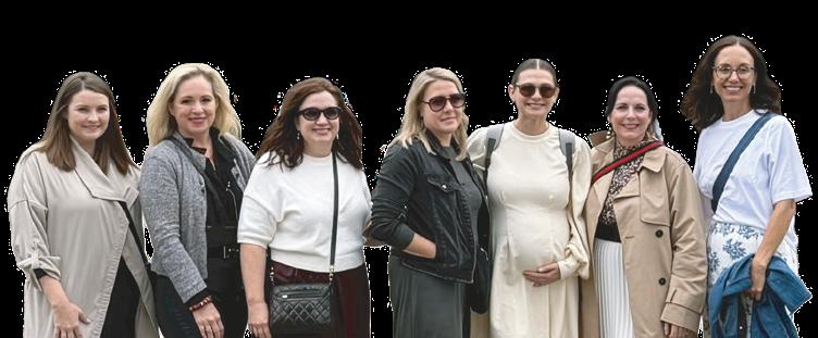
Jaclyn Szerdi Morrison + Joy Lynskey (Owners of JTI) with Ileana Fay and Alexis Fifelski at the ReBuilding Broward Black Dresses and Blueprints Gala, honoring Ileana as a leading Women in Construction
FEBRUARY
Truffle Tone
Maybe it’s the speakeasy craze or the shift away from cooler neutrals toward tones that feel more grounded and warm, but captures that balance perfectly. It’s like a deep conversation with a new friend or a decadent treat at the end of an intimate dining experience. Nostalgic yet celebratory, it invites connection and comfort in equal measure.
MARCH Platinum Pulse
There she is, the hue that speaks to the warped speed that technology seems to be coming at us. It’s the future in a color, decidedly different from the past to this moment. Platinum Pulse precision, offering an element of surprise to anyone who encounters it.
Brittney Ferren, Karissa Stirzl (JTI) with A&D Reps Melissa Villa & Michael Zavala at a JTI Lunch & Learn
Minto Communities
Icy-N-Spicy
When working with bright, playful colors, balance the energy by layering diverse materials and textures. Combine smooth, tactile ones such as ribbed panels or woven textiles. This mix keeps vibrant palettes feeling curated and elevated rather than chaotic.
Playful
Playful
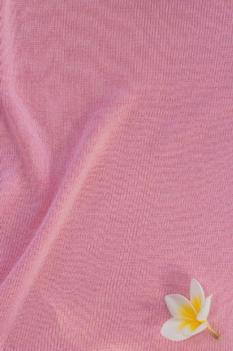
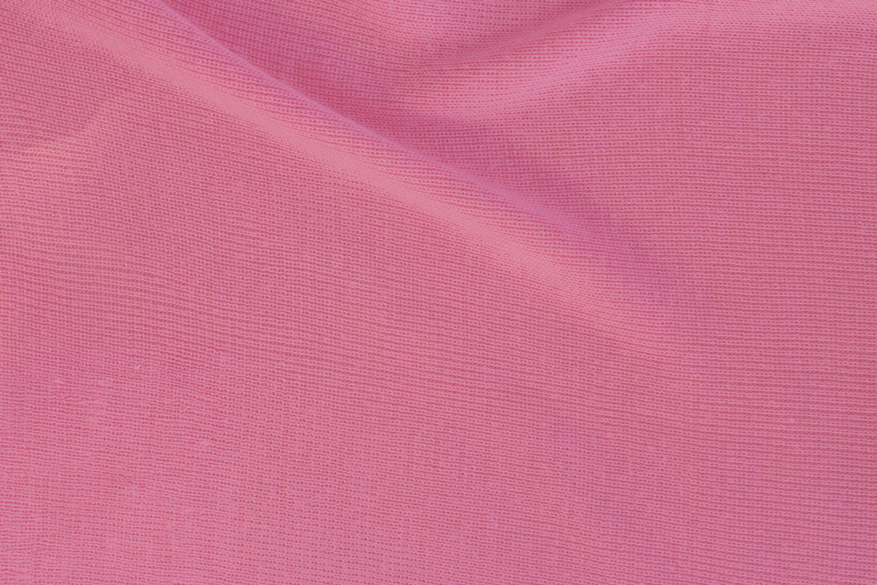
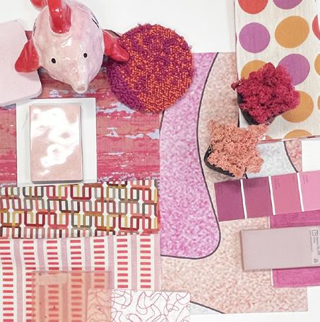
Petal Pop
The playfulness of smile to our faces, as we hope it does for you! It captures the essence of April in a fun way, relying on the solid us, but mixing things up a bit for the newness that Spring brings
APRIL
APRIL
Petal Pop
Petal Pop
Frank (Centuric) & Mili (NSU Levan Center) Peluso, Jaclyn, Joy, Richard, & Andy (JTI) at Junior Achievement's Uncorked Event
Frank (Centuric) & Mili (NSU Levan Center) Peluso, Jalcyn, Joy, Richard, & Andy (JTI) at Junior Achievement's Uncorked Event
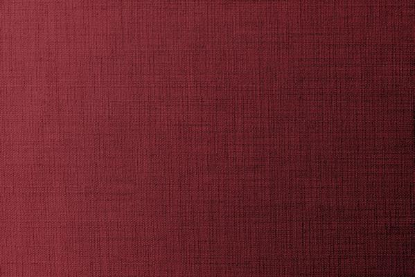
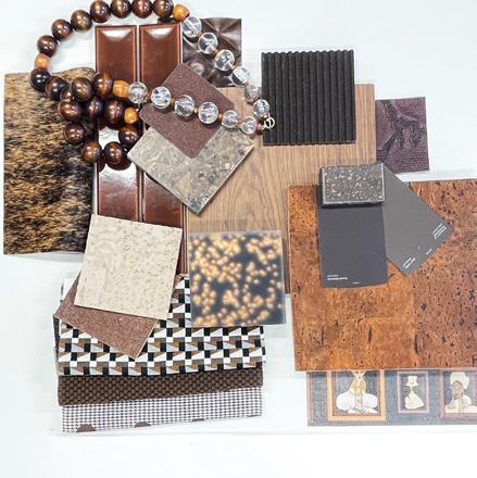
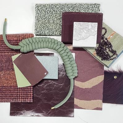
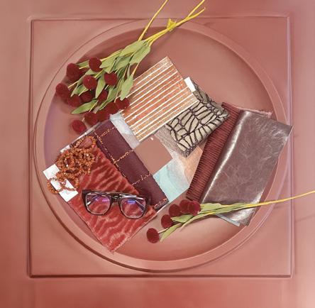
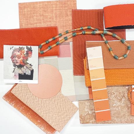
Distinctive
Cabernet Clay is both nomadic and grounded. It’s what I imagine popping amongst the earthy neutral threads in an architectural professor’s tweed suit. The color evokes romance and devotion yet can be used in modern, unexpected ways.
MAY
and Joy (JTI) at the On the Ball. Eat. Drink. Think. Networking Event
Cabernet Clay
David and Kelly Martin, Nick Mau, Marc Nudelberg
DESIGN
tip PANTONE 2042 C
To effectively mix patterns, select 3-5 prints of varying scales and ensure they share at least one common color to create a cohesive look. Balance these patterns by introducing large areas of solid color or natural textures to give the eye a resting spot.
DESIGN tip
You can bring translucency into a space divide rooms and sheer window treatments to diffuse light, both of which maintain an airy feel while providing privacy. In furniture, opt for acrylic or glass pieces to minimize visual clutter and enhance the illusion of spaciousness.
2219 C
Adventure
Adventure
Traci Miller (Miller Construction), Joy (JTI), & Alan Levan (Founder of the NSU Ambassador’s Board) at the NSU Ambassador’s Board Recognition Dinner
Traci Miller (Miller Construction), Joy (JTI), & Alan Levan (Founder of the NSU Ambassador’s Board) at the NSU Ambassador’s Board Recognition Dinner
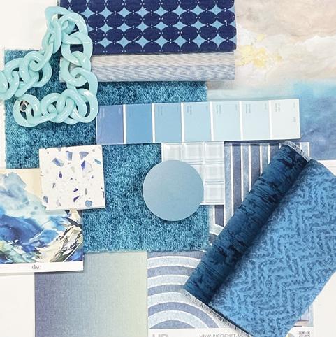
JUNE
Calm Cerulean
JUNE Calm Cerulean
The translucency of June feels ephemeral, much like the vastness of the ocean. It evokes feelings of wanderlust and escapism. Our Calm Cerulean inspires a transformation, if not by place, then by thought, which will inevitably take you to new places.
The translucency of June feels ephemeral, much like the vastness of the ocean. It evokes feelings of wanderlust and escapism.
Our Calm Cerulean inspires a transformation, if not by place, then by thought, which will inevitably take you to new places.
Joy, Latrice Richards, Jaclyn, Pamela Morgan, Dr. Barry Reiman at JTI hosted event “Healing by Design”, to support mental health awareness month
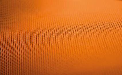
JULY Solar Spritz
Perhaps overstimulating, but refusing to be ignored, our hue for July is Solar Spritz. Its spicy radiance feels daring, bringing to mind days of a wonderfully misspent youth. This color offers vitality, much like a solid shot of Vitamin C. In interiors, it becomes the spark that enlivens a space, adding warmth and personality wherever it lands.
Vitality
Datum
DESIGN tip
To bring a sense of calm to any space, use elements such as carved panels, hand-painted murals, or sculptural greenery introduce nature atmosphere grounded and serene.
Balance
While humble in appearance, Eucalyptus Veil merges the freshness of green with the sophistication of gray. It soothes, providing a gentle embrace to your nervous system. Its quiet elegance allows other hues to take center stage or creates a dependable backdrop when intentionally color-drenching a space.
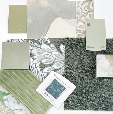
AUGUST
The Gems at our Q2 Quarterly Celebration on Lake June (Suzette,
like a soft breeze, offering an unparalleled sense of serenity to those fortunate enough to experience it. When looking for balance, consider this hue, its quiet space is missing!
like a soft breeze, offering an unparalleled sense of serenity to those fortunate enough to experience it. When looking for balance, consider this hue, its quiet space is missing!
SEPTEMBER
Cashmere Haze
SEPTEMBER
Cashmere Haze
+ her DAC3 counterparts in Bologna, Italy
+ her DAC3 counterparts in Bologna, Italy
Jaclyn
Jaclyn
Neurohealth PANTONE 2310 C
DESIGN tip
Mastering layering requires a neutral foundation, then building depth by mixing textures and varying pattern scales. Focus on layering textiles and decorative vignettes, ensuring all elements share a cohesive color palette to achieve a rich, sophisticated look.
Sophisticated
Sophisticated
DESIGN tip
DESIGN tip
Stone can transform an interior by creating a luxurious focal point, such as a veined slab accent wall or a waterfall kitchen island. To balance its cool, sturdy nature, pair it with warm materials like wood and soft textures like velvet, and use accent lighting to highlight its unique texture.
Stone can transform an by creating a luxurious focal point, such as a veined slab accent wall or a waterfall kitchen island. To balance its cool, sturdy nature, pair with warm materials like wood and soft textures like velvet, and use accent lighting to highlight its unique texture.
Spirited
OCTOBER
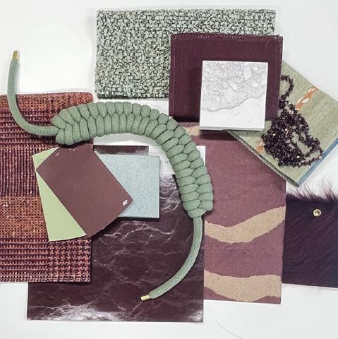
Mulberry Root + Lichen Mist
Perhaps an unlikely combination, but we were drawn to the poised sense of Mulberry Root and the youthful energy of Lichen Mist, especially when paired together. Just a few notches from their quintessential counterparts on the color wheel, this juxtaposition brings effortless distinction to an interior, proving opposites really do attract.
The Gems after Q2 Pow Wow hosted at the Compass showroom in Hollywood
NOVEMBER
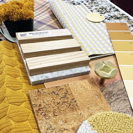
Golden Relic
Abundant and hopeful, our hue for November reinforces a sense of gratitude. It’s a showstopper alone, but can also play a supporting role to contrasting hues. Golden Relic is wistful, reminding us that yes, history inevitably repeats itself, and anything with soul is not lost forever but rather displaced for the time being.
DESIGN tip
To balance leather’s inherent weight, soften main pieces like sofas with plush, layered textiles such as knit throws or velvet pillows, using large area rugs to anchor the room. Pair the leather with complementary materials like wood for a harmonious, organic look or metal and glass for a modern contrast.
Casa Playa
DESIGN tip
When working with deep, dramatic hues like Midnight Muse, balance the intensity such as polished brass, antique gold, or brushed bronze. These subtle metallic accents catch the light, bringing warmth, dimension, and elegance to a richly saturated space.
DECEMBER
DECEMBER
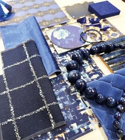
Midnight Muse
Midnight Muse
We’re wrapping up the year with Midnight Muse, a hue that reads ambitious and 2027. Its intensity can’t go unnoticed, striking the perfect balance between boldness and timeless grace.
We’re wrapping up the year with Midnight Muse, a hue that reads ambitious and 2027. Its intensity can’t go unnoticed, striking the perfect balance between boldness and timeless grace.
Joy, Jaclyn, & Alena Capra
Joy, Jaclyn, & Alena Capra
DIAMON
in the Rough
Michelle Larenz-Sans is a dynamic sales leader with a true passion for design and connection. In her role with Wolf-Gordon, she partners with architects and designers to introduce innovative wallcovering and surface solutions that elevate interior spaces in meaningful ways. What sets Michelle apart is not just her product knowledge, but her energy, authenticity, and ability to engage a room, making complex materials feel approachable and inspiring. Her presentation this year did exactly that, leaving a lasting impression and earning her our Diamond in the Rough Award!