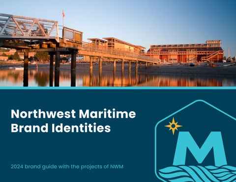
Northwest Maritime Brand Identities
Projects of Northwest Maritime
Introduction
The mission of Northwest Maritime is to engage and educate people of all generations in traditional and contemporary maritime life, in a spirit of adventure and discovery.
Brand Promise
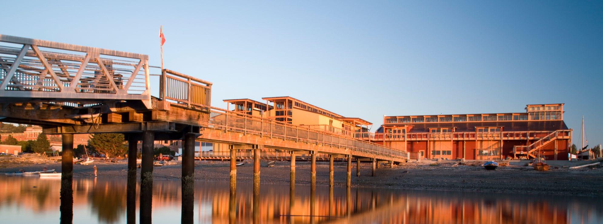
What lies out there, beyond your horizon?
A unique constellation of communities. Experiences you’ll never forget. The most powerful teacher we know: The Sea.
NWM inspires, empowers, and sustains vibrant, diverse communities, creating transformative maritime experiences in this extraordinary place we call the Pacific Northwest. NWM. Beyond Horizons.
Northwest Maritime Logo: Overview
Overview
Our new logo for Northwest Maritime incorporates the “M star” motif from the previous logo, setting it on a horizon and situating it in our brand family’s new hexagon shape.
Logo Mark
Logo Type with Mark
NWM
NWM
Preferred Mark Use
NWM full color logo on white and light-colored backgrounds. Use this version when possible.
Optional Use
When limited to one color, or two color or when brand colors are not available, a black logo is an option. Can use single color in brand color options.
Clear Space around Mark
20% of the hexagon diameter away from text and other elements.
Optional Use on Dark Colors
When limited to one color on a dark background when needed white logo is an option.
Northwest Maritime Logo: Lock up
Logo mark lock up with Poppins semibold in inital Caps. Text must be at least one “M” from the mark. Do not use all caps.
Northwest Maritime: Graphic Elements
Graphic Elements
Northwest Maritime new colors consist of a new dark and light teal/blue, white and minimal use of the star accent yellow.
Crop only on the right side.
Do not crop the star on the left.
Primary Logo
Mark Crop Usage
Icon Variations
Supporting Icon
Northwest Maritime: Brand Colors
Colors
Northwest Maritime new colors consist of a new dark and light teal/blue, white and minimal use of the star accent yellow.
CMYK: 99, 71, 44, 33
RGB: 0, 63, 89
PMS: 3025 C
#38c2d6 #e9b435
CMYK: 65, 0, 16, 0
RGB: 56, 194, 214
PMS: 3545 C
CMYK: 9, 29, 93, 0
RGB: 233, 180, 53
PMS: 6003 C
Use the preferred logo color when possible on white and light-colored backgrounds. Use alternate color options with bold background colors. Do not invert the colors where the “M star” is darker than the background
#003f59
OLD MAIN TEAL OLD HIGHLIGHT TEAL
Logo Options on Bold Colors
New Main Teal New Highlight Teal Star Yellow (Accent)
Northwest Maritime: Brand Font
Typography
Poppins is a sans serif font that has a modern and friendly feel, with a hint of sophistication. Its character is described as approachable, balanced, and versatile. It works well on web and in print, and is available as a Google web font as well as Google Docs for individual use.
Poppins ABCDEFGHIJKLM
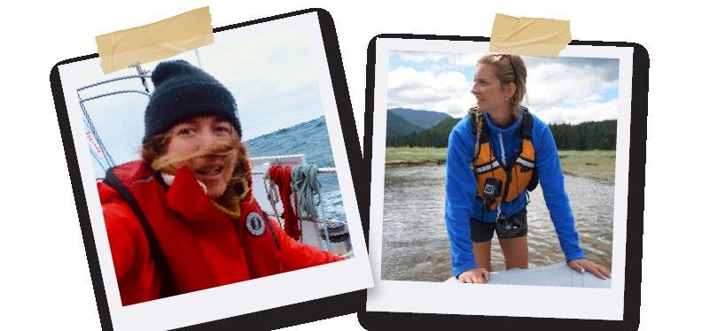
Race to Alaska
Overview
If it ain’t broke, don’t fix it. The iconic R2AK logo remains unchanged with this brand update.
R2AK Logo Mark
R2AK Logo Type with Mark
R2AK full color logo on white and light-colored backgrounds. Use this version when possible.
Clear Space around Mark
20% of the hexagon diameter away from text and other elements.
Optional Use
When limited to one color if brand color is not available black logo is an option.
Optional Use on Dark Colors
When limited to one color or two color, a dark background when needed white logo options.
Race To Alaska: Brand Colors
Colors
Race To Alaska colors consist of blue, gray and minimal use of the red-orange accent color.
#3b5683 #414141 #fd4e00
CMYK: 86, 70, 26, 9
RGB: 59, 86, 131
PMS: 288 U
CMYK: 67, 60, 59, 46
RGB: 65, 65, 65
PMS: 446 C
Logo Options on Backgrounds
CMYK: 0, 83, 100, 0
RGB: 233, 180, 53
PMS: 1655 C
Use the preferred logo color when possible on white and light-colored backgrounds. Use alternate color options with bold background colors.
Incorrect Use on Backgrounds
Do not use the preferred logo when the background is R2AK blue, inverse the colors where the mountain snow is darker than the hexagon frame, or change the color of the R2AK logo.
R2AK Blue Dark Gray Red-Orange (Accent)
Northwest Maritime Logo: Lock up
Logo mark lock up with Poppins semibold in inital Caps. Text must be at least one “M” from the mark. Do not use all caps.
Logo mark lock up with Poppins semibold in inital caps. Text must be at least one “M” from the mark. Do not use all caps.
Race to Alaska
Northwest Maritime
Race to Alaska to
Race To Alaska
431 Water Street, Port Townsend, WA
RACE TO ALASKA
Race to Alaska
Race to Alaska: Brand Font
Used for display font only on headlines and titles. Not for use in body copy or long lines of text. Typography
Textures
Rum aditassunt. Di natemque nis millaborum, omnih cab il eost, quam, con rest volum as inimagni as cor mod earchil itintorro occat.
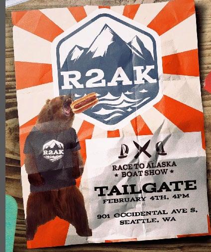
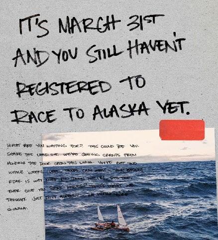
R2AK’s style is based on a DIY aesthetic. Graphic elements that add texture and a feeling of being handmade are important. Also: bears.


Wooden Boat Festival
Overview
The Port Townsend Wooden Boat Festival is the largest wooden boat festival in North America and the second largest in the world. It’s the place where kids and adults alike experience the magic of getting on the water, the beauty of wooden boats, the celebration of craftsmanship, and the richness of our maritime culture.
Wooden Boat Festival
WBF Logo Mark
WBF Logo Type with Mark
Preferred Mark Use Clear Space around Mark
WBF full color logo on white and light-colored backgrounds. Use when possible.
20% of the hexagon diameter away from text and other elements.
Optional Use
When limited to one color if brand color is not available black logo is an option.
Optional Use on Dark Colors
When limited to one color or two color a dark background when needed white hexagon frame options.
Northwest Maritime Logo: Lock up
Logo mark lock up with Poppins semibold in inital caps. Text must be at least one “M” from the mark. Do not use all caps.
Logo mark lock up with Poppins semibold in inital Caps. Text must be at least one “M” from the mark. Do not use all caps.
Wooden Boat MFestival
Wooden Boat Festival
Wooden Boat Festival
Wooden Boat Festival
431 Water Street, Port Townsend, WA
FESTIVAL
Wooden Boat Festival
WOODEN BOAT
Wooden
Boat Festival: Brand Colors
Colors
Wooden Boat Festival colors consists of vibrant red, two tone blue, and sail.
CMYK: 4, 92, 84, 0
RGB: 229, 59, 57
PMS: 185 C
CMYK: 83, 51, 30, 7
RGB: 55, 108, 139
PMS: 776 C
Logo Options on Backgrounds
CMYK: 26, 0, 7, 0
RGB: 177, 249, 248
PMS: 304 C
Use the preferred logo color when possible on white and light-colored backgrounds. Use alternate color options with bold backgrounds.
CMYK: 4, 14, 27, 0
RGB: 242, 217, 187
PMS: 468 C
Incorrect Use on Backgrounds
Do not use the preferred logo when the background is WBF Red or inverse the white logo where the sails are the darker background color.
#e63b39
#b1f9f8
WBF Red
WBF Dark Blue
WBF Dark Light Sail
#376c8b
#f2d9bb
Wooden Boat Festival: Brand Font
Typography
Poppins is a sans serif font that has a modern and friendly feel, with a hint of sophistication. Its character is described as approachable, balanced, and versatile. It works well on web and in print, and is available as Google web font and Google Docs for individual use.
Poppins ABCDEFGHIJKLM
Overview
48ºNorth’s new logo turns the star from the Northwest Maritime logo into the needle in a compass pointing north. 48º as a number sails along in some exciting conditions, echoing the adventures of many readers.
48º North
48N Logo Mark
48N Logo Type with Mark
Preferred Mark Use Clear Space around Mark
48N full color logo on white and light-colored backgrounds. Use when possible.
20% of the hexagon diameter away from text and other elements.
Optional Use
When limited to one color if brand color is not available black logo is an option.
Optional Use on Dark Colors
When limited to one color or two color a dark background when needed white hexagon frame options.
Northwest Maritime Logo: Lock up
Logo mark lock up with Poppins semibold in inital caps. Text must be at least one “M” from the mark. Do not use all caps.
48º MNorth
48° North
48° North
Logo mark lock up with Poppins semibold in inital Caps. Text must be at least one “M” from the mark. Do not use all caps. M M M M
48° North
48° North
431 Water Street, Port Townsend, WA
48° NORTH
48° North: Brand Colors
Primary Color Secondary Colors
48° North primary logo colors consist of orange and white.
The secondary colors can change issue to issue. Here are some alternate colors that can be used.
#000000
#f69731
48N Orange
CMYK: 0, 48, 91, 0
RGB: 246, 151, 49
PMS: 2012 C
Logo Options on Backgrounds
Use the preferred logo color when possible on white and light-colored backgrounds. Use alternate color options with bold backgrounds.
#f7e029 #00a89e #bd202b
Incorrect Use on Backgrounds
Do not use the preferred logo when the background is 48N orange or invert the white logo where the sails are the darker background color.
Typography
Poppins is a sans serif font that has a modern and friendly feel, with a hint of sophistication. Its character is described as approachable, balanced, and versatile. It works well on web and in print, and is available as Google web font and Google Docs for individual use.
Poppins ABCDEFGHIJKLM
The Swan Hotel
The Swan Hotel Logo: Overview
Overview
The iconic Swan Hotel logo is updated with a more serene and modern feel.
The Swan Hotel
Swan Logo Mark
Swan Logo Type with Mark
Preferred Mark Use
Swan full color logo on white and light-colored backgrounds. Use when possible.
Optional Use
When limited to one color or two color or when brand colors are not available black logo is an option. Can use single color in brand color options.
Clear Space around Mark
20% of the hexagon diameter away from text and other elements.
Optional Use on Dark Colors
When limited to one color on a dark background when needed white logo is an option.
Northwest Maritime Logo: Lock up
Logo mark lock up with Poppins semibold in inital caps. Text must be at least one “M” from the mark. Do not use all caps.
Logo mark lock up with Poppins semibold in inital Caps. Text must be at least one “M” from the mark. Do not use all caps.
The Swan Hotel
The Swan Hotel
The Swan Hotel
The Swan Hotel 222 Monroe Street, Port Townsend, WA
THE SWAN HOTEL
The Swan Hotel
The Swan Hotel: Brand Colors
Colors
The Swan Hotel new colors consist of a new dark and light teal/blue, white and minimal use of the star accent yellow.
Main Teal Blue Light Teal Beach Peach (Accent)
CMYK: 65, 23, 37, 1
RGB: 95, 158, 160
PMS: 7473 C
CMYK: 18, 2, 13, 0
RGB: 208, 229, 221
PMS: 573 C
Logo Options on Bold Colors
CMYK: 83, 60, 30, 10
RGB: 60, 96, 131
PMS: 2210 C
CMYK: 1, 46, 59, 0
RGB: 244, 156, 110
PMS: 163 C
Use the preferred logo color when possible on white and light-colored backgrounds. Use alternate color options with bold background colors. Do not inverse the colors where the swan is darker than the background. The swan should remain white or paper color.
#5f9ea0
#3d6083 #d0e5dd
#F49C6E
The Swan Hotel: Brand Font
Typography
Poppins
Used for display font only on headlines and titles. Not for use in body copy or long lines of text.
1234567890