
1 minute read
Intro


Learning from others
A large number of excellent works are studied and the ability to appreciate art is cultivated, which is efficient for improving the level of design. Before making a good design work, it should start from understanding the excellent work. The designer combines professional knowledge to look and think, and carefully study the points worth learning in the work.
Advertisement
1. New Identity Introduction: PWC
I think this intro works great in terms of clarity and being informative enough. The logo of PWC is enlarged on a very clear scale for the readers to examine the details. It also has proper tags and corresponding call out explanation to better complete the whole story.
2. Logo Anatomy: Broadview
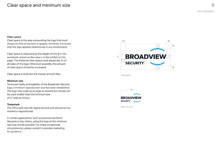
Similar to pwc’s identity intro format, Broadview’s logo anatomy has good visual call outs and guide lines, as well as detailed explanation of its elements.
3. Type Specs: DFW

DFW type specs example gives great visual call out on the left side and guidelines in subtle grey color on the right side. I think the format gives a better hierarchy.
4. Main ID Colors: Norway
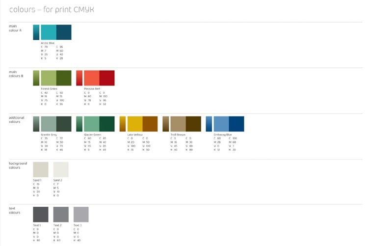
Followed by different categories: logo, background, text, etc, the main ID colors were listed in very specs and very easy to follow.
5. Logo Don’ts: Exploratorium

Instead of focusing on what’s wrong or reinforce the incorrect use of the logo, Exploratorium listed a quote that addreses the importance of correctly using their logo. This is smart.
6. Alternate Versions of the Logo: FedEx

It’s listed in a very organized pattern with proper naming of each one. I think this one template could also be applied to any other logo system.


