
1 minute read
Final Logo


Dots stands for different groups of people. The lines in between the dots make connection with each other. They link together and form a whole community.
The Cube shape stands for a comfort community that serves a group of people who share the same interests.
Advertisement
The M and s stands for myspace. The Cube shape stands for a comfort community that serves a group of people who share the same interests.
Dots stands for different groups of people.
Other color variation.
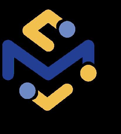
The lines in between the dots make connection with each other. They link together and form a

05
Similar Logos
52
Similar logos
We conducted visual research to identify logomarks that are visually similar or use shapes and motifs similar to those in myspace’s refined logo options. This is a crucial step in visual research to identify what is already successful out in the world and how to further differentiate the myspace brand to make a unique visual identity.


