
PORTFOLIO
1
JENNY CANDIA Architect and Interior Designer


From what I have learned through my 13 years of experience, I’m convinced that art and design pour life and identity into people’s homes and lives. More than just a good, eye-catching outlook, I’m passionate about creating spaces that can improve human well-being.
I’m a structured person and a fast learner, values which I practice daily, overseeing every step in the production process of the projects at my design entrepreneurship This has allowed me to grow personally and professionally. Eager and versatile, I constantly adapt to fulfil various tasks, individually and in groups.
As part of my high accountability, I pay close attention to details Hand drawing and architectural rendering are both my passions That’s why I’m always in pursuit of improving my skills in those areas.
I am constantly curious about different cultures and places worldwide; because of that, I love learning new languages and I always open myself to new knowledge

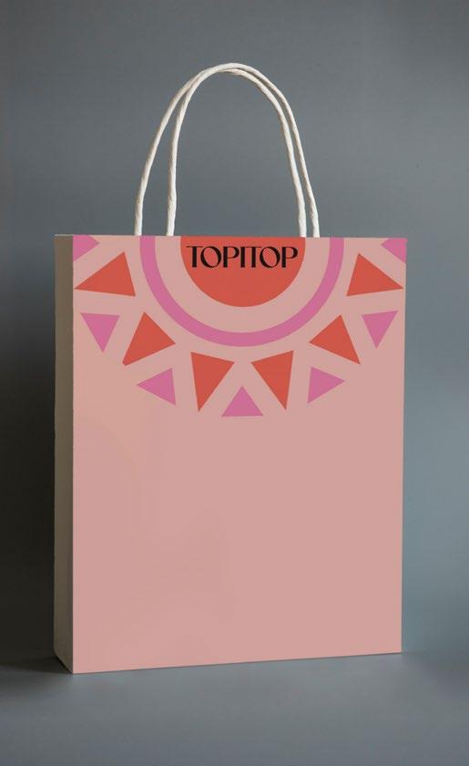

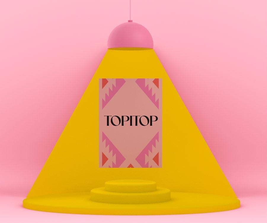
The objective of this project was to strengthen the brand by defining the shapes and styles of the elements of the visual identification system. To achieve this, I developed a Brand Manual with the rebranding of its image and identity
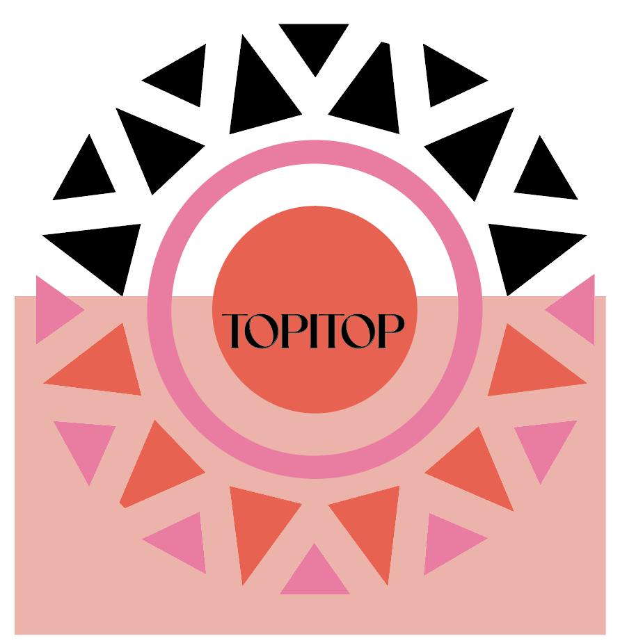
Topitop is a Peruvian clothing brand that needed to highlight its values, which are; quality, Peruvian identity, and teamwork. It also needed to emphasize its Golden Circle, which includes the entire process from manufacturing to the final sale, as well as distinguish the brand's personality for the youthful target audience.
To accomplish this, I worked on the concept, using the words quality and passion (Peruvian)

Grafic line
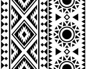
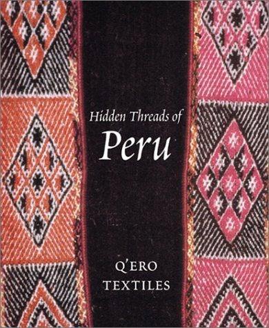
For the moodboard, I drew inspiration from Peruvian textiles and their colors I took patterns from a fabric, digitized them, and based on that, selected the suitable pattern for each application until achieving the final graphic line
The logo is based on typography, using a clear and simple font
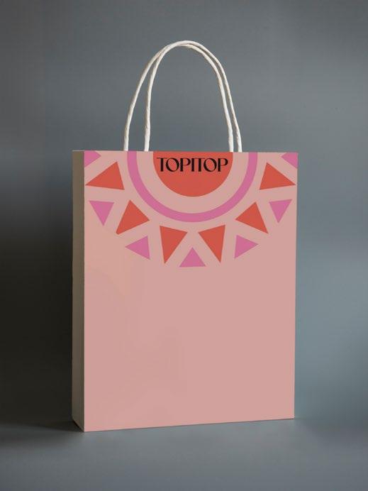
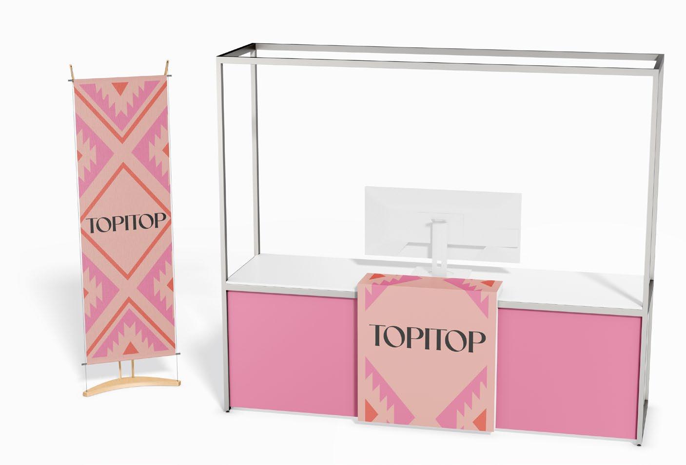
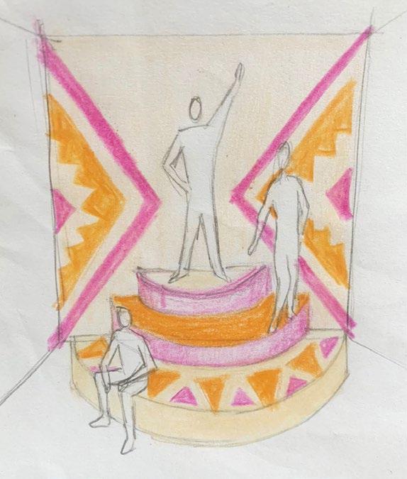
I applied the graphic line and its colors in the development of garment hang tags, packaging, point-of-purchase (POP), posters, and sketches for the application on in-store displays

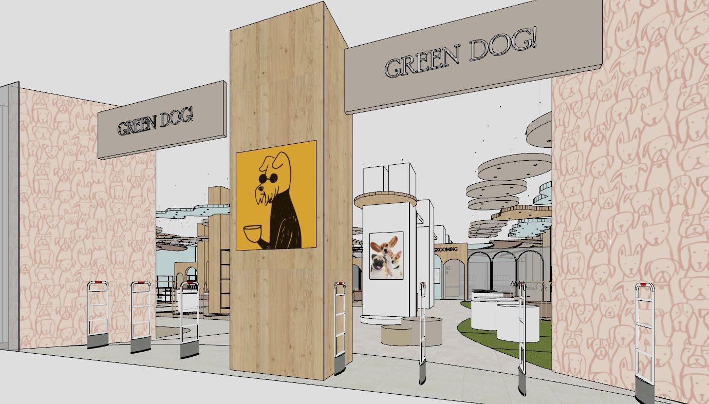
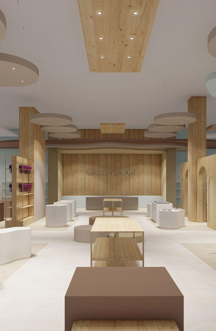
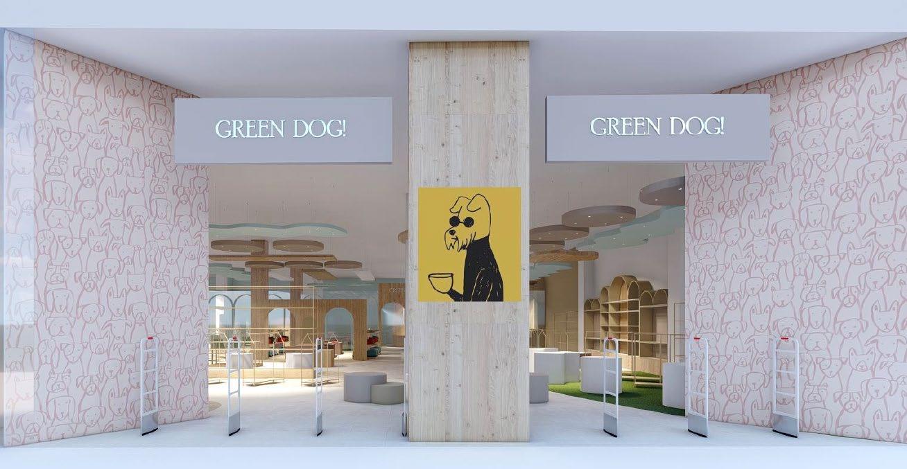
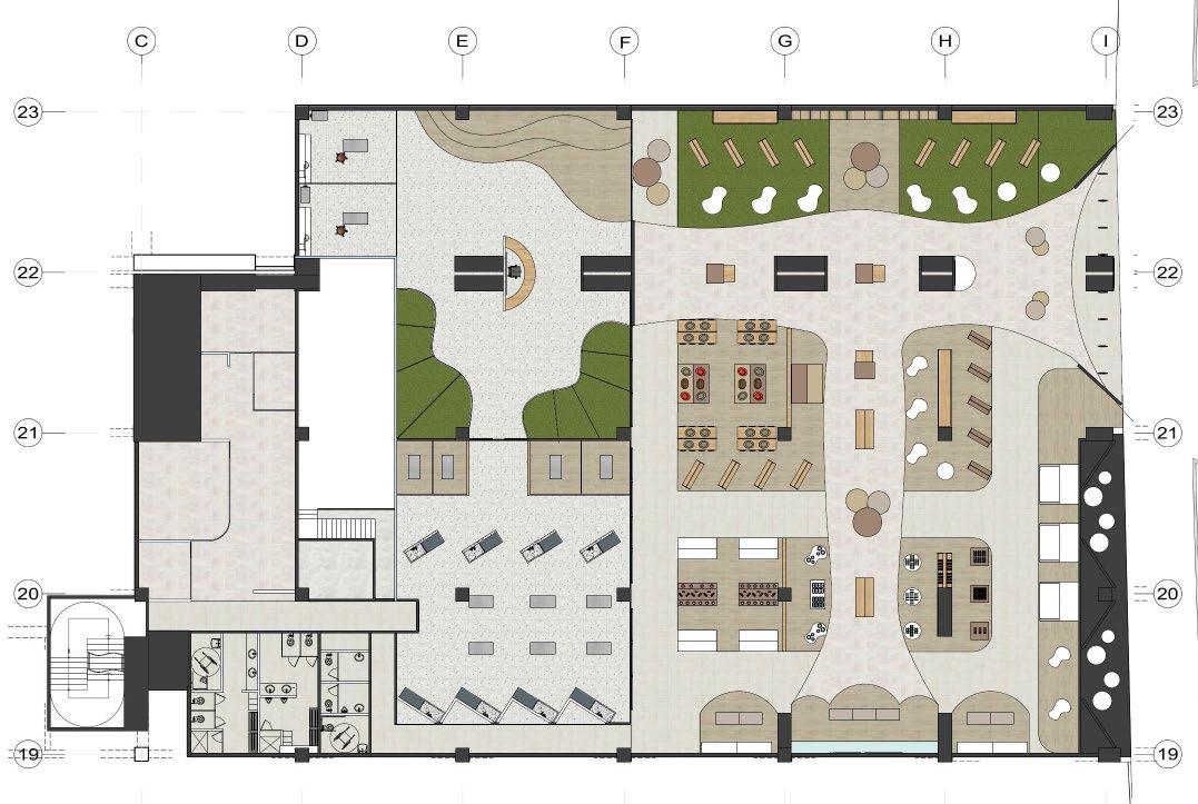
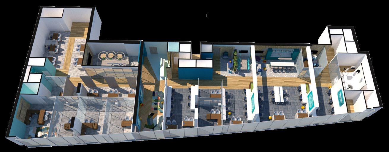
Green Dog is a Petshop and Grooming Project that I developed for a shopping center, with a total area of 1600 m2. For the project, I designed the sales area, grooming area, service area, and administrative area.
Based on the study of the target market and brand typology, I developed the concept, which is a chic eco-friendly daycare
I focused extensively on applying sensitivity in the design so that customers feel confident in entrusting their pets to the Petshop and grooming services.
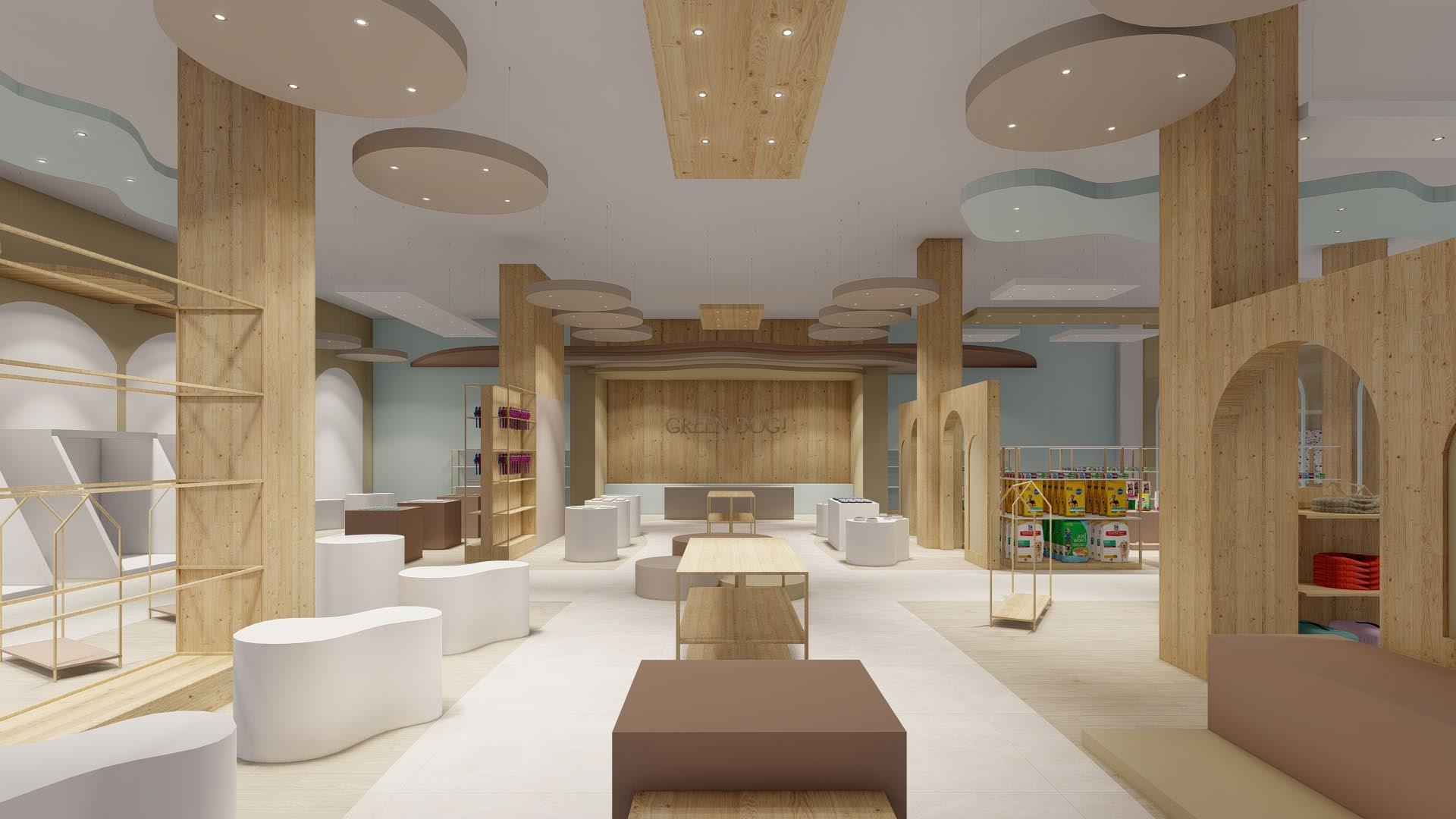
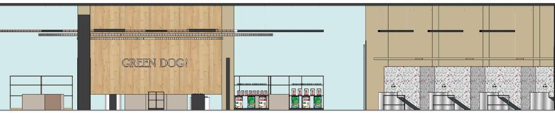
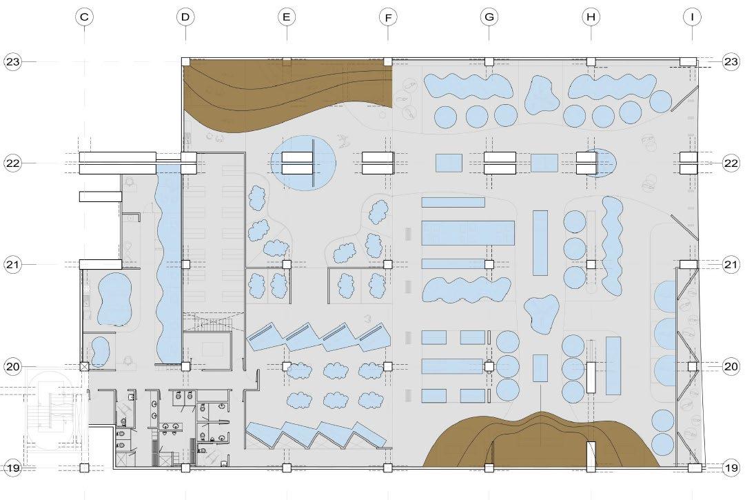
For the Store Planning design, I began with the analysis of cold and hot zones, as well as the visual and circulation aspects of the premises
From there, I took into consideration a program with all sales categories and zoned them in the project.
Next, I prioritized the main and secondary pathways towards the checkout and displays.
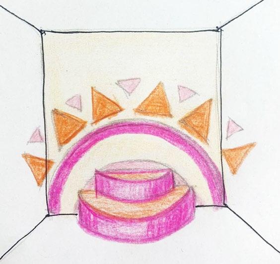
Finally, I applied the concept in the design of each space
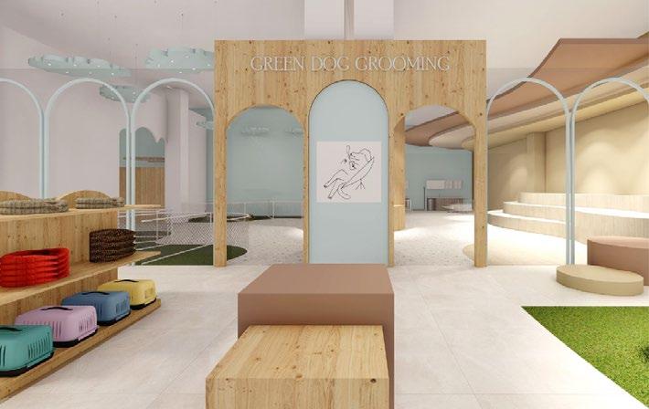
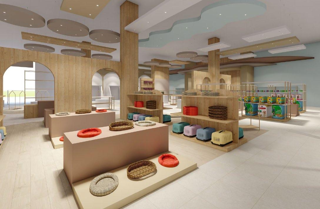
The floor design, ceilings, and circulation pathways are dynamic, organic, and playful, reflecting the brand's concept

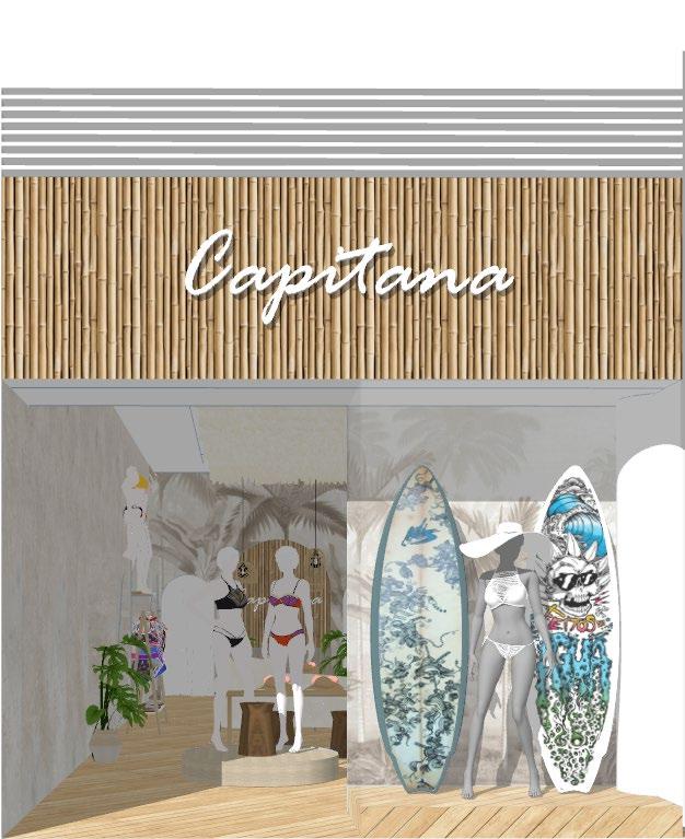
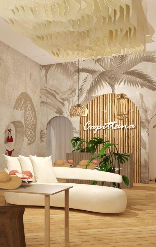
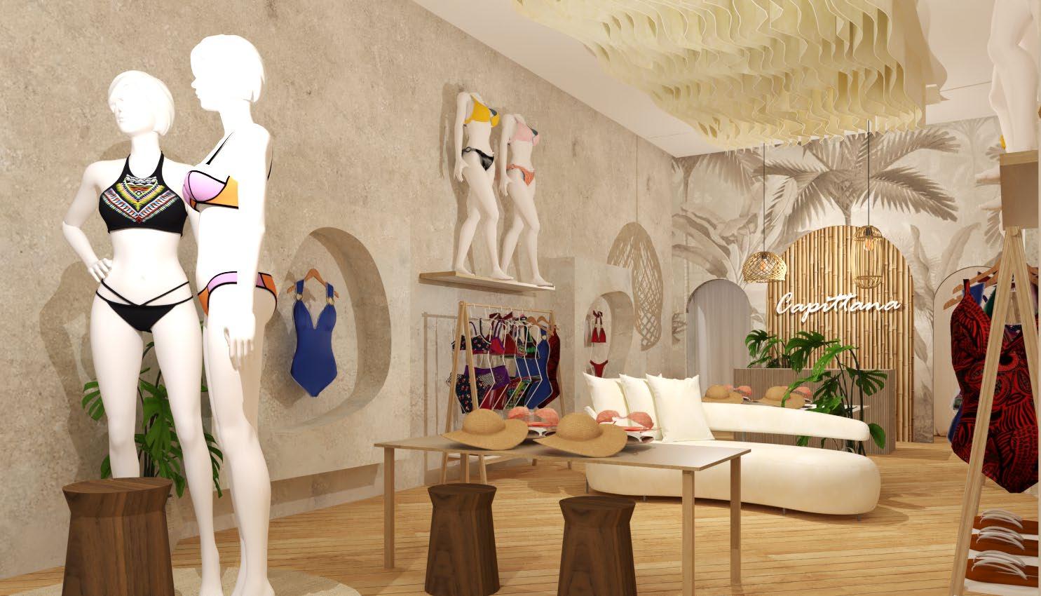
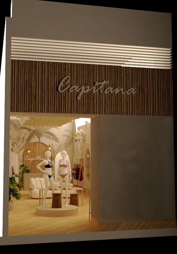
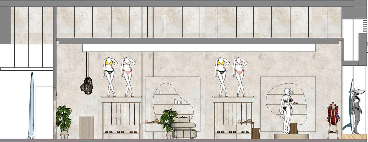
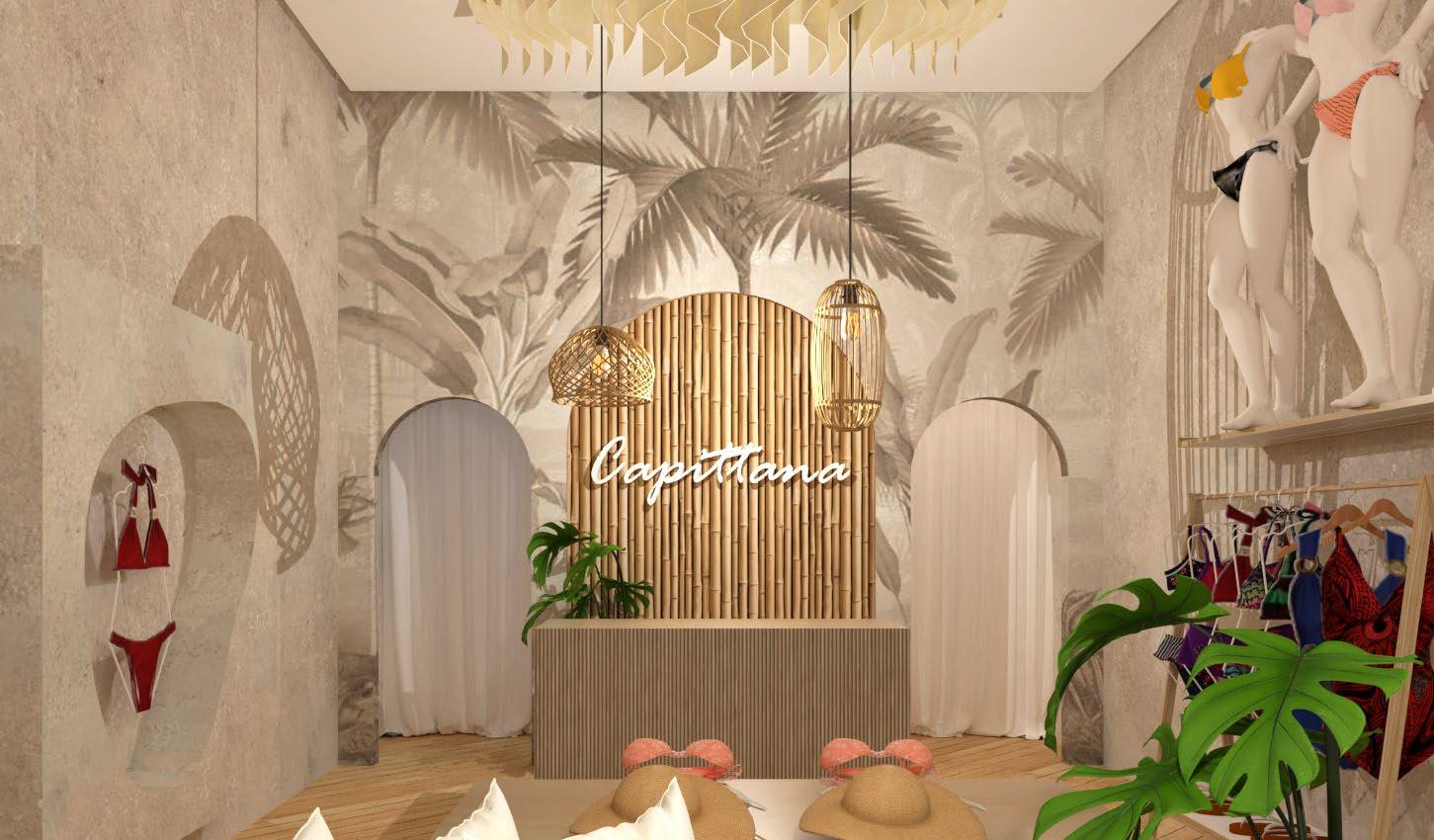
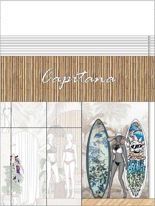
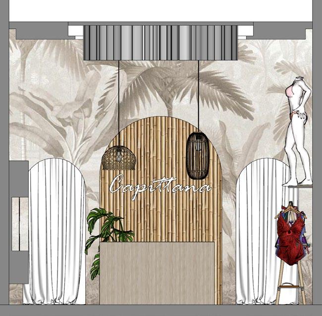
"Capitana" is a project that I developed for a Peruvian brand specializing in exclusive, handmade swimwear.
To achieve this, I analyzed the brand, its unique selling points, and the variety of products it wanted to showcase in the store.
The concept I chose was: Summer, femininity, and beach
For the style, I proposed materials with natural textures, decorative accessories with weaves and fibers, light woods, and greenery.
Distribution
I placed the checkout at the back of the store, next to the clothing fitting rooms and a small service storage area
On the side walls, I positioned the clothing racks and shelves, and in the center of the store, I arranged the displays showcasing the seasonal highlights.
I designed the ceiling in a way that emphasized the central axis, directing the sightlines toward the brand logo.
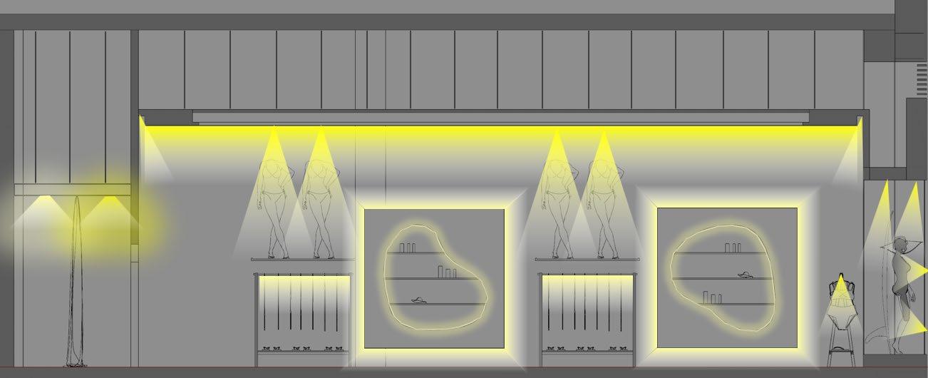
Lighting Design
I conducted a study and proposed a lighting scheme to emphasize the atmosphere and highlight the circulation, furniture, displayed garments, and the emotions of the customers

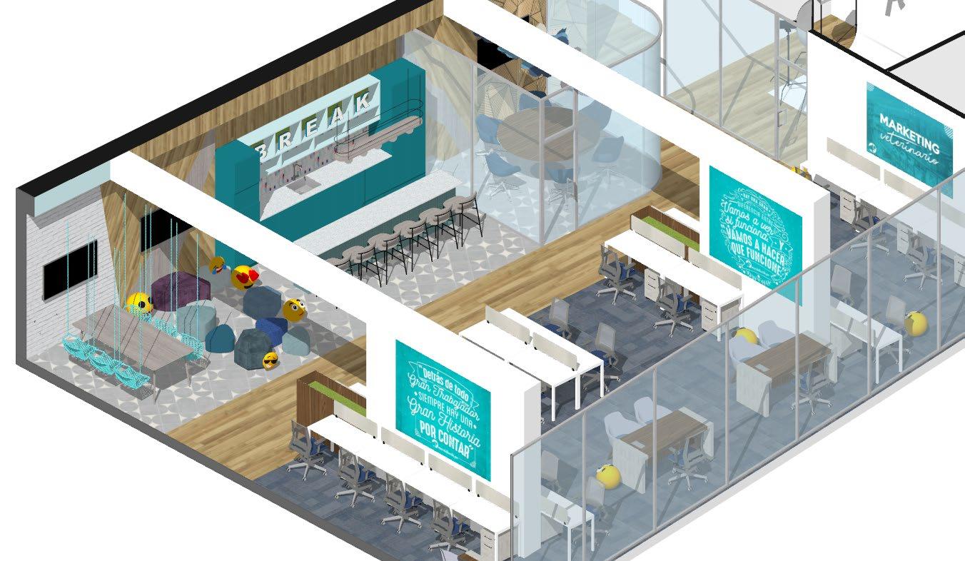
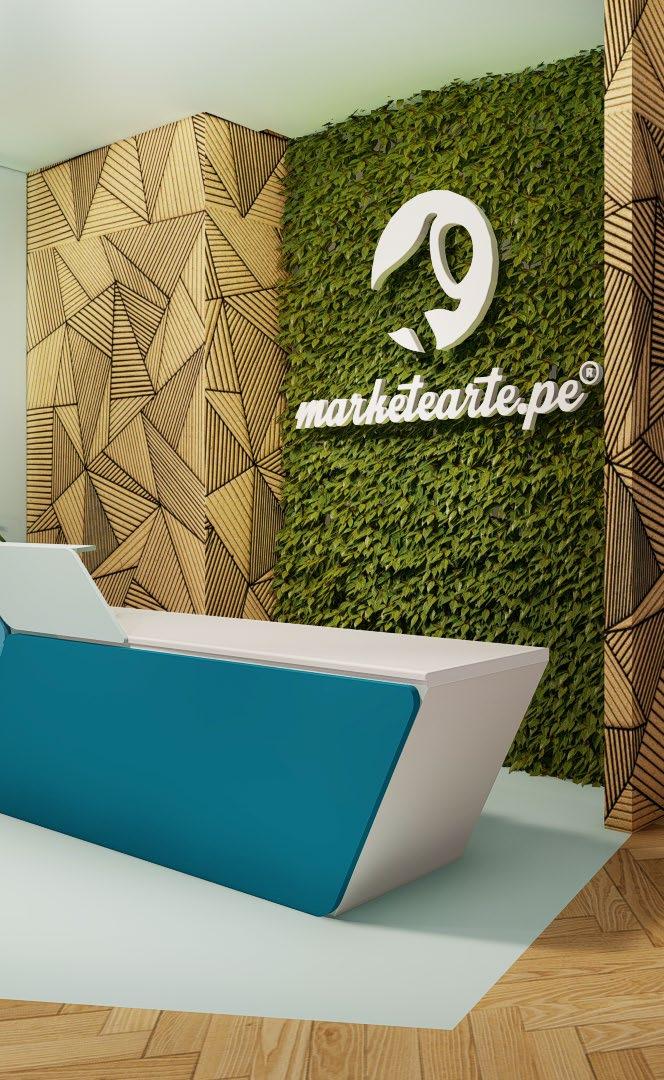
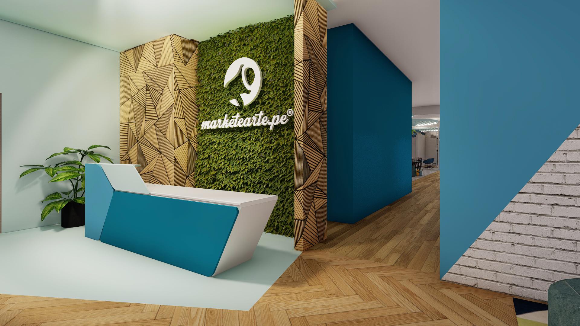
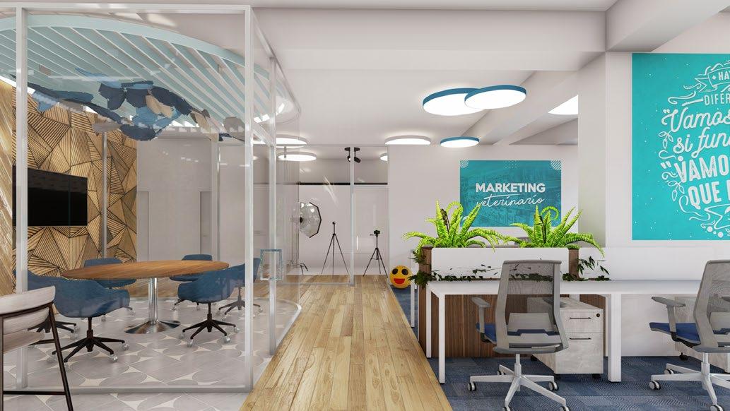
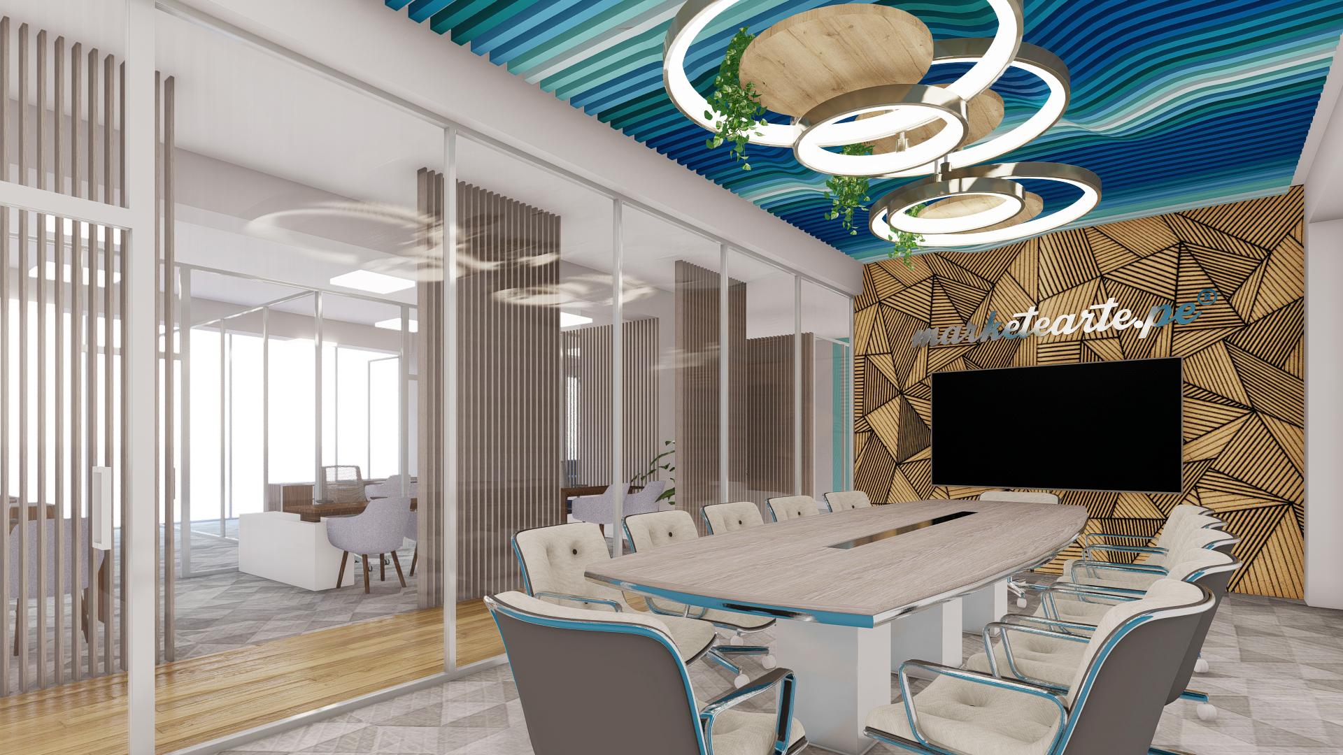
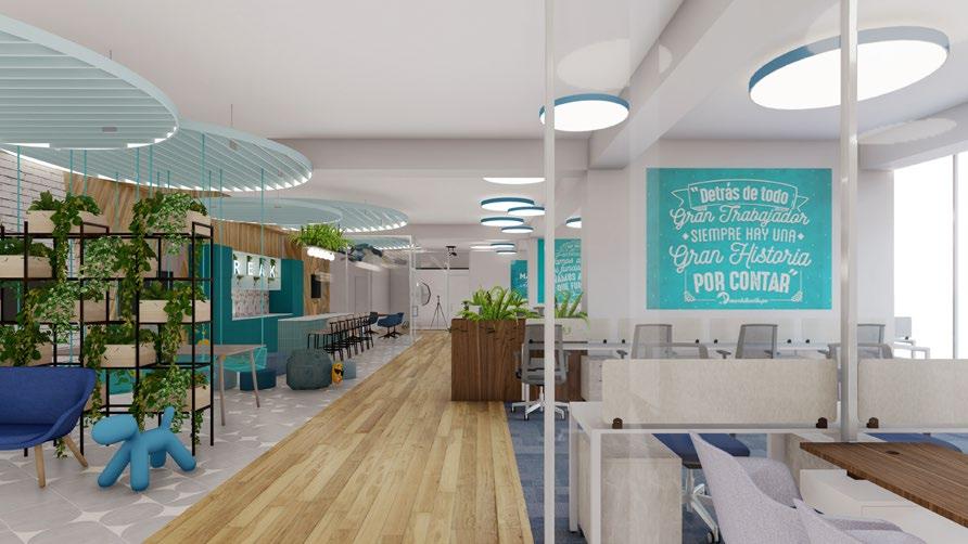
"Marketearte" is an office design project I carried out in an area of 670 m2. Marketearte is a digital marketing and video production agency with a youthful yet professional personality
I began the project by conducting a diagnosis of the brand, visual identity, and a study of their initial office.
Subsequently, I analyzed the new space, considering circulations, sightlines, and degrees of privacy.
Finally, I examined the functional organizational chart, allowing me to dimension work areas, meeting spaces, and storage areas.
Layout
I designed all the office furniture, including workstations, meeting areas, and storage, considering the materials from the moodboard and modular assembly for flexibility in adapting their use in each space according to the needs.
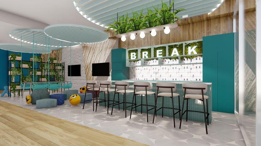
With a special analysis of the required spaces, I conducted a Test Fit with the zoning of the management areas, taking into account the spatial relationships between them, for their placement. 1
The circulations are continuous and serve to separate the work and relaxation areas, which do not have enclosures

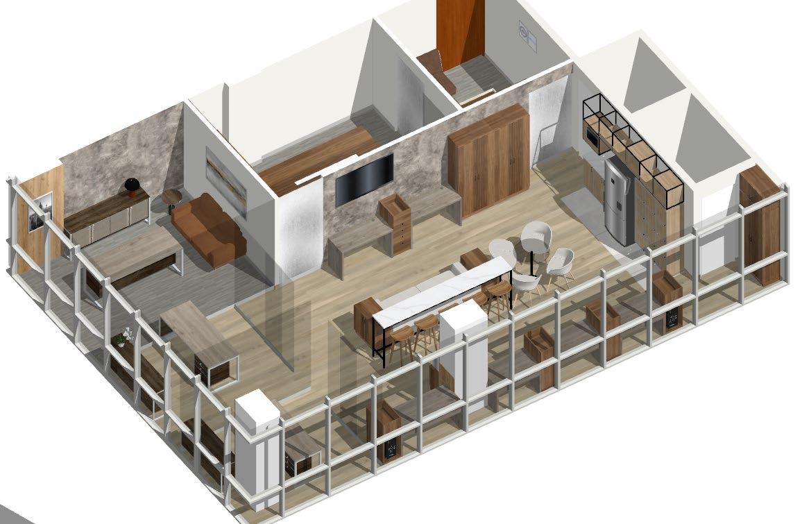
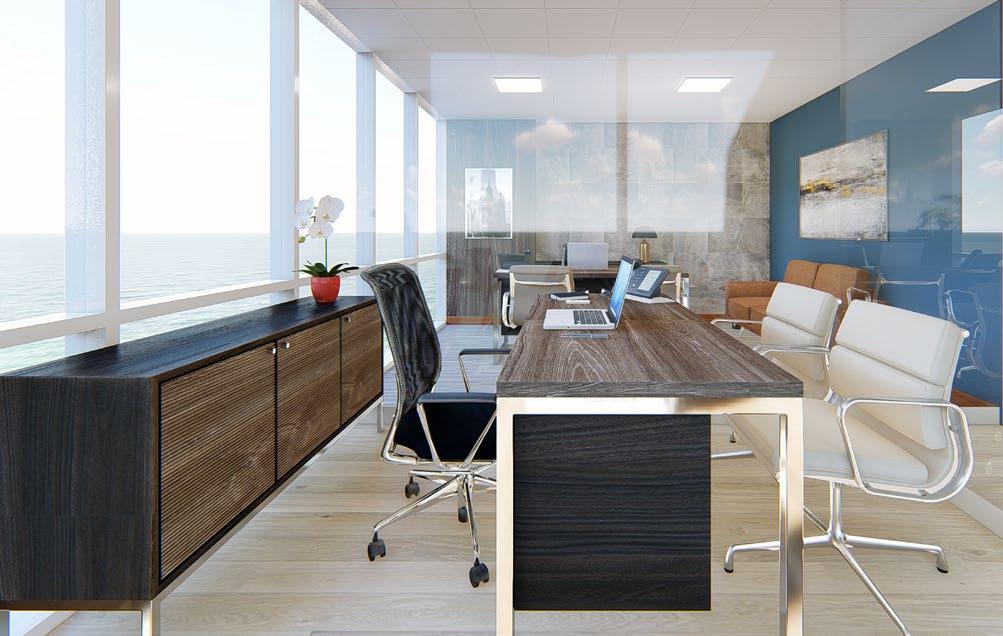
"Maxx" is an office project that I designed for a real estate company in Lima. Maxx Real Estate specializes in exclusive buildings and operates with a team of young professionals
It was important to design two separate entrances and spaces
One area for meetings and work to serve exclusive clients and another area for meetings and work for the team of young workers, more informal and interactive.
The challenge was to achieve a design that could integrate both requirements into a cohesive and unified language.
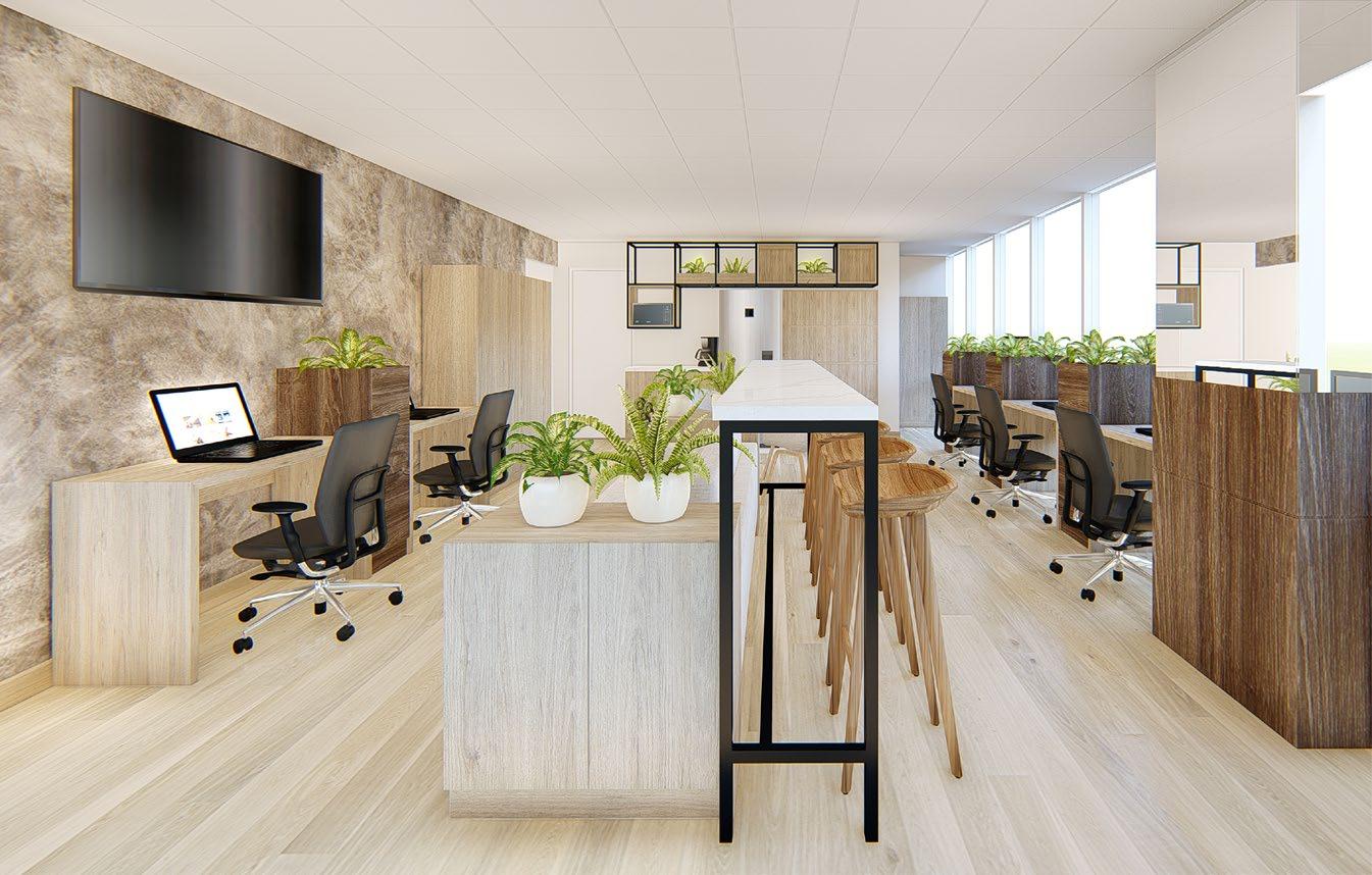
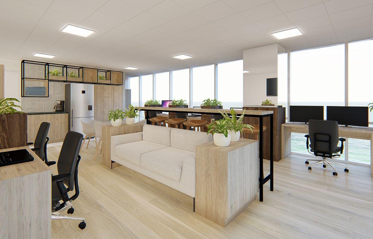
I distributed the entrance hall as access to two areas, one large and well-lit for the workspace, featuring a central island with relaxation spaces, a small dining area, and access to the kitchenette.
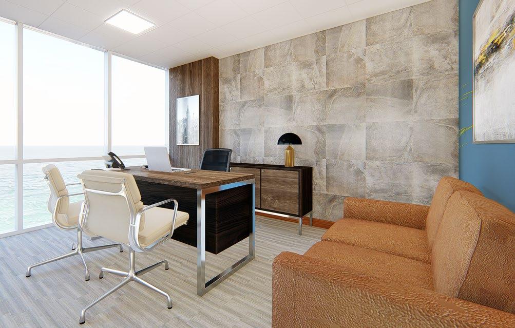
And another entrance for a more private and exclusive environment Continuing from this space are the management offices.
In order to combine the same language, a moodboard was used with a palette of dark and light colors. Most of the dark elements are in the more exclusive area, while lighter colors are used in the more informal zone.
1. Informal área view
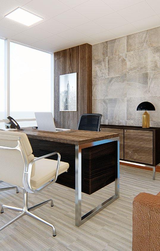
2. Office of General Management
3. Offices View
4. Informal Office view


linkedin.com/in/jenny-candia-6512a4b5