Department of Industrial Design at Tatung University
Graduate Institute of Industrial Design at Tatung University
2022.09-2025.03
2022 Young Designers' Exhibition (YODEX)
2023 Ergonomics Society of Taiwan Annual Meeting and Conference
2024 Holtek MCU Innovative Product Design Competition Outstanding Award
Finalist in Three Professional Awards :
◦ Smart Bicycle & Health Technology Application Award
◦ Youfang Technology - Human-Machine Interface Application Award
◦ Shinhong Electronics - Wireless Innovation Application Award
Work Experience
KURA SUSHI ASIA CO., LTD
Teamson Hongkong Limited
CAMA COFFEE INC
2025.0�ience & Awards
Certificates
Basic Part Design with Creo from NTUST
Advanced Part Design with Creo from NTUST
iPAS Industry Professional Assessment System—Color Planning Manager
Chiang
Jean
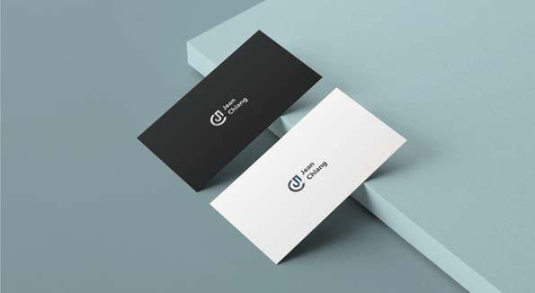
My Chinese name last letter “C”+My English name first letter “J”
Personal Logo Design
The logo is inspired by the initial letters of my English first letter, "J", and my Chinese last name, "C".Using a ruler, I combined simple circles and lines to create a minimalist design that represents my personal style.
The graphic symbolizes my expectations for my future in design, and my ability to persevere and approach everything with a balanced and harmonious attitude, even in the face of setbacks. As for the colors, gray represents my calm and introverted personality, while blue represents my easy-going and adaptable approach to handling things.
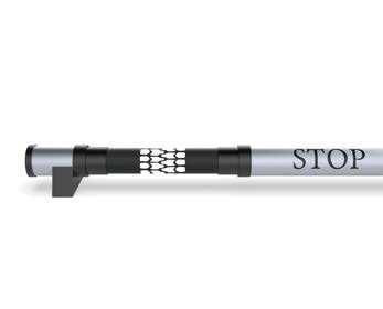
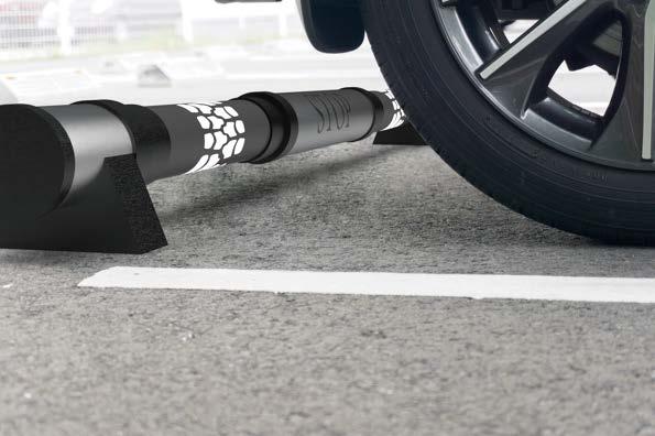
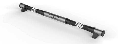
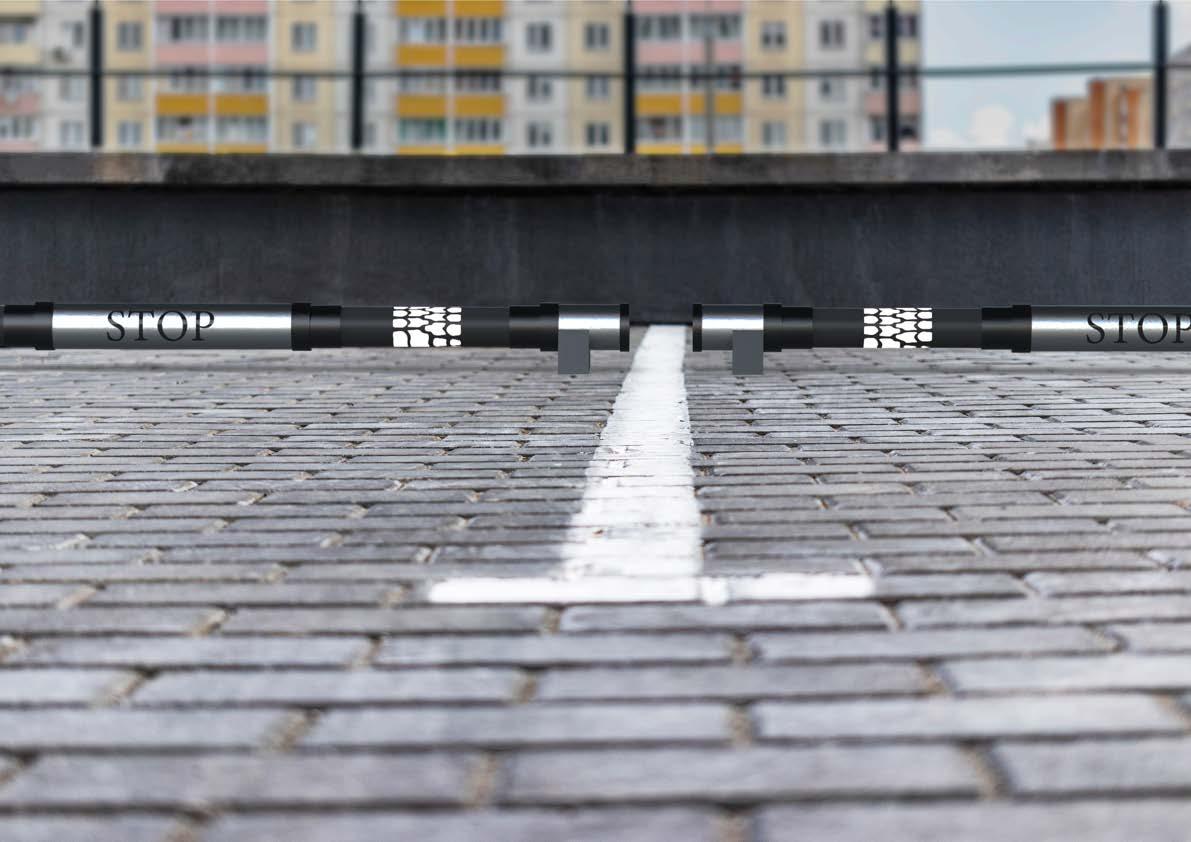
As the largest gas station company in Taiwan, CPC Corporation owes much of its success to the unwavering support of its customers. To show appreciation for this support, a lamp has been designed which features the tire marks left by customers as they drive to CPC's gas stations to refuel. This image represents the support that customers leave behind, and which plays an integral part in CPC's continued success.
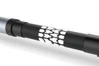
Concept
GUIDE has been designed as a wheel chock that guides people's way in dimly lit parking lots, just like a gas station that awaits visitors in the dark of night. The aim of GUIDE is to provide direction and guidance to pedestrians and drivers, ensuring their safety and allowing them to navigate easily in low-light conditions.
Feature
The lamp is inspired by tire tracks left by wheels on the ground.
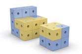
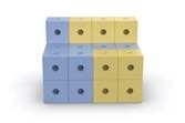
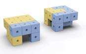
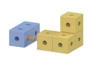
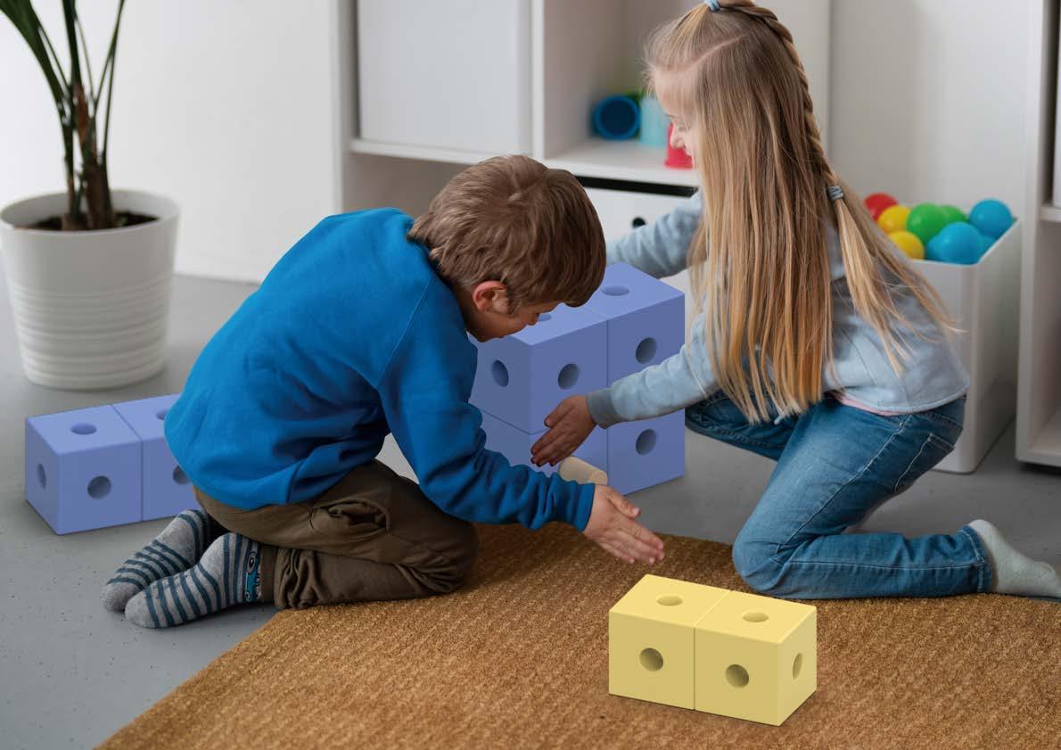
When children begin to play with building blocks, they often become so engrossed in the creative process that they lose track of time and derive pleasure and a sense of achievement from it. The design inspiration for BLOCKS! comes from the classic games of Tetris and building blocks, combining these two elements to allow children to create their own imaginative shapes through different combinations. This not only enhances their creativity and problem-solving abilities, but also enables them to learn and grow through play.
Function Description
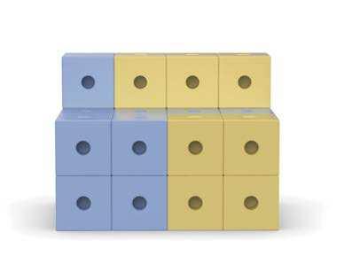
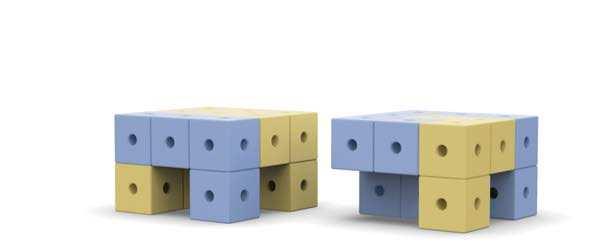
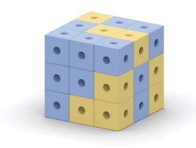
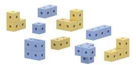
BLOCKS! consists of a total of 27 cubes, divided into nine groups, and can be used to build three basic shapes of furniture: a table and chair set, a sofa, and stools. These building blocks are not only used to assemble basic furniture, but also inspire children's imaginations to create a variety of shapes through free assembly. As for assembly, BLOCKS! uses a freely detachable mortise design, which allows children to easily disassemble and assemble the blocks without worrying about loss or mismatch.
To cater to the strength of children, BLOCKS! use round bars as connectors to make assembly easier. Each cube in the set has circular holes on each side, providing more possibilities for children to create different structures. Moreover, for safety reasons, all edges of the blocks and holes are rounded to avoid any sharp edges.
A table and chair set
Sofa
Stools
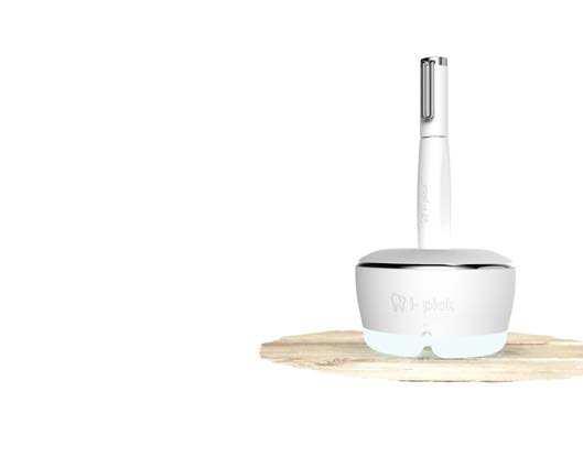
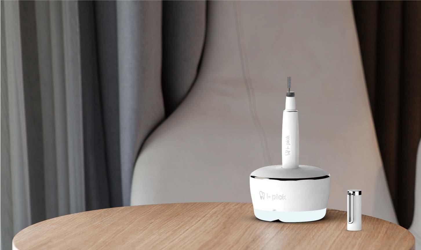
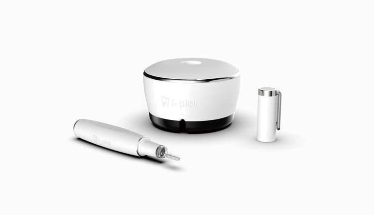
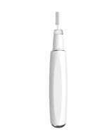
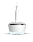
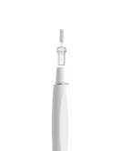
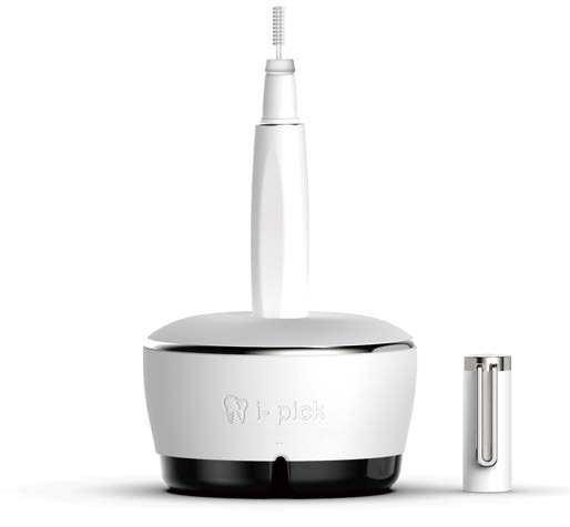
i- pick
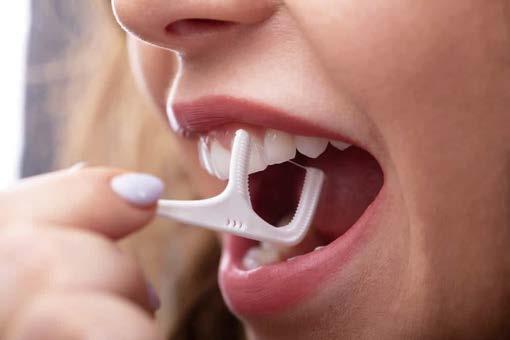
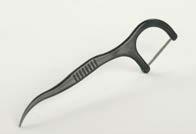
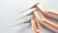
Intelligient Tooth Cleaner
Year of Design
2020
Category of Design
Product Development
Theme
Creative Ideation, Digital Manufacturing.
Background
It's very inconvenient when you need to clean your teeth after a meal but there's no restroom available. Sometimes it's hard to tell where the food residue is stuck when using a toothpick. Although you can use your phone camera to check, it's difficult to see the deep inside of your mouth. Therefore, most people tend to poke around with toothpicks, which may lead to problems such as inflamed gums and enlarged gaps between teeth. Moreover, most toothpicks are disposable products that are harmful to the environment and wasteful.
Situation Analysis
After collecting information on oral hygiene tools, we found that common auxiliary cleaning tools include toothpicks, dental floss sticks, and interdental brushes. After comparison, toothpicks are not suitable as they push food debris further into the teeth and can increase the gap between teeth. Dental floss sticks are only suitable for emergency use since the floss is too short to clean teeth gaps properly. Interdental brushes are the most suitable auxiliary cleaning tool as they effectively remove food debris and dental plaque, are reusable, and come in different sizes for consumers to choose from.
Concept
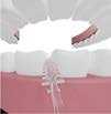
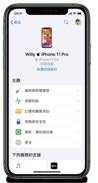
Design an intelligent oral care assistant tool by combining interdental brush with an endoscope camera. Users can connect the camera to their mobile phones to clearly see the deep inside of their oral cavity, making cleaning easier and more convenient.
Function Description:
Power on when opened, quickly connect to the phone camera.
Four-axis directional gyroscope with 360° tilt angle recognition.
Distance sensing and automatic zooming function.
Long-lasting battery life, supports magnetic wireless charging.
Rubber
Glass
Iron Polished
Ergonomic design with a flat handle for comfortable grip.
Wireless charging dock, start charging as soon as the light comes on.
Snap-on design allows for easy brush head replacement.
Wide-angle lens for an expanded view with no blind spots.
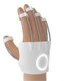
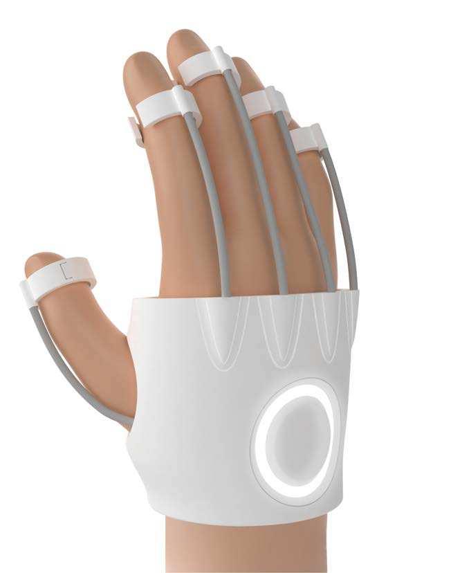
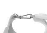
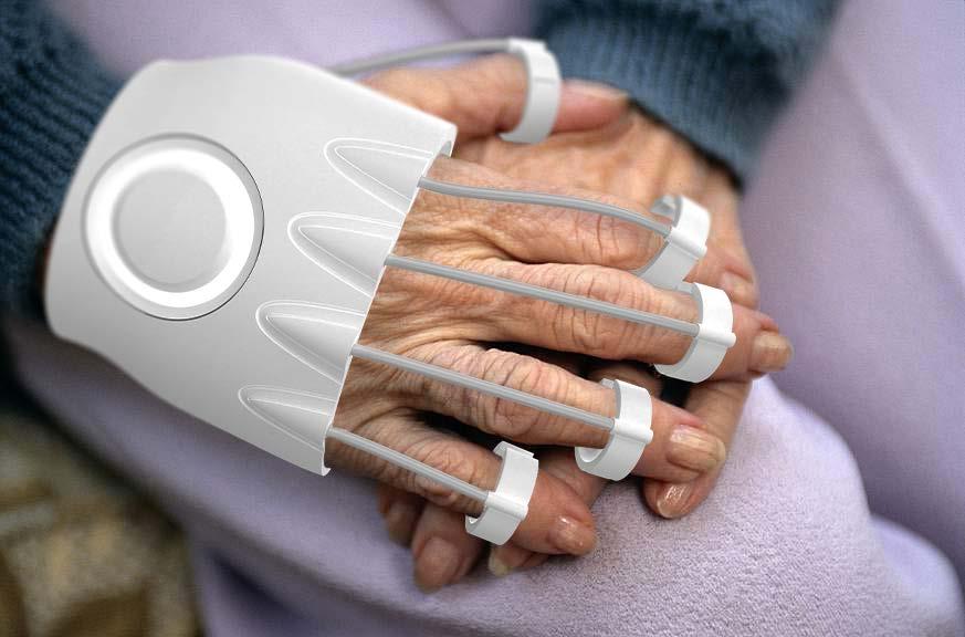
Flexor
Rehabilitation Equipment of Stroke
Year of Design 202�
Category of Design
Product Development
Theme
System Development
Background
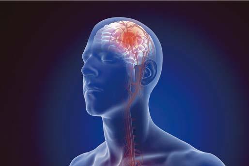
Stroke, caused by damage to the brain, can impair the ability to control limbs, particularly fingers, requiring continuous practice and patience for recovery. Stroke is the third leading cause of death in Taiwan, following cancer and heart disease. The trend of strokes affecting younger people has been increasing due to changes in diet, lifestyle, and the environment. In the past decade, the proportion of stroke patients under 45 years old has increased from 5-6% to 15-18%, with approximately 1 in 7 stroke patients now being young adults. Stroke can cause significant disability in young people at the peak of their careers, with far-reaching consequences for individuals, families, and society.
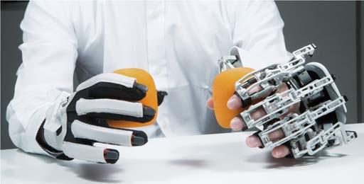
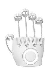
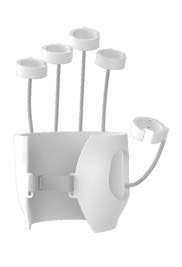
Concept
Flexor is a novel rehabilitation device that utilizes the concept of a mechanical glove and incorporates the principle of elastic cords. With the accompanying mobile app, users can control the resistance of the elastic cords and adjust the rehabilitation difficulty level based on their condition.
Situation Analysis
After researching various finger rehabilitation equipment, it was found that more complex equipment required assistance from others for moderate to severe stroke patients. The inability to train independently at all times has caused inconvenience for patients living alone. Therefore, the goal is to design a product and system that allows stroke patients to train independently at home.
Interface
1. Login and create an account to save progress.
2. Choose from a variety of rehabilitation menus, as prescribed by a doctor.
3. Adjust the length of the elastic band to suit your finger length.
4. The interface will guide the user's movements during the rehabilitation process.
5. Before starting, a comprehensive evaluation will be conducted.
6. After each session, review and upload rehabilitation data to the cloud using the upload button beside each record.
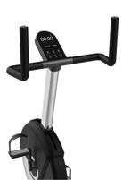
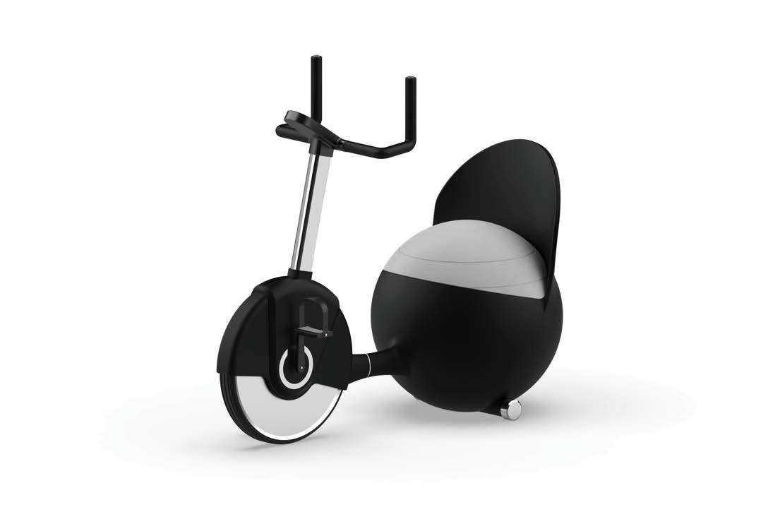
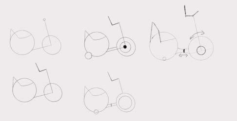
Pregn�ncy Exercise Bike
Year of Design 2022
Category of Design
Product Development and Design
Theme
Graduation Project Production
Team Members Chiang, Yu-HanHuang, Mei-Chih
Responsible Project
Concept
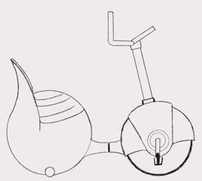
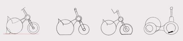
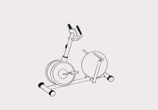
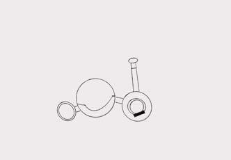
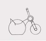
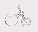
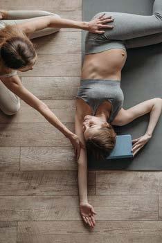
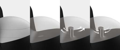
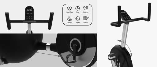
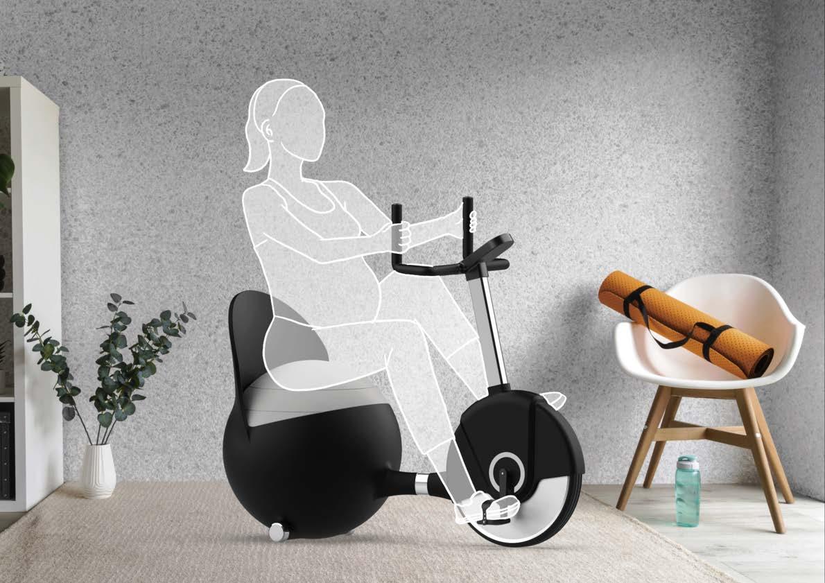
O.Bike is a fitness equipment designed specifically for pregnant beginners or pregnant women who are unable to do intense exercise. Combining the principles of yoga ball and exercise bike, it enhanc es overall comfort through thoughtful design. The equipment can be adjusted to the most suitable angle and length for pregnant women, making the difficult fitness training easy to get started. The design of O.Bike is bio-inspired by the pregnant belly, giving users a more intimate feeling while riding.
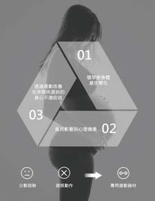
Importance of Antenatal Exercises
In the traditional Chinese impression, people consider that pregnant woman should reduce their physical activity. In fact, appropriate exercise is not only important to unborn child and pregnant woman but also can make pregnant woman relieve their stress. We find that there a few women who are not suitable for high-intensity activity give up on doing exericse directly. And some women who are pregnant for the first time do the wrong movements and cause injuries because they don't have much relevant exercise experience before.
Background
Pregnant women are not feeling well during their bodies change. Under the influence of bodies change, they will generate negative emotions. What's more, if the circumstance is ongoing, it not only will decrease the immune system of woman but also will impact the health of unborn child. The research indicates that almost every women who were pregnant before suffered physical discomfort and more and 50% felt depressed because of their bodies changed. However, there are a few did exercise during the period of pregnancy. They claim that doing exercise made them feel better.
Design Features
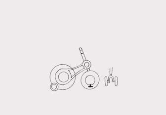
We chose yoga ball and spinning bike as the design elements. The bouncy yoga ball makes pregnant woman ride in comfort. Besides, sitting on yoga ball helps pregnant woman giving birth to their children more smoothly. Furthermore, exercise bike can help woman training their muscles of hips, buttocks and thights and fix the problem of edema and varicose veins.
In order to getting closer with pregnancy, O.bike which has many details designed to fix the disadvantage of pregnant woman, including adjustability system, the high-back and safety support at the bottom, put pregnant woman at ease with riding it.
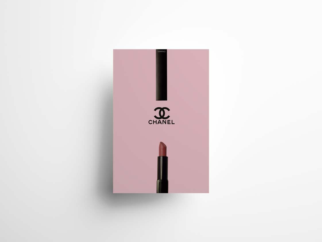
Brand Poster Design
Concept
Designing a promotional poster with Chanel lipstick as the main theme.
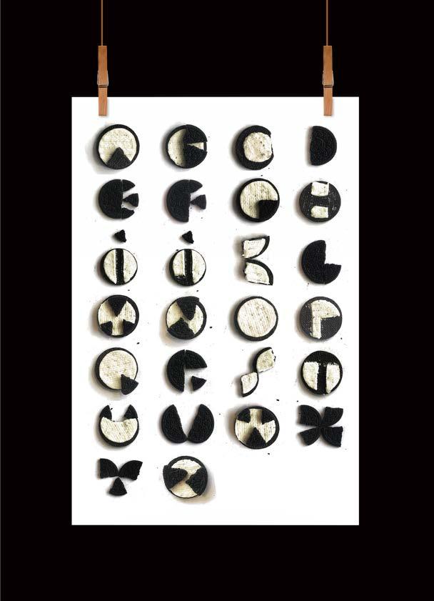
Alphabet Design
Concept
Using the black and white features of OREO's cream filling and cookies, a creative set of letters has been designed.
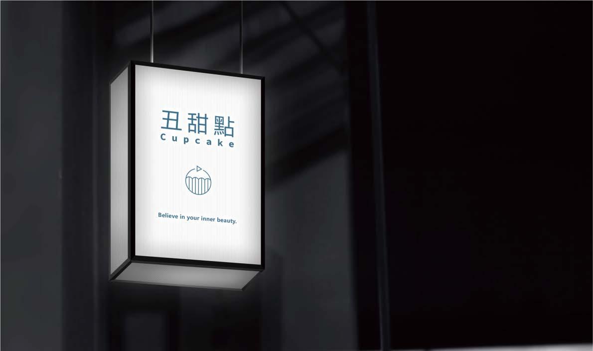
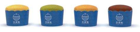
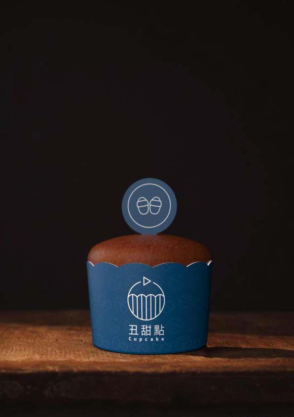
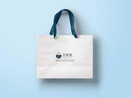
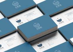
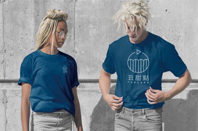
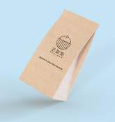
丑甜點 Cupc�ke
丑甜點 is dedicated to providing customers with rich and diverse flavors in our cupcakes, with a focus on the filling. In today's society where appearance is often emphasized, we aim to promote the importance of inner beauty through our brand. Ugly Desserts uses a simple and pure exterior design and packaging to convey that while the appearance may not be glamorous, with a discerning palate, one can experience the deliciousness within. Furthermore, we will continue to develop new and original flavors, providing customers with delicious and high-quality cupcakes.
Responsible Project Logo Design Scenario Rendering
Concept
The design inspiration is based on a cupcake with a small flag. The simple circle and triangle shapes represent the "simple image" we want to present for our cupcakes. For the typography, we use the Microsoft YaHei font, which is square but not monotonous, creating a simple yet playful style. As for the colors, we use deep blue and bright orange to form a strong contrast, making the overall logo more lively and conveying the core of our brand - "simple appearance but unique inside."
Conveying the concept of confidence and self-belief in our own inner beauty
Using a contrasting color as an accent to create a strong visual impact.
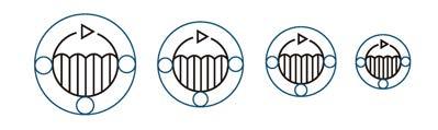
Logo Design Evolution
Simplify the original proposal using a ruler to create a more consistent overall design.
Logo Perimeter Space Limitation
Leave at least one diameter of space around the logo.
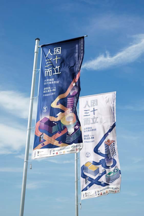
To commemorate the 30th anniversary of the Ergonomics Society of Taiwan, the EST 2023 academic conference has been themed as "Thirty Years of Maturity". The main visual design incorporates the four main axes of ergonomics: healthcare, national defense, transportation, and occupational safety, combined with the image of future urban development, to convey the Ergonomics Society of Taiwan's vision of a promising future.
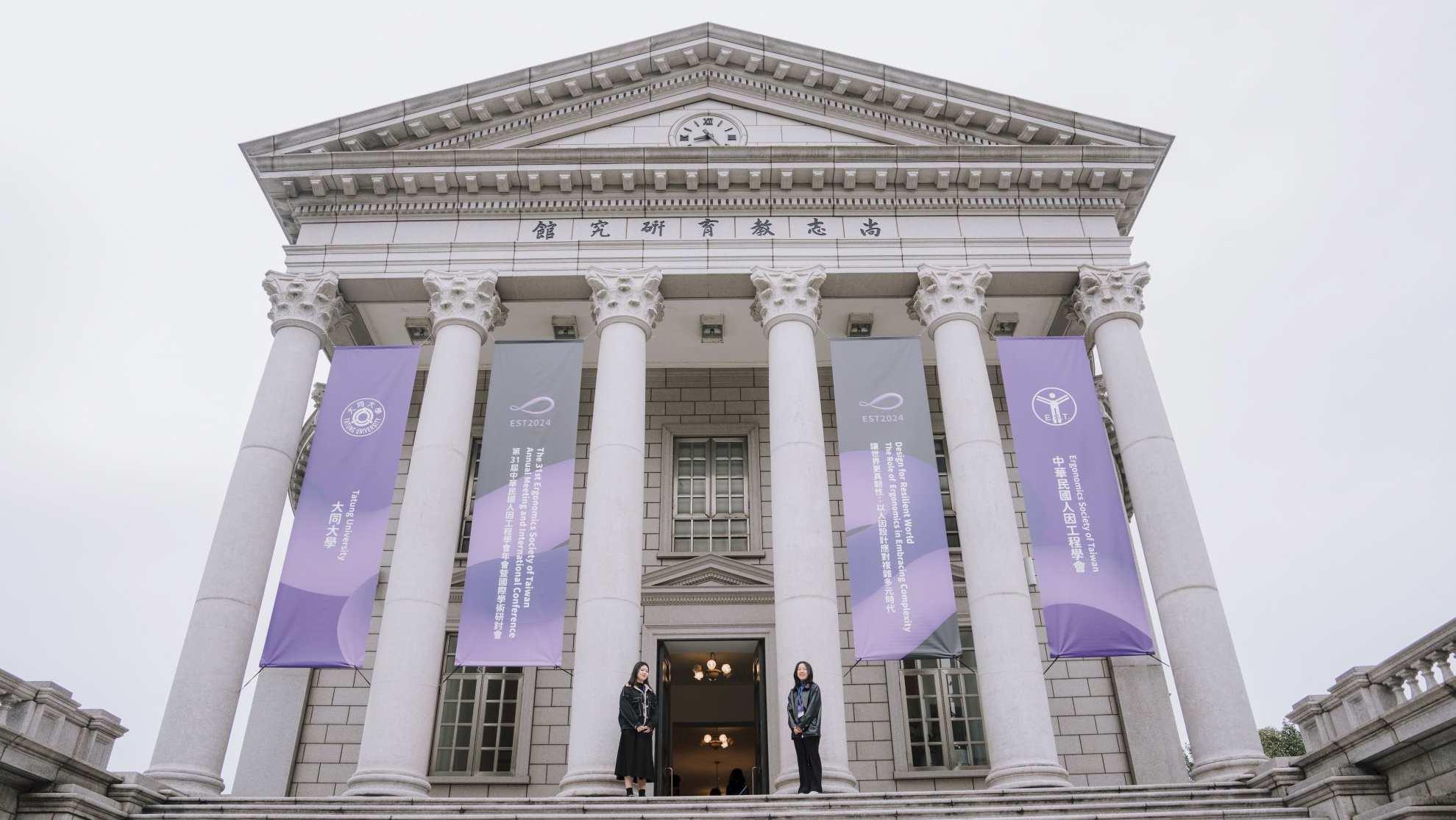
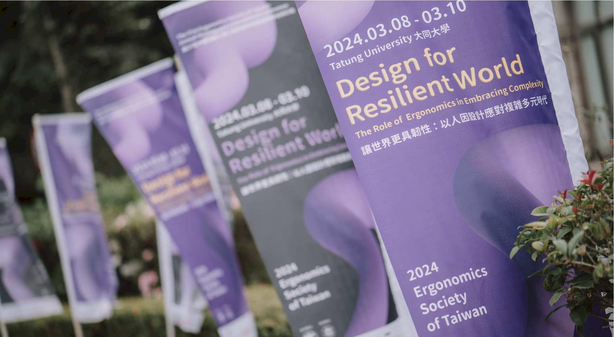
Concept Main Visual Design EST2024
As the pandemic subsides, the world faces new challenges. People continuously adapt to changing environments, evolving work models, and technological advancements. From in-person to remote work and learning, from traditional print media to digital information design, from the physical world to virtual integration, and from mechanical operations to AI-driven assistance—human-centered ergonomics remains both flexible and resilient, supporting individuals in navigating an increasingly complex era.
The 3�st Ergonomics Society of Taiwan Annual Meeting and International Conference is centered around the theme “Design for a Resilient World,” emphasizing how design, through the lens of ergonomics, can address complexity and enhance adaptability. I developed a comprehensive visual identity system for the conference to communicate its core values of resilience, adaptability, and human-centered innovation. The design integrates fluidity and structure, symbolizing the balance between technology and human needs, while soft color gradients and curved elements reflect the essential role of ergonomic design in an ever-changing world.